Clock&Flow: Elements of Cycle Analysis 2nd partClock&Flow – Elements of Cycle Analysis (ECA) | Complete Suite
Elements of Cycle Analysis (ECA) is an advanced cyclic analysis suite designed to interpret the market through time, structure, strength, and energy, combining cycles, volatility, and participation into a single operational framework.
The suite consists of two complementary modules:
🔹ECA 1 – Cycles, Structure, and Volatility (Overlay: True)
ECA 1 is dedicated to the structural and temporal analysis of the market.
Cyclic SMAs (Cyclic Ratio) Moving averages are calibrated according to nominal cycles and timeframes to monitor multiple cycles simultaneously (from the lower cycle to the upper cycles). Crossovers between fast and slow SMAs certify the closing or transition of the cycle related to the faster SMA. The specific cycle is identified in the Info Table at the bottom right (for 15m - 1h - 2h - 1D timeframes). You can select the number of cycles to observe and the asset type to apply them to:
Index: Standard quotes (e.g., Cash sessions).
Future: Extended quotes (24h).
50-200: Classic institutional references for the medium-long term.
ATR-based Dynamic Cyclic Channels The channels represent a lower cycle and its upper counterpart; their width is determined by the observed timeframe and calculated based on average volatility (ATR). Volatility is not treated as noise but as a structural component of the cycle, essential for contextualizing excesses, compressions, and expansions.
Info Table and Quick Guide Dynamic tables automatically link SMAs, timeframes, and time cycles, providing an immediate reading of the current cyclic context.
Time Bands (Weekly / Daily) Temporal visualization helps identify cyclic pivots and rhythm transitions.
🔹 ECA 2 – Market Excesses, Strength, and Energy
ECA 2 analyzes how the market moves within the cyclic structure.
Excesses and Divergences (Cyclic Stochastic) An oscillator calibrated on the same cyclic ratio as the suite. Crossovers between the lower cycle (blue) and upper cycle (red) signal potential phase changes. In areas of excess, divergences often confirm the closing and restart of a cycle.
Directional Movement System (DMS) The ADX measures the strength of the movement, while +DI and -DI indicate direction. A simultaneous crossover of ADX, +DI, and -DI signals imminent acceleration, even before the strength is fully expressed.
Market Pulse – Real Market Energy The Market Pulse measures the amount of real energy moving through the market by relating three factors:
Price Velocity
Normalized Volume
Volatility (ATR relative to price)
These three factors are combined multiplicatively: if one is missing, the impulse weakens. The zero line represents a state of energy equilibrium; values above or below indicate a real imbalance (bullish or bearish). Note: Market Pulse is not a classic oscillator and should not be interpreted as overbought or oversold; it is used to evaluate the energetic quality of a movement.
Operational Convergence
The maximum operational effectiveness of the ECA suite is achieved when all modules converge on the same market phase.
When cyclic timing, volatility, price structure, trend strength, and movement energy align, the context signals a high-probability operational phase. The system is applicable to any timeframe or asset because it is not bound by dogmatic or subjective interpretations of technical or fundamental analysis; instead, it leverages what is actually happening in the market. Major chart patterns and Volume Profile (technically not includable in this specific suite) provide further confirmation.
Under these conditions, the signal does not originate from a single indicator but from the consistency of the entire system: time, volatility, and energy moving in the same direction.
Entries should always be accompanied by proper risk management.
––––––––––––––––––––––––––––––––––––––––––––––––––––––––––––––––––––––––
Clock&Flow – Elements of Cycle Analysis (ECA) | Suite Completa
Elements of Cycle Analysis (ECA) è una suite avanzata di analisi ciclica progettata per leggere il mercato attraverso tempo, struttura, forza ed energia, combinando cicli, volatilità e partecipazione in un unico framework operativo.
La suite è composta da due moduli complementari:
🔹 ECA 1 – Cicli, Struttura e Volatilità (overlay true)
ECA 1 è dedicato all’analisi strutturale e temporale del mercato.
SMA cicliche (ratio ciclica)
Le medie mobili sono calibrate in funzione dei cicli nominali e del timeframe per monitorare più cicli simultaneamente (dal ciclo inferiore fino ai cicli superiori).
Gli incroci tra SMA veloci e lente certificano la chiusura o transizione del ciclo correlato alla SMA più veloce. Il ciclo in questione è segnalato nella info table in basso a destra (per i time frame 15’ - 1h - 2h - 1D) Puoi selezionare il numero dei cicli da osservare e su quali asset applicarle (Index = quotazioni standard / Future = quotazioni estese / 50-200 i classici riferimenti istituzionali per il medio-lungo periodo
Canali ciclici dinamici basati su ATR
I canali rappresentano un ciclo inferiore e il suo superiore, l’ampiezza è data dal time frame osservato e calcolata sulla volatilità media (ATR).
La volatilità non è trattata come rumore, ma come componente strutturale del ciclo, utile per contestualizzare eccessi, compressioni ed espansioni.
Info Table e Quick Guide
Tabelle dinamiche collegano automaticamente SMA, timeframe e cicli temporali, fornendo una lettura immediata del contesto ciclico in corso.
Time Bands (Weekly / Daily)
La visualizzazione temporale aiuta a individuare pivot ciclici e transizioni di ritmo.
––––––––––––––––––––––––––––––––––––––––––––––––––––––––––––––––––––––
🔹 ECA 2 – Eccessi, Forza ed Energia del Mercato
ECA 2 analizza come il mercato si muove all’interno della struttura ciclica.
Eccessi e divergenze (Stochastic ciclico)
Oscillatore calibrato sulla stessa ratio ciclica della suite.
Gli incroci tra ciclo inferiore (blu) e superiore (rosso) segnalano potenziali cambi di fase; in area di eccesso, le divergenze certificano spesso la chiusura e ripartenza del ciclo.
Directional Movement System (DMS)
L’ADX misura la forza del movimento, mentre +DI e –DI ne indicano la direzione.
L’incrocio simultaneo di ADX, +DI e –DI segnala un’accelerazione imminente, anche in assenza di forza già espressa.
Market Pulse – Energia reale del mercato
Il Market Pulse misura quanta energia reale sta attraversando il mercato mettendo in relazione:
velocità del prezzo
volume normalizzato
volatilità (ATR rapportato al prezzo)
I tre fattori sono combinati in modo moltiplicativo: se uno manca, l’impulso si indebolisce.
La linea dello zero rappresenta una condizione di equilibrio energetico; valori sopra o sotto indicano uno sbilanciamento reale, rialzista o ribassista.
Il Market Pulse non è un oscillatore classico e non va interpretato in termini di ipercomprato o ipervenduto: serve a valutare la qualità energetica del movimento.
La massima efficacia operativa della suite ECA si ottiene quando tutti i moduli convergono sulla stessa fase di mercato.
Quando tempi ciclici, volatilità, struttura del prezzo, forza del trend ed energia del movimento risultano allineati, il contesto segnala una fase ad alta probabilità operativa.
È applicabile su qualunque time frame o asset perché non è vincolato a dogmatiche e soggettive interpretazioni di analisi tecnica - fondamentale ma sfrutta ciò che realmente sta accadendo sul mercato.
I principali pattern grafici e il Volume Profile (in questa suite tecnicamente non inseribili) forniscono ulteriori conferme e/o indicazioni.
In queste condizioni il segnale non nasce da un singolo indicatore, ma dalla coerenza dell’intero sistema: tempo, volatilità ed energia si muovono nella stessa direzione.
Gli ingressi vanno sempre accompagnati da una corretta gestione del rischio.
Ketidakstabilan

Clock&Flow: Elements of Cycle Analysis 1st partClock&Flow – Elements of Cycle Analysis (ECA) | Complete Suite
Elements of Cycle Analysis (ECA) is an advanced cyclic analysis suite designed to interpret the market through time, structure, strength, and energy, combining cycles, volatility, and participation into a single operational framework.
The suite consists of two complementary modules:
🔹 ECA 1 – Cycles, Structure, and Volatility (Overlay: True)
ECA 1 is dedicated to the structural and temporal analysis of the market.
Cyclic SMAs (Cyclic Ratio) Moving averages are calibrated according to nominal cycles and timeframes to monitor multiple cycles simultaneously (from the lower cycle to the upper cycles). Crossovers between fast and slow SMAs certify the closing or transition of the cycle related to the faster SMA. The specific cycle is identified in the Info Table at the bottom right (for 15m - 1h - 2h - 1D timeframes). You can select the number of cycles to observe and the asset type to apply them to:
Index: Standard quotes (e.g., Cash sessions).
Future: Extended quotes (24h).
50-200: Classic institutional references for the medium-long term.
ATR-based Dynamic Cyclic Channels The channels represent a lower cycle and its upper counterpart; their width is determined by the observed timeframe and calculated based on average volatility (ATR). Volatility is not treated as noise but as a structural component of the cycle, essential for contextualizing excesses, compressions, and expansions.
Info Table and Quick Guide Dynamic tables automatically link SMAs, timeframes, and time cycles, providing an immediate reading of the current cyclic context.
Time Bands (Weekly / Daily) Temporal visualization helps identify cyclic pivots and rhythm transitions.
🔹 ECA 2 – Market Excesses, Strength, and Energy
ECA 2 analyzes how the market moves within the cyclic structure.
Excesses and Divergences (Cyclic Stochastic) An oscillator calibrated on the same cyclic ratio as the suite. Crossovers between the lower cycle (blue) and upper cycle (red) signal potential phase changes. In areas of excess, divergences often confirm the closing and restart of a cycle.
Directional Movement System (DMS) The ADX measures the strength of the movement, while +DI and -DI indicate direction. A simultaneous crossover of ADX, +DI, and -DI signals imminent acceleration, even before the strength is fully expressed.
Market Pulse – Real Market Energy The Market Pulse measures the amount of real energy moving through the market by relating three factors:
Price Velocity
Normalized Volume
Volatility (ATR relative to price)
These three factors are combined multiplicatively: if one is missing, the impulse weakens. The zero line represents a state of energy equilibrium; values above or below indicate a real imbalance (bullish or bearish). Note: Market Pulse is not a classic oscillator and should not be interpreted as overbought or oversold; it is used to evaluate the energetic quality of a movement.
Operational Convergence
The maximum operational effectiveness of the ECA suite is achieved when all modules converge on the same market phase.
When cyclic timing, volatility, price structure, trend strength, and movement energy align, the context signals a high-probability operational phase. The system is applicable to any timeframe or asset because it is not bound by dogmatic or subjective interpretations of technical or fundamental analysis; instead, it leverages what is actually happening in the market. Major chart patterns and Volume Profile (technically not includable in this specific suite) provide further confirmation.
Under these conditions, the signal does not originate from a single indicator but from the consistency of the entire system: time, volatility, and energy moving in the same direction.
Entries should always be accompanied by proper risk management.
––––––––––––––––––––––––––––––––––––––––––––––––––––––––––––––––––––––––
Clock&Flow – Elements of Cycle Analysis (ECA) | Suite Completa
Elements of Cycle Analysis (ECA) è una suite avanzata di analisi ciclica progettata per leggere il mercato attraverso tempo, struttura, forza ed energia, combinando cicli, volatilità e partecipazione in un unico framework operativo.
La suite è composta da due moduli complementari:
🔹 ECA 1 – Cicli, Struttura e Volatilità (overlay true)
ECA 1 è dedicato all’analisi strutturale e temporale del mercato.
SMA cicliche (ratio ciclica)
Le medie mobili sono calibrate in funzione dei cicli nominali e del timeframe per monitorare più cicli simultaneamente (dal ciclo inferiore fino ai cicli superiori).
Gli incroci tra SMA veloci e lente certificano la chiusura o transizione del ciclo correlato alla SMA più veloce. Il ciclo in questione è segnalato nella info table in basso a destra (per i time frame 15’ - 1h - 2h - 1D) Puoi selezionare il numero dei cicli da osservare e su quali asset applicarle (Index = quotazioni standard / Future = quotazioni estese / 50-200 i classici riferimenti istituzionali per il medio-lungo periodo
Canali ciclici dinamici basati su ATR
I canali rappresentano un ciclo inferiore e il suo superiore, l’ampiezza è data dal time frame osservato e calcolata sulla volatilità media (ATR).
La volatilità non è trattata come rumore, ma come componente strutturale del ciclo, utile per contestualizzare eccessi, compressioni ed espansioni.
Info Table e Quick Guide
Tabelle dinamiche collegano automaticamente SMA, timeframe e cicli temporali, fornendo una lettura immediata del contesto ciclico in corso.
Time Bands (Weekly / Daily)
La visualizzazione temporale aiuta a individuare pivot ciclici e transizioni di ritmo.
––––––––––––––––––––––––––––––––––––––––––––––––––––––––––––––––––––––
🔹 ECA 2 – Eccessi, Forza ed Energia del Mercato
ECA 2 analizza come il mercato si muove all’interno della struttura ciclica.
Eccessi e divergenze (Stochastic ciclico)
Oscillatore calibrato sulla stessa ratio ciclica della suite.
Gli incroci tra ciclo inferiore (blu) e superiore (rosso) segnalano potenziali cambi di fase; in area di eccesso, le divergenze certificano spesso la chiusura e ripartenza del ciclo.
Directional Movement System (DMS)
L’ADX misura la forza del movimento, mentre +DI e –DI ne indicano la direzione.
L’incrocio simultaneo di ADX, +DI e –DI segnala un’accelerazione imminente, anche in assenza di forza già espressa.
Market Pulse – Energia reale del mercato
Il Market Pulse misura quanta energia reale sta attraversando il mercato mettendo in relazione:
velocità del prezzo
volume normalizzato
volatilità (ATR rapportato al prezzo)
I tre fattori sono combinati in modo moltiplicativo: se uno manca, l’impulso si indebolisce.
La linea dello zero rappresenta una condizione di equilibrio energetico; valori sopra o sotto indicano uno sbilanciamento reale, rialzista o ribassista.
Il Market Pulse non è un oscillatore classico e non va interpretato in termini di ipercomprato o ipervenduto: serve a valutare la qualità energetica del movimento.
La massima efficacia operativa della suite ECA si ottiene quando tutti i moduli convergono sulla stessa fase di mercato.
Quando tempi ciclici, volatilità, struttura del prezzo, forza del trend ed energia del movimento risultano allineati, il contesto segnala una fase ad alta probabilità operativa.
È applicabile su qualunque time frame o asset perché non è vincolato a dogmatiche e soggettive interpretazioni di analisi tecnica - fondamentale ma sfrutta ciò che realmente sta accadendo sul mercato.
I principali pattern grafici e il Volume Profile (in questa suite tecnicamente non inseribili) forniscono ulteriori conferme e/o indicazioni.
In queste condizioni il segnale non nasce da un singolo indicatore, ma dalla coerenza dell’intero sistema: tempo, volatilità ed energia si muovono nella stessa direzione.
Gli ingressi vanno sempre accompagnati da una corretta gestione del rischio.

Malama's Range BreakoutMalama's Range Breakout is a dynamic indicator designed to automatically detect periods of price consolidation (tight ranges) and generate actionable signals for breakouts or wick-based reversals.
Why It's Useful: Unlike fixed-time tools like Opening Range Breakouts (ORB), this indicator is Adaptive. It uses a volatility-adjusted threshold (ATR multiplier) to determine when a market is truly consolidating. This helps traders avoid false signals in choppy markets and focus on periods where volatility is compressing.
Key Features:
Adaptive Detection: Uses ATR over a user-defined lookback to find tight ranges automatically.
Preset Profiles: Quickly switch between optimized settings for:
Scalping: (Tight Ranges)
Intraday: (Normal Ranges)
Swing Trading: (Loose Ranges)
Options/Chop: (Extreme sideways movement)
Breakout Signals: Triggers "BUY/SELL" labels when price closes outside the box. Includes an optional Volume Filter to ignore low-momentum breakouts.
Wick Reversals: Detects "Fake-outs" where wicks probe the range boundary but fail to close outside, signaling a potential reversal back into the range.
How to Use:
Select a Profile: Choose "Normal" for standard day trading or "Tight" for scalping.
Wait for the Box: The indicator will draw an orange box when price consolidates.
Trade the Break: Wait for a confirmed close outside the box (Look for the "Malama BUY/SELL" label).
Watch for Rejection: If you see a "Wick" label, it means the breakout failed—be cautious or trade the reversal.
Settings:
Profile: Select your trading style (Scalping, Intraday, Swing).
Volume Filter: Require a volume spike to confirm breakouts (Recommended).
Wick Confirmation: Require a confirmation candle before signaling a wick reversal.

Weighted ATRWeighted ATR is a volatility indicator that computes True Range and smooths it using a selectable kernel (native Wilder ATR, SMA, EMA, WMA, VWMA, or HMA). It outputs a single volatility line in price units for risk sizing, stop distances, and regime filtering.


IV Rank as a Label (Top Right)IV Rank (HV Proxy) – Label
Displays an IV Rank–style metric using Historical Volatility (HV) as a proxy, since TradingView Pine Script does not provide access to true per-strike implied volatility or IV Rank.
The script:
Calculates annualized Historical Volatility (HV) from price returns
Ranks current HV relative to its lookback range (default 252 bars)
Displays the result as a clean, color-coded label in the top-right corner
Color logic:
🟢 Green: Low volatility regime (IV Rank < 20)
🟡 Yellow: Neutral volatility regime (20–50)
🔴 Red: High volatility regime (> 50)
This tool is intended for options context awareness, risk framing, and volatility regime identification, not as a substitute for broker-provided IV Rank.
Best used alongside:
Options chain implied volatility
Delta / extrinsic value
Time-to-expiration analysis
Note: This indicator does not use true implied volatility data.

XSP 5 DTE Combo: Safe & AggressiveStrategy Document: XSP 5 DTE Trend-Follower
Objective: Systematic capital growth using weekly XSP (Mini-SPX) Options while maintaining a high-interest cash reserve.
1. The Core Philosophy
The strategy is built on three pillars: Directional Trend Following, Volatility Filtering, and Capital Preservation. Unlike "Buy & Hold," this system only risks capital when the market shows clear momentum. By using XSP Options, we gain leveraged exposure with a defined maximum risk (the premium paid).
2. Capital Management (The 70/30 Rule)
70% Safety Reserve: Held in low-risk, interest-bearing instruments (e.g., US Treasury Bills or Money Market Funds). This acts as a collateral base and generates a steady 4–5% yield, offsetting trading costs and providing a psychological "anchor."
30% Active Trading Capital: Used for purchasing XSP Options.
Scaling: Start with 1 contract. Increase position size by 1 contract for every $10,000 of account growth.
3. Execution Rules
Trading Day: Every Thursday.
Entry Time: 15:30 – 16:00 CET (Wall Street Open).
Instrument: XSP Index Options (Standard Delta 50 / At-The-Money).
Expiration: 5 Days to Expiration (DTE) – typically the following Tuesday.
Exit: Hold to expiration (maximum gain) or close manually at +100% ROI.
Technical Script Description: "ATR Pro Trend Combo"
The Pine Script (v6) serves as a binary gatekeeper. It suppresses trades during low-probability environments and highlights entries during high-conviction trends.
Key Indicators & Logic:
Trend Filter (EMA 50): Determines the "Primary Trend." We only buy Calls if the price is above the 50-period EMA, and Puts if it is below. This prevents trading against the institutional flow.
Momentum Switch (SuperTrend): Acts as a trailing volatility-based confirmation. The script requires the SuperTrend to align with the EMA direction (Green for Calls, Red for Puts).
Volatility Threshold (ATR): Filters out "flat" markets. A trade is only signaled if the current Average True Range (ATR) is at least 80–90% of its long-term average. This ensures there is enough "swing" in the market to overcome the Theta (time decay) of the options.
Seasonal Overlay: An automated hard-stop for January and September, months that historically exhibit high randomness and trend reversals.
Multi-Mode Functionality:
Safe Mode: Uses a tighter 2.0 SuperTrend multiplier and 0.9 ATR threshold. Best for accounts under $15,000 to maximize Capital Preservation.
Aggressive Mode: Uses a 2.5 multiplier and 0.8 ATR threshold. Increases trade frequency to accelerate compounding once a capital buffer is established.
How to use this in TradingView:
Copy the latest code provided into the Pine Editor.
Add to Chart and ensure you are on the Daily (1D) or 4-Hour (4H) timeframe for the best signal quality.
Check the Dashboard on the top right for the current Season and Trend status before executing your Thursday trade.

Long Short Trading System With TableSmart Trading System Pro is an advanced TradingView indicator designed for precision and clarity.
It combines Order Blocks, Liquidity Zones, EMA trend alignment, MACD, RSI, Volume, and ATR-based risk management to generate high-quality LONG / SHORT signals.
🔹 Clear trade direction
🔹 Smart entry, stop-loss & multi-level take-profit
🔹 Automatic risk/reward & leverage calculation
🔹 Clean visual dashboard for fast decision-making
Built for traders who value structure, confirmation, and risk control.
Best suited for crypto, forex, and indices on all timeframes.
Disclaimer:
This indicator is for educational and informational purposes only and does not constitute financial advice.
Trading involves risk, and past performance does not guarantee future results.
You are solely responsible for your trading decisions and outcomes.

VCTOS - Volatility & Candle Transition OscillatorShort Description (one-line summary)
Displays candle and volatility-based trend transitions using EMA relationships and adaptive dynamic thresholds.
Full Description
Overview
This VCTOS (Volatility & Candle Transition Oscillator System) indicator visualizes market structure, volatility, and transition phases using a custom oscillator-based candle model.
Its purpose is to provide contextual insight into pressure, strength, and loss of momentum, not to predict future price movement and not to provide trading signals.
________________________________________
What Makes This Script Distinct
The indicator is designed to make relative market strength observable:
• Taller candles reflect higher volatility
• Shorter candles reflect reduced activity
• Candles extending far beyond the threshold suggest stronger conditions
• Compression toward the threshold suggests weakening pressure
While the base calculations use EMA-derived components, the indicator’s distinguishing feature is its adaptive advanced threshold logic, which frames volatility in a consistent and measurable way across different conditions.
________________________________________
How to Read It
One way to interpret the oscillator candles is by comparing them against price to observe divergence, compression, and loss of momentum.
To support this, candles are labeled with incrementing numbers.
These numbers do not represent signals, probabilities, or trade instructions. They simply indicate how long a sequence has been developing.
The label colors reflect transition phases:
• Blue – early phase
• Orange – transition building
• Green – late phase
A green label indicates that a sequence has matured, not that a transition will occur. Interpreting whether this information is meaningful depends on broader market context.
________________________________________
Oscillator Candle Representation
Price action is transformed into candles plotted around a zero line in oscillator form.
Each candle reflects relative movement and is color-coded based on its current state:
• Green – upward pressure
• Orange – range or transitional behavior
• Red – downward pressure
Because absolute market tops and bottoms cannot be known in advance, the oscillator format focuses on relative extremes and structural behavior, rather than fixed price levels.
________________________________________
Dynamic Candle Threshold Line
A dotted Candle Threshold Line is plotted above and below the oscillator candles.
This line is not a simple average. It dynamically adapts using the most relevant extreme values observed over time, allowing it to adjust automatically to changing volatility conditions.
The threshold line serves as a reference zone where market conditions may become stretched. It is a dynamic indication only and should not be interpreted as a reversal level or predictive boundary.
________________________________________
Volatility Line
The indicator includes a Volatility Line representing directional pressure:
• Above zero – downward pressure
• Below zero – upward pressure
Short colored threshold lines appear on the indicator right areas where pressure threshold was in the past. These segments are contextual references, not triggers.
The slope and magnitude of the volatility line are emphasized, as they reflect increasing or decreasing pressure rather than binary conditions.
________________________________________
Timeframes and Assets
The indicator is designed to work on any asset and any timeframe.
The active timeframe is displayed in the top-right corner of the chart.
Using multiple timeframes can help place short-term structure within broader market context.
________________________________________
Usage Notes
• This indicator does not generate trade entries, exit signals, or financial recommendations.
• This indicator does not predict future price movement
• Colored candles and labels highlight contextual phases within market behavior and should not be interpreted as buy or sell signals.
• Zero-line interactions in the volatility line visually mark potential phase transitions, not confirmed trend changes.
• All visuals are intended for analytical and educational purposes only.
• Users are encouraged to integrate this indicator within their own analytical or confirmation framework.
• Numerical labels are iterative and do not carry standalone predictive meaning.
• The distance between the oscillator candles, the candle threshold line, and the volatility threshold levels can help visualize relative market strength and pressure, but should not be interpreted as a forecast or signal.
The indicator is intended as a market-structure and volatility visualization tool, not as a standalone decision system.
________________________________________
Access
This is an invite-only script.
Access is restricted to users who have been granted permission by the author.
To request access, contact me through vtostrading@gmail.com
Approved users will find the indicator under Invite-only scripts in the TradingView Indicators panel.
________________________________________
Disclaimer
VCTOS is provided strictly for informational and educational purposes.
It does not constitute financial advice, investment guidance, or performance assurance.
All users should conduct independent analysis and manage their own risk responsibly.

The Beast (Adaptive Companion)⚡Quick Start
Shows momentum behind every signal
Histogram view (clearer than lines)
Highlights re-entry preparation
Plots entries and re-entries in the panel
Designed to be used together with "The Beast (Main) indicator.
📊 Overview
This oscillator is a visual companion to the main indicator.
It explains why signals occur, not just when.
It uses the same Z-Score logic and thresholds, giving you a clear view of momentum, pullbacks, and continuation setups.
📈 What You See
Z-Score Histogram
Green → strong bullish momentum
Red → strong bearish momentum
Neutral → low or mixed momentum
Threshold Levels
Zero line
Positive and negative thresholds
These match the exact rules used for entries.
Re-Entry Arming (Background Highlight)
The background subtly highlights when:
A bullish re-entry is being prepared
A bearish re-entry is being prepared
This helps you anticipate continuation trades, not chase them.
Signal Markers (In the Panel)
The oscillator displays:
▲ BUY entries
▼ SELL entries
✕ Re-entries
This keeps the price chart clean while preserving full context.
🔗 How Both Indicators Work Together
Main Indicator → What to do (entries on price)
Oscillator Companion → Why it happens (momentum + structure)
When both use the same input values, they stay perfectly aligned and create a clear, intuitive workflow.
✅ Final Notes
Non-repainting
Rule-based
Designed for clarity, not signal spam
Best used with proper risk management

The Beast (Main)This Indicator combines Trendline Break + Z-Score + Adaptive Re-Entry
🔥 Quick Start
Trade trendline breakouts only
Confirm entries with Z-Score momentum
Optional adaptive re-entries (✕) after pullbacks
Clean signals, no clutter, no repaint
Works best when paired with the Z-Score Oscillator Companion
🚀 Overview
This indicator is a clean, rule-based breakout and continuation system designed to highlight high-quality trend trades while avoiding noise and overtrading.
It combines:
Structural trendline breaks
Statistical momentum (Z-Score)
Adaptive re-entry logic based on timeframe behavior
The result is a disciplined, professional signal framework focused on clarity and confidence rather than signal quantity.
🧠 How It Works
1️⃣ Trendline Break (Structure First)
Signals are only considered after price breaks a dynamically calculated trendline based on swing highs/lows.
This ensures alignment with real market structure.
2️⃣ Z-Score Momentum Confirmation
After a break:
BUY → Z-Score ≥ positive threshold
SELL → Z-Score ≤ negative threshold
This filters out weak moves and confirms statistical momentum, not guesswork.
3️⃣ Controlled Timing Window
Signals are valid only for a limited number of bars after the break.
This avoids late entries and stale setups.
🔁 Adaptive Re-Entries (Optional)
Re-entries allow controlled continuation trades in strong trends.
Marked with a ✕ (cross) for clear distinction
Always occur after a pullback
Printed one bar after confirmation (non-repainting)
Timeframe-aware modes:
Auto (Recommended)
Low / Mid / High TF
Off
A max re-entry limit prevents overexposure.
🔄 Alternate Signal Protection
An optional filter prevents:
BUY → BUY → BUY
SELL → SELL → SELL
This enforces signal discipline and avoids overtrading.
🎨 Visual Design
Primary entries: Arrow or Label (user choice)
Re-entries: ✕ only (always discreet)
Adjustable transparency for clean charts
🛠 Best Use
Trend-focused markets
Crypto, Forex, Indices, Futures
Intraday and Swing trading
Combine with "The Beast (Adaptive Companion)" for maximum clarity.

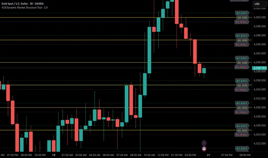
VLB Cycle Market ToolThe VLB Dynamic Levels Tool provides a visual framework for observing price structure on XAUUSD.
It displays automatically generated levels based on a rules-based approach, allowing traders to study how price interacts with important reference areas on the chart.
The tool updates dynamically as market structure evolves, reflecting changes in price movement without requiring manual redrawing.
Its purpose is to offer a clear, consistent layout of structural levels that users can incorporate into their own market analysis.
Features:
Automatically displayed structural reference levels
Dynamic recalculation as new highs and lows form
Neutral, non-predictive visual layout
A consistent framework for studying price behavior
This tool does not generate trading signals or provide predictive information.
It simply organizes price structure into visual reference points that may assist users in their independent chart analysis.
Traders remain fully responsible for their own interpretation, timing, and risk management.
The VLB Dynamic Levels Tool is intended for those who prefer a clean and adaptable way to observe XAUUSD structure throughout changing market conditions.

VLB Dynamic Market Structure ToolAdaptive Structural Continuation Framework for XAUUSD
The VLB Dynamic Market Structure Tool is a proprietary, rules-driven market structure framework designed specifically to analyze price continuation behavior in XAUUSD under live market conditions.
This tool does not plot static support and resistance.
Instead, it provides a continuously adapting structural model that reorganizes itself around current price, allowing traders to observe acceptance, rejection, and expansion behavior between key structural zones.
Core Conceptual Foundation
The framework is built on three integrated components that work together as a single methodology:
1. Dynamic Price-Anchored Structural Range
Unlike traditional indicators that rely on fixed historical levels, this tool anchors its entire structural range to live market price.
As price migrates:
Levels that are no longer relevant are automatically removed
New forward-relevant levels are introduced
The framework re-centers itself around active price action
This ensures that the trader is always viewing current, actionable structure, without manual redrawing or chart repositioning.
2. Evenly Spaced Structural Reference Levels
Within the dynamically anchored range, price is organized into consistent structural intervals that frequently act as transition points in XAUUSD price behavior.
These levels serve as objective reference boundaries, allowing traders to:
Compare reactions across identical structural distances
Observe recurring price behavior in a normalized framework
Maintain consistency across different sessions and market conditions
The levels are contextual, not predictive.
3. Post-Break Acceptance & Expansion Zones
The framework distinguishes between:
Initial structural breaks that fail or retrace
Confirmed acceptance beyond a defined offset from the level
Expansion phases as price transitions toward the next structural interval
By visualizing this sequence, the tool allows traders to study continuation behavior only after confirmation, rather than reacting to first-touch or initial breakouts.
Adaptive Behavior (Why This Is Not Static S&R)
A defining feature of the VLB Dynamic Levels Tool is its continuous recalculation and real-time adaptation:
The visible structure evolves with price
The framework moves up or down as market conditions change
Historical clutter is intentionally removed to preserve clarity
The trader’s focus remains on the active trading environment
This adaptive behavior is integral to the methodology and cannot be replicated through manual drawing or static indicators.
Intended Use
This tool is designed for discretionary traders who:
Study market structure, acceptance, and momentum
Prefer confirmation-based continuation frameworks
Value rule-based consistency over subjective interpretation
Combine structural context with their own execution, fundamentals, and risk management
The indicator does not generate automated buy or sell signals and does not execute trades.
Important Disclosures
No performance or outcome is guaranteed
No predictive claims are made
All trading decisions remain the responsibility of the user
Summary
The VLB Dynamic Levels Tool provides a self-adjusting, structurally consistent framework for observing how XAUUSD price transitions between key zones in real time.
Its proprietary value lies in the integration of dynamic price anchoring, structural normalization, and post-break acceptance visualization, offering a methodical way to study continuation behavior in changing market conditions.
Universal Moving Average🙏🏻 UMA (Universal Moving Average) represents the most natural and prolly ‘the’ final general universal entity for calculating rolling typical value for any type of time-series. Simply via different weighting schemes applied together, it encodes:
Location of each datapoint in corresponding fields (price, time, volume)
Informational relevance of each datapoint via using windowing functions that are fundamental in nature and go beyond DSP inventions & approximations
Innovation in state space (in our case = volatility)
The real beauty of this development: being simply a weighting scheme that can be applied to anything: be it weighted median , weighted quantile regression, or weighted KDE , or a simple weighted mean (like in this script). As long as a method accepts weights, you can harness the power of this entity. It means that final algorithmic complexity will match your initial tool.
As a moving ‘average’ it beats ALMA, KAMA, MAMA, VIDYA and all others because it is a simple and general entity, and all it does is encoding ‘all’ available information. I think that post might anger a lot of people, because lotta things will be realized as legacy and many paywalls gonna be ignored, specially for the followers of DSP cult, the ones who yet don’t understand that aggregated tick data is not a signal omg, it’s a completely different type of time series where your methods simply don’t fit even closely. I am also sorry to inform y’all, that spectral analysis is much closer to state-space methods in spirit than to DSP. But in fact DSP is cool and I love it, well for actual signals xD
...
Weights explained & how to use them: as I already said, the whole thing is based on combining different set of weights, and you can turn them on/off in script settings. Btw I've set em up defaults so you can use the thing on price data out of the box right away.
Price, Time, Volume weights: encode location of every datapoint in Price & TIme & Volume field
Howtouse: u have to disable one weight that corresponds to the field you apply UMA to. E.g if you apply UMA to prices, you turn off price weighting And turn on time and volume weighting. Or if you apply UMA to volume delta, you turn off volume weighting And turn on price and time weighting.
Higher prices are more important, this asymmetry is confirmed and even proved by the fact that prices can’t be negative (don’t even mention that incorrect rollover on CL contract in 2k20...).
Signal weights: encode actuality/importance/relevance of datapoints.
Howtouse: in DSP terms, it provides smoothing, but also compensates for the lag it introduces. This smoothness is useful if you use slope reversals for signal generation aka watching peaks and valleys in a moving average shape. It's also better to perturb smoothed outputs with this , this way you inject high freq content back, But in controlled way!
Signal = information.
The fundamental universal entity behind so-called “smoothing” in DSP has nothing to do with signals and goes eons beyond DSP. This is simply about measuring the relevance of data in time.
First, new datapoints need some time to be “embedded” into the timeline, you can think of it as time proof, kinda stuff needs time to be proved, accepted; while earliest datapoints lose relevance in time.
Second, along with the first notion, at the same time there’s the counter notion that simply weights new data more, acting as a counterweight from the down-weighting of the latest datapoints introduced by the first notion.
The first part can be represented as PDF of beta(2, 2) window (a set of weights in our case). It’s actually well known as the Welch window, that lives in between so called statistical and DSP worlds, emerges in multiple contexts. Mainstream DSP users tho mostly don’t use this one, they use primitive legacy windowing function, you can find all kinds on this wiki page.
Now the second part, where DSP adepts usually stop, is to introduce the second compensating windowing function. Instead they try to reduce window size, or introduce other kinds of volatility weights, do some tricks, but it ain’t provides obviously. The natural step here is to simply use the integral of the initial window; if the initial window is beta(2, 2) then what we simply need is CDF of beta(2, 2), in fact the vertically inverted shape of it aka survival function . That’s it bros. Simply as that.
When both of these are applied you have smth magical, your output becomes smooth and yet not lagging. No arbitrary windowing functions, tricks with data modification etc
Why beta(2, 2)? It naturally arises in many contexts, it’s based on one of the most fundamental functions in the universe: x^2. It has finite support. I can talk more bout it on request, but I am absolutely sure this is it.
^^ impulse response of the resulting weighs together (green) compared with uniform weights aka boxcar (red). Made with this script .
Weighing by state: encodes state-space innovation of each datapoint, basically magnitude of changes, strength of these changes, aka volatility.
Howtouse: this makes your moving average volatility aware in proper math ways. The influence of datapoints will be stronger when changes are stronger. This is weighting by innovations, or weighting by volatility by using squared returns.
Why squared returns? They encode state‑space innovations properly because the innovation of any continuous‑time semimartingale is about its quadratic variation, and quadratic variation is built from squared increments, not absolute increments.
Adaptive length is not the right way to introduce adaptivity by volatility xD. When you weight datapoints by squared returns you’re already dynamically varying ‘effective’ data size, you don’t need anything else.
...
It’s all good, progress happens, that’s how the Universe works, that's how Universal Moving Average works. Time to evolve. I might update other scripts with this complete weighting scheme, either by my own desire or your request.
...
∞

Hybrid CCI Scalper ProHybrid CCI Scalper Pro is a sophisticated trading system designed to solve the biggest problem in scalping: False Signals in Choppy Markets.
Unlike standard CCI indicators that fire on every crossover, the HCS Pro uses a Hybrid Logic Engine that distinguishes between high-probability Trend Continuations and powerful Reversal Setups. It processes every potential entry through a 6-factor "Quality Filter" before generating a signal.
Core Features:
1. The Hybrid Signal Engine The script identifies two distinct market conditions:
TREND Mode: Triggers when price is aligned with the Daily/Local trend AND the CCI angle is steep.
REVERSAL Mode (REV): Triggers only on Extreme Momentum (steep angle) combined with a Zero-Line cross, allowing you to catch tops and bottoms without waiting for lagging trend indicators.
2. The Quality Scoring System (Q-Score) Every signal is rated from 0 to 6 stars based on confluence. The signal label shows Q: 4/6, Q: 5/6, etc.
Score 4+: High probability (Recommended).
Score 6: "The Perfect Storm" – All filters (Trend, Volume, RSI, ADX) align.
3. The "Ironclad" Filters To eliminate fake-outs, the script enforces strict rules:
Candle Color Guard: Never Buys on a Red candle or Sells on a Green one.
Angle validation: Flat CCI movement is ignored.
MTF Trend: Checks the Daily timeframe (D1 EMA) to ensure you aren't scalping against the major flow.
Noise Filter: Uses ATR and Volume to ignore low-volatility "dead" markets.
4. The Information Panel A clean dashboard on the top-right displays real-time metrics:
Current Daily Trend (Bull/Bear)
Momentum Strength (Weak/Strong/Extreme)
ADX Power (Trending vs Ranging)
Live Signal Score
How to Trade:
BUY Signal: Look for a Green Triangle. Ideally, the Label should say TREND or REV with a Quality Score of 4/6 or higher.
SELL Signal: Look for a Red Triangle with a high Quality Score.
No Signal? If the panel says "WAIT" or the score is low, the market is likely choppy. Stay out.
Recommended Settings:
Gold (XAUUSD): Works best on 15m.
Forex (EURUSD): Works well on 5m - 15m.
Default settings are optimized for a balance between frequency and accuracy.

Supply-Demand Dominance & Energy RibbonOverview:
This indicator is specifically fine-tuned for the Nasdaq (NAS100) market. It combines volume-based Delta analysis (Supply-Demand) with price kinetic energy (Slope) to identify high-probability reversal points and trend strength.
Key Features & Usage:
Supply-Demand Dominance (Top-Right Label):
Analyzes volume spikes over a 50-period lookback to determine market control.
Displays "매수 우위" (Bullish Dominance) or "매도 우위" (Bearish Dominance) in real-time.
Energy Ribbon (Bottom Visualization):
Calculates the slope of the TCI oscillator to visualize momentum intensity.
Solid Green/Red: Strong momentum.
Faded Green/Red: Weakening momentum or minor trend.
Momentum Combo Signals (Circle Shapes):
Triggered when WaveTrend and TCI oscillators cross in extreme zones (Overbought 70 / Oversold 30).
Smart Filter: Signals are only shown when they align with the current Supply-Demand dominance, reducing "market noise."
Volume Spikes (Arrow Symbols):
Indicates abnormal volume activity (1.5x average delta). These arrows (↑/↓) help identify potential breakout points or the climax of a move even when a full combo signal isn't present.

Falcon 1Introducing the MyFXSchool Falcon 1Leading Indicator™, a next-generation market prediction tool designed exclusively for traders who want accuracy, clarity, and early trend identification. Built using advanced price-action logic, institutional order-flow concepts, and dynamic volatility algorithms, this indicator gives you a true leading advantage—not just lagging signals.

Falcon 2Introducing the MyFXSchool Falcon 2 Leading Indicator™, a next-generation market prediction tool designed exclusively for traders who want accuracy, clarity, and early trend identification. Built using advanced price-action logic, institutional order-flow concepts, and dynamic volatility algorithms, this indicator gives you a true leading advantage—not just lagging signals.

ATR Volatility FilterA Basic Volatility Filter
3 Modes
1- Absolute ATR filter
2- Filter Based on ATR threshold relative percentage of the price
3- ATR Threshold relative to its moving average

@tom_w777 Turtles Systems with 2N marks//// @tom_w777
//// 2 systems from the Turtles trading system, including S1 and S2 2N marks for the drawbacks to enter an existing trend
//// data to program it taken from the book : "the complete turtle trader" from Michael W. COVEL
/////////

SMA MAD Trend [Alpha Extract]A sophisticated trend identification system that combines Simple Moving Average with Mean Absolute Deviation methodology to create adaptive Super Trend-style bands with advanced strength filtering and gradient visualization. Utilizing ADX-based trend strength validation and slope analysis for signal quality enhancement, this indicator delivers institutional-grade trend detection with dynamic ATR-based ribbon visualization and comprehensive strength measurement. The system's dual-filter architecture eliminates false signals during weak or choppy market conditions while maintaining sensitivity to genuine trend establishment and reversal events.
🔶 Advanced SMA-MAD Band Construction
Implements innovative Mean Absolute Deviation calculation around Simple Moving Average baseline to create volatility-adaptive bands with ratcheting logic for trend persistence. The system calculates MAD by measuring absolute price deviations from the mean, then applies configurable multipliers to generate upper and lower bands that adjust to changing market conditions while preventing premature band violations.
// Core SMA-MAD Framework
SMA_Value = ta.sma(close, SMA_Length)
Mean = ta.sma(close, MAD_Length)
Abs_Deviation = abs(close - Mean)
MAD_Value = ta.sma(Abs_Deviation, MAD_Length)
// Adaptive Bands
Upper_Band = SMA_Value + MAD_Factor * MAD_Value
Lower_Band = SMA_Value - MAD_Factor * MAD_Value
🔶 Intelligent Dual-Filter System
Features comprehensive trend validation using ADX strength measurement and slope analysis to eliminate low-conviction signals during ranging or consolidating markets. The system calculates normalized slope strength using ATR scaling and combines with ADX threshold analysis, generating filtered trend states that distinguish genuine trends from temporary price fluctuations.
🔶 Dynamic Trend Strength Engine
Implements sophisticated strength calculation combining slope intensity and ADX readings to produce normalized 0-100% strength scores with gradient colour intensity modulation. The system normalizes slope by minimum threshold and ADX by configurable level, multiplying factors to create composite strength measurement that drives visual feedback intensity across all indicator elements.
🔶 Super Trend-Style Direction Logic
Utilizes classic Super Trend methodology adapted for SMA-MAD bands, where trend direction flips occur on opposite band violations with persistent state maintenance. The system tracks previous band levels with ratcheting behaviour that adjusts bands only when price movement or new calculations warrant changes, preventing oscillation during normal volatility.
🔶 ATR-Based Ribbon Visualization
Provides dynamic ribbon overlay using ATR-scaled width around the trend line with opacity modulation based on trend strength for intuitive conviction assessment. The system creates upper and lower ribbon bounds at configurable ATR multiples, filling the channel with gradient-adjusted transparency that increases during strong trends and fades during weak conditions.
🔶 Multi-Dimensional Visual Architecture
Provides complete chart integration through trend line overlay, ATR ribbon fills, candle colouring, background glow, and transition signal labels with configurable visibility toggles. The system enables traders to customize display density from minimal (trend line only) to comprehensive (all visual elements) while maintaining consistent colour scheme and strength-based intensity across components.
🔶 Slope Strength Validation
Calculates ATR-normalized slope over configurable lookback periods to measure trend line momentum and filter sideways price action. The system compares absolute slope against minimum threshold requirements, preventing trend signals when price movement relative to the trend line lacks sufficient directional conviction regardless of band position.
🔶 Signal Generation Framework
Generates trend change signals when filtered direction state transitions from bearish to bullish or vice versa, with label placement and alert integration. The system implements state persistence that maintains previous trend until both ADX and slope filters confirm directional change, reducing whipsaw signals while capturing genuine reversals with minimal lag.
🔶 Performance Optimization Framework
Utilizes efficient calculation methods with optimized variable management and configurable parameters for balance between responsiveness and stability. The system includes intelligent state tracking with NA handling for initial bars and smooth gradient calculations that maintain performance across extended historical periods and real-time updates.
This indicator delivers sophisticated trend identification through Mean Absolute Deviation methodology combined with dual-strength filtering for superior signal quality. Unlike traditional Super Trend indicators that rely solely on ATR bands, the SMA-MAD approach uses statistical deviation measurement while incorporating ADX strength and slope validation to eliminate false signals during choppy conditions. The system's gradient-based visual feedback, ATR ribbon visualization, comprehensive dashboard, and multi-dimensional filtering make it essential for traders seeking reliable trend-following approaches with clear conviction measurement across cryptocurrency, forex, and equity markets. The combination of adaptive bands, strength-based transparency, and intelligent filtering creates an institutional-grade trend system suitable for systematic trading strategies.

Bar HL Distribution - XWiseTradeBar HL Distribution - XWiseTrade
Analyze the distribution of High-Low ranges over the last N bars.
This indicator groups candle ranges (in ticks) into bins and displays:
• Count per bin
• Percentage and cumulative %
• Visual histogram bars
Perfect for understanding typical volatility, setting realistic targets/stops, and spotting unusual bar sizes.
Features:
• Adjustable lookback and bin size
• Clean table with truncation warning
• Lightweight and always up-to-date
More premium indicators and strategies coming soon at:
xwisetrade.com
Be Wise. Trade X.
Frequency AnalyzerFREQUENCY ANALYZER
This indicator is called Frequency Analyzer to analyze the movement of volatility explosion, to detect exploding candles, before they explode. The indicator only describes large volatility would happen in the future, but we don't know, it's volatility as a buy or sell transaction. Of course this has an impact on whether the candle after that occurs a rally or a drop.
That this is useful for detecting exploding candles before exploding, to detect super bullish before bullish, or detect super bearish before bearish. If the candle is in the support position and there is the Spike Bar on Frequency Analyzer, that high probability the exploding volatility becomes a rally. Conversely, if the candle position is in the resistance and there is the Spike Bar on Frequency Analyzer, that high probability the exploding volatility becomes a drop. So this is an indicator to detect exploding candles before they explode, the candles become super rally or super drop.
