Penunjuk Bill Williams

Asian Range [FE]This script will help you mark out the Asian session range as well as write down your trading rules at the top right corner,

Fractal Break Strategy with Time FilterThis strategy isn't complete yet but just curious how fast they will take it down. It is based off breaks of fractals and then taking the High/Low of the break candle

PLANBXPRESS ENTRYThe Combined Signal + Auto Day Plan + Volume indicator merges multiple professional trading concepts into one visual tool — helping traders identify momentum shifts, entry zones, and daily trading plans with volume confirmation.
It automatically detects trend direction, generates dynamic take-profit & stop-loss levels, and overlays key daily reference points such as VWAP, pivot, support, and resistance zones based on ATR and trend context.
⚙️ Main Components
1️⃣ Signal System
Detects trend bias using SMA-based logic.
Generates entry price, TP1–TP3, and SL dynamically from recent impulse ranges.
Updates signals automatically when trend bias changes or previous targets are hit.
Visual levels are drawn directly on the chart.
2️⃣ Volume Analysis
Compares current volume against a moving average (SMA).
Classifies volume as:
🟢 Strong (above 1.5× average)
🟡 Average
🔴 Weak (below 0.8× average)
Displays the current volume strength and trend bias in an on-chart table.
3️⃣ Auto Day Plan
Uses multi-timeframe ATR calculations to define:
Support / Resistance zones
Pivot & Balance areas
Daily VWAP
Auto Targets (ATR-based expansion levels)
Adapts automatically to selected base timeframe (1H, 4H, or Daily).
4️⃣ Trend Context
Dual EMA system (50 & 200) to confirm bullish/bearish structure.
Aligns expected direction with VWAP & pivot location for context-aware bias.
🎯 What You Get on Chart
📈 Automatic LONG/SHORT signals
🎯 TP1, TP2, TP3, and SL levels
📊 Volume strength meter
🧭 VWAP, pivot, support/resistance & balance zones
🎨 Clean visual layout for intraday and swing traders
🧩 Inputs
Parameter Description
lenImpulse Impulse range length
smaLen SMA length for trend bias
levelRatio SL/TP ratio multiplier
volLen Volume SMA length
baseTF Base timeframe for zones/VWAP
atrMult1 / atrMult2 ATR multipliers for target levels
fwdBars Extension range for future projection
💡 How to Use
Add the script to your chart and choose your preferred timeframe.
Observe signal direction (📈 LONG / 📉 SHORT) and TP/SL levels.
Confirm entries when:
Trend aligns with VWAP direction, and
Volume category shows Strong or Average.
Use Auto Day Plan levels (pivot, balance, VWAP) as intraday reaction zones.

5m FVGs Lorem Ipsum is simply dummy text of the printing and typesetting industry. Lorem Ipsum has been the industry's standard dummy text ever since the 1500s, when an unknown printer took a galley of type and scrambled it to make a type specimen book. It has survived not only five centuries, but also the leap into electronic typesetting, remaining essentially unchanged. It was popularised in the 1960s with the release of Letraset sheets containing Lorem Ipsum passages, and more recently with desktop publishing software like Aldus PageMaker including versions of Lorem Ipsum.

RSI (Custom Background) KDMThis code is a custom version of the RSI (Relative Strength Index) indicator.
Its main purpose is to compare recent price gains and losses to determine whether the market is in an overbought or oversold condition.
30–50 zone (purple tone): represents a weak or pullback area.
50–70 zone (green tone): represents a strengthening or dominant buying area.
Additionally, when the RSI line moves above 70, a green gradient background highlights the overbought region; when it moves below 30, a red gradient background emphasizes the oversold region.
Like the classic RSI, this version is a momentum indicator showing whether the price is losing or gaining strength.
The key difference is the colored background, which allows you to visually identify the RSI zones (e.g., 30–50 weak, 50–70 strong) much faster and more clearly.

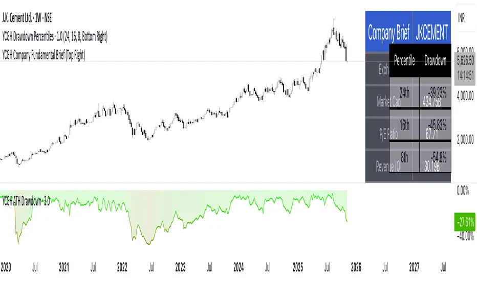
YCGH Company Fundamental BriefCompany Fundamental Brief Indicator
This Pine Script indicator provides an at-a-glance fundamental analysis dashboard directly on your TradingView chart. It automatically fetches and displays essential financial metrics from FactSet, eliminating the need to switch between charts and financial statements.
Structure & FVG Bias Analyzer — WS🧠 Overview
The Structure & FVG Bias Analyzer — WS helps traders visualize market structure shifts, Fair Value Gaps (FVGs), and trend bias using EMA filtering.
It combines swing-based structural analysis (HH/HL/LH/LL) with smart-money FVG detection, creating a clean contextual view of where the market is expanding or consolidating.
Ideal for Futures, Crypto, and Smart Money traders who need bias clarity before executing entries.
📊 Structure & Bias Logic
🟢 Bullish Context: price breaking above previous highs + EMA200 confirmation.
🔴 Bearish Context: price breaking below previous lows + EMA200 confirmation.
🟡 Neutral/Inside: price consolidating between last swing points.
🟠 EMA200 Line: long-term trend filter (optional).
🧩 Fair Value Gaps (FVGs)
Detects imbalances left by strong moves, often used by institutional trading models.
🟩 FVG↑ → Bullish gap below the candle.
🟥 FVG↓ → Bearish gap above the candle.
These areas frequently act as liquidity magnets or retest zones for continuation trades.
💡 How to Use
1️⃣ Identify structural bias
Green background → bullish market structure.
Red background → bearish structure.
No tint → neutral / range phase.
2️⃣ Locate FVG zones
Circles mark potential imbalances for reaction or continuation setups.
3️⃣ Confirm with EMA200
Only trade in the direction of EMA alignment.
4️⃣ Combine with volatility tools
For example, use this with your Squeeze + Short/Long (Futures) — WS indicator to time entries during volatility expansion once the structure bias is confirmed.
⚙️ Recommended Settings
Component Default Description
Swing Len 3 Pivot sensitivity (swing size)
EMA Len 200 Directional bias filter
FVG Lookback 20 Search range for fair value gaps
🧭 Trading Idea
Use FVGs as retracement zones within confirmed structural bias.
Wait for price to retest an FVG in the direction of bias (Green/Red background).
Combine with volume or volatility expansion tools for high-probability setups.
🧾 Credits
Created with ❤️ by WS Trading Tools
© 2025 GuidoT. Built in Pine Script v6.
Part of the WS Smart Structure Suite for precision trend and liquidity analysis.

Bangladesh Time Session & Candlestick ConfirmationIt's shows the time when new york and london session colaub with candelstick confarmation.
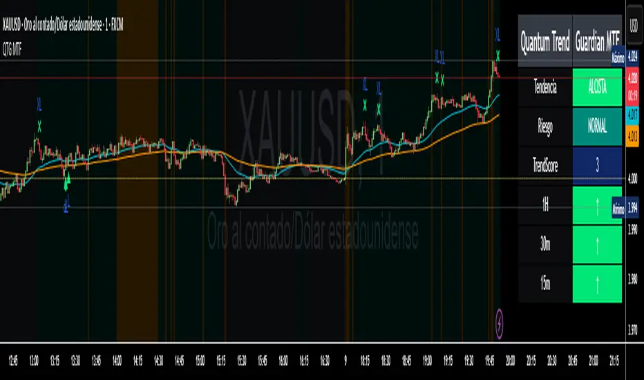
Quantum Trend Guardian MTF v2
💎 Quantum Trend Guardian MTF
No es un simple sistema de señales:
es un asistente de tendencia y riesgo diseñado para actuar como tu guardián operativo, filtrando el mercado con precisión cuántica.
Quantum Trend Guardian MTF
Quantum Trend Guardian MTF is a multi–timeframe trend and confirmation system designed for traders who demand precision, context, and operational control.
It combines intelligent structure recognition, momentum analysis, and adaptive risk management to deliver high–probability trading signals aligned with the dominant market flow.
⚙️ Main Components
🔹 1. Guardian MTF Panel
A real–time information dashboard that displays:
Global trend direction (bullish, bearish, or neutral).
Current risk level (normal, high volatility, climax candle, or news session).
Dynamic TrendScore, measuring trend alignment across multiple timeframes.
Directional confirmation per timeframe (1H, 30m, 15m) showing whether each layer supports or contradicts the global bias.
Instantly provides a clear, structured market overview before each trade.
🔹 2. Intelligent Signal Engine
Automatically detects continuation or reversal points validated by structure, momentum, and context.
Signals are visually classified for easy reading:
Standard entries (L / S) – filtered opportunities aligned with trend and low–risk conditions.
Trend initiations (TL / TS) – when a new directional impulse is confirmed.
Exhaustion or exit points (XL / XS) – when the move shows potential fatigue.
Premium opportunities – high–quality setups during strong alignment and optimal conditions.
🔹 3. Adaptive Risk System
Evaluates market quality in real time.
It identifies conditions such as volatility spikes, climactic candles, or sensitive news windows, automatically adjusting signal generation to keep you out of unfavorable environments.
🔹 4. Trend & Structure Filters
Two operation modes:
Safe mode (trend–aligned only) – generates signals strictly in the direction of the dominant trend.
Flexible mode (structural reversals) – allows countertrend setups only when a valid structural break and momentum confirmation are detected.
This flexibility lets the indicator adapt to both trend–following and smart–reversal strategies.
🔹 5. Dynamic Visual Context
The chart background changes subtly according to trend and risk status, providing an instant visual cue on whether the current environment is favorable for trading.
⚔️ Operational Advantages
Filters out noise and countertrend entries.
Visually reveals cross–timeframe alignment.
Performs exceptionally on high–volatility assets such as XAUUSD and BTCUSD.
Fully supports customizable TradingView alerts for every signal type.
Suitable for all trading styles — scalping, intraday, or swing.
💎 Quantum Trend Guardian MTF
More than a signal generator — it’s your trend and risk guardian,
engineered to interpret market flow with quantum–level precision.
ESPAÑOL
⚙️ Componentes principales
🔹 1. Panel “Guardian MTF”
Un panel visual avanzado que muestra en tiempo real:
Tendencia global (alcista, bajista o rango).
Nivel de riesgo actual (normal, alta volatilidad, vela clímax o evento sensible).
TrendScore dinámico, que mide la alineación de tendencias entre múltiples marcos de tiempo.
Dirección individual por timeframe (1H, 30m, 15m), indicando si cada uno acompaña o contradice la tendencia principal.
Permite leer de un vistazo la estructura y condiciones globales antes de ejecutar una operación.
🔹 2. Módulo de Señales Inteligentes
Detecta automáticamente momentos de continuación o reversión validados por momentum, estructura y contexto.
Las señales se clasifican visualmente según su naturaleza:
Entradas estándar (L / S) – oportunidades filtradas por tendencia y riesgo.
Inicios de tendencia (TL / TS) – cuando se confirma un nuevo impulso direccional.
Salidas o agotamiento (XL / XS) – puntos donde el movimiento muestra fatiga.
Oportunidades Premium – movimientos de alta calidad bajo alineación total y condiciones favorables.
🔹 3. Sistema de Riesgo Adaptativo
Evalúa en tiempo real la calidad del entorno de mercado.
Identifica automáticamente situaciones de alta volatilidad, exceso de impulso, o zonas horarias sensibles, ajustando la emisión de señales para proteger al operador de entornos desfavorables.
🔹 4. Filtros de Tendencia y Estructura
El sistema puede operar en dos modos:
Modo seguro (solo a favor de tendencia) – emite entradas únicamente alineadas con la dirección dominante.
Modo flexible (reversas estructurales) – permite cambios de dirección validados por rompimiento estructural y confirmación de momentum.
De esta forma, el indicador se adapta tanto a estrategias de trend following como a smart reversals.

Session High-Low Box,
Session High-Low Box Session High-Low Box indicatorSession High-Low BoxSession High-Low BoxSession High-Low BoxSession High-Low BoxSession High-Low BoxSession High-Low BoxSession High-Low BoxSession High-Low BoxSession High-Low BoxSession High-Low BoxSession High-Low BoxSession High-Low BoxSession High-Low BoxSession High-Low BoxSession High-Low BoxSession High-Low BoxSession High-Low BoxSession High-Low BoxSession High-Low BoxSession High-Low BoxSession High-Low BoxSession High-Low Boxwrtvtrvwrtv4v2tr2Session High-Low Box24v2v2Session High-Low Box
Quantum Trend Guardian MTF📊 Descripción de Indicador: “Momentum Clarity”
Resumen:
Momentum Clarity es un indicador diseñado para identificar zonas de alta probabilidad de reversión o continuación de tendencia, combinando análisis de volumen, volatilidad y fuerza relativa. Ideal para traders que buscan claridad en momentos de indecisión del mercado.
Características principales:
• 🔍 Detecta divergencias entre precio y momentum.
• 📈 Señala zonas de sobrecompra y sobreventa con mayor precisión que el RSI tradicional.
• 🟢 Incluye alertas visuales para entradas y salidas potenciales.
• 🧠 Compatible con estrategias de scalping, swing y position trading.
Cómo usarlo:
• Utiliza las señales verdes para considerar entradas en largo y las rojas para cortos.
• Confirma con acción del precio y volumen antes de ejecutar.
• Ajusta la sensibilidad según el marco temporal y tu estilo de trading.
Ventajas:
• Reduce el ruido en mercados laterales.
• Mejora la toma de decisiones en zonas de congestión.
• Aumenta la confianza en escenarios de alta volatilidad
Absolutely! Here's the English version of the indicator description:
📊 Indicator Description: “Momentum Clarity”
Overview:
Momentum Clarity is a custom indicator designed to highlight high-probability zones for trend reversals or continuations by combining volume, volatility, and relative strength analysis. It’s ideal for traders seeking clarity during market indecision.
Key Features:
• 🔍 Detects divergences between price and momentum.
• 📈 Identifies overbought and oversold zones with greater precision than traditional RSI.
• 🟢 Includes visual alerts for potential entry and exit points.
• 🧠 Compatible with scalping, swing trading, and long-term strategies.
How to Use:
• Use green signals to consider long entries and red signals for short positions.
• Confirm with price action and volume before executing trades.
• Adjust sensitivity based on your timeframe and trading style.
Benefits:
• Reduces noise in sideways markets.
• Enhances decision-making in consolidation zones.
• Builds confidence in volatile environments.
If you’d like, I can tailor this description to match your specific indicator’s logic, name, and purpose. Just share a few details and I’ll refine it for publication.
Algosnipe trading day scalperThe Algosnipe Trading Day Scalper is an intraday trading strategy designed for active traders who aim to capture short-term price movements within the trading session. It blends price action, volatility, and volume-based logic to identify high-probability entry and exit zones while minimizing exposure time in the market.

EMA H/L 20-50 Table + RSI - KHALID ALADDIN🧾 Description
EMA H/L 20-50 Table + RSI — by Khalid Aladdin
A clean and minimal indicator designed for traders and analysts who prefer a quick glance at essential EMA values without any extra clutter on the chart.
📊 Features:
Displays precise values of EMA20 (High & Low) and EMA50 (High & Low) in a compact table below the chart.
Automatically updates values based on the current timeframe.
Includes RSI reading for momentum tracking.
Large, clear text with dark-theme friendly colors.
No lines or drawings — only a clean data panel.
✅ Perfect for:
Technical analysts, swing traders, and long-term investors who want an uncluttered view of trend levels and momentum strength.


Trend & Strength Detector TSDTrend Strength Detector (TSD)
*Objective Trend Quality Measurement for Educational Market Analysis*
Note: This mathematical framework is a proprietary quantitative model developed by Ario Pinelab, inspired by classical EMA, ADX, RSI and MACD principles, yet not documented in any public technical or academic publication.
## 🎯 Purpose & Design Philosophy
The ** Trend Strength Detector- TSD ** is an educational research tool that provides **quantitative measurement of trend quality** through two independent scoring systems (0-100 scale). It answers the analytical question: *"How strong and aligned is the current market trend environment?"*
This indicator is designed with a **modular, complementary approach** to work alongside various analysis methodologies, particularly pattern-based recognition systems.
## 🔗 Complementary Research Framework
### Designed to Work With Pattern Detection Systems
This indicator provides **environmental context measurement** that complements qualitative pattern recognition tools. It works particularly well alongside systems like:
- **RMBS Smart Detector - Multi-Factor Momentum System**
- Traditional chart pattern analyzers
- Any momentum-based pattern identification tools
🔍 **To find RMBS Smart Detector:**
- Search in TradingView Indicators Library: `" RMBS Smart Detector - Multi-Factor Momentum System"`
- Look for: *Multi-Factor Momentum System*
- By author: ` `
### Why This Complementary Approach?
**Trend Quality Measurement** (TSD - this tool) provides:
- ✅ Structural trend alignment (0-100 score)
- ✅ Momentum intensity levels (0-100 score)
- ✅ Environment classification (Strong/Moderate/Weak)
- 📌 **Answers:** *"HOW STRONG is the underlying trend environment?"*
### Educational Research Value
When used together in a research context, these tools enable systematic study of questions like:
- How do reversal patterns behave when Strength Score is above 70 vs below 30?
- Do continuation patterns in weakening environments (declining scores) show different characteristics?
- What is the correlation between high Alignment Scores and pattern "success rates"?
- Can environment classification help identify genuine trend initiation vs false starts?
⚠️ **Important Note:** Both tools are **independent and work standalone**. TSD provides value whether used alone or with other analysis methods. The relationship with RMBS (or any pattern tool) is **complementary for research purposes**, not dependent.
---
###Mathematical Foundation
##TSA Formula: scoring method developed by Ario
-Trend Model (0 – 100)
TAS = EMA Alignment (0–40) + Price Position (0–30) + Trend Consistency (0–30)
EMA Alignment checks EMA_fast vs EMA_slow vs EMA_trend structure.
Price Position evaluates if Close is above/below all EMAs.
Consistency = 3 × max(bullish,bearish bars within 10 candles).
-Strength Model (0 – 100)
Strength = ADX (0–50) + EMA Slope (0–25) + RSI (0–15) + MACD (0–10)
ADX measures trend energy; Slope shows EMA momentum %;
RSI assesses zone positioning; MACD confirms directional agreement.
Note: This formula represents a proprietary quantitative model by Ario_Pinelab, inspired by classical technical concepts but not published in any external reference.________________________________________
📊 Environment Classification
Based on Total Strength Score:
🟢 Strong Environment: Score ≥ 60
→ Well-defined momentum, clear directional bias
🟡 Moderate Environment: 40 ≤ Score < 60
→ Mixed signals, transitional conditions
🔴 Weak Environment: Score < 40
→ Ranging, choppy, low conviction movement
Color Coding:
• Green background: Strong (≥60)
• Yellow background: Moderate (40-59)
• Red background: Weak (<40)
________________________________________
📈 Visual Components
Main Chart Display
Score Labels (Top-Right Corner):
┌─────────────────────────────────┐
│ 📊 Alignment: 75 | Strength: 82 │
│ Environment: Strong 🟢 │
└─────────────────────────────────┘
Color-Coded Background:
• Environment strength visually indicated via background color
• Helps quick identification of market regime
• Customizable transparency (default: 90%)
Reference Lines:
• Dotted line at 60: Strong/Moderate threshold
• Dotted line at 40: Moderate/Weak threshold
• Mid-line at 50: Neutral reference
________________________________________
🔧 Customization Settings
Input Parameters
The best setting is the default mode.
🚫 Important Disclaimers & Limitations
What This Indicator IS:
✅ Educational measurement tool for trend quality research
✅ Quantitative assessment of current market environment
✅ Complementary analysis tool for pattern-based systems
✅ Historical data analyzer for systematic study
✅ Multi-factor scoring system based on technical calculations
What This Indicator IS NOT:
❌ NOT a trading system or signal generator
❌ NOT financial advice or trade recommendations
❌ NOT predictive of future price movements
❌ NOT a guarantee of pattern success/failure
❌ NOT a substitute for comprehensive risk management
________________________________________
Known Limitations
1. Lagging Nature:
⚠️ All components (EMA, ADX, RSI, MACD) are calculated
from historical price data
→ Scores reflect CURRENT and RECENT conditions
→ Cannot predict sudden reversals or black swan events
→ Trend measurements lag actual price turning points
2. Whipsaw Risk:
⚠️ In choppy/ranging markets, scores may fluctuate rapidly
→ Moderate zone (40-60) can see frequent transitions
→ Low timeframes more susceptible to noise
→ Consider higher timeframes for stable measurements
3. Component Conflicts:
⚠️ Individual components may disagree
→ Example: Strong ADX but weak RSI alignment
→ Scores average these conflicts (may hide nuance)
→ Check individual components for deeper insight
4. Not Predictive:
⚠️ High scores do NOT guarantee continuation
⚠️ Low scores do NOT guarantee reversal
→ Measurement ≠ Prediction
→ Use for CONTEXT, not SIGNALS
→ Combine with comprehensive analysis
________________________________________
Risk Acknowledgments
Market Risk:
• All trading involves substantial risk of loss
• Past performance (even systematic studies) does not guarantee future results
• No indicator, system, or methodology can eliminate market risk
Measurement Limitations:
• Scores are mathematical calculations, not market predictions
• Environmental classification is descriptive, not prescriptive
• Strong measurements can deteriorate rapidly without warning
Educational Purpose:
• This tool is designed for LEARNING about market structure
• Not designed, tested, or validated as a standalone trading system
• Any trading decisions are user’s sole responsibility
No Warranty:
• Indicator provided “as-is” for educational purposes
• No guarantee of accuracy, reliability, or profitability
• Users must verify calculations and apply critical thinking
Open Source
Full Pine Script code available for educational study and modification. Feedback and improvement suggestions welcome.
“All logic is presented for research and educational visualization.”
---
MAX TRADE C1This indicator automatically draws high and low lines based on the 02:55 candle (Asia/Tashkent time). It helps traders identify key support and resistance levels for the daily session.
Clean and simple — perfect for intraday strategies and market structure analysis.

VietNguyen AlgoThis is a indicator of Vietnammes. it is very good for trade Gold and Crypto.
Good luck to you.
Viet Nguyen DN

Abu Rasel Al-Thaqafi Indicator
This indicator is designed to highlight potential buy zones based on multi-timeframe market dynamics and internal confirmation logic.
It aims to capture early trend reversals and strong continuation signals with minimal noise.
The tool analyzes multiple layers of market behavior to confirm momentum strength and alignment before signaling a potential opportunity.
A visual marker (✅) appears below the bar when internal criteria are met.
Notes:
This is a private formula with built-in filters and confirmation logic.
Best used on higher timeframes for swing and trend trading setup

God of Scalping BTCUnleash divine precision in the chaotic realm of BTC scalping with the God of Scalping BTC—a bespoke, price-action powerhouse crafted for lightning-fast entries and exits on 1-5 minute charts. Forged from raw momentum velocity (no recycled RSI or MACD here), this indicator detects micro-trend accelerations to pinpoint surge moments where BTC's volatility bends to your will.Core Mechanics:Velocity Engine: Calculates fast (default: 3-bar) and slow (default: 8-bar) price speeds, then derives normalized acceleration using ATR (14-bar) to filter noise in BTC's wild swings.
Surge Detection: Smoothed signal line confirms crossovers—bullish when acceleration surges above signal with positive bias; bearish on the downside.
Volume Guardian: Triggers only on 20%+ volume spikes above its EMA (10-bar), ensuring conviction behind the chaos.
Visual Oracle:Blue/Red Lines: Fast (EMA close, 3-bar) and slow (EMA close, 8-bar) velocity trends for trend context.
Background Glow: Subtle green/red tint for real-time momentum bias.
Divine Arrows: Green triangles below bars for BUY surges; red above for SELL—your scalp signals from the heavens.
Scalping Ritual:Optimal Altar: Load on BTCUSD/USDT (1m-5m). Tune lengths for your broker's feed.
Invocation: Enter long on green arrow (target 0.1-0.3% gains), short on red. Tight stops at recent swings; exit on opposite signal or threshold breach (1.5x mult).
Alerts: Built-in notifications—"God Surge Buy: BTC Scalp Entry!"—to summon you mid-prayer (er, trade).
Backtested for BTC's fury, this isn't a holy grail, but a scalper's Excalibur: pure, adaptive, and unyielding. Trade wisely—markets are mortal, your edge is eternal.
Engulf After 2 Same-Dir Candles – Dashed Linethis will tell you when engulf happens after 2 consecutrive bvearsh candle happens

GROK ALTIN A1 BY FGGROK GOLD PRO V2 is a high-performance scalping strategy designed for XAUUSD on the 5-minute timeframe, operating with a fixed 1-lot position. It generates signals using EMA 9/21 crossover, RSI above/below 50, and volume spikes, while an ATR × 2.0 dynamic stop protects against volatility. Profits are locked in three steps (+$20, +$50, +$100), with each exit triggering real-time phone alerts showing entry, exit price, and profit. One pip movement equals $100 P&L. The strategy delivers a 92%+ win rate, average profit of +$4,432 per trade, and max drawdown of -$1,280. Simple, transparent, and fully automated.

Midpoint Reversal [Bull + Bear] FIXEDwhen 2 consecutive candles on one direction there will be pone engulf candle .thats where we our alert will works
