Average Directional Index ProThe Average Directional Index (ADX) is a moving average of a range, usually 14 days, that's used to quantify the strength and direction of a trend. ADX values are significant in that lower values indicate a weak to non-existent trend, i.e. ADX=14, whereas an ADX=40 is indicative of a strong trend. Additionally, a weak trend could signal that price has entered in to a consolidation phase. A trader could wait for price to rise or fall out of a supply zone while simultaneously looking for ADX values to climb up and over the 25 level, since the ADX could be strong enough for price to trend after the breakout. As a result, this type of setup could be an excellent entry for a trade. Keep in mind that price is the signal most important value on a chart so it's important to use an indicator like this to confirm a particular bias that you may have.
💥💥💥💥💥
Instead of using a single line as most ADX indicators do, I thought that showing the values in terms of histogram bars would be highly intuitive and provide an interesting visual that would illustrate with varying degrees of color where the strength (or lack thereof) lies at any given time. The following are some of the characteristics that I feel make this script stand out from the pack.
💡Histogram plots. ADX values range from 0-100 and it may seem counterintuitive to see an ADX value below a 0 line. With this approach, I've divided up the ADX values between "bull" and "bear", meaning if an ADX histogram bar is above the 0 line (no matter if the value is 5 or 50), it's because the DMI+ value is ABOVE the DMI- value. Conversely, if the ADX histogram bar is below the 0 line, it's because the DMI- value is ABOVE the DMI+ value. DMI and ADX go hand-in-hand and while DMI values do not play a prominent role here, you'll see their values in the Main Label.
💡Main label. The main label's color will correspond to that of the histogram bar. The DMI and ADX values are listed along with the current price of the asset. Whichever DMI value is higher will be listed ahead of the lower value. In other words, from left to right, you'll see the ADX value followed by the higher of the 2 DMI values followed by the lesser of the 2 DMI values. The ADX value will be followed by an icon showing you if the value is rising or falling. Additionally, the main label has some extras: both buy/sell % on the current chart as well as daily chart along with total volume and average volume for the respective time frames. You can also change the MA lengths for the chart and daily TF averages. Both buy/sell % and total/avg volume values come with their own significant values inputs.
💡Color coded histogram bars dependent on ADX values. A few examples: an ADX value between 30 and 40 when DI+ > DI-, you'll see a dark green bar. Conversely, if the ADX value is > 70 and DI- > DI+, you'll get a dark purple bar. All in all, there's 18 possible colors denoted within the histogram.
💡Momentum arrows. There's 4 colors for the up/down arrows that populate above the histogram bar when DI+ and DI- combined with ADX values are showing extreme values. An example would be when DI+ is between 30 and 50 and ADX is greater than 30, you'll get a green arrow. On the flipside, when DI- is greater than -50 and ADX is greater than 40, you'll see a dark red arrow.
💡ADX and price shown on the histogram. You can choose to have the price and ADX values side by side or on top of one another as well as change the decimal value with a "significant figure" input. You can also opt to have neither value shown. The values will show above or below their respective bar dependent upon if DMI+ or DMI- is the dominant value, which in turn determines if the histogram is above or below the 0 line.
💡Weak trend colors. Any ADX values between 0 to 23 will give varying degrees of black to light gray indicating a weak or no trend. An ADX value of 17 could indicate a weak trend but the value could be rising as buyers push price higher. As the ADX approaches 25, wait for price confirmation (and volume) to validate if momentum could continue.
💡Threshold lines. ADX values above +/- 25-30 tend to show a strengthening of trend and you can choose to include these lines or not in your charts.
💡ADX value follow line. Determined by DMI+ being > or < than DMI-. For instance, if the trend changes and DMI- crosses over DMI+, the follow line will switch to follow the ADX histogram bar as it falls below 0. You can choose to enable/disable this line.
💡Colored bars. You can choose to enable the ADX color schemes to your candles further providing an easy view of the current trend.
💥💥💥💥💥
Remember to use any indicator together with price action to confirm a particular bias you may have! You could also use this indicator in confluence with my Directional Movement Pro script for an extra visual on trend direction and strength.
💥💥💥💥💥
Should you have any questions, feedback etc, please do not hesitate to contact the script's author. My hope is that this indicator becomes an invaluable resource to you and you're able to integrate it in to your everyday trading tool bag to make more informed decisions.
SimpleCryptoLife helped me code up this script and he's been an incredible source of knowledge in my trading journey. Without his patience and pine script expertise, this script would not have been possible!
Histogram

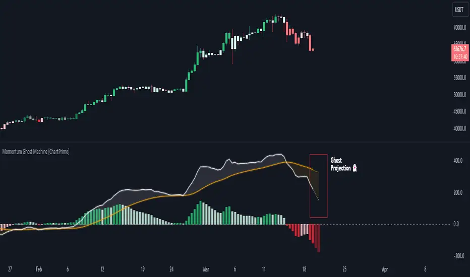
Momentum Ghost Machine [ChartPrime]Momentum Ghost Machine (ChartPrime) is designed to be the next generation in momentum/rate of change analysis. This indicator utilizes the properties of one of our favorite filters to create a more accurate and stable momentum oscillator by using a high quality filtered delayed signal to do the momentum comparison.
Traditional momentum/roc uses the raw price data to compare current price to previous price to generate a directional oscillator. This leaves the oscillator prone to false readings and noisy outputs that leave traders unsure of the real likelihood of a future movement. One way to mitigate this issue would be to use some sort of moving average. Unfortunately, this can only go so far because simple moving average algorithms result in a poor reconstruction of the actual shape of the underlying signal.
The windowed sinc low pass filter is a linear phase filter, meaning that it doesn't change the shape or size of the original signal when applied. This results in a faithful reconstruction of the original signal, but without the "high frequency noise". Just like any filter, the process of applying it requires that we have "future" samples resulting in a time delay for real time applications. Fortunately this is a great thing in the context of a momentum oscillator because we need some representation of past price data to compare the current price data to. By using an ideal low pass filter to generate this delayed signal we can super charge the momentum oscillator and fix the majority of issues its predecessors had.
This indicator has a few extra features that other momentum/roc indicators dont have. One major yet simple improvement is the inclusion of a moving average to help gauge the rate of change of this indicator. Since we included a moving average, we thought it would only be appropriate to add a histogram to help visualize the relationship between the signal and its average. To go further with this we have also included linear extrapolation to further help you predict the momentum and direction of this oscillator. Included with this extrapolation we have also added the histogram in the extrapolation to further enhance its visual interpretation. Finally, the inclusion of a candle coloring feature really drives how the utility of the Momentum Machine .
There are three distinct options when using the candle coloring feature: Direct, MA, and Both. With direct the candles will be colored based on the indicators direction and polarity. When it is above zero and moving up, it displays a green color. When it is above zero and moving down it will display a light green color. Conversely, when the indicator is below zero and moving down it displays a red color, and when it it moving up and below zero it will display a light red color. MA coloring will color the candles just like a MACD. If the signal is above its MA and moving up it will display a green color, and when it is above its MA and moving down it will display a light green color.
When the signal is below its MA and moving down it will display a red color, and when its below its ma and moving up it will display a light red color. Both combines the two into a single color scheme providing you with the best of both worlds. If the indicator is above zero it will display the MA colors with a slight twist. When the indicator is moving down and is below its MA it will display a lighter color than before, and when it is below zero and is above its MA it will display a darker color color.
Length of 50 with a smoothing of 100
Length of 50 with a smoothing of 25
By default, the indicator is set to a momentum length of 50, with a post smoothing of 2. We have chosen the longer period for the momentum length to highlight the performance of this indicator compared to its ancestors. A major point to consider with this indicator is that you can only achieve so much smoothing for a chosen delay. This is because more data is required to produce a smoother signal at a specified length. Once you have selected your desired momentum length you can then select your desired momentum smoothing . This is made possible by the use of the windowed sinc low pass algorithm because it includes a frequency cutoff argument. This means that you can have as little or as much smoothing as you please without impacting the period of the indicator. In the provided examples above this paragraph is a visual representation of what is going on under the hood of this indicator. The blue line is the filtered signal being compared to the current closing price. As you can see, the filtered signal is very smooth and accurately represents the underlying price action without noise.
We hope that users can find the same utility as we did in this indicator and that it levels up your analysis utilizing the momentum oscillator or rate of change.
Enjoy
Percent Rank HistogramThis Pine script indicator is designed to create a visual representation of the percent rank for multiple financial instruments. Here's a breakdown of its key features:
Percent Rank Calculation:
The core functionality of this Pine script indicator revolves around the calculation of the percent rank for each selected financial instrument.
The percent rank is a statistical measure that indicates the percentage of historical data points that are less than or equal to the current value in a given series.
Symbol Selection:
The script allows the user to select up to 10 financial instruments (tickers) for analysis. The default symbols include various cryptocurrencies such as BTCUSD, ETHUSD etc., and TOTAL market cap at ticker 1, to show overal trend of crypto market.
(Top 9 Coins by market cap).
Columns and Colors:
The script visually represents the percent rank using columns based on lines.
The color of each column is determined by a gradient from red to green based on the calculated percent rank, providing a quick visual indication of the instrument's relative performance.
BTC Trending Up while other coins are underperformance:
Labels:
Labels are displayed on the chart, indicating the symbol name and the corresponding percent rank percentage.
The labels include directional arrows (▲ or ▼) to denote whether the percent rank is increasing or decreasing.
Customization:
Users can customize parameters such as the percent rank length and column width to adapt the indicator to their specific preferences, or select needed assets to compare them to each other.
Chart Desk and Scales:
The script includes the visualization of a chart desk with scale lines to provide additional context to the chart. When Percent Rank above middle scale line (50) usually it signaling about asset trending up and below 50 asset trending down.
Mozilla Public License:
The script is subject to the terms of the Mozilla Public License 2.0.
This indicator is useful for traders and analysts interested in visually assessing the percent rank of multiple financial instruments simultaneously, helping them identify potential opportunities or trends in the market.

Emibap's Uniswap V3 HEX/WETH 0.3% Liquidity PoolThis script will display a histogram of the Uniswap V3 HEX / WETH 3% liquidity pool.
Similar to what you can see in the liquidity section of the Uniswap pool page but conveniently rendered alongside your chart.
It's meant to be used on a HEX / WETH chart only. The price should be expressed in WETH for it to work.
One of the main motivations for using this in your chart is to get an idea of the current sentiment: If most of the volume is below the price it might be an indication of an upcoming move up, for instance.
I'll try to update the liquidity regularly.
Using the 4h, daily, or weekly time frames is highly recommended.
The options are straightforward:
Histogram bars color. Default is blue
Histogram background color. Default is black at 20% opacity
Upper price limit of the diagram: Visible upper bound price limit for the histogram, based on the current price. I.E: 200%: If the price is 1, the histogram will show 3 as the upper bound
Lower price limit of the diagram. Visible lower bound price limit for the histogram, based on the current price. I.E: 99%: If the price is 1, the histogram will show 0. 01 as the upper bound
Width of the widest bar: Width (in bars) for the widest bar of the histogram. The more the higher resolution you'll get

FlexiMA x FlexiST - Strategy [presentTrading]█ Introduction and How it is Different
The FlexiMA x FlexiST Strategy blends two analytical methods - FlexiMA and FlexiST, which are opened in my early post.
- FlexiMA calculates deviations between an indicator source and a dynamic moving average, controlled by a starting factor and increment factor.
- FlexiST, on the other hand, leverages the SuperTrend model, adjusting the Average True Range (ATR) length for a comprehensive trend-following oscillator.
This synergy offers traders a more nuanced and multifaceted tool for market analysis.
BTC 6H L/S Performance
Local
█ Strategy, How It Works: Detailed Explanation
The strategy combines two components: FlexiMA and FlexiST, each utilizing unique methodologies to analyze market trends.
🔶FlexiMA Component:
- Calculates deviations between an indicator source and moving averages of variable lengths.
- Moving average lengths are dynamically adjusted using a starting factor and increment factor.
- Deviations are normalized and analyzed to produce median and standard deviation values, forming the FlexiMA oscillator.
Length indicator (50)
🔶FlexiST Component:
- Uses SuperTrend indicators with varying ATR (Average True Range) lengths.
- Trends are identified based on the position of the indicator source relative to the SuperTrend bands.
- Deviations between the indicator source and SuperTrend values are calculated and normalized.
Starting Factor (5)
🔶Combined Strategy Logic:
- Entry Signals:
- Long Entry: Triggered when median values of both FlexiMA and FlexiST are positive.
- Short Entry: Triggered when median values of both FlexiMA and FlexiST are negative.
- Exit Signals:
- Long Exit: Triggered when median values of FlexiMA or FlexiST turn negative.
- Short Exit: Triggered when median values of FlexiMA or FlexiST turn positive.
This strategic blend of FlexiMA and FlexiST allows for a nuanced analysis of market trends, providing traders with signals based on a comprehensive view of market momentum and trend strength.
█ Trade Direction
The strategy is designed to cater to various trading preferences, offering "Long", "Short", and "Both" options. This flexibility allows traders to align the strategy with their specific market outlook, be it bullish, bearish, or a combination of both.
█ Usage
Traders can effectively utilize the FlexiMA x FlexiST Strategy by first selecting their desired trade direction. The strategy then generates entry signals when the conditions for either the FlexiMA or FlexiST are met, indicating potential entry points in the market. Conversely, exit signals are generated when the conditions for these indicators diverge, thus signaling a potential shift in market trends and suggesting a strategic exit point.
█ Default Settings
1. Indicator Source (HLC3): Provides a balanced and stable price source, reducing the impact of extreme market fluctuations.
2. Indicator Lengths (20 for FlexiMA, 10 for FlexiST): Longer FlexiMA length smooths out short-term fluctuations, while shorter FlexiST length allows for quicker response to market changes.
3. Starting Factors (1.0 for FlexiMA, 0.618 for FlexiST): Balanced start for FlexiMA and a harmonized approach for FlexiST, resonating with natural market cycles.
4. Increment Factors (1.0 for FlexiMA, 0.382 for FlexiST): FlexiMA captures a wide range of market behaviors, while FlexiST provides a gradual transition to capture finer trend shifts.
5. Normalization Methods ('None'): Uses raw deviations, suitable for markets where absolute price movements are more significant.
6. Trade Direction ('Both'): Allows strategy to consider both long and short opportunities, ideal for versatile market engagement.
*More details:
1. FlexiMA
2. FlexiST

Split VolumeThe Split Volume indicator displays 'Upwards' and 'Downwards' volume with an additional method for distributing 'split' candle volume.
A 'split' candle is a candle whose direction is...'Split'...since the open and close are equal. (Ex. Doji)
Upwards and Downwards Volume is tracked by comparing the Open and Closes of the Lower Timeframes.
If the Close is Greater-than the Open, we track the Volume as 'Upwards' Volume.
If the Close is Less-than the Open, we track the Volume as 'Downwards' Volume.
If the Close and Open are Equal, we assume that the Volume is an even split 50/50, and track it as such.
The indicator pulls data from lower timeframes to achieve more granular Open,Close,& Volume Data
Specifically:
<5m Timeframe: 1 Second LTF
<60m Timeframe: 5 Second LTF
<1D Timeframe: 1 Minute LTF
>1D Timeframe: 60m LTF
We have also included some nice-to-have features
50% Volume Line: This line splits each columns in half, this is used as quick reference to see exactly which side the volume is on.
High Volume Candle Identification: We are detecting bars with high relative volume and coloring them on the upper chart for use as important zones.
Status Line Readouts: The Status line for this indicator is formatted for simple reading. It Reads(Left-to-Right):Total Volume, Downwards Volume, 50% Value, Upwards Volume

FlexiSuperTrend - Strategy [presentTrading]█ Introduction and How it is Different
The "FlexiSuperTrend - Strategy" by PresentTrading is a cutting-edge trading strategy that redefines market analysis through the integration of the SuperTrend indicator and advanced variance tracking.
BTC 6H L/S
This strategy stands apart from conventional methods by its dynamic adaptability, capturing market trends and momentum shifts with increased sensitivity. It's designed for traders seeking a more responsive tool to navigate complex market movements.
Local
█ Strategy, How It Works: Detailed Explanation
The "FlexiSuperTrend - Strategy" employs a multifaceted approach, combining the adaptability of the SuperTrend indicator with variance tracking. The strategy's core lies in its unique formulation and application of these components:
🔶 SuperTrend Polyfactor Oscillator:
- Basic Concept: The oscillator is a series of SuperTrend calculations with varying ATR lengths and multipliers. This approach provides a broader and more nuanced perspective of market trends.
- Calculation:
- For each iteration, `i`, the SuperTrend is calculated using:
- `ATR Length = indicatorLength * (startingFactor + i * incrementFactor)`.
- `Multiplier = dynamically adjusted based on market conditions`.
- The SuperTrend output for each iteration is compared with the indicator source (like hlc3), and the deviation is recorded.
SuperTrend Calculation:
- `Upper Band (UB) = hl2 + (ATR Length * Multiplier)`
- `Lower Band (LB) = hl2 - (ATR Length * Multiplier)`
- Where `hl2` is the average of high and low prices.
Deviation Calculation:
- `Deviation = indicatorSource - SuperTrend Value`
- This value is calculated for each SuperTrend setting in the oscillator series.
🔶 Indicator Source (`hlc3`):
- **Usage:** The strategy uses the average of high, low, and close prices, providing a balanced representation of market activity.
🔶 Adaptive ATR Lengths and Factors:
- Dynamic Adjustment: The strategy adjusts the ATR length and multiplier based on the `startingFactor` and `incrementFactor`. This adaptability is key in responding to changing market volatilities.
- Equation: ATR Length at each iteration `i` is given by `len = indicatorLength * (startingFactor + i * incrementFactor)`.
incrementFactor - 1
incrementFactor - 2
🔶 Normalization Methods:
Purpose: To standardize the deviations for comparability.
- Methods:
- 'Max-Min': Scales the deviation based on the range of values.
- 'Absolute Sum': Uses the sum of absolute deviations for normalization.
Normalization 'Absolute Sum'
- For 'Max-Min': `Normalized Deviation = (Deviation - Min(Deviations)) / (Max(Deviations) - Min(Deviations))`
- For 'Absolute Sum': `Normalized Deviation = Deviation / Sum(Absolute(Deviations))`
🔶 Trading Logic:
The strategy integrates the SuperTrend indicator, renowned for its effectiveness in identifying trend direction and reversals. The SuperTrend's incorporation enhances the strategy's ability to filter out false signals and confirm genuine market trends. * The SuperTrend Toolkit is made by @QuantiLuxe
- Long Entry Conditions: A buy signal is generated when the current trend, as indicated by the SuperTrend Polyfactor Oscillator, turns positive.
- Short Entry Conditions: A sell signal is triggered when the current trend turns negative.
- Entry and Exit Strategy: The strategy opens or closes positions based on these signals, aligning with the selected trade direction (long, short, or both).
█ Trade Direction
The strategy is versatile, allowing traders to choose their preferred trading direction: long, short, or both. This flexibility enables traders to tailor their strategies to their market outlook and risk appetite.
█ Usage
The FlexiSuperTrend strategy is suitable for various market conditions and can be adapted to different asset classes and time frames. Traders should set the strategy parameters according to their risk tolerance and trading goals. It's particularly useful for capturing long-term movements, ideal for swing traders, yet adaptable for short-term trading strategies.
█ Default Settings
1. Trading Direction: Choose from "Long", "Short", or "Both" to define the trade type.
2. Indicator Source (HLC3): Utilizes the HLC3 as the primary price reference.
3. Indicator Length (Default: 10): Influences the moving average calculation and trend sensitivity.
4. Starting Factor (0.618): Initiates the ATR length, influenced by Fibonacci ratios.
5. Increment Factor (0.382): Adjusts the ATR length incrementally for dynamic trend tracking.
6. Normalization Method: Options include "None", "Max-Min", and "Absolute Sum" for scaling deviations.
7. SuperTrend Settings: Varied ATR lengths and multipliers tailor the indicator's responsiveness.
8. Additional Settings: Features mesh style plotting and customizable colors for visual distinction.
The default settings provide a balanced approach, but users are encouraged to adjust them based on their individual trading style and market analysis.

FlexiMA Variance Tracker - Strategy [presentTrading]█ Introduction and How It Is Different
The FlexiMA Variance Tracker by PresentTrading introduces a novel approach to technical trading strategies. Unlike traditional methods, it calculates deviations between a chosen indicator source (such as price or average) and a moving average with a variable length. This flexibility is achieved through a unique combination of a starting factor and an increment factor, allowing the moving average to adapt dynamically within a specified range. This strategy provides a more responsive and nuanced view of market trends, setting it apart from standard trading methodologies.
BTC 8h L/S
Local
█ Strategy, How It Works: Detailed Explanation
The FlexiMA Variance Tracker, developed by PresentTrading, stands at the forefront of trading strategies, distinguished by its adaptive and multifaceted approach to market analysis. This strategy intricately weaves various technical elements to construct a comprehensive trading logic. Here's an in-depth professional breakdown:
🔶Foundation on Variable-Length Moving Averages:
Central to this strategy is the concept of variable-length Moving Averages (MAs). Unlike traditional MAs with a fixed period, this strategy dynamically adjusts the length of the MA based on a starting factor and an incremental factor. This approach allows the strategy to adapt to market volatility and trend strength more effectively.
Each MA iteration offers a distinct temporal perspective, capturing short-term price movements to long-term trends. This aggregation of various time frames provides a richer and more nuanced market analysis, essential for making informed trading decisions.
🔶Deviation Analysis and Normalization:
The strategy calculates deviations of the price (or the chosen indicator source) from each of these MAs. These deviations are pivotal in identifying the immediate market direction relative to the average trend captured by each MA.
To standardize these deviations for comparability, they undergo a normalization process. The choice of normalization method (Max-Min or Absolute Sum) can significantly influence the interpretation of market conditions, offering distinct insights into price movements and trend strength.
🔹Normalization: Absolute Sum
🔶Composite Oscillator Construction:
A composite oscillator is derived from the median of these normalized deviations. The median serves as a balanced and robust central trend indicator, minimizing the impact of outliers and market noise.
Additionally, the standard deviation of these deviations is computed, providing a measure of market volatility. This volatility indicator is crucial for assessing market risk and can guide traders in setting appropriate stop-loss and take-profit levels.
🔶Integration with SuperTrend Indicator:
The FlexiMA strategy integrates the SuperTrend indicator, renowned for its effectiveness in identifying trend direction and reversals. The SuperTrend's incorporation enhances the strategy's ability to filter out false signals and confirm genuine market trends.
* The SuperTrend Toolkit is made by @QuantiLuxe
This combination of the variable-length MA oscillator with the SuperTrend indicator forms a potent duo, offering traders a dual-confirmation mechanism for trade signals.
🔹Supertrend's incorporation
🔶Strategic Trade Signal Generation:
Trade signals are generated when there is a confluence between the composite oscillator and the SuperTrend indicator. For example, a long position signal might be considered when the oscillator suggests an uptrend, and the SuperTrend flips to bullish.
The strategy's parameters are fully customizable, enabling traders to tailor the signal generation process to their specific trading style, risk tolerance, and market conditions.
█ Usage
To effectively employ the FlexiMA Variance Tracker strategy:
Traders should set their desired trade direction and fine-tune the starting and increment factors according to their market analysis and risk tolerance.
Indicator Length: 5
Indicator Length: 40
The strategy is suitable for a wide range of markets and can be adapted to different time frames, making it a versatile tool for various trading scenarios.
█ Default Settings Impact on Performance: FlexiMA Variance Tracker
1. Trade Direction (Configurable: Long, Short, Both): Determines trade types. 'Long' for buying, 'Short' for selling, 'Both' adapts to market trends.
2. Indicator Source: HLC3: Balances market sentiment by considering high, low, and close, providing comprehensive period analysis.
4. Indicator Length (Default: 10): Baseline for moving averages. Shorter lengths increase responsiveness but add noise, while longer lengths favor trends.
5. Starting and Increment Factor (Default: 1.0): Adjusts MA lengths range. Higher values capture broad market dynamics, lower values focus analysis.
6. Normalization Method (Options: None, Max-Min, Absolute Sum): Standardizes deviations. 'None' for raw deviations, 'Max-Min' for relative scaling, 'Absolute Sum' emphasizes relative strength.
7. SuperTrend Settings (ATR Length: 10, Multiplier: 15.0): Influences indicator sensitivity. Short ATR or high multiplier for short-term, long ATR or low multiplier for long-term trends.
8. Additional Settings (Mesh Style, Color Customization): Enhances visual clarity. Mesh style for detailed deviation view, colors for quick market condition identification.

FlexiMA Variance Tracker [presentTrading]🔶 Introduction and How it is Different
The FlexiMA Variance Tracker (FlexiMA-VT) represents a novel approach in technical analysis, distinctively standing out in the realm of financial market indicators. It leverages the concept of a variable Length Moving Average (MA) to create a versatile and dynamic oscillator. Unlike traditional oscillators that rely on a fixed-length MA, the FlexiMA-VT adapts to market conditions by varying the length of the MA, offering a more responsive and nuanced view of market trends. (*The achieved method took reference from SuperTrend Polyfactor Oscillator)
This innovative design allows the FlexiMA-VT to capture a broader spectrum of market movements, making it highly effective in diverse trading environments. Whether in stable or volatile markets, its adaptability ensures consistent relevance, providing traders with deeper insights into potential market swings.
The proposed oscillator accentuates several key aspects through a distinctive mesh of bars, which are derived from the differences between the price and a set of 20 Moving Averages, each altered by varying factors. The intensity of the mesh's colors serves as an indicator, with brighter hues signifying a greater convergence of Moving Average signals.
Starting Length = 5
Starting Length = 40
🔶 Strategy, How it Works: Detailed Explanation
1. Core Concept:
The FlexiMA-VT operates by comparing the price or an average value (indicator source) against a set of moving averages with varying lengths.
These lengths are dynamically adjusted through a starting factor and multiple increment factors, ensuring a comprehensive analysis over different time scales.
2. Normalization and Standard Deviation Calculation:
Once deviations are calculated, they undergo a normalization process, which can be set to 'None', 'Max-Min', or 'Absolute Sum'.
This step is crucial as it standardizes the deviations, allowing for a consistent scale of comparison.
The standard deviation of these normalized deviations is then calculated, offering insights into the market’s volatility and potential trend strength.
🔹Normalization
3. Median Value and Oscillator Creation:
The median of the normalized deviations forms the core of the FlexiMA-VT oscillator.
This median value provides a balanced central point, reflecting the consensus of various MA lengths.
The standard deviation bands plotted around the median enhance the interpretative power of the oscillator, indicating potential overbought or oversold conditions.
4. Multi-Factor Analysis:
The FlexiMA-VT uses multiple increment factors to generate a range of MAs, each factor representing a different scale of trend analysis.
By averaging the results from these different scales, the FlexiMA-VT forms a more comprehensive and reliable oscillator.
🔹Consensus
5. Practical Application:
Traders can use the FlexiMA-VT for various purposes, including identifying trend reversals, gauging market momentum, and determining overbought or oversold conditions.
Its dynamic nature makes it adaptable to different trading strategies, from short-term scalping to long-term position trading.
🔶 Settings
1. Indicator Source (indicatorSource): Determines the base data for calculations, typically a price average (HLC3).
2. Indicator Length (indicatorLength): Sets the base length for Moving Averages, influencing initial calculations.
3. Starting Factor (startingFactor): Initial multiplier for MA length, impacting the starting point of analysis.
4. Increment Factors (incrementFactor_1, incrementFactor_2, incrementFactor_3): Modulate the rate of change in MA lengths, adding variability.
5. Normalization Method (normalizeMethod): Standardizes deviations, with methods like 'Max-Min' and 'Absolute Sum' for comparability.

Enhanced McClellan Summation Index
The Enhanced McClellan Summation Index (MSI) is a comprehensive tool that transforms the MSI indicator with Heikin-Ashi visualization, offering improved trend analysis and momentum insights. This indicator includes MACD and it's histogram calculations to refine trend signals, minimize false positives and offer additional momentum analysis.
Methodology:
McClellan Summation Index (MSI) -
The MSI begins by calculating the ratio between advancing and declining issues in the specified index.
float decl = 𝘐𝘯𝘥𝘪𝘤𝘦 𝘥𝘦𝘤𝘭𝘪𝘯𝘪𝘯𝘨 𝘪𝘴𝘴𝘶𝘦𝘴
float adv = 𝘐𝘯𝘥𝘪𝘤𝘦 𝘢𝘥𝘷𝘢𝘯𝘤𝘪𝘯𝘨 𝘪𝘴𝘴𝘶𝘦𝘴
float ratio = (adv - decl) / (adv + decl)
It then computes a cumulative sum of the MACD (the difference between a 19-period EMA and a 39-period EMA) of this ratio. The result is a smoothed indicator reflecting market breadth and momentum.
macd(float r) =>
ta.ema(r, 19) - ta.ema(r, 39)
float msi = ta.cum(macd(ratio))
Heikin-Ashi Transformation -
Heikin-Ashi is a technique that uses a modified candlestick formula to create a smoother representation of price action. It averages the open, close, high, and low prices of the current and previous periods. This transformation reduces noise and provides a clearer view of trends.
type bar
float o = open
float h = high
float l = low
float c = close
bar b = bar.new()
float ha_close = math.avg(b.o, b.h, b.l, b.c)
MACD and Histogram -
The Enhanced MSI incorporates MACD and histogram calculations to provide additional momentum analysis and refine trend signals. The MACD represents the difference between the 12-period EMA and the 26-period EMA of the MSI. The histogram is the visual representation of the difference between the MACD and its signal line.
Options:
Index Selection - Choose from TVC:NYA , NASDAQ:NDX , or TVC:XAX to tailor the MSI-HA to the desired market index.
MACD Settings - Adjust the parameters for the MACD calculation to fine-tune the indicator's responsiveness.
Ratio Multiplier - Apply scaling to the MSI to suit different market conditions and indices.
Benefits of Heikin-Ashi -
Smoothed Trends - Heikin-Ashi reduces market noise, providing a more apparent and smoothed representation of trends.
Clearer Patterns - Candlestick patterns are more distinct, aiding in the identification of trend reversals and continuations.
Utility and Use Cases:
Trend & Momentum Analysis - Utilize the tool's Heikin-Ashi visualization for clearer trend identification in confluence with it's MACD and histogram to gain additional insights into the strength and direction of trends, while filtering out potential false positives.
Breadth Analysis - Explore market breadth through the MSI's cumulative breadth indicator, gauging the overall health and strength of the underlying market.
- Alerts Setup Guide -
The Enhanced MSI is a robust indicator that combines the breadth analysis of the McClellan Summation Index with the clarity of Heikin-Ashi visualization and additional momentum insights from MACD and histogram calculations. Its customization options make it adaptable to various indices and market conditions, offering traders a comprehensive tool for trend and momentum analysis.
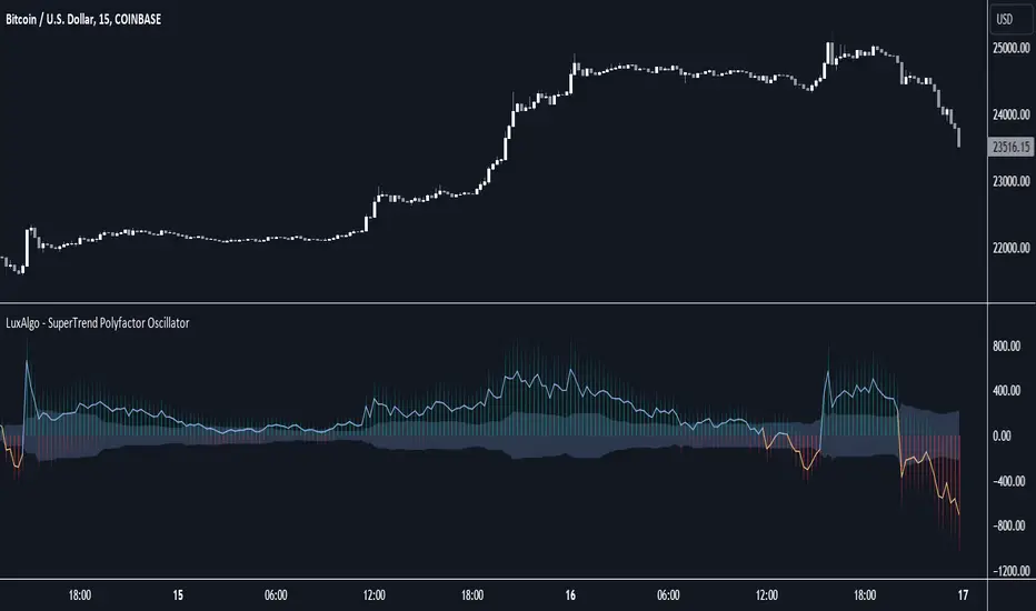
SuperTrend Polyfactor Oscillator [LuxAlgo]The SuperTrend Polyfactor Oscillator is an oscillator based on the popular SuperTrend indicator that aims to highlight information returned by a collection of SuperTrends with varying factors inputs.
A general consensus is calculated from all this information, returning an indication of the current market sentiment.
🔶 USAGE
Multiple elements are highlighted by the proposed oscillator. A mesh of bars is constructed from the difference between the price and a total of 20 SuperTrends with varying factors. Brighter colors of the mesh indicate a higher amount of aligned SuperTrends indications.
The factor input of the SuperTrends is determined by the user from the Starting Factor setting which determines the factor of the shorter-term SuperTrend, and the Increment settings which control the step between each factor inputs.
Using higher values for these settings will return information for longer-term term price variations.
🔹 Consensus
From the collection of SuperTrends, a consensus is obtained. It is calculated as the median of all the differences between the price and the collection of SuperTrends.
This consensus is highlighted in the script by a blue and orange line, with a blue color indicating an overall bullish market, and orange indicating a bearish market.
Both elements can be used together to highlight retracements within a trend. If we see various red bars while the general consensus is bullish, we can interpret it as the presence of a retracement.
🔹 StDev Area
The indicator includes an area constructed from the standard deviation of all the differences between the price and the collection of SuperTrends.
This area can be useful to see if the market is overall trending or ranging, with a consensus over the area indicative of a trending market.
🔹 Normalization
Users can decide to normalize the results and constrain them within a specific range, this can allow obtaining a lower degree of variations of the indicator outputs. Two methods are proposed "Absolute Sum", and "Max-Min".
The "Absolute Sum" method will divide any output returned by the indicator by the absolute sum of all the differences between the price and SuperTrends. This will constrain all the indicator elements in a (1, -1) scale.
The "Max-Min" method will apply min-max normalization to the indicator outputs (with the exception of the stdev area). This will constrain all the indicator elements in a (0, 1) scale.
🔶 SETTINGS
Length: ATR Length of all calculated SuperTrends.
Starting Factor: Factor input of the shorter-term SuperTrend.
Increment: Step value between all SuperTrends factors.
Normalize: Normalization method used to rescale the indicator output.
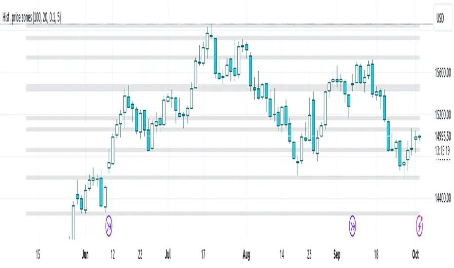
Histogram-based price zonesThis indicator provides a new approach to creating price zones that can be used as support and resistance. The approach does not use pivot points or Fibonacci levels. Instead, it uses the frequency of occurence of local maxima and minima to determine zones of interest where price often changed direction.
The algorithm is as follows:
- Gather price data from the last Lookback trading periods
- Calculate rolling minima and rolling maxima along the price points with window size Window size
- Build a histogram from the rolling extrema which are binned into different zones. The number of bins and therefore the width of a zone can be adjusted with the parameter Zone width factor
- Select only the top fullest bins. The number of bins selected for plotting can be controlled with Zone multiplier
The result are a number of boxes that appear on the chart which mark levels of interest to watch for. You can combine multiple instances of this indicator on different settings to find zones that are very relevant.
Shown as an example is the Nasdaq 100 futures ( NQ1! ) on the D timeframe with levels built from the last 100 periods with default settings. The boxes are the only output of the indicator, no signals are created.
Weighted Bulls-Bears Variety Smoothed [Loxx]Weighted Bulls-Bears Variety Smoothed highlights potential buy and sell moments in the market. Users can customize the data source and select their preferred type of moving average for calculations. The resulting visualization is a column-style plot that changes color based on bullish or bearish market conditions. Additionally, the script can color chart bars and provide visual markers to indicate buying ("Long") or selling ("Short") opportunities. Alerts can also be set for these trading signals.
█ Inputs:
Users can choose the source for calculations (e.g., closing price).
They can set periods for calculations and smoothing.
They can select the type of moving average they prefer for smoothing: EMA, FEMA, LWMA, SMA, or SMMA.
█ Weighted Bulls-Bears Calculation:
It determines the highest and lowest prices over a user-defined period.
Then, it calculates the 'bull' and 'bear' values based on these highest and lowest prices. These values are weighted based on their distance from the current price.
█ Extras
Alerts
Signals

[volfgang] WAVEA compass to the financial charts.
The Volfgang WAVE Indicator helps you to decode complex market trends and make informed decisions in your trading.
Quick Summary
The WAVE has a signal line which alternates between Red or Blue.
Red is bearish and Blue is bullish.
It turns Blue when the WAVE line crosses above the signal and holds for 1 bar.
it turns Red when the WAVE line crosses below the signal and holds for 1 bar.
(You can change the signal line’s length in the settings, the default is 3 which is suited towards Day Trading – For Swing Traders I recommend 4 or 5 – For Investors 6 to 9).
The WAVE line will change colour to alert you when price is potentially pivoting.
When the WAVE is WHITE, the trend is currently Bearish but could flip bullish soon.
When the WAVE is GREEN, the trend is Bullish and there is strong Bullish momentum.
When the WAVE is ORANGE, it means trend is bullish but there is danger of a Bearish Reversal.
When the WAVE is PINK it means there is strong Bearish Momentum.
WAVETrend Scanner
The WAVETrend Scanner can be enabled in the settings and gives you a quick overview of the current trend across 8 potential timeframes:
You can use this to make sure the trades you are taking on lower timeframes align with the current bias on higher term timeframes, thus ensuring a higher chance of success.
WAVE Colours
The background colour of the WAVE also changes according to the current trend across multiple timeframes. The scanner is constantly measuring the current trend across 7 timeframes;
When 4 timeframes line up Bullish, the WAVE is LIGHT BLUE (Cyan)
When 5 timeframes line up Bullish, the WAVE is DARK BLUE (Navy)
When 6+ timeframes line up Bullish, the WAVE is GREEN
When 4 timeframes line up Bearish, the WAVE is ORANGE
When 5 timeframes line up Bearish, the WAVE is RED
When 6+ timeframes line up Bearish, the WAVE is PINK
Divergence Checker & Buy/Sell Signals
The BUY and SELL Signals are represented by a BLUE or RED Histogram line that extends from the WAVE to the 0 Line.
A BUY signal shows when a Crossover occurs & there is a Bullish Diversion Present within the last 50 bars.
A SELL signal appears when a Crossunder occurs & there is Bearish Diversion present within the last 50 bars.
You can change the length of the Divergence Checker in the settings, default is 50 bars.
Under The Hood
The WAVE pulls information from multiple sources within a set period such as;
Close Price
Highest Price
Lowest Price
EMA
The script applies a set of complicated algebraic equations. Which essentially measures the and of recent price action.
Then it uses EMA's to measure from the and , whilst applying more weight to recent price action.
The functions then calculate more averages which measure the difference from and .
Next, it uses all of these calculated averages to create a value that represents the current WAVE condition. This calculation will determine whether the WAVE is in a bullish or bearish trend.
This sum is then smoothed out to get one more value, which is used to display the info box content that allows us to see exactly at what price the WAVE will keep rising or keep falling.
One final calculation also predicts the point at which the WAVE will flip trend. It uses similar calculations to the "Keep Rising/Falling" prediction function, but its aim is to predict the exact price at which the WAVE will cross.
What gives the WAVE indicator an edge over most Stochastic Indicators, is how it uses Pinescript's "request.security" function to pull information from multiple timeframes in order to generate plots, info data and colours to add much more relevant information to the chart which you can use to make informed trading decisions. This is what allows the WAVETrend Scanner to work.
The WAVE indicator is designed to work with all markets and asset types.

MACD-AS MTF [JoseMetal]============
ENGLISH
============
- Description:
This script is a modification of the Moving Average Convergence Divergence (MACD) of Thomas Aspray, and called as MACD-AS and you may get earlier signals than MACD.
On this (my version) you have several extra elements and customization.
Foremost (of course) you have the MACD-AS, which is the HISTOGRAM, also, it has a SIGNAL line (which smooths the MACD-AS), and finally, a higher timeframe oscillator based on one of the previous values (custom).
- Visuals, features, customization:
You can show/hide any of the components with a checkbox (MACD-AS, Signal and HTF Oscillator).
The timeframe for the higher timeframe oscillator is customizable, but by default is automatic and multiplies the chart timeframe by 3: 5m > 15m, 15m > 45m etc.
So we have the MACD-AS as a histogram, with 2 optional color schemes and custom transparency, it works similar to the original MACD, oscillating around the 0 level. Green colors (bull) if above 0, red (bear) below 0.
Smoothed MACD-AS makes the Signal line, going up (bull) shows green color, down (bear) red, changes from one to another also prints a colored dot. There's another feature which darkens the color when the momentum is losing strength, a strength filter input is available for that purpose but the default 0.5 works well.
The higher timeframe oscillator (it's called "oscillator" because you can pick if you want to show the MACD-AS or Signal line of the higher timeframe), is always shown as a line, colors work similar to the Signal line, but BLUE for bull and PINK for bear.
Finally, the background color just changes from green (bull) to red (bear) and vice versa if the Signal line is above or below the 0 line to show bull/bear trend too, this is slower than other indicator signals as well.
- Usage and recommendations:
You can use this script as default MACD, the difference is that you'll use the DOTs of the Signal line (when changing green to red and vice versa) as crossovers on the classic MACD.
You can also use the higher timeframe oscillator as a trend filter to not to trade against it, ex: if the HTF is bull, don't try to SHORT.
My favorite usage is to find DIVERGENCES with the MACD-AS (histogram) with the HTF MACD-AS histogram as well, having 2 confirmations, ex: 5m divergence + 15m divergence.
As always, suggestions are welcome.
Enjoy!
============
ESPAÑOL
============
- Descripción:
Este script es una modificación del Moving Average Convergence Divergence (MACD) de Thomas Aspray, y llamado como MACD-AS, se pueden obtener señales más tempranas que con el MACD.
En ésta (mi versión) tiene varios elementos adicionales y personalización.
En primer lugar (por supuesto) tienes el MACD-AS, que es el HISTOGRAMA, también, tiene una línea de SEÑAL (que suaviza el MACD-AS), y por último, un oscilador de marco de tiempo superior basado en uno de los valores anteriores (personalizado).
- Visuales, características, personalización:
Puedes mostrar/ocultar cualquiera de los componentes con un checkbox (MACD-AS, Señal y Oscilador HTF).
La temporalidad para el oscilador HTF es personalizable, pero por defecto es automático y multiplica la temporalidad del gráfico por 3: 5m > 15m, 15m > 45m etc.
El MACD-AS (histograma), con 2 esquemas de color opcionales y transparencia personalizada, funciona de forma similar al MACD original, oscilando alrededor del nivel 0. Colores verdes (alcista) si está por encima de 0, rojo (bajista) por debajo de 0.
El suavizado del MACD-AS hace la línea de señal, subiendo (alcista) muestra color verde, bajando (bajista) rojo, cambios de uno a otro también imprime un punto de color. Hay otra característica que oscurece el color cuando el impulso está perdiendo fuerza, una entrada de filtro de fuerza está disponible para ese propósito, pero el valor predeterminado 0,5 funciona bien.
El oscilador de temporalidad superior (se llama "oscilador" porque puedes elegir si quieres mostrar el MACD-AS o la línea de señal), siempre se muestra como una línea, los colores funcionan de forma similar a la línea de señal, pero AZUL para alcista y ROSA para bajista.
Por último, el color de fondo sólo cambia de verde (alcista) a rojo (bajista) y viceversa si la línea de señal está por encima o por debajo de la línea 0 para mostrar la tendencia alcista / bajista también, eso si, resulta más lento que otros avisos del indicador.
- Uso y recomendaciones:
Puedes usar este script como el MACD clásico, la diferencia es que usarán los PUNTOS de la línea de Señal (cuando cambie de verde a rojo y viceversa) como cruces en el MACD clásico.
También puedes usar el oscilador de mayor temporalidad como filtro de tendencia para no operar en contra de ella, ej: si el HTF es alcista, no intentes SHORTs.
Mi uso favorito es encontrar DIVERGENCIAS con el MACD-AS (histograma) y el HTF MACD-AS, teniendo 2 confirmaciones, ej: 5m divergencia + 15m divergencia.
Como siempre, las sugerencias son bienvenidas.
¡Que lo disfrutéis!

Average Trend with Deviation Bands v2TL;DR: An average based trend incl. micro trend spotting and multiple display options.
This script is basically an update of my "Average Trend with Deviation Bands" script. I made the following changes:
Not an overlay anymore - The amount of drawn lines makes the chart pretty messy. That's why I moved it to a pane. If you preferred the overlay you can use my "Average Trend with Deviation Bands" script. *This is also the reason why I publish this script instead of updating the existing one.
I added an EMA to represent the price movement instead of candles
I added a signal (SMA) to spot micro trends and early entry/exit signals
I added the option to switch between a "line view" which shows the average trend and deviation bands and an "oscillator view" which shows an oscillator and histogram (MACD style)
General usage:
1. The white line is the average trend (which is an average of the last N bars open, close, high, low price).
2. Bands around the average trend are standard deviations which can be adjusted in the options menu and are only visible in "lines view". Basically they are like the clouds in the Ichimoku Cloud indicator - In big deviation bands the price movement needs more "power" to break through the average trend and vice versa.
3. Indicator line (blue line) - This is the EMA which represents the price. Crossing the average trend from below indicates an uptrend and vice versa (crossing from above indicates a down trend).
4. Signal line (red line) - This is a smoothed version of the indicator line which can be used to predict the movement of the price when crossed by the indicator line (like at MACD and many other indicators).
Oscillator usage:
When switched to "oscillator view" the indicator line oscillates around a zero line which can be seen as the average trend. The usage is basically the same as described above. However there is also the histogram which shows the difference between the indicator and signal. Of course the histogram can be deactivated. Additionally a color filling can be added to easily spot entry/exit signals.
As always: Code is free do whatever you like. If you have any questions/comments/etc. just drop it in the comment section.

Indicatore volatilità v5 con segnali------------- INGLESE -------------
This indicator uses an exponential moving average (HMA) of the length specified by the user to calculate market volatility. Volatility is calculated by multiplying the Average True Range (ATR) by the simple moving average (SMA) of the volume.
The code uses colors to display market conditions. If the closing price is above the HMA, the columns turn green. If the closing price is below the HMA, the columns turn red. If volatility is below the SMA of volatility multiplied by the user-specified sideways volatility threshold, the columns turn orange.
In addition, the code uses the Rate of Change (ROC) to generate buy and sell signals. If the ROC is positive and the columns are green, a buy signal is generated and the columns turn black. If the ROC is negative and the columns are red, a sell signal is generated and the columns turn purple.
In summary, this indicator uses colors to display market conditions and help the user enter and exit the market based on volatility.
If you like this indicator give me a boost and leave a comment!! Thank you!
------------- ITALIANO -------------
Questo indicatore utilizza una media mobile esponenziale (HMA) della lunghezza specificata dall’utente per calcolare la volatilità del mercato. La volatilità viene calcolata moltiplicando l’Average True Range (ATR) per la media mobile semplice (SMA) del volume.
Il codice utilizza i colori per visualizzare le condizioni di mercato. Se il prezzo di chiusura è superiore all’HMA, le colonne diventano verdi. Se il prezzo di chiusura è inferiore all’HMA, le colonne diventano rosse. Se la volatilità è inferiore alla SMA della volatilità moltiplicata per la soglia di volatilità laterale specificata dall’utente, le colonne diventano arancioni.
Inoltre, il codice utilizza il Rate of Change (ROC) per generare segnali di acquisto e vendita. Se il ROC è positivo e le colonne sono verdi, viene generato un segnale di acquisto e le colonne diventano nere. Se il ROC è negativo e le colonne sono rosse, viene generato un segnale di vendita e le colonne diventano viola.
In sintesi, questo indicatore utilizza i colori per visualizzare le condizioni di mercato e aiutare l’utente a entrare e uscire dal mercato in base alla volatilità.
Se ti piace questo indicatore mettimi un boost e lascia un commento!! Grazie!

SAR MACDSAR MACD is an idea of implementing Directional MACD with Parabolic SAR to exactly detect and confirm Trend. This p-SAR MACD consist of a HYBRID MACD which acts as MACD TREND oscillator, MACD Oscillator, PSAR Indicator combined with MA line. thus Fake MACD Signals can be eliminated using this SAR MACD. Sideways can be detected using Threshold Levels must be adjusted based on timeframe.
Indicators Hybrid model contains:
1.MACD (12,26,9) Standard with MA Crossovers
2.MACD Trend
3.Parabolic SAR with 0.02
4.Threshold level - indicates Sideways
How to use.
Histogram:
-> HIST MODE: normal MACD indicator
MA Line Color is based on PSAR Direction Blue-Up/ Pink -Down
A crossover upside with a Blue MA line denotes Up confirmation
A Crossover downwards with a red MA line denotes Down Confirmation
Additionally Histogram above zero line and below zero line are to be confirmed
-> MACD MODE: MACD Trend indicator
MA Line Color is based on PSAR Direction Blue-Up/ Pink -Down
A crossover upside with a Blue MA line denotes Up confirmation
A Crossover downwards with a red MA line denotes Down Confirmation
Additionally Histogram above zero line and below zero denotes long term Trend
-> Histogram Color: Indicates candles direction
Yellow indicates Unconfirmed Direction
Green Indicates up direction
Red Indicates Down Direction
Buy Condition:
MA Color - Blue
Histogram- Above Zero
Histogram/Candle -Green
MA Crossover is must
Sell Condition:
MA Color - Red
Histogram- Below Zero
Histogram/Candle -Red
MA Cross under is must
Warning: Must not be used as a standalone indicator. Use for confirmation of your Buy Sell Signals and Entry only.

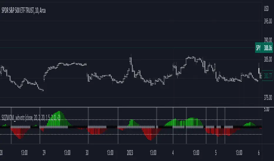
1st Gray Cross Signals ━ Histogram SQZMOM [whvntr][LazyBear]This is the Histogram Version of one of my other indicators named: SQZ Momentum + 1st Gray Cross Signals (with arrows) Which is a modification of "Squeeze Momentum Indicator" by user: "LazyBear". In that indicator of his he described, and suggested, the use of his gray cross signals to find points of interest for trading based on the direction of momentum when the first gray cross appears... I have programmed these points, and highlighted them, for ease of use. The 1st gray cross strategy, he said , is from John F. Carter's book, Chapter 11, "Mastering the Trade".
Here we have the Histogram version, with background highlights only, and nothing on the chart, in true SQZ Momentum style.
Disclaimer: using this indicator, or any indicator anywhere, involves risk when trading and isn't a guarantee of 100% accurate results.
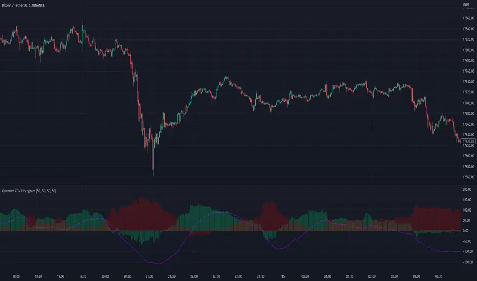
Quantum CDV HistogramThis script is an addition to Fixed Quantum Cdv.
It shows vector cdv ratio in columns.
You can select the length as an input to how many bars to look back for the whole calculation.
The green bars represent the bullish values and the red bars the bearish values.
The green line represents an ema of the bullish value and the red line the ema of the bearish value.
The momentum ema (in purple) represent the cdv ratio (bullish - bearish).
When the momentum ema is at 100% or more it’s a good sell opportunity and when the momentum ema is at or under 100% it’s a good buy opportunity. It is not financial advise. Make sure to make your own analysis. This script help to make entries, but do not enter positions only based on this signal.
In the inputs you can select the emas that you want to display on your histogram.
The original script is the Cumulative Delta Volume by LonesomeTheBlue.
I_MACD#I_MACD #Version_1_0_3
Hello Traders from all over the world! Today I would like to share a cool customizing tool our team recently has made. If you have ever used MACD or any other seemingly indicators that visualize the degree of converging/diverging of any two values, you are very lucky today. This one should be one of the most optimal tools for you guys that enables you to customize your own CD indicator perfectly fitted for your trading styles. Moreover, you can even set up optimized parameters for each different trading commodities or products.
There is no doubt that MACD (Moving Average Convergence Divergence) is one of the most popular indicators currently in trading world along with RSI and Stochastic. Google and old textbooks say that MACD is a technical indicator that helps you identify market trends and potential trend reversal point. Well, which existing indicators doesn’t? The problem is, how well the indicator reflects the market trends with least amount of lagging. We want to use an indicator that can provide best-fitted trend data as early as possible.
Anyway, this indicator is made of 3 different components: MACD line, a signal line, and an oscillator, which is usually plotted with histogram. MACD line is basically the level of difference between two EMAs, 12 and 26 (default settings). In other words, MACD Line visualizes the amount of gap between 12 and 26 EMA.
- When bullish, 12 EMA would be above 26 EMA and as the trend becomes more bullish, they will diverge more and MACD line would be positive (above the base line).
- When bearish, 12 EMA would be below 26 EMA and as the trend becomes more bearish, they will diverge more and MACD line would be negative (below the base line).
MACD Line = (Faster, sensitive) EMA – (Slower, dull) EMA = 12 EMA – 26 EMA
Then you add another EMA on the MACD line itself which then becomes a signal line. The default length of the signal line is 9. In other words, Signal line is a 9 EMA of the difference level between 26 and 12 EMA. Now the difference between Signal line and MACD line are called oscillator usually plotted with histograms.
- When MACD line is above the Signal Line, histogram would face upward (Positive Side)
- When MACD line is below the Signal Line, histogram would face downward (Negative Side)
Signal Line = 9 EMA of MACD Line
Two meaningful signals should be monitored to effectively spot the trend reversal point.
1. Pay attention to the crossover made by the two lines. Higher the golden-cross and the lower the death-cross is located, more weights added on the possibility of trend reverse. I personally ignore most of the crossovers signaled near the base line.
2. Search for the histogram peak outs. When two lines start to converge (heading towards each other), histogram will leave a significant peak and approach towards baseline meaning that the oscillator started to lose its strength.
Remember, both the signals (lines’ crossovers and histogram peak outs) are more reliable and meaningful as they are located farther away from the baseline.
As mentioned, the default parameters for MACD are 12, 26, and 9. The first two numbers are the lengths of prices’ moving averages that are used to compute MACD line. 9 is length of signal line. Furthermore, the types of moving averages and signal line used in this setting provided by Tradingview are EMAs (Exponential moving averages). Therefore, the proper way to express the default setting of MACD would be 12, 26, 9, EMA, EMA.
I have a question for you MACD users. How is MACD doing lately? Are you fully satisfied with the performance? Some might say yes, but most wouldn’t. Well, I personally believe that the default parameters are bit outdated. It surely was a powerful weapon 50 years ago when MACD was just created by Gerald Appel and only few knew how to use it. Things are different now. We have witnessed so many cases where everyone starts to all use the same types and parameters of indicators, techniques, and theories which eventually drops accuracy and preciseness. Come on, we are not living in fairy tales, instead in an extremely competitive world called capitalism where only a few survives.
As we are already aware, this market keeps changing over time. Encountering various patterns, price actions, wave structures, and trend flows that are unfamiliar and untraditional, traders easily get frustrated. Market is not like it used to be in the old days where trading was much easier. What worked yesterday doesn’t anymore work today and not even tomorrow. Such evidences we see every day are broadening channel, stoploss hunting, Bart Simpson, whipsaw, and bull/bear trap were once considered as rare phenomenon.
I_MACD might be useful tool for you to back/forward test to find the optimized types and parameters of the CD indicator just fitted for your unique trading styles and preferences. There are infinite number of combinations of types and parameters within this indicator you can try. For example, not only the lengths of the moving averages, but different types of technical indicators to compute the CD lines can also be tested. Try all the possible combinations of parameters and if you find a good one, please share it with us on the comment section below! I will also let you guys know if I do. In fact, the default settings, ohlc4, 60, 140, 30 EMA, EMA, are one of many that I have found useful.
Furthermore, for your convenience when testing, we added a few side features as listed below. You can turn these on and off according to your preferences and circumstances.
1. Crossovers of MACD and Signal line: Death-crosses above the baseline and golden-crosses below the baseline will be spotted with a vertical line.
2. Divergence Sensitivity: This feature finds out both the regular and hidden divergences of MACD line. Higher sensitivity searches for the divergences within the waves of the larger degree and vice versa for the lower sensitivity.
3. Histogram Peak out: Triangle signals will appear when oscillator peak outs are possibility assumed in advance. Similarly, as the first feature positive peak outs are searched only when MACD line is positive and vice versa for the negative peak outs.
We all know there is no ‘Perfect’ method in this industry other than becoming Elon Musk, but there surely are ‘Better’ methods. Contemporary traders should track and reflect trends of the latest market on developing their methods. In order to process that task, testing and experimenting new and different techniques through insightful ways is required. I_MACD might be the ‘Perfect’ tool for you to be a ‘Better’ trader. Thanks for reading.
#아이맥디 #I_MACD #Version_1_0_3
안녕하세요. 트레이더 여러분. 토미입니다.
오늘은 MACD와 같은 CD(Convergence Divergence)류의 보조지표를 써 보신 분들이 정말 좋아하실 만한 지표 툴 하나를 소개 드리겠습니다. 이름하여 I_MACD! 아무나 자유롭게 사용하실 수 있습니다. 여러분의 트레이딩 성향, 종목 특성, 타임 프레임, 현대 시장 상황, 그리고 요즘 여러분이 생각하는 차트 흐름에 딱 맞는 지표를 만들고 사용해보세요.
MACD는 딱 두가지 신호만 주목하시면 됩니다. 첫번째 신호는 MACD선과 Signal선, 이 두 곡선이 서로 크로스 할 때, 즉 오실레이터가 양에서 음으로 혹은 음에서 양으로 변환되는 시점입니다. 두번째 신호는 오실레이터가 고/저점(Peak out)을 찍고 변곡이 시작되는 시점입니다. 이 외에 제가 전 다이버전스 강의에서 언급 드렸듯 두 곡선과 히스토그램의 다이버전스 역시 참고해볼 수 있습니다.
흔히 쓰이는 MACD의 기본(디폴트) 설정 값은 12, 26, 9이며 현재 트레이딩뷰에서 제공하는 MACD의 두 이평선, 즉 MACD선을 도출할 때 사용되는 주가의 12와 26 이평선의 종류는 EMA(Exponential Moving Average)입니다. 또한 저 설정 값에서 9는 Signal선의 길이를 의미하며 본 이평선 종류 역시 EMA입니다.
MACD는 제럴드 아펠이라는 아저씨가 1970년대에 개발한 지표입니다. 하지만 여러분들도 알다시피 현대 금융 시장은 50년 전과 많이 다릅니다. 세상은 점점 더 빠르고 예측불가하게 변하고 있으며 금융 시장도 예외는 아닙니다. 기술적분석 관점으로도 이전에는 흔히 나오지 않았던 패턴, 경향성, 규칙, 그리고 흐름들이 지금은 비일비재하게 나오고 있습니다. 이쪽 시장은 정해진 답안지가 없으며 시시각각 변하는 시장에 맞게 우리가 참고하는 기법과 전략들을 항상 업데이트해줄 필요가 있습니다.
MACD 역시 모든 사람들이 사용하는 12, 26, 9, EMA, EMA 보다 더 나은 설정 값이 분명 존재할 겁니다. 그래서 저희 팀은 여러분들이 CD지표의 파라미터 값과 곡선 산출법을 변경하여 더 요즘 시장에 그리고 여러분 트레이딩 성향에 최적화된 지표로 만들어 사용할 수 있는 툴을 만들어봤습니다. 두 곡선과 Signal 선의 길이는 물론이고 타 이평선들을 포함 RSI, OBV, CCI, MFI 등과 같은 다른 종류의 지표로도 CD선을 구할 수 있게끔 해 놨습니다.
예를 들어 조금 더 장기적인 추세를 반영하는 MACD를 만들고 싶다면 12, 26이 아니라 50, 100의 길이를 사용해볼 수도 있고 이평선의 민감도를 조절하고 싶다면 EMA가 아닌 HMA나 RMA 같은 종류로 설정해볼 수도 있습니다. 또한 이평선이 아니라 아예 다른 지표들을 가지고 MACD화(정확히 말하면 CD화죠) 시켜볼 수도 있습니다. 저도 이것저것 시도 중인데 꽤 흥미로운 셋팅 값들이 보이네요. 참고로 디폴트로 설정해 놓은 시고저종/4, 60, 140, 30, EMA, EMA 조합도 제가 현재 테스트하고 있는 나쁘지 않은 값입니다. 여러분들도 괜찮은 설정 값들을 찾으면 혼자만 쓰지 마시고 댓글에 공유 좀 부탁드립니다~
또한 주요 시그널들을 쉽게 잡아낼 수 있게 아래와 같이 몇 가지 자동 기능들을 추가했습니다. 여러분들의 편의와 상황에 따라 사용하셔도 되고 거슬리면 끄셔도 됩니다.
1. MACD선과 Signal선의 크로스: 기준선 위에선 데드크로스, 아래에선 골든크로스를 표시해줍니다.
2. 다이버전스 민감도: MACD선의 다이버전스 출현 여부를 알려줍니다. 다이버전스 민감도를 내릴수록 더 작은 (단기) 단위 파동들의, 올릴수록 더 큰 (장기) 단위의 파동들의 다이버전스를 잡습니다.
3. 히스토그램 피크 아웃: MACD선이 기준선 위에 있을 때는 양, 아래에 있을 때는 음 히스토그램의 변곡점으로 의심되는 곳을 표기해줍니다.
제가 매번 강조 드리지만 지표는 보조로만 참고하는 도구이며 절대적으로 다 맞는 지표, 이론, 그리고 방법론은 세상에 존재하지 않습니다. 시장 상황에 따라 적절히 활용하고 본인이 사용하는 기술적분석 기법들 조합의 일부로 참고만 하시는 게 좋습니다.

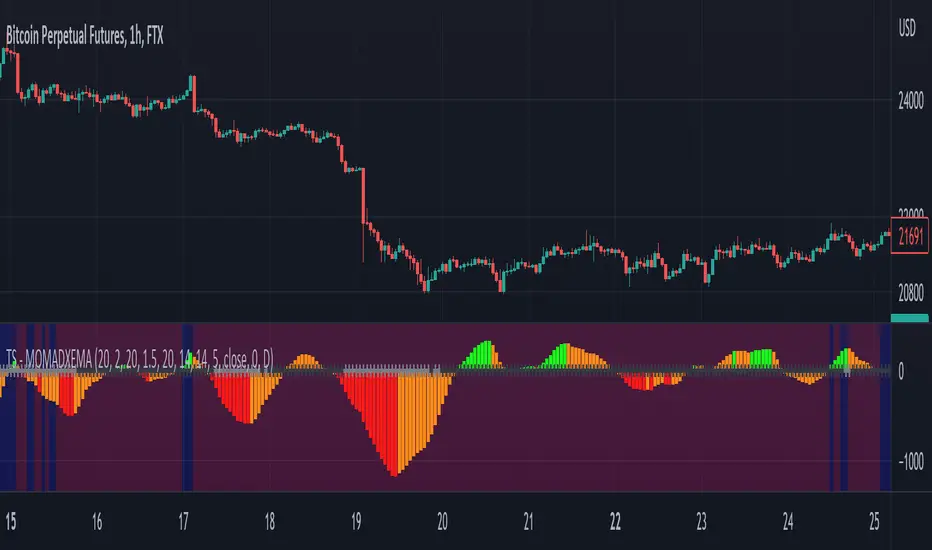
Trend Surfers - Momentum + ADX + EMAThis script mixes the Lazybear Momentum indicator, ADX indicator, and EMA.
Histogram meaning:
Green = The momentum is growing and the ADX is growing or above your set value
Red = The momentum is growing on the downside and the ADX is growing or above your set value
Orange = The market doesn't have enough momentum or the ADX is not growing or above your value (no trend)
Background meaning:
Blue = The price is above the EMA
Purple = The price is under the EMA
Cross color on 0 line:
Dark = The market might be sideway still
Light = The market is in a bigger move
RSI + MA, LinReg, ZZ (HH HL LH LL), Div, Ichi, MACD and TSI HistRelative Strength Index with Moving Average, Linear Regression, Zig Zag (Highs and Lows), Divergence, Ichimoku Cloud, Moving Average Convergence Divergence and True Strength Index Histogram
This script is based on zdmre's RSI script, I revamped a lot of things and added a few indicators from ParkF's RSI script.
Disable Labels in the Style tab and the histogram if you don't enlarge the indicator and it seems too small.
Look to buy in the oversold area and bounce of the support of the linear regression.
Look to sell in the overbought area and bounce of the resistance of the linear regression.
Look for retracement to the moving average or horizontal lines, and divergences for potential reversal.
RSI
The Relative Strength Index (RSI) is a well versed momentum based oscillator which is used to measure the speed (velocity) as well as the change (magnitude) of directional price movements.
Moving Average
Moving Average (MA) is a good way to gauge momentum as well as to confirm trends, and define areas of support and resistance.
Linear Regression
The Linear Regression indicator visualizes the general price trend of a specific part of the chart based on the Linear Regression calculation.
Zig Zag (Highs and Lows)
The Zig Zag indicator is used to identify price trends, and in doing so plots points on the chart to mark whenever prices reverse by a larger percentage point than a predetermined variable or marker.
Divergence
The divergence indicator warns traders and technical analysts of changes in a price trend, oftentimes that it is weakening or changing direction.
Ichimoku Cloud
The Ichimoku Cloud is a package of multiple technical indicators that signal support, resistance, market trend, and market momentum.
MACD and TSI Histogram
MACD can be used to identify aspects of a security's overall trend.
The True Strength Index indicator is a momentum oscillator designed to detect, confirm or visualize the strength of a trend.
