Regression Fit Bollinger Bands [Spiritualhealer117]This indicator is best suited for mean reversion trading, shorting at the upper band and buying at the lower band, but it can be used in all the same ways as a standard bollinger band.
It differs from a normal bollinger band because it is centered around the linear regression line, as opposed to the moving average line, and uses the linear regression of the standard deviation as opposed to the standard deviation.
This script was an experiment with the new vertical gradient fill feature.
Regresi Linear

Linear Average PriceWhat is "Linear Average Price"?
"Linear Average Price" is both a trend and an overbought oversold indicator .
What it does?
it creates a trendline and trading zones.
How it does it?
To create the trend line, it averages the difference between each data and chooses it as the slope of the line it creates. then it positions this line so that it passes right through the middle of the data at hand. It uses standard deviation to create trading zones.
How to use it?
It can be used both to have an idea about the trend direction and to determine buy-sell zones. You can choose how many candles the indicator will calculate from the "lenght" section. The "range" part is the coefficient of the standard deviation and can be used to expand or collapse zones.

GKYZ-Filtered, Non-Linear Regression MA [Loxx]GKYZ-Filtered, Non-Linear Regression MA is a Non-Linear Regression of price moving average. Use this as you would any other moving average. This also includes a Garman-Klass-Yang-Zhang Historical Volatility Filter to reduce noise.
What is Non-Linear Regression?
In statistics, nonlinear regression is a form of regression analysis in which observational data are modeled by a function which is a nonlinear combination of the model parameters and depends on one or more independent variables. The data are fitted by a method of successive approximations.
What is Garman-Klass-Yang-Zhang Historical Volatility?
Yang and Zhang derived an extension to the Garman Klass historical volatility estimator that allows for opening jumps. It assumes Brownian motion with zero drift. This is currently the preferred version of open-high-low-close volatility estimator for zero drift and has an efficiency of 8 times the classic close-to-close estimator. Note that when the drift is nonzero, but instead relative large to the volatility , this estimator will tend to overestimate the volatility . The Garman-Klass-Yang-Zhang Historical Volatility calculation is as follows:
GKYZHV = sqrt((Z/n) * sum((log(open(k)/close( k-1 )))^2 + (0.5*(log(high(k)/low(k)))^2) - (2*log(2) - 1)*(log(close(k)/open(2:end)))^2))
Included
Alerts
Signals
Loxx's Expanded Source Types
Bar coloring
Fourier Spectrometer of Price w/ Extrapolation Forecast [Loxx]Fourier Spectrometer of Price w/ Extrapolation Forecast is a forecasting indicator that forecasts the sinusoidal frequency of input price. This method uses Linear Regression with a Fast Fourier Transform function for the forecast and is different from previous forecasting methods I've posted. Dotted lines are the forecast frequencies. You can change the UI colors and line widths. This comes with 8 frequencies out of the box. Instead of drawing sinusoidal manually on your charts, you can use this instead. This will render better results than eyeballing the Sine Wave that folks use for trading. this is the real math that automates that process.
Each signal line can be shown as a linear superposition of periodic (sinusoidal) components with different periods (frequencies) and amplitudes. Roughly, the indicator shows those components. It strongly depends on the probing window and changes (recalculates) after each tick; e.g., you can see the set of frequencies showing whether the signal is fast or slow-changing, etc. Sometimes only a small number of leading / strongest components (e.g., 3) can extrapolate the signal quite well.
Related Indicators
Fourier Extrapolator of 'Caterpillar' SSA of Price
Real-Fast Fourier Transform of Price w/ Linear Regression
Fourier Extrapolator of Price w/ Projection Forecast
Itakura-Saito Autoregressive Extrapolation of Price
Helme-Nikias Weighted Burg AR-SE Extra. of Price
***The period parameter doesn't correspond to how many bars back the drawing begins. Lines re rendered according to skipping mechanism due to TradingView limitations.
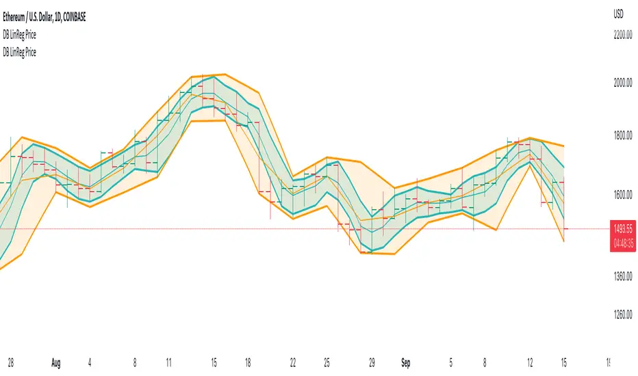
DB LinReg Price ChannelDB LinReg Price Channel
What does the indicator do?
This indicator is very simple and designed to plot a quick linear regression channel for high, hlc3, and low. It allows the symbol and timeframe to be configured in the settings.
The purpose of the indicator is to obtain a price channel for the desired timeframe with outliers removed.
How should this indicator be used?
I personally use two of the indicators with one set to the current timeframe and the second set to 2x of the current timeframe. For example, 12H and Daily which gives you a fast and slow price channel for your desired timeframe. Price channels can help you know the value of the current price in respect to the timeframe and for pricing stop losses and liquidation levels.
Does the indicator include any alerts?
Not yet.
Use at your own risk and do your own diligence.
Enjoy!
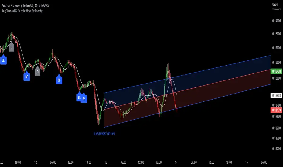
Regression Channel, Candles and Candlestick Patterns by MontyRegression Candles by ugurvu
Regression Channel by Tradingview
All Candlestick Patterns By Tradingview
This script was combined for a friend of mine who needed this.
This Script has regression candles by ugurvu, Regression channel and Candlestick patterns by tradingview.
The intention was to fuse these together so more information can be processed on the cost of a single indicator.
Leavitt Projection [CC]The Leavitt Projection indicator was created by Jay Leavitt (Stocks and Commodities Oct 2019, page 11), who is most well known for creating the Volume-Weighted Average Price indicator. This indicator is very simple but is also the building block of many other indicators, so I'm starting with the publication of this one. Since this is the first in a series I will be publishing, keep in mind that the concepts introduced in this script will be the same across the entire series. The recommended strategy for how to trade with these indicators is to plot a fast version and a slow version and go long when the fast version crosses over the slow version or to go short when the fast version crosses under the slow version. I have color coded the lines to turn light green for a normal buy signal or dark green for a strong buy signal and light red for a normal sell signal, and dark red for a strong sell signal.
I know many of you have wondered where I have been, and my personal life has become super hectic. I was recently hired full-time by TradingView, and my wife is pregnant with twins, and she is due in a few months. I will do my absolute best to get back to posting scripts regularly, but I will post a bunch today in the meantime to fulfill a special request from one of my loyal followers (@ashok1961).

Standard Deviation Channel V.1Standard Deviation channel For TradingView V.1
Many thanks to and Made with help from @rumpypumpydumpy
█ - How to add the indicator-
You can “Boost” the tool if you like it, then scroll down on this page to "Add to favorite indicators" so it will be saved in your favorites. Easiest way to add to chart past that is simply copy the indicators name, Navigate to a chart, then paste the indicators name into your chart's "Indicators" tab. It should then be immediately added to the current chart. If your display is not large enough, when you first add your channel,, you may realize that you see labels appear, but no channel. Simply scroll backwards in time until the chart loads. TradingView needs to be able to see the data you would like the channel to read in order to plot and display correctly. This is a simple one or two mouse wheel scroll and it will appear.
You may notice a compression of price scale. IF this happens simply right click your right price axis, a menu will appear, select “Scale price chart only”, and "Auto (fits data to screen) This will release the scale compression and let you view the channel and price normally. Once your Channel is added, loaded, and ready to go, you can proceed to settings. In the top left corner of your main chart there will be a Indicator title, hover that and click on the gear icon to access the channels custom settings. You can also double click any of the active plots from the channel or averages on the chart, and gain access to the settings panel through that.
█ OVERVIEW
Settings explained -
Inputs and color choices
You can think of the settings panel as 3 separate sections.
First - Look and feel- You will have your Channels visual inputs, Simple Yes or No check boxes on whether you would like to display the visual items listed. You can choose to display the channel in a multitude of ways, with or without half deviations, with no 2nd, 3rd, or 4th deviations. This first section is your quick access control panel to the visual feel and display of the channel and its items.
Then below that you will see quick access color presets for each deviation and half deviations. You can choose to leave these as is, or you can choose custom colors per your preference.
The positive and negative Second deviations (+/-2std) are colored by positive and negative slope of channel. This will help to show overall trend, whether up or down, positive or negative. User can change the positive and negative slope colors if they would like.
Second, - Time and Regression - Next as you scroll down the settings panel you will encounter the Time and regression settings. In order for the channel to match the channel used widely in TOS, we had to Preset the look back lengths into the code because on Tradingview we have an “Continuous left edge of the chart”. We needed to tell the channel how far to look back and start calculating. The frame work for this time logic came initially from the channel that was developed years back by @corgalicious, We then took that time logic and re-worked it in order to fit the parameters that the widely used and popular TOS channel has.
Above the time frame length back inputs you will find a dropdown menu "Regression method type". This will offer different methods of regression and calculating the standard deviation from the center linear regression line. It is preset to “Population standard deviation” which will mimic the widely used TOS channel. There is also a choice for “Regression method standard error, or RMSE. This is a similar regression style, but will result in a tighter fitting, smaller deviation measurement and channel all around. As well as a multitude of other regression styles thanks to the genius of @rumpypumpydumpy
All the time presets were carefully chosen based off Pre set time frames TOS offers for their widely used Standard deviation channel, and time frames I had noted as widely used. You as the user can change those look back windows if you prefer through the input length settings. I recommend using the stock settings in most scenarios. Trading view has a 5000 bar look back limit, so we have implemented “Max lookbacks” inside the code to avoid any user error or confusion. The standard error of the sample mean is an estimate of how far the sample mean is likely to be from the population mean, whereas the standard deviation of the sample is the degree to which individuals within the sample differ from the sample mean. For longer time frames and sample sets I tend to use Population Standard Dev setting. For smaller sample sets I will go with Linreg RMSE setting. This is a personal preference. It is encouraged to try all of them and see what fits your trading style the best.
If the user would like to use a "Max bar lookback and plot the maximum allowed length on the current time frame, Simply select, "Use the full range of data allowed in max bars back for calculation?" This will automatically search back on the current time frame and plot the channel 4999 bars back. User will have to SCROLL BACK in order to fully load the channel into view. Again, Tradingview needs to see the candles you would like to plot on.
Third, - Finally at the bottom of the settings I have included Exponential moving average clouds. These are NOT enabled by default. If the user would like them enabled simply check "show momentum average clouds" and "Show Candle EMA". These are Multiple time frame moving average clouds consisting of 72/89 length 3, and 5min exponential moving averages. I use these to simply show the front or back side of a move and to find if trend is strong or weakening. These are not always needed so they are turned off by default.
█ CONCEPTS
Reversion and Repulsion-
You will find that the channel linear regression trend line has two characteristic's, Reversion to the mean, and Repulsion away from the mean. Price either seeks to aggressively return to the mean when it has exited a normal distribution, or price seeks to aggressively move away from the mean in times of momentum. Most seek to participate in the move through MAJOR WHOLE deviation levels in one scenario or the other.
The idea behind using a Standard deviation channel is to see extension and find where in the move we are. Are you extended out to 3 or 4 deviation's up or down? If so, you could start to think about reversion back to the mean. Have you had a violent move down to -3 or -4 deviations in a sell off? Maybe look at reversion back up toward the mean off a whole deviation break. Have you broken out of a normal distribution at +1 deviation and are building trend? maybe seek to join trend.
I have found most success by using a Split screen style layout. On the left chart most will have a 1min intraday channel showing, and on the left chart a 4hr channel showing. The idea is to mark your longer time frame deviations onto your intraday time frame, and use the intraday Channel to guide you through the higher time framed move. The move through +/- 1 deviation is a high momentum area in most names as price either seeks to return to the mean, or move strongly away from the mean.
█ Time periods
The channel has pre determined lookback presets for each major time frame. These have been preset in the code to mimic the widely used channel in TOS to the best of our ability.
Preset timeframe lookbacks include.
//intraday shorter time frames. 1/2min with 2day lookbacks
'1D-1Min' - Default= 2D, minval=1, maxval=5
'1D-2Min' - Default= 2D, minval=1, maxval=7
//intraday shorter time frames. 3/5min with 5day lookbacks. User can set shorter or longer if they choose, up to a 5000k bar look back depending on their Data tier level, Basic, Pro, Pro+, Premium etc.
'5D-3Min' - Default= 5D, minval=1, maxval=7
'5D-5Min' - Default= 5D, minval=1, maxval=20
// larger intraday time frames, 10/15min with 5day look backs.
'5D-10Min' - Default= 5D, minval=1, maxval=20
'5D-15Min' - Default= 5D, minval=1, maxval=60
// "Swing style time frames" 30/60 min with 10 and 20 day look back.
'10D-30Min' - Default= 10D, minval=1, maxval=60
'20D-1Hr' - Default= 20D, minval=1, maxval=90
//longer lookbacks for larger time frames using day lookback with the exception of week/month
'90D-2Hr' - Default = 90D, minval=1, maxval=180
'4h ' - Default = 180D,minval=1, maxval=4999
'6h' - Default = 36D, minval=1, maxval=252
'5Yr-W' - Default = 260W,minval=1, maxval=260
'1Yr-1D' - Default = 252D,minval=1, maxval=4999
'1Yr-1W' - Default = 52W, minval=1, maxval=480
'5Yr-1M' - Default = 60W, minval=1, maxval=480
█ Minimum Window Size
Note that on each time frame you MUST quickly scroll out to the first bar that the channel should start calculating on in order for the channel to populate on longer time frame series. This is under construction and as soon as there is a fix or other way around this, it will be addressed.
█ NOTES
Enjoy!
In the end I encourage any who tries the Channel to really sit down and spend some time playing around with the settings in order to find out how they like the Channel set up. I usually run the default settings on a intraday 5min chart, and then another instance of the study on a 4 hour chart. That way I can see granular intraday levels, and macro long term levels in the same view. See what fit's you the best, and how you like to trade. Most of all ENJOY!
Good luck -
JMF.
IMPORTANT INFO-
As always, the creator of this code is NOT a licensed investment advisor. No output of this tool is to be taken as investment advice or a recommendation to buy or sell any security.
Trading is risky, any one using this tool acknowledges they CAN LOSE some if not all of their initial investment even with this tool enabled.
User assumes ALL RESPONSIBILITY when using this tool in their technical analysis. There is NO GUARANTEE THAT THE USE OF THIS TOOL WILL RESULT IN PROFIT Use at your own risk.
R2-Adaptive RegressionOVERVIEW
This is an implementation of alexgrover's R2-Adaptive Regression optimized for the latest version of TradingView.
Full details on the indicator are on alexgrover's page here:

Regression Channel Trend DetectionThis is a regression channel that uses ichimoku to determine trend. The sensitivity is customizable. The centerline will change color according to the trend detected by ichimoku, and each line can act as support/resistance. The bands of the channel also change colors according to how far price is getting away from them. If you notice in this example, the lower band is turning orange when the price is getting too far away from it, suggesting that it may have risen too fast and too soon. This is still in testing so feel free to comment with any suggestions or fixes.
Real-Fast Fourier Transform of Price w/ Linear Regression [Loxx]Real-Fast Fourier Transform of Price w/ Linear Regression is a indicator that implements a Real-Fast Fourier Transform on Price and modifies the output by a measure of Linear Regression. The solid line is the Linear Regression Trend of the windowed data, The green/red line is the Real FFT of price.
What is the Discrete Fourier Transform?
In mathematics, the discrete Fourier transform (DFT) converts a finite sequence of equally-spaced samples of a function into a same-length sequence of equally-spaced samples of the discrete-time Fourier transform (DTFT), which is a complex-valued function of frequency. The interval at which the DTFT is sampled is the reciprocal of the duration of the input sequence. An inverse DFT is a Fourier series, using the DTFT samples as coefficients of complex sinusoids at the corresponding DTFT frequencies. It has the same sample-values as the original input sequence. The DFT is therefore said to be a frequency domain representation of the original input sequence. If the original sequence spans all the non-zero values of a function, its DTFT is continuous (and periodic), and the DFT provides discrete samples of one cycle. If the original sequence is one cycle of a periodic function, the DFT provides all the non-zero values of one DTFT cycle.
What is the Complex Fast Fourier Transform?
The complex Fast Fourier Transform algorithm transforms N real or complex numbers into another N complex numbers. The complex FFT transforms a real or complex signal x in the time domain into a complex two-sided spectrum X in the frequency domain. You must remember that zero frequency corresponds to n = 0, positive frequencies 0 < f < f_c correspond to values 1 ≤ n ≤ N/2 −1, while negative frequencies −fc < f < 0 correspond to N/2 +1 ≤ n ≤ N −1. The value n = N/2 corresponds to both f = f_c and f = −f_c. f_c is the critical or Nyquist frequency with f_c = 1/(2*T) or half the sampling frequency. The first harmonic X corresponds to the frequency 1/(N*T).
The complex FFT requires the list of values (resolution, or N) to be a power 2. If the input size if not a power of 2, then the input data will be padded with zeros to fit the size of the closest power of 2 upward.
What is Real-Fast Fourier Transform?
Has conditions similar to the complex Fast Fourier Transform value, except that the input data must be purely real. If the time series data has the basic type complex64, only the real parts of the complex numbers are used for the calculation. The imaginary parts are silently discarded.
Inputs:
src = source price
uselreg = whether you wish to modify output with linear regression calculation
Windowin = windowing period, restricted to powers of 2: "4", "8", "16", "32", "64", "128", "256", "512", "1024", "2048"
Treshold = to modified power output to fine tune signal
dtrendper = adjust regression calculation
barsback = move window backward from bar 0
mutebars = mute bar coloring for the range
Further reading:
Real-valued Fast Fourier Transform Algorithms IEEE Transactions on Acoustics, Speech, and Signal Processing, June 1987
Related indicators utilizing Fourier Transform
Fourier Extrapolator of Variety RSI w/ Bollinger Bands
Fourier Extrapolation of Variety Moving Averages
Fourier Extrapolator of Price w/ Projection Forecast

Cycle-Period Adaptive, Linear Regression Slope Oscillator [Loxx]Cycle-Period Adaptive, Linear Regression Slope Oscillator is an osciallator that solves for the Linear Regression slope and turns it into an oscillator. This is a very simple calculation and uses one of Ehler's first implementations of his cycle period calculations. The output slope value is smoothed after calculation and before being drawn. This is a sort of momentum indicator and has a rich history with Forex traders around the world.
What is the Cycle Period?
The spectral content of the data are measured in a bank of contiguous filters as described in "Measuring Cycle Periods" in the March 2008 issue of Stocks & Commodities Magazine. The filter having the strongest output is selected as the current dominant cycle period. The cycle period is measured as the number of bars contained in one full cycle period.
What is Linear Regression?
In statistics, linear regression is a linear approach for modeling the relationship between a scalar response and one or more explanatory variables. The case of one explanatory variable is called simple linear regression; for more than one, the process is called multiple linear regression.
Included:
Bar coloring
2 signal types
Alerts
Loxx's Expanded Source Types
Loxx's Moving Averages

Polynomial-Regression-Fitted RSI [Loxx]Polynomial-Regression-Fitted RSI is an RSI indicator that is calculated using Polynomial Regression Analysis. For this one, we're just smoothing the signal this time. And we're using an odd moving average to do so: the Sine Weighted Moving Average. The Sine Weighted Moving Average assigns the most weight at the middle of the data set. It does this by weighting from the first half of a Sine Wave Cycle and the most weighting is given to the data in the middle of that data set. The Sine WMA closely resembles the TMA (Triangular Moving Average). So we're trying to tease out some cycle information here as well, however, you can change this MA to whatever soothing method you wish. I may come back to this one and remove the point modifier and then add preliminary smoothing, but for now, just the signal gets the smoothing treatment.
What is Polynomial Regression?
In statistics, polynomial regression is a form of regression analysis in which the relationship between the independent variable x and the dependent variable y is modeled as an nth degree polynomial in x. Polynomial regression fits a nonlinear relationship between the value of x and the corresponding conditional mean of y, denoted E(y |x). Although polynomial regression fits a nonlinear model to the data, as a statistical estimation problem it is linear, in the sense that the regression function E(y | x) is linear in the unknown parameters that are estimated from the data. For this reason, polynomial regression is considered to be a special case of multiple linear regression .
Included
Alerts
Signals
Bar coloring
Loxx's Expanded Source Types
Loxx's Moving Averages
Other indicators in this series using Polynomial Regression Analysis.
Poly Cycle
PA-Adaptive Polynomial Regression Fitted Moving Average
Polynomial-Regression-Fitted Oscillator
Polynomial-Regression-Fitted Oscillator [Loxx]Polynomial-Regression-Fitted Oscillator is an oscillator that is calculated using Polynomial Regression Analysis. This is an extremely accurate and processor intensive oscillator.
What is Polynomial Regression?
In statistics, polynomial regression is a form of regression analysis in which the relationship between the independent variable x and the dependent variable y is modeled as an nth degree polynomial in x. Polynomial regression fits a nonlinear relationship between the value of x and the corresponding conditional mean of y, denoted E(y |x). Although polynomial regression fits a nonlinear model to the data, as a statistical estimation problem it is linear, in the sense that the regression function E(y | x) is linear in the unknown parameters that are estimated from the data. For this reason, polynomial regression is considered to be a special case of multiple linear regression .
Things to know
You can select from 33 source types
The source is smoothed before being injected into the Polynomial fitting algorithm, there are 35+ moving averages to choose from for smoothing
This indicator is very processor heavy. so it will take some time load on the chart. Ideally the period input should allow for values from 1 to 200 or more, but due to processing restraints on Trading View, the max value is 80.
Included
Alerts
Signals
Bar coloring
Other indicators in this series using Polynomial Regression Analysis.
Poly Cycle
PA-Adaptive Polynomial Regression Fitted Moving Average

Auto Linear Regression ChannelsThe Linear Regression indicator visualizes the general price trend of a specific part of the chart based on the Linear Regression calculation. The central line of the indicator is the linear regression calculation itself, and the lines above or below it are X number of standard deviations removed from the main one. This is a good tool to use to determine when a price is unusually far away from its baseline.
This differs from the built-in Linear Regression indicator by adding in more standard deviations to show more potential reversal points.

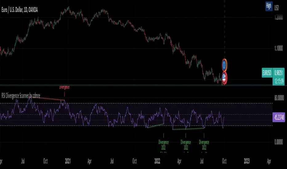
RSI Divergence Scanner by zdmreDivergence is when the price of an asset is moving in the opposite direction of a technical indicator, such as an oscillator, or is moving contrary to other data. Divergence warns that the current price trend may be weakening, and in some cases may lead to the price changing direction.
If the stock is rising and making new highs, ideally the RSI is reaching new highs as well. If the stock is making new highs, but the RSI starts making lower highs, this warns the price uptrend may be weakening. This is negative divergence.
Positive divergence is the opposite situation. Imagine the price of a stock is making new lows while the RSI makes higher lows with each swing in the stock price. Investors may conclude that the lower lows in the stock price are losing their downward momentum and a trend reversal may soon follow.
Divergence is one of the common uses of many technical indicators, primarily the oscillators.
Use it at your own risk
Everything Bitcoin [Kioseff Trading]Hello!
This script retrieves most of the available Bitcoin data published by Quandl; the script utilizes the new request.security_lower_tf() function.
Included statistics,
True price
Volume
Difficulty
My Wallet # Of Users
Average Block Size
api.blockchain size
Median Transaction Confirmation Time
Miners' Revenue
Hash Rate
Cost Per Transaction
Cost % of Transaction Volume
Estimated Transaction Volume USD
Total Output Volume
Number Of Transactions Per Block
# of Unique BTC Addresses
# of BTC Transactions Excluding Popular Addresses
Total Number of Transactions
Daily # of Transactions
Total Transaction Fees USD
Market Cap
Total BTC
Retrieved data can be plotted as line graphs; however, the data is initially split between two tables.
The image above shows how the requested Bitcoin data is displayed.
However, in the user inputs tab, you can modify how the data is displayed.
For instance, you can append the data displayed in the floating statistics box to the stagnant statistics box.
The image above exemplifies the instance.
You can hide any and all data via the user inputs tab.
In addition to data publishing, the script retrieves lower timeframe price/volume/indicator data, to which the values of the requested data are appended to center-right table.
The image above shows the script retrieving one-minute bar data.
Up arrows reflect an increase in the more recent value, relative to the immediately preceding value.
Down arrows reflect a decrease in the more recent value relative to the immediately preceding value.
The ascending minute column reflects the number of minutes/hours (ago) the displayed value occurred.
For instance, 15 minutes means the displayed value occurred 15 minutes prior to the current time (value).
Volume, price, and indicator data can be retrieved on lower timeframe charts ranging from 1 minute to 1440 minutes.
The image above shows retrieved 5-minute volume data.
Several built-in indicators are included, to which lower timeframe values can be retrieved.
The image above shows LTF VWAP data. Also distinguished are increases/decreases for sequential values.
The image above shows a dynamic regression channel. The channel terminates and resets each fiscal quarter. Previous channels remain on the chart.
Lastly, you can plot any of the requested data.
The new request.security_lower_tf() function is immensely advantageous - be sure to try it in your scripts!

Infiten's Regressive Trend Channel An experiment using Pinescript's candle plotting feature. This indicator performs a linear regression on the lows, highs, and moving average, and plots them all in the form of a candlestick. If the close is below the prediction, the candlestick is red, if the close is above the regression, the candlestick is green. Effective and aesthetic way to analyze trends.

[Fedra Algotrading Strategy 2tp+L&S] Futures Long or ShortStrategy for crypto market, designed for automatic algorithmic trading with bots.
Can place long and short orders
Calculates your entries based on the breakout of the simple deviation of the linear regression of the last X periods.
Configures TP (green line) and SL (red line) percentages, the TP is a trailing TP.
Optionally, you can set a first TP (white line) that sells half of the position.
Advanced trend filter to not open trades against the market. SMA (yellow line), WMA (blue line) and secret sauce
Includes an advanced system to control the backtest period (choose how many days to backtest).
Risk management by volume of capital or amount of losing trades (kill switches that will exit the trade and stop the script)
The script includes default commissions of 0.2% per trade (configurable).
- Dinamic table with Price positions to plan your limit orders if you are trading manually
- Highly customizable and optimizable.
If you want to trade longs and shorts, it is advisable to create 2 different alerts. In most cases, the optimal parameters for longs are not the same as for shorts. In a forthcoming update I will enable separate configurations.
For better performance the script uses real time price information, for this reason Tradingview may warn you that there is "repainting", as the backtest information does not contain the information of each tick but only the open, close, high and low values of each candle.
To avoid this, you can disable the "calculate on every tick" option from the strategy settings panel.
SMI MTF 4-Colored MAs (jkf)Four linear moving averages of varying frequency. Reading the moving averages is an art. If looking at a Daily price chart (for example):
For bullish trades, I like to see the yellow (longest term) moving average moving higher, but timing can be improved by respecting the shorter term lines, especially the black (shortest term).
For further support of your hypothesis, switch the frequency to Weekly, and validate that is supportive as well.
Warning: "Lookahead" is set to on, so large price swings can alter prior day readings.

Linear Regression CloudClouds based on Linear Regression Band.
A cloud forms if the linear regression channel is fully on one side of the channel on higher time frames.
The cloud represents the gap between the upper/lower channel and the baseline on the higher time frame.
The higher time frames have 2x, 4x and 8x the length.

Trend Line wi 3-PointsHello, my friends. This is a new version of the trend line regression indicator, which always finds quantitive trend lines with three key points.
(1) Indicator description
This indicator finds a trend line with three key points on the historical K-line
Solving the problem of calculation timeout based on a faster trend line regression algorithm
Supports filtering unwanted trend lines by setting a trendline strength threshold
It's suitable for most markets and timeframes
(2) Key parameters
- Pivot High/Low Settings
Pivot Lookback Left: Number of K-lines to look back left from the pivot top/bottom
Pivot Lookback Right: Number of K-lines to look back right from the pivot top/bottom
- Trend Line Regression
Max of Lookback Forward: The maximum number of historical K-lines
Min Regression Strength: The minimum strength threshold for trend line regression
Multiply Regression Std: The width of the trend line to display on the chart
(3) Script description
Due to some circumstances that I don't want to see, subsequent scripts will not be open source, but you can still use the script for free. Thanks for your understanding and support!
If you have any suggestions or comments about the script, please feel free to leave your comments!
Happy trading, and enjoy your life!
————————————————————————————————————————
各位朋友大家好,这是一个全新的趋势线回归指标。该指标总是会找到在图表中具有3个关键点的合理趋势线
(1) 指标说明
该指标在历史K线上找到具有3个关键点的趋势线,并绘制于图表上
基于更快速的趋势线回归算法,解决了计算超时的问题
支持通过设置趋势线强度阈值过滤不需要的趋势线
该指标适用于大部分市场和时间周期
(2) 关键参数
- Pivot High/Low Settings
Pivot Lookback Left: 枢纽顶/底点往左回顾的 K线 数量
Pivot Lookback Right: 枢纽顶/底点往右回顾的 K线 数量
- Trend Line Regression
Max of Lookback Forward: 回顾历史 K线 的最大数量
Min Regression Strength: 趋势线回归的最小强度阈值
Multiply Regression Std: 趋势线的显示宽度
(3) 脚本说明
因为出现了一些我不希望看到的情况,后续的脚本将不再开源代码,但是您依然可以免费使用该脚本,感谢理解和支持!
如果您存在对于该脚本的使用建议或者意见,欢迎各位留言!
祝大家交易愉快
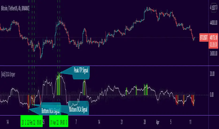
[k4d] DCA SniperFrench text below / Texte en Français plus bas
TL;DR
DCA Sniper is an indicator that tells you the perfect time to do DCA, the bottoms areas are indicated by red bars, the buy signal is given when a yellow bar appears.
"DCA Sniper" aims to help you make DCA (Dollar Cost Average) smarter.
Instead of buying your cryptos at a regular rate, this script will send you an alert at an opportune moment when the prices are touching, or are close to, a bottom.
The script works on several time intervals, the smaller the interval the more signals you will get...
so you can try with several time slots and choose the one that gives you the best signals for your strategy.
How to use this indicator
The indicator scans the price evolution in real time and displays grey bars
When it detects a potential bottom, the bars become darker
When the bottom is near, the bars turn red
Finally, when a potential bottom is detected, a yellow bar is displayed => it's time to buy
Warning:
Since the indicator works in real time, a bar can change color as long as the current candle is not closed. A yellow bar may very well turn red and thus cancel the signal. So wait for the close before making a decision.
Settings
This version of the indicator has only two settings:
Use Candlesticks filter: If this box is checked, the script will try to eliminate false signals based on candlestick patterns.
Use LinReg filter: If this box is checked, the script uses the "LinReg length" value to apply a linear regression and filters out all bottoms that fall within a standard deviation of the linear regression.
Before using DCA Sniper
This indicator was not developed for trading, although it can give good potential entries.
If you use it for trading, please manage your risk well and share your feedback :)
====================================================================
Résumé
DCA Sniper est un indicateur qui vous indique le moment parfait pour faire du DCA, les zones de bottoms sont indiquée par des barres rouges, le signal d'achat est donné lorsqu'une barre jaune apparait.
"DCA Sniper" a pour objectif de vous aider à faire du DCA (Dollar Cost Average) plus intelligement
Au lieu d'acheter vos crypto à un rythme régulier, ce script va vous envoyer une alerte à un moment opportun ou les prix touchent, ou sont proches, d'un bottom.
Le script fonctionne sur plusieurs intervals horaires, plus l'interval est petit plus vous aurez des signaux ...
vous pouvez donc essayer avec plusieurs tranches horaires et choisir celle qui vous donnent les meilleurs signaux pour votre stratégie.
Comment utiliser cet indicateur
L'indicateur scan l'évolution des prix en temps réel et affiche des barres grises
Lorsqu'il détecte une zone de bottom potentiel, les barres deviennent plus foncées
Lorsque le bottom est proche les barres deviennent rouges
Enfin, lorsqu'un bottom potentiel est détecté, une barre jaune s'affiche => c'est le moment d'acheter
Attention
Puisque l'indicateur fonctionne en temps réel, une barre peut changer de couleur tant que la bougie actuelle n'est pas cloturée. Une barre jaune peut très bien devenir rouge et annule donc le signal. Il faut donc attendre la cloture avant de prendre une décision.
Réglages
Cette version de l'indicateur propose seulement deux réglages :
Use Candlesticks filter : Si cette case est cochée, le script va essayer d'éliminer des faux signaux en se basant sur des patterns de bougies.
Use LinReg filter : Si cette case est cochée, le script utilise la valeur "LinReg length" pour appliquer une regression linéaire et filtre tous les bottoms qui se retrouvent au sein d'une déviation standard de la régression linéaire.
Avant d'utiliser DCA Sniper
Cet indicateur n'a pas été développé pour faire du trading, bien qu'il puisse donner de bonnes entrées potentielles.
Si vous l'utilisez pour du trading, gérer bien votre risque et partagez vos retours :)