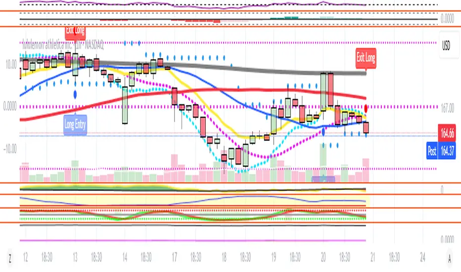
9/15 EMA Scalper 9/15 EMA Scalper — by uzairbaloch
This script is a price-action based scalping system built around the 9 EMA and 15 EMA trend structure.
It identifies short-term reversal points where the market pulls back into the EMAs and confirms direction with a strong candle signal.
The strategy looks for:
• A clear EMA trend (9 above 15 for buys, 9 below 15 for sells)
• Pullback into EMA9/EMA15 with candle bodies touching the fast EMA
• Strong confirmation candle (engulfing / strong momentum / controlled wick)
• Optional slope filter to avoid flat, choppy sessions
• Automatic trade labels showing Entry, SL and TP (based on R:R)
The script is designed for scalping on gold, indices, and high-volatility FX pairs.
It resets trade logic immediately after SL or TP is hit, so it can catch the next valid signal without delay.
This tool is meant as an indicator — not a full strategy — and can be used to visually mark high-probability EMA pullback setups with precise levels.
Author: uzairbaloch
Moving Averages

ST – ATR Guides + Midline [Soothing Trades]Short Description
A clean EMA midline with two ATR-based guides above and below price. Use the midline for trend bias and the ATR rails as a dynamic structure for entries, exits, and stop placement on any market or timeframe.
Full Description
What this indicator is
ST – ATR Guides + Midline is a small, focused engine for trend bias and volatility-aware risk management. It gives you:
• One midline (EMA-based) for objective trend direction.
• Two ATR guides (long and short) that expand and contract with volatility.
Together, the three lines form a simple "rail system" you can build your trading framework on.
Core logic
• An EMA is calculated on a user-selectable price source and used as the midline.
• ATR is computed to measure current volatility.
• Two guides are plotted at a configurable ATR distance above and below the midline:
• The lower line acts as the long guide.
• The upper line acts as the short guide.
• The band between the guides adapts automatically to changing volatility conditions.
Inputs & customization
• Signal Source – Choose which price the EMA midline should be built from.
• Fast EMA – Controls how responsive or smooth the midline is.
• Show Midline – Option to hide the midline if you only want to see the guides.
• Midline style – Color and line width for the midline.
• ATR settings – ATR lookback and multiplier to control the size of the band.
• Guide style – Individual colors and widths for the long and short guides.
All parameters can be tuned directly in the TradingView settings panel.
Practical use cases
• Define trend bias at a glance.
• Build a rule-based stop placement framework around ATR instead of arbitrary distances.
• Use the guides as dynamic trailing rails for winning positions.
• Identify "healthy" pullback regions in a trend.
• Frame your existing entry signals (price action, volume, order flow, etc.) inside a clear volatility structure.
Notes & disclaimer
This is not an automatic signal generator.
It is a structural tool meant to support discretionary analysis and systematic frameworks.
Always test any idea thoroughly (backtests, forward tests, demo trading) before using it live.
Nothing in this script or description is financial advice.
Trading involves risk, and you are solely responsible for your own decisions and performance.

Eagle V 2.0 - AIEagle V 2.0 – AI Edition is a next-generation signal engine designed for traders who want clean entries, consistent performance, and reduced stop-loss hits.
The indicator analyzes trend strength, liquidity behavior, volatility conditions, market structure, and price momentum to generate high-quality buy and sell signals only when the market is aligned.
Instead of flooding the chart with noise, Eagle V 2.0 focuses on precision.
Every signal comes with a calculated stop-loss, three Fibonacci-based take-profit levels, and a confidence score that helps you quickly judge the strength of the setup.
What the Indicator Delivers
Clear Long/Short signals filtered to avoid weak setups
Smart Stop-Loss placement to reduce fake-outs
TP1 / TP2 / TP3 levels automatically calculated based on market movement
AI Confidence Score (0–100) to measure the quality of each opportunity
Real-time Support & Resistance zones that update with market structure
Trend direction and momentum bias across multiple timeframes
Trade history panel showing win rate, total P&L, biggest wins/losses, and your last trades
Dashboard with market conditions, liquidity state, and timeframe bias
Who This Indicator Is For
Scalpers, day traders, and swing traders who want fewer but higher-quality signals, strong risk management, and a tool that adapts to any market—Forex, Crypto, Indices, or Stocks.
Summary
Eagle V 2.0 focuses on the only thing that matters:
Cleaner signals, controlled risk, and stronger results.

Multi-EMA IndicatorIndicator Purpose
The "Multi EMA Indicator" is a clean, customizable script that plots up to four Exponential Moving Averages (EMAs) on the price chart simultaneously. It is designed for traders who want full control over which EMAs are displayed, their periods, colors, and visibility — without cluttering the chart or needing multiple separate EMA indicators.
User-Configurable Options (all adjustable from the indicator’s settings panel):Option
All EMAs are calculated using the close price and are plotted with a linewidth of 2 for clear visibility. Users can instantly show/hide any combination of the four EMAs and change their colors to match any charting style or strategy (e.g., 9/21 crossover, 50/200 golden cross, etc.).

SMA-Indicator (NEW_8h)Using simple SMA but with a small twist of volume and RSI filter.
Results are amazing on 8h for both ETH and BTC and for SOL it's the best on daily TF.
Pretty simple to use...there is label for everything...where to open long and where to close it...same for short positions.
You have the option to switch on and off the labels, bar colors and even plot to keep the chart clean and simple.
Hope this helps and for any query feel free to DM.

4-Line RibbonRibbon for 20, 50, 100, 200 EMA/ SMA.
2 colour areas for bullish or bearish.
3 shade gradient between the different MA's.

Golden Guardian Breakout Suite with Trend Filter🔥 Golden Guardian Breakout Suite with Trend Filter
After years of inconsistent results, emotional entries, and overthinking trades, I built the Golden Guardian Breakout Suite to bring structure and confidence back into the way I trade.
This system was created to remove hesitation, eliminate noise, and help traders execute based on clear confirmation - not fear or impulse. Designed specifically for Gold (XAUUSD), Indices, and Forex markets.
My goal is simple: help you trade with discipline, clarity, and confidence - One clean setup at a time.
⸻
💳 Purchase Access
Access is invite-only.
👉 Purchase here:
Paypal Link
Monthly 🔗 paypal.me
Quarterly 🔗 paypal.me
Annually 🔗 paypal.me
💵 Cash App (USD)
Tag: $KFraser87
💳 Pricing
Choose the access level that fits your trading style:
⸻
🟦 Monthly Access
Golden Guardian Access
💰 $39.99 / month
✔️ Full indicator access
✔️ Updates included
✔️ Cancel anytime
⸻
🟩 Quarterly Access
Golden Guardian Pro Access
💰 $109 / quarter
✔️ Everything in Monthly
+
✔️ Priority support
✔️ Better pricing than monthly
⸻
🟪 Annual Access
Golden Guardian Elite Access
💰 $399 / year
✔️ Full access for 12 months
✔️ Updates included
✔️ Best long-term value
✔️ Price locked even if future pricing increases
⸻
🔧 Payment Methods Accepted
✔️ Cash App
✔️ PayPal
✔️ Stripe or Gumroad (coming soon)
⸻
📩 After Payment
Send a message via Telegram to:
👉 @GoldenGuardianSuite
Include:
• Your TradingView username
• Screenshot of payment
Access will be activated within 0–24 hours.
⸻
🔐 📜 Terms of Use
• License valid for one TradingView username
• Source code is protected
• Resale, redistribution, copying, or sharing access is prohibited
• No refunds after access approval
⸻
⭐️ Updates Included
All future upgrades and improvements are included during your active subscription.
🚀 Key Features
✔️ Breakout entry signals
✔️ Trend Filter Toggle — ON/OFF option
- ON: Only shows signals that align with the trend
- OFF: Shows all breakout signals for aggressive scalping
✔️ Dynamic stop loss modes: ATR or Structure-based
✔️ TP1 / TP2 mapped automatically
✔️ Visual SL and TP labeling
✔️ Clean arrows and road visuals
✔️ Optimized for mobile and desktop charting
✔️ Alerts available for all trade conditions
⸻
🎯 Designed For
• Scalpers
• Intraday traders
• Traders who need structure and confidence
• Those who want rule-based entries and less emotional decision-making
Whether you prefer aggressive entries or filtered confirmation-based entries, the toggle gives you full control.
⸻
📈 Best Markets & Timeframes
Asset Supported
XAUUSD (Gold) ⭐ Highly optimized
NAS100 / US30 / Indices ✅
Forex pairs ✅
Crypto👍 Works well
Recommended timeframes: 1m, 5m, 15m, 1H, 4H
Recommended sessions: New York, London
Personal Timeframe used: 5 min Timeframe and TP 1 Only
🔔 Alerts Included
• Buy signal
• Sell signal
• Trend shift
• Breakout confirmation (Filtered & Unfiltered)
Alerts can be sent to mobile, desktop, email, or webhook for automation.
⚠️ Risk Disclaimer
Trading foreign exchange (forex), commodities, indices, and CFDs involves significant risk and may not be suitable for all investors.
Leverage can amplify both profits and losses.
You should carefully consider your financial goals, experience level, and risk tolerance before trading.
Past performance or indicator results do not guarantee future success.
Always trade responsibly and use proper risk management.
⸻
💛 Final Thoughts
🚀 Golden Guardian Breakout Suite because when the Golden Path, the trend, and your focus align - consistency and profit follow!

Scalper Pro Pattern Recognition & Price Action📘 Scalper Pro Pattern Recognition & Price Action
Overview
Scalper Pro is a dynamic multi-layer trend recognition and price action strategy that integrates Supertrend, Smart Money Concepts (SMC), and volatility-based risk control.
It adapts to market volatility in real time to enhance entry precision and optimize risk.
⚠️ This script is for educational and research purposes only.
Past performance does not guarantee future results.
🎯 Strategy Objectives
Detect structural market shifts (BOS / CHoCH) automatically.
Identify Order Blocks (OB), Fair Value Gaps (FVG), and key liquidity zones.
Plot dynamic Take-Profit (TP) and Stop-Loss (SL) levels based on ATR.
Avoid low-volatility (sideways) conditions using ADX filtering.
Combine trend-following signals with structural confirmation.
✨ Key Features
Supertrend Entry Signals — Generates precise buy/sell markers based on price crossovers with the Supertrend line.
Order Block Detection — Automatically plots both Internal and Swing Order Blocks for smart money insights.
Fair Value Gap Visualization — Highlights inefficiency zones in bullish or bearish structures.
Market Structure Labels — Marks Break of Structure (BOS) and Change of Character (CHoCH) points for clear trend shifts.
Dynamic Risk Levels — Automatically generates TP/SL lines and price labels using ATR-based distance.
📊 Trading Rules
Long Entry:
• Price crosses above the Supertrend (ta.crossover(close, supertrend))
• ADX above sideways threshold (trend condition confirmed)
• Optional confirmation from a bullish BOS or CHoCH
Short Entry:
• Price crosses below the Supertrend (ta.crossunder(close, supertrend))
• ADX above threshold
• Optional confirmation from a bearish BOS or CHoCH
Exit (or Reverse):
• Opposite Supertrend crossover
• Price hits TP/SL lines
• Trend shift confirmed by internal BOS/CHoCH
💰 Risk Management Parameters
Stop Loss & Take Profit based on ATR × risk multiplier
ATR Length: 14 (default)
Risk %: 3% per trade
Sideways Filter: ADX < 15 → no trade zone
TP1–TP3 = Entry ± (ATR × 1~3)
⚙️ Indicator Settings
Supertrend Module:
ATR Length: 10
Factor: nsensitivity × 7
ADX Module:
ADX Length: 15
Sideways Threshold: 15
EMA Set:
EMA (5, 9, 13, 34, 50) × Volatility Factor (3)
SMA Filter:
SMA(8) & SMA(9) for short-term trend confirmation
Smart Money Concepts Module:
Displays BOS/CHoCH, Order Blocks, FVGs, Equal Highs/Lows, and Premium/Discount zones
🔧 Improvements & Uniqueness
Integrates Supertrend momentum with Smart Money Concepts (SMC) structural analysis.
Dual detection layers: Internal (micro) and Swing (macro) structures.
ATR-driven auto labeling for entry, stop, and profit targets.
Premium/Discount and Equilibrium zones visualized on the chart.
Built-in ADX filter to skip low-trend market conditions.
✅ Summary
Scalper Pro Pattern Recognition & Price Action merges classical trend-following with modern market structure analytics.
It combines momentum detection, volatility control, and smart money mapping into one cohesive framework.
Unified trend, structure, and risk visualization.
Auto-marked BOS/CHoCH, OB, FVG, and liquidity zones.
Usable for scalping, intraday, or swing trading setups.
⚠️ This strategy is based on historical data and designed for educational use only.
Always apply sound risk management and forward testing before live trading.

RSI VWAP EMA ON CHART1. Understand the components
VWAP (Volume Weighted Average Price)
Green: price is above VWAP → bullish trend
Red: price is below VWAP → bearish trend
Blue: price exactly at VWAP → neutral
Acts as a dynamic trend line and support/resistance.
4 Moving Averages (MA1–MA4)
Customizable lengths and type (SMA or EMA).
Useful for trend confirmation and dynamic support/resistance.
Typically:
MA1 = fastest (short-term)
MA4 = slowest (long-term)
When price is above multiple MAs → strong bullish trend; below → bearish trend.
RSI Overlay with VWAP Alignment
RSI line normalized to price scale.
Background shading indicates momentum aligned with VWAP trend:
Green shading: RSI > 50 and price above VWAP → bullish momentum
Red shading: RSI < 50 and price below VWAP → bearish momentum
Gray areas: neutral or momentum does not align with VWAP.
2. Basic usage workflow
Trend Confirmation
Look at VWAP color: price above → bullish, below → bearish.
Check RSI + VWAP shading: green confirms bullish momentum, red confirms bearish momentum.
Check MA alignment: shorter MAs above longer MAs = stronger bullish trend; vice versa for bearish.
Entry Signals (Scalping)
Long (Buy) Setup
Price above VWAP (green)
RSI green shading (RSI > 50)
Shorter MAs above longer MAs (trend support)
Short (Sell) Setup
Price below VWAP (red)
RSI red shading (RSI < 50)
Shorter MAs below longer MAs
Exits / Stops
Exit if price closes against VWAP trend (e.g., price drops below VWAP during a bullish trade).
Use nearest MA support/resistance as stop-loss or take-profit zones.
3. Optional adjustments for scalping
RSI length / thresholds
Shorter RSI (7–10) → faster response for scalping.
Standard RSI (14) → smoother, fewer false signals.
MA lengths
Short-term: 20–50
Medium-term: 50–100
Long-term: 100–200
Can tweak for the timeframe you trade (1m, 5m, 15m).
Timeframe
VWAP works best on intraday charts (1m, 5m, 15m).
Use higher timeframe (e.g., 15m or 1h) for trend direction and lower timeframe (1m–5m) for entries.
4. Example Scalping Setup
Bullish setup (buy):
Price above VWAP → VWAP green
RSI > 50 and green shading
Shorter MAs above longer MAs
Enter on small pullback or breakout
Stop: below nearest MA or VWAP
Bearish setup (sell):
Price below VWAP → VWAP red
RSI < 50 and red shading
Shorter MAs below longer MAs
Enter on minor bounce or breakdown
Stop: above nearest MA or VWAP
5. Visual cues summary
Element Interpretation
VWAP Green Price above VWAP → bullish trend
VWAP Red Price below VWAP → bearish trend
RSI Green Shading Bullish momentum aligns with VWAP
RSI Red Shading Bearish momentum aligns with VWAP
MA Alignment Trend strength (short above long = bullish, short below long = bearish)

VWAP + 4 MAs with RSI Overlay & VWAP Alignment1. Understand the components
VWAP (Volume Weighted Average Price)
Green: price is above VWAP → bullish trend
Red: price is below VWAP → bearish trend
Blue: price exactly at VWAP → neutral
Acts as a dynamic trend line and support/resistance.
4 Moving Averages (MA1–MA4)
Customizable lengths and type (SMA or EMA).
Useful for trend confirmation and dynamic support/resistance.
Typically:
MA1 = fastest (short-term)
MA4 = slowest (long-term)
When price is above multiple MAs → strong bullish trend; below → bearish trend.
RSI Overlay with VWAP Alignment
RSI line normalized to price scale.
Background shading indicates momentum aligned with VWAP trend:
Green shading: RSI > 50 and price above VWAP → bullish momentum
Red shading: RSI < 50 and price below VWAP → bearish momentum
Gray areas: neutral or momentum does not align with VWAP.
2. Basic usage workflow
Trend Confirmation
Look at VWAP color: price above → bullish, below → bearish.
Check RSI + VWAP shading: green confirms bullish momentum, red confirms bearish momentum.
Check MA alignment: shorter MAs above longer MAs = stronger bullish trend; vice versa for bearish.
Entry Signals (Scalping)
Long (Buy) Setup
Price above VWAP (green)
RSI green shading (RSI > 50)
Shorter MAs above longer MAs (trend support)
Short (Sell) Setup
Price below VWAP (red)
RSI red shading (RSI < 50)
Shorter MAs below longer MAs
Exits / Stops
Exit if price closes against VWAP trend (e.g., price drops below VWAP during a bullish trade).
Use nearest MA support/resistance as stop-loss or take-profit zones.
3. Optional adjustments for scalping
RSI length / thresholds
Shorter RSI (7–10) → faster response for scalping.
Standard RSI (14) → smoother, fewer false signals.
MA lengths
Short-term: 20–50
Medium-term: 50–100
Long-term: 100–200
Can tweak for the timeframe you trade (1m, 5m, 15m).
Timeframe
VWAP works best on intraday charts (1m, 5m, 15m).
Use higher timeframe (e.g., 15m or 1h) for trend direction and lower timeframe (1m–5m) for entries.
4. Example Scalping Setup
Bullish setup (buy):
Price above VWAP → VWAP green
RSI > 50 and green shading
Shorter MAs above longer MAs
Enter on small pullback or breakout
Stop: below nearest MA or VWAP
Bearish setup (sell):
Price below VWAP → VWAP red
RSI < 50 and red shading
Shorter MAs below longer MAs
Enter on minor bounce or breakdown
Stop: above nearest MA or VWAP
5. Visual cues summary
Element Interpretation
VWAP Green Price above VWAP → bullish trend
VWAP Red Price below VWAP → bearish trend
RSI Green Shading Bullish momentum aligns with VWAP
RSI Red Shading Bearish momentum aligns with VWAP
MA Alignment Trend strength (short above long = bullish, short below long = bearish)

MA10, MA20, MA50, MA100, MA200This indicator plots 5 Simple Moving Averages (SMA) on the chart: MA10, MA20, MA50, MA100, and MA200.
It helps visualize short-term and long-term trends, support and resistance levels, and potential crossover signals.
Perfect for trend analysis, trade confirmation, and spotting market direction across multiple timeframes.

BB Breakout + EMA Touch (50/100)Shows points only when BOTH happen on the same candle:
1️⃣ Price breaks through Bollinger Bands
2️⃣ Price touches (or crosses) EMA 50 or EMA 100

Enhanced ML-FRAMA with HTFCore Concept
FRAMA (Fractal Adaptive Moving Average) is an adaptive moving average that automatically adjusts its sensitivity based on market volatility using fractal geometry. This indicator enhances it with Machine Learning predictions and multi-timeframe analysis.
Key Components:
1. ML-Enhanced FRAMA
ML Enhancement: Uses machine learning to adjust FRAMA's sensitivity
Dynamic Adaptation: ML predictions modify the smoothing constant based on market conditions
2. Machine Learning System
Three ML Models Combined:
K-Nearest Neighbors (KNN): Finds similar historical patterns
Trend Model: Uses EMA crossovers for trend detection
Momentum Model: Combines RSI, ROC, and volume for momentum
Features Used:
RSI, MACD, ATR, Rate of Change
Volume ratio and momentum
VWAP deviation
Higher timeframe RSI
Daily EMA trend
3. Higher Timeframe Integration
HTF1: 1-hour timeframe
HTF2: 4-hour timeframe
Confluence Trading: Requires agreement across multiple timeframes
4. Visual Features
Support/Resistance Circles: Dynamic levels based on ATR volatility
Color Coding:
Green: Bullish signals
Red: Bearish signals
Purple/Orange: HTF indicators
Trend Detection: Colors change based on direction
Requirements for Bullish Signal:
Price crosses above ML-FRAMA
ML prediction > 60% bullish
High confidence (>30%)
Volume 20% above average
Both HTF timeframes bullish
Performance Tracking:
Adaptive Weights: Automatically adjusts model weights based on recent accuracy
Dynamic K: Adjusts KNN neighbors based on market volatility
Outlier Detection: Filters unusual bars from training data
Trading Philosophy:
Multi-Timeframe Confirmation
Avoids false signals by requiring HTF agreement
Reduces noise by focusing on higher probability setups
Volume Confirmation
Requires above-average volume for valid signals
Volume momentum adds conviction
Machine Learning Edge
Learns from historical patterns
Adapts to changing market conditions
Combines multiple analysis techniques
Use Cases:
Trend Following: ML-FRAMA as dynamic support/resistance
Breakout Trading: Price crosses with volume and HTF confirmation
Mean Reversion: Support/resistance circles as reversal zones
Swing Trading: HTF confluence for higher probability setups
Strengths:
Adaptive: Adjusts to market volatility
Multi-timeframe: Reduces false signals
Volume-confirmed: Adds conviction
ML-enhanced: Learns from market behavior
Visual: Clear support/resistance levels
Ideal For:
Swing traders looking for high-probability entries
Trend followers wanting adaptive moving averages
Technical analysts who value multi-timeframe confirmation
Traders who want machine learning without complexity
The indicator essentially creates a "smart" adaptive moving average that learns from the market and only provides signals when multiple timeframes and technical factors align.

KC-BB Squeeze Trend Trader█ OVERVIEW
The KC-BB Squeeze Trend Trader identifies volatility compression and expansion by detecting when Bollinger Bands contract inside Keltner Channels and then release with confirmed momentum. It highlights potential trend-starting breakouts by combining squeeze detection, directional momentum, trend bias, and optional volume filters.
During periods of low volatility, price consolidates and energy builds. When volatility expands again, strong directional moves often follow. This tool helps traders spot those opportunities early with clear visual cues and optional performance tracking.
█ KEY FEATURES
Squeeze detection using Bollinger Bands inside Keltner Channels
Automatic identification of volatility expansion after the squeeze ends
Optional filters for momentum, trend direction, volume, and signal cooldown
Dynamic color fills for squeeze, bullish expansion, bearish expansion, and neutral states
Dashboard showing squeeze duration, tightness, momentum, trend, and volume context
Optional win-rate analytics using ATR-based target and stop evaluation
Multi-timeframe confirmation for higher-quality breakouts
█ HOW IT WORKS
A squeeze occurs when both Bollinger Bands sit inside the Keltner Channels.
A breakout begins when the Bollinger Bands expand outside the KCs.
Long signals appear when squeeze release aligns with bullish momentum and trend strength.
Short signals appear when bearish momentum and trend conditions agree.
Volume and cooldown filters help reduce noise and avoid low-quality entries.
█ HOW TO USE
Wait for a squeeze period (yellow fill).
Monitor duration and tightness: longer/tighter squeezes often lead to stronger moves.
When a long or short signal appears, use the plotted ATR-based target and stop as reference levels.
Watch for contraction or exit hints when momentum fades or volatility narrows again.
Higher timeframes generally provide cleaner and more reliable signals.
█ TIMEFRAME GUIDANCE
Crypto: 4H or 1D; consider increasing KC multiplier for high volatility.
Forex: 1H–4H; longer squeeze duration can improve selectivity.
Stocks: 1D–1W; consider slightly higher BB multiplier on slow-moving markets.
█ SETTINGS SUMMARY
Adjustable Bollinger Band and Keltner Channel lengths and multipliers
Three momentum modes: Linear Regression, Price–SMA, or ROC
Trend and volume filters (optional)
Configurable minimum squeeze duration and signal cooldown
ATR-based target and stop multipliers
Optional historically tight squeeze filter (percentile-based)
█ ALERTS
Squeeze Detected
Squeeze Released
Long Entry
Short Entry
Exit Hint
Historically Tight Squeeze
█ NOTES
ATR-based win-rate calculations provide simplified performance estimates.
Past behavior does not guarantee future movement.
Use position sizing and risk management appropriate for the instrument and timeframe.
█ CREDITS
Inspired by the Bollinger Band and Keltner Channel squeeze concept popularized by John Carter’s TTM Squeeze, with added enhancements for squeeze strength, filtering, and real-time performance metrics.

The Bear & Bull TieWhat it does:
Bear & Bull Tie is a moving average crossover indicator that identifies trend reversals and generates entry/exit signals based on the relationship between price and three simple moving averages (SMA 21, SMA 55, SMA 89). The indicator combines these three MAs into an Average Moving Average (AMA) to confirm directional bias, then uses ATR (Average True Range) volatility measurement for dynamic position sizing and stop-loss placement.
How it works:
The indicator operates on a simple but effective principle: it enters a bullish trend when price closes above all three moving averages simultaneously, and enters a bearish trend when price closes below all three MAs simultaneously. This "three MA alignment" approach filters out noise and confirms genuine trend changes. The indicator then plots:
Entry levels at the highest MA during uptrends or lowest MA during downtrends
Stop-loss zones calculated using 2x ATR distance from entry prices
Trend confirmation fill between price and the Average Moving Average, color-coded blue for bullish and red for bearish
The ATR-based stop-loss sizing adapts to market volatility, making it suitable for different market conditions and timeframes.
How to use it:
Monitor the filled zones to visually confirm your trend bias
Watch for alerts when new long or short setups form; entry prices and ATR-based stops are displayed on the chart
Trade the zones between your entry level and stop-loss zone, adjusting position size based on your risk tolerance
Exit when colors reverse to indicate trend termination
The indicator works best on higher timeframes (1H and above) where trend clarity is stronger and false signals are reduced.
Alerts: FOR AUTOMATION / NOTIFICATION's (create an alert for B/B tie (2, 4) that uses Any Alert / Function Call )
Long Positions:
entries ---> "Bull Tie on NVDA | Entry : 100.5 | ATR Stop : 99.5"
exits ------> "Bull Tie on NVDA | Exit : 110.1"
Short Positions:
entries ---> "Bear Tie on NVDA | Entry : 120.05 | ATR Stop : 85.05"
exits -----> "Bear Tie on NVDA | Exit : 100"
Credits:
This script incorporates concepts and code portions from @LOKEN94 with his explicit permission. Special thanks for the foundational logic that inspired this development.
Disclaimer:
This indicator is for educational and analytical purposes. It is not financial advice. Past performance does not guarantee future results. Always manage risk properly and use stops. Test thoroughly on historical data before live trading.

Trade4Freedom## 🔷 Trade4Freedom – Market Logic Framework
**Not a group of indicators. One continuous system of reading market behaviour.**
The script is designed to follow the same decision flow I use in trading.
Every tool here supports the others — there are no standalone modules.
The market is analysed layer by layer, but always as one sequence:
---
### 🔄 **How the logic works (continuous process)**
1. **Structure first** – BOS/ChoCH levels show where the market changed behaviour.
The projected dotted line is not a signal — it is a place where I wait and observe.
I do not enter until price interacts with structure.
2. **Liquidity next** – if the structure level aligns with a liquidity bag (retest),
the zone becomes important. Active liquidity lines are potential targets or
reasons to avoid trading against the area.
3. **Context filter** – I use CCI only when structure + liquidity are already active.
Example of long bias:
−200 level is broken → candle closes above the MA → CCI rises from the channel.
From this point I begin to trail stops and start building position if structure supports it.
4. **Confirmation & positioning**
Stochastic heatmap is not for entries – it confirms pressure.
Divergences on CCI or price are additional evidence when forming or adjusting a position.
5. **Execution zones** – only after structure → liquidity → context,
I use deviation levels (1–5) to define where to place orders.
On higher timeframes they work for accumulation models,
on intraday levels they work for tactical entry zones.
Dev1/Dev2 boxes exist only to make limit-order planning faster.
---
### 📌 **Purpose of the script**
This tool does not predict price or generate signals.
It creates the same structured environment on any chart:
**Structure → Liquidity → Context → Deviation → Decision**
This helps avoid random trading and replaces guessing with logic and observation.


Eagle (NEW) This is one of my oldest indicator but the newer version is more refined.
Works best on 4h TF.
I mostly trade BTC and ETH and sometimes SOL as well, so I have included best settings for all of them. If you want to use it for some other coins, I have no idea if it'll work for them or not, so if you want my recommendation, just stick to these three.
For reference...settings are
BTC - 195 | 195
ETH - 91 | 175
SOL - 150 | 194
Please use this indicator on 4h and under these settings for best results. If you have any query just send me a DM.

NeuraEdge Pro v1- Auto-OptimizedNeuraEdge Pro is an advanced, self-optimizing trading system that combines Smart Money Concepts (SMC), ICT principles, and adaptive neural networks to identify high-probability trade setups. The indicator automatically learns from its signal history and optimizes parameters in real-time to maintain your target win rate.
Key Features:
✅ Auto-optimization based on historical performance
✅ Neural adaptive system that learns market conditions
✅ ICT session filtering (London, New York, Asian)
✅ Smart Money Concepts integration
✅ Multi-timeframe support (Scalping to Swing trading)
✅ Built-in risk management system
📊 How It Works
NeuraEdge Pro identifies institutional order blocks, fair value gaps, and liquidity zones using advanced price action analysis. The system then filters these setups through multiple confluence factors including:
Market structure alignment
Volume confirmation
Neural network prediction
Session timing (ICT concepts)
Momentum indicators
RSI divergences
The higher you set the confluence number to (max 5) the more accurate but less signal quantity preferred on higher time frame from 1 HR and above.
The unique auto-optimization engine tracks signal performance and automatically adjusts internal parameters to improve accuracy over time.
⚙️ Recommended Settings by Trading Style
🔥 Scalping (1m - 5m charts)
Trading Mode:
✅ Scalp Mode
❌ Intraday Mode
❌ Swing Mode
✅ ICT Concepts
✅ Neural Adaptive
Risk Management:
Risk % per Trade: 0.5-1.0%
Risk:Reward Ratio: 2:1
ATR-Based Stop Loss: ON
ATR Multiplier: 1.3
Min SL Points: 15-20
Advanced Settings:
Analysis Lookback: 40
Order Block Strength: 4-5
Base FVG Size: 0.8-1.0
Base Volume Threshold: 1.8
Base Confluence Score: 4
📈 Intraday (15m - 1h charts)
Trading Mode:
❌ Scalp Mode
✅ Intraday Mode
❌ Swing Mode
✅ ICT Concepts
✅ Neural Adaptive
Risk Management:
Risk % per Trade: 1.0-1.5%
Risk:Reward Ratio: 2.5:1
ATR-Based Stop Loss: ON
ATR Multiplier: 1.5
Min SL Points: 25-30
Advanced Settings:
Analysis Lookback: 50
Order Block Strength: 4
Base FVG Size: 0.9
Base Volume Threshold: 1.6
Base Confluence Score: 4
📊 Swing Trading (4h - Daily charts)
Trading Mode:
❌ Scalp Mode
❌ Intraday Mode
✅ Swing Mode
✅ ICT Concepts
✅ Neural Adaptive
Risk Management:
Risk % per Trade: 1.5-2.0%
Risk:Reward Ratio: 3:1
ATR-Based Stop Loss: ON
ATR Multiplier: 1.8
Min SL Points: 40-50
Advanced Settings:
Analysis Lookback: 75
Order Block Strength: 3-4
Base FVG Size: 1.0-1.2
Base Volume Threshold: 1.5
Base Confluence Score: 3-4
🤖 Auto-Optimization Settings
Recommended for all timeframes:
Enable Auto-Optimization: ON
Optimization Lookback: 100 trades
Target Win Rate: 60%
💡 The system needs at least 10-15 signals to begin optimization. Initial signals use base settings, then the system adapts automatically.
🔮 Predictive Analysis
Keep these balanced for optimal results:
Enable Predictive Mode: ON
Price Action Weight: 0.4
Volume Weight: 0.3
Momentum Weight: 0.3
These weights determine how much each factor influences setup scoring.
📱 Signal Interpretation
BUY Signals (Green Labels)
Price has reached a bullish order block or FVG
Multiple confluence factors aligned
Neural network confirms bullish bias
Entry price shown on label
Green dashed line = Take Profit target
Red dashed line = Stop Loss
SELL Signals (Red Labels)
Price has reached a bearish order block or FVG
Multiple confluence factors aligned
Neural network confirms bearish bias
Entry price shown on label
Green dashed line = Take Profit target
Red dashed line = Stop Loss
📊 Dashboard Explained
Top Section:
Mode - Active trading mode and timeframe
Trend - Current market structure (Bullish/Bearish/Range)
Vol - Volume ratio (higher = stronger moves)
ATR - Current volatility measurement
Auto-Optimize Section:
Win Rate - Historical performance (updates after signals)
FVG/Vol/Conf - Current optimized parameters with arrows:
↑ = System increased selectivity (fewer signals)
↓ = System decreased selectivity (more signals)
= = No change from base settings
Ready OBs - Number of high-probability setups currently available
⚠️ Important Trading Rules
Wait for signal labels - Don't trade order blocks/FVGs without confirmation
Respect the stop loss - Always displayed as red dashed line
Use proper position sizing - Based on your Risk % setting
Trade during recommended sessions - When ICT Concepts enabled
Let auto-optimization work - Give it 15-20 signals before judging
One signal at a time - System prevents new signals for 5 bars after entry
🎯 Best Practices
✅ DO:
Use on liquid, trending markets (Forex majors, indices, crypto majors)
Enable only ONE trading mode matching your timeframe
Keep ICT Concepts enabled for session filtering
Trust the auto-optimization after 15+ signals
Set alerts for BUY/SELL signals
❌ DON'T:
Enable multiple trading modes simultaneously
Override stop losses manually
Trade during low liquidity hours without ICT filtering
Expect perfection - manage risk appropriately
Judge performance before 20+ signals
🔔 Alert Setup
The indicator includes 4 alert types:
Buy Signal - Long entry opportunity
Sell Signal - Short entry opportunity
Sell-Side Sweep - Liquidity grabbed above
Buy-Side Sweep - Liquidity grabbed below
Set up alerts via TradingView's alert menu for real-time notifications.
📈 Performance Tracking
The dashboard shows real-time performance metrics:
Win Rate % - Percentage of profitable signals
Parameter adjustments - How the system is adapting
Neural Score - AI confidence (0-1 scale)
ICT Session Status - Whether optimal trading hours are active
💡 Pro Tips
Start conservative - Use recommended settings for your timeframe
Give it time - Auto-optimization needs 20-30 signals for best results
Higher timeframes = higher quality - Fewer but better signals
Volume matters - Strongest signals occur on volume spikes
Structure alignment - Best trades align with overall trend
⚙️ Technical Requirements
Minimum Timeframe: 1 minute
Maximum Timeframe: Monthly
Best Timeframes: 5m, 15m, 1h, 4h
Asset Classes: Forex, Crypto, Indices, Stocks
Account Type: Any (works with all TradingView plans)
📞 Support & Updates
This indicator is actively maintained and updated based on user feedback. Future updates will include additional features and optimizations.
Disclaimer: Trading involves substantial risk. This indicator is a tool to assist analysis, not a guarantee of profits. Always use proper risk management and never risk more than you can afford to lose. Past performance does not guarantee future results.

Semi-Martingala Sicura 1.20x PROIncrements or a maximum amount of 200. If the previous trade is profitable, the count is reset and the initial amount is resumed. Exit management uses fixed percentage stop loss and take profit, set relative to the entry price. In summary, this strategy aims to capitalize on trend and momentum signals, using a semi-martingale system to increase positions in case of losses, but with precise limits to contain risk. Note: This method aims to be "safer" than a classic martingale, respecting increment limits and a maximum amount.
Comment by saying what you think and what I could change.

Hyper MACDThe Hyper MACD is a customizable momentum indicator exclusively designed for Scalping that blends traditional MACD logic with dynamic signal coloring, overbought/oversold detection, and WaveTrend overlays. It supports multiple moving average types and highlights key momentum shifts with visual markers and alerts.
The settings/alerts are self explanatory and are optimized for quick scalping, works for any timeframe.
Suggested rules are.
The MACD line and Signal line must be above the zero line to scalp
The price begins do decay when the Signal turns from white to orange, however if both the lines are above zero line, then its still game to scalp but cautiously.
The colors are telling on both the lines, blue indicates a bullish surge on both and green on macd and white on signal suggests the bullish trend continuation
It also prints take profit arrows along the way, and also possible trend reversals.
