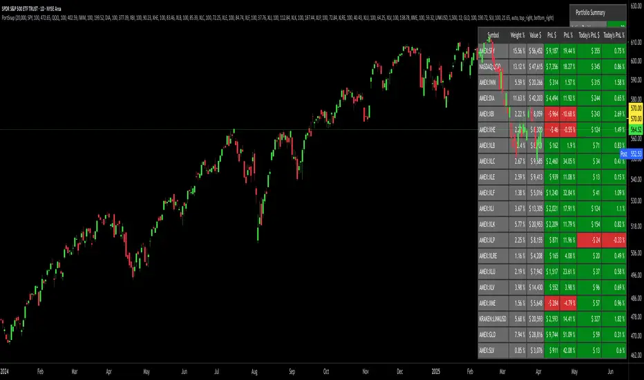
Portfolio SnapShot v0.3Here is a Tradingview Pinescript that I call "Portfolio Snapshot". It is based on two other separate scripts that I combined, modified and simplified - shoutout to RedKTrader (Portfolio Tracker - Table Version) and FriendOfTheTrend (Portfolio Tracker For Stocks & Crypto) for their inspiration and code. I was using both of these scripts, and decided to combine the two and increase the number of stocks to 20. I was looking for an easy way to track my entire portfolio (scattered across 5 accounts) PnL on a total and stock basis. PnL - that's it, very simple by design. The features are:
1) Track PnL across multiple accounts, from inception and current day.
2) PnL is reported in two tables, at the portfolio level and individual stock level
3) Both tables can be turned on/off and placed anywhere on the chart.
4) Input up to 20 assets (stocks, crypto, ETFs)
The user has to manually calculate total shares and average basis for stocks in multiple accounts, and then inputs this in the user input dialog. I update mine as each trade is made, or you can just update once a week or so.
I've pre-loaded it with the major indices and sector ETFs, plus URA, GLD, SLV. 100 shares of each, and prices are based on the close Jan 2 2024. So if you don't want to track your portfolio, you can use it to track other things you find interesting, such as annual performance of each sector.
Portfolio
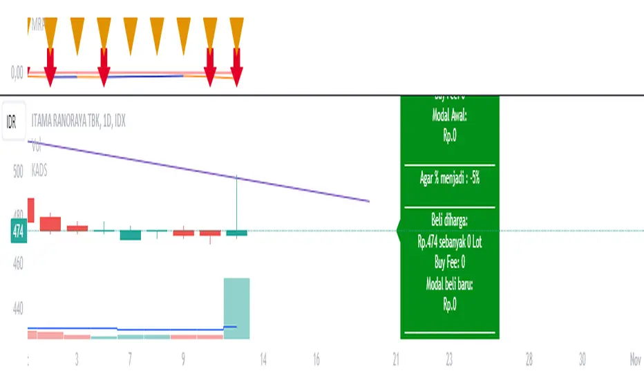
Average Down CalculatorAverage Down Calculator is an indicator for investors looking to manage their portfolio. It aids in calculating the average share price, providing insights into optimizing investment strategies. Averaging down is a strategy investors use when the price of a security they own goes down. Instead of selling at a loss, they buy more shares at the lower price to reduce the average cost per share.
There are situations where a stock's price moves contrary to your expectations. The market moves downward. Despite this, your faith in the stock persists. This indicator allowing you to strategically add more stocks to lower the average price. But You must remember, it’s not without risks, as it involves investing more money in a losing position.
This Indicator allowing you to quickly understand your new position and make informed decisions. It’s designed for easy use, regardless of your experience level with investing.
Steps to use it:
1.put buy fee from your securitas
2.next put the price of the emiten from your portofolio
3.and how many lot you have
4.next is the the taget of percentage you want it become.
5 the last you can choose, the price that you want to buy for average.
this calculator is designed to help you navigate your investment better, choose it wisely.Be aware of the risks of investing more in a declining asset and consider diversification to manage potential losses.
Portfolio Index Generator [By MUQWISHI]▋ INTRODUCTION:
The “Portfolio Index Generator” simplifies the process of building a custom portfolio management index, allowing investors to input a list of preferred holdings from global securities and customize the initial investment weight of each security. Furthermore, it includes an option for rebalancing by adjusting the weights of assets to maintain a desired level of asset allocation. The tool serves as a comprehensive approach for tracking portfolio performance, conducting research, and analyzing specific aspects of portfolio investment. The output includes an index value, a table of holdings, and chart plotting, providing a deeper understanding of the portfolio's historical movement.
_______________________
▋ OVERVIEW:
The image can be taken as an example of building a custom portfolio index. I created this index and named it “My Portfolio Performance”, which comprises several global companies and crypto assets.
_______________________
▋ OUTPUTS:
The output can be divided into 4 sections:
1. Portfolio Index Title (Name & Value).
2. Portfolio Specifications.
3. Portfolio Holdings.
4. Portfolio Index Chart.
1. Portfolio Index Title, displays the index name at the top, and at the bottom, it shows the index value, along with the chart timeframe, e.g., daily change in points and percentage.
2. Portfolio Specifications, displays the essential information on portfolio performance, including the investment date range, initial capital, returns, assets, and equity.
3. Portfolio Holdings, a list of the holding securities inside a table that contains the ticker, average entry price, last price, return percentage of the portfolio's initial capital, and customized weighted percentage of the portfolio. Additionally, a tooltip appears when the user passes the cursor over a ticker's cell, showing brief information about the company, such as the company's name, exchange market, country, sector, and industry.
4. Index Chart, display a plot of the historical movement of the index in the form of a bar, candle, or line chart.
_______________________
▋ INDICATOR SETTINGS:
Section(1): Style Settings
(1) Naming the index.
(2) Table location on the chart and cell size.
(3) Sorting Holdings Table. By securities’ {Return(%) Portfolio, Weight(%) Portfolio, or Ticker Alphabetical} order.
(4) Choose the type of index: {Equity or Return (%)}, and the plot type for the index: {Candle, Bar, or Line}.
(5) Positive/Negative colors.
(6) Table Colors (Title, Cell, and Text).
(7) To show/hide any indicator’s components.
Section(2): Performance Settings
(1) Calculation window period: from DateTime to DateTime.
(2) Initial Capital and specifying currency.
(3) Option to enable portfolio rebalancing in {Monthly, Quarterly, or Yearly} intervals.
Section(3): Portfolio Holdings
(1) Enable and count security in the investment portfolio.
(2) Initial weight of security. For example, if the initial capital is $100,000 and the weight of XYZ stock is 4%, the initial value of the shares would be $4,000.
(3) Select and add up to 30 symbols that interested in.
Please let me know if you have any questions.

Oster's Investment Plan (OIP)Oster's Investment Plan (OIP) is a versatile and powerful tool designed to help traders and investors create and evaluate their long-term investment strategies . Unlike many conventional investment tools, OIP emphasizes customization, allowing users to design personalized savings plans and compare the performance of their portfolios against chosen benchmarks. Whether you're setting up a new investment plan or analyzing an existing one, OIP provides comprehensive insights into your portfolio's growth and performance.
Tailored Investment Planning:
OIP enables users to create customized savings plans with up to five assets from any available on TradingView. This feature offers unparalleled flexibility in asset selection, allowing investors to diversify their portfolios across various markets and asset classes. With OIP , users can freely determine the weighting of each asset, ensuring the portfolio aligns with their individual investment strategies and risk preferences .
Comprehensive Fee and Cost Analysis:
One of OIPs standout features is its ability to factor in nearly all cost components associated with investing. This includes annual deposit fees, fees on savings rates, tax deductions on dividend payouts, potential savings rate dynamics, and the Total Expense Ratio (TER) of funds. By considering these costs, OIP provides a realistic and accurate projection of your portfolio's growth, helping you identify the most cost-effective broker or investment platform .
Benchmark Comparison:
OIP allows users to select any benchmark to compare their portfolio's performance. This feature enables investors to gauge their portfolio's returns against broader market indices or specific sector benchmarks, providing valuable insights into the effectiveness of their investment strategy. The ability to choose and change benchmarks ensures that OIP remains relevant and adaptable to different investment goals and market conditions.
Reinvestment of Dividends:
For investors who prefer to reinvest their dividends, OIP can incorporate annual dividend reinvestments into the portfolio's growth curve . This feature accounts for the compounding effect of reinvested dividends, offering a more accurate representation of potential portfolio performance over time.
Use Cases:
Creating a Personalized Savings Plan:
With OIP , users can design a personalized savings plan tailored to their financial goals and investment horizon. By selecting up to five assets and determining their weightings, investors can create a diversified portfolio that suits their risk tolerance and investment preferences. OIP then calculates the potential growth of the portfolio, factoring in all relevant costs and fees, to provide a clear picture of the expected returns.
Evaluating Broker Fees:
For those who have already established a long-term investment plan, OIP can be used to compare the costs associated with different brokerage platforms . By inputting the fee structures of various brokers, investors can identify the most cost-effective option, ensuring that they maximize their returns by minimizing fees and expenses.
Sophisticated Calculation Methodology:
OIP employs a robust calculation methodology to derive its insights. It takes into account the initial investment, recurring deposits, fees, taxes, and the performance of the selected assets. The tool adjusts for annual deposit fees, dynamic savings rates, and the reinvestment of dividends, providing a detailed and nuanced evaluation of the portfolio's performance.
Interpretation:
OIP plots the total equity of the savings plan and the chosen benchmark , allowing users to visually compare the performance of their portfolio against the benchmark. The tool also displays the total invested amount , helping investors track their contributions and returns over time. Dynamic color coding enhances visual clarity, with the savings plan and benchmark differentiated by distinct colors for easy interpretation.
Conclusion:
Oster's Investment Plan (OIP) represents a significant advancement in investment planning and portfolio analysis. By offering customizable parameters, comprehensive fee considerations, and benchmark comparisons, OIP equips investors with a powerful tool for creating and evaluating their investment strategies. Whether you're a seasoned investor or new to the market, OIP provides invaluable insights that can inform and enrich your investment journey.
By integrating these features, OIP stands out as a sophisticated and user-friendly tool for managing and optimizing investment portfolios. Its emphasis on customization, detailed cost analysis, and flexible benchmarking makes it an essential resource for any investor looking to maximize their returns and achieve their financial goals.

Equity CurveAn equity curve is a graphical representation of the change in the value of a trading account over a time period. The equity curve is a direct reflection of a trading strategy's effectiveness. A consistently upward-trending equity curve indicates a successful strategy, while a flat or declining curve may signal the need for adjustment.
This indicator takes traders daily account values as a comma separated list, and creates an equity curve and simple moving average of the equity curve. This serves as a mirror reflecting the outcome of past actions and decisions, guiding traders in fine-tuning their strategies, managing risk more effectively, and ultimately striving towards a consistently profitable trading journey.
New equity values should be added to the end of the current list. A space or no space after the comma has no effect.
Importance of the Equity Curve
Strategy Evaluation: The equity curve is a direct reflection of a trading strategy's effectiveness over time. A consistently upward-trending equity curve indicates a successful strategy, while a flat or declining curve may signal the need for adjustment.
Risk Management: Monitoring the equity curve helps traders to see the impact of their risk management practices. Sudden drops in equity could highlight instances of excessive risk-taking or inadequate stop-loss settings.
Performance Benchmarks: Comparing the equity curve against benchmarks or desired performance goals allows traders to assess if they are meeting, exceeding, or falling short of their trading objectives.
Psychology: Trading is as much about psychology as it is about strategy. A visual representation of one's equity curve helps maintain discipline, encouraging adherence to a trading plan during downturns and preventing overconfidence during upswings.
Having this data visually allows traders to see which category of trader they fall into.
Unprofitable
Boom or Bust
Profitable
Statistical Data
The indicator not only plots the equity curve and moving average, but includes the option to display the highest value reached by the equity curve, the percentage difference from the peak, and performance over selected periods (All Time, YTD, QTD, MTD, WTD).
Historical Analysis
The Equity Curve Indicator is not just a tool for real-time monitoring of trading performance; it also serves as a powerful instrument for conducting historical analysis. By analyzing the equity curve in conjunction with historical market conditions, traders can identify patterns or triggers that resulted in significant gains or losses.
For example, the chart below shows the equity curve overlaid on periods of net new highs / lows. The equity curve experienced declines while the market was showing net new lows or choppy periods (represented by a red or white background), while most of the equity gains were made while net new highs were present (green background).
This retrospective analysis helps in understanding how different market conditions impact trading strategies and performance.
Trading the Equity Curve
All trading strategies produce an equity curve that has winning and losing periods. In the example above, the trader could introduce a simple rule to lighten up on long positions or move to cash during periods of net new lows.
Another simple rule could be introduced to stop trading if the equity curve falls below the moving average, until favorable market conditions return again.
This indicator is intended to be used on the daily timeframe.

Test - Most correlated assetThis is a simple test to find the most and least correlated assets in a list.

BetaBeta , also known as the Beta coefficient, is a measure that compares the volatility of an individual underlying or portfolio to the volatility of the entire market, typically represented by a market index like the S&P 500 or an investible product such as the SPY ETF (SPDR S&P 500 ETF Trust). A Beta value provides insight into how an asset's returns are expected to respond to market swings.
Interpretation of Beta Values
Beta = 1: The asset's volatility is in line with the market. If the market rises or falls, the asset is expected to move correspondingly.
Beta > 1: The asset is more volatile than the market. If the market rises or falls, the asset's price is expected to rise or fall more significantly.
Beta < 1 but > 0: The asset is less volatile than the market. It still moves in the same direction as the market but with less magnitude.
Beta = 0: The asset's returns are not correlated with the market's returns.
Beta < 0: The asset moves in the opposite direction to the market.
Example
A beta of 1.20 relative to the S&P 500 Index or SPY implies that if the S&P's return increases by 1%, the portfolio is expected to increase by 12.0%.
A beta of -0.10 relative to the S&P 500 Index or SPY implies that if the S&P's return increases by 1%, the portfolio is expected to decrease by 0.1%. In practical terms, this implies that the portfolio is expected to be predominantly 'market neutral' .
Calculation & Default Values
The Beta of an asset is calculated by dividing the covariance of the asset's returns with the market's returns by the variance of the market's returns over a certain period (standard period: 1 years, 250 trading days). Hint: It's noteworthy to mention that Beta can also be derived through linear regression analysis, although this technique is not employed in this Beta Indicator.
Formula: Beta = Covariance(Asset Returns, Market Returns) / Variance(Market Returns)
Reference Market: Essentially any reference market index or product can be used. The default reference is the SPY (SPDR S&P 500 ETF Trust), primarily due to its investable nature and broad representation of the market. However, it's crucial to note that Beta can also be calculated by comparing specific underlyings, such as two different stocks or commodities, instead of comparing an asset to the broader market. This flexibility allows for a more tailored analysis of volatility and correlation, depending on the user's specific trading or investment focus.
Look-back Period: The standard look-back period is typically 1-5 years (250-1250 trading days), but this can be adjusted based on the user's preference and the specifics of the trading strategy. For robust estimations, use at least 250 trading days.
Option Delta: An optional feature in the Beta Indicator is the ability to select a specific Delta value if options are written on the underlying asset with Deltas less than 1, providing an estimation of the beta-weighted delta of the position. It involves multiplying the beta of the underlying asset by the delta of the option. This addition allows for a more precise assessment of the underlying asset's correspondence with the overall market in case you are an options trader. The default Delta value is set to 1, representing scenarios where no options on the underlying asset are being analyzed. This default setting aligns with analyzing the direct relationship between the asset itself and the market, without the layer of complexity introduced by options.
Calculation: Simple or Log Returns: In the calculation of Beta, users have the option to choose between using simple returns or log returns for both the asset and the market. The default setting is 'Simple Returns'.
Advantages of Using Beta
Risk Management: Beta provides a clear metric for understanding and managing the risk of a portfolio in relation to market movements.
Portfolio Diversification: By knowing the beta of various assets, investors can create a balanced portfolio that aligns with their risk tolerance and investment goals.
Performance Benchmarking: Beta allows investors to compare an asset's risk-adjusted performance against the market or other benchmarks.
Beta-Weighted Deltas for Options Traders
For options traders, understanding the beta-weighted delta is crucial. It involves multiplying the beta of the underlying asset by the delta of the option. This provides a more nuanced view of the option's risk relative to the overall market. However, it's important to note that the delta of an option is dynamic, changing with the asset's price, time to expiration, and other factors.

Portfolio TableA tool to manage your invested assets (stocks, crypto currencies, ...).
- Show profit of every asset as well as the total profit.
- Show/hide a bought price line on the chart if the current selected ticker is on your portfolio.

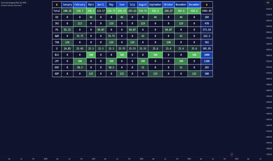
Dividend Calendar (Zeiierman)█ Overview
The Dividend Calendar is a financial tool designed for investors and analysts in the stock market. Its primary function is to provide a schedule of expected dividend payouts from various companies.
Dividends, which are portions of a company's earnings distributed to shareholders, represent a return on their investment. This calendar is particularly crucial for investors who prioritize dividend income, as it enables them to plan and manage their investment strategies with greater effectiveness. By offering a comprehensive overview of when dividends are due, the Dividend Calendar aids in informed decision-making, allowing investors to time their purchases and sales of stocks to optimize their dividend income. Additionally, it can be a valuable tool for forecasting cash flow and assessing the financial health and dividend-paying consistency of different companies.
█ How to Use
Dividend Yield Analysis:
By tracking dividend growth and payouts, traders can identify stocks with attractive dividend yields. This is particularly useful for income-focused investors who prioritize steady cash flow from their investments.
Income Planning:
For those relying on dividends as a source of income, the calendar helps in forecasting income.
Trend Identification:
Analyzing the growth rates of dividends helps in identifying long-term trends in a company's financial health. Consistently increasing dividends can be a sign of a company's strong financial position, while decreasing dividends might signal potential issues.
Portfolio Diversification:
The tool can assist in diversifying a portfolio by identifying a range of dividend-paying stocks across different sectors. This can help mitigate risk as different sectors may react differently to market conditions.
Timing Investments:
For those who follow a dividend capture strategy, this indicator can be invaluable. It can help in timing the buying and selling of stocks around their ex-dividend dates to maximize dividend income.
█ How it Works
This script is a comprehensive tool for tracking and analyzing stock dividend data. It calculates growth rates, monthly and yearly totals, and allows for custom date handling. Structured to be visually informative, it provides tables and alerts for the easy monitoring of dividend-paying stocks.
Data Retrieval and Estimation: It fetches dividend payout times and amounts for a list of stocks. The script also estimates future values based on historical data.
Growth Analysis: It calculates the average growth rate of dividend payments for each stock, providing insights into dividend consistency and growth over time.
Summation and Aggregation: The script sums up dividends on a monthly and yearly basis, allowing for a clear view of total payouts.
Customization and Alerts: Users can input custom months for dividend tracking. The script also generates alerts for upcoming or current dividend payouts.
Visualization: It produces various tables and visual representations, including full calendar views and income tables, to display the dividend data in an easily understandable format.
█ Settings
Overview:
Currency:
Description: This setting allows the user to specify the currency in which dividend values are displayed. By default, it's set to USD, but users can change it to their local currency.
Impact: Changing this value alters the currency denomination for all dividend values displayed by the script.
Ex-Date or Pay-Date:
Description: Users can select whether to show the Ex-dividend day or the Actual Payout day.
Impact: This changes the reference date for dividend data, affecting the timing of when dividends are shown as due or paid.
Estimate Forward:
Description: Enables traders to predict future dividends based on historical data.
Impact: When enabled, the script estimates future dividend payments, providing a forward-looking view of potential income.
Dividend Table Design:
Description: Choose between viewing the full dividend calendar, just the cumulative monthly dividend, or a summary view.
Impact: This alters the format and extent of the dividend data displayed, catering to different levels of detail a user might require.
Show Dividend Growth:
Description: Users can enable dividend growth tracking over a specified number of years.
Impact: When enabled, the script displays the growth rate of dividends over the selected number of years, providing insight into dividend trends.
Customize Stocks & User Inputs:
This setting allows users to customize the stocks they track, the number of shares they hold, the dividend payout amount, and the payout months.
Impact: Users can tailor the script to their specific portfolio, making the dividend data more relevant and personalized to their investments.
-----------------
Disclaimer
The information contained in my Scripts/Indicators/Ideas/Algos/Systems does not constitute financial advice or a solicitation to buy or sell any securities of any type. I will not accept liability for any loss or damage, including without limitation any loss of profit, which may arise directly or indirectly from the use of or reliance on such information.
All investments involve risk, and the past performance of a security, industry, sector, market, financial product, trading strategy, backtest, or individual's trading does not guarantee future results or returns. Investors are fully responsible for any investment decisions they make. Such decisions should be based solely on an evaluation of their financial circumstances, investment objectives, risk tolerance, and liquidity needs.
My Scripts/Indicators/Ideas/Algos/Systems are only for educational purposes!
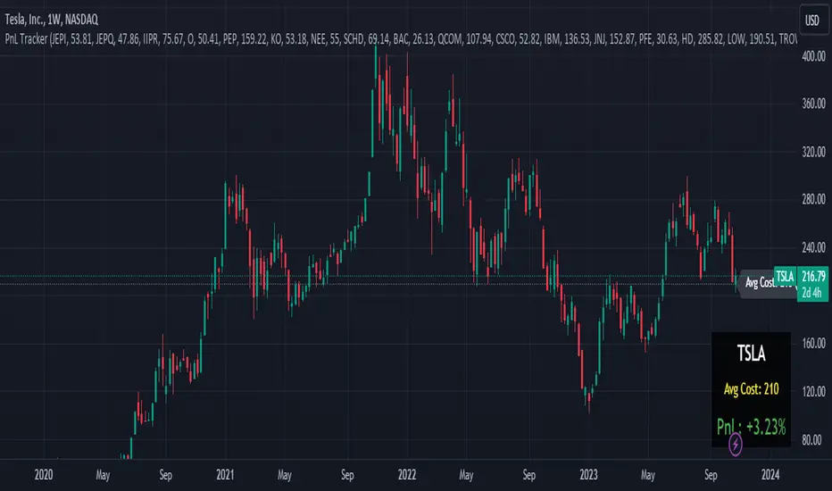
Portfolio PnL Tracker
This is a personal portfolio tracker that helps you track your daily profits and losses. You can track up to 64 stocks or cryptocurrencies. You can set them by specifying the symbol and average price.
FEATURES
- Set up to 64 stock or crypto symbols.
- Shows the average price line
- Show profit or loss as a percentage
- Shows only when on the chart that matches the symbol settings.
HOW TO USE
1. Double click the PnL Tracker indicator at the top left of the chart
2. Enter your symbol and average cost
The average cost line shows your current position.
PnL is calculated based on the average cost you input.
The Profit and Loss (PnL) box and the average cost line will only be displayed when your input symbol matches the chart you are currently viewing.
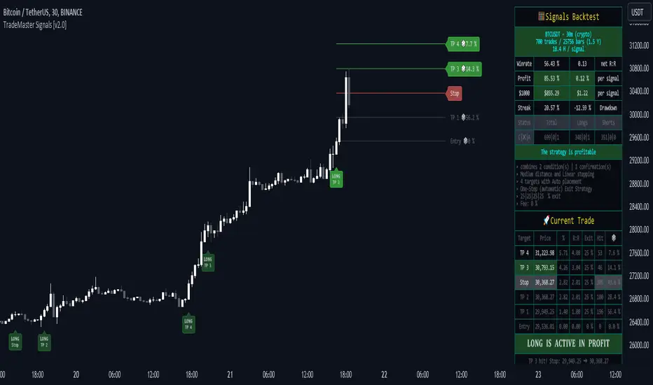
TradeMaster SignalsTrading effectively requires a range of techniques, experience, and expertise. From technical analysis to market fundamentals, traders must navigate multiple factors, including market sentiment and economic conditions. However, traders often find themselves overwhelmed by market noise, making it challenging to filter out distractions and make informed decisions. To address this, we present a powerful indicator package designed to assist traders on their journey to success.
The TradeMaster indicator package encompasses a variety of trading strategies, including the SMC (Supply, Demand, and Price Action) approach, along with many other techniques. By leveraging concepts such as price action trading, support and resistance analysis, supply and demand dynamics, these indicators can empower traders to analyze entry and exit positions with precision. Unlike other forms of technical analysis that produce values or plots based on historical price data, Price Action brings you the facts straight from the source - the current price movements.
The indicator package consists of three powerful indicators that can be used individually or together to maximize trading effectiveness.
⭐ About the Signals Indicator
This indicator offers a unique opportunity for traders to design their own personalized trading strategy. It has a built-in backtesting system, which allows you to thoroughly analyze the performance of your strategy before implementing it in live trading. With the ability to customize and test your strategy using historical data, the Signals indicator empowers you to make data-driven decisions and refine your trading approach.
👉 How does it work?
The Signals indicator provides users with the ability to select trigger conditions and further narrow them down using confirmations.
Conditions are quantitative factors that influence the generation of signals on the chart and in the backtest table. You can enable multiple conditions to create a comprehensive set of criteria for signal generation.
Confirmations, on the other hand, are qualitative factors that selectively filter out conditions based on their alignment with the chosen confirmations. This helps refine the signals and provide more targeted trading opportunities. Multiple confirmations can be enabled to further enhance the precision of the signals.
A well-balanced strategy in the Signals indicator involves carefully selecting a combination of conditions and confirmations to generate accurate trading signals. Finding the right balance between them is crucial for consistent and profitable trading.
To offer even more flexibility, the Signals indicator includes two powerful main functions:
Target Placement System: This feature allows you to set up to 6 targets with a stop loss level and partial exit percentages. You can choose between automatic target creation or manual customization, giving you control over your profit targets.
Exit Strategy: With this feature, you can define your preferred trailing stop strategy, allowing you to implement a systematic approach to exiting trades. By setting appropriate trailing stop levels, you can limit potential losses, while the system secures profits by automatically closing positions partially when certain price targets are reached. This may help you to maintain discipline in your trading and optimize your risk-reward ratio.
With over 30 unique conditions, 10 confirmations, and the deep Target Placement and Exit Strategy systems, the Signals indicator offers a vast array of possibilities. In fact, there are potentially millions of different strategy outputs available for each ticker. Despite its complexity, the script remains lightweight and fast, ensuring smooth performance.
The Signals Backtest table provides a comprehensive overview of your strategy's performance. You can track your current position with all the necessary details, allowing you to monitor your trades effectively and make informed decisions based on the backtest results.
⚠️ WARNING!
Backtest results do not guarantee future performance. Strategies tested on synthetic data may not accurately represent real-world results. Testing should be conducted on charts that reflect actual closing prices.
The indicator displays buy/sell signals intended to support traders' analysis. There are numerous possibilities and combinations available to create your own unique strategies, whether trading with or against the trend or capturing oversold bounces. These are just a few of the many options! Our indicator can easily be tailored to fit your trading strategy.
The settings that influence the signal-generating algorithm play a crucial role in effectively utilizing the signals. We provide users with the flexibility to modify the settings to align with their trading style, while also offering simple adjustment methods using various techniques.
Each method for modifying the signal settings has been designed to meet specific user needs. It is important to understand that one method is not necessarily more accurate than another.
It is essential to understand that signal indications generally serve as trend confirmations, rather than direct entry and exit points. Focusing on the easy use of signal settings and utilizing other functionalities in our toolkit will likely be a better decision than attempting to find the "holy grail" of optimized signal settings and solely relying on following the signals.
⭐ Conclusion
We hold the view that the true path to success is the synergy between the trader and the tool, contrary to the common belief that the tool itself is the sole determinant of profitability. The actual scenario is more nuanced than such an oversimplification. Our aim is to offer useful features that meet the needs of the 21st century and that we actually use.
🛑 Risk Notice:
Everything provided by trademasterindicator – from scripts, tools, and articles to educational materials – is intended solely for educational and informational purposes. Past performance does not assure future returns.
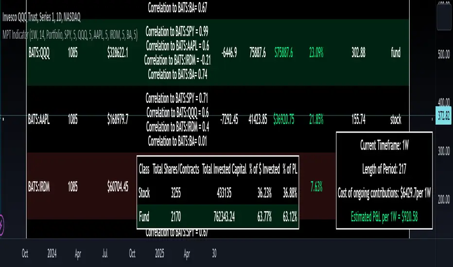
Modern Portfolio Management IndicatorAfter weeks of grueling over this indicator, I am excited to be releasing it!
Intro:
This is not a sexy, technical or math based indicator that will give you buy and sell signals or anything fancy, but it is an indicator that I created in hopes to bridge a gap I have noticed. That gap is the lack of indicators and technical resources for those who also like to plan their investments. This indicator is tailored to those who are either established investors and to those who are looking to get into investing but don't really know where to start.
The premise of this indicator is based on Modern Portfolio Theory (MPT). Before we get into the indicator itself, I think its important to provide a quick synopsis of MPT.
About MPT:
Modern Portfolio Theory (MPT) is an investment framework that was developed by Harry Markowitz in the 1950s. It is based on the idea that an investor can optimize their investment portfolio by considering the trade-off between risk and return. MPT emphasizes diversification and holds that the risk of an individual asset should be assessed in the context of its contribution to the overall portfolio's risk. The theory suggests that by diversifying investments across different asset classes with varying levels of risk, an investor can achieve a more efficient portfolio that maximizes returns for a given level of risk or minimizes risk for a desired level of return. MPT also introduced the concept of the efficient frontier, which represents the set of portfolios that offer the highest expected return for a given level of risk. MPT has been widely adopted and used by investors, financial advisors, and portfolio managers to construct and manage portfolios.
So how does this indicator help with MPT?
The thinking and theory that went behind this indicator was this: I wanted an indicator, or really just a "way" to test and back-test ticker performance over time and under various circumstances and help manage risk.
Over the last 3 years we have seen a massive bull market, followed by a pretty huge bear market, followed by a very unexpected bull market. We have been and continue to be plagued with economic and political uncertainty that seems to constantly be looming over everyone with each waking day. Some people have liquidated their retirement investments, while others are fomoing in to catch this current bull run. But which tickers are sound and how tickers and funds have compared amongst each other remains somewhat difficult to ascertain, absent manually reviewing and calculating each ticker individually.
That is where this indicator comes in. This indicator permits the user to define up to 5 equities that they are potentially interested in investing in, or are already invested in. The user can then select a specific period in time, say from the beginning of 2022 till now. The user can then define how much they want to invest in each company by number of shares, so if they want to buy 1 share a week, or 2 shares a month, they can input these variables into the indicator to draw conclusions. As many brokers are also now permitting fractional share trading, this ability is also integrated into the indicator. So for shares, you can put in, say, 0.25 shares of SPY and the indicator will accept this and account for this fractional share.
The indicator will then show you a portfolio summary of what your earnings and returns would be for the defined period. It will provide a percent return as well as the projected P&L based on your desired investment amount and frequency.
But it goes beyond just that, you can also have the indicator display a simple forecasting projection of the portfolio. It will show the projected P&L and % Return over various periods in time on each of the ticker (see image below):
The indicator will also break down your portfolio allocation, it will show where the majority of your holdings are and where the majority of your P&L in coming from (best performers will show a green fill and worst will show a red fill, see image below):
This colour coding also extends to the portfolio breakdown itself.
Dollar cost averaging (DCA) is incorporated into the indicator itself, by assuming ongoing contributions. If you want to stop contributions at a certain point, you just select your end time for contributions at the point in which you would stop contributing.
The indicator also provides some basic fundamental information about the company tickers (if applicable). Simply select the "Fundamental" chart and it will display a breakdown of the fundamentals, including dividends paid, market cap and earnings yield:
The indicator also provides a correlation assessment of each holding against each other holding. This emphasizes the profound role of diversification on portfolios. The less correlation you have in your portfolio among your holdings, the better diversified you are. As well, if you have holdings that are perfectly inverse other holdings, you have a pseudo hedge against the downturn of one of your holdings. This is even more helpful if the inverse is a company with solid fundamentals.
In the below example you will see NASDAQ:IRDM in the portfolio. You will be able to see that NASDAQ:IRDM has a slight inverse relationship to SPY:
Yet IRDM has solid fundamentals and is performing well fundamentally. Thus, this makes IRDIM a solid addition to your portfolio as it can potentially hedge against a downturn for SPY and is less risky than simply holding an inverse leveraged share on SPY which is most likely just going to cost you money than make you money.
Concluding remarks:
There are many fun and interesting things you can do with this indicator and I encourage you to try it out and have fun with it! The overall objective with the indicator is to help you plan for your portfolio and not necessarily to manage your portfolio. If you have a few stocks you are looking at and contemplating investing in, this will help you run some theoretical scenarios with this stock based on historical performance and also help give you a feel of how it will perform in the future based on past behaviour.
It is important to remember that past behaviour does not indicate future behaviour, but the indicator provides you with tools to get a feel for how a stock has performed under various circumstances and get a general feel of the fundamentals of the company you could potentially be investing in.
Please note, this indicator is not meant to replace full, fundamental analyses of individual companies. It is simply meant to give you a "gist" of how companies are fundamentally and how they have performed historically.
I hope you enjoy it!
Safe trades everyone!
Consensio Allocation ToolOriginally created and taught by Taylor Jenks, this indicator provides portfolio allocation suggestions based on the behaviour of price and 3 simple moving averages (4/10/40 by default)
(ie. when short & medium term SMAs are above the long term then allocation is to be 100%).
This percentage allocated to the stock/commodity is to be reduced as it passes below the SMA's, particularly as each moving average crosses.
Consensio is useful for scaling in and out of a position as the portfolio allocation will change according to the momentum of the asset.
The rules below are my own based on understanding of the trading system developed by Jenks and his online content.
This script has the following rules:
if fastAboveSlowMA and not mediumAboveSlowMA
allocation := 30.0
else if longAboveFastMA
allocation := 0.0
else if fastAboveMediumMA and fastAboveSlowMA
allocation := 100.0
else if not fastAboveMediumMA and fastAboveSlowMA
allocation := 80.0
else if not fastAboveMediumMA and not fastAboveSlowMA
allocation := 50.0
else if not mediumAboveSlowMA and fastAboveSlowMA
allocation := 50.0
// Calculate adjusted allocation percentage based on crossing moving averages
allocation := allocation + (priceAboveFastMA ? 10.0 : -10.0)
allocation := allocation + (priceAboveMediumMA ? 10.0 : -10.0)

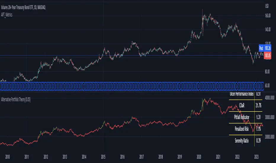
Metrics using Alternative Portfolio TheoryLibrary "APT_Metrics"
Portfolio metrics using alternative portfolio theory
metrics(init, cur, start, end, alpha)
Calculates APT metrics
Parameters:
init (float) : Starting Equity (strategy.initial)
cur (float)
start (int) : Start date (UNIX)
end (int) : End Date (UNIX)
alpha (float) : Confidence interval for DaR/CDaR. Defval = 0.05
Returns: Plots table with APT metrics
The metrics are shown in the bottom pane being applied to a buy-and-hold strategy.
PLEASE NOTE: This is the first draft of the library. Some calculations may be incorrect. If you spot any mistakes then please let me know and I will correct them as soon as possible. I am also open to suggestions on how to improve this.
At the moment this only works on the daily timeframe until I can find a way to universally calculate annualized volatility.
Trendmaster - Crypto Flow IndexWhat it is:
The Trendmaster Crypto Flow Index is a unique tool designed to give you an overview of the performance of different Crypto market sectors and sub-sectors. It helps you to identify where you should be focusing your investments for maximum portfolio efficiency and profitability.
What it does:
The Crypto Flow Index presents a visual overview of the flows of retail and institutional capital into the four main market sectors: Large Caps, Alts Coins, Shit Coins, and Stable Coins as well as several other sub-sectors. Each sector is assigned a "Flow Score", which indicates its current performance, demand, and strength in percentage terms. The "Flow Score" also provides insights into the current stage of the market cycle and the typical over and underperformances of assets that correlate to it. Additionally, the index factors in the sector have a "Correlation" to the broader market, allowing you to see the best sectors for trading and investing, either for positional hedging or differential plays.
How to Use it:
To use the Trendmaster Crypto Flow Index, you can simply observe the evolving colored line within the indicator and the table overview. You can identify which sectors are outperforming or underperforming the general market and make informed decisions about where to direct your focus and funds. By monitoring the transitions of Flow between sectors, you can gain invaluable insights into the market cycle and the typical over and underperformances of assets that correlate to it. This information will help you to maximize portfolio efficiency by targeting different market sectors based on their performance to the overall cryptocurrency market. The index covers different sectors, including Large caps, Alts, Shit, Stables, AI, Defi, Dex, Exchange, Gaming, Meme, Metaverse, Nft, Privacy, Smart, and Sports.
Examples of Cryptocurrencies represented in the different market sectors:
Large caps: The biggest market cap cryptocurrencies such as BTC and ETH.
Alts: High-cap and high-volume digital assets that are smaller than large caps, such as LTC and XRP.
Shit coins: Smaller cap projects that are highly speculative and experience significant price volatility, such as BAT and HOT.
Stables: Fiat-pegged assets that provide a stable value, such as USDT and USDC.
AI: Projects that are based on artificial intelligence, such as FET and AGIX.
DeFi: Leverages high volume smart contract platforms to provide financial products in crypto, mainly ERC20 tokens such as LINK and AAVE.
DEX: Decentralized exchanges with their own utility tokens, such as UNI and SUSHI.
Exchange: Centralized exchanges with their own utility tokens, such as BNB and CRO.
Gaming: Web3/crypto gaming platforms with their own utility tokens, such as AXS and GMT.
Meme: Similar to shit coins, but with no real functionality and based purely on social media and memes, such as DOGE and SHIB.
Metaverse: Projects that aim to provide Metaverse assets such as virtual land and assets, such as MANA and SAND.
NFT: Non-fungible tokens with their own token or NFT-based platforms that have their own utility tokens, such as APE and LOOKS.
Privacy: Anonymous and privacy-focused chains, such as XMR and ZEC.
Smart: Projects that provide smart contract alternatives to ETH, such as ADA and AVAX.
Sports: Fan tokens based on real-world sports teams or platforms that support and distribute them, such as CHZ and FLOW.

Average Cost (Costo Promedio)ENGLISH
This 'Average Cost' script allows the user to input and visualize profit or loss for different stocks (up to 50) with average cost and quantity data on a single chart. This is useful for tracking the profit or loss of each stock in real-time.
To use this script, the user should follow these steps:
1. Add the 'Average Cost' script to your TradingView chart.
2. In the script's configuration window, input the tickers, average costs, and quantity of shares for each ticker you want to monitor.
3. Click 'Accept' to apply the changes.
This script is primarily designed for stock markets, but can also be useful in other financial markets where the user is interested in tracking the performance of multiple assets.
ESPAÑOL
Este script de "Costo Promedio" permite al usuario ingresar y visualizar si hay ganancia o perdida para diferentes acciones (hasta 50) con los datos de costos promedio y cantidad de acciones en un solo gráfico. Esto es útil para realizar un seguimiento de la ganancia o pérdida de cada acción en tiempo real.
Para utilizar este script, el usuario debe seguir estos pasos:
1. Agregue el script "Costo Promedio" a su gráfico en TradingView.
2. En la ventana de configuración del script, ingrese los tickers, costos promedio y cantidad de acciones para cada ticker que desee monitorear.
3. Haga clic en "Aceptar" para aplicar los cambios.
Este script está diseñado principalmente para los mercados de acciones, pero también puede ser útil en otros mercados financieros donde el usuario esté interesado en rastrear el rendimiento de múltiples activos.

basilPort Portfolio Tracker Pro [basilChart]This script is helps giving detailed information about the portfolio.
Prominent features of this portfolio tracking indicator are:
- Chart of your portfolio: This portfolio tracker let’s you view the chart of your portfolio real-time.
- Visualized Profit/Loss: Indicator will let you know of your profit and loss on the chart.
- In-Depth Monitoring: Most Gained 1st, 2nd, 3rd and Most Lost 1st, 2nd, 3rd.
- All Time Highs: Let’s us view All Time Highs on the portfolio chart for each equity on the chart.
- 40 Different Symbols: Supports monitoring 40 different symbols at the same time, real-time.
- 10 Pair Detailed View: For the first 10 symbol in our portfolio, indicator supports viewing detailed info about each of them. Such as: Price, Cost, Qty, Profit Percentage, Chart TF Profit Percentage, Weight
basilPort Portfolio Tracker Pro indicator can be used to:
- Track your investments: The basilPort Portfolio Tracker allows you to enter all your investments and their associated details, such as the ticker symbol, purchase price, and quantity. It then calculates your total portfolio value, including gains and losses.
- Monitor portfolio performance: Provides an overview of your portfolio's performance over time. You can see how your portfolio is performing on a daily, weekly, or monthly basis, and compare it to the performance of the overall market.
- Analyze asset allocation: Helps you analyze your portfolio's asset allocation, which is the percentage of your portfolio invested in different symbols. You can use this information to adjust your portfolio and diversify your holdings.
- Set investment goals: You can use the Portfolio Tracker to set investment goals and track your progress towards achieving them. For example, you can set a goal of achieving a certain rate of return or accumulating a specific amount of wealth by a certain date.
Overall, the Portfolio Tracker is a useful tool for investors who want to monitor their portfolio's performance, evaluate their investment strategies, and make informed investment decisions.
Best and worst 3 performers in our portfolio:
From Data Window, script let’s us see the best and worst 3 performers in our portfolio. To know how to read it we follow this pattern:
- Check 1st Gained value.
- Find the nth symbol from script’s Inputs tab.
- Check 1st Gained to see its Profit Percentage.
An example scenario to reading Data Window is explained at the very end of the description.
Using the script:
- Add this script to the chart from indicators tab
- Set starting date for the basilGrid Portfolio Tracker Pro either by dragging and dropping the vertical line or by the date-time picker from indicator Inputs tab.
- Set symbols and enable them to monitor with this indicator.
- Set quantity and price information for the symbols you have selected.
- Set visual settings to tailor your experience.
basilPort Portfolio Tracker is an indicator that allows you to track and analyze the performance of your investment portfolio over time. It's a helpful tool for investors who want to monitor their holdings and evaluate their investment strategies.
In this example we used pair BTCUSDT 1h timeframe, our settings are:
Inputs Tab:
- Start Date: 2022-12-13 13:00
- Show All Time Highs: Unchecked
- Show Pair Data (First 10): Checked
- Show Total Data: Checked
Symbols:
- BINANCE:ETHUSDT Qty 4.2 Price 1 332
- BINANCE:BTCUSDT Qty 0.5 Price 17 469
- BINANCE:BNBUSDT Qty 20 Price 270
- BINANCE:AVAXUSDT Qty 200 Price 13.61
- BATS:PYPL Qty 50 Price 78.5
- BATS:AMZN Qty 40 Price 95.4
- BATS:ETSY Qty 40 Price 135.64
For example, if you check Data Window, you'll see the following:
An example scenario:
- Bought Portfolio Value 39142.98 => The cost of the portfolio
- Current Portfolio Value 39142.98 => The current value of the portfolio
- 1st Gained 2.00 => The most gained symbol's index. (Checking the Symbols what we see on the 2nd spot is this symbol, we can see this value indicates BINANCE:BTCUSDT)
- 1st Gained 28.09 => Means BINANCE:BTCUSDT is +%28.09
- 2nd Gained 4.00 => Again, after checking the Symbols, we now know what this value indicates. It is AVAXUSDT.
- 2nd Gained 18.59 => Means BINANCE:AVAXUSDT is +%18.59
..
And so on to Lost section. Only difference between Gained and Lost section indicates Lost equities.
This script's purpose is to make easier to have more control over the portfolio. With in depth data that’ll help with decision-making.

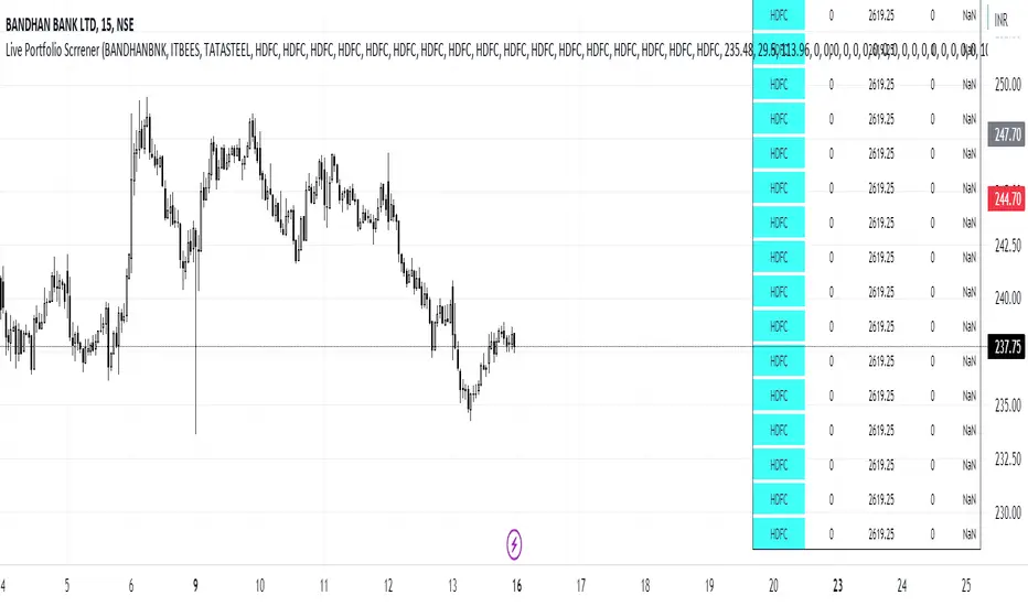
Live Portfolio ScreenerThe live portfolio screener indicator is a tool that help users to track the performance of their investments in real-time. The indicator provides a detailed breakdown of the user's portfolio, including the current profit and loss (P&L) for each stock that is invested in. This allows users to quickly and easily see how their portfolio is performing and make informed decisions about their investments on charts. Overall, this tool is an essential tool for anyone looking to stay on top of their investments and make data-driven decisions.
This indicator can load any symbol globally usable.
How to use this indicator ?
in this indicator firstly
you have add script name. (For example if you want to add symbol you have add in 's01 ' means the first symbol)
after that
you have to add price for each (For example if you want to add buy price for the first symbol then add the buy price in ' Bp01 ')
then the quantity comes in picture which is below price list and named here as Bq01 which means 'Buy quantity for first symbol'
Portfolio Chart by fonotoFeatures:
If you are looking for a chart that can project your portfolio value as a whole over time instead of individual stocks, this can be it. This is an indicator overlaid on the main chart of your index/stock selection allowing you to compare your portfolio performance against the main index/stock visually in chart form.
UI:
The settings has UI to input your portfolio stocks and quantities. The setting also has a divide factor which you can set to divide the portfolio value by this value so Y-Axis is offset to show main index/stock chart and your portfolio chart relatively closer. Portfolio chart works on any chosen timeframe. Colors can be customized in the UI.
Limitations:
1. Number of portfolio stocks is limited to 10.
2. Chart Type is limited to Candle.
3. Exponential Moving Averages are limited to 21, 50, 100, 200 & 500.

Portfolio Tracker For Stocks & CryptoThis is a portfolio tracker that will track individual, overall and daily profit/loss for up to 12 assets. You can set the size of your buys and price of your buys for accurate, up to date profit and loss data right on your chart. It works on all markets and timeframes.
HOW TO USE
Go into the indicator settings and you will see all of the available settings. The first is the ability to turn the tracker info table on or off from the chart, so it saves your portfolio info but let’s you remove it from the chart while trading. Second is the option to move the position of the info table to suit your preference.
Next we get into setting up your portfolio tickers, order size and price. Each ticker lets you set which stock/crypto you bought, then set how much you purchased and then what price you purchased them at.
Go through and set up all of your assets and then turn off any tickers that you don’t need. Once that is all done, your portfolio will be shown on the chart with all the data.
FEATURES
Top Section
The portfolio tracker has 2 sections. The top section shows each ticker in your portfolio individually with the following data:
- Ticker Name
- Weight of that asset compared to your total portfolio in %
- Current value of that position in $
- Profit or loss value from purchase price in %
- Todays change in value from yesterday’s close in %
The $ Value, PnL % and Today % will all change colors from green to red depending if they are in profit or not.
Bottom Section
The bottom section of the tracker will give you info for your portfolio as a whole. It has the following data:
- Total cost of your entire portfolio in $
- Current value of your entire portfolio in $
- Current profit or loss of your entire portfolio in $
- Current profit or loss of your entire portfolio in %
- Todays change of your entire portfolio value compared to yesterday’s close in %
The $ Value, PnL $, PnL % and Today % will all change colors from green to red depending if they are in profit or not.

Dollar Cost Averaging (Portfolio)
You can use it in daily, weekly and monthly candles. It can be used on multiple assets(10). All assets must have data and make sure they all use the same currency. See style in settings for plot titles If you are interested in passive investing, I hope it helps.
------------------
Günlük, haftalık, aylık mumlarda kullabilirsiniz. Birden fazla varlıkta kullanılabilir. Çoklu kullanım için hepsinin verisi olmalı ve aynı para birimini kullanmalı. Ayarlardan stilde grafik başlıklarını bulabilirsiniz. Pasif yatırım ile ilgiyseniz umarım yardımcı olur.

Portfolio PerformanceThis indicators will help you to compute portfolio performance and display results with a stats table and a nice monthly chart.
In this script you can do following:
Compose portfolio with up to 15 instruments
Change Initial capital / date range / rebalancing period
Compare portfolio performance with a benchmark
Compute basic stats
Compute instruments contribution
Display monthly performance of portfolio and benchmark
Change style for almost everything you see on your chart
Hope it will be useful for you!
Thanks to @MUQWISHI for helping me coding it.
Disclaimer
Please remember that past performance may not be indicative of future results.
Due to various factors, including changing market conditions, the strategy may no longer perform as well as in historical backtesting.
This post and the script don’t provide any financial advice.

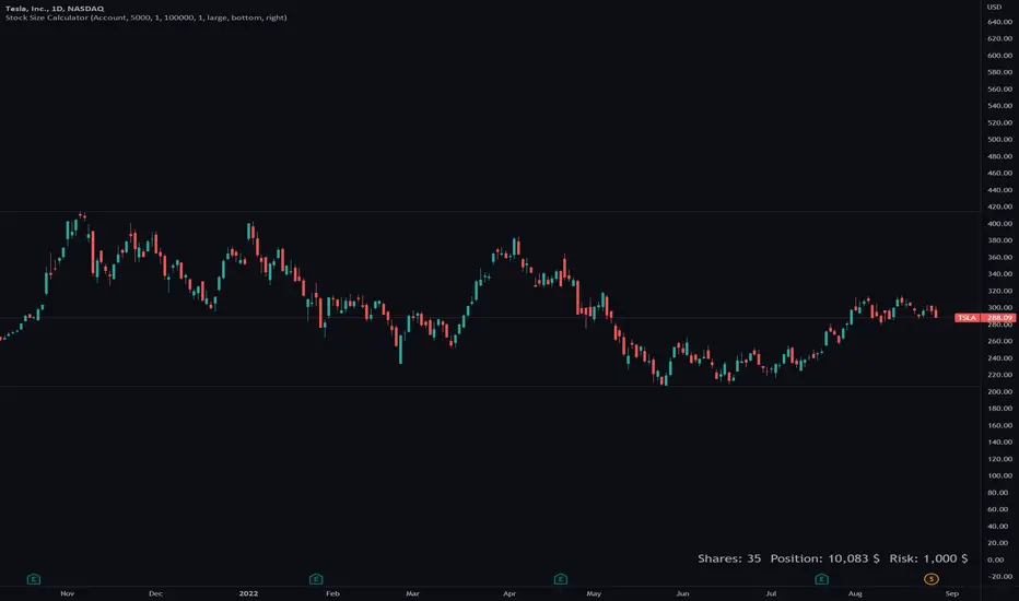
Stock Size CalculatorThis indicator helps traders to calculate the amount of shares they need to buy based on their preferred position size.
The Stock Size Calculator has two modes: Account and Position mode.
Position mode:
In Position mode the trader enters a position size in dollar and directly gets the amount of shares that can be bought with the given position size.
In addition it is possible to select a factor to quickly see how many shares should be bought for a half or double position.
Account mode:
In Account mode the trader enters his/her account size and a preferred risk in percent.
With both values the amount of shares as well as the risk in dolloar is calculated.
Features
■ Calculate the amount of shares, position size & risk
■ Use Position or Account mode
■ Multiple customize options
Hints
*Only tested on US stocks
*All calculations without guarantee, please check the results before open orders