VWAP & EMA9 Cross AlertAlerts when EMA9 and VWAP Cross. This provides an indicator of general market direction based on these 2 indicators.
Cari dalam skrip untuk "vwap"


VWAP (SIYL) Stdev Bands v2v2 indicator to allow for reversion-to-mean trading via the Stay In Your Lane approach.

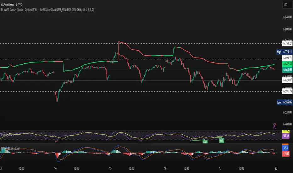
ES VWAP Overlay for SPX VWAP indicator for SPX. Since SPX does not have volume (index) it's using /es to mimic SPX volume. I find it good for day trading
Auto AVWAP (Anchored-VWAP) with Breakout Screener_v2Updated indicator for AWAP breakout. The indicator identified the candle that breaks out of AVWAP

Volume Weighted Average Price - CoinruleVWAP with additional Anchor Periods as supported on Coinrule.

Anchored VWAP ClickIt calculates AVWAP set from a mouse click on a chart instead of having to edit a popup box, manually transferring date and time from the chart.
It's the Oct 2021 sample script from Tradingview to demonstrate their new chart interactive capabilities of Pine script.
www.tradingview.com
I take no credit for this, just noticed it wasn't in the Public Library.
This ability to accept OnMouse positional data from the chart, into an indicator has been needed in TV for a long time.
Glad to see they continue to grow the capabilities.

Auto Anchored Volume Weighted Average Price - Custom AVWAP
Based on Brian Shannon's AVWAP - This indicator anchors vwap to the highest high, lowest low and highest volume bar of a user defined lookback period.
In the chart example above on AVAX, the lookback period is set to 90 days
- The blue line depicts AVWAP from the highest bar in in the last 90 dats
- The purple Line is AVWAP from the lowest bar in the last 90 days
- The golden line is AVWAP from the highest volume bar in the last 90 Days
These levels act as a price magnet and strong levels of support and resistance. I use them to identify chart locations for where I want to do business and look for trade setups.
Unlike moving averages, AVWAP will maintain it's chart position no matter the chart resolution. One way to take advantage of this is to wait for price to get to one of these levels, go to lower timeframes and find low risk setups based on your trading strategy.
You can customise the look and feel and which anchors you want displayed. You can use multiple instances with varying lookback periods to display shorter and longer term levels simultaneously

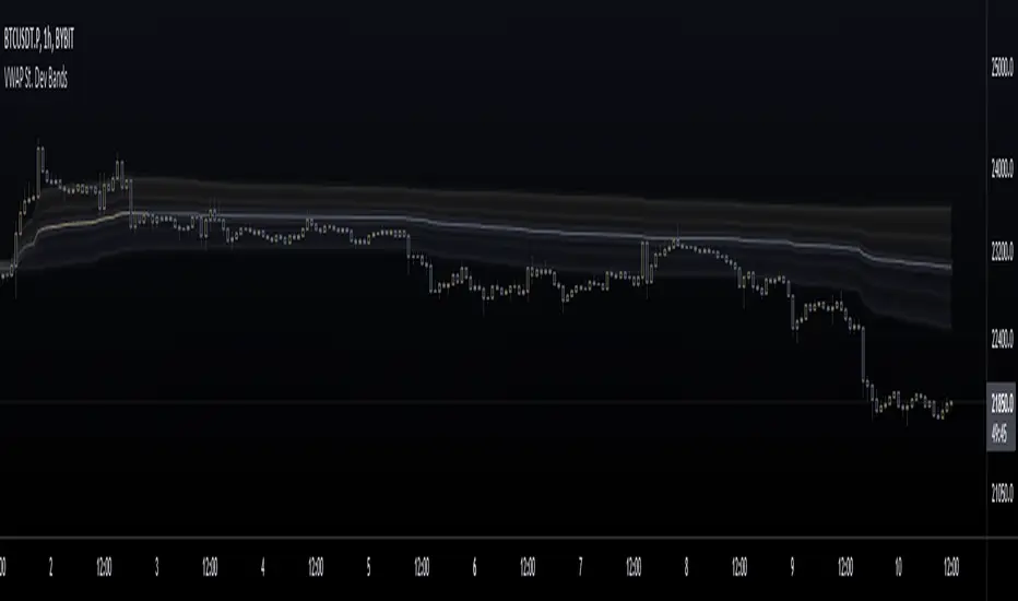
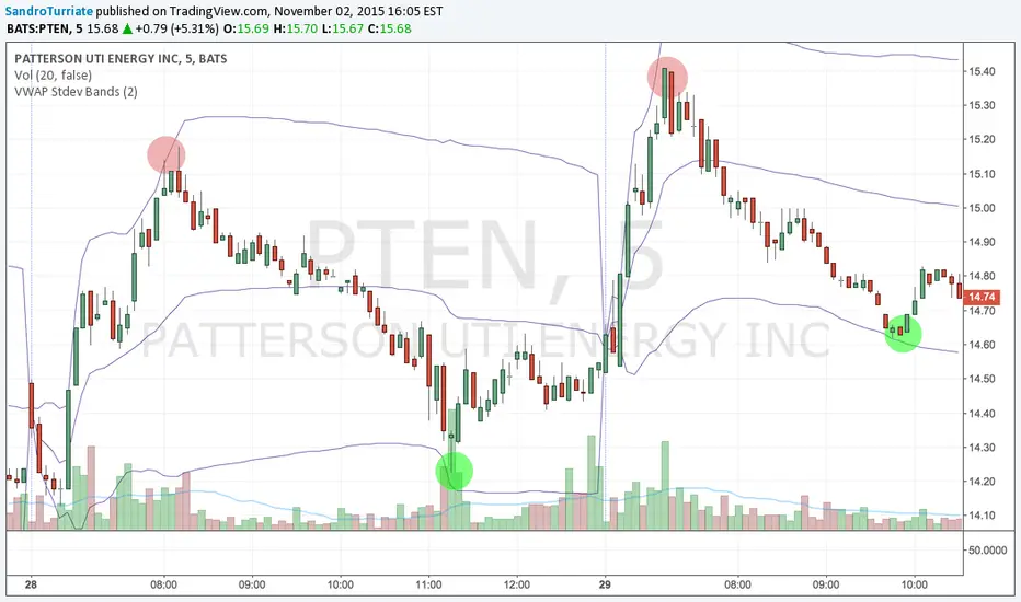
VWAP St. Dev BandsThis indicator allows you to add up to 3 volatility bands to VWAP based on its Standard Deviation.
Best use is for intraday but you can choose higher timeframes too.
For day trading a band of 3 standard deviations usually works well as an overbought/oversold region, allowing for mean reversion trading, but you are free to come up with your own strategies.
Enjoy!

Vwap Ribbon - JDThis indicator displays a custom timeframe VWAP line
together with several multiples of this timeframe
After a large price move, the price often tends to return to one of these multiples
JD.
#nottradingadvice
#DYOR


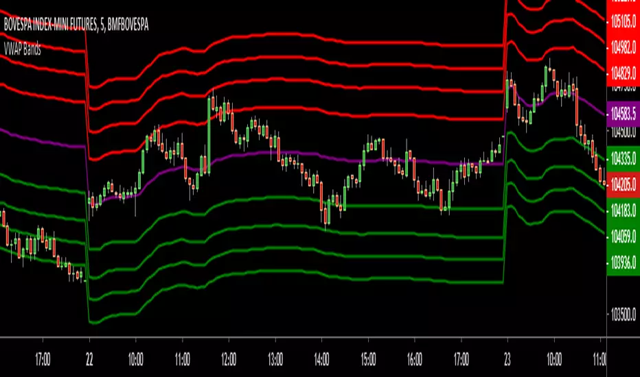
VWAP BandsThis indicator plots distant VWAP lines that serve as support and resistance. You can add more lines from the script.
Good trades!

VWAP Stdev Bands v3Adds timeframe option for Weekly and Monthly timeframes, changes default 2nd and 3rd bands to more common deviations

VWAP Stdev BandsThis indicator plots VWAP with 2x Standard Deviation bands. This could potentially be used to trade a mean reversion type strategy. Only works on intraday charts.
VWAP with FIB range JayyThis is sandbox experiment. The script creates bands around the VWAP based on the opening range on an intraday chart (adjustable in the format section) using fibonacci multipliers (mostly): .236, .382, .5, .618, .786, 1, 1.27 and 1.618. I have not built much flexibility into the script so this is very much an alpha script. Something new for Pippin and Kipp.

MGC1! Sniper Levels [NY Midnight + PDH/PDL + VWAP]This script, titled "MGC1! Sniper Levels ," is a specialized institutional-grade technical indicator designed for intraday trading on Micro Gold (MGC1!) futures. It merges Time & Price theory with Statistical Volatility to create a comprehensive roadmap for high-probability "Sniper" entries.
Core Technical Components
NY Midnight Pivot: Automatically identifies and plots the New York Midnight opening price. This level serves as the "True Open" for the daily session, helping traders determine whether the market is in a Premium or Discount zone relative to the daily start.
Previous Day Structure (PDH/PDL): Displays the Previous Day’s High and Low using a background security call. These levels are primary targets for Liquidity Sweeps (trapping retail traders) before a reversal occurs.
Advanced Session VWAP: Calculates the Volume Weighted Average Price starting from the session open. Unlike a standard moving average, VWAP represents the true fair value based on actual capital commitment.
Standard Deviation Extensions (SD 1, 2, 3): Plots three layers of volatility bands based on the variance of price and volume.
SD1 & SD2: Act as dynamic support and resistance within normal market conditions.
SD3 (Extreme Zones): Highlights the "Extreme Long" and "Extreme Short" zones, representing areas where 99.7% of price action is statistically contained, often leading to sharp mean-reversion moves.
Key Features & Interface
Customizable Labels: Includes a specific toggle to show or hide Standard Deviation labels. This allows for a cleaner chart when focusing on ICT/SMC price action while maintaining the colored "Zones" for visual context.
Real-Time Vignettes: High-contrast labels appear at the right edge of the price action, providing the exact numerical value of every key level (VWAP, PDH, NY Midnight) for immediate order execution.
Previous VWAP Close: Plots the final VWAP value from the prior session. This level often acts as a magnetic "fair value" target during the current session's open.
Strategic Trading Application
The script is built for the Gold Sniper MGC1! persona to identify "Smart Money" reversals. A typical setup involves waiting for price to reach an SD3 Extreme Zone that coincides with the PDH or PDL. Once the price "sweeps" these levels and shows a Market Structure Shift (MSS) back toward the VWAP, a high-probability trade is triggered.

Sistema Neutro GOULART HUD Regime Radar ORB VWAPSistema Neutro GOULART is an advanced visual trading indicator that integrates:
• A unified HUD displaying session status, ORB, VWAP, risk and market bias
• A Regime Radar heatmap (GO / WAIT / NO) designed to provide clarity without chart clutter
• ORB with straight daily lines and a clean zone limited to the current session
• Direction filtering using VWAP and VWAP slope
• Condition assessment based on risk and overall market context
• A harmonized visual design focused on objective decision-making
⚠️ This indicator does NOT generate trade signals.
It provides market context, regime classification, and quality assessment to support discretionary trading decisions.
Ideal for:
• Futures markets (ES, NQ, YM)
• Day trading using ORB + VWAP
• Traders who prioritize context, discipline, and structure over signals
For educational purposes only.

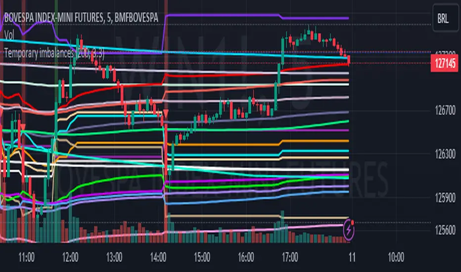
Temporary imbalances 2.0 This indicator attempts to calculate potential points of imbalance and equilibrium based on VWAPs and modified moving averages. The idea is to determine if there has been a change in volume and perform the calculation from that point It uses the standard deviation to determine the significant imbalance threshold. Candles with bullish imbalances are highlighted in green, while candles with bearish imbalances are highlighted in red.
"It also features a set of VWAPs and modified moving averages that you can enable or disable."
When you activate the 'Show Anchor VWAP' option, it will add five modified VWAPs.
Practical Significance:
The Anchored VWAP is a volume-weighted average price that serves as a dynamic reference to assess the average price during specific moments of market imbalance.
During a bullish imbalance, the anchor_vwap reflects the VWAP at that moment, emphasizing price behavior during that specific period.
Similarly, in a bearish imbalance, the anchor_vwap provides the associated VWAP for that condition, highlighting price movements during the imbalance phase.
How to Use:
The anchor_vwap can be employed to contextualize the volume-weighted average price during critical moments associated with significant changes in market imbalance.
By analyzing price behavior during and after periods of imbalance, the Anchored VWAP can help better understand market dynamics and identify potential areas of support or resistance.
Show VWAP Percent Imbalance"
Definition: Represents the Volume Weighted Average Price (VWAP) adjusted by the volume-weighted average of the price multiplied by volume, with a focus on conditions where the percentage volume variation surpasses a predefined threshold.
Calculation: Utilizes the simple moving average weighted of the product of the volume-weighted average price and volume only when the percentage volume variation exceeds a specific threshold.
Interpretation: Provides insight into the volume-weighted price trend during conditions where the percentage volume variation exceeds a predefined limit.
The "showDeltaVWAP" is a toggleable setting that you can turn on or off. When activated, it displays special lines on the chart. Let's understand what these lines represent:
Delta Anchor VWAP:
A green line (Delta Anchor VWAP) represents a measure of market volume imbalance.
Delta2 Anchor VWAP:
A red line (Delta2 Anchor VWAP) shows another perspective of volume imbalance.
VWAP Delta Volume:
A light blue line (VWAP Delta Volume) displays a volume-weighted average of price.
VWAP Delta Volume2:
An orange line (VWAP Delta Volume2) shows another view of the volume-weighted average of price.
Delta3 Anchor VWAP:
A light blue line (Delta3 Anchor VWAP) represents a combination of the previous measures.
Delta4 Anchor VWAP:
A purple line (Delta4 Anchor VWAP) is another combination, providing an overall view.
These lines are based on different conditions and calculations related to trading volume. When you activate "showDeltaVWAP," these lines appear on the chart, aiding in better understanding market behavior.
"Show Faster Volatility" is an option that you can enable or disable. When activated (set to true), it displays special lines on the chart called "Faster Volatility VWAP," "Faster Volatility VWAP2," and "Faster Volatility VWAP3." Let's understand what these lines represent:
Faster Volatility VWAP:
A purple line (Faster Volatility VWAP) is a Volume Weighted Average Price (VWAP) that is calculated more quickly based on short-term price reversal patterns.
Faster Volatility VWAP2:
A light gray line (Faster Volatility VWAP2) is another Volume Weighted Average Price (VWAP) that is calculated even more quickly based on even shorter-term price reversal patterns.
Faster Volatility VWAP3:
A purple line (Faster Volatility VWAP3) is another Volume Weighted Average Price (VWAP) calculated rapidly based on even shorter-term price reversal patterns.
These lines are designed to indicate moments of possible exhaustion of volatility in the market, suggesting that there may be a subsequent increase in volatility. When you activate "Show Faster Volatility," these lines are displayed on the chart.
"Show Average VWAPs Imbalance" displays weighted averages of different Volume Weighted Average Prices (VWAPs) in relation to specific market conditions. Here's an explanation of each component:
Standard VWAP:
The blue line represents the standard VWAP, a volume-weighted average of asset prices over a specific period.
VWAP with Added Imbalance (avg_vwap2):
The pink line is a weighted average that adds an imbalance value to the standard VWAP. This component highlights periods of market imbalance.
VWAP with Balance (avg_vwap3):
The lilac line is a weighted average that adds balance based on the imbalance between uptrend and downtrend, reflecting changes in volume. This provides insights into supply and demand dynamics.
Overall Average of VWAPs (avg_vwaptl):
The violet line is a weighted average that incorporates both standard and adjusted VWAPs, offering an overview of market behavior under different considered conditions.
Visual Customization (Show Average VWAPs Imbalance):
Users have the option to show or hide these average lines on the chart, allowing for a clear visualization of market trends.
"Show Min Variation VWAP" is associated with the calculation and display of a smoothed version of the Volume Weighted Average Price (VWAP), taking into account the minimum price variation over a specific period.
"How Imbalance Anchor VWAP Calculated as the smoothed relationship between liquidity difference and maximum VWAP equilibrium" is associated with the calculation and display of a smoothed version of the Imbalance Anchor VWAP. Here is a detailed explanation:
Calculations and Smoothing:
The variable "smoothed_difference" represents the exponential moving average (EMA) of the difference between two variables related to liquidity.
"smoothed_difference2" is the division of "smoothed_difference" by the maximum variation of the VWAP Equilibrium.
"smoothed_difference3" involves additional manipulation of "smoothed_difference" and "vwap_delta3."
"smoothed_difference4" incorporates the previous results, adjusted by the value of the VWAP.
Visual Customization:
The user has the option to enable or disable the display on the chart.
The line is colored in a shade of green.
It provides a smoothed representation of the Imbalance Anchor VWAP.
The line is colored in a shade of blue, and the calculation involves the summation of moving averages (20, 50, 200). Afterward, there is division by 3. Additionally, there is the summation of moving averages (766, 866, 966), divided by 3. The final step is to add these results together and divide by 2. media name is Imbalance Value2
Show VWAP Equilibrium (Max Variation) Calculated as the difference between two VWAPs derived from the highest and lowest price changes
Show Equilibrium VWAP Calculated as the sum of VWAP and (sma200 - sma20)
calculate the difference between the media of 200 to 20
Show Equilibrium VWAP Calculated as the sum of VWAP and (766+866+966)/3 - (sma200 - sma20)
Show Equilibrium VWAP Standard Deviation Calculated as the Exponential Moving Average (EMA) of the Standard Deviation of SMA (sma200 + sma20 + sma8)/3
Show Equilibrium VWAP Delta Calculated as the ratio of the smoothed VWAP Delta Result componentes
Show Standard Deviation Equilibrium VWAP Delta: Calculated as the Standard Deviation between the Average of VWAP Delta Result Components and Their Smoothed Versions
This average attempts to calculate the equilibrium."
vwap_equilibrium:
Definition: Represents the Volume Weighted Average Price (VWAP) adjusted by the volume-weighted average of the price (hl2) multiplied by volume, focusing on periods of volume equilibrium.
Calculation: Utilizes the simple moving average weighted (sma) of the product of the volume-weighted average price and volume only when there is no volume imbalance.
Interpretation: This indicator provides a view of the volume-weighted price trend during moments when the market is in equilibrium, meaning there is no noticeable imbalance in volume conditions. The calculation of VWAP is adjusted to reflect market characteristics during periods of stability.
vwap_percent_condition:
Definition: Represents the Volume Weighted Average Price (VWAP) adjusted by the volume-weighted average of the price multiplied by volume, with a focus on conditions where the percentage volume variation surpasses a predefined threshold.
Calculation: Utilizes the simple moving average weighted of the product of the volume-weighted average price and volume only when the percentage volume variation exceeds a specific threshold.
Interpretation: Provides insight into the volume-weighted price trend during conditions where the percentage volume variation exceeds a predefined limit.
The objective of these two VWAPs is to calculate possible equilibrium points between buyers and sellers.
The indicator works for all timeframes This indicator can be adjusted according to the preferences and characteristics of the specific asset or market. It provides clear visual information and can be used as a complementary tool for technical analysis in trading strategies.
Interesting
Interesting
lookback period 7 , 12, 20,70,200, 500,766,866,966
imbalance threshold 2.4, 3.3 ,4.2
The objective of this indicator is to identify and highlight various points of imbalance and equilibrium.
Tactical Deviation🎯 TACTICAL DEVIATION - Volume-Backed VWAP Deviation Analysis
What Makes This Different?
Unlike basic VWAP indicators, Tactical Deviation combines:
• Multi-timeframe VWAP deviation bands (Daily/Weekly/Monthly)
• Volume spike intelligence - signals only appear with volume confirmation
• Pivot reversal detection at deviation extremes
• Optional multi-VWAP confluence system
• Smart defaults for quality over quantity
This unique combination filters weak setups and identifies high-probability entries at extreme price deviations from fair value.
📊 DEFAULT SETTINGS (Ready to Use)
✅ Daily VWAP with ±2σ deviation bands
✅ Volume spike detection (1.5x average required)
✅ 2σ minimum deviation for signals
❌ Weekly/Monthly VWAPs (enable for multi-timeframe)
❌ Pivot reversal requirement (enable for stronger signals)
❌ Fill zones (optional visual enhancement)
Why: Daily VWAP is most relevant for intraday trading. 2σ bands catch meaningful moves. Volume spikes ensure conviction. Clean chart focuses on what matters.
🚀 HOW TO USE
BASIC USAGE:
• Green triangles (below bars) = Long signals at oversold deviations
• Red triangles (above bars) = Short signals at overbought deviations
SIGNAL QUALITY:
• Normal size, bright colors = Volume spike (best quality)
• Small size, lighter colors = Volume momentum
• Tiny size = No volume confirmation
DEVIATION ZONES:
• ±2σ = Extreme deviation (signals appear here)
• ±1σ to ±2σ = Extended but not extreme
• Within ±1σ = Normal range
TRADING APPROACHES:
Mean Reversion:
→ Enter when price reaches ±2σ with volume spike
→ Target: Return to VWAP or opposite band
→ Stop: Beyond extreme deviation
Trend Continuation:
→ Use bands to identify pullbacks
→ Enter pullback to VWAP in trending market
→ Volume confirms continuation
Reversal Trading:
→ Enable "Require Pivot Reversal" for stronger signals
→ Signals only when deviation + pivot reversal occur
→ Higher probability, fewer signals
⚙️ EXPLORE SETTINGS FOR FULL USE
VWAP SETTINGS:
• Show Weekly/Monthly VWAP = Multi-timeframe context
• Show ±1σ Bands = Normal deviation range
• Show ±3σ Bands = Extreme extremes (rare but powerful)
SIGNAL SETTINGS:
• Min Deviation: 1σ (more signals) | 2σ (default) | 3σ (fewer, extreme only)
• Require Pivot Reversal: OFF (default) | ON (stronger but fewer)
• Volume Spike Threshold: 1.5x (default) | 2.0x+ (major spikes) | 1.2x (more signals)
CONFLUENCE SETTINGS:
• Require Multi-VWAP Confluence: OFF (default) | ON (2+ VWAPs must agree)
• Min VWAPs: 2 (Daily + Weekly/Monthly) | 3 (all must agree)
VISUAL SETTINGS:
• Show Fill Zones = Shaded areas between bands
• Fill Opacity = Transparency adjustment
• Line Widths = Customize thickness
💡 PRO TIPS
1. Start with defaults, then enable features as you learn
2. Volume spike requirement filters weak moves - keep it enabled
3. Enable Weekly/Monthly VWAPs for higher timeframe context
4. Enable confluence for swing trading setups
5. Pivot reversals: ON for reversals, OFF for continuations
6. Check top-right info table for current deviation levels
🎨 VISUAL GUIDE
• Cyan Line = Daily VWAP (fair value)
• Cyan Bands = Daily deviation zones
• Orange Line = Weekly VWAP (if enabled)
• Purple Line = Monthly VWAP (if enabled)
• Green Triangle = Long signal (oversold)
• Red Triangle = Short signal (overbought)
⚠️ IMPORTANT
Educational purposes only. Always use proper risk management. Signals are based on statistical deviation, not guarantees. Volume confirmation improves quality but doesn't guarantee outcomes. Combine with your own analysis.
The unique combination of VWAP deviation analysis, volume profile confirmation, pivot identification, and multi-timeframe confluence in a single clean interface makes Tactical Deviation different from basic VWAP indicators.
Happy Trading! 📈
