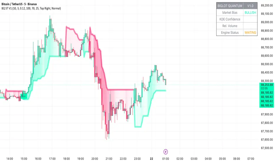
BigLot Quantum SuperTrend V1BigLot Quantum SuperTrend V1 is a trend-following indicator that enhances the traditional SuperTrend by integrating statistical volume analysis.
The script combines an ATR-based SuperTrend engine with Kernel Density Estimation (KDE) applied to relative buy and sell volume. Volume behavior is modeled statistically, allowing the indicator to filter breakout signals and activate only when volume conditions show high probability compared to historical data.
Bullish and bearish signals are generated when price crosses the SuperTrend line and the corresponding volume probability exceeds a user-defined threshold. This approach helps reduce false signals during low-liquidity or sideways market conditions.
The script includes visual trend highlighting, probability-based confidence filtering, and a real-time dashboard displaying trend direction, volume strength, and signal status. It is designed to work across all markets and timeframes without repainting.
Trend
Hybrid CCI Scalper ProHybrid CCI Scalper Pro is a sophisticated trading system designed to solve the biggest problem in scalping: False Signals in Choppy Markets.
Unlike standard CCI indicators that fire on every crossover, the HCS Pro uses a Hybrid Logic Engine that distinguishes between high-probability Trend Continuations and powerful Reversal Setups. It processes every potential entry through a 6-factor "Quality Filter" before generating a signal.
Core Features:
1. The Hybrid Signal Engine The script identifies two distinct market conditions:
TREND Mode: Triggers when price is aligned with the Daily/Local trend AND the CCI angle is steep.
REVERSAL Mode (REV): Triggers only on Extreme Momentum (steep angle) combined with a Zero-Line cross, allowing you to catch tops and bottoms without waiting for lagging trend indicators.
2. The Quality Scoring System (Q-Score) Every signal is rated from 0 to 6 stars based on confluence. The signal label shows Q: 4/6, Q: 5/6, etc.
Score 4+: High probability (Recommended).
Score 6: "The Perfect Storm" – All filters (Trend, Volume, RSI, ADX) align.
3. The "Ironclad" Filters To eliminate fake-outs, the script enforces strict rules:
Candle Color Guard: Never Buys on a Red candle or Sells on a Green one.
Angle validation: Flat CCI movement is ignored.
MTF Trend: Checks the Daily timeframe (D1 EMA) to ensure you aren't scalping against the major flow.
Noise Filter: Uses ATR and Volume to ignore low-volatility "dead" markets.
4. The Information Panel A clean dashboard on the top-right displays real-time metrics:
Current Daily Trend (Bull/Bear)
Momentum Strength (Weak/Strong/Extreme)
ADX Power (Trending vs Ranging)
Live Signal Score
How to Trade:
BUY Signal: Look for a Green Triangle. Ideally, the Label should say TREND or REV with a Quality Score of 4/6 or higher.
SELL Signal: Look for a Red Triangle with a high Quality Score.
No Signal? If the panel says "WAIT" or the score is low, the market is likely choppy. Stay out.
Recommended Settings:
Gold (XAUUSD): Works best on 15m.
Forex (EURUSD): Works well on 5m - 15m.
Default settings are optimized for a balance between frequency and accuracy.

Infinity Algo█ OVERVIEW
Infinity Algo is an all-in-one signal system with 5 entry modes, 6 take-profit levels, and built-in Auto-Tune optimization.
Switch between trend-following, contrarian, and sniper modes based on market conditions — all within one indicator. Auto-Tune tests 500+ parameter combinations to selects the best-scoring settings from historical simulations.
Includes on-chart TP/SL visualization, trailing stop modes, and webhook-ready alerts.
█ KEY FEATURES
✅ 5 Signal Modes: Normal, Smart, AI, HL Sniper, AI Sniper
✅ 3 Exit Modes: Percentage targets, Signal step-outs, Opposite signal
✅ 6 Take-Profit Levels with on-chart visualization
✅ Trailing Stop-Loss (Breakeven / Moving Target)
✅ Auto-Tune Parameter Optimization
✅ Visual Helpers: Bar coloring, gradient background, "signal coming" markers
✅ Built-in alert conditions for automation
✅ Designed for crypto, forex, stocks, indices, and commodities
█ WHAT MAKES THIS INDICATOR DIFFERENT
🧠 Auto-Tune Engine
Most indicators use static settings that fail when volatility shifts. Auto-Tune tests 500+ parameter combinations in the background — varying sensitivity, thresholds, and trigger configs — selects the best-scoring settings from historical simulations.
Choose from 12 scoring metrics: Sharpe Ratio, Sortino Ratio, Calmar Ratio, SQN, Martin Ratio, GPR, Win Rate, Total Profit, Average Profit, Profit Factor, and more.
Note: Auto-Tune is systematic parameter optimization on historical data — not predictive AI. Past performance does not guarantee future results.
🎯 Multi-Mode Signal System
One indicator, five signal modes:
Normal: Contrarian entries against the trend filter
Smart: Trend-following entries with the trend filter
Auto-Tune: Auto-optimized momentum signals
HL Sniper: More selective trend triggers
Auto-Tune Sniper: Auto-optimized sniper configuration
🛡️ Adaptive Risk Management
Trailing SL modes that respond to your TP hits — not arbitrary price levels. Lock in breakeven or ratchet your stop as profit grows.
👁️ Anticipation Markers
"Possible Long/Short Coming" labels appear when momentum approaches signal levels — giving you time to prepare before the signal fires.
█ SIGNAL MODES EXPLAINED
Normal + Smart (Default)
The dual-mode system that adapts to market conditions:
Normal Signals: Momentum threshold cross against the trend filter — contrarian plays for reversals and range boundaries
Smart Signals: Momentum threshold cross with the trend filter — trend-following plays for continuation moves
Auto-Tune Mode
Let the optimization engine find best-scoring settings:
Tests 500+ parameter combinations against historical data
Simulates trades using your configured TP/SL levels
Scores each configuration by your chosen metric (Sharpe, Sortino, Win Rate, etc.)
Walk-Forward: Re-optimizes every N bars to adapt to regime changes
Static: Locks in best-scoring settings from full available history
HL Sniper
For traders who prefer quality over quantity:
Trend-trigger mode for more selective entries
Fewer signals, more selective setups
Best suited for volatile markets where patience matters
Auto-Tune Sniper
Combines sniper selectivity with automatic optimization:
Optimizes RSI period, smoothing factor, and trigger sensitivity
Adapts configuration based on historical performance
Selective entries + adaptive parameters
█ EXIT & RISK MANAGEMENT
Percentage Targets
Up to 6 TP levels (TP1…TP6) with on-chart lines and labels
Configure price distance (%) and position size (%) for each level
Designed for scaling out positions systematically
Signal Step-Outs
Momentum-shift condition triggers partial exits
Optional higher-timeframe confirmation for stronger signals
"New TP Must Beat Last" prevents weak consecutive exits
Opposite Signal
Closes/flips position when the next opposite entry signal appears
Simple and effective for trend-following systems
Stop-Loss & Trailing
Fixed SL as % from entry (configurable separately for long/short)
Breakeven: Moves SL to entry price after chosen TP is hit
Moving Target: Advances SL to previous TP level as profit grows
█ VISUAL HELPERS
On-Chart TP/SL Lines: See your targets and stops directly on the chart
Bar Coloring: Candles colored by current signal bias
Background Gradient: Visual confirmation of position direction
"Possible Signal Coming" Markers: Anticipate entries before they trigger
Peak Profit Label: Track maximum unrealized profit during trades
█ AUTO-TUNE DASHBOARD
When Auto-Tune is enabled, the dashboard displays:
Current Parameters: Active sensitivity, thresholds, or sniper config
Simulated Performance: Trade count, win rate, P&L from internal backtest
Confidence Score: Stability indicator based on agreement among top configurations
Note: Auto-Tune is automated parameter selection on historical data — not predictive AI. It cannot guarantee future performance.
█ USE CASES
📈 Trending Markets
Use "Smart" signals + Percentage TPs. Stay aligned with momentum while scaling out at multiple targets. Enable Moving Target trailing to maximize winners.
📉 Ranging / Choppy Markets
Use "Normal" signals (contrarian mode). Catch reversals at range boundaries. Tighter TP targets and quicker exits work best.
⚡ High Volatility / News Events
Use "HL Sniper" for selective entries. Fewer signals, more selective. Wider SL to accommodate volatility.
🧪 New Asset / Unfamiliar Market
Enable "AI" mode and let Auto-Tune find optimal parameters. Great for exploring new markets without manual optimization.
🤖 Automation & Bots
Structured alert payloads work with popular bot platforms and custom webhooks. Entry + 6 TPs + SL in one alert.
█ HOW TO USE
Apply to your chart (any timeframe, any market)
Choose your signal mode based on market conditions
Pick your direction (Long / Short / Both)
Select exit mode: Percentage, Signals, or Opposite Signal
Configure TP levels and position sizing
Enable Stop-Loss and choose a trailing mode
Optional: Enable Auto-Tune for adaptive optimization
Set alerts for signals and TP/SL events
█ ALERTS
Built-in alert conditions for:
All entry signal types (Normal, Smart, AI, HL Sniper, AI Sniper)
TP hits (percentage levels or signal-based steps)
SL touch events
"Possible Long/Short Coming" anticipation markers
Tip: Create separate alerts for each condition. Use TradingView placeholders ({{ticker}}, {{close}}) in your alert messages.
█ WORKS ON
Crypto
Forex
Stocks
Indices
Commodities
█ REALISTIC EXPECTATIONS
No indicator wins 100% of the time — this is no exception
Signals should be combined with your own analysis
Auto-Tune optimizes on past data — it cannot predict the future
Always use proper position sizing and risk management
Paper trade or backtest before risking real capital
█ LIMITATIONS
Signals and overlays are decision-support tools — they cannot eliminate losses
Auto-Tune can overfit if used without out-of-sample validation
Multi-timeframe logic confirms on higher-TF closes — slight delay is expected
Best evaluated on standard candles with realistic fee/slippage assumptions
█ DISCLAIMER
This indicator is provided for educational and informational purposes only and does not constitute financial advice. Past performance is not indicative of future results. Trading involves substantial risk of loss, and you are solely responsible for your own trading decisions.

EMA and Dow Theory Strategies V2📘 Overview
This strategy is an advanced evolution of the original EMA × Dow Theory hybrid model. V2 introduces true swing‑based trend detection, gradient trend‑zones, higher‑timeframe swing overlays, and dynamic exit logic designed for intraday to short‑term trading across crypto, forex, stocks, and indices.
The system provides precise entries, adaptive exits, and highly visual guidance that helps traders understand trend structure at a glance.
🧠 Key Features
🔹 1. Dual‑EMA Trend Logic (Symbol + External Index)
Both the chart symbol and an external index (OTHERS.D) are evaluated using fast/slow EMAs to determine correlation‑based trend bias.
🔹 2. Dow Theory Swing Detection (Real‑time)
The script identifies swing highs/lows and updates trend direction when price breaks them. This creates a structural trend model that reacts faster than EMAs alone.
🔹 3. Gradient Trend Zones (Visual Trend Strength)
When trend is up or down, the area between price and the latest swing level is filled with a multi‑step gradient. This makes trend strength and distance-to-structure visually intuitive.
🔹 4. Higher‑Timeframe Swing Trend (htfTrend)
Swing highs/lows from a higher timeframe (e.g., 4H) are plotted to show macro structure. Used only for visual context, not for filtering entries.
🔹 5. RSI‑Based Entry Protection
RSI prevents entries during extreme overbought/oversold conditions.
🔹 6. Dynamic Exit System
Includes:
Custom stop‑loss (%)
Partial take‑profit (TP1/TP2/TP3)
Automatic scale‑out when trend color weakens
“Color‑change lockout” to prevent immediate re‑entry
Real‑time PnL tracking and labels
🔹 7. Alerts for All Key Events
Entry, stop‑loss, partial exits, and trend‑change exits all generate structured JSON alerts.
🔹 8. Visual PnL Labels & Equity Tracking
PnL for the latest trade is displayed directly on the chart, including scale‑out adjustments.
⚙️ Input Parameters
Parameter Description
Fast EMA / Slow EMA EMAs used for symbol trend detection
Index Fast / Slow EMA EMAs applied to external index
StopLoss (%) Custom stop‑loss threshold
Scale‑Out % Portion to exit when trend color weakens
RSI Period / Levels Overbought/oversold filters
Swing Detection Length Bars used to detect swing highs/lows
Stats Display Position of statistics table
🧭 About htfTrend (Higher Timeframe Trend)
The higher‑timeframe swing trend is displayed visually but not used for entry logic.
Why? Strict HTF filtering reduces trade frequency and often removes profitable setups. By keeping it visual‑only, traders retain flexibility while still benefiting from macro structure awareness.
Use it as a contextual guide, not a constraint.
📘 概要
本ストラテジーは、V1 を大幅に拡張した EMA × ダウ理論 × スイング構造 × 上位足トレンド可視化 の複合型モデルです。 短期〜デイトレード向けに最適化されており、仮想通貨・FX・株式・指数など幅広いアセットで利用できます。
V2 では、スイング構造の自動検出、グラデーションによるトレンド強度の可視化、上位足スイングライン、動的な利確/損切りロジック が追加され、視覚的にもロジック的にも大幅に強化されています。
🧠 主な機能
🔹 1. 銘柄+外部インデックスの EMA クロス判定
対象銘柄と OTHERS.D の EMA を比較し、相関を考慮したトレンド方向を判定します。
🔹 2. ダウ理論に基づくスイング高値・安値の自動検出
スイング更新によりトレンド方向を切り替える、構造ベースのトレンド判定を採用。
🔹 3. グラデーション背景によるトレンド強度の可視化
スイングラインから現在価格までを段階的に塗り分け、 「どれだけトレンドが伸びているか」を直感的に把握できます。
🔹 4. 上位足スイングトレンド(htfTrend)の表示
4H などの上位足でのスイング高値・安値を表示し、 大局的なトレンド構造を視覚的に把握できます(ロジックには未使用)。
🔹 5. RSI による過熱・売られすぎフィルター
極端な RSI 状態でのエントリーを防止。
🔹 6. 動的イグジットシステム
カスタム損切り(%)
TP1/TP2/TP3 の段階的利確
トレンド色の弱まりによる自動スケールアウト
色変化後の再エントリー制限(waitForColorChange)
リアルタイム PnL の追跡とラベル表示
🔹 7. アラート完備(JSON 形式)
エントリー、損切り、部分利確、トレンド反転などすべてに対応。
🔹 8. 損益ラベル・統計表示
直近トレードの損益をチャート上に表示し、視覚的に把握できます。
⚙️ 設定項目
設定項目名 説明
Fast / Slow EMA 銘柄の EMA 設定
Index Fast / Slow EMA 外部インデックスの EMA 設定
損切り(%) カスタム損切りライン
部分利確割合 トレンド弱化時のスケールアウト割合
RSI 期間・水準 過熱/売られすぎフィルター
スイング検出期間 スイング高値・安値の検出に使用
統計表示位置 テーブルの表示位置
🧭 上位足トレンド(htfTrend)について
上位足スイングの更新に基づくトレンド判定を表示しますが、 エントリー条件には使用していません。
理由: 上位足を厳密にロジックへ組み込むと、トレード機会が大幅に減るためです。
本ストラテジーでは、 「大局の把握は視覚で、エントリーは柔軟に」 という設計思想を採用しています。
→ 裁量で利確判断や逆張り回避に活用できます。

GardFx - Fusion Pro FREE TrialFusion Pro - by GardFx
This script is a specialized session-trading system designed to capitalize on the Opening Range Breakout (ORB) by utilizing Fair Value Gaps (FVG) as entry confirmation zones. Unlike standard breakout indicators that signal immediately upon a range break, this system waits for a price retest (mitigation) of specific imbalances created during the breakout move.
Core Concept
The strategy operates on a three-step logic sequence:
Define the Range: It establishes the High and Low of the opening session (London or New York).
Identify Imbalance: Upon a breakout of this range, the script scans for the creation of a Fair Value Gap (FVG) on the 1-minute timeframe.
Confirm Entry: It waits for price to retrace into the FVG (mitigation) and looks for specific candle confirmation patterns before generating a signal.
Detailed Methodology
1. The Opening Range (ORB)
The script monitors the first 15 minutes of the session (configurable).
High Line: The highest price reached during the first 15m.
Low Line: The lowest price reached during the first 15m.
Breakout: A breakout is validated when a candle closes outside of this defined range.
2. Fair Value Gap (FVG) Detection
Shutterstock
Not all breakouts are valid. This script filters for momentum by requiring an FVG to form immediately following the breakout.
Bullish FVG: Defined when the Low of Candle 1 is higher than the High of Candle 3.
Bearish FVG: Defined when the High of Candle 1 is lower than the Low of Candle 3.
Note: If an FVG is not formed shortly after the breakout, the setup is considered low-probability and ignored.
3. Entry Confirmation Models Once an FVG is identified and price returns to mitigate it, the script offers three confirmation modes:
Instant (First Touch): Aggressive entry immediately when price touches the FVG box.
Reversal Close: Waits for a candle to close in the direction of the trend after touching the FVG (e.g., a green candle close after dipping into a bullish FVG).
Engulfing Candle: The most conservative filter. Requires a full engulfing candle pattern occurring within or bouncing off the FVG.
4. Advanced Filters To reduce false signals during choppy markets, two optional filters are included:
Volume Filter: Requires the breakout candle's volume to be higher than its Moving Average (multiplied by a user-defined factor).
Higher Timeframe (HTF) Trend: Checks the trend on a higher timeframe (e.g., 1H or 4H).
Logic: If the HTF Close is > HTF EMA 50, only Buy signals are permitted. If HTF Close < HTF EMA 50, only Sell signals are permitted.
5. Risk Management The script includes an automated Risk/Reward calculator.
Stop Loss (SL): Placed at the invalidation point of the FVG structure, plus an optional ATR buffer to account for volatility.
Take Profit (TP): Calculated based on a user-defined Risk:Reward ratio (e.g., 1:2) relative to the Stop Loss distance.
Dashboard A multi-timeframe dashboard is displayed to provide a "Glance View" of market bias across the Daily, 4H, 1H, and 15M timeframes, ensuring trades are aligned with macro momentum.
3 hours ago
Release Notes
🚀 GardFx - Fusion Pro V2: The Ultimate ORB & ICT Suite
Welcome to Version 2.0 of Fusion Pro. This update transforms the indicator from a simple breakout tool into a complete institutional trading system. We have integrated Multi-Timeframe (MTF) logic, Candlestick Pattern recognition, and Smart Exit management to filter out noise and catch high-probability moves.
🔥 NEW FEATURES IN V2:
1. 🧠 Smart MTF Bias & Voting System
No more guessing the trend. The script now checks Daily, 4H, 1H, and 15m timeframes.
Voting Logic: A trade is only signaled if the higher timeframes agree (e.g., 2 out of 3 votes).
Visuals: The dashboard displays the live bias for every timeframe.
2. 🎯 Advanced Entry Confirmations We have added specific trigger patterns to reduce fake-outs. You can now choose your entry style:
🦄 Unicorn Setup: ORB Level + FVG overlap.
🕯️ Candlestick Patterns: Pinbar, Engulfing, Tweezer Tops/Bottoms, and Inside Bar.
📉 FVG 50%: Wait for price to retrace to the 50% equilibrium of the gap before entering.
3. 🛡️ Entry Validation Modes Control exactly when the entry label fires:
Instant: Enters immediately upon touch.
Candle Close: Waits for the candle to close in your direction.
Break of High/Low: Places a pending order at the wick; only enters if momentum breaks that level.
Wait for MSS: Waits for a Market Structure Shift (local high/low break).
4. 💰 Dynamic Smart Exit (Secure TP)
A new Volume-Based Exit Manager detects sudden momentum shifts or volume spikes against your position.
It prints a "Secure TP" label to help you bank profits before a reversal occurs, even if the fixed TP hasn't been hit.
5. 📊 Enhanced Dashboard & Stats
Tracks Win/Loss rates separately for Asia, London, and New York sessions.
Weekly and Daily stats reset automatically.
Fully customizable size and position.
6. ⚡ Automated UK Sessions
Built-in timings for Asia, London, and New York based on UTC (London) time. No more timezone conversion headaches.

MarketMind LITEM🜁rketMind LITE ────────────────────
Essential Market Awareness, Reduced to Its Core
M🜁rketMind LITE is a lightweight market awareness tool designed to display essential situational context .
It provides basic orientation and movement awareness without interpretation, risk framing, diagnostics, or decision guidance.
This script is designed as a standalone awareness layer. It does not evaluate trade quality, issue signals, or influence decision-making.
WHAT IT DOES ────────────────────
M🜁rketMind LITE presents a minimal, static view of current market conditions focused entirely on awareness rather than analysis.
The system displays only essential context, allowing traders to stay oriented without introducing judgment, noise, or implied direction.
The script provides visibility into:
Time-of-day session context
Basic market regime classification (trending, range-bound, mixed)
Short-term momentum direction only (up, down, neutral)
A clean, static HUD display
M🜁rketMind LITE also includes a minimal visual state indicator that reflects recent price responsiveness, intended to be observed over time alongside the trader’s own experience.
The goal is to support awareness without influence .
HOW TO USE IT ────────────────────
M🜁rketMind LITE is not a signal generator.
It is designed to remain visible in the background of any chart, offering quiet orientation while traders rely entirely on their own process for analysis and execution.
Common use cases include:
Maintaining session awareness
Preserving context during focused trading periods
Reducing cognitive load while monitoring markets
M🜁rketMind LITE does not evaluate risk, alignment, or opportunity.
It simply shows what is happening.
DESIGN PHILOSOPHY ────────────────────
M🜁rketMind LITE is intentionally minimal.
It includes only essential awareness elements and excludes all interpretive or evaluative logic:
Situational context only
Directional momentum (up / down / neutral)
No diagnostics, confidence, or conviction framing
No process, risk, or quality assessment
Presentation controls only (HUD on/off, size, position)
Nothing is inferred.
Nothing is suggested.
This script shows market state without interpretation.
WHO IT IS FOR ────────────────────
M🜁rketMind LITE is suited for traders who:
Want passive situational awareness
Prefer minimal on-chart information
Already operate with a defined decision process
It is not designed for:
Analytical or diagnostic use
Risk evaluation or context synthesis
Traders seeking guidance or confirmation
IMPORTANT NOTES ────────────────────
M🜁rketMind LITE does not provide financial advice
No system can predict future price behavior
This tool is designed for awareness only
Used appropriately, M🜁rketMind LITE helps traders stay oriented without interference.

Market Pressure Regime [Interakktive]The Market Pressure Regime (MPR) is a 4-state market classifier that models how structural forces create "pressure zones" — regions where price movement is either supported (Release) or suppressed (Pinned) by market microstructure.
It combines compression analysis, follow-through efficiency, and stress detection into a composite pressure score, classifying markets into Release, Suppressed, Transition, or Trap states — helping traders understand WHY price is moving (or not moving) in the current environment.
█ USAGE
MPR addresses a core question traders face: Is the market in a regime where directional moves are likely to follow through, or is it structurally pinned?
For swing traders, MPR identifies Release phases where momentum strategies work best, and Suppressed phases where mean reversion dominates.
For day traders, it highlights Trap conditions — high effort with no follow-through — where reversals are probable and trend entries fail.
🔹 The 4-State Model
The indicator classifies markets into four distinct regimes:
• Release (Teal): Pressure score ≥ +5. Directional flow dominates. Price moves efficiently with follow-through. Favor trend continuation.
• Suppressed (Grey): Pressure score ≤ -5. Compression dominates. Price is range-bound or pinned. Fade extremes, expect reversion.
• Transition (Amber): Score between thresholds OR instability detected. Regime is uncertain — wait for confirmation before committing.
• Trap (Magenta): High stress + low follow-through. Effort without result. Expect reversals.
🔹 Reading the Pressure Histogram
The histogram displays the composite Pressure Score (range approximately -100 to +100):
• Positive values: Follow-through exceeds compression. Market is "releasing" — directional moves are supported.
• Negative values: Compression exceeds follow-through. Market is "suppressed" — price movement is constrained.
• Color reflects confirmed state: The histogram uses persistence filtering — a state must hold for N bars before the color changes, preventing false signals from noise.
🔹 The 5-Stage Calculation
MPR synthesizes five analytical stages into the final state:
1. Compression Score: Measures how tight the current range is relative to ATR. High compression suggests structural forces are pinning price.
2. Follow-Through Score: Measures price path efficiency (MER-style). Efficient moves indicate genuine directional flow, not chop.
3. Stress Score: Detects effort-without-result (ERD-style). High volume or range with no price progress = absorption.
4. Composite Pressure: Combines follow-through and compression into a single directional score.
5. Persistence Filter: Requires states to hold for configurable bars before confirming, eliminating flickering.
█ SETTINGS
Core Settings
• ATR Length: Period for volatility normalization. Default 14.
• Baseline Lookback: Period for compression and efficiency baselines. Default 20.
• Volume Average Length: Period for stress calculation baseline. Default 20.
State Classification
• Release Threshold: Pressure score above this = Release. Default +5.
• Suppressed Threshold: Pressure score below this = Suppressed. Default -5.
• Trap Threshold: Stress score above this (with low follow-through) = Trap. Default 30.
• Persistence Bars: Bars required to confirm state change. Default 3.
• Stability Lookback: Period for stability calculation. Default 20.
• Stability Threshold: Below this = forced Transition state. Default 0.5.
Visual Settings
• Show Pressure Histogram: Display the main pressure score histogram.
• Show Zero Line: Display the zero reference line.
• Show Background Tint: Subtle background color by state (default OFF).
Data Window
• Show Data Window Values: Export all calculated scores for analysis.
█ INTERPRETATION GUIDE
When to Use Trend Strategies (Release):
• Histogram tall and positive
• Teal coloring confirmed
• Price making efficient higher highs or lower lows
When to Use Mean Reversion (Suppressed):
• Histogram flat or negative
• Grey coloring confirmed
• Price oscillating without follow-through
When to Wait (Transition):
• Amber coloring
• Mixed signals — don't force trades
• Wait for state to resolve
When to Expect Reversals (Trap):
• Magenta coloring
• High volume moves that don't stick
• Often occurs at structural inflection points
█ COMPLEMENTARY TOOLS
MPR pairs well with:
• Volatility State Index (VSI) — Confirms whether volatility is expanding into the pressure regime
• Effort-Result Divergence (ERD) — Provides bar-by-bar absorption/vacuum detection
• Market Efficiency Ratio (MER) — Validates follow-through quality
█ SUITABLE MARKETS
Works across all liquid markets:
• Equities: SPY, QQQ, liquid single stocks
• Futures: ES, NQ, CL, GC
• Crypto: BTC, ETH
• Forex: Major pairs
Works on any timeframe, but 1H–Daily provides cleanest regime classification. Intraday (5m–15m) useful for session-level tactical decisions.
█ OPEN SOURCE
This indicator is open-source for educational purposes. Review the code to understand the full calculation methodology.
█ DISCLAIMER
This indicator is for educational and informational purposes only. It does not constitute financial advice. Past performance does not guarantee future results. Always conduct your own analysis and use proper risk management.

Phantom Trend Filter [BOSWaves]Phantom Trend Filter - Volatility-Gated Trend Mapping with Fake Move Suppression
Overview
Phantom Trend Filter is a market-state and trend-validation framework designed to help traders distinguish between directional opportunity and structural noise. Rather than attempting to predict price or generate constant entry signals, Phantom focuses on identifying when trend information is reliable and when it should be ignored.
Most indicators attempt to remain active at all times. Phantom does the opposite. It is built around the idea that markets frequently enter conditions where directional interpretation is misleading - whether through consolidation, volatility expansion, artificial momentum bursts, or weak underlying trend participation. In these phases, acting on trend information often leads to poor trade quality. Phantom is designed to recognize these environments and deliberately suppress bias during them.
The result is an indicator that spends a meaningful amount of time telling the trader not to trade.
Conceptual Alignment and Regime Philosophy
Phantom operates on a regime-aware philosophy similar to advanced volatility frameworks: markets transition through identifiable states, and not all states are suitable for directional interpretation.
Rather than measuring opportunity by price movement alone, Phantom evaluates whether participation, volatility behavior, and directional imbalance are aligned. When these elements diverge, trend interpretation becomes statistically fragile. Phantom reframes trend analysis away from constant engagement and toward conditional relevance. It does not ask where price is likely to go, but whether directional reasoning is currently justified at all.
Structural Trend Framework
At its core, Phantom Trend Filter employs a low-lag filtering mechanism designed to model price behavior across two distinct temporal sensitivities. One component responds rapidly to immediate price pressure, while the other captures broader directional context. Together, they form an adaptive structure that tracks price fluidly without relying on fixed bands, static smoothing, or conventional averaging assumptions.
Rather than treating these components as isolated signals, Phantom interprets their interaction as a cohesive trend framework. The space between them defines an active zone where price engagement conveys information about market participation, continuation strength, or emerging exhaustion. A dynamically calculated balance reference within this structure reflects the equilibrium between short-term pressure and higher-order directional force.
Trend direction is derived strictly from relative structural positioning, not exaggerated slope changes or reactive trigger events. This design minimizes over-responsiveness and maintains structural integrity during consolidation phases, avoiding the constant recalibration common in traditional trend tools.
Market State Awareness and Filtering Philosophy
Trend indicators often fail not because their logic is incorrect, but because they are applied indiscriminately across all market states. Phantom is built around the assumption that trend logic is only meaningful when certain conditions are met.
To address this, Phantom incorporates multiple independent measurements designed to assess whether current price movement represents genuine directional intent or transient distortion. These measurements do not attempt to forecast price; instead, they evaluate quality.
Volatility is assessed relative to historical baselines rather than absolute expansion. Momentum is normalized to avoid reacting to short-lived impulses. Trend strength is evaluated through directional imbalance rather than price slope alone. Price behavior is examined for whipsaw characteristics, where range expansion lacks follow-through. Consolidation is detected when price variance collapses relative to recent volatility.
Each of these components serves a single purpose: to decide whether trend interpretation should be trusted.
State-Based Regime Transitions
Phantom internally classifies market behavior into functional states rather than continuous gradients. These states are expressed visually through color, structure, and suppression rather than explicit labels.
A validated trend state emerges only when structural alignment, normalized volatility behavior, and directional imbalance agree. In contrast, when destabilizing forces dominate — such as volatility distortion, weak participation, compression, or whipsaw behavior - Phantom enters a suppressed state and removes directional bias entirely.
Transitions between these states are deliberately conservative. Phantom requires stabilization before re-enabling trend interpretation, preventing rapid flip-flopping during unstable market phases.
Fake Move Identification
When one or more destabilizing conditions are detected, Phantom classifies the environment as unreliable. These situations often correspond to what traders colloquially refer to as fake pumps, fake dumps, stop hunts, or algorithmic noise - though Phantom does not rely on labels or narrative.
In these states, Phantom intentionally removes directional bias. The indicator does not attempt to guess the eventual outcome of the move. Instead, it signals that any directional interpretation at that moment is statistically weaker.
This design choice is intentional and conservative. Phantom prioritizes capital protection and decision clarity over constant engagement.
Relationship to Volatility and Participation
Although Phantom is not a volatility oscillator, volatility behavior plays a critical contextual role in its filtering logic.
Rather than reacting to absolute volatility expansion, Phantom evaluates volatility relative to recent structural norms and directional participation. Elevated volatility without directional imbalance is treated as noise. Directional imbalance without supportive volatility structure is treated as fragile. This allows Phantom to suppress visually convincing but structurally weak moves - the type most commonly responsible for overtrading and stop-outs.
Visual Communication and Interpretation
Phantom communicates market state primarily through color and structure rather than symbols, markers, or signal arrows. This is a deliberate design decision aimed at reducing cognitive load.
When conditions validate a bullish environment, the Phantom structure and candles adopt a bullish color (green). When bearish conditions are validated, the structure reflects that state, adopting a bearish color (red). When filtering conditions dominate, the indicator shifts into a neutral gray state across bands, fills, and candles.
Gray is not indecision — it is information. It communicates that the system’s internal conditions do not support directional conviction. Traders are expected to interpret this as a stand-aside environment or as a warning against aggressive execution.
Adaptive Behavior and Trading Styles
Phantom offers two operational modes that adjust its sensitivity without altering its underlying philosophy. A faster mode responds more quickly to changes in price structure and is more suitable for lower timeframes or scalping environments. A slower mode increases stability, favoring higher timeframes and swing-based decision-making.
Importantly, neither mode attempts to optimize for signal frequency. Both prioritize environment validation first and directional interpretation second.
Use Cases
Use Case 1: Trend Participation With Built-In Noise Suppression
Phantom Trend Filter is designed for traders who want directional exposure without getting chopped to death. The adaptive trend structure highlights when price is being accepted within a dominant directional regime, while automatically muting conditions associated with weak participation, consolidation, or engineered volatility.
When the Phantom zone is colored and stable, it signals that price is operating within a structurally supported trend environment. When the zone turns neutral, it’s not indecision — it’s a warning that directional assumptions are statistically weak and capital should be protected. This makes Phantom especially effective as a trend permission filter rather than a trigger generator.
Use Case 2: Fake Pump / Dump Avoidance in High-Volatility Markets
In fast-moving or thin-liquidity conditions, Phantom excels at identifying structurally invalid moves - sharp expansions driven by volatility spikes, momentum bursts, or whipsaw price behavior that lack trend integrity. Instead of chasing candles, traders can use Phantom’s neutral state to stand aside during manipulated or exhaustion-driven moves, then re-engage only when price behavior realigns with sustained directional pressure.
Alerts and Practical Integration
Alerts within Phantom are intentionally conservative. Directional alerts only trigger when trend conditions are met and filtering logic is inactive. This ensures alerts correspond to structurally valid environments rather than transient fluctuations.
An additional alert notifies the user when Phantom detects unreliable conditions. This is not an entry or exit signal, but a contextual warning that trend-based logic may be compromised.
Phantom is best used as a filtering and confirmation layer rather than a standalone strategy. It pairs naturally with execution-based systems, structure tools, or discretionary price action approaches that benefit from knowing when trend bias is valid.
Design Intent and Limitations
Phantom Trend Filter is not designed to call tops or bottoms. It is not optimized for maximum trade frequency. It will intentionally keep traders out of the market during extended periods of uncertainty.
This is not a flaw. It reflects a design philosophy centered on reducing poor-quality decisions rather than maximizing engagement.
Traders who expect constant activity will find Phantom restrictive. Traders who prioritize clarity, patience, and structural alignment will find it useful.
What Phantom Is Not
Phantom is not a signal generator. It is not a predictive model. It is not designed to extract profit from every phase of the market.
Its value emerges through omission - by identifying when trend logic should not be applied.
Integration With Execution and Structure Tools
Phantom is most effective when paired with tools that answer how to execute rather than whether to engage. In this role, Phantom acts as a gating mechanism, conditioning execution logic rather than replacing it.
Operational Expectations
Phantom will spend extended periods in a neutral state. This behavior is intentional.
Markets spend more time transitioning, compressing, and distorting than trending cleanly. Phantom reflects this reality rather than obscuring it.
Final Notes
No indicator removes risk. No filter eliminates losses. Phantom does not attempt to outperform the market; it attempts to improve the conditions under which decisions are made.
Used correctly, it helps traders trade less - but trade better.
Risk Disclaimer
Phantom Trend Filter is a professional-grade trend-regime and volatility-filtering tool provided for educational and informational purposes only and does not constitute financial advice. It does not predict future price movement and does not guarantee profitability. Trading involves significant risk, and past performance is not indicative of future results. Performance depends on market conditions, parameter selection, disciplined execution, and proper risk management. Users are solely responsible for their own analysis, risk controls, and execution decisions.

UIA TrendCompass V1.0UIA TrendCompass v1.0 is a market structure interpretation tool designed to visualize trend states in real time.
The script identifies four structural states based on price behavior and trend continuity:
• T — Trend Start
• E — Trend Extension
• H — Structural High / Low
• X — Trend Exit / Reversal
This indicator is intended for market structure analysis and educational purposes only.
It does NOT provide trading signals, buy/sell recommendations, or investment advice.
All labels are generated based on historical price data and do not predict future market movements.
Users should combine this tool with their own analysis and risk management framework.
This script is provided "as is" with no guarantee of accuracy or performance.

Market Efficiency Ratio [Interakktive]The Market Efficiency Ratio decomposes price movement into two components: net progress vs wasted movement. This tool exposes the underlying math that most traders never see, helping you understand when price is moving efficiently versus chopping sideways.
Unlike simple trend indicators, this shows you WHY price movement matters — not just whether it's up or down, but how much of that movement was useful directional progress versus noisy oscillation.
█ WHAT IT DOES
• Calculates Efficiency Ratio (0–1 or 0–100) measuring directional progress
• Exposes Net Displacement (how far price actually moved)
• Exposes Path Length (total distance price traveled)
• Calculates Chop Cost (wasted movement)
• Visual zones for high/mid/low efficiency states
█ WHAT IT DOES NOT DO
• NO signals, NO entries/exits, NO buy/sell
• NO performance claims
• NO predictions — purely diagnostic
• This is a tool for understanding price behavior
█ HOW IT WORKS
The efficiency ratio answers one question: "Of all the movement price made, how much was useful progress?"
🔹 THE MATH
Over a lookback period of N bars:
Net Displacement = |Close - Close |
Path Length = Σ |Close - Close | for all bars
Efficiency Ratio = Net Displacement / Path Length
🔹 INTERPRETATION
• Efficiency = 1.0 (100%): Price moved in a straight line — every tick was progress
• Efficiency = 0.5 (50%): Half the movement was wasted in back-and-forth chop
• Efficiency = 0.0 (0%): Price ended exactly where it started — all movement was noise
🔹 CHOP COST
This is the "wasted movement" — how much price traveled without making progress:
Chop Cost = Path Length - Net Displacement
Chop % = Chop Cost / Path Length
High chop cost means lots of effort for little result — a warning sign for trend traders.
█ VISUAL GUIDE
Three efficiency zones:
• GREEN (≥70): High efficiency — strong directional movement
• YELLOW (30-70): Mixed efficiency — some progress, some chop
• RED (<30): Low efficiency — mostly noise, little progress
█ INPUTS
Lookback Length (default: 14)
Number of bars to calculate efficiency over. Higher values produce smoother readings but respond slower to changes.
Smoothing Length (default: 5)
EMA smoothing applied to the output. Reduces noise in the efficiency reading.
Apply Smoothing (default: true)
Toggle EMA smoothing on/off.
Scale Mode (default: 0–100)
Display as percentage (0-100) or decimal ratio (0-1).
Show Reference Bands (default: true)
Display the high/low efficiency threshold lines.
Low/High Efficiency Level (default: 30/70)
Thresholds for classifying efficiency zones.
Overlay Effect (default: None)
• None: No overlay
• Background Tint: Subtle chart background color in high/low zones
• Bar Highlight: Color bars during low efficiency periods
Show Data Window Values (default: true)
Export all raw values (Net Displacement, Path Length, Efficiency, Chop Cost, Chop %) to the data window for analysis.
█ USE CASES
This indicator helps traders understand:
• Why some trends are "clean" and others are "messy"
• When price is consolidating vs trending (without using volume)
• The relationship between movement and progress
• Why high-chop environments are difficult to trade
This is the foundational concept behind more advanced regime detection systems.
█ SUITABLE MARKETS
Works on: Stocks, Futures, Forex, Crypto
Timeframes: All timeframes
Note: This is a price-only indicator — no volume required
█ DISCLAIMER
This indicator is for informational and educational purposes only. It does not constitute financial advice. It does not generate trading signals. Past performance does not guarantee future results. Always conduct your own analysis.

RS High Beta Exposure | QuantLapseRS High Beta Exposure | QuantLapse
Conceptual Foundation and Innovation
The RS High Beta Exposure indicator from QuantLapse is a comprehensive multi-asset allocation and momentum-ranking system that integrates beta and trend analysis, pairwise relative strength comparison, and volatility-adjusted filtering.
Its objective is to identify dominant crypto assets while dynamically reallocating High Beta exposure based on a calculated relative strength. The objective is to integrate trend analysis along with volatility filtering to these pairs to determine its relative strength.
At its core, RS High Beta Exposure indicator measures the systematic (β) performance of each asset relative to other assets provided combining these measures with inter-asset ratio trends to determine which assets exhibit superior strength and momentum relative to the other assets.
This integration of relative strength comparison, and trend and filtering analysis represents a quantitative evolution of traditional relative strength analysis, designed for adaptive asset rotation across major cryptocurrencies.
Technical Composition and Calculation
The indicator is structured around three major analytical layers:
1. Beta and Alpha Analysis
-Each asset’s return is decomposed into systematic components relative to the other assets by using a trend based, volatility filtering model.
-Assets with the highest point on a relative strength basis above the median are considered outperformers and eligible for allocation.
2. Pairwise Ratio Momentum
-Every asset is compared against all others through a ratio-trend, where momentum based trend scores quantify the directional momentum between each pair.
-In addition, we filter any false signals with volatility adjusted trends in which ensure high quality signals.
3. High Confidence Ranking
-Using the Pairwise Momentum signals, the RS High Beta Exposure scores them. If the asset comparison is given a signal, the RS High Beta Exposure scores points for each asset.
-If the total points of an asset is 5, its given the rank the dominant asset and is most likely to outperform.
By combining these layers, RS High Beta Exposure determines not only which assets is the strongest but also which assets to be invested.
User Inputs and Feature Adaptability
The indicator includes set of customizable parameters to support portfolio and risk management preferences:
Start Date Filter – Defines the beginning of live strategy evaluation.
Display Options – Able to change the location of the RS Table, Background and equity color.
Asset Selection – Modify or replace up to six crypto assets in the ranking matrix
asset1 = input.symbol("CRYPTO:XRPUSD", title ="Asset 1")
asset2 = input.symbol("CRYPTO:BNBUSD", title ="Asset 2")
asset3 = input.symbol("CRYPTO:ADAUSD", title ="Asset 3")
asset4 = input.symbol("CRYPTO:DOGEUSD", title ="Asset 4")
asset5 = input.symbol("CRYPTO:XLMUSD", title ="Asset 5")
asset6 = input.symbol("CRYPTO:LINKUSD", title ="Asset 6")
Each module operates cohesively to maintain analytical transparency while allowing user-level control over system sensitivity and behavior.
Real World, Practical Applications
The RS High Beta Exposure indicator is designed for systematic traders and quantitative portfolio managers who seek a disciplined framework for dynamic crypto asset rotation.
Key applications include:
High-Beta Asset Identification: Systematically identify crypto assets exhibiting relative dominance and stronger momentum characteristics versus peers within the comparison set.
Rule-Based Portfolio Rotation: Reallocate exposure toward leading assets using objective pairwise signals, reducing emotional decision-making and FOMO-driven trades.
Trend-Aligned Risk Participation: Employ the pairwise relative strength model to maintain exposure only during favorable momentum conditions, helping avoid prolonged participation in weak or deteriorating trends.
By combining relative strength comparisons with trend-aware filtering, this framework bridges quantitative finance and market regime analysis, providing a structured, data-driven approach to crypto asset allocation.
Advantages and Strategic Value
RS High Beta Exposure goes beyond conventional relative strength tools by integrating multi-asset comparison, ratio-based dominance scoring, and volatility-aware regime filtering into a single coherent framework.
By employing a three-layer confluence model — combining trend integrity, relative performance attribution, and volatility-state confirmation — the system improves the reliability of rotation and trend-following decisions.
The model is particularly valuable for traders seeking to:
Mitigate drawdowns while participating in higher-beta assets through regime-aware exposure control.
Identify persistent outperformers early in emerging market trends.
Maintain capital exposure only when statistical and momentum conditions signal elevated confidence.
The inclusion of visual allocation tables and a dynamic alert system makes RS High Beta Exposure both transparent and actionable, supporting discretionary analysis as well as systematic or automated trading workflows.
Alerts and Visualization
The script delivers clear, intuitive visual cues and alert-based feedback to support real-time decision-making:
Color-coded background states visually indicate the current allocation regime.
Allocation labels and summary tables display the dominant asset and its relative strength in real time.
An integrated alert system automatically notifies users whenever allocation states change (e.g., “100% XRP” or “100% CASH”).
Together, these visualization and alert features make RS High Beta Exposure both analytically rigorous and easy to interpret, even in fast-moving live market conditions.
Summary and Usage Tips
RS High Beta Exposure is an advanced interpretation of relative strength analysis, blending pairwise momentum comparisons, multi-asset dominance scoring, and adaptive volatility filters into a disciplined framework for crypto asset rotation.
By combining cross-asset selection with systematic allocation logic, the indicator helps traders determine when to be exposed, which asset demonstrates leadership, and when to step aside during unfavorable conditions. The model is best applied on the 1D timeframe, where its structure is optimized for identifying sustained leadership rather than short-term price noise. For broader context and confirmation, it can be used alongside other QuantLapse systematic models at the portfolio level.
Note: Past performance does not guarantee future results. This indicator is intended for research and educational use within TradingView.

Pivot Trend [ChartPrime]The Pivot Trend indicator is a tool designed to identify potential trend reversals based on pivot points in the price action. It helps traders spot shifts in market sentiment and anticipate changes in price direction.
◈ User Inputs:
Left Bars: Specifies the number of bars to the left of the current bar to consider when calculating pivot points.
Right Bars: Specifies the number of bars to the right of the current bar to consider when calculating pivot points.
Offset: Adjusts the sensitivity of pivot point detection.
◈ Indicator Calculation:
The indicator calculates pivot points based on the highest and lowest prices within a specified range of bars. It then determines the trend direction based on whether the current price crossed above upper band or crossed below lower band.
Upper and Lower Bands
◈ Visualization:
Trend direction is indicated by the color of the plotted lines, with blue representing an upward trend and red representing a downward trend.
Buy and sell signals are marked on the chart with corresponding symbols (🅑 for buy signals and 🅢 for sell signals).
Buy and sell signals generated by the indicator can be used in conjunction with other technical analysis tools to confirm trading decisions and manage risk.
Overall, the Pivot Trend indicator offers traders a simple yet effective method for identifying potential trend changes and capturing trading opportunities in the market. Adjusting the input parameters allows for customization according to individual trading preferences and market conditions.

Trend Engine ProTrend Engine Pro — Index Trend & Market Structure Framework
Trend Engine Pro is an advanced, non-repainting market structure indicator designed for index traders who want clarity on trend direction, balance zones, and price behavior—not buy/sell noise.
Built specifically for NIFTY & BANKNIFTY, this tool helps traders stay aligned with the dominant market context using previous-day structure, dynamic trend logic, and equilibrium-based midlines.
What Trend Engine Pro Does
Trend Identification
Determines bullish or bearish bias using previous-day High / Low structure
Uses 78.6% range logic to confirm decisive trend shifts
Visual trend background for instant market context
Key Price Levels
Dynamic structure levels derived from previous sessions
Equilibrium reference level for balance vs imbalance zones
Helps identify acceptance, rejection, and compression areas
Previous Trend Zones
Automatically captures:
Previous uptrend high
Previous downtrend low
Useful for:
Support & resistance mapping
Mean reversion context
Risk planning reference
Master Trend Midline
Midpoint of the last completed trend range
Acts as a higher-timeframe directional filter
Helps avoid counter-trend bias
Running Trend Midline
Continuously updates during an active trend
Shows trend strength, balance, and momentum health
Ideal for pullback & continuation evaluation
Option Context (Index Only)
Optional option seller reference level derived from structure extremes
Rounded strike logic for planning context
For analytical reference only, not trade execution
Optional Option P/L Table
Manual option & hedge symbol selection
Displays:
Entry price
Live price
Running P/L
Max trade P/L with timestamp
Disabled by default
Alerts Included
Bullish trend shift alert
Bearish trend shift alert
(Alerts are informational and based on confirmed structure changes)
Who This Indicator Is For
NIFTY & BANKNIFTY traders
Intraday & positional traders
Option sellers seeking market context
Traders who prefer structure over signals
Users who value non-repainting logic
What Trend Engine Pro Does NOT Do
No buy/sell signals
No automated trading
No profit guarantees
No repainting
Disclaimer
This indicator is for educational and analytical purposes only.
It does not provide trading or investment advice.
I am not a SEBI registered investment advisor.
Trading involves risk. Use this tool at your own discretion.
Best Usage Tip
Trend Engine Pro works best when used to:
Align trades with dominant trend
Avoid trades near equilibrium zones
Combine with your own entry and risk management logic

Trading Module [BackQuant]Trading Module
A modular overlay that lets you combine three core components, a Trend Model, an Impulse Model, and an optional Stop Loss framework, then layer in a multi-symbol RSI screener plus a full price action toolkit (market structure, FVGs, order blocks, volumetric S/R). Built for discretionary execution and study, not for blind automation.
────────────────────────────────────────────────────────────
What this script is
This indicator is designed like a “module picker”. Instead of forcing one opinionated system, it gives you selectable models that can be combined into a workflow:
1) Trend Model , answers “what side is the market biased to?”
2) Impulse Model , answers “is there currently expansion, pressure, or a momentum event worth paying attention to?”
3) Stop Loss Layer , answers “where are reasonable invalidation zones if I’m managing risk manually?”
4) RSI Screener , answers “what are my watchlist assets doing right now, on multiple timeframes, in one place?”
5) Price Action Concepts , answers “what structure levels, imbalances, institutional zones, and volume-based levels matter?”
You can run it as a lightweight overlay (trend + impulse only), or turn on the heavier price action stack when you want deeper context.
────────────────────────────────────────────────────────────
How to use it, the intended workflow
Step 1, pick your Trend Model
The trend model is your baseline directional filter. It is meant to reduce “random trading” by keeping you aligned with the dominant structure or momentum bias.
Trend Models (examples)
Typical usage:
- If the trend model reads bullish, you focus on long setups and avoid shorting into strength.
- If the trend model reads bearish, you focus on short setups and avoid catching bottoms.
- If the trend model is neutral or mixed, you reduce size or wait for confirmation.
What you can expect from the options (without exposing internal weighting or thresholds):
- Universal Trend+ , a composite trend regime model that blends multiple families of trend evidence. It is designed to be more robust than a single indicator and reduce “one-indicator failure modes”.
- EMA Cross , a classic fast vs slow trend bias. Simple, responsive, but can whipsaw in ranges.
- DEMA ATR , a smoother trend anchor that adapts to volatility. Often cleaner in chop than basic crosses.
- Relative Strength Overlay , a strength scoring style bias built from an RSI-style internal scoring process. Useful when you want “strength state” more than “moving average state”.
Color conventions:
- Long color and short color are user-defined, so you can keep consistent visuals across your BackQuant suite.
Step 2, pick your Impulse Model
Impulse is separate from trend on purpose. Trend answers direction, impulse answers timing. A market can be trending but not currently impulsing, or impulsing in a counter-trend squeeze.
Impulse Models (examples)
How to use impulse signals:
- Treat impulse as “permission” to engage, not as a standalone trade trigger.
- Best pairing is trend aligned impulse, meaning bullish trend model plus bullish impulse, bearish plus bearish.
- Counter-trend impulses can be used as warning signals, take-profit cues, or short-lived mean reversion opportunities, depending on your style.
The impulse options in this module are built around pressure and expansion detection. They are meant to identify moments where conditions shift from “noise” to “initiative activity”.
Step 3, choose a Stop Loss framework
This script includes optional stop visualization modes. These are not meant to be blindly used as a “one true stop”, they are tools for structuring invalidation around volatility or defined percentage bands.
Stop Loss (examples)
Stop loss options:
- None , no overlay.
- Dynamic , a volatility-aware band. Useful when you want stops to widen in high vol and tighten in low vol.
- Fixed , preset percentage bands. Useful for quick structure around risk units, scaling, or rule-based journaling.
- Bar-to-Bar , a micro-structure invalidation reference that uses the prior bar as a risk anchor. Useful for very tight management and fast invalidation.
How to apply them properly:
- Stops should be placed where the trade idea is wrong, not where you “feel pain”.
- A volatility stop is usually an environment stop, while a fixed stop is usually a plan stop.
- If you use impulses for entries, your stop should account for impulse volatility, otherwise you get stopped on the exact move you’re trying to capture.
────────────────────────────────────────────────────────────
RSI Screener module
This module is built for scanning multiple symbols and timeframes from one chart, without switching tabs.
RSI Screener (example)
What it does:
- Lets you define up to 10 symbols (defaults to major crypto pairs).
- Each slot can have its own timeframe.
- Computes an RSI value per symbol and assigns a directional state relative to a midline threshold.
- Displays a stacked overlay readout using a monospace label style for quick scanning.
How to use it:
- Set slots 1–5 as your majors, 6–10 as your rotation candidates.
- Use higher timeframes for regime, lower timeframes for timing.
- Use the midline threshold as a “trend bias” line, not an overbought or oversold line.
- Treat the screener as context, not a signal. Your chart model and price action still decide the trade.
Performance note:
- Screeners are heavy by nature because each symbol is a security() request. Keep the number of enabled slots reasonable if you are on lower-end hardware or running many scripts.
────────────────────────────────────────────────────────────
Price Action Concepts and Market Structure stack
This script includes a full price action toolkit intended to provide “where” context, levels, zones, and structural breaks, so the trend and impulse models are not operating in a vacuum.
Price Action Concepts / Market Structure (example)
This section is split into five major blocks:
1) Market Structure, Swing and Internal
You can enable swing structure and internal structure separately, with independent lookbacks.
- Swing structure tracks larger, slower pivots, better for macro trend structure.
- Internal structure tracks tighter pivots, better for entry timing and micro shifts.
It prints structure events as:
- BOS (Break of Structure), continuation-style break.
- MSB (Market Structure Break), shift-style break. Some traders call this CHoCH, here it’s presented as an MSB concept.
Usage:
- Swing BOS is good for confirming a larger regime.
- Internal structure is good for timing entries within the swing context.
- If internal flips but swing does not, treat it as a warning, not necessarily a full reversal.
2) Fair Value Gaps (FVG)
Optional imbalance boxes that highlight displacement zones.
Key controls:
- Timeframe selection (or current timeframe).
- How many to keep on chart.
- How far to extend them right.
Usage:
- FVGs are best treated as “areas of interest”, not guaranteed support/resistance.
- They help you frame where price might rebalance after an impulse event.
3) Order Blocks (OB)
Optional institutional-style zones detected from structure and candle logic, with filters.
Key controls:
- Fractal type (3 or 5) changes how “strict” structure detection is.
- Break method (close vs high/low) changes confirmation strictness.
- Optional filter with FVG distance to reduce low-quality blocks.
- Extend, delete-when-filled, and label options for chart hygiene.
Usage:
- OBs are strongest when aligned with swing context and confirmed by volume or displacement.
- Filled blocks are informational, they can be removed to reduce clutter.
4) Volumetric Support and Resistance
This module creates support and resistance “zones” based on high-volume pivot events, then manages them over time.
Key controls:
- Detection sensitivity, volume multiplier, and lookback period.
- Minimum distance between zones to avoid stacking duplicates.
- Remove broken, extend, and volume display toggles.
How to interpret:
- Levels are thicker zones, not single price lines.
- “Touches” are tracked as an interaction count, useful for identifying repeatedly defended or attacked zones.
- High-volume zones are visually emphasized, these tend to matter more than low volume pivots.
Usage:
- Pair volumetric levels with impulse signals, an impulse into a high-volume resistance zone is not the same as an impulse in open space.
- Use volumetric levels as structure anchors for invalidation and targets.
5) Alerts
The price action stack includes alerts for new levels, touches, breaks, and order block creation or interaction.
Use alerts for:
- Watchlist management, you get notified when price hits an area.
- Avoiding screen-watching, especially when you run multi-timeframe setups.
────────────────────────────────────────────────────────────
Core philosophy of the module
This indicator is not “one model to rule them all”. It is meant to let you build a trading process:
- Trend decides bias.
- Impulse decides engagement timing.
- Price action decides location and structure.
- Stops decide risk containment.
- Screener decides where to look.
If you only use one layer, you are throwing away most of the edge this style of framework is designed to create. The strength is in confluence and filtering.
────────────────────────────────────────────────────────────
Suggested presets
Preset A, clean trend-following overlay
- Trend Model, Universal Trend+ or DEMA ATR
- Impulse Model, either option
- Stop Loss, Dynamic
- Price action modules off (structure off, FVG off, OB off, volumetric off)
- Screener on (high timeframe)
Preset B, execution and structure mode
- Trend Model on
- Impulse Model on
- Market Structure on (swing + internal)
- FVG on (current timeframe or one higher)
- Order Blocks on with FVG filter
- Volumetric S/R on
- Stop Loss, Dynamic or Bar-to-Bar depending on speed
Preset C, watchlist scanner mode
- Screener on
- Minimal chart overlays on
- Use alerts for touches and breaks
- Only open charts that show alignment across trend and impulse
────────────────────────────────────────────────────────────
Notes and limitations
- This is a heavy script when multiple modules are enabled, because it draws objects and can request multiple symbols.
- The models are designed to be modular, so not every combination will be optimal for every market or timeframe.
────────────────────────────────────────────────────────────
Quick input map
Main Settings/Models
- Select Trend Model
- Select Impulse Model
- Select Stop Loss
- Show Screener
- Long/Short colors
Screener Settings
- Label size and offsets
- RSI length and midline
- Up to 10 symbol slots with per-slot timeframe and enable toggle
Market Structure
- Swing and internal structure mode and lookbacks
- Bull and bear colors
Fair Value Gaps
- Enable, count, timeframe, extend, colors
Order Blocks
- Enable, labels, fractal type, break method
- FVG filter and distance
- Lookback, extend, delete-when-filled, colors
Volumetric S/R
- Sensitivity, volume multiplier, analysis window
- Level limits, distance rules, extension and cleanup rules
- Volume display preferences
────────────────────────────────────────────────────────────
End note
This is intended as a full visual decision-support module for discretionary traders who want trend, timing, structure, and watchlist scanning in one place. Use it to build a repeatable process, then validate that process with proper testing and journaling before risking real capital.

NeuraLine v1Neuraline is a daily market-regime indicator designed to help traders stay aligned with the dominant trend while avoiding noise, false flips, and emotional overtrading.
Instead of reacting to every small move, Neuraline focuses on structural trend confirmation, combining trend strength, regime persistence, and higher-timeframe context into one clean visual layer.
1. Anti-Flip Trend Logic
Neuraline uses a buffered EMA regime system with built-in hysteresis.
This means the indicator does not flip trend on every minor crossover, but only when price confirms a meaningful shift.
Result: fewer false signals, more stability.
2. Market Strength Filter (ADX)
Trend changes are only validated when market strength confirms the move.
This prevents signals during low-volatility, choppy conditions where most indicators fail.
3. Clear Market Regime: Bullish or Bearish
Neuraline always operates in one of two states:
• Bullish regime
• Bearish regime
No confusion. No over-analysis.
Every signal is contextualized within the current regime.
4. Higher-Timeframe Structure via 50 / 200 Moving Averages
The integrated 50 & 200 day moving averages provide long-term market context:
• MA lines automatically adapt their color based on bullish or bearish alignment
• A subtle ribbon highlights the structural zone between them
This makes it instantly clear whether price action is occurring within a healthy trend or against macro structure.
5. Minimal, Emotion-Free Signals
Buy and sell signals are only triggered on confirmed regime transitions, not on every fluctuation. Signals are displayed as clean, non-intrusive icons directly on the chart — no clutter, no noise.
6. Designed for Daily & Swing Traders
Neuraline is optimized for:
• Daily charts
• Swing trading
• Position management
• Market bias confirmation
It is not a scalping tool.
It is a decision-filter.

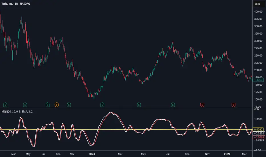
Momentum Quality Index (MQI)
Welcome to the Momentum Quality Index! This indicator aims to provide insight into short term trends by measuring the efficiency of price movement relative to the momentum of the trend. This indicator is designed to work better on short term time frames, capturing the micro-level of trends for practices such as day-trading, options trading, and shorter term swing trading.
How to read:
The main way of reading this indicator is through moving average crossovers. Upwards crossovers indicates uptrends whereas downwards crossovers indicates downtrends.
Customization:
This indicator includes a few adjustable options for fine tuning, such as optimized smoothing options and moving average length for efficiency in spotting reversals.
RMO [modded LazyBear] OscillatorBoth Yellow lines mean short or PUT option.. Both BLUE lines mean LONG or Call options. Using this to watch structure, and trend bias. this is only good for entry, and Not stop Loss. Don't be on the wrong side of trend

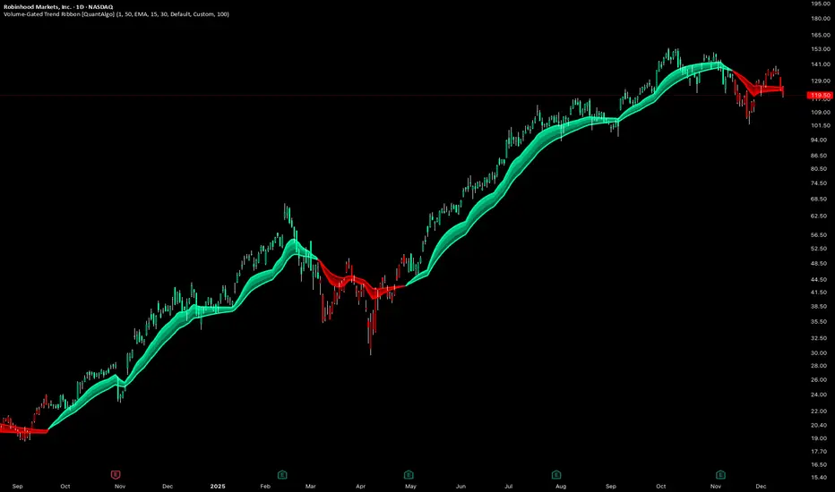
Volume-Gated Trend Ribbon [QuantAlgo]🟢 Overview
The Volume-Gated Trend Ribbon employs a selective price-updating mechanism that filters market noise through volume validation, creating a trend-following system that responds exclusively to significant price movements. The indicator gates price updates to moving average calculations based on volume threshold crossovers, ensuring that only bars with significant participation influence the trend direction. By interpolating between fast and slow moving averages to create a multi-layered visual ribbon, the indicator provides traders and investors with an adaptive trend identification framework that distinguishes between volume-backed directional shifts and low-conviction price fluctuations across multiple timeframes and asset classes.
🟢 How It Works
The indicator first establishes a dynamic baseline by calculating the simple moving average of volume over a configurable lookback period, then applies a user-defined multiplier to determine the significance threshold:
avgVol = ta.sma(volume, volPeriod)
highVol = volume >= avgVol * volMult
The gated price mechanism employs conditional updating where the close price is only captured and stored when volume exceeds the threshold. During low-volume periods, the indicator maintains the last qualified price level rather than tracking every minor fluctuation:
var float gatedClose = close
if highVol
gatedClose := close
Dual moving averages are calculated using the gated price input, with the indicator supporting various MA types. The fast and slow periods create the outer boundaries of the trend ribbon:
fastMA = volMA(gatedClose, close, fastPeriod)
slowMA = volMA(gatedClose, close, slowPeriod)
Ribbon interpolation creates intermediate layers by blending the fast and slow moving averages using weighted combinations, establishing a gradient effect that visually represents trend strength and momentum distribution:
midFastMA = fastMA * 0.67 + slowMA * 0.33
midSlowMA = fastMA * 0.33 + slowMA * 0.67
Trend state determination compares the fast MA against the slow MA, establishing bullish regimes when the faster average trades above the slower average and bearish regimes during the inverse relationship. Signal generation triggers on state transitions, producing alerts when the directional bias shifts:
bullish = fastMA > slowMA
longSignal = trendState == 1 and trendState != 1
shortSignal = trendState == -1 and trendState != -1
The visualization architecture constructs a three-tiered opacity gradient where the ribbon's core (between mid-slow and slow MAs) displays the highest opacity, the inner layer (between mid-fast and mid-slow) shows medium opacity, and the outer layer (between fast and mid-fast) presents the lightest fill, creating depth perception that emphasizes the trend center while acknowledging edge uncertainty.
🟢 How to Use This Indicator
▶ Long and Short Signals: The indicator generates long/buy signals when the trend state transitions to bullish (fast MA crosses above slow MA) and short/sell signals when transitioning to bearish (fast MA crosses below slow MA). Because these crossovers only reflect volume-validated price movements, they represent significant level of participation rather than random noise, providing higher-conviction entry signals that filter out false breakouts occurring on thin volume.
▶ Ribbon Width Dynamics: The spacing between the fast and slow moving averages creates the ribbon width, which serves as a visual proxy for trend strength and volatility. Expanding ribbons indicate accelerating directional movement with increasing separation between short-term and long-term momentum, suggesting robust trend development. Conversely, contracting ribbons signal momentum deceleration, potential trend exhaustion, or impending consolidation as the fast MA converges toward the slow MA.
▶ Preconfigured Presets: Three optimized parameter sets accommodate different trading styles and market conditions. Default provides balanced trend identification suitable for swing trading on daily timeframes with moderate volume filtering and responsiveness. Fast Response delivers aggressive signal generation optimized for intraday scalping on 1-15 minute charts, using lower volume thresholds and shorter moving average periods to capture rapid momentum shifts. Smooth Trend offers conservative trend confirmation ideal for position trading on 4-hour to weekly charts, employing stricter volume requirements and extended periods to filter noise and identify only the most robust directional moves.
▶ Built-in Alerts: Three alert conditions enable automated monitoring: Bullish Trend Signal triggers when the fast MA crosses above the slow MA confirming uptrend initiation, Bearish Trend Signal activates when the fast MA crosses below the slow MA confirming downtrend initiation, and Trend Change alerts on any directional transition regardless of direction. These notifications allow you to respond to volume-validated regime shifts without continuous chart monitoring.
▶ Color Customization: Six visual themes (Classic, Aqua, Cosmic, Ember, Neon, plus Custom) accommodate different chart backgrounds and display preferences, ensuring optimal contrast and visual clarity across trading environments. The adjustable fill opacity control (0-100%) allows fine-tuning of ribbon prominence, with lower opacity values create subtle background context while higher values produce bold trend emphasis. Optional bar coloring extends the trend indication directly to the price bars, providing immediate directional reference without requiring visual cross-reference to the ribbon itself.
4HR JRSX Swing Bias (RB Trading)4HR JRSX Swing Bias (RB Trading)
The 4HR JRSX Swing Bias is a higher timeframe swing analysis script designed to evaluate directional pressure, momentum decay, and price acceptance on the four hour chart. It is built specifically for GBPUSD and EURUSD and is not intended for use on other markets or timeframes.
It highlights conditions where directional pressure weakens, rotates, and is then confirmed by price behavior.
Intended Use and Scope
• Timeframe: 4 hour only
• Markets: GBPUSD and EURUSD
• Style: Swing bias and rotation analysis
• Signal frequency: Intentionally low, typically 10 to 15 setups per year per pair
• Alerts: Available for confirmed setups
• Not designed for Asia session conditions
Core Framework
The script operates through a sequential three-stage process. A setup can only appear when all stages align.
Directional pressure evaluation
Momentum exhaustion and rotation
Candle-based price confirmation
This structure prevents signals from appearing during noise or low-quality market conditions.
Directional Pressure Evaluation
The first stage measures directional pressure across multiple four hour candles using a smoothed strength calculation. This step evaluates whether bullish or bearish participation is dominant over time rather than reacting to isolated price spikes.
When directional pressure is unclear or neutral, the script remains inactive.
Momentum Exhaustion and Rotation
Once directional pressure is established, the script monitors for loss of momentum. Exhaustion is identified when pressure fails to expand despite continued price movement.
This decay often appears near the later stages of a directional move and signals increased probability of rotation rather than continuation.
Price Acceptance and Confirmation
The final stage requires price to confirm the rotation through candle behavior. No intrabar logic is used.
• Buy confirmation requires either
– a bullish candle close following downside pressure exhaustion
– or a pinbar showing strong rejection of lower prices
• Sell confirmation requires either
– a bearish candle close following upside pressure exhaustion
– or a pinbar showing strong rejection of higher prices
A setup is only confirmed after the four hour candle has fully closed.
Stop and Target Reference Plotting
When a setup is confirmed, the script plots visual reference levels:
• A stop reference beyond the exhaustion zone where the setup would be invalidated
• A projected target reference calculated using a fixed 4R multiple relative to the stop distance
These levels are provided for structural planning and consistency. They do not represent predictions or guarantees.
Why the Four Hour Chart Is Required
The pressure and exhaustion calculations are tuned to higher-timeframe behavior. On lower timeframes, momentum cycles occur too rapidly and lead to frequent false rotations.
The four hour chart provides the balance required for meaningful pressure, decay, and acceptance to develop.
Session Considerations
The script is not intended for Asia session evaluation. Reduced liquidity during those hours can distort momentum behavior and reduce signal quality. Best evaluation occurs during or after London and New York participation.
Chart Presentation Guidelines
• Use the script on a clean chart
• Avoid stacking other oscillators or momentum tools
• If drawings are used, they should be limited to swing structure or key price levels
All visual elements should support understanding of the script output.
Important Notes
This script analyzes historical price behavior to identify structural swing conditions. It does not predict future price movement or ensure outcomes. Users should test the tool, understand its confirmation rules, and apply independent risk management.

MWTI Introduction onChartMarket Wave TransIndex (MWTI)
Colors show when to attack and when to rest.
• Background = current market wave
• Masked zones = low momentum (rest)
• Upper dots = higher timeframe bias
No symbols, no predictions.
Just read the market state.
Works on any market, any timeframe.
Introduction (sample) is optimized for the 15m chart.
Try it on any market in 15m.
-------------------------------------------------------

Neural Markets [Institutional]Neural Markets is a proprietary technical analysis algorithm designed for structural trend identification and volatility filtering.
The script combines two core engines to generate high-probability market insights:
1. Volatility Engine:
Uses dynamic standard deviation bands (Volatility Bands) adjusted by a proprietary multiplier to filter out market noise. The logic adapts to expanding or contracting market phases to reduce false signals during consolidation.
2. Trend Filter (Smart Mode):
Integrates an Institutional EMA-based logic (Exponential Moving Average) to determine the macro-bias. Signals are only generated when price action aligns with the dominant trend, filtering out counter-trend noise.
KEY FEATURES:
- Non-Repainting Logic: All signals are permanent once the candle closes.
- Military Dashboard (HUD): Real-time display of Trend, Volatility, and Algorithm Status.
- Visual Cloud: Instant identification of the support/resistance zones based on volatility.
- Clean Chart: Optimized for professional use, minimizing visual clutter.
WARNING:
This is an Invite-Only script. Access is restricted to authorized members for educational and analytical purposes only. It does not constitute financial advice.
Clean chart visualization suitable for professional trading.
WARNING: This is a restricted access tool (Invite-Only). It is strictly for educational and analytical purposes.

Vega Convexity Regime Filter [Institutional Lite]STOP TRADING THE NOISE.
90% of retail trading losses occur during "Chop"—sideways markets where standard trend-following bots bleed capital through slippage and fees. Institutional desks know that the secret to high returns isn't just winning trades; it's knowing when to sit in cash.
The Vega V6 Regime Filter is the "Gatekeeper" layer of our proprietary Hierarchical Machine Learning engine (developed by a 25-year TradFi Risk Quant). It calculates a composite volatility score to answer one simple question: Is this asset tradeable right now?
THE VISUAL LOGIC
This indicator visually filters market conditions into two distinct Regimes based on our institutional backtests:
🌫️ GREY BARS (Noise / Chop)
The State: Volatility is compressing. The trend is undefined or weak.
The Trap: This is where MACD/RSI give false signals.
Institutional Action: Sit in Cash. Preserve Capital. Wait.
🟢 🔴 COLORED BARS (Impulse)
The State: Volatility is expanding. Momentum is statistically significant.
The Opportunity: A "Fat-Tail" move is likely beginning.
Institutional Action: Deploy Risk. Look for entries.
HOW IT WORKS (The Math)
Unlike simple moving average crossovers, the Vega Gatekeeper analyzes 4 distinct market dimensions simultaneously to generate a Tradeability Score (0-10) :
Trend Strength (ADX): Is there a vector?
Momentum (RSI/MACD): Is the move accelerating?
Volatility (Bollinger Bands): Is the range expanding?
Volume Flow: Is there institutional participation?
The Rule: If the composite score is < 4 , the market is Noise. The bars turn Grey. You do nothing.
BEST PRACTICES
For Swing Trading (Daily): Use Medium sensitivity. Only look for entries when the background turns Green/Red.
For Day Trading (4H/1H): Use Low sensitivity (more conservative). Use the Grey zones to tighten stops or exit positions.
THE PHILOSOPHY: "CASH IS A POSITION"
Most traders feel the need to be in a trade 24/7. The Vega V6 Engine (the system this tool is based on) achieved a +3,849% backtested return (18 months) largely by sitting in cash during chop. This tool visualizes that discipline.
🔒 WANT THE DIRECTIONAL SIGNALS?
This Lite version provides the Regime (When to trade).
To get the specific Entry Signals , Intraday Stop-Losses , and Probability Matrix (Stage 2 of our model), you need the Vega V6 Convexity Engine .
The Pro Version includes:
🚀 Specific Direction: Classification of "Explosion," "Rally," or "Crash."
🛡️ Dynamic Risk: Plots the exact Stop Loss levels used in our institutional backtests.
🌊 Macro Data: Integration of M2 Liquidity flow alerts.
👉 ACCESS INSTRUCTIONS:
Links to the Pro System , our Live Dashboard , and the 18-Month Performance Audit can be found in the Author Profile below or in the script settings.
Disclaimer: This tool is for educational purposes only. Past performance is not indicative of future results. Trading cryptocurrencies involves significant risk.
