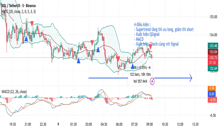
HVTCHVTC – SMC Market Structure & Trend Indicator
HVTC is a Smart Money Concepts–based tool that helps traders visualize market structure and trend direction with clarity.
Features:
CHoCH & BOS Detection
Automatically identifies structural shifts using true SMC logic and labels them directly on the chart.
Trend Filter
Confirms bullish or bearish conditions using an internal trend system to keep trades aligned with the major direction.
EMA 25 Guide
EMA 25 acts as dynamic support/resistance, helping define momentum and bias.
Alerts (Optional)
Notify traders when CHoCH/BOS or key retests occur—ideal for those who don’t monitor charts continuously.
Use Cases:
Works for Crypto, Forex, Gold, Indices, and Stocks across all timeframes. Helps improve entries, exits, and overall market understanding based on institutional structure.
Not financial advice. Use with proper risk management.
Jalur dan Saluran
QQQ Long Tier 1 (Conservative) - 4-Bar SweepTier 1 Entry (Conservative)
Parameter Details
Entry Zone 618.5–620.5
Entry Condition 1. Price closes >1H VWAP after intraday sweep of 618. 2. RSI(15m) > 45. 3. MACD 4H histogram positive and rising.
Stop 613.5 (below VRVP HVN and 20EMA daily cluster)
Take Profit 1 627.0
Take Profit 2 634.0 (call wall)
Position Size 0.5R (reduced due to low IV and positive gamma pin)
Time Invalidation Exit by Dec 11 pre-FOMC if no breakout over 627
Chart Reference QQQ Daily VRVP and 4H structure show base above 618 EMA cluster; OBV confirms accumulation.

BB & MTF EMAs + DPOC/WPOC v0.1This indicator combines multiple trend and support/resistance tools into a single overlay with specific customization for the Indian Standard Time (IST) session.
Features Included:
Bollinger Bands: 20-period SMA Basis, 1.5 StdDev.
4 Multi-Timeframe EMAs:
EMA 1: 9 Length (1m timeframe)
EMA 2: 20 Length (3m timeframe)
EMA 3: 50 Length (15m timeframe)
EMA 4: 200 Length (15m timeframe)
Session POCs (IST):
Daily POC (DPOC): Calculated 05:30-05:29 IST. Extends for full 24h session.
Weekly POC: Calculated from Monday 05:30 IST Open. Extends for full 7-day week.
Controls:
Toggle visibility for all individual components.
"Show Historical" toggle for pivots to see past levels or keep charts clean.
2 days ago
Release Notes
Description:
This indicator combines multiple trend and support/resistance tools into a single overlay with specific customization for the Indian Standard Time (IST) session.
Features Included:
Bollinger Bands: 20-period SMA Basis, 1.5 StdDev.
4 Multi-Timeframe EMAs:
EMA 1: 9 Length (1m timeframe)
EMA 2: 20 Length (3m timeframe)
EMA 3: 50 Length (15m timeframe)
EMA 4: 200 Length (15m timeframe)
Session POCs (IST):
Daily POC (DPOC): Calculated 05:30-05:29 IST. Extends for full 24h session.
Weekly POC: Calculated from Monday 05:30 IST Open. Extends for full 7-day week.
Controls:
Toggle visibility for all individual components.
"Show Historical" toggle for pivots to see past levels or keep charts clean.

rosha 3.1.6 (v6)ema based for scalping xauusd,good during london and newyork sassions, use withour modifications, dont enter in tranverse markate

Sniper ZonesThe indicator evaluates the relationship between price expansion and compression within daily ranges. Based on these dynamics, it derives upper and lower threshold zones that often behave as supply or demand areas.
These thresholds act as “reaction pockets” where price has a tendency to slow, reverse, or accelerate depending on how it interacts with the levels.
No future data or repainting methods are used; the zones come from completed timeframe evaluations and remain fixed once established for that particular trading session
📌 How Traders Can Use It
Reversal Trading:
When price approaches a marked zone, traders can monitor for rejection signals or momentum fade.
Breakout & Continuation:
If a zone is broken with strength, it often suggests continuation in that direction. The broken zone can then act as a flip level.
Risk Management:
Zones may serve as potential stop-loss areas or context for target placement.
Bias Confirmation:
Zones help traders decide whether market structure is leaning toward exhaustion or expansion.
📌 What Makes This Indicator Valuable
While many supply/demand tools rely on pattern detection or candle shapes, this indicator uses a structured, rule-based approach grounded in range evaluation and volatility footprinting. The zones are clean, stable, and designed for professional reaction-based trading rather than subjective drawing.
This works best of Indices which are Nifty, Banknifty, Finnifty and also works for Indian Stocks. This is for Intraday and Scalpers.

MSB (MM+SP2L+BTB) V6_by_shahriar📝 MSB(MM + SP2L + BTB) V6_by_shahriar
This indicator is the improved and professional version of the earlier Combo V16. The logic has been streamlined by removing less critical patterns and focusing exclusively on the three most powerful strategies—Micro Map (MM), Spike to 2nd Leg (SP2L), and Back To Break Even (Pro BTB). These three form a "strong triangle" of high-probability entries, all strictly filtered by a long-term Simple Moving Average (SMA) to ensure trades align with the prevailing market trend.
💡 Strategy Logic Overview
This strategy generates a Buy or Sell signal only when the signal condition is met and the price is on the correct side of the Trend SMA (default 200).
1. Micro Map (MM): The Catalyst for Strong Profit Moves
The Micro Map strategy is the critical final piece of the Strong Triangle, acting as the precise trigger that signals the end of consolidation and the start of a powerful, high-momentum profit move in the direction of the trend. While SP2L identifies the momentum start and BTB identifies the retest of value, MM identifies the moment price is ready to explode.
Logic: This strategy focuses on identifying a tightly controlled consolidation or pullback (indicated by patterns like Lower Highs or Higher Lows over the MM Correction Bars period) that occurs within the major trend (above/below the Trend SMA).
Trigger: The signal fires when price decisively breaks out of this compressed area (using the MM Breakout Lookback high/low), indicating that the short-term resistance/support has collapsed and the larger trend momentum is taking over.
Profit Potential: Because this entry follows a period of energy buildup (consolidation), the MM signal is often the precursor to the strongest leg of the move, offering the highest potential for profit capture.
2. Spike to 2nd Leg (SP2L)
The SP2L strategy capitalizes on the market's tendency to continue movement after an initial strong impulse.
Trigger: It first detects a strong impulse move (Spike) based on the Min Bars in Spike and Min Spike Move % inputs. The entry is then triggered upon the breakout of the first corrective bar (pullback) that follows that initial Spike, confirming the continuation of the trend.
3. Back To Break Even (Pro BTB)
The Pro BTB strategy identifies high-probability entries near previous support/resistance levels that have been broken and then retested (a "Breaker" structure).
Trigger: It first detects a breakout of a high/low level defined by the Donchian Channel Length. The signal is generated when the price returns to touch the exact breakout level and then confirms the original trend direction with a closing candle (e.g., a bullish close on a retest of a broken resistance).
⚙️ Settings and Customization (Inputs Tab)
The indicator's parameters are fully customizable to adjust sensitivity and adapt to different markets and timeframes.
Setting Name,Category,Description
SMA Length (Trend Filter),General,Defines the period for the Simple Moving Average (SMA) used to determine the primary trend direction. (Default: 200)
Donchian Channel Length,General,"Determines the lookback period for the Donchian Channel, used to establish significant high/low levels for the Pro BTB strategy. (Default: 20)"
ATR Multiplier for Micro Map/BTB SL,General,A multiplier for the Average True Range (ATR) that can be used for calculating Stop Loss (SL) distance outside of the indicator's core logic.
ATR Multiplier for SP2L SL (Wider),General,"A wider ATR multiplier, often used for setting Stop Loss in the higher volatility SP2L strategy."
Min Bars in Spike,Spike Params,Minimum number of bars used to calculate the price change for detecting an initial Spike in the SP2L strategy.
Min Spike Move %,Spike Params,Minimum percentage price change required over the Min Bars in Spike to qualify as a strong Spike.
MM Correction Bars,Micro Map Params,Sets the number of bars to analyze for the Lower Highs/Higher Lows pattern that confirms consolidation/pullback in the MM strategy.
MM Breakout Lookback,Micro Map Params,Sets the lookback period for the high/low that must be broken to trigger a MM signal after consolidation.
🎨 Style Tab
The Style tab allows users to customize the visual appearance of the indicator on the chart:
Trend SMA: Displays the long-term SMA line used for trend filtering.
BTB Long/Short Level: Displays the exact price level of the Donchian Channel breakout when a BTB signal is active (helps visualize the retest point).
Signal Shapes: Allows customization of the color, size, and style of the shapes for Buy/Sell signals for MM, SP2L, and BTB individually.
⚠️ Disclaimer (Liability Waiver)
This indicator is intended for educational and analytical purposes only.
The signals generated by this combination of strategies are based on historical price data and technical analysis principles. Trading involves substantial risk, and past performance is not indicative of future results. Users must conduct their own thorough research (due diligence) and analysis before making any trading decisions. The indicator serves as a supplementary tool and should not be the sole basis for entering or exiting any financial market position. You are solely responsible for all trading decisions and risks taken.

HSS Price Action v1based on price action and SMC concepts this indicator will give you trade entry and also guide on order blocks and liquidity .. good luck

Ghost Super EMAGhost Super EMA: Dynamic Dual-Filter Trend System
Indicator Overview
The GHOST SUPER EMA is a robust trend-following indicator designed to give traders a comprehensive view of trend direction, volatility, and bias. It achieves this by combining a unique mashup of two distinct Supertrend bands with a single Exponential Moving Average (EMA).
The result is a triple-layered visualization of the market's structure: the two Supertrend bands form a Dynamic Cloud for visual support/resistance, and the EMA provides a crucial speed confirmation filter.
Core Components & Technical Justification
The core of this indicator functions powerfully on the current chart timeframe when the Timeframe input is left blank. The components are combined to create a unique, layered filtration system:
Outer Supertrend (Factor 3.35): This is the Macro-Trend Boundary. Its higher factor creates a slower, wider band that acts as the primary threshold for trend direction, preventing noise-related whipsaws often seen with standard settings.
Inner Supertrend (Factor 1.67): This is the Volatility Boundary. Its lower factor makes it quicker and measures current market momentum. It provides an early alert for volatility contraction or expansion within the established macro-trend.
Supertrend Cloud: The visual area between the two Supertrend bands represents a Dynamic Support/Resistance Zone. The cloud's width reflects market volatility. Price trading within this zone signals potential consolidation or momentum loss. Its color is determined by the Close price relative to the Outer Supertrend.
EMA (Length 20): This is the Speed Confirmation Filter. A classic trend measurement, its color (Green/Red) serves as an independent velocity check, validating the primary trend signal from the Supertrend Cloud.
Trading Signals and Confirmation
A confirmed trading bias requires the simultaneous alignment of both the Cloud and the EMA:
🟢 Bullish Confirmation (Go Long): The Supertrend Cloud is Green (Price above Outer ST) AND the EMA is Green (Price above EMA).
🔴 Bearish Confirmation (Go Short): The Supertrend Cloud is Red (Price below Outer ST) AND the EMA is Red (Price below EMA).
Optional Advanced Filtering: Multi-Timeframe (MTF) Tool
The Timeframe input is optional and serves as an advanced filter for obtaining market context.
Function: By entering a Higher Timeframe (HTF) value (e.g., entering "4H" or "D"), the indicator uses the request.security() function to fetch all three components (Dual Supertrend and EMA) from that stable, larger timeframe.
Utility: This anchors trading decisions to the macro-trend, filtering out lower-timeframe noise and false signals. Traders can ensure their entries on a fast chart (e.g., 5-minute) are aligned with the dominant trend of the chosen higher timeframe (e.g., 1-hour). If the input is left blank, the indicator runs on the current chart's timeframe.
Customizable Settings
The following inputs are available for user configuration:
ATR Length: Period for Average True Range calculation (Default: 10).
Supertrend Factor 1: Factor for the Outer (Slow) Supertrend (Default: 3.35).
Supertrend Factor 2: Factor for the Inner (Fast) Supertrend (Default: 1.67).
EMA Length: Period for the Exponential Moving Average (Default: 20).
Timeframe: Optional MTF input. Leave blank for current chart timeframe (Default: "").
Disclaimer: Past performance is not indicative of future results. This indicator is a tool for technical analysis and should not be used as the sole basis for trading decisions.

Dual Session Range Boxes with FIB Lines█ OVERVIEW
The Dual Session Range Boxes with FIB Lines indicator is a powerful tool for identifying and visualizing Range Breakout or Inside Boxes Strategy setups with dual session tracking, customizable Fibonacci extensions, and trade zone levels. Perfect for traders who focus on session-based strategies across multiple markets.
█ FEATURES
◆ DUAL SESSION RANGES
- Range 1: Defines the Range (ORB) based on a specific time window
- Range 2: Extends the Range levels throughout a second session for trade management
- Both ranges can be independently configured with preset sessions or custom times
◆ SESSION PRESETS
- Tokyo Session (00:00 - 09:00)
- London Session (08:00 - 17:00)
- New York Session (14:00 - 21:00)
- Pre Market Session (10:00 - 15:30)
- Custom Time: Define your own session windows
◆ FIBONACCI EXTENSION LEVELS
- Automatically calculated from Range 1 High/Low
- Buy Side Levels: Projected above the range (green)
- Sell Side Levels: Projected below the range (red)
- 10 customizable Fib levels with individual on/off toggles:
- 23.6%, 38.2%, 50%, 61.8%, 78.6%, 100%, 127.2%, 161.8%, 200%, 261.8%
- Special color highlighting for key levels (50%, 100%, 200%)
- All percentage values are fully editable
◆ INSIDE TRADE ZONES
- Two horizontal lines drawn inside the Range 1 box
- Configurable percentage from High/Low (default: 10%)
- Helps identify premium/discount zones within the range
◆ LABELS & DISPLAY OPTIONS
- Show/hide price values on labels
- Show/hide percentage values on labels
- Adjustable label size (Tiny, Small, Normal, Large, Huge)
- Configurable label offset (distance above lines)
- Multiple rounding options for price display:
- 0.25 (quarter points - ideal for indices)
- 0.1 (tenth points)
- 0.01 (two decimals)
◆ STYLE CUSTOMIZATION
- Independent fill and border colors for both ranges
- Adjustable border width (1-5)
- Line style options: Solid, Dashed, Dotted
- Separate color settings for:
- Buy side Fibonacci levels
- Sell side Fibonacci levels
- Trade zone lines
- Special levels (50%, 100%, 200%)
◆ HISTORICAL DATA CONTROL
- Toggle to show/hide historical sessions
- Current session always remains visible
- Clean chart view when analyzing only the active session
█ HOW TO USE
1. Set your timezone in General settings
2. Configure Range 1 to capture your desired Opening Range period
3. Configure Range 2 to define how long levels should extend
4. Adjust Fibonacci levels based on your trading strategy
5. Use Trade Zones to identify key areas within the range
6. Toggle historical data on/off based on your analysis needs
█ USE CASES
- Opening Range Breakout (ORB) strategies
- Session-based trading (London, New York, Tokyo, Pre-Market)
- Fibonacci extension targets for breakout trades
- Identifying support/resistance from session ranges
- Multi-session analysis and confluence zones
█ NOTES
- Indicator works on timeframes lower than Daily
- All times are based on the selected timezone setting
- Range 2 only activates after Range 1 completes
- Fibonacci levels extend from Range 1 start to Range 2 end
Let me know if you like to have any enhancements.
Leave a like if you like it!

The Composite Predictive Index-(CPI-IGv5)***Main Purpose: Developed by Alcides J. Davila (TradingView: Alcides0265), a Miami-based daily trader and financial consultant specializing in commodities and capital solutions. The primary reason for CPI-IG v5 is to deliver institutional-grade predictive signals for market direction, synthesizing diverse technical factors into a probabilistic "probUp" score (upward movement likelihood) to guide high-confidence trades, aiming for 68-80% predictability in identifying trends/reversals.
Key Features: Probability Engine: Weighted combination of price delta, momentum (CMMI from RSI/mom), volume pressure, volatility (ATR/BB), trend slope, sentiment/news (manual inputs), projection (MACD ratio), and POC crossover; normalized via Z-score and tanh approx, mapped to probUp using normal CDF or logistic.
Signals and Strategies: Base/strong/ultra buy/sell gates based on prob thresholds (e.g., >0.68 for medium-term buys), bullish/bearish alignments (EMA9/20/SMA9 vs. VWAP/POC proxy), Golden/Death crosses (EMA50/200), short/medium/long confirmations, and breakout/breakdown with retest detection.
Visuals and HUD: Overlay plots (EMAs, BB, VWAP, projections), dynamic tables for stats (prob/z/ATR/delta vol), oscillator (bull/neu/bear on LTF/current/HTF), indexes (S&P/DJIA/Nasdaq), ETFs (SPY/QQQ/VIX), all resizable/movable.
Trading Modes: Versatile for scalping (short projections, 0.55 buy thresh), intraday, short/medium/long-term (stricter thresh up to 0.70, adjusted lookbacks/projections up to 500 bars).
Additional Tools: Internal backtest (with TP/SL via ATR mults, slippage/fees), alerts with cooldown, multi-timeframe alignment (HTF strict option).
Design and Protocol Structure: Modular Pine Script v5 with helpers (tanh/erf approx for ASCII-only math, safe div/Z-score norms); core series compute indicators (RSI/MACD/BB/VWAP/volume delta); linear weighted sum -> standardized Z -> prob calc -> gated signals with filters; efficient resource caps (max bars/lines/labels=500).
Reliability: Multi-factor redundancy and confirmations (e.g., simultaneous POC crosses, vol/MACD filters for ultra signals) reduce noise; HTF/LTF integration ensures alignment; backtest tracks cumR/wins/maxDD for validation; robustness via clamping/approx handles extremes/div0.
Efficiency: Real-time computation with rolling sums/Z-windows (50 bars); optimized for daily/institutional use without heavy lag; cooldowns prevent alert overload.
Robustness: Edge-case handling (e.g., na checks, mintick ranges); flexible inputs (weights, mults, modes) adapt to markets; no strict cutoff, continuous updates via security requests.
Flexibility: Customizable weights/thresh/resolutions; manual sentiment/news for external integration; toggles for visuals/backtest; suits pros, institutions, scalpers, daily traders across assets/timeframes.
Market Predictability: Claims 68-80% effectiveness via sophisticated prob model, multi-indicator fusion, and strategy layers; thresholds imply edge (e.g., 70% long-term buy prob), enhanced by projections/breakouts for forward bias.
Tiny Simplified Feedback Summary
CPI-IG v5 excels as a versatile, prob-driven institutional tool for predictive trading (68-80% edge), blending TA factors with custom modes/signals/visuals; robust and efficient for all trader levels, per code analysis and TradingView desc. Cheers!!!

KIMATIX INFOS – CoreKIMATIX INFOS – Core is a professional trend and entry framework designed to identify market regime shifts, confirm directional bias, and generate high-probability trade signals.
This system blends volume flow, higher-timeframe directional context, and momentum behavior to detect genuine trend transitions while filtering out chop and noise. Trend phases are visualized through an adaptive channel, and trade signals only trigger when structure, bias, and momentum align.
The indicator displays:
Validated trend phases via dynamic trend channels
Long/Short bias based on delta flow and directional structure
Hybrid entry signals combining momentum, structure, and trend
Visual signals for the most recent trend shifts
Built for traders who want clean trend entries, controlled pullback timing, or early trend reversal detection.
Works as a standalone tool or as a modular core logic inside automated systems.
Key Features
• Trend filter to separate trending vs. sideways markets
• Adaptive channel acting as dynamic support/resistance
• Hybrid signal engine that activates only with confirmed trend context
• Arrow markers displaying the latest trend initiations
• Ready-to-use alert conditions for automatic signaling
Benefits for Traders
• Avoids chop and false breakouts
• Captures impulsive directional movement precisely
• Provides clear market direction and real-time validation
• Suitable for scalpers, day traders, and swing traders
• Supports institutional logic

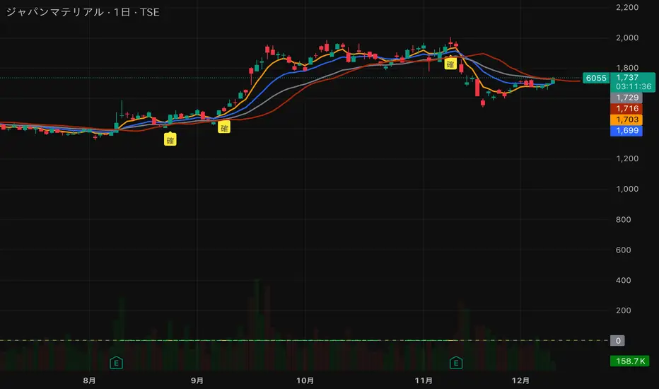
猛の掟・初動スクリーナー v3//@version=5
indicator("猛の掟・初動スクリーナー v3", overlay=true)
// ===============================
// 1. 移動平均線(EMA)設定
// ===============================
ema5 = ta.ema(close, 5)
ema13 = ta.ema(close, 13)
ema26 = ta.ema(close, 26)
plot(ema5, title="EMA5", color=color.orange, linewidth=2)
plot(ema13, title="EMA13", color=color.new(color.blue, 0), linewidth=2)
plot(ema26, title="EMA26", color=color.new(color.gray, 0), linewidth=2)
// ===============================
// 2. MACD(10,26,9)設定
// ===============================
fast = ta.ema(close, 10)
slow = ta.ema(close, 26)
macd = fast - slow
signal = ta.ema(macd, 9)
macdBull = ta.crossover(macd, signal)
// ===============================
// 3. 初動判定ロジック
// ===============================
// ゴールデン並び条件
goldenAligned = ema5 > ema13 and ema13 > ema26
// ローソク足が26EMAより上
priceAbove26 = close > ema26
// 3条件すべて満たすと「確」
bullEntry = goldenAligned and priceAbove26 and macdBull
// ===============================
// 4. スコア(0=なし / 1=猛 / 2=確)
// ===============================
score = bullEntry ? 2 : (goldenAligned ? 1 : 0)
// ===============================
// 5. スコアの色分け
// ===============================
scoreColor = score == 2 ? color.new(color.yellow, 0) : score == 1 ? color.new(color.lime, 0) : color.new(color.gray, 80)
// ===============================
// 6. スコア表示(カラム)
// ===============================
plot(score,
title="猛スコア (0=なし,1=猛,2=確)",
style=plot.style_columns,
color=scoreColor,
linewidth=3)
// 目安ライン
hline(0, "なし", color=color.new(color.gray, 80))
hline(1, "猛", color=color.new(color.lime, 60))
hline(2, "確", color=color.new(color.yellow, 60))
// ===============================
// 7. チャート上に「確」ラベル
// ===============================
plotshape(score == 2,
title="初動確定",
style=shape.labelup,
text="確",
color=color.yellow,
textcolor=color.black,
size=size.tiny,
location=location.belowbar)

Pious 3EMA-8EMA with 89ema when the stock price is above 89 ema and 3emah is above 8emah and 3emal is above 8emal buy prefers and vice versa, other conditions are additive to it

NQ DDNQ DD - Day Displacement Bands
This indicator displays dynamic upper and lower bands designed specifically for NQ (Nasdaq-100 E-mini) futures contracts, including their micro variants (MNQ).
The bands are plotted as blue circles that update at the start of each new trading session, providing key reference levels for intraday trading. These levels help traders identify potential areas of price expansion and contraction throughout the trading day.

ssdv%v2ssdv%v2 is a probabilistic trading indicator that learns from historical price behavior to predict where price is likely to move during today's trading session. Instead of using fixed values, it adapts based on what actually happened in past sessions.

Simple Multi VWAPSimple Multi VWAP - Release Notes
Overview
**Simple Multi VWAP** is a powerful Volume Weighted Average Price (VWAP) indicator that allows you to display up to **four independent VWAP lines** simultaneously on your chart, each with its own customisable anchor period. This provides traders with a comprehensive view of volume-weighted price levels across different timeframes, enabling better analysis of price action and support/resistance levels.
Key Features
Multiple VWAP Lines
- Display up to **4 independent VWAP lines** on a single chart
- Each VWAP can be individually enabled or disabled
- Each VWAP maintains its own anchor period independently
Flexible Anchor Periods
Choose from **10 different anchor periods** for each VWAP:
- **Session** - Resets daily
- **Week** - Resets weekly
- **Month** - Resets monthly
- **Quarter** - Resets quarterly
- **Year** - Resets annually
- **Decade** - Resets every 10 years
- **Century** - Resets every 100 years
- **Earnings** - Resets on earnings announcements
- **Dividends** - Resets on dividend payments
- **Splits** - Resets on stock splits
Native Styling Support
- Full integration with TradingView's native style dialog
- Right-click any VWAP line to customise:
- Colour
- Line style (solid, dashed, dotted, etc.)
- Line thickness
- Opacity
- Default colours provided for easy identification:
- **VWAP #1**: Orange (#f19d37)
- **VWAP #2**: Purple (#7859bc)
- **VWAP #3**: Red (#df484b)
- **VWAP #4**: Cyan (#54b9d1)
Global Settings
- **Source**: Choose the price source (default: Close)
- **Offset**: Shift VWAP lines forward/backward in time
- **Hide on 1D or Above**: Automatically hide VWAPs on daily or higher timeframes
How to Use
Basic Setup
1. **Add the Indicator**: Search for "Simple Multi VWAP" in TradingView's indicator library
2. **Enable VWAPs**: Check the boxes next to the VWAPs you want to display
3. **Select Anchor Periods**: Choose the anchor period for each enabled VWAP using the dropdown next to each VWAP toggle
4. **Customise Styling**: Right-click any VWAP line → "Style" to customise appearance
Recommended Configurations
Intraday Trading
- **VWAP #1**: Session (daily reset)
- **VWAP #2**: Week (weekly reset)
- **VWAP #3**: Month (monthly reset)
Swing Trading
- **VWAP #1**: Week (weekly reset)
- **VWAP #2**: Month (monthly reset)
- **VWAP #3**: Quarter (quarterly reset)
Long-term Analysis
- **VWAP #1**: Month (monthly reset)
- **VWAP #2**: Quarter (quarterly reset)
- **VWAP #3**: Year (yearly reset)
- **VWAP #4**: Decade (decade reset)
Input Settings
Global Settings
- **Source**: Price source for all VWAP calculations (default: Close)
- **Offset**: Number of bars to shift the VWAP lines (default: 0)
- **Hide VWAP on 1D or Above**: Toggle to hide all VWAPs on daily/weekly/monthly charts
VWAP Settings
Each VWAP has two settings displayed on the same line:
- **Enable Toggle**: Checkbox to show/hide the VWAP line (labelled as "VWAP#1", "VWAP#2", etc.)
- **Anchor Period**: Dropdown to select the reset period (labelled as "---> Anchor Period")
*Note: All VWAP settings are grouped under a single "VWAPs" group for easy organisation.*
Technical Details
Calculation Method
The indicator uses TradingView's built-in `ta.vwap()` function, which calculates:
**VWAP** = Σ(Price × Volume) / Σ(Volume)
The calculation resets based on the selected anchor period, ensuring accurate volume-weighted averages for each timeframe.
Event-Based Anchors
For Earnings, Dividends, and Splits anchors, the indicator uses TradingView's data requests to detect these events automatically, ensuring precise reset points.
Use Cases
Support and Resistance Levels
Multiple VWAPs help identify key support and resistance zones across different timeframes. Price often respects these levels, making them valuable for entry and exit decisions.
Trend Analysis
Compare price action against multiple VWAPs to gauge trend strength:
- Price above all VWAPs = Strong uptrend
- Price below all VWAPs = Strong downtrend
- Mixed positioning = Consolidation or trend change
Mean Reversion
When price deviates significantly from VWAP, it may indicate overextension and potential mean reversion opportunities.
Entry/Exit Signals
- **Long Entry**: Price crosses above VWAP with volume confirmation
- **Short Entry**: Price crosses below VWAP with volume confirmation
- **Exit**: Price returns to VWAP after a significant move
Tips & Best Practices
1. **Start Simple**: Begin with 1-2 VWAPs to avoid chart clutter
2. **Match Timeframes**: Use anchor periods that align with your trading timeframe
3. **Combine with Volume**: VWAP works best when combined with volume analysis
4. **Use Multiple Timeframes**: Apply the indicator to multiple chart timeframes for confirmation
5. **Customise Colours**: Use distinct colours for each VWAP to easily identify them
Notes
- The indicator requires volume data to function properly
- VWAP calculations are most accurate on intraday charts
- Event-based anchors (Earnings, Dividends, Splits) require symbol data availability
- All VWAPs share the same source input for consistency
Version Information
**Current Version**: 1.0.0

ssdv%Are you tired of drawing random boxes on your chart that don’t actually correlate to price?
This indicator solves that. It’s a Session-Based Standard Deviation Percentage Calculator designed to show you where price has actually reacted—and where it’s statistically likely to react again.
Just select the session you’re trading as Session 1 and the previous session as Session -1. The script automatically builds a live data pool from those sessions, calculates the true standard-deviation-based percentage levels, and dynamically adjusts as new data comes in.
The result?
Clean, adaptive reversal zones grounded in real volatility, not guesswork—so you can finally stop drawing boxes and start trading price with precision.

Mid-term Valuation Indicator | MiesOnChartsMedium-Term Valuation Indicator
This medium-term valuation indicator integrates multiple valuation metrics to assist investors in identifying oversold and overbought market conditions with greater precision.
How it works:
This indicator uses an average of multiple valuation indicators like technical mean reversion, sentiment and on-chain indicators. Its core innovation is an adaptive z-score aggregation that normalizes these diverse inputs (e.g., RSI for mean reversion or NUPL for on-chain sentiment) into a unified score, minimizing noise from isolated metrics and providing a more reliable valuation snapshot than traditional single-indicator tools.
All included indicators have individual flexible metrics, allowing users to customize them as needed. Additionally, the script uses color-coding based on the aggregation of z-scores, which aids in visualizing whether the market is overvalued or undervalued.
How to Interpret:
The indicator employs adaptive standard deviation bands to define extreme market zones. The red band signals a strongly overbought condition, while the green band indicates a significantly oversold condition.
How to Apply:
Investors can leverage these extreme levels as strategic points for taking profits or implementing dollar-cost averaging (DCA) strategies, optimizing entry and exit decisions in the market.
Disclaimer: NOT Financial advice. Past performance is not indicative of future results. No trading strategy can guarantee success in financial markets.

Moon Boys LineWe have the 44 and 125 day moving averages. When they cross, the trend is bullish or bearish.

The Composite Predictive Index-(CPI-IG v5)**The Composite Predictive Index (CPI-IG v5) is a comprehensive Market Institutional Indicator created by Alcides Davila and is an overlay indicator designed for institutional-grade market analysis and trading signals. Nevertheless, Daily-Short-Term Traders may also take advantage of this robust and efficient indicator. Still, they must make the necessary adjustments for scalping and for short-, medium-, and long-term trading. It synthesizes multiple technical factors (e.g., RSI, MACD, Bollinger Bands, VWAP, EMAs/SMAs, volume pressure, delta volume, manual sentiment/news inputs) into a weighted Z-score-based probability model (probUp) for forecasting price direction—generating buy/sell gates, strong/ultra signals, and short-term projections. It supports multi-timeframe alignment (HTF/LTF), breakout/breakdown detection with retests, internal backtesting, and alerts, while displaying dashboards for probabilities, stats, oscillators (bull/bear/neutral), major indexes (S&P, DJIA, Nasdaq), and ETFs (SPY, QQQ, etc.).
In terms of structure, it's highly reliable and productive: modular code with error-handling (safe divisions, approximations for tanh/erf), customizable modes (scalp to long-term), efficient resource use (max_bars_back=500), and cooldowns to prevent alert spam. Quality is strong, with transparent math, visual flexibility, and no apparent logic bugs—though real-world performance depends on market conditions and user tuning.
Investors can benefit significantly by using it for data-driven decisions, reducing bias through probability scores (e.g., >68% for buys), timing entries/exits with cross-confirmations, and monitoring broader market context via indexes/ETFs. It's especially useful for trend-following or reversal strategies, potentially improving win rates in volatile markets, but, like all indicators, it's not foolproof—use it in combination with risk management.
Strongest feature: The probability engine, which normalizes diverse signals into a robust, Z-scaled probUp metric (via the normal CDF or a logistic), enabling a quantifiable edge over traditional oscillators. Cheers...!!!

CRT Inside Hunter + FVG (Final Fusion)CRT Inside Hunter + FVG (Final Fusion)
This indicator automatically detects Inside Bar → CRT (Consolidation – Range – Trap) structures and generates LONG / SHORT BAM breakout signals whenever the mother bar is violated.
It also includes optional Fair Value Gap (FVG) confirmation.
🔍 1. Inside Bar → Mother Bar Detection
Automatically identifies inside bar sequences.
Creates the Mother Bar with High / Low boundaries.
Draws Q1 – Mid – Q3 levels as visual guidance.
Auto-removes CRT structure after a user-defined number of bars.
🚨 2. BAM Breakout Signals
Breakout events trigger automatic trade signals:
Upper violation → SHORT signal
Lower violation → LONG signal
Signals are displayed as labels and fully support alerts.
🟦 3. FVG (Fair Value Gap) Confirmation
Optional FVG detection mode:
Automatically marks Demand and Supply FVG zones.
If the price touches an FVG at the breakout moment, the signal becomes FVG-Confirmed.
🎨 4. Additional Features
Inside bars highlighted for clarity.
Clean, minimal drawing system.
All drawings reset daily for maximum chart hygiene.
This tool combines liquidity, imbalance, breakout logic and provides a powerful structure for scalping and intraday trading.
