Weekly & Monthly Thresholds + Targets (final, fixed)bullish and bearish weekly and monthly range for the whole audience
Jalur dan Saluran

Weekly & Monthly Thresholds + Targets (final, fixed)with alerts the weekly and monthly bullish and bearish ranges

Opening Range + Prev/Pre/Post Market Hi/Lo
Tracks each day’s regular-session high/low and their bar_index.
On a new day, stores those as “prev day” values.
Draws the prev-day lines anchored at the actual high/low bars from yesterday, then extends them across today (and beyond).

Zumiko ADHD Trend🎶 ZuMiKo – Team of the Future 🎶
ZuMiKo on the front line, competition in the background,
Team number one – everyone knows that!
Indicators like gold, dollars flying by,
The machine does the work, you just count the profits.
Zero accidents, every move is right here,
The algorithm is like a sniper – it hits without fail.
From zero to a hundred, the pace doesn't slow down here,
Whoever bets on ZuMiKo will win and reign supreme tomorrow.
Zu-Mi-Ko! – the future is in motion,
One click and you get a financial boost!
Zu-Mi-Ko! – the plan is fulfilled here,
The machine works, and you count the balance!
A new era of business, no carrying,
The system does the selling, you have time to use.
Phone in your pocket, money spinning,
When others are afraid – our team just rushes ahead.
No bullshit here, just results and facts,
Indicators in the green, like lights for a rocket.
A team like concrete, everyone here is a player,
Either you stand and watch, or you join in and get it!
Zu-Mi-Ko! – the future is in motion,
One click and you get a financial boost!
Zu-Mi-Ko! – the plan is coming true here,
The machine is working, and you're counting your money!
Don't wait for a miracle, because the miracle is already here,
Technology is working for your future and peace of mind.
Don't ask “is it worth it?”, just “when do we start?”,
Because this is the moment to deal the cards.
Zu-Mi-Ko! – it's not a dream, it's a game,
Team number one – this is where you win money!
Zu-Mi-Ko! – jump into the game,
One click separates you from this story!
t.me

Zumiko Haso🎶 ZuMiKo – Team of the Future 🎶
ZuMiKo on the front line, competition in the background,
Team number one – everyone knows that!
Indicators like gold, dollars flying by,
The machine does the work, you just count the profits.
Zero accidents, every move is right here,
The algorithm is like a sniper – it hits without fail.
From zero to a hundred, the pace doesn't slow down here,
Whoever bets on ZuMiKo will win and reign supreme tomorrow.
Zu-Mi-Ko! – the future is in motion,
One click and you get a financial boost!
Zu-Mi-Ko! – the plan is fulfilled here,
The machine works, and you count the balance!
A new era of business, no carrying,
The system does the selling, you have time to use.
Phone in your pocket, money spinning,
When others are afraid – our team just rushes ahead.
No bullshit here, just results and facts,
Indicators in the green, like lights for a rocket.
A team like concrete, everyone here is a player,
Either you stand and watch, or you join in and get it!
Zu-Mi-Ko! – the future is in motion,
One click and you get a financial boost!
Zu-Mi-Ko! – the plan is coming true here,
The machine is working, and you're counting your money!
Don't wait for a miracle, because the miracle is already here,
Technology is working for your future and peace of mind.
Don't ask “is it worth it?”, just “when do we start?”,
Because this is the moment to deal the cards.
Zu-Mi-Ko! – it's not a dream, it's a game,
Team number one – this is where you win money!
Zu-Mi-Ko! – jump into the game,
One click separates you from this story!
t.me

Simple Moving Averages + LabelsSimple Moving Averages
With this indicator, you can add a personal and visual touch to your simple mobile averages, activating and customizing the way you view your SMAs with or without labels and prices.

Zumiko Haso🎶 ZuMiKo – Team of the Future 🎶
ZuMiKo on the front line, competition in the background,
Team number one – everyone knows that!
Indicators like gold, dollars flying by,
The machine does the work, you just count the profits.
Zero accidents, every move is right here,
The algorithm is like a sniper – it hits without fail.
From zero to a hundred, the pace doesn't slow down here,
Whoever bets on ZuMiKo will win and reign supreme tomorrow.
Zu-Mi-Ko! – the future is in motion,
One click and you get a financial boost!
Zu-Mi-Ko! – the plan is fulfilled here,
The machine works, and you count the balance!
A new era of business, no carrying,
The system does the selling, you have time to use.
Phone in your pocket, money spinning,
When others are afraid – our team just rushes ahead.
No bullshit here, just results and facts,
Indicators in the green, like lights for a rocket.
A team like concrete, everyone here is a player,
Either you stand and watch, or you join in and get it!
Zu-Mi-Ko! – the future is in motion,
One click and you get a financial boost!
Zu-Mi-Ko! – the plan is coming true here,
The machine is working, and you're counting your money!
Don't wait for a miracle, because the miracle is already here,
Technology is working for your future and peace of mind.
Don't ask “is it worth it?”, just “when do we start?”,
Because this is the moment to deal the cards.
Zu-Mi-Ko! – it's not a dream, it's a game,
Team number one – this is where you win money!
Zu-Mi-Ko! – jump into the game,
One click separates you from this story!
t.me

Daily Low < Threshold AND Close > Threshold//@version=5
indicator("Daily Low < Threshold AND Close > Threshold", overlay=true)
// Get 1-month close (no lookahead)
monthlyClose = request.security(syminfo.tickerid, "1M", close, lookahead=barmerge.lookahead_off)
// Compute adjustment and threshold
adjustment = monthlyClose * 12.15 / (100 * math.sqrt(360.0 / 30.0))
threshold = monthlyClose - adjustment
// Conditions
condLow = low < threshold
condClose = close > threshold
signal = condLow and condClose
// Plots
plot(threshold, title="Threshold", color=color.orange, linewidth=2)
plot(low, title="Daily Low", color=color.red, linewidth=1)
plot(close, title="Daily Close", color=color.green, linewidth=1)
// Signal marker
plotshape(signal,
title="Signal",
location=location.belowbar,
style=shape.labelup,
text="OK",
textcolor=color.white,
size=size.tiny,
color=color.green)

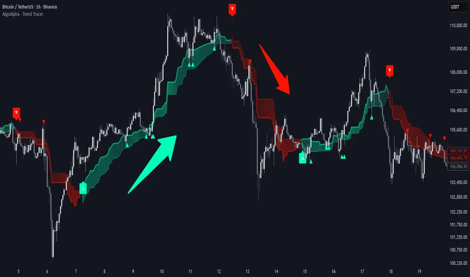
Trend Tracer [AlgoAlpha]🟠 OVERVIEW
This tool builds a two-stage trend model that reacts to structure shifts while also showing how strong or weak the move is. It uses a mid-price band (from the highest high and lowest low over a lookback) and applies two Supertrend passes on top of it. The first pass smoothens the basis. The second pass refines that direction and produces the final trail used for signals. A gradient fill between the two trails uses RSI of price-to-trail distance to show when price is stretched or cooling off. The aim is to give traders a simple way to read trend alignment, pressure, and early turns without guessing.
🟠 CONCEPTS
The script starts with a mid-range basis. This is the average of the rolling highest high and lowest low. It acts as a stable structure reference instead of raw close or typical price. From there, two Supertrend layers are applied:
• The first Supertrend uses a shorter ATR period and lower factor. It reacts faster and sets the main regime.
• The second Supertrend uses a slightly longer ATR and higher factor. It filters noise, waits for confirmed continuation, and generates the signal line.
The interaction between these trails matters. The outer Supertrend provides context by defining the broader regime. The inner Supertrend provides timing by flipping earlier and marking possible shifts. The gradient fill uses RSI of (close − supertrend value) to display when price stretches away from the trail. This shows strength, exhaustion, or compression within the trend.
🟠 FEATURES
Bullish and bearish flip markers placed at recent highs/lows
Rejection signals off the trend tracer line
Alerts for bullish and bearish trend changes
🟠 USAGE
Setup : Add the script to your chart. Timeframe is flexible; lower timeframes show more flips while higher ones give cleaner swings. Adjust Length to change how wide the basis range is. Use the two ATR settings and factors to match the volatility of the market you trade.
Read the chart : When the refined trail (stv_) sits above price the regime is bearish; when below, it is bullish. The wide trail (stv) confirms the larger move. Watch the gradient fill: darker colors appear when price is stretched from the trail and lighter colors appear when the move is weakening. Flip markers ▲ or ▼ highlight the first clean shift of the refined trail.
Settings that matter : Increasing the Main Factor slows main-trend flips and filters chop. Increasing the Signal Factor delays the timing trail but reduces noise. Shortening Length makes the basis more reactive. ATR periods change how sensitive each Supertrend pass is to volatility.
Pious 3/8 EMA High-Low + 89 EMA Strategybuy signal when 3emah cross above 8emah, 3emal cross above 8emal,high cross above previous 3 high with volume and vice versa

Institutional VWAP Pressure – 5M Execution With 15M HTF BiasHow Smart Money Fades Overextended Intraday Moves
Most intraday traders rely on lagging indicators, chasing breakouts or reacting emotionally to volatility spikes.
Institutional traders do the opposite: they fade inefficiencies, accumulate liquidity, and force price back toward VWAP — the intraday “fair value anchor”.
In this idea, I’ll show you how 5M execution timing combined with 15M VWAP bias creates one of the cleanest mean-reversion models you can trade.
🧩 Why VWAP Matters for Institutional Flow
Large players measure performance and position quality relative to VWAP.
When price stretches too far above or below VWAP:
liquidity becomes thin
market orders become inefficient
continuation becomes unlikely
reversion becomes the path of least resistance
This creates exploitable opportunities — if you know where to look.
⏱ Why the 5M Timeframe Is Ideal for Execution
Most intraday inefficiencies (liquidity grabs, stop runs, exhaustion wicks) occur on 1M–5M candles, not on higher timeframes.
On 5-minute, we see:
microstructure shifts
orderflow exhaustion
failed breakouts
aggressive wicks into VWAP extremes
momentum curls (stochastics turning)
These details are invisible on 15M, meaning the 5M chart is where the actual entries should be taken.
📊 Why 15M Should Be Your HTF Bias Layer
Before fading an extended move, you must know:
Is the session trending strongly?
Is VWAP sloping up or down?
Are we in a high-volume directional environment?
15M gives clarity that 5M alone cannot.
It filters out setups that would fail in trending conditions and ensures that reversion plays align with institutional behavior.
Think of 15M as your macro intraday compass.
🎯 The Institutional VWAP Pressure Setup
We use a combination of three factors:
1️⃣ VWAP Deviation Zones (Overextension)
Price must exceed a tolerance band (e.g., ±0.5%) from VWAP.
This marks inefficiencies where retail is trapped.
2️⃣ Volume Exhaustion (Weak Liquidity)
Continuation requires strong volume.
Reversion happens when volume drops below a threshold (e.g., 70% of average).
Weak volume = weak conviction = high reversion probability.
3️⃣ Momentum Reversal (Stochastics Curl)
Institutions don’t fade blindly — they wait for momentum to turn:
SHORT: Stoch turns down from high levels
LONG: Stoch turns up from depressed levels
This avoids early entries and aligns with microstructure shifts.
🔻 SHORT Conditions (5M Execution)
Price > VWAP + tolerance
Volume < 0.7 × average
Stoch turning down (momentum shift)
15M VWAP not trending strongly upward
This identifies weak, extended rallies likely to mean-revert.
🔹 LONG Conditions (5M Execution)
Price < VWAP − tolerance
Volume exhaustion (weak selling)
Stoch curling upward
15M VWAP not trending sharply downward
This captures panic-driven selling that institutions often buy.
🧠 Why This Works Consistently
Because the model isn’t based on patterns or random indicators — it’s based on how real liquidity is managed:
VWAP = institutional fair value
Extreme deviations = retail emotion
Low volume = lack of continuation
Stochastic curl = momentum turning
15M slope = session structure
You’re essentially trading the natural tendency of price to return to efficiency.

ULTRA KAMA (Hayalet Sinyaller)Although you only see the KAMA (Kaufman Adaptive Moving Average) line on the chart, signal generation is managed by a powerful, 5-layer confirmation system running in the background.
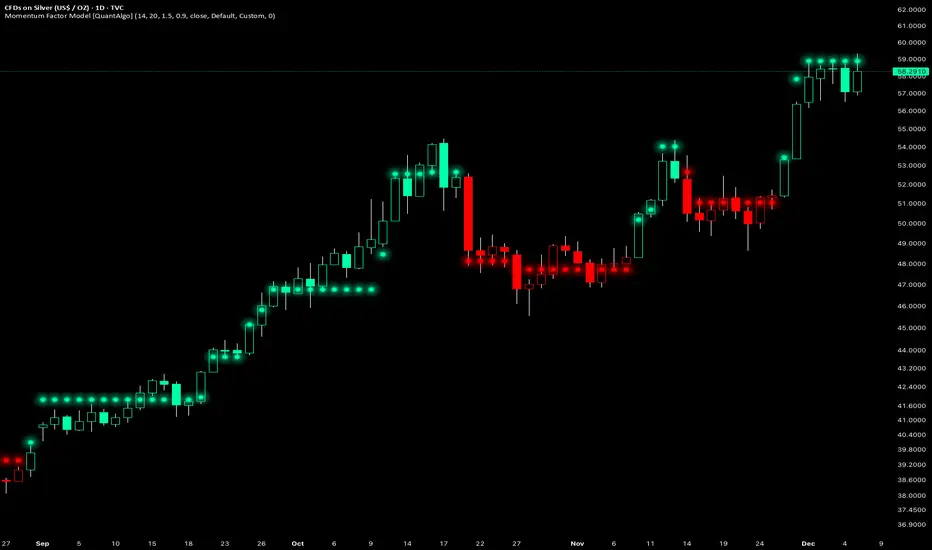
Momentum Factor Model [QuantAlgo]🟢 Overview
The Momentum Factor Model is a multi-horizon momentum analysis system that combines weighted return calculations with risk-adjusted price projections to identify and track persistent directional trends. The indicator employs a quantitative approach by measuring momentum across multiple timeframes simultaneously, applying exponential decay weighting to balance recent versus historical price action, and constructing volatility-normalized boundaries for trend validation. This factor-based methodology provides traders and investors with a systematic framework for momentum regime identification, trend persistence evaluation, and dynamic support/resistance determination across diverse market conditions and timeframes.
🟢 How It Works
The indicator constructs a composite momentum factor by calculating percentage returns over three distinct lookback periods (1, 3, and 5 bars) and combining them using exponentially decayed weights. The momentum decay parameter controls the relative importance of each timeframe, with higher decay values creating more balanced weighting between recent and historical momentum, while lower values emphasize immediate price action. This weighted momentum factor captures the multi-dimensional nature of trend strength rather than relying on a single timeframe measurement.
The expected return is derived by smoothing the momentum factor over a user-defined period, establishing a baseline for anticipated price movement based on recent momentum characteristics. This expected return then projects a factor-based price estimate, which undergoes risk adjustment through volatility normalization, creating a price estimate that accounts for both directional bias and market volatility conditions.
🟢 How to Use It
▶ Enter Long positions when the momentum factor dots (⏺) transition from red to green (bullish) , indicating the momentum factor model has confirmed positive directional bias. The color change represents a validated shift where the factor line has broken through the lower boundary and begun tracking the upper bound, signaling momentum reversal to the upside. Conversely, enter Short positions or exit existing Longs when the dots shift from green to red (bearish) , confirming negative momentum establishment and downward trend tracking.
The momentum factor dots function as a dynamic momentum-based reference pathway that can be used for position management and risk control. During bullish phases, the dot formation represents a momentum-weighted support zone where pullbacks may find stability before continuation. During bearish trends, it acts as resistance where rallies may encounter selling pressure. Price action relative to the momentum factor pathway provides context on trend health: sustained price movement in the direction of the trend (above the dots during bullish phases, below during bearish phases) confirms momentum persistence, while repeated violations may suggest weakening directional conviction.
▶ Configure alert notifications to monitor trend changes without continuous chart observation. The indicator provides three alert types: "Bullish Momentum Signal" triggers specifically on upward trend reversals, "Bearish Momentum Signal" captures downward momentum shifts, and "Momentum Trend Change" fires on any directional transition. These alerts activate only when the trend state changes from one regime to another, eliminating false triggers from intrabar noise or temporary boundary touches that don't result in confirmed trend reversals.
▶ The indicator also offers six pre-designed color schemes (Classic, Aqua, Cosmic, Ember, Neon, Custom) optimized for various chart backgrounds and visual preferences, ensuring the momentum trend remains clearly visible under different display conditions. The bar coloring feature overlays trend direction directly onto the price candles, providing immediate visual confirmation of the momentum regime without needing to reference the dot pattern position.
🟢 Pro Tips for Trading and Investing
▶ Align the configuration preset with your trading timeframe and objectives: Fast Response settings excel on 1-15 minute charts for scalping and day trading where capturing quick momentum shifts is paramount, though this comes with increased signal frequency and potential whipsaws in ranging conditions. Default parameters suit hourly to daily charts for swing trading, providing balanced responsiveness without excessive noise. Smooth Trend configuration works best on 4-hour to weekly timeframes for position trading and investment analysis, prioritizing trend stability over timing precision and significantly reducing false reversals during consolidation periods.
▶ Context matters significantly for momentum-based systems. The indicator performs optimally during trending market regimes where directional persistence exists and may struggle during sideways consolidation where momentum lacks consistency. Before taking signals, assess the broader market structure: look for established higher highs/higher lows (uptrend) or lower highs/lower lows (downtrend) on higher timeframes to confirm you're trading with the dominant directional bias. During range-bound periods, reduce position sizing or wait for the momentum factor dots to establish a clear directional slope and consistent movement before committing capital.
▶ Layer the momentum factor model with complementary analysis rather than using it in isolation. Combine trend signals with volume confirmation (increasing volume on trend changes suggests institutional participation), key support/resistance levels (signals near major levels carry higher probability), and volatility context (ATR expansion can precede significant moves). Consider the momentum decay parameter's impact: values near 0.85 make the model highly sensitive to recent price action, ideal for fast-moving markets but prone to false signals; values near 0.95 create smoother momentum estimates that better filter noise but may lag major reversals.
▶ Implement dynamic position management using the momentum factor pathway as a trailing reference framework. Rather than placing fixed stops, observe the dot formation's progression: as long as it maintains its directional slope and price respects it as support (bullish) or resistance (bearish), the momentum regime remains intact. Exit or tighten stops when price closes decisively through the momentum factor dots against your position, or when the dot pathway itself flattens (losing slope) indicating momentum exhaustion. For portfolio allocation, scale position sizes based on momentum factor strength, e.g., steeper dot progression angles and faster advancement suggest stronger momentum worthy of larger allocations within your risk parameters.
W/M Pattern Strategy + MACD/RSI Confirmation V3.0 by ThaungkmitlW/M Pattern Strategy + MACD/RSI Confirmation V3.0
Description Text:
This script is a comprehensive Strategy (backtestable) that combines classical Chart Patterns with momentum indicators to identify high-probability reversal setups. It focuses on detecting "W" Patterns (Double Bottoms/Higher Lows) and "M" Patterns (Double Tops/Lower Highs), filtered by MACD and RSI to reduce false signals.
How It Works
The strategy relies on a "Confluence" of three factors before triggering an entry:
1. Price Action Patterns (W & M)
W Pattern (Bullish): The script detects Pivot Lows. If a new Pivot Low is higher than the previous one (forming a Higher Low structure), it marks a potential "W" pattern.
M Pattern (Bearish): The script detects Pivot Highs. If a new Pivot High is lower than the previous one (forming a Lower High structure), it marks a potential "M" pattern.
2. MACD Confirmation (Zero Line)
Price action alone is not enough. The script waits for the MACD Line to cross the Zero Line:
Buy: MACD crosses UP over 0 (indicating bullish momentum shift).
Sell: MACD crosses DOWN under 0 (indicating bearish momentum shift).
3. RSI Threshold
To ensure the trend has strength, the RSI (Relative Strength Index) acts as a final filter:
Buy Condition: RSI must be above 50.
Sell Condition: RSI must be below 50.
Visual Features
Pivot Labels: Automatically marks Pivot High (Red Triangle) and Pivot Low (Green Triangle).
Pattern Lines: Draws lines connecting the swing points when a potential W or M pattern is detected.
Signals: Displays "BUY" or "SELL" labels with text explaining the setup (e.g., "W+MACD+RSI").
Background: Highlights the chart background (Green/Red) when a valid trade signal occurs.
EMAs: Plots EMA 10 (Blue) and EMA 15 (Red) to help you visualize the immediate trend direction.
Settings
Pivot Left/Right Bars: Adjust the sensitivity of the Swing detection.
MACD Settings: Fast, Slow, and Signal lengths (Standard 12, 26, 9).
RSI Settings: Adjust Length and the Threshold level (Default is 50).
Backtesting
This is a strategy script, meaning you can use the Strategy Tester panel below the chart to see how this logic performs on historical data for your chosen timeframe and asset.
Disclaimer: This tool is for educational purposes. Past performance in backtesting does not guarantee future results.

01 TMA Centered BandsA dynamic, adaptive volatility channel used to identify trend direction, overbought/oversold zones, and precise reversal points.
Features:
Real-time centered TMA calculation
Market volatility detection
Reversal zones with high-probability signals
Works on all timeframes and assets
Benefits:
Helps you catch early trend shifts
Filters out market noise during ranging periods

Fibot X: LDO Hyperliquid (Katōshi) Auto StrategyFibot X v4 – Hyperliquid LDO Edition (Katōshi Connector)
This Fibot X v4 edition is specially optimized for trading LDO on the Hyperliquid DEX, with native Katōshi connector integration for fast, stable automated execution.
The system has been internally tuned to match LDO’s volatility and structural behavior on Hyperliquid while preserving the original Fibot X engine: precise entries, progressive TP management, risk control, and long-term consistency.
⚙️ Operational Requirements
• Mandatory timeframe: 30 minutes
• Fixed leverage: x1 (higher leverage reduces system consistency)
• Each bot must operate with its own dedicated initial capital
Features
• Exclusive internal optimization for LDO
• Full automation through Katōshi
• Logic adapted to decentralized environments
• Structured multi-TP risk-managed system
• Reliable backtesting with a stable performance curve
Designed for algorithmic traders seeking accuracy and consistency in a focused asset.
(For access or subscription details, check my X profile linked here.)

Fibot X: YGG Hyperliquid (Katōshi) Auto StrategyFibot X – Hyperliquid YGG Edition (Katōshi Connector)
This Fibot X v4 edition is specially optimized for trading YGG on the Hyperliquid DEX, with native Katōshi connector integration for fast, stable automated execution.
The system has been internally tuned to match YGG’s volatility and structural behavior on Hyperliquid while preserving the original Fibot X engine: precise entries, progressive TP management, risk control, and long-term consistency.
⚙️ Operational Requirements
• Mandatory timeframe: 30 minutes
• Fixed leverage: x1 (higher leverage reduces system consistency)
• Each bot must operate with its own dedicated initial capital
Features
• Exclusive internal optimization for YGG
• Full automation through Katōshi
• Logic adapted to decentralized environments
• Structured multi-TP risk-managed system
• Reliable backtesting with a stable performance curve
Designed for algorithmic traders seeking accuracy and consistency in a focused asset.
(For access or subscription details, check my X profile linked here.)

SwgMFI
⸻
🧭 Description (for TradingView)
Swing Filter MFI + Divergence + Exhaustion
This indicator is designed to identify swing phases, momentum shifts, and exhaustion points using a refined version of the Money Flow Index (MFI).
It combines multi-layer filters to help traders visualize when momentum is building, fading, or reversing.
⸻
⚙️ Core Logic
• MFI Momentum Wave
Displays normalized money flow pressure (–60 to +60).
Gray zone = neutral.
Red/Green extensions = strong momentum bursts beyond upper/lower bands.
• Exhaustion Detection
Highlights orange (bull exhaustion) and blue (bear exhaustion) zones when momentum starts to fade after an extended move.
• Divergence Recognition
Plots circles when price makes new highs/lows but MFI fails to confirm — signaling potential turning points.
• Swing Confirmation Signals
Buy/Sell triangles appear when a recent exhaustion or divergence is followed by a re-entry into normal momentum range, confirming a likely swing reversal.
Frequency is automatically throttled to avoid multiple signals during one move.
⸻
💡 How to Use
1. Use red/green blocks to identify strong momentum zones.
2. Watch for orange/blue exhaustions — they often mark late-trend fatigue.
3. A BUY▲ signal suggests bearish exhaustion followed by recovery momentum.
4. A SELL▼ signal suggests bullish exhaustion followed by declining momentum.
5. Combine with your trend filter (EMA/Bollinger) for confirmation.
⸻
🧩 Best Settings
• MFI length: 14
• Upper / Lower bands: ±40
• Slope sensitivity: 1.5
• Signal lookback: 5
• Minimum gap between signals: 10 bars
⸻
📊 Built For
Swing traders, momentum scalpers, and algorithmic strategists who need early exhaustion cues rather than lagging trend indicators.
Can be used on any asset or timeframe (works exceptionally well on 4H and Daily charts).
⸻
✍️ Credits
Concept & logic refinement by @kkbst88
Based on original MFI/RSI work by LazyBear & SeiglerJ (open-source community).

ZY Target TerminatorThe indicator follows trends and generates short and long signals. Furthermore, when it generates a signal, it displays the maximum profit margins for the last three signals it generated in the same direction. It also clearly indicates the number of candles for which no signal has been generated for the pair. Avoid trading pairs whose profit margins do not align with your trading strategy.

Fibot X: CAKE Hyperliquid (Katōshi) Auto StrategyFibot X – Hyperliquid CAKE Edition (Katōshi Connector)
This Fibot X v4 edition is specially optimized for trading CAKE on the Hyperliquid DEX, with native Katōshi connector integration for fast, stable automated execution.
The system has been internally tuned to match CAKE’s volatility and structural behavior on Hyperliquid while preserving the original Fibot X engine: precise entries, progressive TP management, risk control, and long-term consistency.
⚙️ Operational Requirements
• Mandatory timeframe: 30 minutes
• Fixed leverage: x1 (higher leverage reduces system consistency)
• Each bot must operate with its own dedicated initial capital
Features
• Exclusive internal optimization for CAKE
• Full automation through Katōshi
• Logic adapted to decentralized environments
• Structured multi-TP risk-managed system
• Reliable backtesting with a stable performance curve
Designed for algorithmic traders seeking accuracy and consistency in a focused asset.
(For access or subscription details, check my X profile linked here.)

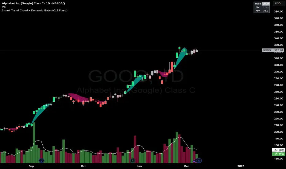
Smart Trend Cloud + Dynamic Gate (V 2.3)Smart Trend Cloud + Dynamic Gate
The Smart Trend Cloud + Dynamic Gate is a comprehensive trend-following system designed to filter out market noise and identify high-probability trend entries. Unlike simple Moving Average crossovers which often fail in ranging markets, this indicator employs a multi-stage validation system (The "Gate") combining Volume, Momentum, and Volatility filters to ensure you only trade when the market has conviction.
Key Features:
> Multi-Type Trend Cloud: Choose between HMA (Hull Moving Average), EMA, or ZeroLag EMA to define the trend baseline.
> The "Dynamic Gate" Filter: A crossover alone does not trigger a signal. The move must be validated by Relative Volume or MACD Histogram momentum within a specific window.
> Choppiness Suppression: Integrated ADX filter turns the candles gray during low-volatility consolidation zones to prevent over-trading.
> Stretch Bands: Optional ATR-based bands to highlight when price is over-extended from the mean.
> Live Dashboard: A table on the chart displaying current Trend State, Relative Volume strength, and ADX values.
How logic Works
1. Trend Definition & The Cloud The core trend is defined by the relationship between a Fast and Slow Moving Average.
Visuals: The space between these MA's forms the "Cloud". The cloud color transparency adjusts dynamically based on the strength of the trend (the spread between the MAs).
MA Options:
HMA: Best for scalping (1m/5m) due to low lag.
ZeroLag EMA: Custom calculation to reduce latency while retaining smoothness.
EMA: Standard trend following.
2. The Entry Gate (Validation) To avoid false signals during "whipsaw" price action, this script uses a logic gate. When a MA crossover occurs, it enters a "Pending" state. It only confirms a BULL or BEAR state if one of the following conditions is met within Gate Window bars:
Volume Spike: Relative Volume (Current Vol / Avg Vol) is greater than the defined threshold (default 1.2x).
Momentum Shift: The MACD Histogram confirms the direction of the trend.
3. Consolidation Filter The script calculates the ADX (Average Directional Index). If the ADX is below the Min ADX Strength threshold (default 20), the market is considered "Choppy."
Visual: Bars turn Gray.
Logic: Trend signals are suppressed until volatility expands.
4. Visual Dashboard A panel is located in the top-right corner providing real-time data:
Trend: Current State (Bull, Bear, or Chop).
Vol: Current Relative Volume (Green if > 1.0).
ADX: Current Trend Strength value.
Settings:
Trend Settings:
Adjust MA types and lengths to fit your timeframe.
Entry Gate: Toggle the Volume/Price gate on/off and adjust the Relative Volume requirement.
Consolidation: Enable/Disable the ADX filter to see all signals or only high-strength ones.
Visuals: Toggle the Cloud, Dashboard, or "Stretch Bands" (ATR bands) to declutter your chart.
Recommended Settings by Timeframe
Since different timeframes require different sensitivities to noise, here are the optimized settings for the Smart Trend Cloud:
⚡ 5 Minute Chart (Scalping)
Best for: Catching quick intraday momentum bursts while filtering chop.
MA Type: HMA (Hull Moving Average for speed)
Fast Length: 9
Slow Length: 21
Min Relative Volume: 1.3 (Requires higher volume to confirm entry)
Min ADX: 25 (Stricter chop filter)
⏱️ 15 Minute Chart (Intraday Swing)
Best for: Day trading with a balance of speed and stability.
MA Type: ZeroLag EMA (Reduces noise better than HMA)
Fast Length: 10
Slow Length: 30
Min Relative Volume: 1.2
Min ADX: 20
hrs 1 Hour Chart (Short-Term Swing)
Best for: Capturing the trend of the week.
MA Type: EMA or ZeroLag EMA
Fast Length: 12
Slow Length: 26 (Classic MACD correlation)
Min Relative Volume: 1.1
Min ADX: 20
📅 1 Day Chart (Position Trading)
Best for: Long-term trends and "Golden Cross" style entries.
MA Type: EMA (Standard Institutional Moving Average)
Fast Length: 20
Slow Length: 50
Min Relative Volume: 1.2
Min ADX: 15 (Allows for earlier entries on major trend shifts)
Alerts:
The script includes built-in alertcondition events for:
Trend Start: Bull (Valid trend detected after filtering).
Trend Start: Bear (Valid trend detected after filtering).
Access & Authorization
This is an Invite-Only script.
st reversal detector" Highly accurate reversal-detection algorithm that identifies market reversals before they occur, focusing on early signals at swing highs and swing lows. The tool must work seamlessly with confluences such as RSI overbought/oversold levels, bullish or bearish divergence, and other reversal confirmations to filter only A+ setups. no lag, no repainting, and clear visual signals for intraday trading. The model should work exceptionally well on the 10-minute and 5-minute timeframes and be specifically optimized for XAUUSD m10 and ETH m5 timeframe ''

Trend Step Channel [BigBeluga]🔵 OVERVIEW
Trend Step Channel identifies directional bias by forming a dynamic volatility-based step channel. It detects trend shifts when candle lows close above the upper band (bullish) or when candle highs drop below the lower band (bearish). A step-style midline tracks the trend evolution, while an integrated dashboard shows price positioning percentages across multiple timeframes.
🔵 CONCEPTS
ATR-Based Channel — The indicator constructs upper and lower channel boundaries using ATR distance around a single adaptive trend line, providing automatic scaling with volatility.
Trend Direction Logic —
• Low above upper band → uptrend confirmation.
• High below lower band → downtrend confirmation.
Step Trend Line — A reactive midline that locks onto price swings, stepping upward or downward as new trend confirmations occur.
Channel Width — Defines the total volatility range around the midline; a wider channel smooths market noise, while a narrower one reacts faster.
Price Position Ratio — Calculates the relative position of the close within the channel, from 0% (bottom) to 100% (top).
🔵 FEATURES
Volatility-Adaptive Channel — Expands and contracts dynamically to match market volatility, maintaining consistent distance scaling.
Configurable MA Source — Choose from SMA, EMA, SMMA, WMA, or VWMA as the base smoothing method.
Color-Coded Step Line —
• Green indicates an uptrend.
• Orange indicates a downtrend.
Channel Fill Visualization — Semi-transparent fills highlight active volatility zones for clear trend identification.
Price Position Label — Displays a “<” marker and percentage at the channel edge showing how far the current close is from the lower or upper band.
Multi-Timeframe Dashboard —
• Displays alignment across 1H–5H charts.
• Each cell shows an arrow (↑ / ↓) with price % positioning.
• Cell background color reflects bullish or bearish bias.
Real-Time Updating — The channel, midline, and dashboard refresh dynamically every bar for continuous feedback.
🔵 HOW TO USE
Trend Confirmation —
• Bullish trend forms when candle low closes above the upper band.
• Bearish trend forms when candle high closes below the lower band.
Trend Continuation — Maintain bias while the step line color remains consistent.
Volatility Breakouts — Sudden candle breaks outside the band suggest new directional strength.
Dashboard Alignment — Confirm trend consistency across multiple timeframes before entering trades.
Entry Planning — In uptrends, consider entries near the lower band; in downtrends, focus on upper-band rejections.
Price Position Insight — Use the % label to judge whether price is extended (near 100%) or compressed (near 0%) within the channel.
🔵 CONCLUSION
Trend Step Channel delivers a precise, volatility-driven view of trend structure using ATR-based boundaries and a step-line framework. The integrated dashboard, color-coded channel, and live positioning metrics give traders a complete picture of market direction, trend strength, and price location within evolving conditions.
