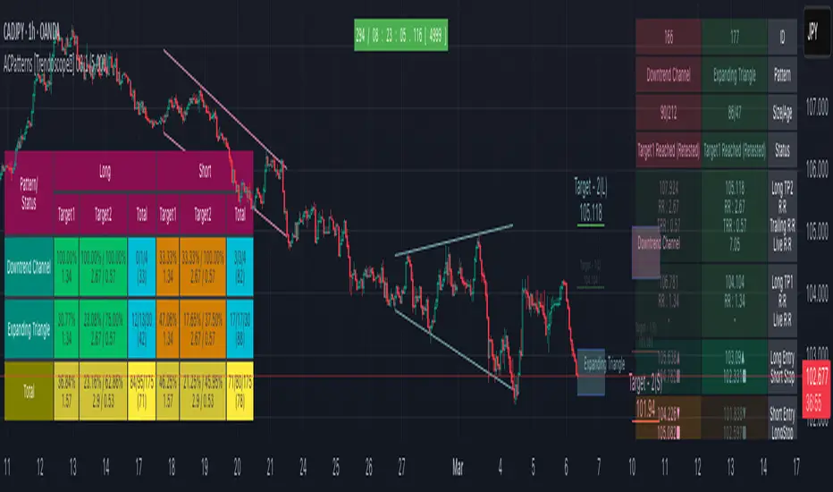
Auto Chart Patterns - Ultimate [Trendoscope]Here is an attempt to gather and present stats and probabilities of different chart patterns. Here, we challenge few traditional biases such as rising wedge is bearish, falling wedge is bullish etc. All the chart patterns identified in this script are bi-directional. Meaning they offer opportunities to trade in either direction.
This indicator is built on the base of two free scripts
🎯 Wedge-and-Flag-Finder-Multi-zigzag
🎯 Trendline-Pairs-Deep-Search
🎲 Following are the major highlights/updates in the present script
▶ Uses the similar deep search algorithm for finding patterns. Pattern identification logic has been optimised to provide more accurate patterns.
▶ Provides suggestion on how to trade these patterns - along with entry, stop and target suggestions.
▶ Advanced options available in setting such as 'Safe Repaint' - which enables repaint only when trade has not started.
▶ Option to run algorithm within specified time window
▶ Comprehensive stats on historical patterns which include win ratio, risk reward, trailing win ratio and trailing risk reward.
▶ Open Trades Stats widget which can help tracking trades easily.
▶ Fully customisable alerts - which can be used to plugin into bots.
🎲 Chart Patterns Included
▶ Channel - Uptrend, Downtrend, Ranging
▶ Triangle - Expanding, Contracting
▶ Rising Wedge - Expanding, Contracting
▶ Falling Wedge - Expanding, Contracting
If unable to determine the type and yet pivots are inline to form two trend lines, then it goes to category - Indeterminate
🎲 Indicator Components
Below is a quick snapshot of indicator components.
Now, lets look at some of the individual components:
▶Open trade stats helps recognise trades in motion.
▶ Closed trade stats can either be shown with minimal stats or fully detailed stats.
🎲 Settings
▶ Generic Settings
▶ Zigzag and pattern selection
▶ Channel Settings
▶ Risk/Reward and Stats/Display Settings
🎲 Key Features
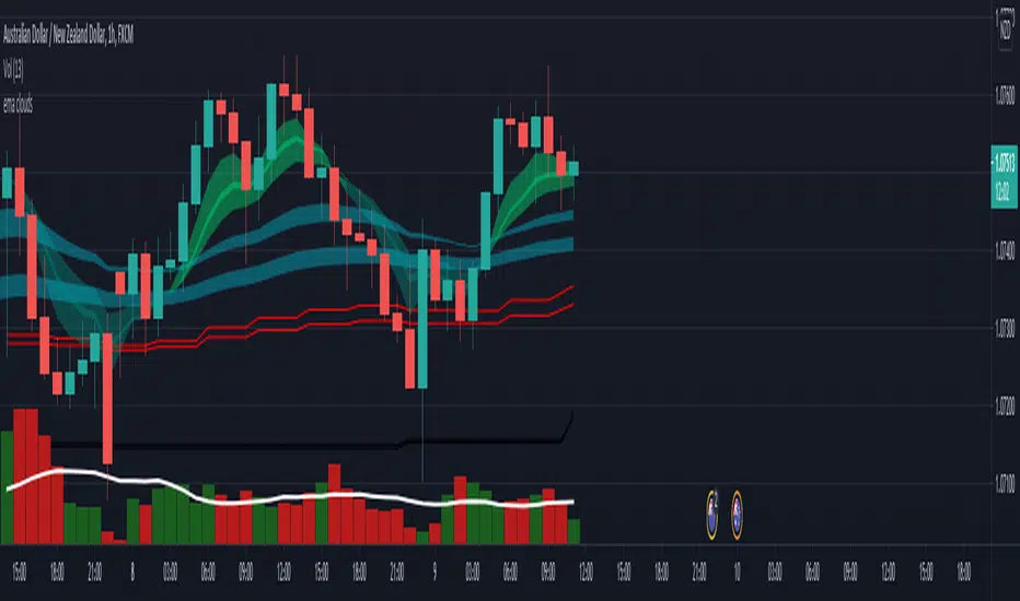
⬤ Safe Repaint :
This option allows redrawing pattern only if trade has not been taken. This increases accuracy of pattern detection. Example of impact of safe repaint is shows as below:
⬤ Trade Reversal or Breakout of Channels :
This option is useful to handle channels of different size. If the distance between channel trendlines are huge, then it is more advantageous to trade reversals. If the distance between trendlines of channel is small, it is more rewarding to trade the breakouts.
Here is an example of how this setting impacts the trade suggestions.
⬤ Detailed Closed Trade Stats :
Closed Stats settings give users option to see in depth details such as risk reward and win ratios for past patterns along with numbers.
⬤ Fully Customisable Alerts :
Alerts are implemented using alert method. Hence, users will not see text box in alert window where they can set alert format. To overcome this challenge, the indicator offers customisation of alerts through settings.
In the settings window, you notice below options for alerts
These settings allow users to enable/disable alerts for different status of patterns. The text box in the settings allows users to set customisable alert formats using specific placeholders.
Valid placeholders are:
{type} - Alert Type
{id} - Pattern id for which alert is generated
{ticker} - Ticker for which alert is generated
{timeframe} - Chart timeframe
{price} - Current close price
{pattern} - Name of the pattern
{longTrade} - Array containing stop, entry, target1 and target2 for long side of the trade for given pattern
{shortTrade} - Array containing stop, entry, target1 and target2 for short side of the trade for given pattern
{status} - Contains status of both long and short side of the trades as text
Default alert template set for all type of alerts is as below
{
"alert" : "{type}",
"id" : {id},
"ticker" : "{ticker}",
"timeframe" : "{timeframe}",
"price" : {price},
"pattern" : "{pattern}",
"long " : {longTrade},
"short " : {shortTrade},
"status" : "{status}"
}
An example alert looks like this:
If you just want to display pattern name and alert type, your alert message in the box should be something like this:
Type - {type}, Pattern - {pattern}
Will make a video on settings and usage when I get time :)
Skrip berbayar