Trend LinesHello Everyone.
This is my first script on TV, hope you find it useful.
How it works?
- On each bar it finds last x (depending on your settings) higher and lower Pivot Points ( PP ).
- It searches for possible trend line from oldest PP to newest, once found it stops and draws the line.
- The higher the time frame the lower the number of PP needed. Play around with the number of PP and left/right bars needed to confirm a PP and you get different results.
For suggestions don't hesitate to contact me
Cari dalam skrip untuk "TRENDLINES"
Angular Resistance & Breakout/BreakdownAngular Resistance & Breakout/Breakdown (Dynamic Trendlines)
This indicator provides a dynamic approach to identifying major support and resistance levels by fitting Linear Regression lines to recent pivot points (swing highs and swing lows). Unlike static horizontal lines, these "Angular" trendlines adapt to the market's slope, providing continuously adjusting targets for resistance and support, along with signals for confirmed breakouts and breakdowns.
💡 Key Features
Dynamic Trendlines: Utilizes Linear Regression to automatically draw sloped trendlines based on a configurable number of the most recent swing pivots.
Confirmed Signals: Generates clear Breakout (▲) and Breakdown (▼) signals with optional buffer and sensitivity filters to reduce noise.
Customizable Inputs: Fine-tune the pivot detection period, the number of points used for regression, line extension, and signal sensitivity.
On-Chart Info Panel: A table displays real-time data, including the number of detected pivot points and the current calculated price level of the dynamic lines.
⚙️ How It Works (The Logic)
Pivot Detection: The script uses the standard ta.pivothigh() and ta.pivotlow() functions to reliably identify swing points, based on the Pivot Left and Pivot Right settings. These points are stored in dynamic arrays (highs for resistance, lows for support).
Angular Line Generation: A custom function, f_regression_from_array, performs a Linear Regression analysis using the bar index (X-axis) and the pivot price (Y-axis) for the Points to use. This calculation determines the optimal slope and intercept to draw a best-fit dynamic line through the identified pivot points.
Breakout/Breakdown Confirmation:
Breakout: Triggered when the current close price crosses above the dynamic resistance line plus the user-defined Breakout buffer.
Breakdown: Triggered when the current close price crosses below the dynamic support line minus the user-defined Breakout buffer.
Sensitivity Filter: An optional filter requires the price movement on the signal bar to exceed a minimum percentage (Label sensitivity) away from the line to confirm the momentum of the move.

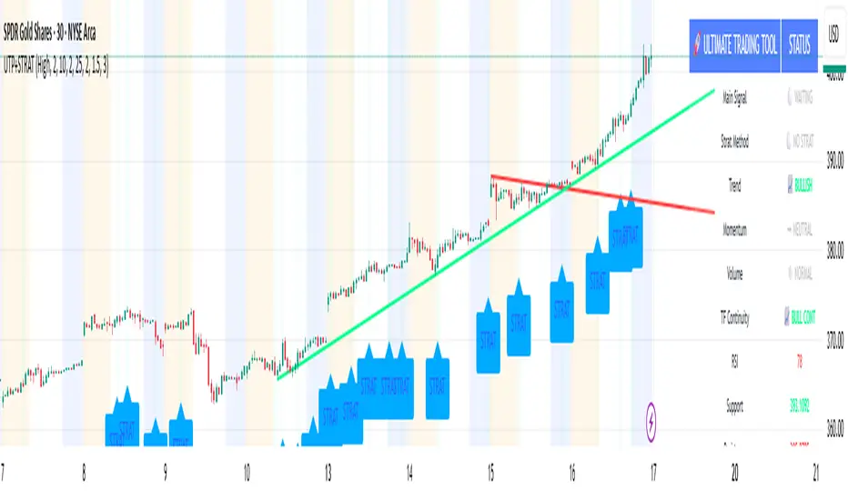
🚀 Ultimate Trading Tool + Strat Method🚀 Ultimate Trading Tool + Strat Method - Complete Breakdown
Let me give you a comprehensive overview of this powerful indicator!
🎯 What This Indicator Does:
This is a professional-grade, all-in-one trading system that combines two proven methodologies:
1️⃣ Technical Analysis System (Original)
Advanced trend detection using multiple EMAs
Momentum analysis with MACD
RSI multi-timeframe analysis
Volume surge detection
Automated trendline drawing
2️⃣ Strat Method (Pattern Recognition)
Inside bars, outside bars, directional bars
Classic patterns: 2-2, 1-2-2
Advanced patterns: 3-1-2, 2-1-2, F2→3
Timeframe continuity filters
📊 How It Generates Signals:
Technical Analysis Signals (Green/Red Triangles):
Buy Signal Triggers When:
✅ Price above EMA 21 & 50 (uptrend)
✅ MACD histogram rising (momentum)
✅ RSI between 30-70 (not overbought/oversold)
✅ Volume surge above 20-period average
✅ Price breaks above resistance trendline
Scoring System:
Trend alignment: +1 point
Momentum: +1 point
RSI favorable: +1 point
Trendline breakout: +2 points
Minimum score required based on sensitivity setting
Strat Method Signals (Blue/Orange Labels):
Pattern Recognition:
2-2 Setup: Down bar → Up bar (or reverse)
1-2-2 Setup: Inside bar → Down bar → Up bar
3-1-2 Setup: Outside bar → Inside bar → Up bar
2-1-2 Setup: Down bar → Inside bar → Up bar
F2→3 Setup: Failed directional bar becomes outside bar
Confirmation Required:
Must break previous bar's high (buy) or low (sell)
Optional timeframe continuity (daily & weekly aligned)
💰 Risk Management Features:
Dynamic Stop Loss & Take Profit:
ATR-Based: Adapts to market volatility
Stop Loss: Entry - (ATR × 1.5) by default
Take Profit: Entry + (ATR × 3.0) by default
Risk:Reward: Customizable 1:2 to 1:5 ratios
Visual Risk Zones:
Colored boxes show risk/reward area
Dark, bold lines for easy identification
Clear entry, stop, and target levels
🎨 What You See On Screen:
Main Signals:
🟢 Green Triangle "BUY" - Technical analysis long signal
🔴 Red Triangle "SELL" - Technical analysis short signal
🎯 Blue Label "STRAT" - Strat method long signal
🎯 Orange Label "STRAT" - Strat method short signal
Trendlines:
Green lines - Support trendlines (bullish)
Red lines - Resistance trendlines (bearish)
Automatically drawn from pivot points
Extended forward to predict future levels
Stop/Target Levels:
Bold crosses at stop loss levels (red color)
Bold crosses at take profit levels (green color)
Line width = 3 for maximum visibility
Trade Zones:
Light green boxes - Long trade risk/reward zone
Light red boxes - Short trade risk/reward zone
Shows potential profit vs risk visually
📊 Information Dashboard (Top Right):
Shows real-time market conditions:
Main Signal: Current technical signal status
Strat Method: Active Strat pattern
Trend: Bullish/Bearish/Neutral
Momentum: Strong/Weak based on MACD
Volume: High/Normal compared to average
TF Continuity: Daily/Weekly alignment
RSI: Current RSI value with color coding
Support/Resistance: Current trendline levels
🔔 Alert System:
Entry Alerts:
Technical Signals:
🚀 BUY SIGNAL TRIGGERED!
Type: Technical Analysis
Entry: 45.23
Stop: 43.87
Target: 48.95
```
**Strat Signals:**
```
🎯 STRAT BUY TRIGGER!
Pattern: 3-1-2
Entry: 45.23
Trigger Level: 44.56
Exit Alerts:
Target hit notifications
Stop loss hit warnings
Helps maintain discipline
⚙️ Customization Options:
Signal Settings:
Sensitivity: High/Medium/Low (controls how many signals)
Volume Filter: Require volume surge or not
Momentum Filter: Require momentum confirmation
Strat Settings:
TF Continuity: Require daily/weekly alignment
Pattern Selection: Enable/disable specific patterns
Confirmation Mode: Show only confirmed triggers
Risk Settings:
ATR Multiplier: Adjust stop/target distance
Risk:Reward: Set preferred ratio
Visual Elements: Show/hide any component
Visual Settings:
Colors: Customize all signal colors
Display Options: Toggle signals, levels, zones
Trendline Length: Adjust pivot detection period
🎯 Best Use Cases:
Day Trading:
Use low sensitivity setting
Enable all Strat patterns
Watch for high volume signals
Quick in/out trades
Swing Trading:
Use medium sensitivity
Require timeframe continuity
Focus on trendline breakouts
Hold for target levels
Position Trading:
Use high sensitivity (fewer signals)
Require strong momentum
Focus on weekly/daily alignment
Larger ATR multipliers
💡 Trading Strategy Tips:
High-Probability Setups:
Double Confirmation: Technical + Strat signal together
Trend Alignment: All timeframes agree
Volume Surge: Institutional participation
Trendline Break: Clear level breakout
Risk Management:
Always use stops - System provides them
Position sizing - Risk 1-2% per trade
Don't chase - Wait for signal confirmation
Take profits - System provides targets
What Makes Signals Strong:
✅ Both technical AND Strat signals fire together
✅ Timeframe continuity (daily & weekly aligned)
✅ Volume surge confirms institutional interest
✅ Multiple indicators align (trend + momentum + RSI)
✅ Clean trendline breakout with no resistance above (or support below)
⚠️ Common Mistakes to Avoid:
Don't ignore stops - System calculates them for a reason
Don't overtrade - Wait for quality setups
Don't disable volume filter - Unless you know what you're doing
Don't use max sensitivity - You'll get too many signals
Don't ignore timeframe continuity - It filters bad trades
🚀 Why This Indicator is Powerful:
Combines Multiple Edge Sources:
Technical analysis (trend, momentum, volume)
Pattern recognition (Strat method)
Risk management (dynamic stops/targets)
Market structure (trendlines, support/resistance)
Professional Features:
No repainting - signals are final when bar closes
Clear risk/reward before entry
Multiple confirmation layers
Adaptable to any market or timeframe
Beginner Friendly:
Clear visual signals
Automatic calculations
Built-in risk management
Comprehensive dashboard
This indicator essentially gives you everything a professional trader uses - trend analysis, momentum, patterns, volume, risk management - all in one clean package!
Any specific aspect you'd like me to explain in more detail? 🎯RetryClaude can make mistakes. Please double-check responses. Sonnet 4.5
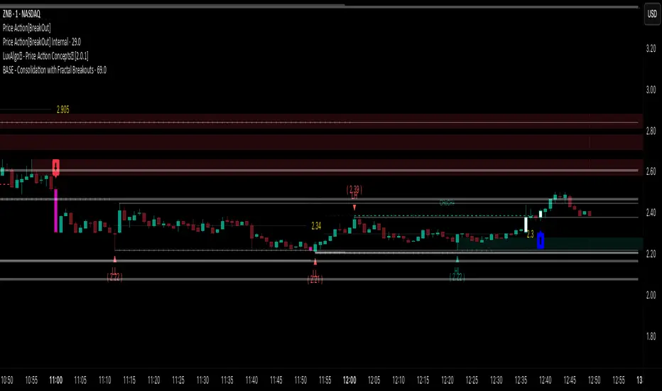
Price Action [BreakOut] InternalKey Features and Functionality
Support & Resistance (S/R): The script automatically identifies and draws support and resistance lines based on a user-defined "swing period." These lines are drawn from recent pivot points, and users can customize their appearance, including color, line style (solid, dashed, dotted), and extension (left, right, or both). The indicator can also display the exact price of each S/R level.
Trendlines: It draws trendlines connecting pivot highs and pivot lows. This feature helps visualize the current trend direction. Users can choose to show only the newest trendlines, customize their length and style, and select the source for the pivot points (e.g., candle close or high/low shadow).
Price Action Pivots: This is a core component that identifies and labels different types of pivots based on price action: Higher Highs (HH), Lower Highs (LH), Higher Lows (HL), and Lower Lows (LL). These pivots are crucial for understanding market structure and identifying potential trend changes. The script marks these pivots with shapes and can display their price values.
Fractal Breakouts: The script identifies and signals "fractal breakouts" and "breakdowns" when the price closes above a recent high pivot or below a recent low pivot, respectively. These signals are visually represented with up (⬆) and down (⬇) arrow symbols on the chart.
Customization and Alerts: The indicator is highly customizable. You can toggle on/off various features (S/R, trendlines, pivots, etc.), adjust colors, line styles, and text sizes. It also includes an extensive list of alert conditions, allowing traders to receive notifications for:
Price Crossovers: When the close price crosses over or under a support or resistance level.
Trendline Breaks: When the price breaks above an upper trendline or below a lower trendline.
Fractal Breaks: When a fractal breakout or breakdown occurs.
Dual Trendline Breakout [Splirus]This advanced trading tool leverages the power of dual pivot-based trendlines to provide traders with a superior edge in identifying potential breakout and retest opportunities. By combining two separate pivot lengths, the indicator creates both primary and secondary trendlines, enabling more robust confluence and decision-making in your trading strategy.
Key Features:
1. Dual Pivot Analysis:
Primary Trendline: Uses a shorter pivot length to capture immediate price movements and breakout scenarios.
Secondary Trendline: Employs a longer pivot length for broader trend identification and confirmation.
2. Enhanced Confluence:
The combination of short-term and long-term trendlines provides stronger signals, reducing false positives and enhancing accuracy.
3. Dynamic Visualization:
Automatically plots trendlines and extends them until they are crossed.
Distinct colors for uptrend and downtrend lines for easy interpretation.
Highlights where price breaks above or below the trendlines with bar coloring.
4. Alerts for Key Events:
Alerts are triggered for breakout and retest scenarios, ensuring you never miss critical market movements.
5. Customizable Settings:
Adjust pivot lengths, trendline colors, and visualization preferences to suit your trading style.
Optional settings for showing only the most recent trendlines, hiding crossed lines, and extending lines dynamically.
How It Works:
The indicator identifies pivot highs and lows based on the specified lengths for both primary and secondary trendlines.
When price interacts with these trendlines (breakout, retest, or cross), it highlights the event with customizable bar colors and optional alerts.
By monitoring these interactions, traders can better time their entries and exits, leveraging the dual-period analysis for stronger market confluence.
Ideal Use Cases:
Scalping: Use primary trendlines for quick trade opportunities.
Swing Trading: Combine primary and secondary trendlines for more significant market moves.
Trend Continuation or Reversal: Identify breakout confirmations or retests for confident trade setups.
This indicator is a powerful addition to any trader's toolkit, offering precision, adaptability, and actionable insights for navigating the markets with confidence.
Its closed-source design ensures that the unique advantages of the Dual Trendline identification algorithm remain exclusive to its users, providing an edge that cannot be duplicated elsewhere.

Market Structure Overlay🚀 Market Structure Overlay Indicator 🚀
🔍 Overview
The Market Structure Overlay (MSO) is a sophisticated technical analysis tool created to analyze price action and understand market structure in a more precise way. It identifies Break of Structure (BOS), Market Structure Breaks (MSBs), Equal Highs (EQH), and Equal Lows (EQL) with meticulous precision by utilizing both wicks and closing prices for better accuracy. The MSO is suitable for all trading timeframes, providing traders with the flexibility to observe and trade on any scale, from intraday to long-term trends.
⚙️ How It Works
The MSO uses advanced logic to detect critical price levels that highlight structural changes in the market. It calculates swing highs and lows using user-defined settings, allowing for customization in market structure analysis. The indicator further highlights BOS and MSB levels by leveraging supply and demand detection, offering a comprehensive understanding of trend reversals and continuation points.
✨ Key features include:
📈 Bullish and Bearish BOS/MSB Lines: MSO differentiates between bullish and bearish structural events, which helps traders understand the prevailing trend and identify key pivot points.
🎨 Customizable Appearance: Traders can personalize line styles and colors for BOS/MSB, trendlines and EQH/EQL, making the tool integrate seamlessly into any chart setup.
🔄 Swing Length and Demand Memory Settings: MSO allows users to specify the swing length for BOS lookback and how many historical zones should be stored on the chart, enhancing control over how much data is analyzed visually.
📊 Market Structure Elements Explained
Break of Structure (BOS): A BOS occurs when the price breaks through a previous Higher High (HH) or Lower Low (LL), indicating a continuation of the current trend. It helps confirm the prevailing market direction.
Market Structure Break (MSB): occurs when a Higher Low (HL) or Lower High (LH) is broken, signaling a potential shift in the market trend. This typically marks the beginning of a trend reversal.
Equal Highs (EQH) and Equal Lows (EQL): These levels are areas of liquidity where previous highs or lows are tested again by the market, often signifying areas of accumulation or distribution. EQH and EQL are crucial for recognizing potential liquidity traps.
Trendlines: Trendlines are used to connect successive highs or lows, providing a visual representation of the current direction of the market. They help traders understand trend momentum and potential breakouts.
🔥 Key Features and Benefits
✅ Accurate Market Structure Detection
The Market Structure Overlay identifies Break of Structure (BOS) and Market Structure Breaks (MSB) events that indicate potential trend changes or continuations. The indicator also distinguishes between bullish and bearish market structures using color-coded lines and custom labels, which helps in immediately identifying market dynamics.
📊 Supply and Demand Zones for BOS/MSB Detection
The MSO uses Supply and Demand Zones as part of the detection logic for BOS and MSB. Although these zones are not directly plotted, they play a key role in determining when a significant structural break occurs. This unique approach enhances the accuracy of BOS and MSB identification, as it takes into account areas of accumulation or distribution that often serve as precursors to trend shifts.
🔍 Equal Highs and Lows Detection
The MSO features Equal Highs (EQH) and Equal Lows (EQL) detection, which is a significant indicator for liquidity zones where potential orders might be resting. These areas often trigger key price actions as they get tested or broken.
⚙️ Customizable Settings
Users can customize the indicator’s behavior, including choosing whether to use candle wicks or closing prices, setting swing lengths for identifying key levels, and specifying memory for storing past zones. This flexibility allows traders to adjust the indicator to suit their personal trading strategy and preferences.
⏱️ Multi-Timeframe Highs and Lows
The indicator includes multi-timeframe support for significant highs and lows (daily, weekly, monthly, yearly). This helps traders understand where they are in the larger market context, especially when making decisions during intra-session trading.
🔎 Precise Detection Approach
Unlike traditional market structure indicators that rely heavily on simple pivot points, the MSO employs a more advanced and precise detection mechanism for BOS and MSB. Traditional pivot points typically use a lookback function to identify highs and lows over a fixed period, which can lead to false signals due to market noise or temporary price fluctuations. In contrast, the MSO records and checks swing and interim points against stored memory, only signaling structural breaks after a thorough evaluation. This results in a non-repainting and highly accurate depiction of market structure, minimizing false alerts and providing traders with reliable insights based on price action that remains consistent once confirmed.
🎨 Visualization Options
The MSO uses color-coded BOS and MSB lines to easily differentiate between bullish and bearish scenarios. Users also have options to visualize equal highs/lows (EQH/EQL) to recognize potential liquidity points. A detailed breakdown of Supply and Demand Zones helps traders identify high-probability areas for entries and exits. Additionally, the indicator allows traders to toggle visibility of key elements, including trend lines, labels, and multi-timeframe levels.
📝 Summary
The Market Structure Overlay is an essential tool for understanding price behavior and structural shifts in any financial market. Its use of sophisticated logic to detect structural breaks, coupled with customizable visualizations, allows traders to gain a nuanced view of market dynamics. The supply and demand zones, together with the BOS, MSB, EQH, and EQL labels, provide a strong foundation for both trend-following and reversal trading strategies.
MSO is not just a tool for understanding market direction—it's designed to enhance decision-making by delivering reliable and actionable insights into market structure. This indicator provides a seamless blend of market theory with advanced technical features, making it a valuable asset for serious traders.
📊 Key Visual Examples:
📈 Bullish and Bearish BOS/MSB Lines
📸
🌀 Trendlines
📸
⚠️ Note:
This indicator should be used as part of a broader trading strategy. Always confirm your entries and exits with additional tools and analysis methods. 💡

Algo LinesThe primary objective of this indicator is to identify and draw significant trendlines based on pivot points. These trendlines can help traders make informed decisions by providing a visual representation of support and resistance levels in the market.The script consists of several input parameters, functions, and variables that work together to create dynamic trendlines based on pivot points. The input parameters allow users to customize the appearance and behavior of the indicator, including the colors of the trendlines, the timeframe, and the maximum number of crossed lines to display.
The core of the script is built around two main functions:
1. createLine(): This function is responsible for creating a new trendline based on the provided pivot points. It takes five arguments - pivot type, x1, y1, x2, and y2 coordinates - and returns a new line object. Depending on the pivot type, the function adds the new line to either the dtlArray (down trendline array) or utlArray (up trendline array).
2. getSlope(): This function calculates the slope of a given line and returns the extended price level based on the current bar index. It takes one argument - the line object - and uses its coordinates to compute the slope.
The script also employs several variables to store and manipulate pivot points and trendlines. These include arrays for up and down trendlines (dtlArray and utlArray), variables for storing pivot point coordinates (utlX1, utlY1, etc.), and temporary arrays for storing crossed trendlines (tempUtl and tempDtl).
Creating Trendlines
The Algo Lines script identifies pivot highs and pivot lows using the ta.pivothigh() and ta.pivotlow() functions. When a new pivot low is detected, the script updates the utlX1 and utlY1 variables with the previous pivot low coordinates, and the utlX2 and utlY2 variables with the current pivot low coordinates. If the rate of change between these points meets the minimum threshold specified by the user, the createLine() function is called to create a new up trendline.
Similarly, when a new pivot high is detected, the script updates the dtlX1 and dtlY1 variables with the previous pivot high coordinates, and the dtlX2 and dtlY2 variables with the current pivot high coordinates. If the rate of change between these points meets the minimum threshold specified by the user, the createLine() function is called to create a new down trendline.
Processing Trendlines
The Algo Lines script processes up and down trendlines separately. For each trendline in the utlArray, the script checks if the price has crossed the trendline based on the user's chosen cross source (either close or high/low). If the price crosses a trendline, the script creates a new dashed line with the pastColor and adds it to the temporary array (tempUtl). The original trendline is then deleted.
The same process is applied to the dtlArray, except that the temporary array used is tempDtl. In both cases, if the number of crossed lines exceeds the maximum specified by the user, the oldest crossed line is removed from the temporary array.
Conclusion
The Algo Lines indicator offers traders a powerful tool for identifying significant trendlines based on pivot points. By providing a customizable and dynamic visual representation of support and resistance levels, the script enables traders to make better-informed decisions in the market. The concise and well-structured Pine Script code adheres to TradingView's house rules and ensures a seamless integration with the platform.

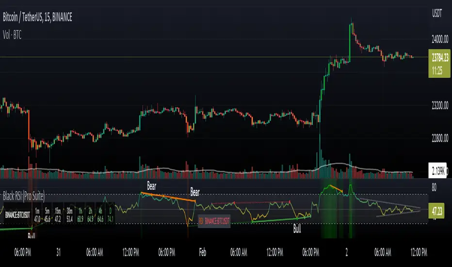
Black RSI (Pro Suite)Black RSI (Pro Suite) is combination of RSI (Relative Strength Index), Volume RSI, Heikin Ashi RSI & other multi Oscillators with multi features into one indicator, features like (Quad Divergences, Multi Time Frame RSI, MTF RSI Panel, Oscillator Support/Resistance/Wedges/Trendlines, Oscillator Moving Average/BBs, Smooth RSI, RSI Price Estimator, Oscillator Over bought/sold Bars, Osc OB/OS Zones, Osc OB/OS Highlights, additionally Black RSI indicator is flexible & completely customizable).
Indicator goal: I have tried my best to organized RSI & other suitable oscillators and oscillator useful tools into one simple and free indicator for Tradingview users (specifically for Tradingview 'basic' subscription users). suggestions are always welcome. please give feedback & appreciate if you like my work.
Black RSI Indicator Features Summary:
Black RSI indicator includes many features mainly relevant to RSI and other Oscillators, these are briefly highlighted below:
Black RSI Dashboard
Multi Oscillators: Choose between multiple oscillators. All oscillators settings are customizable.
Multi Symbol: Multi Symbol Support, applicable on all oscillators
RSI (Relative Strength Index)
VRSI (Volume Relative Strength Index)
HA RSI (Heikin Ashi Relative Strength Index)
OBV (On Balance Volume)
CVD (Comulative Volume Delta)
MFI (Money Flow Index)
UO (Ultimate Oscillator)
MOM (Momentum Oscillator)
ATR (Average True Range)
Stoch (Stochastic Oscillator)
Stoch RSI (Stochastic RSI)
Oscillator Primary Tools ◢
Oscillator Moving Average/Bollinger Bands
Smooth RSI
Multi Timeframe RSI
Multi Timeframe RSI Panel
RSI Price Estimator
Oscillator Support/Resistance/Wedges/Trendlines
Oscillator Moving Average/BBs: Shows Moving Average for selected oscillator.
Smooth Smooth: Smooths out RSI
Multi Timeframe RSI: Displays Multiple Time Frame/Multiple Symbol RSI and converts it and shows it as it is in current time frame without effecting Primary RSI
Multi Timeframe RSI Panel: Displays Multiple Time Frame/Multiple Symbol RSI values of user input specific timeframes in compact panel (max 8 Time frames)
RSI Price Estimator: Calculates RSI estimate price values of 3 different user specific RSI input levels, RSI x MA cross price and RSI future value of user specific price input level.
Oscillator Support/Resistance/Wedges/Trendlines: Draws Trendlines, Wedges and Support & Resistance lines on selected oscillator
Oscillator Quad Divergence ◢
1st Oscillator Divergence: Traditional divergence indicator with enhancements & customization
2nd Oscillator Divergence: Traditional divergence indicator with enhancements & customization
3rd Oscillator Divergence: Advanced Divergence indicator with source selection, RSI/Price threshold, potential divergences & customization
4th Oscillator Divergence: Pivots divergence indicator with flexible pivots selection & customization
Regular bullish divergences are indicated when price is forming lower lows while an oscillator shows higher lows.
Regular bearish divergences are indicated when price is forming higher highs while an oscillator shows lower highs.
While regular divergences indicate trend reversals, hidden divergences indicate a trend continuation.
When the price is making higher lows and the oscillator is showing lower lows, we speak of a bullish hidden divergence.
When the price is making lower highs and the oscillator shows higher highs, it's a bearish hidden divergence.
Oscillator Secondary Tools ◢
Oscillator HH/LL pivots
Osc OB/OS Color Bars
Osc OB/OS Zones
Osc OB/OS Highlights
Background
Oscillator HH/LL pivots: Shows HH/LL pivot points on selected oscillator
Osc OB/OS Color Bars: Plots color chart bars based on RSI, MFI, Stochastic, Stochastic RSI or combine overbought/oversold conditions
Osc OB/OS Zones: Plots Osc OB/OS Zones with user input levels
Osc OB/OS Highlights: Highlight oscillator OB/OS background area
Background: background color customization
+ Primary RSI Settings ▾
- Primary RSI Length: User input RSI Length value
- Primary RSI Source: User RSI Source selection
- RSI Overbought Threshold: Allows the user to set the RSI overbought threshold value. This Overbought Threshold value will also be applied on "RSI Divergence overbought condition", "RSI OB Color Bars" and "Primary RSI Color Schemes
- RSI Oversold Threshold: Allows the user to set the RSI oversold threshold value. The lower band (oversold line) of RSI. This Oversold Threshold value will also be applied on "RSI Divergence oversold condition", "RSI OS Color Bars" and "Primary RSI Color Schemes
- RSI Middle Band: Allows the user to set the RSI middle band value. This value will also applied to "Center Line" color scheme from "Primary RSI Color Schemes" drop menu
- Primary RSI Colors:
Range color specifies a gradient of colors from the overbought to the oversold threshold user inputs from "Primary RSI" section. Color interpolation also a gradient but smoother than Range color. Center Line is similar but is not a gradient, linked to Middle Band ("Primary RSI" section) and changes color with RSI Middle Band. Traditional is simple with Overbought and Oversold colors change.
- RSI Bullish Band: Allows the user to plot extra/optional RSI band on RSI Oscillator (Note: it will not be plotted if "OB/OS Zone only" enabled from "OB/OS Zone Settings" section)
- RSI Bearish Band: Allows the user to plot extra/optional RSI band on RSI Oscillator (Note: it will not be plotted if "OB/OS Zone only" enabled from "OB/OS Zone Settings" section)
+ Primary RSI Smooth Settings ▾
- Smooth Moving Average Type: User selected Smooth MA type. With RSI Smooth enabled, will also effect all RSI Divergences detection (all divergences will be plot according to "Smoothed RSI line")
- Smooth Moving Average Length: User input Smooth MA length value
+ Oscillator Moving Average Settings ▾
- Osc Moving Average Colors: Allows user to select Bullish/Bearish colors of Oscillator Moving Average
- Osc Moving Average Type: Allows user to select Oscillator MA Type
- Osc Moving Average Length: User input Oscillator MA length value
- Osc Moving Average Thickness: User input Oscillator MA thickness
- BB StdDev: user input Bollinger Bands standard deviation value
+ Stochastic Oscillator Settings ▾
- Same as Traditional/Default indicator
+ Stochastic RSI Oscillator Settings ▾
- Same as Traditional/Default indicator
+ Money Index Flow Settings ▾
- Same as Traditional/Default indicator
+ Ultimate Oscillator Settings ▾
- Same as Traditional/Default indicator
+ Momentum Oscillator Settings ▾
- Same as Traditional/Default indicator
+ Average True Range Settings ▾
- Same as Traditional/Default indicator
+ Multi Timeframe RSI Settings ▾
- MTF RSI Time Frame: Allows user to select MTF RSI Time Frame
- MTF RSI Symbol: Allows user to select MTF RSI Time Symbol
- MTF RSI Length: User input MTF RSI length value
- MTF RSI Source: User selected MTF RSI source
- MTF RSI Line Width: User input MTF RSI line thickness value
- Number of Bars for MTF RSI plot
- MTF RSI Color > OB color > OS color : Allows user to select MTF RSI color with additionally Overbought/Oversold colors
+ MTF RSI Panel Settings ▾
- Select MTF RSI Type: If "Primary RSI" or "Volume RSI" selected MTF RSI Panel will show output values based on "Primary RSI" or "Volume RSI" parameters e.g. source, length, but without smooth.
- MTF RSI Panel Symbol: Allows user to select MTF RSI Panel symbol, leave symbol blank or uncheck "checkbox" for current chart symbol
- Show Symbol in Panel: Shows symbol ticker(current or user selected) in MTF RSI Panel
- Panel Background: Allows user to select MTF RSI Panel Background (enable/disable) and Background color selection
- TF1: MTF RSI Timeframe 1 user selection
- TF2: MTF RSI Timeframe 2 user selection
- TF3: MTF RSI Timeframe 3 user selection
- TF4: MTF RSI Timeframe 4 user selection
- TF5: MTF RSI Timeframe 5 user selection
- TF6: MTF RSI Timeframe 6 user selection
- TF7: MTF RSI Timeframe 7 user selection
- TF8: MTF RSI Timeframe 8 user selection
- Panel Top Offset: MTF RSI Panel offset input value
- Position: MTF RSI Panel position selection
- Text Size: MTF RSI Panel text size selection
- Bullish Colors: MTF RSI Panel bullish color selection. (Bullish colors range RSI >75, <75 to >65, <65 to >55)
- Bearish Colors: MTF RSI Panel bearish color selection. (Bearish colors range RSI <45 to >35, <35 to >25, <25)
+ RSI Price Estimator Settings ▾
- Price 1: User input value for RSI future price
- Price 2: User input value for RSI future price
- Price 3: User input value for RSI future price
- Panel Position Offset: User input value for panel position offset
- Price Decimals: User input value for output price decimals in panel
- Show RSI/OscMA cross Price: Enable/Disable RSIxOscillator MA cross future price
- Show RSI Level for Input Price: User input price for future RSI level
- Invisible Background: Enable/Disable Background
Auto Text Color > Auto color change of Panel text according to Dark/Light chart theme
+ Oscillator Support/Resistance Settings ▾
- Show Support line: Allows user to Enable/Disable Oscillator support line
Color > Auto Color: Auto color change of support line according to Dark/Light chart theme
- Show Resistance line: Allows user to Enable/Disable Oscillator resistance line
Color > Auto Color: Auto color display of resistance line according to Dark/Light chart theme
- Lookback lows/highs: User input of Lookback lows/highs value
- Distance threshold: Distance from the line to the low
- Line touch points: Number of points that have to be around the line
- Low/High left bars: User input of Low/High left bars value
- Low/High right bars: User input of Low/High right bars value
- Line style: User selection of line style
- Line thickness: User input of line thickness value
+ Oscillator 1st Divergence Settings ▾
- Divergence Source: User selection of divergence source. "High/Low" (high/low of oscillator/price divergence detection), "Close" (close of oscillator/price divergence detection) and "Both" (Both Close + High/Low of oscillator/price divergence detection). (Note: Traditional Divergence indicator default source is "High/Low")
- Pivot Lookback Right: How many candle to compare on the right side of a candle when deciding whether it is a pivot. The lower the number is, the earlier pivots (and therefore divergences) will be signaled, but the quality of those detections could be lower.
- Pivot Lookback Left: How many candle to compare on the left side of a candle when deciding whether it is a pivot. The lower the number is, the earlier pivots (and therefore divergences) will be signaled, but the quality of those detections could be lower.
- Divergence Max Length (Bars): The maximum length of a divergence (number of bars). If a detected divergence is longer than this, it will be discarded
- Divergence Min Length (Bars): The minimum length of a divergence (number of bars). If a detected divergence is shorter than this, it will be discarded
- Show Divergence as:
- Line Thickness: User input divergence line thickness value
- Label Transparency: it could reduce labels mess on oscillator line, input "100" for label text only without label background
- Labels Text Color: User label text color selection
Auto Text Color > Auto color change of label text according to Dark/Light chart theme
- Bull Divergences: Enable/Disable of Bull divergences
> Color: User selection of Bull divergence color
> Oversold only: It will show Regular Bullish RSI divergences in oversold zone only, RSI oversold threshold can be configure in "Primary RSI Settings" section.
- Bear Divergences: Enable/Disable of Bear divergences
> Color: User selection of Bear divergence color
> Overbought only: It will show Regular Bearish RSI divergences in overbought zone only, RSI overbought threshold can be configure in "Primary RSI Settings" section.
- Hidden Bull Div: Enable/Disable of Hidden Bull divergences
> Color: User selection of Hidden Bull divergence color
- Hidden Bear Div: Enable/Disable of Hidden Bear divergences
> Color: User selection of Hidden Bear divergence color
+ Oscillator 2nd Divergence Settings ▾
- Same as Oscillator 1st Divergence Settings
+ Oscillator 3rd Divergence Settings ▾
- Divergence source: User selection of divergence source . "oscillator" (divergence detection with high/low or close of selected oscillator), "price" (divergence detection with high/low or close of price)
- Bull price source: User selection of Bull price source. Bull price source: "Low" (low of price divergence detection), "Close" (close of price divergence detection) (linked to "price" in "Divergence source")
- Bear price source: User selection of Bear price source. Bear price source: "High" (high of price divergence detection), "Close" (close of price divergence detection) (linked to "price" in "Divergence source")
- Low/High left bars: How many candle to compare on the left side of a candle when deciding whether it is a pivot. The lower the number is, the earlier pivots (and therefore divergences) will be signaled, but the quality of those detections could be lower.
- Low/High right bars: How many candle to compare on the right side of a candle when deciding whether it is a pivot. The lower the number is, the earlier pivots (and therefore divergences) will be signaled, but the quality of those detections could be lower.
- Maximum lookback bars: The maximum length of a divergence (number of bars). If a detected divergence is longer than this, it will be discarded.
- Price threshold: User selection of Price threshold, higher values more lines
- RSI threshold: User selection of RSI threshold, higher values more lines
- Show Lows: Displays lows of RSI
- Show Highs: Displays highs of RSI
- Show Divergence as:
- Line Style:
- Line thickness: User input divergence line thickness value
- Label Transparency: it could reduce labels mess on oscillator line, input "100" for label text only without label background
- Labels Text Color: User label text color selection
Auto Text Color > Auto color change of label text according to Dark/Light chart theme
- Bull Divergences: Enable/Disable of Bull divergences
> Color: User selection of Bull divergence color
> Potential Bull: It will plot potential regular bull divergence with dotted line.
- Bear Divergences: Enable/Disable of Bear divergences
> Color: User selection of Bear divergence color
> Potential Bear: It will plot potential regular bear divergence with dotted line.
- Hidden Bull Div: Enable/Disable of Hidden Bull divergences
> Color: User selection of Hidden Bull divergence color
> Potential H.Bull: It will plot potential hidden bull divergence with dotted line.
- Hidden Bear Div: Enable/Disable of Hidden Bear divergences
> Color: User selection of Hidden Bear divergence color
> Hidden Bear divergence: It will plot potential hidden bear divergence with dotted line.
> Regular Bull oversold only: It will show Regular Bullish RSI divergences in oversold zone only, RSI oversold threshold can be configure in "Primary RSI Settings" section.
> Regular Bear overbought only: It will show Regular Bearish RSI divergences in overbought zone only, RSI overbought threshold can be configure in "Primary RSI Settings" section.
+ Oscillator 4th Divergences Settings ▾
- Upper Length: User pivot input value of draw upper divergence line From
- To Pivot:
- Lower Length: User pivot input value of draw lower divergence line From
- To Pivot:
- Show Divergence as:
- Line Style:
- Line thickness: User input divergence line thickness value
- Label Transparency: it could reduce labels mess on oscillator line, input "100" for label text only without label background
- Labels Text Color: User label text color selection
Auto Text Color > Auto color change of label text according to Dark/Light chart theme
- Bull Divergences: Enable/Disable of Bull divergences
> Color: User selection of Bull divergence color
- Bear Divergences: Enable/Disable of Bear divergences
> Color: User selection of Bear divergence color
- Regular Bull oversold only: It will show Regular Bullish RSI divergences in oversold zone only, RSI oversold threshold can be configure in "Primary RSI Settings" section.
- Regular Bear overbought only: It will show Regular Bearish RSI divergences in overbought zone only, RSI overbought threshold can be configure in "Primary RSI Settings" section.
+ Oscillator HHLL Pivots Settings ▾
- Pivot Length: User input value of HH/LL pivot length
> L.Text Color: User label text color selection
- HH color: User HH Label color selection
- HL color: User HL Label color selection
- LH color: User LH Label color selection
- LL color: User LL Label color selection
+ Oscillator OB/OS Colored Bars Settings▾
- Overbought/Oversold Bars Oscillator: Plots Overbought/Oversold color bars based on RSI, MFI, Stoch, Stoch RSI overbought/oversold threshold conditions separately or combined(when every oscillator reach its OB or OS threshold condition at same time).
- Overbought Bar Color: User RSI OB Bars color selection
- Oversold Bar Color: User RSI OS Bars color selection
+ Primary RSI Range Color ▾
- OB: Overbought Color
- OS: Oversold Color
- Bullish: Bullish Color
- Bearish: Bearish Color
+ Primary RSI Color interpolation ▾
- RSI Color: RSI Color
- OB: Overbought Color
- OS: Oversold Color
+ Primary RSI Center Line Color ▾
- OB: Overbought Color
- Bullish: Bullish Color
- Bearish: Bearish Color
- OS: Oversold Color
+ Primary RSI Traditional Color ▾
- RSI Color: RSI Color
- OB: Overbought Color
- OS: Oversold Color
Osc Overbought/Oversold Zones Settings ▾
- OB/OS Zone Band Lines: Enable/Disable OB/OS Zone Band Lines
- OB/OS Zones only: Only shows OB/OS Zones and disable all RSI band lines except Middle Band. Background will not be effected by this setting.
- Overbought Zone: User input value of Overbought Zone from
> To:
- Oversold Zone: User input value of Oversold Zone from
> To:
Osc Overbought/Oversold Highlights ▾
- Overbought Highlights : Enable/Disable Overbought Highlights
- Oversold Highlights : Enable/Disable Oversold Highlights
- Transparency: Gradient transparency of highlighted area
+ 'Oscillators Color Settings ▾
- Show Osc Symbol label : Enable/Disable of oscillator symbol label. Displays current oscillator symbol, but with "Override Oscillator Symbol" enabled from "Black RSI Dashboard" it will Auto/forcefully displays Override Oscillator Symbol on Oscillator
- Fade out Oscillator line: Fade out the oscillator line color, focusing only the most recent periods prominent for a clearer chart
- Fill Stoch/StochRSI lines: Fills Stoch/Stoch RSI lines
- Oscillator line thickness: user input value of oscillator line thickness
- Oscillator line offset: Shifts the oscillator to the left or to the right on the given number of bars, Default is 0
- OBV Color
- MFI Color
- ATR Color
- UO Color
- MOM Color
- CVD Bullish Color
- CVD Bearish Color
+ Background Setting ▾
- Custom Background Color: User selection of Background color
Authors & Credits: I'd like to THANK to Nabeel Black(myself), LonesomeTheBlue, iFuSiiOnzZ, jmosullivan, zdmre, creengrack, and TradingView for the locally sourced ingredients.
Disclaimer: DYOR. Not financial advice. Not a trading system. I am not affiliated with TradingView or any authors mentioned here; You alone have the sole responsibility of evaluating the script output and risks associated with the use of the script. Trading success is all about following your trading strategy and the indicators should fit within your trading strategy, and not to be traded upon solely. Always trade with confluence and Risk Management.
Feedback & Bug report
if you found any bug in this indicator or any suggestion, please let me know. Please give feedback & appreciate if you like to see more future updates and indicators. Thank you
True Trend (StevenCharts)Overview
True Trend (StevenCharts) is a next-generation technical analysis tool designed to automate the most subjective part of trading: Drawing Trendlines.
Whether you are scalping, day trading, or swing trading, identifying valid support and resistance channels is critical. This indicator uses a proprietary multi-timeframe momentum engine to objectively identify market pivots and automatically draw precise, high-probability trendlines (rays) on your chart.
The "True Trend" Engine
At the heart of this indicator is a custom algorithmic model that evaluates market structure across multiple timeframes simultaneously.
No Guesswork: Instead of manually connecting wicks, the script waits for specific algorithmic momentum peaks and troughs to determine exactly where a trend begins and ends.
Dynamic Generation: When the internal trend logic detects maximum strength, the indicator tracks the highest or lowest points of the move. When momentum shifts, it locks in a trendline that projects forward, creating dynamic support and resistance levels.
Key Features
Automated Ray Creation: Automatically draws Red (Bearish) and Green (Bullish) rays based on confirmed momentum shifts.
Clean Chart Logic: The script includes intelligent "cleanup" logic. If price breaks a trendline and confirms the break with sustained momentum, the line is automatically removed to keep your chart clean and focused on relevant data only.
High Volume Confirmation: The logic accounts for volume spikes to validate line breaks.
"SHIFT" Logic (Adaptive vs. Static)
This script features a powerful setting called "Turn SHIFT On":
ON (Adaptive Mode): Uses advanced logic to "leapfrog" trendlines. As price makes new structural highs or lows, the trendline adjusts and locks onto the most recent valid pivot points. This is ideal for active traders following a developing trend.
OFF (Static Mode): Draws independent, static trendlines from every valid pivot. This is useful for seeing the history of market structure and identifying older levels that may still act as support/resistance.
How to Use
Support & Resistance: Use the automatically generated rays as dynamic S/R levels.
Bullish Trend: Price should respect the Green rays as support.
Bearish Trend: Price should respect the Red rays as resistance.
Breakout/Reversal: When a localized trendline is deleted or broken, it signals a potential shift in market structure.
Settings
Turn 'SHIFT' On: Toggles between adaptive (moving) lines and static lines.
Show Highest/Lowest Only: Keeps the chart clean by focusing on the most dominant outer trends.
Ray Colors: Customizable colors for Up and Down trends.

🟢💲 EMA Bias + Multi-TF Perfect Touch10 Koplick (Upgraded)Absolutely! Here’s a detailed rating and explanation of your upgraded "🟢 EMA Bias + Multi-TF Perfect Touch9 Koplick (Upgraded)" indicator.
🔥 Rating: 9/10
Strengths:
Multi-Timeframe Analysis:
Checks EMA bias and linear regression trendlines across multiple standard and custom timeframes, giving a robust, well-rounded market view.
EMA Bias with Validity Check:
Incorporates a strict EMA trend confirmation — requiring EMA50 > EMA100 > EMA200 for bullish bias (and reverse for bearish) — plus price must not touch EMA50 to confirm strength. This avoids false signals from weak trends.
Linear Regression Trendline Factor:
Adds a sophisticated trendline bias that uses user-defined timeframes and a lookahead-on linear regression midline, to check price relation and "touch" status. Trendline touches neutralize signals, preventing premature entries.
Toggle Flexibility:
Users can enable/disable EMA bias or regression trendline factors independently, allowing customization per strategy or market condition.
Suggestion Logic:
Aggregates signals from multiple timeframes to provide a clear buy/sell/hold suggestion. It requires 4+ bullish or bearish EMA biases for strong signals, which is a solid threshold.
Clear Table Display:
The table shows biases and validity per timeframe, making it easy to visually confirm the analysis at a glance.
Alerts:
Provides live alerts when the overall suggestion changes — great for active traders.
Clean and Maintainable Code:
Well-structured with reusable functions, arrays for scalability, and clear naming.
Minor Limitations / Possible Improvements:
EMA100’s role is implicit:
It’s used only as a middle EMA in the bias chain. Could be extended to also appear in the output or be weighted differently.
No volume or price action filters:
Including additional filters like volume spikes or candle patterns might improve entry quality.
Suggestion logic only considers EMA biases for bullish/bearish counts:
LR trendline biases affect only the neutralization (touch) logic; you might also consider including their bias direction for a more nuanced suggestion.
Fixed threshold (4 out of 5) for strong signals:
Allowing user customization of this threshold could enhance flexibility.
⚙️ How It Works - Step-by-Step:
Input Parameters:
User selects custom timeframe (customTF).
User defines 3 timeframes (lr_tf_1, lr_tf_2, lr_tf_3) for linear regression trendlines.
User toggles enable/disable EMA bias and LR trendline factors.
User sets the linear regression length (lrLength).
EMA Calculation & Bias:
For standard timeframes (5m, 15m, 1h, 4h, Daily) and the custom timeframe, the script fetches EMA50, EMA100, EMA200, plus high and low prices.
The bias for each timeframe is:
Bullish: EMA50 > EMA100 > EMA200 and price stays above EMA50 (low > EMA50).
Bearish: EMA50 < EMA100 < EMA200 and price stays below EMA50 (high < EMA50).
Neutral: Otherwise.
A valid flag confirms if the price respects the bias without touching EMA50.
Linear Regression Trendline Bias:
For each user-defined LR timeframe, the indicator computes a linear regression midline.
Bias is bullish if price > midline; bearish otherwise.
If the price "touches" the LR line (high >= mid and low <= mid), the bias is considered invalid (neutralized).
Table Display:
Shows all biases and validity states for the custom TF, standard TFs, and LR trendlines.
Valid biases show a ✅, invalid (or touching) show a 🚫.
Colors visually differentiate bullish (blue/purple), bearish (red), and neutral (orange).
Overall Suggestion Logic:
Counts bullish and bearish EMA biases on standard TFs only if the EMA factor is enabled.
Checks if any LR trendline is touched (neutralizing signal) if LR factor enabled.
If no trendline is touched and EMA factor is enabled:
4+ bullish biases → Strong Buy
4+ bearish biases → Strong Sell
Otherwise → Neutral / Hold
If any LR trendline is touched → Trendline Touch - No Clear Signal (neutralizes the suggestion).
Plots:
Current timeframe EMA50, EMA100, and EMA200 lines are plotted for reference.
LR trendlines for the 3 user-defined timeframes are plotted on the chart.
Alerts:
Fires an alert whenever the suggestion changes, letting the trader know when market bias shifts.
Summary
This indicator elegantly combines classical moving average bias with regression-based trendline analysis over multiple timeframes, applying thoughtful filters like “price must not touch EMA50” or “price must not touch LR line” to reduce false signals. The toggles for each factor provide great flexibility to tailor it for scalping, swing, or position trading.
The clear table and suggestion make it very practical for quick decision-making, and the alerts ensure traders don’t miss important shifts.
If you want, I can help you further with:
Adding multi-factor weighting.
Integrating volume or other technical confluences.
Extending to strategy/backtesting.
Or anything else!
Just say the word.

Juice RemedyThis Remedy suite is a remake of the Auto Remedy suite.
We have improved the performance and added a few new features.
Updated:
- Converted some boxes to lines to mitigate the limit of 500.
- Rewrote the code and disabled blocks if features are turned off
New features:
- RSI based candle colors
- Added features to limit historical renders
---
RSI Candles tells you the RSI and volatility by coloring the candlesticks. The different stages are: overbought, oversold, neutral and a top and bottom RSI / EMA crossover.
There is also an option to enable the RSI signal on the chart to see when it's entering an overbought or oversold area.
---
Volume Profile displays a vertical histogram on the right side of the price chart, representing the volume traded at each price level. The length of each bar corresponds to the total volume traded at that particular price level. Traders can analyze the shape and distribution of the Volume Profile to gain valuable information about the market structure.
Here's how Volume Profile is used and applied in trading:
Identifying Areas of High Volume:
Volume Profile helps traders identify areas of high trading activity. Peaks in the Volume Profile histogram indicate price levels where significant buying or selling pressure was present. These areas can act as support or resistance levels in the future, as they represent levels where traders have previously shown interest.
Understanding Price Acceptance and Rejection:
Volume Profile assists in determining whether the market has accepted or rejected specific price levels. When the volume is higher at a particular price level, it suggests that traders have accepted that price and consider it fair. On the other hand, low volume at a price level indicates rejection, suggesting that traders are not willing to transact at that price.
Identifying Value Areas:
Volume Profile can help identify value areas, which are price regions where the most volume has been traded. These areas are considered significant as they reflect levels where the market has found fair value and attracted substantial trading activity. Traders often pay attention to these value areas as potential support or resistance zones.
Confirming Breakouts and Reversals:
Volume Profile can be used to confirm the validity of breakouts and reversals. If a price breaks out of a range with high volume, it suggests strong conviction and increases the likelihood of a sustained move. Similarly, if a price reverses near a high-volume area, it provides additional confirmation of a potential trend reversal.
Assessing Market Sentiment:
By analyzing the shape and structure of the Volume Profile, traders can gain insights into market sentiment. A balanced Volume Profile with volume evenly distributed across price levels indicates a neutral market. Skewed or asymmetrical Volume Profiles may suggest bullish or bearish sentiment, depending on where the volume is concentrated.
It's important to note that traders often combine Volume Profile with price patterns, trendlines, and momentum indicators to validate signals and develop a comprehensive understanding of the market.
By studying the Volume Profile, traders can gain a clearer picture of where significant trading activity has occurred and identify levels of potential support, resistance, and value. This information can assist in making more informed trading decisions and improving overall market analysis.
---
VWAP(Volume Weighted Average Price) is a technical analysis tool that calculates the average price weighted by trading volume over a specified time period. It provides traders with insights into the average price at which a particular asset has traded during a given period, considering the volume traded at each price level.
Here's a general explanation of VWAP and its application in trading:
Calculation of VWAP:
VWAP is calculated by multiplying the price of each trade by its corresponding volume, summing these values over a specific time period, and dividing the total by the cumulative volume. The calculation continuously updates as new trades occur within the specified time frame.
Interpretation of VWAP:
VWAP is primarily used as a reference point to assess whether a current price is relatively high or low compared to the average price weighted by volume. Traders compare the current price to the VWAP to gauge whether the price is trading above or below the average level. If the price is above VWAP, it suggests that the asset is trading at a premium, while a price below VWAP indicates a discount.
VWAP as a Trading Indicator:
Traders use VWAP in various ways to support their trading decisions. Here are a few common applications:
a. Trend Identification: Traders analyze the relationship between the current price and VWAP to identify the prevailing market trend. If the price consistently trades above VWAP, it is often seen as a bullish signal, while prices below the VWAP is considered a bearish signal. This approach helps traders align their trades with the overall market direction.
b. Support and Resistance Levels: VWAP can act as a dynamic support or resistance level. Traders observe how the price reacts when approaching the VWAP. If the price bounces off the VWAP and continues in the direction of the prevailing trend, it may indicate support or resistance. Traders can use the VWAP as a reference for setting stop-loss levels or determining potential entry or exit points.
c. Reversal Signals: In some cases, when the price deviates significantly from VWAP, it may indicate overbought or oversold conditions. Traders watch for price reversals when the price moves away from the VWAP, potentially signaling a short-term market reversal.
d. Volume Analysis: VWAP considers volume along with price, providing insights into the significance of price moves. Traders analyze the relationship between volume and VWAP to evaluate the strength of price movements. Higher volume trading near the VWAP may suggest increased market interest and potential continuation of the trend.
It's worth noting that the VWAP is often used in intra-day trading and is more relevant for short-term analysis. Traders typically adjust the VWAP time frame based on their trading style and the asset being analyzed.
---
The Zig Zag works by filtering out price movements below a certain threshold (percentage or points) and only displaying significant price changes. This helps to eliminate minor price fluctuations and focus on the more substantial market movements.
When applying the Zig Zag indicator, traders typically select a percentage or point value as the threshold. For example, if a 5% threshold is chosen, the Zig Zag indicator will only plot a new point when the price has moved up or down by at least 5% from the previous significant high or low.
The indicator plots lines connecting the significant highs and lows on the price chart, creating a zigzag pattern. The lines are drawn in a way that reflects the change in the trend direction. The indicator can be adjusted to suit different timeframes and trading styles.
The primary purpose of the Zig Zag indicator is to identify and highlight trend reversals and price swings. Traders often use it to:
Identify major turning points: The Zig Zag indicator helps traders spot major highs and lows in the price action. These levels can act as potential support or resistance areas for future price movements.
Filter out noise: By filtering out minor price fluctuations, the Zig Zag indicator helps traders focus on the more significant price moves and trends. This can provide a clearer picture of the overall market direction.
Confirm chart patterns: The Zig Zag indicator can be used to confirm the validity of chart patterns, such as trendlines, channels, or chart formations. It can help traders validate breakouts, pullbacks, or continuation patterns.
Set trailing stops: Traders may use the Zig Zag indicator to set trailing stops based on the significant swing highs and lows. This allows them to trail their stop-loss orders behind the price action and potentially lock in profits as the trend develops.
Additionally, it's essential to customize the settings of the Zig Zag indicator according to the specific market being analyzed, as different markets and timeframes may require different threshold values for optimal performance.
Please keep in mind that while the Zig Zag indicator can provide valuable insights, it should be used alongside other analysis tools and not solely relied upon for trading decisions.
---
Fibonacci extensions and retracements are both technical analysis tools that traders use to identify potential levels of support and resistance in financial markets. Here's a clear understanding of each concept and how they are used in trading:
1. Fibonacci Retracement:
Fibonacci retracement is based on the idea that after an upward or downward price movement, the price tends to retrace a portion of that move before continuing in the original direction. The key levels used in Fibonacci retracement are based on ratios derived from the Fibonacci sequence, such as 0.382 (38.2%), 0.500 (50%), and 0.618 (61.8%).
To apply Fibonacci retracements, traders typically select two significant points on a price chart: a swing high and a swing low. The retracement levels are then plotted as horizontal lines based on the Fibonacci ratios. These levels act as potential support (in an uptrend) or resistance (in a downtrend) where the price may reverse or consolidate before resuming the overall trend.
Traders often use Fibonacci retracement levels to identify potential entry or exit points, place stop-loss orders, or assess the strength of a trend. The most commonly used retracement levels are 38.2%, 50%, and 61.8%, but other Fibonacci ratios like 23.6% and 78.6% are also sometimes used.
2. Fibonacci Extension:
Fibonacci extension is used to identify potential price targets beyond the initial trend or price move. It helps traders determine where the price may reach once it surpasses the previous swing high or swing low.
Similar to Fibonacci retracement, Fibonacci extension levels are derived from the Fibonacci sequence. The most commonly used extension levels are 138.2%, 161.8%, 261.8%, and 423.6%, although other ratios can also be applied.
To use Fibonacci extension, traders select three points on a price chart: a swing low, a swing high (corresponding to the previous trend), and a subsequent swing low or swing high (from where the extension is projected). The extension levels are then projected beyond the swing high or swing low, acting as potential price targets or areas of interest.
Fibonacci extension levels are often used to determine potential profit targets or to identify areas where a trend may reverse or consolidate. Traders may also use extensions in conjunction with other technical analysis tools to confirm trade signals or assess the overall market structure
---
The Pitchfan tool is based on the concept of Andrew's Pitchfork, which is a popular technical analysis tool developed by Dr. Alan H. Andrews. It consists of three parallel trendlines that are drawn to encompass the price action of an asset. The trendlines are typically drawn by connecting three significant points on a price chart - usually a pivot high, a pivot low, and another pivot high.
Once the Pitchfork is plotted, the Pitchfan tool extends the concept by adding additional trendlines that are parallel to the original Pitchfork. These additional trendlines are drawn based on certain mathematical ratios (e.g., Fibonacci ratios) applied to the distance between the original trendlines.
The Pitchfan can be used to identify potential support and resistance levels, as well as potential areas for price reversal or continuation. Traders may look for price reactions near these trendlines, with the expectation that the price may find support or encounter resistance at these levels.
---
Higher timeframe opens refer to the opening prices of different sessions or timeframes above the one being currently analyzed. For example, in intra-day trading, higher timeframe opens can refer to the daily session open or the opening prices of other significant market sessions in the forex market.
In addition to higher timeframe opens, traders often utilize daily reference ranges by incorporating indicators such as Average True Range (ATR) and the previous day's range. These tools help traders gauge the potential price volatility for the day and establish reference levels for stop-loss orders, profit targets, overall risk management strategies and market knowledge to develop a comprehensive trading approach.
---
Disclaimer : Please note that trading success relies on adhering to your trading strategy, and indicators should be used in accordance with your strategy rather than being the sole basis for trading decisions.
The provided script is intended solely for informational and educational purposes. Its use does not constitute professional or financial advice. It is your sole responsibility to evaluate the script's output and assess the risks associated with its use. By utilizing the script, you agree not to hold "JuiceSignals" TradingView user liable for any potential claims for damages that may arise from decisions made based on the use of the script.

TrendLine ScythesTrendline Scythes is a script designed to automatically detect and draw special curved trendlines, resembling scythes or blades, based on pivotal points in price action. These trendlines adapt to the volatility of the market, providing a unique perspective on trend dynamics.
🔲 Methodology
Traditional trendlines connect consecutive pivot points on a price chart, providing a linear representation of trend direction. However, this script employs a distinctive methodology by automatically detecting price pivots and then calculating special curved trendlines based on the Average True Range (ATR) of the price. This introduces a curvature to the trendlines, resembling scythes, offering a unique way to interpret market trends.
🔲 Auto Breakout and Target Detection
Trendline Scythes includes features for automatic breakout detection, signaling potential trend changes. Additionally, the script assists in target detection, helping traders set realistic and data-driven profit-taking levels based on market volatility and user adjustment.
🔲 Utility
Trend Confirmation - Use Trendline Scythes to confirm existing trends by observing how price interacts with the curved trendlines.
Breakout Signals - Auto-detection of breakouts adds a proactive element to your trading strategy, helping you stay ahead of potential trend reversals.
Target Setting - Utilize the script to set profit-taking targets based on volatility, aligning with the current market conditions.
🔲 Settings
Pivot Length - Swing detection length
Scythe Length - Adjusts the length of the scythes blade
Sensitivity - Controls how restrained the target calculation is, higher values will result in tighter targets.
🔲 Alerts
Breakout
Breakdown
Target Reached
Target Invalidated
As well as the option to trigger 'any alert' call.
Trendline Scythes is a versatile tool combining the benefits of traditional trendlines with the dynamic adaptability of curved lines for a unique approach to trend analysis.

Dynamic Trendline Break - Strategy [presentTrading]- Introduction and How It Is Different
The Dynamic Trendline Break Strategy is a unique trading algorithm that leverages the power of trendlines and swing detection to identify potential trading opportunities.
Unlike traditional trendline strategies that rely on static trendlines, this strategy dynamically calculates trendlines based on pivot highs and lows.
This dynamic approach allows the strategy to adapt to changing market conditions (especially 24hr markets like Crypto) and potentially identify trading opportunities that static trendlines might miss.
BTCUSD 6hr chart
Tencent 700.HK 1D chart
- Strategy, How It Works
The strategy works by first identifying pivot highs and lows using a lookback period defined by the user. These pivot points are then used to calculate the slope of the trendlines. The slope calculation method can be chosen from three options: Average True Range (ATR), Standard Deviation (Stdev), or Linear Regression (Linreg), providing flexibility to the trader.
Once the trendlines are calculated, the strategy identifies potential trading opportunities when the price crosses over the upper trendline (for long trades) or crosses under the lower trendline (for short trades). The strategy also allows the user to define the trade direction (Long, Short, or Both) and the stop loss method (Fixed or SuperTrend).
- Trade Direction
The trade direction parameter allows the user to define the direction of the trades that the strategy will take. If set to "Long", the strategy will only take long trades when the price crosses over the upper trendline. If set to "Short", the strategy will only take short trades when the price crosses under the lower trendline. If set to "Both", the strategy will take both long and short trades.
- Usage
To use this strategy, simply input your desired parameters for the swing detection lookback, slope, slope calculation method, trade direction, stop loss method, and stop loss level. Once these parameters are set, the strategy will automatically calculate the trendlines and identify potential trading opportunities based on the defined parameters.
- Default Settings
The default settings for the strategy are as follows:
Swing Detection Lookback: 30
Slope: 0.618
Slope Calculation Method: ATR
Trade Direction: Both
Stop Loss Method: SuperTrend
Stop Loss Level: 15%
SuperTrend Factor: 3
SuperTrend Lookback: 21
These settings can be adjusted to suit your trading style and risk tolerance. Always remember to backtest any changes to the settings before live trading.

RSI Master Suite [Kodexius]RSI Master Suite is a custom momentum engine built around a proprietary RSI style oscillator, designed to go far beyond a simple overbought and oversold line. The core calculation uses internal smoothing and optional adaptive logic to create a cleaner, more stable signal that is still responsive to real time price action. On top of that engine, the script adds structure, context and visual layers that turn the oscillator into a complete decision support panel.
Instead of watching a single line cross fixed levels, you get dynamic channels, gradient zones, reversal markers, divergence mapping, multi timeframe readings, a compressed stochastic flow and automated RSI based trendlines. The goal is to let you read the state of momentum at a glance: where it is stretched, where it is reverting, how different timeframes align and where conditions may support a potential shift in direction.
This is not ordinary RSI. It is a complete momentum intelligence engine that is designed to help you identify trend strength, exhaustion, breakout style conditions and potential reversal points with a structured and visually guided approach.
⚠️ Note:
This suite builds on a custom RSI engine and enhances it with an MTF dashboard, dynamic channels, divergence and deviation logic, stochastic flow and smart alerting. It is suitable for traders who rely on price action and momentum context, from short term scalpers to swing traders and more systematic trend followers.
🔹 Features
🔸 Enhanced RSI Core
- Custom RSI style oscillator with optional adaptive smoothing that aims to reduce noise while keeping momentum turns visible in real time.
- Configurable source and oscillator length to adapt the tool to different markets, assets and styles.
- Optional RSI moving average for an extra layer of confirmation on crosses and reversals.
♦️ Adaptiveness Logic - Heart of the Oscillator
The adaptive RSI engine continuously measures how efficiently price has been moving over a recent window comparing net directional movement to the total back-and-forth volatility.
When price is trending cleanly, the engine behaves closer to a fast response, allowing the oscillator to track momentum shifts more aggressively. In choppy or noisy phases, it automatically slows down and applies a heavier smoothing profile, down-weighting random fluctuations while preserving the larger structural swings.
🔸 Dynamic Channel Suite
- Multiple channel modes (Bollinger-style, Keltner-style or Donchian-style) applied directly to RSI, giving a clear view of volatility and expansion/contraction phases in momentum.
- Upper and lower channel bands highlight when RSI is pressing into extreme territory or breaking out of its usual range.
- Channel touches and breaks can be used as an additional filter for exhaustion or continuation behavior.
🔸 Gradient Overbought/Oversold Zones
- Customizable OB/OS levels with gradient fills, making it easy to see when RSI is entering, residing in, or exiting critical zones.
- Smooth shading between overbought, oversold and midline areas provides instant visual context instead of relying on hard lines alone.
- Midline (50) is clearly marked, helping to distinguish between bullish and bearish momentum regimes.
🔸 Reversal Signal Markers
- Bullish and bearish reversal markers are plotted when RSI conditions suggest a potential shift after reaching OB/OS zones.
- Signals rely on interactions between Enhanced RSI and its internal smoothing, reducing noise compared to raw threshold crosses.
- Markers are placed directly on the RSI line for quick recognition without cluttering the price chart.
🔸 Divergence Mapping (Regular & Hidden)
- Detects regular bullish/bearish divergences as well as hidden bullish/bearish divergences between price and RSI.
- Optional “wait for candle close” behavior, giving you the choice between more reactive or more conservative confirmations.
- Separate visibility toggles for each divergence type so you can focus only on the signals that fit your approach.
🔸 Compressed Stochastic “Flow” Overlay
- Built-in adaptive and normalized Stochastic RSI layer, normalized into a compact band around the midline to avoid overcrowding the panel.
- The design focuses on direction and pressure rather than raw values: the flow band shows whether short-term momentum is actively feeding into the current RSI regime or fading against it, giving an immediate read on micro-structure underneath the main signal.
- Visual emphasis on whether the stochastic flow is leaning bullish or bearish, rather than on exact numeric values.
- Filled zones above/below the midline help to quickly gauge short-term momentum thrusts within the broader RSI context.
🔸 Multi-Timeframe (MTF) Dashboard
- Compact dashboard table that summarizes RSI conditions across multiple user-defined timeframes.
Per-timeframe cells show:
- Divergence bias (bullish/bearish/none),
- OB/OS state,
- Basic directional “signal” hints,
- RSI channel breaks (upside/downside).
Makes it easy to see alignment or conflict between intraday and higher-timeframe momentum without changing charts.
Timeframe labels auto-format into familiar units (e.g., 1H, 4H, 1D) for readability.
🔸 Oscillator-Based Trendlines & Break Detection
- Automatic drawing of oscillator trendlines derived from swing pivots on the oscillator, not just on price.
- Lines adapt to bullish or bearish structures, focusing on clean slopes with minimal internal violations.
- Breaks of these RSI trendlines are highlighted with labels, providing an additional structural confirmation of potential momentum shifts.
🔸 Alert-Ready Event Logic
- Integrated alert conditions for RSI-based reversals and all four divergence types (regular/hidden, bullish/bearish).
- Designed so you can create alerts directly from the indicator, turning key RSI events into actionable notifications.
Altogether, RSI Master Suite consolidates multiple momentum tools into one cohesive interface, helping you read the “story” of RSI and its derivatives more intuitively and efficiently.
🔹 How To Use
▶ Reading the Core Momentum Engine
- The main line represents the custom momentum engine: values sustained above the midline indicate a bullish-leaning regime, while values below it point to a more bearish-leaning backdrop. Gradient OB/OS zones make it easy to see where conditions are stretched or rotating out of extremes instead of behaving like simple on/off thresholds.
- The dynamic channel adds a second layer of structure:
• When the engine is pressing into or outside the outer channel, momentum is extended relative to its recent behaviour.
• When it oscillates closer to the mid-area of the channel, conditions are more neutral or mean-reverting.
- If the internal moving average is enabled, crosses between the engine and its average can highlight transitions between phases rather than just single-bar spikes, especially around overbought/oversold zones.
▶ Working With Reversals & Divergences
- Reversal markers appear when the engine has pushed into OB/OS regions and then begins to turn with confirmation from its internal smoothing. They are meant as attention points around potential inflection zones in momentum, not as blind entry or exit signals on their own.
- Divergence mapping compares the structure of price swings with the structure of the engine:
• Regular bullish/bearish divergences highlight potential exhaustion when price makes a new extreme but momentum does not confirm.
• Hidden bullish/bearish divergences highlight potential continuation when price pulls back but the engine remains relatively strong (or weak) underneath.
- You can choose which divergence types to display and whether they should only confirm on candle close. Keeping “wait for close” enabled generally provides a more conservative, less noisy view of divergence structure.
▶ Using the Compressed Stochastic “Flow” Overlay
- The Stochastic flow band is designed as a micro-structure layer on top of the main engine, compressed into a tight band around the midzone so it doesn’t require a separate oscillator panel.
- When the flow spends more time in the upper side of its band, short-term impulse is aligning with bullish pressure; when it leans to the lower side, short-term activity is skewed bearish. This makes it easier to judge whether recent pushes are driving with, or fading against, the current momentum regime.
- Filled areas above and below the central line turn this overlay into a quick visual gauge of short-term thrust inside the broader momentum context, especially when viewed together with reversals and divergences.
▶ Reading the Multi-Timeframe Dashboard
- The MTF dashboard compresses multiple timeframes into a small table so you can see cross-timeframe alignment without changing charts. Each column corresponds to one timeframe from your list, and each row represents a different aspect of the engine: divergence bias, OB/OS status, directional hint and channel break state.
- A practical approach is to:
• Scan for alignment, where several higher timeframes show similar momentum regimes or biases.
• Note areas of conflict, where lower timeframes are diverging or reverting while higher timeframes remain extended.
- Used this way, the dashboard acts as a context map you glance at before drilling into any individual setup.
▶ Trendlines, Breaks & Structure
- The oscillator-based trendlines are drawn from swing pivots on the engine itself. This can reveal underlying momentum structure that does not always appear clearly on raw price swings.
- Rising lines typically reflect underlying strength, while falling lines reflect underlying weakness. When these lines are broken and annotated on the panel, they can serve as structural confirmation that a prior momentum phase is weakening or transitioning into something new.
- Many users keep this component off for day-to-day monitoring and switch it on when they want a more detailed structural read on momentum phases.
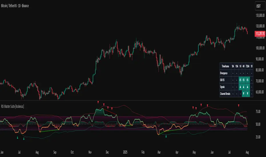
RSI Trendline Pro - Multi Confirmation
Overview
RSI Trendline Pro is an advanced Pine Script indicator that automatically draws trendlines on the RSI (Relative Strength Index) to detect support and resistance breakouts. It generates high-quality trading signals through a multi-confirmation system.
Key Features
Auto Trendlines: Detects pivot points on RSI to create intelligent support and resistance lines
Multi-Confirmation System: Combines Volume, Stochastic RSI, ADX, and Divergence filters to reduce false signals
RSI Divergence Detection: Automatically identifies bullish/bearish divergences between price and RSI
Live Dashboard: Displays RSI value, active trendlines, ADX strength, and last signal info on a visual panel
Smart Breakout Detection: Identifies trendline breaks and generates LONG/SHORT signals
How to Use
Add to TradingView: Paste code into Pine Editor and add to chart
Configure Parameters:
RSI Length: RSI period (default: 14)
Pivot Strength: Trendline sensitivity (lower = more lines)
Filters: Enable/disable Volume, Divergence, Stoch RSI, and ADX confirmations
Follow Signals:
LONG (Green): When RSI breaks resistance upward
SHORT (Red): When RSI breaks support downward
Divergence: "D" markers indicate potential trend reversals
Alert Setup
Script offers 4 alert types:
LONG Breakout: Resistance break
SHORT Breakout: Support break
Bullish/Bearish Divergence: Divergence detection
Any Signal: Combined alert for all signals
Best Practices
Prioritize high-volume breakouts (Volume Filter enabled)
Trends are stronger when ADX > 25
Confirm divergence signals with price action
Trade when 2-3 confirmations align

Smart Breakout Detector: Trendline Retest & Angle FilteringDetect trendline breakouts with two important filtering controls: retest validation and angle filtering. Require multiple price retests (2-4 touches) before a trendline is considered valid, eliminating weak single-touch lines. Set precise angle limits to filter out unreliable steep or shallow trendlines. Three independent timeframe sets (fast/medium/slow) with customizable pivot lengths allow you to get low risk entry point for both short-term and major trend continuations/reversals.
═══════════════════════════════════════════
CORE METHODOLOGY
═══════════════════════════════════════════
This indicator identifies trendline breakouts using two configurable filtering parameters that are uncommon in publicly available indicators:
1. RETEST VALIDATION
Requires a specified number of price touches (2-4) before considering a trendline valid. This reduces false signals from randomly aligned single-touch lines. Higher thresholds decrease signal frequency while increasing reliability.
2. ANGLE FILTERING
Applies maximum angle constraints (0-20) to trendlines independently for resistance and support, both upward and downward slopes. This filters trendlines with extreme angles that typically lack predictive value.
═══════════════════════════════════════════
TECHNICAL IMPLEMENTATION
═══════════════════════════════════════════
DETECTION ALGORITHM:
1. Identifies pivot highs/lows using configurable lookback periods
2. Connects pivots within ATR-based proximity threshold
3. Validates trendlines only after minimum retest requirement is met
4. Applies angle constraints using arctangent calculations
5. Verifies no price penetration occurred between pivot points
6. Triggers breakout signals when price breaches validated lines
THREE INDEPENDENT TREND LINE BANKS:
The indicator operates three parallel detection systems with separate parameters:
- Level Set A: Short pivot periods (default 5 bars)
- Level Set B: Medium pivot periods (default 10 bars)
- Level Set C: Long pivot periods (default 6 bars)
Each system maintains independent arrays of resistance and support lines.
ADAPTIVE COMPONENTS:
- Proximity tolerance scales with ATR(40) to accommodate volatility
- Angle thresholds adjust using combined absolute and percentage ATR factors
- Line lifespan configurable by bar count (default 180/200/300 bars per set)
══════════════════════════════════════════
USE CASES
══════════════════════════════════════════
Appropriate for:
- Filtering breakout candidates by reliability metrics
- Multi-timeframe trendline analysis
- Automated breakout monitoring
- Reducing chart noise from weak trendlines
Not appropriate for:
- Range-bound or highly choppy markets
- Instruments with insufficient historical data
- Strategies requiring predictive (non-historical) trendlines

Breakout Patterns Detector: Triangle & Wedge [Splirus]This indicator identifies Breakout Patterns such as Ascending Triangles , Descending Triangles , Symmetric Triangles , Ascending Wedges , and Descending Wedges , using candlestick charts and Trendlines. It provides visual cues, stop-loss (SL), and take-profit (TP) levels, alongside a detailed dashboard to evaluate performance. The indicator supports two alert modes: Manual Mode for trader notifications and Bot Mode for automated trading signals.
To achieve optimal results, users are encouraged to experiment with indicator parameters and analyze the dashboard summary to find the perfect configuration for each timeframe, pair, and market condition.
Pattern Identification
The indicator detects the following breakout patterns based on pivot highs and lows:
Ascending Triangle : Flat upper trendline, rising lower trendline.
Descending Triangle : Flat lower trendline, declining upper trendline.
Symmetric Triangle : Converging trendlines with similar slopes (within a user-defined threshold).
Ascending Wedge : Both trendlines slope upward, converging.
Descending Wedge : Both trendlines slope downward, converging.
Patterns are identified using configurable left and right bars for small and big patterns, with slope thresholds normalized by ATR. A trend confirmation filter ensures breakouts align with market direction, and users can adjust breakout confirmation bars to validate signals.
The goal is to fine-tune these settings to suit specific timeframes and pairs, as each combination may require a unique setup for optimal performance.
Stop-Loss Calculation
Stop-loss levels are calculated dynamically based on pattern type and breakout direction:
Symmetric Triangle : SL is set at the first pivot of the opposite trendline, adjusted by a buffer percentage.
Ascending/Descending Triangle : SL is placed at the breakout trendline’s price, plus the buffer.
Ascending/Descending Wedge : SL is set at the second pivot of the opposite trendline, adjusted by the buffer.
The indicator calculates leverage based on a user-defined risk tolerance percentage. Users should adjust the SL buffer and risk tolerance to balance risk and reward, monitoring the dashboard to assess how these settings impact performance across different timeframes and pairs.
Take-Profit Calculation
Three take-profit levels ( TP1 , TP2 , TP3 ) are calculated using pattern height and user-defined multipliers:
For Ascending/Descending Triangles, height is the difference between the max and min prices within the pattern.
For Symmetric Triangles and Wedges, height is the vertical distance between trendlines at the pattern’s start.
TP levels are set as:
TP1 = Breakout price ± (Height × TP1 Multiplier).
TP2 = Breakout price ± (Height × TP2 Multiplier).
TP3 = Breakout price ± (Height × TP3 Multiplier, with a 1.5x adjustment for Wedges).
Experiment with TP multipliers to optimize the risk-reward ratio, using the dashboard to evaluate TP hit rates and overall profitability for each configuration.
Symmetric Triangle:
Ascending/Descending Wedge:
Ascending/Descending Triangles:
Finding the Perfect Configuration
The indicator’s dashboard provides a comprehensive summary of performance metrics, including total trades, TP1/TP2/TP3 hits, SL hits, profit/loss percentages, and win rates for bullish, bearish, and combined trades. These metrics are crucial for identifying the ideal parameter settings:
Timeframe and Pair Variability : Each timeframe (e.g., 15m, 30min, 1H, 4H, Daily) and pair (e.g., BTC/USD, EUR/USD) behaves differently. Adjust parameters like left/right bars, minimum pattern length, and breakout confirmation bars to match the volatility and trend characteristics of the chosen pair and timeframe.
Parameter Tuning : Modify slope thresholds, trend confirmation filters, and bars inside the pattern to filter out false breakouts. For example, a higher breakout confirmation bar setting may reduce signals but increase reliability on longer timeframes.
Dashboard Analysis : Focus on the dashboard’s win rate, profit/loss ratio, and TP/SL hit frequencies. A “Perfect” win rate (>66%) or high TP hit rate indicates a strong configuration. If the SL hit rate is high, consider tightening the trend confirmation filter or increasing the SL buffer.
Iterative Testing : Test different combinations of settings (e.g., small vs. big patterns, aggressive vs. conservative breakout confirmation) and compare dashboard results over time. The goal is to find a balance where the indicator consistently delivers high win rates and profitability for your specific trading setup.
Alert Modes
The indicator supports two alert modes to suit different trading styles:
Manual Mode : Generates alerts for breakouts with entry price, SL, TP1/TP2/TP3, and leverage, tailored for Crypto or Forex markets. Use this mode to manually evaluate signals while refining configurations.
Bot Mode : Sends automated trading signals. To avoid conflicts, Bot Mode ensures no short position alert is triggered while a long position is active, and vice versa. This mode is ideal once you’ve identified an optimal configuration via the dashboard.
Additional Features
Historical Patterns : Displays past trendlines with customizable transparency and extension, helping users analyze how patterns performed under different settings.
Customizable Settings : Adjust pattern size, breakout confirmation, trend filters, and visual preferences (colors, dashboard location) to match your trading style.
Market Compatibility : Supports Crypto and Forex markets across all timeframes, but requires careful tuning for each market type.
Usage Notes
Start with default settings and monitor the dashboard to establish a baseline performance for your chosen timeframe and pair.
Gradually adjust one parameter at a time (e.g., left/right bars, TP multipliers) and compare dashboard results to identify improvements.
Use historical pattern analysis to understand how past breakouts performed under different configurations, guiding your optimization process.
Once a high win rate and profitability are achieved, consider automating trades with Bot Mode for consistent execution.
Disclaimer
This indicator is intended for educational purposes only and should not be considered financial advice. Trading involves significant risk, and past performance is not indicative of future results. Users are strongly advised to thoroughly test and validate the indicator’s signals in a demo environment before using it in live trading. The author is not responsible for any financial losses incurred while using this indicator. Always conduct your own research and consult with a qualified financial advisor before making trading decisions.
Trend and Trendline DetectorTrend and Trendline Detector
Overview
The Trend and Trendline Detector indicator provides both major and minor trend analysis using Simple Moving Averages (SMA) and automatically plots dynamic support and resistance trendlines based on pivot highs and lows.
Key Features
Major Trend Detection: Uses a configurable SMA to determine primary market direction.
Minor Trend Visualization: Optional minor SMA with color-coded line segments to mark smaller trend fluctuations.
Dynamic Pivot Trendlines: Automatically detects pivot highs/lows and draws major (solid) and minor (dashed) trendlines, with user-controlled extension modes.
Customizable Inputs: User can adjust SMA lengths, pivot look back/look forward periods, line extend mode, and toggle features on/off.

Trend Lines [LuxAlgo]Our new "Trend Lines" indicator detects and highlights relevant trendlines on the user chart while keeping it free of as much clutter as possible.
The indicator is thought for real-time usage and includes several filters as well as the ability to estimate trendline angles.
🔶 USAGE
Trendlines can act as support/resistance, with a higher number of tests indicating a more significant support/resistance role.
A broken TrendLine can be indicative of a potential trend reversal. The script highlights breaks with a label.
Users can additionally filter trendlines, only showing trendlines whose angles fall within a user set range:
This allows for the removal of potential clutter from the chart but also helps keep steeper or more horizontal trendlines.
🔶 DETAILS
When a swing (pivot point) is found, a Trendline is drawn when certain conditions are fulfilled.
An essential condition is that a Bearish Trendline (red) always occurs on a lower high, while a Bullish Trendline (blue) occurs on a higher low.
Our implementation will first show an initial dotted-styled TrendLine on confirmation, after which a solid-styled secondary TrendLine will develop. The latter will be used for the real-time detection of breaks at that line:
Furthermore, the script allows you to add more conditions:
🔹 Length (Swings)
A swing develops when a high/low is the highest/lowest against x highs/lows on the left AND right of that bar. x can be set by "Length" in settings.
The following images clarify this. The script confirms a swing where the yellow flag is shown; the high (here visualized with a purple label) is the highest point against x bars left and right of that point.
At that moment, this swing is checked against the previous swing. If all conditions are fulfilled, an initial TrendLine is drawn on confirmation.
After that point, a secondary thicker solid line is seen which keeps progressing bar after bar, until:
• a new TrendLine is formed
• the TrendLine is broken
🔹 Breaks between Swings
Once there is confirmation that a TrendLine can be drawn, the script allows you to filter for breakthroughs on that line. This can be set with "Check breaks between"
Disabled : the initial TrendLine is allowed to be pierced:
Check breaks between point A - point B : no breaks are allowed between both Swing points:
Point A - Current bar : no breaks are allowed between the first Swing point and the point of confirmation ('current' bar):
🔹 TrendLine breaks
As mentioned, the secondary TrendLine (solid line) progresses bar after bar until a new TrendLine is formed or the TrendLine is broken. When a TrendLine is broken, the TrendLine stops progressing, but if there isn't a new TrendLine and price return back, the TrendLine will re-appear, potentially giving several signals when the TrendLine is broken again.
Minimal bars allow you to regulate the amount of signals when the TrendLine is broken.
-> The secondary TrendLine must be uninterrupted for at least x bars before a potential break can be considered.
The following example shows 1 signal against 3 by adjusting this setting from 2 to 5:
🔹 Angles
Angles should normally be calculated when the units of the X and Y axis are the same. However, on our charts, the unit of the X-axis is bar_index (bars), and on the Y-axis the unit is price (¥, €, £, $,...).
It is not easy to normalize and create reasonably valid angles. Often certain angle calculations can differ through price changes or volatility.
Our calculate_slope() function tries to make corresponding angles through all bars.
We do this by calculating the difference between the highest/lowest price values in a certain bar range. The bar range is our X-axis, and the price difference is our Y-axis.
Zooming in/out will not change the amount of bars or the price. Since it does change our view on the chart, and thereby how we see the angles, we have included a setting where you can personalize the ratio between X and Y-axis (Angles -> Ratio X-Y axis).
Settings: Angles - Ratio X-Y axis:
🔶 SETTINGS
🔹 Swings
Length: Lookback period for the detection of swing points.
🔹 Trendline validation
Check breaks between :
Disabled : the initial TrendLine is allowed to be pierced
Check breaks between point A - point B : no breaks are allowed between both Swing points
Point A - Current bar : no breaks are allowed between the first Swing point and the point of confirmation ('current' bar)
Source (breaks) : Source which invalidates TrendLine, default: close
🔹 TrendLine breaks
Minimal bars : The secondary TrendLine must be uninterrupted for at least x bars before a potential break can be considered.
🔹 Angles
Show : Toggle labels.
Ratio X-Y axis : Every user has his preferences regarding zoom, chart layout,...
If the shown angles are not according to your expectations, you can adjust this number.
Only TrendLine between : Only allow TrendLines between the minimum and maximum degrees. Set only the minimal and maximum values above 0.

Lune Technical Analysis Premium⬛️ Overview
Lune Technical Analysis is a state-of-the-art TradingView indicator, meticulously designed to provide real-time market insights. Distinguished by its non-repainting features that operate in real-time, this tool brings enhanced accuracy and timeliness to your market analysis.
🟦 Features
Lune Technical Analysis equips traders with an array of innovative features:
🔹 Candle Coloring: The Candle Coloring feature introduces an innovative approach to visualizing market sentiment by coloring chart candles. It is devised to streamline your market analysis, offering a readily digestible snapshot of market trends. For example, if you aim to gauge the predominant market sentiment promptly, enable this feature for instant candle color-coding in accordance with prevailing bullish or bearish market structures. Though it currently supports only Market Structure-based Candle Coloring, its settings can be manipulated for enabling or disabling this feature. This feature operates by applying predefined algorithms that interpret market sentiment, coloring the candles accordingly.
🔹 Chart Pattern Detection: This sophisticated tool automatically detects and illustrates common chart patterns on your chart, simplifying the process of pattern identification. It identifies a range of patterns such as Head & Shoulders, Inverted Head & Shoulders, Ascending/Descending Wedges, Broadening Wedges, various Triangles, and Double Tops/Bottoms, enhancing your confluence detection in the market. For example, upon detecting a Double Top pattern, you could anticipate a potential price reversal due to this bearish signal. The sensitivity of this tool can be customized according to your trading style, with lower settings for short-term changes and higher for long-term. This feature leverages predefined formulas and price action analysis to identify these patterns.
🔹 Trendlines: With the Automatic Trendline Drawing tool, your technical analysis becomes significantly more efficient and precise. This feature is engineered to identify upward and downward Trendlines, aiding in locating potential pivots, and market support/resistance. For instance, if the price consistently rebounds off a Trendline, it may continue to do so, serving as a support/resistance level. However, a break through the Trendline could signal potential volatility and trend change. This feature's sensitivity to price changes can be adjusted to either short or long-term. It works by tracing Trendlines based on price action and wick formations to detect potential pivots.
🔹 Liquidity Bubbles: Liquidity Bubbles is an advanced tool that pinpoints key liquidity areas and large positions in real-time. This feature significantly contributes to effective trading strategy formulation by highlighting potential entry and exit points. It operates in real-time, ensuring zero repaint or lag, and supports two modes: Enhanced Bubbles and Basic Bubbles. For instance, the detection of multiple bullish Liquidity Bubbles during a ranging market could suggest an upward price movement due to dominant bullish volume. This feature's settings include thresholds for insignificant bubble filtering and a mode selection feature. Liquidity Bubbles operates by applying a proprietary formula to volume data, determining general volume direction and potential positions.
🔹 Market Structure: The Market Structure tool identifies key market structures such as Break of Structures (BoS) and Change of Character (ChoCh), thereby enhancing your ability to read market trends and sentiment. This smart money concept gives you a unique insight into short-term and long-term market trends. For instance, the appearance of a bullish Break of Structure and Change of Character after a predominantly bearish market sentiment could suggest a new bullish trend. This feature allows users to select which Market Structures to display and calculates these structures based on the market's high and low points.
🔹 Order Blocks: Order Blocks provide a visual representation of areas where large market participants are likely to place orders. These zones, where significant buying or selling activity has occurred in the past, offer insightful data for future price movements. The Order Blocks feature operates in real-time, providing real-time Order Blocks without any lag. For instance, if the price enters a large Order Block with predominantly bullish volume, an upward price movement can be anticipated. However, if the price breaks through the block, it could suggest the block's invalidation and a likely continued price fall. You can configure the settings to enable an additional Order Block, customize timeframes, overlap functions, and apply a quality filter. This feature calculates Order Blocks using the volume and candle size data.
🔹 Supply/Demand Zones: This real-time tool identifies crucial supply and demand zones, revealing potential price reaction points. These zones, where supply (selling pressure) and demand (buying pressure) have historically impacted price significantly, provide traders with insights into potential areas of strong support (demand) and resistance (supply). For example, if the price enters a large supply zone, a price rejection could be anticipated due to historical selling pressure at this zone. The settings enable users to add an additional Supply/Demand Zone, customize the timeframe, and apply a quality filter. This feature identifies common Supply/Demand Zones patterns based on volume and the size of the zone and displays them on the chart.
🔹 Fair Value Gaps: The Fair Value Gaps tool is designed to identify potential price correction zones or "gaps". These areas, where the market price sharply deviated from the fair value, suggest potential price adjustments in the future. For instance, the formation of a bullish Fair Value Gap could indicate a future price drop to fill this gap, potentially followed by an upward movement if the gap was of fair value. The settings allow users to enable additional Fair Value Gaps, customize the timeframe, and apply a quality filter. This feature measures large market gaps based on the size of the gap and its volume.
These features and tools collectively offer a comprehensive solution for traders to understand and navigate the financial markets. It's important to remember that they are designed to assist in making informed trading decisions and should be used as part of a balanced trading strategy.
🟧 Usage
Lune Technical Analysis's unique feature set can be leveraged both individually and synergistically. It is important to understand each feature and experiment with different configurations to best suit your unique trading needs.
🔸 Example #1: The following example demonstrates how the Order Block and Liquidity Bubbles feature can be used together to enhance your market analysis.
Order Blocks work in real-time to identify key order zones based on price action. These zones are often crucial for predicting price fluctuations. Meanwhile, Liquidity Bubbles act as real-time visual cues that detect significant market positions, facilitating an understanding of market accumulation, distribution, and trapped positions.
In this instance, at point 1, a bearish Basic and Enhanced Liquidity Bubble is visible within a crucial Order Block. The combination of these indicators augments the bearish sentiment, leading to a potential price decrease. Similarly, at point 2, the conjunction of two bullish Basic Liquidity Bubbles within an Order Block strengthens the bullish sentiment, culminating in a subsequent price increase.
🔸 Example #2: The following example demonstrates how Supply and Demand Zones can be used to detect strong and quality supports and resistance.
Supply and Demand Zones operate in real-time, detecting crucial zones based on price action and volume. This feature is invaluable for predicting potential price reaction points.
At point 1, the price enters a Supply Zone, a historical hotspot for selling activity, which usually leads to a price rejection and consequent decrease. At point 2, a Demand Zone indicating a bullish sentiment suggests a potential reversal when the price touches this level.
🔸 Example #3: The following example demonstrates how the Chart Pattern Detection feature is able to detect chart patterns to help enhance your trades.
Chart Pattern Detection employs formulas and price action analysis to identify common chart patterns as they form. Here, it successfully detects a 'Head and Shoulders' pattern, a conventionally bearish pattern, indicating a potential price drop.
🟥 Conclusion
Lune Technical Analysis stands as an exceptional blend of real-time insights into market activity. Its real-time, non-repainting features offer traders a more precise and timely approach to market analysis, promoting improved decision making in ever-changing market conditions.
🔻 Access
You can see the Author's instructions below to get instant access to this indicator & our Premium Suite.
🔻 Disclaimer
Lune Technical Analysis is a tool for aiding in market analysis and is not a guarantee of future market performance or individual trading success. We strongly recommend that users combine our tool with their trading strategies and do their due diligence before making any trading decisions.
Remember, past performance is not indicative of future results. Please trade responsibly.
Trend Lines ProHello Traders!
We need to make things better & better to solve the puzzle and I try to do my best on this way. now I am here with my new Trend Lines Pro script.
As you know, Trend Lines is very subjective and many people (even professionals) draw different Trend Lines on the same chart. This is confusing and there must be an automation to make the life easer. with this tool I tried to automate it.
The idea in this script is different from my previous trend lines scripts. In this, I use channel idea so it can check number of pivot points it contains, it checks H/L/C in the channels as well. it also checks the angle while choosing trend lines. then we get stronger and useful Trend Lines automatically.
There are some option in the script, let see one by one:
Pivot Period: The Length to calculate Pivot Highs/Lows
Source : Option to use "High/Low" or "Close" as the source for Pivot Points
Threshold Rate : This rate is used for channel width. it you give bigger numbers then you get bigger channels. it's 4 by default
Minimum Angle Rate for new Trendline: if there are different trend lines, there must be an angle between them to choose best trend lines. you can set the angle with this option.
Minimum Strength: there can be many trend lines but we need to choose/use stronger ones. with this option you can set the number of pivot points a trend channel have to contains.
Maximum Loopback Length: by default the script can check 40 pivot highs and 40 pivot lows but to make the script faster and useful I needed to add a limitation for the number of bars that the script can go back.
Show Trendlines as: you can see trend lines as "Trendline", "Channel", "Trend Channel". you can see examples below.
Enable Weak Trend Lines: if there is no trend lines strong enough (as defined in "Minimum Strength" option) you have option to see a weak trend line. that is useful sometimes. if you enable this option weak lines are shown as dotted lines.
Show Price Labels on Trendlines: the script can show the price levels to break trend lines. the examples are below
Line Style: trend lines can be Solid or Dashed as you wish
Color theme: colors of the Up/Down Trend lines can be set. 'Red', Lime, Blue, White, Black, Olive, Gray
you can see the Trend Lines as channels:
you can see Trend Channels to see the big picture.also there is dotted trend line as weak trend line defined above.
you can set color/width of trend lines as you wish.
the script is fast enough to run on 1sec chart:
you can use this script on any chart, fx pairs, stocks, indices etc
I made a short video to explain how to use it and some options:
Please PM for access.
Enjoy!
DISCLAIMER: No sharing, copying, reselling, modifying, or any other forms of use are authorized for our documents, script / strategy, and the information published with them. This informational planning script / strategy is strictly for individual use and educational purposes only. This is not financial or investment advice. Investments are always made at your own risk and are based on your personal judgement. I am not responsible for any losses you may incur. Please invest wisely.
Skrip berbayar

Slark Signal - Telegram Alert---
Indicator Description: Slark Signal - Telegram Alert
The Slark Signal - Telegram Alert is a custom trading indicator designed to detect potential buy and sell signals based on pivots and trendlines. This indicator sends real-time alerts via Telegram when specific market conditions are met and provides automatic Stop-Loss (SL) and Take-Profit (TP) levels for better trade management.
---
What Does the Indicator Do?
Pivot-Based Signals: Detects significant pivot highs and lows to identify potential trend reversals.
Automatic SL and TP Levels: Projects customizable Stop-Loss and Take-Profit levels on the chart based on user-defined parameters.
Telegram Alerts: Sends buy or sell signals with relevant trade details (entry price, SL, and TP) to your Telegram channel when conditions are met.
Session-Based Signals: Limits the signals to a specific trading session (8:00 - 10:00).
---
How Does the Indicator Work?
Customizable Input Parameters:
- Pivot Detection Length: Defines the length used to detect pivot highs and lows.
- Slope Multiplier: Controls the slope of trendlines based on ATR.
- Session Start and End Hours: Specifies the time window during which signals can be generated.
- SL and TP Ticks: Defines the distance (in ticks) for Stop-Loss and Take-Profit levels.
- Telegram Chat ID: Input your Telegram chat ID to receive alerts in your Telegram channel.
Pivot Highs and Lows Detection:
- The indicator calculates pivot highs (PH) and pivot lows (PL) over the specified period, drawing trendlines for both based on the slope multiplier.
- Trendline Breakouts: When the price crosses above the upper trendline or below the lower trendline, it generates a buy or sell signal.
Signal Generation and Trade Levels:
- If a buy signal is detected, the indicator automatically sets and displays the entry price, Stop-Loss, and Take-Profit levels.
- The same applies for sell signals when a sell condition is met.
- Signals are valid only within the defined trading session (8:00 - 10:00).
Telegram Alerts:
- When a buy or sell signal is triggered, an alert with the trade details (entry price, SL, and TP) is sent to your Telegram chat via the chat ID you have provided.
---
How to Use the Indicator?
Set Up Input Parameters:
- Pivot Detection Length: Set the period for detecting pivot highs and lows (default: 5).
- Slope Multiplier: Adjust the slope multiplier for trendlines based on ATR (default: 0.4).
- SL and TP Ticks: Define the tick distance for SL and TP (default: SL = 100, TP = 300).
- Session Start and End Hours: Set the time window for signal generation (default: 8:00 - 10:00).
- Telegram Chat ID: Input your Telegram channel’s chat ID to receive alerts.
Interpreting Buy and Sell Signals:
- Buy Signal: When a buy condition is met, a label "COMPRA" is shown below the bar, and the system sends the signal to Telegram with all trade details.
- Sell Signal: When a sell condition is met, a label "VENTA" is displayed above the bar, and the system sends the corresponding alert to Telegram.
- The system ensures signals are only triggered during the defined session time (8:00 - 10:00).
Trade Planning and Risk Management:
- **Stop-Loss and Take-Profit:** Automatically drawn on the chart, use these levels to plan your trades.
- **Telegram Alerts:** Stay updated with real-time buy or sell signals in your Telegram channel for quick decision-making.
---
What Makes This Indicator Original?
Pivot and Trendline Logic: The indicator uses pivot highs and lows to draw dynamic trendlines, identifying key reversal points and breakouts.
Real-Time Telegram Alerts: Unique in its ability to send automatic alerts with detailed trade information directly to your Telegram channel, allowing you to act quickly on signals.
Built-In SL/TP Visualization: The system automatically calculates and displays SL and TP levels, making it easier to manage risk and reward.
Session-Based Signals: Helps traders focus on key trading hours by limiting signal generation to a specific time range.
---
Additional Considerations
Complement with Other Analysis: It is recommended to use this indicator in conjunction with other analysis tools to confirm trade setups.
Testing: Before using the indicator live, consider testing it on a demo account to fine-tune your settings.
Risk Management: Ensure that the SL and TP levels fit your trading strategy and risk tolerance.
Market Awareness: Stay informed about news and events that could impact market conditions during your trading session.
---
Example Configuration
To help you get started, here is an example configuration:
Pivot Detection Length: 5
Slope Multiplier: 0.4
SL Ticks: 100
TP Ticks: 300
Session Start Hour: 8
Session End Hour: 10
Telegram Chat ID: Input your unique Telegram chat ID here.
---
Conclusion
The Slark Signal - Telegram Alert indicator provides a highly customizable and automated solution for detecting buy and sell signals based on pivots and trendline breaks. By utilizing real-time alerts via Telegram, you can stay updated on key trading opportunities. It also offers automatic SL and TP levels, making trade planning and risk management straightforward.
Ready for immediate use in TradingView, this indicator can become a vital part of your trading strategy.
---

Parallel Projections [theEccentricTrader]█ OVERVIEW
This indicator automatically projects parallel trendlines or channels, from a single point of origin. In the example above I have applied the indicator twice to the 1D SPXUSD. The five upper lines (green) are projected at an angle of -5 from the 1-month swing high anchor point with a projection ratio of -72. And the seven lower lines (blue) are projected at an angle of 10 with a projection ratio of 36 from the 1-week swing low anchor point.
█ CONCEPTS
Green and Red Candles
• A green candle is one that closes with a high price equal to or above the price it opened.
• A red candle is one that closes with a low price that is lower than the price it opened.
Swing Highs and Swing Lows
• A swing high is a green candle or series of consecutive green candles followed by a single red candle to complete the swing and form the peak.
• A swing low is a red candle or series of consecutive red candles followed by a single green candle to complete the swing and form the trough.
Peak and Trough Prices (Basic)
• The peak price of a complete swing high is the high price of either the red candle that completes the swing high or the high price of the preceding green candle, depending on which is higher.
• The trough price of a complete swing low is the low price of either the green candle that completes the swing low or the low price of the preceding red candle, depending on which is lower.
Historic Peaks and Troughs
The current, or most recent, peak and trough occurrences are referred to as occurrence zero. Previous peak and trough occurrences are referred to as historic and ordered numerically from right to left, with the most recent historic peak and trough occurrences being occurrence one.
Support and Resistance
• Support refers to a price level where the demand for an asset is strong enough to prevent the price from falling further.
• Resistance refers to a price level where the supply of an asset is strong enough to prevent the price from rising further.
Support and resistance levels are important because they can help traders identify where the price of an asset might pause or reverse its direction, offering potential entry and exit points. For example, a trader might look to buy an asset when it approaches a support level , with the expectation that the price will bounce back up. Alternatively, a trader might look to sell an asset when it approaches a resistance level , with the expectation that the price will drop back down.
It's important to note that support and resistance levels are not always relevant, and the price of an asset can also break through these levels and continue moving in the same direction.
Trendlines
Trendlines are straight lines that are drawn between two or more points on a price chart. These lines are used as dynamic support and resistance levels for making strategic decisions and predictions about future price movements. For example traders will look for price movements along, and reactions to, trendlines in the form of rejections or breakouts/downs.
█ FEATURES
Inputs
• Anchor Point Type
• Swing High/Low Occurrence
• HTF Resolution
• Highest High/Lowest Low Lookback
• Angle Degree
• Projection Ratio
• Number Lines
• Line Color
Anchor Point Types
• Swing High
• Swing Low
• Swing High (HTF)
• Swing Low (HTF)
• Highest High
• Lowest Low
• Intraday Highest High (intraday charts only)
• Intraday Lowest Low (intraday charts only)
Swing High/Swing Low Occurrence
This input is used to determine which historic peak or trough to reference for swing high or swing low anchor point types.
HTF Resolution
This input is used to determine which higher timeframe to reference for swing high (HTF) or swing low (HTF) anchor point types.
Highest High/Lowest Low Lookback
This input is used to determine the lookback length for highest high or lowest low anchor point types.
Intraday Highest High/Lowest Low Lookback
When using intraday highest high or lowest low anchor point types, the lookback length is calculated automatically based on number of bars since the daily candle opened.
Angle Degree
This input is used to determine the angle of the trendlines. The output is expressed in terms of point or pips, depending on the symbol type, which is then passed through the built in math.todegrees() function. Positive numbers will project the lines upwards while negative numbers will project the lines downwards. Depending on the market and timeframe, the impact input values will have on the visible gaps between the lines will vary greatly. For example, an input of 10 will have a far greater impact on the gaps between the lines when viewed from the 1-minute timeframe than it would on the 1-day timeframe. The input is a float and as such the value passed through can go into as many decimal places as the user requires.
It is also worth mentioning that as more lines are added the gaps between the lines, that are closest to the anchor point, will get tighter as they make their way up the y-axis. Although the gaps between the lines will stay constant at the x2 plot, i.e. a distance of 10 points between them, they will gradually get tighter and tighter at the point of origin as the slope of the lines get steeper.
Projection Ratio
This input is used to determine the distance between the parallels, expressed in terms of point or pips. Positive numbers will project the lines upwards while negative numbers will project the lines downwards. Depending on the market and timeframe, the impact input values will have on the visible gaps between the lines will vary greatly. For example, an input of 10 will have a far greater impact on the gaps between the lines when viewed from the 1-minute timeframe than it would on the 1-day timeframe. The input is a float and as such the value passed through can go into as many decimal places as the user requires.
Number Lines
This input is used to determine the number of lines to be drawn on the chart, maximum is 500.
█ LIMITATIONS
All green and red candle calculations are based on differences between open and close prices, as such I have made no attempt to account for green candles that gap lower and close below the close price of the preceding candle, or red candles that gap higher and close above the close price of the preceding candle. This may cause some unexpected behaviour on some markets and timeframes. I can only recommend using 24-hour markets, if and where possible, as there are far fewer gaps and, generally, more data to work with.
If the lines do not draw or you see a study error saying that the script references too many candles in history, this is most likely because the higher timeframe anchor point is not present on the current timeframe. This problem usually occurs when referencing a higher timeframe, such as the 1-month, from a much lower timeframe, such as the 1-minute. How far you can lookback for higher timeframe anchor points on the current timeframe will also be limited by your Trading View subscription plan. Premium users get 20,000 candles worth of data, pro+ and pro users get 10,000, and basic users get 5,000.
█ RAMBLINGS
It is my current thesis that the indicator will work best when used in conjunction with my Wavemeter indicator, which can be used to set the angle and projection ratio. For example, the average wave height or amplitude could be used as the value for the angle and projection ratio inputs. Or some factor or multiple of such an average. I think this makes sense as it allows for objectivity when applying the indicator across different markets and timeframes with different energies and vibrations.
“If you want to find the secrets of the universe, think in terms of energy, frequency and vibration.”
― Nikola Tesla
