50% of Previous 1H Candle (Color Logic)📌 Script Title: 50% Midpoint of Previous 1H Candle (Color Coded)
📝 Description:
This indicator draws a horizontal line at the 50% (midpoint) of the most recently closed 1-hour candle, helping traders visualize intraday support/resistance and sentiment bias.
🔹 Key Features:
Plots the midpoint of the last 1H candle as a horizontal line.
Color-coded line and label:
🟢 Green: Previous candle was bullish
🔴 Red: Previous candle was bearish
⚪ Gray: Neutral (doji or equal open/close)
Displays the exact price level with a floating label.
Works on any lower timeframe chart (e.g., 5m, 15m, 30m).
Automatically updates every hour after the 1H candle closes.
📈 Use Cases:
Trade around the 1H midpoint as a dynamic pivot zone.
Confirm or fade price breakouts/rejections at this level.
Use it with trendlines, supply/demand zones, or VWAP.
🔍 Technical Notes:
The midpoint is calculated using:
Midpoint = (High + Low) / 2
from the most recent closed 1H candle.
Color logic is based on whether the 1H candle closed above or below its open.
🚀 Enhancement Ideas (future updates):
Add optional alerts on cross of the midpoint.
Show multiple historical midpoint levels.
Input toggle to enable/disable color coding.
Whether you’re scalping intraday or watching for reaction zones, this tool gives you a clean, real-time level to anchor your trades around.
Happy trading! 💹
— Built with ❤️ in Pine Script v6
Cari dalam skrip untuk "TRENDLINES"

RSI 3 Time FrameRSI 3 Time Frames Indicator
Overview
The RSI 3 Time Frames Indicator is designed to provide traders with a comprehensive view of the Relative Strength Index (RSI) across three different timeframes: Ripple (short-term), Wave (medium-term), and Tide (long-term). By combining insights from multiple timeframes on a single chart, traders can identify momentum, overbought/oversold conditions, and confluence zones for better decision-making.
This indicator is highly customizable, enabling you to adjust RSI timeframes, line colors, thickness, and reference levels such as oversold/overbought areas.
Features
Multi-Timeframe RSI Analysis:
Ripple RSI: Captures short-term momentum (default: 5-minute RSI) for quick entries and scalping.
Wave RSI: Provides medium-term RSI perspective (default: 15-minute RSI) for day trading setups.
Tide RSI: Gives broader trends and momentum shifts (default: 60-minute RSI) suitable for swing trading.
Key RSI Reference Levels:
Horizontal lines show critical RSI levels to help traders interpret conditions:
Oversold Zone:
20 (Oversold Extreme) → Green dotted line.
30 (Oversold) → Green dotted line.
Neutral Zone:
40 (Neutral Low) → Orange dotted line.
50 (Midpoint) → Black dotted line.
60 (Neutral High) → Orange dotted line.
Overbought Zone:
70 (Overbought) → Red dotted line.
80 (Overbought Extreme) → Red dotted line.
Customizable Options:
Adjust RSI line color, width, and timeframes to fit your trading needs.
Customize horizontal level line colors and styles (dotted, dashed, or solid).
Easy-to-Interpret Design:
All RSI lines and reference levels are visualized clearly to help you identify overbought/oversold zones, neutral levels, and overall market momentum across multiple perspectives.
Recommended Use Cases
Scalping:
Use Ripple RSI (default: 5-minute timeframe) for short-term insights into momentum-driven setups.
Day Trading:
Use Wave RSI (default: 15-minute timeframe) to analyze medium-term trends and spot entries/exits.
Swing Trading:
Use Tide RSI (default: 60-minute timeframe) for longer-term momentum shifts and confluence zones.
Multi-Timeframe Confirmation :
Look for alignment among RSI values across Ripple, Wave, and Tide to increase confidence in your trades.
How to Use the RSI 3 Time Frames Indicator
Add the Indicator to Your Chart: Import the RSI 3 Time Frames Indicator into TradingView.
Customize Settings:
Choose Ripple, Wave, and Tide RSI timeframes according to your strategy (e.g., 5-minute for short-term, 15-minute for medium-term).
Modify line colors, styles, and thickness for better clarity.
Enable/disable RSI lines or reference levels based on preference.
Interpret RSI Values Across Timeframes:
Identify overbought levels (above 70) for potential reversals.
Spot oversold levels (below 30) for buying opportunities.
Use the neutral midpoint (50) for balanced momentum, indicating neither buyers nor sellers dominate.
Combine with Other Tools:
Enhance your trading strategy by using RSI signals with price action tools like support/resistance zones, trendlines, and candlestick patterns.
Example Scenario
Let’s say you’re trading Bitcoin (BTC/USD):
Ripple RSI shows momentum building but nearing overbought (above 70).
Wave RSI confirms shorter momentum trends (above 60).
Tide RSI shows divergence as the longer timeframe RSI is falling toward oversold (below 40).
This alignment across timeframes helps you make informed decisions, such as waiting for Ripple RSI to cool off before entering a longer-term trade based on the Tide RSI oversold condition.
Disclaimer
The RSI 3 Time Frames Indicator is provided for educational and informational purposes only. It is not intended as financial advice or as a definitive trading signal. This tool should not be used in isolation for decision-making. Trading is inherently risky, and while RSI can offer valuable insights into market trends, traders should use proper risk management strategies and include other tools such as volume-based indicators, price action, fundamental research, and macroeconomic analysis in their decision-making process.
Always test any new strategies in a simulated or paper trading environment before applying them to real markets. Remember to consult with a licensed financial professional if you’re unsure whether trading is suitable for your financial situation.
Key Benefits
Enhanced flexibility with customizable RSI settings.
Clear visualization of momentum across short, medium, and long-term timeframes.
Helps traders avoid tunnel vision by providing a multi-timeframe perspective.
Final Note
The RSI 3 Time Frames Indicator is a powerful, easy-to-use tool for traders who want to leverage RSI across multiple timeframes to pinpoint high-probability setups. Customize the settings based on your strategy and use this as a companion tool for your overall trading system.
We hope you enjoy using this indicator to improve your trading and analysis! Happy trading! 😊

Pivot Points mura visionWhat it is
A clean, single-set pivot overlay that lets you choose the pivot type (Traditional/Fibonacci), the anchor timeframe (Daily/Weekly/Monthly/Quarterly, or Auto), and fully customize colors, line width/style , and labels . The script never draws duplicate sets—exactly one pivot pack is displayed for the chosen (or auto-detected) anchor.
How it works
Pivots are computed with ta.pivot_point_levels() for the selected anchor timeframe .
The script supports the standard 7 levels: P, R1/S1, R2/S2, R3/S3 .
Lines span exactly one anchor period forward from the current bar time.
Label suffix shows the anchor source: D (Daily), W (Weekly), M (Monthly), Q (Quarterly).
Auto-anchor logic
Intraday ≤ 15 min → Daily pivots (D)
Intraday 20–120 min → Weekly pivots (W)
Intraday > 120 min (3–4 h) → Monthly pivots (M)
Daily and above → Quarterly pivots (Q)
This keeps the chart readable while matching the most common trader expectations across timeframes.
Inputs
Pivot Type — Traditional or Fibonacci.
Pivots Timeframe — Auto, Daily (1D), Weekly (1W), Monthly (1M), Quarterly (3M).
Line Width / Line Style — width 1–10; style Solid, Dashed, or Dotted.
Show Labels / Show Prices — toggle level tags and price values.
Colors — user-selectable colors for P, R*, S* .
How to use
Pick a symbol/timeframe.
Leave Pivots Timeframe = Auto to let the script choose; or set a fixed anchor if you prefer.
Toggle labels and prices to taste; adjust line style/width and colors for your theme.
Read the market like a map:
P often acts as a mean/rotation point.
R1/S1 are common first reaction zones; R2/S2 and R3/S3 mark stronger extensions.
Confluence with S/R, trendlines, session highs/lows, or volume nodes improves context.
Good practices
Use Daily pivots for intraday scalps (≤15m).
Use Weekly/Monthly for swing bias on 1–4 h.
Use Quarterly when analyzing on Daily and higher to frame larger cycles.
Combine with trend filters (e.g., EMA/KAMA 233) or volatility tools for entries and risk.
Notes & limitations
The script shows one pivot pack at a time by design (prevents clutter and duplicates).
Historical values follow TradingView’s standard pivot definitions; results can vary across assets/exchanges.
No alerts are included (levels are static within the anchor period).

Divergence & Volume ThrustThis document provides both user and technical information for the "Divergence & Volume Thrust" (DVT) Pine Script indicator.
Part 1: User Guide
1.1 Introduction
The DVT indicator is an advanced tool designed to automatically identify high-probability trading setups. It works by detecting divergences between price and key momentum oscillators (RSI and MACD).
A divergence is a powerful signal that a trend might be losing strength and a reversal is possible. To filter out weak signals, the DVT indicator includes a Volume Thrust component, which ensures that a divergence is backed by significant market interest before it alerts you.
🐂 Bullish Divergence: Price makes a new low, but the indicator makes a higher low. This suggests selling pressure is weakening.
🐻 Bearish Divergence: Price makes a new high, but the indicator makes a lower high. This suggests buying pressure is weakening.
1.2 Key Features on Your Chart
When you add the indicator to your chart, here's what you will see:
Divergence Lines:
Bullish Lines (Teal): A line will be drawn on your chart connecting two price lows that form a bullish divergence.
Bearish Lines (Red): A line will be drawn connecting two price highs that form a bearish divergence.
Solid lines represent RSI divergences, while dashed lines represent MACD divergences.
Confirmation Labels:
"Bull Div ▲" (Teal Label): This label appears below the candle when a bullish divergence is detected and confirmed by a recent volume spike. This is a high-probability buy signal.
"Bear Div ▼" (Red Label): This label appears above the candle when a bearish divergence is detected and confirmed by a recent volume spike. This is a high-probability sell signal.
Volume Spike Bars (Orange Background):
Any price candle with a faint orange background indicates that the volume during that period was unusually high (exceeding the average volume by a multiplier you can set).
1.3 Settings and Configuration
You can customize the indicator to fit your trading style. Here's what each setting does:
Divergence Pivot Lookback (Left/Right): Controls the sensitivity of swing point detection. Lower numbers find smaller, more frequent divergences. Higher numbers find larger, more significant ones. 5 is a good starting point.
Max Lookback Range for Divergence: How many bars back the script will look for the first part of a divergence pattern. Default is 60.
Indicator Settings (RSI & MACD):
You can toggle RSI and MACD divergences on or off.
Standard length settings for each indicator (e.g., RSI Length 14, MACD 12, 26, 9).
Volume Settings:
Use Volume Confirmation: The most important filter. When checked, labels will only appear if a volume spike occurs near the divergence.
Volume MA Length: The lookback period for calculating average volume.
Volume Spike Multiplier: The core of the "Thrust" filter. A value of 2.0 means volume must be 200% (or 2x) the average to be considered a spike.
Visuals: Customize colors and toggle the confirmation labels on or off.
1.4 Strategy & Best Practices
Confluence is Key: The DVT indicator is powerful, but it should not be used in isolation. Look for its signals at key support and resistance levels, trendlines, or major moving averages for the highest probability setups.
Wait for Confirmation: A confirmed signal (with a label) is much more reliable than an unconfirmed divergence line.
Context Matters: A bullish divergence in a strong downtrend might only lead to a small bounce, not a full reversal. Use the signals in the context of the overall market structure.
Set Alerts: Use the TradingView alert system with this script. Create alerts for "Confirmed Bullish Divergence" and "Confirmed Bearish Divergence" to be notified of setups automatically.

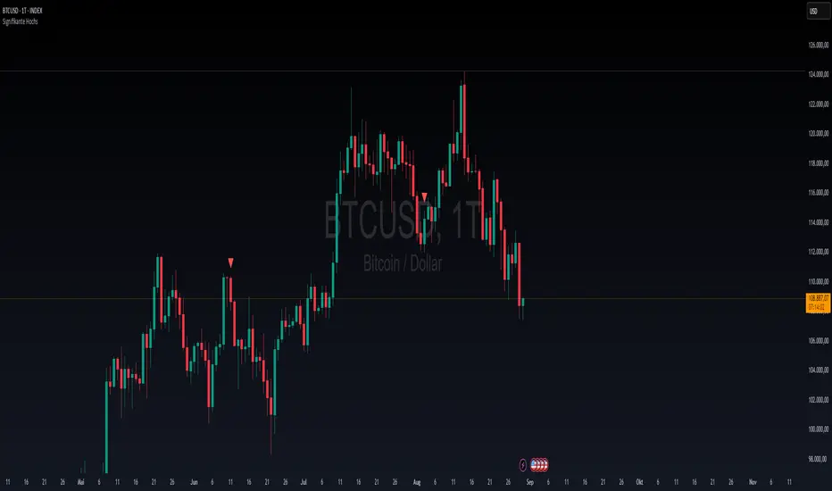
Signifikante HochsThis indicator was created to highlight significant highs in the price chart. It is intentionally kept simple and lightweight, since its primary purpose is to serve as a test and learning tool for exploring the functions of the TradingView platform.
How it works:
A user-defined lookback period is applied to check whether a local high has been formed.
A minimum percentage change threshold is used as an additional filter, so that only highs with a certain level of significance are marked.
Once such a high is detected, a visual marker is plotted above the corresponding candle.
The main goal of this script is not to provide a complete trading strategy, but rather to help users understand the basic elements of Pine Script, chart visualization, and platform workflows. In particular, this script is a practical way to test and demonstrate:
The use of input parameters.
Core functions such as ta.pivothigh.
Conditional checks for price significance.
Simple plotting of signals directly on the chart.
At the same time, this test indicator can serve as a foundation for further development. The logic can easily be extended to:
Display significant lows as well as highs.
Draw connecting trendlines between pivots.
Generate alerts whenever a new significant high appears.
Incorporate multi-timeframe logic for deeper analysis.
Important note:
This script is not intended to be a full trading strategy in its current form. Instead, it acts as a test environment for learning how to publish, manage, and experiment with indicators on TradingView.
For the TradingView community, this simple tool can still be valuable, as it provides a quick visual reference for key highs that traders may use as additional context in their market analysis.
Auto S/R 1H - Stable Simplethat is a script to find out the support and resistance as trendlines for stocks in one hour timeframe for swing trading.

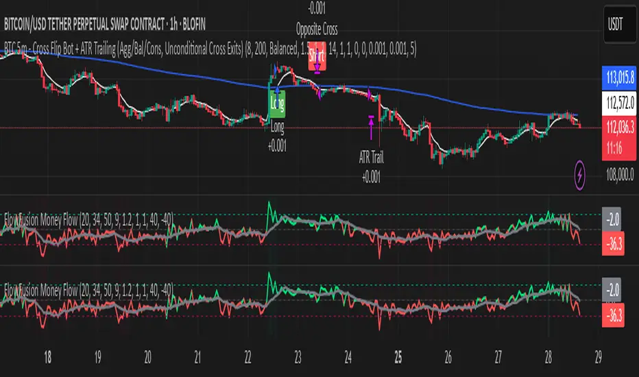
FlowFusion Money Flow — FP + VWAP Drift + PVT (−100..+100)Title (ASCII only)
FlowFusion Money Flow — Flow Pressure + Rolling VWAP Drift + PVT (Normalized −100..+100)
Short Description
Original money-flow oscillator combining Flow Pressure, Rolling VWAP Drift, and PVT Momentum into one normalized score (−100..+100) with a signal line, thresholds, optional component plots, and ready-made alerts.
Full Description (meets “originality & usefulness”)
What’s original
FlowFusion Money Flow is not a generic mashup. It builds a single score from three complementary, volume-aware components that target different facets of order flow:
Flow Pressure (FP) — In-bar directional drive scaled by relative volume.
Drive
=
close
−
open
max
(
high
−
low
,
tick
)
∈
=
max(high−low, tick)
close−open
∈ .
Relative Volume
=
volume
average volume over
𝑓
𝑝
𝐿
𝑒
𝑛
=
average volume over fpLen
volume
.
𝐹
𝑃
𝑟
𝑎
𝑤
=
Drive
×
RelVol
FP
raw
=Drive×RelVol then squashed (softsign) to
.
Why it belongs: distinguishes real pushes (big body and big volume) from noise.
Rolling VWAP Drift — Direction of VWAP itself over a rolling window, normalized by ATR.
𝑉
𝑊
𝐴
𝑃
𝑡
=
∑
(
𝑇
𝑃
×
𝑉
𝑜
𝑙
)
∑
𝑉
𝑜
𝑙
VWAP
t
=
∑Vol
∑(TP×Vol)
over vwapLen.
Drift
=
𝑉
𝑊
𝐴
𝑃
𝑡
−
𝑉
𝑊
𝐴
𝑃
𝑡
−
1
𝐴
𝑇
𝑅
=
ATR
VWAP
t
−VWAP
t−1
→ squashed to
.
Why it belongs: persistent VWAP movement signals sustained accumulation/distribution.
PVT Momentum — Price-Volume Trend standardized (z-score) and squashed.
𝑃
𝑉
𝑇
𝑡
=
𝑃
𝑉
𝑇
𝑡
−
1
+
𝑉
𝑜
𝑙
×
Δ
𝐶
𝑙
𝑜
𝑠
𝑒
𝐶
𝑙
𝑜
𝑠
𝑒
𝑡
−
1
PVT
t
=PVT
t−1
+Vol×
Close
t−1
ΔClose
.
𝑧
=
𝑃
𝑉
𝑇
−
SMA
(
𝑃
𝑉
𝑇
)
StDev
(
𝑃
𝑉
𝑇
)
z=
StDev(PVT)
PVT−SMA(PVT)
→ squashed to
.
Why it belongs: captures volume-weighted trend pressure without relying on price alone.
Composite score:
Score
=
𝑤
𝐹
𝑃
⋅
𝐹
𝑃
+
𝑤
𝑉
𝑊
𝐴
𝑃
⋅
𝑉
𝑊
𝐴
𝑃
_
𝐷
𝑟
𝑖
𝑓
𝑡
+
𝑤
𝑃
𝑉
𝑇
⋅
𝑃
𝑉
𝑇
_
𝑀
𝑜
𝑚
𝑤
𝐹
𝑃
+
𝑤
𝑉
𝑊
𝐴
𝑃
+
𝑤
𝑃
𝑉
𝑇
Score=
w
FP
+w
VWAP
+w
PVT
w
FP
⋅FP+w
VWAP
⋅VWAP_Drift+w
PVT
⋅PVT_Mom
with a Signal = SMA(Score, sigLen). Thresholds mark strong accumulation/distribution zones.
How it works (step-by-step)
Compute FP, VWAP Drift, PVT Momentum.
Normalize each to the same
scale.
Weighted average → FlowFusion Score.
Smooth with a Signal line to reduce whipsaw.
Optional background shading when Score exceeds thresholds.
How to use
Direction filter:
Score > 0 favors longs; Score < 0 favors shorts.
Momentum turns:
Score crosses above Signal → setup for long; below → setup for short.
Strength zones:
Above Upper Threshold (default +40) = strong buy pressure; below Lower (−40) = strong sell pressure.
Confluence:
Best near S/R, trendlines, or HTF bias. For scalping on 1–5m, consider sigLen 9–13 and thresholds ±40 to ±50.
Alerts included: zero cross, zone entries, and Score/Signal crossovers.
Inputs (key)
fpLen (20): relative-volume lookback for Flow Pressure.
vwapLen (34): rolling VWAP window.
pvtLen (50): PVT z-score window.
sigLen (9): Signal smoothing.
Weights: wFP, wVWAP, wPVT to bias the blend.
Thresholds: upperBand / lowerBand (defaults +40/−40).
Display: toggle component plots and background shading.
Best practices
Trending markets: increase wVWAP (VWAP Drift) or widen thresholds.
Ranging markets: increase wFP and wPVT; take quicker profits.
News: wait for bar close confirmation or reduce size.
Data quality: use consistent volume feeds (especially in crypto).
Limitations
Oscillators can stay extreme in strong trends; use structure/trend filters.
Volume anomalies (illiquid pairs, API glitches) can distort signals—sanity-check with another venue when possible.
Disclaimer
This indicator is for educational purposes only and is not financial advice. Trading involves risk; past performance does not guarantee future results. Always paper-trade first and use appropriate risk controls.
Forex Sessions(IST)📌 Forex Sessions (IST Version)
This indicator highlights the four major Forex market sessions — Asia, Frankfurt, London, and New York — automatically adjusted to Indian Standard Time (IST).
Session Timings in IST:
Asia: 02:30 – 10:30
🇩🇪 Frankfurt: 11:30 – 12:30
🇬🇧 London: 12:30 – 21:30
🇺🇸 New York: 17:30 – 02:30 (next day)
Trading Advantages:
Asia session → Spot the range high/low
Frankfurt → Detect inducement moves
London → Identify the main push/trend move
New York → Catch reversals & profit taking
Features:
Clean session highlights with custom colors
Optional tools: range, trendlines, mean, VWAP, max/min levels
Adjustable transparency and display settings
With this, you can easily track session overlaps, volatility shifts, and trade setups — all aligned with IST Forex timings.
CAT FLD SmoothWhat is an FLD?
The FLD stands for Future Line of Demarcation, introduced by J.M. Hurst in his Cyclic Analysis work.
It is constructed by shifting the price forward in time by half the length of a given cycle. For example, if you want to analyze a 40-bar cycle, you would plot price shifted forward by 20 bars. This creates a projected line that acts as a dynamic reference for where the cycle rhythm should align.
In practice, each cycle has its own FLD (20, 40, 80 bars, etc.), and when price interacts with those FLDs, it often reveals the underlying rhythm of market waves.
How Traders Use the FLD
1. Cycle Detection
When price crosses its FLD, it is often the signal that a cycle trough or peak has recently formed. This allows the trader to recognize where one wave ends and the next begins.
Upward cross → suggests a new upward cycle has started.
Downward cross → suggests a downward cycle is unfolding.
2. Projection of Price Targets
One of Hurst’s key insights is that after crossing an FLD, price often travels a distance roughly equal to the recent cycle’s amplitude. This makes the FLD a tool not only for timing but also for projecting targets.
Example:
If price rises through the 40-bar FLD after a cycle trough, the expected move is often the same height as the move off the last trough to the point of a break through the FLD.
3. Support and Resistance
FLDs can act like invisible levels of support and resistance, but unlike static horizontal levels, they are dynamic and cycle-based. Price often hesitates, bounces, or accelerates when touching its FLD.
4. Multi-Cycle Confluence
Markets rarely move in just one cycle length. By plotting multiple FLDs (for example, 20-bar, 40-bar, and 80-bar), traders can see where several FLDs line up. These confluences are particularly powerful—they highlight high-probability turning points.
Why FLDs Matter?
They help separate noise from structure by focusing on repeating time rhythms.
They provide early signals of where cycles invert.
They give price targets that are not arbitrary, but cycle-derived.
They can be combined with other tools (trendlines, oscillators, volume) for confirmation.
👉 With this indicator, you can visualize Hurst’s FLDs directly on your TradingView charts, making it easier to detect cycles, project targets, and anticipate turning points before they become obvious to everyone else.
CastAway Trader LLC, the publisher of this indicator is not registered as an investment adviser nor a broker/dealer with either the U. S. Securities & Exchange Commission or any state securities regulatory authority.
CastAway Trader LLC reserves the right to un-publish this indicator or change it without any written notice.
Past results are not indicative of future profits.
Fibonacci Sequence Circles [BigBeluga]🔵 Overview
The Fibonacci Sequence Circles is a unique and visually intuitive indicator designed for the TradingView platform. It combines the principles of the Fibonacci sequence with geometric circles to help traders identify potential support and resistance levels, as well as price expansion zones. The indicator dynamically anchors to key price points, such as pivot highs, pivot lows, or timeframe changes (daily, weekly, monthly), and generates Fibonacci-based circles around these anchor points.
⚠️For proper indicators visualization use simple not logarithmic chart
🔵 Key Features
Customizable Anchor Points : The indicator can be anchored to Pivot Highs , Pivot Lows , or timeframe changes ( Daily, Weekly, Monthly ), making it adaptable to various trading strategies.
Fibonacci Sequence Logic : The circles are generated using the Fibonacci sequence, where the diameter of each circle is the sum of the diameters of the two preceding circles.
first = start_val
secon = start_val + int(start_val/2)
three = first + secon
four = secon + three
five = three + four
six = four + five
seven = five + six
eight = six + seven
nine = seven + eight
ten = eight + nine
Adjustable Start Value : Traders can modify the starting value of the sequence to scale the circles larger or smaller, ensuring they fit the current price action.
Color Customization : Each circle can be individually enabled or disabled, and its color can be customized for better visual clarity.
Visual Labels : The diameter of each circle (in bars) is displayed next to the circle, providing additional context for analysis.
🔵 Usage
Step 1: Set the Anchor Point - Choose the anchor type ( Pivot High, Pivot Low, Daily, Weekly, Monthly ) to define the center of the Fibonacci circles.
Step 2: Adjust the Start Value - Modify the starting value of the Fibonacci sequence to scale the circles according to the price action.
Step 3: Customize Circle Colors - Enable or disable specific circles and adjust their colors for better visualization.
Step 4: Analyze Price Action - Use the circles to identify potential support/resistance levels, price expansion zones, or trend continuation areas.
Step 5: Combine with Other Tools - Enhance your analysis by combining the indicator with other technical tools like trendlines, moving averages, or volume indicators.
The Fibonacci Sequence Circles is a powerful and flexible tool for traders who rely on Fibonacci principles and geometric patterns. Its ability to anchor to key price points and dynamically scale based on market conditions makes it suitable for various trading styles and timeframes. Whether you're a day trader or a long-term investor, this indicator can help you visualize and anticipate price movements with greater precision.

Simple Liquidity Zones [Supertrade]🔎 What this indicator does
This indicator is designed to highlight liquidity sweep zones on the chart.
• A liquidity sweep occurs when price briefly breaks above a recent swing high or below a recent swing low, but fails to close beyond it.
• Such behavior often indicates that price has taken liquidity (stop orders resting above highs or below lows) and may reverse.
The indicator marks these events as bullish or bearish liquidity zones:
• Bullish Zone (green) → Price swept a swing low and closed back above it (possible bullish reversal area).
• Bearish Zone (red) → Price swept a swing high and closed back below it (possible bearish reversal area).
These zones are drawn as shaded horizontal bands that extend forward in time, providing visual areas where liquidity grabs occurred.
________________________________________
⚙️ How calculations are made
The indicator does not use moving averages or smoothing.
Instead, it works with raw price action:
1. Swing Detection → It checks the highest high and lowest low of the past N bars (swing length).
2. Sweep Logic →
o A bearish sweep happens if the high breaks above the previous swing high, but the close returns below that level.
o A bullish sweep happens if the low breaks below the previous swing low, but the close returns above that level.
3. Zone Creation → When a sweep is detected, a shaded zone is drawn just above/below the swing level.
4. Persistence → Zones extend into the future until replaced by new ones (or optionally until price fully trades through them).
This makes the calculations simple, transparent, and responsive to actual market structure without lag.
________________________________________
📈 How it helps traders
This tool helps traders by:
• Visualizing liquidity areas → Shows where price previously swept liquidity and may act as support/resistance.
• Identifying reversals → Helps spot potential turning points after liquidity grabs.
• Risk management → Zones highlight areas where stops may be targeted, useful for positioning stop-loss orders.
• Confluence tool → Works best when combined with other strategies such as order blocks, trendlines, or volume analysis.
⚠️ Note: Like all indicators, this should not be used in isolation. It provides context, not guaranteed trade signals.
________________________________________
🏦 Markets & Timeframes
• Works across all markets (crypto, forex, stocks, indices, commodities).
• Particularly effective in high-liquidity environments where stop-hunting is common (e.g., forex majors, BTC/ETH, S&P500).
• Timeframes:
o Lower timeframes (1m–15m) → Scalpers can spot intraday liquidity sweeps.
o Higher timeframes (1H–1D) → Swing traders can identify major liquidity pools.
________________________________________
MTF Target Prediction LiteMTF Target Prediction Enhanced Lite
Description:
MTF Target Prediction Enhanced is an advanced multi-timeframe technical analysis indicator that identifies and clusters target price levels based on trendline breakouts across multiple timeframes. The indicator uses sophisticated clustering algorithms to group similar price targets and provides visual feedback through dynamic arrows, cluster boxes, and detailed statistics.
Key Features:
Multi-Timeframe Analysis: Simultaneously analyzes up to 8 different timeframes to identify convergence zones
Smart Clustering: Groups nearby target prices into clusters with quality scoring
Predictive Arrows: Dynamic arrows that track price movement toward cluster targets
Grace Period System: Prevents false cluster loss signals with configurable waiting period
Enhanced Quality Scoring: 5-component quality assessment (Density, Consistency, Reachability, Size, Momentum)
Real-time Statistics: Track performance with win rate, P&L, and success metrics
Adaptive Performance Modes: Optimize for speed or accuracy based on your needs
How It Works:
The indicator identifies pivot points and trendlines on each selected timeframe
When a trendline breakout occurs, it calculates a target price based on the measured move
Multiple targets from different timeframes are grouped into clusters when they converge
Each cluster receives a quality score based on multiple factors
High-quality clusters generate prediction arrows showing potential price targets
The system tracks whether targets are reached or clusters are lost
Settings Guide:
⚡ Performance
Performance Mode: Choose between Fast (200 bars), Balanced (500 bars), Full (1000 bars), or Unlimited processing
🎯 Clustering
Max Cluster Distance (%): Maximum price difference to group targets (default: 1.5%)
Min Cluster Size: Minimum number of targets to form a cluster (default: 2)
One Direction per TF: Allow only one direction signal per timeframe
Cluster Grace Period: Bars to wait before considering cluster lost (default: 10)
➡️ Prediction Arrows
Min Quality for Arrow: Minimum cluster quality to create arrow (0.1-1.0)
Quality Weights: Adjust importance of each quality component
Close Previous Arrows: Auto-close arrows when new ones appear
Use Trend Filter: Create arrows only in trend direction
Trend Filter Intensity: Sensitivity of trend detection (High/Medium/Low)
📅 Timeframes
Pivot Length: Bars for pivot calculation (default: 3)
Timeframes 1-8: Select up to 8 timeframes for analysis
Visualize
Show Cluster Analysis: Display cluster boxes and labels
Show Cluster Boxes: Rectangle visualization around clusters
Show TP Lines: Display individual target price lines
Show Trend Filter: Visualize trend cloud
Show Prediction Arrows: Display directional arrows to targets
Show Statistics Table: Performance metrics display
Visual Elements:
Green/Red Boxes: Cluster zones with transparency based on quality
Arrows: Diagonal lines pointing to cluster targets
Green/Red: Active and tracking
Orange: In grace period
Gray: Cluster lost
Labels: Detailed cluster information including:
Timeframes involved
Center price (C)
Quality score (Q)
Component scores (D,C,R,S,M)
Distance from current price
Result Markers:
✓ Green: Target reached successfully
✗ Red/Gray: Cluster lost
Quality Components Explained:
D (Density): How tightly packed the TPs are relative to ATR
C (Consistency): How close the timeframes are to each other
R (Reachability): Likelihood of reaching target based on distance and trend
S (Size): Number of TPs in cluster (with diminishing returns)
M (Momentum): Alignment with current price momentum
Best Practices:
Start with Balanced performance mode and default settings
Use higher timeframes (D, W) for more reliable clusters
Look for clusters with quality scores above 0.7
Enable trend filter to reduce false signals
Adjust grace period based on your timeframe (higher TF = longer grace)
Monitor the statistics table to track indicator performance
Alerts Available:
High-quality cluster formation (UP/DOWN)
Target reached notifications
Cluster lost warnings
------------------------------------------------------------------------------------------------------------------
MTF Target Prediction Enhanced Lite
Описание:
MTF Target Prediction Enhanced - это продвинутый мультитаймфреймовый индикатор технического анализа, который идентифицирует и кластеризует целевые уровни цен на основе пробоев трендовых линий на нескольких таймфреймах. Индикатор использует сложные алгоритмы кластеризации для группировки схожих ценовых целей и предоставляет визуальную обратную связь через динамические стрелки, кластерные боксы и детальную статистику.
Ключевые особенности:
Мультитаймфреймовый анализ: Одновременный анализ до 8 различных таймфреймов для определения зон схождения
Умная кластеризация: Группировка близких целевых цен в кластеры с оценкой качества
Прогнозные стрелки: Динамические стрелки, отслеживающие движение цены к целям кластера
Система Grace Period: Предотвращение ложных сигналов потери кластера с настраиваемым периодом ожидания
Улучшенная оценка качества: 5-компонентная оценка (Плотность, Согласованность, Достижимость, Размер, Импульс)
Статистика в реальном времени: Отслеживание эффективности с винрейтом, P&L и метриками успеха
Адаптивные режимы производительности: Оптимизация скорости или точности по вашим потребностям
Как это работает:
Индикатор определяет опорные точки и трендовые линии на каждом выбранном таймфрейме
При пробое трендовой линии рассчитывается целевая цена на основе измеренного движения
Множественные цели с разных таймфреймов группируются в кластеры при схождении
Каждый кластер получает оценку качества на основе нескольких факторов
Высококачественные кластеры генерируют стрелки прогноза, показывающие потенциальные цели
Система отслеживает достижение целей или потерю кластеров
Руководство по настройкам:
⚡ Производительность
Performance Mode: Выбор между Fast (200 баров), Balanced (500), Full (1000) или Unlimited
🎯 Кластеризация
Max Cluster Distance (%): Максимальная разница цен для группировки (по умолчанию: 1.5%)
Min Cluster Size: Минимальное количество целей для формирования кластера (по умолчанию: 2)
One Direction per TF: Разрешить только один сигнал направления на таймфрейм
Cluster Grace Period: Бары ожидания перед потерей кластера (по умолчанию: 10)
➡️ Стрелки прогноза
Min Quality for Arrow: Минимальное качество кластера для создания стрелки (0.1-1.0)
Quality Weights: Настройка важности каждого компонента качества
Close Previous Arrows: Автозакрытие стрелок при появлении новых
Use Trend Filter: Создавать стрелки только в направлении тренда
Trend Filter Intensity: Чувствительность определения тренда (Высокая/Средняя/Низкая)
📅 Таймфреймы
Pivot Length: Бары для расчета пивота (по умолчанию: 3)
Timeframes 1-8: Выбор до 8 таймфреймов для анализа
Визуализация
Show Cluster Analysis: Отображение боксов и меток кластеров
Show Cluster Boxes: Визуализация прямоугольников вокруг кластеров
Show TP Lines: Отображение линий целевых цен
Show Trend Filter: Визуализация облака тренда
Show Prediction Arrows: Отображение направленных стрелок к целям
Show Statistics Table: Отображение метрик эффективности
Визуальные элементы:
Зеленые/Красные боксы: Зоны кластеров с прозрачностью на основе качества
Стрелки: Диагональные линии, указывающие на цели кластера
Зеленые/Красные: Активные и отслеживающие
Оранжевые: В периоде ожидания
Серые: Кластер потерян
Метки: Детальная информация о кластере:
Задействованные таймфреймы
Центральная цена (C)
Оценка качества (Q)
Оценки компонентов (D,C,R,S,M)
Расстояние от текущей цены
Маркеры результата:
✓ Зеленый: Цель успешно достигнута
✗ Красный/Серый: Кластер потерян
Объяснение компонентов качества:
D (Density/Плотность): Насколько плотно расположены TP относительно ATR
C (Consistency/Согласованность): Насколько близки таймфреймы друг к другу
R (Reachability/Достижимость): Вероятность достижения цели с учетом расстояния и тренда
S (Size/Размер): Количество TP в кластере (с убывающей отдачей)
M (Momentum/Импульс): Соответствие текущему импульсу цены
Лучшие практики:
Начните с режима Balanced и настроек по умолчанию
Используйте старшие таймфреймы (D, W) для более надежных кластеров
Ищите кластеры с оценкой качества выше 0.7
Включите фильтр тренда для уменьшения ложных сигналов
Настройте grace period в зависимости от вашего таймфрейма (старший TF = дольше grace)
Следите за таблицей статистики для отслеживания эффективности индикатора
Доступные алерты:
Формирование высококачественного кластера (ВВЕРХ/ВНИЗ)
Уведомления о достижении цели
Предупреждения о потере кластера
Disclaimer / Отказ от ответственности:
This indicator is for educational and informational purposes only. Past performance does not guarantee future results. Always conduct your own analysis and risk management.
Данный индикатор предназначен только для образовательных и информационных целей. Прошлые результаты не гарантируют будущих результатов. Всегда проводите собственный анализ и управление рисками.

ATAI Volume Pressure Analyzer V 1.0 — Pure Up/DownATAI Volume Pressure Analyzer V 1.0 — Pure Up/Down
Overview
Volume is a foundational tool for understanding the supply–demand balance. Classic charts show only total volume and don’t tell us what portion came from buying (Up) versus selling (Down). The ATAI Volume Pressure Analyzer fills that gap. Built on Pine Script v6, it scans a lower timeframe to estimate Up/Down volume for each host‑timeframe candle, and presents “volume pressure” in a compact HUD table that’s comparable across symbols and timeframes.
1) Architecture & Global Settings
Global Period (P, bars)
A single global input P defines the computation window. All measures—host‑TF volume moving averages and the half‑window segment sums—use this length. Default: 55.
Timeframe Handling
The core of the indicator is estimating Up/Down volume using lower‑timeframe data. You can set a custom lower timeframe, or rely on auto‑selection:
◉ Second charts → 1S
◉ Intraday → 1 minute
◉ Daily → 5 minutes
◉ Otherwise → 60 minutes
Lower TFs give more precise estimates but shorter history; higher TFs approximate buy/sell splits but provide longer history. As a rule of thumb, scan thin symbols at 5–15m, and liquid symbols at 1m.
2) Up/Down Volume & Derived Series
The script uses TradingView’s library function tvta.requestUpAndDownVolume(lowerTf) to obtain three values:
◉ Up volume (buyers)
◉ Down volume (sellers)
◉ Delta (Up − Down)
From these we define:
◉ TF_buy = |Up volume|
◉ TF_sell = |Down volume|
◉ TF_tot = TF_buy + TF_sell
◉ TF_delta = TF_buy − TF_sell
A positive TF_delta indicates buyer dominance; a negative value indicates selling pressure. To smooth noise, simple moving averages of TF_buy and TF_sell are computed over P and used as baselines.
3) Key Performance Indicators (KPIs)
Half‑window segmentation
To track momentum shifts, the P‑bar window is split in half:
◉ C→B: the older half
◉ B→A: the newer half (toward the current bar)
For each half, the script sums buy, sell, and delta. Comparing the two halves reveals strengthening/weakening pressure. Example: if AtoB_delta < CtoB_delta, recent buying pressure has faded.
[ 4) HUD (Table) Display /i]
Colors & Appearance
Two main color inputs define the theme: a primary color and a negative color (used when Δ is negative). The panel background uses a translucent version of the primary color; borders use the solid primary color. Text defaults to the primary color and flips to the negative color when a block’s Δ is negative.
Layout
The HUD is a 4×5 table updated on the last bar of each candle:
◉ Row 1 (Meta): indicator name, P length, lower TF, host TF
◉ Row 2 (Host TF): current ↑Buy, ↓Sell, ΔDelta; plus Σ total and SMA(↑/↓)
◉ Row 3 (Segments): C→B and B→A blocks with ↑/↓/Δ
◉ Rows 4–5: reserved for advanced modules (Wings, α/β, OB/OS, Top
5) Advanced Modules
5.1 Wings
“Wings” visualize volume‑driven movement over C→B (left wing) and B→A (right wing) with top/bottom lines and a filled band. Slopes are ATR‑per‑bar normalized for cross‑symbol/TF comparability and converted to angles (degrees). Coloring mirrors HUD sign logic with a near‑zero threshold (default ~3°):
◉ Both lines rising → blue (bullish)
◉ Both falling → red (bearish)
◉ Mixed/near‑zero → gray
Left wing reflects the origin of the recent move; right wing reflects the current state.
5.2 α / β at Point B
We compute the oriented angle between the two wings at the midpoint B:
β is the bottom‑arc angle; α = 360° − β is the top‑arc angle.
◉ Large α (>180°) or small β (<180°) flags meaningful imbalance.
◉ Intuition: large α suggests potential selling pressure; small β implies fragile support. HUD cells highlight these conditions.
5.3 OB/OS Spike
OverBought/OverSold (OB/OS) labels appear when directional volume spikes align with a 7‑oscillator vote (RSI, Stoch, %R, CCI, MFI, DeMarker, StochRSI).
◉ OB label (red): unusually high sell volume + enough OB votes
◉ OS label (teal): unusually high buy volume + enough OS votes
Minimum votes and sync window are user‑configurable; dotted connectors can link labels to the candle wick.
5.4 Top3 Volume Peaks
Within the P window the script ranks the top three BUY peaks (B1–B3) and top three SELL peaks (S1–S3).
◉ B1 and S1 are drawn as horizontal resistance (at B1 High) and support (at S1 Low) zones with adjustable thickness (ticks/percent/ATR).
◉ The HUD dedicates six cells to show ↑/↓/Δ for each rank, and prints the exact High (B1) and Low (S1) inline in their cells.
6) Reading the HUD — A Quick Checklist
◉ Meta: Confirm P and both timeframes (host & lower).
◉ Host TF block: Compare current ↑/↓/Δ against their SMAs.
◉ Segments: Contrast C→B vs B→A deltas to gauge momentum change.
◉ Wings: Right‑wing color/angle = now; left wing = recent origin.
◉ α / β: Look for α > 180° or β < 180° as imbalance cues.
◉ OB/OS: Note labels, color (red/teal), and the vote count.
◉Top3: Keep B1 (resistance) and S1 (support) on your radar.
Use these together to sketch scenarios and invalidation levels; never rely on a single signal in isolation.
[ 7) Example Highlights (What the table conveys) /i]
◉ Row 1 shows the indicator name, the analysis length P (default 55), and both TFs used for computation and display.
◉ B1 / S1 blocks summarize each side’s peak within the window, with Δ indicating buyer/seller dominance at that peak and inline price (B1 High / S1 Low) for actionable levels.
◉ Angle cells for each wing report the top/bottom line angles vs. the horizontal, reflecting the directional posture.
◉ Ranks B2/B3 and S2/S3 extend context beyond the top peak on each side.
◉ α / β cells quantify the orientation gap at B; changes reflect shifting buyer/seller influence on trend strength.
Together these visuals often reveal whether the “wings” resemble a strong, upward‑tilted arm supported by buyer volume—but always corroborate with your broader toolkit
8) Practical Tips & Tuning
◉ Choose P by market structure. For daily charts, 34–89 bars often works well.
◉ Lower TF choice: Thin symbols → 5–15m; liquid symbols → 1m.
◉ Near‑zero angle: In noisy markets, consider 5–7° instead of 3°.
◉ OB/OS votes: Daily charts often work with 3–4 votes; lower TFs may prefer 4–5.
◉ Zone thickness: Tie B1/S1 zone thickness to ATR so it scales with volatility.
◉ Colors: Feel free to theme the primary/negative colors; keep Δ<0 mapped to the negative color for readability.
Combine with price action: Use this indicator alongside structure, trendlines, and other tools for stronger decisions.
Technical Notes
Pine Script v6.
◉ Up/Down split via TradingView/ta library call requestUpAndDownVolume(lowerTf).
◉ HUD‑first design; drawings for Wings/αβ/OBOS/Top3 align with the same sign/threshold logic used in the table.
Disclaimer: This indicator is provided solely for educational and analytical purposes. It does not constitute financial advice, nor is it a recommendation to buy or sell any security. Always conduct your own research and use multiple tools before making trading decisions.

On-Balance Volume with Multiple MA TypesOn-Balance Volume with Multiple MA Types
English Description
Overview
This is the first version of the "On-Balance Volume with Multiple MA Types" indicator designed to overlay directly on the price chart, a significant evolution from its previous iterations, which functioned solely as an oscillator in a separate window. The indicator calculates On-Balance Volume (OBV) and applies various smoothing methods to provide a clear view of volume dynamics in relation to price movements. It is pinned to the price scale for seamless integration with the chart.
Interpretation Recommendations
Price Pushing the OBV Line from Below: When the price chart pushes the OBV line upward and remains below it, this indicates rising volume, suggesting strong buying pressure.
Price Above the OBV Line: When the price chart is above the OBV line, it signals falling volume, indicating weakening momentum or selling pressure.
OBV Line Crossings: When the price crosses the OBV line, it represents a balance point in volume dynamics. The price level at the current crossing can be compared to the previous crossing to assess changes in market sentiment or momentum.
Moving Average Types
The indicator offers eight smoothing options for the OBV line, each with unique characteristics:
EMA (Exponential Moving Average): A weighted average that prioritizes recent data, providing a smooth yet responsive line.
DEMA (Double Exponential Moving Average): Uses two EMAs to reduce lag, offering faster response to volume changes.
HMA (Hull Moving Average): Combines weighted moving averages to minimize lag while maintaining smoothness.
WMA (Weighted Moving Average): Assigns more weight to recent data, balancing responsiveness and noise reduction.
TMA (Triangular Moving Average): A double-smoothed simple moving average, emphasizing central data points for smoother output.
VIDYA (Variable Index Dynamic Average): Adapts smoothing based on market volatility, using a CMO (Chande Momentum Oscillator) for dynamic weighting. Controlled by the VIDYA Alpha parameter (default: 0.2, range: 0–1), which adjusts sensitivity to volatility.
FRAMA (Fractal Adaptive Moving Average): Adjusts smoothing based on fractal dimensions of the OBV data, adapting to market conditions.
JMA (Jurik Moving Average): A proprietary adaptive average designed for minimal lag and high smoothness. Controlled by two parameters:
JMA Phase (default: 50, range: -100 to 100): Adjusts the balance between responsiveness and smoothness.
JMA Power (default: 1, range: 0.1+): Controls the strength of smoothing.
Input Parameters
OBV MA Length (default: 10): The lookback period for smoothing the OBV. Higher values produce smoother results but increase lag.
OBV MA Type (default: JMA): Selects the moving average type from the eight options listed above.
Line Width (default: 2): Thickness of the OBV line on the chart.
Bullish Color (default: Blue): Color of the OBV line when rising (indicating increasing volume).
Bearish Color (default: Red): Color of the OBV line when falling (indicating decreasing volume).
JMA Phase (default: 50): Adjusts the JMA’s responsiveness (used only when JMA is selected).
JMA Power (default: 1): Adjusts the JMA’s smoothing strength (used only when JMA is selected).
VIDYA Alpha (default: 0.2): Controls the sensitivity of VIDYA to market volatility (used only when VIDYA is selected).
How to Use
Add the indicator to your TradingView chart. It will overlay directly on the price chart, aligned with the price scale.
Adjust the OBV MA Type to select your preferred smoothing method based on your trading style (e.g., JMA for low lag, TMA for smoothness).
Modify the OBV MA Length to balance responsiveness and noise reduction. Shorter periods (e.g., 5–10) are better for short-term trading, while longer periods (e.g., 20–50) suit longer-term analysis.
Use the Bullish Color and Bearish Color to visually distinguish rising and falling volume trends.
For JMA or VIDYA, fine-tune the JMA Phase, JMA Power, or VIDYA Alpha to optimize the indicator for specific market conditions.
Interpret the OBV line in relation to price:
Watch for price pushing the OBV line upward (rising volume) or moving above it (falling volume).
Note crossings of the OBV line to identify balance points and compare with prior crossings to gauge momentum shifts.
Combine with other technical tools (e.g., support/resistance levels, trendlines) for a comprehensive trading strategy.
Notes
This indicator is designed to work on any timeframe and market, but its effectiveness depends on the chosen moving average type and parameters.
Experiment with different MA types and lengths to find the best fit for your trading approach.
The indicator is licensed under the Mozilla Public License 2.0 and copyrighted by TradingStrategyCourses © 2025.

EMA21/SMA21 + ATR Bands SuiteThe EMA/SMA + ATR Bands Suite is a powerful technical overlay built around one of the most universally respected zones in trading: the 21-period moving average. By combining both the EMA21 and SMA21 into a unified framework, this tool defines the short-term mean with greater clarity and reliability, offering a more complete picture of trend structure, directional bias, and price equilibrium. These two moving averages serve as the central anchor — and from them, the script dynamically calculates adaptive ATR bands that expand and contract with market volatility. Whether you trade breakouts, pullbacks, or reversion setups, the 21 midline combined with ATR extensions offers a powerful lens for real-time market interpretation — adaptable to any timeframe or asset.
🔍 What's Inside?
✅ EMA21 + SMA21 Full Plots and Reduced-History Segments using arrays:
Enable full plots or segmented lines for the most recent candles only with automatic color coding. The reduced-history plots are perfect for reducing clutter on your chart.
✅ ATR Bands (2.5x & 5x):
Adaptive ATR-based volatility envelopes plotted around the midline (EMA21 + SMA21) to indicate:
🔸Potential reversion zones.
🔸Trend continuation breakouts.
🔸Dynamic support/resistance levels.
🔸 Expanding or contracting volatility states
🔸 Trend-aware color changes — yellow when both bands are rising, purple when falling, and gray when direction is mixed
✅ Dual MA Fills (EMA21/SMA21):
Visually track when short-term momentum shifts using a fill between EMA21 and SMA21
✅ EMA5 & EMA200 Labels:
Display anchored labels with rounded values + % difference from price, helping you track short-term + macro trends in real-time.
✅ Intelligent Bar Coloring
Bars are automatically colored based on both price direction and position relative to the EMA/SMA. This provides instant visual feedback on trend strength and structural alignment — no need to second-guess the market tone.
✅ Dynamic Close Line Tools:
Track recent price action with flexible close-following lines
✅ RSI Overlay on Candles:
Optional RSI + RSI SMA displayed above the current bar, with automatic color logic.
🎯 Use Cases
➖Trend Traders can identify when price is stacked bullishly across moving averages and breaking above ATR zones.
➖Mean Reversion Traders can fade extremes at 2.5x or 5x ATR zones.
➖Scalpers get immediate trend insight from colored bar overlays and close-following lines.
➖Swing Traders can combine multi-timeframe EMAs with volatility thresholds for higher confluence.
📌 Final Note:
As powerful as this script can be, no single indicator should be used in isolation. For best results, combine it with price action analysis, higher-timeframe context, and complementary tools like trendlines, moving averages, or support/resistance levels. Use it as part of a well-rounded trading approach to confirm setups — not to define them alone.
CandelaCharts - Dip Index 📝 Overview
The Dip Index (DIPX) is a market breadth oscillator designed to identify market dips by measuring the percentage of assets within a chosen index or asset class that are trading above a specified moving average (such as the 50, 100, 150, or 200-period).
By highlighting when fewer assets remain above their averages, DIPX helps traders detect potential dip opportunities and assess overall market strength or weakness.
While commonly applied to equities, the indicator is adaptable to various financial instruments, including exchange-traded funds (ETFs), commodities, cryptocurrencies, and even fixed-income securities.
Assess the overall health of a market by measuring internal participation in price moves.
Detect overbought or oversold conditions when momentum becomes concentrated or overly extended.
Generate actionable signals when the index exits extreme levels, suggesting renewed momentum or potential exhaustion.
📦 Features
Multiple Indices: Supports SP500, Nasdaq, DJI, Russel2000, and sector-specific S&P indices.
Dynamic MA Selection: Choose from SMA, EMA, RMA, WMA, VWMA with configurable lengths.
Visual Customization: Full control over colors, line styles, text size, and branding.
Signal Markers: Triangle markers appear when exiting overbought/oversold zones.
Gradient & Background Fill: Visual highlighting of extreme market conditions.
Overlay Mode Option: Can display OB/OS background as chart overlay.
⚙️ Settings
Market: Chooses the index or asset class to measure.
MA: Enables moving average filter; options include type (SMA, EMA, etc.) and period length.
Oversold: Defines the lower threshold (default: 20) with customizable color.
Overbought: Defines the upper threshold (default: 80) with customizable color.
DIPX Line: Sets the thickness and color of the Dip Index line.
Mode: Selects display type (Line, Cross, Circle, Stepline, etc.).
Signals: Toggles buy/sell signal markers with customizable colors.
OB/OS Zones: Enables highlighting of Overbought/Oversold zones.
OB/OS Overlay: Toggles overlay shading for Overbought/Oversold zones.
⚡️ Showcase
Overbought/Oversold
Modes
Overbought/Oversold Zones
Signals
Overlay
📒 Usage
How to use DIPX effectively in trading and analysis, including interpretation, signal usage, strategic applications, and best practices.
DIPX outputs values from 0% to 100%, reflecting how widely participation extends across the underlying assets in an index or basket.
1. Assessing Market Health
Use DIPX to evaluate whether price moves are supported by broad participation:
In a bull trend, confirm strength by checking if DIPX stays above 50%.
In a bear trend, watch for rebounds in DIPX to spot temporary relief rallies.
2. Detecting Divergences
Divergence occurs when the price trend and DIPX trend disagree — often a precursor to reversal.
Bearish Divergence: Price makes higher highs; DIPX makes lower highs -> Momentum weakening - potential top
Bullish Divergence: Price makes lower lows; DIPX makes higher lows -> Selling pressure fading - potential bottom
How to Spot It:
Overlay DIPX on the same chart as the index price.
Use trendlines or horizontal markers to compare swing points.
Focus on weekly or daily timeframes for reliability.
3. Signal-Based Entries/Exits
When enabled (Signals = true) , DIPX generates triangle markers when exiting extreme zones:
Bullish Triangle (▲): DIPX crosses above Oversold Value (e.g., 20%, 30%) -> Green upward triangle
Bearish Triangle (▼): DIPX crosses below Overbought Value (e.g., 80%, 70%) -> Red downward triangle
4. Timeframe Guidance
1m – 4h: ❌ Not Recommended - DIPX uses daily-aggregated data;
Daily (D): ✅ Strongly Recommended - Matches data frequency; clearest signals
Weekly (W): ✅ Acceptable - Ideal for macro analysis and long-term positioning
Monthly (M): ⚠️ Limited Use - Too slow for active trading; useful for big-picture context
By integrating DIPX into your analysis, you gain a powerful lens into market internals — helping you distinguish between broad-based strength and narrow leadership, regardless of asset class.
🚨 Alerts
The indicator does not provide any alerts!
⚠️ Disclaimer
These tools are exclusively available on the TradingView platform.
Our charting tools are intended solely for informational and educational purposes and should not be regarded as financial, investment, or trading advice. They are not designed to predict market movements or offer specific recommendations. Users should be aware that past performance is not indicative of future results and should not rely on these tools for financial decisions. By using these charting tools, the purchaser agrees that the seller and creator hold no responsibility for any decisions made based on information provided by the tools. The purchaser assumes full responsibility and liability for any actions taken and their consequences, including potential financial losses or investment outcomes that may result from the use of these products.
By purchasing, the customer acknowledges and accepts that neither the seller nor the creator is liable for any undesired outcomes stemming from the development, sale, or use of these products. Additionally, the purchaser agrees to indemnify the seller from any liability. If invited through the Friends and Family Program, the purchaser understands that any provided discount code applies only to the initial purchase of Candela's subscription. The purchaser is responsible for canceling or requesting cancellation of their subscription if they choose not to continue at the full retail price. In the event the purchaser no longer wishes to use the products, they must unsubscribe from the membership service, if applicable.
We do not offer reimbursements, refunds, or chargebacks. Once these Terms are accepted at the time of purchase, no reimbursements, refunds, or chargebacks will be issued under any circumstances.
By continuing to use these charting tools, the user confirms their understanding and acceptance of these Terms as outlined in this disclaimer.
MMA, Mid-Price Moving Averages (Open + Close Based MAs)📝 Script Description
This script introduces a custom set of moving averages based on the mid-price, calculated as the average of the open and close prices:
Mid Price = (Open + Close) / 2
Instead of traditional close-based MAs, this approach reflects the average sentiment throughout the trading session, offering a smoother and more realistic view of price action.
🔍 Key Features:
✅ Gap-aware smoothing
Captures opening gaps, offering a better representation of intraday shifts.
✅ Reduced noise
Less vulnerable to sharp closing moves or one-off spikes, making it easier to identify true trend breaks or supports.
✅ Closer to actual flow
Reflects a more natural midline of price movement, ideal for traders who prioritize clean, sustained trends.
✅ Better support/resistance alignment
Especially useful for identifying stable uptrends and minimizing false breakout signals.
📐 Included Moving Averages:
MA 5
MA 10
MA 20
MA 60
MA 120
MA 200
(All based on mid-price, not close)
🎯 Recommended For:
Traders seeking smoother and more reliable trendlines
Those who want a more realistic depiction of support and resistance
Ideal for filtering out noisy movements while focusing on clean, straight-moving charts

Trend Break Target
The Trend Break Target indicator helps traders identify and trade potential breakout opportunities with precision. It offers the following key benefits:
Customizable Trend Anchors
Allows traders to set specific start and end dates for the trendline, ensuring analysis is aligned with chosen time windows.
Supports different price sources (High, Low, Close) to fit diverse trading styles.
Automatic Trendline Projection
Dynamically plots a trendline between selected anchor points and extends it forward, providing a clear visual guide for future price interactions.
Breakout Detection
Instantly detects when price breaks above or below the trendline.
Plots breakout markers (▲ / ▼) directly on the chart to highlight actionable trade signals.
Pivot-Based Target Calculation
Uses the nearest valid pivot high/low before the breakout (or a fallback lookback if unavailable).
Measures the distance between the pivot and the trendline, then projects a target price in the breakout direction.
Clear Visual Targets
Draws a dotted target line to show where price may reach after the breakout.
Adds a connector line from breakout to target and a measurement line from pivot to trendline, improving clarity of the setup.
Automatic Reset & Efficiency
Resets calculations when new anchors are applied, keeping charts clean and reducing noise.
Deletes old lines and labels automatically to optimize chart readability.
Strategic Trade Planning
Helps traders quickly identify risk-reward opportunities by visualizing breakout levels and price targets.
Useful for trend continuation as well as reversal trading strategies.
👉 In short, the FTBT indicator provides a structured way to analyse trendlines, confirm breakouts, and project realistic price targets—making it a powerful tool for both discretionary and systematic traders.

♨️盛天®MACD背離Ⓜ️速效TopDog版🕯📊功能概述
該指標整合了傳統 MACD(移動平均線收斂-發散指標)的核心功能,並新增了背離檢測、Top Dog Trading 的 MOM 和 DAD 模式、多時間框架支持以及靈活的視覺化和警報設置。
以下是其主要功能👇 :
1️⃣ MACD 核心計算MACD 線:由快速移動平均線(Fast MA)減去慢速移動平均線(Slow MA)計算得出,反映價格的短期與長期趨勢差異。
信號線:對 MACD 線進行平滑處理(通常使用 EMA 或 SMA),用於識別趨勢轉換點。
直方圖:MACD 線與信號線的差值,顯示動量的強弱和方向。
靈活性:用戶可選擇使用 EMA(指數移動平均線)或 SMA(簡單移動平均線)進行計算,並可設置快速均線、慢速均線和信號線的週期。
📊Feature Overview
This indicator integrates the core functionality of the traditional MACD (Moving Average Convergence-Divergence) indicator and adds divergence detection, Top Dog Trading's MOM and DAD modes, support for multiple time frames, and flexible visualization and alert settings.
Here are its key features:
1. MACD Core Calculation: The MACD Line is calculated by subtracting the Slow Moving Average (Slow MA) from the Fast Moving Average (Fast MA) and reflects the divergence between short-term and long-term price trends.
Signal Line: The MACD Line is smoothed (typically using an EMA or SMA) to identify trend reversals.
Histogram: The difference between the MACD Line and the Signal Line indicates the strength and direction of momentum.
Flexibility: Users can choose to use either EMA (Exponential Moving Average) or SMA (Simple Moving Average) for calculations, and can set the periods for the fast and slow moving averages, as well as the signal line.
2️⃣多時間框架支持通過 request.security 函數,允許用戶選擇不同的時間框架(例如 1 小時、日線等)來計算 MACD,適用於分析更高或更低時間框架的趨勢,無需改變圖表的當前時間框架。
2️⃣Multi-timeframe support is available through the request.security function, allowing users to select different timeframes (such as 1 hour, daily, etc.) to calculate the MACD. This is suitable for analyzing trends in higher or lower timeframes without changing the current timeframe of the chart.
3️⃣Top Dog Mode:
The Top Dog Mode is an advanced feature of the indicator that enhances the MACD's sensitivity to short-term momentum and its ability to identify long-term trends through specific moving average periods (5, 20, 30) and MOM/DAD visualization. It is particularly suitable for short-term traders, swing traders, and market participants who need fast momentum signals. Through crossover dots, MOM histograms, DAD direction alerts, and divergence detection, the Top Dog Mode provides traders with flexible signal generation tools suitable for various market environments.
The signal line period (30) is longer than the standard MACD's 9, which helps filter out short-term fluctuations and confirm long-term trends.
The Top Dog pattern is suitable for the following trading scenarios:
(🔵➤ Short-term trading scenario: In highly volatile markets (such as forex or cryptocurrencies), use the rapid crossover signals of the MOM and DAD to capture short-term price fluctuations.
Recommendation: Use this pattern on lower timeframes (such as the 5-minute or 15-minute timeframe) and set a stop-loss to control risk.
(🔵➤ Trend confirmation scenario: Use the direction of the DAD to confirm the long-term trend and combine it with the MOM histogram to determine entry points.
Recommendation: Use this pattern on higher timeframes (such as the 1-hour or 4-hour timeframe) and combine it with trendlines or moving averages.
(🔵➤ Reversal trading scenario: Combine the Top Dog pattern's divergence signals (labeled "divergence" or "hidden") to identify potential trend reversals.
Recommendation: Confirm divergence signals near key support/resistance levels to reduce the risk of false positives.
(🔵➤ Trend Continuation Scenarios: Using Hidden Divergences (labeled "Hidden") to Identify Trend Continuation Opportunities 👇
4. Divergence Detection: Regular Divergences (labeled "Divergence"): Bullish Divergence: When the price makes lower lows, but the MACD histogram or MACD line makes higher lows, it indicates weakening bearish momentum and may signal a reversal.
Bearish Divergence: When the price makes higher highs, but the MACD histogram or MACD line makes lower highs, it indicates weakening bullish momentum and may signal a reversal. 👇
Hidden Divergences (labeled "Hidden"): Hidden Bullish Divergence: When the price makes higher lows, but the MACD histogram or MACD line makes lower lows, it may signal the possibility of trend continuation.
Hidden Bearish Divergence: When the price makes lower highs, but the MACD histogram or MACD line makes lower highs, it may signal a reversal. The line has made a higher high, indicating the possibility of trend continuation👇
3️⃣Top Dog 模式:
Top Dog 模式是該指標的一個進階功能,通過特定的均線週期(5、20、30)和 MOM/DAD 的視覺化方式,增強了 MACD 對短期動量的敏感性和長期趨勢的確認能力。它特別適合短線交易者、波段交易者和需要快速動量信號的市場參與者。通過交叉圓點、MOM 直方圖、DAD 方向警報和背離檢測,Top Dog 模式為交易者提供了靈活的信號生成工具,適用於多種市場環境。
信號線週期(30)比標準 MACD 的 9 更長,有助於過濾短期波動,確認長期趨勢。
Top Dog 模式適用於以下交易場景:
(🔵➤短線交易場景:在高波動市場(如外匯或加密貨幣)中,利用 MOM 和 DAD 的快速交叉信號捕捉短期價格波動。
建議:在低時間框架(如 5 分鐘或 15 分鐘)使用,並設置止損以控制風險。
(🔵➤ 趨勢確認場景:利用 DAD 的方向確認長期趨勢,結合 MOM 直方圖判斷進場時機。
建議:在較高時間框架(如 1 小時或 4 小時)使用,結合趨勢線或移動平均線。
(🔵➤反轉交易場景:結合 Top Dog 模式的背離信號(標籤“背”或“隱”),識別潛在的趨勢反轉。
建議:在關鍵支撐/阻力位附近確認背離信號,降低假信號風險。
(🔵➤ 趨勢延續場景:利用隱藏背離(標籤“隱”)捕捉趨勢延續機會👇
4. Divergence Detection: Regular Divergence (labeled "Divergence"): Bullish Divergence: When prices make lower lows, but the MACD histogram or MACD line makes higher lows, it indicates weakening downside momentum and may signal a reversal.
Bearish Divergence: When prices make higher highs, but the MACD histogram or MACD line makes lower highs, it indicates weakening upside momentum and may signal a reversal.
4️⃣背離檢測常規背離(標籤為“背”):看漲背離:當價格創出更低低點,但 MACD 直方圖或 MACD 線創出更高低點,表明下跌動量減弱,可能預示反轉。
看跌背離:當價格創出更高高點,但 MACD 直方圖或 MACD 線創出更低高點,表明上漲動量減弱,可能預示反轉👇。
隱藏背離(標籤為“隱”):隱藏看漲背離:當價格創出更高低點,但 MACD 直方圖或 MACD 線創出更低低點,表明趨勢延續的可能。
隱藏看跌背離:當價格創出更低高點,但 MACD 直方圖或 MACD 線創出更高高點,表明趨勢延續的可能👇
5️⃣ Trend Coloring MACD Line: Based on the position of the MACD line relative to the signal line (crossing above for an uptrend, crossing below for a downtrend), you can choose whether to display the trend color (default green for uptrend, red for downtrend)👇.
5️⃣ 趨勢著色MACD 線:根據 MACD 線相對於信號線的位置(上穿為上升趨勢,下穿為下降趨勢),可選擇是否顯示趨勢顏色(默認綠色為上升,紅色為下降)👇 。
6️⃣ Crossover Dots:
When the MACD line crosses the signal line, a dot appears: Upward crossover (MACD line crosses above the signal line): a green dot.
Downward crossover (MACD line crosses below the signal line): a red dot. You can set whether to display the dot and its width.
6️⃣ 交叉圓點:
當 MACD 線與信號線交叉時,顯示圓點:上穿(MACD 線上穿信號線):綠色圓點。
下穿(MACD 線下穿信號線):紅色圓點。可設置是否顯示以及寬度👇 。
7️⃣ Display Flexibility: Users can choose whether to display the MACD line, signal line, histogram, histogram outline, MOM histogram (Top Dog pattern), crossover dots, and divergence labels.
Line widths (MACD line, signal line, histogram, dots) and color settings are adjustable.
7️⃣顯示靈活性用戶可選擇是否顯示 MACD 線、信號線、直方圖、直方圖外框、MOM 直方圖(Top Dog 模式)、交叉圓點和背離標籤。
可調整線條寬度(MACD 線、信號線、直方圖、圓點)和顏色設置👇 。
8️⃣警報功能:
MACD交叉警報:
🚨MACD 線上穿信號線(看漲信號)。
🚨MACD 線下穿信號線(看跌信號)。
🚨MACD > 0 且上穿(強看漲信號)。
🚨MACD < 0 且下穿(強看跌信號)。
背離警報:
🚨MACD 直方圖/MOM 的常規和隱藏看漲/看跌背離。
🚨MACD 線/DAD 的常規和隱藏看漲/看跌背離。
DAD 方向警報:
🚨DAD(信號線)方向改變(交叉前一根 K 線的信號線值)。
🚨DAD 向上(信號線上升)。
🚨DAD 向下(信號線下降)。
所有警報默認啟用,可通過 TradingView 的警報設置面板配置通知方式。
8️⃣Alert Features:
MACD Crossover Alerts:
🚨MACD Line crosses above Signal Line (bullish signal).
🚨MACD Line crosses below Signal Line (bearish signal).
🚨MACD > 0 and crosses upward (strong bullish signal).
🚨MACD < 0 and crosses downward (strong bearish signal).
Divergence Alerts:
🚨Regular and hidden bullish/bearish divergences of the MACD Histogram/MOM.
🚨Regular and hidden bullish/bearish divergences of the MACD Line/DAD.
DAD Direction Alerts:
🚨DAD (Signal Line) direction changes (crosses over the previous candlestick's Signal Line value).
🚨DAD up (Signal Line rising).
🚨DAD down (Signal Line falling).
All alerts are enabled by default, and notification methods can be configured through the TradingView Alerts panel.
Dynamic Support and Resistance V2 | AnonycryptousThe Dynamic Support and Resistance V2 indicator, an easy tool to identify key support, resistance, trendline levels, pivot points and volume data.
Pivot Points.
Calculates support, resistance and trendline levels using pivot points, which are derived from the high, low, and close prices of previous trading periods.
Customize the pivot calculation by using Close' or 'High/Low' and adjusting the lookback periods for both the left and right sides of the pivot calculation.
Pivot points are crucial for forecasting potential market turning points, so it allows traders to adapt the indicator to different market conditions and timeframes.
By using pivot points, traders can spot reversal and consolidation levels or trendlines early on, allowing them to react to them in time.
Volume Levels.
This option focuses on identifying support and resistance levels based on volume data, specifically the Point of Control.
The POC is the highest traded volume price level during a time period.
This POC calculation, allow traders to areas of significant trading levels as support or resistance zones.
Volume-based levels gives insights into market sentiment and showes strong support and resistance based on trading volume.
Traders can choose between pivot-based and volume-based levels or use both simultaneously, depending on their analysis.
The indicator offers custom colors, so the trader can customize their visual analysis to their own style.
It calculates the importance of each level based on the number of touches and the duration it holds.
This indicator is intended for educational and informational purposes only and should not be considered financial advice.
Trading involves significant risk, and you should consult with a financial advisor before making any trading decisions.
The performance of this indicator is not guaranteed, and past results do not predict future performance.
Use at your own risk.
ATR x2 AUTODescription:
This indicator automatically plots ATR-based horizontal levels for each of the most recent candles, helping traders visualize potential stop-loss hunting zones, breakout areas, or price reaction points.
It works by taking the Average True Range (ATR) over a customizable period and multiplying it by a user-defined factor (default: ×2). For each of the last N candles (default: 5), it calculates and draws:
Below green candles (bullish) → A horizontal line placed ATR × multiplier below the candle’s low.
Above red candles (bearish) → A horizontal line placed ATR × multiplier above the candle’s high.
Doji candles → No line is drawn.
Each line extends to the right indefinitely, allowing traders to monitor how price reacts when returning to these ATR-based levels. This makes the tool useful for:
Identifying likely stop-loss clusters below bullish candles or above bearish candles.
Anticipating liquidity sweeps and fakeouts.
Supporting breakout or reversal strategies.
Key Features:
Customizable ATR length, multiplier, number of recent candles, and line thickness.
Separate colors for bullish and bearish candle levels.
Automatic real-time updates for each new bar.
Clean overlay on the main price chart.
Inputs:
ATR Length → Period used for ATR calculation.
Multiplier → Factor applied to the ATR distance.
Number of Candles → How many recent candles to track.
Line Thickness and Colors → Full visual customization.
Usage Tip:
These levels can be combined with key market structure points such as support/resistance, trendlines, or the 200 EMA to anticipate high-probability price reactions.
Source-indicatorsSource Indicators – A premium TradingView tool combining automated support/resistance levels, dynamic trendlines, and breakout alerts.
Perfect for spotting key market zones and trend shifts in real-time.
BuySell-byALHELWANI🔱 BuySell-byALHELWANI | مؤشر التغيرات الاتجاهية الذكية
BuySell-byALHELWANI هو مؤشر احترافي متقدّم يرصد نقاط الانعكاس الحقيقية في حركة السوق، باستخدام خوارزمية تعتمد على تحليل القمم والقيعان الهيكلية للسعر (Structure-Based Detection) وليس على مؤشرات تقليدية.
المؤشر مبني على مكتبة signalLib_yashgode9 القوية، مع تخصيص كامل لأسلوب العرض والتنبيهات.
⚙️ ما يقدمه المؤشر:
🔹 إشارات واضحة للشراء والبيع تعتمد على كسر هيكل السوق.
🔹 تخصيص مرن للعمق والانحراف وخطوات التراجع (Backstep) لتحديد الدقة المطلوبة.
🔹 علامات ذكية (Labels) تظهر مباشرة على الشارت عند كل نقطة قرار.
🔹 تنبيهات تلقائية فورية عند كل تغير في الاتجاه (Buy / Sell).
🧠 الآلية المستخدمة:
DEPTH_ENGINE: يتحكم في مدى عمق النظر لحركة السعر.
DEVIATION_ENGINE: يحدد المسافة المطلوبة لتأكيد نقطة الانعكاس.
BACKSTEP_ENGINE: يضمن أن كل إشارة تستند إلى تغير هيكلي حقيقي في الاتجاه.
📌 المميزات:
✅ لا يعيد الرسم (No Repaint)
✅ يعمل على كل الأطر الزمنية وكل الأسواق (فوركس، مؤشرات، كريبتو، أسهم)
✅ تصميم بصري مرن (ألوان، حجم، شفافية)
✅ يدعم الاستخدام في السكالبينغ والسوينغ
ملاحظة:
المؤشر لا يعطي إشارات عشوائية، بل يستند إلى منطق السعر الحقيقي عبر تتبع التغيرات الحركية للسوق.
يُفضّل استخدامه مع خطة تداول واضحة وإدارة رأس مال صارمة.
🔱 BuySell-byALHELWANI | Smart Reversal Detection Indicator
BuySell-byALHELWANI is a high-precision, structure-based reversal indicator designed to identify true directional shifts in the market. Unlike traditional indicators, it doesn't rely on lagging oscillators but uses real-time swing analysis to detect institutional-level pivot points.
Powered by the robust signalLib_yashgode9, this tool is optimized for traders who seek clarity, timing, and strategic control.
⚙️ Core Engine Features:
🔹 Accurate Buy/Sell signals generated from structural highs and lows.
🔹 Adjustable sensitivity using:
DEPTH_ENGINE: Defines how deep the algorithm looks into past swings.
DEVIATION_ENGINE: Sets the deviation required to confirm a structural change.
BACKSTEP_ENGINE: Controls how many bars are validated before confirming a pivot.
🧠 What It Does:
🚩 Detects market structure shifts and confirms them visually.
🏷️ Plots clear Buy-point / Sell-point labels directly on the chart.
🔔 Sends real-time alerts when a directional change is confirmed.
🎯 No repainting – what you see is reliable and final.
✅ Key Benefits:
Works on all timeframes and all asset classes (FX, crypto, indices, stocks).
Fully customizable: colors, label size, transparency.
Ideal for scalping, swing trading, and strategy automation.
High visual clarity with minimal noise.
🔐 Note:
This script is designed for serious traders.
It highlights real market intent, especially when used with trendlines, zones, and volume analysis.
Pair it with disciplined risk management for best results.
