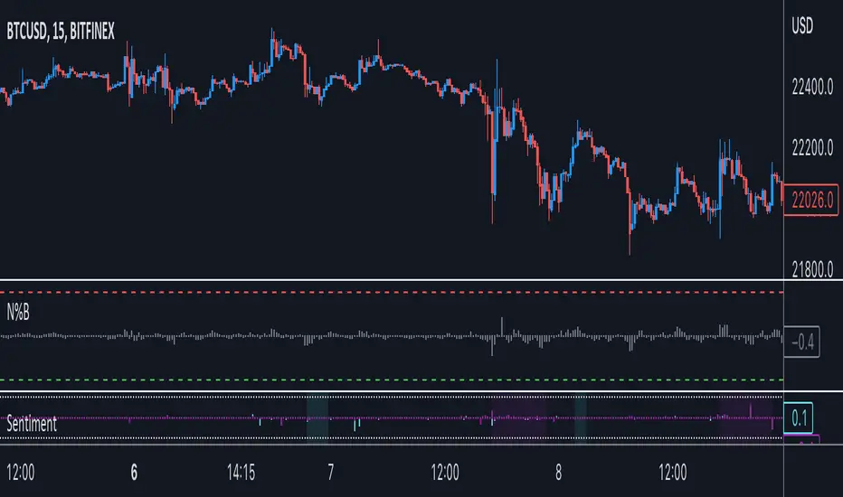
Midline OscillatorA centered oscillator that rethinks the Stocastic Oscillator (and others).
The midline of historical price is used to calculate the percentage of the current price relative to the midline.
See the comments at the beginning of the script for a complete description.
Percentage
Average True Range Percentage (ATRP)ATR measures volatility, but you can't compare one instrument vs. another with it because the ATR value will be different depending on the price of the instrument. I went searching for something like ATR but with percentages, so you could compare one stock vs. another to find who is more volatile and found this .
It was exactly what I was looking for, so decided to re-create it in TradingView. Enjoy!
Description
Average True Range Percent (ATRP) expresses the Average True Range (ATR) indicator as a percentage of a bar’s closing price.
How this indicator works
ATRP is used to measure volatility just as the Average True Range (ATR) indicator is. ATRP allows securities to be compared, where ATR does not.
ATR measures volatility at an absolute level, meaning lower priced stock will have lower ATR values than higher price stocks. ATRP displays the indicator as a percentage, to allow for securities trading at different prices per share to be compared.
Calculation
ATRP = (Average True Range / Close) * 100
BTC%I made this for personal use, for a indicator, but bcs I dont see a script like this I wanted to just post it for other ppl.
This is just a script that tells the candles based on %, including wicks. (wicks are inverted to save space and bcs I prefer it)
This works for all markets.
Market Edge Shields I took the Donchian Channel, and added two new levels calculated on a percentage variation of the bottom and top edges.
The inputs allow you to choose the donchian channel lenght and the percentage levels.
Spread PercentThis indicator shows the percent change between the highs and the lows (or optionally the open and close) of each candle. You may also set a low and a high percent threshold to better highlight the candles that exceed your desired spread percent. Red signifies low spread, green is high spread - these are unrelated to the color of the candle body. There is also the option to display a moving average of the spread percent at your desired length which is a representation of volatility over time.
This is not only helpful for historical analysis over time, but this can also be a time saver if you are trying to calculate the measured distance of a move. Save clicks - no more needing to use the measuring tool.
The settings of the indicator on the chart above are:
- Measure Candle Body Only? - No
- Highlight Thresholds? - Yes
- Thresholds Based on Moving Averages? - Yes
- Low Percent Threshold - 3.0
- High Percent Threshold - 7.0
- Show Moving Average? - Yes
- Moving Average Length - 5
Volatilità candeleCon questo indicatore si può avere facilmente e velocemente un'idea della volatilità della candela in percentuale. Accoppiata a una media mobile esponenziale (sempre espressa in percentuale) posso avere una media della volatilità per scopi di trading.
Price Percentage Divergence IndicatorThis is a price percentage divergence ( PPO ) indicator. It may as well be called a turning points indicator.)
Changed Percentage Labels - Quan DaoThis overlayed utility is used for showing the volatality of the price.
It is useful to see the changed percentage of the price in order to decide what stock/crypto to buy, b/c if the volatility (changed percentage) is high it's likely that you can make bigger profit.
Added option to display changed percentage for:
- Current Close price compared to previous Closed price.
- Close price compared to Open price.
- High price compared to Low price.
As a limit of current pine script, it can only show the last 50 labels for now.
Alnami_Quantum_blocksThis is the revolution of renko... it is renko chart based on percentage movement of the underlying ..
User can set:
1- the % move that if exceeded, the channel will shift
2- entry strategy
3- exit strategy
Moving Gain Loss PercentTracks the percentage gain/loss in three ranges:
single candle (can be turned on or off)
custom range of candles
For example, with a range of 3 candles, and the serie:
1 - close 10
2 - close 5
3 - close 20
The moving gain would be:
1 - close 10 - gain 10, infinite%
2 - close 5 - gain 5, infinite%
3 - close 18 - gain 8, 80%
Or, for example if the range is 12 candles on a monthly chart, then the result is the Year-To-Date gain/loss plotted as a percentage.
Correlation Volitility Bars [BVCC]This chart will allow you to compare the volatility of correlation of any other instrument to your current chart. When the comparison coin is selected, it will overlay your current bars with additional information that shows up/down correlation to your master chart as well the volatility of that correlation.
This can be used to compare other coins to BTC for a quick visual reference of if a coin moves with or against BTC movements. If the comparison coin moves up on the given bar, it is represented by a green histogram ABOVE of your current candle. If the comparison coin moves down, it is represented as a red histogram BELOW your current candle.
The height of the correlation candle represents the percentage that the comparison coin moved up or down. The longer the candle, the farther that coin moved.
The blue band represents a 'volatility reference'
-If your comparison coin stays within this band, then it is moving at an absolute rate which is less than the absolute rate of the master coin.
-If your comparison coin moves outside of this band, then it is moving at an absolute rate which is more than the absolute rate of the master coin.
A couple of example of how to read this;
*******Master Candle = Up | Comparison Candle = Up | Equal to Volatility Band********
This means that when the master went up, so did the comparison coin and they both moved equal amounts
******Master Candle = Up | Comparison Candle = Down | Outside Volatility Band*******
This means that when the master went up, the comparison coin went down in response and it's downward response was greater than the corresponding master up movement
******Master Candle = Up | Comparison Candle = Up | Outside Volatility Band*******
This means that when the master went up, the comparison candle responded by going up as well but made more % gains than the corresponding master candle.
Uses for this indicator would be research into the historical performance of how a specific coin reacts to BTC and whether it is a more or less profitable vehicle than BTC during that time period. If the price is consistently outside of the Volatility band then you can infer that this coin is hypersensitive to BTC movements. If the price is consistently within the bands, then you could infer that your comparison coin is relatively correlated or unfazed by BTC.
Percentage Change Comparison [BVCC]This script allows you to input 2 different coins and plot % changes against each other.
Look Back is adjustable to account for different time frame windows. Default is 1, so each line will be graphed on a 1:1 ratio with the candle period selected on the chart. raising this number to 24 will plot the change across every 24 candles and so on. It's pretty interesting to move the input dialogue window out of the way and change this number, watching how the % gain comparisons change in real time.
Default coins to compare are set to BTCUSD and ETHUSD @ coinbase.
[RESEARCH] Percentrank BugI found a bug with built-in percentrank function. Sometimes it gives unexpected and incorrect results. You can see a one of them on the chart.
ALL scripts which use percentrank function are affected. No matter which version they use, no matter who is their author - ALL scripts which use this built-in function can work incorrectly.
If you want to avoid this bug use _percentrank function (the "shim" ) - you can find it in the script.
NOTE: Don't push on TradingView Support or Pine Core Team because they already know about this issue and work on the fix. I publish it to warn you.
GBTC/BTC(average) premium percentageaverage bitcoin price used (average between bitfinex, coinbase, bitstamp, bittrex, and gemini).
find current amount of bitcoin per share here: grayscale.co
GBTC/BTC(average) premium percentageI updated the GBTC premium percentage indicator to the average bitcoin price (average between bitfinex, coinbase, bitstamp, bittrex, and gemini). I also left this new script open so you can update the amount of bitcoin per share because it is always changing. you can find the amount of bitcoin per share at grayscale.co half way down on the left.
BossHouse - Price ChangeBossHouse - Price Change
What it is:
In the stock market, a price change is the difference in trading prices from one period to the next or the difference between the daily opening and closing prices of a share of stock.
Here you have a timeline with a bar price change. In seconds you can see if the selected market has good and high price changes or not.
The values are in percentage and you have a limiter in the settings, so you can show only bar/values above a value. Ex. 2.4%.
Why it Matters:
Price changes are a core component of financial analysis, and predicting price changes can be as, if not more, important than an actual price change.
It is important to remember, however, that percent-based price changes are useful only in the context of the number of dollars involved.
A 75% change in the price of a company X, for example, may only involve a few dollars while a 75% change in the price of company Y may involve thousands of dollars.
Settings:
Show the SMA 21 line
Minimum Limit - Set the minimum value to show a bar
Calculation:
For example, let's say Company XYZ shares opened at $25 this morning and closed at $24.
The price change is -$1, or -$1/$25 = -4%.
Any help and suggestions will be appreciated.
Marcos Issler @ Isslerman
% Volume (%V)Read about it in the book of Buff Pelz Dormeier "Investing with Volume Analysis: Identify, Follow, and Profit from Trends" .
Normalized volume ( %V ) is a concept that uses an average of volume to plot volume. The volume total for the current bar is divided by the average volume (over the last n bars) to form a ratio. This ratio is multiplied by 100 and plotted in the same way that traditional volume is plotted as vertical bars on the horizontal plane, which creates a normalized volume scale of 0 to 100 . This allows for easy interpretation of volume’s relative movements, with 50 being typical or average volume, numbers below 50 being light volume, and numbers above 50 being heavier volume.
Good luck!
Weekly & Daily Percantage Price OscillatorMy first script.
By Vitali Apirine. Technical Analysis of Stocks & Commodities ( February 2018, Vol.36 Issue 2). Thank you.
Percentage Volume OscillatorThis indicator is based on Percentage Price Oscillator and volume as a source.
Percentage BandsA different version of bollinger bands, I use percentage difference instead of standard deviation.
Percent Change Smoothed (PCT + EMA)ROC works great on data with only positive numbers (like prices).
But it fails to correctly represent the rate of change when source series have negative values.
ROC is positive when:
Source is positive AND Source is rising
OR Source is negative AND Source is falling
Percent change (PCT) is just a ROC that deals with this sign confusion.
Anyone with Data Science backgroud would likely know about it.
PCT is positive only when:
Source is rising
When applying to only positive data PCT = ROC they are exactly equal.
I've also added EMA smoothing option.
Enjoy!


