RS_Stoch-RSI_MTFmodification by Richard Siegers that turned stochastic mtf from ChrisMoody into stochastic-rsi mtf
Cari dalam skrip untuk "mtf"
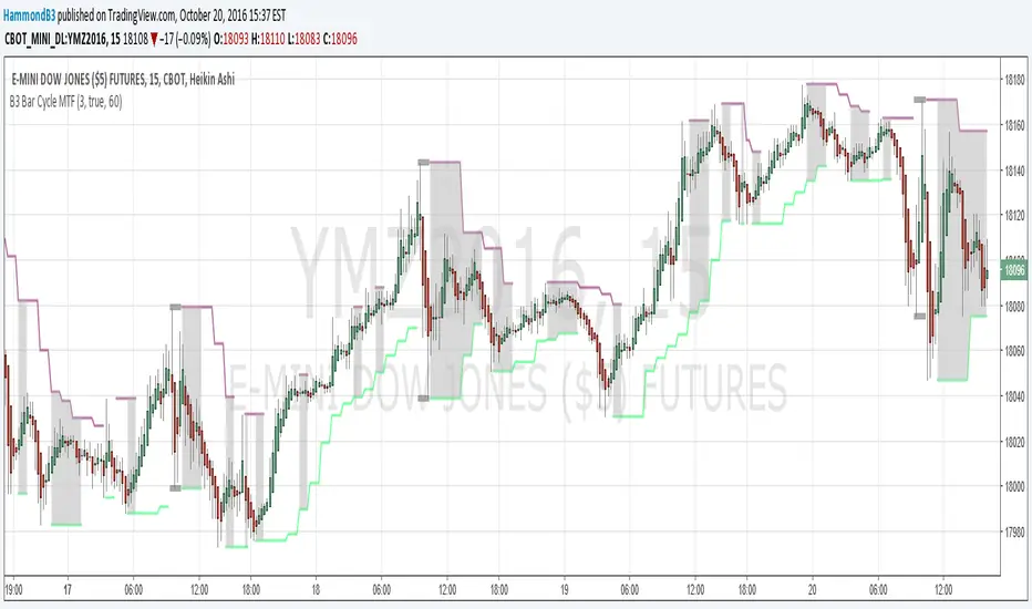
B3 Bar Cycle MTF (fix)Apologies, there was an error in printing for the thick gray boxes, happened when MTF was switched on. All better, and here is the details from before:
This is an interesting study that can be used as a tool for determining trend direction, and also could be a trailing stop setter. I use it as a gauge on MTF settings. If on, you can look at the bar cycle of the 1h while on the 15m giving you a lot of information in one tool. If a line is missing high or low, it is because it was broken, if both exist you are trading in range and cloud appears. If both sides break you get thick gray boxes above and below bar.
Get used to editing the inputs to suit your liking. Often 3-5 length and always looking at different resolutions to get a big picture story. You could put multiple instances of the study up to see them simultaneously. I based the idea off of Krausz's 3 day cycle which you can read about in his teachings. I tend to find it looking better using Heikin Ashi bar-style.
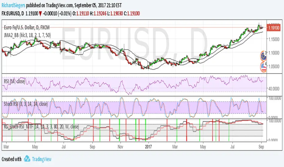
True Strength Indicator MTFHere is an example of a script showing a multi-time frame of TSI.
Chart below compares FX EURUSD Daily TSI to 1H TSI
Here is an updated version
study("True Strength Indicator MTF", shorttitle="TSI MTF")
resCustom = input(title="Timeframe", type=resolution, defval="60" )
long = input(title="Long Length", type=integer, defval=25)
short = input(title="Short Length", type=integer, defval=13)
signal = input(title="Signal Length", type=integer, defval=13)
price = close
double_smooth(src, long, short) =>
fist_smooth = ema(src, long)
ema(fist_smooth, short)
pc = change(price)
double_smoothed_pc = double_smooth(pc, long, short)
double_smoothed_abs_pc = double_smooth(abs(pc), long, short)
tsi_value = 100 * (double_smoothed_pc / double_smoothed_abs_pc)
tsi = security(tickerid, resCustom,tsi_value)
plot(tsi, color=black)
plot(ema(tsi, signal), color=red)
hline(0, title="Zero")

Power200EMA - MTF 200 EMA SuiteThe MTF 200 EMA Suite is a trend-confluence tool designed to reveal institutional support and resistance levels across multiple timeframes simultaneously. By plotting the 200-period Exponential Moving Average from six different time horizons onto a single chart, it allows you to identify "Power Zones" where various market cycles overlap.
Core Functionality
Multi-Timeframe Visibility: On a single lower-timeframe chart (like the 1m or 5m), you can see exactly where the 200 EMA sits on the 1m, 3m, 5m, 15m, 1h, and 4h horizons.
Institutional Benchmarking: The 200 EMA is the primary "line in the sand" used by institutional algorithms and bank traders to determine long-term trend bias.
Dynamic Clustering: When multiple EMA lines converge or "cluster" in one price area, it identifies a high-probability zone of institutional interest.
Floating Labels: Each line features an auto-updating label at the current price bar, allowing you to instantly identify which timeframe you are looking at without hovering over the plots.
Strategic Use
Trend Filter: Trade only in the direction where price is relative to the majority of the EMAs (e.g., only buy when price is above the 1h and 4h lines).
Mean Reversion: Use the higher-timeframe lines (1h/4h) as targets for price to return to during volatile over-extensions.
Support/Resistance: Use EMA clusters as "hard" barriers to place stops behind or to look for bounce-entry confluence.

Funnelzon Graded Buy and Sell Signals (LITE) MFI MTFFunnelzon Buy and Sell Signals (EMA Zones) – LITE is a lightweight overlay indicator built for scalping and short-term trading. It generates BUY/SELL signals, grades each signal (A+ to F), and provides a clean Confirmation Box that summarizes multi-timeframe context so you can make faster, more structured decisions.
How it works
Signal Engine (LTF)
Signals are triggered using an ATR-based “scalp helper” logic with adjustable sensitivity.
A stop-state system helps reduce repeated or noisy entries.
Signal Scoring & Grades (A+ → F)
When a signal appears, it is evaluated by a context pipeline that considers:
Adaptive momentum/flow (AMF)
ALMA trend alignment
Support/Resistance proximity
Swing structure behavior
Market regime / trend strength (ADX-based)
The result is a score mapped to a grade:
A+ / A = strongest signals
B / C = mixed conditions
D / F = low-quality conditions
Optional Filters
MFI Filter: Helps avoid signals that do not meet Money Flow conditions.
HTF Confirmation (MTF): Uses HTF1 and HTF2 bias. Choose strict filtering or soft alignment.
Confirmation Box (Dashboard)
The box displays:
HTF State: Trend Long / Trend Short / HTF Conflict / Neutral
Market Mode: Trend / Pullback / Conflict
Trade Bias: Long-only / Short-only / Wait
ENTRY NOW? = “YES” when HTF bias and LTF signal align
MFI status + HTF1/HTF2 direction
Optional Structure Tools
EMA overlays: 9 / 12 / 20 / 50 / 100 / 200
Auto Supply/Demand zones (pivot-based, ATR thickness, configurable extension and limits)
Best practices (recommended workflow)
Prefer trading A+ / A signals only.
Trade in the direction of HTF State when possible.
If Market Mode shows PULLBACK or CONFLICT, reduce risk or wait for better alignment.
Use Supply/Demand zones and EMAs for structure (targets, invalidation, and bias).
Important: Confirmation with Stochastic + MACD
This script is a signal + context tool, not a guarantee. To validate signal confirmation, it is strongly recommended to use:
Stochastic Oscillator (momentum/exhaustion confirmation)
MACD (trend momentum and direction confirmation)
Only take trades when the script signal and your confirmation indicators agree.
Alerts
Includes alert conditions for:
Buy Signal
Sell Signal
Any Signal
ENTRY NOW (HTF + LTF aligned)
ENTRY NOW Long / ENTRY NOW Short
Disclaimer
This indicator is for educational purposes and does not constitute financial advice. Always backtest, manage risk, and confirm signals with your own rules.

CRT Master 974 par GUIROA Stephane [ULTIMATE MTF + HTF SWEEP]"CRT Master Blueprint ". This indicator is designed to display multi-timeframe levels from user-defined timeframes and highlight certain trading signals within a specified session.
Multi-Timeframe Configuration
1.Input Timeframes: Users can input three separate timeframes (e.g., 30 minutes, 60 minutes, 240 minutes).Each timeframe is assigned an option to be displayed or hidden, along with a customizable color.
2.Display Options: Each timeframe can be toggled on or off, with corresponding colors set in the input parameters.
Level Retrieval Function
3.Getting Levels: The get_crt_levels function retrieves high, low, and close values from the previous bar of a specified timeframe.pinescript
Drawing Levels
4.Drawing Levels Function: The draw_levels function visuals the high, low, and mid levels with different styles (dashed and dotted lines) and labels on the chart based on whether the respective timeframes' options are enabled.
6.Dashboard: A small table displays the status of the indicator (active or inactive) and the primary timeframe on the chart.
Summary
In summary, this indicator is helpful for traders who want to visually analyze multiple timeframe levels and receive signals based on specific price action within a defined session. The use of customizable parameters allows for flexibility in adapting to different trading strategies or preferences.

Support and Resistance Levels with Breaks (MTF + Alerts FIXED) Support and Resistance Levels with Breaks
Added MTF and FIXED Alarm for Support and Resistance line

Weekly Regime Filter - Trend + Momentum + Structure (MTF)A multi-timeframe weekly regime indicator that classifies market conditions into BULL , BEAR , or CHOP using three components: trend, momentum, and market structure.
Works on any timeframe while always referencing weekly data — no repainting.
━━━━━━━━━━━━━━━━━━━━━━━━━━━━━━
🎯 WHAT IT DOES
Answers one question: What is the weekly regime?
• Trend — EMA hierarchy (Price > EMA Fast > EMA Slow)
• Momentum — DI+ vs DI- with optional ADX filter
• Structure — Break of Structure (BOS) and Change of Character (CHOCH)
BULL = All three bullish
BEAR = All three bearish
CHOP = Mixed signals
━━━━━━━━━━━━━━━━━━━━━━━━━━━━━━
⚡ KEY FEATURES
• Multi-Timeframe (MTF) — View on 1H, 4H, Daily; regime stays consistent
• Auto-Detect Asset Type — Automatically applies optimized settings for Crypto, Stocks, Forex, Gold, Silver, Oil, Commodities
• BOS/CHOCH Labels — Visual market structure breaks on chart
• Live Status Panel — Shows regime, components, and active parameters
• Non-Repainting — Uses confirmed weekly closes only
━━━━━━━━━━━━━━━━━━━━━━━━━━━━━━
📊 ASSET PRESETS
• Crypto — EMA 50/200, ADX Off, Pivot 2
• Stocks/Indices — EMA 50/200, ADX >20, Pivot 3
• Forex — EMA 30/100, ADX >25, Pivot 2
• Gold — EMA 40/150, ADX >20, Pivot 3
• Silver — EMA 40/150, ADX >22, Pivot 3
• Oil — EMA 30/100, ADX >25, Pivot 2
• Commodities — EMA 40/120, ADX >20, Pivot 3
Select "Custom" to use your own values.
━━━━━━━━━━━━━━━━━━━━━━━━━━━━━━
📈 HOW TO USE
For Swing Trading:
• Set chart to Daily
• Use Auto-Detect or select preset
• Long only when BULL, short only when BEAR
• Reduce size or avoid when CHOP
Structure Signals:
• CHOCH ↑ after bear regime = Early reversal signal
• CHOCH ↓ after bull regime = Tighten stops
• BOS in regime direction = Trend continuation
━━━━━━━━━━━━━━━━━━━━━━━━━━━━━━
🔔 ALERTS
• Regime → BULL
• Regime → BEAR
• CHOCH → Bull
• CHOCH → Bear
━━━━━━━━━━━━━━━━━━━━━━━━━━━━━━
⚙️ SETTINGS
Preset: Auto-Detect, Crypto, Stocks, Forex, Gold, Silver, Oil, Commodities, Custom
Custom Settings (when Custom selected):
• EMA Fast/Slow lengths
• ADX Length & Threshold
• ADX Filter toggle
• Pivot Left/Right
Display:
• Plot Weekly EMAs
• Show BOS/CHOCH Labels
• Show Regime Background
• Background Opacity
• Show Status Label
━━━━━━━━━━━━━━━━━━━━━━━━━━━━━━
📝 NOTES
• Needs ~200 weeks of history for full calculation
• Weekly signals are slower by design — filters noise
• Not a standalone system — combine with entries and risk management
• When using presets, Custom input fields won't visually update (Pine limitation) — status label shows actual values

VDUB Bands - MTF WMA+ATR Volatility Lanes (6 Alerts)VDUB Bands draws volatility-scaled “trend lanes” around a Weighted Moving Average (WMA) using ATR (or a WMA of True Range). It can display up to four tiers (L1–L4), with higher tiers sourced from higher timeframes to show local structure → higher-timeframe structure on a single chart.
────────────────────────────────────────
1. What it does (plain English)
────────────────────────────────────────
Think of each tier as a lane system around the trend:
• Inner rails = “normal volatility lane” around the WMA
• Outer rails = “extension / extreme zone” for that tier
• Higher tiers (L3/L4) show bigger structure
• Lower tiers (L1/L2) show active lane behavior
Typical interpretation:
• Price inside inner rails → normal variance around the trend lane
• Between inner and outer → stretched, but not extreme
• Outside outer rails → extended vs that tier’s volatility band
────────────────────────────────────────
2) Why it’s useful (and why it’s not a mashup)
────────────────────────────────────────
This is not a bundle of unrelated indicators. Everything serves one cohesive purpose:
• Visualize trend + volatility lanes across multiple time horizons
• Keep rails consistent and readable (levels, fills, outlines)
• Optional multi-timeframe aggregation for structure context
• A compact 6-alert set to catch key transitions without alert spam
────────────────────────────────────────
3) What you see on the chart
────────────────────────────────────────
For each level (L1–L4), you can show:
• Upper/Lower Inner rails
• Upper/Lower Outer rails
• Optional center fill (between outer rails) = operating range
• Optional MA line per tier (off by default to reduce clutter)
• Base WMA line (L1 MA) if enabled
Suggested workflow:
• Start with L1 + L2 only
• Add L3/L4 once you like the structure view
• Use Dynamic Opacity if the chart feels crowded
────────────────────────────────────────
4) How it works (transparent formula)
────────────────────────────────────────
For each tier:
• MA = WMA(source, baseLen × levelMultiplier)
• ATR_like = Wilder ATR (default)
OR WMA(TrueRange, atrLen × levelMultiplier)
Inner rails:
• upperInner = MA + ATR_like × innerMult
• lowerInner = MA - ATR_like × innerMult
Outer rails:
• upperOuter = MA + ATR_like × outerMult
• lowerOuter = MA - ATR_like × outerMult
Tier behavior:
• L1 uses the chart timeframe
• L2–L4 can use user-selected HTFs (defaults: 4H / D / W)
or optional auto-selection
────────────────────────────────────────
5) Multi-timeframe behavior + interpolation
────────────────────────────────────────
• L2–L4 use request.security() with lookahead OFF (no future data).
• HTF bands naturally “step” when the HTF candle confirms.
• Interpolate HTF Bands (optional): visually blends from the prior confirmed HTF value to the current confirmed HTF value to reduce stepping. This is display smoothing, not prediction.
Repaint note:
• If Live Interp (Repaints) is enabled, the HTF lines can update intrabar and may repaint. Keep it OFF for strict non-repainting behavior.
────────────────────────────────────────
6) Auto-select L2/L3/L4 (optional)
────────────────────────────────────────
Two modes:
A) Ladder (deterministic)
• Picks “bigger” timeframes relative to the chart (simple and fast).
B) Score (data-driven)
• Tests candidate timeframes and scores them using:
• Coverage: % of closes inside the OUTER band over Score Lookback
• Width: average outer-band width as a fraction of MA
• Targets: Target Coverage + Target Width
• Weights: Coverage Weight + Width Weight
Performance notes:
• Score mode is heavier (many candidates).
• “Lock auto-select after first pick” is recommended to reduce load and avoid platform limits.
────────────────────────────────────────
7) Alerts (6 total, aggregated across L1–L4)
────────────────────────────────────────
Alerts trigger if ANY tier meets the condition:
• Cross ABOVE an OUTER band
• Cross BELOW an OUTER band
• Cross ABOVE an INNER band
• Cross BELOW an INNER band
• Price is OUTSIDE ABOVE an OUTER band
• Price is OUTSIDE BELOW an OUTER band
These are intentionally aggregated to keep the alert count small while catching meaningful transitions.
────────────────────────────────────────
8) Limitations & transparency
────────────────────────────────────────
• Indicator only (not a strategy). No performance claims.
• MTF values update when the higher timeframe candle confirms.
• Interpolation is visual smoothing; it does not forecast.
• Non-standard chart types (Heikin Ashi/Renko/etc) may behave differently from standard candles.
• If you enable repainting options, signals/levels may change intrabar.
────────────────────────────────────────
9) Credits/reuse disclosure
────────────────────────────────────────
• Conceptual inspiration: VDUB and the community “VDUB_BINARY_PRO_3_V2” idea of WMA ± TR/ATR × multipliers.
• This version is a reimplementation + extension, adding:
o Multi-tier architecture (L1–L4)
o Higher-timeframe sourcing + optional interpolation
o Optional scoring-based timeframe selection
o Dynamic opacity + streamlined plotting
o Aggregated 6-alert set
No code was copied directly from the older script; this is a rewritten implementation with additional features and different structure.
www.tradingview.com

Auto Fibo Pivot [Ultimate MTF]Stocks: Locks lines during market hours (09:00-15:30) and switches to "Preview Mode" (Next Day) after market close.
Forex/Crypto: Always Fixed Mode (24h).
Multi-Timeframe (MTF): Select between Auto Daily, Weekly, Monthly, or Yearly pivots.
Fully Customizable: Easily change Fibonacci ratios and colors in the settings.
No Repaint: Stable lines on 1-minute charts.
自動判別・マルチタイムフレーム対応のフィボナッチピボット
株・為替を自動判別し、最適なモードで動作する実戦向けインジケーターです。
主な機能:
自動判別機能:
日本株: ザラ場中はラインを完全固定。15:30以降は自動で「明日の予習モード」に切り替わります。
為替・仮想通貨: 24時間常時固定モードで動作します。

LiquidityPulse MTF Intrabar Micro-Structure Absorption DetectorLiquidityPulse MTF Intrabar Micro-Structure Absorption Detector
Non-repainting: Markers appear on bar close and do not change.
Important (if you can’t see any markers)
This indicator measures intrabar micro-structure and it can use seconds-based micro data on lower timeframes.
If you load it and don’t see anything:
Go to 15m or higher, or
In settings, change Micro feed (inside HTF bar) from Auto to 1m / 5m / 15m.
Auto will often choose a “micro” feed that’s very small when your HTF is small, which can affect what you see.
What this indicator does
This script is designed to highlight absorption-like conditions by analysing what happens inside each higher-timeframe (HTF) candle — not just the candle’s OHLC.
It looks for candles where:
price moves a lot internally (high intrabar activity),
the candle structure shows churn / rejection (wick dominates body),
and participation is elevated (relative high volume).
When those conditions align, the indicator prints a marker line at the wick extreme:
LW (Lower-wick marker) = printed at the candle’s low
UW (Upper-wick marker) = printed at the candle’s high
Each marker is then extended to the right (so it can be treated like a potential level).
Image shows a wick-dominant candle with an absorption marker: Markers appear when price shows strong intrabar movement, a wick-dominant candle structure, and elevated participation — a combination often associated with absorption-like behaviour.
How it works
A marker is created only when all three filters pass on a confirmed candle close:
1) Intrabar micro-speed (internal activity)
The script pulls intrabar closes from a lower timeframe (“micro feed”) and sums the absolute internal price changes inside the HTF candle.
It then converts this to a Z-score and checks it against the Speed-z threshold.
Higher threshold = fewer, stronger events.
2) Wick vs body (churn / rejection structure)
This measures how the HTF candle’s internal range compares to its net close-to-open movement using:
Churn ratio = (HTF range) / (HTF body)
If the candle has a large range but a relatively small body, it indicates that price moved extensively during the candle but made limited net progress by the close — a structure often associated with active two-sided participation and absorption-like behaviour.
3) Relative HTF volume (participation filter)
The script also Z-scores HTF volume and requires it to exceed the Volume z-score threshold.
This helps filter out candles that show apparent activity but occur on relatively low participation.
Multi-timeframe + micro-structure analysis: Image shows a 15 minute chart marker on the 1 minute timeframe. The indicator can analyse higher-timeframe candles (15 minute) while using lower-timeframe micro data inside each bar (1 minute). This allows absorption-style markers to be plotted with higher-timeframe context and intrabar detail.
Composite Intensity
When a marker triggers, the script calculates a Composite Intensity number (CI):
It’s a combined score based on how strongly each of the three conditions exceeded its threshold.
Higher CI = stronger absorption-style event
Higher CI = brighter chart marker
The table shows:
HTF and Micro timeframes being used
the last marker type (LW or UW)
the last CI value
Micro feed & multi-timeframe behaviour
This indicator always works as a two-layer system:
HTF candle (context) → the candle you’re analysing
Micro feed (inside HTF bar) → the intrabar data used to measure micro-speed
Higher-TF source
Chart timeframe = uses your chart timeframe as HTF
Manual = choose any HTF (example: chart = 1m, HTF = 15m → prints 15m absorption markers onto a 1m chart)
Micro feed options
Auto (recommended) picks a sensible micro feed based on HTF
Or choose 1s / 1m / 5m / 15m manually for performance/clarity
HTF direction filter (optional)
When enabled:
LW markers only print when the HTF candle closes bullish
UW markers only print when the HTF candle closes bearish
This is optional and is designed to reduce noise by aligning markers with the directional bias of the higher-timeframe candle.
Traders can use the absorption markers to:
Identify potential areas of interest where price showed unusually high intrabar activity but limited net progress by the close.
Mark reference levels where price may react again later, reflecting prior elevated participation and extensive intrabar movement areas.
Add structural context to existing analysis such as trend structure, support/resistance, session highs/lows, or other volume-based tools.
Compare behaviour across timeframes, by observing how absorption-style events on a higher timeframe align with lower-timeframe price action.
Image shows price reacting to a previous absorption markers level (Lines/ levels can be extended in the settings): Extended LW / UW markers can be observed as areas of prior absorption-like activity. Traders may watch how price behaves around these levels (reaction, acceptance, or rejection) alongside their own structure, liquidity, or risk management tools.
Key settings (what they change)
Higher-TF source / Higher-TF bar (manual): which candle timeframe is analysed
Micro feed (inside HTF bar): what intrabar resolution is used to calculate micro-speed
Speed-z threshold: how unusual intrabar activity must be
Wick/Body threshold: how large the candle’s total range must be compared to its body
Volume z-score threshold: how elevated HTF volume must be
Z-score look-back: how far back the indicator normalises speed/volume
Line extension (bars): raise if you want markers to behave more like extended levels
Max markers: how many markers remain on the chart at once
Alerts
Alerts trigger on candle close when an absorption marker is detected.
Disclaimer
This indicator does not measure true order flow or the full limit order book. It uses intrabar price activity, candle structure, and relative participation as interpretive tools to highlight absorption-like behaviour. It is not a buy/sell system, and all signals should be used with traders own confirmation and risk management.

Tahir's Dual MTF order blocks Order Blocks + Swing Levels (Dual MTF, Fixed, Extended, NoAutoClose)
This tool combines smart orderblock detection with swinghigh / swinglow validation, designed for traders who want precise, rulebased zone plotting without repainting tricks or automatic deletion of historical levels.
🔥 What this indicator does
1️⃣ Detects Order Blocks Across Multiple Timeframes
It automatically finds bullish & bearish order blocks using three layers:
Current timeframe OBs
Higher Timeframe 1 (custom selectable)
Higher Timeframe 2 (custom selectable)
Each layer is colorcoded so you instantly know where institutional zones exist.
Order blocks remain extended forward until price fills them, giving a realistic market structure map.
2️⃣ Keeps Zones Until They Are Truly Filled
Unlike many scripts that autodelete boxes, this version:
✔️ Extends zones to the right
✔️ Tracks “active” vs. “filled” OBs
✔️ Prevents unnecessary removal
This allows proper backtesting and historical reference.
3️⃣ SwingHigh & SwingLow Confirmation
The script overlays SWL/SWH labels to identify pivot turning points.
An order block becomes a validated zone when:
Bullish OB + Swing Low (SWL)
Bearish OB + Swing High (SWH)
Validated zones are highlighted with special colors:
🟩 Lime = Valid Bullish OB
🟪 Fuchsia = Valid Bearish OB
This filters out weak zones and highlights only strong price bases.
4️⃣ DualTimeframe Logic
You can enable/disable each timeframe independently:
HTF1 (e.g., 1H)
HTF2 (e.g., 4H)
Current chart timeframe
This gives flexibility for scalpers, swing traders, and position traders.
5️⃣ Optimized & Debugged
The script has:
Memory controls (limits stored boxes)
Stable boxextension logic
No repainting structure logic
Clearly separated and readable functions
Everything is optimized to avoid lag while handling many OB zones.
⚙️ Key Inputs
Show Long / Short OBs
Enable HTF1 & HTF2
Custom timeframes
Swing detection length
Memory limit for stored zones
📌 UseCases
Institutional trading models
Smartmoney concepts
Supply & demand zone trading
Confluence with entries (FVG, BOS, RSI, etc.)
This indicator is a visual decisionsupport tool — not a buy/sell signal system.
⚠️ Disclaimer
This script does not repaint, but trading always carries risk.
Use alongside price action and risk management.

Market Structure MTF [HH/HL/LH/LL + CHoCH + BOS]Automatic market structure detection with pivot classification (HH/HL/LH/LL), Change of Character (CHoCH) and Break of Structure (BOS) signals. Multi-timeframe support allows overlaying higher timeframe structure on any chart.
█ OVERVIEW
This indicator automatically detects and classifies pivot points to visualize market structure. It identifies trend direction through the sequence of highs and lows, and signals potential reversals through Change of Character (CHoCH) and trend continuation through Break of Structure (BOS).
█ CONCEPTS
Market structure analysis is based on the relationship between consecutive pivot points:
Bullish Structure:
• HH (Higher High): A swing high that exceeds the previous swing high
• HL (Higher Low): A swing low that stays above the previous swing low
• Sequence: HH → HL → HH → HL confirms uptrend
Bearish Structure:
• LH (Lower High): A swing high that fails to exceed the previous swing high
• LL (Lower Low): A swing low that breaks below the previous swing low
• Sequence: LH → LL → LH → LL confirms downtrend
Structure Shifts:
• CHoCH (Change of Character): Signals when the expected sequence breaks, suggesting potential trend reversal
• BOS (Break of Structure): Confirms trend continuation when price breaks a pivot level in trend direction
█ FEATURES
• Automatic pivot detection using configurable lookback period
• Smart classification comparing each pivot to its predecessor
• CHoCH detection when trend sequence is violated
• BOS signals with anti-repetition filter to reduce noise in consolidation zones
• Multi-Timeframe (MTF) support to display higher timeframe structure
• Horizontal dashed lines marking HTF pivot levels
• Clean visual output with color-coded labels
█ SETTINGS
Structure Settings:
• Pivot Length: Number of bars on each side required to confirm a pivot (default: 5)
- Lower values (2-3) = more sensitive, detects minor swings
- Higher values (10-20) = less sensitive, only major structure
Multi-Timeframe:
• Show HTF Structure: Enable/disable higher timeframe overlay
• HTF Timeframe: Select the higher timeframe to display (D, W, M, etc.)
Visualization:
• Show Local Structure: Toggle visibility of current timeframe pivots
Filters:
• BOS Buffer: Minimum bars between BOS signals to avoid repetition
█ HOW TO USE
The indicator offers three visualization modes:
1. LOCAL STRUCTURE ONLY (default)
├─ Show Local Structure: ✓ Enabled
├─ Show HTF Structure: ✗ Disabled
└─ Use case: Analyze structure on the current timeframe only
2. HIGHER TIMEFRAME ONLY (recommended for clarity)
├─ Show Local Structure: ✗ Disabled
├─ Show HTF Structure: ✓ Enabled
├─ HTF Timeframe: Select desired TF (D, W, M)
└─ Use case: View higher TF context on lower TF charts without clutter
3. BOTH TIMEFRAMES (advanced)
├─ Show Local Structure: ✓ Enabled
├─ Show HTF Structure: ✓ Enabled
└─ Use case: See confluence between timeframes
⚠️ WARNING: This mode can make the chart visually crowded.
Recommended only for experienced users who need both layers simultaneously.
█ RECOMMENDED SETTINGS BY TIMEFRAME
| Chart TF | Pivot Length | Suggested HTF |
|----------|--------------|---------------|
| 1H | 10-15 | 4H or D |
| 4H | 5-10 | D or W |
| 1D | 5-7 | W |
| 1W | 3-5 | M |
The goal is to make pivots on lower timeframes represent equivalent time context.
█ VISUAL REFERENCE
Local Structure Labels:
• 🟩 Green (above): HH - Higher High
• 🟥 Red (above): LH - Lower High
• 🟩 Green (below): HL - Higher Low
• 🟥 Red (below): LL - Lower Low
• 🟧 Orange: CHoCH - Change of Character
• 🟦 Blue: BOS - Break of Structure
HTF Structure Labels:
• 🩵 Teal: HH/HL - Bullish HTF structure
• 🟫 Maroon: LH/LL - Bearish HTF structure
• 🟨 Yellow: CHoCH - HTF trend shift
• 🟦 Navy: BOS - HTF structure break
• ┈┈ Dashed lines mark HTF pivot price levels
█ INTERPRETATION GUIDELINES
Reading the sequence:
• Consistent HH + HL = Bullish bias, look for long opportunities
• Consistent LH + LL = Bearish bias, look for short opportunities
• CHoCH after trending sequence = Potential reversal, exercise caution
• BOS in trend direction = Trend continuation confirmed
Combining timeframes:
• HTF structure defines the primary bias
• Local structure provides entry timing
• Confluence (both TFs aligned) = Higher probability setups
█ LIMITATIONS
• Pivots are confirmed with a delay equal to the Pivot Length parameter
• In ranging markets, multiple CHoCH signals may appear (this is correct behavior - the market IS changing direction frequently)
• CHoCH signals potential reversal, not guaranteed reversal
• Works best on liquid markets with clean price action
█ TECHNICAL NOTES
• Uses ta.pivothigh() and ta.pivotlow() for pivot detection
• request.security() fetches higher timeframe data
• Anti-repetition logic prevents BOS signal clustering in consolidation
• All crossover/crossunder calculations are performed at global scope for consistency (Pine Script v6 compliance)
█ CREDITS
Developed for swing traders and position traders who use market structure for trend analysis and trade timing.
Feedback and suggestions are welcome.

Supply & Demand (10-MTF) | StableThe Supply & Demand (10-MTF) indicator is a sophisticated technical analysis tool designed to identify high-probability institutional "buy" and "sell" zones across ten different timeframes simultaneously.
Core Functionality
The indicator works by scanning for displacement—sharp, aggressive price movements that leave behind "unfilled orders."
Zone Identification: It identifies a "Base" (the candle before the move) and a "Leg-out" (the momentum candles). If the leg-out meets your momentum strength requirements, a zone is drawn.
Multi-Timeframe Aggregation: Instead of switching between charts, a trader can see 1H Supply, 4H Demand, and Daily Supply zones all layered on a 5-minute chart.
Real-Time Invalidation: The indicator tracks whether price has "mitigated" (broken) a zone. Once a zone is breached by a wick or a close (depending on your settings), it can be hidden or marked as historic.
Why It’s Useful for Traders
1. Confluence Mapping (The "Nest" Strategy)
The most powerful use of this tool is finding Nested Zones. When a 15-minute Demand zone resides inside a 4-hour Demand zone, the probability of a reversal is significantly higher. This indicator makes these high-confluence areas visually obvious.
2. Institutional Footprint Tracking
Institutions do not buy or sell everything at once; they leave footprints in the form of supply and demand imbalances. This tool helps retail traders avoid "buying the top" or "selling the bottom" by showing where the big money actually entered the market.
3. Dynamic Stop Loss & Take Profit
Stop Loss: Traders can place stops just outside the structural boundary of a zone.
Take Profit: Traders can use the opposing HTF (Higher Timeframe) supply zone as a natural target for a long trade.
4. Time Efficiency
Managing 10 timeframes manually is mentally exhausting. This indicator automates the "top-down analysis" process, allowing you to focus on execution rather than chart flipping.

Order Blocks+swl - Dual MTF Fixed ExtendedOrder Blocks+SWL - Dual MTF with Swing Validation
Overview
This advanced TradingView indicator combines Multi-Timeframe Order Block detection with Swing High/Low validation to identify high-probability supply and demand zones. The tool displays order blocks from higher timeframes and current timeframe, then highlights those that align with swing points for enhanced reliability.
🔧 Key Features
Multi-Timeframe Order Block Detection
- Current Timeframe: Detects order blocks on the chart's native timeframe
- HTF1 & HTF2: Two customizable higher timeframes (default: 60m, 240m)
- Independent Toggles: Enable/disable each timeframe's OBs separately
Smart Order Block Logic
- Long Order Blocks: Formed when current candle's LOW > middle candle's HIGH
- Short Order Blocks: Formed when current candle's HIGH < middle candle's LOW
- Persistent Display: Boxes extend until price fills the zone
- Color Coding:
- Current TF: Green (long) / Red (short)
- HTF1: Orange (long) / Maroon (short)
- HTF2: Blue (long) / Purple (short)
Swing Point Integration
-Swing Lows (SWL) & Swing Highs (SWH): Automatically detected using pivots
-Validation Overlay: Highlights order blocks that coincide with swing points
- Lime boxes: Long OBs with SWL confirmation
- Fuchsia boxes: Short OBs with SWH confirmation
Visual Elements
- Order Block Boxes: Semi-transparent zones with bold borders
- Entry Markers: Triangle shapes below/above bars for visual confirmation
- Swing Labels: SWL/SWH labels at pivot points
- Valid OB Overlay: Distinctive colored boxes for validated zones
⚙️ Input Parameters
Display Controls
- `Show Long OBs`: Toggle long order block display
- `Show Short OBs`: Toggle short order block display
- `Show Current TF OBs`: Display order blocks from current timeframe
- `Use HTF1/HTF2 OBs`: Enable higher timeframe order blocks
- `HTF1/HTF2`: Customizable timeframe strings
Technical Settings
- `My Input`: Maximum unfilled boxes to display (50-50000, default: 1000)
- `Swing Lookback / Forward Length`: Pivot detection sensitivity (default: 10)
📊 How It Works
1. Order Block Detection: The indicator scans three timeframes for specific candlestick patterns that indicate potential supply/demand zones.
2. Swing Point Detection: Simultaneously identifies swing highs and lows using pivot logic.
3. Validation Overlay: When an order block forms on the same candle as a swing point, it creates a special highlighted zone indicating higher probability.
4. Memory Management: Automatically manages box count to prevent performance issues while maintaining historical context.
🎯 Trading Applications
- Trend Continuation: Validated order blocks in trend direction offer high-probability entries
- Reversal Zones: Swing-aligned order blocks at key levels suggest potential reversals
- Multi-Timeframe Analysis: Higher timeframe OBs provide stronger support/resistance
- Zone Trading: Trade bounces from or breaks through validated zones
💡 Usage Tips
1. Prioritize Validated Zones: Focus on lime/fuchsia boxes as they have swing confirmation
2. Timeframe Hierarchy: HTF2 (240m) > HTF1 (60m) > Current TF for zone strength
3. Combine with Price Action: Use zones alongside candlestick patterns and volume
4. Risk Management: Place stops beyond opposite side of order block
⚠️ Limitations
- Not a standalone trading system - combine with other analysis
- May repaint on current bar until close
- Higher timeframes require sufficient historical data
- Swing detection sensitivity depends on length parameter
---
Note: This tool is for educational purposes. Always practice proper risk management and backtest strategies before live trading.

ICT Clean CISD & Mitigated MTF FVGs Clean CISD & MTF FVGs
Minimalist Institutional Order Flow Tool
Key Features:
CISD (Change in State of Delivery): Marks the first sign of an order flow shift. Displayed as a clean black line + label (no bulky boxes).
High-Probability FVGs: Scans 15m, 1h, and 4h timeframes for gaps.
Displacement Filter: Only shows "Crucial" gaps. Tiny, insignificant imbalances are automatically filtered out using an ATR threshold.
Auto-Cleaning Logic: Boxes are automatically deleted once price fills or closes through them, keeping your chart 100% clean.

NQ vs ES-RTY-YM Divergence MTF OSOpen source script version for my NQ vs ES-RTY-YM Divergence MTF indicator

E9 MTF Candle Array E9 MTF Candle Array plots up to six selectable higher-timeframe candle sets (e.g., H1/H4/D1/W1) as “mini candles” stacked to the right of your chart for fast multi-TF context. For each HTF, it also draws a shaded High–Low range box on the main chart that spans the candle’s time window and updates in real time as the current HTF candle forms, then “locks” the prior box when a new HTF candle opens. Optional features include HTF labels and countdown timers, Open/Close/High/Low trace lines with price labels, day/interval markers, and imbalance highlighting (FVG/VI) on the displayed HTF candle array.
*Work in progress.

RSI Monitor (High/Low) + MTF & Time FilterDual-Source RSI: Calculates RSI on the candle High (to detect selling pressure/overbought) and Candle Low (to detect buying pressure/oversold) rather than just the Close.
Multi-Timeframe (MTF) Dashboard: An on-screen table displays the Real-Time RSI High and Low values for your current chart plus two user-defined higher timeframes (e.g., 1H, 4H).
Session-Based Alerts: A built-in time filter restricts alerts to a specific trading window (e.g., 09:30–16:00), effectively blocking signals during low-volume overnight sessions.
Independent Alert Timeframe: You can configure alerts to monitor a specific timeframe (e.g., 60-min) regardless of the timeframe you are currently viewing.
Real-Time Execution: Alerts trigger immediately when levels are crossed (no bar-close confirmation required), ensuring you catch moves as they happen.

Market Phase Dashboard MTFGetting into a trade is the easy part. if anyone out there could use a little assistance in knowing when to exit a trade this ones for you..
This is a Market Phase Dashboard MTF (Multi-Timeframe) that classifies market conditions into 4 distinct phases based on trend + momentum alignment. Here's what it does:
The 4 Market Phases:
CONTINUATION 🟢 - Uptrend (EMA rising) + Strong momentum (RSI > 55)
Translation: "Trend is strong, keep riding it"
SLOWING 🟠 - Two scenarios:
Uptrend but momentum fading (RSI ≤ 55), OR
Downtrend but momentum not fully committed (RSI ≥ 45)
Translation: "Trend losing steam, be cautious"
EXHAUSTION 🔴 - Downtrend (EMA falling) + Weak momentum (RSI < 45)
Translation: "Trend is dying, possible reversal coming"
NEUTRAL ⚪ - Anything that doesn't fit above (shouldn't happen much with these thresholds)
Multi-Timeframe View:
Shows phases for:
Chart TF - Whatever timeframe you're viewing (only updates on confirmed bar close)
5m - Always shows 5-minute phase
15m - Always shows 15-minute phase
Visual Cues:
Background color changes based on the live chart timeframe phase (updates in real-time, not waiting for bar close)
Table shows confirmed phases for all timeframes
Practical Use:
Helps you understand if different timeframes are aligned. For example:
All 3 showing CONTINUATION = strong aligned trend, high confidence trades
15m EXHAUSTION but 5m CONTINUATION = possible short-term bounce in downtrend
Mixed signals = choppy/transitional market, stay cautious
It's basically a trend health checker across multiple timeframes at a glance! I am also in the works of adding every higher time frame so that it will consist of 5 min all the way to the 12 mo time frame i will keep you guys updated as i update this indicator.

Unmitigated Cave Diving MTF High Low - BookMap Style Chart
Unmitigated Cave Diving MTF High Low - BookMap Style Chart
Introduction
This Pine Script indicator tracks unmitigated higher timeframe highs and lows with a session-aware approach, inspired by KinetiCapital's X D HL Targets.
Built for precision trading on instruments like NQ during extended trading hours (ETH), it visualizes support and resistance levels that have not yet been breached, helping traders identify key price zones for potential reversals or breakouts.
Core Features
The indicator monitors multi-timeframe levels (default 15-minute) and applies intelligent styling based on recency and survival duration:
Most Recent Levels: The 1st and 2nd most recent unmitigated highs and lows are highlighted with distinct colors and widths for quick visual identification
Session Age Tracking: Levels are categorized by how many full trading sessions (1800-1700 NQ ETH) they've survived unmitigated, with "old" levels receiving special highlighting once they exceed your defined threshold
BookMap-Style Visualization: Clean horizontal lines with optional price labels positioned above highs and below lows for minimal chart clutter
Real-Time Summary Table: Displays the four most recent levels with their prices, distance in points from current price, and session age
Mitigation Logic
Levels automatically update when price touches them - high levels are mitigated when price reaches or exceeds them, while low levels are mitigated when price touches or breaks below. Mitigated levels change to a neutral gray color and can optionally be deleted at session end to preserve chart memory.
This tool is particularly valuable for intraday traders who trade around key structural levels and need to understand which unmitigated zones represent the freshest or most significant price memory in the market.

Hybrid Strategy: Trend/ORB/MTFHybrid Strategy: Trend + ORB + Multi-Timeframe Matrix
This script is a comprehensive "Trading Manager" designed to filter out noise and identify high-probability breakout setups. It combines three powerful concepts into a single, clean chart interface: Trend Alignment, Opening Range Breakout (ORB), and Multi-Timeframe (MTF) Analysis.
It is designed to prevent "analysis paralysis" by providing a unified Dashboard that confirms if the trend is aligned across 5 different timeframes before you take a trade.
How it Works
The strategy relies on the "Golden Trio" of confluence:
1. Trend Definition (The Setup) Before looking for entries, the script analyzes the immediate trend. A bullish trend is defined as:
Price is above the Session VWAP.
The fast EMA (9) is above the slow EMA (21). (The inverse applies for bearish trends).
2. The Signal (The Trigger) The script draws the Opening Range (default: first 15 minutes of the session).
Buy Signal: Price breaks above the Opening Range High while the Trend is Bullish.
Sell Signal: Price breaks below the Opening Range Low while the Trend is Bearish.
3. The Confirmation (The Filter) A signal is only valid if the Higher Timeframe (default: 60m) agrees with the direction. If the 1m chart says "Buy" but the 60m chart is bearish, the signal is filtered out to prevent false breakouts.
Key Features
The Matrix Dashboard A zero-lag, real-time table in the corner of your screen that monitors 5 user-defined timeframes (e.g., 5m, 15m, 30m, 60m, 4H).
Trend: Checks if Price > EMA 21.
VWAP: Checks if Price > VWAP.
ORB: Checks if Price is currently above/below the Opening Range of that session.
D H/L: Warns if price is near the Daily High or Low.
PD H/L: Warns if price is near the Previous Daily High or Low.
Visual Order Blocks The script automatically identifies valid Order Blocks (sequences of consecutive candles followed by a strong explosive move).
Chart: Draws Green/Red zones extending to the right, showing where price may react.
Dashboard: Displays the exact High, Low, and Average price of the most recent Order Blocks for precision planning.
Risk Management (Trailing Stop) Once a trade is active, the script plots Chandelier Exit dots (ATR-based trailing stop) to help you manage the trade and lock in profits during trend runs.
Visual Guide (Chart Legend)
⬜ Gray Box: Represents the Opening Range (first 15 minutes). This is your "No Trade Zone." Wait for price to break out of this box.
🟢 Green Line: The Opening Range High. A break above this line signals potential Bullish momentum.
🔴 Red Line: The Opening Range Low. A break below this line signals potential Bearish momentum.
🟢 Green / 🔴 Red Zones (Boxes): These are Order Blocks.
🟢 Green Zone: A Bullish Order Block (Demand). Expect price to potentially bounce up from here.
🔴 Red Zone: A Bearish Order Block (Supply). Expect price to potentially reject down from here.
⚪ Dots (Trailing Stop):
🟢 Green Dots: These appear below price during a Bullish trend. They represent your suggested Stop Loss.
🔴 Red Dots: These appear above price during a Bearish trend.
🏷️ Buy / Sell Labels:
BUY: Triggers when Price breaks the Green Line + Trend is Bullish + HTF is Bullish.
SELL: Triggers when Price breaks the Red Line + Trend is Bearish + HTF is Bearish.
Settings
Session: Customizable RTH (Regular Trading Hours) to filter out pre-market noise.
Matrix Timeframes: 5 fixed slots to choose which timeframes you want to monitor.
Order Blocks: Adjust the sensitivity and lookback period for Order Block detection.
Risk: Customize the ATR multiplier for the trailing stop.
Disclaimer
This tool is for educational purposes only. Past performance does not guarantee future results. Always manage your risk properly.

Fractal MTF MA System Overview Unlock the fractal nature of the market with a single, clean indicator. This tool allows you to visualize the exact same Moving Average length (default: 50) across 5 different timeframes simultaneously. By comparing "apples to apples" across time dimensions, you get a clear, immediate view of the overall market trend and momentum health.
No more switching charts or manually adding 5 different indicators. This script does it all with a single global setting.
Key Features
🧩 Fractal Logic: Applies one consistent calculation (e.g., 50 Period) to 15m, 30m, 1H, 2H, and 4H timeframes.
🎛️ Global Control: Change the Length or MA Type once, and it instantly updates all 5 lines. No need to adjust each line individually.
🚀 3 Calculation Modes: Switch between DEMA (Double Exponential - Default/Fast), EMA (Standard), or SMA (Smooth) to fit your trading style.
🎨 Visual Clarity: Choose between Step mode (for precise MTF levels) or Line mode (for a smoother, cleaner look).
How to Use This Indicator
1. Trend Following (The Fan) When the market is trending strongly, the lines will stack in perfect order:
Bullish: Price > 15m > 30m > 1H > 2H > 4H.
Bearish: Price < 15m < 30m < 1H < 2H < 4H.
Strategy: Ride the trend as long as the "Fan" is open and orderly.
2. Mean Reversion (The Snap-Back) When the price moves too far from the anchor line (the 4H line) and the gaps between the lines become extreme, the market is "overextended" (like a stretched rubber band).
Strategy: Watch for price to stall and cross back over the fastest line (15m) as an early sign of a correction towards the slower averages.
3. Dynamic Support & Resistance During a trend, price often pulls back to test the 1H or 2H lines before continuing. These lines act as dynamic support zones.
Settings
Global Length: Sets the lookback period for ALL lines (Default: 50).
MA Type: Select DEMA, EMA, or SMA.
Line Style: Toggle between Step (precise) or Line (smooth).
Individual Toggles: You can hide specific timeframes via the settings menu if you want a cleaner chart.
Enjoy the clean charts! Feedback and likes are appreciated. 🚀
