Auto Trendline & Breakout Alert(Linear / Log) Full-VersionContents
Overall Introduction
Does it repaint?
Features
Settings menu parameters
How to setup
Limits
Errors and Performance
Examples
Overall Introduction
This indicator is the best tool for breakout traders.
Drawing and evaluating the trend lines of multiple charts in different time frames is a very time-consuming and tedious task. In addition, being aware of breakouts in the shortest possible time requires constant monitoring.
With this tool, you can draw and classify trend lines in a fraction of a second and by placing an alert on any chart, you can receive notifications about breakouts, wherever you are.
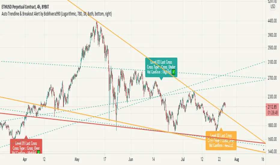
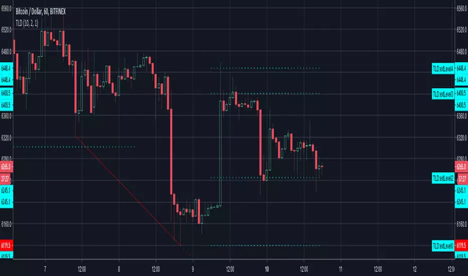
The classification of trend lines is done based on the reaction of the price chart to the trend lines and the analysis of the trading volume.
This indicator is designed to reclassify trend lines with each reaction of the price chart. These lines are classified into 6 levels and these levels are distinguished by different colors. Thus, any touching or crossing of the price chart can make a difference.
Does it repaint?
Any tool that shows trend lines must repaint because trend lines are constantly changing. Some lines lose their strength and new ones are formed, so some lines should be removed and replaced with new lines and that means repainting.
The indicator should reflect the latest changes. So while repainting is a bad thing in a strategy, it is essential in this indicator.
This indicator is designed to reclassify trend lines with each reaction of the price chart. Thus, any touching or crossing of the price chart can make a difference.
Note that unlike alerts, breakout labels are not trading signals:
Breakout labels show the latest breakout for each level based on the lines that appear on the chart, so they may repaint or have delay.
But Alerts work differently, Alerts are triggered when one of the trend lines is broken and then the next candle is opened and has no any delay.
Features
This indicator is designed for use on both linear and logarithmic scales. It works linearly by default. If you are using a logarithmic chart, enter the settings menu and set the chart scale parameter to “Log”.
The indicator is equipped with the volume status tool to identify and avoid false breakouts. Note that you can't completely avoid false breakouts, but you can minimize risk and loss. I have already published volume status as a separate script.
Several filters are provided to customize alerts. You can limit alerts based on the level and strength of broken trend lines, volume status, and type of breakout (Cross-Over, Cross-Under, or both).
The last breakouts panel gives an overview of the current market situation. You can activate it in the settings menu. the figure below shows the panel:
Settings menu parameters
{Chart Scale …} =>
Set it according to the chart. If you are using a linear chart, select the "Linear" option or if you are using a logarithmic chart, select the "Log" option
{Max Operational Range Length ...} =>
This parameter specifies the number of candles processed by the indicator (By default, the last 1000 bars)
{Filter Out-Of-Range Lines} =>
The filter removes diverging or out-of-range lines and reduces the clutter of the chart
{Visible Trend Lines ...} =>
In this section you can specify which level of trend lines should be visible. Level 1 contains the strongest lines and level 6 contains the weakest.
{Alert Condition 01 _ Trendline Levels} =>
In this section, you can specify which level of trend lines will trigger an alert after the breakout. This section has been added to customize alerts.
{Alert Condition 02 _ Cross Type} =>
In this section, you can limit alerts based on the type of breakout (Cross-Over, Cross-Under or both). This section has been added to customize alerts.
{Alert Condition 03 _ Volume Status} =>
In this section, you can limit alerts by volume to avoid fake breakouts. This section has been added to customize alerts.
{Last Breakout Label} =>
In this section, you can enable or disable the last breakout labels.
{Panel} =>
In this section, you can enable or disable the last breakout panel or set its position on the chart.
How to setup
There are many parameters in the settings menu, but two are more important. One is “Chart Scale” and the other is the “Max Operational Range Length".
Set the “chart scale” parameter according to the chart, otherwise the trend lines drawn by the indicator do not match the price chart.
If you are using a linear chart, select the "Linear" option or if you are using a logarithmic chart, select the "Log" option.
Max Operational Range Length Limits the range of the price chart that is processed by the indicator.
By increasing this parameter:
The strength and durability of the trend lines increases.
The number of breakout signals decreases.
The importance of breakout signals increases.
The indicator processing load increases.
In the following figure, you can see the effects of increasing the “Max Operational Range Length" parameter:
Limits
Since this indicator makes extensive use of trading volume, it is necessary to use a chart with volume information.
But if the volume information is not provided by the vendor, indicator will continue to work based on the price chart only, and a warning message will be displayed below the chart to let you know.
Errors and Performance
The performance of this indicator depends on the “Max Operational Range Length” parameter in the settings menu because it performs calculations, within a range with the length of this parameter.
By increasing this parameter, the processing load increases. Sometimes you may encounter the following error: “Loop takes too long to execute (>200 ms)”
If you see this error, do one of the following:
Reduce the “Max Operational Range Length”.
Reset the indicator. To do this, double-click on the “Hide” button in front of the indicator name.
Examples
EURUSD (FX:EURUSD) – 1D // Scale: Logarithmic, Max Range Length = 1000, Filter: 2X
NASDAQ 100 (CME_MINI:NQ1!) - 1D // Scale: Logarithmic, Max Range Length = 700
GOLD (COMEX:GC1!) – 1D // Scale: Logarithmic, Max Range Length = 650, Filter: 2X
NATURAL GAS (NYMEX:NG1!) – 1D // Scale: Logarithmic, Max Range Length = 625, Filter: 4X
AMAZON (NASDAQ:AMZN) – 1D // Scale: Logarithmic, Max Range Length = 1750, Filter: 2X
APPLE INC (NASDAQ:AAPL) – 1D // Scale: Logarithmic, Max Range Length = 340, Filter: 4X
GBPUSD (FX:GBPUSD) – 1D // Scale: Logarithmic, Max Range Length = 1000, Filter: 3X
SILVER (COMEX:SI1!) – 1D // Scale: Logarithmic, Max Range Length = 550, Filter: 3X
BITCOIN (KUCOIN:BTCUSDT) – 4H // Scale: Logarithmic, Max Range Length = 1250, Filter: 3X
MICROSOFT (NASDAQ:MSFT) – 1D // Scale: Logarithmic, Max Range Length = 340, Filter: 4X
TOTAL (CRYPTOCAP:TOTAL) – 2H // Scale: Logarithmic, Max Range Length = 1075, Filter: 3X
Cari dalam skrip untuk "trendline"
FibBand, Perfect Trendline Trader and Target SystemSo, Dear Friends, I am open-sourcing one of my scripts which I created as a thesis project,
The Auto Trader System is a Scalping Tool , to be used mostly in intraday Setups!!
and is designed using,
1. Fibonacci Bands
Fibo Bands are Calculated by defining dynamic Fibonacci Pivots Lines over a history of Lookup values (Default is 89 periods lookback),
The bands help in identifying the Target Points for the setup
2. Perfect TrendLine Setup
The script uses PTS, as a filter to define the optimum entry and exit points
Which timeframe it works for ?
Works for Any Time Frame, but Intraday setups are good!
Who is this System for ?
Beginner and Intermediate Traders
Provision For Alerts
The Script has provision for both long and short alerts!!
Enjoy!
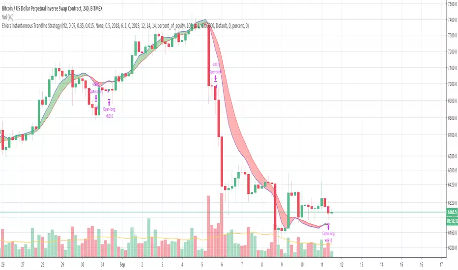
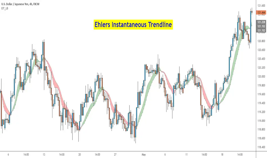
[blackcat] L2 Ehlers Instantaneous Trendline Trading StrategyLevel: 2
Background
John F. Ehlers introuced Instantaneous Trendline Trading Strategy in his "Cybernetic Analysis for Stocks and Futures" chapter 3 on 2004.
Function
With the crossover strategy that Dr. Ehlers has developed it is possible to be on the wrong side of the trade for a substantial period from time to time. For this reason, Dr. Ehlers has added a rule that if the price goes against your position by more than some percentage, the strategy will correct itself and automatically reverse to the opposite position. The percentage is supplied as the input variable RevPct. RevPct is an optimizable parameter, but I find that the default
value of 1.5 percent (RevPct = 1.015) is a relatively robust number.
Key Signal
Trigger ---> Instantaneous Trendline fast line
ITrend ---> Instantaneous Trendline slow line
LimitBuy ---> limit buy price level which is triggered by gold cross
LimitSell ---> limit buy price level wich is triggered by dead cross
Pros and Cons
100% John F. Ehlers definition translation of original work, even variable names are the same. This help readers who would like to use pine to read his book. If you had read his works, then you will be quite familiar with my code style.
Remarks
The 23th script for Blackcat1402 John F. Ehlers Week publication.
Readme
In real life, I am a prolific inventor. I have successfully applied for more than 60 international and regional patents in the past 12 years. But in the past two years or so, I have tried to transfer my creativity to the development of trading strategies. Tradingview is the ideal platform for me. I am selecting and contributing some of the hundreds of scripts to publish in Tradingview community. Welcome everyone to interact with me to discuss these interesting pine scripts.
The scripts posted are categorized into 5 levels according to my efforts or manhours put into these works.
Level 1 : interesting script snippets or distinctive improvement from classic indicators or strategy. Level 1 scripts can usually appear in more complex indicators as a function module or element.
Level 2 : composite indicator/strategy. By selecting or combining several independent or dependent functions or sub indicators in proper way, the composite script exhibits a resonance phenomenon which can filter out noise or fake trading signal to enhance trading confidence level.
Level 3 : comprehensive indicator/strategy. They are simple trading systems based on my strategies. They are commonly containing several or all of entry signal, close signal, stop loss, take profit, re-entry, risk management, and position sizing techniques. Even some interesting fundamental and mass psychological aspects are incorporated.
Level 4 : script snippets or functions that do not disclose source code. Interesting element that can reveal market laws and work as raw material for indicators and strategies. If you find Level 1~2 scripts are helpful, Level 4 is a private version that took me far more efforts to develop.
Level 5 : indicator/strategy that do not disclose source code. private version of Level 3 script with my accumulated script processing skills or a large number of custom functions. I had a private function library built in past two years. Level 5 scripts use many of them to achieve private trading strategy.
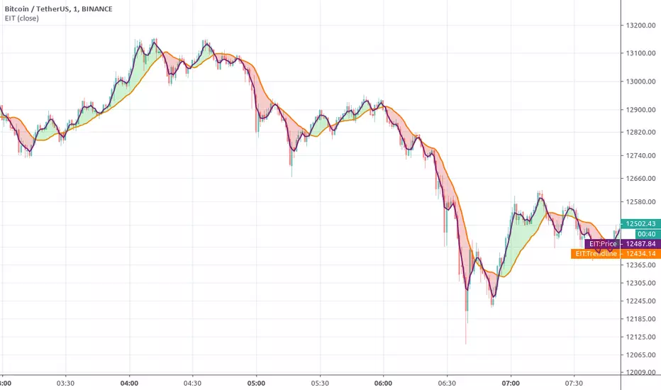
Etlers Instantenous TrendlineThis script uses @cheatcountry script to calculate Ehlers Instantenous Trendline .
Backtest offers 3 capital management tools. One that will always calculate order size as initial capital/close, one that uses the same calculation but adds or substracts profit. The last one allows you to enter manually the size you want to trade.
Green and red horizontal lines are profit/stop values.
Ehlers Instantaneous Trendline V2 [CC]The Instantaneous Trendline was created by John Ehlers (Cybernetic Analysis For Stocks And Futures pg 24) and this is an updated version of his original Instantaneous Trendline that works much better in my opinion. Buy when the indicator line turns green and sell when it turns red.
Let me know what other scripts you would like to see me publish or if you want something custom done!

VIX TrendlineThis indicator helps to see the volatility index (VIX) trendline in all stock charts without opening the VIX chart explicitly.
Hope this helps many of you to be more efficient in your chart analysis - have fun!

[JOHN] SUPER BOSSHello this is SUPER BOSS indicator.
---------------------------------
How this indicator work?
SUPER BOSS work in sync with KNIFE CUT script.
This indicator provide trendline to check the trend and support/resistance areas.
Check the images below.
The system work with moving averages (you can choose your favorite with 8 different type).
Support and resistance work with rsi conditions.
This script work with every pair and market, with all timeframes.
OverBought, Oversold candles
Green line is a LONG, Red line is a SHORT.
4H example, work with all timeframes also for excellent 15m scalping.
Some other big % ROI examples
Many opportunities.
Tried this with 15m timeframe trading and the result is incredible.

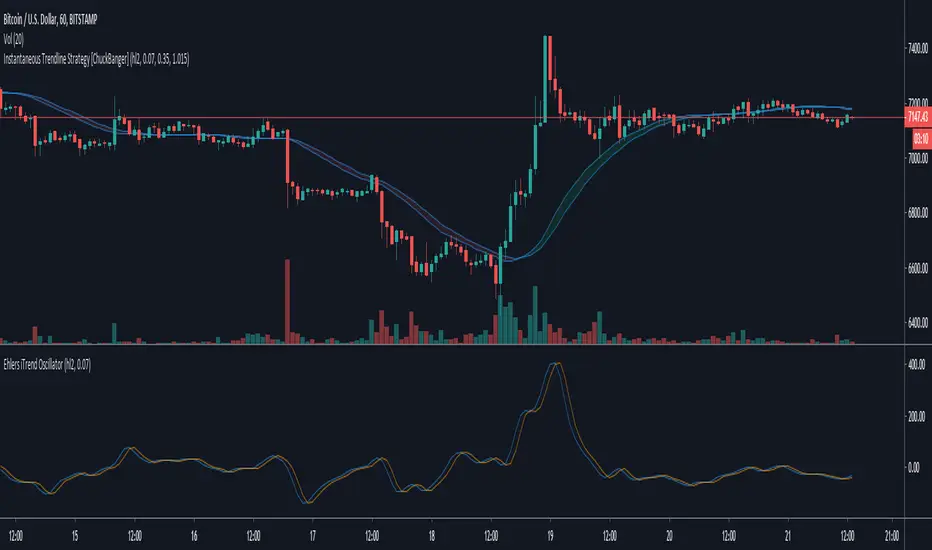
Instantaneous Trendline Strategy [ChuckBanger]Based on Instantaneous Trendline, by John Ehlers , identifies the market trend by doing removing cycle component. I think, this simplicity is what makes it attractive :) To understand Ehlers's thought process behind this, refer to the PDF linked below.
There are atleast 6 variations of this ITrend. This version is from his early presentations. You can find it here: www.mesasoftware.com
This is better then a regular MA cross over strategy
UltimateTraders TrendlineUltimateTraders Trendline or in short, UT Trendline is an indicator which is used to determine the direction of trend of a stock. Each and every colour of these lines also represent support and resistance
Short term = RED
Mid term = ORANGE
Mid-long term = BLUE
Long term = BLACK

MACD Divergence TrendlineAuto draw MACD Divergence Trendline on your chart.
This script uses pine script v4 new features!

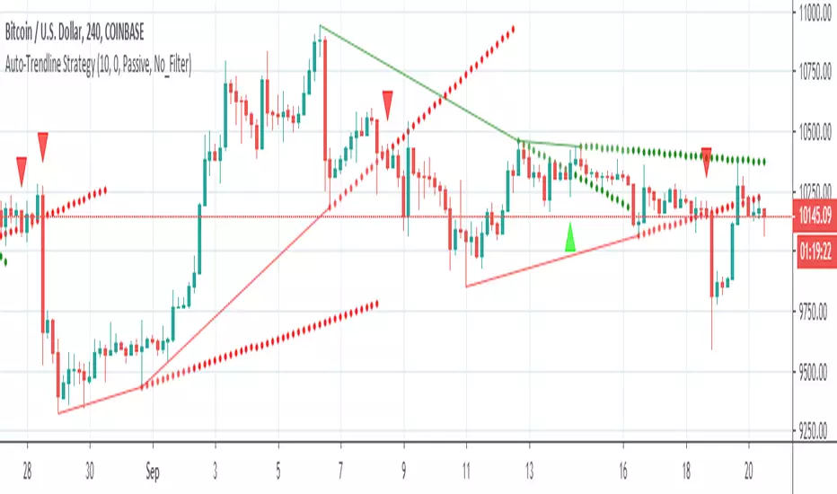
Auto-Trendline StrategyCredits to @Tradeindicators for the idea:
More filters will be added further: (This strategy is a combination of multiple scripts)
This strategy cant be used as a signal provider but its VERY helpful when it comes to finding trades and making your life easier.
Alerts included for Longs and Shorts
For LONG:
-Filter 1 : Green Trendline break
Filter 2: MUST be 3 green squares from trend meter
-Filter 3: EMA 10 below price bar (blue line)
-Filter 4: All short trades must be above 400 EMA ( big orange line,it can be modified from settings)
-Filter 5: Passive/Agressive type of entry (optional on settings)
For SHORT:
-Filter 1 : Red Trendline break
Filter 2: MUST be 3 red squares from trend meter
-Filter 3: EMA 10 above price bar (blue line)
-Filter 4: All short trades must be below 400 EMA ( big orange line,it can be modified from settings)
-Filter 5: Passive/Agressive type of entry (optional on settings)
Low Latency Trendline[Geo]Low latency trendline is a better and faster indicator than MAs.
It lowes high frequency wave(noise) and echoes low frequency wave(main move trend).
You can find out trend faster and have more confidence to dicide than MA indicators.
Take your own risk to use this Indicator.
PS:
I found RMTA() to help coding.
Tradingview has a good recursive function method. And RMTA has a good licence:MIT licence. Thanks to you, Alex.

Ehlers Instantaneous TrendlineEhlers Instantaneous Trendline script.
This indicator was described by John F. Ehlers in his book "Rocket Science for Traders" (2001, Chapter 10: The Instantaneous Trendline).

Ehlers Instantaneous Trendline StrategyInstantaneous Trendline Strategy by John Ehlers from his book "Cybernetic Analysis for Stocks and Futures".
You can choose implementation of stop-loss. Don't forget to define correct spread for your instrument.
Auto Trendline, Downtrend Descending Trend line indicatorThis is a customized Tradingview indicator will automatically plots descending trend lines which formed by two adjacent swing lows. It will also draw 5 extended resistance and support levels after the trend line detected.
The concept is simple: the trend line is formed by two adjacent troughs when the price is in a downtrend . It will save a lot of time for people (like me) who uses trendline very often.
By deploying this indicator, should the condition meet, you don't need to draw the trend lines by hand anymore. It's also very easy to use, just load it on chart and set your desired inputs.
Features:
Strength, this parameter is used to define the minimum number of bars to the left and right side of the troughs (swing low point).
Set price difference between two troughs in two variables: amount or percentage.
Enable/disable the extended level lines.
By using different inputs, you can easily filter out some unwanted trend lines.
It's recommended to use small value for price difference input on intraday chart, and use relatively large value on Daily chart.
The choice of price difference value input also depends on the market you work on, you may want to use small value on Forex market and use large value on Stock market.
Auto Trendline Lower Ascending Trend line No label editionThis version is for people don't like the labels shown on chart, it works the same as the original one.
There will be no label on the right side of chart.
The concept is straightforward: the trend line is formed by two adjacent troughs when the price is in a uptrend. It will save a lot of time for people who uses trendline very often.
By deploying this indicator, should the condition meet, you don't need to draw the trend lines by hand anymore. You can also consider it as a trend line reminder.
It's also very easy to use, just load it on chart and set your desired inputs.
Features:
Adjust the strength of the 2 troughs that form the trend line .
Set price difference between two troughs in two variables: amount or percentage.
Turn on/off the cross below alert.
It works on all symbols and all timeframes.
never paint

Auto Trendline, Upper Descending Trend line detector with alertThis is a custom Tradingview indicator that automatically plots descending trend lines above price bars. It will alert when the price closes above the trend line.
The concept is straightforward: the trend line is formed by two adjacent peaks when the price is in a downtrend. It will save a lot of time for people (just like me) who uses trendline often.
By deploying this indicator, should the condition meet, you don't need to draw the trend lines by hand anymore. You can also consider it as a trend line reminder.
It's also very easy to use, just load it on chart and set your desired inputs.
Features:
Adjust the strength of the 2 peaks that form the trend line.
Set price difference between two peaks in two variables: amount or percentage.
Turn on/off the cross above alert.
It works on all symbols and all timeframes.
never paint
A detailed instruction will show you how to properly adjust each input.

Ehlers Instantaneous Trend [LazyBear]One more to add to the Ehlers collection.
Ehlers Instantaneous Trendline, by John Ehlers, identifies the market trend by doing removing cycle component. I think, this simplicity is what makes it attractive :) To understand Ehlers's thought process behind this, refer to the PDF linked below.
There are atleast 6 variations of this ITrend. This version is from his early presentations.
Is this better than a simple HMA? May be, May be not. I will leave it to you to decide :)
I have added options to show this as a ribbon, and to color bars based on ITrend. Check out the options page.
More info:
- ITrend: www.mesasoftware.com
List of my public indicators: bit.ly
List of my app-store indicators: blog.tradingview.com
Trend Score
This Indicator show trend score for all cripto.
With this indicator it is possible to read the trend of the graphical time and your trend score,
Level 1 = trend start
level 2 = trend full
The best upside cenário = level 1, level 2, level 3, level 4, all scoring = 2
The best downside ceário = level 1, level 2, level 3, level 4, all scoring = 1
Trend score over 70% = Bull
Trend score unver -70% = Bear

Decred TrendSignals 1.0For advanced traders :
We have 3 fractals trends.
This Indicator filter trend for Decred.
With this indicator it is possible to read the trend of the graphical time and your fractal trend,
Best results = 15 min charts
I use Decred trendSignals for Scalping Trading ( at least 2% profit), Stop Loss under 6% (prefer 2% or = profit).
I prefer buy after Yellow candle print.

CryptoFilter 2x - TrendsFor advanced traders :
See 2 fractals trends.
This Indicator filter trend for Crypto-Market.
With this indicator it is possible to read the trend of the graphical time and your fractal trend,
For convergence / divergence chart..
Thus it is possible to define if the market is aligned in several times of reading, following the same direction, mainly the sequential times, or 1/5 / 15min and 5/15/60 min.
Cryptofilter 2x is not recommended for use as a point of entry or exit indicator.
TrendLineThis is a tool to see trend lines on charts. This code takes two maximum and two minimum and draws a line between them.
