Volume with SD+2Volume with SD+2
Volume with SMA20 and Standard Deviation +2
If Volume < SMA20 , mean Volume Low and less momentum.
If Volume > SMA20 and < SD2 , mean Volume Increase and more momentum.
If Volume > SD2 , mean Volume Climax , show strong trend but show reversal point in someitmes.
Cari dalam skrip untuk "wave"

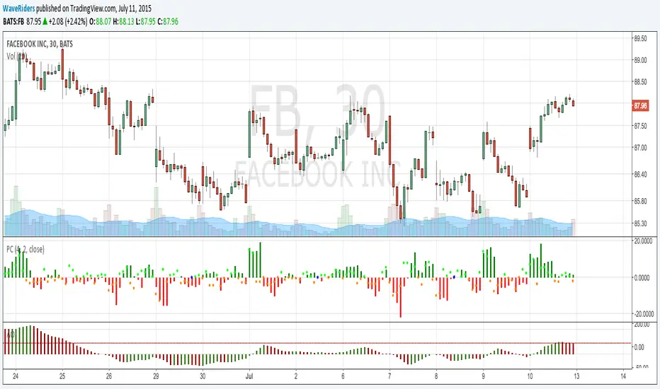
PriceCounterPrice Counter
Use to identify Price Short Term Trend By
PC = Present Close - 4 Previous Close
PC > 0 Show Value in Green bar
PC 0
Dot = Present Close - 2 Previous High
If PC = 0 or < 0
Dot = Present Close - 2 Previous Low
Indicator will Show momentum of price. PC bar is long mean price move fast .
PC bars are the same color continuously , mean price in trend.
PC bars are often flip color and small bar , mean price sideway and weak momentum.
The Zone Trades v1.0The Zone v.1.0
The Zone is mention in New Trading Dimensions by Bill Williams,PhD. The Zone is used for Entry Signal of Both Long and Short side.
Green Zone are painting Green Bars when Awesome Oscillator (AO) and Accelerater/Decelerator (AC) are both increasing.
Red Zone are painting Red Bars when Awesome Oscillator (AO) and Accelerater/Decelerator (AC) are both decreasing.
Gray Zone are painting Gray Bars AO and AC in difference changing. Gray Zone are indicate the indecision between bulls and bears.
Bill Williams, PhD. mention that Green Zone or Red Zone usually happen 6-8 bars Continuously.
The First Bar that change to be Green or Red color is the Signal Bar.
Entry Signal is the second bar in the same color as the Signal bar happen with Volume
Price go higher the high of previous Green Bar is Buy Signal. Entry Buy (Long) and place Stop at 1 tick lower the Low of previous bar.
Price go ;ower the Low of previous Red Bars is Sell Signal. Entry Sell (Short) and place Stop at 1 tick higher the High of previous bar.
Do not Entry if Green Bars or Red Bars completed 5 bars continuously.


🦶🦶 VuManCraigThis script is a community-driven recreation of the popular VMC/Decipher B divergence tool.
Full credit and thanks go to the original authors and contributors from the original indicator comments — this version simply brings the same logic into a cleaner, more customizable format, with default settings adjusted to reflect Craig the Educator’s trading setup.
Features
Detects bullish & bearish divergences on the VMC/Decipher B waveform
Automatic label plotting for clear visual signals
Default parameters tuned to match Craig the Educator’s preferred setup
Adjustable lengths, thresholds and smoothing
Optional oscillator visibility toggles
Alerts for divergence confirmations
Lightweight and optimised for intraday or swing-trading use

Hybrid Flow Master📊 Hybrid Flow Master - Professional Trading Indicator
Overview
Hybrid Flow Master is an advanced all-in-one trading indicator that combines Smart Money Concepts, institutional order flow analysis, and multi-timeframe confluence scoring to identify high-probability trade setups. Designed for both scalpers and swing traders across all markets (Forex, Crypto, Stocks, Indices).
🎯 Key Features
1. Intelligent Confluence System (0-100% Scoring) Proprietary scoring algorithm that weighs multiple factors Only signals when minimum confidence threshold is met
Real-time probability calculations for each setup Signal quality grading: A+, A, B, C ratings
2. Smart Money Concepts (SMC)
Automatic Order Block detection (bullish/bearish) Fair Value Gap (FVG) identification
Market structure analysis (Higher Highs, Lower Lows) Swing high/low tracking with visual markers
3. Multi-Timeframe Analysis
Higher timeframe trend filter for confluence Customizable HTF periods (1H, 4H, Daily, etc.)
Prevents counter-trend trades Aligns entries with major trends
4. Volume Flow Analysis
Volume spike detection with customizable thresholds Volume delta calculations (buying vs selling pressure) Institutional footprint identification Background highlighting for high-volume bars
5. Advanced Risk Management
ATR-based stop loss calculation Automatic take profit levels Customizable risk/reward ratios (1:1, 1:2, 1:3+) Visual SL/TP lines on chart Position sizing guidance
6. Professional Dashboard
Real-time HUD displaying:
Market bias (Bullish/Bearish/Neutral)
Higher timeframe trend status
Current confluence percentage
Volume status (Normal/High)
RSI reading with color coding
ATR volatility measure
Signal quality grade
7. Smart Alert System
Bullish confluence signals
Bearish confluence signals
Volume spike notifications
Customizable alert messages
Works with mobile app notifications
📈 What Makes It Unique?
✅ No Repainting - All signals are confirmed and final
✅ Probability-Based - Shows confidence level, not just binary signals
✅ Multi-Factor Confluence - Combines structure, volume, momentum, and HTF analysis
✅ Clean Interface - Toggle individual components on/off
✅ Works on All Timeframes - From 1-minute scalping to daily swing trading
✅ Universal Markets - Forex, Crypto, Stocks, Indices, Commodities
🎨 Customization Options
Adjustable swing detection length
Volume threshold settings
Minimum confluence score filter
Custom color schemes
Dashboard position (4 corners)
Show/hide individual components
Risk/reward ratio adjustment
ATR multiplier for stops
📊 Best Used For:
✔️ Scalping (1m - 15m charts)
✔️ Day Trading (15m - 1H charts)
✔️ Swing Trading (4H - Daily charts)
✔️ Trend Following
✔️ Reversal Trading
✔️ Breakout Trading
💡 How to Use:
Add indicator to chart - Works immediately with default settings Set your timeframe - Choose your trading style Wait for signals - Green BUY or Red SELL labels with confidence %
Check confluence score - Higher % = better quality setup Review dashboard - Confirm market bias and HTF trend Manage risk - Use provided SL/TP levels or adjust to your preference
Set alerts - Get notified of high-probability setups
⚙️ Recommended Settings:
For Scalping (1m-5m):
Swing Length: 5-7
Min Confluence: 70%
HTF: 15m or 1H
For Day Trading (15m-1H):
Swing Length: 10-15
Min Confluence: 60%
HTF: 4H or Daily
For Swing Trading (4H-Daily):
Swing Length: 15-20
Min Confluence: 50-60%
HTF: Weekly
📚 Indicator Components:
✦ Market Structure Detection
✦ Order Block Identification
✦ Fair Value Gaps (FVG)
✦ Volume Analysis
✦ RSI (14)
✦ MACD (12, 26, 9)
✦ ATR (14)
✦ Multi-Timeframe Trend
✦ Confluence Scoring Algorithm
🚀 Performance Notes:
Optimized for speed and efficiency Minimal CPU usage Clean chart presentation
Limited drawing objects (no chart clutter) Works on all TradingView plans
⚠️ Important Notes:
This indicator is a tool to assist trading decisions, not financial advice Always use proper risk management (1-2% per trade recommended) Backtest on your preferred market and timeframe
Combine with your own analysis and strategy Past performance does not guarantee future results
🔔 Alert Setup:
Right-click indicator name → "Add Alert" → Choose:
"Bullish Confluence Signal" for buy setups
"Bearish Confluence Signal" for sell setups
"Volume Spike Alert" for unusual activity
💬 Support:
For questions, suggestions, or custom modifications, feel free to message me directly through TradingView.

Test shift level strategyTesting this on all timelines where in it checks the candle color and takes call to buy or sell

MaayaBullish_PROD_v14_Nov2025trying to analyses trend.
trying to analyses trend.
trying to analyses trend.
trying to analyses trend.
trying to analyses trend.
trying to analyses trend.
trying to analyses trend.
trying to analyses trend.

brrr on $ indicator 𐤀it is an indicator that brrr's too but this one only brrr's on $.
ppl want know more about $ but thats all. it just brrr's $
sometimes it brrr's $ sometimes it wont. but wen it brrr's $ it really brrr's $.
brrr

brrr indicator 𐤀its an indicator that brrr's.
ppl want know more about but thats all. it just brrr's
sometimes it brrr's sometimes it wont. but wen it brrr's it really brrr's.
brrr

RSI with SMA + 70/60/50/40/30 LevelsIndicator Name:
RSI with SMA + 70/60/50/40/30 Levels
🧩 Concept Overview:
यह indicator दो popular tools को combine करता है:
RSI (Relative Strength Index) – momentum indicator जो market ke overbought aur oversold zones ko identify karta hai.
SMA (Simple Moving Average) – trend smoother jo RSI ke movement ko average karke lagging confirmation deta hai.
इन दोनों के साथ 70, 60, 50, 40, और 30 की multiple reference lines draw की जाती हैं, ताकि trader को RSI ke swings aur reversals easily samajh aaye.
⚙️ Indicator Components:
RSI Line:
Default Period: 14 (customize kar sakte ho).
Show karta hai price momentum – agar RSI 70 ke upar jaata hai to market overbought zone me hota hai; agar 30 ke niche jaata hai to oversold zone me.
SMA on RSI:
RSI ka smooth version (usually 9-period SMA).
Trend confirmation ke liye – jab RSI line SMA ke upar cross karti hai to bullish signal, aur neeche cross kare to bearish signal.
Horizontal Levels:
70: Overbought zone (potential sell area).
60: Strong bullish momentum line (trend confirmation).
50: Neutral / midline (trend direction flip area).
40: Weak bearish zone (trend losing strength).
30: Oversold zone (potential buy area).
💡 How to Use:
Trend Identification:
RSI > 60 aur SMA ke upar → Bullish trend.
RSI < 40 aur SMA ke neeche → Bearish trend.
Reversal Spotting:
RSI 70 ke upar jaake wapas niche aaye → Sell signal.
RSI 30 ke neeche jaake wapas upar aaye → Buy signal.
Confirmation Using SMA:
RSI cross SMA from below → Confirmed bullish reversal.
RSI cross SMA from above → Confirmed bearish reversal.

NAVJOTDANDIWAL77 GOLD BTC 5 M 1;4
// disclaimer: this script and strategy are created only for educational and informational purposes. it is not financial advice or a recommendation to buy or sell any financial instrument. trading and investing involve significant risk, and past performance does not guarantee future results. do not use this script for live trading or real money decisions. the creator of this script is not responsible for any losses or damages that may occur from its use. use at your own risk.

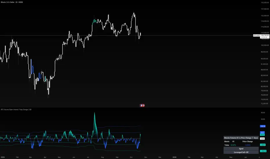
BTC Futures Open Interest 7-day Change | QRBitcoin Futures OI vs Price (7-Day)
What it is
This tool compares the 7-day momentum of Bitcoin perpetual futures Open Interest (OI) with the 7-day price change to classify market behavior into four intuitive regimes:
Leverage Rally (OI↑, Price↑) – positioning builds with rising price
Leveraged Sell-Off (OI↑, Price↓) – forced/short-term positioning into weakness
Deleveraging Sell-Off (OI↓, Price↓) – positions reduce while price falls
Spot Rally (OI↓, Price↑) – spot-led advance with lighter derivatives leverage
It is designed for BTC using the BINANCE:BTCUSD.P OI feed and a clean, self-contained visualization.
How it works (principle, not code)
OI Momentum: Calculates the 7-day Rate of Change (ROC) of BTC perpetual futures Open Interest.
Price Momentum: Calculates the 7-day ROC of the chart’s close.
Regime Logic: The sign of OI ROC and Price ROC determines the 4 regimes shown in the on-chart table label.
Volatility Context: A rolling standard deviation of OI ROC defines ±1σ and ±2σ bands. Bars are tinted when OI ROC exceeds ±2σ to highlight exceptional leverage shifts.
This is not a latency-sensitive microstructure model; it’s a context tool to see how derivatives positioning evolves relative to price.
Why it’s useful (originality & value)
Most OI overlays show a single line. This script adds:
a behavioral classifier (the 4 regimes) that’s immediately interpretable, and
adaptive σ-bands on OI momentum to distinguish routine leverage changes from abnormal expansions/flushes.
Together, they make it easier to read leverage cycles, spot rally quality, and identify riskier states (e.g., price up while OI surges vs. price up while OI fades).
What you see on the chart
Futures Open Interest (stepline) for BTC perpetuals (BINANCE:BTCUSD.P_OI).
OI ROC plot with zero line and ±1σ / ±2σ guides.
Bar tinting when OI ROC > +2σ (aggressive leverage build) or < −2σ (aggressive deleveraging).
Side table showing current OI ROC, Price ROC, and the regime label.
Note: If applied to a non-crypto symbol, OI will be suppressed and the script will warn that no OI data is available. It is intended for BTC.
Inputs & customization
Color mode: Choose among preset palettes to match your chart style.
(Other logic—lookbacks, σ-bands, and regime rules—are fixed to keep the reading consistent across users.)
How to use it
Confirm trends:
Leverage Rally with OI ROC above +1σ supports risk-on continuation.
Spot Rally can be constructive early in cycles, but be aware that OI can catch up quickly.
Caution in stress:
Leveraged Sell-Off often coincides with liquidation spikes and unstable conditions.
Deleveraging Sell-Off typically marks clearing phases; watch for stabilization as OI ROC returns toward 0.
Watch extremes:
±2σ moves in OI ROC are non-routine; combine with price structure, liquidations, and funding to refine decisions.
Use it as contextual confluence alongside your execution plan (levels, risk, and timeframe).
Chart-publishing guidance
Publish with a clean chart so the OI line, ROC bands, and regime label are easy to identify.
Avoid stacking unrelated indicators unless you explain why they are required to interpret the tool.
Limitations
OI feeds can vary by venue; this script uses Binance perpetual OI. Other venues may differ.
Short-term spikes (maintenance, outages, large block flows) can distort OI ROC for a few bars.
The σ-bands adapt to recent variability; regime persistence is more informative than a single spike.
Disclaimer
This script is for research and educational purposes only and is not financial advice. Trading involves risk, including loss of capital. Past performance does not predict or guarantee future results. Always validate on your timeframe and use robust risk management.
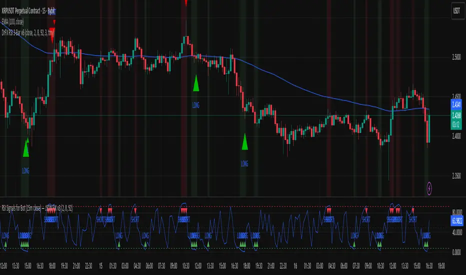
RSI Signals for Bot (15m close) — JSON FIX v4RSI Signals for Bot (JSON Ready) is a lightweight automation-friendly indicator that generates clean LONG and SHORT alerts based on RSI thresholds, fully formatted in JSON for webhook-based trading bots.
It’s designed primarily for 15-minute charts and sends one alert per confirmed bar close.
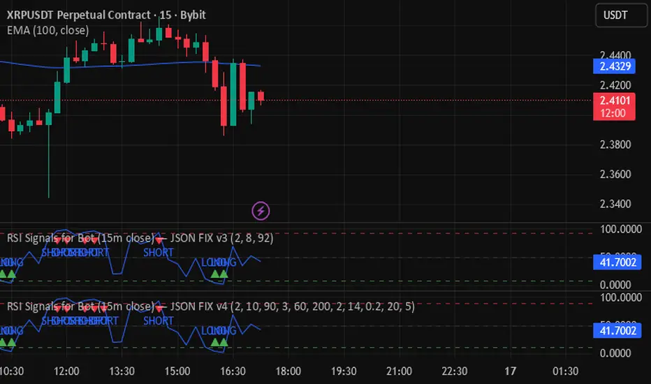
Rsi- bybitbot - JSON v3Backtesting based on the RSI indicator, based on the RSI length, RSI level, and the number of candles at the RSI level. Backtesting for monitoring in-points.
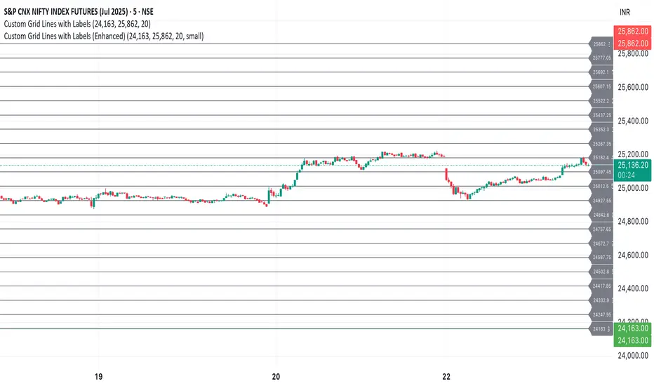
Custom Grid LinesThe Custom Grid Lines Indicator is a versatile tool designed for traders who want to manually define key price zones and visualize them with precision. This indicator allows users to select their own starting and ending price levels and automatically divides the range into user-defined grids using horizontal lines.
🔧 Key Features:
📍 User-Controlled Price Range:
Manually set the starting (bottom) and ending (top) price levels based on your trading plan, key zones, or market structure.
📊 Flexible Grid Setup:
Easily choose the number of grid lines to divide your selected range into equal price intervals.
📏 Automatic Grid Calculation:
The indicator calculates grid spacing and plots horizontal lines at each level, providing a clean and structured visual guide.
✅ Simple and Effective Visualization:
Ideal for grid trading, manual support/resistance plotting, or price zone tracking.
⚙️ How to Use:
Input the desired starting price (bottom of your range).
Input the ending price (top of your range).
Select the number of grids you want between these two levels.
The indicator will automatically draw all grid lines across your chart.
💡 Best For:
Grid Trading Strategies
Visualizing Custom Price Zones
Manual Support and Resistance Mapping
Session-Based Trading Ranges
Simple Pips GridOverview
This is a clean, simple, and highly practical indicator that draws horizontal grid lines at user-defined pip intervals.
Unlike other complex grid indicators, this script is designed to be lightweight and error-free. It eliminates automatic symbol detection and instead gives you full manual control, ensuring it works perfectly with any symbol you trade—FX, CFDs, Crypto, Stocks, Indices, and more.
Key Features
Universal Compatibility: Works with any trading pair by letting you manually define the pip value.
Fully Customizable: Easily set the pip interval for your grid (e.g., 10 pips, 50 pips, 100 pips).
Lightweight & Fast: Simple code ensures smooth performance without lagging your chart.
Visual Customization: Change the color, width, and style (solid, dashed, dotted) of the grid lines.
How to Use
It's incredibly simple to set up. You only need to configure two main settings:
Step 1: Set the "Pip Value"
This is the most important setting. You need to tell the indicator what "1 pip" means for the symbol you are currently viewing.
Go to the indicator settings and find the "Pip Value" input. Here are some common examples:
Symbol Pip Value (Input this number)
USD/JPY 0.01
EUR/USD 0.0001
GBP/USD 0.0001
XAU/USD (Gold) 0.1
JP225 (Nikkei 225) 10
US500 (S&P 500) 1
BTC/USD 0.1 or 1.0 (depending on your preference)
Step 2: Set the "Pip Interval"
Next, in the "Pip Interval" input, simply type how many pips you want between each line.
For a 10-pip grid, enter 10.
For a 50-pip grid, enter 50.
That's it! The grid will now be perfectly aligned to your specifications.
Additional Settings
Line Color, Width, Style: Customize the appearance of the lines to match your chart theme.
Number of Lines: Adjust how many lines are drawn above and below the current price to optimize performance and visibility.
This script was created with the assistance of Gemini (Google's AI) to be a simple and reliable tool for all traders. Feel free to use and modify it. Happy trading!

FSVZO | QuantumResearch🔊 FSVZO | QuantumResearch
Fourier Smoothed Volume Zone Oscillator
A proprietary hybrid oscillator blending momentum and frequency domain analysis
🧠 What Makes It Unique?
FSVZO introduces a novel approach to the classic Volume Zone Oscillator (VZO) by incorporating Discrete Fourier Transform (DFT) into both price and volume streams before calculating the VZO. This technique extracts the dominant frequency components from the market, resulting in a more stable and noise-filtered signal.
This hybrid approach of signal processing + volume-based trend detection sets it apart from traditional oscillators that only operate in the time domain.
⚙️ Core Concepts:
📈 Volume Zone Oscillator (VZO):
Built on a directional volume engine that emphasizes bullish/bearish pressure via smoothed volume flows.
🔍 Fourier Transform Layer:
A Discrete Fourier Transform is applied to the most recent price and volume arrays to isolate dominant cyclic components and suppress noise.
🧠 Trigger Line Comparison:
A smoothed EMA of the oscillator is used as a signal line for crossovers, highlighting momentum shifts.
🔍 Key Features:
✅ Fourier-Decomposed Source Data
✅ Adaptive Smoothing of the Signal Line
✅ Color-coded Trend Conditions
✅ Customizable Thresholds for Overbought/Oversold Regions
✅ Background Fill Zones for Visual Context
✅ Bar Color Overlays to Track Signal Transitions
📌 How to Use It:
When FSVZO > Trigger Line, bullish volume momentum dominates (green bars).
When FSVZO < Trigger Line, bearish volume momentum dominates (red bars).
Use ±60/90 zones as overbought and oversold thresholds.
Great for momentum confirmation, mean-reversion plays, and early trend detection when used with price action or moving averages.
⚠️ Designed For:
Momentum traders looking for a volume-aware oscillator
Analysts seeking signal stability through frequency filtering
Traders wanting a modern, noise-reduced alternative to RSI/MFI/VZO
⚠️ Disclaimer:
This script is for educational and research purposes only.
Past performance does not guarantee future results.
Always confirm with other indicators, price structure, and risk management.

Bitcoin: Pi Cycle Top & Bottom | QuantumResearchBitcoin: Pi Cycle Top & Bottom | QuantumResearch
Adaptive Deviation Model for Bitcoin Macro Extremes
Bitcoin: Pi Cycle Top & Bottom by QuantumResearch is a proprietary interpretation of the famous Pi Cycle concept—enhanced with normalized deviation logic, adjustable thresholds, and visual clarity. Unlike traditional models that simply cross two moving averages, this tool calculates the dynamic spread between a short-term and amplified long-term exponential average, delivering a continuous score that adapts to Bitcoin's evolving volatility profile.
🧠 What Makes It Unique?
🔹 Pi Deviation Engine:
This creates a centered, symmetric oscillator that better visualizes overextended conditions—something the original Pi Cycle model does not offer.
🔹 Dynamic Zoning via Thresholds:
Users can set custom top and bottom thresholds to adjust sensitivity based on current market regimes, making it more flexible than static crossover models.
🔹 Gradient-Powered Area Fill:
The oscillator plot is filled with directional gradients that react to the score's magnitude, creating an intuitive visual spectrum between bullish and bearish extremes.
🔹 Macro-Focused, Overlay-Free:
The indicator runs in a clean subpanel, preserving chart space and allowing better integration into multi-layered macro dashboards.
🔹 Built for BTC’s Unique Structure:
The moving average lengths and logic are specifically calibrated to Bitcoin’s halving-driven cycles, unlike generic Pi models applied across asset classes.
🔍 Key Features
✅ Continuous Cycle Score (not binary crosses)
✅ Custom upper/lower thresholds for signal flexibility
✅ Visual gradient fill and background shading
✅ Zero chart clutter (non-overlay)
✅ Fully customizable moving average lengths
✅ Designed for macro cycle top/bottom detection
📌 Ideal For:
Long-term Bitcoin investors
Macro traders and analysts
Those seeking early warning signs of euphoria or despair
Anyone using on-chain + cyclical tools to time large market pivots
⚠️ Disclaimer
This indicator is for educational and research purposes only.
It does not provide financial advice or guarantees.
Past performance does not predict future behavior.
Always confirm with additional tools and analysis.

MAs For Loop | QuantumResearchMAs For Loop | QuantumResearch
Multi-MA Composite Momentum Scoring Engine
MAs For Loop is a unique, multi-layered moving average scoring system developed by QuantumResearch to capture persistent trend momentum through time-based strength analysis. Rather than using a single moving average or crossover, this tool evaluates the historical behavior of five different MA types simultaneously, scoring each one across a 50-bar window and generating a clean, confidence-weighted signal.
📚 How It Works:
For each selected MA (ZLEMA, DEMA, HMA, VIDYA, MEDIAN), the script applies a for-loop that compares the current value to its value over the past 50 bars.
If the MA is above its past value → +1
If it’s below → -1
These values are summed into a score for each MA, ranging from -50 to +50
These individual scores are then averaged into a final “MultiWave” score, which reflects the directional consensus of all five MAs.
🧠 What Makes This Unique?
Unlike traditional moving average signals (e.g., crossovers or price > MA), this system quantifies time-weighted directional pressure.
It doesn’t just tell you “trend or no trend”—it tells you how strong and how consistent that trend has been across multiple smoothing methods.
The composite for-loop engine captures structural momentum in a way that avoids lag and reduces noise from single-source inputs.
🔍 Included MAs & Customization:
📘 ZLEMA (Zero-Lag EMA)
📘 DEMA (Double EMA)
📘 HMA (Hull MA)
📘 VIDYA (Volatility-Adjusted MA)
📘 Median Filter (Percentile Rank 50%)
Users can:
Adjust lengths, sources, and visual color themes
Modify the bullish and bearish thresholds
Display a real-time trend scoring table
Visualize transitions with multi-layer HMA overlays and dynamic bar coloring
📊 Signals:
✅ Long → when average score > +40
🟥 Cash/Short → when average score < -10
All in-between states are neutral (gray)
🔔 Alerts:
"MAs For Loop Long" and "MAs For Loop Short" alert conditions are built-in.
📌 Use Case:
Designed for trend-following swing traders and momentum analysts who want:
Confirmation across multiple MA styles
Smoothed entries based on historical persistence
A scoring engine they can plug into larger systems
Better signal quality during consolidation or early breakout phases
⚠️ Disclaimer:
This tool is for educational and informational purposes only. It does not constitute financial advice or a recommendation to buy or sell any asset.
Past performance is not indicative of future results. Use at your own risk.

Inter Cycle Valuation | QuantumResearchIntroducing Inter Cycle Valuation by QuantumResearch
A Multi-Factor Adaptive Z-Score System for Market Valuation & Reversal Potential
🧠 Overview
The Inter Cycle Valuation System is a sophisticated multi-factor indicator designed to evaluate the market’s cyclical valuation zones using a blend of momentum, volatility, mean-reversion, and risk-based metrics. It delivers a unified Z-Score—ranging from extremely oversold to overheated conditions—empowering traders to identify high-probability market turning points.
Rather than relying on a single indicator, Inter Cycle blends over 15 diverse Z-score factors, including RSI, ROC, VWAP deviation, Repulse, PGO, and statistical ratios like Sharpe, Sortino, and Omega. This multi-dimensional view allows traders to assess market extremes with greater confidence.
🧩 1. Key Features
📌 Multi-Factor Z-Score System
Inter Cycle integrates 16+ unique indicators into a single composite score. Each input is normalized via a Z-score to ensure balance and reduce bias, helping prevent outlier distortion.
⚙️ Indicator Diversity
Momentum: RSI, ROC, Chande Momentum, Repulse
Mean Reversion: VWAP deviation, Median rank, PGO
Volatility: BB% positioning, Intraday Momentum Index
Risk Ratios: Sharpe, Sortino, Omega
Fractal Geometry: Crosby Ratio
📈 Visually Intuitive Output
Gradient-based area plot for valuation intensity
Optional background heatmap for oversold/overbought zones
Table displaying real-time Z-score values for each component
Dynamic market suggestions: Accumulate, Do Nothing, or Distribute
📊 On-Chart Dashboard
The valuation dashboard displays key stats like Z-price, Z-rsi, Z-mfi, Z-roc, Z-crosby, and more—allowing for real-time interpretation without leaving the chart.
🔍 2. How It Works
1️⃣ Z-Score Normalization
Each indicator is transformed into a Z-score to standardize the values. This ensures that one factor does not dominate due to its scale or volatility.
2️⃣ Multi-Factor Aggregation
All Z-scores are averaged into a single score—called the "Inter Cycle Score"—giving you a reliable snapshot of market positioning.
3️⃣ Actionable Thresholds
🟩 Below -1.6 → “Accumulate Aggressively”
🟨 Between -1.5 and -0.65 → “Accumulate”
⚪ Between -0.5 and +0.5 → “Do Nothing”
🟧 Above +1.2 → “Distribute”
🟥 Above +1.55 → “Distribute Aggressively”
The system prints these labels automatically in real time.
📌 3. Valuation Zones
📉 Strongly Undervalued (< -1.6) → Prime accumulation
📉 Moderately Undervalued (-1.5 to -0.65) → Cautious entries
⚖️ Neutral/Fair (-0.5 to +0.5) → Wait-and-see
📈 Moderately Overheated (+1.2 to +1.55) → Begin reducing risk
🔥 Strongly Overheated (> +1.55) → Take profits, reduce exposure
This structure helps traders and investors clearly interpret current market cycles and position accordingly.
🔁 4. Use Cases & Applications
🔁 Cycle-Based Market Rotation
Great for timing market rotations by spotting macro tops and bottoms. Use the valuation dashboard to rotate capital across assets at optimal phases.
📈 Mean Reversion Entry Triggers
Z-Score combinations such as VWAP deviation + RSI + ROC help pinpoint high-probability mean reversion setups.
📉 Risk-Based Trend Exhaustion
With integrated Sharpe, Sortino, and Omega ratios, you can identify unsustainable moves fueled by low-quality momentum.
💼 Swing Trading & Portfolio Rebalancing
The Inter Cycle score can be used as a filter for swing setups or to rebalance holdings when conditions become extreme.
✅ Conclusion
Inter Cycle Valuation by QuantumResearch is a precision tool for any trader or investor seeking structured insights into market cycles. With its blend of valuation, risk, momentum, and reversion components—standardized via Z-scores—it offers a high-level framework to identify when markets are overheated or undervalued.
Who Should Use It?
✅ Swing Traders & Medium-Term Investors
✅ Portfolio Managers looking for capital rotation signals
✅ Quant Traders and Stat Arb enthusiasts
✅ Macro Traders monitoring cyclical inflection zones
⚠️ Disclaimer
The content provided by this indicator is for educational and informational purposes only. Nothing herein constitutes financial or investment advice. Trading and investing involve risk, including the potential loss of capital. Always backtest and apply risk management suited to your strategy.
