Santhosh Zero lag Trend change AlertThis indicator alert whenever these is a change in trend direction. Change input to match with your Asset/Index. This works well in all time frame, I recommend this for Scalping and Position trading
Sentiment

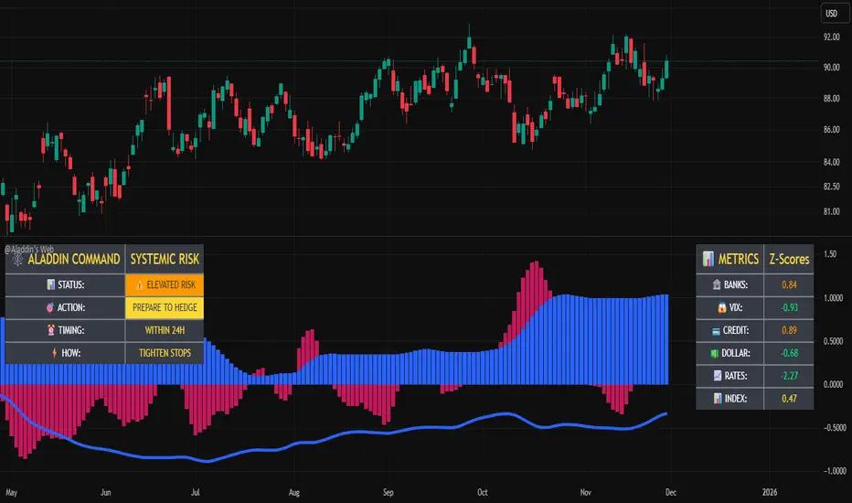
@Aladdin's Trading Web – Command CenterThe indicator uses standard Pine Script functionality including z-score normalization, standard deviation calculations, percentage change measurements, and request.security calls for multiple predefined symbols. There are no proprietary algorithms, external data feeds, or restricted calculation methods that would require protecting the source code.
Description:
The @Aladdin's Trading Web – Command Center indicator provides a composite market regime assessment through a weighted combination of multiple intermarket relationships. The indicator calculates normalized z-scores across several key market components including banks, volatility, the US dollar, credit spreads, interest rates, and alternative assets.
Each component is standardized using z-score methodology over a user-defined lookback period and combined according to configurable weighting parameters. The resulting composite measure provides a normalized assessment of the prevailing market environment, with the option to invert rate relationships for specific market regime conditions.
The indicator focuses on capturing the synchronized behavior across these interconnected market segments to provide a unified view of systemic market conditions.
Elite Energy Alpha MatrixThe Elite Energy Alpha Matrix indicator provides comprehensive analysis of the energy sector, focusing on the complex relationships between crude oil benchmarks, natural gas, energy-related ETFs, and the performance dynamics across various energy sub-sectors.
The indicator tracks multiple energy price data sources including WTI crude oil, Brent crude, natural gas, and oil ETFs, enabling detailed monitoring of price relationships and divergences within the energy complex.
Key analytical components include:
• Correlation analysis between major energy benchmarks
• Multi-timeframe examination of energy price relationships
• Sector rotation detection within energy sub-sectors including integrated oil majors, exploration and production companies, oilfield services, refiners, pipelines, and renewable energy
• Performance monitoring across different energy market segments
The indicator provides a structured framework for analyzing the internal dynamics of the energy sector, identifying periods of alignment or divergence between different energy price instruments, and monitoring relative performance across energy sub-sectors.
This approach enables users to assess the consistency of price movements across the energy complex and identify situations where different components of the energy market are exhibiting divergent behavior, which can provide insight into the underlying drivers affecting the sector.2.6s

Myfxschool Trade Pick v25Introducing the MyFXSchool Leading Indicator™, a next-generation market prediction tool designed exclusively for traders who want accuracy, clarity, and early trend identification. Built using advanced price-action logic, institutional order-flow concepts, and dynamic volatility algorithms, this indicator gives you a true leading advantage—not just lagging signals.

BT Aggressionv0.3.1 Beta Release
The BT Aggression Indicator is a high-resolution market sentiment and aggression tool for futures trading. It combines volume delta, volatility normalization, and dynamic smoothing to give traders real-time insight into market pressure.
Detailed description in future release.

ZY Target TerminatorThe indicator generates trading signals. The profitability displayed on the signal at the time it is generated is the maximum profitability of the trade opened with the preceding signal. Therefore, avoid trading pairs and trends where this ratio is insufficient.


Extended SOPR Indicator - SSOPR Tops (A/B toggle)Extended SOPR Indicator — SSOPR Tops and Lows (A/B toggle)
Observation-only. Data: Glassnode SOPR.
Overview
This indicator extends the classical SOPR (Spent Output Profit Ratio) to improve readability and reduce noise on charts. SOPR measures whether coins moved on-chain were spent at a profit or at a loss. In brief: SOPR > 1 → spending at profit; SOPR < 1 → spending at loss. SSOPR (from "Smoothed SOPR") applies optional log transform (centers baseline at 0), smoothing (standard or adaptive), and adds structured signals: Z‑score lows (capitulation), buy zones , and top detection after prolonged elevation.
Why extend SOPR? (SSOPR vs classical SOPR)
• Noise reduction: Raw daily SOPR can whipsaw around its baseline. SSOPR uses smoothing and (optionally) adaptive smoothing so regimes are visible without overfitting.
• Better readability: The log transform shifts the break-even line to 0, making “profit territory” (above 0) and “loss territory” (below 0) visually intuitive on oscillators.
• Actionable context: Z‑score highlights extreme lows (capitulation risk), a simple buy-zone threshold marks potential accumulation, and a structured top pattern (with a time factor) helps frame distribution phases after sustained elevation.
What the script plots
• Smoothed SOPR (SSOPR): An orange line representing the smoothed SOPR (with optional log transform and optional adaptive smoothing).
• Top markers: A red triangle appears once at the onset of a confirmed top pattern.
• Background shading:
– Soft green: Buy zone when SSOPR falls below the “Buy Threshold.” (+ Z‑score capitulation zones (extreme lows)).
– Soft red: Top‑zone shading when the top criteria are met but before the single triangle fires.
Inputs & parameters
• Smoothing Length (default 14): Base window for smoothing SSOPR. Higher values = smoother, slower response.
• Apply Log Transform (default ON): Uses log(SOPR) so the baseline is 0 (log(1)=0). Above 0 → net profit regime; below 0 → net loss regime.
• Adaptive Smoothing (default OFF): Expands smoothing length as volatility rises using a standard deviation proxy; reduces whipsaws while preserving structure.
• Z‑score Threshold for Lows (default −2.5): Highlights capitulation zones when SSOPR deviates far below its rolling mean.
• SSOPR Buy Threshold (default −0.02): Simple rule-of-thumb level for potential accumulation context when below (log scale).
• SSOPR Top Threshold (default +0.005): Minimum elevation required for “profit territory” when assessing tops (log scale).
• Min Bars Above Threshold Before Top (default 50): Ensures prolonged elevation before calling a top.
• Lookback for Peak Detection (default 50): Window used to locate the recent high.
• Drop % from Peak to Confirm Top (default 5%): Confirms the start of distribution from a local high.
• Highlight Background : Toggles shaded zones.
Top detection (indicator-only)
A top fires when ALL of the following are true:
SSOPR spent at least Min Bars Above Threshold above the Top Threshold (sustained elevation).
The rising phase test passes (Option A or B; see below).
A drop from the local peak exceeds Drop % within the Lookback window.
The peak occurred in profit territory (SSOPR > Top Threshold).
To avoid repeated signals during the decline, the script emits the triangle once, at onset.
Rising‑phase switch: Option A vs Option B
• Option A — Up‑step ratio : Over the last A: Bars for Rising Check (default 50), it requires that at least A: Required Up‑Step Ratio (default 60%) of bars were rising (each bar compared to the previous). This favors gradual, persistent advances and filters out “choppy” lifts.
• Option B — Net slope : Compares current SSOPR to its value B: Bars Back for Net Slope ago (default 50). If higher, the series is considered rising. This is simpler and reacts faster in volatile phases but can admit brief pseudo‑trends.
Guidance : Prefer A for conservative confirmation in slow, persistent cycles; use B when trend moves are strong and you need timely detection.
Interpretation guide
• Regimes (log view): Above 0 → spending at profit; below 0 → spending at loss.
• Capitulation lows: When Z‑score < threshold, conditions often reflect forced/liquidity‑driven spending. Treat as context, not signals.
• Buy zone: SSOPR < Buy Threshold flags potential accumulation conditions (combine with price structure).
• Tops: After prolonged elevation, a confirmed top often coincides with profit‑taking/distribution phases.
Recommended timeframes
• Daily : Code optimized for daily timeframe.
Method summary
• SSOPR source: GLASSNODE:BTC_SOPR (via request.security ).
• Optional log transform: sopr → log(sopr) to normalize around 0.
• Smoothing: SMA over Smoothing Length , optionally adaptive using local volatility (std dev).
• Z‑score: (SSOPR − mean) / std dev, highlighting extreme lows.
• Top: Requires long elevation above Top Threshold , rising‑phase (A/B), and a subsequent drop > Drop % from recent high.
Limitations & notes
• SOPR reflects on‑chain movements; some activity occurs off‑chain (exchanges, internal transfers). Not all moves imply sale; aggregation makes it a usable proxy for profit/loss realization.
• Higher smoothing reduces noise but delays signals; adaptive smoothing can help but is still a trade‑off.
• Treat thresholds as context markers. They are not entry/exit signals by themselves.
• Use with price structure, volume, and other on‑chain indicators (e.g., realized price bands, dormancy/CDD) for confluence.
How to use (examples)
• Advance holding above 0 (log view): Retests of 0 from above that hold—while SSOPR remains elevated—often mark absorption; look for Top conditions only after sustained elevation and a confirmed drop from peak.
• Downtrend below 0: Rejections near 0 can align with continued loss realization; extreme Z‑score lows suggest capitulation risk—context for accumulation, not a blind buy.
Recommended settings
• Weekly: Log ON, Smoothing Length 14–30, Adaptive ON, Buy Threshold −0.02, Top Threshold +0.005, Rising Method A, Min Bars 50.
• Daily: Log ON, Smoothing Length 14–20, Adaptive OFF or ON (depending on noise), Rising Method B for timely slope checks.
Credits & references
• SOPR metric: Renato Shirakashi; documentation: Glassnode , CryptoQuant , overview: Bitbo .
Disclaimer
This script is for research/education on market behavior. It is not financial advice. Indicators provide context; decisions remain your responsibility.
Tags
bitcoin, btc, on‑chain, sopr, ssopr, glassnode, oscillator, regime, distribution, capitulation

RSI Regimes + Cardwell Sweet SpotsRSI based upon Cardwell principles, with a strength evaluation based upon the ADX, VWAP, velocity of both, and Cardwell RSI principles of a sweet spot of a RSI.

Pivot Points by Pangusandhai.comPivot Points by Pangusandhai.com
This PP will usefull only for pangusandhai.com clients.
because they only know about how to use it for intraday, swing & investment purpose.

Bitcoin vs. S&P 500 Performance Comparison**Full Description:**
**Overview**
This indicator provides an intuitive visual comparison of Bitcoin's performance versus the S&P 500 by shading the chart background based on relative strength over a rolling lookback period.
**How It Works**
- Calculates percentage returns for both Bitcoin and the S&P 500 (ES1! futures) over a specified lookback period (default: 75 bars)
- Compares the returns and shades the background accordingly:
- **Green/Teal Background**: Bitcoin is outperforming the S&P 500
- **Red/Maroon Background**: S&P 500 is outperforming Bitcoin
- Displays a real-time performance difference label showing the exact percentage spread
**Key Features**
✓ Rolling performance comparison using customizable lookback period (default 75 bars)
✓ Clean visual representation with adjustable transparency
✓ Works on any timeframe (optimized for daily charts)
✓ Real-time performance differential display
✓ Uses ES1! (E-mini S&P 500 continuous futures) for accurate comparison
✓ Fine-tuning adjustment factor for precise calibration
**Use Cases**
- Identify market regimes where Bitcoin outperforms or underperforms traditional equities
- Spot trend changes in relative performance
- Assess risk-on vs risk-off periods
- Compare Bitcoin's momentum against broader market conditions
- Time entries/exits based on relative strength shifts
**Settings**
- **S&P 500 Symbol**: Default ES1! (can be changed to SPX or other indices)
- **Lookback Period**: Number of bars for performance calculation (default: 75)
- **Adjustment Factor**: Fine-tune calibration to match specific data feeds
- **Transparency Controls**: Customize background shading intensity
- **Show/Hide Label**: Toggle performance difference display
**Best Practices**
- Use on daily timeframe for swing trading and position analysis
- Combine with other momentum indicators for confirmation
- Watch for color transitions as potential regime change signals
- Consider using multiple timeframes for comprehensive analysis
**Technical Details**
The indicator calculates rolling percentage returns using the formula: ((Current Price / Price ) - 1) × 100, then compares Bitcoin's return to the S&P 500's return over the same period. The background color dynamically updates based on which asset is showing stronger performance.

Signal Vision - Divergence vs ES1!Signal Vision – Divergence vs ES1!
This TradingView indicator tracks the divergence between a chart’s RSI and the ES1 RSI. It plots an oscillator showing the difference between the two RSIs, helping identify when the asset is overperforming or underperforming the S&P 500 futures.


Myfxschool V1Introducing the MyFXSchool Leading Indicator™, a next-generation market prediction tool designed exclusively for traders who want accuracy, clarity, and early trend identification. Built using advanced price-action logic, institutional order-flow concepts, and dynamic volatility algorithms, this indicator gives you a true leading advantage—not just lagging signals.

Volatility Meter & Entry LineIndicator Name: Volatility Meter & Entry Line
Created by: Texas Trading Strategies
Overview
The "Volatility Meter & Entry Line" is a comprehensive, multi-factor technical analysis tool designed to help traders assess current market conditions and identify potential trading opportunities. It synthesizes three key market dimensions—momentum (RSI), market noise (Choppiness Index), and volatility (ATR)—into a single, easy-to-understand composite score. This score visually informs you whether the market is in a favorable state for trading or if it's better to avoid choppy, low-opportunity environments. Additionally, it plots a dynamic support/resistance line based on recent price wicks to aid in entry and exit planning.
⚠️ IMPORTANT: FINANCIAL RISK & LEGAL DISCLAIMER
PLEASE READ THIS CAREFULLY BEFORE USING THIS INDICATOR.
1. No Financial Advice: I am NOT a licensed financial advisor, broker, or certified financial planner. The indicator I have created and any accompanying descriptions are provided for EDUCATIONAL AND INFORMATIONAL PURPOSES ONLY. This is NOT financial advice. You should not construe any information provided here as a recommendation to buy, sell, or hold any financial instrument or asset class.
2. High Risk of Loss: Trading in financial markets (including stocks, forex, cryptocurrencies, futures, and CFDs) carries a HIGH LEVEL OF RISK and may not be suitable for all investors. There is a possibility you could sustain a loss of some, all, or in some cases (e.g., leveraged products), more than your initial investment. You should be aware of all the risks associated with trading and seek advice from an independent, qualified financial advisor if you have any doubts.
3. No Guarantee of Profit or Accuracy: Past performance is NOT indicative of future results. No representation is being made that any account will or is likely to achieve profits or losses similar to those discussed. The signals and metrics generated by this indicator are based on historical data and mathematical formulas. They are NOT guarantees of future market behavior and are inherently lagging. The indicator can and will produce losing signals.
4. Your Responsibility: You are solely responsible for your own trading decisions and for evaluating the merits and risks associated with the use of any information from this indicator. It is your responsibility to backtest and forward-test any strategy, understand its limitations, and only trade with capital you can afford to lose.
By using this indicator, you acknowledge that you have read, understood, and agree to this disclaimer and accept full responsibility for your own trading actions.
Detailed Indicator Description & Components
1. The Core Components (Inputs & Calculations)
RSI (Relative Strength Index): Measures the speed and change of price movements. It identifies overbought (typically above 70) and oversold (typically below 30) conditions. Your indicator allows you to adjust these thresholds.
Choppiness Index (CI): A volatility indicator designed to determine if a market is trending (low CI values) or ranging/choppy (high CI values). A value below 38.2 often suggests a trend, while a value above 61.8 suggests a choppy market. Your Choppy Market Threshold input allows for customization.
ATR-based Volatility Score: The Average True Range (ATR) is normalized as a percentage of the current price (atrPercent). This value is then compared to your High Volatility Threshold to create a VolatilityScore from 0 to 100. Higher scores indicate more volatility, which can be favorable for certain trading strategies.
2. The Composite Trading Signal (The "Meter")
This is the heart of the indicator. It combines the three components above into a single tradeScore (0-100) and categorizes the market condition.
GOOD TO TRADE (Lime Color): Triggered when tradeScore >= 70.
What it means: The market is likely exhibiting a favorable combination of high volatility (opportunity), extreme RSI readings (potential momentum exhaustion for reversals or breakouts), and low choppiness (a trending or clean-moving market).
MODERATE (Yellow Color): Triggered when 40 <= tradeScore < 70.
What it means: Market conditions are mixed. There may be some opportunity, but it's not as clear. This could be a period of consolidation or a weakening trend. Caution is advised.
CHOPPY / AVOID (Red Color): Triggered when tradeScore < 40.
What it means: The market is likely in a low-volatility, highly choppy, or directionless state. Trading in these conditions often leads to whipsaws and small, frustrating losses. The indicator suggests it's best to avoid entering new positions or to be extremely selective.
3. The Wick Line (For Entries & Exits)
What it is: A dynamic line that connects recent swing highs (the tops of candle wicks), effectively acting as a moving resistance line.
How to use it:
In an uptrend, a break above this line can confirm bullish strength.
In a downtrend or during a pullback, this line can act as resistance. A price rejection (e.g., a long wick touching the line) in a "GOOD TO TRADE" market could signal a short entry or a point to exit a long position.
The concept can be mirrored to plot a support line from swing lows (ta.pivotlow) for a more complete picture (this would require additional code).
How to Use This Indicator in Your Trading
Context First: Use the "Meter" for market context. Do not take trades when the meter is red ("CHOPPY/AVOID") unless you have a very high-conviction, proven strategy for such environments.
Signal Confirmation: Wait for the meter to turn green or yellow BEFORE looking for specific entry setups. This filters out low-quality market noise.
Entry Trigger: Use the "Wick Line" (resistance/support) or your own preferred entry method (e.g., candlestick patterns, break of structure) to time your entry, but only when the overall marketCondition is favorable.
Risk Management is Paramount: ALWAYS use a stop-loss. The indicator does not provide stop-loss levels. You must determine your risk management based on the ATR, the Wick Line, or support/resistance levels.
Remember: This indicator is a FILTER, not a crystal ball. Its purpose is to improve the odds of your trades by ensuring you are only trading when market conditions align with the strategy's logic. It should be one component of a complete trading plan that includes rigorous risk management.

Atlas 8 Currency Session Momentum (6H, London)This indicator calculates real-time currency strength for the 8 major currencies (USD, EUR, GBP, JPY, AUD, NZD, CAD, CHF) using a balanced multi-pair engine and a 6-hour momentum reset.
🔍 How it works
The indicator computes the relative strength of each currency by averaging the percentage change of 7 major cross-pairs for each currency.
A currency's value increases when pairs where it is the base appreciate, and decreases when pairs where it is the quote depreciate.
This creates a symmetric and stable strength calculation similar to institutional relative-value models.
🕒 Session-based Momentum Reset
The global trading day is split into 4 × 6-hour blocks:
• 00:00–06:00 Tokyo
• 06:00–12:00 London
• 12:00–18:00 New York
• 18:00–24:00 Late US/Asia pre-open
At each new 6-hour session, all strength lines reset to 0.
This highlights fresh intraday momentum generated by liquidity transitions between sessions.
🎯 What the indicator shows
• Relative strength of all 8 currencies
• Smooth momentum curves using EMA smoothing
• Vertical dividers at each new session
• Background color for each session
• Real intraday build-up of strength/weakness (not cumulative from previous day)
This tool is designed for intraday traders who follow cross-currency momentum during session transitions (Tokyo → London → NY).
🧭 How to use it
• Look for the strongest vs weakest currency after each session reset
• Identify fresh trends during London and NY opens
• Confirm currency-pair bias using strength divergence
• Track momentum exhaustion when lines flatten or converge

Multi-Ticker Anchored CandlesMulti-Ticker Anchored Candles (MTAC) is a simple tool for overlaying up to 3 tickers onto the same chart. This is achieved by interpreting each symbol's OHLC data as percentages, then plotting their candle points relative to the main chart's open. This allows for a simple comparison of tickers to track performance or locate relationships between them.
> Background
The concept of multi-ticker analysis is not new, this type of analysis can be extremely helpful to get a gauge of the over all market, and it's sentiment. By analyzing more than one ticker at a time, relationships can often be observed between tickers as time progresses.
While seeing multiple charts on top of each other sounds like a good idea...each ticker has its own price scale, with some being only cents while others are thousands of dollars.
Directly overlaying these charts is not possible without modification to their sources.
By using a fixed point in time (Period Open) and percentage performance relative to that point for each ticker, we are able to directly overlay symbols regardless of their price scale differences.
The entire process used to make this indicator can be summed up into 2 keywords, "Scaling & Anchoring".
> Scaling
First, we start by determining a frame of reference for our analysis. The indicator uses timeframe inputs to determine sessions which are used, by default this is set to 1 day.
With this in place, we then determine our point of reference for scaling. While this could be any point in time, the most sensible for our application is the daily (or session) open.
Each symbol shares time, therefore, we can take a price point from a specified time (Opening Price) and use it to sync our analysis over each period.
Over the day, we track the percentage performance of each ticker's OHLC values relative to its daily open (% change from open).
Since each ticker's data is now tracked based on its opening price, all data is now using the same scale.
The scale is simply "% change from open".
> Anchoring
Now that we have our scaled data, we need to put it onto the chart.
Since each point of data is relative to it's daily open (anchor point), relatively speaking, all daily opens are now equal to each other.
By adding the scaled ticker data to the main chart's daily open, each of our resulting series will be properly scaled to the main chart's data based on percentages.
Congratulations, We have now accurately scaled multiple tickers onto one chart.
> Display
The indicator shows each requested ticker as different colored candlesticks plotted on top of the main chart.
Each ticker has an associated label in front of the current bar, each component of this label can be toggled on or off to allow only the desired information to be displayed.
To retain relevance, at the start of each session, a "Session Break" line is drawn, as well as the opening price for the session. These can also be toggled.
Note: The opening price is the opening price for ALL tickers, when a ticker crosses the open on the main chart, it is crossing its own opening price as well.
> Examples
In the chart below, we can see NYSE:MCD NASDAQ:WEN and NASDAQ:JACK overlaid on a NASDAQ:SBUX chart.
From this, we can see NASDAQ:JACK was the top gainer on the day. While this was the case, it also fell roughly 4% from its peak near lunchtime. Unlike the top gainer, we can see the other 3 tickers ended their day near their daily high.
In the explanations above, the daily timeframe is used since it is the default; however, the analysis is not constrained to only days. The anchoring period can be set to any timeframe period.
In the chart below, you can observe the Daily, Weekly, and Monthly anchored charts side-by-side.
This can be used on all tickers, timeframes, and markets. While a typical application may be comparing relevant assets... the script is not limited.
Below we have a chart tracking COMEX:GCV2026 , FX:EURUSD , and COINBASE:DOGEUSD on the AMEX:SPY chart.
While these tickers are not typically compared side-by-side, here it is simply a display of the capabilities of the script.
Enjoy!

Karapuz Daily Context EngineKarapuz Daily Context Engine is designed for traders who want to understand the day’s context in advance and see how the market shapes its structure even before European liquidity hits the chart. It blends Asian session analysis with fractal structure, helping you quickly grasp the market’s intraday dynamics and potential directional bias.
The indicator automatically highlights the Asian session, reads its range, and compares it to the previous one. Based on this comparison, it generates a color-coded state — a daily sentiment marker that instantly shows whether buyers or sellers are taking the initiative.
The Asia box fills with color one hour before the Frankfurt open, giving you early access to the emerging context and making this tool perfect for your morning preparation.
Fractals act as clean structural cues, helping you identify key local highs and lows without cluttering the chart.
Key Features:
Intelligent detection and analysis of the Asian session.
Color-based daily context generated by comparing the current and previous Asian ranges.
True daily context that refreshes every new trading day.
Early visualization — session shading appears 1 hour before Frankfurt opens.
Adjustable fractals (3/5 bars) for clean structural insights.
Minimalistic, sharp visual design optimized for fast chart reading.
For contact or questions, you can reach me on Telegram: @KarapuzGG

Ghost Protocol [Bit2Billions]Ghost Protocol — Institutional RSI Intelligence Engine
*A unified RSI-based momentum-mapping system built on original logic, designed for professional-grade trend, reversal, and volatility analysis.*
Ghost Protocol is a momentum framework engineered to give traders a single, coherent view of trend strength, equilibrium shifts, reversals, volatility states, and momentum pressure across all time horizons.
It is not a mashup of public RSI indicators. Every module is built on proprietary RSI engines, ensuring consistency, originality, and practical trading value.
The script is designed to solve a frequent trader problem: RSI tools producing conflicting or isolated signals.
Ghost Protocol consolidates candles, divergences, adaptive zones, trend indexing, cloud states, and multi-timeframe momentum context into one synchronized ecosystem.
Ghost Protocol is driven by three custom systems:
1. Proprietary RSI Divergence Engine (Ghost Divergence Core)
This engine identifies momentum turning points using:
* Displacement-weighted RSI swing logic
* Real-time regular & hidden divergence validation
* Multi-layer swing scoring
* Pre-confirmation “Ghost Candidate” modeling
These outputs form the foundation for reversal detection, momentum shifts, and early trend-exhaustion signals.
This is not based on standard pivot matching or public divergence scripts.
2. Adaptive RSI Architecture (Volatility-Responsive Layer)
This system evaluates RSI behavior in a dynamic, market-adaptive sequence:
* Volatility-adjusted RSI zones
* Dynamic OB/OS thresholds
* Percentile-indexed trend strength
* Auto-drawn RSI support/resistance trendlines
This ensures RSI interpretation is not static or fixed, but evolves through continuously adaptive logic.
3. Momentum Cloud & Trend Pressure Engine
All RSI clouds, trend states, and regime changes respond to the Adaptive Layer, producing contextual momentum reading rather than isolated signals.
This includes:
* RSI Ichimoku-style cloud (equilibrium + displacement modeling)
* Real-time momentum shift structure
* Multi-timeframe relative trend index
* Pressure gradients & continuation/exhaustion bias
The result is a full RSI ecosystem—not a blend of unrelated tools.
Why This Script Has Genuine Value
TradingView requires originality, consistency, and practical use.
Ghost Protocol delivers this through:
✔ A unified RSI ecosystem
All modules connect to the same internal RSI engines, so the chart tells one consistent momentum story.
✔ Proprietary decision-making logic
Divergence detection, RSI zones, clouds, and trendlines use original formulas rather than built-ins or public logic.
✔ A visual-first trading workflow
All visuals are structured for institutional-style clarity:
* Trend continuation vs. exhaustion
* Divergence confirmation hierarchy
* Momentum pressure vs. equilibrium shift
* Cloud-based regime transitions
✔ Designed for traders who rely on narrative momentum reading
Ghost Protocol replaces:
* Manual divergence drawing
* RSI zone calibration
* Trendline plotting on RSI
* OB/OS state interpretation
* Multi-timeframe RSI comparison
* Momentum shift detection
* Volatility-adjusted trend reading
All in one coherent tool.
Key Components & Intent
RSI Candles (Standard & Heiken-Ashi)
Purpose: show momentum transitions with visual clarity and divergence readability.
Divergence Engine
Detects:
* Regular divergences
* Hidden divergences
* Pre-divergence Ghost Candidates
Purpose: identify trend exhaustion before price shows it.
Adaptive RSI Zones
Zones react to:
* Volatility
* Recent displacement
* Trend direction
Purpose: avoid static “fixed OB/OS” readings and provide more realistic thresholds.
RSI Ichimoku Cloud
Outputs include:
* Bull/bear cloud bias
* Momentum compression/expansion
* Equilibrium shifts
Purpose: reveal regime transitions inside RSI behavior.
RSI Trendlines
Auto-draws momentum support/resistance on RSI swings.
Purpose: structural RSI mapping.
Relative Trend Index
Evaluates trend consistency across multiple timeframes.
Dashboard Metrics
Shows:
* Volatility overview
* Volume analysis
* VWAP vs price
* EMA-9 sentiment
* EMA-9/21 cross (5m–Weekly)
* EMA-50 trend (5m–Weekly)
* RSI OB/OS percentages
* Price OB/OS percentages
* Relative Trend
* ATR state & ATR trailing stop
Purpose: provide a consolidated, multi-layer reading at a glance.
Visual Design (Clutter-Free Standard)
* Only real-time labels appear; historical labels stay hidden for clarity.
* Consistent, structured line styles:
* RSI trendlines: solid green/red
* Regular divergence: dashed green/red
* Hidden divergence: dotted green/red
* Momentum signals: solid green/red
This color structure helps traders read momentum quickly.
Recommended Use
* Best on: 15m, 1H, 4H, Daily, Weekly
* Works across: crypto, forex, indices, liquid equities
* Pivot-style modules may show noise in illiquid markets
Performance Notes
* Heavy modules may draw many objects → disable unused tools
* Refresh chart if buffer limits are approached
* Internal handling of TradingView object rules
License
* Proprietary script © 2025
* Independently developed
* Redistribution, sharing, resale, or decompilation prohibited
* Similarities to public tools result only from shared market concepts
Respect & Transparency
Built using widely-recognized RSI concepts, but extended with proprietary logic.
Developed with respect for the TradingView community.
Any overlaps can be addressed openly and constructively.
Disclaimer
For educational and research use only.
Not financial advice.
Always test responsibly and manage risk.
FAQs
* Source code is intentionally private
* Modules can be toggled
* Alerts can be configured manually
* Works on all major markets and timeframes
About Ghost Trading Suite
Author: BIT2BILLIONS
Project: Ghost Trading Suite © 2025
Indicators: Ghost Matrix, Ghost Protocol, Ghost Cipher, Ghost Shadow
Strategies: Ghost Robo, Ghost Robo Plus
Pine Version: V6
The Ghost Trading Suite is designed to simplify and automate many aspects of chart analysis. It helps traders identify market structure, divergences, support and resistance levels, and momentum efficiently, reducing manual charting time.
The suite includes several integrated tools — such as Ghost Matrix, Ghost Protocol, Ghost Cipher, Ghost Shadow, Ghost Robo, and Ghost Robo Plus — each combining analytical modules for enhanced clarity in trend direction, volatility, pivot detection, and momentum tracking.
Together, these tools form a cohesive framework that assists in visualizing market behavior, measuring momentum, detecting pivots, and analyzing price structure effectively.
This project focuses on providing adaptable and professional-grade tools that turn complex market data into clear, actionable insights for technical analysis.
Crafted with 💖 by BIT2BILLIONS for Traders. That's All Folks!
Changelog
v1.0 – Initial Release
* Added RSI Candles (Standard & Heiken-Ashi) for enhanced trend and divergence clarity.
* Implemented Divergence Engine to highlight both regular and hidden divergences automatically.
* Introduced Live Ghost Candidates to visualize forming divergence setups.
* Added Adaptive RSI Zones for dynamic overbought and oversold thresholds.
* Integrated Trend Index using percentile volatility sampling for directional bias.
* Added RSI Ichimoku Cloud for equilibrium and momentum zone visualization.
* Implemented RSI Trend Lines for auto support/resistance on RSI.
* Added Momentum Shift Visualization and real-time momentum tracking.
* Introduced Relative Trend Index for multi-timeframe trend strength analysis.
* Developed Dashboard Module displaying volatility, volume, EMA trends, RSI/price overbought-oversold percentages, relative trend, and ATR-based metrics.

Coach Cardave (Empowerment) — Strat Combos + Failed 2UP/2DOWN Strat combos and failed 2UP/2DOWN reversals, plus 1/3-3/1 showing how Coach Cardave times high-probability entries using liquidity, multi-timeframe analysis, and momentum shifts.
By using you’ll understand how failed 2s flip the script, convert traps into opportunity, and produce the “Small Bags Daily → Big Bags Weekly” consistency that defines the Empowerment trading style.


Fear & Greed Index Mod [ASM] Fear & Greed Index modification.
Green and red background shows sentiment and market regime.
Green - all clear, Red to be cautious
Arrows show Extreme Greed and Extreme Fear. And call for a contrarian trade, but use with confluene of your trading style and system.
Cheers!

US EU Airlines Basket V2This is a decision engine, not a standard, off-the-shelf indicator full of screaming moon shots, but a multi-faceted system that aggregates data from an entire sector (US and EU Airlines) and combines it with macroeconomic factors (USD and Oil prices) and standard technical tools (Moving Averages, RSI, Volume, Supply/Demand Zones). This system draws from current sentiment with a lookback to match similar fundamental data historically to provide a potential price movement range estimation within the current viewable timeframe.
💡 Overview of the Indicator
The script, titled "US & EU Airlines Basket Analysis - DUAL SENTIMENT (Anchored Projection)," is an effort to create a holistic trading signal specifically for the airline industry.
It uses a "Basket Analysis" approach, which means it calculates the aggregate sentiment of a group of related stocks rather than just the stock it's currently plotted on. The core idea is that the overall health of the airline sector (US vs. EU) is a stronger signal than the analysis of a single airline stock.
🏗️ Core Structure and Ideas
The script's structure is modular and highly sophisticated, incorporating several distinct trading concepts:
Dual Basket Sentiment (The Core Idea)
It pulls 7 eu airline stocks and 7 us airline stocks
• Anchored Plot: The most innovative visualization feature is the Dual Combined Sentiment Plot. It plots the two regional sentiment scores as lines that are vertically "anchored" to a percentage of the visible chart range
2. Multi-Factor Sentiment Aggregation
The final sentiment index for US and EU is not purely based on MA crosses but is a weighted score incorporating multiple indices and commodities/oil and currency weighted factors, which is a sign of robust and well-thought-out logic.
How to use:
Observe the two sentiment EU US lines (they’re self explanatory and the backbone of the system).
Discoverable factors: global trends, local Country trends, fragmented market trends.
Tags EU US (w for weak) (m for medium) (s for strong) numbers 1 to 7 occur in any instance on a bar where one of the 7 stocks of a basket experienced a heavy buying or selling event.
🟡 Yellow Bars (Inverse Correlation)
The yellow bars signal a period where the airline basket and the price of oil are moving in a strong inverse direction (as expected).
• Condition: They appear when one of two inverse scenarios is met on the specified oil_inflection_timeframe (default is Daily):
1. Oil Rises significantly (above oil_change_threshold) AND the Airlines Fall significantly (below -airline_change_threshold).
2. Oil Falls significantly (below -oil_change_threshold) AND the Airlines Rise significantly (above airline_change_threshold).
🔵 Blue/Cyan Bars (Direct Correlation)
The blue/cyan bars signal a period where the airline basket and the price of oil are moving in a strong direct direction, which is an unusual/non-traditional relationship.
• Condition: They appear when the movement of the two assets is in the same strong direction:
1. Oil Rises significantly AND the Airlines Rise significantly.
2. Oil Falls significantly AND the Airlines Fall significantly.
White bar right side of screen: This is a standard lookback average bar with customisable lookback length in setting.
Blue and yellow horizontal lines right side..
Blue is US with estimated price range based on us sentiment line, also accompanied by a derived lookback dotted line “US LB”
Green horizontal line is EU estimated price range based on EU sentiment line also accompanied by a derived lookback dotted line “EU LB”.
The dotted line of EU and US simply displays to the user how far back we are looking in relation to the right side solid blue and green horizontal price estimate lines.
Grey box: Definitive market conditions in % if the air sector is moving neutral with or against the petrodollar.
