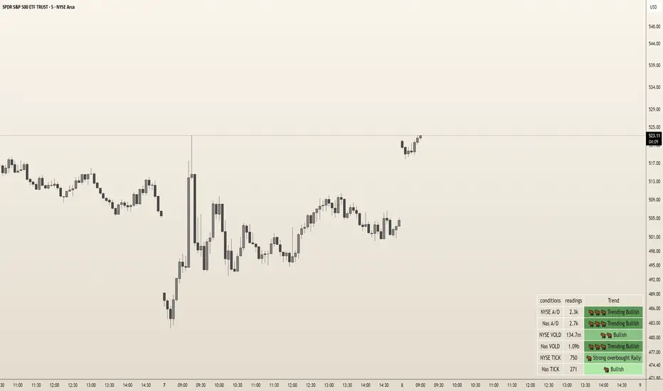
DoloresOverview
The "Dolores Trading Assistant" is a sleek and intuitive indicator designed to empower traders during the high-volatile New York trading session. This tool overlays a customizable table on your chart, presenting real-time insights from key market internals—NYSE and Nasdaq Advance/Decline (A/D), Volume Difference (VOLD), and TICK—in a clear, color-coded format. Its streamlined design focuses on delivering essential market data with trend states, making it a practical companion for assessing momentum and sentiment at a glance.
Purpose and Usefulness
Tailored for intraday traders, the Dolores Trading Assistant goes beyond price-based analysis by tapping into broad market internals to uncover the underlying forces driving the New York session. Whether you’re scalping, day trading, or monitoring short-term trends, this indicator helps you quickly gauge market direction, confirm momentum, and identify potential shifts—all from a single, visually accessible table. Its simplicity and focus on real-time data make it a valuable tool for traders seeking clarity in fast-moving markets.
How It Works
The indicator fetches live data from six vital market internals using a 1-second timeframe:
NYSE Advance/Decline (A/D) - Tracks the net balance of advancing versus declining NYSE stocks.
Nasdaq Advance/Decline (A/D) - Monitors the same for Nasdaq stocks.
NYSE VOLD - Measures the net volume difference between buying and selling on the NYSE.
Nasdaq VOLD - Captures the equivalent for Nasdaq.
NYSE TICK - Reflects the net number of NYSE stocks ticking up versus down.
Nasdaq TICK - Provides the same for Nasdaq.
These internals are processed to determine their trend states—such as bullish, bearish, or neutral—displayed in colors and emojis for instant recognition. The table organizes this data into three columns: the condition (e.g., "NYSE A/D"), its current reading (formatted for readability, like "1.2m" or "500k"), and its trend state (e.g., "Trending Bullish" or "Neutral"). This setup offers a snapshot of market health without overwhelming the user with excessive details.
Internal Signals and Their Role
Each internal signal contributes to understanding the market’s current state and the conditions you’re trading into:
NYSE and Nasdaq A/D: Reveals market breadth. Strong positive values suggest widespread buying, while negative readings indicate broad selling, helping you confirm if a move has robust participation.
NYSE and Nasdaq VOLD: Tracks volume momentum. High positive figures point to aggressive buying pressure, while deep negatives signal heavy selling, validating whether price moves are backed by volume.
NYSE and Nasdaq TICK: Captures short-term sentiment. Extreme readings highlight overbought or oversold conditions, offering clues about momentum strength or potential exhaustion.
How Signals Confirm Conditions
Trend States: Each internal’s trend state (e.g., "Bullish," "Bearish," "Trending Bearish") reflects its current momentum. Consistent bullish states across multiple internals confirm a strong upward trend, while bearish alignments suggest selling pressure. Neutral or mixed states indicate indecision or choppiness, guiding you to adjust expectations accordingly.
Visual Cues: Color-coded backgrounds (e.g., green for bullish, red for bearish) and emojis (e.g., 🐂for bullish, 🐻for bearish) make it easy to spot dominant conditions or emerging shifts, enhancing your ability to react quickly.
How to Use It
Add to Chart: Apply the indicator to any symbol (Best W/ SPY, QQQ, IWM and correlated futures securities) on a 1-second or higher timeframe. The table appears in your chosen position (default: bottom right).
Monitor Internals: Check the table for real-time readings and trend states. For example, "NYSE TICK: 800, Strong Overbought Rally" signals short-term bullish momentum.
Assess Conditions: Look for alignment across internals—e.g., multiple "Bullish" states suggest buying strength, while "Neutral" dominance warns of choppy action.
Adapt Your Strategy: Use the trend states to confirm entries, exits, or hold-off decisions. Pair with price tools (e.g., candlestick patterns) for a fuller picture.
Customize: Adjust table position, orientation (vertical/horizontal), text size, colors, and transparency via inputs to match your setup.
Customization
Tailor the experience with options for table placement (e.g., "Top Left"), text size (e.g., "Small" to "Huge"), orientation, and color schemes. Adjust transparency settings to keep the table unobtrusive yet readable.
Limitations
Requires real-time NYSE/Nasdaq data access, which may depend on your TradingView subscription.
Displays current conditions only, not predictive signals—use it as a real-time snapshot, not a crystal ball.
Best paired with price analysis for comprehensive trading decisions.
Requires a TradingView Subscription that supports the 1s Time Frame
Why It’s Original
The Dolores Trading Assistant stands out with its elegant, yet simple table-based presentation of NYSE and Nasdaq internals, distilled into an intuitive format with trend states and visual cues. Unlike cluttered dashboards or generic mashups, it offers a focused, trader-centric view of market momentum, avoiding unnecessary complexity while delivering actionable insights—making it a fresh and practical tool for the New York session.
Sentiment
FordOverview
The "Ford Trading Assistant" is an indicator crafted to support traders during the fast-paced New York trading session. This tool overlays a customizable table on your chart, delivering real-time insights from key market internals—NYSE and Nasdaq Advance/Decline (A/D), Volume Difference (VOLD), and TICK—alongside a unique Trend Score and actionable trading instructions. Its innovative design blends multiple data points into a cohesive market analysis tool, offering visual clarity and contextual guidance to help traders navigate intraday momentum shifts.
Purpose and Usefulness
Unlike typical price-based indicators, the Ford Trading Assistant taps into broad market internals to reveal underlying sentiment and momentum, making it an essential companion for intraday trading in the New York session for ETFs such as SPY/QQQ/IWM and Futures Markets(ES/NQ/RTY). It’s ideal for scalpers, day traders, and swing traders looking to confirm trend strength, spot potential reversals, or avoid choppy conditions. The indicator’s dual-table interface—one for data and signals, another for instructions—provides a streamlined way to assess current market dynamics and anticipate what’s ahead, enhancing decision-making in real time.
How It Works
The indicator pulls live data from six critical market internals using a 1-second timeframe:
NYSE Advance/Decline (A/D) - Tracks the balance of advancing versus declining NYSE stocks.
Nasdaq Advance/Decline (A/D) - Monitors the same for Nasdaq stocks.
NYSE VOLD - Measures the net volume difference between buying and selling on the NYSE.
Nasdaq VOLD - Captures the equivalent for Nasdaq.
NYSE TICK - Gauges the net number of NYSE stocks ticking up versus down.
Nasdaq TICK - Reflects the same for Nasdaq.
These internals are analyzed to determine their trend state (e.g., bullish, bearish, or neutral), displayed with color-coded backgrounds and emojis for instant recognition. The indicator then:
Assesses Trend Conditions: Evaluates the alignment of internals to identify varying degrees of bullish or bearish momentum, reflected in bar colors on the chart.
Calculates a Trend Score: Combines the strength of all internals into a single, proprietary metric that summarizes market direction and intensity.
Generates Signals: Detects changing states in market internals like reversals, acceleration, exhaustion, divergence, breakouts, and mean reversion, presented with directional cues and timestamps.
A separate instruction panel interprets these conditions, delivering guidance tailored to the market’s current state—whether it’s trending strongly, leaning one way, or stuck in divergence—helping traders understand the auction’s behavior and adjust their approach.
Internal Signals and Their Role
Each internal signal plays a distinct role in confirming the market’s current state and the conditions you’re trading into:
NYSE and Nasdaq A/D: Reflects market breadth. Strong positive readings indicate widespread buying interest, while negative readings suggest broad selling pressure, helping confirm if a move has solid participation.
NYSE and Nasdaq VOLD: Tracks volume momentum. High positive values signal aggressive buying, while deep negatives point to heavy selling, validating whether price action is supported by volume.
NYSE and Nasdaq TICK: Captures short-term sentiment. Extreme values highlight overbought or oversold conditions, offering clues about potential continuation or exhaustion.
How Signals Confirm Conditions
Trend Score: A positive score suggests bullish control, a negative score indicates bearish control, and a neutral score points to indecision. It acts as a quick gauge of overall market health with a low score of -24 and a max score of +24 with calculations based on overall internal conditions.
Reversal: Warns of potential trend shifts, triggered by significant changes in momentum or conflicting internals. Useful for exiting trends or preparing for counter-moves.
Acceleration: Highlights strengthening momentum, confirming conditions for trading a trend with confidence.
Exhaustion: Flags overextended moves, signaling fading momentum—ideal for profit-taking or fading trades.
Divergence: Indicates a disconnect between price and internals, cautioning against chasing moves that lack internal support.
Breakout: Identifies sharp momentum surges, confirming conditions for high-probability breakout trades.
Mean Reversion: Signals a pullback from extremes, suggesting a return to balance for range-bound strategies.
How to Use It
Add to Chart: Apply the indicator to any symbol (e.g., SPY, QQQ) on a 1-second or higher timeframe. It displays an "Internals Table" (default bottom right) and an "Instructions" panel (top right).
Track Internals: Watch the table for real-time data, trend states, and the Trend Score. The Bar colors also reflect the strength of bullish or bearish conditions.
Read Instructions: Use the instruction panel to understand the market’s state—e.g., "Trending Bullish" suggesting buying conditions, while "Diverging" would suggests caution.
Leverage Signals: Act on signals like "Breakout" or "Exhaustion" to enter new trades, exit old trades, manage current trades or continue to remain sidelined. Adjust table settings (position, size, colors) via inputs.
Pair with Price: Combine with your favorite price tools (e.g., support/resistance) to align internals with chart setups.
Customization
Modify the lookback period (default 100 bars), table orientation (vertical/horizontal), text size, colors, and transparency to fit your workflow.
Limitations
Requires real-time NYSE/Nasdaq data, which may depend on your TradingView plan.
Signals reflect current conditions, not future predictions, and may lag in extreme volatility.
Best used alongside price analysis for a complete trading strategy.
Requires a TradingView Subscription that supports the 1s Time Frame
Why It’s Original
The Ford Trading Assistant stands apart by integrating NYSE and Nasdaq internals into a unified, trader-friendly tool with a custom Trend Score and dynamic instructions. Rather than simply mashing up existing indicators, it offers a fresh approach to interpreting market momentum, enhanced by real-time signal detection and actionable guidance—making it a standout assistant for the New York session.

BTC Dominance Excluding StablecoinsBTC Dominance Excluding Stablecoins
Description:
The "BTC Dominance Excluding Stablecoins" indicator calculates Bitcoin's dominance as a percentage of the total cryptocurrency market capitalization, excluding the market caps of major stablecoins (USDT and USDC). Unlike the standard BTC.D ticker, which includes stablecoins in the total market cap, this indicator provides a clearer view of Bitcoin’s dominance relative to the "non-stable" crypto market. This can be useful for traders and analysts who want to assess Bitcoin’s strength without the influence of stablecoin market caps, which often skew dominance metrics during periods of high stablecoin usage.
How It Works:
Bitcoin Market Cap: Fetches Bitcoin’s market capitalization using CRYPTOCAP:BTC.
Total Market Cap: Retrieves the total cryptocurrency market cap via CRYPTOCAP:TOTAL.
Stablecoin Adjustment: Subtracts the market caps of USDT (CRYPTOCAP:USDT) and USDC (CRYPTOCAP:USDC) from the total market cap.
Dominance Calculation: Computes Bitcoin’s dominance as (BTC Market Cap / Adjusted Total Market Cap) * 100, where the adjusted total excludes stablecoins.
Output: Plots the resulting dominance percentage as a line chart.
Features:
Displays Bitcoin dominance excluding stablecoins on any timeframe.
Customizable line color and thickness for better visualization.
Provides a more accurate representation of Bitcoin’s market share in the volatile, non-stablecoin crypto ecosystem.
Usage:
Add this indicator to your TradingView chart to compare Bitcoin’s dominance against the broader altcoin market, free from stablecoin distortions. Use it alongside other indicators like BTC.D or price charts to analyze market trends, especially during periods of high stablecoin inflows or outflows.
Notes:
The indicator currently excludes USDT and USDC, the two largest stablecoins by market cap. Additional stablecoins (e.g., DAI, BUSD) can be added by modifying the script if desired.
Data is sourced from TradingView’s CRYPTOCAP symbols, which may have slight delays or variations depending on exchange data feeds.
Best used on daily or higher timeframes for smoother, more reliable results.
Author:
Created by K Du₿
Version:
Pine Script v5

50-Line Oscillator // (\_/)
// ( •.•)
// (")_(")
25-Line Oscillator
Description:
The 25-Line Oscillator is a sophisticated technical analysis tool designed to visualize market trends through the use of multiple Simple Moving Averages (SMAs). This indicator computes a series of 26 SMAs, incrementally increasing the base length, providing traders with a comprehensive view of price dynamics.
Features:
Customizable Base Length: Adjust the base length of the SMAs according to trading preferences, enhancing versatility for different market conditions.
Rainbow Effect: The indicator employs a visually appealing rainbow color scheme to differentiate between the various trend lines, making it easy to identify crossovers and momentum shifts.
Crossovers Detection: The script includes logic to detect crossover events between consecutive trend lines, which can serve as signals for potential entry or exit points in trading.
Clear Visualization: Suitable for both novice and seasoned traders, the plots enable quick interpretation of trends and market behavior.
How to Use:
Add the indicator to your chart and customize the base length as desired.
Observe the rainbow-colored lines for trend direction.
Look for crossover events between the SMAs as potential trading signals.
Application: This indicator is particularly useful for swing traders and trend followers who aim to capitalize on market momentum and identify reversals. By monitoring the behavior of multiple SMAs, traders can gain insights into the strength and direction of price movements over various time frames.

Options Chart Lite [Pt]█ Options Chart Lite
────────────────────────────
█ Introduction
Options Chart Lite is a simplified version of the full Options Chart+ tool — created for traders who want a clean and easy way to visualize option volume around price without extra complexity.
It displays live call and put volume and pricing directly on your TradingView chart, centered around the most relevant strikes for the selected expiry.
────────────────────────────
█ What Is Options Chart Lite ?
Options Chart Lite is a tool that shows real-time call and put activity in a clean, strike-by-strike table.
It provides:
- Side-by-side call/put volume and pricing
- Live table centered on current price
- Total call and put volume summary
- Quick insight into flow without overlays or clutter
────────────────────────────
█ Key Features
Visual Option Table
- Volume and price for calls and puts
- Table auto-centers around current price
- Up to 20 strikes shown
Total Volume Summary
- Call vs put volume shown at the bottom
Formatted Expiry + Timeframe
- Full expiry display (e.g. “Fri Apr 11, 2025”)
- Fixed to 1D timeframe
Reset & Warnings
- Button to reset strike range
- Optional delayed data notice
────────────────────────────
█ Inputs
Option Expiry Date (YYMMDD): Must match a valid expiry
Strike Increment: Strike spacing (e.g., 1, 2.5, 5)
Reference Strike Denominator: Rounds price to valid strike
Font Size Option: Choose Auto, Tiny, Small, or Normal
Reset Button: Re-centers if price moves
Delayed Data Warning: Toggle display of warning
────────────────────────────
█ Use Cases
Spot Key Strikes
See which strikes have the most activity.
Quick Flow Insights
Volume bias without opening an option chain.
Prep Levels
Align price action with strike flow.
Volume Skew Snapshot
Check if calls or puts dominate.
────────────────────────────
█ Known Limitations
- Invalid Expiry or Strike Inputs Will Error
Inputs must match real listed options for the symbol.
- Options Data Must Be Available
Volume will appear as 0 if TradingView data isn’t accessible.
- Strike Range is Limited
Script renders ~20 strikes. Use Reset Indicator if price moves too far.

Options Chart+ [Pt]█ Introduction
Since the launch of options data support on TradingView, the landscape for retail options traders has started to shift. But until now, no tool in the public TradingView library has offered a full-featured, visual-first interface for reading option strike activity directly from your chart.
www.tradingview.com
Options Chart+ changes that — bringing an institutional-style strike analysis interface to TradingView.
It reads the option chain for any symbol and expiry, dynamically builds a strike-by-strike volume and price table, highlights top areas of market activity, and helps you interpret directional sentiment through both total and skew-adjusted implied moves.
────────────────────────────
█ What Is Options Chart+ ?
Options Chart+ is a premium script for analyzing call and put option volumes and pricing for any option chain that's readily available on TradingView.
It provides a real-time, on-chart display of:
- Strike-Level Volume and Price Table
- Gradient Heatmaps for Volume Activity
- Overlayed Top Strikes on the Chart
- Implied Move and Directional Bias Metrics
By visualizing where options traders are concentrating their positioning, this tool helps uncover potential support/resistance zones, directional bets, and key gamma levels — all from the flow.
────────────────────────────
█ Key Features
Visual Option Chain Table
- Centers around the current price
- Real-time volume and price per strike
- Clean formatting with total summaries
Gradient Volume Coloring
- Highlights activity using customizable color gradients
- Makes volume spikes obvious at a glance
Top Strike Overlays
- Automatically highlights top volume call/put strikes
- Overlays labeled lines on the chart for price context
Implied Move and Directional Bias
- ATM straddle = Total Implied Move
- Volume-weighted extrinsics = Directional Implied Move (DIM)
- Shows skew-based bias: bullish or bearish
────────────────────────────
█ Inputs & Customization
Option Expiry Date (YYMMDD): Must match valid options for the symbol
Strike Increment: Matches strike spacing (e.g., 1, 2.5, 5)
Reference Strike Denominator: Rounds the center strike
Volume Timeframe: Any valid chart timeframe
Gradient Volume Coloring: Toggle on/off
Call/Put Volume Colors: Fully customizable
Draw Top Strike Lines: Enables chart overlays
Start / End Offset: Customize overlay length
Font Size: Auto, Tiny, Small, or Normal
Delayed Data Warning: Adds footnote in the table
Reset Button: Re-centers the tool if price moves too far
────────────────────────────
█ Use Cases
1. Spotting High-Interest Strikes
Use gradient heatmaps and overlays to see where volume is clustering.
Example: Heavy calls at 4200 may act as a magnet or gamma level — perfect for breakout or fade setups.
2. Interpreting Sentiment with DIM
Gauge where the flow is leaning directionally.
Example: Bullish DIM = call extrinsics outweigh puts → sentiment skewed bullish.
3. Sizing Risk Around Implied Movement
Use Total Implied Move to set range boundaries.
Example: Avoid selling premium inside the expected move unless risk is tight.
4. Combining Volume and Price Action
Overlay strikes with price structure for confluence trades.
Example: A heavy put strike with price holding = potential bounce zone.
5. Structuring Straddles or Strangles
Use volume skew to inform multi-leg positions.
Example: If call side is bid up, lean strangle wider to the upside.
────────────────────────────
█ Known Limitations
- Invalid Expiry or Strike Inputs Will Error
You are responsible for selecting a valid expiry and strike increment that matches the symbol’s listed options.
- Options Data Must Be Available
This tool depends on TradingView's options feed. If you do not have access (delayed or real-time), the script will fail to load.
- Strike Range is Limited
Renders ~20 strikes max to preserve clarity. If price moves beyond that, use the Reset Indicator input.
────────────────────────────
█ Final Thoughts
Options Chart+ is built for traders who operate on flow, structure, and sentiment. It lets you trade with confidence by showing where the real positioning is happening — visually, clearly, and in real-time.
If you:
- Think in terms of option flow
- Trade around volume levels or gamma exposure
- Want faster access to skew and sentiment
- Or just need clarity over chaos in an options chain...
This tool is for you.

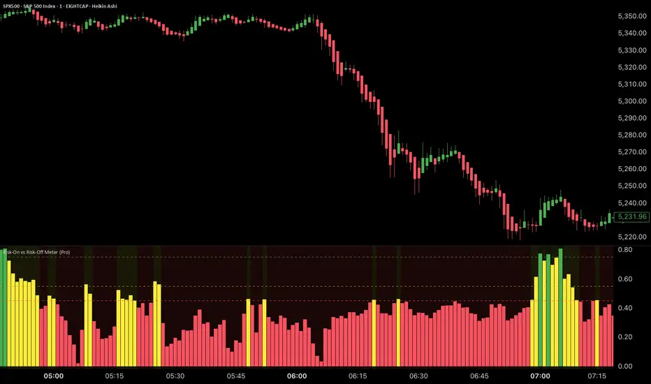
Risk-On vs Risk-Off Meter (Pro)Risk-On vs Risk-Off Meter (Pro)
This macro-based tool analyzes capital flows across key assets to gauge overall market risk sentiment. It does not use ES, SPY, or stock data directly—making it a powerful confirmation tool for ES traders looking to align with macro forces.
🔹 Core Idea:
Tracks capital rotation between copper/gold, bonds, dollar, crude oil, VIX, and yield spreads to generate a normalized risk score (0–1). This score reflects whether macro money is flowing into risk or safety.
🔹 Use:
Use this indicator as confirmation of directional bias when scalping or day trading ES.
– Green Zone (>0.75): Risk-On environment. Favor long setups.
– Red Zone (<0.45): Risk-Off. Favor short setups or stand aside.
– Yellow Zone: Neutral, use caution.
– Divergence Alerts: Signals when ES price disagrees with macro risk trend—potential reversals or exhaustion zones.
HOT TO USE
– Combine with your existing price action or order flow signals
– Avoid trading against the macro sentiment unless strong setup
– Use divergence as a heads-up for fading or exiting trades
This gives you a macro-informed lens to validate or filter your entries.
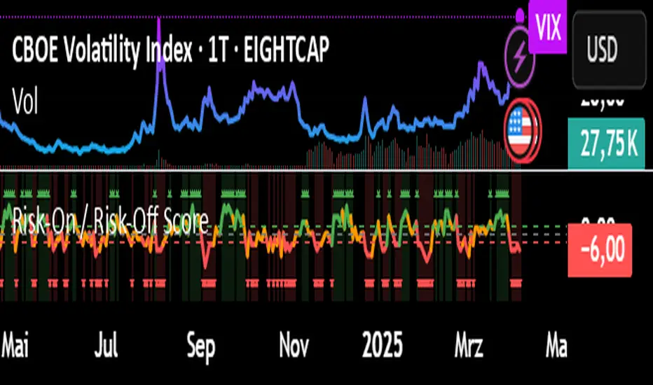
Risk-On / Risk-Off ScoreRisk-On / Risk-Off Score (Macro Sentiment Indicator)
This indicator calculates a custom Risk-On / Risk-Off Score to objectively assess the current market risk sentiment using a carefully selected basket of macroeconomic assets and intermarket relationships.
🧠 What does this indicator do?
The score is based on 14 key components grouped into three categories:
🟢 Risk-On Assets (rising = appetite for risk)
(+1 if performance over X days is positive, otherwise –1)
NASDAQ 100 (NAS100USD)
S&P 500 (SPX)
Bitcoin (BTCUSD)
Copper (HG1!)
WTI Crude Oil (CLK2025)
🔴 Risk-Off Assets (rising = flight to safety)
(–1 if performance is positive, otherwise +1)
Gold (XAUUSD)
US Treasury Bonds (TLT ETF) (TLT)
US Dollar Index (DXY)
USD/CHF
USD/JPY
US 10Y Yields (US10Y) (yields are interpreted inversely)
⚖️ Risk Spreads / Relative Indicators
(+1 if rising, –1 if falling)
Copper/Gold Ratio → HG1! / XAUUSD
NASDAQ/VIX Ratio → NAS100USD / VIX
HYG/TLT Ratio → HYG / TLT
📏 Score Calculation
Total score = sum of all components
Range: from –14 (extreme Risk-Off) to +14 (strong Risk-On)
Color-coded output:
🟢 Score > 2 = Risk-On
🟠 –2 to +2 = Neutral
🔴 Score < –2 = Risk-Off
Displayed as a line plot with background color and signal markers
🧪 Timeframe of analysis:
Default: 5 days (adjustable via input)
Calculated using Rate of Change (% change)
🧭 Use Cases:
Quickly assess macro sentiment
Filter for position sizing, hedging, or intraday bias
Especially useful for:
Swing traders
Day traders with macro filters
Volatility and options traders
📌 Note:
This is not a buy/sell signal indicator, but a contextual sentiment tool designed to help you stay aligned with overall market conditions.
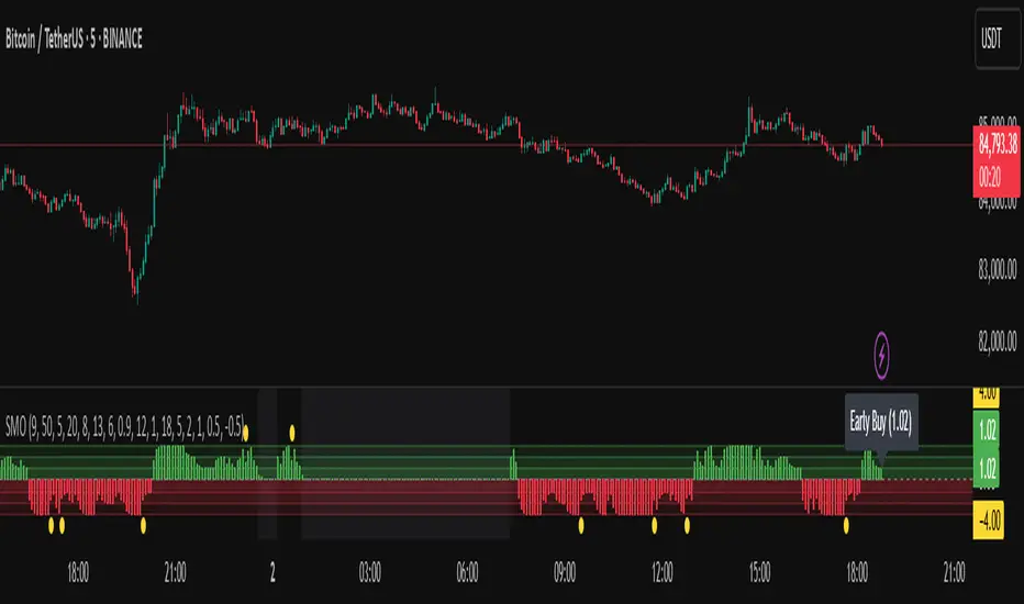
Sentiment Master Oscillator[BullByte]
The Sentiment Master Oscillator is a modern market sentiment indicator designed for traders seeking to identify early trend shifts and potential reversals with clarity. This oscillator combines multiple technical tools—RSI, MACD, EMAs, ADX, ATR, and volume filters—to deliver layered signals that help you assess market momentum in a clear and simplified manner.
Key Features:
- Multi-Indicator Approach :
Integrates RSI (with a smoothing function), MACD, and two EMAs to gauge momentum and trend direction. The oscillator also includes ADX and ATR filters to ensure that only markets with sufficient directional strength and volatility generate signals.
- Dynamic Signal Zones :
The oscillator produces a raw value ranging roughly from -3 to +3 (adjustable via a scaling factor). Positive readings suggest bullish conditions, while negative readings indicate bearish trends. Visual zones (Early, Confirmed, Strong) are clearly marked with color-coded horizontal lines to help you interpret the strength of the signal at a glance.
- Adaptive Smoothing :
For those who prefer quicker, more responsive signals (ideal for scalping), an adaptive smoothing option is available. When enabled, it applies a shorter smoothing period to the oscillator; otherwise, a more conservative base period is used.
- Reversal Alerts :
Yellow dots are plotted on the chart to highlight potential reversal points. These alerts are triggered when the oscillator crosses specific thresholds, coupled with volume and ATR conditions, signaling that a top or bottom may be forming.
- Customizable Filters :
- ATR Filter :Ensures that the market's volatility is above a set threshold before signaling.
- ADX Filter :Confirms sufficient trend strength.
- Volume Filter : Requires that trading volume surges above a multiple of its simple moving average, filtering out low-volume noise.
- Clear Signal Messaging :
Based on the combined signals from various indicators, the script categorizes market sentiment into actionable messages such as "Early Buy", "Confirmed Buy", "Strong Buy", "Early Sell", "Confirmed Sell", and "Strong Sell". A "Grey Zone" label is used when the oscillator is near neutral, indicating that no clear trend is present.
How to Use :
1. Entry and Exit Decisions : Use the different signal stages (Early, Confirmed, Strong) as guides for your entries and exits.
2. Trend Confirmation : Rely on the multi-indicator setup for added confirmation of prevailing market conditions before executing trades.
3. Reversal Cues : Pay attention to the reversal dots for potential turning points in the market, which can be used to adjust positions or initiate trades.
Disclaimer:
This indicator is intended for educational and informational purposes only. It should not be taken as financial advice. Always use appropriate risk management and combine it with your analysis before making any trading decisions. Past performance is not indicative of future results.
By adhering to TradingView's publishing guidelines, the BullByte Sentiment Master is designed to provide transparency, simplicity, and robust analysis tools to enhance your trading strategy. Enjoy a clearer view of market sentiment and make more informed trading decisions!
ATR and Moving AverageUsing ATR and Moving Average: A Technical Analysis Strategy
The Average True Range (ATR) and the Moving Average are two important technical analysis tools that can be used together to identify trading opportunities in the market. In this article, we will explore how to use these two tools and how the crossover between them can indicate changes in the market.
What is ATR?
The Average True Range (ATR) is a measure of the volatility of an asset, which calculates the average true range of an asset over a period of time. The true range is the difference between the closing price and the opening price of an asset, or the difference between the closing price and the highest or lowest price of the day. ATR is an important measure of volatility, as it helps to identify the magnitude of price fluctuations of an asset.
What is Moving Average?
The Moving Average is a technical analysis tool that calculates the average price of an asset over a period of time. The Moving Average can be used to identify trends and price patterns, and is an important tool for traders. There are different types of Moving Averages, including the Simple Moving Average (SMA), the Exponential Moving Average (EMA), and the Weighted Moving Average (WMA).
Crossover between ATR and Moving Average
The crossover between ATR and Moving Average can be an important indicator of changes in the market. When ATR crosses above the Moving Average, it may indicate that the volatility of the asset is increasing and that the price may be about to rise. This occurs because ATR is increasing, which means that the true range of the asset is increasing, and the Moving Average is being surpassed, which means that the price is rising.
On the other hand, when ATR crosses below the Moving Average, it may indicate that the volatility of the asset is decreasing and that the price may be about to fall. This occurs because ATR is decreasing, which means that the true range of the asset is decreasing, and the Moving Average is being surpassed, which means that the price is falling.
Trading Strategies
There are several trading strategies that can be used with the crossover between ATR and Moving Average. Some of these strategies include:
Buying when ATR crosses above the Moving Average, with the expectation that the price will rise.
Selling when ATR crosses below the Moving Average, with the expectation that the price will fall.
Using the crossover between ATR and Moving Average as a filter for other trading strategies, such as trend analysis or pattern recognition.
In summary, the crossover between ATR and Moving Average can be an important indicator of changes in the market, and can be used as a technical analysis tool to identify trading opportunities. However, it is important to remember that no trading strategy is foolproof, and that it is always important to use a disciplined approach and manage risk adequately.

Magnetic Trend filterMagnetic Trend Filter – A Smarter Way to Trade Trends 🚀
I’m excited to introduce a powerful trend filtering method that I’ve been working on—Magnetic Trend Filter (MTF). If you’ve ever struggled with noisy price action, false signals, or unclear trends, this indicator might be just what you need!
🔍 What is the Magnetic Trend Filter?
MTF is designed to smooth out market noise and help traders focus on clean, high-probability trend signals. It works by applying an intelligent filtering mechanism to Close price data, reducing whipsaws while maintaining trend sensitivity.
Instead of relying solely on conventional moving averages or lagging indicators, MTF adapts dynamically to market conditions, providing a more refined view of trend direction.
🎯 How it Works
• MTF processes filtered Close price data, making trends more visible.
• It reduces unnecessary price fluctuations, helping you stay in trades longer.
• The filtering mechanism ensures better accuracy in defining trend direction.
📈 How to Use It
• Buy Signals: When the trend filter turns bullish (uptrend confirmation).
• Sell Signals: When the trend filter turns bearish (downtrend confirmation).
• Combine with Other Indicators: MTF works great alongside VWAP, Bollinger Bands, and Ichimoku Cloud for added confluence.
Personally, I use it with my price range filter to catch good exits. Have added that to the Magnetic trend filter and will also publish advanced version independently.
🛠 Customization & Optimization
I’ve optimized the script to reduce computation load, making it efficient and responsive even on lower timeframes. You can tweak smoothing parameters to adjust the sensitivity of the filter based on your trading style.
📌 Final Thoughts
Magnetic Trend Filter is an efficient way to identify trends while avoiding unnecessary noise in price movements. Whether you’re a day trader or swing trader, this tool can help improve decision-making and increase trading accuracy.
💡 Try it out and let me know your thoughts! I’d love to hear feedback and explore potential improvements together. 🚀
Disclaimer:
This is for educational purpose only, no matter how promising things look on chart, they are past performances and reality may vary in real-time.
So use at your own risk.

[TehThomas] - ICT Inversion Fair value Gap (IFVG) The Inversion Fair Value Gap (IFVG) indicator is a powerful tool designed for traders who utilize ICT (Inner Circle Trader) strategies. It focuses on identifying and displaying Inversion Fair Value Gaps, which are critical zones that emerge when traditional Fair Value Gaps (FVGs) are invalidated by price action. These gaps represent key areas where price often reacts, making them essential for identifying potential reversals, trend continuations, and liquidity zones.
What Are Inversion Fair Value Gaps?
Inversion Fair Value Gaps occur when price revisits a traditional FVG and breaks through it, effectively flipping its role in the market. For example:
A bullish FVG that is invalidated becomes a bearish zone, often acting as resistance.
A bearish FVG that is invalidated transforms into a bullish zone, serving as support.
These gaps are significant because they often align with institutional trading activity. They highlight areas where large orders have been executed or where liquidity has been targeted. Understanding these gaps provides traders with a deeper insight into market structure and helps them anticipate future price movements with greater accuracy.
Why This Strategy Works
The IFVG concept is rooted in ICT principles, which emphasize liquidity dynamics, market inefficiencies, and institutional order flow. Traditional FVGs represent imbalances in price action caused by gaps between candles. When these gaps are invalidated, they become inversion zones that can act as magnets for price. These zones frequently serve as high-probability areas for price reversals or trend continuations.
This strategy works because it aligns with how institutional traders operate. Inversion gaps often mark areas of interest for "smart money," making them reliable indicators of potential market turning points. By focusing on these zones, traders can align their strategies with institutional behavior and improve their overall trading edge.
How the Indicator Works
This indicator simplifies the process of identifying and tracking IFVGs by automating their detection and visualization on the chart. It scans the chart in real-time to identify bullish and bearish FVGs that meet user-defined thresholds for inversion. Once identified, these gaps are dynamically displayed on the chart with distinct colors for bullish and bearish zones.
The indicator also tracks whether these gaps are mitigated or broken by price action. When an IFVG is broken, it extends the zone for a user-defined number of bars to visualize its potential role as a new support or resistance level. Additionally, alerts can be enabled to notify traders when new IFVGs form or when existing ones are broken, ensuring timely decision-making in fast-moving markets.
Key Features
Automatic Detection: The indicator automatically identifies bullish and bearish IFVGs based on user-defined thresholds.
Dynamic Visualization: It displays IFVGs directly on the chart with customizable colors for easy differentiation.
Real-Time Updates: The status of each IFVG is updated dynamically based on price action.
Zone Extensions: Broken IFVGs are extended to visualize their potential as support or resistance levels.
Alerts: Notifications can be set up to alert traders when key events occur, such as the formation or breaking of an IFVG.
These features make the tool highly efficient and reduce the need for manual analysis, allowing traders to focus on execution rather than tedious chart work.
Benefits of Using This Indicator
The IFVG indicator offers several advantages that make it an indispensable tool for ICT traders. By automating the detection of inversion gaps, it saves time and reduces errors in analysis. The clearly defined zones improve risk management by providing precise entry points, stop-loss levels, and profit targets based on market structure.
This tool is also highly versatile and adapts seamlessly across different timeframes. Whether you’re scalping lower timeframes or swing trading higher ones, it provides actionable insights tailored to your trading style. Furthermore, by aligning your strategy with institutional logic, you gain a significant edge in anticipating market movements.
Practical Applications
This indicator can be used across various trading styles:
Scalping: Identify quick reversal points on lower timeframes using real-time alerts.
Day Trading: Use inversion gaps as key levels for intraday support/resistance or trend continuation setups.
Swing Trading: Analyse higher timeframes to identify major inversion zones that could act as critical turning points in larger trends.
By integrating this tool into your trading routine, you can streamline your analysis process and focus on executing high-probability setups.
Conclusion
The Inversion Fair Value Gap (IFVG) indicator is more than just a technical analysis tool—it’s a strategic ally for traders looking to refine their edge in the markets. By automating the detection and tracking of inversion gaps based on ICT principles, it simplifies complex market analysis while maintaining accuracy and depth. Whether you’re new to ICT strategies or an experienced trader seeking greater precision, this indicator will elevate your trading game by aligning your approach with institutional behavior.
If you’re serious about improving your trading results while saving time and effort, this tool is an essential addition to your toolkit. It provides clarity in chaotic markets, enhances precision in trade execution, and ensures you never miss critical opportunities in your trading journey.
__________________________________________
Thanks for your support!
If you found this idea helpful or learned something new, drop a like 👍 and leave a comment, I’d love to hear your thoughts! 🚀
Make sure to follow me for more price action insights, free indicators, and trading strategies. Let’s grow and trade smarter together! 📈

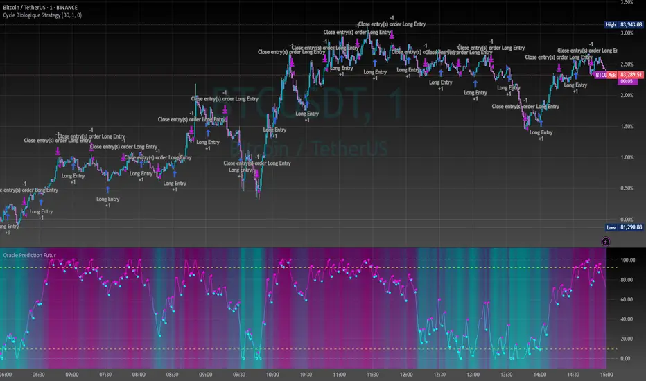
Cycle Biologique Strategy // (\_/)
// ( •.•)
// (")_(")
//@fr33domz
Experimental Research: Cycle Biologique Strategy
Overview
The "Cycle Biologique Strategy" is an experimental trading algorithm designed to leverage periodic cycles in price movements by utilizing a sinusoidal function. This strategy aims to identify potential buy and sell signals based on the behavior of a custom-defined biological cycle.
Key Parameters
Cycle Length: This parameter defines the duration of the cycle, set by default to 30 periods. The user can adjust this value to optimize the strategy for different asset classes or market conditions.
Amplitude: The amplitude of the cycle influences the scale of the sinusoidal wave, allowing for customization in the sensitivity of buy and sell signals.
Offset: The offset parameter introduces phase shifts to the cycle, adjustable within a range of -360 to 360 degrees. This flexibility allows the strategy to align with various market rhythms.
Methodology
The core of the strategy lies in the calculation of a periodic cycle using a sinusoidal function.
Trading Signals
Buy Signal: A buy signal is generated when the cycle value crosses above zero, indicating a potential upward momentum.
Sell Signal: Conversely, a sell signal is triggered when the cycle value crosses below zero, suggesting a potential downtrend.
Execution
The strategy executes trades based on these signals:
Upon receiving a buy signal, the algorithm enters a long position.
When a sell signal occurs, the strategy closes the long position.
Visualization
To enhance user experience, the periodic cycle is plotted visually on the chart in blue, allowing traders to observe the cyclical nature of the strategy and its alignment with market movements.
Emperor RSI CandleDescription:
The Emperor RSI Candle is a real-time, non-lagging trading indicator that colors candles based on RSI (Relative Strength Index) levels. It offers instant visual feedback on market momentum, making it easy to identify trend strength, overbought/oversold zones, and potential reversals with precision.
Unlike traditional RSI indicators, which display RSI values in a separate panel, Emperor RSI Candle integrates RSI signals directly into the candles, providing a cleaner, more intuitive charting experience. Its multi-timeframe RSI box shows RSI values across different timeframes, offering confluence confirmation for better trade decisions.
🔥 Emperor RSI Candle is original because it includes a multi-timeframe RSI box that displays RSI values from:
1 min → Monthly timeframes simultaneously.
📊 How this is unique:
Traders can instantly compare RSI values across different timeframes.
This helps them spot confluence and divergences, which is not possible with standard RSI indicators.
The multi-timeframe confluence feature makes the indicator highly effective for both short-term and long-term traders.
🚀 What the script does:
Real-time candle coloring based on RSI levels.
Multi-timeframe RSI box for confluence insights.
Customizable RSI settings for adaptability.
How it benefits traders:
Instant visual feedback for momentum and reversals.
No lag signals for precise trading decisions.
Flexible customization for different trading styles.
Unique visual signals:
Green, red, parrot green, and blue candles → Clearly indicating bullish/bearish momentum and overbought/oversold zones.
Multi-timeframe RSI box → For cross-timeframe confluence.
⚡️ 🔥 UNIQUE FEATURES 🔥:
✅ Multi-Timeframe RSI Box:
Displays RSI values from 1 min to monthly timeframes, helping traders confirm confluence across different timeframes.
✅ Fully Customizable RSI Levels & Display:
Modify RSI thresholds, source, and appearance to fit your trading style.
✅ Dynamic Candle Borders for Weak Signals:
Green border → Weak bullishness (RSI between 50-60).
Red border → Weak bearishness (RSI between 40-50).
✅ Lag-Free, Real-Time Accuracy:
No repainting or delay—instant visual signals for accurate decisions.
✅ Scalable for Any Trading Style:
Perfect for both intraday scalping and positional trading.
📊 🔥 HOW IT WORKS 🔥:
The indicator dynamically colors candles based on RSI values, providing real-time visual signals:
🟢 Above 60 RSI → Green candle:
Indicates bullish momentum, signaling potential upward continuation.
🟩 Above 80 RSI → Parrot green candle:
Overbought zone → Possible reversal or profit booking.
🟥 Below 40 RSI → Red candle:
Signals bearish momentum, indicating potential downward continuation.
🔵 Below 20 RSI → Blue candle:
Oversold zone → Possible reversal opportunity.
🔲 Neutral candles:
50-60 RSI → Green border: Weak bullishness.
40-50 RSI → Red border: Weak bearishness.
📊 🔥 MULTI-TIMEFRAME RSI BOX 🔥:
The Emperor RSI Candle includes an RSI box displaying multi-timeframe RSI values from 1 min to monthly. This provides:
✅ Confluence confirmation:
Compare RSI across multiple timeframes to strengthen trade conviction.
✅ Spot divergences:
Identify hidden trends by comparing smaller and larger timeframes.
✅ Validate trade entries/exits:
Use higher timeframe RSI to confirm smaller timeframe signals
⚙️ 🔥 HOW TO USE IT 🔥:
To maximize the accuracy and clarity of Emperor RSI Candle, follow these steps:
🔧 STEP 1: Chart Settings Configuration
Go to Chart Settings → Symbols
Uncheck the following options:
Body
Borders
Wick
✅ This ensures that only the Emperor Candle colors are visible, making the signals clear and distinct.
🔧 STEP 2: Style Settings for Emperor Candle
After applying the Emperor RSI Candle:
Go to Settings → Style tab
Wick section:
Select Color 2 and Color 3 → Set Opacity to 100%.
Border section:
Select Color 2 and Color 3 → Set Opacity to 100%.
✅ This ensures the candles display with full visibility and accurate colors.
⚙️ 🔥 CUSTOMIZATION OPTIONS 🔥:
Emperor RSI Candle offers full flexibility to match your trading style:
✅ RSI Length:
Modify the period used for RSI calculation (default: 10).
✅ Top & Bottom Levels:
Adjust the overbought (default: 80) and oversold (default: 20) thresholds.
✅ Intermediate Levels:
Up Level: Default: 60 → Bullish RSI threshold.
Down Level: Default: 40 → Bearish RSI threshold.
Mid Level: Default: 50 → Neutral zone.
✅ RSI Source:
Select the price source for RSI calculation (Close, Open, High, Low).
✅ RSI Period:
Customize the RSI calculation period (default: 10).
✅ Font Size:
Adjust the RSI box font size for better visibility.
✅ Box Position:
Choose where to display the RSI box:
Top Left / Top Center / Top Right
Bottom Left / Bottom Center / Bottom Right
💡 🔥 HOW IT IMPROVES TRADING 🔥:
✅ Clear trend identification:
Instantly recognize bullish, bearish, or neutral conditions through candle colors.
✅ Precise entries and exits:
Spot overbought and oversold zones with visual clarity.
✅ Multi-timeframe confirmation:
Validate trades with RSI confluence across multiple timeframes.
✅ No lag, real-time accuracy:
Immediate visual signals for faster and more reliable trade decisions.
✅ Customizable settings:
Tailor the indicator to fit your trading strategy and preferences.
✅ Works for all trading styles:
Suitable for scalping, day trading, and swing trading.
🔥How Traders Can Use Emperor RSI Candle for Trading:
🟢 Green Candles (Above 60 RSI) → Bullish Momentum:
Indicates strong upward movement → Ideal for long entries.
Traders can hold until RSI approaches 80 for profit booking.
🟥 Red Candles (Below 40 RSI) → Bearish Momentum:
Signals strong downward movement → Ideal for short trades.
Traders can exit or book profits near RSI 20.
2. Spotting Overbought and Oversold Zones for Reversals:
🟩 Parrot Green Candles (Above 80 RSI) → Overbought Zone:
Indicates potential for reversals or profit booking.
Traders can tighten stop-losses or exit positions.
🔵 Blue Candles (Below 20 RSI) → Oversold Zone:
Signals a potential reversal opportunity.
Traders can look for buy signals with confluence confirmation.
3. Catching Weak Bullish and Bearish Trends with Border Colors:
🟢 Green Border (RSI 50-60) → Weak Bullishness:
Indicates mild upward momentum.
Traders can consider cautious long entries.
🔴 Red Border (RSI 40-50) → Weak Bearishness:
Indicates mild downward pressure.
Traders can consider cautious short entries.
4. Using the RSI Multi-Timeframe Box for Confluence:
✅ Displays RSI values from 1 min to monthly timeframes.
Usage:
Confluence confirmation:
Multiple timeframes showing bullish RSI → Strong uptrend → Reliable buy signals.
Multiple timeframes showing bearish RSI → Strong downtrend → Reliable sell signals.
Spotting divergences:
If lower timeframes are bullish but higher timeframes are bearish, it indicates a potential reversal.
5. Customization Tips for Different Trading Styles:
✅ For Scalping:
Use a smaller RSI period (9-10) for faster signals.
Check the multi-timeframe RSI box to confirm signals quickly.
✅ For Swing Trading:
Use the default RSI period (14-15) for more accurate signals.
Focus on higher timeframes (1 hr, 4 hr, daily) for stronger trend confirmation.
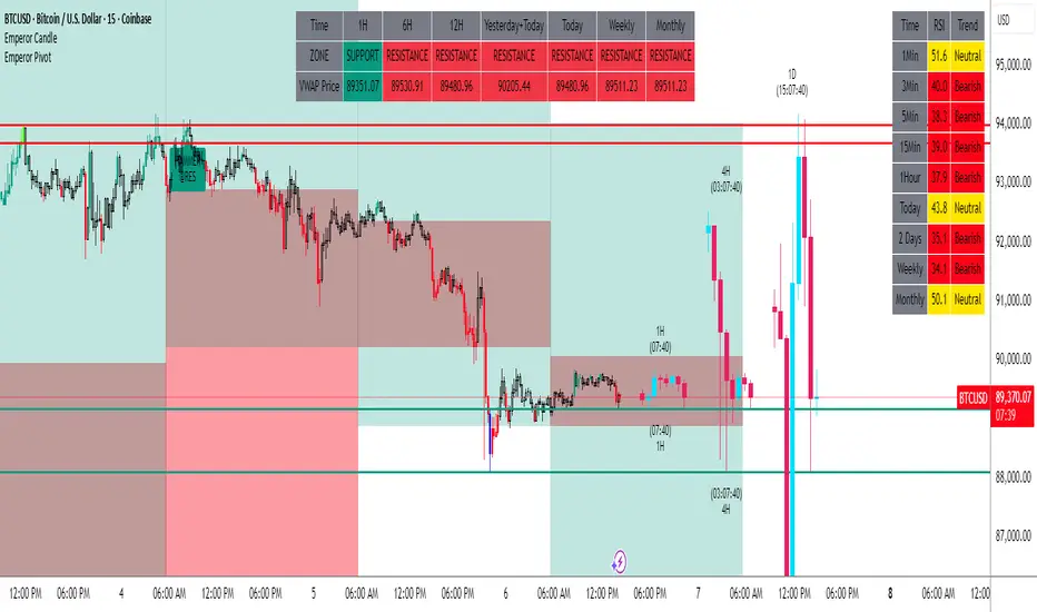
Emperor Pivot LevelsDescription:
Emperor Pivot Levels is a powerful and advanced Trading View indicator designed to help traders identify precise support and resistance zones in real-time. It combines Woodie and Camarilla pivot points across multiple timeframes, ranging from 15 min to decennial, providing a comprehensive market view. The indicator features color-coded buyer and seller zones, with a green background indicating bullish territory above the pivot and a red background highlighting bearish areas below it. With its real-time accuracy and multi-timeframe analysis, Emperor Levels of Pivot empowers traders to make informed decisions and capitalize on market trends effectively.
🔥Emperor Levels of Pivot is original because it is a unique and customized enhancement of the traditional Pivot Point Standard indicator. Unlike standard pivot indicators, Emperor Pivot offers:
Dual Pivot Calculation: It combines both Woodie and Camarilla pivot types, giving traders a broader and more versatile analysis of support and resistance levels.
Multi-Timeframe Accuracy: It displays pivot levels from 15 min to decennial timeframes, providing a comprehensive market view in a single indicator. Most standard pivot indicators are limited to fewer timeframes.
Real-Time Accuracy: Unlike many lagging indicators, Emperor Pivot shows real-time support and resistance zones, making it highly effective for live trading decisions.
Unique Color-Coded Zones: The indicator features a green buyer zone above the pivot and a red seller zone below it, offering clear visual cues to identify market bias instantly.
🚀 What the script does:
snapshot
✅ 1. Displays Pivots for Multiple Timeframes Simultaneously
The script calculates and shows pivot levels for 15 min, 30 min, 45 min, 1 hr, 2 hr, 3 hr, 4 hr, 5 hr, 6 hr, daily, weekly, monthly, quarterly, half-yearly, yearly, bi-yearly, tri-yearly, quinquennial, and decennial timeframes.
snapshot
This multi-timeframe analysis helps traders see both short-term and long-term trends without switching charts.
🎯 2. Plots Buyer and Seller Zones
snapshot
Above Pivot: The script fills the area with a green background, marking the buyer zone.
Below Pivot: The area is filled with a red background, indicating the seller zone.
This color coding provides a visual representation of market sentiment, helping traders quickly spot trends.
⚡ 3. Real-Time Updates Without Lag
The script uses real-time price data to update the pivot levels instantly. This ensures that traders get the most accurate support and resistance levels during live market conditions.
🎨 4. Visual and Customizable Display
The script offers clear and clean plotting with color-coded zones, making it easy to interpret.
It also includes distance labels from the current price to the nearest pivot, helping traders measure the market's potential movement.
🔥 5. Efficient and Lightweight
Despite its complex functionality, the script is optimized for speed and performance, ensuring it doesn’t slow down the TradingView platform, even when multiple timeframes are displayed.
🚀 In Summary:
The Emperor Levels of Pivot script is a powerful tool that:
✅ Displays multi-timeframe pivots in real time.
✅ Marks buyer and seller zones with clear color coding.
✅ Shows distance from pivots for precise trading insights.
✅ Updates instantly during live trading without time lag.
This makes it an essential and highly effective indicator for both intraday and long-term traders.
📊 🔥 HOW IT WORKS 🔥:
1. Buyer and Seller Zones
The script colors the background in two zones:
Green Background (Buyer Zone): When the price is above the pivot, indicating a bullish trend.
Red Background (Seller Zone): When the price is below the pivot, indicating a bearish trend.
These color-coded zones help traders quickly understand market sentiment.
2. Real-Time Updates
The indicator continuously updates pivot levels in real time as the price moves, ensuring that traders always have the most accurate information for decision-making.
3. Efficient Performance
Despite handling multiple timeframes and pivot calculations, the script is optimized for performance, ensuring that it runs smoothly without slowing down TradingView, even with many pivots being displayed.
In Summary:
Emperor Levels of Pivot works by calculating pivot levels using Woodie and Camarilla formulas, displaying them across multiple timeframes, and visualizing market sentiment with color-coded zones. It provides real-time, accurate, and dynamic support and resistance levels, helping traders make informed decisions quickly.
⚙️ HOW TO USE Emperor Levels of Pivot 🔥:
Here’s how you can use the Emperor Levels of Pivot to make more informed trading decisions:
1. Add the Indicator to Your Chart
First, add the Emperor Levels of Pivot indicator to your TradingView chart.
You will see pivot levels displayed for multiple timeframes (15 min, 1 hour, daily, weekly, etc.) with support and resistance levels.
2. Understand the Pivot Levels
The indicator will plot pivot levels, which act as key support and resistance levels for the market.
Support Levels (S1, S2, S3, etc.): These are price levels where the market could potentially find support and reverse or slow down.
Resistance Levels (R1, R2, R3, etc.): These are levels where the price could face resistance and reverse or stall.
3. Interpret the Color-Coded Zones
snapshot
Green Background (Buyer Zone): When the price is above the pivot, the background turns green, indicating a bullish trend. Traders may consider buying or looking for long positions in this zone.
Red Background (Seller Zone): When the price is below the pivot, the background turns red, indicating a bearish trend. Traders may consider selling or looking for short positions in this zone.
4. Monitor Multi-Timeframe Pivots
The indicator displays pivot levels for multiple timeframes. For example, a short-term (15-minute) pivot might be used for quick scalping, while a long-term (daily, weekly) pivot can provide a broader view of market sentiment.
You can compare pivot levels from different timeframes to get a better understanding of market trends. For example:
Short-term (15 min) may show immediate trends.
Long-term (daily, weekly) pivots help spot overall market direction.
5. React to Price Action
Watch for price reactions at key pivots:
If the price is approaching a resistance level and facing rejection, it may indicate a selling opportunity.
If the price is approaching a support level and bouncing back, it could signal a buying opportunity.
Reversals at key pivots often present high-probability trades.
6. Combine with Emperor RSI Candle
The Emperor Levels of Pivot indicator can be combined with other indicators, such as RSI, moving averages, or candlestick patterns, to confirm trading signals and increase the probability of a successful trade.
🔥 Key Tips for Using Emperor Levels of Pivot:
Adapt to your trading style: Whether you are scalping, day trading, or taking longer-term positions, use the appropriate timeframe pivots to match your strategy.
Set stop-loss and take-profit levels near key pivot points for better risk management.
Watch for price consolidations around pivot levels, as these often signal potential breakouts or reversals.
By following these steps, you can effectively use Emperor Levels of Pivot to guide your trading decisions, improve accuracy, and increase your chances of success in the market!
💡 HOW Emperor Levels of Pivot IMPROVES TRADING 🔥
Here’s how the Emperor Levels of Pivot can significantly enhance your trading experience and decision-making:
1. Clear Identification of Key Support & Resistance Levels
The pivot levels act as strong support and resistance zones, making it easier to identify where the price might reverse or consolidate.
By visually seeing these levels, traders can avoid getting trapped in breakouts that fail or entering trades at bad price points.
2. Real-Time Market Sentiment Understanding
The color-coded zones (green for buyer zone and red for seller zone) quickly show the market’s overall sentiment. This helps traders avoid counter-trend trades and only take positions aligned with the market's current momentum.
You’ll know instantly if the market is in a bullish or bearish phase, allowing you to align your trades accordingly.
3. Multi-Timeframe Insights for More Accurate Decisions
The multi-timeframe support allows you to view pivot levels for various timeframes (from 15 min to decennial). This means you can analyze both short-term trends and long-term market conditions, giving you a holistic view.
By combining short-term and long-term pivots, you can find the best entry points and avoid trading against the dominant trend.
4. Increased Trade Precision
The distance labels show how far the current price is from key pivot points (support/resistance), helping you assess whether the price is too far from the pivot or if a pullback is likely.
This precision allows you to set more accurate stop-loss and take-profit levels, optimizing your risk-to-reward ratio.
5. Faster Decision Making
The visual simplicity of the indicator’s color-coded zones and pivot levels allows for quick decision-making. Instead of spending time analyzing price action or trying to plot pivots manually, you can immediately spot trade setups that align with your strategy.
6. Helps Identify Breakouts and Reversals
By watching how price behaves near key support and resistance levels, you can spot potential breakouts or reversals earlier.
If price bounces off a support level (green zone) or gets rejected from a resistance level (red zone), it signals high-probability entry points.
7. Reduces Overtrading and Emotional Decisions
The clarity and structure provided by the Emperor Levels of Pivot indicator reduce the chance of overtrading. When you have a clear view of key levels, you'll be less likely to take impulsive trades based on emotions or random price movements.
8. Optimized for Intraday and Long-Term Trading
Whether you’re a scalper, day trader, or position trader, the multi-timeframe functionality provides flexibility. You can zoom into lower timeframes for quick trades or focus on higher timeframes for broader market trends.
🔥 In Summary:
Emperor Levels of Pivot improves trading by:
Providing clear, reliable support and resistance levels.
Offering a real-time view of market sentiment (buyer or seller zones).
Giving multi-timeframe insights, enhancing overall decision-making.
Increasing trade precision and optimal entry/exit points.
Enabling faster decisions for quicker execution.
Helping identify potential breakouts and reversals.
Reducing the chance of overtrading and emotional errors.
Being versatile for both intraday and long-term strategies.
By utilizing Emperor Levels of Pivot, traders can make more informed, precise, and effective trading decisions, leading to better risk management and higher success rates.

RH_SanityCheckShows a quick calculation of key pullback levels in relation to current or all time highs.
Allows you to adjust the calculation based on All time high or pick a specific date to calculate from
Intraday Volume Indicator for INDICES by TBTPH Pine Script code for an intraday volume indicator with session and lunch break highlights looks great! Here’s a summary of what each part of the script does:
Indicator Settings:
The indicator is set to show on a separate pane (overlay=false).
The SMA Length is adjustable with an input box (default of 20).
Volume and SMA Calculation:
You calculate the Simple Moving Average (SMA) of the volume over the selected length.
The volume color is determined based on whether the close price is higher or lower than the previous close and if the volume is above or below the SMA.
Volume Plot:
Volume is plotted as a histogram with different colors to indicate if the volume is higher or lower than the SMA.
You plot the SMA of the volume with an orange line for easier comparison.
Background Color:
You set a light gray background color to give a subtle contrast.
NYSE and LSE trading sessions are highlighted with green and blue, respectively.
Lunch break periods are highlighted with a white background for both exchanges.
Here are a couple of improvements or suggestions you might consider:
Session Time Overlap Handling:
If the script is applied to a chart where both NYSE and LSE data is visible, they may overlap depending on the time zone of your chart. Ensure the session times align with the active market's timezone, especially if you are using a chart with a different timezone setting.
Color Customization:
The color scheme for bullish/bearish volume could be enhanced further. For example, you could introduce more transparency for low-volume periods to make the histogram appear more subtle during less active trading times.
Handling Different Time Zones:
If your chart is not in the "America/New_York" or "GMT" time zone, be mindful of the session times. The timestamp function depends on the chart’s time zone, so ensuring you're adjusting for different markets is key.
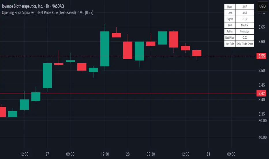
Opening Price Signal (Text-Based)Overview:
This simple yet powerful indicator quickly identifies the intraday trend direction by comparing the current price to the day’s opening price.
How it Works:
• Bullish Signal: Last price is at least +0.25 points above today’s open—suggests buying (Long).
• Bearish Signal: Last price is at least -0.25 points below today’s open—suggests selling (Short).
• Neutral: Price remains within ±0.25 points of today’s open—no trade recommended.
What’s Displayed:
• Open Price: Today’s opening price.
• Last Price: Current trading price.
• Signal: Difference between last price and today’s open.
• Sentiment: Clearly labeled as Bullish, Bearish, or Neutral.
• Action: Recommended trade direction (Long, Short, or None).
Recommended Timeframes:
• 5-Minute (ideal for precise intraday trading)
• 15-Minute (balanced clarity and noise reduction)
• 30-Minute (reduced noise, smoother signals)
Ideal Usage:
Perfect for day traders looking for a quick and clear gauge of intraday market sentiment. Use it to confirm momentum and trade confidently in the direction of the daily trend.
Happy trading! 📈✨
PumpC Opening Range Breakout (ORB) Stretch RangePumpC ORB Stretch
The PumpC ORB Stretch is a volatility-based indicator that helps traders identify potential breakout zones by analyzing how price typically behaves around the open. This tool is inspired by concepts introduced by Toby Crabel in his well-known book “Day Trading with Short-Term Price Patterns and Opening Range Breakout.”
Rather than predicting market direction, this indicator highlights areas where price is likely to expand based on recent volatility. It is designed for traders who prefer dynamic, data-driven breakout levels over static support and resistance zones.
What Is the "Stretch"?
In Toby Crabel’s framework, the Stretch is the average of the smaller of two price moves:
The distance from the open to the high of the bar
The distance from the open to the low of the bar
This smaller value captures the “quiet side” of the candle and reflects recent price compression. Averaged over multiple periods (commonly 10 daily bars), it creates a baseline to assess how far price may move away from the open under typical market conditions.
How the Indicator Works
The PumpC ORB Stretch follows this process:
Uses a higher timeframe (such as daily) to calculate the open, high, and low.
For each bar, measures the smaller of the two distances: open to high or open to low.
Applies a moving average to the result over a user-defined number of bars (default is 10).
Multiplies the average stretch by customizable levels (e.g., 0.382, 1.0, 2.0).
Plots breakout levels above and below the open of the selected timeframe.
The result is a set of adaptive levels that expand or contract with market volatility.
Customization Options
Stretch Timeframe: Choose the timeframe used for stretch calculation (default: Daily).
Stretch Length: Set the number of bars to include in the moving average.
Breakout Levels: Enable or disable individual levels and define multipliers.
Color Settings: Customize colors for each range level for easy visual distinction.
Plot Style: Circular markers are used to reduce chart clutter and improve readability.
How to Use It
Use plotted levels to anticipate possible breakouts from the open.
Adjust stretch length to reflect short-term or longer-term volatility trends.
Combine this tool with momentum indicators, volume, or price action for confirmation.
Use levels to help guide stop placement or profit targets in breakout strategies.
Important Notes
This script is based on an interpretation of Crabel’s concepts and is not affiliated with Crabel Capital or the original author.
The indicator does not predict direction; it is a tool for context and structure.
It is recommended that users test and validate this tool in a simulated environment before applying it to live trading.
This indicator is intended for educational purposes only.
Licensing and Attribution
This script is built entirely in Pine Script v5 and follows TradingView’s open-source standards. It does not include any third-party or proprietary code. If you modify or share it, please credit the original idea and follow all TradingView script publishing rules.

TICK Bias Timer with EMA Position📌 Description
This indicator tracks the time in minutes that the Exponential Moving Average (EMA) of the NYSE USI:TICK remains above or below the zero line. It serves as a powerful market breadth confirmation tool to support your intraday directional bias.
Rather than focusing on momentary TICK spikes, this tool emphasizes duration and persistence of buying/selling pressure across the entire NYSE – helping traders stay on the right side of the flow.
🔧 Features
✅ Measures how long the EMA of TICK stays above or below 0
✅ Visual plots of upward and downward pressure duration (in minutes)
✅ Background color changes based on EMA position relative to 0
✅ Automatic daily reset at a customizable time (e.g. 15:30 for RTH open)
✅ Gap filter to avoid spikes during overnight or weekend sessions
✅ Clean, minimalist design – built for real-time decision making
🎯 How to Use
EMA > 0 for 10+ minutes → sustained bullish breadth → intraday bullish bias
EMA < 0 for 10+ minutes → sustained bearish breadth → intraday bearish bias
Frequent flip between sides → uncertain or choppy market → trade with caution
Can be used in confluence with Volume Profile, VWAP, price action, and Bookmap to reinforce trade setups.
💡 Ideal For:
Scalpers looking for flow confirmation
Day traders who want to filter fake strength/weakness
Professionals using TICK, USI:ADD , USI:VOLD , and other internals for decision-making

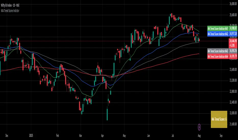
MA Trend ScoreA Trend Score Indicator inspired by an interview by Navy Ramavat, where I liked the idea presented and decided to publish a script for it.
Disclaimer: I am not associated with Navy Ramavat in any manner.
The goal is to objectify the trend of an instrument and calculate a score which represents the trend strength and direction.
The score is calculated as follows:
If price is > EMA 20 add 1 to the score
If price is > EMA 50 add 1 to the score
If price is > EMA 100 add 1 to the score
If EMA 20 is > EMA 50 add 1 to the score
If EMA 20 is > EMA 100 add 1 to the score
If EMA 50 is > EMA 100 add 1 to the score
If EMA 20 is < EMA 50 deduct 1 from the score
If EMA 20 is < EMA 100 deduct 1 from the score
If EMA 50 is < EMA 100 deduct 1 from the score
The highest score can be 6, and lowest score can be -6
The trend score can be used as per your discretion on the long and short side.
An example of using the trend score on the long side for position sizing is:
100% position size if Score greater than 4
75% position size if Score between 2-4
50% position size if Score between 0-2
25% position size if Score between 0 and -2
0% position size if Score is less than -2
Ranked Parabolic Curve Detector (Adaptive + Reversion Aware)The Parabolic Curve Detector is a smart, adaptable trading signal engine designed to help you spot true momentum — not the flashy head-fakes, but sustained, accelerating moves that have the potential to go parabolic. Whether you’re new to trading or looking to sharpen your edge, this tool combines a suite of time-tested and modern techniques into one unified signal, all while adjusting to changing market conditions.
The core idea is simple: detect when price is not just rising, but accelerating, like a curve bending upward. To do that, the script analyzes the log of price and calculates both:
Slope1: how fast the price is moving (momentum)
Slope2: how fast that momentum is changing (acceleration)
Over a user-defined number of bars (which amounts to sensitivity ), the script checks for consistency. So, for example, if both slope1 and slope2 have been positive for 4 bars, that’s a strong signal.
But it doesn’t stop there.
The key is weighted Intelligence
What makes this tool uniquely customizable is that each layer of signal logic is weighted:
Slope1 and Slope2: You can assign how much these matter (e.g., 60% for slope1, 20% for slope2)
Ichimoku Trend Filter: A bullish setup (Tenkan > Kijun) can contribute to the total score
RSI Context: The indicator checks for overextension (RSI > 70 and falling) and mean-reversion potential (RSI < 45 and rising), adjusting scores accordingly
You can fine-tune these weights to match your trading style — whether you prefer to catch early momentum, ride mature trends, or fade reversals.
Finally, there is adaptive Intelligence . This isn’t a static signal. The indicator auto-adjusts its strictness using:
Slope Flip Rate: If price changes direction frequently, the required bar count increases
Volatility (ATR): In volatile markets, the threshold for signal confirmation tightens to avoid noise
You can turn this adaptive behavior on or off. When enabled, it makes the script self-tuning across timeframes — more reactive on clean moves, more skeptical in chop.
How to Use It
Start on a log-scaled daily chart
Enable the indicator and optionally turn on Adaptive Sensitivity
Look for:
Green Circles = bullish signal with favorable RSI + trend
Orange Circles = still bullish, but possibly overextended
For bearish setups, enable Parabolic Drops in settings
I am still experimenting with it, so if you find a better way to use it, let us know!
My suggested tweaks :
sensitivity: 3–5 for normal, higher for stricter
signalThreshold: 0.7–0.85 depending on how picky you want to be
Weights for slope1/slope2/trend
RSI boost/penalty levels
Sentiment OscillatorIn the complex world of trading, understanding market sentiment can be like reading the emotional pulse of financial markets. Our Sentiment Oscillator is designed to be your personal market mood translator, helping you navigate through the noise of price movements and market fluctuations.
Imagine having a sophisticated tool that goes beyond traditional price charts, diving deep into the underlying dynamics of market behavior. This indicator doesn't just show you numbers – it tells you a story about market sentiment, combining multiple financial signals to give you a comprehensive view of potential market directions.
The Sentiment Oscillator acts like a sophisticated emotional barometer for stocks, cryptocurrencies, or any tradable asset. It analyzes price changes, market volatility, trading volume, and long-term trends to generate a unique sentiment score. This score ranges from highly bullish to deeply bearish, providing traders with an intuitive visual representation of market mood.
Green zones indicate positive market sentiment, suggesting potential buying opportunities. Red zones signal caution, hinting at possible downward trends. The oscillator's gray neutral zone helps you identify periods of market uncertainty, allowing for more calculated trading decisions.
What sets this indicator apart is its ability to blend multiple market factors into a single, easy-to-understand indicator. It's not just about current price – it's about understanding the deeper currents moving beneath the surface of market prices.
Traders can use this oscillator to:
- Identify potential trend reversals
- Understand market sentiment beyond price movement
- Spot periods of market strength or weakness
- Complement other technical analysis tools
Whether you're a day trader, swing trader, or long-term investor, the Sentiment Oscillator provides an additional layer of insight to support your trading strategy. Remember, no indicator is a crystal ball, but this tool can help you make more informed decisions in the dynamic world of trading.
