Triple Correlation Signal by COCOSTATriple Correlation Signal by COCOSTA
Concept
Bitcoin experiences violent swings driven by large liquidations and panic selling. During these chaotic market events, Bitcoin often decouples from its usual correlation patterns with traditional assets like gold, copper, and equity indices.
This indicator identifies these critical moments when an asset simultaneously loses correlation with three major reference assets—a phenomenon that typically signals oversold conditions and extreme market dislocations .
How It Works
The Triple Correlation Signal monitors the correlation coefficient between your primary asset and three customizable assets. Simply apply it to any chart—the signals will trigger based on that asset's correlation behavior.
Default Setup: Bitcoin (BTC1!)
Gold (GC1!) - Safe-haven asset correlation
Copper (HG1!) - Industrial/economic growth correlation
NASDAQ-100 (US100) - Technology/equity market correlation
When all three correlations fall below zero simultaneously , the indicator triggers a signal. This rare multi-asset decorrelation event suggests that the asset has decoupled far beyond normal trading ranges—often indicating extreme selling pressure that has pushed prices to unreasonable levels .
Signal Visualization
The indicator displays signals as vertical lines that span the full chart height when all three correlations drop below zero. A semi-transparent red background also highlights periods when the signal condition is active. This neutral visual representation avoids implying a specific directional bias.
Universal Application
This indicator works on any ticker or asset class . Simply change the chart to your desired asset and adjust the three correlation symbols to match different market combinations:
Stocks: Compare against sector indices, VIX, and bond futures
Commodities: Compare against currencies, equity indices, and related commodities
Forex: Compare against central bank proxies, commodity indices, and equity markets
Why Use BTC1! (CME Bitcoin Futures)
For Bitcoin specifically, use BTC1! (CME Bitcoin Futures) rather than spot BTCUSD. Since traditional assets like gold (GC1!) and copper (HG1!) trade on CME with market hours, using BTC1! ensures synchronized trading sessions and accurate correlation measurements . The 24/7 spot market can create timing mismatches that distort correlation readings.
Trading Application
Signal triggers = Potential capitulation events and oversold extremes
Best used with other confirmation indicators (support levels, RSI, volume analysis)
Customizable correlation length (default: 62 bars) and asset symbols to match any strategy
Finding Your Edge
Experiment with different asset combinations for your trading interest. If you discover particularly effective correlation combinations—especially for underexplored assets—feel free to reach out. Your insights help COCOSTA continuously improve market analysis tools.
Key Insight
When massive liquidations force panic selling, assets temporarily break their normal relationships with other markets. The Triple Correlation Signal catches these precise moments—your edge in identifying when any asset has been sold below reasonable value.
Created by COCOSTA | Advanced Market Analysis Tools
Sentiment
Consolidation Value Zones (Recio)Consolidation Value Zones introduces an original algorithm to identify consolidation ranges and locate areas of importance within them. This new method "looks" at the chart and draws zones based on price with the goal of producing actionable zones which appear natural, as if they were found through a human analysis.
> Consider the following...
The chart image above displays Bitcoin, at no specific date, for no specific reason. What I have done here is simply glanced at the chart for about 5 seconds, and circled a few areas which stood out as "obvious" consolidation. It does not take a savant to look at a chart and circle ranging price. However, what we have just done defies many common systems for identifying consolidation. We have located ranges of various zone lengths, as small as roughly 25 bars to as large as roughly 100 bars. Regardless of this, we still determined these zones with our eyes and brain in a few seconds, for some it's practically instant. The issue with us humans doing this, is that we are subjective. We did not really use any concrete rules to determine these areas with our eyes. So the problem becomes "How do we identify these zones in a way which seems natural to us with a repeatable system?" Because of this, my approach is simply a logical attempt to reverse engineer our human intuition.
> Consolidation Value Zones
The name of this indicator is generic. To dissect it, we are identifying consolidation ranges, then using a volume profile to determine the value zone within that range. The specific method used to identify these consolidation zones is something I've personally been referring to as the "skewer" method. Another name that may fit better is "Linear Range Alignment/Overlap".
Ultimately, the goal is to locate a single price level or range that overlaps many adjacent bars.
This should, in theory, return areas of visually obvious consolidation.
> The Skewer Method (Identification Method & Bar Gap Allowances)
One consistent concept across the different identification methods for determining consolidation is time. How long do we chop around before calling it consolidation? This is the "Identification Threshold". Once we have located a consolidation zone "this" wide, we will then consider it as consolidation.
In the chart image above, we are considering a six-bar consolidation formation. The figure on the left shows an example of a perfect raw bar overlap, we can see that the six bars all overlap at one price range. This is a perfect example of what we are looking to identify as consolidation. Unfortunately, if this was all we looked at, we would have a very scarce identification method.
For that reason, we have the example on the right, which shows the additional allowances for the identification of these ranges. At most, the example on the right shows a gapless three-bar overlap. However, if we allow the identification to bridge across the gaps, we are able to draw a zone directly through the center and still be within our parameters. This allowance is the "Bar Gap Allowance" and will determine the leniency of the identification.
Between our identification threshold and bar gap allowance, we can start to piece together how the script is "looking" at our chart.
> Detecting Consolidation (Live Detection)
To aid in transparency and user understanding, the live detection calculation can be seen on the chart as a box, skewering the recent historical bars with a number next to it, indicating the number of bars found as potential consolidation.
As we can see in the chart image above, the script, by default, is looking for a 15-bar consolidation, with a 5-bar gap allowance. In the image, the specific gap count is labeled, we can see the script scan backwards as far as it can before counting five gaps in the data. Once that occurs, the detection stops.
Notice how the zone found is a range, consisting of all price levels which meet the parameters. The lower level of the range only had two gaps, but the upper level reached five.
> Consolidation Range and Value Zones (Volume Profiles)
Once the script has identified the consolidation formation, it calculates a volume profile across the identified consolidation range. From this it calculates and draws the Point of Control (POC) and Value Area in addition to the full consolidation range.
Once we have our zones drawn, and understand what they identify, we can go one step further and apply concepts from volume profile trading.
Range High/Low: Displays the current extent of the identified consolidation.
Value High/Low: Shows the specific area within the consolidation where buyers and sellers found the most value.
POC: The single point, where the most volume was transacted during consolidation.
In a balanced market, we would anticipate price to rotate around POC, oscillating from Value High (VAH) to Value Low (VAL). In contrast, a market in motion moves directionally, building volume at new price levels as value, naturally the POC shifts with it.
> Zone Extensions
Unlike many other scripts, there is no mitigation logic at play here, since crossing a zone simply tells us "buyers and sellers are not currently active here", but it does not guarantee that value cannot return or react from previous areas of value.
Obviously the current zone will always be most relevant, but historical zones can retain relevance depending on the context of the market.
Remember: Each area of consolidation is an area where buyers and sellers were once facing off, resulting in price's consolidation. Amidst this, the value zone was the area of greatest agreement between the participants at that time. When moving outside of a range, we would typically look at historical value areas and price's interaction with them for further context.
Due to the ever changing market, there is no fixed extension lookback that will cover every scenario. By default, the Extension Lookback is "1", meaning the script will extend the most recent zone forward until a new zone is detected.
Note: For clarity, zone extensions are colored differently from core zones.
The following chart image shows a few examples of these unique interactions.
As seen in the chart image, looking to previous areas of value as well as POC can provide context in the form of acceptance or rejection at these levels, providing further insight into the auction for us to respond to.
The zones do contain logic to maintain a clean display. By default, the zones extend conditionally when price returns to the previous consolidation range. If desired, the zones can be extended regardless of price action; this can be toggled with the option "Regardless Extension Mode", as seen below.
> Hollow Candles & Zone Merging
When consolidation is identified, a hollow candle is drawn; these can be used to see exactly when each zone is identified. It is important to understand that consolidation zones stemming from the same origin are merged into one zone. This is a frequent occurrence when the consolidation threshold is passed, but the consolidation continues. For this reason you will often see multiple hollow candles in the later areas of the zones.
Similarly, zones from different origin points that overlap are also merged into one consolidation zone. This ensures that no core zones overlap.
Additionally, every time a zone is merged, a new volume profile for the area is calculated.
> Bar Gap Allowance Type (Technical Explanation)
The specific bar gap allowance value can be altered, but so can the type of allowance being used. While some analyses may benefit from counting the total amount of bar gaps within the consolidation, others may benefit from detecting based on consecutive bar gaps.
The chart image above displays the gap counts for each gap allowance type.
The total bar gap allowance type will count until the gap amount is reached, then terminate detection once the allowed number of gaps has been exceeded.
The consecutive bar gap allowance type resets its count once it finds a valid bar within range, by doing so, it only counts the bars that separate each island of in-range bars.
Both methods have merit.
> Implementation
This identification method has proven effective to identify consolidation across market types. As a result, there cannot be one configuration of settings to fit every application. Adapting the detection type and method for each trader's specific market conditions is highly recommended.
When determining parameters, it is helpful to consider time, as it plays a major role in the identification method.
On a 1D chart, the default threshold of 15 corresponds to 15 days, or about 3 weeks depending on the ticker. To identify periods of one-week consolidation, a threshold of 5 would be suitable. To detect perfect gapless weeks, a bar gap allowance of 0 could be used, as seen in the chart image below.
Additional Example:
In the chart image above, we see a 15-second forex chart over the span of a few hours. The detection parameters are set up to detect 15-minute consolidation with a 2-minute max dead zone (consecutive bar gap).
> Detection Source
By default, the script detects consolidation ranges using the full extent of candle wicks. While this is traditional, detection can also be done using only the candle bodies. These identifications are much more nuanced, detecting only from confirmed candle price action; they do not trigger at the same frequency as wick detection.
Optionally, a "Wick/Body Average" can be chosen as the source for detection; as the name implies, this uses the average value between the candle body and its respective wick.
> Additional Settings
The settings mentioned thus far serve as core parameters for identifying consolidation. The following parameters are simply included for the benefit of the advanced user. It is not recommended to adjust these settings under normal circumstances.
- Value Area Percent: Default = 68.26, while traditionally 70 for volume profiles, 68.26 is accurate to the values of a standard bell-curve distribution. The differences are minimal in application.
- VP Rows: Default = 99, Sets the number of rows to be used when calculating the Volume Profiles (VP); note that higher values will lead to a slower calculation. Max value: 999
> Final Notes
If you have made it this far, thank you for reading.
I hope you find value in this new consolidation identification system and understand the logic behind it.
That's it.
Skrip berbayar

Gold vs. Dollar Sentiment Map [SB1]🟡 Gold vs Dollar Sentiment Map
The Gold vs Dollar Sentiment Map reveals the direct inverse relationship between Gold Futures (GC) and the U.S. Dollar Index (DXY) — one of the most reliable global risk-sentiment gauges.
It helps traders instantly identify whether capital is flowing into safety (Gold) or into the Dollar (risk assets) during any session or timeframe.
🔍 Core Logic
Risk-Off (Bearish background = Red): DXY ↓ and Gold ↑ → investors seeking safety, rising fear or falling yields.
Risk-On (Bullish background = Green): DXY ↑ and Gold ↓ → investors rotating into risk assets, stronger USD demand.
Neutral (Gray): Mixed signals – no dominant macro driver.
📊 Dashboard
A compact on-chart table displays real-time trend bias for:
Gold (GC) – Bullish / Bearish / Neutral
U.S. Dollar Index (DXY) – Bullish / Bearish / Neutral
Color shading reflects each asset’s intrabar momentum.
⚙️ Visual Features
Adaptive background colors to show sentiment shifts.
Strong candle markers highlighting momentum bars near range extremes.
Alerts for clear Risk-On / Risk-Off alignment.
🧭 How to Use
Red background (Risk-Off): Gold strength + Dollar weakness → favorable environment for long gold setups.
Green background (Risk-On): Dollar strength + Gold weakness → bias toward short gold or avoid long exposure.
Gray background: Stay patient; look for confirmation or wait for alignment.
💡 Ideal For
Gold and Forex traders monitoring macro rotation.
Sentiment confirmation alongside order-flow, VWAP, or volume-delta tools.
Overlaying on intraday or higher-timeframe charts to frame trade bias.

Contango/Backwardation Monitor
This is an indicator to display the spread difference between two products. I designed it around VX1! and VX2! but any other two products can be chosen. It is a simple subtraction of VX2-VX1. I will go through the options first and what they do followed by what contango/backwardation is in my own words. You will need the data package for VX futures for the default version to work.
INPUTS
-Apply Smoothing: choose to apply smoothing or not.
-Smoothing Method: choose between SMA,EMA,WMA, etc.
-Line Width: Width of line if line is chosen style(can be changed in style section)
-Threshold 1-5: This is the level at which the line will change colors(defaults are for VX)
-Color 1-5: The color the line will change to when crossing threshold.
Towards Backwardation: Background color change when line is slanted down
Towards Contango: Background color change when line is slanted up
Bars to Confirm Trend: This is my method to cut down on background color changes. It is how many bars consecutive going back needed to change color.
STYLE
-All colors and whatnot can be changed here(threshold colors can be changed here or on the input page).
T1 Line-T5 line: These are simple horizontal lines that can be used to denote threshold areas or whatever you want.
Contango/Backwardation-These terms are used mostly with futures to define the calendar spread between two contracts. Contango is when that spread is is getting longer and backwardation is when that spread is closing. In terms of VIX futures, Contango would imply that volatility is stabilizing and the S and P will likely gain. Backwardation, woudl eb the opposite.
The most simple way to read this indicator with default settings- If the line is up, red, and the background is red, then you can assume S and P prices are going down. And if the opposite is true, then prices are likely going up.
Please feel free to ask any questions and I will do my best to answer them.

Breakout ScannerThis is a Breakout Scanner that shows you the immediate trend across 4 higher timeframes for up to 10 different tickers. It calculates a score from 1 to 3 for bullish and -1 to -3 for bearish based on where price is currently at compared to the previous higher timeframe’s candle levels.
When price is breaking out of the previous higher timeframe candle’s range, then it will have a score of 3 for bullish breakout or -3 for bearish breakout. When price is above the high or below the low of multiple different higher timeframe candles, you can expect price to continue the breakout and move to a new area of price range.
The brighter red or green the color is, the stronger the trend is on that timeframe. When it shows a bright green or red box on the far right side of a ticker, it is notifying you that the ticker is bullish or bearish on all timeframes and trending strongly, so switch over to that chart and look to trade in the direction of that trend.
The tickers, colors and time frames can be customized to suit your preference and you can also turn off as many tickers or time frames as you’d like if you want less tickers or time frames to show up on the indicator. It also includes alerts for when all timeframes are bullish or all timeframes are bearish for one ticker.
Make sure to keep each timeframe set to a timeframe that is higher than your chart timeframe.
Bullish Scoring & Colors
If the current candle close is above the midline of the higher time frame candle, it is given a score of 1 and a dark green background. If the current candle close is above the higher timeframe candle body, then it is given a score of 2 and a medium green background. If the current candle close is above the high of the higher time frame candle, it is given a score of 3 and a bright green background.
The higher the score the stronger the bullish trend and the brighter green the color will be.
Bearish Scoring & Colors
If the current candle close is below the midline of the higher timeframe candle, it is given a score of -1 and a dark red background. If the current candle close is below the higher timeframe candle body, then it is given a score of -2 and a medium red background. If the current candle close is below the low of the higher timeframe candle, it is given a score of -3 and a bright red background.
The lower the score, the stronger the bearish trend and the brighter red the color will be.
Total Score Display
On the right side of the indicator table, there is a column that displays the total score by adding all the scores together so you can easily tell the overall strength of the trend across all timeframes. Wait for the trend score to be at least 75% of the possible score to trade so you can ensure you are only trading very strong trends and increase your probability of winning your trade. The total score will update according to how many time frames you have enabled in the settings. You can also turn on or off the total score count if you prefer. The default setting is off.
All Timeframe Trends Agree
When all of the timeframes that you have turned on are in the same direction at the same time, a green or red box will appear on the far right side of the scanner. This is a visual cue that lets you know the strongest trending markets without having to read any of the numbers. Make sure to check out the charts for the markets that have a green or red box on the far right side and look for potential trend trading opportunities.
Alerts
You can set alerts for when all time frames for a certain ticker are bullish or bearish. If you have some time frames turned off at the time of creating your alerts, then it will only require all time frames that are on to be all bullish or bearish to generate an alert. Make sure to set your alerts to once per bar close to ensure you don’t get premature alerts that aren’t yet valid.
Best Way To Use The Scanner
For best results, make sure you wait for the trend to show all bullish or all bearish at the same time and then look to trade in the direction of the strong trend. If you can be patient enough to do that, you will increase the probability of winning your trade because you are trading with the direction of the overall higher timeframe trend when the market is trending strongly and making new highs or lows.
When one of the markets in the scanner shows all timeframes trending, go to that chart and see how price action is reacting to the previous higher timeframe candle levels. You can see those levels easily by adding our Higher Timeframe Candle Levels indicator to your chart and using the same timeframes as your Breakout Scanner is using.
If price is holding the higher timeframe candle levels well, then look to place trades in the direction of the trend that the Breakout Scanner is showing.
Other Indicators To Pair This With
Use this in combination with our Higher Timeframe Candle Levels indicator so you can see all of these levels being used to calculate the trend strength scores and watch how price reacts to those levels. You should also use our Trend Strength Indicator to easily read the historical trends of price compared to the higher timeframes and use those trends to guide you on when to trade and which direction to trade.
Trend Strength Indicator, Higher Timeframe Candle Levels and the Breakout Scanner all use the same levels to calculate the trend scores so they are designed to work all together to help you quickly be able to read a chart and find what direction to trade in.

Trend Strength IndicatorThis is a Trend Strength Indicator that shows you the immediate trend and historical trend of price for up to 7 higher timeframes.
It shows the strength of each timeframe by showing a red or green dot based on where price is at compared to the previous higher timeframe candle. The brighter red or green the dot is, the stronger the trend is compared to that higher timeframe candle.
The colors and timeframes can be customized to suit your preference and you can also turn off as many timeframes as you’d like if you want less time frames to show up on the indicator.
It also includes alerts for when all timeframes are bullish or all timeframes are bearish.
Keep these timeframes set to higher time frames than your chart so you can trade in the direction of the overall higher timeframe trend.
Bullish Scoring & Colors
If the current candle close is above the midline of the higher time frame candle, it is given a score of 1 and a dark green dot. If the current candle close is above the higher timeframe candle body, then it is given a score of 2 and a medium green dot. If the current candle close is above the high of the higher time frame candle, it is given a score of 3 and a bright green dot.
The higher the score the stronger the bullish trend and the brighter green the dot will be.
Bearish Scoring & Colors
If the current candle close is below the midline of the higher timeframe candle, it is given a score of -1 and a dark red dot. If the current candle close is below the higher timeframe candle body, then it is given a score of -2 and a medium red dot. If the current candle close is below the low of the higher timeframe candle, it is given a score of -3 and a bright red dot.
The lower the score, the stronger the bearish trend and the brighter red the dot will be.
Trend Scoring Modes
We gave you the option to set the trend scoring mode to either score based on price above or below the midline for quick and easy trend identification, or using the midline, candle body and highs and lows to give you a more detailed view of the trend strength. You can switch between these modes by selecting your preferred mode in the settings panel. The default is Open, High, Low, Close + Midline.
Sending Trend Direction To External Indicators
We coded in the ability to use the trend strength score as a signal that you can use to filter other indicators. This feature is great for notifying signal generating indicators what direction the market is trending in so that the signal generating indicator only gives signals in the direction of the trend.
This feature works by providing a data output of 1, 0 or -1. 1 means the trend is bullish, 0 means the trend is neutral and -1 means the trend is bearish.
This score is calculated by using the score of each timeframe that is turned on and checking if all timeframes are in the same direction or not. So if 3 timeframes are turned on and they are all bullish, the indicator will provide a data output of 1. This tells your external indicators that the trend is bullish.
This data output can be found in the data window and is labeled Trend Direction To Send To External Indicators.
At the bottom of the settings panel, there is a setting called Trend Score Threshold For External Indicators. This setting is the score threshold that all timeframes will need to meet to allow a trend strength signal to go through. So if set to 1, then all timeframes must be scored 1 or higher for bullish or -1 or lower for bearish. If set to 2, then all timeframes must be 2 or higher for bullish or -2 or lower for bearish. If set to 3, then all timeframes must be 3 for bullish or -3 for bearish. If all timeframes have met this threshold, then a bullish or bearish signal can be sent to your external indicator as a trend filter.
Labels
There are labels to the right of each row of dots, telling you which timeframe is which so you can easily identify what timeframe each row is showing the trend for.
Alerts
You can set alerts for when all timeframes are bullish or when all timeframes are bearish. If you have some time frames turned off at the time of creating your alerts, then it will only require all timeframes that are on to be all bullish or bearish to generate an alert. Make sure to set your alerts to once per bar close to ensure you don’t get premature alerts that aren’t yet valid.
Backtesting
This indicator helps you quickly identify and backtest the trend direction, how strong that trend is on multiple timeframes and helps you spot reversals and trend continuations. Make sure you look back at a lot of historical data to see how price moves when trend changes take place and how well price continues in each direction compared to the overall trend. This will help you gain confidence in reading the indicator and using it to your advantage when trading.
Best Way To Use The Indicator
This indicator is designed to help you quickly identify the trend on various different timeframes. The brighter the green dots are, the stronger the bullish trend is. The brighter the red dots are, the stronger the bearish trend is.
Trade in the direction of the trend. If the colors are mixed green and red, then price is likely to chop back and forth, so only trade the extremes of the ranges when that happens.
When most of the lower timeframe dots are the same color, that means it is a strong trend and you should place trades in the direction of the trend to be safe. The lower timeframes will start trending before the higher timeframes, so take notice of the lower timeframe colors starting to agree with each other and then take advantage of the trend that is forming.
You can also spot reversals with this indicator by watching for the lower timeframes to start changing color after a strong trend in one direction. The lower timeframes will start to change color one by one, indicating that the trend is actually changing direction.
For best results, make sure you wait for the trend to show all bullish or all bearish at the same time before you place any trades. If you can be patient enough to do that, you will increase the probability of winning your trade because you are trading with the direction of the overall higher timeframe trend which is typically an easy way to win more trades. Of course wait for pullbacks during the trend so you can keep a tight stop loss after entering your trade.
If you are scalping, you can turn off the higher timeframes and just use the 1 hour through 1 day. This won’t be as reliable as using all timeframes and waiting for them to align, but it is suitable for scalping quick intraday movements.
Other Indicators To Pair This With
Use this in combination with our Higher Timeframe Candle Levels indicator so you can see all of these levels being used to calculate the trend strength scores and watch how price reacts to those levels. You should also use our Breakout Scanner to find other markets with strong trends so you always know which market is trending the strongest and can trade those. Trend Strength Indicator, Higher Timeframe Candle Levels and the Breakout Scanner all use the same levels and calculate the trend scores the same way so they are designed to work all together to help you quickly be able to read a chart and find what direction to trade in.
DEMI Spaghetti IndicatorCorrelation Pairs Spread Trader
🎯 Purpose
This indicator is specifically designed for correlation spread trading between highly correlated cryptocurrency pairs. Each color group represents two assets that typically move together, allowing traders to identify spread trading opportunities when the correlation temporarily breaks.
📊 How It Works For Spread Trading
Color-Coded Correlation Groups: Similar colors = correlated pairs
Spread Visualization: The difference between lines shows the spread between correlated assets
Mean Reversion Signals: When correlated pairs diverge significantly, it creates potential mean reversion opportunities
💡 Trading Strategy
Identify Correlated Pairs (same color group)
Monitor Spread Divergence - when percentage changes differ significantly
Enter Spread Trades:
Buy the underperforming asset
Sell the outperforming asset
Wait for Correlation Restoration - profit when spread narrows back to normal
🎨 Correlation Groups:
🔴 Red Group: ARB/SUI - DeFi tokens
🔵 Blue Group: 1INCH/CRV - DEX tokens
🟢 Green Group: AXS/MANA - Gaming/Metaverse
🟣 Purple Group: SHIB/DOGE - Meme coins
🟦 Teal Group: ALGO/DOT - Layer 1 protocols
⚪ Yellow/White: ETH/BTC - Market leaders
Morning Straddle Backtest + Range Filter Morning Straddle Backtest
Purpose:
This script tests a Morning Straddle concept where a trader enters both long and short breakout orders based on the overnight range (22:00–06:00 by default).
It is designed for backtesting the effectiveness of volatility breakouts following low-volume overnight sessions.
Setup
Overnight session: 22:00–06:00 (adjustable).
At the end of the overnight session, the script automatically places:
A long stop order above the range high.
A short stop order below the range low.
Both use an ATR-based buffer for cleaner breakouts (default 5%).
When one side triggers, the opposite order is cancelled if OCO mode is active.
Adjustable Parameters
- Session - Defines the overnight hours used for the range.
- ATR Length - Number of bars used for ATR calculation.
- ATR Buffer % - Distance above/below range for entry & stop placement.
- Risk:Reward Ratio - Determines the TP distance relative to SL.
- Stop-Loss - Choose between “Behind Range” or “Mid-Range (50%)” with ATR buffer added.
- OCO - Cancels opposite order once one side triggers.
- Close All EOD - Closes all open trades at the end of day (default 22:00).
- Range Filter – Enables filtering of trades only when the overnight range size falls within a defined threshold.
-Min Range / Max Range – Define acceptable range size boundaries.
-Display Units – Select whether the filter is measured in Price Change, Pips, or Points.
- Stats Panel Settings – Toggle visibility, position (Top/Bottom Left/Right), and background opacity.
Visual
The overnight range (22:00–06:00) is highlighted on the chart with a teal background for clarity.
No lines are drawn for the high and low.
Strategy Notes
Works best on 5m or 15m charts where the overnight range can be clearly defined.
Backtests should be run over multiple months to gauge performance consistency.
Can be adapted for other markets by adjusting session times and ATR settings. For example, S&P initial balance breakout using 14:30-15:30 range time.
Stats Panel Displays
- 20-Day Range Data: Maximum, Average, and Minimum range sizes.
- Today’s Range: With automatic classification — Huge, Normal, or Small.
- Average Winning Range: Average size of the overnight range on profitable days.
- Average Losing Range: Average size of the overnight range on losing days.
- Filter Status: Displays whether the range met the filter criteria — Range OK, Skipped, or Off.

The Sentiment Indicator - Ultimate Hybrid v2(image shown of chart is not the coloured candles - message for a screenshot)
The Sentiment Indicator – Ultimate Hybrid v2
Most indicators react. This one anticipates.
Using dual-timeframe sentiment normalization, it blends institutional money flow, market participation, global risk appetite, and adaptive momentum into one real-time composite score — then colours your candles from blood red (panic) to deep green (conviction).
What You See
Dark Green Candles = Institutional buying confirmed
(Filtered by volume, flow, and participation — no fakeouts)
Early Warning Flash = Short-term sentiment collapsing while price still high
→ Your edge to exit or hedge before the drop
Dynamic Thresholds = Levels shift with market regime — never static
Trend Boost Engine = Rewards sustained moves, punishes chop
Built for Real Traders
Works on SPY, QQQ, IWM, stocks, futures, crypto
No repainting | No lookahead | Fully transparent logic
Top-right dashboard shows every layer in real time
Dark Green Gate™ blocks false strength signals
How It Works (The Edge)
We analyse 12 major assets and over 20 institutional-grade metrics — including:
Smart money flow (volume-weighted, momentum-adjusted)
Market breadth (% of stocks above key MAs)
Global risk-on/risk-off signals (equities, bonds, commodities, EM)
VIX regime penalties
Up/down volume panic ratio
All fused into one adaptive composite score using dual-timeframe normalization (long-term stability + short-term sensitivity).
Key Inputs You Control
Primary Lookback (default: 40) – Core sensitivity
Early Warning Threshold (default: -15) – Catch tops early
Money Flow Weight (default: 50%) – Prioritize volume action
Dark Green Gate™ – ON/OFF – Blocks false strength signals
Exclusive Features
Early Warning System™ – Flashes when short-term sentiment collapses while price is still high
Dynamic Thresholds – Auto-adjust to current market volatility
Trend Boost Engine – Rewards sustained moves above the 150-day MA
Dark Green Gate™ – Requires volume + flow + price confirmation for top-tier signals
Works Everywhere
SPY, QQQ, IWM, ES, NQ, stocks, crypto
Work on daily, weekly
Real-time dashboard with every layer visible
Stop reacting. Start anticipating.

MarketCap + BVPSMarketCap + BVPS
Fundamental Summary Table Version 1 is currently being tested on the Israeli market and some stocks from the American market
Releasing a version after the data has been tested
And there is also interesting information that emerges from this indicator
עברית
טבלת סיכום פונדמנטלי גרסה 1 כרגע בדוקה על השוק הישראלי ועל כמה מניות מהשוק האמריקאי
משחרר גרסה לאחר שהנתונים נבדקו
וגם יש מידע מעניין שעולה מן האינדיקטור הזה! (מוזמנים לבדוק)
High/Low from Set Period with LabelsMark high and low from a set period.
I use it to mark Overnight Low and High of FDAX instrument, to achieve that :
- you need to use candle chart
- you need to use regular trading hours ( to include overnight trades )
- you need to set that on M2 timeframe
- you need to set time begin : 17:30
- you need to set time end : 08:58
- when it will be drawn in 09:02, then let extend it via a hand and then you can disable
Issues :
- it will be visible after finished miminum period time :
-- after 2 minutes on M2 ( 9:02 )
-- after 5 minutes on M5 ( 9:05 )
etc ...

DAX Sectors OverviewIt's a table with a realtime read of DAX sectors, their changes in the day, weight for the whole DAX index.
Weights are fixed values defined in the script - recommended to refresh them periodically.

TrendMaster V2TrendMaster V2 is a comprehensive Pine Script indicator designed for TradingView. It combines multiple technical indicators and an advanced scoring logic to provide actionable trading signals. The script is highly customizable, allowing users to adjust trading modes, color themes, and signal filters according to their preferences and risk tolerance.
Key Features
Composite Scoring System:
The script calculates a composite score based on trend, momentum, pattern recognition, volume, volatility, divergence, Pearson correlation, and the CCI index. This score helps identify the best buy or sell opportunities.
Customizable Parameters:
Users can choose between “Aggressive,” “Balanced,” or “Conservative” trading modes, adjust indicator periods, and customize the color scheme of all visual elements.
Confluence Analysis:
The script evaluates the number of matching bullish or bearish signals, providing a confluence summary for higher-confidence trades.
Visual Signals:
Clear visual cues (triangles, circles, crosses) are displayed on the chart for strong buy/sell signals, confluences, and divergences.
Information Panels:
Two panels display real-time data such as score, RSI, volume, volatility, Pearson, CCI, trend, signal, and mode, along with the confluence status for quick reference.
Alert Conditions:
The script supports alerts for strong buy/sell signals, confluences, and divergences.
How It Works
Main Configuration:
Users select a trading mode (Aggressive, Balanced, or Conservative) and a color theme (Dark or Light).
Custom colors can also be set for bullish, bearish, strong, neutral, and signal elements.
Technical Indicators
Moving Averages (SMA/EMA) for trend analysis.
RSI to assess momentum and overbought/oversold conditions.
MACD for trend confirmation.
Volume and Volatility (ATR) for market activity evaluation.
Advanced Indicators
Pearson Correlation to measure trend strength.
CCI for cyclic momentum analysis.
Pattern Recognition
The script identifies common bullish and bearish reversal patterns (e.g., engulfing, hammer, morning/evening star) and continuation patterns (e.g., three white soldiers/black crows).
Composite Score
Each indicator contributes to a composite score, weighted according to the selected trading mode.
The score determines the strength of buy/sell signals.
Confluence Analysis
The script counts the number of matching bullish or bearish signals, providing a confluence summary for higher-confidence trades.
Visual Signals and Alerts
Strong buy/sell signals: triangles
Confluence signals: circles
Divergences: crosses
Alerts are triggered for strong buy/sell signals, confluences, and divergences.
Usage Instructions
Add the script to your TradingView chart.
Adjust the settings in the configuration panel to match your trading style.
Monitor the information panels and visual signals to spot trading opportunities.
Set up alerts for your preferred signal types.

NQ 55 LEVELSlevels to top and bottom tick
These levels top and bottom tick a lot of the times, use your own confluences to make them work

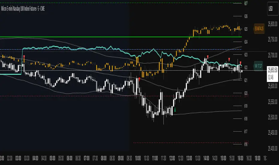
ES VIX on MNQ🧭 ES + VIX Overlay on MNQ
This indicator overlays the ES (S&P 500 futures) and VIX (Volatility Index) directly on the MNQ (Micro Nasdaq Futures) chart, allowing traders to visualize in real time the correlation, divergence, and volatility influence between the three instruments.
⸻
⚙️ How It Works
• The VIX is dynamically rescaled to the MNQ’s daily open, so its moves appear on the same price scale.
• The ES line is projected based on its percentage move relative to the session open (18:00 NY).
• Both are plotted in sync with MNQ to expose relative strength and divergence zones that often precede strong directional moves.
⸻
🧩 Inputs
• VIX Symbol: choose between VIX, CBOE:VIX, TVC:VIX
• Invert VIX Correlation: flips the VIX line for inverse-correlation setups
• VIX Step: controls how sensitively the VIX moves on the MNQ scale
• ES Symbol: defines the ES contract (e.g. ES1!)
• Show Signals: toggles on/off buy & sell markers
• Step (points): minimum distance between MNQ and VIX for a valid signal
• Block Signals: disables signals between 16:15 – 03:15 (illiquid hours)
⸻
💡 Signal Logic
The system tracks crossings between MNQ and the projected VIX line:
• Buy signal → when MNQ crosses above the VIX and expands upward by ≥ X points.
• Sell signal → when MNQ crosses below the VIX and expands downward by ≥ X points.
A time filter avoids noise during low-volume sessions.
⸻
📊 Visual Guide
• Cyan line = VIX on MNQ scale
• Orange line = ES on MNQ scale
• Labels on the right = current VIX / ES values
• BUY/SELL markers = potential volatility-based reversals
⸻
🚀 Practical Use
Perfect for traders who monitor:
• VIX–price divergence
• ES vs MNQ momentum confirmation
• Early volatility expansions before trend moves
⸻
💬 Core Idea:
“Volatility leads — price confirms.”
ES on MNQES on MNQ — ES percent-move overlay on the MNQ price scale.
Overview
This indicator projects the ES’s intraday percent change since session open onto the MNQ price scale. At the session start (18:00 chart time), it stores the ES open and the MNQ open, tracks ES’s percentage move from that anchor, and applies the same percent move to the MNQ open. The result is a single line that behaves like ES but is plotted in MNQ points—useful for spotting convergence/divergence, failed breaks, and mean-reversion setups between ES and MNQ.
How it works
1. Detects session open (18:00 on your chart).
2. Saves ES_open and MNQ_open.
3. Computes pct = (ES_close - ES_open) / ES_open.
4. Plots MNQ_open * (1 + pct) as the ES-on-MNQ line.
A label on the last bar shows the current ES value for quick reference.
Inputs
• ES Symbol: default ES1! (change if you use a different continuous).
• Line Color: color of the overlaid ES-on-MNQ line.
Works best on intraday timeframes and when your chart’s session aligns with ES.
Why it’s useful
• Highlights divergences (MNQ decoupling from ES baseline).
• Aids confirmation on pullbacks/breakouts when MNQ’s move disagrees with the ES-based projection.
• Helps risk control by flagging stretches likely to revert toward the ES-anchored path.
Notes & limitations
• This is a percent-rebasing overlay, not a hedge ratio, fair value, or spread model.
• Session/timezone settings matter; if your feed doesn’t print exactly at 18:00 on a higher timeframe, use a smaller TF or adjust session settings.
• Minor differences between ES (full) and MNQ (micro) and data latency can create small offsets.
Disclaimer
For educational use only. Not financial advice. Use proper risk management.
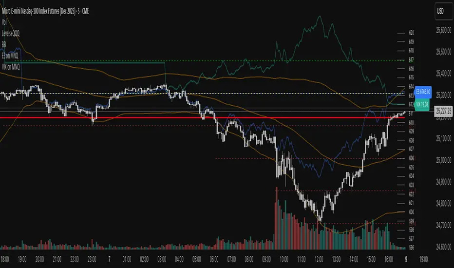
VIX on MNQVIX on MNQ — VIX percent-move overlay on the MNQ price scale (daily-open anchor, optional inversion)
Overview
This indicator projects the VIX’s intraday percent change from the daily open onto the MNQ price scale. It takes today’s open for both VIX and MNQ, measures the VIX’s percentage move since that open, optionally inverts it (given the typical inverse relationship), and applies a scale factor to fit that move onto MNQ’s price axis. The result is a single line that reflects VIX dynamics but is plotted in MNQ points—great for reading risk-on/risk-off tone, spotting divergences, and timing mean-reversion around volatility spikes.
How it works
• Fetches VIX close on your chart timeframe and today’s open for VIX and MNQ.
• Computes pct = (VIX_close − VIX_open) / VIX_open.
• Optionally multiplies by −1 (invert) and then by a Scale Factor to compress amplitude.
• Plots MNQ_open * (1 + pct * (invert? −1 : 1) * scaleFactor) as the VIX-on-MNQ line.
• Adds a last-bar label with the current VIX value and a small info panel (VIX, % change, scaled level).
Inputs
• VIX Symbol: VIX, CBOE:VIX, or TVC:VIX (pick the one that matches your data feed).
• VIX Line Color: color of the overlay line.
• Invert VIX: flip the sign to reflect inverse correlation with MNQ.
• Scale Factor (default 0.05): tune how much of the VIX move is mapped onto MNQ points.
Why it’s useful
• Surfaces volatility-led divergences: when MNQ’s path disagrees with VIX’s risk signal.
• Helps confirm/fade breakouts and pullbacks during volatility expansions/compressions.
• Provides a quick, visual “volatility baseline” directly on the MNQ chart without juggling two panes.
Notes & limitations
• This is a percent-rebased overlay, not a hedge ratio, fair value, or spread model.
• It anchors to the current day’s open; session/timezone settings and your VIX symbol choice (CBOE:VIX vs TVC:VIX) can affect exact prints.
• The scale factor is intentionally manual—adjust until the overlay’s swings are visually informative for your setup.
Disclaimer
For educational use only. Not financial advice. Always manage risk.

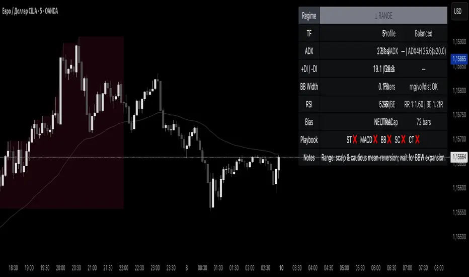
Reddington Regime Panel + PlaybookReddington Regime Panel + Playbook
On-chart market regime panel and strategy playbook for use with ReddingtonBotAdaptive Signal.
Shows the current regime (Trend / Correction / Range), key metrics (TF, ADX, +DI/−DI, BB Width, RSI), directional bias, and a Playbook with live recommendations for the ReddingtonBotAdaptive Signal strategies ST / MACD / BB / SC / CT:
✅ Use
⚠ Use with caution / extra condition
❌ Avoid
This script is a context filter. Pair it with ReddingtonBotAdaptive Signal to decide when its entries are most appropriate.
What it does
Classifies the market on your chosen timeframe into:
TREND UP / TREND DOWN / CORRECTION UP / CORRECTION DOWN / RANGE.
Guides strategy selection for ReddingtonBotAdaptive Signal via a compact on-chart table.
Multi-timeframe & multi-asset: works on any symbol and exchange; calculations are performed on the selected timeframe via request.security.
Clean UI: table only (top-right). No lines, no shapes, no price-scale impact.
How it works (logic)
Uses standard, transparent components:
EMA(20) / EMA(34) — directional structure and mean.
DMI/ADX(14) — trend strength and side dominance (+DI vs −DI).
Bollinger Band Width(20) — volatility compression/expansion.
ATR(14) — normalizes EMA “confluence/flatness”.
RSI(14) — “healthy pullback” bands in corrections.
Regime definitions (summary):
TREND UP/DOWN — ADX ≥ trend threshold, +DI/−DI confirm direction, EMA20/34 aligned, not in heavy squeeze.
CORRECTION UP/DOWN — price between EMA20 and EMA34 within a trend, ADX between range/trend thresholds, RSI in pullback band.
RANGE — ADX ≤ range threshold and/or EMAs “confluent” (flat) with low BB Width.
Playbook mapping for ReddingtonBotAdaptive Signal
The panel renders a line like: ST ✅ MACD ✅ BB ⚠ SC ✅ CT ❌
TREND UP / TREND DOWN
ST ✅, MACD ✅, SC ✅, BB ⚠, CT ❌
Trade with trend. For BB, prefer confirmed expansion (BB Width ↑ & ADX ↑).
CORRECTION UP / CORRECTION DOWN
ST ✅, SC ✅, MACD ⚠, BB ⚠, CT ❌
Wait for impulse resumption (ADX uptick / BBW expansion) after EMA20/VWAP retest.
RANGE
SC ✅, CT ⚠, ST ❌, MACD ❌, BB ❌/⚠
Mean-reversion/scalps inside the corridor; BB only if early expansion emerges.
✅/⚠/❌ are heuristics. Tune thresholds per asset/timeframe if needed.
Inputs (essentials)
Regime timeframe — empty = use chart TF.
ADX Trend/Range Thresholds — default 25 / 20.
EMA Fast/Slow — 20 / 34.
BB Width Length — 20.
ATR Length — 14.
EMA confluence vs ATR (×ATR) — flatness sensitivity (default 0.20).
BBW squeeze factor (vs BBW SMA) — compression sensitivity (default 0.90).
Correction RSI bands — pullback zones for up/down trends.
Show Playbook — toggle recommendations row.
How to use with ReddingtonBotAdaptive Signal
Filter first, then act: take Adaptive entries only when the Playbook shows ✅ for that strategy in the current regime.
Confirm at bar close on the regime timeframe to avoid MTF “in-bar” fluctuations.
Best practice:
Trading TF: 5–15m
Regime filter TF: 15m–1h
Raise ADX Trend to 28–30 on noisy assets; set BBW squeeze to 1.0 on volatile alts.
Notes & limitations
This is an analytical tool, not an entry/exit system.
No alerts by design (panel only). You can add alerts in your entry script.
MTF values update until the higher-TF bar closes; for strict discipline, use confirmed bars.
Disclaimer
This script is for educational purposes only and is not financial advice. Trading involves risk, including the loss of capital. Past performance does not guarantee future results. By using this script, you acknowledge that you are solely responsible for your trading decisions.
Magnificent 7 Basket This indicator is engineered for traders focused specifically on the seven most influential technology stocks (At the time of writing). It moves beyond single-asset analysis by establishing a sophisticated multi-factor validation system. Its primary mission is to filter out the noise and transient volatility of the local chart you are observing by determining whether the price action is fundamentally aligned with the coordinated capital flow driving Market Leadership (the Magnificent 7) and Global Risk Appetite (the U.S. Dollar Index, DXY).
The indicator achieves this by integrating three distinct data streams—local momentum, Mag 7 synchronized flow, and DXY context—into one final, powerful metric: the Self-Confirming Line (the Combined Plot). This line is a statistically refined score that provides the ultimate signal. It tells you, with high conviction, if the local move you are observing is merely an isolated event or is genuinely supported by coordinated capital deployment across the most influential assets in the market: Apple (AAPL), Microsoft (MSFT), Alphabet (GOOGL), Amazon (AMZN), Nvidia (NVDA), Tesla (TSLA), and Meta Platforms (META). This validation is crucial because trades that lack systemic backing are often high-risk, low-reward propositions.
Part I: The Alignment Philosophy – Systemic Context in Modern Markets
1. Market Leadership: The Magnificent 7 Index as a Capital Flow Barometer
The Mag 7 basket is not simply an aggregate of large stocks; it is the thermometer of risk appetite for the highest-value technology companies. Their collective momentum serves as a real-time proxy for the conviction of institutional capital managers.
The Necessity of Validation: When one of the seven stocks flashes a buy signal, the movement must be checked against the collective health of the Mag 7. If one stock is rising while the basket is stagnating or declining, the local move is likely based on short-term news or a temporary enthusiasm spike. Such moves often lack the institutional commitment required for sustained follow-through.
High-Conviction Bullish Confirmation: Imagine one of the seven stocks is completing a bullish pattern breakout. If the indicator confirms that the Mag 7 basket is simultaneously exceeding its adaptive volatility threshold (M7s signal), it signifies a coordinated "risk-on" movement. This confirms that the market leaders are validating the sentiment on your chart, greatly increasing the probability that the breakout will continue. The Self-Confirming Line will reflect this powerful alignment by spiking higher than the local Raw Line.
Contradiction and Caution (Bearish Warning): Conversely, if one of the seven stocks shows a deep, alarming pullback, but the Mag 7 basket is holding firm or showing synchronized positive inertia, the indicator issues a warning. The local pullback is likely a shallow, temporary correction that will quickly be bought up by liquidity flowing among the leaders. By identifying this contradiction, the Self-Confirming Line warns against premature bearish entries that are swimming against the overwhelming systemic current.
2. Global Risk Appetite: The DXY as the Inverse Barometer
The DXY (U.S. Dollar Index) measures the value of the dollar relative to a basket of six major foreign currencies. Because the Dollar is the world's primary reserve currency and a dominant component of global liquidity, its strength or weakness profoundly impacts risk assets, particularly the globally operating Magnificent 7 technology companies.
DXY Strength (The Headwind): A rising DXY signals a tightening of global liquidity, a shift toward safer assets, or the repatriation of capital. For U.S.-based technology giants with substantial international revenue, a strong DXY acts as a systemic Headwind. This structural drag can suppress equity prices even if local earnings news is good. The indicator uses this relationship to penalize the final sentiment score, cautioning you to reduce leverage or size.
DXY Weakness (The Tailwind): A falling DXY suggests greater risk tolerance and capital moving out of safe havens. This creates a powerful systemic Tailwind for the technology sector. The indicator magnifies the conviction score when the local price movement is aligned with this liquidity flow, validating the strength of the bullish move.
Part II: Core Mechanics and Calculation Detail – The Engine Room
The indicator is built upon a layered system of filters and adaptive calculations to produce a reliable, filtered signal.
1. The Basket Calculation and The Adaptive Threshold
The Mag 7 basket's external validation score is generated through a rigorous, multi-step calculation. This process ensures the signal is based on the aggregate quality of momentum, not just raw price movement.
A. Calculating the Basket Total Score (BTS)
Individual Component Fetch: The script first makes seven distinct request.security calls to simultaneously fetch the price data for each of the seven Magnificent 7 stocks, ensuring they are all synchronized to the current bar's close time.
Individual Quality Scoring: For each of the seven stocks, the system calculates a proprietary Momentum Quality Score. This score is based on the stock’s closing strength, its raw Moving Average divergence, and most importantly, its current RSI Strike Batch (detailed below). This step ensures poor-quality moves (e.g., short-lived, high-volume spikes that immediately reverse) do not contribute meaningfully to the basket’s total conviction.
Aggregation: The seven Individual Quality Scores are summed up to create the Basket Total Score (BTS). This BTS represents the instantaneous, aggregated momentum quality of the entire market leadership group.
Standard Deviation Context: The script then calculates the historical standard deviation (volatility) of the BTS over the user-defined Basket Adaptive Lookback. This provides the essential context: How significant is the current BTS movement relative to recent systemic volatility?
B. The M7 Labels (Statistical Significance + Quality Filter)
The M7 confirmation labels (M7s, M7m, M7w) that appear on the price bars are generated only when two conditions are met, acting as a two-factor authentication system for systemic strength: on the left of the labels is a number representing how many of the 7 stocks reached RSI on the viewable timeframe. These labels appear in blue below for buying and orange above in selling pressure.
Statistical Significance (Standard Deviation Check): The current Basket Total Score (BTS) must exceed its historical standard deviation by a defined multiple:
M7w (Weak/Initial): BTS > 1.0 Standard Deviation
M7m (Medium/Confirmation): BTS > 1.5 Standard Deviations
M7s (Strong/High Conviction): BTS > 2.0 Standard Deviations
RSI Quality Check (Accumulation Filter): The collective RSI Strike Batch Count (explained below) for the Mag 7 must indicate a measured accumulation rather than an exhaustion spike. The M7 label will only print on the bar if the combined RSI quality of the basket is within the desirable RSI Strike Batches (55-75). If the BTS is statistically significant (Condition 1) but the underlying RSI profile of the components suggests exhaustion (RSI > 80), the M7 label is suppressed, filtering out false-breakout signals.
The M7 label is thus a powerful confirmation: the move is statistically massive and structurally healthy.
2. RSI Strike Batches and Identifying "Hot Periods"
The core of the "Accumulation Filter" relies on proprietary RSI target ranges, called RSI Strike Batches, designed to find measured, persistent institutional flow as opposed to retail-driven extremes.
A. Defining RSI Strike Batches
Instead of treating the Relative Strength Index (RSI) as a binary overbought/oversold signal, the system uses distinct bands that correlate with different phases of large capital deployment:
RSI Range (Batch)
Interpretation
Momentum Quality
55-65
Early Accumulation/Distribution
The first phase of clear directional bias. Large capital actively establishing positions. This is the highest momentum zone.
65-75
Sustained Trend/Mid-Cap Deployment
Strong follow-through. Trend continuation is confirmed, but liquidity is starting to thin.
75-80
Late-Stage Euphoria/Liquidity Trap
Price is nearing exhaustion. The risk of quick reversal is high. This range penalizes the score.
B. The "Hot Period" Confirmation
A Hot Period is identified when a significant number of Mag 7 components are simultaneously operating within the highest quality momentum zones (RSI 55-65 or 65-75).
Detection: The indicator counts how many of the seven stocks fall into these bullish or bearish strike batches on the current bar.
Conviction Magnification: When, for example, four or more of the Mag 7 stocks are simultaneously in the RSI 55-65 Bullish Strike Batch, it signals synchronized, coordinated capital deployment across the sector. This is a true "Hot Period" of high institutional conviction.
Signal Output: When a Hot Period is detected, the external validation score (which feeds into the Self-Confirming Line) is magnified significantly. This prevents the system from generating high-conviction signals during periods when all the leaders are simply exhibiting exhausted overbought (RSI > 80) conditions, ensuring trades are entered during the measured, sustained phase of accumulation.
Part III: Interpreting the Sentiment Plot Lines – Alignment and Divergence
The indicator plots two distinct lines at the bottom of the chart. Mastering the interplay between these two plots is the key to trading with the indicator.
Sentiment Line
Data Source
Interpretation Focus
Key Use Case
AAI Sentiment Index (The Raw Line)
Internal to the current chart only.
Local Momentum. Measures the asset's own strength, volatility, and internal MA crosses.
Identifying early, pre-validated trade setups, confirming local divergences (e.g., price higher, Raw Line lower).
Self-Confirming Line (The Combined Plot)
Raw Line + Mag 7 Score + DXY Weight.
Systemic Alignment. The final, filtered score validated by external market leadership and global risk context.
The primary signal for trade entry/exit confirmation, position sizing, and determining true conviction.
A. High-Conviction Alignment (The Trade Confirmation)
High-conviction trades occur when the two lines move in synchronized fashion, with the Self-Confirming Line leading or sustaining a level significantly higher than the Raw Line.
Example: High-Conviction Long Entry:
Raw Line Fires: Your local chart begins to move up, and the Raw Line (local momentum) breaks above the centerline. This is your initial setup alert.
Self-Confirming Line Confirms: The Self-Confirming Line immediately follows, not just crossing the centerline, but often exceeding the Raw Line's initial height. This powerful action confirms the Mag 7 leaders are providing a strong synchronized push (M7s signal likely fired, confirming a Hot Period).
Action: This is the ideal moment for a confirmed trade entry, allowing for larger position sizing and a higher expectation of follow-through.
B. Cautionary Divergence (The Risk Filter)
Divergence occurs when the two lines fail to agree, signaling a disconnect between the local price action and the systemic market support.
Example: Bearish Trap Divergence (A Long Warning):
Raw Line Fires Strongly: Your local asset is rocketing up, and the Raw Line spikes to an extreme high (e.g., +80).
Self-Confirming Line Lags: Despite the local spike, the Self-Confirming Line remains flat, moves only slightly, or—critically—starts declining.
Interpretation: This is a severe warning. The local spike is likely a short-term liquidity event. The other six Mag 7 leaders are not confirming this move, or the DXY is suddenly acting as a Headwind. The system is telling you: "The market is not buying this move."
Action: Avoid entering long, or significantly reduce position size. This pattern often precedes a sharp reversal or a failed breakout.
Part IV: Deep Dive into Setting Customization – Adapting to Your Asset
1. AAI Sentiment Weight (% - Balance Slider)
This controls the balance of importance between the local chart's internal momentum and the external indices' input.
Focusing on Individual Stock Volatility (TSLA, NVDA):
Goal: Focus primarily on the local chart's own volatile swings, using the external data as a soft, contextual filter.
Action: Increase the AAI Sentiment Weight (e.g., 70-80%). This forces the Self-Confirming Line to closely track the Raw AAI Line.
Trading Stable, High-Cap Leaders (AAPL, MSFT):
Goal: Demand strong external validation for every signal. Ensure that movement is overwhelmingly validated by the other Mag 7 members.
Action: Decrease the AAI Sentiment Weight (e.g., 20-30%). The Self-Confirming Line becomes heavily influenced by the Mag 7 Basket Momentum Score.
2. Individual Stock MA Weight (% - Basket Importance)
This setting determines the proportional importance of the Mag 7 basket score within the total external component of the calculation.
High Weight: When trading one of the Mag 7 stocks that is highly sensitive to the overall basket flow. This ensures signals fire with high conviction only when the leadership stocks are aligned.
Lower Weight: When focusing on stock-specific news events that temporarily decouple one stock from the other six. The Mag 7 momentum will still be measured, but its influence on the Self-Confirming Line will be significantly reduced, allowing the local momentum to be more dominant in the final validated score.
Part V: Execution and Auxiliary Tools
1. The Dynamic Strike Price Line
This line is calculated as a function of the current Self-Confirming Line's magnitude and the user-defined Target Price Multiplier (%). It does not represent a static resistance level, but rather a dynamic projection of where price should travel given the current level of confirmed, systemic momentum.
2. Adaptive Brightness Range Lines (Dynamic Support/Resistance)
These dynamic support and resistance zones are derived from recent high-volume pivots and short-term volatility envelopes. Their key innovation is a visual cue tied to volatility: the closer the price approaches a range boundary, the brighter the line becomes. This provides an immediate visual warning that the asset is entering a high-probability reversal, consolidation, or test zone.
3. PoS Trend Projection (Probability of Success Filter)
This is a forward-looking trend line that is governed by the internal Probability of Success (PoS) filter. The line uses the validated sentiment to project the likely path of price over the next few bars. The line disappears when conditions are uncertain or contradictory.
Part VI: Screen Clarity and Toggling Features for Focused Analysis
The indicator provides granular visibility controls to ensure the raw price action is never obscured. You can toggle off auxiliary features to allow the trader to focus solely on the primary instrument and the final, most crucial signal: the Self-Confirming Line.
Achieving a Minimalist View by Toggling Features Off
For a clean chart, you can disable the following:
Show Adaptive Brightness Range Lines: Removes the dynamic support/resistance lines.
Show Strike Price Line: Removes the dynamic take-profit/invalidation line.
Show PoS Trend Projection: Removes the forward-looking trend line.
Show M7 Confirmation Labels: Removes the M7s, M7m, and M7w labels that appear directly above or below the price candles. By toggling these off, you rely purely on the magnitude of the Self-Confirming Line in the bottom pane for your M7 confirmation.
This leaves you with a focused view of the price action and the Self-Confirming Line, which is the final, validated, systemic conviction score.
This is a request for access script.
Always trade with risk control, do your own research, exercise market awareness.

Cumulative Delta_Effort vs Result_immy**Cumulative Delta Oscillator\_effort**
This script creates a “Cumulative Delta Effort vs Result” oscillator, a custom indicator designed to measure the balance between buying and selling pressure (Effort) versus actual price movement (Result).
**How It Works**
Delta Volume: Measures aggressive buying vs selling per candle.
Cumulative Delta: Tracks net buying/selling pressure over time.
Effort vs Result: Compares volume delta (effort) to price movement (result).
Oscillator: Highlights divergence between effort and result, useful for spotting absorption (high effort, low result) and exhaustion (low effort, high result).
Histogram: Visual cue for accumulation/distribution zones.
----------------------------
This indicator combines volume delta (effort) and price movement (result), so it tells you how efficiently volume is moving price — a concept sometimes called effort vs. result analysis in Wyckoff or volume–spread analysis (VSA).
🔍 Concept Summary
Effort (delta volume) = how much buying/selling pressure is there (volume side).
Result (price change) = how much that effort moves price (price side).
Oscillator (Effort − Result) = how much “extra” effort is not producing movement — often showing absorption or exhaustion.
📈 How to Interpret the Signals
1\. Oscillator above Signal line → Bullish Momentum
When osc > signal, histogram turns green.
Means buying effort is stronger than price reaction — often early sign of accumulation or rising demand.
This can signal:
Possible bullish continuation if confirmed by rising prices.
Or early absorption if prices aren’t yet breaking out (smart money absorbing supply).
✅ Bullish Entry Signal:
When the oscillator crosses above the signal line (green cross) and price is near support or consolidating → potential long setup.
2\. Oscillator below Signal line → Bearish Momentum
When osc < signal, histogram turns red.
Selling effort dominates; can mean increasing supply or price exhaustion.
This often appears before:
Bearish continuation (trend strengthening)
Or upthrust/exhaustion (price rising on weak volume)
❌ Bearish Entry Signal:
When the oscillator crosses below the signal line (red cross), especially if near resistance → potential short setup.
3\. Crossovers
The alert is triggered when: ta.cross(osc, signal)
That means:
Bullish crossover: oscillator line crosses above signal → potential buy momentum shift.
Bearish crossover: oscillator line crosses below signal → potential sell momentum shift.
These work like MACD crossovers, but volume-adjusted.
4\. Zero Line
The zero line is the neutral point.
When osc crosses above zero, overall buying effort exceeds price change — market gaining strength.
When osc crosses below zero, selling pressure increases — market weakening.
→ Combining signal line crosses with zero-line crosses gives stronger confirmation.
5\. Histogram Analysis (Absorption \& Exhaustion)**
Tall green bars: rising momentum (buyers dominate)
Tall red bars: falling momentum (sellers dominate)
Shrinking bars: momentum fading — possible reversal zone.
If volume increases but price stalls, oscillator may spike while price stays flat — absorption (big players taking the opposite side).
If price surges but oscillator weakens, exhaustion — move running out of volume support.
------------------------------------------------------------------------
🧠 Practical Strategy Example
Situation What It Might Mean Possible Action
Oscillator crosses above signal near support Buyer effort increasing, price may rise Go long / close shorts
Oscillator crosses below signal near resistance Seller effort rising, price may drop Go short / take profits
Oscillator high but price flat Absorption (big players absorbing supply) Wait for breakout confirmation
Oscillator low but price flat Absorption (demand absorbing supply) Look for bullish reversal
Oscillator diverges from price Volume–price divergence Early warning of reversal
⚙️ Best Practice
Works best on volume-sensitive assets (futures, crypto, forex tick data).
**Combine with:**
Price structure (support/resistance)
Volume profile / delta footprint
Candle confirmation
We’ll go through both bullish and bearish examples so you can see how to trade with it in real market context.
---------------------------------------------------------------------------------
🟩 Example 1 — Bullish Setup (Long Trade)
Step 1. Context: Identify Potential Support Zone
Before relying on any indicator, find support using:
Previous swing low
Demand zone
VWAP / volume profile node
Trendline or moving average
👉 You’re looking for a place where buyers might step in.
Step 2. Wait for Oscillator Signal
Watch the oscillator panel:
The oscillator (green line) has been below the signal line (orange) → bearish phase.
Then it crosses above the signal line and the histogram turns green.
This means:
➡️ Buying “effort” is increasing faster than price reaction — momentum shift upward.
Step 3. Confirm with Price
On your chart:
Candle closes above short-term resistance or above previous candle high
Ideally volume confirms (green candle with increasing volume)
✅ Bullish Entry Condition
osc crosses above signal
price closes above local resistance
Step 4. Entry \& Stop
Entry: Next candle open after confirmation cross
Stop-loss: Below recent swing low or support zone
Take profit:
2R or 3R target
or near next resistance level
🧠 Optional filter: Only take the trade if oscillator is rising from below zero (coming out of weakness).
Step 5. Manage Trade
If oscillator flattens or starts curling down → tighten stop
If it crosses below the signal again → consider exit
Example Interpretation:
Oscillator crosses above signal from -200 to +100, histogram turns green, price breaks a resistance line → strong bullish reversal → enter long.
🟥 Example 2 — Bearish Setup (Short Trade)
Step 1. Context: Find Resistance
Look for: Prior swing high
Supply zone
Major moving average
Trendline top
Step 2. Wait for Oscillator Cross Down
The oscillator (green) crosses below the signal line (orange).
Histogram turns red.
This means:
➡️ Selling effort is rising relative to price movement — bearish pressure.
Step 3. Confirm with Price
Price fails to make higher highs, or
Forms a bearish engulfing candle near resistance.
✅ Bearish Entry Condition
osc crosses below signal
price confirms with bearish candle
Step 4. Entry \& Stop
Entry: On next candle open
Stop-loss: Above resistance or recent swing high
Take profit: 2R or more or at next major support
Step 5. Exit on Opposite Signal
If oscillator crosses back above signal → momentum shift → exit short.
⚙️ Pro Tips
Tip Why It Matters
Use on 15m–4H+ charts More reliable delta signal
Combine with volume or OBV Confirms “effort” strength
Watch divergences Early reversals
Align with higher timeframe trend Avoid countertrend traps
-------------------------------------------------------------------------------------------------
🧩 Quick Checklist
Step Condition Action
1 Identify zone (support/resistance) Mark area
2 Oscillator crossover Prepare order
3 Candle confirmation Enter
4 Stop-loss \& target Manage risk
5 Opposite cross Exit
Please follow and like if you appreciate my work. thank you.

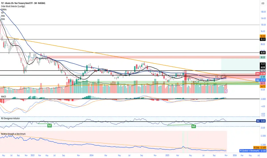
Relative Strength vs Benchmark SPYRelative Strength vs Benchmark (SPY)
This indicator compares the performance of the charted symbol (stock or ETF) against a benchmark index — by default, SPY (S&P 500). It plots a Relative Strength (RS) ratio line (Symbol / SPY) and its EMA(50) to visualize when the asset is outperforming or underperforming the market.
Key Features
📈 RS Line (blue): Shows how the asset performs relative to SPY.
🟠 EMA(50): Smooths the RS trend to highlight sustained leadership.
🟩 Green background: Symbol is outperforming SPY (RS > EMA).
🟥 Red background: Symbol is underperforming SPY (RS < EMA).
🔔 Alerts: Automatic notifications when RS crosses above/below its EMA — signaling new leadership or weakness.
How to Use
Apply to any stock or ETF chart.
Keep benchmark = SPY, or switch to another index (e.g., QQQ, IWM, XLK).
Watch for RS crossovers and trends:
Rising RS → money flowing into the asset.
Falling RS → rotation away from the asset.
Perfect for sector rotation, ETF comparison, and momentum analysis workflows.
nOI + Funding + CVD • strategynOI + Funding + CVD Strategy
Overview
This strategy is designed for cryptocurrency trading on platforms like TradingView, focusing on perpetual futures markets. It combines three key indicators—Normalized Open Interest (nOI), Funding Rate, and Cumulative Volume Delta (CVD)—to generate buy and sell signals for long and short positions. The strategy aims to capitalize on market imbalances, such as overextended open interest, funding rate extremes, and volume deltas, which often signal potential reversals or continuations in trending markets.
The script supports pyramiding (up to 10 positions), uses percentage-based position sizing (default 10% of equity per trade), and allows customization of trade directions (longs and shorts can be enabled/disabled independently). It includes multiple signal systems for entries, various exit mechanisms (including stop-loss, take-profit, time-based exits, and conditional closes based on indicators), a Martingale add-on system for averaging positions during drawdowns, and handling of opposite signals (ignore, close, or reverse).
This strategy is not financial advice; backtest thoroughly and use at your own risk. It requires data sources for Open Interest (OI) and Funding Rates, which are fetched via TradingView's security functions (e.g., from Binance for funding premiums).
Key Indicators
1. Normalized Open Interest (nOI)
Group: Open Interest
Purpose: Measures the relative level of open interest over a lookback window to identify overbought (high OI) or oversold (low OI) conditions, which can indicate potential exhaustion in trends.
Calculation:
Fetches OI data (close) from the symbol's standard ticker (e.g., "{symbol}_OI").
Normalizes OI within a user-defined window (default: 500 bars) using min-max scaling: (OI - min_OI) / (max_OI - min_OI) * 100.
Upper threshold (default: 70%): Signals potential short opportunities when crossed from above.
Lower threshold (default: 30%): Signals potential long opportunities when crossed from below.
Visualization: Plotted as a line (teal above upper, red below lower, gray in between). Horizontal lines at upper, mid (50%), lower, and a separator at 102%.
Notes: Handles non-crypto symbols by adjusting timeframe to daily if intraday. Errors if no OI data available.
2. Funding Rate
Group: Funding Rate
Purpose: Tracks the average funding rate (premium index) to detect market sentiment extremes. Positive funding suggests bull bias (longs pay shorts), negative suggests bear bias.
Calculation:
Fetches premium index data from Binance (e.g., "binance:{base}usdt_premium").
Supports lower timeframe aggregation (default: enabled, using 1-min TF) for smoother data.
Averages open and close premiums, clamps values, and scales/shifts for plotting (base: 150, scale: 1000x).
Upper threshold (default: 1.0%): Overheat for shorts.
Lower threshold (default: 1.0%): Overcool for longs.
Ultra level (default: 1.8%): Extreme for additional short signals.
Smoothing: Uses inverse weighted moving average (IWMA) or lower-TF aggregation to reduce noise.
Visualization: Shifted plot (green positive, red negative) with filled areas. Horizontal lines for overheat, overcool, base (0%), and ultra.
Notes: Custom ticker option for non-standard symbols.
3. Cumulative Volume Delta (CVD)
Group: CVD (Cumulative Volume Delta)
Purpose: Measures net buying/selling pressure via volume delta, normalized to identify divergences or confirmations with price.
Calculation:
Delta: +volume if close > open, -volume if close < open.
Cumulative: Rolling cumsum over a window (default: 500 bars), smoothed with EMA (default: 20).
Normalized: Scaled by absolute max in window (-1 to 1 range).
Scaled/shifted for plotting (base: 300 or 0 if anchored, scale: 120x).
Upper threshold (default: 1.0%): Over for shorts.
Lower threshold (default: 1.0%): Under for longs.
Visualization: Shifted plot (aqua positive, purple negative) with filled areas. Horizontal lines for over, under, and separator (default: 252).
Filter Options (for Signal A):
Enable filter (default: false).
Require sign match (Long ≥0, Short ≤0).
Require extreme zones.
Require momentum (rising/falling over N bars, default: 3).
Signal Logics for Entries
Entries are triggered by buy/sell signals from multiple systems (A, B, C, D), filtered by direction toggles and entry conditions.
Signal System A: OI + Funding (with optional CVD filter)
Enabled: Default true.
Sell (Short): nOI > upper threshold, falling over N bars (default: 3), delta ≥ threshold (default: 3%), funding > overheat, and CVD filter OK.
Buy (Long): nOI < lower threshold, rising over N bars (default: 3), delta ≥ threshold (default: 3%), funding < overcool, and CVD filter OK.
Signal System B: Short - Funding Crossunder + Filters
Enabled: Default true.
Sell (Short): Funding crosses under overheat level, optional: CVD > over, nOI < upper.
Signal System C: Short - Ultra Funding
Enabled: Default false.
Sell (Short): Funding crosses ultra level (up or down, both default true).
Signal System D: Long - Funding Crossover + Filters
Enabled: Default true.
Buy (Long): Funding crosses over overcool level, optional: CVD < under, nOI > lower.
Combined: Sell if A/B/C active; Buy if A/D active.
Entry Filters
Cooldown: Optional pause between entries (default: false, 3 bars).
Max Entries: Limit pyramiding (default: true, 6 max).
Entries only if both filters pass and direction allowed.
Opposite Signal Handling
Mode: Ignore (default), Reverse (close and enter opposite), or Close (exit only).
Processed before regular entries.
Position Management
Martingale (3 Steps):
Enabled per step (default: all true).
Triggers add-ons at loss levels (defaults: 5%, 8%, 11%) by adding % to position (default: 100% each).
Resets on position close.
Break Even:
Enabled (default: true).
Activates at profit threshold (default: 5%), sets SL better by offset (default: 0.1%).
Exit Systems
Multiple exits checked in sequence.
Exit 1: SL/TP
Enabled: Separate for long/short (default: true).
SL: % from avg price (defaults: 1% long/short).
TP: % from avg price (defaults: 2% long/short).
Exit 2: Funding
Enabled: Separate for long (up) / short (down) (default: true).
Long Exit: Funding > upper exit threshold (default: 0.8%).
Short Exit: Funding < lower exit threshold (default: 0.8%).
Exit 3: nOI
Enabled: Separate for long (up) / short (down) (default: true).
Long Exit: nOI > upper exit (default: 85%).
Short Exit: nOI < lower exit (default: 15%).
Exit 4: Global SL
Enabled: Default true.
Exit: If position loss ≥ % (default: 7%).
Exit 5: Break Even (integrated in position block)
Exit 6: Time Limit
Enabled: Separate for long/short (default: true).
Exit: After N bars in trade (defaults: 30 each).
Timer updates on add-ons if enabled (default: true).
Visual Elements
Buy/Sell Labels: Small labels ("BUY"/"SELL") on bars with signals, limited to last 30.
All indicators plotted on a separate pane (overlay=false).
Usage Notes
Backtesting: Adjust parameters based on asset/timeframe. Test on historical data.
Data Requirements: Works best on crypto perps with OI and funding data.
Risk Management: Incorporates SL/TP and global SL; monitor drawdowns with Martingale.
Customization: All thresholds, enables, and scales are inputs for fine-tuning.
Version: Pine Script v6.
For questions or improvements, contact the author. Happy trading!

5-min Strat Strategy V2 (With Stop Loss)README: 5-min Strat Strategy V2 – $7,500 Stop Loss Version
✅ Description
This is a rules-based intraday trading strategy developed for use on futures contracts like MNQ (Micro Nasdaq) or MES (Micro S&P). It focuses on momentum-based breakout entries above pre-market highs, during regular trading hours, and uses EMAs to define trend alignment.
⚙️ Strategy Components
✅ Trade Type
Long-Only strategy
Entry and exit based on EMAs, price position, and time windows
✅ Time Frame
Built for 5-minute charts
✅ Symbols
Optimized for MNQ (Micro Nasdaq Futures)
Works on MES or other U.S. index futures with similar structure
📅 Time Windows
Pre-Market Hours (PMH/PML): 04:00 – 09:30 AM EST
Regular Trading Hours (RTH): 09:30 AM – 4:00 PM EST
Auto Exit Time: 4:59 PM EST (to comply with prop firm rules)
📌 Entry Conditions (Long)
48 EMA > 200 EMA (Bullish alignment)
Price > Locked Pre-Market High
Green Candle (close > open)
During RTH (9:30–16:00 EST)
Cooldown: Must wait 4 candles after last entry
Max Trades per Day: 3
💥 Exit Conditions
Primary Exit: Close below the 48 EMA
Max Loss Exit: Stop loss set to $7,500 per trade
EOD Exit: All positions are closed at 4:59 PM EST
💰 Risk Management
Contracts: 6 Micro contracts per trade
Stop Loss: Dynamic point-based SL calculated based on:
MNQ point value = $20/point per contract
30 contracts = $120/point
Max SL points = $7,500 / $120 = 62.5 points
📊 Key Variables for Logging
Parameter Value
Max Stop Loss $7,500
Position Size 30 Micro Contracts - ***Varies depending on account size***
Cooldown Bars 4 (20 min)
Max Daily Trades 3
Strategy Version V2 – $7.5K SL
