XAUUSD Multi-Timeframe Bias Scanner🎯 Purpose & Overview
This is a sophisticated trading indicator that analyzes XAUUSD (Gold) across 5 different timeframes simultaneously to determine market bias and trend direction.
⚙️ Core Components
2. Bias Calculation Engine
The heart of the indicator uses 5 technical factors to score each timeframe:
Technical Factors (Weighted):
Moving Average Alignment (30 points)
Bullish: EMA(9) > EMA(21) > EMA(50)
Bearish: EMA(9) < EMA(21) < EMA(50)
Price vs MA Position (20 points)
Score increases when price above MAs
Score decreases when price below MAs
RSI Momentum (20 points)
Bullish: RSI > 60 or > 50
Bearish: RSI < 40 or < 50
MACD Signals (15 points)
Bullish: MACD line > Signal line AND > 0
Bearish: MACD line < Signal line AND < 0
Volume Confirmation (15 points)
Volume spikes with price movement add confirmation
📊 Timeframe Analysis
Five Timeframes Monitored:
5-minute - Short-term noise (10% weight)
15-minute - Intraday direction (15% weight)
1-hour - Key intraday bias (25% weight)
4-hour - Primary directional bias (30% weight)
1-day - Overall trend context (20% weight)
Bias Scoring System:
0-100 Scale (50 = Neutral)
STRONG BULLISH: ≥70 (Green)
BULLISH: 55-69 (Lime)
NEUTRAL: 46-54 (Gray)
BEARISH: 31-45 (Orange)
STRONG BEARISH: ≤30 (Red)
🎨 Visual Features
1. Comprehensive Table Display
pinescript
var table biasTable = table.new(position.top_right, 3, 7, ...)
Shows a color-coded table with:
Timeframe name
Numerical bias score (0-100)
Strength description with color coding
2. Chart Visual Indicators
Background coloring based on overall bias
Label markers for strong bullish/bearish conditions
Real-time label showing all timeframe scores
3. Alert System
Triggers when overall bias crosses 70 (bullish) or 30 (bearish)
Configurable with sound options
🔄 How It Processes Data
Data Flow:
Requests security data for each timeframe using request.security()
Calculates technical indicators for each TF separately
Scores each TF based on 5 technical factors
Computes weighted overall bias
Updates visual displays and checks alert conditions
💡 Trading Applications
Bullish Scenarios:
Multiple timeframes show bullish alignment
Higher timeframe bias supports lower timeframe direction
Overall score > 70 indicates strong bullish conviction
Bearish Scenarios:
Multiple timeframes show bearish alignment
Higher timeframe bias confirms lower timeframe moves
Overall score < 30 indicates strong bearish conviction
Conflict Detection:
When timeframes show conflicting biases
Caution required - market may be consolidating
Wait for alignment before taking trades
🎚️ Customization Options
Users can modify:
Timeframe weights
Technical indicator parameters
Alert thresholds
Visual display preferences
Scoring sensitivity
📈 XAUUSD Specific Optimizations
The indicator considers Gold's unique characteristics:
High volatility periods
ATR-based volatility adjustments
Volume confirmation for breakouts
Multiple timeframe confirmation for trend reliability
This creates a powerful tool for identifying high-probability trade setups in XAUUSD by ensuring traders have a complete multi-timeframe perspective before entering positions.
Sentiment

Altseason IndexDescription of the "Altseason Index" Indicator
The Altseason Index is a powerful and visually minimalist tool designed to objectively identify the onset and conclusion of an "altseason" in the cryptocurrency market. Moving beyond subjective speculation, this indicator employs a clear, mathematical methodology by comparing the performance of a broad basket of altcoins against Bitcoin.
🎯 Core Concept and Utility
An "Altseason" is a market period where altcoins (cryptocurrencies other than Bitcoin) consistently yield higher returns than BTC. This indicator empowers traders and investors to:
Objectively Identify Market Cycles: Precisely pinpoint when capital is actively rotating from Bitcoin into altcoins and vice versa.
Make Data-Driven Decisions: Adjust their strategy in a timely manner: increasing exposure to altcoins during an altseason or rotating back into BTC upon its conclusion.
Avoid Emotional Pitfalls: Steer clear of FOMO (Fear Of Missing Out) and base decisions on hard data rather than market noise.
⚙️ How the Calculation Works
1. Asset Selection: The indicator tracks the performance of 15 leading altcoins across various market segments (Layer 1s, DeFi, Meme, Payments), ensuring a representative sample.
2. Performance Comparison: For each altcoin, the percentage price change over the user-defined lookback period (default: 90 days) is calculated. This performance is then compared to BTC's performance over the same period.
3. Counting the "Outperformers": The index counts the number of altcoins that have "outperformed" BTC.
4. Calculating the Index: The Altseason Index value is the percentage of altcoins in the basket that are outperforming BTC. For example, a value of 60% means that 9 out of the 15 coins performed better than Bitcoin.
🛠️ Indicator Settings
The settings are kept simple and intuitive, allowing you to customize the indicator to your strategy:
Lookback Period (days) (Default: 90):
- Defines the time horizon for the performance calculation.
- Shorter Periods (30-60 days) react faster to new trends but may produce more false signals.
- Longer Periods (90-180 days) provide smoother and more reliable signals, capturing sustained macro-trends.
Altseason Threshold (%) (Default: 75%):
- This is the key parameter that defines what index value constitutes an official "altseason."
- A threshold of 75% means an altseason is declared when at least 11 out of the 15 altcoins (75%) are outperforming BTC.
- You can increase the threshold (e.g., to 85%) for more conservative and stronger signals, or decrease it (e.g., to 65%) for earlier entries.
📊 Interpreting the Readings and Signals
The indicator uses a clear color-coding system and levels for easy interpretation:
🔴 < 30%: "BTC SEASON"
Bitcoin is dominating. The market is in risk-off mode or a state of anticipation. Growth is concentrated in BTC.
⚪ 30% - 49%: "NEUTRAL"
A transitional phase. The market is uncertain. Some alts show strength, but there is no unified trend.
🔵 50% - 74%: "BULLISH"
Growing strength in altcoins. Capital is beginning to rotate actively. This can be an early stage of an altseason.
🟢 ≥ 75% (or your custom threshold): "ALTSEASON"
The active altseason phase. The vast majority of altcoins are rising faster than BTC. This is the period of maximum potential returns for alts.
Signal Markers:
Green Dot: Signals the potential start of an altseason (the index crosses above the threshold).
Red Dot: Signals the potential end of an altseason (the index crosses below the threshold).
ℹ️ Information Panel
The chart displays two clean information panels:
1. Main Info Label:
Current index value (e.g., ⟠ 80%).
Market status (ALTSEASON, BULLISH, etc.).
The ratio of outperforming altcoins (11/15 alts).
2. Dominance & Market Cap Panel:
Alts: Altcoin Dominance (the market cap share of all coins except BTC).
BTC: Bitcoin Dominance.
Market: Total cryptocurrency market capitalization in billions of USD. This helps assess the overall market context (bullish/bearish).
💎 Conclusion
The Altseason Index is your strategic companion for navigating the crypto markets. It transforms the complex task of identifying market cycles into a simple and visual process. Use it to confirm broad market trends, identify potential entry and exit points, and, most importantly, to maintain discipline in your trading strategy by filtering out noise and emotion.
Disclaimer: This indicator is a tool for analysis and does not constitute investment advice. All trading decisions are taken at your own risk.

AI Projection LevelsProjection Levels – AI-Driven Volatility Projection Grid
Projection Levels is a quantitative market geometry engine that transforms raw volatility into a structured, multi-layered projection grid.
It is designed to help traders identify natural price reaction corridors, exhaustion zones, and expansion targets using a volatility-normalized mathematical framework.
This is not a random fixed indicator – it behaves like a deterministic, AI-style volatility interpreter that adapts to changing market conditions.
Mathematical Core (Simplified)
The system is built around a Volatility Projection Field (VPF) defined conceptually as:
Px = O + (ATR_prev * M * lambda_x)
Where:
O = session anchor (adaptive open)
ATR_prev = volatility memory from the previous regime
M = projection multiplier
lambda_x = fractal expansion ratios:
{0.25, 0.50, 0.75, 1.00, 1.25, 1.50, 1.75, 2.00}
These ratios behave like probabilistic expansion bands derived from historical volatility clustering in financial time series.
Cluster Stabilization Layer
Markets don’t respect random decimals – they tend to gravitate around liquidity clusters.
To reflect this, the indicator applies a discrete price quantization filter:
Q(x) = round( x / step ) * step
Where:
step = user-defined cluster size (for example: 500 points for index futures)
This compresses prices into liquidity-aligned structural clusters, creating “price magnets” where:
Dealers tend to hedge
Liquidity concentrates
Traps and fakeouts often form
Breakouts can accelerate once clusters are left behind
Why It Feels “AI-Driven”
Pine Script cannot run deep neural networks directly, but this tool emulates AI-like behavior via:
Recursive volatility normalization
Multi-level fractal expansion logic
Cluster-aligned price projections
Dynamic label overlays that tag key expansion zones
Functionally, it behaves like a rule-based inference engine operating on volatility memory and price geometry.
Structure of the System
You get three main “intelligent” layers:
1) Core Projection Zone (±25% to ±100%)
Primary behavioral framework:
Intraday reaction zones
Mean-reversion traps
Session acceptance / rejection areas
2) Expansion Zones (125% to 200%)
Extended volatility bands:
Potential exhaustion territories
Trend continuation “fuel” zones
Breakout overextension regions
Often used by momentum and breakout traders to frame extreme moves.
3) Adaptive Label Tracking
Each level is attached to a moving label that follows the latest bar.
This keeps the projection grid readable, even on fast intraday charts.
Designed For
Futures and index traders
Intraday scalpers and day traders
Volatility-based swing traders
Systematic and rules-driven traders building frameworks
Works especially well on:
SPX, NASDAQ, BTC & major crypto indices, NIFTY and liquid futures contracts.
Philosophy Note
Markets move in alternating phases of volatility expansion and compression.
This indicator does not “predict the future” – it maps probabilistic volatility geometry around the current session anchor.
It is best used to ask questions such as:
Are we in compression or expansion?
Is this zone more likely to act as acceptance or rejection?
Are we approaching a structurally stretched region?
Risk Disclaimer
This indicator is a visual and analytical tool only.
It does not provide direct buy/sell signals, financial advice, or guaranteed outcomes.
Trading and investing in financial markets involves substantial risk, including the risk of losing part or all of your capital.
All projections, levels, and zones shown by this script are based on mathematical and volatility-based calculations and should be treated strictly as decision-support, not a prediction engine.
The creator of this script is not responsible for any trading losses, financial damage, or decisions made using this tool.
By using this script, you agree that you:
Understand the risks of trading
Use this indicator at your own discretion and responsibility
Accept that past behavior of levels does not guarantee future performance
Closed-Source Notice
This script contains proprietary projection logic.
The formulas shown above are conceptual summaries for educational clarity.
Actual internal weighting, smoothing, and normalization methods remain closed-source and protected.

Tom Basso ETR HedgeSimple hedge regime indicator inspired by Tom Basso’s hedging approach described at enjoytheride.world It combines Keltner Channels, Bollinger Bands, and Donchian Channels using 50-bar “IN” signals to turn the hedge ON and 21-bar “OUT” signals to turn the hedge OFF. When any 50-bar lower band is broken to the downside, the background turns red to indicate hedge mode, and when price recovers above any 21-bar upper band, hedge mode turns off.
Use this on a broad market index (SPX/ES/SPY, etc.) to time when you should be hedged versus unhedged, not as a standalone entry/exit trading system.

EMA 5-13-21-34-55-89-144-233Fibo sayıları olan 5-13-21-34-55-89 -144-233 dan oluşan EMA'ları göstermek için hazırlanmıştır.

Nexural TransformNexural Transform: Fisher + CVD Order Flow Indicator
What This Indicator Does
Nexural Transform combines a Fisher Transform with Cumulative Volume Delta (CVD) analysis to help identify potential turning points and measure buying/selling pressure beneath price action. Instead of just showing you what price is doing, it attempts to show you what's happening in the order flow - who's in control and whether momentum is building or fading.
The indicator analyzes intrabar volume to separate buying from selling pressure, then integrates this with Fisher Transform momentum calculations to generate signals that consider both price extremes and volume conviction.
Key Features
Core Mechanics:
Fisher Transform with CVD momentum weighting
Intrabar volume analysis for true buying/selling pressure
Adaptive length based on market volatility
Volume-weighted price calculations
Dynamic sigma bands that adjust to current market conditions
Order Flow Detection (always active):
Absorption zones - large volume with minimal price movement
Iceberg orders - hidden liquidity reveals itself
Liquidity sweeps - stop hunts that fail to follow through
Failed auctions - breakouts without volume support
Exhaustion scoring - when moves run out of steam
Smart money tracking - large lot activity
Stacked imbalances - consecutive directional pressure
Additional Tools:
Instant divergence detection (real-time price vs. CVD mismatches)
Traditional divergence signals
Session-based filtering (RTH vs. overnight)
Confidence scoring for signals
Customizable statistics box with three detail levels
How to Use It
Understanding the Display:
The main line oscillates around zero with dynamic sigma bands (1 sigma, 2 sigma, 3 sigma)
Green zones = oversold conditions with buying pressure
Red zones = overbought conditions with selling pressure
The gray signal line shows the previous bar's value
Optional CVD overlay shows cumulative volume delta scaled to fit
Signal Types:
Elite Signals (confidence greater than 100%) - Rare, highest conviction setups
High Confidence Signals (confidence greater than 70%) - Strong probabilistic edge
Standard crossovers - Fisher crosses signal line at extremes
Divergences - Price makes new highs/lows but CVD disagrees
Best Practices:
Use on liquid instruments (ES, NQ, major stocks with good volume)
Works best on 5min-1hr timeframes for intraday trading
Pay attention during key session times (open, 10:30-11:00, close)
Watch the statistics box for exhaustion, streak counts, and order flow activity
Don't trade signals in isolation - confirm with price action and structure
Reduce position size or avoid trading during lunch session (12:00-13:30 EST)
Interpreting Order Flow:
"ABS" in stats = absorption happening (potential reversal zone)
"ICE" = iceberg orders detected (hidden liquidity)
"LIQ" = liquidity sweep (stop hunt - look for reversal)
"TRAP" = failed auction (breakout likely to fail)
High exhaustion scores (greater than 50) = move losing momentum
Honest Pros & Cons
What This Indicator Does Well:
Provides multi-dimensional view of market structure
Catches divergences between price and underlying order flow
Adapts to changing volatility conditions
Offers clear confidence levels - you know when signals are stronger
Works across multiple trading styles (scalping to swing)
Session awareness helps avoid low-probability times
Statistics box gives you real-time market context
Limitations to Understand:
Steep learning curve - order flow concepts take time to grasp
Not a holy grail - no indicator is; you still need proper risk management
Can be noisy in choppy/low volume conditions - like most oscillators
Requires liquid markets - won't work well on illiquid stocks or crypto with thin order books
Lagging component - Fisher Transform is smoothed, so it's not predictive
Works best with context - needs support/resistance, trend analysis, etc.
Information dense - the statistics box can overwhelm beginners
Who This Is For
Good fit if you:
Trade futures (especially ES/NQ) or high-volume stocks
Want to understand order flow beyond just price candles
Use multiple timeframe analysis
Are comfortable with technical concepts
Want confluence factors for your existing strategy
Trade during active market sessions
Probably not for you if:
You're brand new to trading (start simpler)
You trade low-volume instruments
You want a "buy here, sell there" magic system
You don't want to learn order flow concepts
You're looking for a fully automated strategy
Configuration Tips
The indicator comes pre-configured with tested defaults, but you can customize:
Fisher Length (10) - Lower = more sensitive, higher = smoother
CVD Weight (0.3) - How much volume influences the oscillator
Dynamic Bands - Keep ON for adaptive levels that adjust to volatility
Session Filters - Keep ON to reduce overnight noise
Stats Detail Level - Start with "Compact", move to "Order Flow" as you learn
Final Thoughts
This isn't a signal-spamming indicator that paints arrows all over your chart. It's a tool for understanding market structure through the lens of volume and momentum. The best trades happen when multiple factors align - Fisher at extremes, CVD confirming, order flow showing institutional activity, and price respecting key levels.
Treat it as one piece of your trading puzzle, not the whole picture. Use it to confirm what you're seeing in price action, not to replace proper chart reading and risk management.
Test it thoroughly on a demo account. Learn what the order flow signals mean. Understand when it works best and when to ignore it. No indicator works in all market conditions, and this one is no exception.
Questions? Found a bug? Have suggestions?
Drop a comment below. I actively maintain this indicator and appreciate genuine feedback from traders actually using it in the markets.
Remember: Past performance doesn't guarantee future results. Always use proper position sizing and risk management.

RSI Arrow Signals (Daily & Weekly)📘 Indicator Overview
This indicator identifies oversold conditions using RSI on two higher timeframes and plots visual signals directly on the chart. It is designed for traders who want to track multi-timeframe RSI exhaustion without switching charts.
🔍 How It Works
1. Daily RSI Signal (Orange Arrow)
The script pulls Daily RSI using request.security().
When the Daily RSI closes at 30 or below, an orange upward arrow is displayed beneath the bar.
2. Weekly RSI Signal (Red Arrow)
The script also retrieves Weekly RSI.
When the Weekly RSI closes at 30 or below, a red upward arrow appears beneath the bar.
Both signals use confirmed candle data to reduce repainting.
🎯 Purpose
This tool highlights potential oversold reversal zones across two key timeframes.
It helps traders quickly identify moments when price may be stretched to the downside on Daily or Weekly context
⚙️ Features
Multi-timeframe RSI (Daily & Weekly)
Color-coded arrow signals for quick visual recognition
Optional alert conditions for automated notifications
Works on any chart timeframe via request.security()
Repaint-safe (no lookahead_on)
📌 Important Notes
Signals only appear after the Daily or Weekly candle closes.
This indicator is not a buy/sell system; it serves as a market condition signal.
Use together with your own risk management and additional confluence.
*this indicator is helped by GPT

Quant RSIQuant RSI MTF - Professional Multi-Timeframe RSI Analysis
A sophisticated RSI indicator built for serious traders who need more than basic overbought and oversold levels. This tool combines advanced filtering techniques with multi-timeframe analysis to give you a clearer picture of momentum across different time horizons.
What Makes This Different
Most RSI indicators use simple moving averages that lag behind price action. This version uses Laguerre filtering, which is a mathematical technique that reduces lag while maintaining smooth signals. The result is an RSI that responds faster to genuine momentum shifts without getting whipped around by noise.
The system monitors five different timeframes simultaneously, checking whether momentum is aligned or diverging across short-term, medium-term, and long-term perspectives. When all timeframes agree on direction, you have significantly higher probability setups. When they disagree, you know to be cautious.
Core Features
The indicator calculates three separate RSI values using different lookback periods - short, medium, and long term. Each one serves a specific purpose. The short-term catches quick reversals, the medium-term identifies swing trading opportunities, and the long-term keeps you aware of the bigger trend.
Dynamic threshold adjustment is built in based on ATR volatility measurements. During high volatility periods, the overbought and oversold levels automatically expand because extreme readings become more common. During low volatility, the thresholds tighten up. This prevents you from getting false signals just because market conditions changed.
Volume confirmation is integrated into every signal. The system analyzes volume delta to determine whether price movements are supported by actual buying or selling pressure. A divergence between RSI and volume often signals weak momentum that is likely to reverse.
Advanced divergence detection goes beyond basic hidden and regular divergences. The system calculates divergence strength as a percentage, so you know which setups have the most potential. A weak divergence barely worth noting gets scored low, while a major divergence with significant price-RSI separation scores high.
Signal Intelligence
Every potential signal gets assigned a confidence score from 0 to 100. This score factors in trend strength, momentum, volume confirmation, divergence presence, ADX readings, and timeframe alignment. A score above 70 means all the pieces are in place. Below 40 means something important is missing.
The indicator calculates ADX automatically to measure trend strength. Even if RSI shows oversold conditions, a weak ADX reading suggests the market is ranging and mean reversion might not work. Strong ADX with extreme RSI readings often produces the best setups.
Market condition classification tells you whether you are in a strong bull trend, bear trend, pullback, sideways chop, or volatility expansion phase. Each condition requires different trading approaches, and the indicator adapts its signals accordingly.
Volatility Analysis
Real-time volatility state monitoring shows you whether volatility is exploding, expanding, stable, or contracting. Contracting volatility often precedes big moves. Exploding volatility suggests you should reduce position size or stay out entirely.
The system compares current volatility to historical levels using percentile rankings. If current ATR is in the 90th percentile, you know volatility is unusually high even if you have not traded this asset before.
Volume profile approximation analyzes where volume is accumulating at different price levels. While not as detailed as true market profile software, it gives you insight into support and resistance zones based on actual trading activity.
What This Indicator Does Well
The Laguerre filtering genuinely reduces lag compared to standard RSI. You will notice signals forming 1-3 bars earlier than traditional RSI implementations, which can make a significant difference in fast-moving markets.
Multi-timeframe confluence is calculated automatically instead of forcing you to manually switch between charts. When all five timeframes align, the visual confirmation is immediate and the probability of success increases dramatically.
Dynamic threshold adjustment based on volatility is something most RSI indicators lack entirely. This prevents you from taking low-probability trades just because RSI hit 30 or 70 during unusual market conditions.
Volume integration with every signal helps filter out weak setups. RSI might show oversold, but if volume delta is negative and selling pressure continues, the indicator knows not to generate a buy signal.
Divergence strength calculation goes beyond just marking divergences with arrows. Knowing that a divergence has 75% strength versus 20% strength completely changes how you should trade it.
The ADX integration prevents you from trying to trade reversals in ranging markets where mean reversion strategies fail. ADX below 20 with extreme RSI readings typically results in continued chop rather than reversals.
What This Indicator Does Not Do Well
The multi-timeframe data requests can cause slight delays on lower-end computers or slow internet connections. If you are running multiple indicators simultaneously, you might notice brief calculation lags.
Divergence detection requires at least 10-15 bars of history to identify pivot points accurately. On brand new charts or immediately after timeframe changes, divergence signals may be absent for several bars.
The Laguerre filtering, while reducing lag, can occasionally produce false signals during extreme volatility spikes like news releases or market opens. The smoothing cannot completely eliminate noise during truly chaotic conditions.
Dynamic thresholds work well most of the time but can occasionally adapt too slowly during rapid volatility regime changes. If ATR suddenly doubles, it might take 5-10 bars for the thresholds to fully adjust.
The indicator uses significant processing power with five timeframe requests plus all the calculations for volatility, volume analysis, divergences, and signal scoring. On very low timeframes like 1-second or tick charts, this could cause performance issues.
There is no built-in backtesting functionality. You can see historical signals on the chart, but you cannot generate statistical performance reports without exporting data and analyzing it separately.
Best Use Cases
This indicator excels for scalpers and day traders who need fast, reliable RSI signals with proper context. The reduced lag from Laguerre filtering combined with volume confirmation catches reversals quickly enough to matter on 1-5 minute charts.
Swing traders benefit from the multi-timeframe alignment feature. Before entering a multi-day position, you can verify that momentum is aligned across your entry timeframe, swing timeframe, and position timeframe. This significantly improves win rates.
Range traders can use the dynamic thresholds and volatility analysis to identify when markets are coiling up for breakout moves. Contracting volatility with neutral RSI readings often precedes the best trending moves.
The divergence detection with strength calculations makes this valuable for reversal traders. Instead of taking every divergence, you can filter for only high-strength divergences above 60% for better risk-reward setups.
What This Is Not
This is not a standalone trading system. It provides momentum analysis and signal quality scoring, but you still need proper risk management, position sizing, and confluence with price action or other technical factors.
This is not a high-frequency trading tool. While the Laguerre filtering reduces lag, it is not designed for sub-second timeframes or algorithmic trading where microseconds matter.
This is not a volatility prediction system. It measures current and recent volatility states, but it cannot forecast whether volatility will expand or contract in the future beyond basic statistical tendencies.
This is not a replacement for understanding market structure. RSI divergences and extreme readings mean different things at major support and resistance versus in the middle of nowhere. You need context.
Technical Details Worth Knowing
The Laguerre filter uses a gamma parameter that you can adjust. Higher gamma values (0.8-0.9) produce smoother lines with more lag. Lower values (0.5-0.6) respond faster but with more noise. The default of 0.7 balances both reasonably well.
The three RSI lengths serve different purposes. The 5-period catches very short-term momentum for scalping. The 14-period is standard for swing trading. The 21-period keeps you aligned with longer-term trends. You can adjust these based on your trading timeframe.
ATR normalization divides current ATR by a 50-period moving average of ATR. This creates a volatility factor that adjusts thresholds dynamically. When volatility doubles, overbought might move from 70 to 85 automatically.
Volume delta is calculated as volume times the percentage where price closed within the bar's range. An up-close at the high gets full positive delta. A down-close at the low gets full negative delta. This approximates buying and selling pressure without tick data.
Signal strength scoring uses weighted factors. Trend direction gets 30% weight, momentum gets 20%, volume confirmation 15%, divergence presence 15%, ADX strength 10%, and timeframe alignment 10%. This creates a 0-100 composite score.
ADX calculation uses the standard Wilder smoothing method with directional movement indicators. The trend classification shows whether bulls or bears have control, while the strength rating (weak, moderate, strong, extreme) tells you how much conviction is behind the move.
Final Assessment
This is a well-designed RSI indicator that adds genuine value beyond what basic RSI provides. The Laguerre filtering works as advertised for lag reduction. The multi-timeframe analysis saves time and provides clarity. The dynamic thresholds adapt intelligently to changing volatility.
The signal scoring system is particularly useful because it prevents you from chasing low-quality setups. A 35% confidence score tells you immediately that something is wrong with the trade even if RSI looks tempting.
However, this is definitely not a beginner indicator. There are a lot of moving parts and the learning curve is real. You need to understand RSI basics, divergences, volume analysis, and volatility regimes to use this effectively. Someone new to trading would be overwhelmed.
For experienced traders who already understand momentum indicators and want more sophisticated analysis, this is legitimately valuable. The combination of features is not commonly found in free indicators, and the implementation quality is solid.
The main limitation is that it is still just an RSI indicator at its core. No amount of filtering, multi-timeframe analysis, or scoring can overcome the fundamental limitations of oscillator-based trading. You need confluence with price action, support and resistance, and proper market context.
If you trade primarily based on momentum and reversals, this indicator provides most of what you would need in one package. If you are a pure price action trader or trend follower, this probably would not change your approach significantly.
Overall, this is a 7.5 out of 10 indicator. It does what it claims to do well, adds meaningful improvements over basic RSI, and provides useful analysis tools. It is not revolutionary, but it is a solid professional-grade tool for the right type of trader.

Candle Patterns Ver.2When someone decided to start trading the first thing we learn is how to read and understand the candlesticks. This little "boxes" with sticks tell us how the market sentiment and they can be used to "predict" future moves. I put predict inside a quotation marks because I would say predict the market is almost an utopia and we all know the reason.
Anyway with a good understand in reading the candlesticks with other indicators(like momentum or even a MA) can give us some edge when analyzing an instrument.
Since we have a lot of candlesticks types I did some back test and figured out that for my strategy that three candlestick types works very well. I will briefly describe then.
Engulfing Bar
This type of candlestick shows us a potential reversal based on the previous bar.
A bullish Engulfing has the close higher than the open it works better if the previous one is a bearish bar(open higher than close) and it is at a Support level. The body of the Engulfing bar should "engulf" the full body of the previous bar. If all parameters(previous bearish bar at Support level after a downtrend move) this Engulfing will represents a reversal move. When I say reversal it could means a pullback reversal(if the past trend is downtrend) or if the previous downtrend is a pullback from a past uptrend. In any way the previous bearish followed by an bullish Engulfing in general leads for an upward move.
The same picture applies to a previous bullish bar followed by an bearish Engulfing bar that if appears at the Resistance level will lead to a downward move.
One thing that is worth to mention is in a downward(or upward) move we have a small bullish bar followed by a bullish Engulfing this situation may lead to a continuation, not reversal.
Pinbar Bar:
This is another candlestick type that represents possible reversal. The Pinbar candle show a small(or medium) size but the important part is the size of the stick. If the stick is the upper one and has the size of 2 times the size of the body, it is a bearish bars and it appears after an uptrend move it represents that the buyers are losing momentum so we can expect a reversal move. When this type of bar appears after a downward move, it is a bullish bars but the stick is the lower one and has the size of two times of the body it will represents a bullish reversal. In this picture this candle is called a "Hammer".
So based on that I develop an indicator that shows me these 2 bars types and makes easy to identify with the other indicator possible entries.
Please feel free for a constructive comments and hope it help any one whe trading. Candlestick are the fundamentals of Price action.
You all have a great trading new week.

Advanced Market Profile & S/R Zones (Pro)Advanced Market Profile & S/R Zones
This indicator brings professional Auction Market Theory to your chart using a custom rolling Volume Profile algorithm. Unlike standard profiles that remain fixed, this tool dynamically calculates the "Fair Value" of the asset based on your specific lookback period (e.g., the last 100 bars).
It automatically highlights the Point of Control (POC), Value Area (VA), and suggests statistical Discount (Buy) and Premium (Sell) zones.
Key Features
Volume Splitting Algorithm:
Most basic scripts dump the entire volume of a candle into a single price point (the average). This script splits the volume across the candle's entire High-Low range. This results in a much smoother, higher-resolution bell curve that accurately reflects price action, especially on higher timeframes like Monthly charts.
Auto-generated Zones:
Green Zone (Discount): Prices below the Value Area Low (VAL). Statistically "cheap."
Red Zone (Premium): Prices above the Value Area High (VAH). Statistically "expensive."
Real-Time Dashboard:
A built-in panel displays the exact price levels for the POC, VAH, and VAL for precise limit order placement, along with the current Market Trend.
How to Use
For Intraday (Day Trading):
Settings: Set Lookback to 100 - 300.
Strategy: Watch for price to open outside the Value Area. If price breaks back inside the Value Area, target the POC (Red Line).
For Macro (Monthly/Weekly Charts):
Settings: Set Lookback to 12 (1 Year) or 60 (5 Years).
Strategy: Identify multi-year structural support. When a monthly candle enters the Green Discount Zone of a 5-year profile, it is often a high-probability institutional entry point.
Trend Logic
The Dashboard indicates trend based on price location relative to value:
Strong Bullish: Price is accepted ABOVE the Value Area.
Strong Bearish: Price is accepted BELOW the Value Area.
Neutral / In VA: Price is chopping inside the Value Area.
Disclaimer
This is a "Rolling Profile." It calculates the profile based on the current lookback window relative to the latest bar. As new bars form, the lookback window shifts, and the profile updates to reflect the new dataset.

Volume/ADX MarketSession and Economic Calendar Data
Volume / ADX Market Session & Economic Calendar Suite
A multi-asset market intelligence tool combining Volume, ADX/DI trend strength, CVD, VMO, Market Sessions, Divergence, Options Expiry, and a full Forex-Factory Economic Calendar — all auto-adapting to Forex, Oil, Gold, Indices, and Equities.
Key Features
Real-Time Market Sessions
Live-growing session boxes for Sydney, Tokyo, London, New York.
Market Data Dashboard
Cross-asset insights: DXY, VIX, Yields, Oil momentum, Gold ratios, FX trend bias.
Macro Economic Calendar (Forex Factory)
Auto-currency detection, event markers, and alerts before/after events.
CVD (Cumulative Volume Delta)
Real buy/sell pressure + session CVD delta.
Divergence Detection
CVD-based bullish and bearish divergence.
ADX / DI Trend Strength
Strong/weak trend signals with DI cross alerts.
Volume MA Oscillator (VMO)
Volume-based momentum and volatility bands.
Options Expiry Countdown
Auto-detects asset type and shows daily expiry times
(FX 10AM, Gold 1:30PM, Oil 2:30PM, Equity 4PM)
Buy/Sell Score
Grades (A+, A, B, C, D)
Long/Short signal triggers

Combined: RSI Swing + Div + Sentiment + CCI — v6RSI Swing Structure (LL, LH, HH, HL)
✅ RSI Sentiment Direction (Up / Down)
✅ CCI Steroid Direction (Up / Down)
✅ Buy Signal when:
RSI Swing makes LL or HL, AND
RSI Sentiment trending UP, AND
CCI trending UP
✅ Sell Signal when:
RSI Swing makes HH or LH, AND
RSI Sentiment trending DOWN, AND
CCI trending DOWN

Demand & Supply Zones With Volume Candle🧬 Demand & Supply Zones With Volume Color Candles — Multi-Timeframe S/R & Liquidity Zones.
🔥Automatic detects and plots dynamic Support & Resistance zones, liquidity areas, and Break-of-Structure (BoS) levels across multiple timeframes.
🔥 Key Factors
Body-Based Swings: Identifies swing highs/lows using Close or Open for precise S/R detection.
Auto Supply & Demand Zones: Creates ATR-sized S/R boxes that extend forward with touch-count tracking.
BoS Detection: Converts broken zones into dotted BoS lines for instant structure shift visibility.
Multi-TF Mapping (TF1–TF9): Plots higher-timeframe S/R levels directly on your chart for confluence.
Clean Overlap Filtering: Removes zones that are too close using ATR-based spacing logic.
Custom Swing Length: Controls sensitivity of pivots for strong or frequent zone formation.
Lookback Management: Stores only the most relevant recent S/R zones to avoid clutter.
Color-Coded Structure: Red = Supply, Blue = Demand, with labels showing touch count + timeframe.
Non-Repainting: Zones are drawn only after confirmed pivots for accurate, reliable structure.
📊 Volume Color Candle — Advanced Market Strength Visualization
Volume Color Candle is a powerful and visually enhanced tool designed to help traders instantly identify high-impact volume events, body-size anomalies, and market imbalances directly on any chart.
This indicator uses Z-Score statistical modeling to classify candles into Normal, Large, and Extreme categories — giving traders a deeper understanding of momentum, volatility, and unusual market activity.
🔍 Key Features
✅ Multi-Source Outlier Detection
Choose what drives the signal:
Volume
Body Size
Any (either becomes an outlier)
All (both must confirm)
This flexibility helps highlight genuine strength or weakness in price action.
🎨 Dynamic Candle Coloring
The script colors candles based on statistical threshold levels:
Normal Moves
Large Moves
Extreme Moves (High Impact)
You can display them as colored bars or full candles, depending on your charting preference.
📉 Low Volume Detection
Spot weak or imbalanced price moves with a dedicated low-volume algorithm:
Highlight candles with unusually low participation
Option to only show candles where volume is low but body is large (imbalance conditions)
Perfect for identifying fake breakouts or trapped liquidity zones.
⚙️How to use :-
default color schemes:
- Blue -> excheme bullish imbalance
- Green -> large bullish imbalance
- Black -> excheme bearish imbalance
- Red -> large bearish imbalance
- yellow -> low volume bars, indicates "balance", after which volatility usually increases and tends to continue the previous trend
🔔 Built-in Alerts
Receive instant alerts when the script detects:
Extreme Outlier Activity
Large Outlier Activity
Ideal for catching volatility spikes, early trend acceleration, or institutional-level moves.
🎯 What This Helps You Identify
Momentum surges
Volume-based breakouts
Manipulation or low-volume traps
Extreme candle events
Trend strength vs weakness
Liquidity pushes and imbalance signals
This makes it a highly valuable tool for scalpers, intraday traders, swing traders, and anyone relying on volume-price analysis.
Protected script
ForexArchitects
Disclaimer
The information and publications are not meant to be, and do not constitute, financial, investment, trading, or other types of advice or recommendations supplied or endorsed by TradingView. Read more in the Terms of Use.

Volume Color Candle 📊 Volume Color Candle — Advanced Market Strength Visualization
Volume Color Candle is a powerful and visually enhanced tool designed to help traders instantly identify high-impact volume events, body-size anomalies, and market imbalances directly on any chart.
This indicator uses Z-Score statistical modeling to classify candles into Normal, Large, and Extreme categories — giving traders a deeper understanding of momentum, volatility, and unusual market activity.
🔍 Key Features
✅ Multi-Source Outlier Detection
Choose what drives the signal:
Volume
Body Size
Any (either becomes an outlier)
All (both must confirm)
This flexibility helps highlight genuine strength or weakness in price action.
🎨 Dynamic Candle Coloring
The script colors candles based on statistical threshold levels:
Normal Moves
Large Moves
Extreme Moves (High Impact)
You can display them as colored bars or full candles, depending on your charting preference.
📉 Low Volume Detection
Spot weak or imbalanced price moves with a dedicated low-volume algorithm:
Highlight candles with unusually low participation
Option to only show candles where volume is low but body is large (imbalance conditions)
Perfect for identifying fake breakouts or trapped liquidity zones.
⚙️How to use :-
default color schemes:
- Blue -> excheme bullish imbalance
- Green -> large bullish imbalance
- Black -> excheme bearish imbalance
- Red -> large bearish imbalance
- yellow -> low volume bars, indicates "balance", after which volatility usually increases and tends to continue the previous trend
🔔 Built-in Alerts
Receive instant alerts when the script detects:
Extreme Outlier Activity
Large Outlier Activity
Ideal for catching volatility spikes, early trend acceleration, or institutional-level moves.
🎯 What This Helps You Identify
Momentum surges
Volume-based breakouts
Manipulation or low-volume traps
Extreme candle events
Trend strength vs weakness
Liquidity pushes and imbalance signals
This makes it a highly valuable tool for scalpers, intraday traders, swing traders, and anyone relying on volume-price analysis.

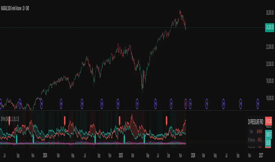
Nexural DI Pressure ImbalanceNexural DI Pressure Imbalance
Overview
This indicator combines traditional Directional Index (DI) analysis with modern order flow concepts to help you identify buying and selling pressure in the market. I built this because I wanted something that goes beyond basic DI calculations and actually shows what's happening inside each candle.
What Makes This Different
Instead of just looking at directional movement, this indicator analyzes:
Candle-by-candle pressure - Where did the price actually close within the candle's range? This tells us who won the battle between buyers and sellers.
Volume-weighted calculations - Low volume moves get less weight, because they're less reliable.
Order flow approximation - Estimates buying versus selling volume based on price action and where the close ended up.
Cumulative delta - Tracks the running total of buy/sell imbalance over your chosen period.
How to Read It
The main display shows two lines:
DI+ (green) - Buying pressure
DI- (red) - Selling pressure
When DI+ is above DI-, buyers are in control. When DI- is on top, sellers have the edge.
The volume bars at the bottom change color based on whether the candle was bought or sold, with brighter colors indicating stronger order flow.
The candle imbalance histogram (middle section) shows you the internal pressure within each candle. Positive values mean the close was near the high, negative means it closed near the low.
The purple cumulative delta line tracks the overall buying/selling imbalance over time. When it's rising, there's more buying volume. When falling, more selling.
Info Table
The table in the top-right gives you a quick summary:
State - Current market condition (Strong Buy, Bullish, Bearish, Strong Sell)
DI Pressure - Net directional pressure
Candle Imb - Current candle imbalance score
Delta - Cumulative volume delta
Composite - Combined score from all components
Volume - Current volume level (Low, Normal, High, Extreme, Strong)
Flow - Order flow strength (Weak, Moderate, Strong)
Settings You Can Adjust
Core Settings:
DI Length - How many periods to use for DI calculation (default 14)
Volume Weighting - Whether to reduce the impact of low volume bars
ATR Normalization - Scales the indicator to match current volatility
Low Volume Threshold - What counts as "low volume" (default 0.3 = 30% of average)
Candle Analysis:
Imbalance Smoothing - How much to smooth the candle imbalance line
Delta Lookback Period - How far back to track cumulative delta
Order Flow:
Flow Sensitivity - Higher values = stricter requirements for "strong flow" signals
Visual:
Toggle various display elements on/off to clean up your chart
Alerts
The indicator includes several alert conditions:
Strong buy/sell signals (DI crossovers with strong volume)
Candle imbalance flips (pressure shifts)
Extreme pressure conditions (composite score above 70 or below -70)
Divergences between price and indicator
Strong order flow detection
Best Use Cases
This works well for:
Confirming trend strength
Identifying potential reversals when price and pressure diverge
Spotting low-conviction moves (weak volume plus conflicting signals)
Finding high-probability entries when all components align
A Few Notes
Low volume periods get a gray background warning - be careful with signals during these times
The indicator combines multiple analysis methods, so you're getting a more complete picture than any single metric alone
Extreme readings (bright green/red backgrounds) often precede reversals or consolidation
Works on any timeframe, though I find it most useful on 5-minute charts and up
This is not a magic bullet, but it does help you see what's actually happening beneath price action. Use it alongside your other analysis tools and always manage your risk.
Divergence Channels Indicator — JudasBulletUnique Buy/Sell Indicator. Place stoploss above/below 18 EMA. Low risk/high reward. My No.1 indicator on every chart.

FXG Elite Signals | FXG v2.0.6Reversal Zone Trading With Scalp , Intraday and Swing setups
Applicable for M1 Timeframe
GOLD Indicator
Added
Pre Trade Alert
SL / TP Alert
Trade Cancellation Alert

RSI to 50 (decimal version) - TemujinTradingSimple indicator that shows the price levels required for the RSI to get to the value of 50.
What I observe is 50 rsi often acts as support or resistance and is a fair indication of bullish/bearish sentiment and price action and bounce/rejection levels.
It provides a table showing current time frame, 4 hr, daily, weekly describing the current rsi value and the price needed for that rsi to get to 50. This table is colored red when bearish at the time frame and green when bullish (as per <50 rsi or >50rsi).
Plots historical lines of each previous candle in the series showing how price interacts.
Updated script to allow manual input of price decimals to enable more assets price to be viewable in the table format.

RSI to 50 - TemujinTradingSimple indicator that shows the price levels required for the RSI to get to the value of 50.
What I observe is 50 rsi often acts as support or resistance and is a fair indication of bullish/bearish sentiment and price action and bounce/rejection levels.
It provides a table showing current time frame, 4 hr, daily, weekly describing the current rsi value and the price needed for that rsi to get to 50. This table is colored red when bearish at the time frame and green when bullish (as per <50 rsi or >50rsi).
Plots historical lines of each previous candle in the series showing how price interacts.

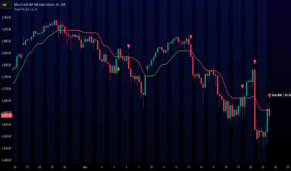
Trend ProTrend Pro is a volatility-adaptive trend and momentum system designed for scalping, day trading, and short-term swing trading.
It uses an ATR-based dynamic trend line (Alpha-Trend style) to identify momentum shifts and confirm directional strength.
Unlike traditional moving averages, Trend Pro adapts to volatility and reacts faster during expansions while filtering noise during chop.
🔍 How Trend Pro Works
Trend Pro builds a dynamic volatility channel using ATR and tracks whether price stays above or below this adaptive line.
When price crosses and closes on the opposite side, it suggests a shift in market control.
When price closes above the line → the trend turns BULLISH (green)
When price closes below the line → the trend turns BEARISH (red)
This gives a clear, visual trend state without repainting.
Tips for Best Performance:
✔ Avoid signals directly inside major ranges or sideways chop
✔ Strongest entries come after small pullbacks into the line
✔ Combine signals with:
Market structure
Key swing highs/lows
Liquidity sweeps
Session timing (NYSE open, power hour)
✔ Trend Pro works best when used with the trend, not counter-trend
Enjoy!
MarketMafia Internals (TICK / ADD / VOLD)this indicator has been built to give the over all heartbeat of the market. Keeping you from fake outs .
100+ BTC Tracker + 182-Day Dormant (6-Month HODL)Instantly see what the biggest Bitcoin whales are doing — and exactly how much of the supply has been completely untouched for 6 full months or longer (182+ days), the strictest and most respected definition of true HODLing.
What this indicator shows you in real time:
Number of wallets holding ≥100 BTC (~15,800 whales)
Total Bitcoin controlled by these whales (~3.25 million BTC)
6-Month Dormant Supply — Bitcoin that hasn’t moved in 182+ days (~14.1 million BTC)
6-Month Dormant % — What percentage of circulating supply is truly locked away
Why 182 days matters:
The 6-month threshold (≈182 days) is the industry-standard cutoff used by Glassnode, CryptoQuant, and analysts worldwide to define ultra-long-term holders. These are the coins least likely to ever hit exchanges — the ultimate measure of conviction and scarcity.
Key features:Live or fallback? — Instantly know if you’re seeing real-time on-chain data (green) or verified backup values (yellow)
Works on free accounts — No paid data subscription required (though it becomes even more accurate with Glassnode/CryptoQuant add-ons)
Clean, non-intrusive design — Three bold plots + sleek dark table in the top-right corner
Always up to date — Fallback values manually verified as of November 21, 2025
Perfect for:
Spotting whale accumulation/distribution phases
Tracking real Bitcoin scarcity during bull or bear markets
Confirming long-term holder conviction before big moves
Add it to any BTC chart and instantly understand who really controls Bitcoin — and how much of it is locked away forever by the strongest hands in crypto.
