Enhanced VolumeEnhanced Volume allows you to show multiple highlights on your volume:
HVE - Highest Volume Ever
HV1 - Highest Volume in 1 Year
Volume Average Moving Average
Projected Volume - Shows the projected volume based on the time of the bar left
2x and 3x volume bars. Shows to bars of where the volume needs to hit to be 2 or 3x above average
Color coding of low volume bars and high volume bars
Up/Down Volume
% Change
Volum

Pivot automatic by GaryIn recent years, I have been exposed to concepts such as order block and fair value gap, which have gained significant popularity. However, I believe that traditional support and resistance levels based on swing highs and lows still hold certain practical value. In particular, support and resistance on higher timeframes play a crucial role in our technical analysis. The traditional principle of support-resistance flip remains valid, and higher timeframe support/resistance levels provide a more systematic framework for analysis. In contrast, the definitions of order block and fair value gap are overly vague; they are often decoupled from market trends, generate numerous false signals, and are thus difficult to apply effectively in practice.
## Pivot Automatic V4 Indicator
An intelligent support and resistance zone identification tool with the following core features:
**🎯 Auto Timeframe Detection**
- Automatically selects appropriate higher timeframes based on current chart period
- No manual adjustment needed, adapts to different trading styles
**📊 Key Features**
- **Support/Resistance Zones**: Auto-identifies and draws HTF pivot high/low zones
- **Touch Alerts**: Real-time alerts for first touch, re-touch, and breakout of zones
- **High Volume Detection**: Marks price areas with exceptional volume
- **Session Filtering**: Configurable trading session analysis
**💡 Practical Features**
- Customizable zone colors and transparency
- Multiple alert types (touch/breakout/retest)
- Detailed price information tooltips
- Auto-extends active zones, cleans broken zones
Perfect for traders to identify key price levels and improve entry/exit timing accuracy across all timeframes.

Volume SMA (StevenCharts)The Volume SMA (StevenCharts) is a streamlined volume analysis tool designed to help traders instantly identify significant market activity.
Standard volume bars can be noisy and difficult to interpret in isolation. This indicator normalizes volume relative to its recent average, highlighting only the bars that carry statistical significance. It separates "smart money" activity from retail noise by color-coding volume based on a user-defined threshold relative to the Moving Average.
How It Works
The indicator calculates a Simple Moving Average (SMA) of the volume (default 20 periods) and compares the current real-time volume against this baseline.
High Relative Volume: If the current volume exceeds the SMA by your set multiplier (e.g., 1.5x or 2.0x), the bar lights up in Green (for bullish closes) or Red (for bearish closes).
Low/Average Volume: If the volume is below the threshold, the bar remains Gray. This helps you ignore low-conviction price action.
Key Features
Threshold Filtering: Easily adjust the "Volume Multiplier" to define what you consider "high volume." Set it to 1.5 to spot bars with 150% of the average volume, or 2.0 for extreme outliers.
Visual Clarity: Automatically greys out insignificant volume, drawing your eye immediately to institutional activity.
Dual-Plot System: Displays standard volume bars alongside the SMA line for context.
Settings
Show Volume SMA: Toggles the blue SMA line on/off.
Volume SMA Length: The lookback period for the average (Default: 20).
Volume Multiplier Threshold: The factor required to trigger the colored highlight.
Example: Setting this to 1.0 means any volume above the average is colored. Setting it to 2.0 means only double-the-average volume is colored.

A.I. 👑 Optimus Prime [RubiXalgo]**A.I. Optimus Prime – The Ultimate Color-Coded AI Trading Indicator**
No equations. No guesswork. Just traffic lights for trading.
🔥 Green = BUY / Long
🔥 Red = SELL / Short
🔥 Yellow = Wait & Watch
Powered by real AI & Machine Learning (Kalman Filters + LOWESS + k-NN + adaptive coloring), this indicator turns complex price & volume data into an instantly readable visual system that works on any market and any timeframe.
### What You Get on Your Chart
- Fast & Slow AI Trend Lines (green = uptrend, red = downtrend)
- Liquidation Window™ – exact stop-loss (red), entry, and 3 take-profit levels (circle → diamond → star)
- Volume Profit-Trend Line – curved AI prediction of next price move
- Dynamic Volume Profile Channel – shows real high-volume support/resistance zones
- Multi-Timeframe Average Lines + Trend Direction Table
- Gradient Candle Coloring + Big Target Dot on last bar
- Speed-Lane fill between fast/slow lines
- Everything fully customizable & toggleable
### Top High-Probability Setups Built In (3:1+ RR)
Longs:
1. Bullish Liquidation Bounce
2. Green Trend Breakout
3. Volume Support Surge
Shorts:
1. Bearish Liquidation Drop
2. Red Trend Breakdown
3. Volume Resistance Fade
Just wait for the colors to align and execute – the indicator does the thinking for you.
### Why Traders Are Switching to A.I. Optimus Prime
✅ 100% visual – perfect for beginners (“green = buy”)
✅ Deadly accurate in expert hands (confluence of trend + volume + liquidation zones)
✅ Adapts automatically to current market volatility
✅ Saves accounts with precise stop-loss & target zones
✅ One indicator replaces 10+ traditional tools
Green window + green volume trend + green fast line = LONG
Red window + red volume trend + red fast line = SHORT

Range Lattice## RangeLattice
RangeLattice constructs a higher-timeframe scaffolding on any intraday chart, locking in structural highs/lows, mid/quarter grids, VWAP confluence, and live acceptance/break analytics. It provides a non-repainting overlay that turns range management into a disciplined process.
HOW IT WORKS
Structure Harvesting – Using request.security() , the script samples highs/lows from a user-selected timeframe (default 240 minutes) over a configurable lookback to establish the dominant range.
Grid Construction – Midpoint and quarter levels are derived mathematically, mirroring how institutional traders map distribution/accumulation zones.
Acceptance Detection – Consecutive closes inside the range flip an acceptance flag and darken the cloud, signaling balanced auction conditions.
Break Confirmation – Multi-bar closes outside the structure raise break labels and alerts, filtering the countless fake-outs that plague breakout traders.
VWAP Fan Overlay – Session VWAP plus ATR-based bands provide a live measure of flow centering relative to the lattice.
HOW TO USE IT
Range Plays : Fade taps of the outer rails only when acceptance is active and VWAP sits inside the grid—this is where mean-reversion works best.
Breakout Plays : Wait for confirmed break labels before entering expansion trades; the dashboard's Width/ATR metric tells you if the expansion has enough fuel.
Market Prep : Carry the same lattice from pre-market into regular trading hours by keeping the structure timeframe fixed; alerts keep you notified even when managing multiple tickers.
VISUAL FEATURES
Range Tap and Mid Pivot markers provide a tape-reading breadcrumb trail for journaling.
Cloud fill opacity tightens when acceptance persists, visually signaling balance compressions ready to break.
Dashboard displays absolute width, ATR-normalized width, and current state (Balanced vs Transitional) so you can glance across charts quickly.
Acceptance Flag toggle: Keep the repeated acceptance squares hidden until you need to audit balance.
PARAMETERS
Structure Timeframe (default: 240): Choose the timeframe whose ranges matter most (4H for indices, Daily for stocks).
Structure Lookback (default: 60): Bars sampled on the structure timeframe.
Acceptance Bars (default: 8): How many consecutive bars inside the range confirm balance.
Break Confirmation Bars (default: 3): Bars required outside the range to validate a breakout.
ATR Reference (default: 14): ATR period for width normalization.
Show Midpoint Grid (default: enabled): Display the midpoint and quarter levels.
Show Adaptive VWAP Fan (default: enabled): Toggle the VWAP channel for assets where volume distribution matters most.
Show Acceptance Flags (default: disabled): Turn the acceptance markers on/off for maximum visual control.
Show Range Dashboard (default: enabled): Disable if screen space is limited, re-enable during prep sessions.
ALERTS
The indicator includes five alert conditions:
Range High Tap: Price interacted with the RangeLattice high
Range Low Tap: Price interacted with the RangeLattice low
Range Mid Tap: Price interacted with the RangeLattice mid
Range Break Up: Confirmed upside breakout
Range Break Down: Confirmed downside breakout
Where it works best
This indicator works best on liquid instruments with clear structural levels. On very low timeframes (1-minute and below), the structure may update too frequently to be useful. The acceptance/break confirmation system requires patience—faster traders may find the multi-bar confirmation too slow for scalping. The VWAP fan is session-based and resets daily, which may not suit all trading styles.

SDFADE nuvolébasic script to signal mean reversions and alert fades when stretched to +/-2.5VWAP Standard Deviation

VWAP 1SD 2SD yasurferThis custom intraday indicator is designed to provide a detailed understanding of market equilibrium, volatility expansion, and trend structure by combining Session VWAP, Standard Deviation bands, and multi-timeframe EMAs. The script calculates cumulative volume-weighted price data throughout the trading day and automatically resets at the start of each new session. This ensures that the Session VWAP reflects only current-day trading activity, making it highly relevant for scalpers, day traders, and intraday swing setups.
The ±2 Standard Deviation bands illustrate where price is statistically stretched. These zones often act as areas of exhaustion, liquidity grabs, or potential momentum continuation points. By tracking variance around VWAP, the indicator helps traders quickly identify whether price is trading within a normal distribution or pushing into extreme territory.
A dynamic label displays the real-time percentage distance from VWAP, allowing traders to assess how far price has deviated from fair value. This is particularly useful for identifying overextended moves, mean-reversion opportunities, or breakout conditions.
The addition of EMA 50, EMA 200, and EMA 325 provides structural trend context—helping traders evaluate higher-timeframe alignment and potential confluence with VWAP levels. Overall, this indicator enhances clarity, timing, and decision-making by blending statistical tools with traditional trend analysis.

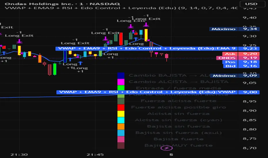
VWAP + EMA9 + RSI + Edo Control (Edu)VWAP + EMA9 + RSI + Edo Control (Edu)
A complete intraday scalping system that combines institutional levels, fast trend signaling and enhanced candle-color analysis for maximum clarity and confirmation.
This indicator includes:
1. VWAP (Volume Weighted Average Price)
The institutional reference line used to determine value zones, liquidity bias and directional pressure.
2. EMA9 (Fast Exponential Moving Average)
A micro-trend guide that reacts quickly to short-term movements and improves timing on pullback entries.
3. RSI (Relative Strength Index)
A clean momentum filter using the classic >50 (bullish) and <50 (bearish) bias.
Edo Control – Advanced Colored Candle System
This version integrates Edo Control, a custom candle-color engine that visualizes market strength shifts based on Williams %R, directional movement and ADX behavior.
Each candle color represents a different market condition, such as:
Trend acceleration
Trend weakening
Possible reversals
Momentum spikes
Bullish or bearish pressure
Transition zones
A built-in movable legend explains the meaning of each color directly on the chart, so traders can identify conditions instantly without guessing.
Why this indicator works
The combination of VWAP + EMA9 + RSI + colored candle strength creates a multi-layer confirmation system that cuts noise and highlights only meaningful setups.
Designed for 1m, 3m, 5m charts, but also effective on higher timeframes.
Suitable for: stocks, indices, futures, forex, crypto.
VWAP + EMA9 + RSI Scalping (Edu)VWAP + EMA9 + RSI Scalping (Edu) is an intraday scalping indicator combining VWAP, EMA9 and RSI to identify high-probability long and short entries. Designed for low timeframes (1m–5m), it aligns micro-trend and momentum to generate clean and fast setups. Works on stocks, indices, forex and crypto.

Institutional VWAP Suite (Lite Compatible)The **Institutional VWAP Suite (Lite Compatible)** brings true institutional volume-weighted price analysis to every trader — even on TradingView Lite/Free accounts where standard VWAP tools are restricted.
This script recreates the most important VWAP models used by banks, funds, and high-frequency desks, including:
• **Daily VWAP** (exchange-accurate)
• **Weekly VWAP** (manually accumulated)
• **Monthly VWAP** (manually accumulated)
• **Rolling Window VWAP** (array-based, fully Lite-compatible)
All calculations avoid blocked functions like `ta.sum` or session-restricted VWAP calls. Everything is built manually from volume and price to ensure accuracy across all accounts and all markets.
### Features
• Multi-timeframe VWAPs (Daily/Weekly/Monthly)
• Manual Rolling VWAP with adjustable length
• Optional VWAP bands (Lite-safe)
• Clean visuals with color-coded levels
• Optimized arrays for fast, stable performance
• Free-tier compatible — no premium functions required
This tool is designed for traders who want institutional structure, premium-level VWAP calculations, and consistent execution regardless of plan level. Perfect for scalpers, day traders, futures traders, and anyone who uses intraday volume profiles.
### Recommended Use
• Map directional bias using Daily vs Weekly VWAP
• Use Monthly VWAP for macro trend context
• Track intraday mean reversion with Rolling VWAP
• Use VWAP bands as dynamic support/resistance zones
A simple, powerful, no-restrictions VWAP engine — built for everyone.

Open Interest Delta AggregateOpen Interest Delta - By Randy (Multi-Exchange Version)This Pine Script indicator calculates and displays the daily change (delta) in total Open Interest across multiple major perpetual futures exchanges.Key Features:Aggregates Open Interest from Binance, OKX, ByBit, Bitget, HTX, and the current chart’s exchange (if any).
You toggle each exchange on/off individually — it automatically sums all active sources.
Plots OI Delta as histogram columns (Type 1 = combined, Type 2 = separate positive/negative).
Uses dynamic thresholds based on standard deviation of positive/negative OI delta EMA to classify changes as:Normal (yellow)
Medium (orange)
Large (red)
Extreme (purple)
Optionally colors price candles when OI delta crosses these significant thresholds (great for spotting big money moves).
Works best on daily timeframe (automatically switches to daily OI data even if you're viewing lower timeframes).
In Simple Terms:It shows you when huge amounts of new positions (long or short) are being opened across the biggest crypto futures exchanges — a powerful signal of institutional/smart money activity and potential trend strength or reversals. The more exchanges light up with extreme OI delta, the stronger the conviction behind the move.

Bullish Volume RatioBullish Volume Ratio (BVR) Indicator
The Bullish Volume Ratio (BVR) is a sophisticated momentum oscillator designed to measure the true intensity of buying pressure versus selling pressure in the market. It provides a unique, statistically-driven view of market conviction, making it an essential tool for traders who seek to confirm trend health and anticipate major shifts.
BVR achieves its precision by not only assessing net volume but also using proprietary volume weighting logic to gauge the quality of participation in each candle, filtering out market noise to present a clear picture of underlying demand.
Key Features
Statistically-Driven Conviction: The indicator utilizes a Z-Score to measure how far the current BVR reading deviates from its historical average, providing an objective measure of whether buying or selling is truly exceptional or just noise.
Clear Visual Signals: The oscillator plot is designed for clear interpretation on a separate pane, helping you identify regime shifts without cluttering the main price chart.
Real-Time Data Dashboard (Optional): A customizable table on the chart displays the current BVR, Z-score, and other critical volume metrics at a glance.
Simplified Trading Guide
The BVR indicator simplifies volume analysis into clear, actionable signals that can be used for trend confirmation and reversal anticipation.
1. Trend Confirmation
Use the BVR to confirm the momentum of an existing trend:
Bullish Confirmation: When price is trending up, look for the BVR line to be rising and consistently above the center line. This signals that buyers are in firm control and the uptrend has strong volume conviction.
Bearish Confirmation: When price is trending down, look for the BVR line to be falling and deep below the center line. This indicates sellers are dominating the volume profile, confirming the strength of the downtrend.
2. Identifying Trade Entry/Exit Zones
The indicator's Z-Score component is key to spotting extremes that often precede a reversal:
Potential Long Entry: Look for a sustained negative Z-Score followed by a sharp crossover back towards the center line or into positive territory. This can signal that selling pressure has reached an exhaustion point and accumulation (buying) is beginning.
Potential Short Entry: Look for a sustained positive Z-Score followed by a sharp crossover back towards the center line or into negative territory. This suggests that buying momentum is exhausted and distribution (selling) is commencing.
3. The Volume Spike Filter
The indicator also alerts you to candles with significantly high volume relative to the recent average. Use this as a filter:
Breakout Validation: A price breakout is more likely to be legitimate if it is accompanied by a high volume spike confirmed by a strong BVR reading in the direction of the breakout.
Reversal Warning: A high volume spike at a key support or resistance level, particularly one that leads to a sharp turn in the BVR, can strongly signal a climactic reversal in progress.

Crypto Liquidation Zones & Order Clusters This PineScript v6 indicator was specifically designed for crypto traders and displays estimated liquidation zones as well as probable order clusters on the chart. Since TradingView has no direct access to real order book data, stop-loss positions, or internal exchange liquidation levels, the indicator works with intelligent estimations based on historical volume data and market behavior.
The indicator identifies three main types of critical price zones: First, it marks psychological levels – round numbers like $100,000 or $50,000, where limit orders typically accumulate. Second, it highlights high-volume zones, areas with unusually high trading volume that indicate many traders have opened positions there. Third, the indicator calculates estimated liquidation zones for long and short positions by assuming typical leverage levels (default 10x) and projecting the probable liquidation prices.
The mechanism is based on analyzing volume spikes combined with volatility: When a strong price increase occurs with high volume, the indicator stores this level as a probable long-entry point and calculates the corresponding liquidation zone below the current price. During price declines with high volume, short positions are tracked and their liquidation zones are drawn above the price. Red zones mark long liquidations, green zones mark short liquidations, blue boxes show high-volume areas, and yellow dashed lines indicate psychological levels.
All settings are fully customizable: You can adjust the lookback period (default 100 bars), sensitivity for volume spikes, assumed average leverage, and toggle individual display elements. An info panel in the top-right corner shows you live how many long and short entry levels are currently being tracked and how current volume compares to the average. It's important to understand that all displayed zones are estimates – the indicator cannot see actual orders from other traders, but it provides valuable insights into areas where many positions are likely at risk and liquidation cascades could occur.

FluxPulse Beacon## FluxPulse Beacon
FluxPulse Beacon applies a microstructure lens to every bar, combining directional thrust, realized volatility, and multi-timeframe liquidity checks to decide whether the tape is being pushed by real sponsorship or just noise. The oscillator's color-coded columns and adaptive burst thresholds transform complex flow dynamics into a single actionable flux score for futures and equities traders.
HOW IT WORKS
Momentum Extraction – Price differentials over a configurable pulse distance are smoothed using exponential moving averages to isolate directional thrust without reacting to single prints.
Volatility + Liquidity Normalization – The momentum stream is divided by realized volatility and multiplied by both local and higher-timeframe EMA volume ratios, ensuring pulses only appear when volatility and liquidity align.
Adaptive Thresholding – A volatility-derived standard deviation of flux is blended with the base threshold so bursts scale automatically between low-volatility and high-volatility market conditions.
Divergence Engine – Linear regression slopes compare price vs. flux to tag bullish/bearish divergences, highlighting stealth accumulation or distribution zones.
HOW TO USE IT
Continuation Entries : Go with the trend when histogram bars stay above the adaptive threshold, the signal line confirms, and trend bias agrees—this is where liquidity-backed follow-through lives.
Fade Plays : Watch for divergence alerts and shrinking compression values; when flux prints below zero yet price grinds higher, hidden selling pressure often precedes rollovers.
Session Filter : Compression percentage in the diagnostics table instantly tells you whether to trade thin overnight sessions—low compression means stand down.
VISUAL FEATURES
Dynamic background heat maps flux magnitude, while threshold lines provide a quick read on whether a pulse is statistically significant.
Diagnostics table displays live flux, signal, adaptive threshold, and compression for quick reference.
Alert-first workflow: The surface is intentionally clean—bursts and divergences are delivered via alerts instead of on-chart clutter.
PARAMETERS
Trend EMA Length (default: 34): Defines the macro bias anchor; increase for higher-timeframe confirmation.
Pulse Distance (default: 8): Controls how sensitive momentum extraction becomes.
Volatility Window (default: 21): Sample window for realized volatility normalization.
Liquidity Window (default: 55): Volume smoothing window that proxies liquidity expansion.
Liquidity Reference TF (default: 60): Select a higher timeframe to cross-check whether current volume matches institutional flows.
Adaptive Threshold (default: enabled): Disable for fixed thresholds on slower markets; enable for high-volatility assets.
Base Burst Threshold (default: 1.25): Minimum flux magnitude that qualifies as an actionable pulse.
ALERTS
The indicator includes four alert conditions:
Bull Burst: Detects upside liquidity pulses
Bear Burst: Detects downside liquidity pulses
Bull Divergence: Flags bullish delta divergence
Bear Divergence: Flags bearish delta divergence
LIMITATIONS
This indicator is designed for liquid futures and equity markets. Performance may degrade in low-volume or highly illiquid instruments. The adaptive threshold system works best on timeframes where sufficient volatility history exists (typically 15-minute charts and above). Divergence signals are probabilistic and should be confirmed with price action.
INSERT_CHART_SNAPSHOT_URL_HERE
---
## RangeLattice Mapper
RangeLattice Mapper constructs a higher-timeframe scaffolding on any intraday chart, locking in structural highs/lows, mid/quarter grids, VWAP confluence, and live acceptance/break analytics. It provides a non-repainting overlay that turns range management into a disciplined process.
HOW IT WORKS
Structure Harvesting – Using request.security() , the script samples highs/lows from a user-selected timeframe (default 240 minutes) over a configurable lookback to establish the dominant range.
Grid Construction – Midpoint and quarter levels are derived mathematically, mirroring how institutional traders map distribution/accumulation zones.
Acceptance Detection – Consecutive closes inside the range flip an acceptance flag and darken the cloud, signaling balanced auction conditions.
Break Confirmation – Multi-bar closes outside the structure raise break labels and alerts, filtering the countless fake-outs that plague breakout traders.
VWAP Fan Overlay – Session VWAP plus ATR-based bands provide a live measure of flow centering relative to the lattice.
HOW TO USE IT
Range Plays : Fade taps of the outer rails only when acceptance is active and VWAP sits inside the grid—this is where mean-reversion works best.
Breakout Plays : Wait for confirmed break labels before entering expansion trades; the dashboard's Width/ATR metric tells you if the expansion has enough fuel.
Market Prep : Carry the same lattice from pre-market into regular trading hours by keeping the structure timeframe fixed; alerts keep you notified even when managing multiple tickers.
VISUAL FEATURES
Range Tap and Mid Pivot markers provide a tape-reading breadcrumb trail for journaling.
Cloud fill opacity tightens when acceptance persists, visually signaling balance compressions ready to break.
Dashboard displays absolute width, ATR-normalized width, and current state (Balanced vs Transitional) so you can glance across charts quickly.
Acceptance Flag toggle: Keep the repeated acceptance squares hidden until you need to audit balance.
PARAMETERS
Structure Timeframe (default: 240): Choose the timeframe whose ranges matter most (4H for indices, Daily for stocks).
Structure Lookback (default: 60): Bars sampled on the structure timeframe.
Acceptance Bars (default: 8): How many consecutive bars inside the range confirm balance.
Break Confirmation Bars (default: 3): Bars required outside the range to validate a breakout.
ATR Reference (default: 14): ATR period for width normalization.
Show Midpoint Grid (default: enabled): Display the midpoint and quarter levels.
Show Adaptive VWAP Fan (default: enabled): Toggle the VWAP channel for assets where volume distribution matters most.
Show Acceptance Flags (default: disabled): Turn the acceptance markers on/off for maximum visual control.
Show Range Dashboard (default: enabled): Disable if screen space is limited, re-enable during prep sessions.
ALERTS
The indicator includes five alert conditions:
Range High Tap: Price interacted with the RangeLattice high
Range Low Tap: Price interacted with the RangeLattice low
Range Mid Tap: Price interacted with the RangeLattice mid
Range Break Up: Confirmed upside breakout
Range Break Down: Confirmed downside breakout
LIMITATIONS
This indicator works best on liquid instruments with clear structural levels. On very low timeframes (1-minute and below), the structure may update too frequently to be useful. The acceptance/break confirmation system requires patience—faster traders may find the multi-bar confirmation too slow for scalping. The VWAP fan is session-based and resets daily, which may not suit all trading styles.
---

VPOCS ZScoreAn indicator Showing Candle POC's.
Added a Zscore Filter to filter out the High volume candle's.
I like to use at Key Support and resistance Area's to see Absorbtion and Offside positions only on High volume Candles ( The high volume candle part is Key! ). Thoose candles Generally indicate forced participants opening or closing positions, or "Breakout traders entering" positions. When i see a Hi-Volume at S/R levels and price is rejecting ( trading away from the POC ) ill take that as a trigger for a trade.
- Dynamic Support and resistance.
- Show Offside and and Trapped traders
You can tweak the Zscore nominator for Less of more Frequent hits.

Fluxion Oscillator [Kodexius]Fluxion Oscillator is a multi dimensional momentum and flow toolkit designed to highlight exhaustion, reversals and confluence in a very compact way. The script combines a normalized trend oscillator, volume sensitive money movement, a volatility gauge and a visual confluence gauge that all sit in a single pane.
Instead of focusing on a single signal, Fluxion looks at the interaction between price, momentum and volume. The core oscillator tracks the relationship between a fast and a slow response of price, then rescales it into a stable 0 to 100 band. A companion flow line tracks how actively price is being supported or pressured by volume. On top of that, a volatility based gauge and an overbought or oversold reversal layer help highlight when moves are stretched and vulnerable.
The result is an environment where you can quickly see:
-When momentum is expanding or fading
-When price swings are supported or rejected by volume
-Where local tops or bottoms can be forming through divergence
-How strong the current push is in the context of recent volatility
-A compact gauge that visually ranks the current state from “minimum” to “maximum” pressure
It is not a trading system by itself, but a framework that makes it much easier to build rules and confluence around your own strategy.
⭐ Features
Normalized Fluxion Oscillator
Core oscillator built from the difference between a fast and a slow smoothing of the chosen source.
Automatically normalized into a bounded range so it behaves consistently across symbols and timeframes.
Dual line structure: the main line and a signal line, making crossovers easy to read.
Dynamic fill that shifts color depending on whether the main line is above or below the signal line.
Bullish and Bearish Crosses
Visual circles highlighting when the main oscillator crosses its signal line upward or downward.
Bullish crosses emphasize potential momentum ignition after downside pressure.
Bearish crosses emphasize potential cooling of momentum after upside pressure.
Money Flow Layer
Separate line that blends price and volume over a configurable lookback.
Smoothed to reduce noise and plotted around a central balance level.
Colored region that clearly shows whether buying pressure or selling pressure dominates.
Divergence Detection Suite
Automatic detection of regular bullish and regular bearish divergences between price and the normalized oscillator.
Optional hidden bullish and hidden bearish divergences for continuation setups.
Uses pivot based swing points so the lines attach to meaningful highs and lows instead of random wiggles.
All divergence types can be toggled independently so you can keep the chart as clean as you like.
Volatility and Positioning Gauge
A compact gauge that evaluates where the current price sits relative to a volume weighted average and its recent typical fluctuation.
Colors shift as price moves from neutral to stretched zones in either direction.
Background highlighting above and below the oscillator scale to reflect when this gauge is in an extreme region.
Helps quickly see whether you are buying into strength after a large extension or stepping in near value.
Reversal Signals With Volume Confirmation
A higher time sensitivity reversal metric based on a 0 to 100 scale of recent price changes.
Signals are only highlighted when there is also a short burst in volume, so quiet market noise is reduced.
Bearish reversal markers appear in the upper region, bullish markers in the lower region, giving a clear visual “top” and “bottom” feel.
Confluence Gauge
Right side grid composed of horizontal bands, from “Min” at the bottom to “Max” at the top.
Each band reflects a segment of a smoothed, range based momentum reading that tracks how far price has advanced within its recent 0 to 100 window.
The currently active band is highlighted in green for bullish momentum or red for bearish momentum, depending on the relationship between fast and slow lines within that range.
A pointer and labels make it obvious where the current environment sits relative to the full range of possible conditions.
Divergence Core
Users can define the pivot length to control how strict and how far apart swing points should be.
High Customization
Adjustable lookback lengths for the core oscillator, signal smoothing and normalization.
Separate controls for money flow length and smoothing.
Optional toggles for each divergence type so you can focus only on the structures you care about.
⭐ Calculations
This section explains conceptually how Fluxion works without exposing the full underlying formula details. The goal is to help you understand what each component represents and how it behaves, so you can use it more effectively.
Fluxion Oscillator Core
The foundation of the indicator is the difference between two smoothed versions of the selected price source. One reacts more quickly to new price information, the other reacts more slowly.
When the fast curve is above the slow curve, the oscillator becomes positive, signaling that short term action is advancing faster than the background trend. When the fast curve is below the slow curve, it becomes negative, indicating short term weakness.
This raw difference is then normalized over a rolling window. The highest and lowest values in that window are used to rescale the oscillator into a 0 to 100 band. This produces a stable, comparable scale across markets and timeframes.
A secondary smoothing of the oscillator creates the signal line. The interaction between the main line and this signal is used to color the fill region and locate cross events.
Money Flow Construction
The money flow line is based on how price closes within its candle range combined with the traded volume. Up candles with strong closes and high volume contribute positively, while down candles with weak closes and high volume contribute negatively.
These contributions are aggregated over a configurable period to create a net “pressure” measure. The result represents how aggressively participants have been positioning over that window, not just whether price went up or down.
The line is then smoothed to reduce micro noise and plotted around a central balance level, here set at 50. Values above the balance zone suggest net positive pressure, values below suggest net negative pressure.
An additional internal threshold is used to detect when this pressure stays on one side of the balance area long enough to be considered an “overflow,” which helps detect sustained accumulation or distribution phases.
Volatility and Positioning Gauge
The gauge computes a volume weighted average price over a user defined period. This gives more weight to prices at which more volume was traded.
It then evaluates how far the current price is from that volume weighted center, relative to the typical price variation around it. This creates a standardized distance measure that tells you how stretched price is from its recent fair zone.
When the distance becomes significantly positive, the market is considered extended upward. When it becomes significantly negative, it is extended downward. Intermediate thresholds are used to create “warning” and “extreme” zones.
Background fills at the top and bottom of the panel change based on this standardized distance, visually indicating when the market is moving into overextended territory that often precedes mean reversion or at least slowing of the move.
Reversal Metric With Volume Filter
A separate 0 to 100 style momentum score is calculated over a mid length window. It evaluates recent gains and losses in price to produce a relative strength measure of the current move.
Upper and lower thresholds on this score are used to mark areas where price action is historically stretched to the upside or downside.
This alone would generate many signals, so a volume based filter is added. Reversal markers are only displayed when this momentum score is in an extreme area and volume has shown a short term pickup.
This combination gives more weight to reversals that occur during active trading, where trapped positions and forced unwinds are more likely.
Divergence Engine
The divergence logic scans for swing highs and swing lows in the normalized oscillator and in price. Swing points are defined by requiring a certain number of bars on both sides of the pivot, which you can configure via the divergence length input.
For regular bullish divergence:
Price makes a lower low, indicating apparent weakness.
The oscillator makes a higher low over the same general region, indicating that internal momentum is actually improving.
If both conditions are met within a valid bar distance, a bullish divergence line is drawn from the prior oscillator pivot to the new one.
For regular bearish divergence:
Price makes a higher high, suggesting continued strength.
The oscillator makes a lower high, showing that underlying momentum is waning.
The engine checks that both pivot structures appear within an allowed time frame, then draws a bearish line between the oscillator peaks.
Hidden divergences are handled in a similar way, except the direction of price and oscillator swings is reversed, which makes them suitable for trend continuation contexts instead of reversal contexts.
Confluence Gauge
The grid on the right converts a smoothed, range based momentum reading into ten equal bands. This momentum reading looks at where the current value sits between the lowest and highest readings of a recent window, then rescales it into a 0 to 100 scale.
That 0 to 100 value is divided into ten slices of ten points each. For example, 0 to 10 is the lowest band, 90 to 100 is the top band.
The algorithm then checks whether the fast component of this reading is above or below its slower companion. If fast is above slow, it is treated as bullish pressure and the active band is colored in green. If fast is below slow, it is treated as bearish pressure and the active band is colored in red.
A pointer label is placed alongside the active band and “Max” and “Min” markers are drawn above and below the grid. This creates a compact visual where you can quickly gauge if the current state is closer to the lower boundary of recent conditions or to the upper boundary, along with its directional bias.
Normalization And Scaling
Several internal components use rolling highest and lowest values to transform raw readings into normalized percentages. This includes the main oscillator and the range based momentum used by the confluence gauge.
The key idea is to express conditions relative to what has recently been possible on that instrument and timeframe instead of using absolute fixed thresholds. This makes Fluxion adaptive and more robust when switching between assets with different volatility profiles.

WSMR v3.9 — WhaleSplash → Mean Reversal
# WSMR v3.9 — WhaleSplash → Mean Reversal
*A Non-Repainting Impulse‑Reversal Engine for Systematic Futures Trading*
## Overview
WSMR v3.9 is a complete impulse → exhaustion → mean‑reversion framework designed for systematic intraday trading. It identifies high‑energy displacement events (“WhaleSplashes”), measures volatility structure, tracks VWAP deviation, and confirms reversals using RSI divergence, Z‑Score resets, SMA20 reclaim, and pivot-based structure.
All signals are non‑repainting and alerts fire on bar close.
---
## Core Components
### 1. WhaleSplash (Short Impulse Event)
Triggered when a candle meets displacement conditions:
- Large bar range vs ATR
- Minimum % move
- Volume expansion
- VWAP deviation (tick-based)
- Z‑Score oversold / RSI exhaustion
- Volatility-gated
### 2. Mean Reversal Long (MR)
Requires:
- RSI bullish divergence
- Z‑Score reset
- SMA20 reclaim
- Higher-low confirmation
### 3. First-Candle Confirmation (Optional)
- MR Confirm → first green after MR
- WS Confirm → first red after WS
- TTL window configurable
### 4. Asia Session Filter
Optional restriction to:
**23:00 → 09:00 UTC**
### 5. Volatility Monitor
Detects:
- Normal
- Wicky
- Spiky
- Extreme
### 6. WS Frequency Analytics
Rolling frequency calculation across:
- Bars / Days / Weeks / Months
---
## Status Panel (Top-Right)
Shows:
- Mode (Global / Asia-only)
- Timeframe + TTL
- WS frequency
- Volatility state
---
## Alerts
- WhaleSplash SHORT
- WhaleSplash LONG (MR)
- MR Confirm LONG
- WS Confirm SHORT
- Volatility Warning
---
## Notes
- Fully non‑repainting
- Stable bar-close logic
- Optimised for 1m–5m
- Works on futures, indices, metals, FX

Hybrid -WinCAlgo/// 🇬🇧
Hybrid - WinCAlgo is a weighted composite oscillator designed to provide a more robust and reliable signal than the standard Relative Strength Index (RSI). It integrates four different momentum and volume metrics—RSI, Money Flow Index (MFI), Scaled CCI, and VWAP-RSI—into a single 0-100 oscillator.
This powerful tool aims to filter market noise and enhance the detection of trend reversals by confirming momentum with trading volume and volume-weighted average price action.
⚪ What is this Indicator?
The Hybrid Oscillator combines:
* RSI (40% Weight): Measures fundamental price momentum.
* VWAP-RSI (40% Weight): Measures the momentum of the Volume Weighted Average Price (VWAP), providing strong volume confirmation for trend strength.
* MFI (10% Weight): Measures money flow volume, confirming momentum with liquidity.
* Scaled CCI (10% Weight): Tracks market extremes and potential trend shifts, scaled to fit the 0-100 range.
⚪ Key Features
* Composite Strength: Blends four different market factors for a multi-dimensional view of momentum.
* Volume Integration: High weights on VWAP-RSI and MFI ensure that momentum signals are backed by trading volume.
* Advanced Divergence: The robust formula significantly enhances the detection of Bullish and Bearish Divergences, often providing an earlier signal than traditional oscillators.
* Customizable: Adjustable Lookback Length (N) and Individual Component Weights allow users to fine-tune the oscillator for specific assets or timeframes.
* Visual Clarity: Uses 40/60 bands for earlier Overbought/Oversold indications, with a gradient-styled background for intuitive visual interpretation.
⚪ Usage
Use Hybrid – WinCAlgo as your primary momentum confirmation tool:
* Divergence Signals: Trust the indicator when it fails to confirm new price highs/lows; this signals imminent trend exhaustion and reversal.
* Accumulation/Distribution: Look for the oscillator to rise/fall while the price is ranging at a bottom/top; this confirms hidden buying or selling (accumulation).
* Overbought/Oversold: Use the 60 band as the trigger for potential selling/shorting signals, and the 40 band for potential buying/longing signals.
* Noise Filter: Combine with a higher timeframe chart (e.g., 4H or Daily) to filter out gürültü (noise) and focus only on significant momentum shifts.
---

RSI Cross Below 30 – Red Background StripShows red bars on chart in instances where RSI drops below 30


On Balance Volume ModA/D doesnt take into account the opening price, it just sees the difference in high to close wik vs close to low wik and adds volume
however if the closing price is above the opening price then arguably there was more buying action than selling
so adjusting A/D formula so that if close > open then it adds to volume not subtract
Effectively this becomes something in bw OBV and A/D
also we need not worry about gaps, since no tradding happens in gaps, so just a gap up / gap down doesnt have any accumulation / distribution effect

EGX30 Advance/Decline Line🇪🇬 EGX30 Advance/Decline & Market Breadth Suite
This comprehensive indicator provides a deep dive into the market breadth of the EGX30 index, allowing traders and analysts to monitor underlying buying and selling pressure across its constituents. It offers five distinct metrics for a holistic view of market health, ranging from traditional Advance/Decline analysis to advanced McClellan Oscillators and TRIN (Arms Index) readings.
Key Features and Metrics
The indicator is selectable via the 'Select Metric' input and can display the following on your chart:
1. Advance/Decline Line: A cumulative measure of the difference between the number of advancing stocks and declining stocks (Advancing Stocks−Declining Stocks). It helps confirm the market's trend strength.
2. McClellan Oscillator: Calculated using the Advance/Decline Ratio (AD Ratio) smoothed by two Exponential Moving Averages (EMAs). It acts as a momentum measure of the A/D Line, highlighting potential overbought/oversold conditions and trend turns.
Climax Levels: Horizontal lines are plotted at +0.1 (Buy Climax) and −0.1 (Sell Climax).
3. Arms Index (TRIN): A volume-based indicator that measures the ratio of the Advance/Decline Ratio to the Advancing Volume/Declining Volume Ratio. A value above 1.0 is generally bearish (more volume in declining stocks), while a value below 1.0 is bullish.
Bands: Upper and Lower deviation bands are calculated and plotted for advanced analysis of extremes.
4. Total Volume: The raw, aggregated volume of all EGX30 constituent stocks.
5. Total Liquidity (Total Traded Value): The sum of (Price × Volume) for all EGX30 constituent stocks, giving a more accurate representation of capital flow.
⚙️ Customizable & Smart Configuration
The indicator is designed for maximum flexibility and accuracy across different chart timeframes:
Automatic Timeframe Configuration: When enabled (default), the script automatically selects optimized lookback periods for the Moving Average (MA), McClellan EMAs, and TRIN Lookback based on whether the chart is Intraday, Daily, Weekly, or other.
Manual Overrides: Disable the auto-configuration to manually set the MA Length, McClellan Fast/Slow EMAs, and TRIN Lookback/StdDev Multiplier for custom analysis.
📊 Advanced Data Table (Market Breakdown)
When the 'Show Table' input is toggled ON, a detailed statistics table appears on the chart's top-right corner, providing real-time market insights.
Top Performance (Contributors): Ranks and displays the Top N (customizable) stocks that are contributing the most to the index's movement, calculated as Weight × Percentage Change.
Top Liquidity: Ranks and displays the Top N stocks by their current-bar traded value (Price×Volume), expressed as a percentage of the Total Traded Value.
Horizontal Stats (Row 3): Provides a comprehensive summary of the current market state:
Adv, Decl, Unch: Count of advancing, declining, and unchanged stocks.
Net Adv: The difference between advancing and declining stocks.
Net Vol / Net Liq: Net Volume/Liquidity as a percentage of Total Volume/Liquidity.
Primary Metric/Volume Stats: Depending on the selected metric, it displays the current value of TRIN or the raw Total Volume and Total Liquidity.
This tool is indispensable for traders needing a clear, quantified understanding of the EGX30's underlying market dynamics.
EGX30 Advance/Decline v1.1
In this improved version, the relative weights of the index components have been adjusted, some stocks have been removed from the index, and new stocks have been added based on the latest update of the Egyptian Exchange's EGX30 index. Some visual improvements have also been made.

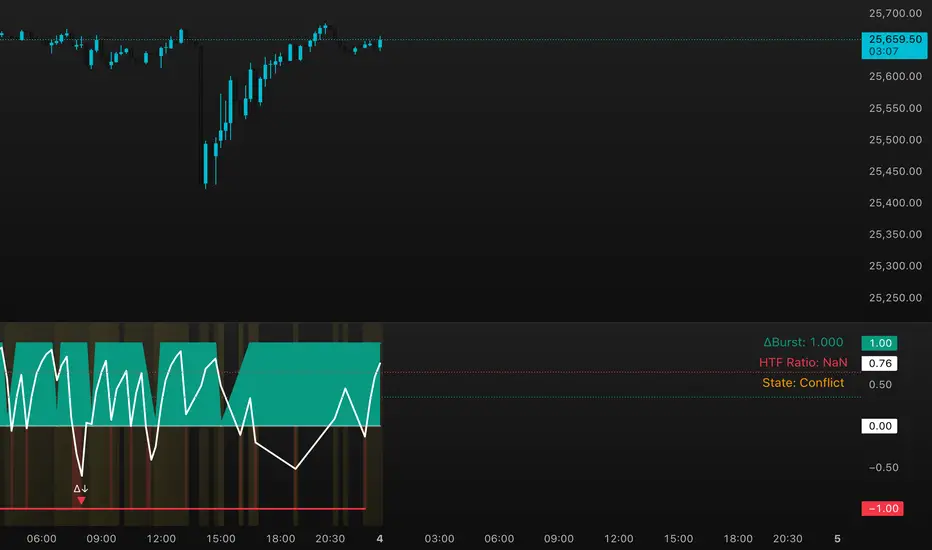
DeltaBurst Locator ## DeltaBurst Locator
DeltaBurst Locator is a sponsorship detector that divides OBV impulse by price thrust, normalizes the ratio, and cross-checks it against a higher timeframe confirmation stream. The oscillator turns the abstract "is this move real?" question into a precise number, exposing accumulation, distribution, and exhaustion across futures and stocks.
HOW IT WORKS
OBV Impulse vs. Price Change – Smoothed deltas of On-Balance Volume and price are ratioed, then normalized using a hyperbolic tangent function to prevent single prints from dominating.
Signal vs. Confirmation – A short EMA produces the execution signal while a higher-timeframe request.security() feed validates whether broader flows agree.
Spectrum Classification – Expansion/compression metrics grade whether current aggression is intense or fading, while ±0.65 bands define exhaust/vacuum zones.
Slope Divergences – Linear regression slopes on both price and the ratio expose bullish/bearish sponsorship mismatches before candles reverse.
HOW TO USE IT
Breakout Validation : Only chase breakouts when both local and higher-timeframe ratios are on the same side of zero; mixed signals suggest liquidity is fading.
Absorption Trades : When the histogram spikes beyond ±0.65 but the EMA lags, expect absorption; combine with price structure for pinpoint reversals.
News/Event Monitoring : During earnings or macro releases, watch for ratio collapses with price still rising—this flags forced moves driven by hedging rather than real demand.
VISUAL FEATURES
Color logic: Positive sponsorship fills teal, negative fills crimson against the zero line, making intent obvious at a glance.
Optional markers: Burst triangles and divergence dots can be enabled when you need explicit annotations or left off for a minimalist panel.
Compression heatmap: Background shading communicates whether the market is coiling (high compression) or erupting (low compression).
Dashboard: Displays the live ratio, higher-timeframe ratio, and agreement state to speed up scanning across tickers.
PARAMETERS
Fast Pulse Length (default: 5): Controls the smoothing window for price change detection.
Slow Equilibrium Length (default: 34): Window for expansion/compression calculation.
OBV Smooth (default: 8): Smoothing period for OBV impulse calculation.
Ratio Ceiling (default: 3.0): Controls how aggressively values saturate; raise for high-volatility tickers.
Signal EMA (default: 4): EMA period for the signal line.
Confirmation Timeframe (default: 240): Pick a higher anchor (e.g., 4H) to validate intraday moves.
Divergence Window (default: 21): Window for slope-based divergence detection.
Show Burst Markers (default: disabled): Toggle burst triangles on demand.
Show Divergence Markers (default: disabled): Toggle divergence dots on demand.
Show Delta Dashboard (default: enabled): Hide when screen space is limited; leave on for desk broadcasts.
ALERTS
The indicator includes four alert conditions:
DeltaBurst Bull: Spotted a bullish liquidity burst
DeltaBurst Bear: Spotted a bearish liquidity burst
DeltaBurst Bull Div: Detected bullish sponsorship divergence
DeltaBurst Bear Div: Detected bearish sponsorship divergence
Hope you enjoy!