Multi-factor momentum & flow confluence oscillator
MarketExploiter
Momentum–flow confluence oscillator.
Overview
This indicator combines momentum structure, money-flow behavior, trend context, and divergence detection into a single visual tool. It helps highlight when momentum is strengthening, weakening, or beginning to shift direction.
Components
• A smoothed momentum curve that visualizes acceleration and exhaustion.
• Money-flow bias reflecting underlying buying or selling pressure.
• Momentum-shift dots that appear only when several factors align, such as momentum inflection, curve behavior, and supportive flow.
• Bullish and bearish divergence detection between price and the momentum curve.
• A trend panel offering broader directional context.
How to Use
Signals are most effective when they appear in the direction of the trend panel and when money-flow conditions support the move. Divergence signals may highlight early strength or weakness relative to price action. The indicator is intended for context and confirmation rather than standalone entries. Works across all liquid markets and timeframes.
Notes
Non-repainting. Suitable for momentum assessment, trend reading, and identifying potential inflection zones.
Centered Oscillators

Session Opening Range Breakout (ORBO)This strategy automates a classic Opening Range Breakout (ORBO) approach: it builds a price range for the first minutes after the market opens, then looks for strong breakouts above or below that range to catch early directional moves.
Concept
The idea behind ORBO is simple:
The first minutes after the session open are often highly informative.
Price forms an “opening range” that acts as a mini support/resistance zone.
A clean breakout beyond this zone can lead to high-momentum moves.
This script turns that logic into a fully backtestable strategy in TradingView.
How the strategy works
Opening Range Session
Default session: 09:30–09:50 (exchange time)
During this window, the script tracks:
orHigh → highest high within the session
orLow → lowest low within the session
This forms your Opening Range for the day.
Breakout Logic (after the window ends)
Once the defined session ends:
Long Entry:
If the close crosses above the Opening Range High (orHigh),
→ strategy.entry("OR Long", strategy.long) is triggered.
Short Entry:
If the close crosses below the Opening Range Low (orLow),
→ strategy.entry("OR Short", strategy.short) is triggered.
Only one opening range per day is considered, which keeps the logic clean and easy to interpret.
Daily Reset
At the start of a new trading day, the script resets:
orHigh := na
orLow := na
A fresh Opening Range is then built using the next session’s 09:30–09:50 candles.
This ensures entries are always based on today’s structure, not yesterday’s.
Visuals & Inputs
Inputs:
Opening range session → default: "0930-0950"
Show OR levels → toggle visibility of OR High / Low lines
Fill range body → optional shaded zone between OR High and OR Low
Chart visuals:
A green line marks the Opening Range High.
A red line marks the Opening Range Low.
Optional yellow fill highlights the entire OR zone.
Background shading during the session shows when the range is currently being built.
These visuals make it easy to see:
Where the OR sits relative to current price
How clean / noisy the breakout was
How often price respects or rejects the opening zone
Backtesting & Optimization
Because this is written as a strategy():
You can use TradingView’s Strategy Tester to view:
Win rate
Net profit
Drawdown
Profit factor
Equity curve
Ideas to experiment with:
Change the session window (e.g., 09:15–09:45, 10:00–10:30)
Apply to different:
Markets: indices, FX, crypto, stocks
Timeframes: 1m / 5m / 15m
Add your own:
Stop Loss & Take Profit levels
Time filters (only trade certain days / times)
Volatility filters (e.g., ATR, range size thresholds)
Higher-timeframe trend filter (e.g., only take longs above 200 EMA)

Price FX Indicator v1📈 Price FX Indicator - Multi-Framework Trend & Continuation Model
This indicator is designed to support traders who work with structured, rule-based trend continuation techniques. Rather than relying on a single signal or timeframe, it blends several types of commonly used technical behaviour into a unified framework. The goal is to simplify multi-step analysis that traders often perform manually when identifying continuation opportunities inside established directional moves.
Unlike a traditional mashup, this script does not simply combine indicators.
Its logic is built around the relationship between trend behaviour across multiple timeframes, the structure of pullbacks during directional moves, and the interaction of local momentum shifts with dynamic support/resistance areas. These components work together to highlight moments where conditions across different analytical layers align.
🧩 What the Indicator Does
This tool evaluates:
- The direction and consistency of trend behaviour across several timeframes
- The structure of local retracements relative to dynamic averages
- The transition of momentum during corrective phases
- The interaction between price and commonly monitored moving average zones
- Confluence between higher-timeframe context and lower-timeframe continuation behaviour
When these elements meet internally defined criteria, the indicator highlights potential continuation setups using on-chart labels.
The aim is not to predict reversals, but to identify conditions where higher-timeframe trend behaviour and short-term continuation structure are in agreement, something many traders typically assess manually by checking several charts and indicators.
🔍 How to Use It
The script is designed for traders who:
- Prefer trading in the direction of broader trend behaviour
- Use pullback-continuation structures in their workflow
- Monitor moving-average dynamics as part of trend filtering
- Want a single tool to reduce chart clutter and manual cross-checking
Signals appear only when internal conditions align.
These are not stand-alone trading signals; they are informational markers that correspond to a specific style of continuation analysis.
⚠️ Disclaimer
This indicator is for educational and informational purposes only. Nothing contained within this script, its alerts, its outputs, or any associated material should be interpreted as financial advice, investment advice, trading advice, or a recommendation to buy or sell any financial instrument.
By using this indicator, you acknowledge and agree to the following:
- Trading involves risk, including the potential loss of your entire investment.
- Past performance does not guarantee future results. Historical signals shown by this indicator are not a reliable guide to future outcomes.
- The indicator does not guarantee accuracy, profitability, consistency, or any form of successful trading results.
- All trading decisions you make are entirely your own responsibility.
- The creator of this indicator is not liable for any financial losses, missed opportunities, or negative outcomes that may occur through the use of this tool.
- No part of this indicator should be considered a signal service, automated trading system, or financial product.
- The indicator does not account for your personal financial situation, trading experience, risk tolerance, or investment objectives.
- Market conditions can change rapidly, and even high-confluence setups can fail without warning.
- Alerts, drawings, signals, or interpretations generated by this indicator can repaint, be delayed, or behave unexpectedly depending on market volatility, user chart settings, or TradingView data feed limitations.
- You should always verify signals independently and use proper risk management, stop-loss placement, and capital protection practices.
- This tool is provided “as is,” with no warranties or guarantees of any kind. Use at your own risk.
If you choose to trade using information derived from this indicator, you accept full responsibility for all consequences.

Ehlers Dominant Cycle Stochastic RSIEhlers Enhanced Cycle Stochastic RSI
OVERVIEW
The Ehlers Enhanced Cycle Stochastic RSI is a momentum oscillator that automatically adjusts its lookback periods based on the dominant market cycle. Unlike traditional Stochastic RSI which uses fixed periods, this indicator detects the current cycle length and scales its calculations—making it responsive in fast markets and stable in slow ones.
The indicator combines John Ehlers' digital signal processing research with the classic Stochastic RSI indicator, then adds a confirmation system to ensure cycle measurements are reliable.
THE THEORY
Traditional oscillators use fixed lookback periods (ie, 14-bar RSI). This creates a fundamental problem: markets don't move in fixed cycles. A 14-period RSI might capture the rhythm perfectly during one market phase, then completely miss it when conditions change.
Ehlers' research demonstrated that price data contains measurable cyclical components. If you can detect the dominant cycle length, you can tune your indicators to match it—like tuning a radio to the right frequency.
This indicator takes that concept further by using three independent cycle detection methods and only trusting the measurement when they agree:
Hilbert Transform — A mathematical technique from signal processing that extracts cycle period from the phase relationship between price and its derivative. It is fast but can be noisy.
Autocorrelation Periodogram — Measures how similar the price series is to lagged versions of itself. The lag with highest correlation reveals the dominant cycle. More stable than Hilbert, but slightly slower to adapt.
Goertzel Algorithm (DFT) — A frequency-domain approach that calculates spectral power at each candidate period. Identifies which frequencies contain the most energy.
When all three methods converge on similar period estimates, confidence is high. When they disagree, the market may be in a non-cyclical or in transition.
HOW IT CHANGES THE STOCHASTIC RSI
Standard Stochastic RSI:
1. Calculate RSI with fixed period (14 bars)
2. Apply Stochastic formula over fixed period (14 bars)
3. Smooth with fixed periods
Ehlers Enhanced Cycle Stochastic RSI:
1. Detect dominant cycle using three methods
2. Confirm cycle measurement (methods must agree)
3. Calculate RSI with period scaled to the detected cycle
4. Apply Stochastic formula with cycle-scaled lookback
5. Smooth adaptively
The result: when the market is cycling quickly (say, 15-bar cycles), the indicator uses shorter periods and responds faster. When the market stretches into longer cycles (such as 40-bar cycles), it automatically extends its lookback to avoid whipsaws.
The Period Multipliers let you fine-tune this relationship:
• 1.0 = Use the full detected cycle (smoother, fewer signals)
• 0.5 = Use half the cycle (more responsive, catches turns earlier)
INTERPRETATION
Reading the Oscillator:
• K Line (Blue) — The main signal line. Moves between 0 and 100.
• D Line (Orange) — Smoothed version of K. Use for confirmation.
• Above 80 — Overbought. Momentum stretched to upside.
• Below 20 — Oversold. Momentum stretched to downside.
• Crossovers — K crossing above D suggests bullish momentum shift; K crossing below D suggests bearish.
Spectral Dilation (optional):
When enabled, applies a bandpass filter before cycle detection. This isolates the frequency band of interest and reduces noise. Useful for:
• Very noisy instruments
• Lower timeframes
• When confidence stays persistently low

Market Movers TrackerMarket Movers Tracker — Live Big-Move + Volume + Gap Screener (2025)
The cleanest, fastest, most beautiful real-time scanner for stocks, crypto, forex — instantly tells you:
• Daily / Session / Weekly % change
• HUGE moves (5%+) and BIG moves (3%+) with glowing background
• Volume spikes (2x+ average) with orange bar highlights
• Gap-up / Gap-down detection with arrows
• Live stats table (movable to any corner)
• “HUGE” / “BIG” / “Normal” status with emoji
• Built-in alerts for huge moves, volume spikes & gaps
Perfect for:
→ Day traders hunting momentum
→ Swing traders catching breakouts
→ Scalpers riding volume explosions
→ Anyone who wants to see the hottest movers at a glance
Works on ANY symbol, ANY timeframe.
Zero lag. Zero repainting. Pure price + volume truth.
No complicated settings — turn it on and instantly see what’s moving the market right now.
Not financial advice. Just the sharpest scanner on TradingView.
Made with love for the degens, apes, and momentum chads & volume junkies.

Wyckoff + VSA Ultimate - Complete Market Analysis
**Wyckoff + VSA Ultimate** combines three proven methodologies into one powerful indicator:
🔷 **Wyckoff Method** - Identifies market accumulation and distribution phases
🔷 **Volume Spread Analysis** - Confirms moves with volume and price spread
🔷 **Random Walk Index** - Validates trend strength and direction
**MAIN SIGNALS:**
📊 **Wyckoff Signals** (Green = Bullish, Red = Bearish)
• SC (Selling Climax) - Major buying opportunity
• BC (Buying Climax) - Major selling opportunity
• AR (Automatic Rally) - Confirms accumulation
• DAR (Automatic Reaction) - Confirms distribution
• ST (Secondary Test) - Final test before move
📊 **VSA Patterns**
• Upthrust bars (weakness after rally)
• Reverse upthrust (strength after decline)
• No demand/supply bars
• Stopping volume
• Effort failures
**KEY FEATURES:**
✅ Multiple signal confirmation reduces false signals
✅ Real-time info table shows phase, volume, trends
✅ Dynamic stop loss levels calculated automatically
✅ Accumulation/Distribution boxes on chart
✅ Customizable filters for your trading style
✅ 12 alert conditions for all major signals
**HOW TO USE:**
For Swing Trading (4H/Daily):
1. Enable "Require VSA Confirmation"
2. Wait for SC or BC signals
3. Use displayed stop levels
4. Target next opposite phase
For Day Trading (15m/1H):
1. Enable "Require Trend Confirmation"
2. Trade only trend-aligned signals
3. Increase volume threshold to 1.5
4. Use tighter risk management
**BEST FOR:**
✅ Stocks (high volume)
✅ Forex majors
✅ Crypto (BTC, ETH)
✅ Index futures
**SETTINGS:**
Customize everything:
• RSI & Pivot parameters
• Volume & Spread analysis
• Trend periods (RWI)
• Signal filters
• Visual display options
**ALERTS:**
Pre-configured alerts for:
• All Wyckoff signals
• VSA reversals
• Strong buy/sell combinations
**Credits:** Integrates Wyckoff (faytterro) and VSA (theehoganator) methods.
**Disclaimer:** Educational purposes only. Use proper risk management. Past performance doesn't guarantee future results.
---
Pine Script™ v6
---

Matassa BaseMATASSA
Full cyclic indicator works for every asset and timeframe
Centering
Constraints
Swing
Indicators
Fld Fema
cema medium mobile channels with crossing and possibility of centering them
Personalized alerts

Sequential Exhaustion 9/13 [Crypto Filter] - PyraTimeConcept: The Exhaustion Meter
This indicator is a customized version of the Sequential count, a powerful tool used by institutional traders to measure buyer and seller exhaustion. It looks for a sequence of 9 (Setup) or 13 (Countdown) consecutive candles that satisfy specific price criteria.
The purpose is simple: To tell you when a trend has run out of fuel.
Key Differentiators (The Value)
Due to the high volatility of the crypto market, standard Sequential indicators print too many false signals ("13s") during a strong trend. This custom version solves that problem with two core filters:
1. Trend Filter (EMA 200): If enabled, the indicator will automatically hide all Sell signals when the price is above the 200 EMA, protecting the user from shorting an uptrend (and vice-versa).
2. Color Confirmation: It will not print a signal unless the closing candle color matches the direction (e.g., no Red 13 sell signals on Green Candles). This drastically cleans up the chart.
Understanding the Numbers
The numbers appearing above and below the candles are your exhaustion meter.
* The "9" (Setup): Indicates a short-term trend is nearing exhaustion.
* The "13" (Countdown): Indicates the trend is statistically complete and a reversal is highly probable.
The Actionable Strategy (The PyraTime Rule)
This indicator is designed to be your Exit Tool. Use it to determine when to take profit from an existing trade.
* Example: You enter Long at the GPM Time Line. When the PyraTD prints a Red 9 or Red 13, you take profit immediately.
Final Note
Use the integrated visibility settings to turn off signals (e.g., hide 9s or Sells) to customize the view to your preferred trading style.
Disclaimer: This tool measures mathematical exhaustion and is part of the PyraTime system. It is not financial advice.

Harmonic Sniper Trigger [Fisher] - PyraTime**Concept: Precision Momentum**
The Harmonic Sniper Trigger is a custom-tuned implementation of the Fisher Transform, designed specifically to identify sharp market reversals with zero lag. Unlike standard moving averages that react slowly to price changes, the Fisher Transform uses Gaussian probability to convert price into a normal distribution, creating clear, sharp turning points.
This indicator serves as the *Trigger* component of the PyraTime system. While Time Cycles tell you *when* to look, this indicator tells you *what* to do.
Key Features
Visual Signal Markers : Prints clear "B" (Buy) and "S" (Sell) labels on the oscillator pane for instant recognition.
Trend Fills : Dynamic Green/Red shading between the signal lines makes it easy to identify trend direction at a glance.
Integrated Alerts: Fully compatible with TradingView alerts, allowing you to be notified the second momentum flips.
How to Use This Indicator
This tool is designed to filter out noise and identify the exact moment a trend reverses.
1. Wait for the Setup: Do not trade every signal. This indicator is most powerful when price is approaching a key support/resistance level or a specific Time Pivot.
2. The Trigger: When the Fisher line crosses the Signal line (changing from Red to Green or vice versa), it confirms that momentum has mathematically shifted.
3. The Execution: Use this crossover as your entry signal *only* if it aligns with your broader market thesis.
Best Practice:
Use this in conjunction with a Time-Cycle indicator (such as the GPM Architecture).
Scenario: Price hits a Vertical Time Line.
Action: Wait for this Fisher indicator to print a "B" or "S".
Result: You enter exactly at the pivot, minimizing drawdown.
Disclaimer: This tool is for technical analysis purposes only. Past performance does not guarantee future results.

Renko ScalperWhat it is-
A lightweight Renko Scalper that combines Renko brick direction with an internal EMA trend filter and MACD confirmation to signal high-probability short-term entries. EMAs are used internally (hidden from the chart) so the visual remains uncluttered.
Signals-
Buy arrow: Renko direction turns bullish AND EMA trend up AND MACD histogram positive.
Sell arrow: Renko direction turns bearish AND EMA trend down AND MACD histogram negative.
Consecutive same-direction signals are suppressed (only one arrow per direction until opposite signal).
Visuals-
Buy / Sell arrows (large) above/below bars.
Chart background tints green/red after the respective signal for easy glance recognition.
Inputs:-
Renko Box Size (points)
EMA Fast / EMA Slow
MACD fast/slow/signal lengths
How to use-
Add to chart
Use smaller Renko box sizes for scalping, larger for swing-like entries.
Confirm signal with price action and volume—this indicator is a signal generator, not a full automated system.
Use alerts (built in) to receive Buy / Sell arrow notifications.
Alerts-
Buy Arrow — buySignal
Sell Arrow — sellSignal
Buy Background / Sell Background — background-color state alerts
Recommended settings-
Timeframes: 1m–15m for scalping, 5m for balanced intraday.
Symbols: liquid futures/currency pairs/major crypto.
Disclaimer
This script is educational and not financial advice. Backtest and forward test on a demo account before live use. Past performance is not indicative of future results. Use proper risk management.

SNP420/RSI_GOD_KOMPLEXRSI_GOD_KOMPLEX is a multi–timeframe RSI scanner for TradingView that displays a compact table in the top-right corner of the chart. For each timeframe (1m, 5m, 15m, 30m, 1h, 4h, 1d) it tracks the fast RSI line (not the smoothed/main one) and marks BUY in green when RSI crosses up through 30 (leaving oversold territory) and SELL in red when RSI crosses down through 70 (leaving overbought territory), always using only closed candles for reliable, non-repainting signals. The indicator remembers the last valid signal per timeframe, so the table always shows the most recent directional impulse from RSI across all selected timeframes on the same instrument.
author: SNP420 + Jarvis
project: FNXS
ps: piece and love

MFM – Light Context HUD (Minimal)Overview
MFM Light Context HUD is the free version of the Market Framework Model. It gives you a fast and clean view of the current market regime and phase without signals or chart noise. The HUD shows whether the asset is in a bullish or bearish environment and whether it is in a volatile, compression, drift, or neutral phase. This helps you read structure at a glance.
Asset availability
The free version works only on a selected list of five assets.
Supported symbols are
SP:SPX
TVC:GOLD
BINANCE:BTCUSD
BINANCE:ETHUSDT
OANDA:EURUSD
All other assets show a context banner only.
How it works
The free version uses fixed settings based on the original MFM model. It calculates the regime using a higher timeframe RSI ratio and identifies the current phase using simplified momentum conditions. The chart stays clean. Only a small HUD appears in the top corner. Full visual phases, ratio logic, signals, and auto tune are part of the paid version.
The free version shows the phase name only. It does not display colored phase zones on the chart.
Phase meaning
The Market Framework Model uses four structural phases to describe how the market
behaves. These are not signals but context layers that show the underlying environment.
Volatile (Phase 1)
The market is in a fast, unstable or directional environment. Price can move aggressively with
stronger momentum swings.
Compression (Phase 2)
The market is in a contracting state. Momentum slows and volatility decreases. This phase
often appears before expansion, but it does not predict direction.
Drift (Phase 3)
The market moves in a more controlled, persistent manner. Trends are cleaner and volatility
is lower compared to volatile phases.
No phase
No clear structural condition is active.
These phases describe market structure, not trade entries. They help you understand the conditions you are trading in.
Cross asset context
The Market Framework Model reads markets as a multi layer system. The full version includes cross asset analysis to show whether the asset is acting as a leader or lagger relative to its benchmark. The free version uses the same internal benchmark logic for regime detection but does not display the cross asset layer on the chart.
Cross asset structure is a core part of the MFM model and is fully available in the paid version.
Included in this free version
Higher timeframe regime
Current phase name
Clean chart output
Context only
Works on a selected set of assets
Not included
No forecast signals
No ratio leader or lagger logic
No MRM zones
No MPF timing
No auto tune
The full version contains all features of the complete MFM model.
Full version
You can find the full indicator here:
payhip.com
More information
Model details and documentation:
mfm.inratios.com
Momentum Framework Model free HUD indicator User Guide: mfm.inratios.com
Disclaimer
The Market Framework Model (MFM) and all related materials are provided for educational and informational purposes only. Nothing in this publication, the indicator, or any associated charts should be interpreted as financial advice, investment recommendations, or trading signals. All examples, visualizations, and backtests are illustrative and based on historical data. They do not guarantee or imply any future performance. Financial markets involve risk, including the potential loss of capital, and users remain fully responsible for their own decisions. The author and Inratios© make no representations or warranties regarding the accuracy, completeness, or reliability of the information provided. MFM describes structural market context only and should not be used as the sole basis for trading or investment actions.
By using the MFM indicator or any related insights, you agree to these terms.
© 2025 Inratios. Market Framework Model (MFM) is protected via i-Depot (BOIP) – Ref. 155670. No financial advice.

Relative Volume EMA (RVOL)Relative Volume EMA (RVOL) measures the current bar’s volume relative to its typical volume over a selected lookback period.
It helps traders identify whether a price move is supported by real participation or if it’s occurring on weak, low-quality volume.
This version uses:
RVOL = Current Volume ÷ Volume EMA
Volume EMA Length: adjustable
Signal Threshold: a customizable horizontal line (default = 1.2)
How to Use
1. RVOL > 1.2 → High-Quality Momentum
A value above 1.2 indicates that the current bar has at least 20% more volume than normal, suggesting:
Strong conviction
Algorithmic activity
Momentum-backed breakout or breakdown
Higher probability trend continuation
These bars are ideal for confirming entries after a technical setup (e.g., pullback, engulfing pattern, Ichimoku trend confirmation, etc.).
2. RVOL < 1.0 → Weak or Low-Quality Move
When RVOL is below 1.0:
Volume is below average
Moves are more likely to fail or reverse
Breakouts are unreliable
Triggers lack institutional participation
These bars are best avoided for trade entries.
Why This Indicator Is Useful
In many strategies, price alone is not enough.
RVOL acts as a filter to ensure that your signals occur during times when the market is actually active and committed.
Typical use cases:
Confirm trend-following entries
Validate pullbacks and breakout candles
Filter out low-volume chop
Identify session-based volume surges
Improve risk-to-reward quality by entering only during true momentum
Recommended Settings
EMA Length: 20
Threshold Line: 1.2
Works well on Forex, Crypto, and Indices
Best used on 15m, 30m, 1H, and 4H charts

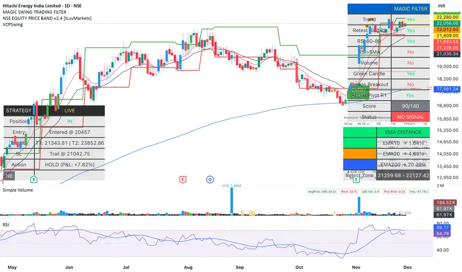
Magic Swing Suite: Trend, Pullback & Risk DashboardMagic Swing Suite: Trend, Pullback & Risk Dashboard
This indicator is a complete Swing Trading System designed to identify high-probability trend continuation setups. It combines classic trend-following principles with a unique "3-Bar Retest" logic and provides a real-time Strategy Dashboard to help you manage positions without needing a separate strategy script.
How it Works:
The system looks for a "Confluence" of factors before generating a signal. It scores every bar out of 140 points based on the following criteria:
Trend Alignment: Price must be above EMA 10, and EMA 10 must be above EMA 20.
Momentum (RSI): RSI must be in the "Bullish Control Zone" (60-80) and above its SMA.
Volume: Volume must be significantly higher than the average (1.5x by default).
The "Magic" Retest: The script checks the last 2-5 bars to see if the price has pulled back to "kiss" the EMA 10. This ensures we are buying a dip in a trend, not chasing a top.
Breakout Confirmation: Checks for Darvas Box breakouts and price position relative to Pivot R1.
Features:
🎯 Virtual Strategy Dashboard: A table that mimics a strategy tester. It tracks Entry, Stop Loss (Trailing), Target 1, and Target 2 in real-time.
📊 Confluence Scorecard: A detailed table showing exactly why a signal was (or wasn't) generated (Trend, Retest, RSI, Volume, etc.).
🛡️ Risk Management: automatically calculates a Trailing Stop (EMA 10) and fixed Risk:Reward targets based on recent highs.
📉 Multi-Layered Overlays: Includes Auto-Pivots (Traditional, Fib, Woodie, etc.) and Darvas Boxes to identify support/resistance levels.
How to Use:
Wait for a Signal:
"FULL BUY SIGNAL" (Green): All conditions are met, including a recent retest of the EMA. This is the highest probability setup.
"BUY - NO RETEST" (Orange): Trend and momentum are strong, but price hasn't pulled back recently. Use caution, as this may be a breakout trade.
Monitor the Dashboard: Once a trade is active, the dashboard will change to "IN POSITION." Follow the "Action" row.
If the trend weakens, the Trailing Stop (EMA 10) will move up to protect profits.
Targets:
T1: Previous Swing High (or 5% if no high found).
T2: 1:1.6 Risk/Reward extension.
Settings:
Volume Spike Factor: Adjust how much volume is needed to confirm a move. Default is 1.2.
Retest Tolerance: Adjust how close the price needs to get to the EMA 10 to count as a "retest."
Dashboard Toggles: You can hide the tables if you prefer a clean chart.
Pivot Timeframes: customizable lookback for S/R levels.
FAQ:
Does this repaint?
No. All signals trigger only on confirmed bars.
Can I use this intraday?
Yes. Works great from 5m to 1D.
Are exits manual or automated?
The indicator tracks SL, T1, and T2, and marks them on the chart.
Does retest affect the buy signal?
Retest is optional. The buy logic does not require it, but adds weight to the score.
Disclaimer: This tool is for educational purposes only. The "Strategy Dashboard" is a simulation based on script calculations and does not execute real trades. Always manage your own risk.
MFM - Light Context HUD (Free)Overview
MFM Light Context HUD is the free version of the Market Framework Model. It gives you a fast and clean view of the current market regime and phase without signals or chart noise. The HUD shows whether the asset is in a bullish or bearish environment and whether it is in a volatile, compression, drift, or neutral phase. This helps you read structure at a glance.
Asset availability
The free version works only on a selected list of five assets.
Supported symbols are
SP:SPX
TVC:GOLD
BINANCE:BTCUSD
BINANCE:ETHUSDT
OANDA:EURUSD
All other assets show a context banner only.
How it works
The free version uses fixed settings based on the original MFM model. It calculates the regime using a higher timeframe RSI ratio and identifies the current phase using simplified momentum conditions. The chart stays clean. Only a small HUD appears in the top corner. Full visual phases, ratio logic, signals, and auto tune are part of the paid version.
The free version shows the phase name only. It does not display colored phase zones on the chart.
Phase meaning
The Market Framework Model uses four structural phases to describe how the market behaves. These are not signals but context layers that show the underlying environment.
Volatile (Phase 1)
The market is in a fast, unstable or directional environment. Price can move aggressively with stronger momentum swings.
Compression (Phase 2)
The market is in a contracting state. Momentum slows and volatility decreases. This phase often appears before expansion, but it does not predict direction.
Drift (Phase 3)
The market moves in a more controlled, persistent manner. Trends are cleaner and volatility is lower compared to volatile phases.
No phase
No clear structural condition is active.
These phases describe market structure, not trade entries. They help you understand the conditions you are trading in.
Cross asset context
The Market Framework Model reads markets as a multi layer system. The full version includes cross asset analysis to show whether the asset is acting as a leader or lagger relative to its benchmark. The free version uses the same internal benchmark logic for regime detection but does not display the cross asset layer on the chart.
Cross asset structure is a core part of the MFM model and is fully available in the paid version.
Included in this free version
Higher timeframe regime
Current phase name
Clean chart output
Context only
Works on a selected set of assets
Not included
No forecast signals
No ratio leader or lagger logic
No MRM zones
No MPF timing
No auto tune
The full version contains all features of the complete MFM model.
Full version
You can find the full indicator here:
payhip.com
More information
Model details and documentation:
mfm.inratios.com
Disclaimer
The Market Framework Model (MFM) and all related materials are provided for educational and informational purposes only. Nothing in this publication, the indicator, or any associated charts should be interpreted as financial advice, investment recommendations, or trading signals. All examples, visualizations, and backtests are illustrative and based on historical data. They do not guarantee or imply any future performance. Financial markets involve risk, including the potential loss of capital, and users remain fully responsible for their own decisions. The author and Inratios© make no representations or warranties regarding the accuracy, completeness, or reliability of the information provided. MFM describes structural market context only and should not be used as the sole basis for trading or investment actions.
By using the MFM indicator or any related insights, you agree to these terms.
© 2025 Inratios. Market Framework Model (MFM) is protected via i-Depot (BOIP) – Ref. 155670. No financial advice.

Auto Div ADX STO RSI (Flip+P) v2This strategy combines multi-indicator divergence detection, momentum confirmation and adaptive position management into a unified automated trading framework.
It identifies regular bullish and bearish divergences using RSI and Stochastic (K), with configurable confirmation logic (RSI+STO, RSI only, or STO only). Divergences are validated only when price forms a lower low / higher high while the oscillator forms a higher low / lower high within a user-defined lookback window.
To filter low-quality setups, the strategy applies an ADX trend strength requirement, ensuring signals are taken only when market conditions reflect sufficient directional energy. Optional stochastic filters (oversold/overbought K levels) can further refine long and short entries.
Once a valid signal appears, the system supports Automatic Flip Logic:
If a bullish divergence forms during a short position, the strategy closes the short and flips long.
If a bearish divergence forms during a long position, it closes the long and flips short.
Position sizing uses adaptive pyramiding: the initial flip takes size proportional to the opposite side’s accumulated units, and new signals in the same direction can add incremental units (scale-in) if enabled. This models progressive conviction as new divergence signals occur.
All entries can optionally be required to confirm on bar close.
Alerts are included for both Long and Short entries.
Key Features
• Automatic detection of RSI and Stochastic divergences
• User-selectable confirmation rules (RSI, STO, or both)
• ADX-based strength filter
• Optional Stochastic K oversold/overbought filters
• Full flip logic between Long and Short
• Dynamic pyramiding and configurable scale-ins
• Bar-close confirmation option
• Alerts for Long/Short entries
• Status-line visualization of ADX, RSI, Stochastic, and unit cycles
This strategy is designed for traders who want a structured, divergence-based model enhanced with trend strength filtering and flexible position management logic, suitable for systematic discretionary trading or fully automated execution.

Bark or BiteBark or Bite – Trend Confirmation Engine (Invite-Only)
Bark or Bite is a trend validation system designed to detect true momentum shifts rather than every crossover or touch of a moving average. The indicator does not act on a single signal. It requires multi-condition confirmation before displaying any output, reducing false entries during chop and sideways price action.
At its core, Bark or Bite combines two distinct forms of market analysis:
1. Momentum qualification
Rather than reacting every time momentum changes, Bark or Bite monitors internal momentum alignment and stores directional shifts in memory. Momentum alone does nothing until structure confirms.
2. Trend filtering with delayed confirmation
The indicator continuously evaluates whether price has meaningfully committed above or below its underlying trend structure. A signal is not created the moment price fluctuates around trend. It is only registered once the market proves direction.
Unique confirmation logic (what makes Bark or Bite different):
Unlike common indicators that require conditions to occur on the same candle, Bark or Bite uses sequential confirmation logic. This allows:
Structure to confirm after momentum
Momentum to confirm after structure without forcing both to occur in the same bar.
This design allows valid trend entries that traditional indicators miss and prevents early entries during fake breakouts or short-lived reversals.
Candle Interpretation
Yellow candle = confirmed bullish trend ignition
Blue candle = confirmed bearish trend ignition
These are not momentum alerts. They represent directional shifts that have already passed multiple logical checks .
Intended Use
Bark or Bite is NOT:
A scalping indicator
A crossover toy
A signal spam tool
It is built for:
Swing traders
Trend traders
Directional bias alignment
Avoiding false starts in chop
This indicator is intentionally restrained. It displays fewer, higher-quality signals by design.
Why it is invite-only
Bark or Bite is protected because its logic is not a simple application of public indicators. The system uses:
State-based signal memory
Delayed confirmation logic
Multi-stage validation rules
Releasing the source openly would immediately cause replication without attribution. Access is therefore controlled.
Final Note
Bark or Bite does not predict the market.
It filters it.
You are not told to trade every movement.
You are told when the market has committed.

ZENADX Momentum FlowZENADX Momentum Flow คืออินดิเคเตอร์ที่ออกแบบมาเพื่อช่วยเทรดเดอร์จับ “ทิศทาง + จังหวะ” ของตลาดด้วยความเรียบง่ายแบบเซน แต่ทรงพลังด้วยแกนวิเคราะห์จาก ADX, DI และ Stochastic Momentum
อินดิเคเตอร์นี้ผสมผสาน โครงสร้างเทรนด์ (Trend Structure) ด้วย ADX/DI และ โมเมนตัม (Momentum Timing) ด้วย Stochastic เพื่อค้นหาจุดเข้าออกที่ “นิ่ง คม และมีสติ” ตามหลัก Zen Flow Trading
สิ่งที่ ZENADX Momentum Flow ทำให้คุณ:
1.จับเทรนด์หลักด้วย ADX ที่ผ่านเกณฑ์ความแข็งแรง
2.ฟิลเตอร์จังหวะด้วย Stochastic เพื่อหลีกเลี่ยงสัญญาณหลอก
3.แสดงสัญญาณ BUY/SELL เฉพาะเมื่อน้ำหนักเทรนด์ + โมเมนตัมสอดคล้องกัน
เหมาะทั้งสาย Trend Following และ Swing Entry ที่ต้องการ Flow ที่เป็นระบบ
เหมาะกับใคร?
สายเทรนด์, เทรดเดอร์แบบ Flow, คนที่ชอบระบบที่เรียบง่ายแต่ให้ “ความมั่นใจ” เวลาเข้าออก
หลักการ Zen:
ไม่ใช่แค่การตามเทรนด์… แต่คือการ ไหลไปตามตลาด อย่างมีสติและไม่ฝืนตลาด
-------------------------------------------------------------------------
ZENADX Momentum Flow is a trend–momentum hybrid indicator designed for traders who want clarity, simplicity, and precision. Inspired by Zen principles, this tool helps you align with the market’s natural flow—without noise or over-complication.
This indicator blends trend strength from ADX/DI with momentum confirmation from Stochastic, producing clean BUY/SELL signals only when both market structure and momentum agree.
What ZENADX Momentum Flow provides:
Detects strong trend directions using ADX threshold logic
Filters noise with Stochastic momentum alignment
Generates precise BUY/SELL signals based on DI crossovers + momentum confirmation
Ideal for Trend Following and Swing Entry traders who want a smooth, systematic flow
Perfect for:
Traders who seek a calm, disciplined, and structured way to follow the market’s movement—without forcing trades.
Zen Philosophy:
You don’t fight the trend…
You flow with it.

X-RAY v5.6 Ai⚡X-RAY v5.6 Ai is a state-of-the-art, non-repainting technical indicator designed to give traders a definitive edge in the market.
It goes beyond conventional oscillators by leveraging a proprietary algorithm that normalizes price momentum against a dynamically calculated volatility range. This allows X-RAY to filter market noise and pinpoint high-probability turning points with exceptional precision.
🧩 Core Methodology
At its core, X-RAY operates through a multi-layered computational engine that performs advanced mathematical and statistical analysis. It doesn’t just track price; it measures the energy of a price move relative to its recent volatility.
This involves:
Complex smoothing functions
Advanced statistical modeling
A real-time adaptive normalized oscillator
The outcome? A powerful tool that uncovers the true strength or weakness of a trend often before it becomes visible on the chart.
⚡ Signal Generation
X-RAY provides three actionable signals for systematic trading. All signals are confirmed at bar close and do not repaint.
🟢 BUY Signal
Generated at the end of a strong downtrend, this signal identifies:
Maximum bearish momentum exhaustion
A potential market capitulation
A high-probability entry for long positions
🎯 TP (Take Profit) Signal
Triggered when bullish momentum peaks, signaling:
The first signs of faltering after an upward move
The optimal zone to secure maximum gains
❌ EXIT Signal
A risk management alert activated when:
Momentum shifts decisively against your position
The trend loses structural integrity
Immediate position closure is required to protect capital
🚀 Optimized Performance & Best Use Cases
Through extensive backtesting, X-RAY proves most effective on the following timeframes:
Cryptocurrency: 15m Chart
Forex: 3h Chart
Gold (XAU/USD): 1m Chart
🧭 Conclusion
X-RAY v5.6 Ai is more than an indicator—it’s a complete analytical framework for traders seeking:
Precision ⚖️
Statistical rigor 📐
Non-repainting logic ⏱️
By focusing on momentum vs. volatility, X-RAY provides a clear and objective roadmap to navigate the markets confidently.
⚠️ Disclaimer:
This indicator is for educational and informational purposes only. It is not investment advice. Past performance is not indicative of future results. Always conduct your own analysis and trade responsibly.


ORB [v1.1]ORB Strategy automatically establishes 2 ranges each day, from 9:30a and 2:30p EST. Useful for momentum continuation strategies.
2025 © TXL under the MIT license

Ghost Shadow [Bit2Billions]📌 Ghost Shadow — Adaptive Momentum & Divergence Engine
Ghost Shadow is an adaptive momentum analysis framework built on a normalized MACD model for consistent trend evaluation across all markets and timeframes. By converting MACD behavior into percentage-scaled zones and layering it with Heikin-Ashi–style MACD candles, the indicator provides a smooth, intuitive read of swing shifts and trend transitions.
It includes stochastic momentum analysis, real-time divergence detection, contextual candle-pattern recognition, supply/demand scoring, and a full multi-layer dashboard that organizes the entire market structure into one visual system.
🔹 Key Features
• Normalized Adaptive MACD
Percentage-based MACD with dynamic overbought/oversold shading for stable momentum context across assets.
• Heikin-Ashi MACD Candles
Smooth, noise-reduced candle representation for clearer swing identification.
• Stochastic Candles & Signals
OB/OS highlights, adaptive zone shifts, and real-time divergence detection.
• Divergence Engine
Flexible detection of:
* Regular Divergence (bull & bear – dashed lines)
* Hidden Divergence (bull & bear – dotted lines)
* Live developing divergences using past-data only (no lookahead)
• Multi-Module Dashboard
A structured overview of everything happening on the chart in one place.
📊 Dashboard Metrics
MACD Bias
Directional momentum & trend strength from the normalized MACD engine.
Stochastic Bias
Short-term momentum read with OB/OS sensitivity.
Candle Pattern Detection (70+ patterns)
Doji, Morning/Evening Star, Shooting Star, Hammer, Bearish/Bullish Engulfing, Harami, Piercing Line, Hanging Man, Spinning Top, Dark Cloud Cover, Raindrop/Doji, Tweezer Top/Bottom, Tower patterns, Inside/Outside Bar, Three Line Strike, Three White Soldiers, Three Black Crows, Marubozu, Tasuki patterns, Rising/Falling Three Methods — and many more.
Body/Wick/Volume Ratios
Automatic interpretation of candle sentiment through proportional body/wick/volume analysis.
Demand & Supply Strength
Real-time scoring of active candle pressure and MA-based supply/demand bias.
Directional Bias (Safe Term)
Aggregated long/short *lean* using combined momentum, divergence, and structure inputs.
*This is a contextual bias, not an automated signal.*
Higher-Timeframe Metrics
* HTF Trap Levels & Scoring
* HTF Volume Conditions
* HTF Price Action Alignment
* Quick HTF Bias Reads
Market Summary
Consolidated sentiment, structure, and volatility status into one panel.
🔹 How Modules Work Together (Conceptual Overview)
Ghost Shadow uses a structured pipeline:
1. Normalized MACD builds the base momentum landscape.
2. Swing Structure is read internally to anchor divergences and zone shifts.
3. Divergence Engine compares MACD/Stoch swings vs price swings using past pivots only.
4. Adaptive OB/OS Zones adjust to volatility using dynamic scaling.
5. Dashboard aggregates all module outputs into a unified directional lean for interpretation.
This ensures each module references the same internal logic rather than acting as separate uncorrelated tools.
🎨 Visual Design & Chart Clarity
* Only essential real-time labels shown.
* All historical/replayed labels disabled to maintain chart cleanliness.
* Consistent color-coded visuals for divergence, momentum zones, and pattern signals.
* Shapes, line-styles, and colors remain organized for fast interpretation.
Divergence Lines
* Regular Divergence: Dashed Green/Red
* Hidden Divergence: Dotted Green/Red
Usage Note
This indicator does not auto-trade or provide guaranteed entries.
All visuals represent contextual bias for trader interpretation only.
What Ghost Shadow Solves
*Reduces manual momentum and divergence analysis
*Removes chart clutter with adaptive visuals
*Provides fast, rules-based market interpretation
*Standardizes workflow across markets and timeframes
*Helps identify exhaustion, continuation, and swing bias instantly
⚙️ Inputs & Settings
* Clean layout with simple Show/Hide toggles
* Pre-configured defaults
* Minimal exposed fields for ease of use
* Designed to reduce setup time and improve workflow speed
🕒 Recommended Timeframes & Markets
* Best on 15m, 1H, 4H, Daily, Weekly
* Works across forex, crypto, indices, commodities, equities
* Pivot-based structures may show noise on illiquid assets
⚡ Performance & Limitations
* Heavy modules may draw many objects → disable unused sections
* If the chart stops loading objects, simply refresh
* All TradingView platform limitations handled internally
📄 License & Legal
* Proprietary © 2025
* Redistribution, resale, or sharing of internals is prohibited
* Independently developed; uses only public-domain trading concepts
* Any resemblance to other tools is coincidental and concept-based only
🤝 Respect & Transparency
* Built fully on public, widely known trading concepts
* No code reused or copied; all logic developed independently
* If any similarity is noticed, it can be addressed constructively
⚠️ Disclaimer
* For education and analysis only
* Not financial advice
* Market risk is real — always backtest and manage risk properly
❓ FAQs
* Source code is not public
* Works best on 15m, 1H, 4H, Daily, Weekly
* All modules individually toggleable
* Alerts can be set manually
* Compatible with forex, crypto, indices, commodities, and equities
About Ghost Trading Suite
Author: BIT2BILLIONS
Project: Ghost Trading Suite © 2025
Indicators: Ghost Matrix, Ghost Protocol, Ghost Cipher, Ghost Shadow
Strategies: Ghost Robo, Ghost Robo Plus
Pine Version: V6
The Ghost Trading Suite is designed to simplify and automate many aspects of chart analysis. It helps traders identify market structure, divergences, support and resistance levels, and momentum efficiently, reducing manual charting time.
The suite includes several integrated tools — such as Ghost Matrix, Ghost Protocol, Ghost Cipher, Ghost Shadow, Ghost Robo, and Ghost Robo Plus — each combining analytical modules for enhanced clarity in trend direction, volatility, pivot detection, and momentum tracking.
Together, these tools form a cohesive framework that assists in visualizing market behavior, measuring momentum, detecting pivots, and analyzing price structure effectively.
This project focuses on providing adaptable and professional-grade tools that turn complex market data into clear, actionable insights for technical analysis.
Crafted with 💖 by BIT2BILLIONS for Traders. That's All Folks!
Changelog
v1.0 – Core Release
* Introduced Normalized Adaptive MACD with percentage-based zones and overbought/oversold shading.
* Added Heikin-Ashi style MACD candles for smoother swing visualization.
* Implemented Stochastic Candles with dynamic zones and divergence detection.
* Added Real-Time Divergence Engine for MACD and Stochastic (regular, hidden, live).
* Integrated Automated Candle Pattern Recognition with 70+ patterns.
* Added Body/Wick/Volume Ratio Metrics for long/short market analysis.
* Implemented Demand & Supply Strength Analysis (current candle & moving average-based).
* Added Directional Predictions for long and short positions.
* Developed Higher-Timeframe Analysis Modules with traps, volume, alignment, and quick signals.
* Added Comprehensive Dashboard summarizing momentum, patterns, HTF traps, and actionable market status.

Structure Break Out + rsi divergence + alma SIMPLIFIED OBJECTIVE (dyor, nfa, test different assets and diff TF)
The goal of this script is to act as a Reversal Sniper. Most traders lose money by trying to guess the top or bottom of a market too early. This strategy solves that by waiting for two specific events to happen together:
First, a hidden shift in momentum (RSI Divergence).
Second, a confirmed change in price direction (Crossing the ALMA 20 Blue Line).
This ensures you only enter a trade when the market has confirmed it is ready to reverse.
TRADING RULES
BUY SIGNAL (Long Position)
Step 1: Look for a GREEN DIV label below the candles. This warns you that sellers are exhausted.
Step 2: Wait for a GREEN TRIANGLE with the text GO. This confirms the price has crossed above the Blue Line.
Step 3: Enter the Buy trade immediately when the candle with the GO signal closes.
SELL SIGNAL (Short Position)
Step 1: Look for a RED DIV label above the candles. This warns you that buyers are exhausted.
Step 2: Wait for a RED TRIANGLE with the text GO. This confirms the price has crossed below the Blue Line.
Step 3: Enter the Sell trade immediately when the candle with the GO signal closes.
EXIT RULES (How to Close the Trade)
The script draws lines on the chart to help you manage the trade.
Scenario A: The Perfect Win (Target Hit)
If price hits the Green Line, the trade is closed automatically for a profit. This is your Risk-Reward Target.
Scenario B: The Trend Change (Reversal)
If the price turns around and crosses the Blue Line in the wrong direction, close the trade immediately. Do not wait for the stop loss. This protects your profits or keeps losses small.
Scenario C: The Safety Net (Stop Loss)
If price hits the Red Line, the trade is closed for a loss. This is your safety guard to prevent a small loss from becoming a big one.
IMPORTANT NOTES
Never trade a DIV label without a GO signal. The DIV is just a warning; the GO is the trigger.
- This strategy works best on 15-Minute and 1-Hour timeframes.
- If t
he Blue Line is flat, be careful, as the market may be ranging. Ideally, you want to see the Blue Line angling up or down.
