Algorithmic Value Oscillator [CRYPTIK1]Algorithmic Value Oscillator
Introduction: What is the AVO? Welcome to the Algorithmic Value Oscillator (AVO), a powerful, modern momentum indicator that reframes the classic "overbought" and "oversold" concept. Instead of relying on a fixed lookback period like a standard RSI, the AVO measures the current price relative to a significant, higher-timeframe Value Zone .
This gives you a more contextual and structural understanding of price. The core question it answers is not just "Is the price moving up or down quickly?" but rather, " Where is the current price in relation to its recently established area of value? "
This allows traders to identify true "premium" (overbought) and "discount" (oversold) levels with greater accuracy, all presented with a clean, futuristic aesthetic designed for the modern trader.
The Core Concept: Price vs. Value The market is constantly trying to find equilibrium. The AVO is built on the principle that the high and low of a significant prior period (like the previous day or week) create a powerful area of perceived value.
The Value Zone: The range between the high and low of the selected higher timeframe.
Premium Territory (Distribution Zone): When the oscillator moves into the glowing pink/purple zone above +100, it is trading at a premium.
Discount Territory (Accumulation Zone): When the oscillator moves into the glowing teal/blue zone below -100, it is trading at a discount.
Key Features
1. Glowing Gradient Oscillator: The main oscillator line is a dynamic visual guide to momentum.
The line changes color smoothly from light blue to neon teal as bullish momentum increases.
It shifts from hot pink to bright purple as bearish momentum increases.
Multiple transparent layers create a professional "glow" effect, making the trend easy to see at a glance.
2. Dynamic Volatility Histogram: This histogram at the bottom of the indicator is a custom volatility meter. It has been engineered to be adaptive, ensuring that the visual differences between high and low volatility are always clear and dramatic, no matter your zoom level. It uses a multi-color gradient to visualize the intensity of market volatility.
3. Volatility Regime Dashboard: This simple on-screen table analyzes the histogram and provides a clear, one-word summary of the current market state: Compressing, Stable, or Expanding.
How to Use the AVO: Trading Strategies
1. Reversion Trading This is the most direct way to use the indicator.
Look for Buys: When the AVO line drops into the teal "Accumulation Zone" (below -100), the price is trading at a discount. Watch for the oscillator to form a bottom and start turning up as a signal that buying pressure is returning.
Look for Sells: When the AVO line moves into the pink "Distribution Zone" (above +100), the price is trading at a premium. Watch for the oscillator to form a peak and start turning down as a signal that selling pressure is increasing.
2. Best Practices & Settings
Timeframe Synergy: The AVO is most effective when your chart timeframe is lower than your selected "Value Zone Source." For example, if you trade on the 1-hour chart, set your Value Zone to "Previous Day."
Confirmation is Key: This indicator provides powerful context, but it should not be used in isolation. Always combine its readings with your primary analysis, such as market structure and support/resistance levels.
Centered Oscillators

Multi Momentum 10/21/42/63 — Histogram + 2xSMAMY MM INDICATOR INDIRED BY KARADI
It averages four rate-of-change snapshots of price, all anchored at today’s close.
If “Show as %” is on, the value is multiplied by 100.
Each term is a simple momentum/ROC over a different lookback.
Combining 10, 21, 42, 63 bars blends short, medium, and intermediate horizons into one number.
Positive MM → average upward pressure across those horizons; negative MM → average downward pressure.
Why those lengths?
They roughly stack into ~2× progression (10→21≈2×10, 21→42=2×21, 63≈1.5×42). That creates a “multi-scale” momentum that’s less noisy than a single fast ROC but more responsive than a long ROC alone.
How to read the panel
Gray histogram = raw Multi-Momentum value each bar.
SMA Fast/Slow lines (defaults 12 & 26 over the MM values) = smoothing of the histogram to show the trend of momentum itself.
Typical signals
Zero-line context:
Above 0 → bullish momentum regime on average.
Below 0 → bearish regime.
Crosses of SMA Fast & Slow: momentum trend shifts (fast above slow = improving momentum; fast below slow = deteriorating).
Histogram vs SMA lines: widening distance suggests strengthening momentum; narrowing suggests momentum is fading.
Divergences: price makes a new high/low but MM doesn’t → potential exhaustion.
Compared to a classic ROC
A single ROC(20) is very sensitive to that one window.
MM averages several windows, smoothing idiosyncrasies (e.g., a one-off spike 21 bars ago) and reducing “lookback luck.”
Settings & customization
Lookbacks (10/21/42/63): you can tweak for your asset/timeframe; the idea is to mix short→medium horizons.
Percent vs raw ratio: percent is easier to compare across symbols.
SMA lengths: shorter = more reactive but choppier; longer = smoother but slower.
Practical tips
Use regime + signal: trade longs primarily when MM>0 and fast SMA>slow SMA; consider shorts when MM<0 and fast

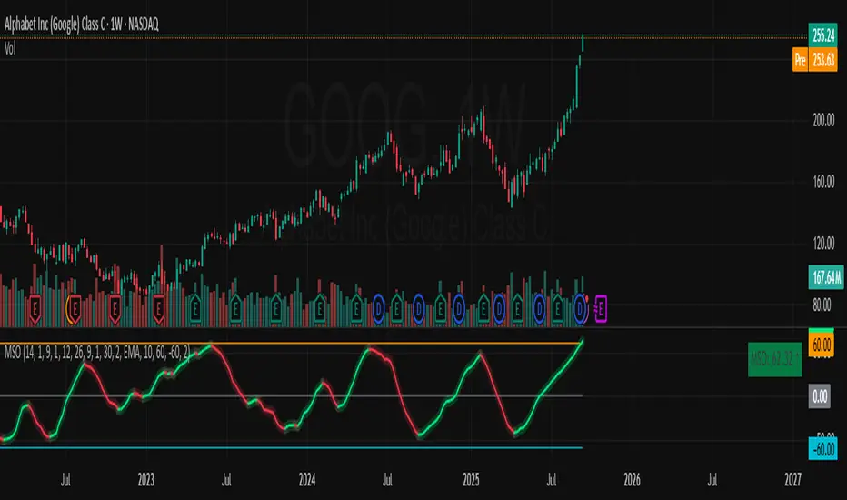
Momentum Shift Oscillator (MSO) [SharpStrat]Momentum Shift Oscillator (MSO)
The Momentum Shift Oscillator (MSO) is a custom-built oscillator that combines the best parts of RSI, ROC, and MACD into one clean, powerful indicator. Its goal is to identify when momentum shifts are happening in the market, filtering out noise that a single momentum tool might miss.
Why MSO?
Most traders rely on just one momentum indicator like RSI, MACD, or ROC. Each has strengths, but also weaknesses:
RSI → great for overbought/oversold, but often lags in strong trends.
ROC (Rate of Change) → captures price velocity, but can be too noisy.
MACD Histogram → shows trend strength shifts, but reacts slowly at times.
By blending all three (with adjustable weights), MSO gives a balanced view of momentum. It captures trend strength, velocity, and exhaustion in one oscillator.
How MSO Works
Inputs:
RSI, ROC, and MACD Histogram are calculated with user-defined lengths.
Each is normalized (so they share the same scale of -100 to +100).
You can set weights for RSI, ROC, and MACD to emphasize different components.
The components are blended into a single oscillator value.
Smoothing (SMA, EMA, or WMA) is applied.
MSO plots as a smooth line, color-coded by slope (green rising, red falling).
Overbought and oversold levels are plotted (default: +60 / -60).
A zero line helps identify bullish vs bearish momentum shifts.
How to trade with MSO
Zero line crossovers → crossing above zero suggests bullish momentum; crossing below zero suggests bearish momentum.
Overbought and oversold zones → values above +60 may indicate exhaustion in bullish moves; values below -60 may signal exhaustion in bearish moves.
Slope of the line → a rising line shows strengthening momentum, while a falling line signals fading momentum.
Divergences → if price makes new highs or lows but MSO does not, it can point to a possible reversal.
Why MSO is Unique
Combines trend + momentum + velocity into one view.
Filters noise better than standalone RSI/MACD.
Adapts to both trend-following and mean-reversion styles.
Can be used across any timeframe for confirmation.
Multiple Relative Strength IndicatorThis indicator is used to display multiple Relative strength of a stock compared with another.
Default value for the first Relative strength period is 55
Default value for the second Relative strength period is 21
Default value for the comparable Index is CNX500
You can add the sectorial index for sector comparison
Triple RSI | MisinkoMasterThe Triple RSI (TRSI) is an advanced trend-following oscillator designed to capture trend reversals with speed and smoothness, combining concepts from traditional RSI, multi-timeframe momentum analysis, and layered moving average smoothing.
By blending multiple RSI lengths and applying a unique smoothing sequence, the TRSI creates a fast, momentum-driven RSI oscillator that reduces noise without sacrificing responsiveness.
🔎 Methodology
The indicator is built in three main steps:
Multi-Length RSI Calculation
Three RSIs are calculated using different lengths derived from the user’s input n:
RSI(√n) → very fast, highly responsive.
RSI(n/2) → moderately fast.
RSI(n) → slower, more stable baseline.
Each RSI is normalized by subtracting 50, centering values around zero.
Triple RSI Formula
The three RSIs are combined into the base formula:
TRSI=RSI(√n)+RSI(n/2)−RSI(n)
TRSI=RSI(√n)+RSI(n/2)−RSI(n)
This subtracts the slower RSI from the faster ones, boosting responsiveness and making the TRSI more momentum-oriented than a standard RSI.
Layered Smoothing
The raw TRSI is smoothed in three steps:
RMA(n/2)
RMA(√n)
HMA(√n)
This sequence balances stability and speed:
RMA provides consistency and reduces false noise.
HMA adds responsiveness and precision.
The result is a smooth yet reactive oscillator, optimized for reversal detection.
📈 Trend Classification
The TRSI offers three ways to interpret trend direction:
Oscillator Values
Above 0 → Bullish (uptrend).
Below 0 → Bearish (downtrend).
Oscillator Colors
Green TRSI line → Positive momentum.
Red TRSI line → Negative momentum.
Background Colors
Green background flash → Reversal into bullish trend.
Red background flash → Reversal into bearish trend.
This makes it easy to scan past price history and quickly identify turning points.
🎨 Visualization
TRSI line plotted with dynamic coloring (green/red).
Filled area between TRSI and zero-line reflects momentum bias.
Background flashes highlight trend reversal points, adding context and clarity for visual traders.
⚡ Features
Adjustable length parameter (n).
Dynamic use of √n and n/2 for multi-speed RSI blending.
Built-in smoothing with 2× RMA + 1× HMA.
Multiple trend detection methods (value, color, background).
Works across all assets and timeframes (crypto, forex, stocks, indices).
✅ Use Cases
Reversal Detection → Catch early shifts in trend direction.
Trend Confirmation → Stay aligned with momentum.
Momentum Filter → Avoid counter-trend trades in trending markets.
Historical Analysis → Quickly scan past reversals via background coloring.
⚠️ Limitations
As with all oscillators, TRSI may give false signals in sideways/choppy markets.
Optimal sensitivity depends on asset volatility → adjust n for best results.
It is not a standalone system and should be combined with other tools (trend filters, volume, higher timeframe confluence).
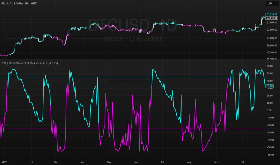
Z-Score For Loop | MisinkoMasterThe Z-Score For Loop (ZSFL) is a unique trend-following oscillator designed to detect potential reversals and momentum shifts earlier than traditional tools, providing traders with fast, adaptive, and reliable signals.
Unlike common smoothing techniques (moving averages, medians, or modes), the ZSFL introduces a for-loop comparison method that balances speed and noise reduction, resulting in a powerful reversal-detection system.
🔎 Methodology
The indicator is built in two main stages:
Z-Score Calculation
Formula:
Z=(Source−Mean)/Standard Deviation
Z=
Standard Deviation
(Source−Mean)
The user can select the averaging method for the mean: SMA, EMA, WMA, HMA, DEMA, or TEMA.
Recommended: EMA, SMA, or WMA for balanced accuracy.
The choice of biased (sample) or unbiased (population) standard deviation is also available.
➝ On its own, the raw Z-score is fast but noisy, requiring additional filtering.
For Loop Logic (Noise Reduction)
Instead of using traditional smoothing (which adds lag), the indicator applies a for loop comparison.
The current Z-score is compared against previous values over a user-defined range (start → end).
Each comparison adds or subtracts “points”:
+1 point if the current Z-score is higher than a past Z-score.
-1 point if it is lower.
The final value is the cumulative score, reflecting whether the Z-score is generally stronger or weaker than its historical context.
➝ This approach keeps speed intact while removing much of the false noise that raw Z-scores generate.
📈 Trend Logic
Bullish Signal (Cyan) → Triggered when the score crosses above the upper threshold (default +45).
Bearish Signal (Magenta) → Triggered when the score crosses below the lower threshold (default -25).
Neutral → When the score remains between the thresholds.
Thresholds are adjustable, making the tool flexible for different assets and timeframes.
🎨 Visualization
The ZSFL score is plotted as a main oscillator line.
Upper and lower thresholds are plotted as static reference levels.
The price chart can also be color-coded with trend signals (cyan for bullish, magenta for bearish) to provide immediate visual confirmation.
⚡ Features
Adjustable Z-score length (len).
Multiple average types for the mean (SMA, EMA, WMA, HMA, DEMA, TEMA).
Toggle between biased vs. unbiased SD calculations.
Adjustable For Loop range (start, end).
Adjustable upper and lower thresholds for signal generation.
Works as both an oscillator and a price overlay tool.
✅ Use Cases
Reversal Detection → Spot early shifts before price confirms them.
Trend Confirmation → Use thresholds to filter false reversals.
System Filter → Combine with trend indicators to refine entries.
Multi-Timeframe Setup → Works well across different timeframes for swing, day, or intraday trading.
⚠️ Limitations
As with all oscillators, the ZSFL will generate false signals in sideways/choppy markets.
Optimal parameters (length, loop size, thresholds) may differ across assets.
It is not a standalone trading system — use alongside other forms of analysis (trend filters, volume, higher timeframe confluence).
BTC Spread: Coinbase Spot vs CME Futures (skullcap)BTC Spread: Coinbase Spot vs CME Futures
This indicator plots the real-time spread between Coinbase Spot BTC (COINBASE:BTCUSD) and CME Bitcoin Futures (CME:BTC1!).
It allows traders to monitor the premium or discount between spot and futures markets directly in one chart.
⸻
📊 How it Works
• The script pulls Coinbase spot BTC closing prices and CME front-month BTC futures prices on your selected timeframe.
• The spread is calculated as:
Spread = CME Price – Coinbase Spot Price
🔧 How to Use
1. Add the indicator to your chart (set to any timeframe you prefer).
2. The orange line represents the spread (USD difference).
3. The grey dashed line marks the zero level (parity between CME and Coinbase).
4. Use it to:
• Compare futures vs. spot market structure
• Track premium/discount cycles around funding or expiry
• Identify arbitrage opportunities or market dislocations
⸻
⚠️ Notes
• This indicator is informational only and does not provide trading signals.
• Useful for traders analysing derivatives vs spot price action.
• Works best when paired with order flow, funding rate, and open interest data.

MACD ProThe MACD Pro is a modern take on the classic MACD, designed to give traders deeper insights into market momentum, trend conditions, and potential turning points. While it keeps the standard MACD foundation, it introduces a few enhancements to make it more adaptive and visually intuitive.
At its core, the indicator calculates the traditional MACD line, Signal line and Histogram. The histogram can be optionally displayed.
One of the things that set this version apart is the addition of the MACD Leader, an optional feature that makes the MACD more responsive to price action. By applying an adaptive smoothing factor (Leader Sensitivity), the Leader line can provide earlier momentum cues compared to the standard MACD and help anticipate shifts before they become obvious on a standard MACD indicator.
Another enhancement is the regime-based color system for the MACD line. Instead of simply coloring based on the MACD or histogram itself, this indicator identifies the overall market regime using momentum and trend strength conditions.
Bullish Regime: Momentum is positive and trend strength is above average.
Bearish Regime: Momentum is negative and trend strength is above average.
Sideways Regime: Momentum remains weak and within noise levels.
This regime detection allows the MACD line to visually adapt, giving traders an extra layer of context beyond standard MACD signals to blend momentum analysis with market conditions, helping distinguish between trending and ranging environments.

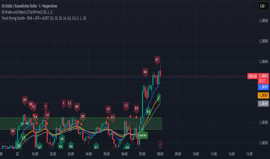
Trend-Strong Candle - Pro Multi Assetighlights:
Major Assets Mode (optional): EURUSD, GBPUSD, USDJPY, AUDUSD, USDCAD, NZDUSD, EURGBP, EURJPY
One‑per‑bar alerts, 24/7 toggle, no session limits
Default EMAs 20/40/60, improved stability and EMA-close filters
Lightweight performance, warning-free calculations, and clearer arrows/plots
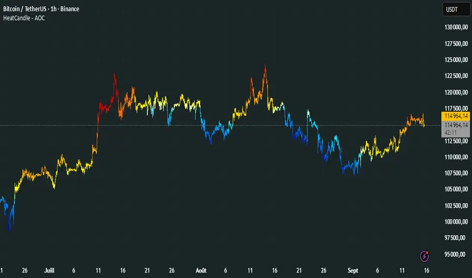
HeatCandleHeatCandle - AOC Indicator
✨ Features
📊 Heat-Map Candles: Colors candles based on the price’s deviation from a Triangular Moving Average (TMA), creating a heat-map effect to visualize price zones.
📏 Zone-Based Coloring: Assigns colors to 20 distinct zones (Z0 to Z19) based on the percentage distance from the TMA, with customizable thresholds.
⚙️ Timeframe-Specific Zones: Tailored zone thresholds for 1-minute, 5-minute, 15-minute, 30-minute, 1-hour, and 4-hour timeframes for precise analysis.
🎨 Customizable Visuals: Gradient color scheme from deep blue (oversold) to red (overbought) for intuitive price movement interpretation.
🛠️ Adjustable Parameters: Configure TMA length and threshold multiplier to fine-tune sensitivity.
🛠️ How to Use
Add to Chart: Apply the "HeatCandle - AOC" indicator on TradingView.
Configure Inputs:
TMA Length: Set the period for the Triangular Moving Average (default: 150).
Threshold Multiplier: Adjust the multiplier to scale zone sensitivity (default: 1.0).
Analyze: Observe colored candles on the chart, where colors indicate the price’s deviation from the TMA:
Dark blue (Z0) indicates strong oversold conditions.
Red (Z19) signals strong overbought conditions.
Track Trends: Use the color zones to identify potential reversals, breakouts, or trend strength based on price distance from the TMA.
🎯 Why Use It?
Visual Clarity: The heat-map candle coloring simplifies identifying overbought/oversold conditions at a glance.
Timeframe Flexibility: Zone thresholds adapt to the selected timeframe, ensuring relevance across short and long-term trading.
Customizable Sensitivity: Adjust TMA length and multiplier to match your trading style or market conditions.
Versatile Analysis: Ideal for scalping, swing trading, or trend analysis when combined with other indicators.
📝 Notes
Ensure sufficient historical data for accurate TMA calculations, especially with longer lengths.
The indicator is most effective on volatile markets where price deviations are significant.
Pair with momentum indicators (e.g., RSI, MACD) or support/resistance levels for enhanced trading strategies.
Happy trading! 🚀📈
Dual-Frame Momentum OscillatorDual-Frame Momentum Oscillator (DFMO)
This is not just another oscillator. This is a confluence engine, built for the discerning trader who reads the story of price action and needs an objective tool to confirm the climax.
The Dual-Frame Momentum Oscillator was designed to solve a specific problem: how to differentiate a genuine, sustainable breakout from an exhaustive liquidity grab. It provides a visual confirmation for high-probability reversal and scalp setups by measuring momentum across two distinct time frames simultaneously.
This tool is for the trader who understands that indicators should not dictate trades, but rather confirm a well-defined thesis based on market structure, volume, and liquidity.
The Core Concept: Context Meets Trigger
The DFMO fuses a slow, methodical Stochastic with a hyper-sensitive RSI to give you a complete picture of momentum.
The Context (Slow Stochastic %K - default 40,4,4): This acts as your long-term momentum gauge. It tells you if the underlying trend is healthy or nearing exhaustion. A high reading suggests the market is overextended and vulnerable, while a low reading suggests the opposite.
The Trigger (Fast RSI - default 3): This is your immediate impulse reader. It measures the velocity and intensity of the current price thrust, making it incredibly sensitive to exhaustive moves, spikes, and bounces.
By themselves, they are useful. Together, they are formidable.
The Confluence Engine: Your Visual Edge
The true power of the DFMO lies in its "Confluence Engine." The indicator's background highlights in real-time when both oscillators are in agreement, visually flagging moments of maximum opportunity.
Bearish Confluence Zone (Red): The background turns red only when the Stochastic is overbought AND the RSI is overbought. This is your signal that the broader trend is exhausted and the current buying impulse has reached a climax. It is the ideal confirmation for a short entry following a liquidity sweep above a key high.
Bullish Confluence Zone (Green): The background turns green only when the Stochastic is oversold AND the RSI is oversold. This signals that the downtrend is tired and the immediate selling pressure is exhaustive, providing high-probability confirmation for a long entry at a key support level.
When these zones appear, the indicator is telling you that both the context and the trigger are aligned. This removes ambiguity and allows for decisive, confident execution.
Practical Application: The Liquidity Sweep
Imagine you're stalking a short on a futures contract like MCL or MES. You've marked the high of the day (HOD) as a key resistance level where liquidity is resting. You see a sharp, vertical impulse move that breaks the HOD, clearing out the stops.
Is this a real breakout, or is it a manipulation move—a classic liquidity grab?
You glance down at the DFMO. The moment price swept the high, the background flashed red. That's your objective confirmation. The slow Stoch was already overbought, and the fast RSI spiking confirmed the exhaustive, terminal nature of that price thrust. You now have the confidence to enter your short scalp, knowing you are aligned with the probable direction of the market's next move.
This is how you move from "feeling" the market to systematically executing a high-probability edge. This is how you aspire for greatness.
Add the Dual-Frame Momentum Oscillator to your toolkit and transform your ability to time entries with surgical precision.
eORB - Day EditionThe eORB – Day Edition (Enhanced Opening Range Breakout) is a powerful intraday trading indicator designed for Algo Trading, Scalpers, Day Traders, and ORB-based strategies. It combines classic ORB logic with advanced filters, multiple exit strategies, and smart risk management tools. The default setup is optimised for a 3-minute ETHUSD chart.
Key Features:-
# Opening Range Breakout (ORB)
- Defines intraday high/low for the first X minutes.
- Automatically updates breakout levels.
- Optional buffer (%) for precision entries.
# Day & Session Filters
- Enable/disable trading on specific weekdays.
- Flexible session time configuration.
# EMA Crossover
- Option to trade based on EMA crossover with ORB levels.
# Breakout Candle Logic
- Detects breakout candle high/low for secondary confirmation.
# RSI Filter
- Confirms signals using RSI thresholds (customisable).
# Exit Strategies
- ORB High/Low Exit
- Buffer Exit
- Trailing Stop Loss (TSL) with activation, lock, and increments
- Target & Stoploss (fixed points)
- Universal Exit (UTC time-based) with background highlight
# Trade Sync Logic
- Prevents consecutive Buy → Buy or Sell → Sell without the opposite signal in between.
# Alerts Ready
- Buy, Sell, and Exit conditions are available for alerts.
- Compatible with TradingView alert system (popup, email, SMS, webhook).
How to Use:-
1. Add indicator to the chart.
2. Set ORB Time & Session (e.g., 3 min ORB at market open).
3. Enable/disable filters (EMA, RSI, Breakout candle).
4. Configure exits (TSL, Target, Stoploss, Universal Exit).
5. Add alerts for automation or notifications.
- This indicator is ideal for Crypto, Nifty, BankNifty, Index Futures, and Stocks, but it can be applied to any asset.
- The default settings are optimised for ETHUSD.
How it Works – eORB Day Edition:-
Step 1 – Define the Range
- At market open, the indicator records the Opening Range High & Low for the first X minutes (configurable by the user).
- This creates a price boundary (box) that acts as support and resistance for the rest of the session.
- Optional buffers can be added to make signals more reliable.
Step 2 – Generate the Signal
- When price (or EMA, if enabled) crosses above the Opening Range High, a Buy signal is generated.
- When price (or EMA) crosses below the Opening Range Low, a Sell signal is generated.
- Extra filters like RSI and Breakout Candle confirmation can be turned on to reduce false breakouts.
- Built-in sync logic ensures signals alternate properly (no double Buy or double Sell without the opposite in between).
Step 3 – Manage the Exit
- Trades can exit using multiple methods:
- Target (fixed profit in points)
- Stoploss (fixed risk in points)
- Trailing Stop-loss (TSL) that locks profit and trails as price moves further in your favour
- ORB/Buffer exit when price re-enters the range
- Universal Exit at a fixed UTC time to close all positions for the day
- Exits are visualised on the chart with shapes, labels, and optional background highlights.
In simple terms:-
Step 1: DEFINE
- Opening Range (first X minutes) → Marks High & Low → Creates breakout zone
Step 2: SIGNAL
- Price / EMA crosses High (+ Buffer) → BUY
- Price / EMA crosses Low (- Buffer) → SELL
- + Optional filters: RSI, Breakout Candle
Step 3: EXIT
- Target | Stoploss | Trailing Stoploss | Universal Exit
Important Note on Alert Setup
- When using the RSI filter, signals may fluctuate in some edge cases where RSI hovers near the Buy or Sell level.
- To avoid this, it is recommended to use “Once Per Bar Close” as the alert trigger, since signals confirm only after the bar closes (especially helpful when Breakout Candle High/Low Crossover is enabled).
- If you choose not to use RSI, you can safely use “Once Per Bar” alerts, even when the Breakout Candle High/Low Crossover option is enabled.
Disclaimer:-
- This tool is for educational and research purposes only.
- It does not guarantee profits. Always backtest and use proper risk management before live trading. The author is not responsible for financial losses.
Developer: @ikunalsingh
Built using AI + the best of human logic.
Fibo RSIThis is a customized Relative Strength Index (RSI) indicator designed to replicate TradingView’s default RSI while adding additional reference levels for deeper market analysis.
🔹 Features:
RSI length set to 8 by default (user adjustable).
Calculates RSI using the standard ta.rsi() function.
Plots the RSI line in a clean, separate panel.
Adds 7 key levels for analysis: 0, 20, 30, 50, 70, 80, 100.
Levels are drawn as thin, solid straight lines for a cleaner look (instead of default dashed).
🔹 Use cases:
Identify momentum shifts with enhanced precision.
Use intermediate levels (20, 30, 50, 70, 80) as potential support/resistance zones.
Ideal for traders who want a Fibonacci-like structure in RSI analysis.

Swing Oracle Stock 2.0- Gradient Enhanced# 🌈 Swing Oracle Pro - Advanced Gradient Trading Indicator
**Transform your technical analysis with stunning gradient visualizations that make market trends instantly recognizable.**
## 🚀 **What Makes This Indicator Special?**
The **Swing Oracle Pro** revolutionizes traditional technical analysis by combining advanced NDOS (Normalized Distance from Origin of Source) calculations with a sophisticated gradient color system. This isn't just another indicator—it's a complete visual trading experience that adapts colors based on market strength, making trend identification effortless and intuitive.
## 🎨 **10 Professional Gradient Themes**
Choose from carefully crafted color schemes designed for optimal visual clarity:
- **🌅 Sunset** - Warm oranges and purples for classic elegance
- **🌊 Ocean** - Cool blues and teals for calm analysis
- **🌲 Forest** - Natural greens and browns for organic feel
- **✨ Aurora** - Ethereal greens and magentas for mystique
- **⚡ Neon** - Vibrant electric colors for high-energy trading
- **🌌 Galaxy** - Deep purples and cosmic hues for night sessions
- **🔥 Fire** - Intense reds and golds for volatile markets
- **❄️ Ice** - Cool whites and blues for clear-headed decisions
- **🌈 Rainbow** - Full spectrum for comprehensive analysis
- **⚫ Monochrome** - Professional grays for focused trading
## 📊 **Core Features**
### **Advanced NDOS System**
- Normalized Distance from Origin of Source calculation with 231-period length
- Smoothed with customizable EMA for reduced noise
- Multi-timeframe confirmation with H1 filter option
- Dynamic gradient coloring based on oscillator position
### **Intelligent Visual Feedback**
- **Primary Gradient Line** - Main NDOS plot with dynamic color transitions
- **Gradient Fill Zones** - Beautiful color-coded areas for bullish, neutral, and bearish regions
- **Smart Transparency** - Colors adjust intensity based on market volatility
- **Dynamic Backgrounds** - Subtle gradient backgrounds that respond to market conditions
### **Enhanced EMA Projection System**
- 75/760 period EMA normalization with 50-period lookback
- Gradient-colored projection line for trend forecasting
- Toggleable display with advanced gradient controls
- Price tracking for precise level identification
### **Multi-Timeframe Analysis Table**
- Real-time trend analysis across 6 timeframes (1m, 3m, 5m, 15m, 1H, 4H)
- Gradient-colored cells showing trend strength
- Customizable table size and position
- Professional emoji indicators (🚀 UP, 📉 DOWN, ➡️ FLAT)
### **Signal System**
- **Gradient Buy Signals** - Triangle up arrows with intensity-based coloring
- **Gradient Sell Signals** - Triangle down arrows with strength indicators
- **Alert Conditions** - Built-in alerts for all signal types
- **7-Day Cycle Tracking** - Tuesday-to-Tuesday weekly cycle visualization
## ⚙️ **Customization Controls**
### **🎨 Gradient Controls**
- **Gradient Intensity** - Adjust color vibrancy (0.1-1.0)
- **Gradient Smoothing** - Control color transition smoothness (1-10 periods)
- **Dynamic Background** - Toggle animated background gradients
- **Advanced Gradients** - Enable/disable EMA projection and enhanced features
### **🛠️ Custom Color System**
- **Bullish Colors** - Define custom start/end colors for bull markets
- **Bearish Colors** - Set personalized bear market gradients
- **Full Theme Override** - Create completely custom color schemes
- **Real-time Preview** - See changes instantly on your chart
## 📈 **How to Use**
1. **Choose Your Theme** - Select from 10 professional gradient themes
2. **Configure Levels** - Adjust high/low levels (default 60/40) for your timeframe
3. **Set Smoothing** - Fine-tune gradient smoothing for your trading style
4. **Enable Features** - Toggle background gradients, candlestick coloring, and advanced EMA projection
5. **Monitor Signals** - Watch for gradient buy/sell arrows and multi-timeframe confirmations
## 🎯 **Trading Applications**
- **Swing Trading** - Perfect for identifying medium-term trend changes
- **Scalping** - Multi-timeframe table provides quick trend confirmation
- **Position Sizing** - Gradient intensity shows signal strength for risk management
- **Market Analysis** - Beautiful visualizations make complex data instantly understandable
- **Education** - Ideal for learning market dynamics through visual feedback
## ⚡ **Performance Optimized**
- **Smart Rendering** - Colors update only on significant changes
- **Efficient Calculations** - Optimized algorithms for smooth performance
- **Memory Management** - Minimal resource usage even with complex gradients
- **Real-time Updates** - Responsive to market changes without lag
## 🚨 **Alert System**
Built-in alert conditions notify you when:
- NDOS crosses above high level (Buy Signal)
- NDOS crosses below low level (Sell Signal)
- Multi-timeframe confirmations align
- Customizable alert messages with emoji indicators
## 🔧 **Technical Specifications**
- **PineScript Version**: v6 (Latest)
- **Overlay**: True (plots on main chart)
- **Calculations**: NDOS, EMA normalization, volatility-based transparency
- **Timeframes**: Compatible with all timeframes
- **Markets**: Stocks, Forex, Crypto, Commodities, Indices
## 💡 **Why Choose Swing Oracle Pro?**
This isn't just another technical indicator—it's a complete visual transformation of your trading experience. The gradient system provides instant visual feedback that traditional indicators simply can't match. Whether you're a beginner learning to read market trends or an experienced trader seeking clearer signals, the Swing Oracle Pro delivers professional-grade analysis with unprecedented visual clarity.
**Experience the future of technical analysis. Your charts will never look the same.**
---
*⚠️ Disclaimer: This indicator is for educational and informational purposes only. Past performance does not guarantee future results. Always conduct your own research and consider risk management before making trading decisions.*
**🔔 Like this indicator? Please leave a comment and boost! Your feedback helps improve future updates.**
---
**📝 Tags:** #GradientTrading #SwingTrading #NDOS #MultiTimeframe #TechnicalAnalysis #VisualTrading #TrendAnalysis #ColorCoded #ProfessionalCharts #TradingToo

Mavi## Core System Structure and Operating Principle
This advanced trading system adopts a multi-dimensional approach to market analysis. Centering on two main trend-following mechanisms, it supports them with 12 different technical analysis tools. Its fundamental philosophy is to simultaneously evaluate different aspects of the market rather than relying on a single indicator. The main signal systems constitute 70% of the total decision, while supporting indicators complete the remaining 30%. Thanks to this mathematical weighting, false signals are minimized while strong market movements are captured early.
The system's most remarkable feature is its automatic calculation of optimal entry points for each trade. During this calculation, the current price position, volatility status, momentum indicators, and critical technical levels are evaluated together. A dynamic algorithm is used to ensure you enter the market at the most suitable price, and this entry point is continuously updated.
## Risk Management and Capital Protection
Risk management is a fundamental element embedded in this system's DNA. Before each trade, the stop loss level is automatically calculated based on volatility, and you are presented with three different profit targets. These targets are determined to optimize the risk/reward ratio. The system recommends risking only 2% of your capital per trade and calculates your position size according to this rule. The profit-taking strategy is based on the principle of graduated exits: 50% of the position at the first target, 30% at the second target, and the remaining 20% at the third target. This approach both protects profits and offers the opportunity to benefit from trend continuation.
Stop loss levels are dynamically adjusted according to the market's current volatility. When volatility increases, the stop distance widens; when it decreases, it narrows. This reduces the risk of unnecessary stops while providing protection against major losses. Additionally, the risk/reward ratio is calculated for each trade, and if this ratio is below 1:2, opening a trade is not recommended.
## Market Condition Analysis and Adaptive Strategy
The system classifies the market into three different regimes: trending, ranging, and consolidation. Different trading strategies are recommended for each regime. During trending periods, more weight is given to signals in the trend direction, and momentum indicators are emphasized. In ranging markets, trading from support and resistance levels is recommended, and overbought/oversold zones receive more attention. During consolidation periods, a major upcoming movement is anticipated, and taking positions in the breakout direction is advised.
Market regime detection is performed by evaluating multiple indicators together. The market's current character is determined by analyzing trend strength, volatility level, volume behavior, and momentum indicators. Through this detection, the appropriate strategy for each market condition is automatically activated.
## Confidence Score and Decision-Making Mechanism
One of this system's most innovative features is the confidence score calculation for each signal. This score is determined by taking the weighted average of 14 different technical indicators and ranges from 0-100. If the confidence score is below 35%, opening a trade is not recommended. The higher the score, the more reliable the signal. Visually represented by stars, this score enables quick decision-making.
The decision-making mechanism adopts an objective and mathematical approach. After all indicators are analyzed, you are presented with a clear recommendation: strong buy, buy, strong sell, sell, or wait. These recommendations are based solely on technical data, completely eliminating emotional factors. This enables disciplined trading free from emotions such as fear and greed.
## Volume and Money Flow Analysis
Volume analysis is an integral part of the system. Metrics such as relative volume, money flow index, accumulated volume indicator, and volume change rate are continuously monitored. Signals are found to be more reliable when trading occurs at more than twice the normal volume. Z-score analysis, particularly used to detect institutional activity, enables you to catch big players' market entries early.
Money flow indicators determine the direction of capital entering or leaving the market. Positive money flow indicates buying pressure, while negative money flow shows selling pressure. By detecting discrepancies between money flow and price movement, potential reversal points are signaled in advance. The combined evaluation of volume and money flow analysis improves signal quality and filters out false breakouts.
## Momentum and Strength Indicators
Momentum analysis enables you to understand the market's internal dynamics. By evaluating the relative strength index, stochastic oscillator, and momentum indicators together, the market's overbought or oversold condition is detected. Trend strength analysis provides information about the sustainability of the current movement. In strong trends, maintaining positions in the trend direction is recommended, while profit realization is advised in weak trends.
Divergence analysis of momentum indicators detects potential reversal points early. If momentum indicators show decline while price makes new highs, this signals trend weakening. Such discrepancies are automatically detected and you are alerted.
## Moving Averages and Trend Analysis
Short, medium, and long-term trends are analyzed using moving averages of different periods. These averages, based on Fibonacci numbers, create natural support and resistance levels. Alignment of all averages in the same direction confirms strong trend presence. Major crossovers are automatically detected and evaluated as harbingers of significant trend changes.
The distance between moving averages is an indicator of trend strength. As averages diverge from each other, the trend strengthens; as they converge, it weakens. This dynamic is continuously monitored, and when the trend weakens, reducing positions or profit realization is recommended.
## Institutional Pattern Recognition
The system automatically detects special formations used by professional investors. Patterns indicating institutional accumulation, such as Spring and UTAD, are evaluated together with large volume movements. A minimum 20-bar cooldown period is applied in detecting these patterns to filter false signals. The Spring pattern indicates potential bottoms and uptrend beginnings, while the UTAD pattern signals tops and downtrend beginnings.
## Practical Use and Application
When you start using the indicator, you should first follow the two main panels in the right corners. The upper panel contains risk management and final decision recommendations, while the lower panel provides detailed market analysis. If there's a high confidence score and a clear signal, you can open a trade from the determined entry point. Always use the recommended stop loss level and stick to profit targets.
You may need to use different parameters in different timeframes. More sensitive settings are preferred for short-term trades, while broader parameters are chosen for long-term trades. Optimized default values are provided for each timeframe, but you can fine-tune according to your own experience.
## Conclusion
This comprehensive trading system is a sophisticated solution developed against the complexity of modern markets. With multiple analysis layers, automatic risk management, and an objective scoring system, it minimizes emotional decisions and enables systematic trading. The system shows you the way, but the final decision is always yours. Disciplined use, patience, and adherence to risk management rules are the keys to long-term success.
The most important rule to remember when trading is that no system is perfect and there are no guarantees in the market. Therefore, always prioritize capital management and only trade with money you can afford to lose. You are provided with professional-level analysis capabilities, but discipline, patience, and continuous learning are essential for success.

LeTa Pro## Core System Structure and Operating Principle
This advanced trading system adopts a multi-dimensional approach to market analysis. Centering on two main trend-following mechanisms, it supports them with 12 different technical analysis tools. Its fundamental philosophy is to simultaneously evaluate different aspects of the market rather than relying on a single indicator. The main signal systems constitute 70% of the total decision, while supporting indicators complete the remaining 30%. Thanks to this mathematical weighting, false signals are minimized while strong market movements are captured early.
The system's most remarkable feature is its automatic calculation of optimal entry points for each trade. During this calculation, the current price position, volatility status, momentum indicators, and critical technical levels are evaluated together. A dynamic algorithm is used to ensure you enter the market at the most suitable price, and this entry point is continuously updated.
## Risk Management and Capital Protection
Risk management is a fundamental element embedded in this system's DNA. Before each trade, the stop loss level is automatically calculated based on volatility, and you are presented with three different profit targets. These targets are determined to optimize the risk/reward ratio. The system recommends risking only 2% of your capital per trade and calculates your position size according to this rule. The profit-taking strategy is based on the principle of graduated exits: 50% of the position at the first target, 30% at the second target, and the remaining 20% at the third target. This approach both protects profits and offers the opportunity to benefit from trend continuation.
Stop loss levels are dynamically adjusted according to the market's current volatility. When volatility increases, the stop distance widens; when it decreases, it narrows. This reduces the risk of unnecessary stops while providing protection against major losses. Additionally, the risk/reward ratio is calculated for each trade, and if this ratio is below 1:2, opening a trade is not recommended.
## Market Condition Analysis and Adaptive Strategy
The system classifies the market into three different regimes: trending, ranging, and consolidation. Different trading strategies are recommended for each regime. During trending periods, more weight is given to signals in the trend direction, and momentum indicators are emphasized. In ranging markets, trading from support and resistance levels is recommended, and overbought/oversold zones receive more attention. During consolidation periods, a major upcoming movement is anticipated, and taking positions in the breakout direction is advised.
Market regime detection is performed by evaluating multiple indicators together. The market's current character is determined by analyzing trend strength, volatility level, volume behavior, and momentum indicators. Through this detection, the appropriate strategy for each market condition is automatically activated.
## Confidence Score and Decision-Making Mechanism
One of this system's most innovative features is the confidence score calculation for each signal. This score is determined by taking the weighted average of 14 different technical indicators and ranges from 0-100. If the confidence score is below 35%, opening a trade is not recommended. The higher the score, the more reliable the signal. Visually represented by stars, this score enables quick decision-making.
The decision-making mechanism adopts an objective and mathematical approach. After all indicators are analyzed, you are presented with a clear recommendation: strong buy, buy, strong sell, sell, or wait. These recommendations are based solely on technical data, completely eliminating emotional factors. This enables disciplined trading free from emotions such as fear and greed.
## Volume and Money Flow Analysis
Volume analysis is an integral part of the system. Metrics such as relative volume, money flow index, accumulated volume indicator, and volume change rate are continuously monitored. Signals are found to be more reliable when trading occurs at more than twice the normal volume. Z-score analysis, particularly used to detect institutional activity, enables you to catch big players' market entries early.
Money flow indicators determine the direction of capital entering or leaving the market. Positive money flow indicates buying pressure, while negative money flow shows selling pressure. By detecting discrepancies between money flow and price movement, potential reversal points are signaled in advance. The combined evaluation of volume and money flow analysis improves signal quality and filters out false breakouts.
## Momentum and Strength Indicators
Momentum analysis enables you to understand the market's internal dynamics. By evaluating the relative strength index, stochastic oscillator, and momentum indicators together, the market's overbought or oversold condition is detected. Trend strength analysis provides information about the sustainability of the current movement. In strong trends, maintaining positions in the trend direction is recommended, while profit realization is advised in weak trends.
Divergence analysis of momentum indicators detects potential reversal points early. If momentum indicators show decline while price makes new highs, this signals trend weakening. Such discrepancies are automatically detected and you are alerted.
## Moving Averages and Trend Analysis
Short, medium, and long-term trends are analyzed using moving averages of different periods. These averages, based on Fibonacci numbers, create natural support and resistance levels. Alignment of all averages in the same direction confirms strong trend presence. Major crossovers are automatically detected and evaluated as harbingers of significant trend changes.
The distance between moving averages is an indicator of trend strength. As averages diverge from each other, the trend strengthens; as they converge, it weakens. This dynamic is continuously monitored, and when the trend weakens, reducing positions or profit realization is recommended.
## Institutional Pattern Recognition
The system automatically detects special formations used by professional investors. Patterns indicating institutional accumulation, such as Spring and UTAD, are evaluated together with large volume movements. A minimum 20-bar cooldown period is applied in detecting these patterns to filter false signals. The Spring pattern indicates potential bottoms and uptrend beginnings, while the UTAD pattern signals tops and downtrend beginnings.
## Practical Use and Application
When you start using the indicator, you should first follow the two main panels in the right corners. The upper panel contains risk management and final decision recommendations, while the lower panel provides detailed market analysis. If there's a high confidence score and a clear signal, you can open a trade from the determined entry point. Always use the recommended stop loss level and stick to profit targets.
You may need to use different parameters in different timeframes. More sensitive settings are preferred for short-term trades, while broader parameters are chosen for long-term trades. Optimized default values are provided for each timeframe, but you can fine-tune according to your own experience.
## Conclusion
This comprehensive trading system is a sophisticated solution developed against the complexity of modern markets. With multiple analysis layers, automatic risk management, and an objective scoring system, it minimizes emotional decisions and enables systematic trading. The system shows you the way, but the final decision is always yours. Disciplined use, patience, and adherence to risk management rules are the keys to long-term success.
The most important rule to remember when trading is that no system is perfect and there are no guarantees in the market. Therefore, always prioritize capital management and only trade with money you can afford to lose. You are provided with professional-level analysis capabilities, but discipline, patience, and continuous learning are essential for success.

High-and-Tight Impulse + Micro ConsolidationThis indicator detects a specific bullish continuation setup on daily charts:
- An impulse move (X% rise within N bars, mostly green candles)
- Immediately followed by a tight consolidation (small ranges, small bodies)
- Closes holding in the top zone of the impulse
On the chart, signals are plotted as orange dots above bars.
Labels show the last detected setup date, and a counter displays total matches in history.
Useful for backtesting "high-and-tight flag" type momentum patterns or any symbol.
Adjust inputs (impulse % threshold, bars, ATR ratios, top zone %) to make it stricter or looser.
Alerts are included when a new setup is detected.
This tool is not financial advice. For educational and research purposes only.
by fiyatherseydir

2 of 3 Confluence StrategyA strategy created for swing and positional trading on stocks and index. Best to use on daily or minimum hourly time frame. It will also work in smaller time frames but there will be some noise.

[DEM] RMEMA Bars RMEMA Bars is a multi-factor trend confirmation indicator that combines a double-smoothed moving average with momentum, trend direction, and price position analysis to generate color-coded bar signals. The indicator uses an RMA-smoothed EMA (21-period EMA smoothed by 5-period RMA) as its primary trend filter, while incorporating four additional technical conditions: price position relative to recent highs/lows over a 20-period window, Parabolic SAR directional bias, relative positioning of recent highs versus lows, and MACD momentum direction using extended parameters (50/100/21). Green bars appear when price is above SAR, recent highs dominate recent lows, MACD is positive, and the smoothed moving average is rising, while red bars signal the opposite conditions with price below SAR, recent lows dominating, negative MACD, and falling moving average. Purple bars indicate mixed or transitional conditions where not all criteria align, creating a comprehensive visual system that requires multiple technical factors to confirm before signaling strong bullish or bearish conditions.

[DEM] Multiple Linear Regression Score Multiple Linear Regression Score is a composite momentum indicator that evaluates market conditions by analyzing a reference symbol (defaulting to NDX) across multiple technical dimensions and combining them into a single predictive score. The indicator processes ten different technical variables including RSI, MACD components (line, signal, and histogram), price relationships to various moving averages (10, 50, 100, 200), and short-term price changes (1-day and 5-day), converting most into binary signals (1 or 0) based on whether they're above or below zero. These binary and continuous inputs are then weighted using regression-derived coefficients and combined into a final percentage score that oscillates around zero, with the indicator also calculating a 20-period standard deviation of the score to measure volatility. This approach creates a data-driven sentiment gauge that quantifies the overall technical health of the reference market by mathematically weighting the importance of each technical factor based on historical relationships.

[DEM] Multiple Linear Regression Oscillator Multiple Linear Regression Oscillator is a sophisticated momentum indicator that combines volume-weighted price action with multiple timeframe price changes to generate predictive signals through a linear regression model. The indicator calculates a volume-price ratio over 5 periods and incorporates price changes across four different lookback periods (2, 5, 10, and 20 bars), applying specific regression coefficients to each variable to produce a normalized oscillator that fluctuates around zero. The main output is plotted alongside a 10-period RMA smoothed version in yellow, with reference lines at +1, 0, and -1 to help identify overbought, neutral, and oversold conditions. This mathematical approach attempts to predict short-term price movements by weighting the historical relationship between volume, price momentum, and multi-timeframe price changes, essentially creating a data-driven oscillator that goes beyond traditional technical indicators by incorporating machine learning-derived coefficients.

[DEM] Multi-Symbol Relative Strength Index Multi-Symbol Relative Strength Index is a comparative analysis indicator that simultaneously displays RSI values for five different symbols (defaulting to major tech stocks NVDA, MSFT, AAPL, AMZN, and GOOG) on a single chart pane. The indicator plots each symbol's RSI as colored lines with standard overbought (70) and oversold (30) reference levels, allowing traders to quickly compare relative momentum across multiple assets. A key feature is the dynamic background coloring that highlights which symbol currently has the extreme RSI value (either highest or lowest, depending on user selection), making it easy to identify which stock is showing the most extreme momentum condition at any given time. The indicator includes a legend table displaying all tracked symbols with their corresponding colors, and the background fill between the 30-70 RSI levels provides clear visual reference for overbought and oversold zones across all symbols simultaneously.
