Forecasting

Ichimoku_RSI_MACDIchimoku cloud + RSI + MACD. Combined indicators with signals, indicating whether it is bullish or bearish (BUY or SELL).

Ichimoku_RSI_MACD_CleanIchimoku + RSI + MACD indicator. It combines these three indicators. It tells whether the trend is bullish or bearish. Multi-timeframe.

Supertrend + EMA50 — Signal (no labels) chpolSupertrend + EMA50, best for 15 minutes, Forex, Crypto, XAUUSD.

Earnings Lines Vertical – All Grey This provides a vertical grey line for prior earnings dates and also for any confirmed (not estimated) future earnings date

3D Cube Projection - √3 Diagonal3D Cube Projection - √3 Diagonal
OVERVIEW
This indicator implements Bradley F. Cowan's cube projection methodology from his "Four Dimensional Stock Market Structures & Cycles" work. It visualizes a 3D cube projected onto the 2D price-time chart, using the √3 (square root of 3) body diagonal as the primary analytical tool for identifying market structure and potential cycle termination points.
METHODOLOGY
The cube is constructed by selecting two pivot points (A and E) which form the body diagonal - the longest diagonal running through the cube's interior from one corner to the diagonally opposite corner. According to Cowan's geometric approach:
- Point A = Starting pivot (low or high)
- Point E = Ending pivot (opposite extreme)
- Body Diagonal (A→E) = √3 × cube side length
- Face Diagonal (A→C) = √2 × cube side length
The script calculates the cube dimensions by:
1. Measuring the total price range from A to E
2. Dividing by √3 to determine the cube side length in price
3. Distributing the time component across three equal segments
4. Projecting the 3D structure onto the 2D chart plane
FEATURES
✓ Interactive date selection for points A and E
✓ Automatic UPLEG/DOWNLEG detection
✓ All 8 cube vertices labeled (A-H)
✓ All 6 cube faces with independent color/opacity controls
✓ √3 body diagonal (red line by default)
✓ √2 face diagonal (orange line by default)
✓ Customizable cube lines, fills, and labels
✓ Information table showing key measurements
VISUAL CUSTOMIZATION
- Front & Back faces: Box fills for the two square faces
- Side faces: Left and right vertical faces
- Top & Bottom faces: Horizontal connecting faces
- Each group has independent color and opacity settings
- Label size and transparency fully adjustable
- Cube line styles (solid, dashed, dotted) for depth perception
IMPORTANT LIMITATIONS & DISCLOSURES
This indicator works within the inherent constraints of projecting 3D geometry onto a 2D price-time chart:
⚠️ VISUAL APPROXIMATION: This is a visual projection tool, not a mathematically perfect 3D cube. True 3D geometry cannot be accurately represented on a 2D plane without distortion.
⚠️ TIME DISTRIBUTION: The script divides the time axis into three equal segments (total bars ÷ 3) for practical visualization. This is an approximation that prioritizes visual coherence over strict geometric accuracy.
⚠️ UNIT SCALING: Price and time use different units (dollars vs. bars), making true isometric projection impossible. The cube appears proportional on screen but the dimensions are not directly comparable.
⚠️ 2D CONSTRAINT: We only have X (time) and Y (price) axes available. The Z-axis (depth) is simulated through visual projection techniques (line styles, shading).
INTENDED USE
This tool is designed for traders and analysts who study Bradley Cowan's geometric market analysis methods. It helps visualize:
- Market structure in geometric terms
- Potential support/resistance zones at cube edges
- Cycle timing relationships using √2 and √3 ratios
- Harmonic price-time relationships
The cube projection should be used as one component of a comprehensive analysis approach, combined with other technical tools and fundamental analysis.
MATHEMATICAL FOUNDATION
While the visual representation involves approximations, the core √3 relationship is mathematically sound:
- For any cube, the body diagonal = √3 × side length
- The face diagonal = √2 × side length
- These ratios are preserved in the price dimension calculations
HOW TO USE
1. Select your starting date (Point A) - typically a significant low or high
2. Select your ending date (Point E) - the opposite extreme pivot
3. The indicator automatically constructs the cube geometry
4. Analyze the cube edges, diagonals, and faces for market structure insights
5. Adjust colors and opacity to suit your chart aesthetic
TECHNICAL NOTES
- Works on all timeframes and instruments
- Best viewed on charts with sufficient historical data
- Cube updates in real-time as new bars form
- Range selection is marked with vertical lines and shading
- Calculator table shows Point A, Point E, side length, and bar measurements
ACKNOWLEDGMENT
This indicator is based on the geometric market analysis principles developed by Bradley F. Cowan. Users are encouraged to study Cowan's original works for deeper understanding of the theoretical framework.
DISCLAIMER
This indicator is for educational and analytical purposes only. It does not constitute financial advice. Past performance does not guarantee future results. Always conduct your own research and risk management before making trading decisions.

SibayakNa - v16.1 Entry Setup Indicator to confirm Entry Setup with simple MA Crossing, RSI, Volume, ATR, OBV, ADX at MTF.


EPS Estimate Profile [SS]This is the EPS Estimate Profile indicator.
What it does
This indicator
Collects all EPS estimates over the course of a lookback and BINS them (sorts them into 10 equal sized categories).
Analyzes the returns from earnings releases based on the EPS estimate and the reaction.
Calculates the number of bullish vs bearish responses that transpired based on the EPS estimate profile.
Calculates the expected Open to High and Open to Low ATR based on the EPS estimate using regression.
Toggle to actual EPS release to compare once earnings results are released.
How to Use it
This indicator can be used to gain insight into whether an earnings release will be received bullishly or bearishly based on the company's EPS estimate.
The indicator allows you to see all historic estimates and how the market generally responded to those estimates, as well as a breakdown of how many times estimates in those ranges produced a bullish response or a bearish response to earnings.
Examples
Let's look at some examples:
Here is MSFT. MSFT's last EPS estimate was 3.672.
If we consult the table, we can see the average return associated with this estimate range is -4%.
Now let's flip to the Daily timeframe and take a look:
MSFT ended the day red and continued to sell into the coming days.
Let's look at another example:
MCDs. Last earnings estimate was 3.327, putting it at the top of the range with an average positive return of 4%.
Let's look on the daily:
We can see that the earnings had a huge, bullish effect on MCD, despite them coming in below their estimates.
If we toggle the indicator to "Actual" EPS release, to see the profile of Actual earnings releases vs response, we get this:
Since MCD under-performed, they were still at the top of the profile; but, we can see that the expected returns are more muted now, though still positive. And indeed, the reaction was still positive.
Distinguishing % Bullish/Bearish to Avg Returns
You will see the profile table displays both the average returns and the percent of bullish/bearish responses. In some cases, you will see that, despite a negative return, the profile reveals more bullish reactions than bearish.
What does this mean?
It means, despite there being more bullish responses, when bearish responses happen they tend to be more severe and profound, vs bullish responses likely are muted.
This can alert you to potential downside risk and help you manage risk accordingly should you elect to trade the earnings release.
ATR Prediction
You will notice in the bottom right corner of the screen a secondary table that lists the predicted open to high ATR and open to low ATR.
This is done using RAW EPS estimates (or raw ACTUAL estimates depending on which you select) and performing a regression to determine the expected ATR.
This is only for reference, the analysis should focus around the historic profile of return estimates and actual return values.
IMPORTANT NOTE: You MUST be on the Monthly timeframe to use this. Otherwise, you will get an error. If, on certain tickers with a huge history, such as MSFT and XOM or OXY, you get an error, you can simply reduce the lookback length to 80 and this will resolve the issue.
Conclusion
And that's the indicator!
A blend of some light math and fundamentals! A real joy honestly.
Hope you enjoy it!

Moving Average ProjectionDisplays 2-5 moving averages (solid lines) and projects their future trajectory (dashed lines) based on current trend momentum. This helps you anticipate where key MAs are heading and identify potential future support/resistance levels.
Important: Projections show where MAs would move IF the current trend continues—they're not predictions. Market conditions change, so use projections as planning tools, not trading signals.
General Settings
Number of MAs (2-5) controls how many moving averages display on your chart. Start with 2-3 to avoid clutter. Projection Bars (1-100) determines how far into the future to project—use 10-20 for intraday charts and 20-40 for daily charts. Lookback for Slope (2-100) sets the number of bars used to calculate trend slope, where shorter lookbacks are more responsive and longer ones are smoother. The default of 20 works well for most situations.
Individual MA Settings (MA 1-5)
Each MA has four settings: Length sets the period for the MA (common values are 9, 20, 50, 100, and 200), Type lets you choose between SMA, EMA, WMA, HMA, VWMA, or RMA (EMA is most popular), Color sets the historical MA line color, and Projection Color sets the projected line color (usually a lighter or transparent version of the main color).
MA Types Quick Reference: EMA is most popular and responsive to recent prices. SMA gives equal weight to all periods and is the smoothest. HMA is very responsive with low lag. VWMA incorporates volume data.
Quick Setup Examples
Day Trading: 3 MAs (9/21/50 EMA), 10-15 projection bars, 10-15 lookback
Swing Trading: 2 MAs (50/200 EMA), 20-30 projection bars, 20 lookback
Scalping: 2 MAs (9/20 EMA), 5-10 projection bars, 5-10 lookback
How to Use
Trend Identification: An uptrend shows price above rising MAs with projections pointing up. A downtrend shows price below falling MAs with projections pointing down. Consolidation appears as flat MAs with horizontal projections.
Support & Resistance: Rising MA projections act as future dynamic support levels, while falling MA projections act as future dynamic resistance levels.
Anticipating Changes: Watch for projected MA crossovers before they happen. When projections converge, expect volatility or consolidation. Steep projections suggest unsustainable trends, so be cautious. Flat projections indicate ranging markets.
Trade Planning: Check the current trend using MA alignment, then look at projections to gauge trend continuation likelihood. Use projected MA levels for potential targets or stop placement.
Important Tips
When Projections Work Best: Projections are most reliable in stable trending markets with consistent momentum, low volatility environments, and away from major news events.
When to Be Cautious: Use caution during high volatility or choppy price action, around major economic releases, when projections show extreme or parabolic angles, and during trend transitions.
Combine With Other Analysis: Don't trade projections alone. Use them alongside price action, volume, support and resistance levels, and other indicators for confirmation.
Best Practices
Start with 2-3 MAs to avoid chart clutter. Match your projection and lookback bars to your trading timeframe. Use consistent color schemes for quick interpretation. Adjust settings as market conditions change. Always use proper risk management—projections are planning tools, not guarantees.
Troubleshooting
Projections not showing: Check that Projection Bars > 0 and you're viewing the most recent bar
Chart too cluttered: Reduce number of MAs or increase projection color transparency
Projections too volatile: Increase lookback bars or switch to EMA/SMA from HMA
Can't see certain MAs: Verify "Number of MAs" setting includes them (MA 3 won't show if set to 2)

Order Blocks with Buy/Sell Signals (3M Capital) The optimal timeframes for trading with the "Order Blocks with Signals" indicator (a Pine Script tool that identifies swing-based pivot points, projects order block zones using percentile calculations from historical price and bar deltas, and generates buy/sell signals at new pivots) depend on factors like the asset class (e.g., forex, crypto, stocks), market volatility, and the trader's style (scalping, day trading, or swing trading). The indicator's core logic relies on a swing length of 20 periods to detect highs/lows, which covers varying real-world time spans depending on the chart timeframe—e.g., ~1.7 hours on a 5-minute chart, ~20 hours on a 1-hour chart, or ~20 days on a daily chart. This makes it versatile, but it performs best where swings are meaningful and noise is manageable.Based on analysis of similar order block indicators and strategies on TradingView, here's a breakdown of recommended timeframes:1. Short-Term Trading (Scalping or Quick Intraday Trades)
Recommended Timeframes: 5-minute (M5) to 30-minute (M30) charts.
Why It Works Well: These capture short-term momentum shifts and frequent signals from minor swings. The zone projections (based on the 75th percentile of past deltas by default) can forecast quick price extensions, allowing for rapid entries on buy/sell labels (e.g., enter long on a "Buy" signal at a bullish pivot, targeting the zone's projected end). Use tight stops above/below the pivot and aim for 1:1 to 1:2 risk-reward. Backtesting on M30 has shown good accuracy for order block detection in pairs like EUR/USD.
Tips for This Indicator: If signals feel noisy, increase the swing length (e.g., to 30-50) to filter smaller swings, or enable "No Overlapping Zones" to avoid clutter. Avoid very low TFs like 1-minute if volatility is high, as percentile-based zones may overproject.
2. Medium-Term Trading (Day Trading or Short Swing Trades)Recommended Timeframes: 1-hour (H1) to 4-hour (H4) charts.
Why It Works Well: These strike a balance between reliability and frequency. Order blocks on H1/H4 tend to represent institutional interest (e.g., areas of limit order accumulation), making signals more predictive. The indicator's forward-projecting zones can anticipate moves over several hours to a day, ideal for holding trades through sessions. Examples from gold (XAU/USD) and forex pairs show strong performance here, with H4 often used to spot liquidity zones tied to order blocks.
3. Long-Term Trading (Swing or Position Trades)Recommended Timeframes: Daily (D1) or higher (e.g., weekly).
Why It Works Well: Higher TFs reduce false signals from noise, and the zones project significant moves (e.g., weeks to months). This aligns with the indicator's percentile approach, which draws from up to 1,000 past reversals for robust stats. Signals are rarer but higher-probability, suitable for trend-following.
Tips for This Indicator: Enable "Show Only Last Zone" for cleaner charts. Normalization (if enabled) helps with percentage-based assets like crypto.
General Strategy Tips Across TimeframesMulti-Timeframe Approach (Highly Recommended): Identify key order blocks on a higher timeframe (e.g., H4 or D1 for structure) and switch to a lower timeframe (e.g., M15 or H1) for precise entries on signals. This filters noise and aligns with smart money concepts—refine broad zones by checking for breaks of structure or fair value gaps on the lower TF. The indicator isn't inherently multi-timeframe (MTF), but it can be applied manually across charts or modified to incorporate MTF data if needed.
Asset Considerations: For volatile markets like crypto (e.g., BTC/USDT), favor M5-H1 to catch quick reversals. For forex/commodities, H1-H4 excels due to session-based liquidity.
Customization and Testing: Adjust the zone percentile (default 75) lower for tighter zones on short TFs or higher for expansive ones on long TFs. Always backtest on historical data for the specific asset—e.g., the indicator's signals have shown effectiveness on M15-M30 for intraday setups.
Risk Management: Trade in the direction of the overall trend; use the projected zone end as a take-profit target, and place stops beyond the pivot price.
This guidance is drawn from established order block trading practices, where higher TFs provide consistency while lower ones offer timing.
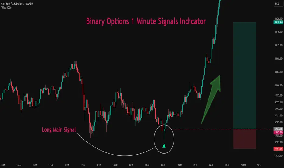
Binary Options 1 Minute Signals [TradingFinder] 1 Min Strategy🔵 Introduction
At first sight, price movement in binary options appears random, but behind every move lies a clear logic of liquidity and market imbalance. The market is always driven by the hunt for liquidity and the continuous rebalancing that takes place around Fair Value Gaps (FVGs) and Order Blocks (OBs). These zones are where institutional activity is concentrated and where Smart Money creates the most significant reactions.
When price approaches a key liquidity zone, it often performs a Liquidity Sweep to capture orders resting around previous highs or lows. This move usually presents itself as a False Breakout. Price briefly breaks a level to trigger stop losses and collect liquidity, then quickly reverses direction. Understanding this false breakout behavior is essential for identifying high probability reversals in binary options trading.
After the liquidity sweep, price typically retraces into a Fair Value Gap or Order Block, where the market seeks balance and new orders are introduced. This interaction between liquidity, imbalance, and institutional order flow forms the core logic of every Smart Money trading model.
By focusing on Liquidity Sweeps, False Breakouts, and the structure of FVGs and OBs, traders can read the true intention behind price movements. What seems like random volatility becomes a structured cycle of liquidity collection and reaction, offering clear opportunities for precision-based binary entries.
Bullish Setup :
Bearish Setup :
🔵 How to Use
This indicator works within the Smart Money framework and focuses on the connection between Liquidity Sweep, False Breakout, Fair Value Gap (FVG) and Order Block (OB).
It is created to help traders identify the moment when the market finishes collecting liquidity and begins to show signs of reversal.
The indicator studies how price behaves around zones where liquidity is concentrated, such as previous highs and lows or areas with visible inefficiency. When a clear reaction forms and a valid candle pattern confirms the shift in direction, the indicator generates a signal that represents the activity of Smart Money.
This tool does not respond to random volatility or noise. It waits for structure, liquidity and confirmation to align together before providing an entry. As a result, every signal has a logical base related to institutional order flow rather than ordinary price fluctuations. This approach allows traders to focus only on the movements that reflect true liquidity behavior.
🟣 Long Setup
A bullish setup takes place when the market moves downward and reaches a sell-side liquidity zone located below previous swing lows. In this area, price performs a Liquidity Sweep by moving under key levels to trigger stop losses and capture liquidity from trapped sellers.
This movement usually appears as a False Breakout because the market breaks below a level for a short moment and then quickly moves back inside the range.
Around this zone, a bullish Order Block or Fair Value Gap (FVG) often exists, showing where institutional demand is active.
When the indicator detects the presence of liquidity collection together with a valid bullish confirmation candle near an OB or FVG, it creates a Call signal.
This marks the moment when Smart Money is shifting from selling pressure to accumulation, and a strong bullish move often follows. For binary entries, the best opportunity usually comes immediately after the confirmation candle closes.
The reaction tends to happen quickly because the liquidity grab has completed and new institutional buying pressure is entering the market. This type of setup often provides a clean and precise entry with a high probability of success.
🟣 Short Setup
A bearish setup happens when the market rises and enters a buy-side liquidity area above previous highs. Here, the market performs a Liquidity Sweep to trigger stop losses placed above those highs and to absorb liquidity from trapped buyers.
This pattern forms what traders recognize as a False Breakout because the price only breaks the level temporarily before reversing in the opposite direction. A bearish Order Block or Fair Value Gap (FVG) often appears around this zone, showing where institutional selling interest exists.
Once the liquidity sweep completes and a bearish confirmation candle closes, the indicator produces a Put signal that reflects the shift from buying to selling pressure by Smart Money.
This moment often leads to a fast downward reaction as the market rebalances and fills the nearby inefficiency.
The most effective entry for binary trading is right after the confirmation candle closes, when the false breakout and liquidity collection are both completed. The price usually reacts sharply as the market transitions from liquidity hunting to a new directional move. This setup represents a structured view of how liquidity drives market cycles and how Smart Money creates precise reversals through controlled imbalance and reaction.
🔵 Settings
Time Frame : Defines the timeframe used for analysis. If left blank, the indicator automatically uses the chart’s current timeframe.
Swing Period : Determines how many candles are used to identify structural turning points such as swing highs and swing lows. Higher values increase accuracy but reduce the number of signals.
Signal Type : Specifies the type of signal generated by the indicator. The option All shows every signal, Main Signal displays only the primary one, and Alternative Signal produces a secondary signal that appears one candle after the main signal for additional confirmation.
Candle Pattern : Enables candle pattern logic for reversal confirmation. When active, the indicator issues a signal only when a valid candle formation confirms the market reaction.
Candle LookBack Check : Verifies that the last few candles move in the opposite direction of the signal to be generated. This condition acts as a confirmation filter, ensuring that the signal appears only after a clear counter-move in price.
Last Candle Direction : Considers the direction of the most recent candle in the analysis. It helps determine whether the final candle moves with or against the current trend.
Last Candle Shadow Ratio : Sets the ratio between the last candle’s wick and body to refine confirmation accuracy. Higher values require longer wicks, indicating stronger rejection and a more reliable reversal pattern.
🔵 Conclusion
Trading with Smart Money logic means understanding how liquidity moves through the market.
Each Liquidity Sweep, False Breakout, Fair Value Gap (FVG) and Order Block (OB) reflects the process of collecting and redistributing orders.
This indicator captures that sequence and turns it into precise, structured signals for binary entries. When liquidity is absorbed and a candle confirmation appears, the market reveals its true direction.
At that moment, traders can act with confidence, following institutional flow instead of reacting to random price moves.
Success with this system comes from patience, confirmation, and a clear reading of liquidity behavior, the core principles behind every Smart Money reversal.
Level LinesThis indicator displays levels in close proximity to the current price, enabling users to identify psychological levels on charts that serve as support/resistance zones or key reference points for price action.
In the settings, you can customize the number of lines shown above and below the current price, along with the interval size for rendering them.
As the price moves higher or lower, the lines dynamically adjust to reflect the most relevant levels.
In settings you can fully customize the style of lines (color, width, style) with separate settings available for lines above & below the current price.

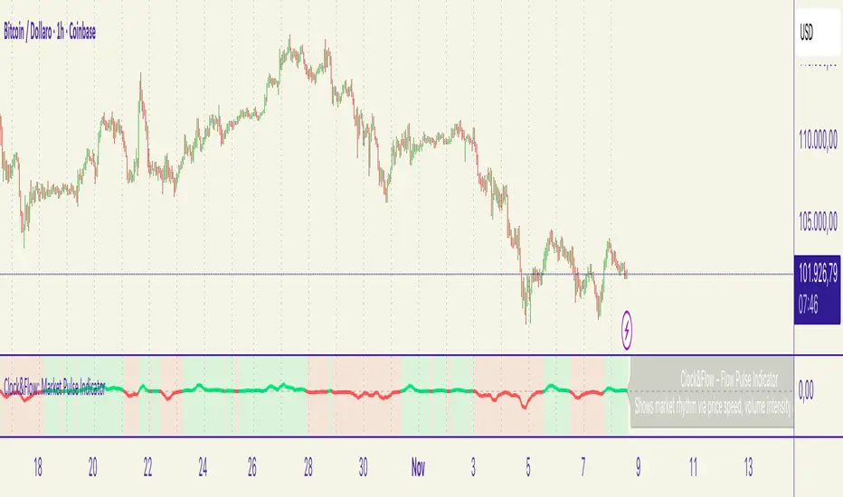
Clock&Flow – Market Pulse IndicatorClock&Flow – Market Pulse Indicator
1) General Purpose
The Market Pulse Indicator is designed to visualize the strength and direction of market flow in a clear, intuitive way.
Unlike common volume or momentum indicators, it blends three essential dimensions — price velocity, normalized volume, and volatility (ATR) — to highlight when market pressure is truly meaningful.
It helps identify genuine liquidity inflows/outflows, potential exhaustion zones, and moments of compression or expansion within the price structure.
2) Data Sources
All data is directly taken from the current chart’s feed on TradingView:
Price (close): to measure relative price change.
Volume: to detect the intensity of market participation (normalized to average).
ATR (Average True Range): to evaluate volatility relative to price levels.
No external data or off-platform sources are used.
3) Logic and Calculation Steps
Price Velocity: calculates the percentage change between the current close and the close N bars ago.
priceChange = (close - close ) / close
Normalized Volume: compares current volume to its moving average over the same period.
volNorm = volume / sma(volume, length)
Normalized Volatility: ATR divided by price to adjust for instrument scale.
atrNorm = atr(length) / close
Combination : multiplies the three components into one raw value that represents market pulse intensity.
rawPulse = priceChange * volNorm * (1 + atrNorm)
Smoothing: a moving average (smoothLen) is applied to create a cleaner and more readable oscillator line.
flowPulse = sma(rawPulse * multiplier, smoothLen)
4) Parameters (Default Settings)
length (20): analysis period for price change, volume, and ATR.
smoothLen (5): smoothing factor; higher values reduce noise.
multiplier (100): scales the output for readability; adjust to fit chart scale.
5) How to Read the Indicator
Market Pulse > 0 (green): net inflow of liquidity; buying pressure dominates.
Market Pulse < 0 (red): net outflow of liquidity; selling pressure dominates.
Near 0: neutral phase; market balance or consolidation.
Sudden peaks: strong bursts of flow — often coincide with news releases or session overlaps.
Confirmations: use as a second-level filter before entering trades or to confirm momentum behind a breakout.
6) Divergences
Divergences between price and Market Pulse are key signals of weakening flow strength:
Bullish divergence: price forms lower lows while Market Pulse forms higher lows → selling pressure is fading; potential reversal or bounce.
Bearish divergence: price forms higher highs while Market Pulse fails to confirm → buying momentum is losing strength; potential correction ahead.
For reliability, look for divergences on higher timeframes (H4, Daily).
On lower timeframes, treat them as early warnings.
7) Typical Use Cases
Breakout confirmation: price breaks resistance with a rising Market Pulse → confirms genuine participation.
False signal filter: price breaks a level but Market Pulse remains flat/negative → likely fake breakout.
Pullback entry: after a breakout, wait for a short retracement and a new positive pulse → safer entry point.
Exit signal: if you’re long and Market Pulse suddenly turns negative with strong volume → consider partial exit or tighter stops.
8) Recommended Timeframes
Intraday / Scalping: 5–30 min charts with length 10–14, smoothLen 3–5.
Swing trading: 1h–4h charts with length 20–50.
Position trading: Daily charts with larger length (50–100) for smoother data.
Always optimize parameters to the specific asset — there are no universal settings.
9) Limitations
This indicator is not a trading system — it’s a decision-support tool.
Results depend on the quality of the volume data available for the symbol.
Performance and sensitivity are influenced by length, smoothing, and multiplier values — always test before live trading.
Use alongside sound risk and money management.
10) Disclaimer
This script is provided for educational purposes only and does not constitute financial advice.
Trading and investing involve significant risk, including the potential loss of capital.
Always test indicators in simulation environments and make independent decisions based on your own analysis and risk tolerance.
Italiano
1) Scopo generale
Flow Pulse è un oscillatore pensato per visualizzare la forza e la direzione del flusso di mercato in modo immediato. Non è un semplice indicatore di volume né una copia di RSI/MACD: combina tre dimensioni fondamentali — variazione di prezzo, volume normalizzato e volatilità — per mettere in evidenza i momenti in cui la pressione dei partecipanti è realmente significativa.
È ideale per identificare: entrate guidate da flussi reali, potenziali esaurimenti, momenti di compressione/espansione del movimento e segnali di conferma per breakout o rimbalzi.
2) Dati utilizzati
L’indicatore usa esclusivamente dati disponibili sulla piattaforma TradingView del grafico corrente:
price (close) — per calcolare la variazione percentuale del prezzo;
volume per misurare l’intensità degli scambi (normalizzato su media);
ATR (Average True Range) — per normalizzare la volatilità rispetto al prezzo;
Tutti i feed (prezzo e volume) sono quelli forniti dall’exchange/fornitore dati collegato al simbolo sul grafico.
3) Logica e passaggi di calcolo
Velocità del prezzo: calcolo della variazione percentuale tra la chiusura corrente e la chiusura N barre fa:
priceChange = (close - close ) / close
— misura la direzione e magnitudine del movimento in termine relativo.
Volume normalizzato: rapporto tra il volume corrente e la media mobile semplice del volume su length barre:
volNorm = volume / sma(volume, length)
— evidenzia volumi anomali rispetto alla media.
Volatilità normalizzata (ATR): rapporto ATR/close per rendere la volatilità comparabile across price levels:
atrNorm = atr(length) / close
Combinazione: il prodotto di questi fattori (con un piccolo offset su ATR) genera un valore grezzo:
rawPulse = priceChange * volNorm * (1 + atrNorm)
— se priceChange e volNorm sono positivi e l’ATR è presente, il rawPulse sarà significativamente positivo.
Smoothing: media mobile semplice (SMA) applicata al rawPulse e moltiplicazione per un fattore scalare (multiplier) per portare il range su livelli leggibili:
flowPulse = sma(rawPulse * multiplier, smoothLen)
4) Parametri esposti (default consigliati)
length (periodo analisi) — default 20: influenza calcolo Δ% e media volumi; allunga la finestra storica.
smoothLen (smussamento) — default 5: smoothing del segnale per ridurre rumore.
multiplier — default 100: fattore di scala per rendere l’oscillatore più leggibile.
5) Interpretazione pratica dei valori
FlowPulse > 0 (verde): predominanza di flusso d’ingresso — pressione d’acquisto. Maggiore il valore, più forte la convinzione (volume + movimento + volatilità).
FlowPulse < 0 (rosso): predominanza di flusso in uscita — pressione di vendita.
Vicino a 0: assenza di flussi netti chiari; mercato piatto o bilanciato.
Picchi repentini: indicano accelerate di flusso — spesso coincidono con rotture, open/close session, news.
Sostegno al trade: usa FlowPulse come conferma prima di entrare su breakout o come avviso di attenzione su esaurimenti.
6) Divergenze (come leggerle)
Le divergenze tra prezzo e FlowPulse sono segnali importanti:
Divergenza rialzista (bullish divergence): prezzo fa nuovi minimi mentre FlowPulse non fa nuovi minimi (o forma minimo relativo più alto) → indica che la spinta di vendita non è supportata da volume/volatilità, possibile inversione/rimbalzo.
Divergenza ribassista (bearish divergence): prezzo fa nuovi massimi mentre FlowPulse non li conferma (o forma massimo relativo più basso) → la spinta d’acquisto è “debole”, possibile esaurimento e inversione.
Note pratiche: cercare divergenze su timeframe maggiori (H4, D) per maggiore attendibilità; sui timeframe minori prendere solo come early warning.
7) Esempi d’uso operativo
Conferma breakout: prezzo rompe resistenza + FlowPulse positivo e crescente → breakout più probabile e con volumi reali.
Filtro per falsi segnali: prezzo rompe ma FlowPulse è piatto/negativo → alto rischio di false breakout.
Entrata per pullback: dopo breakout, attendere un pullback con FlowPulse che torna positivo → ingresso più prudente.
Gestione delle uscite: se sei long e FlowPulse improvvisamente si inverte in negativo su volumi elevati → considerare riduzione posizione o stop.
8) Timeframe consigliati
Intraday / Scalping: M5–M30 con length ridotto (es. 10–14) e smoothLen piccolo.
Swing trading: H1–H4 con length 20–50.
Position trading: D1 con length maggiore per filtrare rumore.
Testa i parametri sul tuo asset e timeframe; nessun parametro è universale.
9) Limitazioni e avvertenze
L’indicatore non è un sistema di trading completo: è un tool di informazione e timing.
Dipende dalla qualità dei dati di volume del simbolo: su alcuni titoli/mercati (es. alcuni ETF, Forex su certi broker) il volume può essere parziale o non rappresentativo.
I valori di margine/multiplier e smoothing influenzano sensibilmente sensibilità e falsi segnali: backtest e ottimizzazione sono raccomandati.
Non usare il solo FlowPulse per entrare su leva elevata senza gestione del rischio12) Disclaimer da inserire
Disclaimer: Questo indicatore è fornito solo a scopo didattico e non costituisce consulenza finanziaria. L’uso comporta rischi: valuta sempre la gestione del rischio e testa su conto demo prima dell’applicazione in reale.
INDEX TRADING SecretWD Gann Indices Level Calculation with VWAP Confirmation for Intraday Trading
Overview
This Pine Script indicator unveils a powerful "secret" strategy inspired by WD Gann's principles for calculating support and resistance levels across multiple timeframes (daily, weekly, monthly, and yearly). It is designed specifically for intraday trading in Indian indices such as NIFTY, BANKNIFTY, FINNIFTY, and SENSEX. By leveraging Gann's Square of Nine methodology, the script derives key static support and resistance levels from significant highs and lows in each timeframe. These levels act as vibrational points where price is likely to react, based on Gann's geometric and mathematical insights into market cycles.
The script integrates Volume Weighted Average Price (VWAP) as a trend confirmation tool, helping traders filter signals and align with the prevailing market momentum. VWAP serves as a dynamic benchmark: prices above VWAP indicate bullish bias, while prices below suggest bearish conditions.
This approach combines Gann's time-price squaring with modern volume analysis, enabling precise entry/exit decisions in volatile intraday sessions. The levels are plotted as horizontal lines for easy visualization on lower timeframes (e.g., 5-min or 15-min charts), with options to toggle visibility for each timeframe to avoid clutter.
Key Features
Gann Level Calculation (Square of Nine Method):
For each timeframe (daily, weekly, monthly, yearly), the script identifies a pivot price, typically the square root of a key value like the previous period's high, low, or close.
Support levels are calculated by subtracting angular increments (e.g., 45°, 90°, 135°, 180°) from the square root of the pivot, then squaring the result:Support Level = (√Pivot - (Angle / 360))²
Resistance levels are calculated by adding the increments:Resistance Level = (√Pivot + (Angle / 360))²
Common angles used: 45° (0.125 increment), 90° (0.25), 135° (0.375), 180° (0.5), 225° (0.625), 270° (0.75), 315° (0.875), 360° (1.0).
Timeframe-specific pivots:
Daily: Based on previous day's high/low/close.
Weekly: Based on previous week's high/low/close (using security() function for higher timeframe data).
Monthly: Based on previous month's high/low/close.
Yearly: Based on previous year's high/low/close, ideal for long-term cycle analysis.
The script automatically fetches higher timeframe data via Pine's security() function, ensuring levels update in real-time on intraday charts.
VWAP Integration:
Plots the standard VWAP line (using ta.vwap for accuracy), resetting at session open for intraday focus.
VWAP acts as a trend filter: It confirms bullish conditions when price is above it and bearish when below.
Plotting and Customization:
Support levels plotted in green, resistance in red, with labels showing timeframe (e.g., "Daily S1", "Weekly R2").
User inputs for selecting which timeframes to display, line styles, and angular increments.
Alerts can be set for price crossing key levels or VWAP.
Trading Strategy: Intraday Rules Using Gann Levels and VWAP
This strategy focuses on confluence between Gann levels and VWAP for high-probability trades in Indian indices. Trade on intraday charts (e.g., 5-min) during market hours (9:15 AM - 3:30 PM IST). Always use risk management: Position size 1-2% of capital, with stops beyond the nearest Gann level.
Buy Signals:
Price above a Gann support level and above VWAP: Indicates upward momentum with support holding. Enter long, targeting the next resistance.
Price above a Gann resistance level and above VWAP: Suggests a breakout. Enter long for continuation, targeting higher timeframe resistance.
Sell Signals:
Price below a Gann support level and below VWAP: Indicates downward momentum with support broken. Enter short, targeting the next support.
Price below a Gann resistance level and below VWAP: Suggests rejection at resistance. Enter short for reversal, targeting lower support.
Alternative Use: Daily Levels as Stop Loss:
For simpler setups, ignore higher timeframes and use only daily Gann support/resistance as protective stops.
Example: In a long trade, place stop below daily support; in a short, above daily resistance. This minimizes risk while letting winners run with VWAP as the trailing guide.
Example Usage
On NIFTY 5-min chart: Daily support at 24,500 (calculated from prior day's low via Square of Nine). If price bounces above 24,500 and crosses VWAP upward, buy with target at weekly resistance (e.g., 24,800).
Risk: If price falls below support and VWAP, exit or reverse to short.
Backtesting and Notes
Backtest on historical Indian index data to validate. Gann levels work best in trending markets; combine with volume spikes or RSI for filters. Remember, markets are cyclical—yearly levels often define major turns, while daily/weekly handle intraday noise. This is not financial advice; test thoroughly

Indicator Overview主力籌碼預判買賣力道 (JUMBO)Pro+ 2.0主力預判買賣力道 Pro+ 是一個先進的多維度交易分析系統,專為台灣股市投資者設計。本指標整合了趨勢、成交量、動量、價格位置和波動率五大維度,通過加權評分系統生成綜合的「Power指標」,精準預判主力資金動向。
🔧 核心技術架構
1. 多維度評分系統
趨勢維度 (30%):雙EMA系統 + MACD + ADX趨勢強度
成交量維度 (25%):OBV能量潮 + 成交量比率分析
動量維度 (20%):RSI + MFI資金流量指標
價格位置維度 (20%):VWAP + 布林通道位置分析
波動率維度 (5%):ATR波動率調整
2. 多重確認機制
趨勢確認:EMA金叉/死叉 + 超級趨勢方向
成交量確認:成交量脈衝檢測 + OBV趨勢確認
動量確認:RSI超買超賣 + MFI資金流向
位置確認:布林通道位置 + VWAP相對位置
📊 主要功能特色
訊號系統
主力佈局訊號 🟥
趨勢多頭確認 + Power > 35
成交量放大 + 動量指標多頭
RSI未超買 + 價格突破基準
主力出貨訊號 🟩
趨勢空頭確認 + Power < -35
成交量異常 + 動量指標空頭
RSI未超賣 + 價格跌破基準
Power交叉訊號 🟠🔵
黃金交叉:Power線向上穿越Power MA線
死亡交叉:Power線向下穿越Power MA線
視覺化系統
台灣股市顏色標準:紅色上漲/多頭,綠色下跌/空頭
多層級K線著色:強力訊號→普通訊號→偏多偏空→盤整
智能資訊面板:實時顯示8大關鍵指標狀態
⚙️ 參數設定說明
主要參數
EMA週期:13/55(短期/長期)
Power閾值:35(靈敏度調整)
成交量濾波:1.2倍(異常成交量檢測)
超級趨勢:10週期/3倍數(趨勢過濾)
進階參數
布林通道:20週期/2倍標準差
波動率設定:14週期ATR
動量指標:14週期RSI/MFI
🎯 交易應用策略
進場時機
強力買入:🔥標記 + Power黃金交叉
常規買入:紅色向上箭頭 + Power > 35
確認買入:多重條件同時滿足
出場時機
強力賣出:💧標記 + Power死亡交叉
常規賣出:綠色向下箭頭 + Power < -35
風險控制:趨勢反轉 + 動量減弱
風險管理
止損設定:ATR波動率參考
倉位控制:Power數值強度分級
訊號過濾:ADX趨勢強度確認
📈 指標優勢
高準確率:多重條件過濾,減少假訊號
及時性:領先指標預判主力動向
完整性:涵蓋技術分析主要維度
用戶友好:直觀的視覺化設計
自定義:參數可調適應不同交易風格
🎯 Indicator Overview
Main Force Prediction Buying/Selling Strength Pro+ is an advanced multi-dimensional trading analysis system specifically designed for Taiwan stock market investors. This indicator integrates five key dimensions: trend, volume, momentum, price position, and volatility, generating a comprehensive "Power Indicator" through a weighted scoring system to accurately predict institutional fund movements.
🔧 Core Technical Architecture
1. Multi-Dimensional Scoring System
Trend Dimension (30%): Dual EMA system + MACD + ADX trend strength
Volume Dimension (25%): OBV accumulation + Volume ratio analysis
Momentum Dimension (20%): RSI + MFI money flow index
Price Position Dimension (20%): VWAP + Bollinger Bands position analysis
Volatility Dimension (5%): ATR volatility adjustment
2. Multi-Confirmation Mechanism
Trend Confirmation: EMA golden/death cross + SuperTrend direction
Volume Confirmation: Volume spike detection + OBV trend confirmation
Momentum Confirmation: RSI overbought/oversold + MFI money flow
Position Confirmation: Bollinger Bands position + VWAP relative position
📊 Key Features
Signal System
Institutional Accumulation Signals 🟥
Bullish trend confirmation + Power > 35
Volume expansion + Momentum indicators bullish
RSI not overbought + Price breakthrough baseline
Institutional Distribution Signals 🟩
Bearish trend confirmation + Power < -35
Abnormal volume + Momentum indicators bearish
RSI not oversold + Price breakdown below baseline
Power Cross Signals 🟠🔵
Golden Cross: Power line crosses above Power MA line
Death Cross: Power line crosses below Power MA line
Visualization System
Taiwan Market Color Standard: Red for uptrend/bullish, Green for downtrend/bearish
Multi-level Candlestick Coloring: Strong signals → Regular signals → Bias signals → Consolidation
Smart Info Panel: Real-time display of 8 key indicator statuses
⚙️ Parameter Settings
Main Parameters
EMA Periods: 13/55 (Short-term/Long-term)
Power Threshold: 35 (Sensitivity adjustment)
Volume Filter: 1.2x (Abnormal volume detection)
SuperTrend: 10 period/3 multiplier (Trend filtering)
Advanced Parameters
Bollinger Bands: 20 period/2 standard deviations
Volatility Settings: 14 period ATR
Momentum Indicators: 14 period RSI/MFI
🎯 Trading Application Strategies
Entry Timing
Strong Buy: 🔥 Mark + Power Golden Cross
Regular Buy: Red upward arrow + Power > 35
Confirmed Buy: Multiple conditions simultaneously met
Exit Timing
Strong Sell: 💧 Mark + Power Death Cross
Regular Sell: Green downward arrow + Power < -35
Risk Control: Trend reversal + Momentum weakening
Risk Management
Stop Loss Setting: ATR volatility reference
Position Sizing: Power value strength grading
Signal Filtering: ADX trend strength confirmation
📈 Indicator Advantages
High Accuracy: Multiple condition filtering reduces false signals
Timeliness: Leading indicators predict institutional movements
Completeness: Covers main dimensions of technical analysis
User-Friendly: Intuitive visualization design
Customizable: Adjustable parameters adapt to different trading styles
🔍 Professional Usage Tips
Trend Confirmation: Use in conjunction with major trend direction
Volume Validation: Ensure volume confirms price movements
Risk Management: Always use appropriate position sizing
Timeframe Analysis: Apply across multiple timeframes for confirmation
Market Context: Consider overall market conditions and sector rotation
版本: Pro+ 2.0
適用市場: 台股、亞股、全球股市
最佳時間框架: 日線、4小時線、1小時線
開發者: JUMBO Trading System
更新日期: 2025版本

Paste Horizontal LinesThis script automictically will draw horizontal line for previous key Price Action levels. I created this script to facilitate line drawing process. I receive key price targets from a trading service for a few stocks every morning. I needed a fast way to lay them out. I copy and past and BAM! Unique situation I know, so you may or may have a need. So if you do it works perfectly. If you want changes let me know.

GTI Buy/SellGTI Buy/Sell – Precision Reversal & Trend Confirmation Tool
The GTI Buy/Sell is an indicator designed to identify potential trend reversals and confirm ongoing trends with precision.
What It Does
This indicator generates Buy and Sell signals based on dynamic positioning relative to price action. A Buy signal is printed when the GTI line closes below the candle’s close, indicating a potential transition from a bearish to bullish phase. A Sell signal occurs when the GTI line appears above the candle’s close, suggesting a possible bearish reversal.
The GTI Buy/Sell doesn’t repaint and provides clear, actionable signals based on live market conditions.
How It Works
GTI Buy/Sell combines Average True Range (ATR) for volatility filtering, Smoothed Moving Averages (RMA), Simple Moving Average (SMA), and Exponential Moving Average (EMA) to generate a responsive trend-following structure.
Rather than using static crossovers, the script evaluates price interaction with multiple weighted moving averages and ATR thresholds to identify exhaustion points and turning moments. These calculated confluences enhance signal quality and reduce false positives.
Strategy & Usage Tips
Combine with a 38-period SMA: When the GTI prints a Buy signal and price is above the 38 SMA, it reinforces bullish continuation or reversal. Similarly, a Sell signal with price under the 38 SMA supports a bearish outlook.
Use with VWAP for Validation: In high-liquidity assets such as indices, pairing GTI with VWAP helps identify institutional support/resistance zones to validate the signal strength.
Confluence with GTI Trend: For best results, use this indicator alongside our GTI Trend, which analyzes broader trend context across timeframes. This combination allows traders to align micro signals with macro market direction.
Recommended Assets
GTI Buy/Sell performs best on assets with significant intraday volatility such as:
NASDAQ
US30 / Dow Jones
S&P 500
Gold (XAUUSD)
Brazilian Mini Index (WIN)
However, it can be applied to any instrument where meaningful trend behavior and price movement are present.

Pearson SL/TP📘 Description
Pearson SL/TP — Advanced Correlation-Based Strategy with Full Risk Management
The Pearson SL/TP indicator is an advanced market analysis tool that combines Pearson correlation, volatility-based stop/target levels, and dynamic signal strength evaluation.
It is designed for traders who want to visualize potential momentum shifts and risk/reward zones in a single, integrated chart.
🔍 Core Concept
This script measures the **Pearson correlation coefficient between recent price movements and time progression, highlighting potential trend exhaustion or momentum reversals when the correlation reaches extreme values.
* High positive correlation (near +1) → price moving steadily upward → possible overbought condition.
* High negative correlation (near -1) → price moving steadily downward → possible oversold condition.
When these extremes are reached, and confirmed by several internal filters, the script generates LONG or SHORT signals with fully calculated Stop Loss and Take Profit levels.
⚙️ Main Features
📈 Signal Generation
* Uses Pearson correlation as a primary indicator of trend intensity.
* Detects potential reversal zones when correlation crosses user-defined thresholds.
* Optional divergence confirmation enhances signal reliability.
💰 Risk Management
* Stop Loss (SL) and Take Profits (TP1 & TP2) automatically adapt to volatility using the ATR (Average True Range).
* Dynamic risk/reward ratios help assess trade quality.
* Adjustable multipliers let you fine-tune your risk parameters.
🧠 Signal Strength Analysis
Each signal is graded from Weak to Very Strong based on four factors:
1. Volume activity
2. Trend alignment
3. Pearson momentum
4. Correlation change intensity
🎨 Visualization
* Overbought / Oversold background zones
* Signal arrows (LONG / SHORT)
* SL / TP** price levels and labels
* Interactive dashboard** displaying:
* Current Pearson value
* Market state (Overbought / Oversold / Neutral)
* Signal strength
* Latest trade data (Entry, SL, TP1, TP2, Risk:Reward)
🔔 Alerts
Built-in alerts for:
* Confirmed LONG / SHORT signals
* Bullish / Bearish divergences
🧩 Customization
All major parameters — including **Pearson length, thresholds, ATR multipliers, and visual options — are fully customizable.
This allows you to adapt the indicator to any market, timeframe, or trading style.

Power Balance ForecasterHey trader buddy! Remember the old IBM 5150 on Wall Street back in the 80s? :) Well, I wanted to pay tribute to it with this retro-style code when MS DOS and CRT screens were the cutting edge of technology...
Analysis of the balance of power between buyers and sellers with price predictions
What This Indicator Does
The Power Balance Forecaster indicator analyzes the relationship between buyer and seller strength to predict future price movements. Here's what it does in detail:
Main Features:
Power Balance Analysis: Calculates real-time percentage of buyer power vs seller power
Price Predictions: Estimates next closing level based on current momentum
Market State Detection: Identifies 5 different market conditions
Visual Signals: Shows directional arrows and price targets
How the Trading Logic Works
Power Balance Calculation:
Analyzes Consecutive Bars - Counts consecutive bullish and bearish bars
Calculates Momentum - Uses ATR-normalized momentum to measure trend strength
Determines Market State - Assigns one of 5 market states based on conditions
Market States:
Bull Control: Strong uptrend (75% buyer power)
Bear Control: Strong downtrend (75% seller power)
Buying Pressure: Bullish pressure (65% buyer power)
Selling Pressure: Bearish pressure (65% seller power)
Balance Area: Market in equilibrium (50/50)
Prediction System:
Bullish Condition: Buyer power > 55% + Positive momentum = Bullish prediction
Bearish Condition: Seller power > 55% + Negative momentum = Bearish prediction
Price Target: Based on ATR multiplied by timeframe factor
Configurable Parameters:
Analysis Sensitivity (5-50): Controls how responsive the indicator is
Low values (5-15): More sensitive, ideal for scalping
High values (30-50): More stable, ideal for swing trading
Table Position: Choose from 9 positions to display the data table
Trading Signals:
Green Triangle ▲: Bullish signal, price expected to increase
Green Triangle ▼: Bearish signal, price expected to decrease
Dashed Line: Shows the price target projection
Label: Displays the exact target value
Recommended Timeframes:
Lower Timeframes (1-15 minutes):
Sensitivity: 10-20
Automatic Low TF mode
Higher Timeframes (1 hour - 1 day):
Sensitivity: 25-40
Automatic High TF mode
Important Notes:
Always use this indicator in combination with:
Market context analysis
Proper risk management
Confirmation from other indicators
Mandatory stop losses
The indicator works best in trending markets and may be less effective during extreme consolidation periods.
Astrology Events
Astrology Events
This indicator marks critical astronomical events that correlate with significant market movements, based on established principles of financial astrology and planetary cycle analysis.
CORE ASTRONOMICAL EVENTS TRACKED:
Planetary Sign Ingress (0 degrees)
Outer planet sign changes: Saturn, Jupiter, Uranus, Neptune, Pluto.
Inner planet sign changes: Sun (monthly), Moon (every 2.5 days approximately).
Special emphasis on 0 degrees Aries ingress across all celestial bodies.
Critical Degrees
Ending degrees (29 degrees) - Anaretic degree before sign transition.
24-hour harmonic divisions (15-degree intervals).
Zero-degree ingress points for all major planets.
Planetary Stations
Retrograde stations: When planets appear to stop and reverse direction.
Direct stations: When retrograde planets resume forward motion.
Includes all outer planets (Jupiter, Saturn, Uranus, Neptune, Pluto) plus Mercury.
Mercury Retrograde Periods
Complete retrograde cycles with start and end dates.
One of the most reliable indicators for market volatility and reversals.
Major Planetary Aspects
Conjunctions (0 degrees separation).
Squares (90 degrees).
Oppositions (180 degrees).
Trines (120 degrees).
Focus on slow-moving outer planet pairs that historically correlate with market movements.
Lunar Cycles
Automatically calculated New Moon phases.
Automatically calculated Full Moon phases.
Uses astronomical algorithms for precise ephemeris calculation.
RULE OF 3 CLUSTER DETECTION
Markets typically require multiple simultaneous astronomical events to produce significant movements. This indicator automatically detects when three or more events occur within a configurable time window (default: 3 days). Clusters are highlighted with background shading and labeled for easy identification.
HIERARCHICAL IMPORTANCE PRINCIPLE
Events are weighted by planetary velocity:
Slower-moving planets (Pluto, Neptune, Uranus) produce larger, longer-lasting market effects.
Faster-moving planets (Sun, Moon) produce shorter-duration effects.
Outer planet events occur less frequently and are therefore more significant.
CONFIGURABLE PARAMETERS:
Event Toggles:
Planet sign changes (0 degrees).
Ending degrees (29 degrees).
Retrograde and Direct stations.
24-degree harmonic intervals.
Sun sign changes.
Moon sign changes.
Mercury retrograde periods.
Major planetary aspects.
Moon phases (auto-calculated).
Aries ingress highlighting.
Rule of 3 cluster detection.
Display Settings:
Label size options (tiny, small, normal).
Individual color customization for each event category.
Cluster detection time window (1-14 days).
Minimum events for cluster threshold (2-5 events).
VISUAL INDICATORS:
Labels: Event markers positioned above/below price bars.
Lines: Vertical lines for significant events (Mercury retrograde, Aries ingress).
Background shading: Highlights Rule of 3 clusters.
Information table: Real-time display of active event filters.
DATA INPUT REQUIREMENTS:
Sample astronomical event dates are provided as templates. For accurate real-time analysis, users should update dates using:
Professional astronomical ephemeris data.
Planetary position calculators.
Astronomical almanacs.
ASTRONOMICAL CALCULATION METHODS:
Moon phases are calculated using:
Julian Date conversion algorithms.
Solar and lunar anomaly calculations.
Ecclesiastical moon phase formulas.
Automatic adjustment for leap years.
APPLICATION IN MARKET ANALYSIS:
This indicator is designed to identify potential timing windows for market reversals, accelerations, or consolidations. It should be used in conjunction with:
Traditional technical analysis, volume trend indicators, risk management practices
LIMITATIONS:
Astronomical events indicate potential timing windows, not directional bias.
Correlation does not imply causation!!!
Historical correlation varies across different markets and time periods.
Should not be used as a standalone trading system.
RCOMANDATIONS:
Update event dates quarterly using current ephemeris data.
Monitor for Rule of 3 clusters as high-probability timing windows.
Pay particular attention to outer planet events (occur less frequently, higher significance).
Cross-reference astronomical timing with traditional support/resistance levels.
Use 0-degree Aries ingress and 29-degree positions as primary alerts.
This indicator is for educational purposes. Astronomical timing methods should be integrated with comprehensive market analysis, data and proper risk management practices.
P.S THIS IS VERSION 1 AND STILL IN TEST

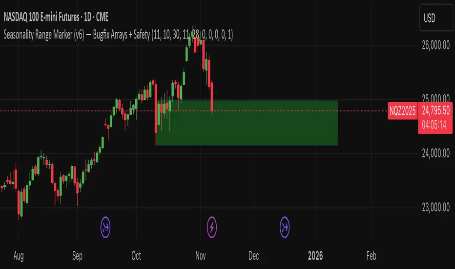
Seasonality Range Marker For better Seasonality Analysation. To see Seasionality patterns in the chart.