Bollinger Bands Forecast [QuantAlgo]🟢 Overview
Bollinger Bands are widely recognized for mapping volatility boundaries around price action, but they inherently lag behind market movement since they calculate based on completed bars. The Bollinger Bands Forecast addresses this limitation by adding a predictive layer that attempts to project where the upper band, lower band, and basis line might position in the future. The indicator provides three unique analytical models for generating these projections: one examines swing structure and breakout patterns, another integrates volume flow and accumulation metrics, while the third applies statistical trend fitting. Traders can select whichever methodology aligns with their market view or trading style to gain visibility into potential future volatility zones that could inform position planning, risk management, and timing decisions across various asset classes and timeframes.
🟢 How It Works
The core calculation begins with traditional Bollinger Bands: a moving average basis line (configurable as SMA, EMA, SMMA/RMA, WMA, or VWMA) with upper and lower bands positioned at a specified number of standard deviations away. The forecasting extension works by first generating predicted price values for upcoming bars using the selected method. These projected prices then feed into a rolling calculation that simulates how the basis line would update bar by bar, respecting the mathematical properties of the chosen moving average type. As each new forecasted price enters the calculation window, the oldest historical price drops out, mimicking the natural progression of the moving average. The system recalculates standard deviation across this evolving price window and applies the multiplier to determine where upper and lower bands would theoretically sit. This process repeats for each of the forecasted bars, creating a connected chain of potential future band positions that render as dashed lines on the chart.
🟢 Key Features
1. Market Structure Model
This forecasting approach interprets price through the lens of swing analysis and structural patterns. The algorithm identifies pivot highs and lows across a definable lookback window, then tracks whether price is forming higher highs and higher lows (bullish structure) or lower highs and lower lows (bearish structure). The system looks for break of structure (BOS) when price pushes beyond a previous swing point in the trending direction, or change of character (CHoCH) when price starts creating opposing swing patterns.
When projecting future prices, the model considers current distance from recent swing levels and the strength of the established trend (measured by counting higher highs versus lower lows). If bullish structure dominates and price sits near a swing low, the forecast biases upward. Conversely, bearish structure near a swing high produces downward bias. ATR scaling ensures the projection magnitude relates to actual market volatility.
Practical Implications for Traders:
Useful when you trade based on swing points and structural breaks
The Structure Influence slider (0 to 1) lets you dial in how much weight structure analysis carries versus pure trend
Helps visualize where bands could form around key structural levels you're watching
Works better in trending conditions where structure patterns are clearer
Might be less effective in choppy, sideways markets without defined swings
2. Volume-Weighted Model
This method attempts to incorporate volume flow into the price forecast. It combines three volume-based metrics: On-Balance Volume (OBV) to track cumulative buying/selling pressure, the Accumulation/Distribution Line to measure money flow, and volume-weighted price changes to emphasize moves that occur on high volume. The algorithm calculates the slope of these indicators to determine if volume is confirming price direction or diverging from it.
Volume spikes above a configurable threshold are flagged as potentially significant, with the direction of the spike (whether it occurred on an up bar or down bar) influencing the forecast. When OBV, A/D Line, and volume momentum all align in the same direction, the model projects stronger moves. When they conflict or show weak volume support, the forecast becomes more conservative.
Practical Implications for Traders:
Relevant if you use volume analysis to confirm price moves
More meaningful in markets with reliable volume data
The Volume Influence parameter (0 to 1) controls how much volume factors into the projection
Volume Spike Threshold adjusts sensitivity to what constitutes unusual volume
Helps spot scenarios where volume doesn't support a move, suggesting possible consolidation
Might be less effective in low-liquidity instruments or markets where volume reporting is unreliable
3. Linear Regression Model
The simplest of the three methods, linear regression fits a straight line through recent price data using least-squares mathematics and extends that line forward. This creates a clean trend projection without conditional logic or interpretation of market characteristics. The forecast simply asks: if the recent trend continues at its current rate of change, where would price be in 10 or 20 bars?
Practical Implications for traders:
Provides a neutral, mathematical baseline for comparison
Works well when trends are steady and consistent
Can be useful for backtesting since results are deterministic
Requires minimal configuration beyond lookback period
Might not adapt to changing market conditions as dynamically as the other methods
Best suited for trending markets rather than ranging or volatile conditions
🟢 Universal Applications Across All Models
Regardless of which forecasting method you select, the indicator projects future Bollinger Band positions that may help with:
▶ Pre-planning entries and exits: See where potential support (lower band) or resistance (upper band) might develop before price gets there
▶ Volatility context: Observe whether forecasted bands are widening (suggesting potential volatility expansion) or narrowing (possible compression or squeeze setup)
▶ Target setting: Reference projected band levels when determining profit targets or stop placement
▶ Mean reversion scenarios: Visualize potential paths back toward the basis line when price extends to a band extreme
▶ Breakout anticipation: Consider where upper or lower bands might sit if price begins a strong directional move
▶ Strategy development: Build trading rules around forecasted band interactions, such as entering when price is projected to return to the basis or exit when forecasts show band expansion
▶ Method comparison: Switch between the three forecasting models to see if they agree or diverge, potentially using consensus as a confidence filter
It's critical to understand that these forecasts are projections based on recent market behavior. Markets are complex systems influenced by countless factors that cannot be captured in a technical calculation or predicted perfectly. The forecasted bands represent one possible scenario of how volatility might unfold, so actual price action may still diverge from these projections. Past performance and historical patterns provide no assurance of future results. Use these forecasts as one input within a broader trading framework that includes proper risk management, position sizing, and multiple forms of analysis. The value lies not in prediction accuracy but in helping you think probabilistically about potential market states and plan accordingly.
Forecasting

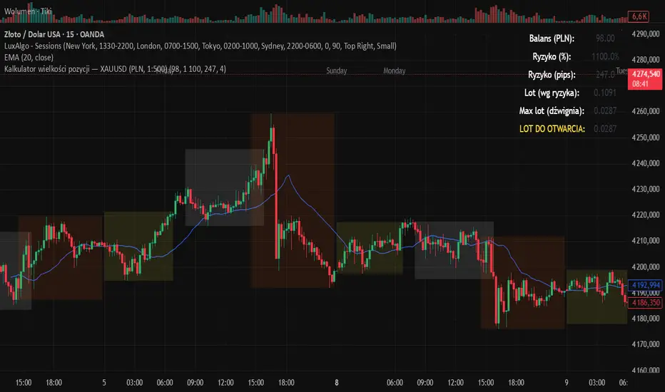
Kalkulator pozycji XAUUSD PLN, 1:500, 1100 to 100 kontaPosition calculator based on the number of pips that you quickly enter from the tool, this device will select the appropriate lot for you and you can quickly take a position
Volume and Volatility Crisis Detector Volume + Volatility Crisis Detector Pro
Created by Alphaomega18
🎯 What is the Crisis Detector Pro?
The Volume + Volatility Crisis Detector Pro is an advanced indicator that combines:
8-Level Volume Analysis: Progressive detection of volume anomalies
Hedging Index: Measurement of institutional fear and protection activity
Progressive Crisis Detection: Identification of pre-crisis patterns like 1987 and 2008
📊 Indicator Components
1️⃣ Volume Ratio
Description:
Compares current volume to its 20-period moving average
Normal value: ~1.0 (volume = average)
High value: >2.0 (volume double the average)
Extreme value: >3.0 (volume triple the average)
8-Level Classification:
LevelRatioColorMeaning1< 1.25x⚪ GrayNormal volume21.25-1.5x🟢 GreenEarly alert31.5-1.75x🟡 Light YellowLight increase41.75-2.0x🟡 YellowModerate52.0-2.25x🟠 OrangeSignificant62.25-2.5x🟠 Dark OrangeVery high72.5-3.0x🔴 RedExtreme8> 3.0x🔴 Bright RedCRISIS
2️⃣ Hedging Index
Description:
Estimates institutional hedging activity (protection buying)
Based on: Weighted bearish volume + ATR volatility
Scale: 0.3 to 2.5 (like a Put/Call ratio)
Hedging Levels:
ValueColorMeaning< 0.7🟢 GreenNormal hedging0.7-1.0🟡 YellowElevated hedging1.0-1.3🟠 OrangeHigh hedging> 1.3🔴 RedPANIC - Extreme hedging
Interpretation:
Rising hedging = Institutions protecting → Market fear
Falling hedging = Confidence returning → Possible rebound
⚙️ Main Parameters
Calculations:
Moving Average Period: 20 (reference period for averages)
Volume Classification (8 Levels):
Level 1: 1.25x (early alert)
Level 2: 1.5x (light increase)
Level 3: 1.75x (moderate)
Level 4: 2.0x (significant)
Level 5: 2.25x (high)
Level 6: 2.5x (very high)
Level 7: 3.0x (extreme)
Level 8: > 3.0x (crisis)
Hedging:
Enable Hedging Detection: Enable/disable hedging index
Hedging Period: 14 (smoothing period)
Display:
Show Signals: Display visual signals
📈 Visual Elements
Main Lines:
Volume Ratio (thick colored line): Current volume ratio vs average
🛡️ Hedging Index (thick colored line): Institutional hedging index
Horizontal Threshold Lines:
For Volume:
1.0 = Normal (thick gray line)
1.25 = Level 1 (green dashed)
1.5 = Level 2 (yellow dashed)
2.0 = Level 4 (orange dashed)
3.0 = Level 7 (red dashed)
For Hedging:
0.7 = Normal (thin green dashed)
1.0 = High (thin orange dashed)
1.3 = PANIC (thin red dashed)
Visual Signals:
🔴 Red triangle: Extreme volume (level 7-8)
🟠 Orange triangle: High volume (level 5-6)
🟡 Yellow triangle: Moderate volume (level 3-4)
Colored Background:
Transparent red: Extreme volume or panic hedging
🎯 How to Use the Indicator
1. Installation
Open TradingView
Click "Indicators" at top of chart
Click "Pine Editor" at bottom
Paste the code
Click "Add to Chart"
2. Reading the Chart
Volume Ratio (main line):
Around 1.0 = Normal volume, no alert
Between 1.25 and 2.0 = Volume increasing, watch closely
Above 2.0 = Abnormal volume, strong activity
Above 3.0 = CRISIS - Extreme volume
Hedging Index (hedging line):
Around 0.7 = Calm market
Rising toward 1.0 = Growing nervousness
Above 1.3 = Institutional PANIC
3. Trading Strategies
🟢 Scalping/Day Trading:
Volume Ratio > 2.0:
Scalping opportunity in direction of movement
Quick entries with tight stops
Exit on activity spikes
Hedging Index > 1.0:
Nervous market = bounce opportunities
Wait for confirmation before entering
🟠 Swing Trading:
Volume Ratio > 2.5:
Avoid opening new swing positions
Protect existing positions (trailing stops)
Wait for return to normal (< 1.5)
Hedging Index > 1.3:
Panic = possible capitulation
Look for reversal opportunities
Wait for hedging to drop
🔴 Risk Management:
Volume RatioHedging IndexRecommended Action< 1.5< 0.7Normal trading1.5-2.00.7-1.0Increased monitoring2.0-3.01.0-1.3Reduce exposure 50%> 3.0> 1.3STOP trading / Protection
4. Crisis Patterns (1987/2008 Style)
Pre-Crisis Pattern:
Volume staying above 1.5x for 5+ days
With 3+ days above 2.0x
= Stress accumulation before explosion
Crisis Building Pattern:
5+ consecutive days above 2.0x
Hedging rising progressively
= Crisis is building
Immediate Crisis Pattern:
Volume > 3.0x
Hedging > 1.3
= Widespread PANIC
🔔 Configurable Alerts
The indicator includes 6 main alerts:
🟢 Level 1: First volume anomaly (1.25x)
🔴 Level 6+: Very high volume (2.25x+)
🔴🔴 CRISIS: Extreme volume (3.0x+)
🛡️ PANIC HEDGING: Panic hedging (1.3+)
Configuration:
Right-click on chart
"Create Alert"
Condition: Select desired alert
Options: Set frequency
Actions: Email, notification, webhook, etc.
💡 Real Use Cases
Example 1: Flash Crash
Volume Ratio: 4.5 (🔴)
Hedging Index: 1.8 (🔴)
Signal: EXTREME CRISIS
Action: Full protection, no new trades
Example 2: Fed Announcement
Volume Ratio: 2.3 (🟠)
Hedging Index: 1.1 (🟠)
Signal: High volume and hedging
Action: Reduce positions, wide stops
Example 3: Technical Squeeze
Volume Ratio: 2.8 (🔴)
Hedging Index: 0.9 (🟡)
Signal: Breakout without panic
Action: Follow movement with confirmation
Example 4: Capitulation
Volume Ratio: 3.5 (🔴)
Hedging Index: 1.5 → 0.8 (rapid drop)
Signal: Panic then relief
Action: Look for bounce opportunities
🔧 Parameter Optimization
Scalping (1-5 min):
Moving Average Period: 10
Level 1: 1.2x
Level 4: 1.8x
Level 7: 2.5x
Hedging Period: 7
Day Trading (15min-1H):
Moving Average Period: 20 (default)
All thresholds: Default
Hedging Period: 14 (default)
Swing Trading (4H-Daily):
Moving Average Period: 30-50
Level 1: 1.3x
Level 4: 2.2x
Level 7: 3.5x
Hedging Period: 20
Crypto (Very volatile):
Moving Average Period: 20
Level 1: 1.5x
Level 4: 2.5x
Level 7: 4.0x
Hedging Period: 14
⚠️ Limitations and Best Practices
❌ Limitations:
Hedging is estimated, not based on real Put/Call data
May give false signals in very volatile markets
Requires significant volume to be reliable
✅ Best Practices:
Always combine with classic technical analysis
Never trade solely on alerts
Adapt thresholds to your asset and timeframe
Backtest before using live
Respect your risk management plan
Golden Rule:
"The indicator detects anomalies, not direction. Always wait for confirmation before entering positions."
📈 Performance and Compatibility
✅ Real-time: Instant detection (0 lag)
✅ All markets: Stocks, Futures, Forex, Crypto
✅ All timeframes: 1min to Monthly
✅ Lightweight: Optimized, no slowdown
✅ Multi-platform: TradingView web, mobile, desktop
🎓 Historical Crises
1987 - Black Monday:
Volume Ratio: x5-x10 for several days
Pattern: Progressive increase then explosion
2008 - Lehman Brothers:
Volume Ratio: x3-x7 for weeks
Hedging: Historical record
Pattern: Prolonged stress then panic
2020 - COVID Crash:
Volume Ratio: x4-x8 in few days
Pattern: Rapid fall with intense panic
2022 - Crypto Winter:
Volume Ratio: x2-x4 over several months
Pattern: Successive capitulations
Goldfishyes I love Fortnite yes I love Fortnite yes I love Fortnite yes I love Fortnite yes I love Fortnite yes I love Fortnite yes I love Fortnite yes I love Fortnite yes I love Fortnite yes I love Fortnite yes I love Fortnite yes I love Fortnite yes I love Fortnite yes I love Fortnite yes I love Fortnite

Core Suite Essentials This script provides institutional-grade, multi-factor market analysis in a unified toolkit. Its true sophistication lies in its ability to reveal the critical interplay—the "dance"—between its core components, offering a profound view of market structure, momentum, and trend health that goes far beyond standard indicators.
Core Differentiators
Reveals the Core Trend "Dance":
The script masterfully visualizes the critical interaction between three foundational elements:
Ichimoku (Tenkan Sen & Kijun Sen): The leading actors defining momentum and equilibrium.
Bollinger Middle Band (BBM): The dynamic stage of support/resistance.
This interaction provides an institutional-grade read on trend integrity:
Strong Trend: A clean, bullish alignment with the Tenkan Sen leading, the Kijun Sen following, and the BBM acting as firm support confirms a powerful, unified move.
Trend Break Warning: The BBM moving between the Tenkan and Kijun signals convergence and compression, a critical alert of weakening momentum and a potential reversal.
Multi-Timeframe Momentum Confirmation:
This core trend analysis is fortified with a layered momentum gauge, providing a robust, institutional-style confirmation system:
Proprietary RSI-Based Bands across weekly, daily, and intraday frames.
Stochastic Channels (Sto12/Sto50) for additional context on price position.
Strategic Filters for Swing & Position Traders:
For higher-timeframe analysis, it delivers essential quantitative tools:
AnEMA29 Angle: Objectively quantifies trend strength and direction.
PDMDR (DMI Ratio): Measures directional dominance to filter low-conviction markets.
Integrated Cross-Asset Intelligence:
Completing the institutional perspective is a Correlation & Hedging Assistant, contextualizing price action against peers and identifying strategic opportunities based on RSI divergences.
Conclusion
This is not a mere collection of indicators; it is a consolidated analytical workstation. It captures the nuanced "dance" of the core trend triad, layers on multi-timeframe momentum confirmation, and provides strategic filters for timing and cross-asset context. This holistic, institutional-grade approach delivers a definitive and actionable market narrative.
ICHIMOKU
@insomniac_vampire

Dynamische Open/Close Levels mit Historie🎯 Key Features
This indicator provides clean, configurable horizontal lines showing the Open and Close prices of a higher chosen timeframe (e.g., the last 5-minute candle), serving as dynamic support and resistance levels.
Unlike traditional indicators that draw messy "steps" across your entire chart, this tool is designed for clarity and precise control.
Controlled History: Easily define how many of the last completed periods (e.g., 5-minute blocks) should remain visible on the chart. Set to 0 for only the current, active levels.
No Stepladder Effect: Uses advanced drawing methods (line.new and object management) to ensure the historical levels remain static and do not clutter your chart history.
Dynamic Labels: The labels (e.g., "Open (5)") automatically adjust to show the timeframe you configured in the indicator settings, eliminating confusion when switching timeframes.
Customizable: Full control over colors, line length, and label positioning/size.
💡 Ideal Use Case
Perfect for scalpers and day traders operating on lower timeframes (1m, 3m) who want to quickly visualize and respect crucial price action levels from a higher context (e.g., 5m, 15m, 1h).

Alloyz Traders_RSI by Sagar BRSI for Intraday purpose with moving average and volume weightage price added in RSI.

AI Exclusive(Precision Entry)AI Exclusive (Precision Entry)
Overview: An indicator that provides precise entry signals along with defined Take Profit (TP) and Stop Loss (SL).
Benefits:
• Confident entries with built in risk management
• Clear TP and SL displayed on the chart
• Suitable for both beginner and professional traders
Features:
• Transparent, unambiguous signals
• Usable on all symbols and timeframes
• Visual design with colored lines and clear labels

PopGun Detector – Trigger + 5. CandleSimple module for the popguns.
It detects PGs, marks them (trigger points), and shows the 5th candle.
This way, you don’t have to search for a long time in the chart – you can easily go through the different timeframes and specifically look for the popguns.

RS Rating Vietnam - IBD Style (AlphaStock Edition)Description: This implies the Relative Strength (RS) Rating specifically optimization for the Vietnam Stock Market, inspired by Investor's Business Daily (IBD) methodology.
How it works: Unlike the standard RSI (which measures internal momentum), this RS Rating compares a stock's performance against a benchmark index (Reference Index: VNMIDCAP or VNINDEX) over the last 12 months.
Calculation Formula: The rating is based on weighted performance (ROC):
40% weight: Latest 3 months (1 Quarter)
20% weight: 6 months
20% weight: 9 months
20% weight: 12 months
Features:
Auto-Scaling RS Line: The line automatically adjusts to fit the price chart, removing the need for manual fixed scales.
Benchmark Comparison: Compares stock Alpha vs. VNMIDCAP (default) to detect leaders even when the general market is skewed by large-cap stocks.
Color Coded:
Purple: Rating > 90 (Strong Buy/Leader)
Green: Rating > 80
Yellow: Rating > 60
Red: Rating < 60
Smart Display: Shows historical Rating values in the Data Window when hovering over past candles.
Credits: Designed by Admin AlphaStock.
RS Rating Viet Nam by Admin AlphaStockSo sanh vs VNMIDCAP
Bạn có thể thay đổi BenchMark trong Code thành VNINDEX hay bất kỳ chỉ số nào

HighCrew Multi-Timeframe RSI Tracker Level 2This script extends standard RSI analysis by combining multiple timeframe RSI readings with volatility-adaptive thresholds, divergence detection, and slope-based reversal estimation. Instead of evaluating RSI in isolation, this version compares short-term, mid-term, and long-term RSI groups to identify alignment, pressure transitions, and early trap conditions.
Core Logic Used in the Script:
1. Multi-Timeframe RSI Stack
The script calculates RSI(14) on eight different timeframes:
1m, 5m, 15m, 30m, 60m, 120m, 180m, 240m.
These values are stored in arrays and evaluated together to determine overall directional bias.
2. Volatility-Adaptive Thresholds
A dynamic adjustment to RSI bull/bear levels is applied based on the ratio between current ATR and its 20-period ATR average.
• Higher volatility raises the required bull threshold and lowers the bear threshold.
• Lower volatility compresses the thresholds.
This allows RSI interpretation to scale with market speed.
3. Alignment & Status Modeling
The script counts how many timeframes are bullish, bearish, or neutral relative to the adaptive thresholds.
From this, it generates statuses such as:
• Full Bull Alignment
• Full Bear Alignment
• Partial Trend Formation
• Mixed / Range Conditions
4. Predictive Divergence Logic
The script compares short-term RSI (1m/5m) against mid-term RSI (15m/30m) to look for early trap-type divergences:
• Short-term RSI flipping while higher-timeframe RSI moves opposite
• Micro-TF bursts failing to confirm on mid-TFs
This helps highlight potential early bull/bear trap conditions.
5. RSI Group Averages & Behavior Interpretation
Short, mid, and long-range RSI averages are calculated to classify behavior such as:
• Pressure building
• Downward momentum
• Early trap signatures
• Macro continuation after local dips
• Alignment cooling/stalling
6. Slope-Based Early Reversal Signal
The script measures RSI slope changes between short-term and mid-term averages.
A widening slope spread indicates a potential early reversal forming.
A decay/reset mechanism reduces reversal probability when slopes re-align.
7. Table Display Output
All RSI readings, thresholds, alignment status, trap conditions, volatility mode, and early-reversal probability are shown in a table for quick interpretation.
Purpose of the Tool:
This system is designed to help traders observe how RSI evolves across multiple timeframes simultaneously and how short-term movement interacts with higher-timeframe structure. It does not generate buy/sell signals — instead, it visualizes alignment, divergence, and momentum shifts.

Stochastic RSI Forecast [QuantAlgo]🟢 Overview
The Stochastic RSI Forecast extends the classic momentum oscillator by projecting potential future K and D line values up to 10 bars ahead. Unlike traditional indicators that only reflect historical price action, this indicator uses three proprietary forecasting models, each operating on different market data inputs (price structure, volume metrics, or linear trend), to explore potential price paths. This unique approach allows traders to form probabilistic expectations about future momentum states and incorporate these projections into both discretionary and algorithmic trading and/or analysis.
🟢 How It Works
The indicator operates through a multi-stage calculation process that extends the RSI-to-Stochastic chain forward in time. First, it generates potential future price values using one of three selectable forecasting methods, each analyzing different market dimensions (structure, volume, or trend). These projected prices are then processed through an iterative RSI calculation that maintains continuity with historical gain/loss averages, producing forecasted RSI values. Finally, the system applies the full stochastic transformation (calculating the position of each forecasted RSI within its range, smoothing with K and D periods) to project potential future oscillator values.
The forecasting models adapt to market conditions by analyzing configurable lookback periods and recalculating projections on every bar update. The implementation preserves the mathematical properties of the underlying RSI calculation while extrapolating momentum trajectories, creating visual continuity between historical and forecasted values displayed as semi-transparent dashed lines extending beyond the current bar.
🟢 Key Features
1. Market Structure Model
This algorithm applies price action analysis by tracking break of structure (BOS) and change of character (CHoCH) patterns to identify potential order flow direction. The system detects swing highs and lows using configurable pivot lengths, then analyzes sequences of higher highs or lower lows to determine bullish or bearish structure bias. When price approaches recent swing points, the forecast projects moves in alignment with the established structure, scaled by ATR (Average True Range) for volatility adjustment.
Potential Benefits for Traders:
Explores potential momentum continuation scenarios during established trends
Identifies areas where structure changes might influence momentum
Could be useful for swing traders and position traders who incorporate structure-based analysis
The Structure Influence parameter (0-1 scale) allows blending between pure trend following and structure-weighted forecasts
Helps visualize potential trend exhaustion through weakening structure patterns
2. Volume-Weighted Model
This model analyzes volume patterns by combining On-Balance Volume (OBV), Accumulation/Distribution Line, and volume-weighted price returns to assess potential capital flow. The algorithm calculates directional volume momentum and identifies volume spikes above customizable thresholds to determine accumulation or distribution phases. When volume indicators align directionally, the forecast projects stronger potential moves; when volume diverges from price trends, it suggests possible reversals or consolidation.
Potential Benefits for Traders:
Incorporates volume analysis into momentum forecasting
Attempts to filter price action by volume support or lack thereof
Could be more relevant in markets where volume data is reliable (equities, crypto, major forex pairs)
Volume Influence parameter (0-1 scale) enables adaptation to different market liquidity profiles
Highlights volume climax patterns that sometimes precede trend changes
Could be valuable for traders who incorporate volume confirmation in their analysis
3. Linear Regression Model
This mathematical approach applies least-squares regression fitting to project price trends based on recent price data. Unlike the conditional logic of the other methods, linear regression provides straightforward trend extrapolation based on the best-fit line through the lookback period.
Potential Benefits for Traders:
Delivers consistent, reproducible forecasts based on statistical principles
Works better in trending markets with clear directional bias
Useful for systematic traders building quantitative strategies requiring stable inputs
Minimal parameter sensitivity (primarily controlled by lookback period)
Computationally efficient with fast recalculation on every bar
Serves as a baseline to compare against the more complex structure and volume methods
🟢 Universal Applications Across All Models
Each forecasting method projects potential future stochastic RSI values (K and D lines), which traders can use to:
▶ Anticipate potential crossovers: Visualize possible K/D crosses several bars ahead
▶ Explore overbought/oversold scenarios: Forecast when momentum might return from extreme zones
▶ Assess divergences: Evaluate how oscillator divergences might develop
▶ Inform entry timing: Consider potential points along the forecasted momentum curve for trade entry
▶ Develop systematic strategies: Build rules based on forecasted crossovers, slope changes, or threshold levels
▶ Adapt to market conditions: Switch between methods based on current market character (trending vs range-bound, high vs low volume)
In short, the indicator's flexibility allows traders to combine forecasting projections with traditional stochastic signals, using historical K/D for immediate reference while considering forecasted values for planning and analysis. As with all technical analysis tools, the forecasts represent one possible scenario among many and should be used as part of a broader trading methodology rather than as standalone signals.

Granger Causality Flow IndicatorGranger Causality Flow Indicator
█ OVERVIEW
The Granger Causality Flow Indicator is a statistical analysis tool designed to identify predictive relationships between two assets (Symbol X and Symbol Y). In econometrics, "Granger Causality" does not test for actual physical causation (e.g., rain causes mud); rather, it tests for predictive causality .
This script is designed to answer a specific question for traders: "Does the past price action of Asset X provide statistically significant information about the future price of Asset Y, beyond what is already contained in the past prices of Asset Y itself?"
This tool is particularly useful for Pairs Traders , Arbitrageurs , and Macro Analysts looking to identify lead-lag relationships between correlated assets (e.g., BTC vs. ETH, NASDAQ vs. SPY, or Gold vs. Silver).
█ CONCEPTS & CALCULATIONS
To determine if Symbol X "Granger-causes" Symbol Y, this script utilizes a variance-reduction approach based on Auto-Regressive (AR) models. Due to the runtime constraints of Pine Script™, we employ an optimized proxy for the standard Granger test using an AR(1) logic (looking back 1 period).
The calculation performs a comparative test over a rolling window (Default: 50 bars):
The Restricted Model (Baseline):
We attempts to predict the current value of Y using only the previous value of Y (Auto-Regression). We measure the error of this prediction (the "Residuals") and calculate the Variance of the Restricted Model (Var_R) .
The Unrestricted Model (Proxy):
We then test if the past value of X can explain the errors made by the Restricted Model. If X contains predictive power, including it should reduce the error variance. We calculate the remaining Variance of the Unrestricted Model (Var_UR) .
The GC Score:
The script calculates a score based on the ratio of variance reduction:
Score = 1 - (Var_UR / Var_R)
If the Score is High (> 0) : It implies that including X significantly reduced the prediction error for Y. Therefore, X "Granger-causes" Y.
If the Score is Low or 0 : It implies X added no predictive value.
█ HOW TO USE
This indicator is not a simple Buy/Sell signal generator; it is a context filter for cross-asset analysis.
1. Setup
Symbol 1 (X): The potential "Leader" (e.g., BINANCE:BTCUSDT).
Symbol 2 (Y): The potential "Follower" (e.g., BINANCE:ETHUSDT).
Differencing: Enabled by default. This checks the changes in price rather than absolute price, which is crucial for statistical stationarity.
2. Interpreting the Visuals
The script changes the background color and displays a table to indicate the current flow of causality:
Green Background (X → Y): Symbol 1 is leading Symbol 2. Price moves in Symbol 1 are statistically likely to foreshadow moves in Symbol 2.
Orange Background (Y → X): Symbol 2 is leading Symbol 1. The relationship has inverted.
Blue Background (Bidirectional): Both assets are predicting each other (tight coupling or feedback loop).
Gray/No Color: No statistically significant relationship detected.
3. Trading Application
Trend Confirmation: If you trade Symbol Y, wait for the background to turn Green . This indicates that the "Leader" (Symbol X) is currently exerting predictive influence, potentially making trend-following setups on Symbol Y more reliable.
Divergence Warning: If you are trading a correlation pair and the causality breaks (turns Gray), the correlation may be weakening, signaling a higher risk of divergence.
█ SETTINGS
Symbol 1 (X) & Symbol 2 (Y): The two tickers to analyze.
Use Differencing: (Default: True) Converts prices to price-changes. Highly recommended for accurate statistical results to avoid spurious regression.
Calculation Window: The number of bars used to compute the variance and coefficients. Larger windows provide smoother, more stable signals but react slower to regime changes.
Significance Threshold: (0.01 - 0.99) The minimum variance reduction score required to trigger a causal signal.
█ DISCLAIMER
This tool provides statistical analysis of historical price data and does not guarantee future performance. Granger Causality is a measure of predictive capability, not necessarily fundamental causation. Always use appropriate risk management.

HRESH SNIPER PRO - V77🦅 HRESH SNIPER PRO V77: High-Precision Visual AidThis indicator is a powerful, proprietary tool designed for extreme accuracy by identifying high-momentum entries. HRESH PRO prioritizes quality over quantity, delivering clean signals that are highly responsive to market structure.🎯 Operational Constraints (Strict adherence is mandatory)FeatureRequirementNotesAssetSTRICTLY BTC/USDTThe indicator's specialized calibration requires focused operation exclusively on Bitcoin's market profile.Timeframe1-Minute (1M)Designed for scalping and precision entry timing.RiskUSER'S SOLE RESPONSIBILITYRISK IS ENTIRELY YOUR RESPONSIBILITY. This indicator is a technical aid; it is not a prediction tool or financial advice.✨ Signal Presentation & LogicThe HRESH PRO system uses a sophisticated process to confirm high-quality entries, focusing entirely on a clean visual hierarchy to maintain continuous trend information:Primary Entry Label (SNIPER): The large "SNIPER" label is reserved for initiating a new sequence or major re-entry. It appears at the start of a trend or when a new powerful impulse occurs after a 7-hour time lapse, confirming a renewed opportunity.Continuation Feedback: To avoid repeating large labels, all subsequent confirmed entries are marked by Small, Color-Coded Diamonds/Dots. These marks visually validate the ongoing trend direction without cluttering the chart.Neon Bar Coloring: Price bars are colored strongly (Neon Lime/Red) throughout the active signal sequence for immediate visual identification of the primary trend.🛑 Important DisclaimerThis indicator (HRESH SNIPER PRO) is provided as a sophisticated technical analysis tool only. It is not financial advice. All risks associated with trading, including capital loss, are borne by the user. Do your own research (DYOR) and strictly adhere to sound risk management principles.

Swing Trading IndicatorThis script is a swing‑trading dashboard designed for BTC, ETH, S&P 500 (for now). It combines weekly RSI, USDT.D, VIX, moving averages and Fisher Transform into a single visual tool, with background highlights, an on‑chart info table and ready‑made alerts to help you time high‑probability swing entries and manage risk.
1. Overview
The indicator is intended to work on daily timeframe.
Signals are context‑aware: BTC and ETH get USDT.D conditions, SPX gets VIX and EMA‑100 logic, and all non‑ETH symbols can also use Fisher Transform as a mean‑reversion filter.
2. Conditions and background highlights
Each component sets a boolean condition and, when active, paints a background layer:
Weekly RSI condition
True when weekly RSI is below its symbol‑specific threshold.
USDT.D conditions
BTC: triggered when USDT.D is above the user threshold and the chart symbol is BTC.
ETH: same logic for ETH, but tracked separately..
VIX condition (SPX only)
True when VIX high is at or above the VIX threshold while the chart is SPX.
EMA condition (BTC & SPX)
BTC: daily close below EMA‑200.
SPX: daily close below EMA‑100.
Fisher Transform condition (non‑ETH)
Fisher Transform on the chart timeframe, using the configured period.
True when Fisher value is below the Fisher threshold.
3. Intended use and notes
This indicator is designed as a confluence tool for swing traders, not a standalone buy/sell system. It works best on assets that are in a clear uptrend, where the main idea is to accumulate during corrections within that broader bullish structure.
During larger market shocks, deep corrections, or black‑swan events, trend‑based and mean‑reversion filters can produce false signals, because volatility and correlations often behave abnormally in those periods. For that reason, this script should always be combined with independent risk management, higher‑timeframe trend analysis, and your own discretion.

Multi-Layer Reversal Pro [The_lurker]🔮 MULTI-LAYER REVERSAL PRO
💡 CONCEPT
─────────────────────────────────────────────────────────────
An intelligent indicator that detects potential market reversal
points through multi-layer analysis combining momentum indicators,
Smart Money Concepts, and an advanced confirmation system.
HOW IT WORKS:
1. When prices reach exhaustion levels, market behavior is
analyzed through key Smart Money Concepts
2. When SMC concepts align with exhaustion, additional
advanced confirmations are activated
3. When all conditions are met, the appropriate signal appears
🥇 Gold 5M Tips
═════════════════════════════════════════════════════════════
📊 SIGNAL TYPES
═════════════════════════════════════════════════════════════
🟢 BUY SIGNALS
─────────────────────────────────────────────────────────────
BUY
Confirmed buy signal - all conditions met
Confidence: HIGH ●●●
E.BUY (Early Buy)
Early buy opportunity - strong exhaustion + high ADX
Confidence: MEDIUM ●●○
🔴 SELL SIGNALS
─────────────────────────────────────────────────────────────
SELL
Confirmed sell signal - all conditions met
Confidence: HIGH ●●●
E.SELL (Early Sell)
Early sell opportunity - strong exhaustion + high ADX
Confidence: MEDIUM ●●○
🟡 YELLOW WARNING
─────────────────────────────────────────────────────────────
Yellow candle = Warning of potential nearby reversal
→ Action: Monitor only, do not rush
⚠️ CLOSE TRADE
─────────────────────────────────────────────────────────────
"Close Trade ⚠️" appears when:
- A yellow warning candle appeared
- The next candle closed below the TP level
→ Meaning: Exit long position + automatic short entry
═════════════════════════════════════════════════════════════
🎯 QUICK ACTION GUIDE
═════════════════════════════════════════════════════════════
BUY / SELL
Confidence: HIGH
✅ Direct entry
E.BUY / E.SELL
Confidence: MEDIUM
⚡ Cautious entry / smaller size
Yellow Candle
Confidence: ALERT
👁️ Monitor only
Close Trade
Confidence: URGENT
🚪 Immediate exit
⚠️ DISCLAIMER
━━━━━━━━━━━━━━━━━━━━━━━━━━━━━━━━━━━━━━━━━━━
This indicator is for educational purposes only. Past performance does not
guarantee future results. Always use proper risk management and conduct your
own analysis before making trading decisions.
═════════════════════════════════════════════════════════════
مؤشر الانعكاس الذكي متعدد الطبقات
═════════════════════════════════════════════════════════════
💡 الفكرة
─────────────────────────────────────────────────────────────
مؤشر ذكي يكتشف نقاط الانعكاس المحتملة في السوق عبر تحليل
متعدد الطبقات يجمع بين مؤشرات الزخم ومفاهيم Smart Money
مع نظام تأكيدات متقدم.
آلية العمل:
1. عند وصول الأسعار إلى مراحل التشبع ، يتم تحليل سلوك السوق من عدة نقاط جوهرية تعتمد على مفاهيم Smart Money
2. عند تطابق مفاهيم SMC مع التشبع ، تُفعَّل تأكيدات متقدمة
3. عند تحقق جميع الشروط، تظهر الإشارة المناسبة
🥇 نصيحة للذهب 5 دقائق
═════════════════════════════════════════════════════════════
📊 أنواع الإشارات
═════════════════════════════════════════════════════════════
🟢 إشارات الشراء
─────────────────────────────────────────────────────────────
1- شراء BUY
إشارة شراء مؤكدة - استوفت جميع الشروط
الثقة: عالية ●●●
2- شراء مبكر E.BUY
فرصة شراء مبكرة - تشبع قوي + ADX عالي
الثقة: متوسطة ●●○
🔴 إشارات البيع
─────────────────────────────────────────────────────────────
1- بيع SELL
إشارة بيع مؤكدة - استوفت جميع الشروط
الثقة: عالية ●●●
2- بيع مبكر E.SELL
فرصة بيع مبكرة - تشبع قوي + ADX عالي
الثقة: متوسطة ●●○
🟡 التحذير الأصفر
─────────────────────────────────────────────────────────────
الشمعة الصفراء = تحذير من احتمال انعكاس قريب
← التصرف: راقب فقط ولا تتسرع
⚠️ إغلاق الصفقة
─────────────────────────────────────────────────────────────
تظهر علامة "إغلاق الصفقة ⚠️" عندما:
- ظهرت شمعة تحذير صفراء
- الشمعة التالية أغلقت تحت مستوى TP
← المعنى: إشارة خروج من الشراء + فتح صفقة بيع تلقائياً
═════════════════════════════════════════════════════════════
🎯 دليل التصرف السريع
═════════════════════════════════════════════════════════════
شراء/بيع BUY / SELL
الثقة: عالية
✅ دخول مباشر
شراء مبكر/ بيع مبكر E.BUY / E.SELL
الثقة: متوسطة
⚡ دخول بحذر أو حجم أقل
شمعة صفراء
الثقة: تنبيه
👁️ مراقبة فقط
إغلاق صفقة
الثقة: عاجل
🚪 خروج فوري
═════════════════════════════════════════════════════════════
⚠️ إخلاء المسؤولية
━━━━━━━━━━━━━━━━━━━━━━━━━━━━━━━━━━━━━━━━━━━
هذا المؤشر للأغراض التعليمية فقط. الأداء السابق لا يضمن النتائج المستقبلية.
استخدم دائماً إدارة مخاطر مناسبة وقم بتحليلك الخاص قبل اتخاذ قرارات التداول.

BTC Swing Plan – Levels & ZonesThis indicator draws a structured breakout model for BTCUSD with clearly defined entry levels, stop zones, and four realistic upside targets.
It automatically plots:
Breakout zone
Stop-loss zone
Target 1
Target 2
Target 3
Target 4 (stretch target)
Midlines & color-coded structure boxes
This tool is designed for traders who prefer clean execution levels, disciplined risk management, and realistic price expansion steps—not overly aggressive moon projections.
All levels are fully adjustable from the settings menu.

Smart Multi-TF StochasticSmart Multi-TF Stochastic (SMTF Stoch)
Smart Multi-TF Stochastic is a multi-layer momentum analysis system built on top of Stochastic signals from several timeframes. It combines four stochastic timeframes (15m / 1H / 2H / 4H), Premium–Equilibrium–Discount zones, dynamic weight reallocation, and adaptive smoothing into a single SMART oscillator that reflects the real market structure with higher accuracy.
Key Features
1. Multi-Timeframe Stochastic Engine
The indicator calculates Stochastic on four different timeframes:
15m – micro momentum
1H – local trend
2H – intraday structure
4H – primary trend
Core logic:
When the 4H trend is strong, higher timeframes receive more weight.
When the 4H trend weakens, the model shifts weight toward lower timeframes, which detect reversals earlier.
2. Premium / Equilibrium / Discount Zones
Based on the recent price range, the indicator determines where the asset currently trades:
Discount — ideal zone for long setups
Equilibrium — neutral territory
Premium — area for exits or reversals
Background shading is applied automatically.
3. SMART-Stochastic — Central Signal Line
The combined oscillator uses:
weighted logic depending on the strength of the higher timeframe trend,
adaptive smoothing (SMA / EMA / WMA / RMA),
dynamic color states:
green — strong bullish trend
red — strong bearish trend
yellow — uncertainty
4. Trading Signals
Long Entry Signal (“ENTRY LONG”)
Triggered when:
price is in Discount,
higher TF line is red/yellow (trend not fully bullish),
SMART-Stoch is below mid-level,
upward crossover through the entry threshold occurs.
Displayed as a green triangle.
Exit / Reversal Signal (“EXIT / REVERSAL”)
Triggered when:
price moves into Premium,
the SMART line exceeds the configured exit level.
Displayed as a red triangle.
Both signals only trigger once at the moment of confirmation.
5. Multi-TF Status Table
A compact table in the top-right corner shows:
stochastic values across all timeframes,
overbought/oversold indicators (🔥 / ❄️),
trend confirmations (✓ / ✗),
SMART signal markers (🚀 entry, ⚠️ exit).
6. Alerts
Built-in alert conditions:
“🚀 ENTRY LONG”
“🔴 EXIT / REVERSAL”
Designed for live trading automation.
Purpose
Smart Multi-TF Stochastic is intended for traders who rely on Premium/Discount logic, trend confirmation from higher timeframes, and precise timing on lower timeframes. It works both as a standalone decision system and as a high-quality confirmation tool in structured trading strategies.
Fractal Chaos & Kalman Trajectory [Signal]🇺🇸 English Explanation: Silence the Noise, Capture the True Trajectory.
This indicator is an advanced tool that moves beyond conventional technical analysis (RSI, MACD, etc.), merging two cutting-edge concepts from financial mathematics: the Kalman Filter and Fractal Chaos Theory (Hurst Exponent).
How It Works and Why It's Premium
1. Noise Cleaner (Kalman Trajectory)
Technology: The Kalman Filter, famously used by NASA for rocket trajectory calculations.
Benefit: It effectively silences all instantaneous, misleading price fluctuations (noise). This low-lag line plots the price's true trajectory, providing the purest trend line available by constantly self-correcting its error estimate.
2. Chaos Detector (Hurst Exponent)
Technology: Derived from Fractal Geometry and Chaos Theory, the Hurst Exponent.
Benefit: It mathematically distinguishes if the market is currently in a "Trending Mode" or a "Random Walk/Choppy Mode."
H > 0.5 (Trend): The market is orderly; past moves influence the future (Safe to Trade!).
H < 0.5 (Chaos/Random): The market is random; trading should be avoided (Preserve Capital!).
Signal Logic: AWAKE and FEAR: Detecting the Genesis of Order
This indicator does not just produce simple crossover signals; it is engineered to identify the "Genesis of Order"—the precise moment a market transitions from untradeable randomness into a reliable trend regime.
Grey Bars (The Waiting Game): When the Hurst Exponent is below the Chaos Threshold (H < 0.5), bars are colored grey. This is the crucial "Wait Mode" signal, which prevents the trader from entering during the most capital-eroding, sideways, or random markets, thus prioritizing capital preservation.
AWAKE Signal (Long Entry): This signal triggers only when two conditions are met: the market breaks out of Chaos (Hurst > 0.5) and confirms a clear upward trend direction (price above the Kalman Trajectory). This is designed to be the safest entry point for a Long position.
FEAR Signal (Short Entry): Conversely, this signal triggers when the market breaks out of Chaos (Hurst > 0.5) and confirms a clear downward trend direction (price below the Kalman Trajectory). This represents the ideal entry point for a Short position.
THIS IS NOT FINANCIAL ADVICE.
Recommended settings:
Gain: 0.1
Chaos Threshold: 0.65

Session Sweep System – WarRoomXYZ V1WarRoom Session Sweep System v1 is a open-source institutional trading framework built to identify liquidity behavior across Asia, London, and New York sessions.
It combines session-based liquidity mapping, sweep detection, daily expansion modeling, and trend confirmation into a unified, timing-driven system optimized for XAUUSD, FX pairs, indices, and any instrument with session-dependent volatility.
This tool does not attempt to predict direction with arbitrary oscillators.
Instead, it focuses on the underlying market mechanisms that drive price:
liquidity, timing, expansion, and trend alignment.
Below is a detailed explanation of what the script does, how its components work, and how traders can use it effectively.
🔹 1. Session Liquidity Mapping
The script automatically identifies the Asia (00:00–06:00 GMT), London (07:00–12:00 GMT), and New York (13:00–17:00 GMT) sessions and builds real-time session ranges.
Each session creates a liquidity pool.
Trading institutions frequently sweep the high or low of one session before delivering the real move in the next session.
This script captures that behavior by:
►Drawing session range boxes
►Tracking previous session highs/lows
►Highlighting high-probability sweep locations
These ranges are essential reference points for timing entries and exits.
🔹 2. Liquidity Sweep Detection (Buy & Sell Sweeps)
The indicator identifies when price runs a previous session high/low and rejects back inside the range, which is commonly interpreted as a liquidity sweep.
The following sweep types are monitored:
►London sweeping Asia
►New York sweeping London
►Asia sweeping New York
►Daily sweep of PDH/PDL
Sweeps signal that liquidity has been collected and that a potential reversal or continuation is likely.
These are marked clearly on the chart for real-time decision-making.
🔹 3. Killzone Timing Model (GMT Time)
Market manipulation and expansion often occur during specific time windows.
The script highlights these institutional killzones:
►London Killzone: 07:00–10:00 GMT
►New York Killzone: 13:30–15:30 GMT
►NY PM Session: 19:00–21:00 GMT
Sweeps occurring inside these windows carry a significantly higher probability.
The timing layer helps filter out low-quality setups.
🔹 4. Daily Range & ADR Expansion Engine
A dedicated panel displays:
►Current day range
►ADR (Average Daily Range)
►Expansion stage (Early / Developed / Extended)
►PDH/PDL swept or intact
►Overall session bias
This allows traders to understand whether the daily move is likely to continue or reverse.
For example:
►Early expansion → trend continuation likely
►Extended expansion → reversal setups become more probable
This is useful for intraday targets and risk management.
🔹 5. MA Cloud Trend Model (Fast/Slow Structure)
To align liquidity behavior with directional conviction, the script includes a configurable MA engine:
►Fast & slow MA
►MA cloud
►Slope-based trend coloring
►Trend background
►MA cross alerts
The cloud provides trend confirmation without relying on oscillators.
Trades are higher quality when the sweep direction aligns with the MA trend.
🔹 6. How the Components Work Together
The script integrates several institutional concepts into one coherent model:
►Sessions define liquidity pools
►Sweeps identify stop-hunts and reversals
►Killzones define optimal timing
►MA Cloud confirms directional bias
►ADR engine indicates expansion potential
This creates a structured framework:
Sweep → Timing → Trend → Expansion → Execution
Each component strengthens the others, forming a robust decision-making model.
🔹 7. How to Use the Indicator (Practical Guide)
✔ Look for a sweep of a previous session level
When price runs a session high/low and closes back inside, liquidity has likely been collected.
✔ Confirm timing
Sweeps inside London or NY killzones tend to produce the strongest moves.
✔ Confirm trend
Use MA cloud direction and slope:
►Cloud green → long setups preferred
►Cloud red → short setups preferred
✔ Check ADR panel
If the day has already expanded significantly, reversal setups are more likely.
If expansion is still early, continuation setups are favored.
✔ Plan your trade
Common targets include:
►Opposite side of session range
►ADR High/Low
►PDH/PDL
Stops are typically placed beyond the sweep wick.
This creates a repeatable, rule-based approach to intraday liquidity trading.
🔹 8. Why This Script Is Original
This is not a mashup of existing open-source indicators.
It introduces:
►A custom session-linked liquidity sweep engine
►A structured daily expansion model
►Integrated killzone timing aligned with GMT
►A unified bias panel merging sweeps, ADR, and session manipulation
►A trend confirmation layer designed around session behavior
While it uses known institutional concepts, their integration, execution, and timing framework are unique, purpose-built, and not directly found in open-source scripts.
🔹 9. Suitable Markets
This indicator works best on:
►XAUUSD
►Major FX pairs
►US indices
►Synthetic markets with session cycles
Ideal timeframes: 1m, 5m, 15m, 30m
🔹 10. Limitations / Notes
This is an analytical tool, not a buy/sell signal generator
All sweeps are confirmed at candle close (non-repaint)
The tool assumes GMT session windows unless chart time differs
Users must practice risk management and entry triggers manually
Disclaimer
This script is provided for informational and educational purposes only. It does not provide financial, investment, or trading advice, and it does not guarantee profits or future performance. All decisions made based on this script are solely the responsibility of the user.
This script does not execute trades, manage risk, or replace the need for trader discretion. Market behavior can change quickly, and past behavior detected by the script does not ensure similar future outcomes.
Users should test the script on demo or simulation environments before applying it to live markets and must maintain full responsibility for their own risk management, position sizing, and trade execution.
Trading involves risk, and losses can exceed deposits. By using this script, you acknowledge that you understand and accept all associated risks.

SuperWaveTrendWaveTrend with Crosses + HyperWave + Confluence Zones + Thresholds
SuperWaveTrend — Advanced Momentum System Integrating WaveTrend, HyperWave, Confluence Zones & Threshold Filters
SuperWaveTrend is an enhanced momentum indicator built upon the classic WaveTrend (WT) framework.
It integrates HyperWave extreme zones, top/bottom Confluence Zones, trend hesitation Threshold regions, WT crossover reversal signals, and more.
This indicator is suitable for:
• Trend following
• Swing trading
• Reversal spotting
• Overbought/oversold structure analysis
• Extreme market sentiment detection
Whether you’re scalping or planning swing entries, SuperWaveTrend offers a more precise and visually intuitive momentum structure.
Key Features
1. WaveTrend Core Structure (WT1 / WT2)
• WT1: Primary momentum line
• WT2: Signal line
• Momentum Spread Area (WT1 − WT2) visualization highlights shifts in trend strength
2. HyperWave Extreme Momentum Zones
Background highlight automatically appears during extreme momentum conditions:
• Purple-red: Extreme bullish zone
• Orange: Extreme bearish zone
Helps identify:
• Blow-off tops
• Panic sell-offs
• Extreme trend continuation phases
3. Confluence Zones (Top/Bottom Resonance)
Combines overbought/oversold signals with momentum structure to mark:
• Gold top zones → weakening bullish momentum
• Blue bottom zones → weakening bearish momentum
Useful for detecting:
• Bearish divergence tops
• Reversal bounces
• High-level exhaustion / low-level capitulation
4. Threshold Hesitation Zone (Gray)
When WT1 and WT2 converge tightly, a gray background highlights:
• Unclear direction
• Trend weakening
• Higher risk of false signals
Generally not recommended for new entries.
5. WT Crossover Signals (Cross Signals)
WT1 and WT2 crossovers are marked with color-coded dots:
• Green: Bullish cross
• Red: Bearish cross
A core signal for capturing reversal shifts.
⚠️ Creator’s Disclaimer & Usage Insights
***WARNING***
SuperWaveTrend is not designed for extremely strong one-sided trends.
During highly impulsive markets, signals may become delayed or less reliable.
Optimal Timeframes
Based on extensive backtesting, In swing-trading environments, the indicator performs most effectively on the 1H–4H timeframes, where momentum cycles form cleanly and Confluence Zones provide high-probability setups.
Trading Insights
• In swing-trading environments, Confluence Zones often coincide with excellent long/short opportunities, especially when momentum exhaustion is confirmed.
• When paired with a Bollinger Bands framework, the system exhibits significantly improved accuracy and structure clarity.
Have fun,
BigTrunks
