NQ Market DNA: ML ScorerNQ Market DNA: ML Scorer — Indicator Description
NQ Market DNA: ML Scorer is a session-structure and machine-learning scoring tool designed specifically for Nasdaq futures (NQ/MNQ). It converts the market’s overnight behavior into a single, probability-style score (0–100%) and a clear directional bias for the upcoming New York session.
This script is not a generic “trend indicator.” It is a rules-based implementation of a machine-learning model whose feature set and weightings were built and calibrated in Python using historical session data. The Pine Script version is the real-time execution layer: it measures the live session structure, applies the model weights, and displays the result on-chart.
________________________________________
What the indicator plots
1) Session Boxes (Structure Map)
The indicator draws three session ranges using boxes and a midline:
• Asia Session (20:00–02:00 NY time by default)
• London Session (02:00–08:00 NY time by default)
• New York Session (08:00–16:00 NY time by default)
Each session box:
• Expands in real time as highs/lows develop
• Includes a dotted midline (session midpoint)
• “Locks” its final values once the session ends
2) Extension Levels (Target Interaction)
When Asia or London ends, the script projects high and low extension lines forward into the day. These lines extend until one of the following happens:
• Price trades back through the level (a touch/cross condition), or
• The script reaches the hard stop at 16:00 (end of NY session)
This makes it easy to visually track whether later sessions respect or invalidate prior-session extremes.
________________________________________
The ML scoring concept
Output: “Probability of High First” (0–100%)
The model’s output is a normalized score intended to behave like a probability. Practically:
• Score ≥ 50% → Bullish bias (“London High First”)
• Score < 50% → Bearish bias (“London Low First”)
The score is produced by summing weighted session features. If a feature is bullish, it contributes its weight; if bearish, it contributes zero. The weights approximately sum to ~100, so the final score naturally maps into a 0–100 range.
Bias coloring
The on-chart score cell uses a risk-style color gradient:
• Strong Bullish (typically > 75): green
• Neutral / mixed (around 40–75): orange
• Bearish / weak (below ~40): red
________________________________________
Features used by the model (and why they matter)
The ML scorer is driven by session positioning, trend, and volatility. Your Python research determined the relative importance of each feature; the largest weights reflect the strongest historical explanatory power.
Primary drivers (most important)
1. NY Open Location (Weight ~63.73%)
Checks whether the NY session opens above or below the London midpoint.
This is treated as the dominant structural signal because it captures whether NY is opening in the “upper half” or “lower half” of London’s range.
2. London Trend (Weight ~28.09%)
London close vs London open (bullish if close > open).
This represents whether London printed a directional push versus chop.
3. London Outcome / Structure (Weight ~4.21%)
Classifies London relative to Asia:
o “High-only sweep” (bullish structure) if London breaks Asia high without breaking Asia low
This is a proxy for one-sided liquidity behavior rather than symmetric volatility.
Minor factors (smaller weights, but still additive)
4. London Volatility (Weight ~1.11%)
London range relative to its own rolling average (lookback-controlled).
Used as a contextual amplifier: higher-than-normal London range can support continuation.
5. Asia Volatility (Weight ~1.05%)
Asia range relative to its rolling average.
Helps distinguish “quiet overnight” vs “expanded overnight,” which can change the day’s tendency.
6. Asia Trend (Weight ~1.00%)
Asia close vs Asia open.
A light directional context input.
7. London Open Location vs Asia Mid (Weight ~0.81%)
Whether London opens above/below the Asia midpoint.
Helps quantify early handoff positioning.
________________________________________
How to read the table
The table is designed to be a compact decision panel:
• ML PREDICTOR: the score (%) for the current day once NY has opened
• NY Bias: bullish or bearish interpretation based on the 50 threshold
• Top Drivers: shows the state of the highest-weighted features (NY location, London trend, structure)
• Minor Factors: a condensed read on volatility context (e.g., “High Vol” vs “Mixed/Low”)
This layout lets you quickly understand not only the bias, but what caused it.
________________________________________
Best-practice usage notes
• This tool is intended to be used as a context engine, not a standalone entry signal.
• It is most effective when combined with your execution framework (levels, risk model, confirmations, etc.).
• Because it relies on session boundaries, chart symbol and market hours must match the intended instrument (NQ futures) for the cleanest behavior.
________________________________________
Critical disclaimer and settings warning
IMPORTANT — DO NOT CHANGE SETTINGS.
This indicator’s machine-learning weights and feature calibration were derived in Python from historical data under a specific configuration (session windows, timezone, and feature definitions). Changing any inputs—especially session times, timezone, rolling windows, or ML feature weights—can materially invalidate the model’s expected behavior and may produce misleading outputs.
Use with caution.
This script is provided for educational and informational purposes only and does not constitute financial advice. Futures trading involves substantial risk and is not suitable for all traders. Past performance and historical patterns do not guarantee future results. You are solely responsible for any trading decisions and risk management.
If you ever re-train or re-calibrate the model in Python, update the weights only by replacing them with the new Python-derived values as a complete set—do not “tune” them manually.
Forecasting

Seasonality Calculator Custom Date Range AnalysisThe Seasonality Calculator lets you manually test any seasonal window by choosing a start day/month and end day/month, and then evaluating how that exact period performed historically.
For the selected date range, the script looks back over past years and calculates:
Average return
Hit rate (win rate)
Winning years vs. total years
The results are displayed in a compact on-chart table showing:
Entry date & exit date (calendar days)
Pattern length
Average return & hit rate
Win/trade count
Optionally, the indicator can also draw highlighted boxes for each year of the chosen seasonal window, so you can visually inspect how that specific date range behaved in the past.
You can:
Choose the exact start and end dates (day & month),
Set how many years of history to include,
And filter by simple regimes such as US election cycle years.
All calculations are based on daily data, and the math is consistent with the Seasonality Screener: if you take a pattern from the Screener and enter the same dates into this Calculator, you will get the same historical statistics.
Use this tool to experiment with custom seasonal ideas and to fine-tune windows you discover with the Screener, always in combination with your own analysis and risk management.

Supertrend with Price Label"Supertrend Indicator with Price Label Integration for Easy Viewing"
Description:
This update enhances the original Supertrend indicator by adding a price label directly on the Supertrend line. Previously, users had to either refer to the price scale or hover the cursor over the Supertrend line to view the price. With this update, the price is displayed as a label right next to the Supertrend, making it easier to track the price levels in real-time without additional effort.
Seasonality Screener Best Long & Short Patterns Auto-ScanThe Seasonality Screener automatically scans a market’s history to find the most profitable seasonal patterns in the days ahead.
It searches for both long and short setups and shows you the two best patterns based on historical performance.
For each pattern, the screener looks back over past years and calculates:
Average return
Hit rate (win rate)
Winning years vs. total years
The results are displayed in a compact on-chart table with:
Entry date & exit date (calendar days)
Pattern length
Average return & hit rate
Win/trade count
Optionally, the indicator can also draw highlighted boxes in the chart’s history for the selected long and/or short pattern, so you can visually inspect how the seasonal window performed in each year.
You can:
Define how far ahead the screener should look (e.g. next X days),
Control the minimum and maximum pattern length,
Choose how many years of history to use,
And filter by simple regimes such as US election cycle years.
Internally, all calculations are based on daily data, so the seasonal analysis has to be done on the daily timeframe.
This tool is designed as a research and idea generator for seasonal tendencies and should be used together with your own risk management and trading plan.

support@tennaflow.comAI-Powered Market Sentiment & Trend Detector for Bitcoin
Experience next-level trading with an AI-driven indicator optimized for the 5-minute timeframe. Using advanced AI algorithms to detect market fear and predict trend shifts with precision.
Notes: Only subscribers can use this indicator.
Subscription Access: $168/month .
Email: support@tennaflow.com
Trading Pair:
BINANCE:BTCUSDT26Z2025

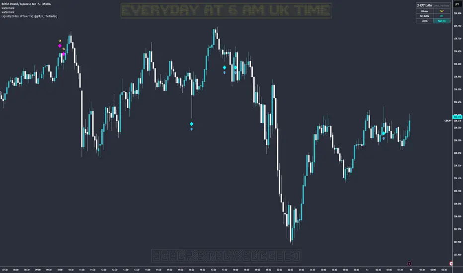
Liquidity X-Ray: Whale Traps [@Ash_TheTrader]👁️ Liquidity X-Ray: The Institutional Edge
Stop Trading Blind. See Inside the Candle.
Ninety percent of retail traders only see the outer shell of a candlestick—the Open, High, Low, and Close. They are trading blind to the actual battle that took place during that candle's formation.
Institutions, however, use expensive Order Flow software to see where aggressive buying or selling is happening in real-time.
The Liquidity X-Ray Strategy, developed by @Ash_TheTrader, levels the playing field. It uses advanced Intrabar Analysis to simulate institutional order flow footprints directly on your TradingView chart, automating powerful reversal signals based on "Absorption."
🧠 The Concept: Intrabar Analysis & Delta
How does it work?
Imagine a single 1-Hour candle. Inside that candle, there are sixty 1-Minute candles hidden from view.
This strategy performs an "X-Ray" scan. It tunnels into the lower timeframes (e.g., 5-minute data inside a 1-hour bar) to calculate the Net Delta—the difference between aggressive buying volume and aggressive selling volume.
Cyan Candles: Indicate that aggressive buyers (hitting the Ask) won the internal battle.
Magenta Candles: Indicate that aggressive sellers (hitting the Bid) won the internal battle.
But knowing who won isn't enough. The real edge comes from identifying Absorption.
🎯 The Signals: Detecting Traps & Shields
The core philosophy of this strategy by @Ash_TheTrader is simple: Identify where high effort yields low results.
When massive volume comes in, but price refuses to move, it means one side is being "absorbed" by a larger player. This is often the precursor to a violent reversal.
1. The Bear Trap (🪤)
What you see: A candle with massive volume and aggressive internal buying (positive Delta), yet the candle body remains small and fails to push price significantly higher.
The Psychology: Retail traders are FOMO-buying aggressively at a high. Institutional "Whales" are sitting on the other side, passively selling into this demand, absorbing all the buy orders without letting price rise.
The Result: Once the buyers are exhausted, the trap snaps shut, and price reverses downward.
Strategy Action: Enters a SHORT position.
2. The Bull Shield (🛡️)
What you see: A candle with massive volume and aggressive internal selling (negative Delta), yet the candle body remains small and fails to push price lower.
The Psychology: A "Stop Run" is occurring. Retail traders are panic-selling. Smart money is stepping in like a shield, absorbing all the sell pressure at a fixed level.
The Result: Once the sellers are exhausted, there is no one left to sell, and price rallies upward.
Strategy Action: Enters a LONG position.
⚡ Strategy Features & The Viral Dashboard
This isn't just an indicator; it's a complete, automated trading system.
Automated Execution: The script takes the trades for you when a Shield or Trap is confirmed upon candle close.
Smart Risk Management: It automatically places Stop Losses beyond the wick of the signal candle and targets a default 2:1 Risk/Reward ratio.
The Live Performance Panel: Look at the top right of your chart. The strategy features a built-in, professional-grade dashboard that displays real-time statistics. You can instantly see the strategy's Win Rate and Net Profit over the current historical data.
"Numbers don't lie. Don't just guess if a setup works; watch the win rate adjust in real-time." — @Ash_TheTrader
🛠️ How to Use This Strategy
For the best results, follow these institutional guidelines:
Timeframe: This strategy is most effective on Higher Timeframes where institutional volume is dominant. We recommend the 1-Hour (1H) or 4-Hour (4H) charts.
Intrabar Resolution (Settings): In the strategy settings, ensure the "Intrabar Resolution" is set lower than your chart timeframe. The default is 5 minutes, which is ideal for scanning inside 1H or 4H candles.
Confluence: While the strategy can be traded standalone, the best signals often occur near major support/resistance zones or key Fibonacci levels.
⚠️ Disclaimer
This strategy uses request.security_lower_tf to perform its calculations. While highly accurate, past performance on the dashboard does not guarantee future results. Always manage your risk responsibly.
Trade smart. See the liquidity.
~ @Ash_TheTrader
NQ 300+ Point Day Checklist (Bias + Alerts + Markers)This indicator helps identify high-range (≥300-point) days on Nasdaq-100 futures (NQ / MNQ) using a clear, rule-based checklist.
It evaluates volatility, compression, price displacement, prior-day structure, and overnight activity to generate a daily expansion score (0–6). Higher scores signal an increased likelihood of a strong trending or expansion day.
The script also provides:
Expansion probability levels (Normal / Watch / High-Prob)
Bullish, bearish, or neutral bias
On-chart markers and background highlights
Optional alerts for early awareness
Best used on the Daily timeframe to help traders focus on high-opportunity days and avoid overtrading during consolidation.
This is a context and probability tool — not a trade signal.
Daily Upper Wick 0.5 (Date Range)Appearance settings modified: Extend lines OFF, level color, Date Range filter, line thickness, Prices labeled and resized tiny, plot lines OFF.
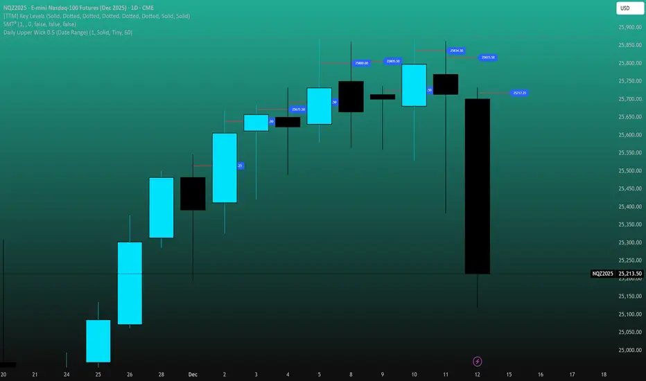
Daily Lower Wick 0.5 (Date Range)Appearance settings modified: Extend lines OFF, level color, Date Range filter, line thickness, Prices labeled and resized tiny, plot lines OFF.

ADAPTIVE ICT MULTI-ZONEAdaptive ICT Multi-Zone
Why Another ICT Script?
Most public ICT zone scripts flood your chart with dozens of noisy, overlapping boxes that never get cleaned up, use fixed lookbacks that work on one asset and fail on another, and mark every tiny gap as “FVG” — turning the chart into a rainbow mess that’s impossible to trade.
ADAPTIVE ICT MULTI-ZONE is built differently:
Only the strongest, most recent zones pass the adaptive filter (default 3 bullish OB + 3 bearish OB + 3 FVG). No more chart clutter.
Fair Value Gaps are filtered by ATR (default ≥ 0.7 × ATR) and optional high-volume confirmation so you only see gaps that actually matter.
Order Blocks are true swing-based (pivot high/low).
Every zone automatically extends far to the right until price closes through it — you never miss a mitigation.
Zero repainting. Zero lag. Zero memory leaks. Runs perfectly on every time frame.
In short: while many ICT scripts are noisy toys, this one is a surgical tool that shows exactly what institutional desks are up to.
How to Trade It Best (Simple & Effective)
Wait for price to return to a freshly drawn zone (watch the newest ones — they have the highest probability).
Look for confluence:
Price inside a Bullish Order Block + bullish engulfing or strong volume → aggressive long.
Price inside a Bearish Order Block + bearish engulfing or strong volume → aggressive short.
Price sweeping into an FVG and instantly rejecting → high-probability reversal (especially if the FVG had high volume when created).
Use higher-timeframe bias: if the daily/4H zone aligns with your 15-min or 5-min zone → stack size.
Take partials at the opposite-side order block or next FVG. Let runners go to next liquidity zone.
That’s it.
This script doesn’t try to do everything. It does one thing — show you the exact institutional zones that actually get respected — and it does it cleaner and smarter.
Add it, delete every other OB/FVG script you own, and catch more accurate reversals.

Adaptive Signal IndicatorAdaptive Signal Indicator
Overview
The Adaptive Signal Indicator is a multi-timeframe confirmation system designed to help traders and investors identify potential entry and exit points. It automatically adjusts its analysis timeframes based on your chart's timeframe, providing consistent signal logic whether you're viewing 15-minute or weekly charts.
How It Works
This indicator combines multiple technical components that must align before generating a signal. However, the signal has a heavier weighting on price action because real investors know that "Only Price Pays." Additionally, rather than relying on a single indicator, it requires confirmation across several dimensions:
Trend Analysis — Evaluates short-term price structure using dual exponential moving averages
Wave Detection — Monitors momentum shifts using smoothed momentum calculations
Flow Tracking — Analyzes volume dynamics to confirm price movements have participation
Pulse Filter — Ensures signals align with the current directional bias of oscillator momentum
Macro Alignment — Checks higher-timeframe trend agreement before triggering signals
Drift Gate — Requires short-term trend confirmation on the daily timeframe
Cross Detection — Identifies key moving average crossovers on the daily timeframe
Range Position — Uses volatility bands to filter signals at extreme price levels
Signal Logic
Buy signals require:
Multiple bullish confirmations across different analysis methods
Macro trend not in bearish alignment
Pulse filter confirming upward momentum
Drift gate showing bullish daily bias
Sell signals require:
Bearish momentum confirmation
Macro trend not in bullish alignment
Pulse filter confirming downward momentum
Dashboard
Two real-time tables display:
Status Panel (Top Right)
Current state of all 8 analysis components
Color-coded for quick visual assessment
Shows conditions count and last signal status with % change since signal
Statistics Panel (Bottom Right)
Total signals generated
Success rate with win/loss breakdown
Average return per signal
Average winning and losing trade percentages
Profit factor
Maximum win and loss percentages
Key Features
✓ Adaptive Timeframes — Automatically selects appropriate analysis timeframes based on your chart
✓ Multiple Confirmations — Reduces false signals by requiring agreement across different analysis methods
✓ Clear Signals — Distinct BUY/SELL markers with no ambiguity
✓ Built-in Statistics — Track historical performance directly on chart
✓ Works on Any Market — Stocks, crypto, forex, indices, commodities
✓ Clean Visual Design — Overlay design keeps your chart readable
Best Practices
Use this indicator as one component of your overall trading plan
Consider your own risk management rules for position sizing and stop losses
Backtest on your preferred markets and timeframes before live trading
Signals work best in trending market conditions (the indicator filters for trend strength)
Who This Is For
Traders who prefer a systematic approach with clearly defined entry conditions. Suitable for swing trading and position trading timeframes. The multi-confirmation requirement means fewer signals, but each signal has passed multiple filters.
Note: Past performance shown in the statistics panel is based on historical data and does not guarantee future results. This indicator provides analysis tools to support your trading decisions—it is not financial advice. Always use proper risk management

Combined: Gann HL + Supertrend + Supertrend v6Combined: Gann HL + Supertrend + Supertrend v6
Included Indicators
1. Gann High-Low Activator
A dynamic trend tool that flips direction when price crosses its smoothed high/low average. Gann signals often catch clean directional swings and act as an excellent early trend filter.
2. Standard Supertrend (ATR-based)
The classic trend-following indicator using average true range for volatility-adaptive stop levels. Its direction flips mark trend reversals, especially effective in trending markets.
3. Orekhov Supertrend (GPL Classic)
A robust version of Supertrend that includes wick sensitivity and doji-handling logic. It behaves smoothly on lower timeframes, avoiding false flips and maintaining direction more intelligently.

Daily Upper Wick 0.5 (10 Trading Days + Today)Adjust appearance in settings. (Line thickness, color, price labels, extended lines, line plot option.)
Daily Lower Wick 0.5 (10 Trading Days + Today)Adjust appearance in settings. (Line thickness, color, price labels, extended lines, line plot option.)

NEURAL FLOW | The AI-Powered Regime Classifier [by @Ash_TheTrade📉 Stop Trading Blindly. Filter the Noise with AI.
Why do your favorite strategies work perfectly one week and bleed your account the next?
The answer is simple: Context.
A Moving Average crossover works in a trend but gets slaughtered in chop. RSI works in a range but fails in a strong breakout. Most indicators are "dumb"—they apply the same math regardless of the market's current reality.
I created Neural Flow to fix this.
Developed by @Ash_TheTrader, this isn't just another buy/sell arrow indicator. It is a sophisticated market Regime Classifier built on concepts derived from machine learning (Lorentzian Distance algorithms).
It doesn't just tell you where price is; it tells you what the market is doing.
🧠 The Concept: How It Works
The core idea behind this script is simple yet powerful: Don't trade unless the environment is right.
The Neural Flow algorithm acts like a veteran trader watching over your shoulder. It analyzes multiple "neurons" (data points representing momentum, volatility, and cyclicality) and compares the current price action to historical data.
By identifying what "state" the market is currently in, it paints your chart in real-time, acting as the ultimate filter for any strategy you use.
👁️ The 4 Market Regimes
The indicator instantly classifies the market into one of four distinct states, visualizing them with a full-chart background glow and candle painting:
1. 🐂 Bull Trend (Neon Green)
The market has clear upward momentum, healthy RSI, and strong trend orientation.
Action: Look for Long entries. Buy dips.
2. 🐻 Bear Trend (Neon Red)
The market has clear downward momentum and weak underlying metrics.
Action: Look for Short entries. Sell rallies.
3. 🚫 CHOP (Grey/Monochrome)
This is the most important feature. The AI has detected low volatility squeeze conditions or directionless ADX. This is where 80% of traders lose money due to fake-outs and whipsaws.
Action: DO NOT TRADE. Sit on your hands and preserve capital.
4. ⚡ Breakout Detected (Gold/Yellow)
The algorithm has detected a sudden, violent expansion in volatility (Bollinger Width explosion) following a period of chop. The direction is not yet confirmed, but a big move is imminent.
Action: Get ready. Watch for a transition into a Bull or Bear regime.
💻 The Glassmorphism Dashboard & AI Confidence
In the corner of your chart, you will find a futuristic, transparent "Glass UI" dashboard designed by @Ash_TheTrader.
It provides instant situational awareness without cluttering your view.
The AI Confidence Score:
This is your conviction meter. It calculates how aligned the various "neurons" of the algorithm are (ranging from 0% to 100%).
A Bull Trend with 40% Confidence might be weak and prone to reversal.
A Bull Trend with 85%+ Confidence indicates strong confluence across multiple data points.
Pro Tip from @Ash_TheTrader: Only take trades when the AI Confidence is above 75%.
🚀 How to Use This in Your Trading
This tool is designed to be versatile.
As a Strategy Filter (Recommended): Use your existing favorite strategy (e.g., MACD, SMC, Price Action). Before taking a trade, glance at the Neural Flow background.
Your strategy says Buy, but the background is Grey (Chop)? Skip the trade.
Your strategy says Sell, and the background is Red (Bear)? Take the trade with confidence.
As a Standalone System: Wait for the market to transition out of "Grey Chop" into a "Green Bull" or "Red Bear" regime. Confirm that the "AI Confidence" on the dashboard is high (>70%), and enter in the direction of the new trend.
⚙️ Settings & Customization
While the default settings are tuned for most markets, @Ash_TheTrader believes in flexibility:
Training Window: Adjust the sensitivity of the regime detection.
Visuals: Customize all colors to match your chart aesthetic.
Glass Dashboard: Move it, resize it, or turn it off completely.
Baseline EMA: Toggle the 50-period baseline reference line on or off to keep your charts ultra-clean.
A Note from the Author:
"Trading isn't about catching every move; it's about catching the right moves and staying safe during the noise. I built this tool to help me instantly recognize when to step on the gas and when to hit the brakes. I hope it brings clarity to your charts."
— @Ash_TheTrader
Disclaimer: This tool is for informational purposes only and does not constitute financial advice. Always manage your risk.

Custom RSI + Divergence + Bold Lines (v6, matched)📌 Custom RSI with Divergence & Dynamic Coloring
This indicator enhances the classic Relative Strength Index (RSI) by combining
dynamic visual feedback with automatic regular divergence detection.
It is designed to help traders quickly identify overbought / oversold conditions
and potential momentum shifts through clear and intuitive visualization.
⸻
🔍 Key Features
1️⃣ Dynamic RSI Line Coloring
• Overbought zone (RSI > Overbought level) → RSI line turns green
• Oversold zone (RSI < Oversold level) → RSI line turns red
• Neutral zone → RSI line remains white
This allows instant recognition of the current RSI state.
⸻
2️⃣ Overbought / Oversold Visual Highlighting
• Clear overbought and oversold reference lines
• Background shading when RSI enters these zones
→ improves signal visibility and reaction speed
⸻
3️⃣ Automatic Regular Divergence Detection
• Bullish Divergence
• Price makes a lower low
• RSI makes a higher low
• Pivot lows are connected with a bold green line
• Bearish Divergence
• Price makes a higher high
• RSI makes a lower high
• Pivot highs are connected with a bold red line
Pivot points are connected directly, making divergence structures easy to identify at a glance.
⸻
4️⃣ Clear Signal Markers
• Bullish divergence: ▲ (bottom of the RSI pane)
• Bearish divergence: ▼ (top of the RSI pane)
⸻
⚙️ Inputs
• RSI Length
• Overbought / Oversold Levels
• Pivot Length (controls divergence sensitivity)
⸻
💡 How to Use
• Oversold + Bullish Divergence → Potential rebound setup
• Overbought + Bearish Divergence → Potential pullback or reversal
• Best used in combination with trend analysis, support/resistance, and volume
⸻
⚠️ Notes
• Divergence signals are probabilistic, not guaranteed.
• In ranging markets, divergences may appear more frequently.
• Always apply proper risk management.
⸻
🎯 Best For
• Traders who actively use RSI
• Traders looking for clean and intuitive divergence visualization
• Users who prefer minimal but informative indicators

Smart match finder🔍 Pattern Match Finder
What It Does:
This indicator finds historical price patterns that look similar to your current price action and projects what might happen next based on what happened after those past patterns.
How It Works:
📊 Captures Current Pattern - Takes the last 30 bars (configurable) of price movement as your "current pattern"
🔎 Searches History - Scans up to 2,500 bars back looking for price patterns that moved similarly
📈 Matches by Trend - When "Same Condition" is ON, it only finds patterns that moved in the same direction (bullish matches bullish, bearish matches bearish)
🎯 Quality Filter - Uses correlation (75%+ by default) to ensure matches are high quality, not random
🔮 Projects Future - Takes what happened AFTER those historical matches and draws a prediction (yellow dashed line) showing where price might go next
📊 Shows Best Match - Highlights the best matching pattern with cyan vertical lines and overlays it on your current chart
Key Features:
✅ Trend-aware matching - Finds patterns with same market direction
✅ Quality scoring - Shows correlation % and match quality (Excellent/Good/Fair)
✅ Visual projection - Yellow prediction line showing expected price movement
✅ Smart filtering - Adjustable correlation and distance thresholds
✅ No match alerts - Warns you when no similar patterns exist
Technical Strength:
This indicator employs advanced statistical correlation analysis combined with normalized pattern recognition algorithms, making it highly effective for identifying statistically significant price pattern repetitions with quantifiable confidence metrics.
⚠️ Important Disclaimer:
This tool is for educational and analytical purposes only. Pattern projections are based on historical data and should NOT be used as the sole basis for buy/sell decisions. Always combine with proper risk management, fundamental analysis, and other technical tools before making any trading decisions.

Impulse Day PlanOverview
This script provides a structured intraday trade plan built on three interacting components:
Impulse-based TP/SL system
Detects trend bias shifts and automatically generates Entry, TP1–TP3 and SL based on impulse range projections. Targets update dynamically and wick-touch confirmation is used for accurate ✓ tracking.
ATR day zones
A blended ATR model (Daily + selected base timeframe) produces support, balance and resistance zones derived from the previous session close. These zones provide directional context and realistic intraday expansion boundaries.
VWAP/EMA trend filter
Trend confirmation is applied using VWAP and EMA 50/200 structure. Signals are only considered aligned when price, VWAP and EMA trend agree.
The script displays a compact dashboard with the active trade plan, including:
Entry
TP1, TP2, TP3
Stop Loss
Checkmarks showing completed targets
This makes the indicator a planning framework, not a simple overlay.
How it differs from my previous publications
I previously released:
Smart Money OB + Limit Orders + Priority
SM OB Intraday Bot Assistant
Impulse TP/SL Zones
Those scripts focus on isolated concepts such as Smart Money structure, intraday automation or basic impulse mapping.
This script introduces a new integrated workflow: impulse TP/SL logic, ATR day zones and VWAP/EMA trend confirmation operating together as a single system. It does not reproduce the functionality of my previous tools and is designed as a standalone intraday planning method.
How to use
Select a base timeframe for the ATR zone model (15m, 1H, 4H).
Follow the dashboard for entry, targets and SL.
Use ATR zones to understand where targets sit within the day’s expected range.
Execute trades only when impulse signal and VWAP/EMA trend align.

SMA Cross PreventionTraditional MA crossover indicators are reactive — they tell you a cross happened after the fact.
This indicator is prescriptive — it tells you exactly what price action is required to prevent a cross from happening.
The Core Insight
When a fast MA is above a slow MA but they're converging, traders ask: "Will we get a death cross?"
This indicator answers a more useful question:
"What is the minimum price path required to prevent the cross?"
By treating the MA structure as a constraint and solving for the required input (future prices), we transform a lagging indicator into a forward-looking risk assessment tool.

PivotX# PivotX - TradingView Description
## Title
PivotX - Exhaustion & Pivot Detection
## Description
**PivotX** is a powerful visual indicator that helps traders identify when major buying or selling pressure has exhausted and when significant market reversals are likely to occur. Think of it as your market "exhaustion detector" that spots the exact moments when one side of the market runs out of steam.
### What Does PivotX Do?
PivotX watches for three critical market conditions:
1. **Selling Exhaustion** - When sellers have pushed price down aggressively but can't push it lower anymore. This is when buyers step in and price often reverses upward.
2. **Buying Exhaustion** - When buyers have pushed price up aggressively but can't push it higher anymore. This is when sellers step in and price often reverses downward.
3. **Major Pivot Points** - Key price levels where the market has made significant turns, marking important support (bottoms) and resistance (tops).
### How It Works (Simple Explanation)
Imagine a tug-of-war between buyers and sellers:
- When sellers are winning (price dropping), PivotX watches for when they get tired
- When buyers are winning (price rising), PivotX watches for when they get tired
- When one side gets exhausted, the other side usually takes over - that's when reversals happen!
PivotX uses multiple signals to confirm exhaustion:
- Volume patterns (when trading activity slows down after a big move)
- Price stabilization (when price stops moving in one direction)
- Absorption patterns (when high volume doesn't move price much - someone is absorbing the pressure)
- Support/Resistance levels (when price bounces off key levels)
### Visual Signals
**Green X Markers** (Below Price)
- Appears when selling has exhausted
- Buyers are stepping in
- Potential upward reversal signal
**Red X Markers** (Above Price)
- Appears when buying has exhausted
- Sellers are stepping in
- Potential downward reversal signal
**Yellow Diamonds**
- Marks major pivot points (support/resistance)
- Shows where significant price turns occurred
- Helps identify key levels for future trades
**Neon Green/Red Lines**
- Support lines (green) - where price found a bottom
- Resistance lines (red) - where price found a top
- These levels often act as future support/resistance
### Best Use Cases
✅ **Swing Trading** - Catch reversals at major pivot points
✅ **Scalping** - Enter trades when exhaustion is confirmed
✅ **Trend Following** - Identify when trends are losing steam
✅ **Support/Resistance Trading** - Use pivot lines as key levels
✅ **Reversal Trading** - Enter counter-trend trades at exhaustion points
### Settings Explained
**Detection Settings:**
- **Lookback Period** - How many bars to analyze (default: 20)
- **Volume Threshold** - Minimum volume spike to consider (default: 1.5x average)
- **Exhaustion Periods** - Bars to check for exhaustion signals (default: 3)
- **Min Price Move %** - Minimum price movement to trigger analysis (default: 2%)
**Pivot Detection:**
- **Pivot Strength** - Bars on each side for pivot confirmation (default: 3)
- Higher = fewer but stronger pivots
- Lower = more but weaker pivots
**Visual Settings:**
- Toggle exhaustion markers, pivot points, and support/resistance lines
- Customize colors to match your chart theme
### Pro Tips
1. **Wait for Confirmation** - PivotX requires multiple signals before showing exhaustion. This reduces false signals but means you might miss some early entries.
2. **Combine with Price Action** - Use PivotX signals with candlestick patterns for stronger confirmation.
3. **Watch the Pivot Lines** - The support/resistance lines often act as key levels. Price bouncing off these lines can be strong reversal signals.
4. **Volume Matters** - The indicator is more reliable when volume patterns confirm the exhaustion signals.
5. **Timeframe Flexibility** - Works on all timeframes, but signals on higher timeframes (4H, Daily) tend to be more reliable.
### What Makes PivotX Unique?
Unlike simple pivot indicators, PivotX combines:
- Volume exhaustion analysis
- Price action confirmation
- Multi-signal validation
- Clean, non-intrusive visualization
- Automatic support/resistance line drawing
This multi-layered approach helps filter out noise and focus on high-probability reversal setups.
### Important Notes
⚠️ **Not Financial Advice** - This indicator is a tool, not a guarantee. Always use proper risk management.
⚠️ **No Indicator is Perfect** - PivotX helps identify potential reversals, but markets can be unpredictable. Always use stop losses.
⚠️ **Combine with Other Analysis** - For best results, use PivotX alongside other technical analysis tools and your trading strategy.
### Support
If you find PivotX helpful, please consider leaving a like and sharing your feedback. Your support helps improve the indicator for everyone!
---
**Happy Trading! 🚀**
*Remember: The best traders don't just follow signals - they understand what the signals mean and how to use them in their overall trading strategy.*

BALANCED Strategy: Intraday Pro + Smart DashboardWelcome to the BALANCED Strategy: Intraday Pro.
This all-in-one indicator is designed for Intraday traders looking to capture trend movements while effectively filtering out sideways market noise. It combines the power of Supertrend for direction, EMA 100 for the baseline trend, and rigorous validation via RSI and ADX.
The script also integrates a complete Risk Management system with targets based on the Golden Ratio (Fibonacci) and a real-time Dashboard.
⏳ Recommended Timeframes
This algorithm is optimized for Intraday volatility:
M5 (5 Minutes) ⭐️: Ideal for quick Scalping. The ADX filter is crucial here to avoid false signals.
M15 (15 Minutes) 🏆: The "Sweet Spot." It offers the best balance between signal frequency and trend reliability.
M30 / H1: For a "Swing Intraday" approach—calmer, fewer signals, but higher precision.
Not recommended for M1 (1 Minute) with default settings (too much noise).
🚀 How It Works
The algorithm follows a strict 3-step logic to generate high-quality signals:
1. Trend Identification (The Engine)
Supertrend: Determines the immediate direction.
EMA 100: Acts as a background trend filter. We only buy above and sell below the EMA.
2. Noise Filtering (Safety)
ADX (Average Directional Index): The signal is only validated if there is sufficient volatility (Configurable threshold, default 12) to avoid "chop markets" (flat markets).
RSI (Relative Strength Index): Strict momentum filter. Buy only if RSI > 50, Sell if RSI < 50.
3. Entry Confirmation (The Trigger)
The script doesn't just rely on a crossover. It waits for "Price Action" confirmation: the candle must close higher than the previous one (for Long) or lower (for Short) to validate the entry.
🛡️ Risk Management (Money Management)
This is the core strength of this tool. Upon signal validation, the script automatically calculates and plots:
Stop Loss (SL): Based on volatility (ATR). It places the stop at the recent Low/High with a safety padding.
Take Profit (TP): Two modes available:
Fibonacci Mode (Default): Targets the 1.618 extension (Golden Ratio) of the risk taken.
Fixed Ratio Mode: Targets a manual Risk/Reward ratio (e.g., 2.0).
📊 The Dashboard
Located at the bottom right, the smart dashboard provides vital info at a glance:
Signal Time: To check if the alert is fresh.
Type (LONG/SHORT): Color-coded (Green/Pink).
Tech Data: RSI and ADX values at the moment of the signal.
Exact Prices: Entry Level, Target (TP), and Stop Loss (SL).
⚙️ Configurable Settings
Sensitivity: Adjust the Supertrend factor (Default 2.0).
Filters: Toggle the RSI filter ON/OFF or adjust the ADX threshold.
Execution: Choose between Fibonacci Target (1.618) or a Manual Ratio.
⚠️ Disclaimer: This tool is a technical decision aid and does not constitute financial investment advice. Always use prudent risk management and backtest the indicator on your preferred assets before live use.

Miela Labs | John Dee's Watchtower [257-463]Bridging the gap between 16th-century esoteric mathematics and modern algorithmic trading.
The Enochian Watchtower is not merely a trend indicator; it is a computational artifact developed by Miela Labs LLC. This script translates Dr. John Dee’s "Great Table of the Watchtowers" and the "Sigil Dei Aemeth" into actionable financial data points.
Using our proprietary Occultator V2.0 Engine, we have derived specific mathematical constants that resonate with the current market structure.
🏛️ The Algorithmic Logic
This indicator utilizes three sacred numbers to construct a "Future Vision" of the market:
1. The Axis Mundi (Vector 257): derived from Fermat Primes and John Dee’s Grid coordinates. This Weighted Moving Average (WMA) acts as the spinal cord of the trend.
2. The Gates (Cipher 463): A prime number derived from the "Galethog" cipher stride. These bands define the absolute volatility limits (Heaven & Earth Gates).
3. Future Vision (Offset 21): Utilizing Fibonacci time sequences, the indicator projects Support and Resistance levels 21 bars into the future, allowing traders to anticipate market movements before they occur.
⚡ How to Use
• The Trend: If price is above the Purple Axis (257), the market is in a bullish phase.
• The Entry: Look for "L" (Long) and "S" (Short) signals. These are confirmed when the signal path crosses the Axis.
• The Future: Watch the projected lines on the right side of the chart to identify upcoming resistance zones.
About Miela Labs
Miela Labs is a Technomancy Research Institute based in McKinney, Texas. We specialize in building open-source esoteric trading tools and the Magic Programming Language (MPL).
🌐 Official Hub: Visit Miela Labs
💻 Source Code & Research: GitHub Repository
Disclaimer: This tool is for educational and research purposes only. It demonstrates the application of esoteric mathematics in financial analysis. Trade responsibly.

Contra Trading Setup - Buy on CloseContra Trding Setp
1. Closing Price is less than 20SMA
2. Today low is less than last 5 days low
3.Today close is above yesterday close
4. If all 3 conditions met
Then tomorrow close should be >Today Close
Buy On Close
Exit After 5 - 7 Trading Session.
