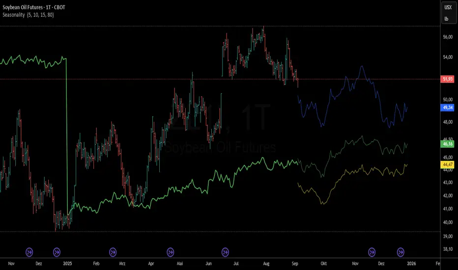
Seasonality - Multiple Timeframes📊 Seasonality - Multiple Timeframes
🎯 What This Indicator Does
This advanced seasonality indicator analyzes historical price patterns across multiple configurable timeframes and projects future seasonal behavior based on statistical averages. Unlike simple seasonal overlays, this indicator provides gap-resistant architecture specifically designed for commodity futures markets and other instruments with contract rolls.
🔧 Key Features
Multiple Timeframe Analysis
Three Independent Timeframes: Configure separate historical periods (e.g., 5Y, 10Y, 15Y) for comprehensive analysis
Individual Control: Enable/disable historical lines and projections independently for each timeframe
Color Customization: Distinct colors for historical patterns and future projections
Advanced Architecture
Gap-Resistant Design: Handles missing data and contract rolls in futures markets seamlessly
Calendar-Day Normalization: Uses 365-day calendar system for accurate seasonal comparisons
Outlier Filtering: Automatically excludes extreme price movements (>10% daily changes)
Roll Detection: Identifies and excludes contract roll periods to maintain data integrity
Real-Time Projections
Forward-Looking Analysis: Projects seasonal patterns into the future based on remaining calendar days
Configurable Projection Length: Adjust forecast period from 10 to 150 bars
Data Interpolation: Optional gap-filling for smoother seasonal curves
📈 How It Works
Data Collection Process
The indicator collects daily price returns for each calendar day (1-365) over your specified historical periods. For each timeframe, it:
Calculates daily returns while excluding roll periods and outliers
Accumulates these returns by calendar day across multiple years
Computes average seasonal performance from January 1st to current date
Projects remaining seasonal pattern based on historical averages
🎯 Designed For
Primary Use Cases
Commodity Futures Trading: Corn, soybeans, coffee, sugar, cocoa, natural gas, crude oil
Seasonal Strategy Development: Identify optimal entry/exit timing based on historical patterns
Pattern Validation: Confirm seasonal tendencies across different time horizons
Market Timing: Compare current performance against historical seasonal expectations
Trading Applications
Trend Confirmation: Use multiple timeframes to validate seasonal direction
Risk Assessment: Understand seasonal volatility patterns
Position Sizing: Adjust exposure based on seasonal performance consistency
Calendar Spread Analysis: Identify seasonal price relationships
⚙️ Configuration Guide
Timeframe Setup
Configure each timeframe independently:
Years: Set historical lookback period (1-20 years)
Historical Display: Show/hide the seasonal pattern line
Projection Display: Enable/disable future seasonal projection
Colors: Customize line colors for visual clarity
Display Options
Current YTD: Compare actual year-to-date performance
Info Table: Detailed performance comparison across timeframes
Projection Bars: Control forward-looking projection length
Fill Gaps: Interpolate missing data points for smoother curves
Debug Features
Enable debug mode to validate data quality:
Data Point Counts: Verify sufficient historical data per calendar day
Roll Detection Status: Monitor contract roll identification
Empty Days Analysis: Identify potential data gaps
Calculation Verification: Debug seasonal price computations
📊 Interpretation Guidelines
Strong Seasonal Signal
All three timeframes align in the same direction
Current price follows seasonal expectation
Sufficient data points (>3 years minimum per timeframe)
Seasonal Divergence
Different timeframes show conflicting patterns
Recent years deviate from longer-term averages
Current price significantly above/below seasonal expectation
Data Quality Indicators
Green Status: Adequate data across all calendar days
Red Warnings: Insufficient data or excessive gaps
Roll Detection: Proper handling of futures contract changes
⚠️ Important Considerations
Data Requirements
Minimum History: At least 3-5 years for reliable seasonal analysis
Continuous Data: Best results with daily continuous contract data
Market Hours: Designed for traditional market session data
Limitations
Past Performance: Historical patterns don't guarantee future results
Market Changes: Structural shifts can alter traditional seasonal patterns
External Factors: Weather, geopolitics, and policy changes affect seasonal behavior
Contract Rolls: Some data gaps may occur during futures roll periods
🔍 Technical Specifications
Performance Optimizations
Array Management: Efficient data storage using Pine Script arrays
Gap Handling: Robust price calculation with fallback mechanisms
Memory Usage: Optimized for large historical datasets (max_bars_back = 4000)
Real-Time Updates: Live calculation updates as new data arrives
Calculation Accuracy
Outlier Filtering: Excludes daily moves >10% to prevent data distortion
Roll Detection: 8% threshold for identifying contract changes
Data Validation: Multiple checks for price continuity and data integrity
🚀 Getting Started
Add to Chart: Apply indicator to your desired futures contract or commodity
Configure Timeframes: Set historical periods (recommend 5Y, 10Y, 15Y)
Enable Projections: Turn on future seasonal projections for forward guidance
Validate Data: Use debug mode initially to ensure sufficient historical data
Interpret Patterns: Compare current price action against seasonal expectations
💡 Pro Tips
Multiple Confirmations: Use all three timeframes for stronger signal validation
Combine with Technicals: Integrate seasonal analysis with technical indicators
Monitor Divergences: Pay attention when current price deviates from seasonal pattern
Adjust for Volatility: Consider seasonal volatility patterns for position sizing
Regular Updates: Recalibrate settings annually to maintain relevance
---
This indicator represents years of development focused on commodity market seasonality. It provides institutional-grade seasonal analysis previously available only to professional trading firms.
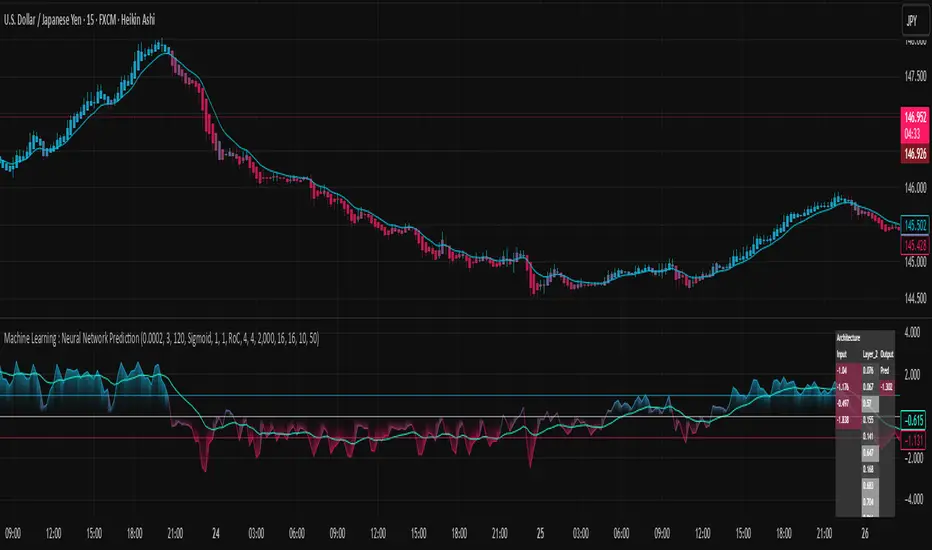
Forecasting
Machine Learning : Neural Network Prediction -EasyNeuro-Machine Learning: Neural Network Prediction
— An indicator that learns and predicts price movements using a neural network —
Overview
The indicator “Machine Learning: Neural Network Prediction” uses price data from the chart and applies a three-layer Feedforward Neural Network (FNN) to estimate future price movements.
Key Features
Normally, training and inference with neural networks require advanced programming languages that support machine learning frameworks (such as TensorFlow or PyTorch) as well as high-performance hardware with GPUs. However, this indicator independently implements the neural network mechanism within TradingView’s Pine Script environment, enabling real-time training and prediction directly on the chart.
Since Pine Script does not support matrix operations, the backpropagation algorithm—necessary for neural network training—has been implemented entirely through scalar operations. This unique approach makes the creation of such a groundbreaking indicator possible.
Significance of Neural Networks
Neural networks are a core machine learning method, forming the foundation of today’s widely used generative AI systems, such as OpenAI’s GPT and Google’s Gemini. The feedforward neural network adopted in this indicator is the most classical architecture among neural networks. One key advantage of neural networks is their ability to perform nonlinear predictions.
All conventional indicators—such as moving averages and oscillators like RSI—are essentially linear predictors. Linear prediction inherently lags behind past price fluctuations. In contrast, nonlinear prediction makes it theoretically possible to dynamically anticipate future price movements based on past patterns. This offers a significant benefit for using neural networks as prediction tools among the multitude of available indicators.
Moreover, neural networks excel at pattern recognition. Since technical analysis is largely based on recognizing market patterns, this makes neural networks a highly compatible approach.
Structure of the Indicator
This indicator is based on a three-layer feedforward neural network (FNN). Every time a new candlestick forms, the model samples random past data and performs online learning using stochastic gradient descent (SGD).
SGD is known as a more versatile learning method compared to standard gradient descent, particularly effective for uncertain datasets like financial market price data. Considering Pine Script’s computational constraints, SGD is a practical choice since it can learn effectively from small amounts of data. Because online learning is performed with each new candlestick, the indicator becomes a little “smarter” over time.
Adjustable Parameters
Learning Rate
Specifies how much the network’s parameters are updated per training step. Values between 0.0001 and 0.001 are recommended. Too high causes divergence and unstable predictions, while too low prevents sufficient learning.
Iterations per Online Learning Step
Specifies how many training iterations occur with each new candlestick. More iterations improve accuracy but may cause timeouts if excessive.
Seed
Random seed for initializing parameters. Changing the seed may alter performance.
Architecture Settings
Number of nodes in input and hidden layers:
Increasing input layer nodes allows predictions based on longer historical periods. Increasing hidden layer nodes increases the network’s interpretive capacity, enabling more flexible nonlinear predictions. However, more nodes increase computational cost exponentially, risking timeouts and overfitting.
Hidden layer activation function (ReLU / Sigmoid / Tanh):
Sigmoid:
Classical function, outputs between 0–1, approximates a normal distribution.
Tanh:
Similar to Sigmoid but outputs between -1 and 1, centered around 0, often more accurate.
ReLU:
Simple function (outputs input if ≥ 0, else 0), efficient and widely effective.
Input Features (selectable and combinable)
RoC (Rate of Change):
Measures relative price change over a period. Useful for predicting movement direction.
RSI (Relative Strength Index):
Oscillator showing how much price has risen/fallen within a period. Widely used to anticipate direction and momentum.
Stdev (Standard Deviation, volatility):
Measures price variability. Useful for volatility prediction, though not directional.
Optionally, input data can be smoothed to stabilize predictions.
Other Parameters
Data Sampling Window:
Period from which random samples are drawn for SGD.
Prediction Smoothing Period:
Smooths predictions to reduce spikes, especially when RoC is used.
Prediction MA Period:
Moving average applied to smoothed predictions.
Visualization Features
The internal state of the neural network is displayed in a table at the upper-right of the chart:
Network architecture:
Displays the structure of input, hidden, and output layers.
Node activations:
Shows how input, hidden, and output node values dynamically change with market conditions.
This design allows traders to intuitively understand the inner workings of the neural network, which is often treated as a black box.
Glossary of Terms
Feature:
Input variables fed to the model (RoC/RSI/Stdev).
Node/Unit:
Smallest computational element in a layer.
Activation Function:
Nonlinear function applied to node outputs (ReLU/Sigmoid/Tanh).
MSE (Mean Squared Error):
Loss function using average squared errors.
Gradient Descent (GD/SGD):
Optimization method that gradually adjusts weights in the direction that reduces loss.
Online Learning:
Training method where the model updates sequentially with each new data point.
TLThe Trade Lean Indicator is a custom-built market tool designed for traders who want a clean, professional, and actionable view of price action without unnecessary noise. It combines trend tracking, liquidity mapping, and momentum signals into a single framework that adapts across multiple timeframes.
Unlike generic indicators, Trade Lean focuses on clarity over clutter. It highlights the key zones that truly matter: supply and demand levels, liquidity pockets, and directional momentum shifts. Whether you’re day trading, swing trading, or just scanning charts for setups, the indicator helps you quickly identify:
Trend bias (bullish, bearish, or neutral)
Liquidity zones where market reactions are most likely
Momentum impulses vs corrective moves
Breakout and recovery points to confirm direction
This makes it easier to lean into high-probability setups and avoid overtrading.
Planetary Speed - CEPlanetary Speed - Community Edition
Welcome to the Planetary Speed - Community Edition , a specialized tool designed to enhance W.D. Gann-inspired trading by plotting the speed of selected planets. This indicator measures changes in planetary ecliptic longitudes, which may correlate with market timing and volatility, making it ideal for traders analyzing equities, forex, commodities, and cryptocurrencies.
Overview
The Planetary Speed - Community Edition calculates the speed of a chosen planet (Mercury, Venus, Mars, Jupiter, Saturn, Uranus, Neptune, or Pluto) by comparing its ecliptic longitude across time. Supporting heliocentric and geocentric modes, the script plots speed data with high precision across various chart timeframes, particularly for markets open 24/7 like cryptocurrencies. Traders can customize line colors and add multiple instances for multi-planet analysis, aligning with Gann’s belief that planetary cycles influence market trends.
Key Features
Plots the speed of eight planets (Mercury, Venus, Mars, Jupiter, Saturn, Uranus, Neptune, Pluto) based on ecliptic longitude changes
Supports heliocentric and geocentric modes for flexible analysis
Customizes line colors for clear visualization of planetary speed data
Projects future speed data up to 250 days with daily resolution
Works across default TradingView timeframes (except monthly) for continuous markets
Enables multiple script instances for tracking different planets on the same chart
How to Use
Access the script’s settings to configure preferences
Choose a planet from Mercury, Venus, Mars, Jupiter, Saturn, Uranus, Neptune, or Pluto
Select heliocentric or geocentric mode for calculations
Customize the line color for speed data visualization
Review plotted speed data to identify potential market timing or volatility shifts
Add multiple instances to track different planets simultaneously
Get Started
The Planetary Speed - Community Edition provides full functionality for astrological market analysis. Designed to highlight Gann’s planetary cycles, this tool empowers traders to explore celestial influences. Trade wisely and harness the power of planetary speed!

Planetary Signs - CEPlanetary Signs - Community Edition
Welcome to the Planetary Signs - Community Edition , a specialized tool designed to enhance W.D. Gann-inspired trading by highlighting zodiac sign transitions for selected planets. This indicator marks when planets enter specific zodiac signs, which may correlate with market turning points, making it ideal for traders analyzing equities, forex, commodities, and cryptocurrencies.
Overview
The Planetary Signs - Community Edition calculates the ecliptic longitude of a chosen planet (Sun, Moon, Mercury, Venus, Mars, Jupiter, Saturn, Uranus, Neptune, or Pluto) and highlights periods when it enters user-selected zodiac signs (Aries, Taurus, Gemini, etc.). Supporting heliocentric and geocentric modes, the script plots sign transitions with minute-level accuracy, syncing perfectly with chart timeframes. Traders can customize colors for each sign and add multiple instances for multi-planet analysis, aligning with Gann’s belief that zodiac transitions influence market trends.
Key Features
Highlights zodiac sign transitions for ten celestial bodies (Sun, Moon, Mercury, Venus, Mars, Jupiter, Saturn, Uranus, Neptune, Pluto)
Supports heliocentric and geocentric modes (Pluto heliocentric-only; Sun and Moon geocentric)
Allows selection of one or multiple zodiac signs with customizable highlight colors
Plots vertical lines and labels (e.g., “☿ 0 ♈ Aries”) at sign transitions with minute-level accuracy
Projects future sign transitions up to 120 days with daily resolution
Enables multiple script instances for tracking different planets or signs on the same chart
How to Use
Access the script’s settings to configure preferences
Choose a planet from the Sun, Moon, Mercury, Venus, Mars, Jupiter, Saturn, Uranus, Neptune, or Pluto
Select one or more zodiac signs (e.g., Aries, Taurus) to highlight
Customize the highlight color for each selected zodiac sign
Select heliocentric or geocentric mode for calculations
Review highlighted periods and labeled lines to identify zodiac sign transitions
Use transitions to anticipate potential market turning points, integrating Gann’s astrological principles
Get Started
The Planetary Signs - Community Edition provides full functionality for astrological market analysis. Designed to highlight Gann’s zodiac cycles, this tool empowers traders to explore celestial transitions. Trade wisely and harness the power of planetary alignments!

Martingale Strategy Simulator [BackQuant]Martingale Strategy Simulator
Purpose
This indicator lets you study how a martingale-style position sizing rule interacts with a simple long or short trading signal. It computes an equity curve from bar-to-bar returns, adapts position size after losing streaks, caps exposure at a user limit, and summarizes risk with portfolio metrics. An optional Monte Carlo module projects possible future equity paths from your realized daily returns.
What a martingale is
A martingale sizing rule increases stake after losses and resets after a win. In its classical form from gambling, you double the bet after each loss so that a single win recovers all prior losses plus one unit of profit. In markets there is no fixed “even-money” payout and returns are multiplicative, so an exact recovery guarantee does not exist. The core idea is unchanged:
Lose one leg → increase next position size
Lose again → increase again
Win → reset to the base size
The expectation of your strategy still depends on the signal’s edge. Sizing does not create positive expectancy on its own. A martingale raises variance and tail risk by concentrating more capital as a losing streak develops.
What it plots
Equity – simulated portfolio equity including compounding
Buy & Hold – equity from holding the chart symbol for context
Optional helpers – last trade outcome, current streak length, current allocation fraction
Optional diagnostics – daily portfolio return, rolling drawdown, metrics table
Optional Monte Carlo probability cone – p5, p16, p50, p84, p95 aggregate bands
Model assumptions
Bar-close execution with no slippage or commissions
Shorting allowed and frictionless
No margin interest, borrow fees, or position limits
No intrabar moves or gaps within a bar (returns are close-to-close)
Sizing applies to equity fraction only and is capped by your setting
All results are hypothetical and for education only.
How the simulator applies it
1) Directional signal
You pick a simple directional rule that produces +1 for long or −1 for short each bar. Options include 100 HMA slope, RSI above or below 50, EMA or SMA crosses, CCI and other oscillators, ATR move, BB basis, and more. The stance is evaluated bar by bar. When the stance flips, the current trade ends and the next one starts.
2) Sizing after losses and wins
Position size is a fraction of equity:
Initial allocation – the starting fraction, for example 0.15 means 15 percent of equity
Increase after loss – multiply the next allocation by your factor after a losing leg, for example 2.00 to double
Reset after win – return to the initial allocation
Max allocation cap – hard ceiling to prevent runaway growth
At a high level the size after k consecutive losses is
alloc(k) = min( cap , base × factor^k ) .
In practice the simulator changes size only when a leg ends and its PnL is known.
3) Equity update
Let r_t = close_t / close_{t-1} − 1 be the symbol’s bar return, d_{t−1} ∈ {+1, −1} the prior bar stance, and a_{t−1} the prior bar allocation fraction. The simulator compounds:
eq_t = eq_{t−1} × (1 + a_{t−1} × d_{t−1} × r_t) .
This is bar-based and avoids intrabar lookahead. Costs, slippage, and borrowing costs are not modeled.
Why traders experiment with martingale sizing
Mean-reversion contexts – if the signal often snaps back after a string of losses, adding size near the tail of a move can pull the average entry closer to the turn
Behavioral or microstructure edges – some rules have modest edge but frequent small whipsaws; size escalation may shorten time-to-recovery when the edge manifests
Exploration and stress testing – studying the relationship between streaks, caps, and drawdowns is instructive even if you do not deploy martingale sizing live
Why martingale is dangerous
Martingale concentrates capital when the strategy is performing worst. The main risks are structural, not cosmetic:
Loss streaks are inevitable – even with a 55 percent win rate you should expect multi-loss runs. The probability of at least one k-loss streak in N trades rises quickly with N.
Size explodes geometrically – with factor 2.0 and base 10 percent, the sequence is 10, 20, 40, 80, 100 (capped) after five losses. Without a strict cap, required size becomes infeasible.
No fixed payout – in gambling, one win at even odds resets PnL. In markets, there is no guaranteed bounce nor fixed profit multiple. Trends can extend and gaps can skip levels.
Correlation of losses – losses cluster in trends and in volatility bursts. A martingale tends to be largest just when volatility is highest.
Margin and liquidity constraints – leverage limits, margin calls, position limits, and widening spreads can force liquidation before a mean reversion occurs.
Fat tails and regime shifts – assumptions of independent, Gaussian returns can understate tail risk. Structural breaks can keep the signal wrong for much longer than expected.
The simulator exposes these dynamics in the equity curve, Max Drawdown, VaR and CVaR, and via Monte Carlo sketches of forward uncertainty.
Interpreting losing streaks with numbers
A rough intuition: if your per-trade win probability is p and loss probability is q=1−p , the chance of a specific run of k consecutive losses is q^k . Over many trades, the chance that at least one k-loss run occurs grows with the number of opportunities. As a sanity check:
If p=0.55 , then q=0.45 . A 6-loss run has probability q^6 ≈ 0.008 on any six-trade window. Across hundreds of trades, a 6 to 8-loss run is not rare.
If your size factor is 1.5 and your base is 10 percent, after 8 losses the requested size is 10% × 1.5^8 ≈ 25.6% . With factor 2.0 it would try to be 10% × 2^8 = 256% but your cap will stop it. The equity curve will still wear the compounded drawdown from the sequence that led to the cap.
This is why the cap setting is central. It does not remove tail risk, but it prevents the sizing rule from demanding impossible positions
Note: The p and q math is illustrative. In live data the win rate and distribution can drift over time, so real streaks can be longer or shorter than the simple q^k intuition suggests..
Using the simulator productively
Parameter studies
Start with conservative settings. Increase one element at a time and watch how the equity, Max Drawdown, and CVaR respond.
Initial allocation – lower base reduces volatility and drawdowns across the board
Increase factor – set modestly above 1.0 if you want the effect at all; doubling is aggressive
Max cap – the most important brake; many users keep it between 20 and 50 percent
Signal selection
Keep sizing fixed and rotate signals to see how streak patterns differ. Trend-following signals tend to produce long wrong-way streaks in choppy ranges. Mean-reversion signals do the opposite. Martingale sizing interacts very differently with each.
Diagnostics to watch
Use the built-in metrics to quantify risk:
Max Drawdown – worst peak-to-trough equity loss
Sharpe and Sortino – volatility and downside-adjusted return
VaR 95 percent and CVaR – tail risk measures from the realized distribution
Alpha and Beta – relationship to your chosen benchmark
If you would like to check out the original performance metrics script with multiple assets with a better explanation on all metrics please see
Monte Carlo exploration
When enabled, the forecast draws many synthetic paths from your realized daily returns:
Choose a horizon and a number of runs
Review the bands: p5 to p95 for a wide risk envelope; p16 to p84 for a narrower range; p50 as the median path
Use the table to read the expected return over the horizon and the tail outcomes
Remember it is a sketch based on your recent distribution, not a predictor
Concrete examples
Example A: Modest martingale
Base 10 percent, factor 1.25, cap 40 percent, RSI>50 signal. You will see small escalations on 2 to 4 loss runs and frequent resets. The equity curve usually remains smooth unless the signal enters a prolonged wrong-way regime. Max DD may rise moderately versus fixed sizing.
Example B: Aggressive martingale
Base 15 percent, factor 2.0, cap 60 percent, EMA cross signal. The curve can look stellar during favorable regimes, then a single extended streak pushes allocation to the cap, and a few more losses drive deep drawdown. CVaR and Max DD jump sharply. This is a textbook case of high tail risk.
Strengths
Bar-by-bar, transparent computation of equity from stance and size
Explicit handling of wins, losses, streaks, and caps
Portable signal inputs so you can A–B test ideas quickly
Risk diagnostics and forward uncertainty visualization in one place
Example, Rolling Max Drawdown
Limitations and important notes
Martingale sizing can escalate drawdowns rapidly. The cap limits position size but not the possibility of extended adverse runs.
No commissions, slippage, margin interest, borrow costs, or liquidity limits are modeled.
Signals are evaluated on closes. Real execution and fills will differ.
Monte Carlo assumes independent draws from your recent return distribution. Markets often have serial correlation, fat tails, and regime changes.
All results are hypothetical. Use this as an educational tool, not a production risk engine.
Practical tips
Prefer gentle factors such as 1.1 to 1.3. Doubling is usually excessive outside of toy examples.
Keep a strict cap. Many users cap between 20 and 40 percent of equity per leg.
Stress test with different start dates and subperiods. Long flat or trending regimes are where martingale weaknesses appear.
Compare to an anti-martingale (increase after wins, cut after losses) to understand the other side of the trade-off.
If you deploy sizing live, add external guardrails such as a daily loss cut, volatility filters, and a global max drawdown stop.
Settings recap
Backtest start date and initial capital
Initial allocation, increase-after-loss factor, max allocation cap
Signal source selector
Trading days per year and risk-free rate
Benchmark symbol for Alpha and Beta
UI toggles for equity, buy and hold, labels, metrics, PnL, and drawdown
Monte Carlo controls for enable, runs, horizon, and result table
Final thoughts
A martingale is not a free lunch. It is a way to tilt capital allocation toward losing streaks. If the signal has a real edge and mean reversion is common, careful and capped escalation can reduce time-to-recovery. If the signal lacks edge or regimes shift, the same rule can magnify losses at the worst possible moment. This simulator makes those trade-offs visible so you can calibrate parameters, understand tail risk, and decide whether the approach belongs anywhere in your research workflow.

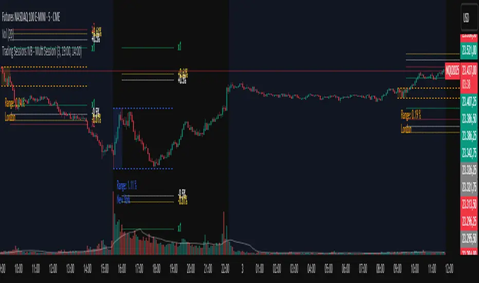
Trading IVBDiscover the power of precision with Trading Sessions IVB – Multi Sessioni, the ultimate intraday tool for session analysis and automatic target generation. Instead of manually calculating levels, this indicator instantly transforms each trading session into a clear, structured framework on your chart.
As soon as a session begins, a dynamic box highlights its price range in real time. From that simple box, the indicator automatically creates high-probability targets: percentage levels at ±0.5% and ±0.61% to capture quick intraday moves, and projection levels at one and two times the session’s range to anticipate powerful breakouts. These targets appear instantly and update live, giving you predefined levels to trade around without the guesswork.
Whether you focus on London, New York, or any custom session, the indicator adapts to your setup, extending ranges to your chosen cutoff time and showing only the most recent sessions you care about. With its clean visual design and automated target generation, you’ll always know where price is most likely to react, retrace, or expand.
Stop wasting time on manual calculations and start trading with a tool that does the heavy lifting for you. Trading Sessions IVB – Multi Sessioni turns raw market sessions into ready-to-use trading levels, helping you trade with more clarity, speed, and confidence.
Astro ToolBox - CEAstro ToolBox - Community Edition
Welcome to the Astro ToolBox - Community Edition, a meticulously designed tool that brings precise planetary ephemeris data to the TradingView community. Inspired by W.D. Gann’s astrological principles, this feature-complete indicator empowers traders to integrate celestial data into their market analysis across equities, forex, commodities, and cryptocurrencies.
Overview
The Astro ToolBox - Community Edition delivers accurate ephemeris data, calculating the ecliptic longitude and latitude of celestial bodies for any selected date. Supporting the Sun, Moon, Mercury, Venus, Mars, Jupiter, Saturn, Uranus, Neptune, and Pluto, this script offers both heliocentric and geocentric perspectives with high precision (within 1-2 arc seconds), it provides traders with a robust dataset for time-based analysis, enhancing Gann-inspired trading strategies.
Key Features
Comprehensive Planetary Data : Displays longitude and optional latitude for ten celestial bodies (Sun, Moon, Mercury, Venus, Mars, Jupiter, Saturn, Uranus, Neptune, Pluto) on user-specified dates.
Heliocentric and Geocentric Modes : Toggle between heliocentric and geocentric calculations (Pluto is heliocentric-only; Moon is geocentric-only).
Zodiac Sign Integration : Optionally display the astrological sign and degree for the selected planet’s longitude, enhancing astrological analysis.
Customizable Display Options : Enable/disable exact time display, longitude rounding, and latitude visibility for tailored data presentation.
Flexible Table Positioning : Choose from nine screen positions (e.g., Top Right, Bottom Center) to place the ephemeris table, with customizable colors for seamless chart integration.
High-Precision Calculations : Utilizes optimized algorithms to deliver near-real-time planetary positions without relying on external APIs.
How It Works
Select a Date : Choose the date for which you want to view planetary data using the input field.
Choose a Planet : Select from the Sun, Moon, Mercury, Venus, Mars, Jupiter, Saturn, Uranus, Neptune, or Pluto.
Set Planetary Mode : Toggle between heliocentric or geocentric modes to align with your analysis approach.
Customize Output : Enable options like zodiac signs, sign degrees, latitude, or exact time, and adjust the table’s position and color.
View Results : The ephemeris data appears in a clear, customizable table on your chart, providing longitude, latitude (optional), and astrological sign details.
Analyze and Trade : Leverage the data to identify time-based turning points or correlations with price action, integrating Gann’s astrological principles into your strategy.
Get Started
As a gift to the TradingView community and Gann traders, the Astro ToolBox - Community Edition is offered free of charge. With no features locked, this tool provides full access to precise ephemeris data for astrological market analysis. Trade wisely and harness the power of celestial insights!

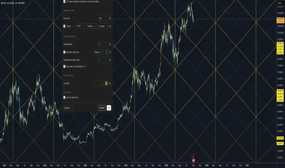
Gann Planetary Lines V1.35 - CEGann Planetary Lines V1.35 - Community Edition
Welcome to the Gann Planetary Lines V1.35 - Community Edition, a powerful tool inspired by W.D. Gann’s astrological trading principles, designed to bring planetary-based price and time analysis to the TradingView community. This feature-complete indicator offers Gann traders and enthusiasts a robust solution for charting planetary influences across equities, forex, commodities, and cryptocurrencies.
Overview
The Gann Planetary Lines V1.35 - Community Edition transforms planetary longitude angles into price levels, leveraging Gann’s methodology to map celestial movements onto financial charts. This script supports plotting lines for the Sun, Moon, Mercury, Venus, Mars, Jupiter, Saturn, Uranus, Neptune, and Pluto, with customizable settings for heliocentric or geocentric perspectives. By integrating harmonic angles and advanced styling options, it provides a comprehensive framework for identifying key price levels and potential market turning points.
Key Features
Planetary Line Projections : Plot lines for ten celestial bodies (Sun, Moon, Mercury, Venus, Mars, Jupiter, Saturn, Uranus, Neptune, Pluto) based on their ecliptic longitudes, offering insights into price-time relationships.
Heliocentric and Geocentric Modes : Switch between heliocentric and geocentric calculations (Pluto is heliocentric-only; Sun and Moon are geocentric).
Customizable Price Unit ($/°) : Adjust the dollar-per-degree value to square planetary lines with your chart’s price scale, ensuring precise alignment.
Harmonic Support : Plot harmonic angles (Opposition, Square, Trine, Sextile, Quintile) with layer selection for multi-level analysis.
Vertical Offset and Styling : Shift lines vertically for custom harmonics and style them with adjustable thickness and colors for clear visualization.
24/7 Market Optimization : Enable extended future data for continuous markets like crypto, enhancing performance and projection accuracy.
Multi-Layer Projections : Display up to nine layers of planetary lines, each offset by 360°, to capture long-term price objectives.
How It Works
Configure Settings : Set the price unit ($/°) to align with your asset’s price action and select a planet from the dropdown menu.
Choose Planetary Mode : Toggle between heliocentric or geocentric modes and enable reverse direction for downward lines.
Enable Harmonics (Optional) : Select desired harmonics (e.g., Square, Trine) and adjust the layer to visualize additional price levels.
Customize Display : Adjust line thickness, color, and vertical offset to enhance chart clarity and match your analysis style.
Analyze and Trade : Use plotted planetary and harmonic lines to identify support, resistance, and potential turning points, integrating Gann’s astrological insights into your trading strategy.
Get Started
As a gift to the TradingView community and Gann traders, the Gann Planetary Lines V1.35 - Community Edition is offered free of charge. No features are locked—enjoy the full power of planetary analysis to enhance your trading. Trade wisely and explore the cosmic edge of Gann’s methodology!
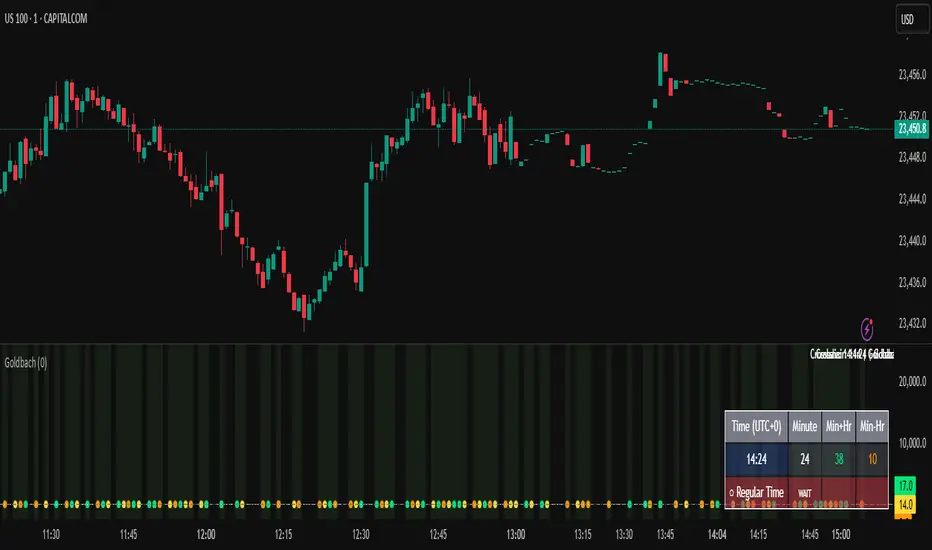
Goldbach Time IndicatorA simple, time-only study that highlights “Goldbach minutes”—bars where any of three time transforms hit a curated integer set. It’s designed for timing research, session rhythm analysis, and building time-of-day confluence with your own strategy.
What it shows
Three time transforms (per bar, using your UTC offset):
Minute (Raw) → the current minute mm (yellow)
Min+Hr → mm + hh with a smart 60→00 rule & capped to 77 (lime)
Min−Hr → mm − hh (only if ≥ 0) (orange)
A minute is flagged when a transform equals a value in the script’s Goldbach set:
0, 3, 7, 11, 14, 17, 23, 29, 35, 41, 44, 47, 50, 53, 56, 59, 65, 71, 77
Background tint whenever there is ≥1 hit on the bar.
Goldbach Count histogram (0–3) showing how many of the three transforms hit.
Reference lines at common values (0, 11, 23, 35, 47, 59).
Live info table (bottom-right): current time (with offset), each transform’s value, and hit status.
Optional crosshair pane label showing time and “Goldbach: YES/NO”.
“00” guardrails (fewer false pings)
Zeros are plotted only when they’re time-valid:
1- Full hour: raw minute is 00
2- Equal pair: mm == hh > 0 so mm−hh = 0
3- Sum=60: mm + hh == 60 so Min+Hr becomes 00
Inputs
UTC Offset (−12…+14): shifts the evaluation clock.
Show Pane Label: on-chart crosshair label (optional).
Show All Plot Lines: plot everything (incl. tiny values 0–3) or, when OFF, show only “meaningful” hits (≥4) plus the strictly-validated 00 cases.
How to use it
Add as a separate pane (overlay=false).
Choose your UTC offset so the indicator matches your session clock.
Look for clusters (Goldbach Count 2–3) and compare with your own trade triggers, session opens, or news windows.
Treat this as timing confluence, not a buy/sell signal.
Notes
Purely time-derived (no price inputs). It doesn’t look ahead; values can update on the live bar as time advances.
The Min+Hr track can exceed 59; it’s capped at 77 to fit the set.
No alerts are included by design; pair it with your strategy’s alerts if needed.
Short description:
Highlights bars where mm, mm+hh, or mm−hh land in a curated “Goldbach” set, with strict 00 rules, UTC offset, count histogram, and a live info table—useful for time-of-day confluence research.
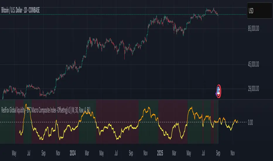
BTC Macro Composite Global liquidity Index -OffsetThis indicator is based on the thesis that Bitcoin price movements are heavily influenced by macro liquidity trends. It calculates a weighted composite index based on the following components:
• Global Liquidity (41%): Sum of central bank balance sheets (Fed , ECB , BoJ , and PBoC ), adjusted to USD.
• Investor Risk Appetite (22%): Derived from the Copper/Gold ratio, inverse VIX (as a risk-on signal), and the spread between High Yield and Investment Grade bonds (HY vs IG OAS).
• Gold Sensitivity (15–20%): Combines the XAUUSD price with BTC/Gold ratio to reflect the historical influence of gold on Bitcoin pricing.
Each component is normalized and then offset forward by 90 days to attempt predictive alignment with Bitcoin’s price.
The goal is to identify macro inflection points with high predictive value for BTC. It is not a trading signal generator but rather a macro trend context indicator.
❗ Important: This script should be used with caution. It does not account for geopolitical shocks, regulatory events, or internal BTC market structure (e.g., miner behavior, on-chain metrics).
💡 How to use:
• Use on the 1D timeframe.
• Look for divergences between BTC price and the macro index.
• Apply in confluence with other technical or fundamental frameworks.
🔍 Originality:
While similar components exist in macro dashboards, this script combines them uniquely using time-forward offsets and custom weighting specifically tailored for BTC behavior.
Molina Prob-Score + FVG + S/R (v1.2)it computes a weighted bull/bear score (0–100%), highlights ICT-style FVGs, marks pivot S/R, and gives simple entry flags. tune the weights to your style.

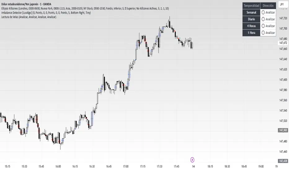
Lectura de VelasScript designed to display, on a panel as shown, the candlestick readings for Weekly, Daily, 4-hour, and 1-hour timeframes
Futures Confluence Delta (FCD) - Histogram
The Futures Confluence Delta (FCD) Histogram is a powerful trend-following indicator tailored for scalping futures on 1-minute charts. Displayed in a bottom panel like RSI or volume, it visualizes cumulative volume delta to identify bullish or bearish market momentum. The histogram turns green for positive delta (buying pressure, suggesting a long trend) and red for negative delta (selling pressure, indicating a short trend), providing quick insight into market direction.
This indicator is ideal for futures traders seeking confluence with other tools, such as VWMA or order block strategies. It uses a simple yet effective delta calculation (buy volume for up candles, sell volume for down candles, smoothed with EMA) to highlight trend strength, making it perfect for fast-paced scalping environments.
Key Features:
Cumulative Delta Histogram: Tracks buying vs. selling pressure, smoothed with an EMA for clarity.
Color-Coded Trend Signals: Green for bullish (long) trends, red for bearish (short) trends.
Customizable Settings: Adjust the delta lookback period and enable/disable daily reset for flexibility.
Optimized for 1-minute charts on futures.
Alert Support: Set alerts for trend changes to stay ahead of market shifts.
How to Use:
Add the indicator to your 1-minute chart. Observe the histogram in the bottom panel:
Green bars (positive delta) suggest a bullish trend, favoring long entries.
Red bars (negative delta) indicate a bearish trend, favoring short entries.
Combine with other indicators (e.g., VWMA, order blocks, or FVGs) for confluence.
Set alerts for trend changes via the FCD Long Trend or FCD Short Trend conditions.
Adjust settings (delta lookback, daily reset) to match your trading style.
Settings:
Delta Lookback Period (default: 14): Controls the EMA smoothing of the delta. Lower values increase sensitivity; higher values smooth trends.
Reset Delta Daily (default: true): Resets cumulative delta at the start of each trading day for futures session alignment.
Long Color (default: green): Color for bullish delta.
Short Color (default: red): Color for bearish delta.
Notes:
Ensure sufficient historical data (500+ bars) for accurate delta calculations.
Test on NQ for higher volatility, as it may show stronger delta signals compared to GC or ES.
Check the Pine Logs pane (“More” > “Pine Logs”) for any NA data issues if the histogram doesn’t display.
Share your feedback or suggestions in the comments!

Price-Volume RelationshipVolume is the relationship between price and performance. Set the candlestick quantity in the settings. It analyzes price and volume based on the number of candlesticks you specify to determine price expectations.

SMC Concepts (Sessions, Lookback Gaps) | קונספטים SMCThe indicator marks the Asian session and the London session in order to see liquidity taking - in addition, it gently marks gaps throughout the entire chart - the indicator marks gaps of a 24/12/6/3 hour back time - from the New York session. The marking of these gaps will be throughout the entire chart until the New York session. Options for selecting a specific time precisely.האינדיקטור מסמן את סשן אסיה ואת סשן לונדון על מנת לראות לקיחת נזילות -בנוסף מסמן בעדינות גאפים לאורך כל הגרף -האינדיקטור מסמן גאפים של זמן לאחור של 24/12/6/3 שעות- מזמן סשן נויורק סימון הגאפים האלו יהיה לאורך כל הגרף עד לסשן נויורק . אפשרויות לבחירת זמן מסוים בדווקה .

Lion Vip + V2Lion Vip +V1
The Lion Vip +V1 indicator is a powerful, multi-purpose tool designed to simplify your trading decisions by combining three core analysis components into a single, clean interface. This comprehensive system helps you identify market trends, pinpoint critical support and resistance levels, and confirm overall market direction.
Key Features:
1. Lion VIP Trend-Following Engine
Clear Buy/Sell Signals: Get straightforward buy and sell signals based on the market's price action. The system uses a dynamic trailing stop to follow the trend, making it easy to spot potential reversals.
Intuitive Trend Highlighting: The background of your chart is colored to instantly show you the dominant trend, so you can make decisions at a glance. Green for uptrends, red for downtrends.
2. Multi-Timeframe Support & Resistance (S/R) Module
Automatic S/R Levels: The indicator automatically identifies and draws significant support and resistance levels from pivot points. This saves you time and ensures you're looking at the most relevant levels.
Cross-Timeframe Analysis: Access key S/R levels from higher timeframes directly on your current chart. By enabling up to three different timeframes in the settings, you can see how the bigger picture affects your trading.
Customizable Lines: You have full control over the style, color, and thickness of your S/R lines to match your personal chart layout.
3. Simple Moving Average (MA) Confirmation
Trend Validation: A customizable Simple Moving Average (MA) is included to help you validate the signals from the Lion VIP system. Use it to confirm the overall trend direction and reduce false signals.
Why Use Lion Vip +V1?
Streamlined Analysis: No need to clutter your chart with multiple indicators. Lion Vip +V1 puts trend-following, support/resistance, and trend confirmation all in one place.
Highly Customizable: Each component can be individually turned on or off and its settings can be adjusted to fit your specific trading strategy.
Clarity and Simplicity: The indicator provides a clean and easy-to-read display, helping you make faster, more confident trading decisions.
Lion Vip +V1 is the perfect tool for traders of all levels who want a clear and comprehensive view of the market without the noise.

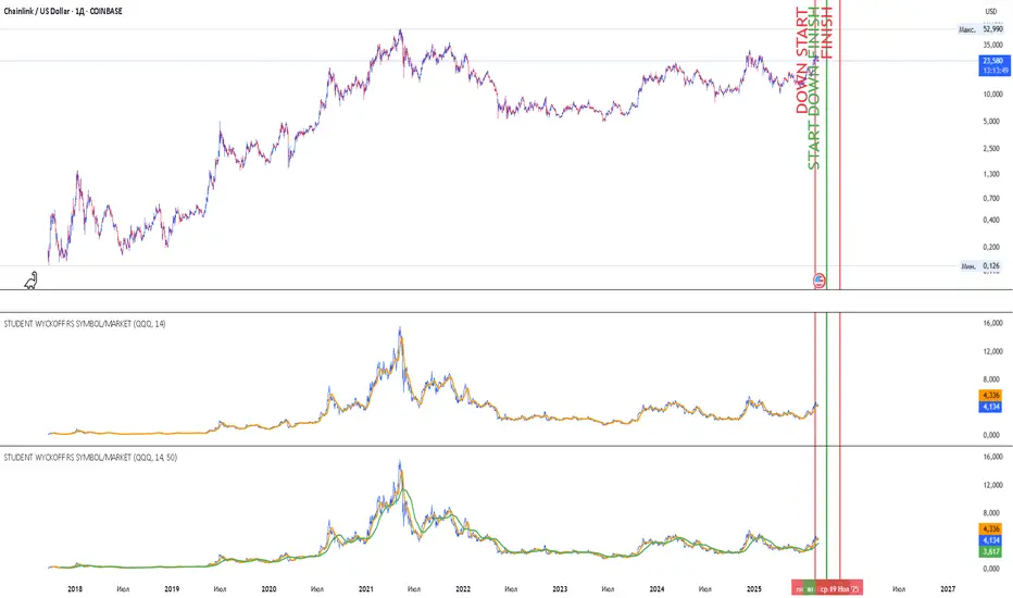
Student Wyckoff RS Symbol/MarketRelative Strength Indicator STUDENT WYCKOFF RS SYMBOL/MARKET
Description
The Relative Strength (RS) Indicator compares the price performance of the current financial instrument (e.g., a stock) against another instrument (e.g., an index or another stock). It is calculated by dividing the closing price of the first instrument by the closing price of the second, then multiplying by 100. This provides a percentage ratio that shows how one instrument outperforms or underperforms another. The indicator helps traders identify strong or weak assets, spot market leaders, or evaluate an asset’s performance relative to a benchmark.
Key Features
Relative Strength Calculation: Divides the closing price of the current instrument by the closing price of the second instrument and multiplies by 100 to express the ratio as a percentage.
Simple Moving Average (SMA): Applies a customizable Simple Moving Average (default period: 14) to smooth the data and highlight trends.
Visualization: Displays the Relative Strength as a blue line, the SMA as an orange line, and colors bars (blue for rising, red for falling) to indicate changes in relative strength.
Flexibility: Allows users to select the second instrument via an input field and adjust the SMA period.
Applications
Market Comparison: Assess whether a stock is outperforming an index (e.g., S&P 500 or MOEX) to identify strong assets for investment.
Sector Analysis: Compare stocks within a sector or against a sector ETF to pinpoint leaders.
Trend Analysis: Use the rise or fall of the RS line and its SMA to gauge the strength of an asset’s trend relative to another instrument.
Trade Timing: Bar coloring helps quickly identify changes in relative strength, aiding short-term trading decisions.
Interpretation
Rising RS: Indicates the first instrument is outperforming the second (e.g., a stock growing faster than an index).
Falling RS: Suggests the first instrument is underperforming.
SMA as a Trend Filter: If the RS line is above the SMA, it may signal strengthening performance; if below, weakening performance.
Settings
Instrument 2: Ticker of the second instrument (default: QQQ).
SMA Period: Period for the Simple Moving Average (default: 14).
Notes
The indicator works on any timeframe but requires accurate ticker input for the second instrument.
Ensure data for both instruments is available on the selected timeframe for precise analysis.
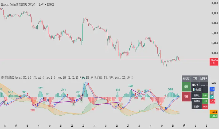
进阶增强版MACD 这是一个增强版 MACD(移动平均线收敛-发散)指标,集成了多时间框架分析、面积统计、背离检测、仪表盘显示和警报功能。
该指标在传统 MACD 指标的基础上进行了大幅扩展,增加了多时间框架(本级别和高级别)、面积分析、背离概率计算、交互式仪表盘和表格显示等功能,旨在为交易者提供更全面的市场动态信息。核心功能包括:双级别 MACD:同时计算本级别(默认快线12、慢线26、信号线9)和高级别(默认快线66、慢线143、信号线50)的 MACD 和信号线。
面积分析:统计 MACD 直方图的面积(红绿柱),并与历史最大面积对比。
背离检测:识别价格与 MACD 的顶背离和底背离,并计算背离概率。
可视化:提供丰富的图形输出,包括直方图、MACD 线、信号线、金叉/死叉标记、背离线、面积标签、表格和仪表盘。
警报系统:为金叉/死叉、面积变化、背离信号等设置多种警报条件。
指标适用于趋势跟踪、背离交易和强度分析,适合日内交易、波段交易等场景。
This is an enhanced MACD (Moving Average Convergence Divergence) indicator that integrates multi time frame analysis, area statistics, divergence detection, dashboard display, and alert functions.
This indicator has been greatly expanded on the basis of the traditional MACD indicator, adding functions such as multi time frame (local and high-level), area analysis, deviation probability calculation, interactive dashboard and table display, aiming to provide traders with more comprehensive market dynamic information. The core functions include: dual level MACD: simultaneously calculating the MACD and signal lines of this level (default fast line 12, slow line 26, signal line 9) and high-level (default fast line 66, slow line 143, signal line 50).
Area analysis: Calculate the area of the MACD histogram (red and green bars) and compare it with the historical maximum area.
Deviation detection: Identify the top and bottom deviations between prices and MACD, and calculate the probability of deviation.
Visualization: Provides rich graphical output, including histograms, MACD lines, signal lines, golden/dead cross markers, backlit lines, area labels, tables, and dashboards.
Alarm system: Set multiple alarm conditions for golden/dead forks, area changes, deviation signals, etc.
The indicator is suitable for trend tracking, divergence trading, and intensity analysis, and is suitable for intraday trading, band trading, and other scenarios.
ORB with Golden Zone FIB targets, Any Timeframe by TenAMTraderDescription:
This indicator is designed to help traders identify key price levels using Fibonacci extensions and retracements based on the Opening Range Breakout (ORB). The levels are visualized as “Golden Zones”, which can serve as potential targets for trades.
Features:
Customizable ORB Timeframe: By default, the ORB is set from 9:30 AM to 9:45 AM EST, but any timeframe can be configured in the settings to fit your trading style.
Golden Zones as Targets: Fibonacci levels are intended to be used as potential profit-taking zones or areas to monitor for reversals, providing a structured framework for intraday and swing trading.
Adjustable Chart Settings: Color-coded levels make it easy to interpret at a glance, and all lines can be customized for personal preference.
Versatile Application: The indicator works across any timeframe, enabling traders to analyze both intraday and multi-day price action.
How to Use:
Ensure Regular Trading Hours (RTH) is enabled on your chart for accurate level calculation.
Observe price action near Golden Zones: a confirmed breakout may indicate continuation, while a pullback could signal a reversal opportunity.
Use the Golden Zones as reference targets for managing risk and planning exits.
Adjust the ORB timeframe and display settings to match your preferred trading style.
Legal Disclosure:
This indicator is provided for educational purposes only and is not financial advice. Trading carries a substantial risk of loss. Users should always perform their own analysis and consult a licensed financial professional before making any trading decisions. Past performance is not indicative of future results.

Session Time Milestones Highlight & AlertSession Time Milestones Highlight & Alert
This script allows you to track and highlight specific trading session milestones on your chart with customizable times, all set in GMT+7. It provides visual cues and alerts for key market events like Tokyo Open, Shanghai Open, Asia Lunch Time, London Open, London Lunch Time, and New York Open.
Features:
Customizable Time Milestones: Adjust the times for each session directly from the settings.
Candle Highlights: The script highlights the candles at your chosen session times for quick visual identification.
Alerts: Set alerts to be notified when each session starts.
Labels: Optionally display simple labels on the chart above the candles for each milestone, with easy toggles to turn them on or off.
Note: All times are in GMT+7.
