Seasonality Scanner by thedatalayers.comThe Seasonality Scanner automatically detects seasonal patterns by scanning a user-defined number of past years (e.g., the last 10 years).
Based on this historical window, the indicator identifies the strongest seasonal tendency for the currently selected date range.
The scanner evaluates all valid seasonal windows using two filters:
• Hit Rate - the percentage of profitable years
• Average Return - the highest mean performance across the analyzed period
The best-scoring seasonal setup is displayed directly on the chart, including the exact start and end dates of the identified pattern for the chosen time range.
Users can define the period they want to analyze, and the indicator will automatically determine which seasonal window performed best over the selected history.
Recommended Settings (Standard Use)
For optimal and consistent results, the following settings are recommended:
• Search Window: 20-30
• Minimum Length: 5
• Time Period: from 2015 onward
• US Election Cycle: All Years
These settings provide a balanced and reliable baseline to detect meaningful seasonal tendencies across markets.
This indicator helps traders understand when recurring seasonal patterns typically occur and how they may align with ongoing market conditions.
This indicator is intended to be used exclusively on the daily timeframe, as all calculations are based on daily candles.
Using it on lower timeframes may result in inaccurate or misleading seasonal readings.
Forecasting

COT Index by thedatalayers.comThe COT Index transforms the weekly COT net positions of Commercial traders into a normalized mathematical model.
Instead of displaying raw net positioning, the COT Index processes the data through a cyclical normalization algorithm (commonly using a 26-week or alternatively a 52-week cycle).
This makes it easier to identify bullish or bearish extremes in Commercial activity.
The index is plotted as a color-coded line:
• Green Zone - Commercials are mathematically classified as bullish.
Historically, bullish Commercial positioning often aligns with upward market pressure.
• Red Zone - Commercials are mathematically classified as bearish.
This typically corresponds with increased downward pressure in the underlying market.
• Neutral Zone - Neither bull nor bear dominance; positioning is mid-range.
Since COT data is published only once per week and the COT Index is built on cyclical multi-week analysis, the indicator is intended to be used exclusively on the weekly timeframe.
Using lower timeframes will not reflect the structure of the data accurately.
The selected cycle length (typically 26 weeks, optionally 52 weeks) determines how net positions are compared and normalized, and can influence how quickly extreme zones appear.
The COT Index provides an objective way to interpret Commercial trader sentiment and to identify potential directional bias in the market.

COT Net Positions by thedatalayers.comCOT Net Positions by thedatalayers.com visualizes the net positioning of different trader groups based on the weekly Commitments of Traders (COT) reports published by the CFTC every Friday.
The indicator processes the raw COT data by calculating Long positions minus Short positions for each trader category. This results in the net position of every group per report.
The script then plots these net positions continuously over time, based on every available COT release. This creates a clear and easy-to-read visualization of how different market participants are positioned.
The indicator displays the three primary COT categories:
• Commercials
• Non-Commercials
• Non-Reportables
By observing how these trader groups shift their positioning, traders can better understand market sentiment and identify potential directional biases or changes in underlying market pressure.
This tool is designed to help traders incorporate positioning data into their analysis and to better interpret how institutional and speculative flows evolve over time.
This indicator is intended to be used exclusively on the weekly timeframe.
COT data is published once per week by the CFTC and therefore only updates weekly.
Using this script on lower timeframes may result in misleading visualization or irregular spacing between data points.
For correct interpretation, please apply it on 1W charts only.

Momentum Quality Index Strategyfiles.fm
Welcome to the Momentum Quality Index Strategy!
This is a fairly conservative strategy with a sharp criteria for entries and taking profits. This strategy has been tested amongst the top 50 stocks with volatility over 2%, and the verdict was that the profitability was often times over 85% profitability, often times reaching over 90% profitability. This strategy thrives in more volatile environments, often times beating the buying and holding strategy YTD performance by large margins.
This strategy is highly optimized for the 30 minute chart, giving insights into shorter term movements. It is based on cash trades of $1,000 per position, with a maximum of 4 trades being placed at once.
This strategy is optimized for common stock trading in more liquid markets, and not yet optimized for options trading (however I plan on developing highly profitable strategies for this purpose soon). The take profit is customizable.
I would refer to the image link I have posted at the top of this article for the strategy's effectiveness. The strategy report on this article isn't accurate, as this strategy is based on trading $1,000 per trade, therefore over longer term periods of time will not be as successful due to the fact that there is no compounding. However, over the course of smaller time frames (such as one year), it beats buying and holding of many assets.
This strategy is meant for day trading and short term swing trading, and is not meant to beat buying and holding of successful assets over the course of long periods of time.

ORB Strategy - EnhancedThis algo is for setting and forgetting ORB. Does require an understanding of how to tweak trading factors

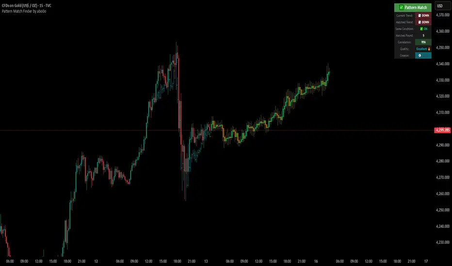
Ultimate Pattern Match FinderUltimate Pattern Match Finder - Introduction 🎯
Your Ultimate Pattern Match Finder is a sophisticated technical analysis indicator that identifies historical price patterns similar to the current market structure and projects potential future price movement based on those matches. 📊✨
Professional-Grade Trading Intelligence 💼
This indicator represents an institutional-quality pattern recognition system designed for serious traders who demand statistical rigor and data-driven decision-making. The multi-layered correlation engine and advanced projection methodology deliver enterprise-level technical analysis directly to your trading platform, transforming raw historical data into actionable market intelligence with quantifiable confidence metrics. 📈⚡
Core Functionality 🔍
The indicator scans through historical price data (up to 7000 bars) looking for patterns that closely resemble the most recent price action. When it finds matching patterns, it overlays them on your current chart and projects what happened next in those historical instances—giving you a data-driven forecast of potential future price movement. 🎯📈
Key Features ⚡
Pattern Recognition Engine 🧠 - Uses three normalization methods (Percent-from-start, Returns, Z-Score) to compare price patterns regardless of their absolute price levels. This allows patterns from different price ranges to be compared effectively.
Correlation & Distance Controls 🎚️ - You can set minimum correlation thresholds (default 75%) and maximum distance thresholds to filter matches. Only high-quality matches that meet your criteria are displayed, preventing false signals. ✅
Trend Direction Filter (Same Condition) 📈📉 - The standout "⭐ SAME CONDITION" feature ensures matches share the same trend direction (UP/DOWN/SIDEWAYS) as your current pattern. This prevents comparing bullish setups to bearish ones, significantly improving forecast relevance.
Advanced Matching Options 🔬 - Includes volume weighting to prioritize matches with similar volume profiles and shape matching to compare trend slope and volatility patterns.
Highly Developed Projection System 🚀🔮 - The crown jewel of this indicator is its sophisticated multi-match projection engine. Instead of relying on a single historical match, it intelligently aggregates the top N matches (up to 10) to create statistical projections. The system displays matched historical candles as semi-transparent teal overlays 📊, then projects future candles in lime/orange colors 🟢🟠 based on what happened after those historical patterns. Each projected candle represents the averaged behavior of multiple high-correlation matches, providing robust, probability-weighted forecasts rather than single-instance predictions. You have full control over projection length (up to 100 bars) and transparency levels for both overlays and projections. 💎
Smart Alerts 🚨 - When no matches meet your thresholds, the indicator displays a "❌ NO MATCH FOUND" alert with suggestions for adjusting your settings, preventing you from acting on weak patterns. The alert even shows how many patterns were filtered out by the trend direction requirement. ⚠️
Rich Visual Feedback 🎨 - The indicator provides a detailed info table showing match quality, correlation percentage (with color-coded ratings), trend comparison with emojis (📈 UP, 📉 DOWN, ➡️ SIDEWAYS), and actionable quality ratings (Excellent 🔥, Very Good ✅, Good 👍, Fair ⚠️).
This tool transforms historical pattern analysis into actionable trading intelligence by showing you not just what patterns match, but what happened next with statistical confidence. 💪🎯
Special Thanks 🙏
A heartfelt thank you to TradingView for providing the powerful Pine Script framework and world-class charting platform that makes advanced indicators like this possible. Their commitment to empowering traders with professional tools and an innovative development environment continues to push the boundaries of what retail traders can achieve. 💙📊
©️ Created by abo0o - All Rights Reserved
📬 Get Access
DM me for access to the Ultimate Pattern Match Finder!
I'm happy to answer any questions you have about the indicator, setup, or optimization for your trading style. Whether you need guidance on parameter settings, strategy integration, or technical support—feel free to reach out! 😊✨
X-Trend reversal (PRO) 👑 X-TREND REVERSAL (PRO): Institutional Order Flow Analysis
Look at the results above. This is not luck. This is mathematics. X-Trend PRO is the flagship algorithm of our ecosystem, engineered for traders who have outgrown standard technical analysis. While the Lite version identifies trends, the PRO version sees where the money is.
Unlike 99% of indicators that focus solely on price action, X-Trend PRO analyzes Market Liquidity and Volume Delta (CVD). We have fused market structure with an X-ray view of institutional activity.
💎 EXCLUSIVE PRO FEATURES:
📊 Volume & CVD Fusion: The indicator detects Cumulative Volume Delta divergences. It warns you of reversals when price is still rising, but buyers have already left the market.
📍 Dynamic POC (Point of Control): Automatically identifies "fair price" levels and institutional accumulation zones. You trade from levels defended by market makers.
🛡 Zero Repaint Guarantee: The signal is locked permanently upon bar close. The history you see is the actual real-time performance of the algorithm.
🧠 Smart Filtering: The system filters out "noise" in ranging markets, generating signals only when Trend, Momentum, and Volume align perfectly.
⚠️ IMPORTANT: SYSTEM SYNERGY
While X-Trend PRO is a powerful standalone tool, the author does not recommend using it in isolation. To achieve the "Sniper Efficiency" shown in the screenshots and to ensure deep market confluence, this tool is engineered to work ideally in synergy with the X-Trend Dashboard PRO. Combining these modules provides the ultimate confirmation system.
🔒 HOW TO GET ACCESS (INVITE-ONLY)
This script is a closed-source proprietary tool. Access is granted exclusively through our official channels.
⛔ NOTE: We do NOT respond to access requests in the comment section below. Please use the links above for instant support and license activation.

Buy / Sell Signals With Take Profits (Non-Repaint)This indicator generates automatic BUY/SELL flip signals based on trend direction, volatility status, and ATR dynamics.
Labels are placed based on actual High/Low and do not shift.
Features
✔ Dynamic ATR Multipliers
✔ Volatility Stretch (calm market → narrow, aggressive → wide)
✔ Trend Memory (25-bar direction memory)
✔ Automatic TP1–TP5 (%1 – %5) calculation
✔ Desktop & Mobile compatible TP Panel
✔ Bull/Bear Flip labels
✔ TradingView alert support
Suitable Markets
Forex, Crypto, Stocks, Indices, Gold, Oil
Works on all timeframes (5min – 1min – 4min – Daily).
⚠ Important Note
This tool is not investment advice.
It does not provide any buy–sell recommendations.
All trading decisions are yours; risk management is entirely the user's responsibility.

Numanti - FairRate EUR/USD Fair ValueFairRate | EUR/USD Fair Value Indicator
Know When EUR/USD Is Overpriced or Underpriced
Price tells you where the market *is*. Fair value tells you where it *should be*.
EUR/USD doesn't move randomly. Interest rates, yield curves, risk appetite, and equity flows drive where the pair trades over time. When price strays too far from these fundamentals, it tends to snap back.
FairRate shows you exactly how far price has strayed.
How It Works
The indicator calculates a fair value for EUR/USD based on macroeconomic variables updated weekly. It then measures the deviation between current price and fair value in standard deviations (the z-score).
> +2σ --> EUR significantly overvalued — watch for pullback
+1σ to +2σ --> EUR above fair value
-1σ to +1σ --> Near equilibrium
-1σ to -2σ --> EUR below fair value
< -2σ --> EUR significantly undervalued — watch for bounce
The bigger the deviation, the stronger the fundamental pressure for mean reversion.
What You See on the Chart
- Fair Value Line — Where EUR/USD "should" be trading
- ±1σ and ±2σ Bands — Normal and extreme deviation zones
- Info Panel — Current fair value, z-score, and signal status
When price pushes into the outer bands, fundamentals are stretched. That's where opportunities often emerge.
Model Quality
This isn't a typical indicator or curve-fitted approach. It's a proper econometric model:
- R² > 80% — Fundamentals explain most of EUR/USD movement
- Out-of-sample validated — Works on data the model never saw
- Updated weekly — Fresh estimates every Friday
- Research-backed — Methodology documented in white paper
How Traders Use It
Mean Reversion
When z-score hits extreme levels (±2σ), look for reversal setups. Combine with your technical analysis for entries.
Trend Confirmation
If price is trending AND fundamentals support it (z-score moving in trend direction), that's a stronger move.
Risk Filter
Avoid counter-trend trades when z-score is near zero — there's no fundamental reason to expect a reversal.
Context Layer
Add fundamental context to pure price action. Know whether you're trading with or against the macro backdrop.
### What This Is NOT
- Not a buy/sell signal generator
- Not a timing indicator
- Not a substitute for technical analysis
FairRate is a fundamental layer — one piece of the puzzle that tells you whether EUR/USD is cheap, expensive, or fairly priced right now.
The Model
Built on peer-reviewed econometric methodology. The model captures the fundamental drivers that institutional desks use to assess currency valuation — not a black-box indicator or curve-fitted pattern.
Add FairRate to your EUR/USD analysis. Know where fundamentals stand.
© 2025 Numanti. All rights reserved.


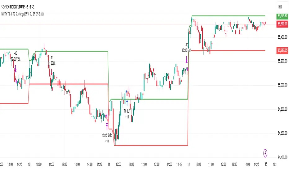
NIFTY T1 & T2 Strategy (65% SL, 15:15 Exit)Time based trading strategy without any indicator and reflecting operators move
Swing Elite Valuation ToolSwing Elite Macro Valuation
This indicator provides intermarket valuation analysis by measuring how an asset is priced relative to key macroeconomic instruments. Rather than analyzing price in isolation, it contextualizes current levels against bonds, the dollar, and gold — the three pillars of macro market structure.
The Concept Behind Macro Valuation
Assets don't move in a vacuum. Equities, commodities, and currencies maintain dynamic relationships with macro instruments. When the S&P 500 rises while bonds (ZB1) also rally, that's a different signal than when stocks rise while bonds sell off. Similarly, an asset's relationship to the dollar index (DXY) and gold (GC1) reveals whether price moves reflect genuine strength or simply dollar weakness.
This indicator quantifies these relationships by normalizing relative performance into a 0-100 scale, making it easy to identify when an asset is historically overvalued or undervalued relative to macro conditions.
How Valuation Is Calculated
The indicator computes a ratio between the charted asset and each comparison instrument, then normalizes this ratio as a percentage move from a historical baseline. Two modes are available: Short-term mode captures recent sentiment shifts and is useful for tactical positioning, while Long-term mode evaluates deeper macro positioning for swing trades and portfolio decisions.
The normalized reading places current valuation within historical context. A reading near 88+ suggests the asset is overvalued relative to that macro instrument — price has extended beyond typical ranges. Readings below 10 indicate undervaluation, where the asset may be oversold relative to macro conditions.
Dynamic vs Manual Thresholds
Users can select between manual threshold levels or automatic dynamic bands. Auto-levels calculate overvalued and undervalued zones using standard deviation from the mean, adapting to each asset's historical volatility. Manual mode allows fixed thresholds for traders who prefer consistent reference points across different instruments.
Multi-Instrument Flexibility
While defaults include ZB1 (30-year Treasury futures), DXY (dollar index), and GC1 (gold futures), any symbol can be substituted. This allows analysis against silver, currency futures, sector ETFs, or any instrument relevant to your trading thesis. Each comparison instrument displays independently with color-coded status: readings in overvalued territory appear red, undervalued zones show green, and neutral conditions display blue.
Practical Application
This tool serves traders who incorporate intermarket analysis into their decision-making. When an asset shows overvalued readings against multiple macro instruments simultaneously, it suggests price has extended relative to the broader macro environment — a potential mean reversion setup. Conversely, undervaluation across multiple macro comparisons can highlight value opportunities where price hasn't kept pace with supportive macro conditions.
The dashboard table provides at-a-glance status for each comparison, while alert conditions enable notifications when valuation crosses key thresholds.

ARVEXV1“Failed Reversal – Opposite Candle Only (No Doji/Hammer/Hanging Man)”:
This strategy captures failed reversal attempts where the current candle is opposite to the previous candle and volume is higher. It enters long if a bearish candle fails to break a previous bullish candle’s low, and short if a bullish candle fails to break a previous bearish candle’s high. Signals are canceled for Doji, Hammer, or Hanging Man candles. Entries only, fully backtestable.

Swing elite Trend DirectionSwing Elite Trend Direction
This indicator provides a structured approach to market analysis by combining swing point detection with trend confirmation logic derived from Smart Money Concepts (SMC).
How It Works
The core algorithm identifies swing highs and lows using a configurable lookback depth, then classifies each pivot based on its relationship to prior swings. A swing high that exceeds the previous swing high is labeled HH (Higher High), while one that fails to do so becomes LH (Lower High). The same logic applies to lows, producing HL (Higher Low) and LL (Lower Low) classifications.
Trend confirmation follows ICT/SMC principles: a bullish trend is confirmed only when a Higher Low is followed by a Higher High, establishing the classic bullish market structure sequence. Conversely, bearish confirmation requires a Lower High followed by a Lower Low. When price creates a counter-structure pivot (such as a Lower High appearing during a bullish sequence), the trend status shifts to "Unconfirmed," alerting traders to potential reversals before they fully develop.
What Makes This Indicator Useful
Rather than displaying isolated swing points, this indicator synthesizes the relationship between consecutive pivots to provide actionable trend status. The multi-timeframe dashboard extends this analysis across three user-defined timeframes, allowing traders to assess trend alignment — a key filter for higher-probability setups.
Structure trendlines automatically connect relevant pivot sequences (HH→LH for resistance, LL→HL for support), visualizing the trajectory of market structure rather than arbitrary price connections. Break levels mark the specific prices where structure would shift, giving clear invalidation points for trade management.
The Fibonacci retracement draws automatically between the two most recent pivots, providing potential entry zones within the established structure context.
Intended Use
This tool is designed for traders who use market structure analysis as their primary framework. It automates the manual process of labeling swing points and tracking structure sequences, reducing subjectivity while maintaining the discretionary trader's analytical approach. Works across all markets and timeframes.
Swing elite Trend direction
A comprehensive market structure indicator that identifies swing highs/lows, labels them with HH/HL/LH/LL structure, draws dynamic trendlines, and provides multi-timeframe trend analysis.
🔹 FEATURES
Market Structure Analysis
Automatically detects swing highs and swing lows
Labels each pivot with its structure type: HH (Higher High), HL (Higher Low), LH (Lower High), LL (Lower Low)
Color-coded zigzag lines based on confirmed trend direction
Structure Trendlines
Downtrend Line: Connects HH to LH (resistance in bearish structure)
Uptrend Line: Connects LL to HL (support in bullish structure)
Extended projection for potential future price interaction
Swing Trendlines
Connects the last 2 swing highs (resistance trendline)
Connects the last 2 swing lows (support trendline)
Optional extension to project future levels
Break Levels
Horizontal lines at key structure points (HH, HL, LL, LH)
Visual reference for potential breakout/breakdown levels
Customizable colors for bullish and bearish breaks
Fibonacci Retracement
Auto-drawn between the last two pivots
Customizable levels: 0, 0.236, 0.382, 0.5, 0.618, 0.786, 1.0
Individual toggle and color settings for each level
Multi-Timeframe Dashboard
Displays trend status across 3 customizable timeframes
Shows trend direction: Bullish / Bearish / Neutral
Shows confirmation status: Confirmed / Unconfirmed
Color-coded for quick visual analysis
Trend Confirmation Logic (ICT/SMC Concepts)
Bullish Confirmed: HL followed by HH (Higher Low → Higher High pattern)
Bearish Confirmed: LH followed by LL (Lower High → Lower Low pattern)
Unconfirmed: Counter-structure appears (potential reversal signal)
🔹 SETTINGS
Swing Settings
Depth: Lookback period for pivot detection
Display
Toggle zigzag lines, labels, price on labels
Adjust label size and number of visible swings
Zigzag Settings
Line style: Solid, Dashed, Dotted
Thickness and colors for bullish/bearish trends
Swing Trendlines
Toggle high/low trendlines independently
Customizable colors, style, thickness
Option to extend trendlines
Structure Trendlines
Toggle HH→LH and LL→HL lines independently
Customizable colors, style, thickness
Option to extend trendlines
Break Levels
Toggle HH, HL, LL, LH break levels independently
Customizable colors for each level
Fibonacci
Toggle individual fib levels
Customizable colors and line style
Dashboard
Position: Top Left, Top Right, Bottom Left, Bottom Right
Size: Tiny, Small, Normal, Large
3 customizable timeframes
🔹 ALERTS
HH Broken: Price breaks above recent Higher High
HL Broken: Price breaks below recent Higher Low
LL Broken: Price breaks below recent Lower Low
LH Broken: Price breaks above recent Lower High
🔹 USE CASES
✅ Identify market structure and trend direction
✅ Spot potential trend reversals (unconfirmed status)
✅ Find key support/resistance levels
✅ Multi-timeframe trend alignment for trade confirmation
✅ Breakout/breakdown trading with break levels
✅ Fibonacci retracement entries
3 hours ago
Release Notes
Swing elite Trend direction
A comprehensive market structure indicator that identifies swing highs/lows, labels them with HH/HL/LH/LL structure, draws dynamic trendlines, and provides multi-timeframe trend analysis.
🔹 FEATURES
Market Structure Analysis
Automatically detects swing highs and swing lows
Labels each pivot with its structure type: HH (Higher High), HL (Higher Low), LH (Lower High), LL (Lower Low)
Color-coded zigzag lines based on confirmed trend direction
Structure Trendlines
Downtrend Line: Connects HH to LH (resistance in bearish structure)
Uptrend Line: Connects LL to HL (support in bullish structure)
Extended projection for potential future price interaction
Swing Trendlines
Connects the last 2 swing highs (resistance trendline)
Connects the last 2 swing lows (support trendline)
Optional extension to project future levels
Break Levels
Horizontal lines at key structure points (HH, HL, LL, LH)
Visual reference for potential breakout/breakdown levels
Customizable colors for bullish and bearish breaks
Fibonacci Retracement
Auto-drawn between the last two pivots
Customizable levels: 0, 0.236, 0.382, 0.5, 0.618, 0.786, 1.0
Individual toggle and color settings for each level
Multi-Timeframe Dashboard
Displays trend status across 3 customizable timeframes
Shows trend direction: Bullish / Bearish / Neutral
Shows confirmation status: Confirmed / Unconfirmed
Color-coded for quick visual analysis
Trend Confirmation Logic (ICT/SMC Concepts)
Bullish Confirmed: HL followed by HH (Higher Low → Higher High pattern)
Bearish Confirmed: LH followed by LL (Lower High → Lower Low pattern)
Unconfirmed: Counter-structure appears (potential reversal signal)
🔹 SETTINGS
Swing Settings
Depth: Lookback period for pivot detection
Display
Toggle zigzag lines, labels, price on labels
Adjust label size and number of visible swings
Zigzag Settings
Line style: Solid, Dashed, Dotted
Thickness and colors for bullish/bearish trends
Swing Trendlines
Toggle high/low trendlines independently
Customizable colors, style, thickness
Option to extend trendlines
Structure Trendlines
Toggle HH→LH and LL→HL lines independently
Customizable colors, style, thickness
Option to extend trendlines
Break Levels
Toggle HH, HL, LL, LH break levels independently
Customizable colors for each level
Fibonacci
Toggle individual fib levels
Customizable colors and line style
Dashboard
Position: Top Left, Top Right, Bottom Left, Bottom Right
Size: Tiny, Small, Normal, Large
3 customizable timeframes
🔹 ALERTS
HH Broken: Price breaks above recent Higher High
HL Broken: Price breaks below recent Higher Low
LL Broken: Price breaks below recent Lower Low
LH Broken: Price breaks above recent Lower High
🔹 USE CASES
✅ Identify market structure and trend direction
✅ Spot potential trend reversals (unconfirmed status)
✅ Find key support/resistance levels
✅ Multi-timeframe trend alignment for trade confirmation
✅ Breakout/breakdown trading with break levels
✅ Fibonacci retracement entries

X-Trend Reversal (Lite version)🚀 X-TREND REVERSAL (LITE): Market Extremes Detector
X-Trend Reversal is a professional algorithm designed to identify high-probability trend inflection points. We have stripped away the "noise" to provide you with deterministic, clean execution signals.
Unlike standard lagging indicators, X-Trend analyzes market structure to find the exact moment a trend is exhausted, giving you the "Sniper Entry" advantage.
💎 KEY FEATURES:
🛡 Immutable Signals: Guaranteed Non-Repainting technology. What you see on historical data is exactly what happened in real-time. No disappearing signals.
🎯 High-Probability Setups: Advanced filtering logic eliminates false moves to pinpoint the most reliable counter-trend entry points.
🌍 Multi-Timeframe Scalability: Universal adaptation to the volatility of any asset class (Crypto, Forex, Indices) and any timeframe (from 15s scalping to 4H swing trading).
🏛 Institutional Confidence: Trade reversals with the clarity usually reserved for institutional desks.
📊 X-TREND ECOSYSTEM
This indicator is a powerful standalone tool, but it is designed to be part of a larger professional suite. For a comprehensive market view and deeper confluence analysis, we highly recommend pairing this tool with our X-Trend Dashboard and other advanced modules from the X-Trend series. Combining these tools provides a 360-degree view of market sentiment and liquidity.
🔒 HOW TO GET ACCESS (INVITE-ONLY)
This script is a closed-source proprietary tool. Access is granted exclusively through our official channels.
⛔ NOTE: Please do not ask for access in the comment section below. Use the links above for instant support and license activation.

Multi-TF EMAs (50/100/200)This indicator plots 9 Exponential Moving Averages (EMAs) on your chart, combining three key EMA lengths (50, 100, 200) across three higher timeframes (Daily, Weekly, Monthly). This allows traders to identify dynamic support/resistance levels and trend direction across multiple timeframes without switching charts.

MinsenTTS 2.0Minsen Trend Tracking System 2.0 (MinsenTTS 2.0)
明心鉴己 · 顺势而为
-------------------------------
“Minsen (明心道动)” 取自 “明心见性,道动为术”,是我作为一个独立交易者,对自己交易体系的一次完整梳理与输出。
交易做久了,我发现最难的不是技术,而是心性。所谓的 “明心”,不仅仅是看清行情,更是认清自己。是在面对市场的诱惑与恐慌时,能否诚实地执行自己制定好的原则,不侥幸、不自欺欺人。
MinsenTTS 2.0 就是基于这个初衷设计的辅助工具。我希望它能像一面镜子,客观地反映市场的真实状态,帮你在混沌中保持清醒,让你的每一次决策,都符合你内心的原则。
-------------------------------
我的设计理念
这套系统的核心,融合了我对“反者道动,弱者道用”的理解,旨在解决我们在交易中常遇到的三个难题:
1. 关于“明心”(去噪与自律):
市场里充满了噪音,很容易让人迷失。系统通过算法过滤掉了那些无效的波动,只呈现最核心的趋势。这不仅是为了看清盘面,更是为了让你在面对杂乱K线时,能守住自己的交易纪律,不被情绪左右。
2. 关于“顺势”(多维共振):
我们常说顺势,但什么是势?真正的趋势是动能、量能与结构的共鸣。这套系统不依赖单一信号,只有当市场的多个维度达成“共识”时,它才会确认趋势。顺势而为,才能让交易变得简单。
3. 关于“弱者道用”(柔弱与保全):
老子讲“柔弱胜刚强”。在交易中,承认自己的渺小,不与市场硬碰硬,才是长存之道。当行情极度亢奋、看似最强劲时,往往内部结构最为脆弱。系统内置的**“极值防御”**机制,就是帮你避开这种“盛极而衰”的锋芒。我们不争一时的暴利,而是求得资金在长周期里的安稳与复利。
-------------------------------
**特别说明:关于“诚实”与“不重绘”
既然讲“明心”,最基本的就是不自欺,也不欺人。
我特别反感市面上那种为了“好看”而作弊的指标。它们最恶心的地方在于:行情走完之后,回头在历史最高点补一个“卖出”,在最低点补一个“买入”。乍一看简直是神级预测,但在实盘的那个当下,信号根本不存在,你永远无法在那个位置成交。
MinsenTTS 2.0 严守底线,绝不使用未来函数,绝不重绘。 我们拒绝为了美化历史业绩而欺骗用户,更不会为了让指标看起来“神准”而扭曲数据的真实性。
所有的信号一旦在当前K线收盘确认,就永久固定,绝不会消失或漂移。哪怕是错误的信号,也会诚实地留在图表上。因为只有面对真实的(哪怕是不完美的)历史,我们才能进行有效的复盘,做出对自己负责的决策。
-------------------------------
Minsen 指标生态:左侧与右侧的配合
MinsenTTS 2.0 专注于右侧趋势追踪(趋势确立后的跟随)。为了获得更完整的视角,建议结合我的另一款指标 MinsenAMRS 使用:
* MinsenAMRS:负责左侧预警,在趋势反转前夕提供信号。
* MinsenTTS:负责右侧确认,在趋势确立后提供跟随依据。
心得分享:当 AMRS 提示反转风险,随后 TTS 确认趋势进入“萌芽期”或“发展期”,这种“左侧预警 + 右侧确认”的结合,往往能提供更高质量的观察窗口。
-------------------------------
图表元素解读:如何使用这套工具
为了还你一个清爽的盘面,系统将繁杂的数据处理转化为直观的视觉元素。以下是你默认可见的内容,建议按这个顺序来观察市场:
1. 🌊 智能趋势色带 (Smart Trend Band)
这是最直观的视觉参考,代表了市场阻力最小的方向。
颜色:绿色代表多头(上涨),红色代表空头(下跌)。
形态:色带越宽,说明趋势劲头越足;色带变窄,说明动能减弱。
衰竭提示:当色带边缘出现橙色轮廓,意味着趋势进入“衰竭期”。虽然价格可能还在惯性运行,但这提示你内部动能已经背离,这时候应该警惕风险,而不是盲目乐观。
(注:本系统采用国际主流配色:绿涨红跌)
2. 🏷️ 市场状态标记 (State Markers)
系统在关键节点会给出图标,作为你观察行情的窗口。
“多” / “空” 标签:代表市场状态发生了高胜率的切换(比如从震荡转为趋势)。这通常是趋势启动或重启的节点,值得你重点关注。
小三角图标 (△/▽):趋势延续标记。当趋势在发展中出现良性回调,并再次顺势突破时,系统会标记这个图标,提示趋势结构依然完整。
3. 🟨 横盘识别背景 (Consolidation Filter)
视觉表现:图表背景出现淡黄色区域。
含义:系统识别到市场进入了低波动或无序的横盘整理。
建议:在这片区域,趋势策略很容易失效。黄色的背景不仅是警示灯,更是资金的保护罩。它提醒你当前处于“垃圾时间”,避免在无序波动中反复磨损本金。
4. 📊 市场情报面板 (Info Table)
右下角的面板是对当前K线的全方位“体检”,帮你把感性的盘感量化为数据:
趋势 (Trend):强势/中等/弱势。注:此项仅代表动能的级别,不代表涨跌方向。
评分 (Score):0-100分。分数越高,代表动能、量能与结构的共振度越高。
阶段 (Stage):告诉你当前处于“萌芽、发展、加速”还是“衰竭”期。
置信度 (Confidence):算法对当前判断的把握有多大。
方向 (Direction):明确指出是“↗上涨”、“↘下跌”还是“震荡”。
市况 (State):定性判断是“趋势”还是“横盘”。
效率 (Efficiency):“高效”代表K线走得干脆利落;“低效”代表锯齿多、磨人。
5. 🚧 动态支撑与阻力 (Dynamic S/R Lines)
视觉表现:图表中延伸出的红色虚线与绿色虚线。
含义:这是系统自动筛选出的筹码密集区。红色虚线是潜在阻力,绿色虚线是潜在支撑。这些位置往往是价格可能停顿或测试的地方,做交易计划时可以作为客观参考。
-------------------------------
写在最后
工具是死的,人是活的。
MinsenTTS 2.0 只是一个辅助你观察市场的工具,它无法消除市场的不确定性,更不能替你做决定。
真正的交易决策,应该来自于你对自己交易系统的坚持,和对风险的敬畏。希望这个工具能帮你省去繁琐的计算,让你在看盘时,心里更明亮,决策更坚定。
明心鉴己,顺势而为。
-------------------------------
免责声明:本指标仅用于技术分析与市场观察,不构成任何具体的投资建议。金融市场风险巨大,请用户结合自身情况独立决策。
=========English Version=========
Minsen Trend Tracking System 2.0 (MinsenTTS)
Reflect on the Self · Flow with the Trend
-------------------------------
"Minsen" (明心道动) is derived from the philosophy of "Clarifying the Mind to see one's Nature, and acting through the movement of the Tao." It represents a complete consolidation and output of my personal trading system as an independent trader.
After trading for a long time, I realized that the hardest part is not the technique, but the mindset (psychology). "Clarifying the Mind" isn't just about seeing the market clearly; it's about seeing yourself clearly. It is about whether you can honestly execute your principles without luck-seeking or self-deception when facing the market's temptations and panic.
MinsenTTS 2.0 was designed as an auxiliary tool with this original intention. I hope it serves as a mirror, objectively reflecting the true state of the market, helping you stay clear-headed amidst the chaos, ensuring every decision aligns with your inner principles.
-------------------------------
My Design Philosophy
The core of this system integrates my understanding of "Reversal is the movement of the Tao; Weakness is the usage of the Tao." It aims to solve three common challenges we face in trading:
On "Clarifying the Mind" (De-noising & Discipline):
The market is full of noise that leads people astray. The system uses algorithms to filter out invalid fluctuations, presenting only the core trend. This is not just to see the chart clearly, but to help you maintain your trading discipline and remain unaffected by emotions when facing messy price action.
On "Flowing with the Trend" (Multi-dimensional Confluence):
We often talk about following the trend, but what is the "trend"? A true trend is the resonance of Momentum, Volume, and Structure. This system does not rely on a single signal; it only confirms a trend when multiple dimensions of the market reach a "consensus." Following the trend makes trading simple.
On "The Way of Weakness" (Yielding & Preservation):
Laozi said, "The soft and weak overcome the hard and strong." In trading, acknowledging one's insignificance and not fighting the market head-on is the way to survive. When the market is extremely euphoric and appears strongest, its internal structure is often the most fragile. The system's built-in "Extremes Defense" mechanism helps you avoid this "sharp edge" of exhaustion. We do not strive for momentary explosive profits, but seek the safety and compounding of capital over the long cycle.
-------------------------------
Special Note: On "Honesty" & "Non-Repainting"
Since we speak of "Clarifying the Mind," the most basic requirement is not to deceive oneself or others.
I have a strong aversion to indicators on the market that cheat just to "look good." The most disgusting part is how they operate: after the market moves, they go back and paint a "Sell" at the historical high and a "Buy" at the low. At first glance, it looks like a god-tier prediction, but in the reality of live trading, that signal did not exist, and you could never have executed that trade.
MinsenTTS 2.0 strictly holds the line: No Future Functions, No Repainting.
We refuse to deceive users to beautify historical performance, and we certainly will not distort the authenticity of the data just to make the indicator look "magical."
All signals are permanently fixed once the current candle closes. They will never vanish or drift. Even incorrect signals will honestly remain on the chart. Because only by facing real (even if imperfect) history can we conduct effective reviews and make responsible decisions.
-------------------------------
The Minsen Ecosystem: Left & Right Side Synergy
MinsenTTS 2.0 focuses on Right-side Trend Tracking (following after the trend is established). For a more complete perspective, it is recommended to combine it with my other indicator, MinsenAMRS:
MinsenAMRS: Responsible for Left-side Warning, providing signals on the eve of a trend reversal.
MinsenTTS: Responsible for Right-side Confirmation, providing the basis for following the trend after it is established.
Trader's Insight: When AMRS alerts to reversal risks, and subsequently TTS confirms the trend entering the "Germination" or "Development" stage, this combination of "Left-side Warning + Right-side Confirmation" often provides a higher-quality observation window.
-------------------------------
Chart Elements: How to Use This Tool
To return a clean chart to you, the system transforms complex data processing into intuitive visual elements. Here is the default content, and I suggest observing the market in this order:
1. 🌊 Smart Trend Band
This is the most intuitive visual reference, representing the path of least resistance.
Color: Green represents Bulls (Up), Red represents Bears (Down).
Shape: A wider band indicates strong momentum; a narrowing band indicates weakening momentum.
Exhaustion Alert: When an Orange Outline appears on the edge of the band, it means the trend has entered the "Exhaustion Phase." Although the price may still run on inertia, this warns you that internal momentum has diverged. You should be alert to risks rather than blindly optimistic.
(Note: This system uses the international color standard: Green for Up, Red for Down).
2. 🏷️ Market State Markers
The system provides icons at key nodes as windows for observing price action.
"Long" / "Short" Labels: Represent a high-probability switch in market state (e.g., from ranging to trending). These are usually the starting or restarting points of a trend and are worth your focus.
Small Triangle Icons (△/▽): Trend Continuation Markers. When a trend experiences a healthy pullback during development and breaks through again with the trend, the system marks this icon, suggesting the trend structure remains intact.
3. 🟨 Consolidation Filter (Range Background)
Visual: A pale yellow area appears in the chart background.
Meaning: The system has identified that the market has entered low-volatility or disordered sideways consolidation.
Advice: In this area, trend strategies are prone to failure. The yellow background is not just a warning light; it is a Capital Protection Shield. It reminds you that you are in "Junk Time"—avoid grinding down your principal in disordered fluctuations.
4. 📊 Market Info Table
The panel in the bottom right corner performs a comprehensive "Health Check" on the current candle, quantifying intuitive market feel into data:
Trend: Strong / Mid / Weak. Note: This represents the level of momentum, not the direction.
Score: 0-100. The higher the score, the higher the Confluence of momentum, volume, and structure.
Stage: Tells you if the trend is in "Germination," "Development," "Acceleration," or "Exhaustion."
Confidence: How confident the algorithm is in the current judgment.
Direction: Clearly indicates "↗ Up", "↘ Down", or "Range".
State: Qualitative judgment of "Trend" vs. "Consolidation".
Efficiency: "High" means the price action is clean and decisive; "Low" means it is choppy and grinding.
5. 🚧 Dynamic S/R Lines (Support & Resistance)
Visual: Red and Green dashed lines extending from the chart.
Meaning: These are dense volume zones automatically filtered by the system. Red dashed lines are potential Resistance; Green dashed lines are potential Support. These are locations where price is likely to pause or test, serving as objective references for your trading plan.
-------------------------------
Final Words
Tools are static; humans are dynamic.
MinsenTTS 2.0 is merely a tool to assist your market observation. It cannot eliminate market uncertainty, nor can it make decisions for you.
True trading decisions should come from your adherence to your own trading system and your reverence for risk. I hope this tool saves you from tedious calculations, making your mind clearer and your decisions firmer when watching the market.
Reflect on the Self, Flow with the Trend.
-------------------------------
Disclaimer: This indicator is for technical analysis and market observation only and does not constitute specific investment advice. Financial markets carry significant risks; please make independent decisions based on your own circumstances.

Early Momentum Dashboard [Small Caps]Early Momentum Dashboard for Small Caps
A clean, real-time dashboard that detects building momentum before major moves in small-cap stocks.
Features:
• 7 key early-momentum indicators with traffic-light system (🟢 Bullish / 🟡 Neutral / 🔴 Bearish)
• Toggle each indicator on/off via settings
• Momentum Score (e.g., 5/7) – higher = stronger early signal
• Visual markers on chart (VOL, RSI, MACD)
• Includes: Relative Volume Spike, RSI Buildup, MACD, OBV Accumulation, ROC, ATR Volatility, VWAP Proximity
Ideal for scanning low-float or catalyst-driven small caps.
Tip: Look for 4+ green lights as a high-probability early entry signal.
Enjoy!
SB - RSI EW OscillatorAdd EW with RSI.
Makes sense take a call if RSI is above 50 and EW turns green and vice versa.

Fibonacci Fibonacci automatic drawing - Last 144 barFibonacci automatic drawing:
It automatically plots Fibonacci based on the last 144 bars.
According to the drawing rules, it calculates itself from bottom to top and from top to bottom.
This will answer the most challenging questions about drawing the right thing.
If 144 bar is not reached, it draws using manual input.
This will be a useful and practical perspective.
This is for those who want to see the most valuable Fibonacci values on a chart.

MNQ DP Levels and 1m high frequency HP+MP trading signalsidea to trade off QQQ DPs converted to NQ (dont ask me :) )on 1m chart focusing only on MP,HP triggers and scaling in down to a downside DP as an exit.
Disclaimer: This tool is for educational purposes only and does not constitute financial advice. Past performance does not guarantee future results.

Velocity SwingtraderThe intended objective of this indicator to gauge trend and momentum and find trades that are at the beginning of a trend change for longer periods of time (days, weeks, months).

Reversal Buy and Sell SignalsThis indicator is fast and minimalistic reversal-detection indicator designed to capture high-probability turning points in the market. It combines engulfing candlestick patterns, a strong candle body filter, and RSI momentum analysis to generate precise BUY and SELL signals with minimal noise.
