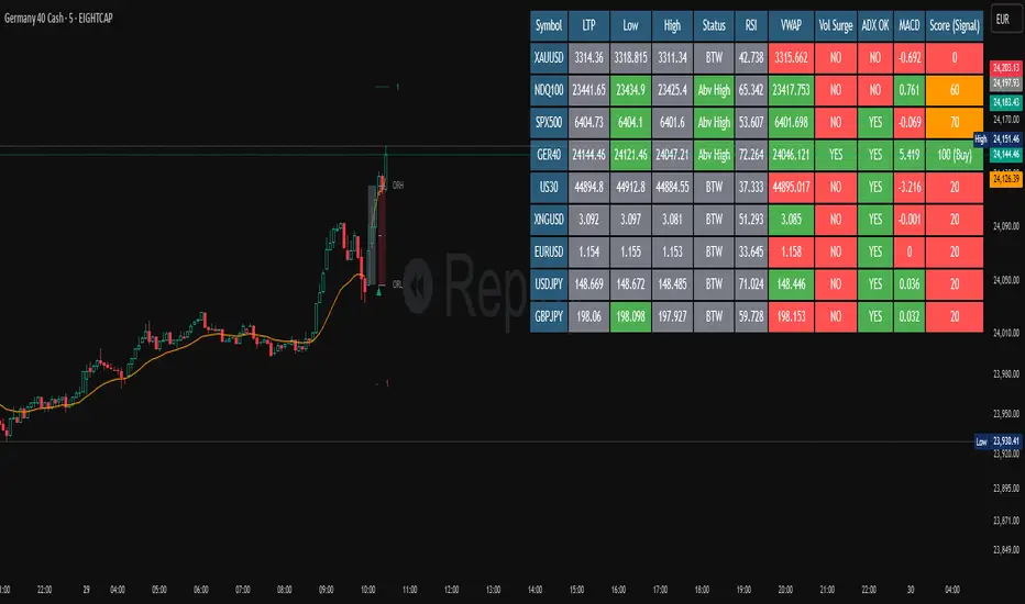
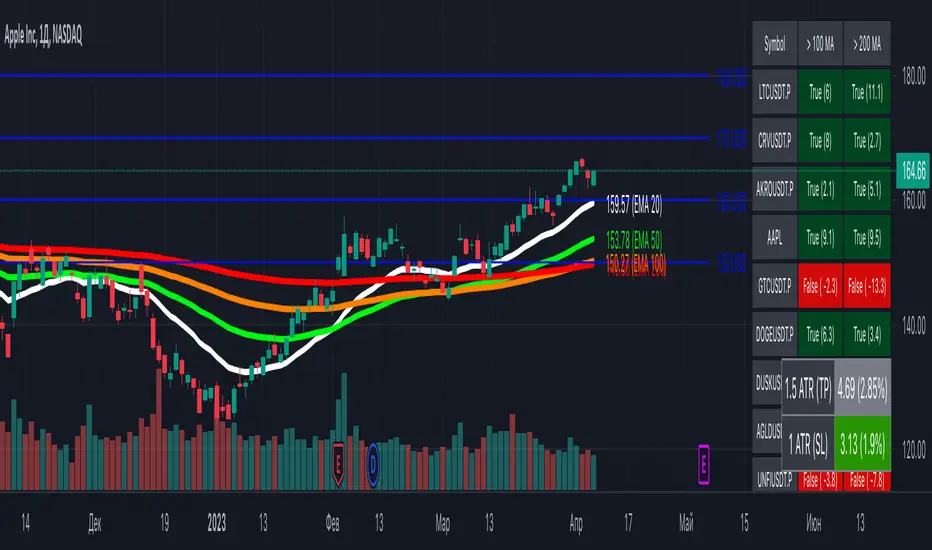
Aggressive Phase + Daily Buy Visual Screener — v6Aggressive Phase + Daily Buy Visual Screener — v6 for bullish, neutral and bearish zone identification
Cari dalam skrip untuk "screener"

ORB Screener-Multiple Indicators [Marin adjusted]ORB Screener for multiple instruments
You can select the range of the ORB and see different indicators for the selected instruments
Weekly % Change Screener (5% Sell Threshold)This is a weekly screener for a 5% change in the stock value. If it increases by 5%, we sell and if it decreases by 5% we buy the stock. Good for stable high value stocks. Buy before testing.
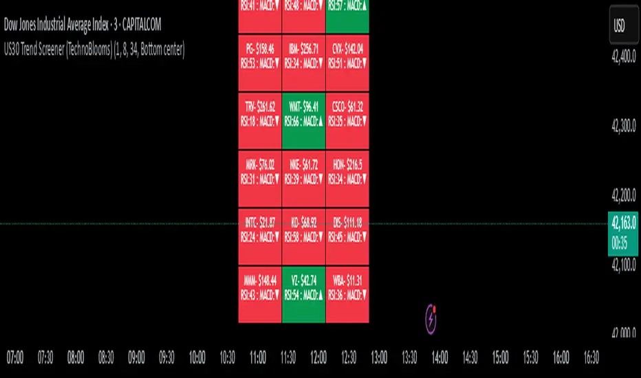
US30 Trend Screener (TechnoBlooms)Identify Index Trends Before the Move Starts.
The US30 Trend Screener is a powerful tool designed to help traders understand the internal dynamics of the Dow Jones Industrial Average (US30) by analyzing the trends of its weighted component stocks in real time.
📊 How It Works
This indicator uses EMA crossovers, RSI, and MACD signals from the 30 Dow Jones stocks and visualizes them in a compact, color-coded dashboard overlay on your chart.
You can choose your preferred lower timeframe (e.g., 1min, 5min, 15min) to analyze intraday momentum before the US30 index reflects the shift.
⏱ Timeframe Input
Select any minute-based timeframe (1–240 min) to suit your trading strategy.
Each stock’s trend data is fetched using your selected timeframe, so you can zoom in or out on price action dynamics.
It is recommended to select the timeframe closer to the chart timeframe in the indicator.
🚀 Key Features
✅ Component-Based Analysis: Tracks all 30 Dow stocks like MSFT, AAPL, GS, etc., with real-time price and indicator updates.
✅ Trend Detection: Uses EMA (8/34) crossover to determine bullish or bearish trends per stock.
✅ Momentum Signals: Shows RSI (14) values and MACD direction (▲ / ▼) for each stock.
✅ Color-Coded Dashboard:
🟩 Green = Bullish trend
🟥 Red = Bearish trend
✅ Compact Display: See 30 stocks in a 3-column grid format, updated every few bars for performance.
🧠 Pro Tips
🔍 Use shorter timeframes (1–5 min) to detect early trend shifts—perfect for scalping and intraday entries.
💼 Watch high-weight stocks like GS, MSFT, UNH. A shift in their trend often precedes index movement.
🎯 Combine with price action or SMC tools to confirm institutional moves and breakouts.
🚦 If most of the dashboard turns green/red at once, it often signals a strong momentum breakout or reversal.
💡 Ideal For:
Index traders (US30/DJI futures or CFDs)
Scalpers & day traders
Momentum and trend-following strategies
Traders who want to see the story behind the index move
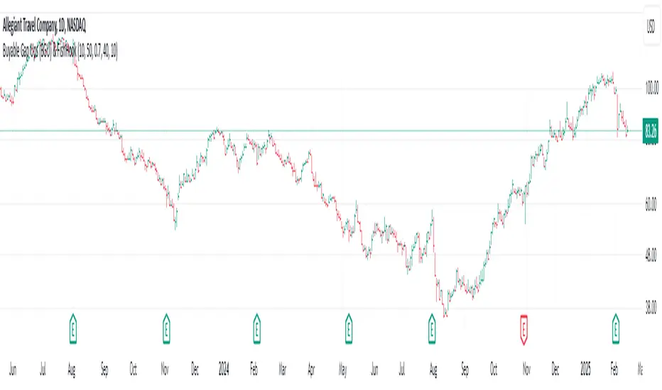
Buyable Gap Ups (BGU) ScreenerBuyable Gap Ups (BGU) Screener
This custom indicator detects Buyable Gap Ups (BGU), designed to identify stocks with significant price movements driven by gap-ups, often signaling strong bullish momentum. It helps traders spot potential opportunities where a stock has gapped up above the previous day's high with increased volume, suggesting the possibility of continued price strength.
Key Features:
Gap Percentage Threshold: Set a minimum gap percentage required for a valid buyable gap-up.
Volume Change Threshold: Identifies gap-ups accompanied by a significant increase in volume compared to the 50-day average.
ATR-Based Gap Detection (Optional): Use Average True Range (ATR) to determine whether the gap is large enough, factoring in recent volatility.
Customizable Lookback Period: Adjust the number of recent bars to track the frequency of BGU occurrences.
Volume Confirmation: Only signals buyable gaps when volume surpasses a defined threshold above the 50-day average.
Input Parameters:
Gap Percentage Threshold: Adjusts the minimum percentage gap for a valid signal.
Volume Change Threshold: Determines the minimum percentage increase in volume compared to the 50-day moving average.
Use ATR Gap: Option to use ATR to determine the minimum gap size instead of the percentage gap.
ATR Multiplier for Gap: Customizes the gap size based on the ATR.
ATR Length: Adjusts the lookback period for calculating ATR.
Lookback Period for BGU: Set the number of bars over which to calculate the BGU count.
Alerts & Signals:
The script will plot signals below bars where a valid BGU condition is met.
Alerts can be set for when a BGU is detected, giving real-time notifications for potential trading opportunities.
This indicator is designed to help traders find stocks showing strong bullish momentum, especially after earnings or other market-moving events, with the potential for continued uptrend. It is ideal for those looking to incorporate gap-based strategies in their trading.
[Spinn] ATH ScreenerThe indicator helps visualize the market’s state as a kind of heatmap, showing how far coins are from their all-time highs (ATH).
Since TradingView has a limitation on the number of coins processed simultaneously (no more than 40), all coins are divided into sets of 40 coins per set. If you place multiple copies of the indicator on the chart and assign a different set number in each copy, you can see the full picture for the exchange or the entire market.
The screener displays a table indicating the set number and the base currency (default is USDT).
For each coin, the following data is provided:
its name;
the distance from the current price to the ATH in percentage;
a 🔹 icon marks new coins (with a short price history);
coins that recently reached their ATH or ATL are highlighted in bold;
the background is colored as follows:
green — when less than 40% remains to the ATH;
red — when more than 60% remains;
blue — between 40% and 60%;
gray — when no data is available.
Hovering over a coin displays its name, current price, ATH and ATL values, and how many days ago they were reached.
Settings
Coin set number
Base currency (USDT)
Exchange
List of all coins on the exchange (comma-separated)*
No overlaps — if this option is enabled, tables with different sets will be placed one below the other.
Sorted — if this option is enabled, coins in the set will be sorted by their distance from ATH.
Colorize — whether to color the cell background with the specified colors or leave it light gray.
Bold ATH or ATL, days back — highlight coins in bold that recently reached an extreme (number of days is configurable).
New coins (🔹), days — mark young coins with a short price history using an icon (number of days is configurable).
Table width, % — approximate table width as a percentage of screen width.
Text size — text size in the table, from 1 to 3.
*Note: The default list was up-to-date at the time of the indicator’s publication. If certain coins are no longer traded, they will be marked with a dark gray background (no data).
Recommendation: to prevent the graph from obscuring the data, I recommend hiding it. This is done in the Object Tree, on the right side of the panel.
—
Индикатор помогает увидеть состояние рынка в виде своеобразной тепловой карты — как далеко монеты находятся от своих исторических максимумов (ATH).
Поскольку у TradingView есть ограничение на количество одновременно обрабатываемых монет (не более 40), все монеты разбиты на наборы по 40 монет в каждом. Если разместить на графике несколько копий индикатора и в каждой копии задать свой номер набора монет, можно видеть всю картину по бирже или рынку целиком.
Скринер выводит на экран таблицу с указанием номера набора монет и базовой валюты (по умолчанию — USDT).
Для каждой монеты указаны следующие данные:
её название;
расстояние от текущей цены до ATH в процентах;
значком 🔹 выделены новые монеты (с короткой историей графика);
жирным шрифтом выделены монеты, у которых ATH или ATL был достигнут недавно;
фон окрашен в такие оттенки:
зелёные — когда до ATH осталось менее 40%;
красные — более 60%;
голубые — между 40% и 60%;
серые — когда нет данных.
Если навести курсор на монету, будут показаны её название, текущая цена, значения ATH и ATL, а также сколько дней назад они были достигнуты.
Настройки
Номер набора монет
Базовая монета (USDT)
Биржа
Список всех монет на бирже (через запятую)*
No overlaps — если эта опция выделена, таблицы с разными наборами будут размещены одна под другой.
Sorted — если эта опция отмечена, монеты в наборе будут отсортированы по удалению от ATH.
Colorize — окрашивать ли фон ячеек в указанные выше цвета или оставить его светло-серым.
Bold ATH or ATL, days back — выделять жирным монеты, у которых недавно был достигнут экстремум (задаётся количество дней).
New coins (🔹), days — выделять значком молодые монеты, история графика которых небольшая (задаётся количество дней).
Table width, % — задаётся приблизительная ширина таблицы в процентах от ширины экрана.
Text size — размер текста в таблице, от 1 до 3.
*Примечание: заданный по умолчанию список был актуален на момент публикации индикатора. Если какие-то монеты перестали торговаться, они будут отмечены тёмно-серым фоном (нет данных).
Рекомендация: для того, чтобы график не заслонял данные, рекомендую его скрыть. Делается это в Дереве объектов, справа на панели.

Multi Timeframe Trend Screener [TradeDots]The "Multi Timeframe Trend Screener" is a trading indicator designed to assist traders in identifying the market trends of multiple assets within a single panel. This tool is invaluable for detecting shifts in trends, enabling traders to easily adjust their strategies under different market conditions.
HOW DOES IT WORK
Upon initialization, the indicator requires users to input two key pieces of information:
The assets to be monitored.
The timeframes to be analyzed.
The tool is capable of simultaneously tracking up to four assets across five distinct timeframes.
By specifying the type and length of the moving average, the indicator uses this data as a baseline to determine the current market trend.
A price movement below the moving average triggers a downward trend symbol (📉), indicating bearish conditions.
Conversely, a movement above the moving average displays an upward trend symbol (📈), signaling bullish conditions.
The aggregation of moving averages across various timeframes provides a comprehensive view of the overall market sentiment.
APPLICATION
In scenarios where the market consistently demonstrates an upward trend, each timeframe will display a bullish symbol. Shifts in market sentiment typically start in the shorter timeframes and can progressively affect longer ones if the trend continues.
This cascading effect allows the indicator to show all timeframes transitioning to a bearish orientation when the trend reverses.
The indicator also facilitates comparison between different assets. For assets with high correlation, a trend shift in one can often predict similar movements in correlated assets, thus allowing traders to swiftly adapt their strategies to align with new market conditions.
RISK DISCLAIMER
Trading entails substantial risk, and most day traders incur losses. All content, tools, scripts, articles, and education provided by TradeDots serve purely informational and educational purposes. Past performances are not definitive predictors of future results.

Multi-Pairs Stratrgy Backtesting ScreenerThis indicator is for viewing and checking the results of a specific strategy simultaneously on 25 currency pairs. Results such as number of trades, wins, losses, canceled trades and most importantly win rate.
Long condition is as follows:
Short condition is as follows:
An Alert Fibo Level is built in to indicate the buy or sell status.
Reset Deal Calculation Fibo Level , if the price hits it, the indicator resets all calculations and prepares for the next situation.
If Other situation appear after missed situation, indicator consider it:
All statistics collected in Screener Table :
Date Period:
Users can customize the date period during which the strategy is tested, allowing for a more granular analysis of performance over specific timeframes.
Entry:
Entry is based on Fibonacci level between the Lower Low and Higher High pivots for Long deals.
Entry is based on Fibonacci level between the Higher High and Lower Low pivots for Short deals.
Allowing a second entry
There is a feature that If the risk-to-reward ratio is below the specified input (rr), the trading deal wont initiate.
Stop Loss:
Adjustable based on Fibonacci levels , Base Pivot, Percent and ATR.
The Base Pivot is calculate from LL pivot point for Long and HH pivot point for short (not Entry price).
The Percent and ATR is calculate from Entry price.
Targets:
Adjustable based on Source, Fibonacci levels , Percent and ATR.
Source indicates the maximum (minimum) value between the open and close of the candle where the Higher High (Lower Low) pivot point was formed for Long (Short) deals.
Percent and ATR calculates from Entry 1 Price
Exit Methods :
The goal is to offer users a diverse set of exits before the price touches the target or stop loss.
1. Pending Entry Time-out
cancel pending entry based on candle counting since alert fired. (before deal started)
2. Active Deal Reverse
If a deal (long or short position) is currently open, and the reverse signal is emitted, the script will close the existing deal.
3. Reverse Deal Exit
If a deal (long or short position) is currently open, and the reverse signal is emitted, the script will automatically close the existing deal.
4. Move Exit
With this method, if Entry 2 is triggered, the deal will be closed when the price touches the Entry price.
5. Candle Counting Exit
This exit type is based on the number of candles since the deal started.

Cryptocurrency Altcoin Screener
This indicator works as a screener for bullish/bearish moves. There are two versions showing two different sets of Altcoins, just choose version 1 or 2. Load up any chart and it will show all selected pairs and their current state regardless of asset or timeframe. Assets can be shown/unshown and longs/shorts can be shown/unshown.
It shows (asset) +1 if it considers it bullish
(asset) -1 if it considers it bearish
(asset) 0 if considers the asset to be neutral/choppy
You can see how effective the indicator is by loading up the asset you're looking at, this will show the true history of the markers for that asset.
This script utilises MACD and RSI on the daily timeframe on both USDT and BTC pairs in order to identify a trend.
The main purpose of the script is to easily identify strong trends that allow you to do TA with rather than manually looking at every asset

Ticker Screener by Volume Heatmap [SS]Fun little screener that creates a heatmap by daily volume trend.
The numbers expressed are the Sell to Buy ratio (Selling volume / buying volume). The % is the % change over the lookback period.
The default lookback period is 25 days, but you can adjust it as you see fit. The brightness of the green and red will change based on the extent of buying / selling.
Anything 1 or over means there is a lot of selling. A percent change in the negatives is good, it means that selling is decreasing and buying is increasing. Vice versa for a percent change in the positives.
It will accomodate up to 12 tickers, there are some pre-set but you can obviously customize it with your own tickers of interest.
And that's pretty much the indicator, pretty simple indicator but I hope you enjoy!
Safe trades everyone!

Multi-Asset Performance [Spaghetti] - By LeviathanThis indicator visualizes the cumulative percentage changes or returns of 30 symbols over a given period and offers a unique set of tools and data analytics for deeper insight into the performance of different assets.
Multi Asset Performance indicator (also called “Spaghetti”) makes it easy to monitor the changes in Price, Open Interest, and On Balance Volume across multiple assets simultaneously, distinguish assets that are overperforming or underperforming, observe the relative strength of different assets or currencies, use it as a tool for identifying mean reversion opportunities and even for constructing pairs trading strategies, detect "risk-on" or "risk-off" periods, evaluate statistical relationships between assets through metrics like correlation and beta, construct hedging strategies, trade rotations and much more.
Start by selecting a time period (e.g., 1 DAY) to set the interval for when data is reset. This will provide insight into how price, open interest, and on-balance volume change over your chosen period. In the settings, asset selection is fully customizable, allowing you to create three groups of up to 30 tickers each. These tickers can be displayed in a variety of styles and colors. Additional script settings offer a range of options, including smoothing values with a Simple Moving Average (SMA), highlighting the top or bottom performers, plotting the group mean, applying heatmap/gradient coloring, generating a table with calculations like beta, correlation, and RSI, creating a profile to show asset distribution around the mean, and much more.
One of the most important script tools is the screener table, which can display:
🔸 Percentage Change (Represents the return or the percentage increase or decrease in Price/OI/OBV over the current selected period)
🔸 Beta (Represents the sensitivity or responsiveness of asset's returns to the returns of a benchmark/mean. A beta of 1 means the asset moves in tandem with the market. A beta greater than 1 indicates the asset is more volatile than the market, while a beta less than 1 indicates the asset is less volatile. For example, a beta of 1.5 means the asset typically moves 150% as much as the benchmark. If the benchmark goes up 1%, the asset is expected to go up 1.5%, and vice versa.)
🔸 Correlation (Describes the strength and direction of a linear relationship between the asset and the mean. Correlation coefficients range from -1 to +1. A correlation of +1 means that two variables are perfectly positively correlated; as one goes up, the other will go up in exact proportion. A correlation of -1 means they are perfectly negatively correlated; as one goes up, the other will go down in exact proportion. A correlation of 0 means that there is no linear relationship between the variables. For example, a correlation of 0.5 between Asset A and Asset B would suggest that when Asset A moves, Asset B tends to move in the same direction, but not perfectly in tandem.)
🔸 RSI (Measures the speed and change of price movements and is used to identify overbought or oversold conditions of each asset. The RSI ranges from 0 to 100 and is typically used with a time period of 14. Generally, an RSI above 70 indicates that an asset may be overbought, while RSI below 30 signals that an asset may be oversold.)
⚙️ Settings Overview:
◽️ Period
Periodic inputs (e.g. daily, monthly, etc.) determine when the values are reset to zero and begin accumulating again until the period is over. This visualizes the net change in the data over each period. The input "Visible Range" is auto-adjustable as it starts the accumulation at the leftmost bar on your chart, displaying the net change in your chart's visible range. There's also the "Timestamp" option, which allows you to select a specific point in time from where the values are accumulated. The timestamp anchor can be dragged to a desired bar via Tradingview's interactive option. Timestamp is particularly useful when looking for outperformers/underperformers after a market-wide move. The input positioned next to the period selection determines the timeframe on which the data is based. It's best to leave it at default (Chart Timeframe) unless you want to check the higher timeframe structure of the data.
◽️ Data
The first input in this section determines the data that will be displayed. You can choose between Price, OI, and OBV. The second input lets you select which one out of the three asset groups should be displayed. The symbols in the asset group can be modified in the bottom section of the indicator settings.
◽️ Appearance
You can choose to plot the data in the form of lines, circles, areas, and columns. The colors can be selected by choosing one of the six pre-prepared color palettes.
◽️ Labeling
This input allows you to show/hide the labels and select their appearance and size. You can choose between Label (colored pointed label), Label and Line (colored pointed label with a line that connects it to the plot), or Text Label (colored text).
◽️ Smoothing
If selected, this option will smooth the values using a Simple Moving Average (SMA) with a custom length. This is used to reduce noise and improve the visibility of plotted data.
◽️ Highlight
If selected, this option will highlight the top and bottom N (custom number) plots, while shading the others. This makes the symbols with extreme values stand out from the rest.
◽️ Group Mean
This input allows you to select the data that will be considered as the group mean. You can choose between Group Average (the average value of all assets in the group) or First Ticker (the value of the ticker that is positioned first on the group's list). The mean is then used in calculations such as correlation (as the second variable) and beta (as a benchmark). You can also choose to plot the mean by clicking on the checkbox.
◽️ Profile
If selected, the script will generate a vertical volume profile-like display with 10 zones/nodes, visualizing the distribution of assets below and above the mean. This makes it easy to see how many or what percentage of assets are outperforming or underperforming the mean.
◽️ Gradient
If selected, this option will color the plots with a gradient based on the proximity of the value to the upper extreme, zero, and lower extreme.
◽️ Table
This section includes several settings for the table's appearance and the data displayed in it. The "Reference Length" input determines the number of bars back that are used for calculating correlation and beta, while "RSI Length" determines the length used for calculating the Relative Strength Index. You can choose the data that should be displayed in the table by using the checkboxes.
◽️ Asset Groups
This section allows you to modify the symbols that have been selected to be a part of the 3 asset groups. If you want to change a symbol, you can simply click on the field and type the ticker of another one. You can also show/hide a specific asset by using the checkbox next to the field.

EMA Screener with Day BreakoutsThe present script is aimed at screening number of stocks as per user input with respect to Daily Exponential Moving Average. Default is set at 200 DEMA, it can be changed by the user from settings menu as per user's preference.
The EMA cell illuminates to Green if Day's Open < EMA
The EMA cell illuminates to Purple if Day's Open > EMA
EMU cell shows the price as, EMA * EMA Price Multiplier (i.e. range below EMA, customizable from settings by user)
EMU cell illuminates to light Green when Price > EMU (i.e. the price is in range of EMA, For example suppose EMA value is 1000 and EMA Price Multiplier is 0.95 then the EMU cell value will be 950 as soon as the price crosses above 950 the EMU cell will get illuminated)
EMD cell shows the price as, EMA * EMA Price Multiplier (i.e. range above EMA, customizable from settings by user)
EMD cell illuminates to red when Price < EMD (i.e. the price is in range of EMA, For example suppose EMA value is 1000 and EMA Price Multiplier is 1.05 then the EMD cell value will be 1050 as soon as the price crosses below 1050 the EMD cell will get illuminated)
The DBO (Day Break Out) cell illuminates to Blue when the current price is near Day's high.
--Dr. Vats
Disclaimer: Only for studying price movement ideas, trading is not advised.

Strategy - Relative Volume GainersStrategy - Relative Volume Gainers
Overview:
This trading strategy, called "Relative Volume Gainers," is designed for Long Entry opportunities in the stock market. The strategy aims to identify potential trading candidates based on specific technical conditions, including volume, price movements, and indicator alignments.
Strategy Rules:
The strategy is focused solely on Long Entry positions.
The volume for the current trading day must be greater than or equal to the volume of the previous day.
The percentage change in price must be greater than or equal to 2.5%.
The Last Traded Price (LTP) must be greater than or equal to the Exponential Moving Average (EMA) 200.
The Relative Volume for the current trading day (calculated over the last 30 days) must be greater than or equal to the Simple Moving Average (SMA) of Relative Volume over the same 30 days.
The current candle on the chart should be Green or Bullish, indicating positive price movement.
The price difference between bid and ask prices should be kept to a minimum.
It's recommended to also analyze market depth for better insights.
Strategy Requirements:
Add the Exponential Moving Average (EMA) 200 to your trading chart.
This strategy can be applied on charts of any timeframe.
For intraday trading, particularly for early entry, consider using a 1-minute timeframe.
It is advisable to create a screener to identify potential trades in real-time market conditions.
Risk Warning:
Stocks that meet the strategy criteria might exhibit high volatility and a high beta, making them inherently risky to trade. Exercise caution and adhere to predetermined risk management strategies.
Determine your trading quantity based on your entry price and stop loss in order to manage risk effectively.
Quantity Calculation Formula:
Quantity calculation is crucial to manage risk and position sizing. The following formulas can be used based on your trading scenario:
Quantity with Leverage:
Quantity = (((Using Capital / 100) * Risk Percent) / (Entry Price - Stop Loss)) * Leverage
Eg: Quantity = (((10000 / 100) * 0.2) / (405.5 - 398.5)) * 5
Quantity = 14
Risk = Rs.100 (Rs.100 is 1% of Rs.10000. So the risk is 1%, means we lose only Rs.100 when the SL is hit. If SL is increased the Quantity will get reduced to maintain a fixed risk of Rs.100)
Quantity without Leverage:
Quantity = (((Using Capital / 100) * Risk Percent) / (Entry Price - Stop Loss))
Note:
Always stay informed about market conditions and be prepared for potential rapid price movements when trading stocks that meet the strategy criteria. Strictly adhere to your predefined risk management strategy to safeguard your capital.
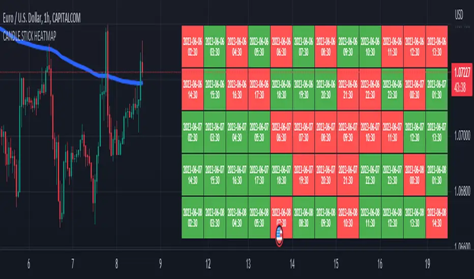
CANDLE STICK HEATMAPCANDLE STICK HEATMAP shows the statistics of a candle at a particular time. its very useful to find repeating pattern's at a particular time in a day.
based on the settings you can see regular repeating patterns of a day in an hourly chart. During a particular time in day there is always a down or up signal or candles.
The table boxes are candles in RED and GREEN based on open and close of the chart. The Heat map is very useful in analyzing the daily Hourly candlesticks in a week. The Time of each candlestick is plotted on the table along with default Indicators like RSI, MACD, EMA, VOLUME, ADX.
Additionally this can be used as a screener of candles on all timeframes. Analysis is easy when you want to see what happened exactly at a particular time in the previous hour, day, month etc.,
Hopefully additional updates will be introduced shortly.
Indicators:
1. MACD (close,12,26,9)
2.RSI (close,14)
3.EMA 200
3.Volume MA
Option is provided to show indicator statistics and time.
Color can be changed using settings.
Supports all Time Zones
BANKNIFTY position screenerThe script takes present day's price range of the stocks (stocks of the Index being tracked included in this screener) into account, to hint strength or weakness in the underlying Index (for example: BANKNIFTY here). The day's price range of a stock is gauged on a scale of 0-100, where 0 is Day's price low and 100 is day's price high.
If a stock is in 90-100 price range section the cell with title "90" illuminates hinting the stock is trading near day's high.
Likewise, if a stock is in 0-10 price range section the cell with title "10" illuminates hinting that the stock is trading near day's low.
The price range of 10-25 is represented in the cell titled "25"
The price range of 75-90 is represented in the cell titled "75"
Only one cell from the day's range illuminates at a time for a stock, signaling the present position of that stock in the Day's range at that instant.
The script works best above 10 second time frame.
Idea: If majority of the heavy weight stocks of the Index being tracked are trading near Day's high the underlying Index must be going strong at that very instant and Vice versa.
Disclaimer: Only for studying Index movement ideas intraday, trading is not advised.

5EMA BollingerBand Nifty Stock Scanner
What ?
We all heard about (well: over-heard) 5-EMA strategy. Which falls into the broader category of mean reversal type of trading setup.
What is mean reversal?
Price (or any time series, in fact) tries to follow a mean . Whenever price diverges from the mean it tries to meet it back.
It is empirically observed by some traders (I honestly don't know who first time observed it) that in Indian context specially, 5 Exponential Moving Average (5-EMA) works pretty good as that mean.
So whenever price moves away from that 5-EMA, it ultimately comes back and attain total nirvana :) Means: if price moved way higher than the 5EMA without touching it, then price will correct to meet it's 5-EMA and if price moved way lower, it will be uplifted to meet it's 5-EMA. Funny - but it works !
Now there are already enough social media coverage on this 5-EMA strategy/setup. Even TradingView has some excellent work done on these setups. Kudos to all those great souls.
So when we came to know about this, we were thinking what we should do for the community. Because it is well cover topic (specially in Indian context). Also, there are public indicators.
Then we thought why not come up with a scanner which will scan all the Nifty-50 constituent stocks and find out on the fly, real-time which all stocks are matching this 5-EMA setup and causing a Buy/Sell trade recommendation.
Hence here we are with the first version of our first scanner on the 5EMA setup (well it has some more masala than merely a 5-EMA setup).
Why?
Parts of why is already covered up.
Now instead of blindly following 5-EMA setup, we added the Bollinger band as well. Again: it's also not new. There are enough coverage in social media about the 5-EMA+BB strategy/setup. We mercilessly borrowed from all of these.
Suppose you have an indicator.
Now you apply the indicator in your chart. And then you need to (rock) and roll through your watchlist of Nifty-50 stocks (note: TradingView has no default watchlist of Nifty-50 stock by default - you have to create one custom watchlist to list all manually) to find out which all are matching the setup, need to take a note about the trade recomendations (entry, SL, target) and other stuffs like VWAP, Volume, volatility (Bollinger Band Width).
Not any more.
This scanner will track all the Nifty-50 stocks (technically: 40 stocks other than Banking stocks) and provide which one to Buy or Sell (if any), what's the entry, SL, target, where is the VWAP of the day, what's the picture in volume (high, low, rising, falling) and the implied volatility (using Bolling band width). Also it has a naive alerting mechanism as well.
In fact the code is there to monitor the (Future) OI also and all the OI drama (OI vs price and all the 4 stuffs like long build up, long unwinding, short covering, short buildup). But unfortunately, due to some limitations of the TradingView (that one can not monitor more than 40 `ta.security` call) we have to comment out the code. If you wish you can monitor only 20 stocks and enable the OI monitoring also (20 for stocks + 20 for their OI monitoring .. total 40 `ta.security` call).
How?
To know the divergence from 5-EMA we just check if the high of the candle (on closing) is below the 5-EMA. Then we check if the closing is inside the Bollinger Band (BB). That's a Buy signal. SL: low of the candle, T: middle and higher BB.
Just opposite for selling. 5-EMA low should be above 5-EMA and closing should be inside BB (lesser than BB higher level). That's a Sell signal. SL: high of the candle, T: middle and lower BB.
Along with we compare the current bar's volume with the last-20 bar VWMA (volume weighted moving average) to determine if the volume is high or low.
Present bar's volume is compared with the previous bar's volume to know if it's rising or falling.
VWAP is also determined using `ta.vwap` built-in support of TradingView.
The Bolling Band width is also notified, along with whether it is rising or falling (comparing with previous candle).
Simple, but effective.
Customization
As usual the EMA setup (5 default), the BB setup (20 SMA with 1.5 standard deviation), we provided option wherther to include or exclude BB role in the 5-EMA setup (as we found out there are two schools of thought .. some people use BB some don't. Lets make all happy :))
We also provide options to choose other symbols using Settings if they wish so. We have the default 40 non banking Nifty stocks (why non-banking? - Bank Nifty is in ATH :) .. enough :)). But if user wishes can monitor others too (provided the symbol is there in TradingView).
Although we strongly recommend the timeframe as 30 minutes , you can choose what's fit you most.
The output of the scanner is a table. By default the table is placed in the right-bottom (as we are most comfortable with that). However you can change per your wish. We have the option to choose that.
What is unique in it ?
This is more of an indicator. This is a scanner (of Nifty-50 stocks). So you can apply (our recommendation is in 30m timeframe) it to any chart (does not matter which chart it is) and it will show every 30 mins (which is also configurable) which all stocks (along with trade levels) to Buy and Sell according to the setup.
It will ease your trading activity.
You can concentrate only on the execution, the filtering you can leave it to this one.
Limitations
There is a build in limitation of the TradingView platform is that one can call only upto 40 securities API. Not beyond that. So naturally we are constraint by that. Otherwise we could monitor 190 Nifty F&O stocks itself.
30m is the recommended timeframe. In very lower (say 5m) this script tends to go out of heap (out of memory). Please note that also.
How to trade using this?
Put any chart in 30m (recommended) timeframe.
Apply this screener from Indicators (shortcut to launch indicators is just type / in your keyboard).
This will provide the Buy (shown in green color) or Sell (shown in red color) recommendations in a table, at every 30m candle closing.
Note the volume and BB width as well.
Wait for at least 2 5-minutes candles to close above/below the recommended level .
Take the trade with the SL and target mentioned.
Mentions
@QuantNomad. The whole implementation concept we mercilessly borrowed from him, even some of his code snippet we took it (after asking him through one of his videos comment section and seeking explicit permission which he readily granted within an hour). Thank You sir @QuantNomad. Indebted to you.
Monika (Rawat) ji: for reviewing, correcting, providing real time examples during live market hours, often compromising her own trading activities, about the effectiveness and usefulness of this setup. Thank You madam ji. Indebted to you.
There are innumerable contents in social media about this. Don't even know whom all we checked. Thanks to all of them.
Happy Trading (in stocks - isn't enough of Indices already?)
Disclaimer
This piece of software does not come up with any warrantee or any rights of not changing it over the future course of time.
We are not responsible for any trading/investment decision you are taking out of the outcome of this indicator.

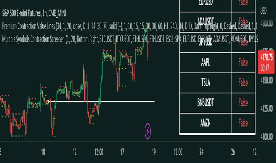
Master Pattern ScreenerMaster Pattern Screener
This is an indicator based on the concept known as the Forex Master Pattern, which contains three phases. The contraction, expansion, and trend phases This indicator, based on your current timeframe, finds out if there is a contraction on 10 symbols that you can customize to suit your needs.
How does it work?
The indicator is a table, and it finds 10 different symbols on the current timeframe that you have selected. Then it does volume and volatility calculations to determine if a contraction is occurring, which is the first phase and probably the most important phase in the FOREX MASTER PATTERN .
This indicator is meant to be used in conjunction with our contraction plotter. We would have placed this indicator in the contraction and expansion plotter, but there were memory limitation issues, so we placed it in a separate indicator.
How traders can use this indicator
The contraction phase is extremely important because once a contraction is occurring, what always happens is an expansion. Some traders will avoid placing trades in the contraction phase, while others will enter to use the momentum for their trades. This indicator just makes it more convenient to identify the contraction phases.
Examples of the indicator:
Things you should know
The symbols can be customized to whatever you want. You can choose your own stocks, cryptocurrencies, currencies, etc.
Make sure that it's exactly the same; if you use, for example, BTCUSDT Coinbase but check on BTCUSDT Binance, then it may show inaccurate results.
Since this script involves a decent amount of calculations, it may not work properly in low timeframes, like anything less than a minute.
Fundamental ScreenerThis indicator is designed to compare the year-over-year earnings and sales growth, as well as the P/E ratio of up to 10 stocks simultaneously .
This provides valuable insights into the fundamental performance of multiple stocks at the same time, allowing traders to quickly identify which stocks are outperforming or underperforming their peers.
The earnings and sales growth figures are calculated on a year-over-year basis , comparing the most recent quarter to the same quarter 1 year ago.
The P/E ratio is a valuation metric that measures a company's stock price relative to its trailing twelve months earnings per share.
By comparing these three key metrics across multiple stocks, traders can quickly identify which stock in a group has superior fundamentals.
Customization
Chose to compare 5 or 10 symbols
Table position, color, and size
[MiV] MA Screener v1.0In my trading I stick to the following strategy: I buy an asset above the 100/200 moving average and then sell it.
The most problematic thing in all this is to look for assets that are above the 100 or 200 moving average, and to assess how "far" the price is from that moving average.
In fact, to solve this problem I created this indicator.
It works with 30 different assets and displays the state of its two moving averages, whether the price is higher or not, and how much higher the price is from that level.
Divergence Indicator Screener [Trading Solutions]It's been a while since the last publication on the platform. We've been studying the charts and developing some interesting strategies and indicators, so we'll be posting some ideas in the near future.
Overview
This indicator allows you to find divergences between the price action and the classic RSI. It has the ability to anticipate trend changes.
Highs and Lows are determined using Pivot Points, wich can be adjusted in settings.
You can use this indicator to find two kind of divergences, Regular and Hidden:
Regular is when price makes a higher high, but the RSI makes a lower high
Hidden is when price makes a lower high, but the RSI makes a higher high
The opposite case for Bearish Divergence
The most important functionality of this indicator is that we can be alerted when a divergence occurs in different trading pairs, without the necessity of checking different charts at the same time, and seize opportunities offered by the market. You only have to go to Alerts Tab , click on Create Alert , select Divergence Indicator Screener and wait for the Notification in your favorite device.
You can choose any ticker to be plotted on chart and even add a new one.
Settings
To get everything started with this indicator, here are the different inputs:
RSI Settings: Period y Source
Pivot Point: Left and Right lookback bars
Filter Divergences: Regular and Hidden and max and min distance from the pivot points to consider a valid divergence
Draw table and Filter how much bars to look for a divergence in the past and plot it in the table: The fewer bars, less divergences shown
We hope you can take the most of this tool, and helps improve your day to day trading. Feel free to comment and make suggestions. We will be updating soon

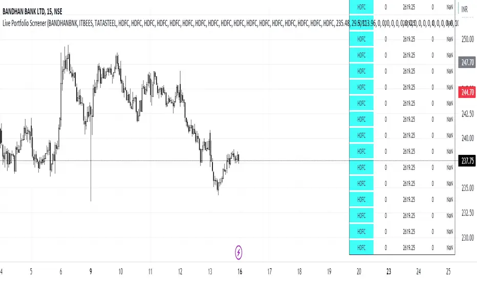
Live Portfolio ScreenerThe live portfolio screener indicator is a tool that help users to track the performance of their investments in real-time. The indicator provides a detailed breakdown of the user's portfolio, including the current profit and loss (P&L) for each stock that is invested in. This allows users to quickly and easily see how their portfolio is performing and make informed decisions about their investments on charts. Overall, this tool is an essential tool for anyone looking to stay on top of their investments and make data-driven decisions.
This indicator can load any symbol globally usable.
How to use this indicator ?
in this indicator firstly
you have add script name. (For example if you want to add symbol you have add in 's01 ' means the first symbol)
after that
you have to add price for each (For example if you want to add buy price for the first symbol then add the buy price in ' Bp01 ')
then the quantity comes in picture which is below price list and named here as Bq01 which means 'Buy quantity for first symbol'
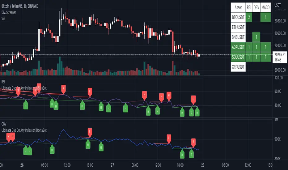
Multi-Indicator Divergence ScreenerHere is a new screener for everyone.
I have applied my Better Divergence On Any Indicator logic to scan 3 different indicators and up to 6 different assets at one time. Shoutout to LonesomeTheBlue and QuantNomad for their respective work on divergence and scanner scripts. I've implemented similar logic to put together this scanner.
So far, I have added support for RSI, OBV, MACD, MFI, Stochastic, and FSR, though I'm happy to add more by request. Please note, for simplicity, I have removed the logic to filter for only overbought/oversold divergences. Because this can scan both centered oscillators and non-centered indicators, overbought/oversold does not apply to all of them. I may try to find a way to work in back in later, as time allows.
Personally, I like to find confluences different types of indicators. For instance, agreeable divergence with a centered strength oscillator like RSI and a volume based indicator like OBV gives me more confidence that there will be follow-through.
Like in the Better Divergence script, you can opt to scan for confirmed divergences, potential divergences, or both.
You have the option to show or hide a table that will tell you exactly which assets have divergence, on which indicator they were found, and how many points of divergence were identified. By default, bull divergences will be green, bear will be red, but you can change these base colors to your liking. Confirmed divergences are shown with a solid background, while potentials (if selected) are shown with transparent background. If all 3 of your chosen indicators have divergence in the same direction, the asset name will show in the bull or bear color to highlight the confluence.
Alerts have also been set up to fire on bar close. The message will essentially tell you the same thing the table does, but in condensed format.
You can choose to have alerts fire any time there is any divergence detected across all assets, only when there are divergences on at least 2 of the chosen indicators for a given asset, or limit them to only when all 3 indicators show divergence in agreement.
Indian Bank Nifty ScreenerIndian Bank Nifty Screener (IBNS) is a comprehensive table displaying the following parameters for Bank Nifty constituents:
Op = Open Price of the Day.
LaP = Last Price.
O-L = Open Price of the Day - Last Price.
ROC = Rate of Change .
SMA20 = Simple Moving Average 20 period.
S20d = Last Price - SMA 20.
SMA50 = Simple Moving Average 50 period.
S50d = Last Price - SMA 50.
SMA200 = Simple Moving Average 200 period.
S200d = Last Price - SMA 200.
ADX(14) = Average Directional Index.
RSI(14) = Relative Strength Index.
CCI(20) = Commodity Channel Index.
ATR(14) = Average True Range.
MOM(10) = Momentum.
CMF(20) = Chaikin Money Flow.
MACD = Moving Average Convergence Divergence.
Sig = MACD signal.
The first row displays individual banks on selection from Input Box in “Settings”.
User after visiting the “Settings” menu simply is required to select the “input symbol” from the stock listed in the “Option” Box. Automatically the selected bank name with parameter details is displayed in first row.
The other rows starting with “Nifty50” and with ” Bank Nifty” in second row, displays static individual Bank Nifty stocks starting from third row.
