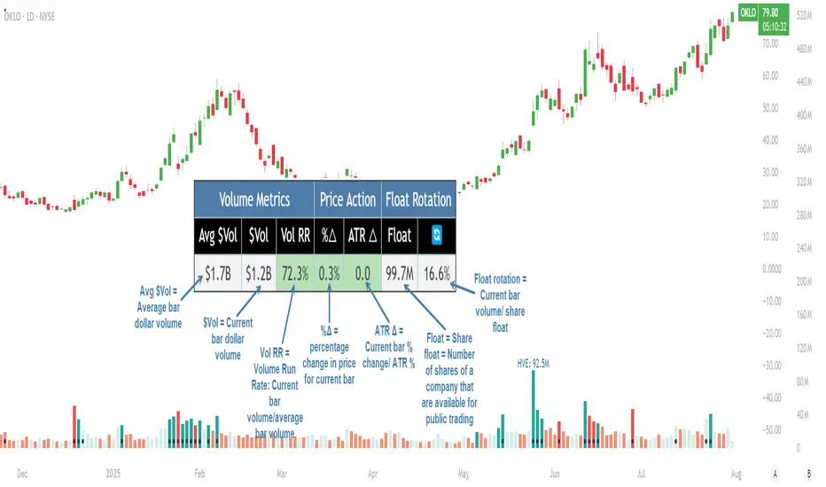
Pristine Volume AnalysisThe Pristine Volume Analysis indicator organizes volume, liquidity, and share structure data, allowing users to quickly gauge the relative volume a security is trading on, and whether it is liquid enough to trade🏆
Volume is an important metric to track when trading, because abnormally high volume tends to occur when a new trend is kicking off, or when an established trend is hitting a climax.
Track only the most important metrics, reducing mental clutter and noise:
▪ Volume run rate - Candle volume/ Avg candle volume
▪ Security liquidity - Average volume and average dollar volume
▪ Float rotation - Candle volume/ Float
This script automatically detects and flags the following conditions on volume bars:
▪ High volume run rate buying/selling based on user-defined thresholds
▪ HVE (highest volume ever) & HVY (highest volume in a year)
▪ High float rotation based on user-defined thresholds
Settings and Preferences
Customize this script based by setting preferred colors and thresholds:
Custom Alerts on HVE and HVY
Set custom alerts on a single equity or an entire watchlist to receive notifications when volume hits HVE or HVY.
Screen for HVE or HVY
Using the Pine Screener, scan watchlists for equities that have reached HVE or HVY.
Note: The Pine Screener is limited to calculations on the last 500 bars. If a symbol has less than 500 bars and has reached HVE, it will be included in the screener results. All symbols with more than 500 historical bars will not be included in the scan.
Volume Analysis Use Case : Confirming a breakout (1/3)
A high volume run rate as a stock breaks out to new highs can confirm a change of character and increase the odds of success on long setups. SMCI put in an HVE candle in January '24, sparking a super-performance run.
1-Month follow-through +137%
SMCI had plenty of gas left in the tank after putting in it's first HVE candle. The rest is history!
Volume Analysis Use Case : Gauging sentiment (2/3)
When a stock advances on repeated high run rate volume and an increasing angle of ascent (parabolic) , it can be a good indication that sentiment is overheated and it is time to reduce exposure to the stock.
Note:25% is the default float rotation threshold. This value can be customized based on your own trading style and preferences.
Following the parabolic ascent on high volume run rate and float rotation, HIMS topped, falling ~67% over the next two months!
Volume Analysis Use Case : Passing on a meme stock (3/3)
High float rotation often goes hand-in-hand with high stock volatility. One might opt out of trading a stock if it is outside their risk tolerance.
Cari dalam skrip untuk "screener"
Order Block Matrix [Alpha Extract]The Order Block Matrix indicator identifies and visualizes key supply and demand zones on your chart, helping traders recognize potential reversal points and high-probability trading setups.
This tool helps traders:
Visualize key order blocks with volume profile histograms showing liquidity distribution.
Identify high-volume price levels where institutional activity occurs.
rank historical order blocks and analyze their strength based on volume.
Receive alerts for potential trading opportunities based on price-block interactions.
🔶 CALCULATION
The indicator processes chart data to identify and analyze order blocks:
Order Block Detection
Inputs:
Price action patterns (consolidation areas followed by breakouts).
Volume data from current and lower timeframes.
User-defined lookback periods and thresholds.
Detection Logic:
Identifies consolidation areas using a dynamic range comparison.
Confirms breakout patterns with percentage threshold validation.
Maps volume distribution across price levels within each order block.
🔶Volume Analysis
Volume Profiling:
Divides each order block into configurable grid segments.
Maps volume distribution across price segments within blocks.
Highlights zones with highest volume concentration.
Strength Assessment:
Calculates total block volume and relative strength metrics.
Compares block volume to historical averages.
Determines probability of reversal based on volume patterns.
isConsolidation(len) =>
high_range = ta.highest(high, len) - ta.lowest(high, len)
low_range = ta.highest(low, len) - ta.lowest(low, len)
avg_range = (high_range + low_range) / 2
current_range = high - low
current_range <= avg_range * (1 + obThreshold)
🔶 DETAILS
Visual Features
Volume Profile Histograms:
Color-coded bars showing volume concentration within order blocks.
Gradient coloring based on relative volume (high volume = brighter colors).
Bull blocks (green/teal) and bear blocks (red) with varying opacity.
Block Visualization:
Dynamic box sizing based on volume concentration.
Optional block borders and background fills.
Volume labels showing total block volume.
Screener Table:
Real-time analysis of order block metrics.
Shows block direction, proximity, retest count, and volume metrics.
Color-coded for quick reference.
Interpretation
High Volume Areas: Zones with institutional interest and potential reversal points.
Block Direction: Bullish blocks typically support price, bearish blocks typically resist price.
Retests: Multiple tests of an order block may strengthen or weaken its influence.
Block Age: Newer blocks often have stronger influence than older ones.
Volume Concentration: Brightest segments within blocks represent the highest volume areas.
🔶 EXAMPLES
The indicator helps identify key trading opportunities:
Bullish Order Blocks
Support Zones: Identify strong support levels where price is likely to bounce.
Breakout Confirmation: Validate breakouts with volume analysis to avoid false moves.
Retest Strategies: Enter trades when price retests a bullish order block with high volume.
Bearish Order Blocks
Resistance Zones: Identify strong resistance levels where price is likely to reverse.
Distribution Areas: Detect zones where smart money is distributing to retail.
Short Opportunities: Find optimal short entry points at high-volume bearish blocks.
Combined Strategies
Order Block Stacking: Multiple aligned blocks create stronger support/resistance zones.
Block Mitigation: When price breaks through a block, it often indicates a strong trend continuation.
Volume Profile Applications: Higher volume segments provide more precise entry and exit points.
🔶 SETTINGS
Customization Options
Order Block Detection:
Consolidation Lookback: Adjust the period for consolidation detection.
Breakout Threshold: Set minimum percentage for breakout confirmation.
Historical Lookback Limit: Control how far back to scan for historical order blocks.
Maximum Order Blocks: Limit the number of visible blocks on the chart.
Visual Style:
Grid Segments: Adjust the number of volume profile segments.
Extend Blocks to Right: Enable/disable extending blocks to current price.
Show Block Borders: Toggle border visibility.
Border Width: Adjust thickness of block borders.
Show Volume Text: Enable/disable volume labels.
Volume Text Position: Control placement of volume labels.
Color Settings:
Bullish High/Low Volume Colors: Customize appearance of bullish blocks.
Bearish High/Low Volume Colors: Customize appearance of bearish blocks.
Border Color: Set color for block outlines.
Background Fill: Adjust color and transparency of block backgrounds.
Volume Text Color: Customize label appearance.
Screener Table:
Show Screener Table: Toggle table visibility.
Table Position: Select positioning on the chart.
Table Size: Adjust display size.
The Order Block Matrix indicator provides traders with powerful insights into market structure, helping to identify key levels where smart money is active and where high-probability trading opportunities may exist.

Altitude Alpha | QuantEdgeB✨ Altitude Alpha | Altcoin Screener by QuantEdgeB ✨
1. Objective
Altitude Alpha is a quantitative altcoin screener designed to systematically identify the strongest outperforming assets from a universe of 20 selected altcoins. With 7 layered filters and a robust scoring engine, this system empowers traders to focus only on high-potential candidates, eliminating guesswork and emotional bias and maximize opportunity cost.
2. 🧠 Purpose & Core Philosophy
The primary goal of Altitude Alpha is not to trigger buy or sell signals, but to highlight where strength is concentrated in the altcoin space. In the most volatile and noisy market environment, relative strength is your compass. By identifying coins that not only outperform their peers but also meet trend, volatility, and statistical benchmarks, Altitude Alpha becomes your strategic alpha-finder.
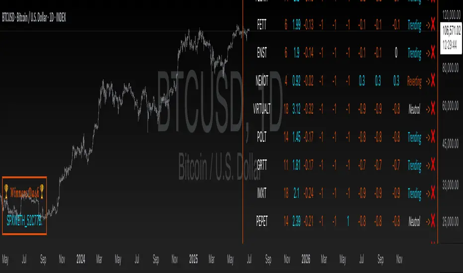
💡 Winners are displayed visually and intuitively in the “🏆 Winners Dash” table at the bottom left.
3. ⚙️ What Makes It Powerful?
Altitude Alpha uses a multi-dimensional 7-filter scoring model built around these components:
🔹 1. Relative Strength Matrix
Each altcoin is scored relative to all others in the pool using pairwise strength logic. The result: the strongest of the strong rise to the top.
🔹 2. Trend Structure
Three independent trend assessments are used to validate the momentum. A coin must sustain multi-angle trend agreement to pass.
🔹 3. Regime Filter
Filters out noisy environments. Only coins in “Trending” or strong “Neutral” regimes are considered.
🔹 4. Beta Screening
Measures each asset’s sensitivity compared to the broader market (BTC Index by default). Higher beta = higher potential volatility-based opportunity.
🔹 5. Alpha Screening
Only assets showing positive alpha—returns exceeding what their beta would explain—are considered worthy of your attention.
🔹 6. Composite Score Threshold
Trend + Regime + Alpha/Beta strength must all align for a coin to qualify.
🔹 7. Top N Rank Filter
Customize your scope: allocate to top 1, 2, 3...5 ranked altcoins dynamically, based on their total composite score.
4. 🧪 Backtest Mode Explained
Altitude Alpha includes an optional backtest simulation, allocating capital to the currently top-ranked assets. This model applies equal-weight dynamic allocation to assets that pass all filters.
⚠️ Disclaimer:
1. While the backtest feature demonstrates performance potential, this is not the recommended live trading mode. The best use-case for Altitude Alpha is asset selection, not execution. Combine it with your personal trading edge or system for superior risk/reward and entry timing.
2. Past performance is not indicative of future performance. Always conduct your own research before investing!
5. ✅ Recommended Use
• Use Altitude Alpha to scan for the best-performing altcoins.
• Select 1–3 assets from the “🏆 Winners Dash” panel.
• Apply your own entry strategy or confirmation setup (e.g., price action, strategies, valution alignment, market structure, etc.)
• Only allocate capital when your personal system confirms opportunity.
• You may optionally allocate based on the system itself—just be aware this introduces higher exposure and risk.
6. 🧬 Customization Features
• 🖌️ Multiple color palettes (Strategy, Solar, Warm, Cool, etc.)
• 🌓 Text readability toggles (Dark/Light)
• 🔢 Adjustable Alpha/Beta periods and benchmark (BTC by default)
• 🔁 Allocation rank selection (Top 1–5)
7. 📈 Visual Output & Dashboards
• 🔍 Altitude Alpha Dashboard — Complete transparency into ranks, trends, scores, and regimes.
• 🏆 Winners Dash Table — Clean, minimal summary of top-selected altcoins.
• 📊 Backtest Panel — Equity curve and stats (Sharpe, Sortino, Omega, Max Drawdown).
• 🌌 Futuristic Glow Plotting — High-contrast equity visuals with layered gradients.
Conclusion & Key Highlights
Altitude Alpha is not just a screener—it's a precision instrument designed to cut through market noise and systematically reveal where true strength lies in the altcoin universe.
While most traders are busy chasing hype, Altitude Alpha offers clarity through quantitative filtration. It’s not about timing the perfect entry. It’s about focusing attention on the highest-potential coins, so you never waste energy on underperformers again.
📌 Key Takeaways:
🧭 Purpose-Built-> Helps identify the strongest altcoin out of 20 dynamically.
🧮 7-Layer Filter Logic-> Combines trend, regime, alpha, beta, and composite strength into one decision engine.
📊 Winners Dash Panel-> Clean display of current top performers — no noise, just output.
⚙️ Backtest Feature-> Optional equity curve based on rotating into ranked leaders (educational use).
🔎 Customizable Framework-> Tweak ranking depth, visual style, and filter sensitivity.
✅ Best Use Case ->Select strong coins, then apply your own entry strategy - maximize risk/reward.
📌 Trade with Statistical Precision | Powered by QuantEdgeB
🔹 Disclaimer: Past performance is not indicative of future results.
🔹 Strategic Advice: Always backtest, optimize, and align parameters with your trading objectives and risk tolerance before live trading.
Swing Trade TarayıcıSwing Trade Scanner (v6) User Guide
1. Purpose:
This TradingView indicator (written in Pine Script v6) is designed to help identify swing trading opportunities. It calculates an overall trend strength and direction score by combining multiple technical analyses for up to 20 financial assets (stocks, cryptocurrencies, forex, etc.) that you specify. It presents the results in a customizable table, allowing you to quickly scan the market.
2. Analyses Used and Their Roles:
By default, the indicator uses the following 4 main technical analyses:
EMA Crossover (Default: 9/21): Used to capture short-term trend direction and potential momentum shifts. When the fast EMA (9) crosses above the slow EMA (21), it's considered a bullish signal; when it crosses below, it's a bearish signal. It's often one of the main entry/exit triggers.
RSI (Relative Strength Index - Default: 14): Measures the speed of price movements to identify overbought (OB) and oversold (OS) conditions. Reversals from the OB zone can signal potential downturns, while reversals from the OS zone can signal potential upturns. It also provides insight into the strength of the momentum.
MACD (Moving Average Convergence Divergence - Default: 12, 26, 9): A trend-following momentum indicator. The relationship between the MACD line and the signal line (crossovers) and the state of the histogram (position relative to the zero line) are used to confirm momentum shifts and trend strength.
ADX/DI (Average Directional Index - Default: 14, 14): Measures the strength (ADX) and direction (+DI/-DI lines) of a trend. Its main role is to filter signals from other indicators. A trend is considered to exist if the ADX is above a certain threshold (e.g., 25). +DI above -DI indicates an uptrend, and the reverse indicates a downtrend.
3. Scoring System:
The indicator calculates an individual score for each analysis and then combines these scores using weights you define to create a final Trend Score:
Individual Scores: Each analysis (EMA, RSI, MACD, ADX/DI) generates a decimal score between -1.0 (Strong Negative/Bearish) and +1.0 (Strong Positive/Bullish) based on its own rules. For example, RSI might score +1.0 if oversold, -1.0 if overbought, and 0.0 if neutral. MACD and ADX/DI scores can also take intermediate values reflecting both direction and strength (e.g., ±1.0, ±0.6, ±0.3, 0.0).
Weighting: In the settings, you can assign a weight (between 0.0 and 1.0) to each analysis, determining how much it influences the final score. For instance, you might give EMA crossover a higher weight and use RSI with a lower weight.
Total Score: The individual scores of the active analyses are multiplied by their assigned weights and summed up. This total is then divided by the sum of the weights of the active analyses to obtain a final, normalized Trend Score between -1.0 and +1.0. This score represents the combined view of all analyses.
4. Trend Determination:
The calculated final Trend Score is classified into an overall TREND status based on threshold values you set in the settings:
S.UP (Strong Up): Score > Strong Up Threshold (Default: 0.70)
UP: Up Threshold < Score <= Strong Up Threshold (Default: 0.35 < Score <= 0.70)
NEUTRAL: Down Threshold <= Score <= Up Threshold (Default: -0.35 <= Score <= 0.35)
DOWN: Strong Down Threshold <= Score < Down Threshold (Default: -0.70 <= Score < -0.35)
S.DOWN (Strong Down): Score < Strong Down Threshold (Default: -0.70)
This classification allows you to see at a glance which assets have strong trend potential.
5. Table Structure and Meanings:
The indicator displays the results in a table with the following columns:
TICKER: The symbol of the analyzed asset (abbreviated).
TREND: The overall trend status determined by the total score (S.UP, UP, NEUTRAL, DOWN, S.DOWN). The background color of this column also reflects this overall trend (Dark Green, Green, Gray, Red, Dark Red).
SCORE: The calculated weighted total score (between -1.00 and +1.00, with two decimal places). The background color of this column also reflects the overall trend.
EMA: Shows the result of only the EMA 9/21 analysis.
▲: EMA(9) > EMA(21) (Green Background)
▼: EMA(9) < EMA(21) (Red Background)
N: Neutral (Gray Background)
-: Analysis disabled or no data (Pale Gray Background)
RSI: Shows the result of only the RSI analysis.
OS: Oversold (RSI < 30) (Green Background)
M+: Mid Positive (30 <= RSI < 45) (Light Green/Lime Background)
N: Neutral (45 <= RSI <= 55) (Gray Background)
M-: Mid Negative (55 < RSI <= 70) (Orange Background)
OB: Overbought (RSI > 70) (Red Background)
-: Analysis disabled or no data (Pale Gray Background)
MACD: Shows the result of only the MACD analysis.
S+: Strong Positive (MACD > Signal AND Histogram > 0) (Green Background)
M+: Mid Positive (MACD > Signal BUT Histogram < 0) (Light Green/Lime Background)
N: Neutral (Other cases) (Gray Background)
M-: Mid Negative (MACD < Signal BUT Histogram > 0) (Orange Background)
S-: Strong Negative (MACD < Signal AND Histogram < 0) (Red Background)
-: Analysis disabled or no data (Pale Gray Background)
ADX/DI: Shows the result of only the ADX/DI analysis.
S+: Strong Uptrend (ADX > 40 AND +DI > -DI) (Green Background)
M+: Mid Uptrend (25 < ADX <= 40 AND +DI > -DI) (Light Green/Lime Background)
W: Weak Trend (ADX <= 25) (Gray Background)
M-: Mid Downtrend (25 < ADX <= 40 AND -DI > +DI) (Orange Background)
S-: Strong Downtrend (ADX > 40 AND -DI > +DI) (Red Background)
-: Analysis disabled or no data (Pale Gray Background)
6. Settings (Inputs):
You can customize the indicator's behavior using the following settings:
General Settings:
Analysis Timeframe: Select the timeframe for the scans (Leave blank to use the chart timeframe).
Auto Adjust Parameters and Weights: If checked, predefined parameters and weights based on the selected timeframe (1h, 4h, 1D, 1W) are used. If unchecked, or if an unsupported timeframe is selected, the manual settings below apply.
Strong/Normal Up/Down Thresholds: Adjust the score thresholds used to determine the TREND column.
Analysis Settings (Separate Group for Each Analysis):
Enable ... Analysis: Check to include the respective analysis in the score.
... Weight (Manual): If auto-adjust is off, set the weight of this analysis in the total score.
... Period/Level (Manual): If auto-adjust is off, adjust the parameters (period, level, etc.) of the respective indicator.
Symbols (1-10):
Checkbox: Check to include the respective symbol in the scan.
Text Box: Enter the symbol of the asset you want to analyze (e.g., "NASDAQ:AAPL", "BINANCE:BTCUSDT").
Table Settings:
Table Position: Choose where the table appears on the chart.
Cell Width: Adjust the width of the table cells.
Text Size: Select the general size of the text in the table (individual analysis columns are usually shown one size smaller).
7. How to Use:
Add the indicator to your TradingView chart.
Enter the indicator settings.
In the Symbols section, enter the symbols of the assets you want to analyze and check the boxes next to them.
In the General Settings section, select your desired Analysis Timeframe.
Decide whether the Auto Adjust Parameters and Weights option should be checked. If not, adjust the manual parameters and weights for each indicator in the Analysis Settings section according to your strategy.
Examine the table:
The TREND and SCORE columns give you a general overview. Focus on strong signals (S.UP, S.DOWN) or states that have just crossed thresholds (UP, DOWN).
The EMA, RSI, MACD, ADX/DI columns allow you to see in detail which analyses influenced the overall score. You can track confirming or conflicting signals here.
Combine these scan results with other rules of your swing trading strategy (support/resistance, patterns, risk management, etc.) to make trading decisions.
8. Important Notes:
This indicator does not constitute financial advice. It is merely a tool that combines technical analysis tools to help you scan the market.
The default parameters and weights in the indicator settings are for general use. For best results, it is strongly recommended that you optimize these settings by backtesting them on historical data according to your own strategy, the assets you trade, and market conditions.
No technical indicator or system generates 100% accurate signals. Always apply risk management principles and do not trade with money you cannot afford to lose.
I hope this guide helps you use the indicator effectively!

Democratic MultiAsset Strategy [BerlinCode42]Happy Trade,
Intro
Included Trade Concept
Included Indicators and Compare-Functions
Usage and Example
Settings Menu
Declaration for Tradingview House Rules on Script Publishing
Disclaimer
Conclusion
1. Intro
This is the first multi-asset strategy available on TradingView—a market breadth multi-asset trading strategy with integrated webhooks, backtesting capabilities, and essential strategy components like Take Profit, Stop Loss, Trailing, Hedging, Time & Session Filters, and Alerts.
How It Trades? At the start of each new bar, one asset from a set of eight is selected to go long or short. As long there is available cash and the selected asset meets the minimum criteria.
The selection process works through a voting system, similar to a democracy. Each asset is evaluated using up to five indicators that the user can choose. The asset with the highest overall voting score is picked for the trade. If no asset meets all criteria, no trade is executed, and the cash reserve remains untouched for future opportunities.
How to Set Up This Market Breadth Strategy:
Choose eight assets from the same market (e.g., cryptos or big tech stocks).
Select one to five indicators for the voting system.
Refine the strategy by adjusting Take Profit, Stop Loss, Hedging, Trailing, and Filters.
2. Voting as the included Trade Concept
The world of financial trading is filled with both risks and opportunities, and the key challenge is to identify the right opportunities, manage risks, and do both right on time.
There are countless indicators designed to spot opportunities and filter out risks, but no indicator is perfect—they only work statistically, hitting the right signals more often than the wrong ones.
The goal of this strategy is to increase the accuracy of these Indicators by:
Supervising a larger number of assets
Filtering out less promising opportunities
This is achieved through a voting system that compares indicator values across eight different assets. It doesn't just compare long trades—it also evaluates long vs. short positions to identify the most promising trade.
Why focus on one asset class? While you can randomly select assets from different asset classes, doing so prevents the algorithm from identifying the strongest asset within a single class. Think about, within one asset class there is often a major trend whereby different asset classes has not really such behavior.
And, you don’t necessarily need trading in multiple classes—this algorithm is designed to generate profits in both bullish and bearish markets. So when ever an asset class rise or fall the voting system ensure to jump on the strongest asset. So this focusing on one asset class is an integral part of this strategy. This all leads to more stable and robust trading results compared to handling each asset separately.
3. Included Indicators and Compare-Functions
You can choose from 17 different indicators, each offering different types of signals:
Some provide a directional signal
Some offer a simple on/off signal
Some provide both
Available Indicators: RSI, Stochastic RSI, MFI, Price, Volume, Volume Oscillator, Pressure, Bilson Gann Trend, Confluence, TDI, SMA, EMA, WMA, HMA, VWAP, ZLMA, T3MA
However, these indicators alone do not generate trade signals. To do so, they must be compared with thresholds or other indicators using specific comparison functions.
Example – RSI as a Trade Signal. The RSI provides a value between 0 and 100. A common interpretation is:
RSI over 80 → Signal to go short or exit a long trade
RSI under 20 → Signal to go long or exit a short trade
Here, two comparison functions and two thresholds are used to determine trade signals.
Below is the full set of available comparison functions, where: I represents the indicator’s value and A represents the comparator’s value.
I < A if I smaller A then trade signal
I > A if I bigger A then trade signal
I = A if I equal to A then trade signal
I != A if I not equal to A then trade signal
A <> B if I bigger A and I smaller B then trade signal
A >< B if I smaller A then long trade signal or if I bigger B then short trade signal
Image 1
In Image 1, you can see one of five input sections, where you define an indicator along with its function, comparator, and constants. For our RSI example, we select:
Indicator: RSI
Function: >< (greater/less than)
Comparator: Constant
Constants: A = 20, B = 80
With these settings a go short signal is triggered when RSI crosses above 80. And a go long signal is triggered when RSI crosses below 20.
Relative Strength Indicator: The RSI from the public TradingView library provides a directional trade signal. You can adjust the price source and period length in the indicator settings.
Stochastic Relative Strength Indicator: As above the Stoch RSI offers a trade signal with direction. It is calculated out of the RSI, the stochastic derivation and the SMA from the Tradingview library. You can set the in-going price source and the period length for the RSI, for the Stochastic Derivation and for the SMA as blurring in the Indicator settings section.
Money Flow Indicator: As above the MFI from the public Tradingview library offers a trade signal with direction. You can set the in-going price source and the period length in the Indicator settings section.
Price: The Price as Indicator is as simple as it can be. You can chose Open, High, Low or Close or combinations of them like HLC3 or even you can import an external Indicator. The absolute price or value can later be used to generate a trade signals when certain constant thresholds or other indicators signals are crossed.
Volume: Similar as above the Volume as Indicator offers the average volume as absolute value. You can set the period length for the smoothing and you can chose where it is presented in the base currency $ or is the other. For example the trade pair BTCUSD you can chose to present the value in $ or in BTC.
Volume Oscillator: The Volume Oscillator Indicator offers a value in the range of . Whereby a value close to 0 means that the volume is very low. A value around 1 means the volume is same high as before and Values higher as 1 means the volume is bigger then before. You can set the period length for the smoothing and you can chose where it is presented in the base currency $ or is the other. For example the trade pair BTCUSD you can chose to present the value in $ or in BTC.
Pressure Indicator: The Pressure is an adapted version of LazyBear's script (Squeeze Momentum Indicator) Pressure is a Filter that highlight bars before a bigger price move in any direction. The result are integer numbers between 0 and 4 whereby 0 means no bigger price move excepted, while 4 means huge price move expected. You can set the in-going price source and the period length in the Indicator settings section.
Bilson Gann Trend: The Bilson Gann Trend Indicator is a specific re-implementation of the widely known Bilson Gann Count Algorithm to detect Highs and Lows. On base of the last four Highs and Lows a trend direction can be calculated. It is based on 2 rules to confirm a local pivot candidate. When a local pivot candidate is confirmed, let it be a High then it looks for Lows to confirm. The result range is whereby -1 means down trend, 1 means uptrend and 0 sideways.
Confluence: The Confluence Indicator is a simplified version of Dale Legan's "Confluence" indicator written by Gary Fritz. It uses five SMAs with different periods lengths. Whereby the faster SMA get compared with the (slower) SMA with the next higher period lengths. Is the faster SMA smaller then the slower SMA then -1, otherwise +1. This is done with all SMAs and the final sum range between . Whereby values around 0 means price is going side way, Crossing under 0 means trend change from bull to bear. Is the value>2 means a strong bull trend and <-2 a strong bear trend.
Trades Dynamic Index: The TDI is an adapted version from the "Traders Dynamic Index" of LazyBear. The range of the result is whereby 2 means Top goShort, -2 means Bottom goLong, 0 is neutral, 1 is up trend, -1 is down trend.
Simple Moving Average: The SMA is the one from the Tradingview library. You can compare it with the last close price or any other moving average indicator to indicate up and down trends. You can set the in-going price source and the period length in the Indicator settings section.
Exponential Moving Average: The EMA as above is the one from the Tradingview library. You can compare it with the last close price or any other moving average indicator to indicate up and down trends. You can set the in-going price source and the period length in the Indicator settings section.
Weighted Moving Average: The WMA as above is the one from the Tradingview library. You can compare it with the last close price or any other moving average indicator to indicate up and down trends. You can set the in-going price source and the period length in the Indicator settings section.
Hull Moving Average: HMA as above is the one from the Tradingview library. You can compare it with the last close price or any other moving average indicator to indicate up and down trends. You can set the in-going price source and the period length in the Indicator settings section.
Volume Weighted Average Price: The VWAP as above is the one from the Tradingview library. You can compare it with the last close price or any other moving average indicator to indicate up and down trends. You can set the in-going price source in the Indicator settings section.
Zero Lag Moving Average: The ZLMA by John Ehlers and Ric Way describe in their paper: www.mesasoftware.com
As the other moving averages you can compare it with the last close price or any other moving average indicator to indicate up and down trends. You can set the in-going price source and the period length in the Indicator settings section.
T3 Moving Average: The T3MA is the one from the Tradingview library. You can compare it with the last close price or any other moving average indicator to indicate up and down trends. You can set the in-going price source, the period length and a factor in the Indicator settings section. Keep this factor at 1 and the T3MA swing in the same range as the input. Bigger 1 and it swings over. Factors close to 0 and the T3MA becomes a center line.
All MA's following the price. The function to compare any MA Indicators would be < or > to generate a trade direction. An example follows in the next section.
4. Example and Usage
In this section, you see how to set up the strategy using a simple example. This example was intentionally chosen at random and has not undergone any iterations to refine the trade results.
We use the RSI as the trade signal indicator and apply a filter using a combination of two moving averages (MAs). The faster MA is an EMA, while the slower MA is an SMA. By comparing these two MAs, we determine a trend direction. If the faster MA is above the slower MA the trend is upwards etc. This trend direction can then be used for filtering trades.
The strategy follows these rules:
If the RSI is below 20, a buy signal is generated.
If the RSI is above 80, a sell signal is generated.
However, this RSI trade signal is filtered so that a trade is only given the maximum voting weight if the RSI trade direction aligns with the trend direction determined by the MA filter.
So first, you need to add your chosen assets or simply keep the default ones. In Image 2, you can see one of the eight asset input sections.
Image 2
This strategy offers some general trade settings that apply equally to all assets and some asset-specific settings. This distinction is necessary because some assets have higher volatility than others, requiring asset-specific Take Profit and Stop Loss levels.
Once you have made your selections, proceed to the Indicators and Compare Functions for the voting. Image 3 shows an example of this setup.
Image 3
Later on go to the Indicator specific settings shown in Image 4 to refine the trade results.
Image 4
For refine the trade results take also a look on the result summary table, development of capital plot, on the list of closed and open trades and screener table shown in Image 5.
Image 5
To locate any trade for any asset in the chronological and scroll-able trade list, each trade is marked with a label:
An opening label displaying the trade direction, ticker ID, trade number, invested amount, and remaining cash reserves.
A closing label showing the closing reason, ticker ID, trade number, trade profit (%), trade revenue ($), and updated cash reserves.
Additionally: a green line marks each Take Profit level. An orange line indicates the (trailing) Stop Loss.
The summary table in the bottom-left corner provides insights into how effective the trade strategy is. By analyzing the trade list, you can identify trades that should be avoided.
To find those bad trades on the chart, use the trade number or timestamp. With replay mode, you can go back in time to review a specific trade in detail.
Image 6
In Image 6, you can see an example where replay mode and the start time filter are used to display specific trades within a narrow time range. By identifying a large number of bad trades, you may recognize patterns and formulate conditions to avoid them in the future.
This is the backtesting tool that allows you to develop and refine your trading strategy continuously. With each iteration—from general adjustments to detailed optimizations—you can use these tools to improve your strategy. You can:
Add other indicators with trade signals and direction
Add more indicators signals as filter
Adjust the settings of your indicators to optimize results
Configure key strategy settings, such as Time and Session Filters, Stop Loss, Take Profit, and more
By doing so, you can identify a profitable strategy and its optimal settings.
5. Settings Menu
In the settings menu you will find the following high-lighted sections. Most of the settings have a i mark on their right side. Move over it with the cursor to read specific explanation.
Backtest Results: Here you can decide about visibility of the trade list, of the Screener Table and of the Results Summary. And the colors for bullish, side ways, bearish and no signal. Go above and see Image 5.
Time Filter: You can set a Start time or deactivate it by leave it unhooked. The same with End Time and Duration Days . Duration Days can also count from End time in case you deactivate Start time.
Session Filter: Here, you can chose to activate trading on a weekly basis, specifying which days of the week trading is allowed and which are excluded. Additionally, you can configure trading on a daily basis, setting the start and end times for when trades are permitted. If activated, no new trades will be initiated outside the defined times and sessions.
Trade Logic: Here you can set an extra time frame for all indicators. You can enable Longs or Shorts or both trades.
The min Criteria percentage setting defines the minimum number of voices an asset has to get to be traded. So if you set this to 50% or less also weak winners of the voting get traded while 100% means that the winner of the voting has to get all possible voices.
Additionally, you have the option to delay entry signals. This feature is particularly useful when trade signals exhibit noise and require smoothing.
Enable Trailing Stop and force the strategy to trade only at bar closing. Other-ways the strategy trade intrabar, so when ever a voting present an asset to trade, it will send the alert and the webhooks.
The Hedging is basic as shown in the following Image 7 and serves as a catch if price moves fast in the wrong direction. You can activate a hedging mechanism, which opens a trade in the opposite direction if the price moves x% against the entry price. If both the Stop Loss and Hedging are triggered within the same bar, the hedging action will always take precedence.
Image 6
Indicators to use for Trade Signal Generating: Here you chose the Indicators and their Compare Function for the Voting . Any activated asset will get their indicator valuation which get compared over all assets. The asset with the highest valuation is elected for the trade as long free cash is present and as long the minimum criteria are met.
The Screener Table will show all indicators results of the last bar of all assets. Those indicator values which met the threshold get a background color to high light it. Green for bullish, red for bearish and orange for trade signals without direction. If you chose an Indicator here but without any compare function it will show also their results but with just gray background.
Indicator Settings: here you can setup the indicator specific settings. for deeper insights see 3. Included Indicators and Compare-Functions .
Assets, TP & SL Settings: Asset specific settings. Chose here the TickerID of all Assets you wanna trade. Take Profit 1&2 set the target prices of any trade in relation to the entry price. The Take Profit 1 exit a part of the position defined by the quantity value. Stop Loss set the price to step out when a trade goes the wrong direction.
Invest Settings: Here, you can set the initial amount of cash to start with. The Quantity Percentage determines how much of the available cash is allocated to each trade, while the Fee percentage specifies the trading fee applied to both opening and closing positions.
Webhooks: Here, you configure the License ID and the Comment . This is particularly useful if you plan to use multiple instances of the script, ensuring the webhooks target the correct positions. The Take Profit and Stop Loss values are displayed as prices.
6. Declaration for Tradingview House Rules on Script Publishing
The unique feature of this Democratic Multi-Asset Strategy is its ability to trade multiple assets simultaneously. Equipped with a set of different standard Indicators, it's new democratic Voting System does more robust trading decisions compared to single-asset. Interchangeable Indicators and customizable strategy settings allowing for a wide range of trading strategies.
This script is closed-source and invite-only to support and compensate for over a year of development work. Unlike other single asset strategies, this one cannot use TradingView's strategy functions. Instead, it is designed as an indicator.
7. Disclaimer
Trading is risky, and traders do lose money, eventually all. This script is for informational and educational purposes only. All content should be considered hypothetical, selected post-factum and is not to be construed as financial advice. Decisions to buy, sell, hold, or trade in securities, commodities, and other investments involve risk and are best made based on the advice of qualified financial professionals. Past performance does not guarantee future results. Using this script on your own risk. This script may have bugs and I declare don't be responsible for any losses.
8. Conclusion
Now it’s your turn! Chose an asset class and pick 8 of them and chose some indicators to see the trading results of this democratic voting system. Refine your multi-asset strategy to favorable settings. Once you find a promising configuration, you can set up alerts to send webhooks directly. Configure all parameters, test and validate them in paper trading, and if results align with your expectations, you even can deploy this script as your trading bit.
Cheers

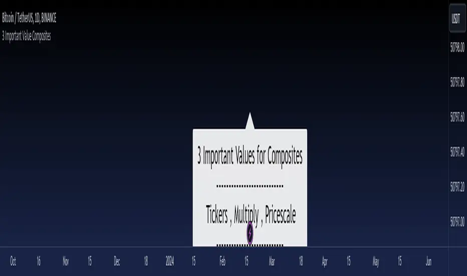
3 Important Value CompositesCalculated on February 17, 2024. USDT 378 items, BTC 282 items, BINANCE
This is a watchlist, along with the most accurate computed values that I could achieve. It may be beneficial for those who want to change values from the "120x ticker screener (composite tickers)" indicator, which is one of the excellent indicators to bypass the limitation of the request. security() function that limits to only 40 requests. I've thought about this before but couldn't succeed, but someone finally did it. :)
--> 120x ticker screener (composite tickers)
Thank you once again for this idea.
You must look for this and change it.
t1 = 'symbol', n1 = Multiply , r1 = Pricescale(decimal)
Example of grouping: Group 1
BINANCE:ETHUSDT , BINANCE:FDUSDUSDT , BINANCE:BTCUSDT
2, 4, 2
13, 10
█ Note
• Tickers: For your watchlist, arrange them from left to right, pairing them in groups of 3.
• Pricescale: This represents the decimal length, arrange them from left to right, pairing them in groups of 3.
• Multiply: This involves multiplying the first 2 items in each pair of watchlists. Arrange them from left to right, pairing them in groups of 2.
* If you group items incorrectly, it may lead to inaccurate results.
* Please be advised that if one of the values in the "Pricescale"(decimal) trio changes, there may be a need to adjust those values accordingly to ensure correct digit separation. Otherwise, within the group, the numbers might appear peculiar.
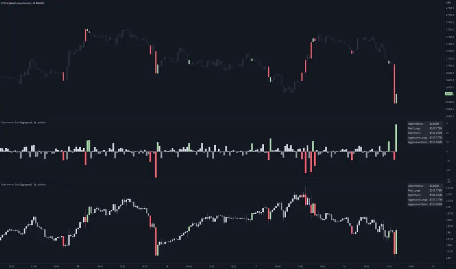
Open Interest Suite [Aggregated] - By LeviathanThis script is an all-in-one indicator that uses aggregated Open Interest data to plot OI candles, Open Interest Delta, OI x rVOL, and OI RSI. It also includes tools such as an OI Distribution profile, large OI increase/decrease coloring, a Stats Screener, and much more.
You can select and have the script plot the following:
- Open Interest in the form of OHLC candles
- Open Interest Delta in the form of a histogram
- Open Interest x Relative Volume in the form of a histogram
- Open Interest RSI in the form of a line
Additional features include:
- OI Distribution Profile (It shows the distribution of open interest in the visible range on y axis. This makes it easier to identify when Open Interest is relatively high or low and at which values most of the action took place)
- Stats screener (The screener includes the real-time net Open Interest value, Rekt Longs/Rekt Shorts based on large OI decreases and Aggressive Longs/Shorts based on large OI increases)
- Coloring (You can color OI Delta nodes, background and chart candles based on large OI increases/decreases)
- more
Instructions for the settings will be provided in the tooltips shortly.
Full credit goes to @KioseffTrading for the profile generation code.
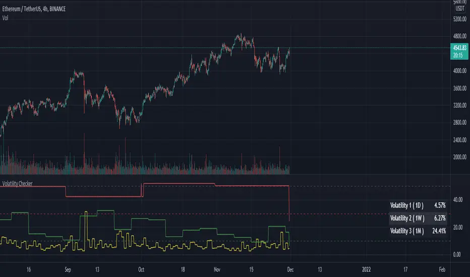
Volatility CheckerWhenever we want to find out volatility of the current chart, we need to visit screener and check the latest percentage. Because of this frustration by visiting screener page, I made this script. And there is no script like this, so it's open and free to use.
This script is detect current percentage of volatility as indicator way. Screener show default 1D volatility. But this script is not only show 1D volatility. You can change the resolution whatever you like. And you can switch more resolution style. But I think, 1D resolution is better. This script is best for crypto investors. I've no idea about stock/forex, so hmmmmm.
Hline helps you to detect the position of the volatility. I always like to check those symbol which is less than 30. Because it's best for scalping. Less than 10 is best for swing traders.
Feel free to use. Any feedback? welcome to comment zone :)
Stochastic RSI Heat Bollinger BandsThis indicator is based on a combination of the famous Bollinger Bands and the Stochastic RSI indicator.
Bands are dynamically colored (and filled) with a RGB color composed by red and green values, directly generated from the average Stochastic RSI current value.
By default, colors represent the following status -> green zone is overgought & red zone is oversold.
A screener is also displayed on the chart, representing StochRSI K and D lines values, RSI value, as well as the current status (Overbought/Oversold) of the StochRSI and RSI indicators.
Notes:
The heat color and the screener status are both based on the average value between the K and D lines (for stochastic RSI based heat)
Bands can be disabled in options to use this indicator as a simple moving average colored by the Stochastic RSI heat color.
Options:
Various moving average types (SMA, EMA, SMMA, VWMA...)
Inversion of colors between overbought and oversold status
Enabling/disabling heat color on bands / basis line and bands background color
Show/Hide the screener
Color source can be modified to base the heat on the RSI instead of the Stochastic RSI value
Standards Bollinger bands, Stochastic and RSI parameters
Example
Feel free to suggest any improvements in comment.

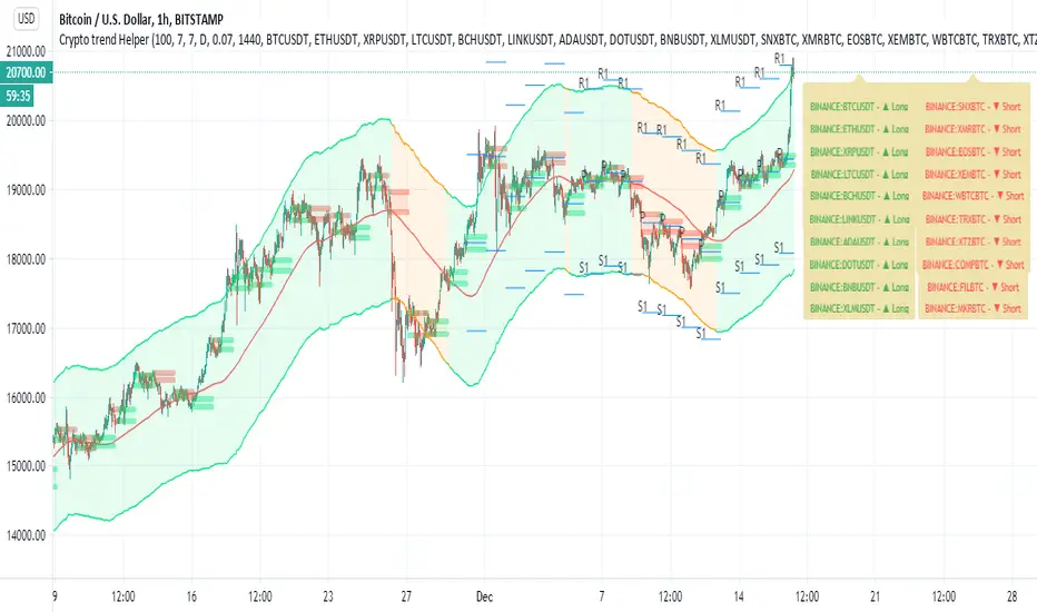
Crypto trend HelperThis is a good tool for chart 2 hours and bellow
the screener script taken from //script taken from with his consent.
long and short determine by my script Trend M version 1
it set up to daily MTF so if it above the mean it green or buy,bellow it it sell
R1 and S1 by percentage from mean set to 7 % or 0.07
the channel is percentage channel set to 7 % up or low
the color of this channel set by
it function to see long trends
you can modify the alts inside the script or in menu\
thanks for Zekis for it help in the screener
[M2J] Indicator | Turtle Atom Duck Signal Turtle Atom Duck shows potential buy and sell
It consist of 3 indicators
Turtle - Donchian Channel
- bullish when price close above previous 1 bar high
- bearish when price close below previous 1 bar low
Atom - Bollinger Band
- bullish when price close above upper band
- bearish when price close below lower band
Duck - Moving Average (Default 50-period EMA)
- bullish when price close above moving average
- bearish when price close below moving average
When all 3 are bullish, buy signal appears
When all 3 are bearish, sell signal appears
Screener Turtle Atom Duck
Example:
FBMKLCI
Technology Sector
Health Sector
TOPGLOV
BINTAI
XOX
PRLEXUS
JCY
EURUSD
XAUUSD

BEST ABCD Pattern StrategyHello traders
This is the strategy version of this script
I - Concept
I present to you, ladies and gentlemen, the first screener for harmonic patterns.
Starting with an ACBD pattern screener this time!!
I used the calculations from Ricardo Santo's script
In short, he's using fractals (regular or Bill Williams ) for the pattern calculations. A masterpiece !!!
II - Definitions
The ABCD pattern ( AB=CD ) is one of the classic chart patterns which is repeated over and over again.
The ABCD pattern shows perfect harmony between price and time.
The Williams Fractal is an indicator, developed by Bill Williams, that aims to detect reversal points (highs and lows) and marks them with arrows.
Up fractals and down fractals have specific shapes. The Williams Fractal indicator helps users determine in which direction price will develop
💎Strategy filters💎
I included some cool backtest filters:
- flexible take profit in USD value (plotted in blue)
- flexible stop loss in USD value (plotted in red)
The take profit and stop loss should work with Forex/FX pairs as well
All the BEST
Dave

{PREMIUM} Support And Resistance ScriptSupport and resistance is a trading technique that has been around for decades. In simple terms, support and resistance is a measure of supply and demand. While this sounds simple, it is very difficult to identify support and resistance as they happen in real time.
Luckily, we have a solution. The script you see below is a custom software that was developed by Mike that automatically identifies the best price levels to buy (support) at and sell (resistance) at. The software uses a proprietary algorithm that identifies when stocks are undervalued and overvalued. When a stock is undervalued, a blue diamond and the word "SUPPORT" will automatically appear on your chart. Additionally, when a stock is overvalued, a black flag and the word "RESISTANCE" will automatically appear on your chart.
When you sign up for our program you have 100% full access to use the support and resistance script on all major stock exchanges, global currency pairs, worldwide indexes, 30+ crypto exchanges, and more. In addition to having completely automatic support and resistance points on your chart, you will have exclusive access to a screener that scans through 19,000 stocks every night and finds the best stocks to buy now. The screener shows stocks that have huge upside potential with minimal downside risk. The stocks on the list are in the $1 - $300 price range, so this screener is suitable for all types of traders.

Whale KitThe Whale Kit is an all-in-one trading toolkit created by ChartPrime, providing a powerful set of indicators and analytical tools. It’s designed with simplicity in mind—clean inputs, intuitive visuals, and straightforward logic—so traders of all experience levels can make informed, confident decisions. This guide gives an overview of each component within the Whale Kit for J Bravo and explains some of the deeper mechanics behind them.
Features of the Whale Kit
Whale Candles
Whale Candles offer a unique visualization of price action by color-coding candles based on their angle relative to previous movement. This allows traders to instantly recognize trend strength and momentum shifts. Users can enable or disable the Whale Candle theme with a single toggle.
Whale Sequential
The Whale Sequential is a refined take on the classic sequential, designed to better detect trend exhaustion. Instead of simply counting consecutive candles, the Whale Sequential analyzes trend angle, giving a more accurate picture of momentum.
By factoring in the slope of the trend—not just higher or lower closes—it can highlight when a trend is weakening even before the traditional 9-count would appear.
When a potential exhaustion is detected, the system prints a “9” along with an optional label for easier visibility. This upgraded angle-based approach often provides earlier and more reliable insight into trend fatigue compared to traditional methods.
Whale Fibonacci Bands
The Whale Fibonacci Bands combine Fibonacci mathematics with a proprietary weighted-average formula to create a dynamic, adaptive price channel. These bands help traders identify key support, resistance, and directional bias in real time.
The system applies the metallic mean (golden/silver mean variations) to the input series, shifting more weight toward recent price action. This results in a smoother, more responsive channel that adapts quickly to market changes while still respecting classical Fibonacci behavior.
The outcome is a highly reliable, intuitive set of bands that reflect both volatility and trend—giving traders a clear visual roadmap of where price is likely to react.
Moving Averages
The suite includes the Whale 9 Moving Average along with several structural moving averages such as the 200-day and 200-week MA. These are custom-tuned, lower-lag moving averages designed to react faster than standard MAs without excessive noise. Users can toggle each MA individually to tailor their chart to their trading style.
The Whale Screener
The Whale Screener allows users to quickly scan for conditions such as active 9-counts, price relative to the Whale 9 MA, above or below the 200-day MA, and readings derived from the Whale Bands. It offers a fast, simplified way to identify setups across multiple market environments.

Golden Cross and Death Cross IndicatorThis screener identifies key technical signals known as the Golden Cross and Death Cross on any TradingView chart. The Golden Cross occurs when the 50-day simple moving average (SMA) crosses above the 200-day SMA, signaling a potential bullish trend or buy opportunity. Conversely, the Death Cross happens when the 50-day SMA crosses below the 200-day SMA, indicating a potential bearish trend or sell signal.
This indicator visually plots both SMAs on the price chart and marks the crossover points with clear green (buy) and red (sell) triangles. It also includes alert conditions for both signals, enabling traders to receive real-time notifications when these important trends develop.
Ideal for swing traders, investors, and technical analysts, this screener helps spot long-term trend shifts effectively, improving timing for entries and exits. It serves as a reliable tool to complement broader trading strategies focused on momentum and trend-following approaches.

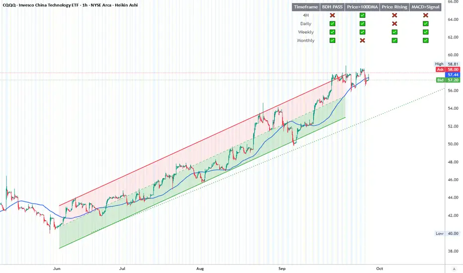
BDH Multi‑Timeframe Dashboard 📊 BDH Multi-Timeframe Dashboard (4H, D, W, M)
The Buy Don’t Hold (BDH) Screener is inspired by the book Buy—Don’t Hold by Leslie N. Masonson. It is designed to rotate into the strongest ETFs during bullish phases while stepping aside in weak markets.
✅ How It Works
The screener evaluates three filters across multiple timeframes (4H, Daily, Weekly, Monthly):
Price > 100-DMA
Price Rising (close > lookback)
MACD > Signal
Each timeframe earns a PASS if at least 2 out of 3 conditions are met.
🖥️ Features
Multi-timeframe dashboard table with green/red checks
🚀 Strategy Application
Scan for ETFs with multi-timeframe PASS signals
Buy the strongest performers
Rotate out when an ETF falls out of strength ranking
This rotation method is designed to historically outperform passive SPY holding by maintaining exposure only to strong, trending ETFs
📌 ETFs Watchlist (copy-paste ready)
Use this watch list for screening :
ARKF, ARKG, ARKK, ARKQ, ARKW, ASHR, BATT, BLCN, BLOK, CLOU, CQQQ, EEM, EMQQ, ESPO, HACK, IBUY, ICVT, IWM, IZRL, KWEB, MDY, OGIG, PBW, PRNT, QCLN, QQQ, REMX, SMH, SOCL, SPY, TAN, TLT, URA, VB, XBI, XHB, XLC, XLE, XLF, XLY, XOP, XRT
✨ With this dashboard, traders can quickly identify ETFs that meet the BDH conditions across multiple timeframes, helping them follow a disciplined rotation strategy.
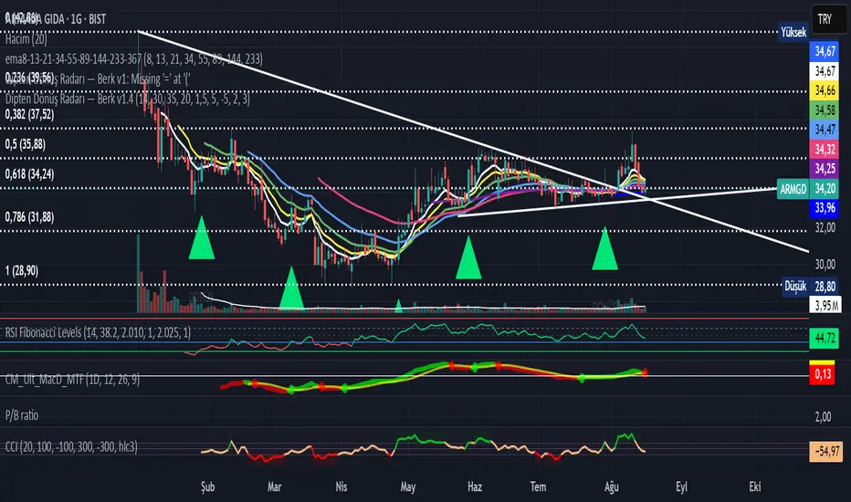
Bottom Reversal Radar — Berk v1.4Bottom Reversal Radar — Berk v1.4
What it does:
Combines RSI recovery after oversold, MACD bull cross, close above EMA8, near-EMA200 proximity, volume expansion, and simple bullish divergence (pivot lows) into a single score.
Signal: Trigger when Score ≥ Threshold (default 3). Set alert via Create Alert → “Dipten Dönüş — Ana Sinyal” → Once per bar close.
How it works
RSI recovery: After touching oversold (30), RSI crosses up 35 within last X bars.
MACD bull cross: MACD Line crosses above Signal.
Close above EMA8 and BOS (close above recent swing high) confirm momentum.
Near EMA200: Price within −5%…+2% band adds a point.
Volume spike: Volume ≥ 1.5× SMA(20) adds a point.
Bullish divergence: Lower price low + higher RSI low (pivot 3/3) adds a point.
Inputs
RSI(14), rsiOS=30, rsiRecover=35, Volume SMA(20) with 1.5× multiplier, EMA200 proximity band −5%…+2%, lookbackBars=5, Score threshold default 3.
Usage tips
Best on Daily / 4H. If too many false positives: raise threshold to 4 and volume to 1.8–2.0×.
Pair with Screener filters: RSI≥35, MACD Line>Signal, Price above EMA8, Volume/Avg(20)≥1.5, and near EMA200 (%).
Disclaimer
For educational purposes only. Not financial advice.
Release notes (v1.4)
Fixed bullDiv typo; simplified visuals; Pine v5.
Tags: rsi, macd, ema, volume, divergence, reversal, trend, screener, bist, stocks, crypto
Equilibrium TrackerWhat does this indicator do?
This is a screener that checks if the current HTF High moves above the previous HTF High.
This also applies for the low moving below the previous low.
If the 50% of the previous candle is touched, this wil also show in the table and send alerts.
Features
Select up to 2 timeframes and 10 instruments.
A screener table will show all instruments and will light up if an event occurs
Alerts can also get fired
Usage:
Select a chart for example 1 minute
Configure the indicator
Create a new alert on the indicator using the lower timeframe chart

Bullish Combo Scan by TLP📈 Bullish Combo Scan by TLP
This indicator scans for high-probability bullish breakout setups based on price action and volume strength, and optionally provides position sizing based on your risk management preferences.
🔍 Key Features:
$ Breakout Detection
Identifies stocks with a $0.90 or more price gain from the open, supported by strong volume and price structure.
% Breakout Detection
Flags stocks moving 4% or more from the previous close, also requiring momentum confirmation and volume above 100,000.
Momentum Filter
Breakouts are filtered to avoid extended moves by requiring low price movement between the previous two candles.
Volume & Price Conditions
Ensures breakouts are supported by liquidity (volume > 100,000) and minimum price (≥ $3) to reduce noise.
Position Size Calculator (Optional)
Displays position size based on your account value, risk percentage, and stop loss derived from a configurable previous candle’s low.
Screener-Ready Output
Includes a numeric plot to support TradingView's built-in screener, showing 1 for $ breakout and 2 for % breakout.
⚙️ Customizable Inputs:
Toggle $ breakout or % breakout conditions
Set your account size and risk per trade
Choose which candle’s low to use for stop loss calculation
✅ Best Used For:
Intraday or swing traders looking for fresh breakout setups
Traders who prefer a rules-based, volume-confirmed breakout scan
Screening large watchlists with custom logic for alerts and automation

8EMA/VWAP14 Oscillator w/ Trend Exhaustion Bands8EMA/VWAP14 Oscillator w/ Trend Exhaustion Bands + Performance Screener
Introducing the 8EMA/VWAP14 Oscillator with Trend Exhaustion Bands + Screener Suite - a comprehensive trading system that combines trend identification, momentum analysis, and real-time performance tracking all in one indicator. This system features a four-tier signal approach: early momentum warning dots before anything happens, confirmed entry/exit triangles when it's time to act, a dynamic trend ribbon on your price chart, and adaptive exhaustion bands that adjust to each asset's unique characteristics. The built-in performance tracker shows exactly how well your signals are working - success rates, average time to hit targets, and more - providing clear insight for confident trading decisions. Optimized for daily and weekly timeframes, this suite is suitable for both manual traders and automated strategies.
Aim of the Indicator
The 8EMA/VWAP14 Oscillator with Trend Exhaustion Bands is an advanced momentum oscillator system that combines trend identification, momentum analysis, and forward-looking performance validation. This comprehensive tool measures the percentage difference between an 8-period Exponential Moving Average and a 14-period Volume Weighted Average Price while providing multiple layers of signal confirmation through visual trend ribbons, momentum shift alerts, and adaptive exhaustion detection.
How to Interpret the Indicator
Visual Trend System: The indicator displays a dynamic ribbon between the 8EMA and 14VWAP lines on the price chart, automatically colored green when EMA8 is above VWAP14 (bullish trend) and red when below (bearish trend), providing instant trend context.
Four-Tier Signal System:
Tiny Green Dots (Below Bars): Early bullish momentum shifts when the oscillator crosses above its adaptive baseline
Green Triangles (Below Bars): Confirmed buy signals when EMA8 crosses above VWAP14
Tiny Red Dots (Above Bars): Early bearish momentum shifts when the oscillator crosses below its adaptive baseline
Red Triangles (Above Bars): Confirmed sell signals when EMA8 crosses below VWAP14
Oscillator Analysis: The separate pane displays the momentum oscillator with a dynamic zero line (thin blue) representing the recent average EMA8/VWAP14 relationship. Trend exhaustion is detected through adaptive bands - orange for potential upside exhaustion and purple for potential downside exhaustion, calculated dynamically based on the oscillator's historical range relative to its adaptive baseline.
Key Settings and Flexibility
Signal Source Customization: Choose from Open, High, Low, Close, OHLC Average, or HL Average to optimize signal sensitivity for different market conditions and trading styles.
Multi-Timeframe Capability: Enable higher timeframe analysis to use signals from longer periods while trading on shorter timeframes, significantly reducing noise and improving signal quality for more reliable entries.
Dynamic Baseline Controls: Adjust the adaptive zero line calculation period (5-100 bars) - shorter periods provide more responsive momentum detection, while longer periods offer smoother trend context and reduced false signals.
Entry Timing Options: "Bar Opening Only" mode ensures signals trigger only at confirmed bar close using realistic entry prices, eliminating mid-bar noise and providing accurate backtesting results for automated trading systems.
Adaptive Exhaustion Detection: Customize lookback periods and threshold multipliers to fine-tune exhaustion sensitivity for different volatility environments and asset classes.
Comprehensive Performance Tracking: Set custom profit targets (1-50%) and maximum holding periods to analyze forward-looking signal effectiveness with real-time success rate monitoring.
Advanced Features and Benefits
Forward-Looking Performance Analytics: Unlike traditional backtesting, this system tracks how often buy signals reach specified profit targets and measures average time to target, providing immediate validation of signal quality across different assets and timeframes.
Adaptive Baseline Technology: The dynamic zero line automatically adjusts to each asset's unique EMA8/VWAP14 relationship patterns, making momentum signals contextually relevant rather than using static thresholds that may not suit all market conditions.
Professional Entry/Exit Tracking: When "Bar Opening Only" is enabled, all performance calculations use actual tradeable prices (next bar's open) rather than theoretical mid-bar prices, ensuring realistic performance expectations.
Visual Performance Dashboard: Real-time table displaying success rate, average bars to target, fastest/slowest target achievement, and active position tracking with complete transparency about timeframe, signal source, and methodology being used.
Integrated Alert System: Comprehensive alerts for both early momentum shifts and confirmed crossover signals, enabling automated trading integration and timely manual intervention.
Best Practices for Timing Entries and Exits
Entry Timing Strategy:
Watch for Early Warning: Monitor tiny green dots as momentum builds - this is your preparation phase
Confirm with Ribbon: Ensure the ribbon color aligns with your intended direction (green for long positions)
Enter on Triangle Signal: Execute entries when confirmed buy triangles appear, using realistic bar opening prices
Avoid Exhaustion Zones: Be cautious entering when the oscillator is near orange (upper) exhaustion bands
Exit Timing Strategy:
Monitor Momentum Shifts: Red dots above bars provide early warning of potential reversals before actual sell signals
Use Exhaustion Bands: Consider partial profit-taking when oscillator reaches exhaustion zones (orange/purple bands)
Confirm with Sell Signals: Exit positions when red triangles appear, especially if preceded by bearish momentum dots
Time-Based Exits: Utilize the "Max Bars to Target" setting to avoid holding losing positions indefinitely
Risk Management Integration:
Position Sizing: Use success rate metrics to adjust position sizes - higher success rates may warrant larger positions
Multi-Timeframe Confluence: Combine daily signals with weekly context for highest probability setups
Avoid False Signals: Wait for momentum dots before triangles for stronger signal confirmation, reducing whipsaw trades
Optimal Market Conditions:
Trending Markets: Ribbon provides clear directional bias - trade in direction of ribbon color
Range-Bound Markets: Focus on exhaustion bands for reversal opportunities near dynamic support/resistance levels
Volatile Conditions: Use higher timeframe settings to filter noise and focus on more significant moves
Optimal Timeframe Usage
This indicator achieves exceptional performance on Daily timeframes and delivers superior results on Weekly timeframes. Weekly analysis is particularly powerful for position trading and swing strategies, as the adaptive exhaustion bands and momentum shifts have greater statistical significance over extended periods. The ribbon visualization becomes especially valuable on longer timeframes, clearly delineating major trend phases while filtering out intraday noise that can plague shorter-term analysis.
Alternative Applications
Multi-Timeframe Confluence System: Use weekly signals for trend direction while executing entries on daily timeframes, combining the indicator's momentum dots and triangles across different time horizons for high-probability setups.
Automated Trading Integration: The indicator's comprehensive alert system and realistic entry tracking make it ideal for automated trading platforms, with clear signal hierarchy and performance validation built into the system.
Risk-Adjusted Position Sizing: Utilize real-time success rate data and average holding period metrics to dynamically adjust position sizes based on current market effectiveness of the strategy.
Market Regime Detection: The ribbon color changes and exhaustion band interactions help identify when markets transition between trending and ranging conditions, allowing strategy adaptation accordingly.
Performance Validation Tool: Test signal effectiveness across different assets, timeframes, and market conditions before committing capital, using the forward-looking analytics to validate strategy assumptions.
Conclusion
The 8EMA/VWAP14 Oscillator with Trend Exhaustion Bands represents a comprehensive trading system that bridges the gap between manual analysis and automated execution. Its multi-layered approach provides both leading momentum indicators and lagging confirmation signals, while the adaptive baseline technology ensures relevance across different market conditions and asset classes. The integration of visual trend ribbons, performance analytics, and flexible timing controls makes it suitable for both discretionary traders seeking enhanced market insight and systematic traders requiring robust signal validation for automated strategies.

Momentum TrackerDescription
To screen for momentum movers, one can filter for stocks that have made a noticeable move over a set period. This initial move defines the momentum or swing move. From this list of candidates, we can create a watchlist by selecting those showing a momentum pause, such as a pullback or consolidation, which later could set up for a continuation.
Momentum = Magnitude × Time
This Momentum Tracker indicator serves as a study tool to visualize when stocks historically met these momentum conditions. It marks on the chart where a stock would have appeared on the screener, allowing us to review past momentum patterns and screener requirements. The indicator measures momentum in three different ways:
Normalized Momentum
Identifies when the current price reaches a new high or low compared to a historical window. This is the most standardized measurement and adapts well across markets.
Normalized = Current Price ≥ Maximum Price in Lookback
Normalized = Current Price ≤ Minimum Price in Lookback
Relative Momentum
Measures the percentage difference between a fast and a slow moving average. This method helps capture acceleration, the rate at which momentum is building over time.
Relative = |Fast MA − Slow MA| ÷ Slow MA × 100
Absolute Momentum
Measures how far price has moved from the highest or lowest point within a defined lookback period.
Absolute = (Current Price − Lowest Price) ÷ Lowest Price × 100
Absolute = (Highest Price − Current Price) ÷ Highest Price × 100
Customization
The tool is customizable in terms of lookback period and thresholds to accommodate different trading styles and timeframes, allowing users to set criteria that align with specific hold times and momentum requirements. While the various calculations can be enabled, the tool is best used in isolation of each to visualize different momentum conditions.

GTC Breakout ScannerIntroducing the GTC Breakout Scanner – Your Ultimate Market Radar!
Stay ahead of market moves with the GTC Breakout Scanner, a powerful TradingView indicator designed to detect momentum shifts, identify breakouts, and optimize your entries and exits like never before.
🔹 Multi-Coin Screener – Get real-time rate-of-change (ROC) alerts across multiple assets in one view.
🔹 AI-Enhanced Analysis – Adaptive K-means clustering fine-tunes overbought and oversold levels dynamically.
🔹 Precision Alerts – Detect bullish and bearish breakouts with customizable thresholds.
🔹 Over-Extended Integration – Visualize price movements with dynamic upper and lower bands for added confirmation.
Whether you're a scalper, swing trader, or long-term investor, the GTC Breakout Scanner empowers you with instant insights to catch high probability opportunities before the crowd.
🚀 Upgrade your trading strategy today with the GTC Breakout Scanner! 🚀
The GTC Breakout Scanner indicator is ideal for traders who rely on momentum, trend shifts, and volatility-based strategies. Here are the key types of traders who would benefit the most:
🔥 1. Momentum Traders
The indicator tracks the Rate of Change (ROC) and alerts when an asset’s price momentum is shifting.
Traders looking for explosive price movements can spot early bullish or bearish signals before major trends develop.
⚡ 2. Swing Traders
The scanner tracks multiple cryptocurrencies and flags high-probability reversals based on historical price action.
The adjustable overbought/oversold zones adapt dynamically using K-means clustering, making it useful for precision entry and exit points.
🚀 3. Trend-Following Traders
The inclusion of Bollinger Bands with dynamic thresholds allows traders to identify trend continuation or breakdowns.
The adaptive OB/OS levels help in recognizing trend exhaustion or potential breakout setups.
🎯 4. Mean Reversion Traders
Traders who capitalize on price deviations from the mean will benefit from the indicator’s multi-timeframe analysis and ability to detect extreme price movements.
Alerts on overbought/oversold conditions help traders enter at ideal pullback levels.
⏳ 5. Crypto Scalpers & Day Traders
The bullish and bearish momentum shifts make it a great tool for short-term traders looking to capitalize on fast moves.
The multi-coin screener lets traders monitor several assets at once, ensuring they don’t miss high-volatility setups.
This indicator is a powerful all-in-one scanner that helps traders spot momentum shifts, trend reversals, and breakout opportunities across multiple cryptocurrencies. Whether you're a swing trader, trend follower, scalper, or momentum trader, the GTC Breakout Scanner indicator provides precision market insights. 🚀🔥
⚠️ Disclaimer:
The GTC Breakout Scanner is a powerful tool designed to enhance your market analysis by providing real-time insights on market shifts. However, it is not a replacement for comprehensive market analysis or prudent risk management. Always combine this tool with thorough research, technical analysis, and a well-structured trading plan. Past performance is not indicative of future results. Trade responsibly.

Multi-indicator Signal Builder [Skyrexio]Overview
Multi-Indicator Signal Builder is a versatile, all-in-one script designed to streamline your trading workflow by combining multiple popular technical indicators under a single roof. It features a single-entry, single-exit logic, intrabar stop-loss/take-profit handling, an optional time filter, a visually accessible condition table, and a built-in statistics label. Traders can choose any combination of 12+ indicators (RSI, Ultimate Oscillator, Bollinger %B, Moving Averages, ADX, Stochastic, MACD, PSAR, MFI, CCI, Heikin Ashi, and a “TV Screener” placeholder) to form entry or exit conditions. This script aims to simplify strategy creation and analysis, making it a powerful toolkit for technical traders.
Indicators Overview
1. RSI (Relative Strength Index)
Measures recent price changes to evaluate overbought or oversold conditions on a 0–100 scale.
2. Ultimate Oscillator (UO)
Uses weighted averages of three different timeframes, aiming to confirm price momentum while avoiding false divergences.
3. Bollinger %B
Expresses price relative to Bollinger Bands, indicating whether price is near the upper band (overbought) or lower band (oversold).
4. Moving Average (MA)
Smooths price data over a specified period. The script supports both SMA and EMA to help identify trend direction and potential crossovers.
5. ADX (Average Directional Index)
Gauges the strength of a trend (0–100). Higher ADX signals stronger momentum, while lower ADX indicates a weaker trend.
6. Stochastic
Compares a closing price to a price range over a given period to identify momentum shifts and potential reversals.
7. MACD (Moving Average Convergence/Divergence)
Tracks the difference between two EMAs plus a signal line, commonly used to spot momentum flips through crossovers.
8. PSAR (Parabolic SAR)
Plots a trailing stop-and-reverse dot that moves with the trend. Often used to signal potential reversals when price crosses PSAR.
9. MFI (Money Flow Index)
Similar to RSI but incorporates volume data. A reading above 80 can suggest overbought conditions, while below 20 may indicate oversold.
10. CCI (Commodity Channel Index)
Identifies cyclical trends or overbought/oversold levels by comparing current price to an average price over a set timeframe.
11. Heikin Ashi
A type of candlestick charting that filters out market noise. The script uses a streak-based approach (multiple consecutive bullish or bearish bars) to gauge mini-trends.
12. TV Screener
A placeholder condition designed to integrate external buy/sell logic (like a TradingView “Buy” or “Sell” rating). Users can override or reference external signals if desired.
Unique Features
1. Multi-Indicator Entry and Exit
You can selectively enable any subset of 12+ classic indicators, each with customizable parameters and conditions. A position opens only if all enabled entry conditions are met, and it closes only when all enabled exit conditions are satisfied, helping reduce false triggers.
2. Single-Entry / Single-Exit with Intrabar SL/TP
The script supports a single position at a time. Once a position is open, it monitors intrabar to see if the price hits your stop-loss or take-profit levels before the bar closes, making results more realistic for fast-moving markets.
3. Time Window Filter
Users may specify a start/end date range during which trades are allowed, making it convenient to focus on specific market cycles for backtesting or live trading.
4. Condition Table and Statistics
A table at the bottom of the chart lists all active entry/exit indicators. Upon each closed trade, an integrated statistics label displays net profit, total trades, win/loss count, average and median PnL, etc.
5. Seamless Alerts and Automation
Configure alerts in TradingView using “Any alert() function call.”
The script sends JSON alert messages you can route to your own webhook.
The indicator can be integrated with Skyrexio alert bots to automate execution on major cryptocurrency exchanges
6. Optional MA/PSAR Plots
For added visual clarity, optionally plot the chosen moving averages or PSAR on the chart to confirm signals without stacking multiple indicators.
Methodology
1. Multi-Indicator Entry Logic
When multiple entry indicators are enabled (e.g., RSI + Stochastic + MACD), the script requires all signals to align before generating an entry. Each indicator can be set for crossovers, crossunders, thresholds (above/below), etc. This “AND” logic aims to filter out low-confidence triggers.
2. Single-Entry Intrabar SL/TP
One Position At a Time: Once an entry signal triggers, a trade opens at the bar’s close.
Intrabar Checks: Stop-loss and take-profit levels (if enabled) are monitored on every tick. If either is reached, the position closes immediately, without waiting for the bar to end.
3. Exit Logic
All Conditions Must Agree: If the trade is still open (SL/TP not triggered), then all enabled exit indicators must confirm a closure before the script exits on the bar’s close.
4. Time Filter
Optional Trading Window: You can activate a date/time range to constrain entries and exits strictly to that interval.
Justification of Methodology
Indicator Confluence: Combining multiple tools (RSI, MACD, etc.) can reduce noise and false signals.
Intrabar SL/TP: Capturing real-time spikes or dips provides a more precise reflection of typical live trading scenarios.
Single-Entry Model: Straightforward for both manual and automated tracking (especially important in bridging to bots).
Custom Date Range: Helps refine backtesting for specific market conditions or to avoid known irregular data periods.
How to Use
1. Add the Script to Your Chart
In TradingView, open Indicators , search for “Multi-indicator Signal Builder”.
Click to add it to your chart.
2. Configure Inputs
Time Filter: Set a start and end date for trades.
Alerts Messages: Input any JSON or text payload needed by your external service or bot.
Entry Conditions: Enable and configure any indicators (e.g., RSI, MACD) for a confluence-based entry.
Close Conditions: Enable exit indicators, along with optional SL (negative %) and TP (positive %) levels.
3. Set Up Alerts
In TradingView, select “Create Alert” → Condition = “Any alert() function call” → choose this script.
Entry Alert: Triggers on the script’s entry signal.
Close Alert: Triggers on the script’s close signal (or if SL/TP is hit).
Skyrexio Alert Bots: You can route these alerts via webhook to Skyrexio alert bots to automate order execution on major crypto exchanges (or any other supported broker).
4. Visual Reference
A condition table at the bottom summarizes active signals.
Statistics Label updates automatically as trades are closed, showing PnL stats and distribution metrics.
Backtesting Guidelines
Symbol/Timeframe: Works on multiple assets and timeframes; always do thorough testing.
Realistic Costs: Adjust commissions and potential slippage to match typical exchange conditions.
Risk Management: If using the built-in stop-loss/take-profit, set percentages that reflect your personal risk tolerance.
Longer Test Horizons: Verify performance across diverse market cycles to gauge reliability.
Example of statistic calculation
Test Period: 2023-01-01 to 2025-12-31
Initial Capital: $1,000
Commission: 0.1%, Slippage ~5 ticks
Trade Count: 468 (varies by strategy conditions)
Win rate: 76% (varies by strategy conditions)
Net Profit: +96.17% (varies by strategy conditions)
Disclaimer
This indicator is provided strictly for informational and educational purposes .
It does not constitute financial or trading advice.
Past performance never guarantees future results.
Always test thoroughly in demo environments before using real capital.
Enjoy exploring the Multi-Indicator Signal Builder! Experiment with different indicator combinations and adjust parameters to align with your trading preferences, whether you trade manually or link your alerts to external automation services. Happy trading and stay safe!
