Engulfing Candles with Sweep by AydmaxxEngulfing Candles with Sweep Indicator
The "Engulfing Candles with Sweep" indicator identifies bullish and bearish engulfing candles that exhibit liquidity sweeps. It marks these significant candlestick patterns and draws a 50% Fibonacci retracement line from the high to low of the engulfing candle. The indicator helps traders spot potential reversal points where large market players might be accumulating or distributing positions.
Key Features:
Bullish Engulfing Candle with Sweep:
Identifies when a bullish candle (closing higher than it opened) engulfs the previous bearish candle (closing lower than it opened).
Ensures that the bullish candle’s low is lower than the previous candle’s low, indicating a sweep of liquidity.
Marks the identified bullish candle with a symbol below the candlestick.
Draws a 50% Fibonacci retracement line from the high to the low of the bullish engulfing candle.
Bearish Engulfing Candle with Sweep:
Identifies when a bearish candle (closing lower than it opened) engulfs the previous bullish candle (closing higher than it opened).
Ensures that the bearish candle’s high is higher than the previous candle’s high, indicating a sweep of liquidity.
Marks the identified bearish candle with a symbol above the candlestick.
Draws a 50% Fibonacci retracement line from the high to the low of the bearish engulfing candle.
Customizable Settings:
Fibonacci Line Color: Allows customization of the Fibonacci retracement line color for both bullish and bearish engulfing candles.
Fibonacci Line Style: Provides options to choose the line style (solid, dotted, dashed).
Fibonacci Line Width: Enables adjustment of the line width for better visibility.
Toggle Fibonacci Lines: Option to enable or disable the display of Fibonacci retracement lines.
How to Use:
Apply the indicator to your chart.
Look for symbols below or above the candlesticks, indicating bullish or bearish engulfing candles with liquidity sweeps.
Utilize the 50% Fibonacci retracement lines to identify potential support or resistance levels.
Benefits:
Helps in identifying key reversal patterns in the market.
Provides visual aids with Fibonacci retracement levels for potential entry and exit points.
Enhances trading decisions by confirming engulfing patterns with liquidity sweeps.
Cari dalam skrip untuk "candle"
Engulfing [TradingFinder] Bullish & Bearish CandleStick Pattern🔵 Introduction
The candlestick engulfing pattern is important pattern in technical analysis that can be observed in candlestick charts. This pattern occurs when a complete candle engulfs or "engulfs" the body of a previous candle, meaning that the body of the new candle completely covers the body of the previous candle.
The candlestick engulfing pattern has two types: the bullish engulfing pattern and the bearish engulfing pattern.
• Bullish Engulfing Pattern: This pattern occurs when a market candle opens with a larger and higher body than the previous market candle and completely covers the body of the previous candle. This pattern may indicate the presence of strong buying pressure and a potential change in price direction upwards.
• Bearish Engulfing Pattern: This pattern occurs when a market candle opens with a larger and lower body than the previous market candle and completely covers the body of the previous candle. This pattern may indicate the presence of strong selling pressure and a potential change in price direction downwards.
The candlestick engulfing pattern is usually used as a valid signal for a change in price direction in the market and can enhance a combination of crossover investments and technical analysis. However, it should always be evaluated alongside other indicators and market factors, and counter decisions should be made accordingly.
🔵 Recognition Method
Correct, the candlestick engulfing pattern is one of the important patterns in technical analysis that is typically used as a strong signal for a valid change in price direction in the market. This pattern occurs when a candle (usually in the market) opens with a larger and higher (for bullish engulfing pattern) or lower (for bearish engulfing pattern) body than a previous market candle and completely covers the body of the previous candle.
Example of Bullish Engulfing Pattern:
• First Candle: A bearish (downward) candle with a small red body.
• Second Candle: A bullish (upward) candle with a larger body that completely covers the body of the previous candle.
This pattern may indicate a change in price direction from downward to upward.
Example of Bearish Engulfing Pattern:
• First Candle: A bullish (upward) candle with a small green body.
• Second Candle: A bearish (downward) candle with a larger body that completely covers the body of the previous candle.
This pattern may indicate a change in price direction from upward to downward.
The most important point is that the candlestick engulfing pattern should be carefully considered and always evaluated alongside other market indicators and overall conditions. For example, the engulfing pattern near important support or resistance levels, during significant market command changes, or accompanied by other technical signals can have greater signaling power.
🟣 "Bullish Engulfing" Candle
• The first candle is bullish and the second candle is bearish.
• At the end of a downtrend.
• The closing of the first candle is above the opening of the second candle.
• The high of the first candle is higher than the high of the second candle.
Optimal Condition:
• The closing of the first candle is higher than the high of the second candle.
• More than 80% of the first candle is bullish.
🟣 "Bearish Engulfing" Candle
• The first candle is bearish and the second candle is bullish.
• At the end of an uptrend.
• The closing of the first candle is below the opening of the second candle.
• The low of the first candle is lower than the low of the second candle.
Optimal Condition:
• The closing of the first candle is below the opening of the second candle.
• More than 80% of the first candle is bearish.
🔵 Settings
The "Engulf Filter" option allows the "Optimal Condition" to be executed and will show fewer candlesticks.
🔵 Status
Off: Default mode, showing more identifications.
• Green color indicates optimal "Bullish Engulfing" candles.
• Red color indicates optimal "Bearish Engulfing" candles.
On: By changing the default to "On," the number of identifications decreases and the optimal condition is applied.
• Blue color indicates "Bullish Engulfing" candles.
• Black color indicates "Bearish Engulfing" candles.
🟣 Important Note
"Engulfing" candles are very useful signals in the direction of the overall trend, but we do not expect a suitable movement from "Engulfing" candles against the trend.
TechniTrend: CandleMetrics🟦 Overview
The TechniTrend: CandleMetrics Indicator is a powerful tool designed to give traders an in-depth analysis of candlestick structures. This indicator allows users to identify potential reversal points, trend continuations, and other crucial market behaviors by examining key ratios between candle components—such as body, shadow, and overall range—alongside volume conditions. The advanced filtering options offer flexibility for both novice and experienced traders, enabling tailored setups to suit different trading strategies.
🟦 Key Features
🔸Customizable Ratios: Set thresholds for Body-to-Range, Shadow-to-Range, Upper Shadow-to-Range, and Lower Shadow-to-Range ratios.
🔸Volume-Based Filters: Integrate volume conditions to strengthen the reliability of signals.
🔸Flexible Conditions: Choose whether filters should work independently or in combination, allowing for precise pattern identification.
🔸Visual Markers: Mark potential signals with a distinct background color and symbols on the chart.
🔸Alerts: Receive notifications for each selected condition, ensuring you never miss an opportunity.
🟦 How It Works
The CandleMetrics Indicator operates by analyzing the relationship between different components of each candlestick, combined with volume data to determine the strength of signals. Here’s a detailed breakdown of each feature:
🔸 Body to Range Ratio:
This filter compares the size of the candle's body to its total range (from high to low).
Example Setting: If you’re interested in spotting candles with small bodies relative to their total range, you might set the Body-to-Range Ratio to “Less than 0.3.”
🔸 Shadow to Range Ratio:
This examines the combined size of both shadows (upper and lower) relative to the entire candle range.
Example Setting: Use a Shadow-to-Range Ratio set to “More than 0.8” to find candles with significant wick lengths, suggesting market indecision.
🔸 Upper Shadow to Range Ratio:
This filter assesses the proportion of the upper shadow (wick) in relation to the candle’s full range.
Example Setting: “Less than 0.05” can help identify situations where the upper shadow is minimal, indicating strong downward pressure.
🔸 Lower Shadow to Range Ratio:
It measures the lower shadow compared to the entire candle range.
Example Setting: “More than 0.7” is useful for detecting potential rejection patterns at lower prices, hinting at a possible bullish reversal.
🔸 Volume Filter:
Integrates volume data to verify the reliability of each candle pattern.
Example Setting: Apply a Volume Filter Length of 100 with an SMA type to smooth volume data over a longer period, filtering out short-term noise and focusing on significant volume shifts.
🟦 Combining Filters
The indicator offers an option to Combine Filters. When this setting is enabled, all selected conditions must be met simultaneously for a candle to be marked. If disabled, each condition functions independently, allowing more flexibility in detecting diverse patterns.
🟦 Examples & Use Cases
🔸Example 1: Spotting Reversal Opportunities
I used the following configuration to find potential bullish reversals:
Upper Shadow to Range Ratio: “Less than 0.05” – Looking for candles with almost no upper shadow.
Lower Shadow to Range Ratio: “More than 0.7” – Highlighting candles with a significant lower shadow.
Volume Filter Length: 100 with SMA.
This setup effectively highlights candles where price rejection is happening at lower levels, suggesting a potential trend reversal to the upside.
🔸Example 2: Detecting Market Uncertainty
If you want to focus on candles showing market hesitation, try:
Shadow to Range Ratio: “More than 0.85” – Emphasizing long-wick candles that could indicate indecision.
Disable Combine Filters to allow flexibility, marking any candle meeting the above criteria.
🟦 Detailed Explanation of Each Option
Here’s a clear and concise breakdown of each option for a better understanding:
1. Body to Range Ratio
Purpose: This ratio shows how significant the candle's body is compared to its overall range. A smaller body-to-range ratio can indicate a potential reversal if the market appears indecisive.
How to Use: Increase the ratio to filter for stronger trend candles; decrease it to identify reversal or indecision candles.
2. Shadow to Range Ratio
Purpose: This filter captures the size of both shadows relative to the candle's total range. A larger ratio often points to market hesitation, while a smaller ratio suggests a decisive move.
How to Use: Adjust this filter to focus on candles with long wicks (indecision) or short wicks (decisiveness).
3. Upper Shadow to Range Ratio
Purpose: Helps to identify candles with strong downward moves by focusing on the upper wick length. A small upper shadow can imply sellers' dominance.
How to Use: Lower the ratio to detect candles with minimal upward rejection.
4. Lower Shadow to Range Ratio
Purpose: Targets candles with strong buying pressure by analyzing the lower shadow. A larger lower shadow may indicate a bullish reversal.
How to Use: Increase the ratio to spot rejection candles with significant lower shadows.
5. Volume Filter
Purpose: Adds a volume component to verify the validity of each candlestick pattern. Higher-than-average volume often signifies the strength of a move.
How to Use: Adjust the filter length and type to smooth out volume fluctuations based on your trading timeframe.
🟦 Indicator Alerts
Each filter has its own alert configuration, enabling traders to stay updated on market conditions that meet their selected criteria. You can customize alerts to trigger whenever a condition is met, helping to manage trades even when away from the screen.
Morning & Evening Star [TradingFinder] Stock Indices Gap Candle🔵 Introduction
In "technical analysis", there are certain reversal patterns that alert us to a potential reversal of a stock's previous trajectory.
Two significant patterns in this regard are the "Morning Star" pattern and the "Evening Star" pattern, which are formed by a combination of three different candlesticks and are considered as reversal patterns.
Here, we will examine how to identify these patterns and how to respond to them.
🟣 Morning Star Pattern
This pattern forms at the end of a downtrend and indicates the beginning of an uptrend.
The pattern consists of three candlesticks in the following order :
1.A large bearish candlestick
2.A candlestick with a short body
3.A bullish candlestick
With the formation of the morning star pattern, it is expected that the stock price will change direction and continue to rise. Therefore, in such situations, it is advisable to enter a long position and follow the uptrend.
Signs of the morning star pattern :
•The first sign of this pattern is the presence of a small-bodied candlestick at the end of the trend, accompanied by a gap from the previous candlestick (a bearish candlestick with a large body). Therefore, the bodies of the first and second candlesticks do not overlap.
•The second candlestick indicates market confusion and uncertainty. The color of the middle candlestick is not significant.
•The third candlestick must be positive and have a higher price than the previous candlestick (i.e., the small-bodied candlestick).
•The closing price of the third candlestick must be higher than half of the first candlestick.
🟣 Evening Star Pattern
This pattern forms at the end of an uptrend and indicates the beginning of a downtrend.
The pattern consists of three candlesticks in the following order :
1.A large bullish candlestick
2.A candlestick with a short body
3.A bearish candlestick
With the formation of the evening star pattern, it is expected that the stock price will change direction and continue to fall. Therefore, in such situations where this pattern is identified, it is advisable to refrain from entering a long position.
If the stock is traded in a two-way market, it is possible to profit by taking a short position after the formation of the evening star pattern.
Signs of the evening star pattern :
•The first sign of this pattern is the presence of a small-bodied candlestick at the end of the trend, accompanied by a gap from the previous candlestick (a bullish candlestick with a large body). Therefore, the bodies of the first and second candlesticks do not overlap.
•The second candlestick indicates market confusion and uncertainty. The color of the middle candlestick is not significant.
•The third candlestick must be negative and have a lower price than the previous candlestick (i.e., the small-bodied candlestick).
•The closing price of the third candlestick must be lower than half of the first candlestick.
🔵 How to Use
The "Filter" and "Market" features are available in the settings section, allowing you to customize the output of the indicator according to your needs.
With the "Filter" feature, you can filter the "Morning Star" and "Evening Star" patterns as "strong" or "weak." The difference between strong and weak patterns lies in their "Candle Body."
In strong patterns, the candle bodies account for more than 80% of the total candle range, while in weak patterns, the bodies comprise between 60% to 80% of the candle range.
If the "Filter" feature is set to "On," only strong patterns will be displayed. If it's set to "Off," all patterns will be displayed. By default, it's set to "Off."
The "Market" feature allows you to include "gaps" in your pattern identification calculations. You can choose between "Forex" and "Stock" modes. In the Forex pattern, calculations are performed without considering gaps since there are fewer gaps in the Forex market.
If gap calculations were to be part of the pattern identification conditions, only a very small number of patterns would be identified. However, in the "Stock" mode, gaps are considered as part of the identification conditions.

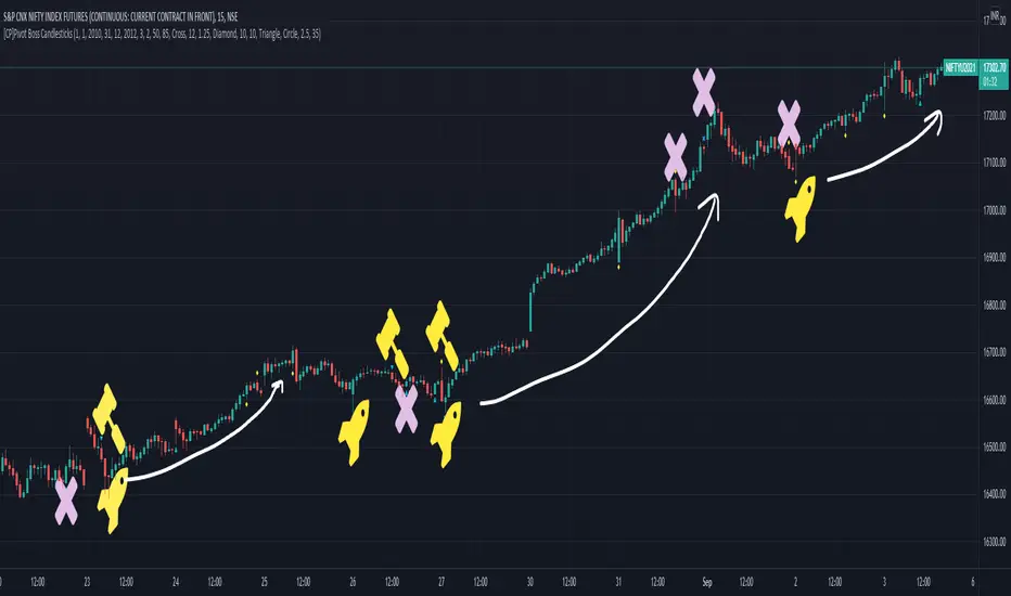
[CP]Pivot Boss Candlestick Scanner - No Repainting This indicator is based on the high probability candlestick patterns described in the ’Secrets of a Pivot Boss’ book.
The indicator does not suffer from repainting.
I have kept this indicator open source, so that you can take this indicator and design a complete trading system around it.
Although the patterns have some statistical edge in the markets, blindly using them as Buy/Sell Indicators will certainly result in a heavy loss.
I like some of these setups more than others, and I have listed them in the order of my likeness.
The first one I like the most, the last one, I like the least.
The patterns are universal and work well in both intraday, daily and even larger timeframes.
Signals in the example charts are manually marked by,
Hammer - profitable short signal
Rocket - profitable long signal
X - unprofitable long or short signal
GENERAL USER INPUTS:
These settings exist as the indicator uses ‘Labels’ to mark the patterns and Pine Script limits a maximum of 500 labels on a chart.
If you want to go back in the past and check how the indicator was doing, set the Start and End dates both and check the ’Use the date range above to mark the Candlestick Setups?’ option.
EXTREME REVERSAL SETUP:
This is by far my favorite setup in the lot. Classic Mean Reversion setup.
The logic, as explained in the book, goes like this,
1. The first bar of the pattern is about two times larger than the average size of the candles in the lookback period.
2. The body of the first bar of the pattern should encompass more than 50 percent of the bar’s total range, but usually not more than 85 percent.
3. The second bar of the pattern opposes the first.
The setup works extremely well in high beta stocks like Vedanta VEDL.
Feel free to play with the settings in order to better align this pattern with your favorite stock.
Check out the examples below,
No indicator is perfect, failed patterns are marked with an X.
OUTSIDE REVERSAL SETUP:
My second favorite setup, it is quite good at catching intraday trends.
Here’s the logic,
1. The engulfing bar of a bullish outside reversal setup has a low that is below the prior bar’s low and a close that is above the prior bar’s high. Reverse the conditions for bearish outside reversal.
2. The engulfing bar is usually 5 to 25 percent larger than the size of the average bar in the lookback period.
Settings for this pattern simply reflect these conditions. Feel free to modify them as you wish.
The pattern is pretty powerful and will sometimes help you catch literally all the highs and lows of the market, as shown in the examples of Vedanta VEDL and RELIANCE stocks below.
As usual, this pattern is not PERFECT either.
DOJI REVERSAL SETUP:
Doji candles signify market indecision and this pattern tries to profit off these market conditions.
Logic:
1. The open and close price of the doji should fall within 10 percent of each other, as measured by the total range of the candlestick.
2. For a bullish doji, the high of the doji candlestick should be below the ten-period simple moving average. Vice-versa for bearish.
3. For a bullish doji setup, one of the two bars following the doji must close above the high of the doji. Vice-versa for bearish.
Feel free to modify the settings and optimize according to the stock you are trading.
Don't optimize too much :)
This pattern works brilliantly well on larger intraday timeframes, like 15m/30m/60m.
This pattern also has a higher propensity to give false indications than the two described above.
Doji reversal typically helps to catch larger trend reversals. Check out the examples below from RELIANCE and NIFTY charts,
Note that the RELIANCE chart below is the same as shown for the Outside Reversal Setup above, notice the confluence of Outside
Reversal and Doji Reversal on the 31st August.
Confluence of patterns usually increases the probability of success.
RELIANCE 15m Chart - Pattern can catch nice trends on higher timeframes
NIFTY 15m Chart
WICK REVERSAL SETUP:
This pattern tries to capture candlesticks with large wick sizes, as they often indicate trend reversal when coupled with significant support and resistance levels.
Logic:
1. The body is used to determine the size of the reversal wick. A wick that is between 2.5 to 3.5 times larger than the size of the body is ideal.
2. For a bullish reversal wick to exist, the close of the bar should fall within the top 35 percent of the overall range of the candle.
3. For a bearish reversal wick to exist, the close of the bar should fall within the bottom 35 percent of the overall range of the candle.
This pattern must always be coupled with important support resistance levels, else there will be a lot of false signals.
The chart below is the same NIFTY chart as above with the Wick Reversal candles marked as well.
You can see that there are a lot of false signals, but the price also indicates ’pausing’ at important levels by printing a wick reversal setup.
You can use this information to your advantage when riding a trend.
FINAL WORDS:
Settings for various patterns simply reflect the logic described.
You will probably need to tweak and optimize the pattern settings for the stock that you are trading.
Higher Beta/Higher Volatility stocks are a great choice for these patterns.
Using these patterns at critical support and resistance levels will result in dramatically high accuracy.
Be creative and try to develop a proper system around this indicator, with rules for position sizing, stop loss etc.
You do not have to trade all the patterns. Even trading just one pattern with a proper system is good enough.
DO NOT USE THIS INDICATOR AS A BUY/SELL SYSTEM, YOU WILL LOSE MONEY.
Feel free to drop any feedback in the comments section below, or if you have any unique candlestick patterns that you would like me to code.
Candle Average PriceOverview
The Candle Average Price indicator is a custom tool designed to help traders identify key price levels by calculating and displaying the average price of recent candles on your TradingView chart. This indicator computes the average price based on a user-defined percentage of each candle's range over a specified number of candles. It then plots a horizontal line representing this average, covering only the last N candles as defined by you.
Key Features
Customizable Number of Candles: Define how many past candles to include in the average calculation.
Adjustable Percentage Level: Choose any percentage of each candle's range (from low to high) to calculate the price level.
Dynamic Horizontal Line: The indicator plots a horizontal line representing the calculated average, updating with each new bar and covering only the specified number of candles.
How It Works
Price at Specified Percentage:
For each candle, the indicator calculates a price level at your chosen percentage within the candle's range.
Formula: Price = Low + (Percentage Level / 100) * (High - Low)
Average Price Calculation:
It computes the average of these price levels over the last N candles.
Formula: Average Price = Sum of Price Levels over N Candles / N
Horizontal Line Plotting:
A horizontal line is drawn at the calculated average price level.
The line spans from N candles ago to the current candle, covering exactly the number of candles specified.
Input Parameters
Number of Candles (length):
Description: The number of recent candles over which the average is calculated.
Default Value: 4
Range: 1 to any positive integer.
Usage: Adjust this to include more or fewer candles in the calculation. A higher number smooths the average, while a lower number makes it more responsive to recent price changes.
Percentage Level (%):
Description: The percentage within each candle's range to calculate the price level.
Default Value: 50%
Range: 0% (candle low) to 100% (candle high).
Usage: Modify this to focus on different parts of each candle:
0%: Uses the low of each candle.
50%: Uses the midpoint of each candle.
100%: Uses the high of each candle.
Custom Percentage: Any value between 0% and 100% to target specific levels.
How to Use the Indicator
Adding the Indicator to Your Chart:
Open the TradingView chart of your preferred financial instrument.
Click on Indicators at the top of the chart.
Select Invite-Only Scripts if you've saved the script there, or use the Pine Editor to paste and apply the script.
Configuring the Settings:
After adding the indicator, click on the gear icon ⚙️ next to its name to open settings.
Adjust the Number of Candles (length) to your desired period.
Set the Percentage Level (%) (percentage) to the specific level within each candle's range you want to analyze.
Interpreting the Horizontal Line:
The horizontal line represents the average price calculated based on your inputs.
It updates with each new bar, always reflecting the most recent data over the specified number of candles.
The line only spans the last N candles, providing a focused view of recent price action.
Practical Applications
Identifying Support and Resistance Levels:
The average price line can act as a dynamic support or resistance level.
Traders can watch for price reactions around this line to make trading decisions.
Trend Analysis:
Observing how the price interacts with the average line can provide insights into the current trend's strength and potential reversals.
Entry and Exit Signals:
Use the line as a reference point for setting stop-loss orders or taking profits.
Combine it with other indicators for more robust trading signals.
In highly volatile markets, consider increasing the number of candles to avoid false signals.
Limitations and Considerations
Not a Standalone Tool:
This indicator should not be used in isolation for making trading decisions. Always consider additional analysis.
Market Conditions Matter:
The indicator may perform differently in trending markets versus ranging markets.
Data Refresh:
Ensure you have a stable internet connection and that your TradingView chart is set to the correct time frame.
Conclusion
The Candle Average Price indicator is a flexible and user-friendly tool that provides valuable insights into recent price action by calculating the average price based on your specific criteria. By adjusting the parameters to suit your trading style, you can incorporate this indicator into your technical analysis to help identify potential trading opportunities.
Disclaimer: Trading financial instruments involves risk, and past performance is not indicative of future results. This indicator is a tool to assist in analysis and should not be considered financial advice.
Happy Trading!
BERLIN CandlesA problem with Heikin Ashi is that while it gives you a great overview of overall direction, it is rarely possible to use it as a replacement for normal japanese
candlesticks. The reason for this is that actual price data is lost, since the candles are more akin to a moving average than a different way to see price action. Also, with Heikin Ashi, most of the actual price action is lost, because the candles can be bigger than the high and low of the underlying japanese candlestick.
With BERLIN Candles I have tried to fix that problem. By using a smoothed out version of the previous Heikin Ashi candle close as the current BERLIN Candle open, the high and low of the actual japanese candlestick for the high and low of the BERLIN Candle, and the current Heikin Ashi close as the BERLIN Candle close, while setting hard limits for BERLIN Candle open and close values so that they can never exceed the high and low of the underlying japanese candlestick.
One problem still persists though. The actual current price data is lost. However, the BERLIN Candles have solved this by adding a fifth part to the candles. The close of the underlying japanese candlesticks are indicated with a plus-sign. This way, actual price data is never lost, while keeping all of the other benefits of this type of candles.
A few added bonuses:
The addition of the 14 period ATR at the latest candle
The baseline from Ichimoku is included as an option
The 14 period ATR value of each candle can be seen in the indicator data as
the orange value

Strong/Weak Candle FinderStrong/Weak Candle Finder (SWCF)
Overview:
The Strong/Weak Candle Finder (SWCF) is a versatile TradingView indicator designed to help traders identify statistically significant candles based on their size relative to recent historical price action. By analyzing a lookback period, the indicator dynamically calculates a threshold to classify candles as either "strong" (larger than the threshold) or "weak" (smaller than the threshold), providing visual cues directly on your chart.
This tool can be invaluable for traders looking to:
Spot potential momentum breakouts or high volatility (Strong Candles).
Identify periods of consolidation or low volatility (Weak Candles).
Gauge shifts in market sentiment based on candle body or range dynamics.
How It Works:
Candle Size Calculation: You choose how candle size is measured from four methods:
High - Low: The full range of the candle.
High - Close: The distance from the high to the close.
Open - Close: The size of the candle body.
Low - Open: The distance from the low to the open.
Historical Analysis: The indicator looks back over a user-defined LookBack Period to collect candle sizes.
Grouping & Precision: To smooth the distribution, candle sizes are grouped based on the Group Precision Size. This parameter divides the observed range of candle sizes into a set number of "bins," and individual candle sizes are rounded to the nearest representative value of these bins.
Percentile Threshold: A dynamic Outlier Pip Value is calculated based on the Outlier Percentile you set.
If Display Mode is "Strong Candles," this threshold represents the Nth percentile of the largest candle sizes (e.g., the 80th percentile if Outlier Percentile is 20%). Candles larger than this are marked as "Strong."
If Display Mode is "Weak Candles," this threshold represents the Nth percentile of the smallest candle sizes (e.g., the 20th percentile). Candles smaller than this are marked as "Weak."
Visual Markers: When a current candle meets the criteria (strong or weak based on your display mode), a configurable shape is plotted above (for strong) or below (for weak) the candle.
Resampling: The historical distribution and outlier threshold are recalculated every Resample Period (number of bars) to adapt to changing market conditions.
Key Features:
Dynamic Thresholds: Adapts to market volatility instead of using fixed pip values.
Customizable Candle Definition: Choose from four methods to define what "candle size" means to your strategy.
Flexible Display Modes: Focus on either identifying exceptionally strong candles or unusually weak ones.
Adjustable Sensitivity: Fine-tune the rarity of signals with Outlier Percentile and Group Precision Size.
Visual Chart Markers: Clear, customizable shapes (arrow, circle, etc.) for easy identification.
Periodic Recalculation: Ensures the indicator remains relevant as market dynamics evolve.
Parameters:
Display Mode:
Strong Candles: Highlights candles larger than the upper percentile threshold.
Weak Candles: Highlights candles smaller than the lower percentile threshold.
Resample Period (Candles): How often (in bars) to recalculate the historical distribution and outlier threshold.
LookBack Period (Candles): The number of past candles to analyze for the historical distribution. (Note: Plots will only begin after this many bars have loaded on the chart).
Group Precision Size: Number of groups to divide the candle size range into for rounding historical sizes. Higher values mean finer precision (less rounding).
Outlier Percentile (%): The percentile used to define the threshold for strong/weak candles.
Candle Size Method: (High-Low, High-Close, Open-Close, Low-Open).
Visuals:
Strong Shape: Choose the icon style for strong candles.
Weak Shape: Choose the icon style for weak candles.
Shape Size: Adjust the size of the plotted icons.
How to Use:
Strong Candles:
May indicate increased momentum, potential breakout confirmations, or high conviction moves.
Consider using in trending markets or as a filter for entry signals.
Weak Candles:
May signal market indecision, low volatility, consolidation phases, or potential exhaustion of a prior move.
Can be useful for identifying range-bound conditions or periods to be cautious.
Experimentation: Adjust the LookBack Period, Outlier Percentile, and Group Precision Size to match your trading style and the characteristics of the asset you are trading. What constitutes "strong" or "weak" can vary significantly.
Confirmation Tool: Use in conjunction with other indicators (e.g., moving averages, RSI, volume) for more robust trading decisions.
Important Notes:
The indicator requires sufficient historical data (LookBack Period) to initialize. You may not see plots on the chart immediately if there aren't enough bars loaded.
Like all indicators, the SWCF is not a standalone trading system and should not be used as the sole basis for financial decisions.
Past performance is not indicative of future results. Always use appropriate risk management.
We hope you find the Strong/Weak Candle Finder a valuable addition to your trading toolkit!
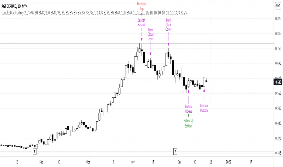
Candlestick Trading (Malaysia Stock Market)1. This indicator will indicate signals of bearish/bullish candlestick as below:
- 10 Bear Candles: Dark Cloud Cover, Bearish Kickers, Bearish Engulfing, Evening Star, Three Black Crows, Hanging Man, Shooting Star, Tweezer Top, Bearish Harami, Doji
- 10 Bull Candles: Piercing, Bullish Kickers, Bullish Engulfing, Morning Star, Three White Soldiers, Hammer, Inverted Hammer, Tweezer Bottom, Bearish Harami, Doji
2. In order for the Bear Candle signals to appear, these conditions should be met:
- Price must be above MA 1 (preset at SMA 20)
- Price must be above MA 2 (preset at SMA 50)
- Price must be above MA 3 (preset at SMA 200)
- In the range of specified trading days (preset at latest 10 days of trading)
3. For a strong bearish signal, a namely 'Potential Top' signal will appear on the top of the bearish candlestick signal. This 'Potential Top' signal will only appear under the condition of:
- Stochastic is at overbought area (preset at 75%)
4. In order for the Bull Candle signals to appear, these conditions should be met:
- Price must be in between MA 4 (preset at EMA 30) and MA 5 (preset at EMA 100)
- In the range of specified trading days (preset at latest 10 days of trading)
5. For a strong bullish signal, a namely 'Potential Bottom' signal will appear at the bottom of the bullish candlestick signal. This 'Potential Bottom' signal will only appear under the condition of:
- Stochastic is at oversold area (preset at 25%)
6. This indicator can help one to enter/exit a trade based on the bullish/bearish candlestick patterns that appear at the beginning/end of a trend, especially when the 'Potential Bottom/Top' appears with any of bullish/bearish candlestick signal.
7. However, this indicator is only designed for Malaysian Stocks Market as the script is based on the bids/pips calculation of the Malaysian Stocks Market. Nevertheless, I let the script open for everyone to modify it based on your own preference markets/instruments.
8. Hope you guys enjoy it. Thanks.
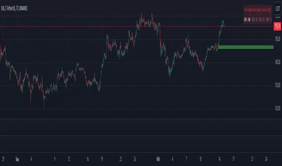
First Heikin-Ashi Candle Tracker [CHE] First Heikin-Ashi Candle Tracker
"A Heikin-Ashi Candle Rarely Comes Alone"
1. Introduction
Fundamental Observation
- "A Heikin-Ashi Candle Rarely Comes Alone"
- This principle highlights the tendency of Heikin-Ashi candles to appear in sequences, indicating sustained trends rather than isolated movements.
- Recognizing these patterns can significantly enhance trading strategies by identifying stronger and more reliable entry points.
2. Understanding Heikin-Ashi Candles
What Are Heikin-Ashi Candles?
- Heikin-Ashi is a type of candlestick chart used to identify market trends more clearly.
- Calculation Method:
- Ha_Close: (Open + High + Low + Close) / 4
- Ha_Open: (Previous Ha_Open + Previous Ha_Close) / 2
- Ha_High: Maximum of High, Ha_Open, Ha_Close
- Ha_Low: Minimum of Low, Ha_Open, Ha_Close
- Visual Differences:
- Smoother appearance compared to traditional candlesticks.
- Helps in filtering out market noise and highlighting the prevailing trend.
Benefits of Heikin-Ashi Candles
- Trend Clarity: Easier identification of uptrends and downtrends.
- Reduced Noise: Minimizes the impact of insignificant price movements.
- Visual Appeal: Cleaner charts enhance decision-making processes.
3. Introducing the First Heikin-Ashi Candle Tracker [CHE ]
Purpose of the Indicator
- Track First Heikin-Ashi Candles: Identifies the initial appearance of Heikin-Ashi candles across multiple timeframes.
- Enhance Trading Decisions: Provides visual cues for potential long and short entries based on trend confirmations.
Key Features
- Multi-Timeframe Support: Monitor Heikin-Ashi candles across different timeframes (e.g., 240, 60, 30, 15 minutes).
- Customizable Visuals: Adjustable colors and line widths for better chart integration.
- User-Friendly Interface: Easy-to-configure settings tailored to individual trading preferences.
- Max Line Management: Controls the number of displayed lines to maintain chart clarity.
4. How to Use the First Heikin-Ashi Candle Tracker
Step-by-Step Guide
1. Enable Desired Groups:
- Activate up to four groups, each representing a different timeframe.
- Customize each group's settings according to your trading strategy.
2. Configure Timeframes:
- Select timeframes that align with your trading style (e.g., short-term vs. long-term).
3. Set Candle Types to Track:
- Choose to monitor Both, Green (Bullish), or Red (Bearish) Heikin-Ashi candles.
- Focus on specific candle types to streamline entry signals.
4. Customize Visual Indicators:
- Adjust Green Line Color and Red Line Color for clear distinction.
- Modify Line Width to ensure visibility without cluttering the chart.
5. Manage Line Limits:
- Set the Max Number of Lines to prevent overcrowding.
- The indicator will automatically remove the oldest lines when the limit is exceeded.
6. Interpret Signals:
- Green Lines: Indicate potential Long entry points.
- Red Lines: Indicate potential Short entry points.
- Observe the sequence and frequency of candles to assess trend strength.
Practical Example
- Uptrend Identification:
- Consecutive green Heikin-Ashi candles with corresponding green lines signal a strong upward trend.
- Consider entering a Long position when the first green candle appears.
- Downtrend Identification:
- Consecutive red Heikin-Ashi candles with corresponding red lines signal a strong downward trend.
- Consider entering a Short position when the first red candle appears.
5. Benefits and Utility
Enhanced Trend Detection
- Early Signals: Identify the beginning of new trends promptly.
- Confirmation: Multiple timeframes provide robust confirmation of trend direction.
Improved Entry Points
- Precision: Pinpoint optimal moments to enter trades, reducing the risk of false signals.
- Flexibility: Suitable for both Long and Short strategies across various markets.
User-Friendly Operation
- Intuitive Settings: Easily configurable to match individual trading preferences.
- Visual Clarity: Clear lines and color-coding facilitate quick decision-making.
Time Efficiency
- Automated Tracking: Saves time by automatically identifying and marking relevant candles.
- Multi-Timeframe Analysis: Consolidates information from different timeframes into a single view.
6. Why Use the First Heikin-Ashi Candle Tracker ?
Strategic Advantages
- Market Insight: Gain deeper understanding of market dynamics through Heikin-Ashi analysis.
- Risk Management: Improved entry points contribute to better risk-reward ratios.
- Versatility: Applicable to various trading instruments, including stocks, forex, and cryptocurrencies.
Why Heikin-Ashi for Entries?
- Trend Reliability: Heikin-Ashi candles smooth out price data, providing more reliable trend indicators.
- Reduced Whipsaws: Fewer false signals compared to traditional candlestick charts.
- Clarity in Decision-Making: Simplifies the process of identifying and acting on market trends.
Conclusion
- The First Heikin-Ashi Candle Tracker is an essential tool for traders seeking to enhance their trend analysis and improve entry strategies.
- By leveraging the power of Heikin-Ashi candles, this indicator offers a clear, user-friendly approach to identifying profitable trading opportunities.
7. Getting Started
Installation
1. Add the Indicator:
- Open TradingView and navigate to the Pine Script editor.
- Paste the translated Pine Script code for the First Heikin-Ashi Candle Tracker .
- Save and add the indicator to your chart.
2. Configure Settings:
- Enable desired groups and set appropriate timeframes.
- Customize colors and line widths as per your preference.
- Adjust the maximum number of lines to maintain chart clarity.
3. Start Trading:
- Monitor the chart for green and red lines indicating potential Long and Short entries.
- Combine with other analysis tools for enhanced trading decisions.
Support and Resources
- Documentation: Refer to the included comments within the Pine Script for detailed explanations.
- Community Forums: Join TradingView communities for tips and shared experiences.
- Customer Support: Reach out for assistance with installation or configuration issues.
8. Disclaimer
The content provided, including all code and materials, is strictly for educational and informational purposes only. It is not intended as, and should not be interpreted as, financial advice, a recommendation to buy or sell any financial instrument, or an offer of any financial product or service. All strategies, tools, and examples discussed are provided for illustrative purposes to demonstrate coding techniques and the functionality of Pine Script within a trading context.
Any results from strategies or tools provided are hypothetical, and past performance is not indicative of future results. Trading and investing involve high risk, including the potential loss of principal, and may not be suitable for all individuals. Before making any trading decisions, please consult with a qualified financial professional to understand the risks involved.
By using this script, you acknowledge and agree that any trading decisions are made solely at your discretion and risk.
Happy Trading!
Best regards
Chervolino (Volker)
Bull/Bear Candle % Oscillator█ OVERVIEW
This script determines the proportion of bullish and bearish candles in a given sample size. It will produce an oscillator that fluctuates between 100 and -100, where values > 0 indicate more bullish candles in the sample and values < 0 indicate more bearish candles in the sample. Data produced by this oscillator is normalized around the 50% value, meaning that an even 50/50 split between bullish and bearish candles makes this oscillator produce 0; this oscillator indirectly represents the percent proportion of bullish and bearish candles in the sample (see HOW TO USE/INTERPRETATION OF DATA ).
It has two overarching settings: 'classic' and 'range'.
█ CONCEPTS
This script will cover concepts related to candlestick analysis, volumetric analysis, and lower timeframes.
Candlestick Analysis - The idea behind this script is to solely look at the candlesticks themselves and derive information from them in a given sample. It separates candles into two categories, bullish (close > open) and bearish (close < open).
If the indicator's setting is set to 'classic', the size of candles do not matter and all are assigned a value of 1 or 0.
If the indicator's setting is set to 'range', specific candle ranges modify the proportion of bullish/bearish values. Bullish candle values include all bullish candles in the set from their lows to the close, plus the lower wicks of all bearish candles. Bearish candle values include all bearish candles in the set from their highs to the close, plus the upper wicks of all bullish candles.
Volumetric Analysis - One of this script's features allows the user to modify the bullish and bearish candle proportions by its 'weight' determined by its volume compared to the sample set's total volume. Volumetric analysis for the 'range' setting are more complex than 'classic' as described below.
Lower Timeframes - For volumetric analysis to be done on candle wicks, there needed to be a way to determine how much volume had occurred in the wick by itself to find the weight of upper and lower wicks. To accomplish this, I employed PineScrypt's request.security_lower_tf function to grab OHLC values of lower timeframe candles (as well as volume) to determine how much volume had occurred in the wicks of the chart resolution's candle. The default OHLC values used here are the lows for upper wicks and highs for lower wicks. These OHLC values are then compared to the chart resolution candle's close to determine if the volume of that lower timeframe candle should be shifted to the wick weight or stay in the current weight of that candle. The reason 'low' and 'high' are used here is to guarantee that 100% of the volume of a lower timeframe candle had occurred in the wick of the candle at the current resolution (see LIMITATIONS ).
Bullish candles will exclude volume of all lower timeframe candles whose lows were greater than that candle's close. Bearish candles will exclude volume of all lower timeframe candles whose highs were less than that candle's close. These wick volumes are then divided by the volume of the sample set, and wick sizes are then multiplied by this weight before being added to their specific bullish/bearish sums (lower wicks to bullish and upper wicks to bearish).
█ FEATURES
There are 13 inputs for the user to modify the behavior/visual representation of this script.
Sample Length - This determines how many candles are in the sample set to find the proportion of bullish and bearish candles.
Colors and Invert Colors - There are three colors set by the user: a bullish color, neutral color, and bearish color. The oscillator plots two lines, one at 0 and another that represents the proportion of bullish or bearish candles in the sample set (we'll call this the 'signal line'). If the oscillator is above 0, bullish color is used, bearish otherwise. This script generates a gradient to color a filled area between the 0 line and the signal line based on the historical values of the oscillator itself and the signal line. For bullish values, the closer the signal line is to the max (or restricted max described below) that the oscillator has experienced, the more colored toward bullish color the shaded area will be, using the neutral color as a starting point. The same is applied to the bearish values using the bearish color.
There is an additional input to invert the colors so that the bearish color is associated with bullish values and vise-versa.
Calculation Type - This determines the overarching behavior of the oscillator and has two settings:
Classic - The weight of candles are either 1 if they occurred and 0 if not.
Range - The weight of candles is determined by the size of specific sections as described in CONCEPTS - Candlestick Analysis .
Volume Weighted - This enables modifying the weights of candles as described in CONCEPTS - Volumetric Analysis and Lower Timeframes based on which Calculation Type is used.
Wick Slice Resolution - This is the lower timeframe resolution that will be used to slice the chart resolution's candle when determining the volumetric weight of wicks. Lower timeframe resolutions like '1 minute' will yield more precise results as they will give more data points to go off of (see LIMITATIONS ).
Upper/Lower Wick Source - These two inputs allow the user to select which OHLC values to compare against the chart resolution's candle close when determining which lower timeframe candles will have their volumes associated with the wicks of candles being analyzed at the chart's resolution.
Restrict Min/Max Data and Restriction - This will restrict the maximum and minimum values that will be used for the signal line when comparing its value to previous oscillator values and change how the color gradient is generated for the indicator. Restriction is the number of candles back that will determine these maximum and minimum values.
Display Min/Max Guide - This will plot two lines that are colored the corresponding bullish and bearish colors which follow what the maximum and minimum values are currently for the oscillator.
█ HOW TO USE/INTERPRETATION OF DATA
As mentioned in the OVERVIEW section, this oscillator provides an indirect representation of the percent proportion of bullish or bearish candles in a given sample. If the oscillator reads 80, this does not mean that 80% of all candles in the sample were bullish . To find the percentage of candles that were bullish or bearish, the user needs to perform the following:
50% + ((|oscillator value| / 100) * 50)%
If the oscillator value is negative, the value from above will represent the percentage of bearish candles in the sample. If it is positive, this value represents the percentage of bullish candles in the sample.
Example 1 (oscillator value = 80):
50% + ((|80| / 100) * 50)%
50% + ((0.80) * 50)%
50% + 40% = 90%
90% of the candles in the sample were bullish.
Example 2 (oscillator value = -43):
50% + ((|-43| / 100) * 50)%
50% + ((0.43) * 50)%
50% + 21.5% = 71.5%
71.5% of the candles in the sample were bearish.
An example use of this indicator would be to put in a 'buy' order when its value shows a significant proportion of the sampled candles were bearish, and put in a 'sell' order when a significant proportion of candles were bullish. Potential divergences of this oscillator may also be used to plan trades accordingly such as bearish divergence - price continues higher as the oscillator decreases in value and vise-versa.*
* Nothing in this script constitutes any form of financial advice. The user is solely responsible for their trading decisions and I will not be held liable for any losses or gains incurred with the use of this script. Please proceed with caution when using this script to assist with trading decisions.
█ LIMITATIONS
Range Volumetric Weights :
Because of the conditions that must be met in order for volume to be considered part of wicks, it is possible that the default settings and their intended reasoning will not produce reliable results. If all lower timeframe candles have highs or lows that are within the body of the candle at the chart's resolution, the volume for the wicks will effectively be 0, which is not an accurate representation of those wicks. This is one of the reasons why I included the ability to change the source values used for these conditions as certain OHLC values may produce more reliable/intended results under these conditions.
Wick Slice Resolution :
PineScript restricts the number of intrabar references to 100,000 total. This script uses 3 separate request.security_lower_tf calls and has a default resolution of 1 minute. This means that if the user were to set the oscillator to the Range setting, enable volume weighted, and had the Wick Slice Resolution set to 1 minute, this script will exceed this 100,000 reference restriction within 24 days of data and will not produce any results beyond the previous 23.14 days.
Below are example uses of all the different settings of this script, these are done on the 1D chart of COINBASE:BTCUSD :
Default Settings:
Classic - Volume Weighted:
Range - no Volume Weight:
Range - Volume Weighted (1 min slices):
Range - Volume Weighted (1 hour slices):
Display Min/Max Guide - No Restriction:
Display Min/Max Guide - Restriction:
Invert Colors:
3D Candles (Zeiierman)█ Overview
3D Candles (Zeiierman) is a unique 3D take on classic candlesticks, offering a fresh, high-clarity way to visualize price action directly on your chart. Visualizing price in alternative ways can help traders interpret the same data differently and potentially gain a new perspective.
█ How It Works
⚪ 3D Body Construction
For each bar, the script computes the candle body (open/close bounds), then projects a top face offset by a depth amount. The depth is proportional to that candle’s high–low range, so it looks consistent across symbols with different prices/precisions.
rng = math.max(1e-10, high - low ) // candle range
depthMag = rng * depthPct * factorMag // % of range, shaped by tilt amount
depth = depthMag * factorSign // direction from dev (up/down)
depthPct → how “thick” the 3D effect is, as a % of each candle’s own range.
factorMag → scales the effect based on your tilt input (dev), with a smooth curve so small tilts still show.
factorSign → applies the direction of the tilt (up or down).
⚪ Tilt & Perspective
Tilt is controlled by dev and translated into a gentle perspective factor:
slope = (4.0 * math.abs(dev)) / width
factorMag = math.pow(math.min(1.0, slope), 0.5) // sqrt softens response
factorSign = dev == 0 ? 0.0 : math.sign(dev) // direction (up/down)
Larger dev → stronger 3D presence (up to a cap).
The square-root curve makes small dev values noticeable without overdoing it.
█ How to Use
Traders can use 3D Candles just like regular candlesticks. The difference is the 3D visualization, which can broaden your view and help you notice price behavior from a fresh perspective.
⚪ Quick setup (dual-view):
Split your TradingView layout into two synchronized charts.
Right pane: keep your standard candlestick or bar chart for live execution.
Left pane: add 3D Candles (Zeiierman) to compare the same symbol/timeframe.
Observe differences: the 3D rendering can make expansion/contraction and body emphasis easier to spot at a glance.
█ Go Full 3D
Take the experience further by pairing 3D Candles (Zeiierman) with Volume Profile 3D (Zeiierman) , a perfect complement that shows where activity is concentrated, while your 3D candles show how the price unfolded.
█ Settings
Candles — How many 3D candles to draw. Higher values draw more shapes and may impact performance on slower machines.
Block Width (bars) — Visual thickness of each 3D candle along the x-axis. Larger values look chunkier but can overlap more.
Up/Down — Controls the tilt and strength of the 3D top face.
3D depth (% of range) — Thickness of the 3D effect as a percentage of each candle’s own high–low range. Larger values exaggerate the depth.
-----------------
Disclaimer
The content provided in my scripts, indicators, ideas, algorithms, and systems is for educational and informational purposes only. It does not constitute financial advice, investment recommendations, or a solicitation to buy or sell any financial instruments. I will not accept liability for any loss or damage, including without limitation any loss of profit, which may arise directly or indirectly from the use of or reliance on such information.
All investments involve risk, and the past performance of a security, industry, sector, market, financial product, trading strategy, backtest, or individual's trading does not guarantee future results or returns. Investors are fully responsible for any investment decisions they make. Such decisions should be based solely on an evaluation of their financial circumstances, investment objectives, risk tolerance, and liquidity needs.
Big Candle HighlighterBig Candle Highlighter
The Big Candle Highlighter indicator highlights significant candles based on their percentage difference between the open and close prices. This tool helps traders quickly identify candles with substantial price movements, which can be crucial for spotting key price action, potential reversals, or significant market events.
Key Features:
Percentage Threshold : Customize the minimum percentage difference from open to close required to mark a candle as "big."
Bullish and Bearish Markers : Bullish big candles are marked with a label below the bar in green, while bearish big candles are marked with a label above the bar in red.
Background Highlighting : Optionally highlight the background of big candles for better visual emphasis.
Inputs:
Percentage Threshold (% ): Set the percentage threshold to define what constitutes a "big" candle. For example, a threshold of 2.0 means that only candles with a 2% or more difference between open and close will be marked.
Color for Big Bullish Candle : Choose the color for labeling and highlighting bullish big candles.
Color for Big Bearish Candle : Choose the color for labeling and highlighting bearish big candles.
Usage :
This indicator is useful for traders looking to identify significant price movements and potential trading opportunities. By focusing on candles that show substantial changes from open to close, you can better understand market dynamics and make more informed trading decisions.
Add the Big Candle Marker to your charts to enhance your technical analysis and stay ahead of market trends.

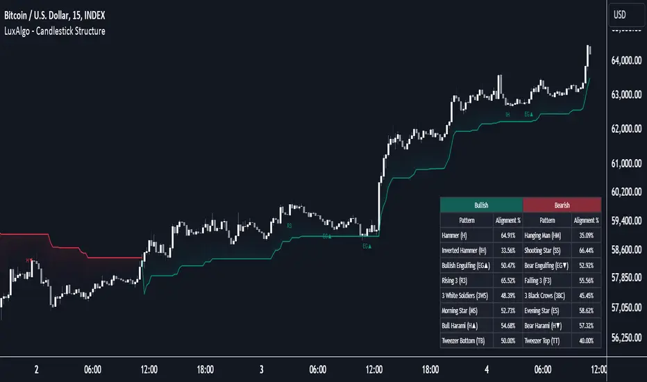
Candlestick Structure [LuxAlgo]The Candlestick Structure indicator detects major market trends and displays various candlestick patterns aligning with the detected trend, filtering out potentially unwanted patterns as a result. Multiple trend detection methods are included and can be selected by the users.
A dashboard showing the alignment percentage of each individual pattern is also provided.
🔶 USAGE
By distinguishing major and minor trend detection, we can still detect patterns based on minor trends, yet filter out the patterns that do not align with the major trend.
By detecting candlestick patterns that align with a major trend, we can effectively detect the ending points of retracements, potentially providing various entry points of interest within a trend.
Users are able to track the alignment of each candlestick pattern in the dashboard to reveal which patterns typically align with the trend and which may not.
Note: Alignment % only checks if the pattern's direction is the same as the current trend direction. These are only raw readings and not any type of confidence score.
🔶 DETAILS
In this indicator, we are identifying and tracking 16 different Candlestick Patterns.
🔹 Bullish Patterns
Hammer: Identified by a small upper wick (or no upper wick) with a small body, and an elongated lower wick whose length is 2X greater than the candle body’s width.
Inverted Hammer: Identified by a small lower wick (or no lower wick) with a small body, and an elongated upper wick whose length is 2X greater than the candle body’s width.
Bullish Engulfing: A 2 bar pattern identified by a large bullish candle body fully encapsulating (opening lower and closing higher) the previous small (bearish) candle body.
Rising 3: A 5 bar pattern identified by an initial full-bodied bullish candle, followed by 3 bearish candles that trade within the high and low of the initial candle, followed by another full-bodied bullish candle closing above the high of the initial candle.
3 White Soldiers: Identified by 3 full-bodied bullish candles, each opening within the body and closing below the high, of the previous candle.
Morning Star: A 3 bar pattern identified by a full-bodied bearish candle, followed by a small-bodied bearish candle, followed by a full-bodied bullish candle that closes above the halfway point of the first candle.
Bullish Harami: A 2 bar pattern, identified by an initial bearish candle, followed by a small bullish candle whose range is entirely contained within the body of the initial candle.
Tweezer Bottom: A 2 bar pattern identified by an initial bearish candle, followed by a bullish candle, both having equal lows.
🔹 Bearish Patterns
Hanging Man: Identified by a small upper wick (or no upper wick) with a small body, and an elongated lower wick whose length is 2X greater than the candle body’s width.
Shooting Star: Identified by a small lower wick (or no lower wick) with a small body, and an elongated upper wick whose length is 2X greater than the candle body’s width.
Bearish Engulfing: A 2 bar pattern identified by a large bearish candle body fully encapsulating (opening higher and closing lower) the previous small (bullish) candle body.
Falling 3: A 5 bar pattern identified by an initial full-bodied bearish candle, followed by 3 bullish candles that trade within the high and low of the initial candle, followed by another full-bodied bearish candle closing below the low of the initial candle.
3 Black Crows: Identified by 3 full-bodied bearish candles, each open within the body and closing below the low, of the previous candle.
Evening Star: A 3 bar pattern identified by a full-bodied bullish candle, followed by a small-bodied bullish candle, followed by a full-bodied bearish candle that closes below the halfway point of the first candle.
Bearish Harami: A 2 bar pattern, identified by an initial bullish candle, followed by a small bearish candle whose range is entirely contained within the body of the initial candle.
Tweezer Top: A 2 bar pattern identified by an initial bullish candle, followed by a bearish candle, both having equal highs.
🔹 Trend Types
Major trend is displayed at all times, the display will change depending on the trend method selected.
The minor trend can also be visualized; to avoid confusion, the minor trend can optionally be displayed through the candle colors.
Supertrend: Displays Upper and Lower SuperTrend, When we break above the upper, it is considered an Uptrend. When we break below the lower, it is considered a Downtrend.
EMAs: Displays Fast and Slow EMAs, When Fast>Slow, it is considered an Uptrend. When Fast
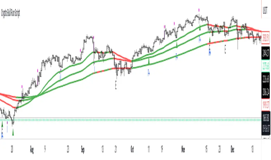
Crypto Uptrend Script + Pullback//Volume CandlesDescription: his is an adaption of my Pullback candle - This works on all timeframes and Markets (Forex//Stocks//)
Crypto Uptrend Script with Pullback Candle allows traders to get into a trend when the price is at end of a pullback and entering a balance phase in the market (works on all markets). The use of Moving averages to help identify a Trends and the use of Key levels to help traders be aware of where strong areas are in the market.
This script can work really well in Crypto Bull Runs when used on HTF and with confluences
The script has key support and resistance zones which are made up of quarterly data. Price reacts to these areas but patience is required as price will take time to come into these areas
I have updated the Pullback Candle with the use of Volume to filter out the weak Pullback Candles -
There are new candles to the script.
The First candle is the Bullish Volume Candle - This candle is set to a multiplier of 2x with a crossover of 50/100 on Volume - this then will paint a purple candle.
Uses of the Bullish Volume Candle:
Breakthrough of key areas // special chart patterns
Rejection of key areas
End of a impulse wave (Profit Takers)
The second candle is a Hammer - I prefer using the Hammers on Higher Timeframes however they do work on all timeframes. .
The third candle is a Exhaustion of impulse downward move.
Uses of this candle - can denote a new trend but has to be with confluence to a demand area // support area or with any use of technical analysis - using this alone is not advised
The fourth candle is a indecision candle in the shape of a Doji - this candle can help identify if the trend is in a continuation or a reversal
This script can work really well in Crypto Bull Runs
Disclaimer: There will be Pullbacks with High Volume (Breakouts) and not go the way as intended but this script is to allow traders to get into trends at good price levels. The script can paint signals in areas where price is too expensive so please do your own due diligence on the markets as this script is to help get into good areas of price
Please leave a thumbs up if you like this script and message me for information on how to use the script.
HTF Control Shift + Prev Candle Break Sequence 🧭 HTF Control Shift + Previous Candle Break Sequence
Overview
The HTF Control Shift + Previous Candle Break Sequence indicator identifies high-probability shift candles that suggest a potential change in market control — from sellers to buyers or vice versa — and then tracks whether price confirms that shift by breaking the previous candle’s high or low.
This tool is designed to help traders detect institutional control shifts and confirm them with price structure breaks, providing a framework for spotting early trend reversals or strong continuation moves.
How It Works
Control Shift Candle Detection
A Bullish Control Shift occurs when a candle shows:
A long lower wick (≥ Wick % Threshold of total range).
A close near the high (within Body % Threshold of the top).
A Bearish Control Shift occurs when a candle shows:
A long upper wick (≥ Wick % Threshold of total range).
A close near the low (within Body % Threshold of the bottom).
These candles are highlighted in green (bullish) or red (bearish), and optionally labeled on the chart.
Previous Candle High/Low Tracking
The script automatically plots horizontal lines at the previous candle’s high (green) and low (red).
These act as key reference levels for breakout confirmation.
Breakout Confirmation Sequence
A Bullish Sequence triggers when a Bullish Control Shift candle is followed by a break above the previous candle’s high.
A Bearish Sequence triggers when a Bearish Control Shift candle is followed by a break below the previous candle’s low.
When either sequence completes, the indicator can send a TradingView alert confirming the directional breakout.
How to Use
Timeframe:
Optimized for higher timeframes (1H, 4H, Daily) to filter out intraday noise and identify structural market shifts.
Trend Reversal Identification:
Watch for Control Shift candles at major highs/lows, order blocks, or liquidity zones — a confirmed breakout often signals a trend reversal or new directional push.
Continuation Confirmation:
In trending markets, a Control Shift candle that breaks in the direction of trend can validate a strong continuation setup.
Alert Usage:
Set alerts for:
Bullish Control Shift Confirmed Breakout
Bearish Control Shift Confirmed Breakdown
Optional: raw Control Shift or Break alerts.
Customization
Wick % Threshold: Adjusts the required wick size to define a control shift.
Body % Threshold: Controls how close the close must be to the high/low for confirmation.
Label Toggle: Optionally display labels only on control shift candles.
Best Practices
Combine with higher-timeframe trend filters.
Avoid using it alone in tight consolidation zones.
Strongest signals occur when:
Control Shift appears at key structure levels.
The breakout bar closes firmly beyond the previous high/low.
Volume supports the breakout.
Summary
✅ Detects when market control flips (buyers ↔ sellers).
✅ Confirms shift with breakout above/below previous candle.
✅ Ideal for 1H–4H swing or position trading.
✅ Provides visual, structural, and alert-based confirmation.

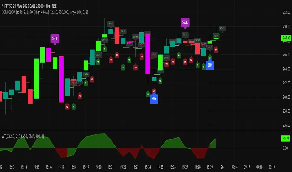
GCM Centre Line Candle MarkerGCM Centre Line Candle Marker (GCM-CLCM) - Descriptive Notes
Indicator Overview:
The "GCM Centre Line Candle Marker" is a versatile TradingView overlay indicator designed to enhance chart analysis by drawing short horizontal lines at user-defined "centre" points of candles. These lines provide a quick visual reference to key price levels within each candle, such as midpoints, open, close, or typical prices. The indicator offers extensive customization for line appearance, positioning, and conditional display, including an option to highlight only bullish engulfing patterns.
Key Features:
1. Customizable Line Position:
o Users can choose from various methods to calculate the "centre" price for the line:
(High + Low) / 2 (Default)
(Open + Close) / 2
Close
Open
(Open + High + Low + Close) / 4 (HLCO/4)
(Open + High + Close) / 3 (Typical Price HLC/3 variation)
(Open + Close + Low) / 3 (Typical Price OCL/3 variation)
2. Line Appearance Customization:
o Visibility: Toggle lines on/off.
o Style: Solid, dotted, or dashed lines.
o Width: Adjustable line thickness (1 to 5).
o Length: Defines how many candles forward the line extends (1 to 10).
o Color: Lines are colored based on candle type (bullish/bearish), with user-selectable base colors.
o Dynamic Opacity: Line opacity is dynamically adjusted based on the candle's size relative to recent candles. Larger candles produce more opaque lines (up to the user-defined maximum opacity), while smaller candles result in more transparent lines. This helps significant candles stand out.
3. Price Labels:
o Show Labels: Option to display price labels at the end of each center line.
o Label Background Color: Customizable.
o Dynamic Text Color: Label text color can change based on the movement of the center price:
Green: Current center price is higher than the previous.
Red: Current center price is lower than the previous.
Gray: No change or first label.
o Static Text Color: Alternatively, a fixed color can be used for all labels.
4. Conditional Drawing - Bullish Engulfing Filter:
o Users can enable an option to Only Show Bullish Engulfing Candles. When active, center lines will only be drawn for candles that meet bullish engulfing criteria (current bull candle's body engulfs the previous bear candle's body).
5. Performance Management:
o Max Lines to Show: Limits the number of historical lines displayed on the chart to maintain clarity and performance. Older lines are automatically removed as new ones are drawn.
6. Alert Condition:
o Includes a built-in alert: Big Bullish Candle. This alert triggers when a bullish candle's range (high - low) is greater than the 20-period simple moving average (SMA) of candle ranges.
How It Works:
• For each new candle, the script calculates the "center" price based on the user's Line Position selection.
• If showLines is enabled and (if applicable) the bullish engulfing condition is met, a new line is drawn from the current candle's bar_index at the calculated _center price, extending lineLength candles forward.
• The line's color is determined by whether the candle is bullish (close > open) or bearish (close < open).
• Opacity is calculated dynamically: scaledOpacity = int((100 - maxUserOpacity) * (1 - dynamicFactor) + maxUserOpacity), where dynamicFactor is candleSize / maxSize (current candle size relative to the max size in the last 20 candles). This means maxUserOpacity is the least transparent the line will be (for the largest candles), and smaller candles will have lines approaching full transparency.
• Optional price labels are added at the end of these lines.
• The script manages an array of drawn lines, removing the oldest ones if the maxLines limit is exceeded.
Potential Use Cases:
• Visualizing Intra-Candle Levels: Quickly see midpoints or other key price points without manual drawing.
• Short-Term Reference Points: The extended lines can act as very short-term dynamic support/resistance or points of interest.
• Pattern Recognition: Highlight bullish engulfing patterns or simply emphasize candles based on their calculated center.
• Volatility Indication: The dynamic opacity can subtly indicate periods of larger or smaller candle ranges.
• Confirmation Tool: Use in conjunction with other indicators or trading strategies.
User Input Groups:
• Line Settings: Controls all aspects of the line's appearance and calculation.
• Label Settings: Manages the display and appearance of price labels.
• Other Settings: Contains options for line management and conditional filtering (like Bullish Engulfing).
This indicator provides a clean and customizable way to mark significant price levels within candles, aiding traders in their technical analysis.
Custom Candlestick MarkingsThis indicator allows you to filter candlesticks based on their body (the real body) and wick lengths. Specifically, it marks candlesticks based on the following criteria:
For Bearish Candles:
1. The close price is lower than the open price (indicating a bearish candle).
2. The difference between the high and the maximum of open and close is less than or equal to the specified upper wick length.
3. The absolute difference between the close and open is greater than or equal to the specified body height.
For Bullish Candles:
1. The close price is higher than the open price (indicating a bullish candle).
2. The difference between the maximum of open and close and the low is less than or equal to the specified lower wick length.
3. The absolute difference between the close and open is greater than or equal to the specified body height.
These conditions are used to filter and mark candlesticks that meet the specified criteria, allowing you to visually identify them on the chart. This can be useful for technical analysis and identifying specific candlestick patterns or conditions based on body and wick lengths.
Certainly, this indicator can help in identifying trends more easily. Specifically, by applying certain criteria based on the length of candlestick bodies and wicks, it becomes easier to visually capture changes in market trends and specific patterns.
For instance, you can use this indicator to identify candlestick patterns that match specific body heights or wick lengths. This makes it easier to detect signs of trend reversals or trend changes, and it can assist in making trading decisions when combined with trendlines or support and resistance levels.
However, it's common to use this indicator in conjunction with other technical analysis tools and indicators. Confirming trends and pinpointing entry points often requires multiple sources of information and analysis. In investing and trading, thorough research and careful strategy are essential.

Price Percentage Shaded CandlesDescription:
The Price Percentage Shaded Candles indicator (P%SC) is a technical analysis tool designed to represent price candles on a chart with shading intensity based on the percentage change between the open and close prices. This overlay indicator enhances visual analysis by providing a visual representation of price movement intensity.
How it Works:
The P%SC indicator calculates the percentage change between the open and close prices of each candle. It then determines the shading intensity of the price candles based on this percentage change. Higher percentage changes result in darker shading, while lower percentage changes result in lighter shading.
Usage:
To effectively utilize the Price Percentage Shaded Candles indicator, follow these steps:
1. Apply the Price Percentage Shaded Candles indicator to your chart by adding it from the available indicators.
2. Configure the indicator's inputs:
- Specify the color for bullish candles using the "Bullish Color" input.
- Specify the color for bearish candles using the "Bearish Color" input.
3. Observe the shaded candles on the chart:
- Bullish candles are colored with the specified bullish color and shaded according to the percentage change.
- Bearish candles are colored with the specified bearish color and shaded according to the percentage change.
4. Interpret the shaded candles:
- Darker shading indicates a higher percentage change and stronger price movement during the corresponding candle.
- Lighter shading indicates a lower percentage change and weaker price movement during the corresponding candle.
5. Combine the analysis of shaded candles with other technical analysis tools, such as trend lines, support and resistance levels, or candlestick patterns, to identify potential trade setups.
6. Implement appropriate risk management strategies, including setting stop-loss orders and position sizing, to manage your trades effectively and protect your capital.
Note: The Price Percentage Shaded Candles indicator provides insights into the shading intensity of price candles based on percentage changes. However, it is recommended to use this indicator in conjunction with other technical analysis tools and perform thorough analysis before making trading decisions.
Custom Candlestick Pattern IndicatorCustom Candlestick Pattern Indicator - Buy Signal Based on Green Candles Breaking Previous Lows
Overview:
This custom candlestick pattern indicator is designed to highlight potential buy opportunities based on a simple yet powerful candlestick pattern. The indicator identifies green candles that break below the low of the previous candle. This combination may signal a potential market reversal or a bullish continuation after a pullback, depending on the market context. Traders can use this indicator to detect areas where prices may be bouncing from recent lows, indicating a potential buying opportunity.
Pattern Explanation:
The strategy underlying this indicator is a two-part condition that must be met before a buy signal is generated:
Green Candle: A green candle forms when the closing price of the current candle is higher than its opening price. This visually represents bullish momentum as buyers have taken control, closing the price higher than where it opened.
Breaking the Previous Low: The low of the current candle must be lower than the low of the previous candle. This suggests that, despite initial bearish pressure during the candle formation (which drove the price below the previous candle's low), buyers stepped in to push the price higher by the candle’s close. This pattern can signify a potential reversal or bullish continuation, as it demonstrates that buyers are overcoming initial selling pressure.
When the Pattern Occurs:
This pattern is particularly interesting to traders who look for potential reversal signals after a brief decline in price.
It may also work well in markets where pullbacks are common, as this pattern could mark the end of a retracement and the resumption of the bullish trend.
How the Indicator Works:
Green Candle: The indicator first identifies a green candle, where the close of the candle is greater than its open (close > open). This signals that the current period closed higher than it opened, which is generally a bullish sign.
Breaking Previous Low: The indicator checks if the current candle's low is below the low of the previous candle (low < low ). If this condition is met, it means the price dropped below the previous candle's low but was still able to close higher (green candle), signaling a potential reversal or buying opportunity.
Buy Signal: If both conditions are true (green candle + breaking previous low), the indicator plots a buy signal below the candle in the form of an upward-facing triangle labeled "Buy" in green. This serves as a visual cue for traders to consider entering a buy position.
Optional Previous Low Plot: For added reference, the indicator plots the previous candle's low as a red step-line on the chart. This helps traders visualize when the price has dipped below the prior candle's low, making it easier to spot instances where the pattern is forming.
How to Use:
This indicator can be used across multiple timeframes, whether you’re trading short-term intraday patterns or longer-term swing trades.
It works well in markets that experience pullbacks or minor retracements, as the pattern it identifies suggests a rejection of lower prices followed by a push higher.
Traders can combine this indicator with other technical analysis tools (such as moving averages, support/resistance levels, or momentum oscillators) to strengthen the buy signals and add more context to the trading decision.
Example Scenarios:
Reversal Signal: Suppose a market has been in a minor downtrend, and suddenly a green candle forms after a low that breaks the previous day’s low. This indicator would generate a buy signal, suggesting the downtrend may be losing strength and that buyers are taking control. This could be an early indication of a reversal.
Bullish Continuation After Pullback: Imagine a market in a steady uptrend experiences a temporary pullback. The price breaks the previous candle’s low, but the current candle closes higher (green candle). This buy signal could indicate that the pullback is over, and the uptrend is likely to continue.
Advantages:
Simplicity: This indicator relies on basic price action (green candles and lows) without requiring complicated indicators or oscillators, making it easy to understand and use.
Visual Alerts: The plotted buy signals and previous lows provide a clear, visual representation on the chart, simplifying decision-making for traders.
Versatility: It can be applied across different timeframes and asset classes (stocks, forex, crypto, etc.), making it a versatile tool for all kinds of traders.
Limitations:
As with any single indicator or pattern, this should not be used in isolation. It is important to incorporate broader market context, support/resistance levels, and other forms of analysis to avoid false signals.
The pattern tends to be more effective when there’s sufficient market liquidity and may perform better in trending or volatile markets compared to sideways or flat markets.

Candle Counter [theEccentricTrader]█ OVERVIEW
This indicator counts the number of confirmed candle scenarios on any given candlestick chart and displays the statistics in a table, which can be repositioned and resized at the user's discretion.
█ CONCEPTS
Green and Red Candles
A green candle is one that closes with a high price equal to or above the price it opened.
A red candle is one that closes with a low price that is lower than the price it opened.
Upper Candle Trends
A higher high candle is one that closes with a higher high price than the high price of the preceding candle.
A lower high candle is one that closes with a lower high price than the high price of the preceding candle.
A double-top candle is one that closes with a high price that is equal to the high price of the preceding candle.
Lower Candle Trends
A higher low candle is one that closes with a higher low price than the low price of the preceding candle.
A lower low candle is one that closes with a lower low price than the low price of the preceding candle.
A double-bottom candle is one that closes with a low price that is equal to the low price of the preceding candle.
█ FEATURES
Inputs
Start Date
End Date
Position
Text Size
Show Sample Period
Show Plots
Table
The table is colour coded, consists of three columns and twenty-two rows. Blue cells denote all candle scenarios, green cells denote green candle scenarios and red cells denote red candle scenarios.
The candle scenarios are listed in the first column with their corresponding total counts to the right, in the second column. The last row in column one, row twenty-two, displays the sample period which can be adjusted or hidden via indicator settings.
Rows two and three in the third column of the table display the total green and red candles as percentages of total candles. Rows four to nine in column three, coloured blue, display the corresponding candle scenarios as percentages of total candles. Rows ten to fifteen in column three, coloured green, display the corresponding candle scenarios as percentages of total green candles. And lastly, rows sixteen to twenty-one in column three, coloured red, display the corresponding candle scenarios as percentages of total red candles.
Plots
I have added plots as a visual aid to the various candle scenarios listed in the table. Green up-arrows denote higher high candles when above bar and higher low candles when below bar. Red down-arrows denote lower high candles when above bar and lower low candles when below bar. Similarly, blue diamonds when above bar denote double-top candles and when below bar denote double-bottom candles. These plots can also be hidden via indicator settings.
█ HOW TO USE
This indicator is intended for research purposes and strategy development. I hope it will be useful in helping to gain a better understanding of the underlying dynamics at play on any given market and timeframe. It can, for example, give you an idea of any inherent biases such as a greater proportion of green candles to red. Or a greater proportion of higher low green candles to lower low green candles. Such information can be very useful when conducting top down analysis across multiple timeframes, or considering trailing stop loss methods.
What you do with these statistics and how far you decide to take your research is entirely up to you, the possibilities are endless.
This is just the first and most basic in a series of indicators that can be used to study objective price action scenarios and develop a systematic approach to trading.
█ LIMITATIONS
Some higher timeframe candles on tickers with larger lookbacks such as the DXY, do not actually contain all the open, high, low and close (OHLC) data at the beginning of the chart. Instead, they use the close price for open, high and low prices. So, while we can determine whether the close price is higher or lower than the preceding close price, there is no way of knowing what actually happened intra-bar for these candles. And by default candles that close at the same price as the open price, will be counted as green. You can avoid this problem by utilising the sample period filter.
The green and red candle calculations are based solely on differences between open and close prices, as such I have made no attempt to account for green candles that gap lower and close below the close price of the preceding candle, or red candles that gap higher and close above the close price of the preceding candle. I can only recommend using 24-hour markets, if and where possible, as there are far fewer gaps and, generally, more data to work with. Alternatively, you can replace the scenarios with your own logic to account for the gap anomalies, if you are feeling up to the challenge.
It is also worth noting that the sample size will be limited to your Trading View subscription plan. Premium users get 20,000 candles worth of data, pro+ and pro users get 10,000, and basic users get 5,000. If upgrading is currently not an option, you can always keep a rolling tally of the statistics in an excel spreadsheet or something of the like.
Infiten's Return Candle OscillatorInfiten's Return Candle Oscillator is an oscillator which shows the percentage return on the open, high, close and low over a customizable period in the form of candlesticks. It may be helpful for seeing volatility, swing trading, or mean reversion trading.
The RCO consists of two plotted elements :
RCO Candles (short length): candlesticks which are plotted with low = the product of the percentage changes in the low over a period, high = the product of the percentage changes in the high over a period, close = the product of the percent changes in close over a period, and open = the product of the percentage changes in return over a period. Similarly to with standard candlesticks, if the percentage change on the close is higher than the percentage change on the open, the candlestick is green, otherwise it is red.
Smoothed RCO Line (long length) : a moving average of the average of the low, close, open and high calculated for the RCO Candles. The line's transparency is determined by the percentage difference between the RCO and the highest or lowest RCO over the long length. A more transparent line means that the RCO is closer to the highest or lowest RCO, and may be indicative of a reversal, or weakening trend.

Candlestick RecognitionCandlestick Recognition
Version 1.0
Fun script to recognize and name candlesticks. Hamers and Highwaves and Marubozus oh my!
All candlestick names can be turned on or off in the settings since sometimes they stack close to each other and are hard to read. If you think I mislabeled any please provide me with an example of what you think it should be and I will review it to see if any changes need to be made. Please keep in mind that each stock will be a little different as the Candlestick Recognition uses ATR (Average True Range) for the calculations.