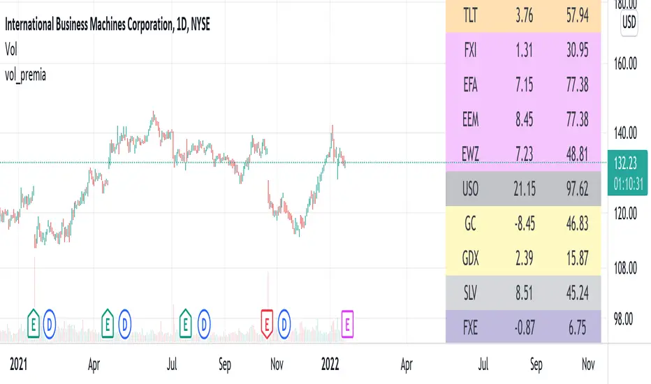
vol_premiaThis script shows the volatility risk premium for several instruments. The premium is simply "IV30 - RV20". Although Tradingview doesn't provide options prices, CBOE publishes 30-day implied volatilities for many instruments (most of which are VIX variations). CBOE calculates these in a standard way, weighting at- and out-of-the-money IVs for options that expire in 30 days, on average. For realized volatility, I used the standard deviation of log returns. Since there are twenty trading periods in 30 calendar days, IV30 can be compared to RV20. The "premium" is the difference, which reflects market participants' expectation for how much upcoming volatility will over- or under-shoot recent volatility.
The script loads pretty slow since there are lots of symbols, so feel free to delete the ones you don't care about. Hopefully the code is straightforward enough. I won't list the meaning of every symbols here, since I might change them later, but you can type them into tradingview for data, and read about their volatility index on CBOE's website. Some of the more well-known ones are:
ES: S&P futures, which I prefer to the SPX index). Its implied volatility is VIX.
USO: the oil ETF representing WTI future prices. Its IV is OVX.
GDX: the gold miner's ETF, which is usually more volatile than gold. Its IV is VXGDX.
FXI: a china ETF, whose volatility is VXFXI.
And so on. In addition to the premium, the "percentile" column shows where this premium ranks among the previous 252 trading days. 100 = the highest premium, 0 = the lowest premium.
Cari dalam skrip untuk "spx"
S&P15 = 33.0% of SPXThis indicator shows what the top 15 stocks in the SPX is doing in a chart form.
VIX Implied Move Bands for ES/Emini futuresThis script uses the close of the VIX on a daily resolution to provide the 'implied move' for the E-mini SP500 futures. While it can be applied to any equity index, it's crucial to know that the VIX is calculated using SPX options, and may not reflect the implied volatility of other indices. The user can adjust the length of the moving average used to calculate the bands, the window of days used to calculate the implied move, and the multiplier that effects the width of the bands.

Horus RSI Stoch BTC - SPX EMA SpreadHello Traders,
Horus RSI Stoch BTC - SPX EMA Spread is an oscillator based on BITSTAMP:BTC and the SPX500USD EMA spread and may indicate Bitcoin oversold / overbought conditions compared to SPX. You can also setup an other time frame.
How it works?
- Like an RSI but only for BTC
- Setup any time frame you want
- Display Stochastic
- Display StochRSI
- Display Crosses for potential breakout / breakdown
If its indicated overbought, this does not mean it can't go higher. Same the other way around.
Use other indicators and PA for more confluence.
Wuuzzaa


Compare Stock to a reference stock (e.g. SPX) Compare Stock to a reference stock (e.g. SPX) for input period
Blue barchart show the stock increment in the period > reference stock, vice versa for red barchart

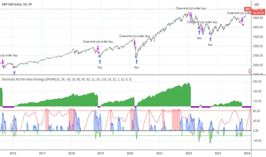
XPloRR S&P500 Stock Market Crash Detection Strategy v2XPloRR S&P500 Stock Market Crash Detection Strategy v2
Long-Term Trailing-Stop strategy detecting S&P500 Stock Market Crashes/Corrections and showing Volatility as warning signal for upcoming crashes
Detecting or avoiding stock market crashes seems to be the 'Holy Grail' of strategies.
Since none of the strategies that I tested can beat the long term Buy&Hold strategy, the purpose was to detect a stock market crash on the S&P500 and step out in time to minimize losses and beat the Buy&Hold strategy. So beat the Buy&Hold strategy with around 10 trades. 100% capitalize sold trade into new trade.
With the default parameters the strategy generates 10262% profit (starting at 01/01/1962 until release date), with 10 closed trades, 100% profitable, while the Buy&Hold strategy only generates 3633% profit, so this strategy beats the Buy&Hold strategy by 2.82 times !
Also the strategy detects all major S&P500 stock market crashes and corrections since 1962 depending on the Trailing Stop Smoothness parameter, and steps out in time to cut losses and steps in again after the bottom has been reached. The 5 major crashes/corrections of 1987, 1990, 2001, 2008 and 2010 were successfully detected with the default parameters.
The script was first released on November 03 2019 and detected the Corona Crash on March 04 2020 with a Volatility crash-alert and a Sell crash-alert.
I have also created an Alerter Study Script based on the engine of this script, which generates Buy, Sell and Volatility signals.
If you are interested in this Alerter version script, please drop me a mail.
The script shows a lot of graphical information:
the Close value is shown in light-green. When the Close value is temporarily lower than the Buy value, the Close value is shown in light-red. This way it is possible to evaluate the virtual losses during the current trade.
the Trailing Stop value is shown in dark-green. When the Sell value is lower than the Buy value, the last color of the trade will be red (best viewed when zoomed)
the EMA and SMA values for both Buy and Sell signals are shown as colored graphs
the Buy signals are labeled in blue and the Sell signals are labeled in purple
the Volatility is shown below in green and red. The Alert Threshold (red) is default set to 2 (see Volatility Threshold parameter below)
How to use this Strategy?
Select the SPX (S&P500) graph and add this script to the graph.
Look in the strategy tester overview to optimize the values Percent Profitable and Net Profit (using the strategy settings icon, you can increase/decrease the parameters), then keep using these parameters for future Buy/Sell signals on the S&P500.
More trades don't necessarily generate more overall profit. It is important to detect only the major crashes and avoid closing trades on the smaller corrections. Bearing the smaller corrections generates a higher profit.
Watch out for the Volatility Alerts generated at the bottom (red). The Threshold can by changed by the Volatility Threshold parameter (default=2% ATR). In almost all crashes/corrections there is an alert ahead of the crash.
Although the signal doesn't predict the exact timing of the crash/correction, it is a clear warning signal that bearish times are ahead!
The correction in December 2018 was not a major crash but there was already a red Volatility warning alert. If the Volatility Alert repeats the next weeks/months, chances are higher that a bigger crash or correction is near. As can be seen in the graphic, the deeper the crash is, the higher and wider the red Volatility signal goes. So keep an eye on the red flag!
Here are the parameters:
Fast MA Buy: buy trigger when Fast MA Buy crosses over the Slow MA Buy value (use values between 10-20)
Slow MA Buy: buy trigger when Fast MA Buy crosses over the Slow MA Buy value (use values between 21-50)
Minimum Buy Strength: minimum upward trend value of the Fast MA Buy value (directional coefficient)(use values between 10-100)
Fast MA Sell: sell trigger when Fast MA Sell crosses under the Slow MA Sell value (use values between 10-20)
Slow MA Sell: sell trigger when Fast MA Sell crosses under the Slow MA Sell value (use values between 21-50)
Minimum Sell Strength: minimum downward trend value of the Fast MA Sell value (directional coefficient)(use values between 10-100)
Trailing Stop ATR: trailing stop % distance from the smoothed Close value (use values between 2-20)
Trailing Stop Smoothness: MA value for smoothing out the Trailing Stop close value
Buy On Start Date: force Buy on start date even without Buy signal (default: true)
Sell On End Date: force Sell on end date even without Sell signal (default: true)
Volatility EMA Period: MA value of the Volatility value (default 15)
Volatility Threshold: Threshold value to change volatility graph to red (default 2)
Volatility Graph Scaler: Scaling of the volatility graph (default 5)
Important : optimizing and using these parameters is no guarantee for future winning trades!
ADL-NDX ADL-SPX Rank Difference Black: Adl Nasdaq + Adl Spx
Red: ADL nasdaq - ADLSPD
If red~0 and black >> 0 or << 0: wait more volatility
Relative Performance between between Stock and SPXSimply plots the close to close performance of your instrument vs SPX below your main chart
Offers further SMA of EMA of such relative performance to get a better idea of the relative strength against the major market
IV/HV ratio 1.0 [dime]This script compares the implied volatility to the historic volatility as a ratio.
The plot indicates how high the current implied volatility for the next 30 days is relative to the actual volatility realized over the set period. This is most useful for options traders as it may show when the premiums paid on options are over valued relative to the historic risk.
The default is set to one year (252 bars) however any number of bars can be set for the lookback period for HV.
The default is set to VIX for the IV on SPX or SPY but other CBOE implied volatility indexes may be used. For /CL you have OVX/HV and for /GC you have GVX/HV.
Note that the CBOE data for these indexes may be delayed and updated EOD
and may not be suitable for intraday information. (Future versions of this script may be developed to provide a realtime intraday study. )
There is a list of many volatility indexes from CBOE listed at:
www.cboe.com
(Some may not yet be available on Tradingview)
RVX Russell 2000
VXN NASDAQ
VXO S&P 100
VXD DJIA
GVX Gold
OVX OIL
VIX3M 3-Month
VIX6M S&P 500 6-Month
VIX1Y 1-Year
VXEFA Cboe EFA ETF
VXEEM Cboe Emerging Markets ETF
VXFXI Cboe China ETF
VXEWZ Cboe Brazil ETF
VXSLV Cboe Silver ETF
VXGDX Cboe Gold Miners ETF
VXXLE Cboe Energy Sector ETF
EUVIX FX Euro
JYVIX FX Yen
BPVIX FX British Pound
EVZ Cboe EuroCurrency ETF Volatility Index
Amazon VXAZN
Apple VXAPL
Goldman Sachs VXGS
Google VXGOG
IBM VXIBM

SPX Volatility EngineWhy This Framework Exists
Intraday markets generate an abundance of information, but not clarity.
Volatility, structure, momentum, and internal conditions often provide conflicting signals in real time, leaving traders uncertain not about what they see, but about what matters now.
Most tools excel at measuring individual aspects of the market. Very few help resolve which information should be prioritized, suppressed, or deferred when conditions are misaligned.
The SVE Volatility Engine was built to address this specific problem:
to provide structured, real-time decision context so traders can understand when the market environment supports participation and when restraint is warranted.
________________________________________
How the SVE Volatility Engine Works (Conceptual)
SVE is a decision-support framework, not a signal generator.
Rather than presenting independent indicators side-by-side, the framework evaluates volatility state, structure, and directional behavior through a contextual hierarchy, emphasizing alignment over activity. Its purpose is to resolve ambiguity created when these dimensions disagree.
At a conceptual level, the framework:
• Interprets volatility regime and compression state to frame market pacing
• Evaluates directional behavior within structural context, not in isolation
• Classifies conditions based on environmental alignment, not indicator triggers
• Suppresses low-quality participation when contextual conflicts exist
The value of the framework lies in how market information is framed and filtered, not in any single calculation. This integration logic is the reason the script is maintained as closed source.
SVE does not attempt to predict outcomes.
It clarifies what type of market is currently present, allowing traders to adapt expectations and behavior accordingly.
________________________________________
What Appears on the Chart
When applied, the SVE Volatility Engine presents a unified on-chart framework that includes:
• A Heads-Up Display (HUD) summarizing directional bias, volatility environment, and contextual classification
• Contextual CALL / PUT markers that are classified, not blindly generated
• Structural reference zones used to frame directional interaction
• Real-time regime and alignment cues designed to support disciplined interpretation
A public companion indicator, SVE Compression Mirror (Companion), is available to display the same compression state and histogram context referenced by this framework in a dedicated lower pane.
Together, these elements provide clarity without clutter, emphasizing decision context rather than frequency.
________________________________________
Intended Use
The SVE Volatility Engine is designed for:
• Intraday traders who value context before conviction
• Discretionary traders seeking a rules-based framework to support judgment
• Professionals and advanced retail traders who prioritize clarity over signal volume
The framework is intended to support interpretation and decision discipline.
It does not provide trade entries, targets, or investment advice.
________________________________________
Access
This script is available by Invite-Only.
________________________________________
Disclaimer
This indicator is provided for informational and analytical purposes only and does not constitute investment advice.

SPX Expected High/Low Move, S&R, Gamma (Daily Manual update Req)This script enables users to manually plot the anticipated low and high price movements, while also visualizing both positive and negative gamma exposures. The anticipated low represents the projected downside threshold based on expected volatility, whereas the anticipated high reflects the potential upside boundary under similar conditions. Positive gamma indicates scenarios where option positions benefit from underlying price movements, enhancing convexity and reducing directional risk. Conversely, negative gamma highlights exposures where option positions lose value as the underlying price moves, amplifying directional risk and requiring active hedging.
I use Barchart to manually update my personal chart each morning. I am not responsible for any information presented on their website. This is a reference tool to determine when and where to take profit, levels where price will test, etc. Use in conjunction with the appropriate EMAs for your timeframe and strategy.

SPX Expected High & Low Move, S&R (Daily Manual update Req)This script enables users to manually plot the anticipated low and high price movements, while also visualizing both positive and negative gamma exposures. The anticipated low represents the projected downside threshold based on expected volatility, whereas the anticipated high reflects the potential upside boundary under similar conditions. Positive gamma indicates scenarios where option positions benefit from underlying price movements, enhancing convexity and reducing directional risk. Conversely, negative gamma highlights exposures where option positions lose value as the underlying price moves, amplifying directional risk and requiring active hedging.
I use Barchart to manually update my personal chart each morning. I am not responsible for any information presented on their website. This is a reference to determine when and where to take profit etc.

SPX Cumulative AD Line IndicatorThe Other ADLines online are trash. Use this one.
This indicator, written in Pine Script version 6, is designed to track market breadth for the S&P 500 by constructing and analyzing a cumulative Advance-Decline (AD) Line. It begins by allowing the user to set two parameters: a smoothing length for the AD line itself and a moving-average length (defaulted to 50 weeks) that will later be applied to the smoothed line. These inputs let traders tailor the sensitivity of the indicator to their preferred timeframe and trading style.
To build the AD line, the script pulls real-time S&P 500 index prices as well as the number of advancing and declining stocks using dedicated market breadth tickers. It calculates the daily AD difference by subtracting declines from advances, a classic method for measuring participation across the index. This difference is fed into a cumulative calculation, which produces a running total that tracks whether market participation is strengthening or weakening over time.
The cumulative AD line is then smoothed with a simple moving average based on the user’s specified smoothing length. At the same time, the script dynamically converts the 50-week moving-average period into an equivalent value for whatever chart timeframe is being used—intraday, daily, weekly, or monthly. This ensures that the moving average of the AD line reflects a consistent long-term trend regardless of the chart’s resolution.
Next, the smoothed AD line is compared to its converted 50-week moving average to determine the market’s directional bias. When the AD line rises above its long-term average, the script labels the environment as bullish; when it falls below, it flags a bearish environment. It also detects crossovers between the two lines, generating discrete buy signals when the AD line crosses upward and sell signals when it crosses downward.
Finally, the indicator visualizes all elements on the chart: the smoothed AD line, its long-term moving average, a zero reference line, and the buy/sell markers. It also colors the line and background to reflect bullish or bearish conditions, making shifts in market breadth easy to spot at a glance. This provides traders with a comprehensive breadth-based tool for identifying trend strength and potential reversals in the S&P 500.

SPX Realized Volatility & Expected MoveRealized Volatility & Expected Move Dashboard
This indicator provides a sophisticated, multi-horizon view of an asset's historical volatility and projects the corresponding expected move (EM) in price points. Unlike indicators that rely on implied volatility (VIX), this tool uses the asset's own historical price action (Realized Volatility) to forecast future range potential.
Key Features & Calculations
Multi-Horizon Realized Volatility (RV): Calculates the annualized Realized Volatility based on log returns for three critical lookback periods:
30 Days (Long-Term): Measures structural volatility (default lookback).
9 Days (Short-Term): Captures recent market temperament.
1 Day (Immediate): Highly reactive to the previous day's movement.
Daily Timeframe Independence (Critical): The RV calculation is performed exclusively on Daily price data (via request.security), ensuring that the 30-day lookback is always 30 calendar days, regardless of whether you view the indicator on a 1-minute or 4-hour chart.
Expected Move Projection: Projects the calculated RV onto the price using the standard financial formula:
$$\text{EM}_{\text{H}} = \text{Price} \times \frac{\text{RV}_{\text{Annual}}}{100} \times \sqrt{\frac{\text{Horizon Days}}{252}}$$
Visual Bands: Plots the Upper and Lower Expected Move bands centered around the current price for all three horizons, providing clear targets for range expansion or contraction.
Comprehensive Table Output: A dashboard summarizes the key metrics, displaying:
Realized Vol (Annualized %): The raw volatility percentage.
Full Horizon Expected Move: The calculated price point move over the full 30-day, 9-day, or 1-day horizon.
Daily Equivalent Expected Move: The daily expected move derived from that RV, making it the most useful target for intraday trading (e.g., the $\pm 1\sigma$ move for today).
Interpretation & Usage
Identify Regime Changes: Compare the short-term RV (9D) against the long-term RV (30D). If 9D > 30D, volatility is accelerating; if 9D < 30D, volatility is contracting.
Set Intraday Targets: Use the 1 Day EM or the Daily Equivalent EM derived from the 9D/30D bands as dynamic support and resistance levels for the trading session.
Analyze Over-Extension: If the price trades outside the 30 Day EM bands, the move is historically extreme and may signal a sharp reversal or momentum exhaustion.

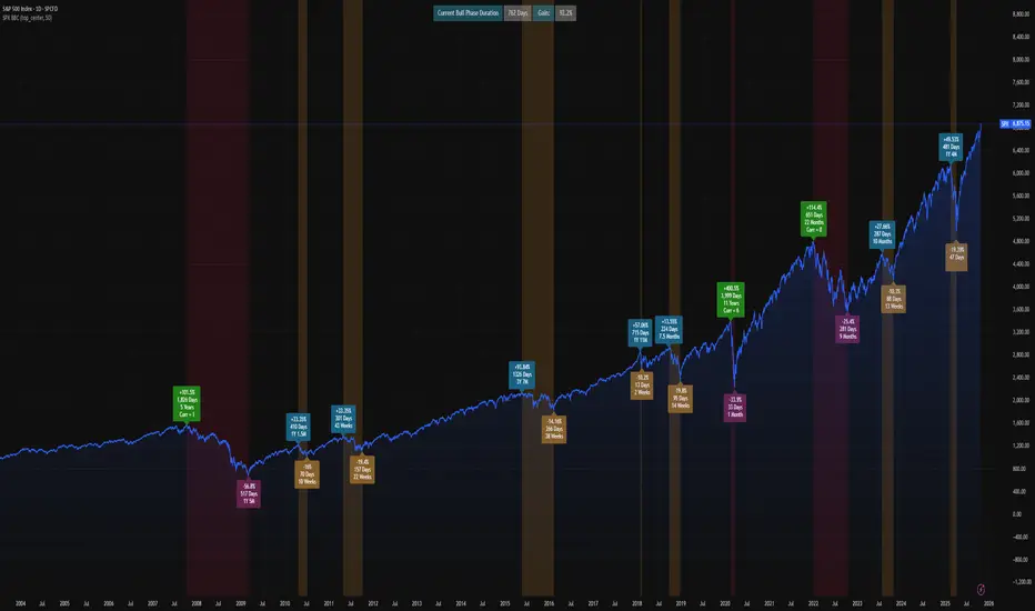
SPX Bull Market, Bear market and Corrections Since 1929 This script show visually with labels all the BULL & BEAR Market since 1929 with intermediary corrections.
Bear Market = Price drop of >=20% (based on closing price not intra day low)
Corrections = Price drop of >=10% and < 20% (based on closing price not intra day low, in intraday price it may go beyond 20% but closes in less than 20% )
The script doesn't update as we move forward , I need to manually update during every correction/bull/bear phases.
It is a good visual to study the past bull and bear market to gain some key insights!
SPX-Sectors % PMO Above Zero [bluesky]█ OVERVIEW
The "Subsector-11 % PMO Above Zero" script analyzes market breadth based on the percentage of 11 user-adjustable subsector ETFs of the S&P 500 with a Positive Momentum Oscillator (PMO) value greater than or equal to zero. It provides insights into the strength and breadth of positive momentum signals within specific subsectors, aiding traders in making informed decisions.
█ CONCEPTS
This script utilizes the PMO values of the 11 user-adjustable subsector ETFs of the S&P 500 to assess market breadth. By calculating the percentage of subsector ETFs with a PMO value above zero, it identifies periods of broad positive momentum and potential trading opportunities within those specific sectors.
█ PMO (Positive Momentum Oscillator)
Developed by Carl Swenlin, the PMO is an oscillator based on a Rate of Change (ROC) calculation that is smoothed twice with exponential moving averages using a custom smoothing process. The PMO is normalized, allowing it to be used as a relative strength tool. Traders can rank subsector ETFs based on their PMO values as an expression of relative strength.
█ CALCULATION
The script calculates the percentage of subsector ETFs with a PMO value above zero based on the provided PMO values of the 11 user-adjustable subsector ETFs. It uses custom smoothing functions similar to Exponential Moving Averages (EMAs) to derive the PMO values.
█ HOW TO USE IT
- Timeframe: Optimize the script for different timeframes to analyze market breadth effectively within specific subsectors.
- Subsector Analysis: The script displays the percentage of subsector ETFs within the 11 user-adjustable subsectors of the S&P 500 with a PMO value above zero, indicating the strength of positive momentum signals within those subsectors.
- Trend Identification: Monitor changes in the percentage of subsector ETFs above zero to identify shifts in market breadth and trends.
- Risk Management: Consider the breadth of positive momentum signals within specific subsectors when setting stop-loss levels or evaluating overall market conditions.
█ ADDITIONAL OPTIONS
This script offers additional options to enhance analysis and customization:
- Candle Style: Choose from different candle styles such as Heikin Ashi, Three Line Break, Candles, or Line for chart visualization.
- PMO Settings: Adjust the lengths of the PMO calculation and signal length according to your trading preferences.
- Moving Average Settings: Incorporate the usage of fast and slow exponential moving averages (EMAs) for additional insights into momentum trends.
█ FLEXIBILITY AND ADAPTABILITY
The script allows traders to adjust the subsector ETF names according to their specific requirements. Please review and update the list of subsector ETFs periodically to reflect the desired sectors for analysis and ensure the script's relevance and accuracy.
█ DISCLAIMER
Trading involves risks, and past performance is not indicative of future results. The "Subsector-11 % PMO Above Zero" script is a tool designed to assist traders in analyzing market breadth and positive momentum signals within specific subsectors. It should be used in conjunction with sound risk management practices and a comprehensive trading strategy. Traders are encouraged to perform their due diligence, exercise caution, and adapt the script to their individual trading preferences and requirements.
Please note that this script does not make any claims of guaranteed profitability or provide investment advice. Always consult with a qualified financial professional before making any investment decisions.

SPX Excess CAPE YieldHere we are looking at the Excess CAPE yield for the SPX500 over the last 100+ years
"A higher CAPE meant a lower subsequent 10-year return, and vice versa. The R-squared was a phenomenally high 0.9 — the CAPE on its own was enough to explain 90% of stocks’ subsequent performance over a decade. The standard deviation was 1.37% — in other words, two-thirds of the time the prediction was within 1.37 percentage points of the eventual outcome: this over a quarter-century that included an equity bubble, a credit bubble, two epic bear markets, and a decade-long bull market."
assets.bwbx.io
In December of 2020 Dr. Robert Shiller the Yale Nobel Laurate suggested that an improvement on CAPE could be made by taking its inverse (the CAPE earnings yield) and subtracting the us10 year treasury yield.
"His model plainly suggests that stocks will do badly over the next 10 years, and that bonds will do even worse. This was the way Shiller put it in a research piece for Barclays Plc in October, (which can be found on SSRN Below):
In summary, investors expect a certain return in equities as compensation for investing in a riskier asset class, and as interest rates have declined, the relative expected return for equities has increased dramatically. We believe this may quantitatively help to explain investors current preference for equities over bonds, and as such the quick recoveries we are observing (with the exception of the UK), whilst still in the midst of a pandemic. In the US in particular, we are once again observing stretched valuations and high CAPE ratios compared to history."
Sources:
papers.ssrn.com
www.bloomberg.com
The standard trading view disclaimer applies to this post -- please consult your own investment advisor before making investment decisions. This post is for observation only and has no warranty etc. www.tradingview.com
Best,
JM
Gabriel's Triple Impulsive Candle DetectorTriple Impulsive Candle Detector
Overview, critical for catching impulse moves in either direction.
SPX Income System is a rule-based framework designed to identify frequent, high-probability income opportunities on the S&P 500 cash index (SPX/SPY) using 0-DTE credit spreads. The core engine operates on 30-minute Impulse bars during the morning trade window and can be extended with optional modules for afternoon, overnight, and weekly swing opportunities. The methodology centers on a single, mechanical price event called a Impulse Bar (small wick to body ratio) to minimize discretion and keep execution consistent.
🔶What’s Inside
Core Strategy: SPX Daily Income
Timeframe: 3 kinds of 30-min bars.
Window: 09:30–11:30 ET (new setups only)
Instrument: SPX (cash index, XSP/SPY), executed with $5-wide credit spreads on 0-DTE SPX options
Bullish Setup
Entry on the break of setup bar high
Use an at the money put credit spread
Bearish Setup
Entry on the break of setup bar low
Use an at the money call credit spread
Intent: Enter shortly after setup; manage to >80% max profit or EOD expiration if SPX. If it's another stock, then a 1.5~2x D ATR is suggested.
Signal: An Impulse Bar that closes at/near the high (bullish) or low (bearish) of its 30-min range, verified with Volume above average.
Risk—limited to the risk of the option spread.
The spread is 5 dollars wide
The premium collected is $2.50
$5 - 2.50 = $2.50, or the breakeven point.
Which means what's left is the risk involved.
The risk is $2.50 per spread
🔶Why the 30-Minute Chart?
The 30-minute bar is the “chart of choice” because it filters noise and aligns with morning institutional flows.
On alternate timeframes, price often retraces half the candle body before following through.
On the 30m: the follow-through is more consistent, especially with 2x volume confirmation.
Adding support/resistance levels at the impulse bar hl2 strengthens execution.
This strategy has roots in MTF Crypto, and SPX/SPY TPO-Order Block logic.
🔶Bonus Examples:
🔹Afternoon SPX Income
Second chance window (typically 14:00–15:00 ET) if the morning trade has exited, 60-min bars instead.
🔹ORB 30 – Opening Range Break (first 30 min)
Classic ORB with an income twist for early action when time is limited. This can be entered on the 15 minute candle break.
🔹ORB 60 – Opening Range Break (second 30 min)
A follow-up ORB variant for traders who miss the first window, verified on a 60-min chart. Enter on the final 3 minutes of the hourly candle or wait for a pullback.
🔹B&B – Bed & Breakfast (Overnight)
Identifies income setups via the 10-minute chart in the last 30–60 minutes of the session with next-day open as the exit.
🔹JB – Just Breakfast
Uses the prior day’s end-of-day setup to enter at the opening bell, then manages into the daily income flow. I trade 0-date, and selling an ITM spread either partially or fully then gives me a head start on the daily income potential. This may work better if you either roll or the ORB 30 also meets the criteria.
🔹All-Day-Scalper
Converts income logic into 30-minute scalps using deep 75/80 delta ITM options as synthetic stock (requires >PDT). Meaning that the option will behave as if it is stock. This strategy comes with a warning: it's better if you can day trade.
🔹Tag ’n Turn—Weekly SPX Income Swing
Weekly swing overlay using 30-min Pulse Bars + Bollinger Bands (50) for 3–7 day swings and as a filter for daily income alignment. I use the TTM Squeeze and obtain similar results. Target heuristics (directional days) with a fired squeeze.
Part of my Gamma Scalping System.
🔶The Impulse Bar (10~40% Wick to Body Bar)
An Impulse Bar is a candle that:
Bullish: Closes higher than it opens and within the top ~10% of its high-low range.
Bearish: Closes lower than it opens and within the bottom ~10% of its high-low range.
Practical tip: Many traders mark 0-10-80-100% levels on the candle range (custom Fib or ruler) to quickly validate Pulse Bars. If it's accompanied by a volume spike, then it's better quality.
🔶SPX Daily Income—Rules & Execution
🔹Rules
Chart: 30 min, no indicators required. Pure PA, TPO-based strategy.
New Setups: 09:30–11:30 ET
Instrument: SPX signals, executed via SPX 0-DTE credit spreads ($5 wide, $2 for SPY)
🔹Entries
Bullish: Enter on a break of the setup bar high, use ATM put credit spread
Bearish: Enter on a break of the setup bar low, use ATM call credit spread
🔹Exits
Primary: Close at >80% of max profit (credit received)
Alternate: Hold to EOD expiration
Stop: Risk of the spread (defined by width – credit)
Target Heuristics (directional days)
Optional: 1.5–2× ATR as a reference (mirrors directional follow-through that often accelerates the >80% outcome)
Credit Guidance (typical)
OTM short strike ≈ $2.40
ITM short strike ≈ $2.50–$2.80
2× ITM short strike ≈ $2.80–$3.00
Trade Management (PDT-Aware)
If under PDT, many prefer set-and-forget with GTC buy-back (e.g., $0.20) or EOD expiration.
1:00 PM ET time check
Trending day ±$15–$20 SPX: usually no action, run to expiration
Non-trending day ±$5 SPX: consider taking 40–60% if available (optional) to avoid 50/50 end-of-day decay dynamics
Rationale: Without a favorable trend by ~1 PM, the odds of a late push decline; choosing a controlled partial outcome can improve long-run expectancy and reduce variance.
🔶Examples (Conceptual)
🔹Bullish: A green dot marks a bullish impulse bar; minor follow-through pushes the spread to >80% quickly.
🔹Bearish: A red triangle marks a bearish Impulse Bar; a modest down move is often sufficient for >80–95%.
🔹Tag ’n Turn—Weekly Swing (Filter & Stand-Alone)
Chart: 30-minute
Overlay: Bollinger Bands 50 (mean-reversion lens), or KC or TTM.
Setup: Tag of upper/lower band + Pulse Bar, enter on break of Pulse Bar in that direction
Target: Opposite Bollinger Band
Use Case: 3–7 day swings and a directional filter for Daily Income signals (trade with weekly bias)
🔹Afternoon SPX Income: Same Pulse logic, 14:00–15:00 ET window.
🔹ORB 30 / ORB 60: Uses 30/60-min opening range; can relax Pulse threshold (up to 40% bars) for early positioning when time-constrained.
🔹B&B (Overnight): Lasts 30–60 minutes; closes the next day at open or after the first 30-minute bar.
🔹JB (Just Breakfast): Enter at open using prior day’s signal; optionally roll into Daily Income if eligible.
🔹All-Day-Scalper: Deep ITM options (~0.75–0.80 delta) as synthetic stock.
Entry: Long ITM option
Stop: ~40% of option price
Target: 70–150% or 30-minute timed exit
Note: Time-intensive; for accounts above PDT.
🔹Brokerage: Must efficiently support SPX options; a <10% spread between OI and Volume is ideal. Preferences vary; Tastytrade, Thinkorswim, and Interactive Brokers are common choices. Use what’s reliable, available in your region, and cost-effective.
🔶Alerts (Check-in)
Bullish Impulse Detected (within 09:30–11:30 ET)
Bearish Impulse Detected (within 09:30–11:30 ET)
Afternoon Pulse (14:00–15:00 ET)
ORB 30/60 Trigger
B&B Window Open (last 60 mins)
JB at Open
Tag ’n Turn: Band Tag + Impulse (Bull/Bear)
🔶Inputs (Typical)
Session windows (morning, afternoon, last hour) ~5~15 Average Bar
Impulse threshold (strict 10% vs relaxed up to 40% for ORB variants)
Marker/label styles (bull/bear colors, dots vs arrows)
Filters (optional ATR TP, band touch BB(50-SMA, 2 Stdv.) for Tag ’n Turn)
Alert toggles (on-close for webhooks)
🔶Best Practices
One playbook, many Doors: Start with daily income; add afternoon or B&B/JB only after you’re consistent.
Credit discipline: Don’t chase poor pricing; stick to the credit guidance.
Time awareness: If no trend by ~1 PM ET, consider variance control.
Weekly bias: When using Tag ’n Turn, align daily trades with the weekly swing direction for added confluence.
Risk is defined as width – credit = max risk per spread. Size, accordingly, 1~2%.
🔶Disclosures & Risk
This is not financial advice. Options involve risk and are not suitable for all investors. Past performance (including backtests or theoretical studies) does not guarantee future results. Slippage, fills, assignment risk, and latency can materially impact outcomes. Trade a plan you fully understand and always size for durability. On the Daily, the Impulse bars, are often a signal that you should plan for it to return back to half of the Candle's body, and plan accordingly. Plot a horizontal support/resistance level and see how price reacts to it. Keep house-money, and use 1~2% Risk, reduce exposure when VIX is low and increase it when VIX is high.
TL;DR (Summary)
Signal: 30-min Pulse Bar (strict 10% close in range)
Window: 09:30–11:30 ET (new setups)
Execution: 0-DTE $5-wide SPX credit spreads
Exit: >80% max profit or EOD
Add-ons: Afternoon, ORB 30/60, B&B/JB overnights, All-Day-Scalper, Tag ’n Turn weekly swing/filter
Philosophy: Fully rule-based, minimal discretion, production-line consistency 0-date.

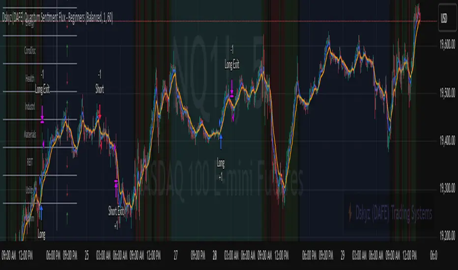
Dskyz (DAFE) Quantum Sentiment Flux - Beginners Dskyz (DAFE) Quantum Sentiment Flux - Beginners:
Welcome to the Dskyz (DAFE) Quantum Sentiment Flux - Beginners , a strategy and concept that’s your ultimate wingman for trading futures like MNQ, NQ, MES, and ES. This gem combines lightning-fast momentum signals, market sentiment smarts, and bulletproof risk management into a system so intuitive, even newbies can trade like pros. With clean DAFE visuals, preset modes for every vibe, and a revamped dashboard that’s basically a market GPS, this strategy makes futures trading feel like a high-octane sci-fi mission.
Built on the Dskyz (DAFE) legacy of Aurora Divergence, the Quantum Sentiment Flux is designed to empower beginners while giving seasoned traders a lean, sentiment-driven edge. It uses fast/slow EMA crossovers for entries, filters trades with VIX, SPX trends, and sector breadth, and keeps your account safe with adaptive stops and cooldowns. Tuned for more action with faster signals and a slick bottom-left dashboard, this updated version is ready to light up your charts and outsmart institutional traps. Let’s dive into why this strat’s a must-have and break down its brilliance.
Why Traders Need This Strategy
Futures markets are a wild ride—fast moves, volatility spikes (like the April 28, 2025 NQ 1k-point drop), and institutional games that can wreck unprepared traders. Beginners often get lost in complex systems or burned by impulsive trades. The Quantum Sentiment Flux is the antidote, offering:
Dead-Simple Setup: Preset modes (Aggressive, Balanced, Conservative) auto-tune signals, risk, and sizing, so you can trade without a quant degree.
Sentiment Superpower: VIX filter, SPX trend, and sector breadth visuals keep you aligned with market health, dodging chop and riding trends.
Ironclad Safety: Tighter ATR-based stops, 2:1 take-profits, and preset cooldowns protect your capital, even in chaotic sessions.
Next-Level Visuals: Green/red entry triangles, vibrant EMAs, a sector breadth background, and a beefed-up dashboard make signals and context pop.
DAFE Swagger: The clean aesthetics, sleek dashboard—ties it to Dskyz’s elite brand, making your charts a work of art.
Traders need this because it’s a plug-and-play system that blends beginner-friendly simplicity with pro-level market awareness. Whether you’re just starting or scalping 5min MNQ, this strat’s your key to trading with confidence and style.
Strategy Components
1. Core Signal Logic (High-Speed Momentum)
The strategy’s engine is a momentum-based system using fast and slow Exponential Moving Averages (EMAs), now tuned for faster, more frequent trades.
How It Works:
Fast/Slow EMAs: Fast EMA (Aggressive: 5, Balanced: 7, Conservative: 9 bars) and slow EMA (12/14/18 bars) track short-term vs. longer-term momentum.
Crossover Signals:
Buy: Fast EMA crosses above slow EMA, and trend_dir = 1 (fast EMA > slow EMA + ATR * strength threshold).
Sell: Fast EMA crosses below slow EMA, and trend_dir = -1 (fast EMA < slow EMA - ATR * strength threshold).
Strength Filter: ma_strength = fast EMA - slow EMA must exceed an ATR-scaled threshold (Aggressive: 0.15, Balanced: 0.18, Conservative: 0.25) for robust signals.
Trend Direction: trend_dir confirms momentum, filtering out weak crossovers in choppy markets.
Evolution:
Faster EMAs (down from 7–10/21–50) catch short-term trends, perfect for active futures markets.
Lower strength thresholds (0.15–0.25 vs. 0.3–0.5) make signals more sensitive, boosting trade frequency without sacrificing quality.
Preset tuning ensures beginners get optimized settings, while pros can tweak via mode selection.
2. Market Sentiment Filters
The strategy leans hard into market sentiment with a VIX filter, SPX trend analysis, and sector breadth visuals, keeping trades aligned with the big picture.
VIX Filter:
Logic: Blocks long entries if VIX > threshold (default: 20, can_long = vix_close < vix_limit). Shorts are always allowed (can_short = true).
Impact: Prevents longs during high-fear markets (e.g., VIX spikes in crashes), while allowing shorts to capitalize on downturns.
SPX Trend Filter:
Logic: Compares S&P 500 (SPX) close to its SMA (Aggressive: 5, Balanced: 8, Conservative: 12 bars). spx_trend = 1 (UP) if close > SMA, -1 (DOWN) if < SMA, 0 (FLAT) if neutral.
Impact: Provides dashboard context, encouraging trades that align with market direction (e.g., longs in UP trend).
Sector Breadth (Visual):
Logic: Tracks 10 sector ETFs (XLK, XLF, XLE, etc.) vs. their SMAs (same lengths as SPX). Each sector scores +1 (bullish), -1 (bearish), or 0 (neutral), summed as breadth (-10 to +10).
Display: Green background if breadth > 4, red if breadth < -4, else neutral. Dashboard shows sector trends (↑/↓/-).
Impact: Faster SMA lengths make breadth more responsive, reflecting sector rotations (e.g., tech surging, energy lagging).
Why It’s Brilliant:
- VIX filter adds pro-level volatility awareness, saving beginners from panic-driven losses.
- SPX and sector breadth give a 360° view of market health, boosting signal confidence (e.g., green BG + buy signal = high-probability trade).
- Shorter SMAs make sentiment visuals react faster, perfect for 5min charts.
3. Risk Management
The risk controls are a fortress, now tighter and more dynamic to support frequent trading while keeping accounts safe.
Preset-Based Risk:
Aggressive: Fast EMAs (5/12), tight stops (1.1x ATR), 1-bar cooldown. High trade frequency, higher risk.
Balanced: EMAs (7/14), 1.2x ATR stops, 1-bar cooldown. Versatile for most traders.
Conservative: EMAs (9/18), 1.3x ATR stops, 2-bar cooldown. Safer, fewer trades.
Impact: Auto-scales risk to match style, making it foolproof for beginners.
Adaptive Stops and Take-Profits:
Logic: Stops = entry ± ATR * atr_mult (1.1–1.3x, down from 1.2–2.0x). Take-profits = entry ± ATR * take_mult (2x stop distance, 2:1 reward/risk). Longs: stop below entry, TP above; shorts: vice versa.
Impact: Tighter stops increase trade turnover while maintaining solid risk/reward, adapting to volatility.
Trade Cooldown:
Logic: Preset-driven (Aggressive/Balanced: 1 bar, Conservative: 2 bars vs. old user-input 2). Ensures bar_index - last_trade_bar >= cooldown.
Impact: Faster cooldowns (especially Aggressive/Balanced) allow more trades, balanced by VIX and strength filters.
Contract Sizing:
Logic: User sets contracts (default: 1, max: 10), no preset cap (unlike old 7/5/3 suggestion).
Impact: Flexible but risks over-leverage; beginners should stick to low contracts.
Built To Be Reliable and Consistent:
- Tighter stops and faster cooldowns make it a high-octane system without blowing up accounts.
- Preset-driven risk removes guesswork, letting newbies trade confidently.
- 2:1 TPs ensure profitable trades outweigh losses, even in volatile sessions like April 27, 2025 ES slippage.
4. Trade Entry and Exit Logic
The entry/exit rules are simple yet razor-sharp, now with VIX filtering and faster signals:
Entry Conditions:
Long Entry: buy_signal (fast EMA crosses above slow EMA, trend_dir = 1), no position (strategy.position_size = 0), cooldown passed (can_trade), and VIX < 20 (can_long). Enters with user-defined contracts.
Short Entry: sell_signal (fast EMA crosses below slow EMA, trend_dir = -1), no position, cooldown passed, can_short (always true).
Logic: Tracks last_entry_bar for visuals, last_trade_bar for cooldowns.
Exit Conditions:
Stop-Loss/Take-Profit: ATR-based stops (1.1–1.3x) and TPs (2x stop distance). Longs exit if price hits stop (below) or TP (above); shorts vice versa.
No Other Exits: Keeps it straightforward, relying on stops/TPs.
5. DAFE Visuals
The visuals are pure DAFE magic, blending clean function with informative metrics utilized by professionals, now enhanced by faster signals and a responsive breadth background:
EMA Plots:
Display: Fast EMA (blue, 2px), slow EMA (orange, 2px), using faster lengths (5–9/12–18).
Purpose: Highlights momentum shifts, with crossovers signaling entries.
Sector Breadth Background:
Display: Green (90% transparent) if breadth > 4, red (90%) if breadth < -4, else neutral.
Purpose: Faster breadth_sma_len (5–12 vs. 10–50) reflects sector shifts in real-time, reinforcing signal strength.
- Visuals are intuitive, turning complex signals into clear buy/sell cues.
- Faster breadth background reacts to market rotations (e.g., tech vs. energy), giving a pro-level edge.
6. Sector Breadth Dashboard
The new bottom-left dashboard is a game-changer, a 3x16 table (black/gray theme) that’s your market command center:
Metrics:
VIX: Current VIX (red if > 20, gray if not).
SPX: Trend as “UP” (green), “DOWN” (red), or “FLAT” (gray).
Trade Longs: “OK” (green) if VIX < 20, “BLOCK” (red) if not.
Sector Breadth: 10 sectors (Tech, Financial, etc.) with trend arrows (↑ green, ↓ red, - gray).
Placeholder Row: Empty for future metrics (e.g., ATR, breadth score).
Purpose: Consolidates regime, volatility, market trend, and sector data, making decisions a breeze.
- VIX and SPX metrics add context, helping beginners avoid bad trades (e.g., no longs if “BLOCK”).
Sector arrows show market health at a glance, like a cheat code for sentiment.
Key Features
Beginner-Ready: Preset modes and clear visuals make futures trading a breeze.
Sentiment-Driven: VIX filter, SPX trend, and sector breadth keep you in sync with the market.
High-Frequency: Faster EMAs, tighter stops, and short cooldowns boost trade volume.
Safe and Smart: Adaptive stops/TPs and cooldowns protect capital while maximizing wins.
Visual Mastery: DAFE’s clean flair, EMAs, dashboard—makes trading fun and clear.
Backtestable: Lean code and fixed qty ensure accurate historical testing.
How to Use
Add to Chart: Load on a 5min MNQ/ES chart in TradingView.
Pick Preset: Aggressive (scalping), Balanced (versatile), or Conservative (safe). Balanced is default.
Set Contracts: Default 1, max 10. Stick low for safety.
Check Dashboard: Bottom-left shows preset, VIX, SPX, and sectors. “OK” + green breadth = strong buy.
Backtest: Run in strategy tester to compare modes.
Live Trade: Connect to Tradovate or similar. Watch for slippage (e.g., April 27, 2025 ES issues).
Replay Test: Try April 28, 2025 NQ drop to see VIX filter and stops in action.
Why It’s Brilliant
The Dskyz (DAFE) Quantum Sentiment Flux - Beginners is a masterpiece of simplicity and power. It takes pro-level tools—momentum, VIX, sector breadth—and wraps them in a system anyone can run. Faster signals and tighter stops make it a trading machine, while the VIX filter and dashboard keep you ahead of market chaos. The DAFE visuals and bottom-left command center turn your chart into a futuristic cockpit, guiding you through every trade. For beginners, it’s a safe entry to futures; for pros, it’s a scalping beast with sentiment smarts. This strat doesn’t just trade—it transforms how you see the market.
Final Notes
This is more than a strategy—it’s your launchpad to mastering futures with Dskyz (DAFE) flair. The Quantum Sentiment Flux blends accessibility, speed, and market savvy to help you outsmart the game. Load it, watch those triangles glow, and let’s make the markets your canvas!
Official Statement from Pine Script Team
(see TradingView help docs and forums):
"This warning may appear when you call functions such as ta.sma inside a request.security in a loop. There is no runtime impact. If you need to loop through a dynamic list of tickers, this cannot be avoided in the present version... Values will still be correct. Ignore this warning in such contexts."
(This publishing will most likely be taken down do to some miscellaneous rule about properly displaying charting symbols, or whatever. Once I've identified what part of the publishing they want to pick on, I'll adjust and repost.)
Use it with discipline. Use it with clarity. Trade smarter.
**I will continue to release incredible strategies and indicators until I turn this into a brand or until someone offers me a contract.
Created by Dskyz, powered by DAFE Trading Systems. Trade fast, trade bold.
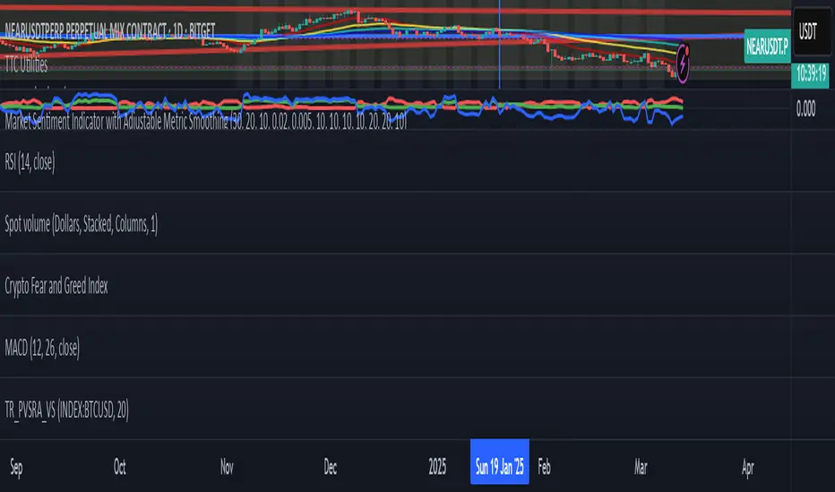
Market Sentiment Indicator with Adjustable Metric Smoothing
Market Sentiment Indicator for BTCUSDT: How It Works
This indicator analyzes market sentiment for BTCUSDT by combining data from various financial metrics like the VIX, DXY, SPX, GOLD, USOIL, US10Y, and BTC itself. It processes this data to assign scores that reflect bearish, bullish, or neutral conditions, ultimately providing a sentiment value. Here’s the step-by-step process:
1. Input Parameters
VIX Thresholds: Define levels (e.g., high, moderate, low) to identify risk-off (bearish) or risk-on (bullish) market conditions.
Change Thresholds: Set limits for "large" and "small" percentage changes in metrics like DXY (Dollar Index), SPX (S&P 500), and BTC, as well as other assets.
2. Data Fetching
Collect closing prices for:
VIX (volatility index)
DXY (U.S. Dollar Index)
SPX (S&P 500)
GOLD (gold price)
USOIL (crude oil price)
US10Y (10-year Treasury yield)
BTC (from the BTCUSDT chart)
These are typically retrieved using a function like request.security in a trading platform.
3. Smoothed Data
Apply Exponential Moving Averages (EMAs) to the closing prices of each metric to smooth out noise. The smoothing length (e.g., 10-day, 20-day) is customizable.
Calculate:
Smoothed percentage changes for DXY, SPX, BTC, GOLD, and USOIL.
Absolute change for US10Y (since it’s a yield, not a price).
4. Step Scores Calculation
The indicator assigns scores based on specific market conditions:
Step 1: Strong Risk-Off (Bearish)
High VIX, strongly rising DXY, strongly falling SPX and BTC.
Step 2: Moderate Risk-Off (Bearish)
Moderately high VIX, moderately rising DXY, moderately falling SPX and BTC.
Step 3: Neutral
VIX near neutral, small changes in DXY, SPX, and BTC.
Step 4: Moderate Risk-On (Bullish)
Moderately low VIX, moderately falling DXY, moderately rising SPX and BTC.
Step 5: Strong Risk-On (Bullish)
Low VIX, strongly falling DXY, strongly rising SPX and BTC.
Step 6: Inflation Concern
Rising GOLD, USOIL, US10Y, and falling DXY.
Step 7: Deflation Concern
Falling GOLD, USOIL, US10Y, and rising DXY.
5. Composite Scores
Bearish Composite: Sum of Step 1 (strong risk-off) and Step 2 (moderate risk-off) scores.
Bullish Composite: Sum of Step 4 (moderate risk-on) and Step 5 (strong risk-on) scores.
6. Sentiment Calculation
Compute a weighted average of all step scores:
Weights: -3 (Step 1), -2 (Step 2), 0 (Step 3), 2 (Step 4), 3 (Step 5), 1 (Step 6), -1 (Step 7).
This produces a sentiment score ranging from negative (bearish) to positive (bullish).
If the total score is zero, sentiment is set to zero to avoid issues.
7. Visualization
Bearish Composite: Plotted in red.
Bullish Composite: Plotted in green.
Sentiment: Plotted in blue.
Why It’s Useful
This indicator gives you a comprehensive view of market sentiment by blending traditional financial metrics (like VIX and SPX) with BTC-specific data. The use of EMAs and customizable thresholds makes it adaptable to different timeframes and market conditions, helping you gauge whether the market is leaning bearish, bullish, or neutral.