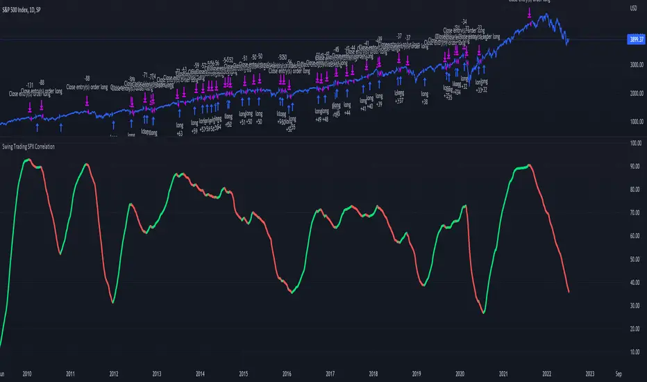
Swing Trading SPX CorrelationThis is a long timeframe script designed to benefit from the correlation with the Percentage of stocks Above 200 moving average from SPX
At the same time with this percentage we are creating a weighted moving average to smooth its accuracy.
The rules are simple :
If the moving average is increasing its a long signal/short exit
If the moving average is decreased its a short signal/long exit.
Curently the strategy has been adapted for long only entries.
If you have any questions let me know !
Cari dalam skrip untuk "spx"
@WACC Volatility Weighted PUT/CALL Positions [SPX]This indicator is based on Volatility and Market Sentiment. When volatility is high, and market sentiment is positive, the indicator is in a low or 'buy state'. When volatility is low and market sentiment is poor, the indicator is high.
The indicator uses the VIX as it's volatility input.
The indicator uses the spread between the Call Volume on SPX/SPY and the Put Volume.
This is pulled from CVSPX and PVSPX.
When volatility and put/call reaches a critical level, such as the levels present in a crisis or a sell off, the line will be green. See Sept 2015, 2008, and Feb 2018.
This level can be edited in the source code.
As the indicator is based on Put/Call, the indicator works best on larger time frames as the put/call ratio becomes a more discernible measure of sentiment over time.


SPX Mapped Gaps [Mxwll]Hello traders 👋
This indicator "SPX Mapped Gaps" detects gaps from the SPX (or the trader's choice of index/asset) and plots them for the asset on your chart!
Features
Selectable comparison symbol
Gaps from the selected symbol (SPX by default) are plotted for the asset on your chart - serving as potential support/resistance levels!
Closest gaps from comparison symbol displayed in upper-right table
Overlapped gaps deleted automatically - less clutter!
How this script works
The "SPX Mapped Gaps" is designed to help traders determine price levels for the asset on their chart where a major index (any asset) gapped up or down.
Of course, a gap that occurs on SPX (4-digit price) is incompatible with the price chart of BTC (5-digit price). To circumvent this, the percentage distance of the gap from SPX is determined, and a gap level is drawn equidistantly (up/down) from the open price of the asset on your chart. With this method, the proportion of the gap is maintained at the price area it occurred for the asset on your chart!
The image above outlines functionality for the indicator!
Key points:
Up gaps are denoted by green boxes
Down gaps are denoted by red boxes
All gaps are listed with their start and end price for the comparison asset (SPX for the example). These labels can be hidden at the user's discretion.
Gaps are expected to act as support/resistance during their lifetime
The image above explains the output of the script, including line style indications!
Solid lines indicate that the leverage used for at your entry price constitutes an active trade. Dotted lines mean the trade has already achieved your profit target for that leverage, or stopped out.
The image above explains the table attached to the indicator!
This table displays the closest gaps to the current asset price. The status (up gap or down gap) from the gap to the current price is also detailed.
Why are gaps on the SPX, or major index, relevant to BTC and other assets?
When a gap on the major indices occurs, it's expected that strong aggregate buying or selling pressure will transpire for BTC and other coins. Due to this, the presence of a gap on a major index might correspond to increased activity on smaller market-cap assets with some degree of positive correlation to the index. Consequently, the price level for the asset at which a gap for the major index occurred may function as support/resistance for future price!
That is all for this - thanks traders!

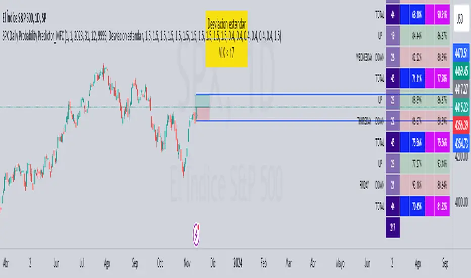
SPX Daily Probability Predictor_MFCDescription:
The SPX Daily Probability Predictor is a powerful trading indicator designed exclusively for TradingView, providing traders with valuable insights into the potential movement of the S&P 500 index (SPX) on a daily basis. This indicator utilizes a sophisticated calculation method based on historical price movements, including gaps, to estimate the probability of the index's future direction.
Key Features:
Daily Probability Calculation:
The indicator calculates the daily probability of the SPX movement by analyzing the standard deviation of historical price changes. This statistical approach offers a comprehensive understanding of the market's volatility and aids traders in making more informed decisions.
Historical Movement Inclusion:
Unlike traditional indicators that only consider the closing prices, the SPX Daily Probability Predictor goes a step further by incorporating the full spectrum of daily movements, including gaps. This inclusive approach provides a more accurate representation of market dynamics, enhancing the reliability of the probability predictions.
Real-Time Analysis:
Stay ahead of the market with real-time analysis that adapts to the current trading session. The SPX Daily Probability Predictor dynamically adjusts its calculations throughout the trading day, ensuring that traders receive the most up-to-date and relevant information for their decision-making process.
Customizable Parameters:
Tailor the indicator to your trading preferences with customizable parameters. Adjust the lookback period or fine-tune other settings to align the probability predictions with your individual trading strategy.
By incorporating historical price movements, including gaps, and employing statistical analysis to calculate daily probabilities, the SPX Daily Probability Predictor equips traders with a valuable tool for anticipating potential market directions. Whether you are a seasoned investor or a newcomer to the world of trading, this indicator provides actionable insights that can contribute to more informed decision-making in the dynamic environment of the stock market.
Upcoming Enhancements:
Please note that while the SPX Daily Probability Predictor currently offers a robust set of features for daily market analysis, we are committed to continuous improvement and the development of additional functionalities. In future updates, users can look forward to exciting enhancements, including the capability to forecast future probabilities of market movements. This forward-looking feature will provide traders with a valuable glimpse into potential trends, aiding in more proactive decision-making.
Furthermore, we are actively working on expanding the indicator's scope to accommodate different time frames. Soon, traders will have the option to obtain probability data not only on a daily basis but also for monthly or weekly intervals. This extended flexibility allows for a more comprehensive analysis, catering to various trading styles and preferences.
As we strive to create a versatile and powerful tool for the TradingView community, we welcome user feedback and suggestions for additional features. Your insights play a crucial role in shaping the future evolution of the SPX Daily Probability Predictor, ensuring it remains a valuable asset in the dynamic landscape of financial markets. Stay tuned for updates as we continue to enhance and refine this innovative trading indicator.
SPX / Silver (XAGUSD) RatioThis script visualizes the S&P 500 Index to Silver ratio (SPX/Silver) — a powerful tool for monitoring the relative strength of equities vs. precious metals over time.
📊 Use Case:
Helps traders assess macro sentiment shifts between risk-on (equities) and risk-off (commodities).
A rising ratio indicates equity outperformance vs Silver, often in growth-driven bull markets.
A falling ratio suggests Silver is outperforming — potentially due to inflation, geopolitical risk, or weakening equities.
⚙️ Data & Calculation:
SPX: SP:SPX (S&P 500 Index)
Silver: TVC:SILVER
Formula:
SPX / Silver
(Both are spot/index prices, updated on daily timeframe)
📈 Interpretation:
📈 Ratio Rising → SPX outperforming Silver → Risk-on sentiment
📉 Ratio Falling → Silver outperforming SPX → Possible flight to safety or inflation hedge
🧠 Ideal For:
Macro trend analysis
Intermarket strategy development
Asset rotation decision-making
Spotting Silver bottoms during SPX/Silver peak zones

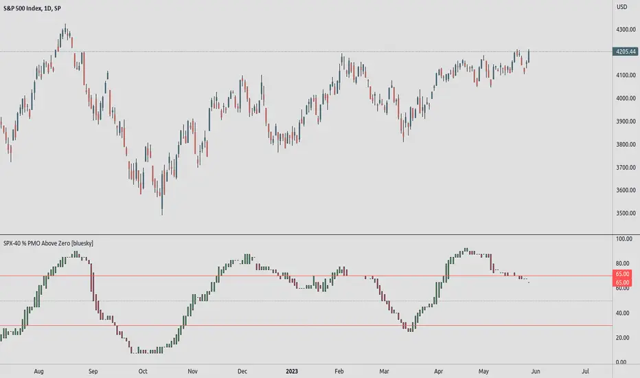
SPX-40 % PMO Above Zero [bluesky]█ OVERVIEW
The "SPX-40 % PMO Above Zero" script analyzes market breadth based on the percentage of stocks within the SPX-40 subset with a Positive Momentum Oscillator (PMO) value greater than or equal to zero. It provides insights into the strength and breadth of positive momentum signals, aiding traders in making informed decisions.
█ CONCEPTS
This script evaluates the percentage of stocks within the SPX-40 subset that have a PMO value above zero. By calculating this percentage, the script identifies periods of broad positive momentum and potential trading opportunities.
█ CALCULATION
The script calculates the percentage of stocks with a PMO value above zero within the SPX-40 subset. It uses the PMO values of individual stocks to assess market breadth and determine the strength of positive momentum signals.
█ HOW TO USE IT
- Timeframe: Optimize the script for different timeframes to analyze market breadth effectively.
- Market Breadth Analysis: The script displays the percentage of SPX-40 stocks with a PMO value above zero, indicating the strength of positive momentum signals across the subset.
- Trend Identification: Monitor changes in the percentage of stocks above zero to identify shifts in market breadth and trends.
- Risk Management: Consider the breadth of positive momentum signals when setting stop-loss levels or evaluating overall market conditions.
█ ADDITIONAL OPTIONS
- This script offers additional options to enhance analysis and customization, including the usage of two exponential moving averages (fast and slow) for additional insights into momentum trends.
- Background colors for EMA crossovers can be visualized using customizable options, aiding in trend identification.
- The Heikin Ashi candles option can be enabled for a different perspective on price movements.
█ FLEXIBILITY AND ADAPTABILITY
It's important to note that the default selection of 40 stocks within the SPX-40 subset may need adjustment over time as market dynamics change. Traders have the flexibility to modify the list of stocks to reflect the current market conditions and ensure the script's relevance and accuracy. Please review and update the list periodically to maintain the effectiveness of the analysis.
█ DISCLAIMER
Trading involves risks, and past performance is not indicative of future results. The "SPX-40 % PMO Above Zero" script is a tool designed to assist traders in analyzing market breadth and positive momentum signals. It should be used in conjunction with sound risk management practices and a comprehensive trading strategy. Traders are encouraged to perform their due diligence, exercise caution, and adapt the script to their individual trading preferences and requirements.
Please note that this script does not make any claims of guaranteed profitability or provide investment advice. Always consult with a qualified financial professional before making any investment decisions.
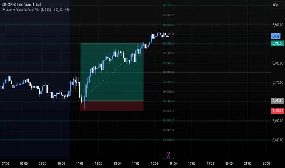
SPX Ladder → Adjusted to Active Ticker (5s & 10s)This indicator allows you to a grid of SPX levels directly on the ES1! (E-mini S&P 500 Futures) chart, automatically adjusting for the spread between SPX and ES1!. This is particularly useful for traders who perform technical analysis on SPX but execute trades on ES1!.
Features:
Renders every 5 and 10 points steps of the SPX in your current chart.
The script adjusts these levels in real-time based on the current spread between SPX and ES1!
Plots updated horizontal lines that move with the spread
Supports Multiple Tickers, ES1!, SPY and SPX500USD.
Ideal for futures traders who want SPX context while trading ES1!.
SPX Fair Value Strategy UltimateThis is a strategy using the SPX Fair Value derived from Net Liquidity.
Net Liquidity function is simply: Fed Balance Sheet - Treasury General Account - Reverse Repo Balance
Formula for calculating the fair value of SPX using Net Liquidity looks like this: net_liquidity/1000000000/1.1 -1625
The SPX Fair Value is then subtracted from the SPX value which creates an oscillating diff value.
When diff is greater than 350, SPX is considered overbought and we go short/sell.
When diff is less than -150, SPX is considered oversold and we cover/buy.
The net liquidity values I calculate outside of TradingView. If you'd like the strategy to work for future dates, you'll need to update them.
Paremeters:
Strategy: Short Only, Long Only, Long/Short
Inverse (bool): check if using an inverse ETF to go long instead of short.
Start After Date: When the strategy should start trading
Close Date: Day to close open trades. I just like it to get complete results rather than the strategy ending with open trades.
SPX +10 / -10 From 9:30 Open//@version=5
indicator("SPX +10 / -10 From 9:30 Open", overlay=true)
// Exchange Time (New York)
sess = input.session("0930-1600", "Regular Session (ET)")
// Detect session and 9:30 AM bar
inSession = time(timeframe.period, sess)
// Capture the 9:30 AM open
var float open930 = na
if inSession
// If this is the first bar of the session (9:30 AM)
if time(timeframe.period, sess) == na
open930 := open
else
open930 := na
// Calculate movement from 9:30 AM open
up10 = close >= open930 + 10
dn10 = close <= open930 - 10
// Plot reference lines
plot(open930, "9:30 AM Open", color=color.orange)
plot(open930 + 10, "+10 Level", color=color.green)
plot(open930 - 10, "-10 Level", color=color.red)
// Alert conditions
alertcondition(up10, title="SPX Up +10", message="SPX moved UP +10 from the 9:30 AM open")
alertcondition(dn10, title="SPX Down -10", message="SPX moved DOWN -10 from the 9:30 AM open")
// Plot signals on chart
plotshape(up10, title="+10 Hit", style=shape.labelup, color=color.green, text="+10", location=location.belowbar, size=size.tiny)
plotshape(dn10, title="-10 Hit", style=shape.labeldown, color=color.red, text="-10", location=location.abovebar, size=size.tiny)

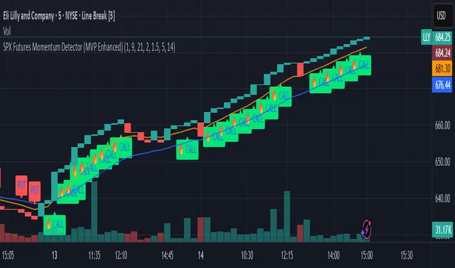
SPX Futures Momentum Detector (MVP Enhanced)Our SPX Futures Momentum Detector is a precision trading tool built for professional futures and options traders.
Optimized for SPX and ES/MES futures, this indicator identifies high probability momentum entries, filters noise, and provides clear CALL/PUT signals for rapid decision-making.
It layers proprietary filters to reduce false positives in volatile or choppy conditions.
This enhanced version leverages our proprietary MVP Momentum framework, incorporating Renko-style brick simulation and momentum confirmation layers.
It is designed for scalping and short-term swing strategies in highly liquid markets.
**Key Features**
• Proprietary momentum detection logic
• Optimized for 5m, 15m, and Renko charts
• Works with SPX, ES, and MES futures contracts and any highly liquid option contracts
• CALL/PUT labeling with A+ setup classification (Hot CALL Signal)
• Zero repaint logic for reliable backtesting
**What it does**
• Detects momentum inflections on SPX/ES/MES using a Renko-style brick simulation + dual EMA context.
• Designed for 1m–5m timeframes; exceptional clarity on Line Break charts.
• Signals: CALL (momentum up), PUT (momentum down). No lookahead; signals print on confirmed bar close.
**How to use**
• Recommended charts: SPX, ES, MES (futures) or any highly liquid options charts.
• Recommended chart types: Line Break for clarity; standard candles for entry points.
• Timeframes: 1m or 5m (scalping to intraday).
• Add alerts: “CALL Signal” and “PUT Signal”, set to “Once per bar close.”
**Inputs explained**
• Fast EMA / Slow EMA – Short/medium trend filters for momentum context.
• Renko Box Size ($) – Sensitivity of the brick simulation (larger = fewer but higher-quality signals).
• Confirmation Bars – Ensures price follow-through (filters weak trends).
• Volume Breakout Multiplier – Confirms breakouts with significant volume increase.
• Consolidation Bars – Filters out sideways action before a momentum shift.
**Risk & limitations**
• Momentum tools perform best in trending sessions. Expect fewer clean signals in chop.
• No guarantees of profit. Use with your own risk management and exit plan.
• Backtest across multiple regimes (trend, post-FOMC, month-end) before live use.
**Best practices**
• Pair with optional companion exit logic for trade management.
• Use alerts at bar close to avoid noise.
• Not recommended for full automation yet: validate broker fills, slippage, and latency.
**Disclaimers**
• Educational tool. Not financial advice. Past performance ≠ future results.
• We do not guarantee outcomes, you are responsible for your trades.
**Changelog**
v1.0 – Initial invite-only release (MVP Enhanced): Renko-style momentum + EMA filters, bar-close alerts, repaint safe security calls.
Enhanced SPX and BTC Overlay with EMASPX-BTC Momentum Gauge and EMA Cross Indicator
Thorough Analysis:
• Combined Overlay (Green/Red Line):
o Function: Plots a wide line over the price chart, representing a composite of SPX and BTC dynamics adjusted by volume data.
o Color Coding:
Green: Indicates bullish conditions when the combined value exceeds its 10-period SMA and Bitcoin volume increases.
Red: Signals bearish conditions when the combined value drops below its 10-period SMA and Bitcoin volume decreases.
o Line Characteristics:
Width: Set at 8 for high visibility.
Transparency: 86% for both colors to overlay without obscuring candlesticks.
Scaling: Uses a factor of 0.02446 to amplify movements, making trend changes more noticeable.
• Continuous Bright Red and Green Lines:
o 20-period EMA of Current Ticker (Red):
Purpose: Acts as a medium-term trend indicator, smoothing price data to reflect the asset's general direction over time.
Color: Bright red for easy identification.
Transparency: 60% to keep it visible but not overpowering.
o 5-period EMA of BTC (Green):
Purpose: Provides insights into short-term Bitcoin momentum, capturing rapid changes in market sentiment.
Color: Bright green to distinguish from the red EMA.
Transparency: 30% for high visibility against price movements.
Detailed Analysis of the EMA Cross:
• Crossing Points:
o Bullish Crossover:
Occurs when the 5-period BTC EMA (green) moves above the 20-period EMA of the current ticker (red).
Suggests that Bitcoin's short-term momentum is gaining strength relative to the asset's medium-term trend, potentially signaling an upcoming uptrend or strengthening of an existing one.
o Bearish Crossover:
When the green line falls below the red, it indicates that Bitcoin's immediate momentum is weakening compared to the asset's medium-term trend, which might precede a downtrend or confirm one.
• Early Trade Signals:
o Entry/Exit Points:
These crossovers can guide traders in making timely decisions to enter or exit trades, especially when corroborated by the combined overlay's color.
o Confirmation:
EMA crossovers can confirm trends indicated by the combined overlay. For example, a bullish crossover with a green combined line could validate a buying opportunity.
o Volatility Insights:
The rapid shifts in Bitcoin's 5-period EMA highlight potential volatility spikes, offering an additional layer of market analysis, particularly useful in volatile markets.
• Strategic Use:
o Multi-Market Insight: The script integrates data from both traditional (SPX) and crypto (BTC) markets, allowing for a more comprehensive analysis of market conditions.
o Decision-Making: Provides traders with visual cues for market sentiment, trend direction, and potential reversals, enhancing strategic trading decisions.
o Trend Confirmation: The combination of EMA crossovers and the overlay's color changes offers a multi-faceted approach to trend confirmation or divergence.
In Summary:
• This script merges elements of traditional stock market analysis with cryptocurrency dynamics, utilizing color changes, line thickness, and EMA crossovers to visually communicate market conditions, offering traders a robust tool for analyzing and acting on market movements.

SPX Open vs SMA AlertThis indicator is specifically designed to identify the first market-relevant candle of the S&P 500 (SPX) after the market opens. The opening price of the trading day is compared to a customizable simple moving average (SMA) period. A visual marker and an alert are triggered when the opening price is above the SMA. Perfect for traders seeking early market trends or integrating automated trading strategies.
Features:
Market Open: The indicator uses the New York market open time (09:30 ET), accounting for time zones and daylight saving time changes.
Flexible Time Offset: Users can set a time offset to trigger alerts after the market opens.
Customizable SMA: The SMA period is adjustable, with a default value of 10.
Visual Representation: A step-line SMA is plotted directly on the chart with subtle transparency and clean markers.
Alert Functionality: Alerts are triggered when conditions are met (opening price > SMA).
Usage:
This indicator is ideal for identifying relevant trading signals early in the session.
Alerts can also serve as triggers for automated trading, e.g., in conjunction with the Trading Automation Toolbox.
Supports both intraday and daily charts.
Alarm Settings:
Select the appropriate symbol (e.g., SPX) and the alert condition "SPX Open > SMA10".
Trigger Settings:
Choose "Once Per Bar Close" to ensure the condition is evaluated at the end of each candle.
If you prefer to evaluate the condition immediately when it becomes true, choose "Once Per Minute".
Duration:
Set the alarm to "Open-ended" if you want it to remain active indefinitely.
Alternatively, set a specific expiration date for the alarm.

SPX and Federal Net Liquidity differenceScript for applying Federal Net Liquidity to the SPX post-2020 monetary policy. Original indicator from jlb05013 with adjustments to make it more readable and usable. When the indicator is above 250 the SPX is overbought and when it's below -250 the SPX is oversold.
It's not perfect, I'm just publishing because I didn't see it already out there.

SPX Options Days Drop By DeltaSimple script that uses the percentage drop for a particular options delta and DTE to show how often you would be assigned on selling cash secured Puts (or naked Puts). Calculate the estimated percentage drop by finding your desired delta in the options chain and divide that price by the current price. For example a Delta of 10% could be $4055 with a current price of $4161 on a given day. The price differential is 2.5%. We test for how many times a 2.5% drop is encountered for our days to expiry (DTE) as this will be the number of times you would be assigned for that position. The lower the Delta the more the price has to drop ie a Delta of 7% would require a 4% drop etc. Objective is to NEVER be "assigned" and make "fee money" selling premium ie Puts.
SPX options expire 3 times a week as do SPY options
SPX options use the European model
SPX options settle in cash ie you are not assigned
NOTE: If you change your DTE you change your Delta and therefore your percentage differential.

SPX-to-ES Gamma Levels (20 GEX Levels)Draws GEX levels specified by user on ES futures chart.
User inputs SPX-to-ES offset, SPX price level, and length of box

SPX Trendlines with VIX Levels By- Profit gang
This comprehensive technical analysis tool combines SPX trendline analysis with VIX volatility levels to help identify potential market turning points. The indicator is specifically designed with non-repainting logic to ensure reliability for both backtesting and live trading.
🔧 KEY FEATURES:
Non-Repainting Design: All signals and lines are drawn only on confirmed bars using barstate.isconfirmed
Dynamic Trendlines: Automatically draws support and resistance lines connecting recent pivot points
VIX Integration: Displays current VIX levels with customizable thresholds for market sentiment analysis
Multiple Visual Elements: Includes diagonal trendlines, horizontal level lines, and an information table
Comprehensive Alerts: Configurable alert system for both buy and sell signals
Clean Interface: Organized inputs and customizable colors for all elements
📊 TRADING CONCEPT:
The indicator utilizes the inverse relationship between VIX and SPX:
High VIX at pivot lows may indicate oversold conditions (potential buying opportunities)
Low VIX at pivot highs may signal complacency at market tops (potential caution zones)
🎛️ CUSTOMIZATION OPTIONS:
Toggle trendlines, VIX labels, and level lines independently
Adjust VIX thresholds (default: 25 high, 18 low)
Customize pivot length for sensitivity (default: 15)
Choose line styles (solid, dashed, dotted) and widths
Personalize all colors and alert preferences
📈 VISUAL COMPONENTS:
Red Lines: Resistance levels and trendlines
Green Lines: Support levels and trendlines
Information Table: Real-time VIX status and current levels
Signal Shapes: Triangle markers for confirmed buy/sell signals
Background Highlighting: Optional signal emphasis
⚠️ EDUCATIONAL PURPOSE:
This indicator is designed for educational and informational purposes. Past performance does not guarantee future results. Always conduct your own research and consider risk management before making trading decisions.
🔔 ALERT SYSTEM:
Separate alerts for buy and sell signals
All alerts trigger only on confirmed bars
Customizable alert messages with price and VIX data
Multiple alert condition options for flexible setup
Perfect for traders who want to combine technical analysis with volatility sentiment in a reliable, non-repainting format.
SPX overnightThis script calculates SPX value during off trading hours, including overnight after the afterhours (before the pre hours of trading), based on value of ES1!
Script is intended to be used only with ES1! ticker, for now and timeframes up to 120 minutes.
It draws a line of ES1! price at NYSE previous day's closing time (4pm NY time) and displays change since that moment and caluclates spx value based on these data.
Also it can draw a previous week's closing line as well.
Whoever wants to improve this script is more than welcome to do it.
I just did it to be enough for what I needed it.

SPX Fair Value Bands V2An updated version of the SPX Fair Value Bands script from dharmatech and based on the net liquidity concept by MaxJAnderson .
Now with full customization of parameters through the settings (Dialog Box) and allowing the options to the use of
1) Standard Bands based on Offsets of the Fair Value
2) Bollinger Bands
3) Keltner Channels
to better capture buy/sell areas rather than relying on noisy unreliably (and unevenly) updated data from the Treasury/Fed.
==================================
Net Liquidity's importance in the new post-COVID QE to QT regime as described MaxJAnderson
----------------
" In past cycles, size of Fed's balance sheet changed a lot, while TGA and RRP changed relatively little. So size of balance sheet roughly equated Net Liquidity.
(The Treasury General Account) TGA and (Reverse Repo) RRP didn't matter. They were rounding errors by comparison.
But starting in 2020, relative changes in TGA and RRP have been THREE TIMES LARGER than the change in size of the Fed's balance sheet. As result, changes in TGA and RRP have taken over as the primary drivers Net Liquidity.
This is new, and changes the game significantly. Again - the size of the Fed's balance sheet doesn't matter.
What matters is the portion of it that's available to circulate in the economy (Net Liquidity).
And ever since 2020, the Treasury and Reverse Repo have become what controls that. Not the size of Fed's balance sheet.
----------------
The idea that follows is simple,short when $SPX reaches extreme levels of overvaluation, and close out when SPX returns to being undervalued. Here's the formulas I currently use to determine fair value:
Fair Value = (Fed Bal Sheet - TGA - RRP)/1.1 - 1625
And here's the trading rules I currently follow:
Short when diff of $SPX - Fair Value > 350
Close when diff of $SPX - Fair Value < 150
When one of these rules is triggered upon market close on a given day, trades are entered at open of the following day "

SPX/ES Basis [Overlay] [Moto]Hello traders,
This script visualizes the difference or "Basis", via %, in price between the SPX and The CME ES Mini Futures.
Understandably, if the ES is significant higher than it underlying index, correlated assets (like crypto) may be prone to revert to the downside, and vice versa if the ES is significantly under the SPX.
This indicator is to be taken in confluence with other factors and shouldn't be used on its own.
I've also included a resolution setting that will change the referenced candles of the SPX/ES. The default setting will have the time frame adjust with the observed resolution.
Thanks

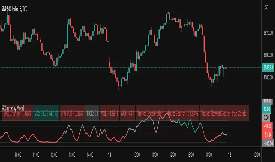
SPX Intraday Mood IndicatorThe SPX Intraday Mood Indicator tries to gauge the intraday market direction of the S&P 500 (SPX) by focusing on internal market data.
Based on the 0DTE Mood Indicator concept. Overall strength/weakness is converted into a directional Mood Percentage which can help with choosing a trade type.
Use at your own risk and discretion. Potential trade ideas offer no guarantees. Intraday Charts Only. Turn off extended hours data. Only works on SPX.
This first version is untested and I am only sharing it to gather feedback on its accuracy, use at your own risk.