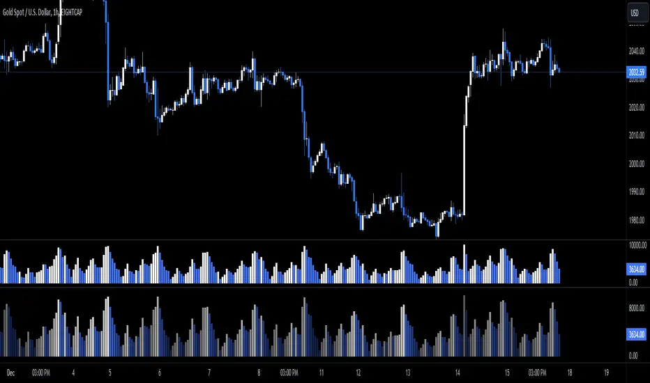
Cumulative Volume Delta with SignalThis premium-grade technical indicator provides deep insights into market sentiment by tracking the difference between buying and selling pressure through volume analysis. SCVD offers a sophisticated approach to volume profile analysis, helping traders identify potential trend reversals and momentum shifts before price action confirms them.
Key Features:
Real-Time Volume Delta Analysis: Visualizes buying vs. selling pressure through color-coded candles
Smart Signal Line Integration: EMA-based signal line helps identify trend changes and trading opportunities
Multi-Timeframe Capabilities: Automatically selects optimal lower timeframes for precision or can be customized
Daily Reset Option: Anchor period functionality for intraday delta analysis
Professional Visualization: Clean, color-coded display with zero reference line
Trading Applications:
Identify divergences between price action and volume delta for potential reversals
Spot accumulation/distribution patterns through delta behavior
Use signal line crossovers for entry/exit timing
Confirm trend strength by analyzing delta momentum
Detect potential false breakouts through volume confirmation
Perfect for day traders, swing traders, and institutional investors who rely on volume analysis for decision-making. This indicator combines sophisticated volume delta metrics with an intuitive interface to provide actionable trading insights across all markets and timeframes.
Cari dalam skrip untuk "volume"

Projected VolumeCalculates Projected Volume for the current trading day. Builds on Pocket Pivot Breakout Script by simatricks.

Ticker Screener by Volume Heatmap [SS]Fun little screener that creates a heatmap by daily volume trend.
The numbers expressed are the Sell to Buy ratio (Selling volume / buying volume). The % is the % change over the lookback period.
The default lookback period is 25 days, but you can adjust it as you see fit. The brightness of the green and red will change based on the extent of buying / selling.
Anything 1 or over means there is a lot of selling. A percent change in the negatives is good, it means that selling is decreasing and buying is increasing. Vice versa for a percent change in the positives.
It will accomodate up to 12 tickers, there are some pre-set but you can obviously customize it with your own tickers of interest.
And that's pretty much the indicator, pretty simple indicator but I hope you enjoy!
Safe trades everyone!

Ace VolumeThis is volume indicator that can help you identify either the volume is increasing or decreasing gradually.
The color based on the previous volume price.
The bigger the volume from the previous, it will show bull color (white) and vice versa bear color (blue).
The example of the indicator volume as shown above. Feel free to used it. Thank you!
Performante's Average Bitcoin Volume IndicatorThe volume of all major exchanges, including:
Bitfinex, Coinbase, Bitstamp, Bitmex, Kraken, Binance, Bithumb, Flyer, and OkEx

Zanger Volume Profile ZVR v1This is an attempt to make a zanger volume profile indicator, it needs improvement and some sort of forward looking volume estimator.
LazyScalp Volume in Currency AVGThis indicator displays the volume in the currency of the asset.
It also draws the average for a certain period and the average multiplied by the coefficient. If the volume is higher than the average multiplied by the coefficient, then the histogram bars and candlesticks on the chart are highlighted in color.
Also, the indicator sends alerts at such moments.
The indicator allows you to quickly see when the volume rises sharply. Often these are very interesting points for trading.
The indicator has many settings and display styles.

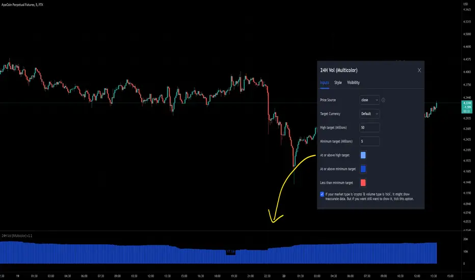
24-hour Volume (Multi-color with target size)This indicator has added the option to set different colors for a size target so you can set and instantly knows if the volume is above or below your target by seeing the different colors. Furthermore, I've added the option to opt-out of the error message that blocked the use of the 'crypto' market with the 'tick' type because maybe some users needed it, for example: BYBIT:APEUSDT is by default not available but personally I want to see it, so I can turn it on in this script.
Koalafied Volume Extension BubblesCircles based on extensions from volume Z-Score. Large volume candles can often signal exhaustion or show market strength in reversals or breakouts. Circles can be offset back to the start of the day/profile or left at the time where they occur.
Colours denoting deviations from the mean are
+2 std dev - Green
+1 std dev - Blue
-1 std dev - Red
-2 std dev - Purple
Concept is primarily as a pseudo volume profile delta tool. Obviously it's a very basic heuristic so would recommend further reading and use of actually footprint data to base trading decisions on.

Mehrdad banakar (volume / candle size)This indicator divided volume on size of candle. It developed base on the volume, and its fluctuate make a good perspective to user to analyze the market.

Buying Selling Volume v2Builds on Ceyhun's "Buying Selling Volume" indicator. This version allows users to define periods by effortlessly dragging two points or you may define periods by manually entering the start and end times in the settings window. Once the period is defined, both buying and selling volume will be totaled thus displaying the amount of buys and sells in that period.
I have found the information provided from the script helps in defining a period of consolidation as either being accumulative or distributive.

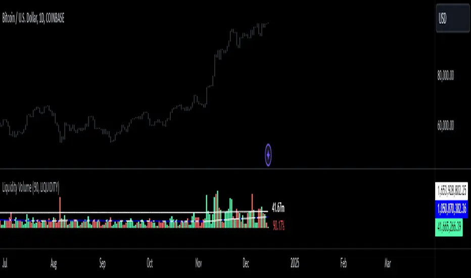
BTC Spot/Futures Volume RatioShows the ratio between the spot trading volume versus futures trading volume for Bitcoin. This ratio may be interpreted as how active the market currently is, and may lead to various interpretations. For example, when the price is at a high level and this ratio gradually decreases, it may imply the end of the distribution phase; when the price is low and the ratio is at the bottom, it may imply the bottom of the price.

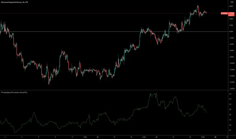
FTX spot/perp 24h volume ratioThis indicator gives the ratio between the 24h volume on the spot instrument versus the perpetual contract on FTX.
Base volumeCalculates volume in base currency. For example, in a pair bnbusdt will show the volume not in bnb, but in usdt (million).

TKP Volume Slope Bar ColoringUsing the slope of the 20 Period Volume Moving Averages to detect trend changes in Volume
*With respect to Indexes only*
Increasing Volume tends to be "Bearish" while decreasing volume tends to be "Bullish".
Color of the slope changes when the current slope is above or below the reading of the slope 3 days prior.

Dip Volume V1the very simple and very effective script, the script fetching the data from future contract data so that you can easily understand what is going inside the future data volume . and this is very important for Nifty and Bank Nifty traders

IBEX35 Volume Template [DM]Greetings Sirs
This Script recovers all the volume of the stocks that make up the index to generate the real volume signal with the market data.
You can see how some bars differ in color that is because the volume has been calculated individually by the forward backward stock layer.
Enjoy

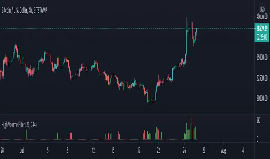
High Volume Filter - Taylor V1High Volume Filter
- Hide Small Volume Bar
- Show High Volume Bar
Able to Change the Filter Average Period

Cumulative Volume FTX + BINANCE SPOT VS DERVIATIVE VOLUMEShows spot volume green and red and derivative volume as blue.

Symbol VolumeUnlike the built-in Volume indicator and other custom scripts, this one allows to configure the volume symbol and preserves the known look and feel.

[ENG/PL] Sumiński's Volume | Wolumen SumińskiegoNASDAQ:DISCK ENG below.
Niniejszy wskaźnik, który jako jego twórca pozwoliłem sobie nazwać w tłumaczeniu na Polski - Wolumenem Sumińskiego :)
Od innych wskaźników wolumenu różni się tym, że mierzy "gęstość wolumenu" na danym barze. Polega to na tym, że w przypadku wystąpienia dużej świecy, np. spadkowej przy niewielkim wolumenie - oznacza to że wskazany obszar cenowy pozbawiony jest drugiej strony - w tym przypadku kupujących, nie zachodzi tu chęć odkupienia sprzedawanego instrumentu.
Jednak w przypadku wystąpienia niedużej świecy, a podwyższonego wolumenu - oznacza to, że przy danym poziomie ceny spotkał się duży kapitał kupujących i sprzedających - wskaźnik oznacza taki bar wysoką wartością. Im wyższy poziom wskaźnika tym "gęstsza" i mocniejsza wymiana pomiędzy kupującymi a sprzedającymi.
_____________________________________________
This indicator, which, as its creator, I have allowed myself to call - Sumiński's Volume :)
It differs from other volume indicators in that it measures the "volume density" on a given bar. It consists in the fact that in the event of a large candle, e.g. a downward candle with a small volume - it means that the indicated price area has no other side - in this case there are buyers, there is no desire to buy back the instrument being sold.
However, in the event of a small candle and an increased volume - this means that at a given price level, there was a large capital of buyers and sellers - the indicator means such a bar with a high value. The higher the index level, the "denser" and stronger the exchange between buyers and sellers.
