SMC Academy [PhenLabs]📊 SMC Academy
Version: PineScript™ v6
📌 Description
The SMC Academy indicator is a comprehensive educational tool designed to demystify Smart Money Concepts (SMC) for traders of all levels. Unlike standard indicators that simply print signals, this script uses a “Learning Phase” system that allows users to toggle between individual concepts—such as Market Structure, Liquidity, Imbalances, and Order Blocks—or view them all simultaneously. It lets you focus on one piece of the puzzle at a time.
🚀 Points of Innovation
Progressive Learning Modes: Toggle between 5 distinct phases to master concepts individually before using the Full Strategy Mode.
Educational Tooltips: Hover over labels to read detailed explanations of why a BOS, MSS, or Liquidity zone was identified.
Smart Filtering: Uses ATR and Volume integration to filter out low-quality Fair Value Gaps and weak Order Blocks.
HTF Dashboard: A built-in panel analyzes Higher Timeframe (4H) data to ensure you are trading in alignment with the broader trend.
🔧 Core Components
Market Structure Engine: Automatically detects Swing Highs and Lows to map out market direction using configurable swing lengths.
Liquidity Manager: Identifies unmitigated swing points that serve as Buy-Side (BSL) and Sell-Side (SSL) liquidity magnets.
Imbalance Detector: Highlights Fair Value Gaps (FVG) where price inefficiencies exist, using ATR thresholds to ignore noise.
Order Block Identifier: Locates the specific candles responsible for structure breaks, validated by volume analysis.
🔥 Key Features
Break of Structure (BOS): Automatically marks trend continuation signals with solid lines and color-coded labels.
Market Structure Shift (MSS): Identifies potential trend reversals when significant swing points are breached.
Dashboard Context: Displays the current trend direction and the 4H context directly on your chart.
Custom Alerts: Built-in alert conditions for structure breaks and new Order Blocks allow for automated tracking.
🎨 Visualization
Structure Lines: Solid lines indicate confirmed breaks (Green for Bullish, Red for Bearish).
Liquidity Zones: Dotted lines extending rightward indicate resting liquidity levels that price may target.
FVG Boxes: Shaded boxes highlight imbalance zones, automatically extending for a user-defined number of bars.
Dashboard: A clean, non-intrusive table in the top-right corner displays trend status and active mode.
📖 Usage Guidelines
Setting Categories
Learning Mode: Select from ‘1. Market Structure’ through ‘5. Full Strategy Mode’ to filter what appears on the chart.
Swing Detection Length: Default (5). Determines the sensitivity of the swing high/low detection.
Structure Break Type: Options (Close/Wick). Choose whether a candle close or just a wick is required to confirm a break.
Min FVG Size: Default (0.5 ATR). Filters out gaps smaller than this multiplier to reduce noise.
Filter Weak OBs by Volume: Default (True). Only highlights Order Blocks where volume exceeds the 20-period average.
✅ Best Use Cases
Educational Study: Isolate “Phase 1: Market Structure” to practice identifying trend changes without distraction.
Trend Following: Use “Phase 3: Imbalances” to find entry points within an established trend.
Reversal Trading: Combine “Phase 2: Liquidity” and “Phase 4: Order Blocks” to catch reversals at key levels.
⚠️ Limitations
Subjectivity: Market structure can be interpreted differently depending on the swing length settings used.
Ranging Markets: Like all trend-following concepts, false BOS/MSS signals may generate during choppy, sideways price action.
Repainting: While the signals are non-repainting once confirmed, the live candle may flash a signal before the close if “Close” mode is selected.
💡 What Makes This Unique
Interactive Learning: The inclusion of tooltip explanations transforms this from a simple tool into an active mentor.
Phase-Based Workflow: The ability to strip the chart back to basics at the click of a button is unique to the PhenLabs ecosystem.
🔬 How It Works
Swing Analysis: The script calculates pivot highs and lows based on your length input to define the structural landscape.
Break Validation: It checks if price crosses these pivot points to trigger BOS (Continuation) or MSS (Reversal) logic.
Volume Confirmation: For Order Blocks, it looks back inside the swing leg to find the specific candle responsible for the move, verifying it has significant volume.
💡 Note:
For the best experience, start in Phase 1 to calibrate your Swing Detection Length to the specific volatility of the asset you are trading before enabling Full Strategy Mode.
Penunjuk dan strategi

Adaptive Trend-Based Fib Extension + TrendlinesThis advanced analysis tool is designed to take the guesswork out of Fibonacci trading. By combining Adaptive Fibonacci Extensions with multi-method Pivot Detection, Dynamic Trendlines, and Horizontal Support/Resistance, this indicator provides a comprehensive roadmap for any market trend.
Learn volume trading - @pricevolumetraders
Key Features
Adaptive Fibonacci Engine: Unlike static tools, this indicator uses an ATR-based adaptive factor to adjust extension levels according to current market volatility.
Smart Trend Detection: Automatically identifies trend direction using EMA cross-overs or Higher High/Higher Low sequences to determine whether to plot Bullish or Bearish extensions.
Multi-Method Pivots: Choose from six different pivot detection methods, including Volume-Based, Fractal, ATR-Based, and Long Wick detection, to suit your specific trading style.
Automated Trendlines & S/R: High-probability diagonal trendlines and horizontal S/R levels are drawn only when they meet a minimum "touch" requirement and volume confirmation.
Institutional Zones: Highlights the "Golden Zone" between the 127.2% and 161.8% extension levels, where trends often reach exhaustion or find major targets.
How to Use
Trend Alignment: Use the built-in Dashboard to quickly identify the current trend (Bull/Bear) and RSI momentum.
The 3-Point Setup: The indicator automatically finds Point 1 (Trend Start), Point 2 (Impulse End), and Point 3 (Retracement/Last Touch) to project future price targets.
Entry Confirmation: Look for price action near the 61.8% or 78.6% Retracement levels for high-probability entries in the direction of the trend.
Targeting: Use the extension levels (100%, 127.2%, 161.8%) as your primary Take Profit zones.
Confluence: The strongest setups occur when a Fibonacci level aligns perfectly with a Horizontal S/R line or a Diagonal Trendline.
Technical Settings
Pivot Settings: Adjust 'Left' and 'Right' bars to change the sensitivity of swing high/low detection.
Fib Timeframe: You can anchor Fibonacci levels to a higher timeframe (e.g., 1-hour levels) while trading on a lower timeframe (e.g., 5-minute).
Volume Multiplier: Filter for horizontal levels that were formed with significant institutional volume.
Disclaimer: Trading involves significant risk. This tool is for educational and analytical purposes only and should be used in conjunction with a complete trading plan.

iFVG ultimateUltimate ifvg strategy indictor, has 1hr/4hr high/low marker, Session high/low and 50% Daily range marker

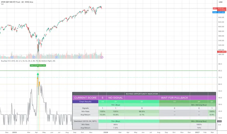
Buying Opportunity Score V2.1Overview
A composite scoring system (0-100) that identifies high-probability buying opportunities during market pullbacks. Validated through backtesting on SPY from 2010-2024.
How It Works
The indicator combines multiple fear and oversold signals into a single actionable score. When fear is elevated and the market is oversold, the score rises. Higher scores historically correlate with better forward returns.
Scoring Components
VIX Level (30 pts) - Market fear gauge
Drawdown (30 pts) - Distance from 52-week high
RSI 14 (12 pts) - Oversold confirmation
Bollinger Band (13 pts) - Statistical extreme
VIX Timing (15 pts) - Bonus when VIX declining from peak
Signal Levels
80+ = STRONG BUY (high conviction)
70-79 = BUY (consider entry)
60-69 = WATCH (monitor closely)
Below 60 = No signal
Backtest Results (SPY, 2010-2024)
70+ Signals: 85% win rate, 7.5% average 20-day return
80+ Signals: 100% win rate, 14% average 20-day return
Features
Statistics table showing 1Y, 3Y, 5Y rolling performance
Signal markers (green triangles) on buy signals
Outcome labels showing WIN/LOSS after measurement period
Multiple alert options
Works on SPY, QQQ, IWM (use VIX for all)
How To Use
Add to SPY, QQQ, or IWM (daily timeframe)
Wait for score to reach 70+ or 80+
Green triangle marks signal day
Check statistics table for recent performance
Set alerts for notifications
Alerts Available
STRONG BUY Signal (80+)
BUY Signal (70+)
Moderate Signal (60+)
Score Crossed 80/70
Score Dropped Below 70
Important Notes
Designed for daily timeframe on broad market ETFs
Signals confirm at end of day (bar close)
Statistics table shows rolling windows based on loaded data
Past performance does not guarantee future results
Structure Lite - Automatic Major Trend LinesStructure Lite — Automatic Major Trend Lines
Structure Lite automatically detects and plots major market structure using higher-timeframe pivot highs and lows.
It is designed to provide a clean, lightweight view of primary support and resistance without manual drawing or chart clutter.
This script focuses only on major structure and intentionally excludes short-term noise, advanced liquidity concepts, or signal logic.
Features
Automatically plots major resistance (red) and major support (green) trend lines
Uses higher-period pivots to reflect macro / swing structure
Lines extend right for forward projection
Keeps only the most recent major levels to reduce clutter
Optional toggle to hide all trend lines for a clean chart view
How to Use
Add the indicator to your chart
Adjust Major Pivot Period to control how swing-based the structure is
Higher values = fewer, more important levels
Lower values = more responsive structure
Use the plotted lines to:
Identify higher-timeframe support and resistance
Contextualize price action and trend bias
Toggle Hide All Trend Lines to quickly remove structure without removing the indicator
This tool is intended for context and structure awareness, not trade signals.
Design Philosophy
Structure Lite is intentionally minimal:
No alerts
No buy/sell signals
No predictions
No performance claims
It is built as a foundational structure tool that can be combined with the user’s own methodology.
Notes
Some inputs reference advanced features available in a separate professional version
These options are disabled here and included only for interface consistency
No external links, promotions, or monetization are included in this script
Disclaimer
Educational and informational purposes only.
This script does not provide financial advice or trade recommendations.
Past market behavior does not guarantee future results.
© 2025 GammaBulldog

MTF Bollinger Bands (2SD & 3SD)
개요
1분봉이나 5분봉 등 하위 타임프레임에서 스캘핑을 할 때, 차트를 변경하지 않고 상위 타임프레임(기본 4시간)의 볼린저 밴드 위치를 확인하기 위해 제작했습니다.
주요 기능
MTF (Multi-Timeframe): 현재 보고 있는 차트와 상관없이 설정한 타임프레임의 볼린저 밴드를 표시합니다. (기본값: 4시간)
듀얼 밴드 시각화 (Dual Zone): 표준편차 2(2SD)와 표준편차 3(3SD)을 동시에 계산합니다.
2SD 영역: 2SD와 3SD의 배경색이 겹치도록 설계하여, 중심부(2SD)가 시각적으로 더 진하게 보입니다. 이는 주요 지지/저항 구간을 직관적으로 보여줍니다.
3SD 영역: 외곽은 연하게 표시되어 과매수/과매도 구간을 식별하기 좋습니다.
끊김 없는 라인: gaps_off 처리를 통해 타임프레임 변경 시 선이 끊기지 않고 부드럽게 연결됩니다.
설정 가이드
Timeframe: 기준이 될 상위 시간대를 선택하세요. (기본: 240분/4시간)
Multiplier: 표준편차 배수를 변경할 수 있습니다. (기본: 2.0 / 3.0)
Transparency: 배경 투명도를 조절해 밴드의 진하기를 변경하세요.
==========================================
Overview
Designed for traders who need to monitor Higher Timeframe (HTF) volatility while scalping on Lower Timeframes (LTF). This indicator overlays HTF Bollinger Bands on your current chart without the need to switch tabs.
Key Features
MTF Capability: Displays Bollinger Bands from any user-defined timeframe. (Default: 4 Hours).
Dual Zone Visualization: Plots both 2 Standard Deviations (2SD) and 3 Standard Deviations (3SD).
Visual Depth: The script utilizes an overlapping fill method. The inner 2SD band appears darker as it layers on top of the 3SD background, clearly highlighting the primary support/resistance zone.
Extreme Zones: The outer 3SD band remains lighter, indicating extreme overbought/oversold conditions.
Seamless Plotting: Uses gaps_off to ensure lines remain continuous across different timeframes.
Settings
Timeframe: Select the target HTF. (Default: 240 / 4H)
Multiplier: Adjust the standard deviation multipliers. (Default: 2.0 & 3.0)
Style: Customize colors and transparency to fit your chart theme.

Liquidity Sell Signal V2 [StrategyLAB_]Liquidity Sell Signal V2
Liquidity Sell Signal V2 is a TradingView indicator designed to help you spot high-probability Sell setups (reversal / pullback entries) using liquidity concepts around Buy-Side Liquidity (BSL) , combined with a bearish confirmation candle pattern.
OANDA:XAUUSD
This script will:
Automatically detect and plot BSL (Swing High) levels based on your selected Swing Strength.
Visually “fade” levels once price has broken above them.
Print a down triangle when a valid Bearish Liquidity Triangle forms at a qualified BSL area.
How it works
1) Identify Buy-Side Liquidity (BSL)
The indicator detects pivot highs using Swing Strength.
Each pivot high is drawn as a horizontal BSL level, keeping up to Max Buy Side Liquidity (BSL) Levels.
2) Bearish confirmation (Liquidity reaction)
A Sell signal triggers only when a bearish candle structure appears, suggesting strong selling pressure and a potential reversal after a liquidity sweep near/above BSL.
3) Noise filter (Avoid “body-cut” levels)
The script checks whether the BSL level has been repeatedly cut through candle bodies in prior bars.
If the level is considered “dirty” based on olderBodyLookback, it is filtered out to reduce false signals.
How to use
Suggested settings
Swing Strength
Lower (5–8): more levels, faster signals, but more noise.
Higher (12–20): fewer levels, cleaner zones, better for swing.
Max BSL Levels: increase if you want to keep more historical liquidity levels.
Filter lookback older bodies: increase to filter more aggressively (fewer signals, cleaner quality).
Entry idea (example)
Wait for a Sell triangle to appear (signal prints on candle close).
Prefer signals that align with:
a major swing high / key resistance,
clear rejection (wick / bearish reaction),
confluence with HTF supply, trendline, session, etc.
SL/TP idea (example)
SL: above the most recent swing high / above the BSL zone with a safety buffer.
TP: toward imbalance fill, previous lows (SSL), or a fixed RR such as 1:2 / 1:3.
Important notes
This is a probability tool, not a guaranteed signal.
Best results come from combining with market structure (BOS/CHOCH), supply/demand, HTF levels, and session context.
The script uses barstate.isconfirmed, so signals appear only after the candle closes (non-repainting signals).
OANDA:EURUSD

MNQ Optimal Entry Detector - Timeframe StableOptimized for timeframes and has better trade stability, overall better option however use with discretion, dont trade until 3 hours after market opens and dont use 4 hours before close due to lack of volume.

Adaptive RSI Pro# Adaptive RSI Pro / 自适应RSI专业版
[! (img.shields.io)](www.tradingview.com)
[! (img.shields.io)](www.tradingview.com)
[! (img.shields.io)](opensource.org)
Dynamic overbought/oversold thresholds + Multi-Timeframe analysis + Divergence detection + Signal statistics.
根据每个标的实际历史分布动态计算超买/超卖阈值,结合多时间框架分析、背离检测和信号统计。
**Pine Script v6** | **Last Update: 2025-12-17** | **v6.2**
---
## Emoji Legend / 信号图例
### Chart Signals / 图表信号
#### Buy Signals / 买入信号 (底部显示)
| Emoji | Signal Name | Condition | Priority | Action |
|-------|-------------|-----------|----------|--------|
| 🌟 | MTF + Extreme | 3+ timeframes oversold + Z<−2σ | ★★★★★ | **STRONG BUY** 强力买入 |
| 💎 | Divergence + Extreme | Bullish divergence in Z<−2σ zone | ★★★★☆ | **BUY** 买入 |
| 🔥 | Extreme Oversold | Z-Score crosses below −2σ (≈P2) | ★★★☆☆ | **BUY** 买入 |
| ⬆️ | Normal Oversold | Z-Score crosses below −1.5σ (≈P7) | ★★☆☆☆ | Consider buy 考虑买入 (默认隐藏) |
| ↗️ | Bullish Divergence | Price↓ RSI↑ (not in extreme zone) | ★☆☆☆☆ | Watch 观察 (潜在底部) |
#### Sell Signals / 卖出信号 (顶部显示)
| Emoji | Signal Name | Condition | Priority | Action |
|-------|-------------|-----------|----------|--------|
| 🌟 | MTF + Extreme | 3+ timeframes overbought + Z>+2σ | ★★★★★ | **STRONG SELL** 强力卖出 |
| 💎 | Divergence + Extreme | Bearish divergence in Z>+2σ zone | ★★★★☆ | **SELL** 卖出 |
| ❄️ | Extreme Overbought | Z-Score crosses above +2σ (≈P98) | ★★★☆☆ | **SELL** 卖出 |
| ⬇️ | Normal Overbought | Z-Score crosses above +1.5σ (≈P93) | ★★☆☆☆ | Consider sell 考虑卖出 (默认隐藏) |
| ↘️ | Bearish Divergence | Price↑ RSI↓ (not in extreme zone) | ★☆☆☆☆ | Watch 观察 (潜在顶部) |
> **Priority System / 优先级系统**: Only the highest priority signal is shown to prevent overlapping.
> 只显示最高优先级信号,避免叠加。
---
### Dashboard Status / 仪表盘状态
| Emoji | Status | Meaning |
|-------|--------|---------|
| 🟢 | EXTREME OVERSOLD | Z-Score < −2σ (≈P2.3), strong buy zone / 极端超卖区,强买区 |
| 🟡 | OVERSOLD | Z-Score < −1.5σ (≈P6.7), oversold / 超卖 |
| ⚪ | NEUTRAL | −1.5σ ≤ Z-Score ≤ +1.5σ, no signal / 中性,无信号 |
| 🟠 | OVERBOUGHT | Z-Score > +1.5σ (≈P93.3), overbought / 超买 |
| 🔴 | EXTREME OVERBOUGHT | Z-Score > +2σ (≈P97.7), strong sell zone / 极端超买区,强卖区 |
### MTF Status / 多周期状态
| Emoji | Meaning |
|-------|---------|
| 🟢 | Timeframe oversold / 该周期超卖 |
| 🔴 | Timeframe overbought / 该周期超买 |
| ⚪ | Timeframe neutral / 该周期中性 |
### Divergence Status / 背离状态
| Emoji | Meaning |
|-------|---------|
| 🟢 BULL DIV | Bullish divergence detected / 检测到看涨背离 |
| 🔴 BEAR DIV | Bearish divergence detected / 检测到看跌背离 |
| — | No divergence / 无背离 |
---
### Alert Emojis / 警报图标
| Emoji | Alert Type | Description |
|-------|------------|-------------|
| 🎯 | Smart Alert | V6 Unified Alert System / V6统一警报系统 |
---
## Overview / 概述
Traditional RSI uses fixed 30/70 thresholds, but different assets have different volatility characteristics.
传统RSI使用固定的30/70阈值,但不同标的有不同的波动特性。
**Solution**: Calculate thresholds using historical percentiles (P5-P95) + advanced features.
**解决方案**:使用历史百分位(P5-P95)计算阈值 + 高级功能。
---
## Features / 功能特性
### 🎯 Adaptive Thresholds / 自适应阈值
- **Z-Score Based Signals**: Uses statistical Z-Score (±2σ for extreme, ±1.5σ for normal) for consistent cross-asset performance
使用统计Z-Score(极端±2σ,普通±1.5σ)实现跨资产一致性
- **Percentile Lines**: Display P5/P10/P25/P50/P75/P90/P95 for visual reference
百分位线(P5-P95)作为视觉参考
- **Dual Display Modes**: Show Z-Score lines, Percentile lines, or both
双重显示模式:可选择显示Z值线、百分位线或两者
### 🔬 Auto-Adaptive Lookback / 自动自适应回看期
- **Statistical Formula**: Uses `n = (Z × σ / E)²` for optimal sample size calculation
统计公式:使用样本量公式自动计算最优回看期
- **Dual Volatility System**: Combines short-term (4× RSI length) and long-term volatility (configurable: 6M/1Y/2Y)
双重波动率系统:结合短期和长期波动率动态调整
- **Precision Control**: Choose High/Normal/Low precision (adjusts acceptable error margin)
精度控制:高/普通/低精度可选(调整统计误差容忍度)
- **Health Indicators**: Real-time validation of sample coverage, distribution spread, and statistical validity
健康度指标:实时验证样本覆盖率、分布宽度和统计有效性
### 📈 Auto-Adaptive Trend Filter / 自动自适应趋势过滤
- **Auto Mode**: Automatically selects optimal filter based on RSI volatility percentiles
自动模式:根据RSI波动率百分位自动选择最优过滤器
- **5 Filter Modes**: Fixed 50, Adaptive P50, SMA(RSI), BB(RSI), or Auto
5种过滤模式:固定50、自适应P50、RSI均线、布林带或自动
- **Smart Selection**: Low volatility → Fixed 50, Medium → Adaptive P50, High → BB(RSI)
智能选择:低波动→固定50,中波动→自适应P50,高波动→布林带
### 🌍 Multi-Timeframe RSI / 多时间框架RSI
- **3 Configurable Timeframes**: View RSI status across multiple timeframes (default: 1h/4h/D)
3个可配置时间框架:跨周期查看RSI状态(默认:1小时/4小时/日线)
- **Auto-Skip Duplicates**: Automatically detects and skips timeframes matching current chart
自动跳过重复:自动检测并跳过与当前图表相同的时间框架
- **Resonance Detection**: Triggers when 3+ valid timeframes agree (oversold/overbought)
共振检测:当3个以上有效时间框架一致时触发强信号
>
> **MTF Signal Confirmation Timing / 信号确认时机**
>
> - Current timeframe signals update in real-time, confirmed on bar close
> - Higher timeframe signals (e.g., Daily on 1H chart) only update after that timeframe's bar closes
> - **Best Practice**: Wait for current timeframe bar close before acting on MTF resonance signals
>
> - 当前图表周期的信号:实时更新,K线收盘确认
> - 高周期信号(如日线):仅在该周期K线收盘后更新
> - **最佳实践**:MTF共振信号建议在当前周期K线收盘后再做交易决策
### 💎 Auto-Adaptive Divergence Detection / 自动自适应背离检测
- **Auto Mode**: Automatically selects parameters based on asset volatility (using ATR)
自动模式:基于资产波动率(ATR)自动选择参数
- **4 Preset Modes**: Low Vol (3/40), Normal (5/60), High Vol (7/80), Crypto (10/120)
4种预设模式:低波动/普通/高波动/加密货币,分别对应不同的回看/范围参数
- **Extreme Zone Detection**: Distinguishes divergence in extreme zones (💎) vs normal zones (↗️↘️)
极端区域检测:区分极端区域背离(💎)和普通背离(↗️↘️)
- **Bullish/Bearish Divergence**: Price lower low + RSI higher low / Price higher high + RSI lower high
看涨/看跌背离:价格新低+RSI未新低 / 价格新高+RSI未新高
### 📊 Layered Signal Statistics / 分层信号统计
- **4-Tier Classification**: MTF Resonance (🌟) > Divergence+Extreme (💎) > Extreme Only (🔥❄️) > Normal (⬆️⬇️)
四层分级:多周期共振 > 背离+极端 > 仅极端 > 普通信号
- **Independent Tracking**: Each signal tier has separate count, average return, and win rate
独立跟踪:每层信号独立统计次数、平均收益、胜率
- **Signal Cooldown**: Optional cooldown period (default 5 bars) to prevent duplicate counting
信号冷却:可选冷却期(默认5根K线)防止重复计数
- **Real Forward Testing**: Calculates actual returns N bars after signal (configurable 5-100 bars)
真实前瞻测试:计算信号后N根K线的实际收益(可配置5-100)
---
## Z-Score 与 百分位:双重视角 / Dual Perspective
This indicator displays **both Z-Score and Percentile** to provide complementary views of the same RSI distribution.
本指标**同时显示Z-Score和百分位**,为同一RSI分布提供互补视角。
### Why Both? / 为什么同时显示?
**Fundamental Connection / 本质关联**:
两者都是描述RSI在历史分布中位置的统计方法。
Both are statistical methods describing RSI's position in historical distribution.
- **Z-Score(标准分数)**: `(RSI - 均值) / 标准差` - 基于正态分布假设
Based on normal distribution assumption.
- **百分位(Percentile)**: RSI在历史数据中的排名位置 - 不假设分布类型
RSI's ranking position in historical data - no distribution assumption.
**Complementary Advantages / 互补优势**:
| Dimension 维度 | Z-Score | Percentile 百分位 |
|------|---------|------------|
| **Cross-asset Consistency / 跨资产一致性** | ✅ Excellent 优秀 - BTC和SPY都用±2σ | ⚠️ Varies by volatility 因波动率不同而异 |
| **Statistical Rigor / 统计学严谨性** | ✅ Confidence intervals 置信区间、假设检验 | ⚠️ Non-parametric 非参数统计 |
| **Intuitive / 直观易懂** | ⚠️ Stats knowledge needed 需要统计学知识 | ✅ "Below 95% of history" "低于95%历史值" |
| **Use Case / 适用场景** | 📊 Quant backtesting 量化回测、信号触发 | 📈 Visualization 可视化、用户理解 |
### Conversion Reference / 转换对照表
**Quick Reference / 快速对照**(Assuming normal distribution / 假设正态分布):
| Z-Score | Percentile 百分位 | Meaning 含义 | Signal 信号类型 |
|---------|--------|---------------|----------|
| **±2.5σ** | **P0.6 / P99.4** | Extreme anomaly (outside 99% CI) / 极端异常(99%置信区间外) | Rare opportunity 罕见机会 |
| **±2.0σ** | **P2.3 / P97.7** | Extreme OB/OS (outside 95% CI) / 极端超买/超卖(95%置信区间外) | 🔥❄️ Extreme 极端信号 |
| ±1.5σ | P6.7 / P93.3 | Notable deviation / 显著偏离 | ⬆️⬇️ Normal 普通信号(默认) |
| ±1.0σ | P15.9 / P84.1 | Mildly strong/weak / 轻度偏强/偏弱 | — |
| 0σ | P50 | Median / 中位数 | — |
### Dashboard Dual Display / 仪表盘双重显示
**新版Dashboard已实现自动转换**:
```
┌─────────────────────────────────┐
│ ADAPTIVE RSI PRO 28.5 │
├─────────────────────────────────┤
│ Z-Score −2.15σ (≈P2) │ ← Z值 + 近似百分位
│ Percentile P5 (−1.5σ ~ −2σ) │ ← 百分位 + 对应Z值范围
│ Status 🟢 EXTREME OVERSOLD │
└─────────────────────────────────┘
```
**理解方式**:
- **从Z值看**:−2.15σ 表示超过95%置信区间,统计异常 → 对应约P2
- **从百分位看**:P5 表示低于95%历史值,极端超卖 → 对应约−1.5σ到−2σ之间
### Threshold Line Modes / 阈值线模式
**Unified Mode (Recommended) / Unified模式(推荐)** - Balances rigor and intuitiveness / 兼顾严谨性和直观性:
- Draws: Z-Score threshold lines (±2σ, ±1.5σ) / 绘制:Z-Score阈值线(±2σ、±1.5σ)
- Labels: Corresponding percentiles (≈P98, ≈P93, ≈P7, ≈P2) / 标注:对应百分位(≈P98、≈P93、≈P7、≈P2)
- Advantage: Instantly understand statistical meaning and historical position / 优势:一眼看懂统计意义和历史位置
**Other Modes / 其他模式**:
- `Z-Score`: Statistical threshold lines only / 仅显示统计学阈值线
- `Percentile`: Percentile lines only / 仅显示百分位线
- `Both`: Display both types (denser) / 同时显示两类线(较密集)
### Practical Examples / 实际应用示例
**Scenario 1: Identifying Extreme Opportunities / 场景1:识别极端机会**
```
Current RSI / 当前RSI: 25.3
Dashboard shows / Dashboard显示:
Z-Score: −2.35σ (≈P1)
Percentile: P5 (< −2σ)
Status: 🟢 EXTREME OVERSOLD
Interpretation / 解读:
• Statistical perspective / 统计学视角: Beyond 99% confidence interval (|Z| > 2.3) / 超过99%置信区间,极端异常
• Intuitive perspective / 直观视角: Lower than 99% of historical values / 低于99%的历史值都低,罕见超卖
• Conclusion / 结论: Strong buy signal 🔥 / 强力买入信号 🔥
```
**Scenario 2: Normal Signal Judgment / 场景2:普通信号判断**
```
Current RSI / 当前RSI: 63.8
Dashboard shows / Dashboard显示:
Z-Score: +1.52σ (≈P94)
Percentile: P90 (+1.5σ ~ +2σ)
Status: 🟠 OVERBOUGHT
Interpretation / 解读:
• Statistical perspective / 统计学视角: ~1.5 std dev, notably high but not extreme / 约1.5倍标准差,显著偏高但未极端
• Intuitive perspective / 直观视角: Higher than 90% of historical values / 高于90%的历史值,轻度超买
• Conclusion / 结论: Consider reducing position, not forced sell ⬇️ / 考虑减仓,非强制卖出 ⬇️
```
### Dashboard Display Logic / Dashboard显示逻辑
**Z-Score Row Display / Z-Score行显示**:
- Always shows current Z-value (2 decimal places) / 始终显示当前Z值(精确到2位小数)
- Auto-calculates approximate percentile: `≈P ` / 自动计算对应的近似百分位:`≈P `
- Uses Error Function for precise conversion / 使用误差函数(Error Function)精确转换
**Percentile Row Display / Percentile行显示**:
- Shows RSI's percentile range (P5, P10, P25, etc.) / 显示RSI所处的百分位区间(P5, P10, P25等)
- Labels corresponding Z-value range (e.g., `−1.5σ ~ −2σ`) / 标注对应的Z值范围(如:`−1.5σ ~ −2σ`)
- Helps understand what "P10" means statistically / 帮助理解"P10"的统计意义
**Color Association / 颜色关联**:
- Both rows use same status color (green/yellow/white/orange/red) / 两行使用相同的状态颜色(绿/黄/白/橙/红)
- Visually reinforces "same indicator, different expressions" / 视觉上强化"同一指标的不同表达"概念
---
### Dashboard Setups / 仪表盘配置
#### Full Mode (PC/Tablet)
Shows detailed stats, MTF status, and divergence info.
显示详细统计、MTF状态和背离信息。
#### Mobile Mode (Phone) / 手机模式
Simplified 3-row layout optimized for small screens.
极简3行布局,专为手机屏幕优化。
- Row 1: RSI Value / 第1行:RSI数值
- Row 2: Signal Status (Emoji) / 第2行:信号状态 (Emoji)
- Row 3: Trend/Filter Status / 第3行:趋势/过滤状态
### 📈 Dashboard Example / 面板示例
```
┌─────────────────────────────────┐
│ ADAPTIVE RSI PRO 35.2 │
├─────────────────────────────────┤
│ Status 🟢 EXTREME OVERSOLD │
│ Percentile P10 ↓ DOWN │
│ Lookback 456 ✅✅✅ │
├─────────────────────────────────├ (Full Mode Only)
│ ── MTF ── │
│ 1h | 4h | D 🟢 | ⚪ | 🟢 │
│ Resonance 🟢 3/4 OVERSOLD │
├─────────────────────────────────┤
│ Divergence 🟢 BULL (5/60) │
├─────────────────────────────────┤
│ ── STATS ── (20 bars) │
│ 🌟 MTF Buy(12) +4.2% | 83% │
│ 🌟 MTF Sell(8) +3.8% | 75% │
│ 💎 Div Buy(15) +3.5% | 80% │
│ 💎 Div Sell(11) +2.9% | 73% │
│ 🔥 Ext Buy(45) +2.1% | 67% │
│ ❄️ Ext Sell(38) +1.8% | 63% │
└─────────────────────────────────┘
```
**Health Indicators / 健康度指标**:
- ✅✅✅ = All healthy (所有健康): Sample coverage ≥ 80%, Distribution spread ≥ 15, Statistical validity ≥ 90%
- ⚠️ present = Warning (警告): One or more health checks failed, consider using Custom mode with larger lookback
---
## Chart Lines Guide / 图表线条指南
! (images/annotated_rsi_indicator.png)
### 📊 主要线条 / Main Lines
| 线条 | 颜色/样式 | 含义 | 作用 |
|------|----------|------|------|
| **RSI主线** | 黄色粗线 | 当前RSI值 | 实时跟踪相对强弱指标 |
| **P50 自适应中位数** | 白色阶梯线 | 动态中线 | 根据历史数据自动调整的中位数,比固定50更准确 |
### 🔴 超买阈值线 / Overbought Thresholds (上方红色)
| 线条 | Z-Score | 百分位 | 样式 | 信号 |
|------|---------|--------|------|------|
| **极端超买线** | +2σ | ≈P98 | 实线 | 触发 ❄️ 极端超买信号(强卖出) |
| **普通超买线** | +1.5σ | ≈P93 | 圆点虚线 | 触发 ⬇️ 普通超买信号(考虑卖出) |
### 🟢 超卖阈值线 / Oversold Thresholds (下方绿色)
| 线条 | Z-Score | 百分位 | 样式 | 信号 |
|------|---------|--------|------|------|
| **极端超卖线** | -2σ | ≈P2 | 实线 | 触发 🔥 极端超卖信号(强买入) |
| **普通超卖线** | -1.5σ | ≈P7 | 圆点虚线 | 触发 ⬆️ 普通超卖信号(考虑买入) |
### ⚪ 固定参考线 / Fixed Reference Lines
| 线条 | 位置 | 样式 | 作用 |
|------|------|------|------|
| **0线** | 底部 | 灰色点线 | RSI下边界 |
| **50线** | 中间 | 灰色点线 | 传统固定中线参考 |
| **100线** | 顶部 | 灰色点线 | RSI上边界 |
### 🎨 渐变填充区域 / Gradient Fill Zones
- **红色渐变**(上方):超买区域,颜色越深表示越极端
- P95-P90(深红)> P90-P75(中红)> P75-P50(浅红)
- **绿色渐变**(下方):超卖区域,颜色越深表示越极端
- P10-P5(深绿)> P25-P10(中绿)> P50-P25(浅绿)
### 💡 关键要点 / Key Points
**线条样式区分 / Line Style Distinction:**
- **实线** = 极端信号(±2σ),优先级高,统计上95%置信区间外
- **圆点虚线** = 普通信号(±1.5σ),优先级较低,显著偏离但未极端
**动态 vs 固定 / Dynamic vs Fixed:**
- **彩色线**(红/绿)= 根据历史波动动态调整,适应不同资产特性
- **灰色虚线** = 固定不变的参考线,用于传统RSI对比
**视觉层次 / Visual Hierarchy:**
- 线条粗细:RSI主线(最粗)> 极端阈值(粗)> 普通阈值(细)> 参考线(最细)
- 透明度:核心线条(不透明)> 百分位线(半透明)> 填充区(高透明)
---
## Settings / 设置
### RSI Settings / RSI设置
| Setting | Default | Description |
|---------|---------|-------------|
| RSI Length | 14 | RSI calculation period / RSI计算周期 |
| RSI Source | Close | Price source / 价格源 |
### Adaptive Settings / 自适应设置
| Setting | Default | Description |
|---------|---------|-------------|
| Lookback Mode | Auto | Auto (statistical formula) / Custom / 自动/自定义 |
| Custom Lookback | 252 | Only used in Custom mode / 仅自定义模式使用 |
| Precision | Normal | High/Normal/Low: Adjusts error tolerance / 精度等级 |
| History Depth | 1 Year | 6 Months / 1 Year / 2 Years for volatility calculation / 波动率历史深度 |
### Visual Settings / 视觉设置
| Setting | Default | Description |
|---------|---------|-------------|
| Threshold Line Mode | **Unified** | Unified(推荐)/Z-Score/Percentile/Both / 阈值线模式 |
| Show Gradient Fill | ON | Display background gradients / 显示背景渐变 |
| Show Dashboard | ON | Display dashboard panel / 显示仪表盘面板 |
| Dashboard Mode | Full | Full/Lite/Mobile(Phone) / 面板模式 |
| Dashboard Size | Normal | Tiny/Small/Normal/Large / 面板大小 |
| Dashboard Transparency | 30 | 0-100% transparency level / 透明度 |
| Bullish Color | #00E676 | Custom color for bullish signals / 牛市信号颜色 |
| Bearish Color | #FF5252 | Custom color for bearish signals / 熊市信号颜色 |
| RSI Line Color | #FFEB3B | RSI line color / RSI主线颜色 |
### Trend Filter / 趋势过滤
| Setting | Default | Description |
|---------|---------|-------------|
| Enable Trend Filter | OFF | Only trigger signals in trend direction / 趋势方向过滤 |
| Filter Mode | Auto | Auto/Fixed 50/Adaptive P50/SMA(RSI)/BB(RSI) / 过滤模式 |
### Alert Settings / 警报设置
| Setting | Default | Description |
|---------|---------|-------------|
| **🎯 Smart Alert** | **ON** | **V6 Unified Alert System** / V6统一警报系统 |
| Show Normal Signals | OFF | Display ⬆️⬇️ on chart / 图表显示普通信号 |
| Normal Signal Threshold | 1.5σ | Z-Score threshold (1.0-2.0σ) / 普通信号阈值 |
| Enable Signal Cooldown | ON | Prevent duplicate signal counting / 防止重复信号 |
| Cooldown Period | 5 bars | Bars between same signal type / 冷却K线数 |
### Multi-Timeframe / 多时间框架
| Setting | Default | Description |
|---------|---------|-------------|
| Enable | ON | Show MTF analysis / 显示MTF分析 |
| MTF Mode | **Auto** | **Auto** (Fractal Breakdown) / **Manual** (Fixed) / 自动/手动模式 |
| TF1/TF2/TF3 | 60/240/D | Timeframes (Manual mode only) / 时间框架(仅手动模式)|
### Signal Statistics / 信号统计
| Setting | Default | Description |
|---------|---------|-------------|
| Enable | ON | Track performance / 跟踪表现 |
| Forward Bars | 20 | Bars for return calculation / 收益计算K线数 |
### Divergence Detection / 背离检测
| Setting | Default | Description |
|---------|---------|-------------|
| Enable Detection | ON | Detect divergences / 检测背离 |
| Divergence Mode | Auto | Auto/Low Vol/Normal/High Vol/Crypto/Custom / 背离模式 |
| Custom Lookback | 5 | Only in Custom mode / 仅自定义模式使用 |
| Custom Range | 60 | Only in Custom mode / 仅自定义模式使用 |
**Auto Mode Presets / 自动模式预设**:
- Low Vol (蓝筹/ETF): Lookback 3, Range 40
- Normal (一般股票): Lookback 5, Range 60
- High Vol (成长股): Lookback 7, Range 80
- Crypto (加密货币): Lookback 10, Range 120
---
## Alerts / 警报
### 🎯 Smart Alert (V6 Unified System)
**The only alert method / 唯一的警报方式** - 自动聚合所有信号到一条富文本消息
Automatically aggregates all signals into a single rich-text message.
**Setup Steps / 设置方法**:
1. Keep "🎯 Smart Alert" enabled in indicator settings (default) / 指标设置中保持 "🎯 Smart Alert" 开启(默认)
2. When creating alert, select **"Any alert() function call"** / 创建警报时选择 **"Any alert() function call"**
3. Done! You'll receive real-time aggregated alerts / 完成!您会收到实时的聚合警报
**Message Example / 消息示例**:
```
AAPL: 🟢 BUY SIGNALS → 🌟MTF共振 💎背离 🔥极端 | RSI:25.3 Z:-2.1σ (≈P2)
AAPL: 🔴 SELL SIGNALS → ❄️极端 | RSI:78.5 Z:2.3σ (≈P98)
```
**Features / 特性**:
- ✅ **Real-time trigger / 实时触发** - Sends when condition met within bar / K线运行中触发条件即发送
- ✅ **Anti-flicker / 防闪烁** - Uses `varip` to prevent duplicate alerts from signal flickering within same bar / 使用 `varip` 防止信号闪烁导致同一K线内重复警报
- ✅ **Signal upgrade detection / 信号升级检测** - Alerts when stronger signal appears (e.g., 🔥Extreme → 🌟MTF) even on same bar / 同一K线内出现更强信号时也会触发(如:🔥极端 → 🌟MTF共振)
- ✅ **Full context / 完整上下文** - Includes RSI value, Z-Score, approximate percentile / 包含RSI值、Z-Score、近似百分位
- ✅ **Auto-aggregation / 自动聚合** - One message contains all triggered signals / 一条消息包含所有触发的信号
- ✅ **Buy/Sell independent tracking / 买卖独立追踪** - Buy and Sell alerts tracked separately / 买入和卖出警报独立追踪,互不干扰
**Signal Priority Levels / 信号优先级**:
| Level 等级 | Signal 信号 | Description 描述 |
|------------|-------------|------------------|
| 4 (Highest) | 🌟 MTF Resonance | Multi-timeframe agreement / 多周期共振 |
| 3 | 💎 Divergence | Divergence + Extreme zone / 背离+极端区 |
| 2 | 🔥❄️ Extreme | Extreme oversold/overbought / 极端超卖/超买 |
| 1 (Lowest) | ⬆️⬇️ Normal | Normal oversold/overbought / 普通超卖/超买 |
---
## Usage Tips / 使用建议
| Timeframe | Lookback | Use Case |
|-----------|----------|----------|
| Daily | 252 | Swing trading / 波段交易 |
| 4H | 1000 | Short-term / 短线 |
| 1H | 2000 | Day trading / 日内交易 |
**Best Practices / 最佳实践:**
1. Focus on 🌟 and 💎 signals (highest priority) / 优先关注 🌟 和 💎 信号(最高优先级)
2. Use MTF resonance for high-confidence entries / 使用 MTF 共振确认高置信度入场
3. Check win rate in stats before trading / 交易前查看统计胜率
---
## Changelog / 更新日志
### v6.2 - Smart Alert Anti-Flicker / 智能防抖警报 (Current / 当前版本)
- 🛡️ **Anti-flicker Mechanism / 防闪烁机制**: Fixed issue where signal flickering caused multiple duplicate alerts within same bar. Now uses `varip` to track alert status per bar. / 修复信号闪烁导致同一K线内发送多次重复警报的问题,使用 `varip` 追踪每根K线的警报状态。
- 📈 **Signal Upgrade Detection / 信号升级检测**: Tracks signal priority level (MTF=4, Divergence=3, Extreme=2, Normal=1). Sends new alert when stronger signal appears on same bar. / 追踪信号优先级等级。同一K线内出现更强信号时会发送新警报。
- 🔄 **Independent Buy/Sell Tracking / 买卖独立追踪**: Buy and Sell alerts are tracked independently, allowing direction changes within same bar. / 买入和卖出警报独立追踪,允许同一K线内捕捉方向变化。
### v6.1 - Mobile Experience / 移动端体验
- 📱 **Mobile Dashboard / 手机端面板**: Added simplified "Mobile" mode optimized for phone screens (RSI + Signal Emoji only). / 新增简化的"Mobile"模式,针对手机屏幕优化(仅显示RSI+信号Emoji)。
- 🔥 **Persistent Zone Status / 持续区域状态**: Mobile Dashboard now shows persistent extreme zone indicators when no new signal but RSI remains in zone: `🔥持续` (Extreme Oversold), `❄️持续` (Extreme Overbought), `⬆️区` (Oversold), `⬇️区` (Overbought). / 手机端面板现在显示持续极端区域指示器:无新信号但RSI仍在区域内时显示持续状态。
- 🔧 **UX Improvements / 用户体验优化**: Optimized font sizes and layout for small screens. / 优化字体大小和小屏幕布局。
### v6.0 - Alert System Simplification & V6 Optimization / 警报系统简化与V6优化
- 🎯 **Smart Alert System / 智能警报系统简化**:
- **Unified entry / 唯一警报入口**: Removed all legacy alertcondition, unified to V6 Smart Alert / 移除所有legacy alertcondition,统一为V6 Smart Alert
- **Real-time trigger / 实时触发**: Changed to `alert.freq_once_per_bar` for intra-bar response / 改为 `alert.freq_once_per_bar` 实现K线内实时响应
- **Smart dedup / 智能去重**: Rising edge detection (`signal and not signal `) / 上升沿检测,只在新信号出现时触发
- **Auto-aggregation / 自动聚合**: Single message with all signals + RSI + Z-Score + Percentile / 单条消息包含所有触发信号 + RSI + Z-Score + 百分位
- **Simplified settings / 简化设置**: Removed "Extreme Alerts" and "Normal Alerts", only Smart Alert toggle / 移除 "Extreme Alerts" 和 "Normal Alerts",只保留Smart Alert开关
- 🛠 **Performance Optimization / 性能优化**:
- Reduced `request.security` calls by 50% using Tuple Requests / 使用元组请求减少50%的`request.security`调用
- Implemented `str.format()` for cleaner and faster string processing / 实现`str.format()`使字符串处理更简洁高效
- 🧹 **Code Cleanup / 代码清理**:
- Refactored timeframe display and alert logic / 重构时间框架显示和警报逻辑
- Fixed plot limit issues and tuple assignment syntax / 修复绑点限制问题和元组赋值语法
- Unified plot titles with percentile annotations / 统一绑点标题与百分位标注
### v5.0 - Adaptive Fractal MTF / 自适应分形MTF
- 🧠 **Adaptive Fractal MTF / 自适应分形MTF**: New "Auto" mode automatically selects lower timeframes for precision structure analysis (Internal Fractal Resonance). / 新增"Auto"模式,自动选择更低时间框架进行精确结构分析(内部分形共振)。
- Daily Chart → Analyzes 1H & 4H / 日线图 → 分析1小时和4小时
- 1H Chart → Analyzes 5m & 15m / 1小时图 → 分析5分钟和15分钟
- 15m Chart → Analyzes 1m & 5m / 15分钟图 → 分析1分钟和5分钟
- 🛠 **Code Refactoring / 代码重构**: Implemented Pine Script v6 UDTs (Objects) and Methods for robust signal statistics. / 实现Pine Script v6 UDT(对象)和方法,增强信号统计的健壮性。
- 🎨 **Dashboard Optimization / 面板优化**: Enhanced string formatting using `str.format` for cleaner display. / 使用`str.format`优化字符串格式,显示更简洁。
### v4.0 - Pine Script v6 Upgrade / Pine Script v6升级
- 🚀 Upgraded entire codebase to **Pine Script v6** engine / 将整个代码库升级到 **Pine Script v6** 引擎
- ⚡ Optimization for better performance and future-proofing / 性能优化,面向未来
- 🛠 Maintenance updates for latest TradingView standards / 维护更新以符合最新TradingView标准
### v3.0 - Auto-Adaptive Systems / 自动自适应系统
- ✨ Auto-adaptive lookback using formula `n = (Z × σ / E)²` / 使用统计公式 `n = (Z × σ / E)²` 自动计算回看期
- ✨ Auto-adaptive trend filter with 5 modes / 5种模式的自动自适应趋势过滤器
- ✨ Auto-adaptive divergence detection with 4 presets / 4种预设的自动自适应背离检测
- ✨ Layered statistics (MTF/Divergence/Extreme/Normal) / 分层统计系统(MTF/背离/极端/普通)
- ✨ Signal cooldown to prevent duplicate counting / 信号冷却机制防止重复计数
- ✨ Health indicators for lookback validation / 回看期健康度指标验证
- ✨ Dashboard modes (Lite/Full) with customization / 面板模式(Lite/Full)支持自定义大小和透明度
- ✨ Dual volatility system (short + long-term) / 双重波动率系统(短期+长期)
### v2.1 - Signal Optimization / 信号优化
- ✨ Consolidated signals with priority system / 信号合并与优先级系统(无重叠)
- ✨ Emoji-based signal display / 基于Emoji的信号显示
- ✨ MTF timeframe auto-skip for duplicates / MTF时间框架自动跳过重复
### v2.0 - Pro Edition / 专业版
- ✨ Added Trend Filter, MTF RSI, Statistics, Divergence / 新增趋势过滤、MTF RSI、统计、背离检测
- ✨ Z-Score based signal triggering / 基于Z-Score的信号触发
### v1.0 - Initial Release / 初始发布
- ✨ Adaptive percentile-based thresholds / 自适应百分位阈值
---
## License
MIT License - Feel free to use, modify, and share.

AI PRE-MARKET PRO - True/Fake Gap Classification-Version 1.0## **AI PRE-MARKET PRO: QUICK START GUIDE**
This indicator classifies market gaps by comparing the **Current Price** to yesterday’s **High (PDH)**, **Low (PDL)**, and **Close (PDC)**.
### **1. GAP CLASSIFICATIONS**
* **🔥 TRUE GAPS (High Momentum)**
* **True Gap Up:** Price is above PDH. The market is in "Discovery Mode." High probability of trend continuation.
* **True Gap Down:** Price is below PDL. Significant bearish sentiment. High probability of further selling.
* **⚠️ FAKE GAPS (Mean Reversion)**
* **Fake Gap Up:** Above PDC but below PDH. Price is "trapped" in yesterday's value. Often reverts to the Close (PDC).
* **Fake Gap Down:** Below PDC but above PDL. Price is "trapped." Often bounces back toward the Close (PDC).
### **2. TRADING STRATEGY CHEAT SHEET**
| Scenario | Primary Play | Entry Logic |
| --- | --- | --- |
| **True Gap Up** | **Continuation** | Wait for a pullback to **PDH**; buy the hold. |
| **True Gap Down** | **Continuation** | Wait for a rally to **PDL**; short the rejection. |
| **Fake Gap Up** | **Fade/Range** | Short the rejection of **PDH** or **ONH**; target **PDC**. |
| **Fake Gap Down** | **Fade/Range** | Buy the bounce at **PDL** or **ONL**; target **PDC**. |
### **3. CRITICAL LEVELS ON YOUR CHART**
* **PDH / PDL:** The "Line in the Sand." Breaking these turns a Fake Gap into a True Gap.
* **ONH / ONL:** Overnight High/Low. These are your immediate support/resistance targets for the first 30 minutes of trading.
* **PDC:** Previous Day Close. The "Magnet." If the market doesn't trend, it usually returns here.
### **4. HOW TO READ THE AI TABLES**
* **Left Table:** Shows real-time distance (RT Δ) to key levels and whether they have been hit yet (**Mitigated**).
* **Bottom Tables:** Provide a probability-based "Game Plan" and specific execution rules (e.g., "Wait for 15-minute confirmation").
---
**Next Step:** Would you like me to show you how to set up an alert for when the price crosses the **PDH** or **PDL** to catch a True Gap breakout?

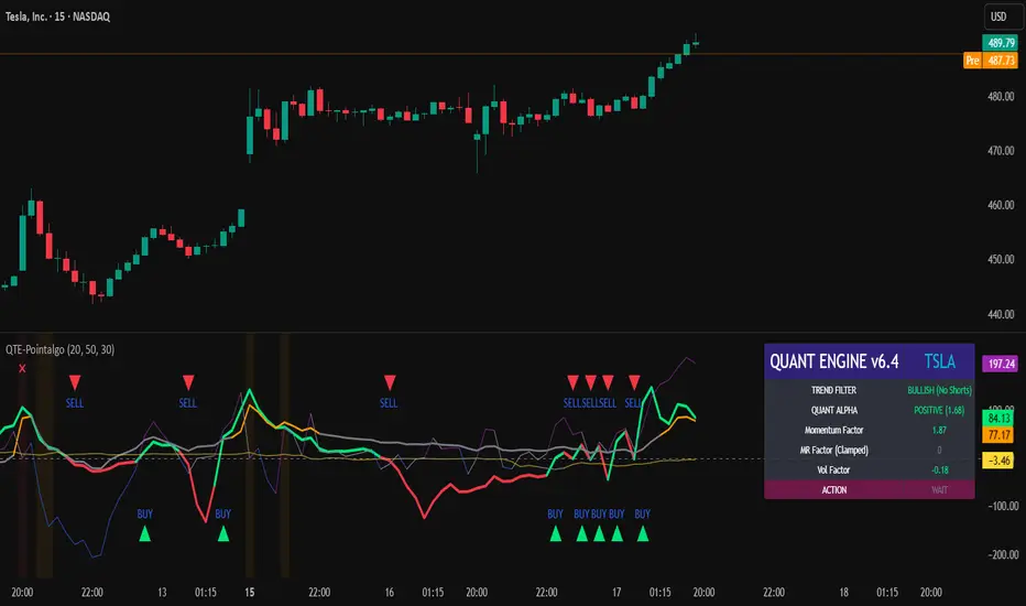
QUANT TRADING ENGINE [PointAlgo]Quant Trading Engine is a quantitative market-analysis indicator that combines multiple statistical factors to study trend behavior, mean reversion, volatility, execution efficiency, and market stability.
The indicator converts raw price behavior into standardized signals to help evaluate directional bias and risk conditions in a systematic way.
This script focuses on factor alignment and regime awareness, not prediction certainty.
Design Philosophy
Markets move through different regimes such as trending, ranging, volatile expansion, and instability.
This indicator attempts to model these regimes by blending:
Momentum strength
Mean-reversion pressure
Volatility risk
Trend filtering
Execution context (VWAP)
Correlation structure
Each component is normalized and combined into a single Quant Alpha framework.
Factor Construction
1. Momentum Factor
Measures directional strength using percentage price change over a rolling window.
Standardized using mean and standard deviation.
Represents trend continuation pressure.
2. Mean Reversion Factor
Measures deviation from a longer moving average.
Standardized to identify stretched conditions.
Designed to capture counter-trend behavior.
Directional Clamping
Mean-reversion signals are dynamically restricted:
No counter-trend buying during downtrends.
No counter-trend selling during uptrends.
Allows both sides only in neutral regimes.
This prevents conflicting signals in strong trends.
3. Volatility Factor
Uses realized volatility derived from price changes.
Penalizes environments where volatility deviates significantly from its norm.
Acts as a risk adjustment rather than a directional driver.
4. Composite Quant Alpha
The final Quant Alpha is a weighted blend of:
Momentum
Mean reversion (trend-clamped)
Volatility risk
The composite is standardized into a Z-score, allowing consistent interpretation across instruments and timeframes.
Signal Logic
Buy signal occurs when Quant Alpha crosses above zero.
Sell signal occurs when Quant Alpha crosses below zero.
Zero-cross logic is used to represent shifts from negative to positive statistical bias and vice versa.
Signals reflect statistical regime change, not trade instructions.
Volatility Smile Context
Measures price deviation from its statistical distribution.
Identifies skewed conditions where upside or downside volatility becomes dominant.
Highlights extreme deviations that may imply elevated derivative risk.
Exotic Risk Conditions
Detects sudden price expansion combined with volatility spikes.
Highlights environments where execution and risk become unstable.
Visual background cues are used for awareness only.
Execution Context (VWAP)
Measures price distance from VWAP.
Used to assess execution efficiency rather than direction.
Helps identify stretched conditions relative to average traded price.
Correlation Structure
Evaluates short-term return correlations.
Detects when price behavior becomes less predictable.
Flags structural instability rather than trend direction.
Visualization
The indicator plots:
Quant Alpha (scaled) with directional coloring
Volatility smile deviation
Price vs VWAP distance
Correlation structure
Signal markers indicate Quant Alpha zero-cross events and risk conditions.
Dashboard
A compact dashboard summarizes:
Trend filter state
Quant Alpha polarity and value
Individual factor readings
Current action state (Buy / Sell / Wait / Risk)
The dashboard provides a real-time snapshot of internal model conditions.
Usage Notes
Designed for analytical interpretation and research.
Best used alongside price action and risk management tools.
Factor behavior depends on instrument liquidity and volatility.
Not optimized for illiquid or irregular markets.
Disclaimer
This script is provided for educational and analytical purposes only.
It does not provide financial, investment, or trading advice.
All outputs should be independently validated before making any trading decisions.
XAUUSD Candle Pattern < $4It is able to identify high impact trades. It works best in XAUUSD in conflunce with Order Blocks and Fair Value gaps.
Use 15 mins TF

10>20,p>50 DEMARenders daily EMA, 10, 20 and 50 on any timeframe below 1D
30m timeframe works well.
Use trend of 10 > 20 + price > 50 for long and 10 < 20 + price < 50 for shorts or exits.

MNQ Optimal Entry Detector Use 2 minute time frame, no range entry signals as they are lower probability, use discretion and understand bias. This is still in testing so do not use it as financial advice.

Impulse Trend Suite (LITE) v4🚀 Impulse Trend Suite (LITE) — v4
Smart trend visualization with precise flip arrows. A lightweight, momentum-filtered trend tool designed to stay clean, avoid repeated signals, and keep you focused only on real market direction.
📌 Core Features
Trend flip arrows (no spam, 1 signal per turn)
Continuous background zones (gap-free trend shading)
Adaptive Baseline + ATR structure channel
RSI + MACD momentum filter (suppresses weak signals)
Trend Status Panel (UP, DOWN, NEUTRAL)
🔍 Quick Guide
BUY setup = green arrow + green background
SELL setup = red arrow + red background
Stay in the move while color doesn’t change
ATR channel helps avoid chasing overextended candles
========================================================
📈 Works on Forex, Stocks, Crypto, Indices, Metals
⌚ Scalping • Intraday • Swing • Long-term
==========================================================
⚠️ Backtest before trading live.
Happy trading and many pips!

Gold Smart Scalper AI V21. The "Red Zone" (News Management)
The strategy logic does not "know" when the Federal Reserve is speaking.
Rule: Disable the strategy or stop taking signals 15 minutes before and after high-impact news (CPI, NFP, FOMC).
Why: During these times, Gold can move $30 in seconds. Slippage will cause your $1.50 Stop Loss to execute much further away, leading to massive drawdown.
2. Session Selection
Gold "Scalping" requires high liquidity and tight spreads.
Discretionary Filter: Only trade during the London/New York overlap (13:00 – 17:00 UTC).
Avoid: The late Asian session or Sunday market open. Spreads often widen to $0.50–$1.00, meaning you are already down 30-50% of your Stop Loss the moment you enter.
3. Market "Mood" (Trend vs. Range)
Trend Context: If the 50 EMA (the White line) is completely flat, the market is in a "Bracket." In this state, EMA crossovers generate many false signals.
The Adjustment: Discretionary traders wait for the 50 EMA to show a clear slope (up or down) before trusting the 9/21 crossover signals.

RSI Distribution [Kodexius]RSI Distribution is a statistics driven visualization companion for the classic RSI oscillator. In addition to plotting RSI itself, it continuously builds a rolling sample of recent RSI values and projects their distribution as a forward drawn histogram, so you can see where RSI has spent most of its time over the selected lookback window.
The indicator is designed to add context to oscillator readings. Instead of only treating RSI as a single point estimate that is either “high” or “low”, you can evaluate the current RSI level relative to its own recent history. This makes it easier to recognize when the market is operating inside a familiar regime, and when RSI is pushing into rarer tail conditions that tend to appear during momentum bursts, exhaustion, or volatility expansion.
To complement the histogram, the script can optionally overlay a Gaussian curve fitted to the sample mean and standard deviation. It also runs a Jarque Bera normality check, based on skewness and excess kurtosis, and surfaces the result both visually and in a compact dashboard. On the oscillator panel itself, RSI is presented with a clean gradient line and standard overbought and oversold references, with fills that become more visible when RSI meaningfully extends beyond key thresholds.
🔹 Features
1. Distribution Histogram of Recent RSI Values
The script stores the last N RSI values in an internal sample and uses that rolling window to compute a frequency distribution across a user selected number of bins. The histogram is drawn into the future by a configurable width in bars, which keeps it readable and prevents it from colliding with the active RSI plot. The result is a compact visual summary of where RSI clusters most often, whether it is spending more time near the center, or shifting toward higher or lower regimes.
2. Gaussian Overlay for Shape Intuition
If enabled, a fitted bell curve is drawn on top of the histogram using the sample mean and standard deviation. This overlay is not intended as a direct trading signal. Its purpose is to provide a fast visual comparator between the empirical RSI distribution and a theoretical normal shape. When the histogram diverges strongly from the curve, you can quickly spot skew, heavy tails, or regime changes that often occur when market structure or volatility conditions shift.
3. Jarque Bera Normality Check With Clear PASS/FAIL Feedback
The script computes skewness and excess kurtosis from the RSI sample, then forms the Jarque Bera statistic and compares it to a fixed 95% critical value. When the distribution is closer to normal under this test, the status is marked as PASS, otherwise it is marked as FAIL. This result is displayed in the dashboard and can also influence the histogram styling, giving immediate feedback about whether the recent RSI behavior resembles a bell shaped distribution or a more distorted, regime driven profile.
Jarque Bera is a goodness of fit test that evaluates whether a dataset looks consistent with a normal distribution by checking two shape properties: skewness (asymmetry) and kurtosis (tail heaviness, expressed here as excess kurtosis where a perfect normal has 0). Under the null hypothesis of normality, skewness should be near 0 and excess kurtosis should be near 0. The test combines deviations in both into a single statistic, which is then compared to a chi square threshold. A PASS in this script means the sample does not show strong evidence against normality at the chosen threshold, while a FAIL means the sample is meaningfully skewed, heavy tailed, or both. In practical trading terms, a FAIL often suggests RSI is behaving in a regime where extremes and asymmetry are more common, which is typical during strong trends, volatility expansions, or one sided market pressure. It is still a statistical diagnostic, not a prediction tool, and results can vary with lookback length and market conditions.
4. Integrated Stats Dashboard
A compact table in the top right summarizes key distribution moments and the normality result: Mean, StdDev, Skewness, Kurtosis, and the JB statistic with PASS/FAIL text. Skewness is color coded by sign to quickly distinguish right skew (more time at higher RSI) versus left skew (more time at lower RSI), which can be helpful when diagnosing trend bias and momentum persistence.
5. RSI Visual Quality and Context Zones
RSI is plotted with a gradient color scheme and standard overbought and oversold reference lines. The overbought and oversold areas are filled with a smart gradient so visual emphasis increases when RSI meaningfully extends beyond the 70 and 30 regions, improving readability without overwhelming the panel.
🔹 Calculations
This section summarizes the main calculations and transformations used internally.
1. RSI Series
RSI is computed from the selected source and length using the standard RSI function:
rsi_val = ta.rsi(rsi_src, rsi_len)
2. Rolling Sample Collection
A float array stores recent RSI values. Each bar appends the newest RSI, and if the array exceeds the configured lookback, the oldest value is removed. Conceptually:
rsi_history.push(rsi_val)
if rsi_history.size() > lookback
rsi_history.shift()
This maintains a fixed size window that represents the most recent RSI behavior.
3. Mean, Variance, and Standard Deviation
The script computes the sample mean across the array. Variance is computed as sample variance using (n - 1) in the denominator, and standard deviation is the square root of that variance. These values serve both the dashboard display and the Gaussian overlay parameters.
4. Skewness and Excess Kurtosis
Skewness is calculated from the standardized third central moment with a small sample correction. Kurtosis is computed as excess kurtosis (kurtosis minus 3), so the normal baseline is 0. These two metrics summarize asymmetry and tail heaviness, which are the core ingredients for the Jarque Bera statistic.
5. Jarque Bera Statistic and Decision Rule
Using skewness S and excess kurtosis K, the Jarque Bera statistic is computed as:
JB = (n / 6.0) * (S^2 + 0.25 * K^2)
Normality is flagged using a fixed critical value:
is_normal = JB < 5.991
This produces a simple PASS/FAIL classification suitable for fast chart interpretation.
6. Histogram Binning and Scaling
The RSI domain is treated as 0 to 100 and divided into a configurable number of bins. Bin size is:
bin_size = 100.0 / bins
Each RSI sample maps to a bin index via floor(rsi / bin_size), with clamping to ensure the index stays within valid bounds. The script counts occurrences per bin, tracks the maximum frequency, and normalizes each bar height by freq/max_freq so the histogram remains visually stable and comparable as the window updates.
7. Gaussian Curve Overlay (Optional)
The Gaussian overlay uses the normal probability density function with mu as the sample mean and sigma as the sample standard deviation:
normal_pdf(x) = (1 / (sigma * sqrt(2*pi))) * exp(-0.5 * ((x - mu)/sigma)^2)
For drawing, the script samples x across the histogram width, evaluates the PDF, and normalizes it relative to its peak so the curve fits within the same visual height scale as the histogram.

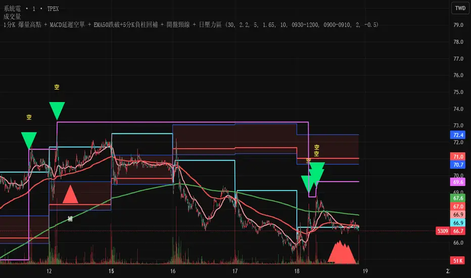
Test此指標為測試階段
最近手法改變,高點出現率後移,
此指標為爆量後跌破12ema才放空,
由於操盤手還是可以騙線,故時間設定為10:00之後成功率比較大
This indicator is in the testing phase.
Recently, the method has changed, and the occurrence rate of high points has shifted later.
This indicator only calls for shorting after a surge in volume followed by a drop below the 12-day moving average (EMA).
Because traders can still create false signals, setting the time after 10:00 AM increases the success rate.
AXUUSD Range < $3 HighlighterHighlights all candles where the gap between the high and low is less than USD 3

Scalping Acciones PRO (Entradas + TP + SL) leo
How to use it correctly
• Timeframe: 1m or 5m
• High-volume stocks (SPY, AAPL, TSLA, NVDA…)
• Take Profit (TP): VWAP or EMA 21
• Stop Loss (SL): low/high of the signal candle
⸻
If you want, in the next message I can:
• 🔧 add automatic Stop Loss and Take Profit
• 🚀 convert it into a strategy (Strategy Tester)
• 🎯 filter only strong reversals (fewer false signals)


Multi-Factor Long Bias ToolThis indicator is designed to help identify higher‑probability long opportunities by combining trend, momentum, and participation into a single visual tool. It runs best on a 1‑hour chart and highlights periods when several bullish conditions align.
What the tool does
Measures short‑term trend and momentum with a fast MACD, looking for instances where MACD is above its signal line, above zero, and showing positive histogram.
Uses RSI as an oscillator filter, favoring conditions that are neither oversold nor overbought, but in a healthy momentum zone.
Confirms participation with a daily volume check, requiring current daily volume to be at or above a configurable multiple of its 20‑day average.
Optionally incorporates short‑interest (via a manual input) so you can require a minimum short percentage when seeking squeeze‑style long setups.
How signals are shown
When MACD, RSI, volume, and optional short‑interest all agree, the chart background turns softly green to show a “long bias” environment.
A triangle‑up marker (“LONG”) appears below price when the long bias is active and the “Focus on Longs Only” option is enabled.
A separate panel can display MACD, its signal line, histogram, and RSI together, with a toggle to show or hide this pane to keep charts clean.
Intended use
Helps discretionary traders quickly see when multiple conditions favor looking for long entries, rather than acting on a single indicator in isolation.
Works as a bias and timing aid; actual entries and exits are meant to be refined with your own levels, risk management, and higher‑timeframe context.
Parameters for MACD, RSI, volume threshold, and short‑interest are fully adjustable so the tool can be tuned to different markets, timeframes, and styles.
As always, none of this is investment or financial advice. Please do your own due diligence and research.

GS Tactical Overlay (SMC + Squeeze)designed to sit atop the 6 pillar commander. it will tell you signs for puts and calls
