Superior-Range Bound Renko - Strategy - 11-29-25 - SignalLynxSuperior-Range Bound Renko Strategy with Advanced Risk Management Template
Signal Lynx | Free Scripts supporting Automation for the Night-Shift Nation 🌙
1. Overview
Welcome to Superior-Range Bound Renko (RBR) — a volatility-aware, structure-respecting swing-trading system built on top of a full Risk Management (RM) Template from Signal Lynx.
Instead of relying on static lookbacks (like “14-period RSI”) or plain MA crosses, Superior RBR:
Adapts its range definition to market volatility in real time
Emulates Renko Bricks on a standard, time-based chart (no Renko chart type required)
Uses a stack of Laguerre Filters to detect genuine impulse vs. noise
Adds an Adaptive SuperTrend powered by a small k-means-style clustering routine on volatility
Under the hood, this script also includes the full Signal Lynx Risk Management Engine:
A state machine that separates “Signal” from “Execution”
Layered exit tools: Stop Loss, Trailing Stop, Staged Take Profit, Advanced Adaptive Trailing Stop (AATS), and an RSI-style stop (RSIS)
Designed for non-repainting behavior on closed candles by basing execution-critical logic on previous-bar data
We are publishing this as an open-source template so traders and developers can leverage a professional-grade RM engine while integrating their own signal logic if they wish.
2. Quick Action Guide (TL;DR)
Best Timeframe:
4 Hours (H4) and above. This is a high-conviction swing-trading system, not a scalper.
Best Assets:
Volatile instruments that still respect market structure:
Bitcoin, Ethereum, Gold (XAUUSD), high-volatility Forex pairs (e.g., GBPJPY), indices with clean ranges.
Strategy Type:
Volatility-Adaptive Trend Following + Impulse Detection.
It hunts for genuine expansion out of ranges, not tiny mean-reversion nibbles.
Key Feature:
Renko Emulation on time-based candles.
We mathematically model Renko Bricks and overlay them on your standard chart to define:
“Equilibrium” zones (inside the brick structure)
“Breakout / impulse” zones (when price AND the impulse line depart from the bricks)
Repainting:
Designed to be non-repainting on closed candles.
All RM execution logic uses confirmed historical data (no future bars, no security() lookahead). Intrabar flicker during formation is allowed, but once a bar closes the engine’s decisions are stable.
Core Toggles & Filters:
Enable Longs and Shorts independently
Optional Weekend filter (block trades on Saturday/Sunday)
Per-module toggles: Stop Loss, Trailing Stop, Staged Take Profits, AATS, RSIS
3. Detailed Report: How It Works
A. The Strategy Logic: Superior RBR
Superior RBR builds its entry signal from multiple mathematical layers working together.
1) Adaptive Lookback (Volatility Normalization)
Instead of a fixed 100-bar or 200-bar range, the script:
Computes ATR-based volatility over a user-defined period.
Normalizes that volatility relative to its recent min/max.
Maps the normalized value into a dynamic lookback window between a minimum and maximum (e.g., 4 to 100 bars).
High Volatility:
The lookback shrinks, so the system reacts faster to explosive moves.
Low Volatility:
The lookback expands, so the system sees a “bigger picture” and filters out chop.
All the core “Range High/Low” and “Range Close High/Low” boundaries are built on top of this adaptive window.
2) Range Construction & Quick Ranges
The engine constructs several nested ranges:
Outer Range:
rangeHighFinal – dynamic highest high
rangeLowFinal – dynamic lowest low
Inner Close Range:
rangeCloseHighFinal – highest close
rangeCloseLowFinal – lowest close
Quick Ranges:
“Half-length” variants of those, used to detect more responsive changes in structure and volatility.
These ranges define:
The macro box price is trading inside
Shorter-term “pressure zones” where price is coiling before expansion
3) Renko Emulation (The Bricks)
Rather than using the Renko chart type (which discards time), this script emulates Renko behavior on your normal candles:
A “brick size” is defined either:
As a standard percentage move, or
As a volatility-driven (ATR) brick, optionally inhibited by a minimum standard size
The engine tracks a base value and derives:
brickUpper – top of the emulated brick
brickLower – bottom of the emulated brick
When price moves sufficiently beyond those levels, the brick “shifts”, and the directional memory (renkoDir) updates:
renkoDir = +2 when bricks are advancing upward
renkoDir = -2 when bricks are stepping downward
You can think of this as a synthetic Renko tape overlaid on time-based candles:
Inside the brick: equilibrium / consolidation
Breaking away from the brick: momentum / expansion
4) Impulse Tracking with Laguerre Filters
The script uses multiple Laguerre Filters to smooth price and brick-derived data without traditional lag.
Key filters include:
LagF_1 / LagF_W: Based on brick upper/lower baselines
LagF_Q: Based on HLCC4 (high + low + 2×close)/4
LagF_Y / LagF_P: Complex averages combining brick structures and range averages
LagF_V (Primary Impulse Line):
A smooth, high-level impulse line derived from a blend of the above plus the outer ranges
Conceptually:
When the impulse line pushes away from the brick structure and continues in one direction, an impulse move is underway.
When its direction flips and begins to roll over, the impulse is fading, hinting at mean reversion back into the range.
5) Fib-Based Structure & Swaps
The system also layers in Fib levels derived from the adaptive ranges:
Standard levels (12%, 23.6%, 38.2%, 50%, 61%, 76.8%, 88%) from the main range
A secondary “swap” set derived from close-range dynamics (fib12Swap, fib23Swap, etc.)
These Fibs are used to:
Bucket price into structural zones (below 12, between 23–38, etc.)
Detect breakouts when price and Laguerre move beyond key Fib thresholds
Drive zSwap logic (where a secondary Fib set becomes the active structure once certain conditions are met)
6) Adaptive SuperTrend with K-Means-Style Volatility Clustering
Under the hood, the script uses a small k-means-style clustering routine on ATR:
ATR is measured over a fixed period
The range of ATR values is split into Low, Medium, High volatility centroids
Current ATR is assigned to the nearest centroid (cluster)
From that, a SuperTrend variant (STK) is computed with dynamic sensitivity:
In quiet markets, SuperTrend can afford to be tighter
In wild markets, it widens appropriately to avoid constant whipsaw
This SuperTrend-based oscillator (LagF_K and its signals) is then combined with the brick and Laguerre stack to confirm valid trend regimes.
7) Final Baseline Signals (+2 / -2)
The “brain” of Superior RBR lives in the Baseline & Signal Generation block:
Two composite signals are built: B1 and B2:
They combine:
Fib breakouts
Renko direction (renkoDir)
Expansion direction (expansionQuickDir)
Multiple Laguerre alignments (LagF_Q, LagF_W, LagF_Y, LagF_Z, LagF_P, LagF_V)
They also factor in whether Fib structures are expanding or contracting.
A user toggle selects the “Baseline” signal:
finalSig = B2 (default) or B1 (alternate baseline)
finalSig is then filtered through the RM state machine and only when everything aligns, we emit:
+2 = Long / Buy signal
-2 = Short / Sell signal
0 = No new trade
Those +2 / -2 values are what feed the Risk Management Engine.
B. The Risk Management (RM) Engine
This script features the Signal Lynx Risk Management Engine, a proprietary state machine built to separate Signal from Execution.
Instead of firing orders directly on indicator conditions, we:
Convert the raw signal into a clean integer (Fin = +2 / -2 / 0)
Feed it into a Trade State Machine that understands:
Are we flat?
Are we in a long or short?
Are we in a closing sequence?
Should we permit re-entry now or wait?
Logic Injection / Template Concept:
The RM engine expects a simple integer:
+2 → Buy
-2 → Sell
Everything else (0) is “no new trade”
This makes the script a template:
You can remove the Superior RBR block
Drop in your own logic (RSI, MACD, price action, etc.)
As long as you output +2 or -2 into the same signal channel, the RM engine can drive all exits and state transitions.
Aggressive vs Conservative Modes:
The input AgressiveRM (Aggressive RM) governs how we interpret signals:
Conservative Mode (Aggressive RM = false):
Uses a more filtered internal signal (AF) to open trades
Effectively waits for a clean trend flip / confirmation before new entries
Minimizes whipsaw at the cost of fewer trades
Aggressive Mode (Aggressive RM = true):
Reacts directly to the fresh alert (AO) pulses
Allows faster re-entries in the same direction after RM-based exits
Still respects your pyramiding setting; this script ships with pyramiding = 0 by default, so it will not stack multiple positions unless you change that parameter in the strategy() call.
The state machine enforces discipline on top of your signal logic, reducing double-fires and signal spam.
C. Advanced Exit Protocols (Layered Defense)
The exit side is where this template really shines. Instead of a single “take profit or stop loss,” it uses multiple, cooperating layers.
1) Hard Stop Loss
A classic percentage-based Stop Loss (SL) relative to the entry price.
Acts as a final “catastrophic protection” layer for unexpected moves.
2) Standard Trailing Stop
A percentage-based Trailing Stop (TS) that:
Activates only after price has moved a certain percentage in your favor (tsActivation)
Then trails price by a configurable percentage (ts)
This is a straightforward, battle-tested trailing mechanism.
3) Staged Take Profits (Three Levels)
The script supports three staged Take Profit levels (TP1, TP2, TP3):
Each stage has:
Activation percentage (how far price must move in your favor)
Trailing amount for that stage
Position percentage to close
Example setup:
TP1:
Activate at +10%
Trailing 5%
Close 10% of the position
TP2:
Activate at +20%
Trailing 10%
Close another 10%
TP3:
Activate at +30%
Trailing 5%
Close the remaining 80% (“runner”)
You can tailor these quantities for partial scaling out vs. letting a core position ride.
4) Advanced Adaptive Trailing Stop (AATS)
AATS is a sophisticated volatility- and structure-aware stop:
Uses Hirashima Sugita style levels (HSRS) to model “floors” and “ceilings” of price:
Dungeon → Lower floors → Mid → Upper floors → Penthouse
These levels classify where current price sits within a long-term distribution.
Combines HSRS with Bollinger-style envelopes and EMAs to determine:
Is price extended far into the upper structure?
Is it compressed near the lower ranges?
From this, it computes an adaptive factor that controls how tight or loose the trailing level (aATS / bATS) should be:
High Volatility / Penthouse areas:
Stop loosens to avoid getting wicked out by inevitable spikes.
Low Volatility / compressed structure:
Stop tightens to lock in and protect profit.
AATS is designed to be the “smart last line” that responds to context instead of a single fixed percentage.
5) RSI-Style Stop (RSIS)
On top of AATS, the script includes a RSI-like regime filter:
A McGinley Dynamic mean of price plus ATR bands creates a dynamic channel.
Crosses above the top band and below the lower band change a directional state.
When enabled (UseRSIS):
RSIS can confirm or veto AATS closes:
For longs: A shift to bearish RSIS can force exits sooner.
For shorts: A shift to bullish RSIS can do the same.
This extra layer helps avoid over-reactive stops in strong trends while still respecting a regime change when it happens.
D. Repainting Protection
Many strategies look incredible in the Strategy Tester but fail in live trading because they rely on intrabar values or future-knowledge functions.
This template is built with closed-candle realism in mind:
The Risk Management logic explicitly uses previous bar data (open , high , low , close ) for the key decisions on:
Trailing stop updates
TP triggers
SL hits
RM state transitions
No security() lookahead or future-bar access is used.
This means:
Backtest behavior is designed to match what you can actually get with TradingView alerts and live automation.
Signals may “flicker” intrabar while the candle is forming (as with any strategy), but on closed candles, the RM decisions are stable and non-repainting.
4. For Developers & Modders
We strongly encourage you to mod this script.
To plug your own strategy into the RM engine:
Look for the section titled:
// BASELINE & SIGNAL GENERATION
You will see composite logic building B1 and B2, and then selecting:
baseSig = B2
altSig = B1
finalSig = sigSwap ? baseSig : altSig
You can replace the content used to generate baseSig / altSig with your own logic, for example:
RSI crosses
MACD histogram flips
Candle pattern detectors
External condition flags
Requirements are simple:
Your final logic must output:
2 → Buy signal
-2 → Sell signal
0 → No new trade
That output flows into the RM engine via finalSig → AlertOpen → state machine → Fin.
Once you wire your signals into finalSig, the entire Risk Management system (Stops, TPs, AATS, RSIS, re-entry logic, weekend filters, long/short toggles) becomes available for your custom strategy without re-inventing the wheel.
This makes Superior RBR not just a strategy, but a reference architecture for serious Pine dev work.
5. About Signal Lynx
Automation for the Night-Shift Nation 🌙
Signal Lynx focuses on helping traders and developers bridge the gap between indicator logic and real-world automation. The same RM engine you see here powers multiple internal systems and templates, including other public scripts like the Super-AO Strategy with Advanced Risk Management.
We provide this code open source under the Mozilla Public License 2.0 (MPL-2.0) to:
Demonstrate how Adaptive Logic and structured Risk Management can outperform static, one-layer indicators
Give Pine Script users a battle-tested RM backbone they can reuse, remix, and extend
If you are looking to automate your TradingView strategies, route signals to exchanges, or simply want safer, smarter strategy structures, please keep Signal Lynx in your search.
License: Mozilla Public License 2.0 (Open Source).
If you make beneficial modifications, please consider releasing them back to the community so everyone can benefit.
Penunjuk dan strategi

SCALPING PRO V2 - INTERMÉDIANT (Dashboard + TP/SL + Alerts)//@version=5
indicator("SCALPING PRO V2 - INTERMÉDIANT (Dashboard + TP/SL + Alerts)", overlay=true, max_labels_count=500)
// ---------------- INPUTS ----------------
emaFastLen = input.int(9, "EMA Fast")
emaSlowLen = input.int(21, "EMA Slow")
atrLen = input.int(14, "ATR Length")
atrMultSL = input.float(1.2, "SL = ATR *")
tp1mult = input.float(1.0, "TP1 = ATR *")
tp2mult = input.float(1.5, "TP2 = ATR *")
tp3mult = input.float(2.0, "TP3 = ATR *")
minBars = input.int(3, "Min bars between signals")
showDashboard = input.bool(true, "Show Dashboard")
// ---------------- INDICATORS ----------------
emaFast = ta.ema(close, emaFastLen)
emaSlow = ta.ema(close, emaSlowLen)
atr = ta.atr(atrLen)
bullTrend = emaFast > emaSlow
bearTrend = emaFast < emaSlow
crossUp = ta.crossover(emaFast, emaSlow) and bullTrend
crossDown = ta.crossunder(emaFast, emaSlow) and bearTrend
var int lastSignal = na
okSignal = na(lastSignal) or (bar_index - lastSignal > minBars)
buySignal = crossUp and okSignal
sellSignal = crossDown and okSignal
if buySignal or sellSignal
lastSignal := bar_index
// ---------------- TP & SL ----------------
var float sl = na
var float tp1 = na
var float tp2 = na
var float tp3 = na
if buySignal
sl := close - atr * atrMultSL
tp1 := close + atr * tp1mult
tp2 := close + atr * tp2mult
tp3 := close + atr * tp3mult
if sellSignal
sl := close + atr * atrMultSL
tp1 := close - atr * tp1mult
tp2 := close - atr * tp2mult
tp3 := close - atr * tp3mult
// ---------------- ALERTS ----------------
alertcondition(buySignal, title="BUY", message="BUY Signal")
alertcondition(sellSignal, title="SELL", message="SELL Signal")
alertcondition(ta.cross(close, tp1), title="TP1", message="TP1 Hit")
alertcondition(ta.cross(close, tp2), title="TP2", message="TP2 Hit")
alertcondition(ta.cross(close, tp3), title="TP3", message="TP3 Hit")
alertcondition(ta.cross(close, sl), title="SL", message="Stop Loss Hit")
// ---------------- DASHBOARD ----------------
if showDashboard
var table dash = table.new(position.top_right, 1, 5)
if barstate.islast
table.cell(dash, 0, 0, "SCALPING PRO V2", bgcolor=color.new(color.black, 0), text_color=color.white)
table.cell(dash, 0, 1, "Trend: " + (bullTrend ? "Bull" : bearTrend ? "Bear" : "Neutral"))
table.cell(dash, 0, 2, "ATR: " + str.tostring(atr, format.mintick))
table.cell(dash, 0, 3, "Last Signal: " + (buySignal ? "BUY" : sellSignal ? "SELL" : "NONE"))
table.cell(dash, 0, 4, "EMA Fast/Slow OK")

MA200 Deviation Percentile200-Day MA Deviation with Dynamic Thresholds
OVERVIEW
This indicator measures price deviation from the 200-day moving average as a percentage, with dynamically calculated overbought/oversold thresholds based on historical percentiles.
Best suited for broad market indices (SPY, QQQ, IWM, etc.) where the 200-day MA serves as a reliable long-term trend indicator. Individual stocks may exhibit more erratic behavior around this level.
CALCULATION
Deviation (%) = (Close - 200MA) / 200MA x 100
Dynamic thresholds are derived from actual historical distribution rather than assuming normal distribution:
- Overbought threshold = 97.5th percentile of historical deviations
- Oversold threshold = 2.5th percentile of historical deviations
SETTINGS
MA Length (default: 200)
Moving average period.
Lookback Period (default: 1260)
Historical window for threshold calculation. 1260 bars approximates 5 years of daily data.
Threshold Percentile (default: 5%)
Two-tailed threshold. 5% places overbought/oversold boundaries at the 97.5th and 2.5th percentiles respectively.
INTERPRETATION
Deviation Value
- Positive: Price trading above 200MA
- Negative: Price trading below 200MA
- Magnitude indicates extent of deviation
Percentile Ranking (0-100%)
- Shows where current deviation ranks historically
- Above 90%: Historically elevated
- Below 10%: Historically depressed
Dynamic Threshold Lines
- Red line: Upper boundary based on historical distribution
- Green line: Lower boundary based on historical distribution
- These adapt automatically to each asset's volatility characteristics
APPLICATION
Mean Reversion
Extreme deviations tend to normalize over time. When deviation exceeds dynamic thresholds, probability of mean reversion increases.
Trend Assessment
Sustained positive/negative deviation confirms trend direction. Zero-line crossovers may signal trend changes.
NOTES
- Optimized for daily timeframe on market indices
- Requires sufficient historical data (minimum equal to lookback period)
- Extreme readings do not guarantee immediate reversals
- Use in conjunction with other analysis methods

Single AHR DCA (HM) — AHR Pane (customized quantile)Customized note
The log-regression window LR length controls how long a long-term fair value path is estimated from historical data.
The AHR window AHR window length controls over which historical regime you measure whether the coin is “cheap / expensive”.
When you choose a log-regression window of length L (years) and an AHR window of length A (years), you can intuitively read the indicator as:
“Within the last A years of this regime, relative to the long-term trend estimated over the same A years, the current price is cheap / neutral / expensive.”
Guidelines:
In general, set the AHR window equal to or slightly longer than the LR window:
If the AHR window is much longer than LR, you mix different baselines (different LR regimes) into one distribution.
If the AHR window is much shorter than LR, quantiles mostly reflect a very local slice of history.
For BTC / ETH and other BTC-like assets, you can use relatively long horizons (e.g. LR ≈ 3–5 years, AHR window ≈ 3–8 years).
For major altcoins (BNB / SOL / XRP and similar high-beta assets), it is recommended to use equal or slightly shorter horizons, e.g. LR ≈ 2–3 years, AHR window ≈ 2–3 years.
1. Price series & windows
Working timeframe: daily (1D).
Let the daily close of the current symbol on day t be P_t .
Main length parameters:
HM window: L_HM = maLen (default 200 days)
Log-regression window: L_LR = lrLen (default 1095 days ≈ 3 years)
AHR window (regime window): W = windowLen (default 1095 days ≈ 3 years)
2. Harmonic moving average (HM)
On a window of length L_HM, define the harmonic mean:
HM_t = ^(-1)
Here eps = 1e-10 is used to avoid division by zero.
Intuition: HM is more sensitive to low prices – an extremely low price inside the window will drag HM down significantly.
3. Log-regression baseline (LR)
On a window of length L_LR, perform a linear regression on log price:
Over the last L_LR bars, build the series
x_k = log( max(P_k, eps) ), for k = t-L_LR+1 ... t, and fit
x_k ≈ a + b * k.
The fitted value at the current index t is
log_P_hat_t = a + b * t.
Exponentiate to get the log-regression baseline:
LR_t = exp( log_P_hat_t ).
Interpretation: LR_t is the long-term trend / fair value path of the current regime over the past L_LR days.
4. HM-based AHR (valuation ratio)
At each time t, build an HM-based AHR (valuation multiple):
AHR_t = ( P_t / HM_t ) * ( P_t / LR_t )
Interpretation:
P_t / HM_t : deviation of price from the mid-term HM (e.g. 200-day harmonic mean).
P_t / LR_t : deviation of price from the long-term log-regression trend.
Multiplying them means:
if price is above both HM and LR, “expensiveness” is amplified;
if price is below both, “cheapness” is amplified.
Typical reading:
AHR_t < 1 : price is below both mid-term mean and long-term trend → statistically cheaper.
AHR_t > 1 : price is above both mid-term mean and long-term trend → statistically more expensive.
5. Empirical quantile thresholds (Opp / Risk)
On each new day, whenever AHR_t is valid, add it into a rolling array:
A_t_window = { AHR_{t-W+1}, ..., AHR_t } (at most W = windowLen elements)
On this empirical distribution, define two quantiles:
Opportunity quantile: q_opp (default 15%)
Risk quantile: q_risk (default 65%)
Using standard percentile computation (order statistics + linear interpolation), we get:
Opp threshold:
theta_opp = Percentile( A_t_window, q_opp )
Risk threshold:
theta_risk = Percentile( A_t_window, q_risk )
We also compute the percentile rank of the current AHR inside the same history:
q_now = PercentileRank( A_t_window, AHR_t ) ∈
This yields three valuation zones:
Opportunity zone: AHR_t <= theta_opp
(corresponds to roughly the cheapest ~q_opp% of historical states in the last W days.)
Neutral zone: theta_opp < AHR_t < theta_risk
Risk zone: AHR_t >= theta_risk
(corresponds to roughly the most expensive ~(100 - q_risk)% of historical states in the last W days.)
All quantiles are purely empirical and symbol-specific: they are computed only from the current asset’s own history, without reusing BTC thresholds or assuming cross-asset similarity.
6. DCA simulation (lightweight, rolling window)
Given:
a daily budget B (input: budgetPerDay), and
a DCA simulation window H (input: dcaWindowLen, default 900 days ≈ 2.5 years),
The script applies the following rule on each new day t:
If thresholds are unavailable or AHR_t > theta_risk
→ classify as Risk zone → buy = 0
If AHR_t <= theta_opp
→ classify as Opportunity zone → buy = 2B (double size)
Otherwise (Neutral zone)
→ buy = B (normal DCA)
Daily invested cash:
C_t ∈ {0, B, 2B}
Daily bought quantity:
DeltaQ_t = C_t / P_t
The script keeps rolling sums over the last H days:
Cumulative position:
Q_H = sum_{k=t-H+1..t} DeltaQ_k
Cumulative invested cash:
C_H = sum_{k=t-H+1..t} C_k
Current portfolio value:
PortVal_t = Q_H * P_t
Cumulative P&L:
PnL_t = PortVal_t - C_H
Active days:
number of days in the last H with C_k > 0.
These results are only used to visualize how this AHR-quantile-driven DCA rule would have behaved over the recent regime, and do not constitute financial advice.

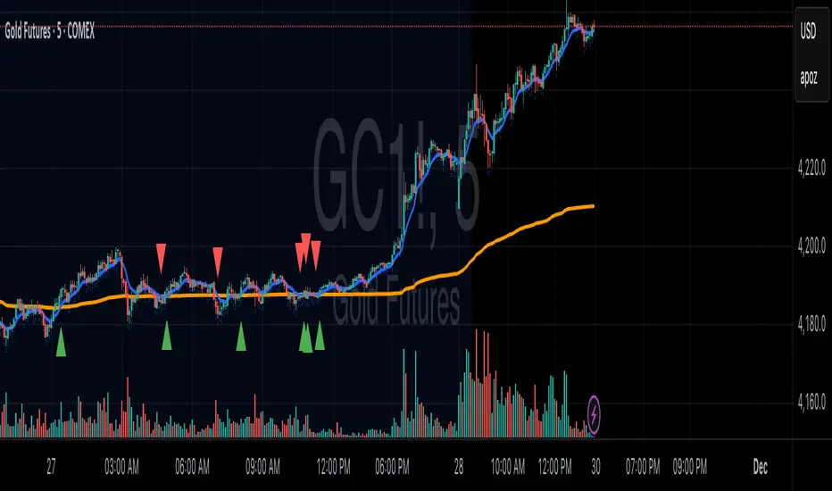
DAILY - 3-Condition Arrows - Buy & SellVersion 1.
On the DAILY time frame, this indicator will add a green BUY arrow to a stock price when the following 3 conditions are ALL true:
BUY (all 3 conditions are true)
1. Stock price > 50 EMA
2. MACD line above moving average
3. Williams %R (Best_Solve version) is above moving average
Conversely, a red SELL arrow will point out when the following 3 conditions are ALL true:
SELL (all 3 conditions are true)
1. Stock price < 50 EMA
2. MACD line below moving average
3. Williams %R (Best_Solve version) is below the moving average

new_youtube_strategy//@version=5
strategy("Dow + Homma 1m Scalper (15m filter)", overlay=true, margin_long=100, margin_short=100, initial_capital=10000)
//===== INPUTS =====
maLen = input.int(50, "Trend SMA Length", minval=5)
htf_tf = input.timeframe("15", "Higher TF")
priceTolPct = input.float(0.05, "SR tolerance %", step=0.01)
wickFactor = input.float(2.0, "Hammer/ShootingStar wick factor", step=0.1)
dojiThresh = input.float(0.1, "Doji body % of range", step=0.01)
risk_RR = input.float(2.0, "Reward:Risk", step=0.1)
capitalRiskPct = input.float(1.0, "Risk % of equity per trade", step=0.1)
//===== 1m TREND (SMA) =====
sma1 = ta.sma(close, maLen)
sma1Up = sma1 > sma1
sma1Down = sma1 < sma1
uptrend1 = close > sma1 and sma1Up
downtrend1 = close < sma1 and sma1Down
//===== 15m TREND VIA request.security =====
sma15 = request.security(syminfo.tickerid, htf_tf, ta.sma(close, maLen), lookahead=barmerge.lookahead_off)
sma15Up = sma15 > sma15
sma15Down = sma15 < sma15
uptrend15 = close > sma15 and sma15Up
downtrend15 = close < sma15 and sma15Down
//===== SWING HIGHS/LOWS (LOCAL EXTREMA) =====
var int left = 3
var int right = 3
swHigh = ta.pivothigh(high, left, right)
swLow = ta.pivotlow(low, left, right)
//===== SR FLIP LEVELS =====
var float srSupport = na
var float srResistance = na
// when a swing high is broken -> new support
if not na(swHigh)
if close > swHigh
srSupport := swHigh
// when a swing low is broken -> new resistance
if not na(swLow)
if close < swLow
srResistance := swLow
//===== CANDLE METRICS =====
body = math.abs(close - open)
cRange = high - low
upperW = high - math.max(open, close)
lowerW = math.min(open, close) - low
isBull() => close > open
isBear() => close < open
bullHammer() =>
cRange > 0 and
isBull() and
lowerW >= wickFactor * body and
upperW <= body
bearShootingStar() =>
cRange > 0 and
isBear() and
upperW >= wickFactor * body and
lowerW <= body
isDoji() =>
cRange > 0 and body <= dojiThresh * cRange
bullEngulfing() =>
isBear() and isBull() and
open <= close and close >= open
bearEngulfing() =>
isBull() and isBear() and
open >= close and close <= open
//===== SR PROXIMITY =====
tol = priceTolPct * 0.01 * close
nearSupport = not na(srSupport) and math.abs(close - srSupport) <= tol
nearResistance = not na(srResistance) and math.abs(close - srResistance) <= tol
//===== SIGNAL CONDITIONS =====
bullCandle = bullHammer() or isDoji() or bullEngulfing()
bearCandle = bearShootingStar() or isDoji() or bearEngulfing()
longTrendOK = uptrend1 and uptrend15
shortTrendOK = downtrend1 and downtrend15
longSignal = longTrendOK and nearSupport and bullCandle
shortSignal = shortTrendOK and nearResistance and bearCandle
//===== POSITION SIZING (IN RISK UNITS) =====
var float lastEquity = strategy.equity
riskCapital = strategy.equity * (capitalRiskPct * 0.01)
//===== ENTRY / EXIT PRICES =====
longStop = math.min(low, nz(srSupport, low))
longRisk = close - longStop
longTP = close + risk_RR * longRisk
shortStop = math.max(high, nz(srResistance, high))
shortRisk = shortStop - close
shortTP = close - risk_RR * shortRisk
// qty in contracts (approx; assumes price * qty ≈ capital used)
longQty = longRisk > 0 ? riskCapital / longRisk : 0.0
shortQty = shortRisk > 0 ? riskCapital / shortRisk : 0.0
//===== EXECUTION =====
if longSignal and longRisk > 0 and longQty > 0
strategy.entry("Long", strategy.long, qty=longQty)
strategy.exit("Long TP/SL", from_entry="Long", stop=longStop, limit=longTP)
if shortSignal and shortRisk > 0 and shortQty > 0
strategy.entry("Short", strategy.short, qty=shortQty)
strategy.exit("Short TP/SL", from_entry="Short", stop=shortStop, limit=shortTP)
//===== PLOTS =====
plot(sma1, color=color.orange, title="SMA 1m")
plot(sma15, color=color.blue, title="HTF SMA (15m)")
plot(srSupport, "SR Support", color=color.new(color.green, 50), style=plot.style_linebr)
plot(srResistance,"SR Resistance",color=color.new(color.red, 50), style=plot.style_linebr)
// Visual debug for signals
plotshape(longSignal, title="Long Signal", style=shape.triangleup, location=location.belowbar, color=color.lime, size=size.tiny)
plotshape(shortSignal, title="Short Signal", style=shape.triangledown, location=location.abovebar, color=color.red, size=size.tiny)

WEEKLY - 3-Condition Arrows - Buy & SellVersion 1.
On the WEEKLY time frame, this indicator will add a green BUY arrow to a stock price when the following 3 conditions are ALL true:
BUY (all 3 conditions are true)
1. Stock price > 50 EMA
2. MACD line above moving average
3. Williams %R (Best_Solve version) is above moving average
Conversely, a red SELL arrow will point out when the following 3 conditions are ALL true:
SELL (all 3 conditions are true)
1. Stock price < 50 EMA
2. MACD line below moving average
3. Williams %R (Best_Solve version) is below the moving average

Super-AO Engine - Sentiment Ribbon - 11-29-25Super-AO Sentiment Ribbon by Signal Lynx
Overview:
The Super-AO Sentiment Ribbon is the visual companion to the Super-AO Strategy Suite.
While the main strategy handles the complex mathematics of entries and risk management, this tool provides a simple "Traffic Light" visual at the top of your chart to gauge the overall health of the market.
How It Works:
This indicator takes the core components of the Super-AO strategy (The SuperTrend and the Awesome Oscillator), calculates the spread between them and the current price, and generates a normalized "Sentiment Score."
Reading the Colors:
🟢 Lime / Green: Strong Upward Momentum. Ideally, you only want to take Longs here.
🟤 Olive / Yellow: Trend is weakening. Be careful with new entries, or consider taking profit.
⚪ Gray: The "Kill Zone." The market is chopping sideways. Automated strategies usually suffer here.
🟠 Orange / Red: Strong Downward Momentum. Ideally, you only want to take Shorts here.
Integration:
This script uses the same default inputs as our Super-AO Strategy Template and Alerts Template. Use them together to confirm your automated entries visually.
About Signal Lynx:
Free Scripts supporting Automation for the Night-Shift Nation 🌙
(www.signallynx.com)

均线变色K线系统 with 转折箭头//@version=6
indicator("均线变色K线系统 with 转折箭头", overlay=true, max_lines_count=500, max_labels_count=200)
// 输入参数
ma_length = input.int(20, title="均线周期", minval=1)
atr_filter = input.bool(true, title="启用ATR波动过滤")
atr_length = input.int(14, title="ATR周期", minval=1)
atr_multiplier = input.float(1.5, title="ATR波动阈值", minval=0.1, step=0.1)
show_arrows = input.bool(true, title="显示转折箭头")
candle_coloring = input.bool(true, title="启用K线变色")
// 计算均线和ATR
ma = ta.sma(close, ma_length)
atr_value = ta.atr(atr_length)
avg_atr = ta.sma(atr_value, atr_length)
// 判断均线方向和趋势转折点
ma_rising = ta.rising(ma, 1)
ma_falling = ta.falling(ma, 1)
// 使用更严格的趋势转折检测(避免repainting)
ma_rising_prev = ta.rising(ma, 2)
ma_falling_prev = ta.falling(ma, 2)
// 检测趋势转折点(确保只在K线收盘确认时检测)
trend_change_up = ma_rising and not ma_rising_prev and (not atr_filter or atr_value >= avg_atr * atr_multiplier)
trend_change_down = ma_falling and not ma_falling_prev and (not atr_filter or atr_value >= avg_atr * atr_multiplier)
// 设置颜色
ma_color = ma_rising ? color.rgb(255, 0, 0) : color.rgb(0, 0, 255) // 红/蓝
candle_color = ma_rising ? color.rgb(255, 0, 0) : color.rgb(0, 0, 255)
border_color = ma_rising ? color.rgb(255, 0, 0) : color.rgb(0, 0, 255)
wick_color = ma_rising ? color.rgb(255, 0, 0) : color.rgb(0, 0, 255)
// 绘制彩色均线
plot(ma, color=ma_color, linewidth=2, title="变色均线")
// 使用plotcandle绘制彩色K线
plotcandle(candle_coloring ? open : na,
candle_coloring ? high : na,
candle_coloring ? low : na,
candle_coloring ? close : na,
title="变色K线",
color = candle_color,
wickcolor = wick_color,
bordercolor = border_color,
editable = true)
// 绘制趋势转折箭头(只在K线确认时显示)
if show_arrows and barstate.isconfirmed
if trend_change_up
label.new(bar_index, low * 0.998, "▲",
color=color.rgb(0, 255, 0),
textcolor=color.white,
style=label.style_label_up,
yloc=yloc.price,
size=size.normal)
else if trend_change_down
label.new(bar_index, high * 1.002, "▼",
color=color.rgb(255, 0, 0),
textcolor=color.white,
style=label.style_label_down,
yloc=yloc.price,
size=size.normal)
// 背景色轻微提示(可选)
bgcolor(ma_rising ? color.new(color.red, 95) : color.new(color.blue, 95), title="趋势背景提示")

Bull/Bear/Consolidation Zones Hariss 369This indicator helps to identify bullish, bearish, and consolidation zones using EMA and ATR-based calculations. It visually highlights zones on the chart and provides buy and sell signals with ATR-based stop-loss (SL) and take-profit (TP) levels.
Key Features:
EMA Trend Filter: Determines the direction of the market.
Bull / Bear / Consolidation Zones: Colored zones to easily spot market phases.
ATR-Based SL & TP: Automatic calculation for each trade signal.
Buy / Sell Signals: Based on price relative to EMA and consolidation zones.
Relative Volume (RVOL) Filter: Optional filter to trade only when volume is significant, helping reduce low-probability signals.
Extended Zones: Option to extend zones forward until a breakout occurs.
Customizable Inputs: EMA length, ATR length, multipliers, RVOL period & multiplier, and toggle RVOL filter.
How to Use:
Identify bull/bear/consolidation zones on your chart. (These are already there) You can change the line as well zone color according to your needs.
Look for buy signals above EMA and consolidation zone, or sell signals below EMA and consolidation zone. The buy and sell labels are already there.
Confirm with RVOL filter (optional) to ensure higher volume support.
Use the plotted SL and TP levels for trade management.
This tool is designed for trend-following and market structure traders who want a visual guide to high-probability trading zones combined with volume confirmation.
One can also trail with EMA in trending market.

TQQQ Ultra Clean Trend Strategy⭐ TradingView Script Description (Layman Friendly, Polished, Professional)
TQQQ Ultra Clean Trend Strategy
This strategy is designed to make trend-following simple and easy to understand, even for beginners.
It looks at three basic conditions to decide when to buy and when to sell, using only price action and two moving averages.
🔵 Buy Logic (in simple English)
The strategy generates a Buy when:
Price is moving upward (above the 50-day average)
The overall trend is healthy (50-day average above the 250-day average)
Strength is increasing (momentum is positive)
In plain words:
👉 “Price is climbing strongly, buyers are in control, and the trend is pointing upward.”
Only when all three conditions agree do we buy.
🔴 Sell Logic (in simple English)
A Sell happens when any of these warning signs appear:
Price starts to fall below the short-term trend
The trend begins to weaken
Momentum turns negative
In plain words:
👉 “Price is starting to drop, the up-move is losing strength, and the trend may be ending.”
This helps lock in gains when the market starts showing weakness.
🟢 Why this strategy is clean and easy to read
Only small text labels appear on the chart (“Buy: Price climbing strongly” / “Sell: Price starting to drop”)
No clutter, no shapes, no background boxes
Makes it easy to visually understand why a trade happened
Uses only reliable long-term signals to avoid noise
Perfect for trending instruments like TQQQ

Super-AO with Risk Management Alerts Template - 11-29-25Super-AO with Risk Management: ALERTS & AUTOMATION Edition
Signal Lynx | Free Scripts supporting Automation for the Night-Shift Nation 🌙
1. Overview
This is the Indicator / Alerts companion to the Super-AO Strategy.
While the Strategy version is built for backtesting (verifying profitability and checking historical performance), this Indicator version is built for Live Execution.
We understand the frustration of finding a great strategy, only to realize you can't easily hook it up to your trading bot. This script solves that. It contains the exact same "Super-AO" logic and "Risk Management Engine" as the strategy version, but it is optimized to send signals to automation platforms like Signal Lynx, 3Commas, or any Webhook listener.
2. Quick Action Guide (TL;DR)
Purpose: Live Signal Generation & Automation.
Workflow:
Use the Strategy Version to find profitable settings.
Copy those settings into this Indicator Version.
Set a TradingView Alert using the "Any Alert() function call" condition.
Best Timeframe: 4 Hours (H4) and above.
Compatibility: Works with any webhook-based automation service.
3. Why Two Scripts?
Pine Script operates in two distinct modes:
Strategy Mode: Calculates equity, drawdowns, and simulates orders. Great for research, but sometimes complex to automate.
Indicator Mode: Plots visual data on the chart. This is the preferred method for setting up robust alerts because it is lighter weight and plots specific values that automation services can read easily.
The Golden Rule: Always backtest on the Strategy, but trade on the Indicator. This ensures that what you see in your history matches what you execute in real-time.
4. How to Automate This Script
This script uses a "Visual Spike" method to trigger alerts. Instead of drawing equity curves, it plots numerical values at the bottom of your chart when a trade event occurs.
The Signal Map:
Blue Spike (2 / -2): Entry Signal (Long / Short).
Yellow Spike (1 / -1): Risk Management Close (Stop Loss / Trend Reversal).
Green Spikes (1, 2, 3): Take Profit Levels 1, 2, and 3.
Setup Instructions:
Add this indicator to your chart.
Open your TradingView "Alerts" tab.
Create a new Alert.
Condition: Select SAO - RM Alerts Template.
Trigger: Select Any Alert() function call.
Message: Paste your JSON webhook message (provided by your bot service).
5. The Logic Under the Hood
Just like the Strategy version, this indicator utilizes:
SuperTrend + Awesome Oscillator: High-probability swing trading logic.
Non-Repainting Engine: Calculates signals based on confirmed candle closes to ensure the alert you get matches the chart reality.
Advanced Adaptive Trailing Stop (AATS): Internally calculates volatility to determine when to send a "Close" signal.
6. About Signal Lynx
Automation for the Night-Shift Nation 🌙
We are providing this code open source to help traders bridge the gap between manual backtesting and live automation. This code has been in action since 2022.
If you are looking to automate your strategies, please take a look at Signal Lynx in your search.
License: Mozilla Public License 2.0 (Open Source). If you make beneficial modifications, please release them back to the community!

Super-AO with Risk Management Strategy Template - 11-29-25Super-AO Strategy with Advanced Risk Management Template
Signal Lynx | Free Scripts supporting Automation for the Night-Shift Nation 🌙
1. Overview
Welcome to the Super-AO Strategy. This is more than just a buy/sell indicator; it is a complete, open-source Risk Management (RM) Template designed for the Pine Script community.
At its core, this script implements a robust swing-trading strategy combining the SuperTrend (for macro direction) and the Awesome Oscillator (for momentum). However, the real power lies under the hood: a custom-built Risk Management Engine that handles trade states, prevents repainting, and manages complex exit conditions like Staged Take Profits and Advanced Adaptive Trailing Stops (AATS).
We are releasing this code to help traders transition from simple indicators to professional-grade strategy structures.
2. Quick Action Guide (TL;DR)
Best Timeframe: 4 Hours (H4) and above. Designed for Swing Trading.
Best Assets: "Well-behaved" assets with clear liquidity (Major Forex pairs, BTC, ETH, Indices).
Strategy Type: Trend Following + Momentum Confirmation.
Key Feature: The Risk Management Engine is modular. You can strip out the "Super-AO" logic and insert your own strategy logic into the template easily.
Repainting: Strictly Non-Repainting. The engine calculates logic based on confirmed candle closes.
3. Detailed Report: How It Works
A. The Strategy Logic: Super-AO
The entry logic is based on the convergence of two classic indicators:
SuperTrend: Determines the overall trend bias (Green/Red).
Awesome Oscillator (AO): Measures market momentum.
The Signal:
LONG (+2): SuperTrend is Green AND AO is above the Zero Line AND AO is Rising.
SHORT (-2): SuperTrend is Red AND AO is below the Zero Line AND AO is Falling.
By requiring momentum to agree with the trend, this system filters out many false signals found in ranging markets.
B. The Risk Management (RM) Engine
This script features a proprietary State Machine designed by Signal Lynx. Unlike standard strategies that simply fire orders, this engine separates the Signal from the Execution.
Logic Injection: The engine listens for a specific integer signal: +2 (Buy) or -2 (Sell). This makes the code a Template. You can delete the Super-AO section, write your own logic, and simply pass a +2 or -2 to the RM_EngineInput variable. The engine handles the rest.
Trade States: The engine tracks the state of the trade (Entry, In-Trade, Exiting) to prevent signal spamming.
Aggressive vs. Conservative:
Conservative Mode: Waits for a full trend reversal before taking a new trade.
Aggressive Mode: Allows for re-entries if the trend is strong and valid conditions present themselves again (Pyramiding Type 1).
C. Advanced Exit Protocols
The strategy does not rely on a single exit point. It employs a "Layered Defense" approach:
Hard Stop Loss: A fixed percentage safety net.
Staged Take Profits (Scaling Out): The script allows you to set 3 distinct Take Profit levels. For example, you can close 10% of your position at TP1, 10% at TP2, and let the remaining 80% ride the trend.
Trailing Stop: A standard percentage-based trailer.
Advanced Adaptive Trailing Stop (AATS): This is a highly sophisticated volatility stop. It calculates market structure using Hirashima Sugita (HSRS) levels and Bollinger Bands to determine the "floor" and "ceiling" of price action.
If volatility is high: The stop loosens to prevent wicking out.
If volatility is low: The stop tightens to protect profit.
D. Repainting Protection
Many Pine Script strategies look great in backtesting but fail in live trading because they rely on "real-time" price data that disappears when the candle closes.
This Risk Management engine explicitly pulls data from the previous candle close (close , high , low ) for its calculations. This ensures that the backtest results you see match the reality of live execution.
4. For Developers & Modders
We encourage you to tear this code apart!
Look for the section titled // Super-AO Strategy Logic.
Replace that block with your own RSI, MACD, or Price Action logic.
Ensure your logic outputs a 2 for Buy and -2 for Sell.
Connect it to RM_EngineInput.
You now have a fully functioning Risk Management system for your custom strategy.
5. About Signal Lynx
Automation for the Night-Shift Nation 🌙
This code has been in action since 2022 and is a known performer in PineScript v5. We provide this open source to help the community build better, safer automated systems.
If you are looking to automate your strategies, please take a look at Signal Lynx in your search.
License: Mozilla Public License 2.0 (Open Source). If you make beneficial modifications, please release them back to the community!

Mean-Reversion with CooldownThis strategy requires no indicators or fundamental analysis. It is designed for longer-term positions and works especially well on unleveraged instruments with strong long-term upward trends, such as precious metals. Feel free to experiment with different timeframes — I’ve found that 1-hour charts work particularly well for cryptocurrencies.
The idea is to filter out ongoing bear phases as effectively as possible and capitalize on long-term bull runs.
The script implements an idea that came to me in a state of complete sleep deprivation: open a random long position with a fixed take-profit (TP) and a tight stop-loss (SL).
If the TP is hit — great, we simply try again.
If the SL is triggered — too bad, we pause for a while and then try again.
## Cooldown (Waiting) Mechanism
The waiting mechanism is simple: the more consecutive SL hits we get, the longer we wait before opening the next trade. The waiting time is measured in closed candles, and thus depends on the timeframe you are using.
## Two cooldown calculation modes are currently supported:
### 1. FIBONACCI
The cooldown follows the Fibonacci sequence, based on the number of consecutive losses:
1st loss → wait 1 bar
2nd loss → wait 1 bar
3rd loss → wait 2 or 3 bars (depending on definition)
4th loss → wait 3 or 5 bars
etc.
### 2. POWER OF TWO
The cooldown increases exponentially:
1st loss → wait 2 bars
2nd loss → wait 4 bars
3rd loss → wait 8 bars
4th loss → wait 16 bars
and so on, using the formula 2ⁿ.
## Configurable Parameters
### Cooldown Pause Calculation
The settings allow you to define the SL and TP as percentages of the position value.
The "Cooldown Pause Calculation" option determines how the next cooldown duration is computed after a losing trade.
The system keeps track of how many consecutive losses have occurred since the last profitable trade. That counter is then used to compute how many bars we must wait before opening the next position.
### Maximum Cooldown
The "Max Cooldown Candles" setting defines the maximum number of bars we are allowed to wait before placing a new trade. This prevents the strategy from “locking itself out” for too long and mitigates the fear of missing out (FOMO).
Once the cooldown duration reaches this maximum, the system essentially wraps around and starts the progression again. In the script, this is handled using a simple modulo operation based on the chosen maximum.

RSI + EMA Dynamic Zones + Volume + Divergence (with RSI 50 line)RSI + EMA Dynamic Zones + Volume + Divergence (with RSI 50 line)

Buy Sell Signal — Ema crossover [© gyanapravah_odisha]Professional EMA Crossover + ATR Risk Control
Trade with confidence using a complete system that gives you clear entries, smart exits, and full automation.
Includes:
Precision 5/13 EMA crossover signals
ATR-based adaptive stop-loss
Multiple take-profit levels (with intermediate targets)
Fully customizable R:R ratios
ATR + volume filters to avoid choppy markets
Real-time trade dashboard
All alerts included
Built for: Crypto, Forex, Stocks • Scalping & Swing Trading
Built for you: Free, open-source & made for real-world trading.

VWAP & EMA9 Cross AlertAlerts the user when VWAP and EMA 9 cross. It gives a general direction of the market to help make decisions.
VWAP & EMA9 Cross AlertAlerts when EMA9 and VWAP Cross. This provides an indicator of general market direction based on these 2 indicators.


V Stop MTF → STRATEGY Why this strategy works so well (your backtest proves it):
FeatureBenefitMulti-timeframe Volatility StopSmarter trend detection than single TFRepainting controlYou can choose safe non-repainting modeLimbo/breach detectionAvoids whipsaws during HTF conflictsReversing systemAlways in the market → captures all trendsCandle coloring on reversalInstant visual confirmation
Recommended settings that match your +17.33% result:
Symbol: SP:SPX or ES1!
Timeframe: 9min or 15min Heikin-Ashi
HTF: "Multiple Of Current TF" × 3 → gives ~45min on 15min chart
ATR Length: 20
ATR Factor: **2.0

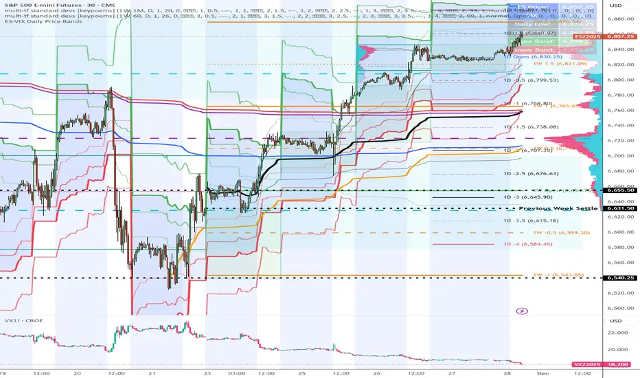
ES-VIX Daily Price Bands - Inner and OuterES-VIX Daily Price Bands
This indicator plots dynamic intraday price bands for ES futures based on real-time volatility levels measured by the VIX (CBOE Volatility Index). The bands evolve throughout the trading day, providing volatility-adjusted price targets.
Formulas:
Upper Band = Daily Low + (ES Price × VIX ÷ √252 ÷ 100)
Lower Band = Daily High - (ES Price × VIX ÷ √252 ÷ 100)
The calculation uses the square root of 252 (trading days per year) to convert annualized VIX volatility into an expected daily move, then scales it as a percentage adjustment from the current day's extremes.
Features:
Real-time band calculation that updates throughout the trading session
Upper band (green) extends from the current day's low
Lower band (red) contracts from the current day's high
Inner upper band (green) at 50% of expected move
Inner lower band (red) at 50% of expected move
Middle Inner upper band (green) at 80% of expected move
Middle Inner lower band (red) at 80% of expected move
Outer upper band (green) at 150% of expected move
Outer lower band (red) at 150% of expected move
Shaded zone between bands for visual clarity
Information table displaying:
Current ES price and VIX level
Running daily high and low
Current upper and lower band values
$TGM | Topological Geometry Mapper (Custom)TGM | Topological Geometry Mapper (Custom) – 2025 Edition
The first indicator that reads market structure the way institutions actually see it: through persistent topological features (Betti-1 collapse) instead of lagging price patterns.
Inspired by algebraic topology and persistent homology, TGM distills regime complexity into a single, real-time proxy using the only two macro instruments that truly matter:
• CBOE:VIX – market fear & convexity
• TVC:DXY – dollar strength & global risk appetite
When the weighted composite β₁ persistence drops below the adaptive threshold → market structure radically simplifies. Noise dies. Order flow aligns. A directional explosion becomes inevitable.
Features
• Structural Barcode Visualization – instantly see complexity collapsing in real time
• Dynamic color system:
→ Neon green = long breakout confirmed
→ red = short breakout confirmed
→ yellow = simplification in progress (awaiting momentum)
→ deep purple = complex/noisy regime
• Clean HUD table with live β₁ value, threshold, regime status and timestamp
• Built-in high-precision alerts (Long / Short / Collapse)
• Zero repaint – uses only confirmed data
• Works on every timeframe and every market
Best used on:
BTC, ETH, ES/NQ, EURUSD, GBPUSD, NAS100, SPX500, Gold – anywhere liquidity is institutional.
This is not another repainted RSI or MACD mashup.
This is structural regime detection at the topological level.
Welcome to the future of market geometry.
Made with love for the real traders.
Open-source. No paywalls. No BS.
#topology #betti #smartmoney #ict #smc #orderflow #regime #institutional

ADX Breakout Enhanced Signal🥋 Trading Dojo – ADX Breakout Enhanced Signal
This indicator combines the trend-strength power of the ADX with dynamic breakout-based signals, designed for traders who want more frequent and higher-probability entries on timeframes like 1 hour.
The core logic focuses on:
📌 1. Trend Strength Detection with ADX
The indicator evaluates whether the market is showing a strong directional trend using an optimized ADX.
When ADX rises above the configured threshold, the system interprets that price has enough momentum to validate an entry.
📌 2. Breakout Entry Logic
It identifies points where price breaks recent highs or lows, confirming the start or continuation of movement.
This breakout-based approach produces more entries than traditional ADX strategies alone.
📌 3. Clear and Simple Signals
🟩 Long when price breaks a recent high with strong trend confirmation.
🟥 Short when price breaks a recent low with strong trend confirmation.
📌 4. Built-In Automated Alerts
The indicator automatically generates JSON alerts ready for use with automation tools such as trading bots, webhooks, BingX, 3Commas, Discord bots, and more.
🎯 Purpose of the Indicator
To provide more frequent, well-distributed, and momentum-validated entries, while maintaining simplicity and speed — perfect for real-time decision-making.
Perfect For:
Intraday trading
1h, 30m, and 15m timeframes
Breakout-based strategies
Automated trading systems
