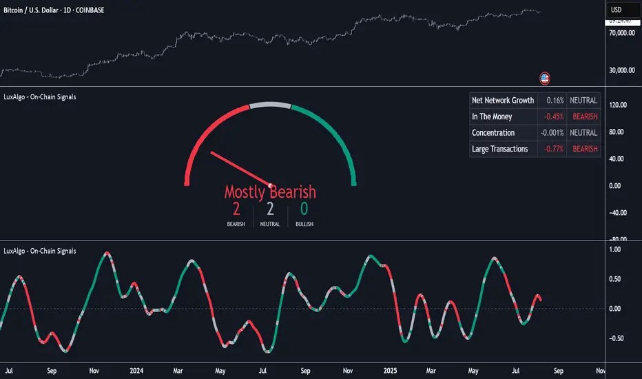
On-Chain Signals [LuxAlgo]The On-Chain Signals indicator uses fundamental blockchain metrics to provide traders with an objective technical view of their favorite cryptocurrencies.
It uses IntoTheBlock datasets integrated within TradingView to generate four key signals: Net Network Growth, In the Money, Concentration, and Large Transactions.
Together, these four signals provide traders with an overall directional bias of the market. All of the data can be visualized as a gauge, table, historical plot, or average.
🔶 USAGE
The main goal of this tool is to provide an overall directional bias based on four blockchain signals, each with three possible biases: bearish, neutral, or bullish. The thresholds for each signal bias can be adjusted on the settings panel.
These signals are based on IntoTheBlock's On-Chain Signals.
Net network growth: Change in the total number of addresses over the last seven periods; i.e., how many new addresses are being created.
In the Money: Change in the seven-period moving average of the total supply in the money. This shows how many addresses are profitable.
Concentration: Change in the aggregate addresses of whales and investors from the previous period. These are addresses holding at least 0.1% of the supply. This shows how many addresses are in the hands of a few.
Large Transactions: Changes in the number of transactions over $100,000. This metric tracks convergence or divergence from the 21- and 30-day EMAs and indicates the momentum of large transactions.
All of these signals together form the blockchain's overall directional bias.
Bearish: The number of bearish individual signals is greater than the number of bullish individual signals.
Neutral: The number of bearish individual signals is equal to the number of bullish individual signals.
Bullish: The number of bullish individual signals is greater than the number of bearish individual signals.
If the overall directional bias is bullish, we can expect the price of the observed cryptocurrency to increase. If the bias is bearish, we can expect the price to decrease. If the signal is neutral, the price may be more likely to stay the same.
Traders should be aware of two things. First, the signals provide optimal results when the chart is set to the daily timeframe. Second, the tool uses IntoTheBlock data, which is available on TradingView. Therefore, some cryptocurrencies may not be available.
🔹 Display Mode
Traders have three different display modes at their disposal. These modes can be easily selected from the settings panel. The gauge is set by default.
🔹 Gauge
The gauge will appear in the center of the visible space. Traders can adjust its size using the Scale parameter in the Settings panel. They can also give it a curved effect.
The number of bars displayed directly affects the gauge's resolution: More bars result in better resolution.
The chart above shows the effect that different scale configurations have on the gauge.
🔹 Historical Data
The chart above shows the historical data for each of the four signals.
Traders can use this mode to adjust the thresholds for each signal on the settings panel to fit the behavior of each cryptocurrency. They can also analyze how each metric impacts price behavior over time.
🔹 Average
This display mode provides an easy way to see the overall bias of past prices in order to analyze price behavior in relation to the underlying blockchain's directional bias.
The average is calculated by taking the values of the overall bias as -1 for bearish, 0 for neutral, and +1 for bullish, and then applying a triangular moving average over 20 periods by default. Simple and exponential moving averages are available, and traders can select the period length from the settings panel.
🔶 DETAILS
The four signals are based on IntoTheBlock's On-Chain Signals. We gather the data, manipulate it, and build the signals depending on each threshold.
Net network growth
float netNetworkGrowthData = customData('_TOTALADDRESSES')
float netNetworkGrowth = 100*(netNetworkGrowthData /netNetworkGrowthData - 1)
In the Money
float inTheMoneyData = customData('_INOUTMONEYIN')
float averageBalance = customData('_AVGBALANCE')
float inTheMoneyBalance = inTheMoneyData*averageBalance
float sma = ta.sma(inTheMoneyBalance,7)
float inTheMoney = ta.roc(sma,1)
Concentration
float whalesData = customData('_WHALESPERCENTAGE')
float inverstorsData = customData('_INVESTORSPERCENTAGE')
float bigHands = whalesData+inverstorsData
float concentration = ta.change(bigHands )*100
Large Transactions
float largeTransacionsData = customData('_LARGETXCOUNT')
float largeTX21 = ta.ema(largeTransacionsData,21)
float largeTX30 = ta.ema(largeTransacionsData,30)
float largeTransacions = ((largeTX21 - largeTX30)/largeTX30)*100
🔶 SETTINGS
Display mode: Select between gauge, historical data and average.
Average: Select a smoothing method and length period.
🔹 Thresholds
Net Network Growth : Bullish and bearish thresholds for this signal.
In The Money : Bullish and bearish thresholds for this signal.
Concentration : Bullish and bearish thresholds for this signal.
Transactions : Bullish and bearish thresholds for this signal.
🔹 Dashboard
Dashboard : Enable/disable dashboard display
Position : Select dashboard location
Size : Select dashboard size
🔹 Gauge
Scale : Select the size of the gauge
Curved : Enable/disable curved mode
Select Gauge colors for bearish, neutral and bullish bias
🔹 Style
Net Network Growth : Enable/disable historical plot and choose color
In The Money : Enable/disable historical plot and choose color
Concentration : Enable/disable historical plot and choose color
Large Transacions : Enable/disable historical plot and choose color
Penunjuk dan strategi
TCP | Market Session | Session Analyzer📌 TCP | Market Session Indicator | Crypto Version
A powerful, real-time market session visualization tool tailored for crypto traders. Track the heartbeat of Asia, Europe, and US trading hours directly on your chart with live session boxes, behavioral analysis, liquidity grab detection, and countdown timers. Know when the action starts, how the market behaves, and where the traps lie.
🔰 Introduction:
Trade the Right Hours with the Right Tools
Time matters in trading. Most significant moves happen during key sessions—and knowing when and how each session unfolds can give you a sharp edge. The TCP Market Session Indicator, developed by Trade City Pro (TCP), puts professional session tracking and behavioral insights at your fingertips.
Whether you're a scalper or swing trader, this indicator gives you the timing context to enter and exit trades with greater confidence and clarity.
🕒 Core Features
• Live Session Boxes :
Highlight active ranges during Asia, Europe, and US sessions with dynamic high/low updates.
• Session Start/End Labels :
Know exactly when each session begins and ends plotted clearly on your chart with context.
• Session Behavior Analysis :
At the end of each session, the indicator classifies the price action as:
- Trend Up
- Trend Down
- Consolidation
- Manipulation
• Liquidity Grab Detection: Automatically detects possible stop hunts (fake breakouts) and marks them on the chart with precision filters (volume, ATR, reversal).
• Session Countdown Table: A live dashboard showing:
- Current active session
- Time left in session
- Upcoming session and how many minutes until it starts
- Utility time converter (e.g. 90 min = 01:30)
• Vertical Session Lines: Visualize past and upcoming session boundaries with customizable history and future range.
• Multi-Day Support: Draw session ranges for previous, current, and future days for better backtesting and forecasting.
⚙️ Settings Panel
Customize everything to fit your trading style and schedule:
• Session Time Settings:
Set the opening and closing time for each session manually using UTC-based minute inputs.
→ For example, enter Asia Start: 0, Asia End: 480 for 00:00–08:00 UTC.
This gives full flexibility to adjust session hours to match your preferred market behavior.
• Enable or Disable Elements:
Toggle the visibility of each session (Asia, Europe, US), as well as:
- Session Boxes
- Countdown Table
- Session Lines
- Liquidity Grab Labels
• Timezone Selection:
Choose between using UTC or your chart’s local timezone for session calculations.
• Customization Options:
Select number of past and future days to draw session data
Adjust vertical line transparency
Fine-tune label offset and spacing for clean layout
📊 Smart Session Boxes
Each session box tracks high, low, open, and close in real time, providing visual clarity on market structure. Once a session ends, the box closes, and the behavior type is saved and labeled ideal for spotting patterns across sessions.
• Asia: Green Box
• Europe: Orange Box
• US: Blue Box
💡 Why Use This Tool?
• Perfect Timing: Don’t get chopped in low-liquidity hours. Focus on sessions where volume and volatility align.
• Pattern Recognition: Study how price behaves session-to-session to build better strategies.
• Trap Detection: Spot manipulation moves (liquidity grabs) early and avoid common retail pitfalls.
• Macro Session Mapping: Use as a foundational layer to align trades with market structure and news cycles.
🔍 Example Use Case
You're watching BTC at 12:45 UTC. The indicator tells you:
The Asia session just ended (label shows “Asia Session End: Trend Up”)
Europe session starts in 15 minutes
A liquidity grab just triggered at the previous high—label confirmed
Now you know who’s active, what the market just did, and what’s about to start—all in one glance.
✅ Why Traders Trust It
• Visual & Intuitive: Fully chart-based, no clutter, no guessing
• Crypto-Focused: Designed specifically for 24/7 crypto markets (not outdated forex models)
• Non-Repainting: All labels and boxes stay as printed—no tricks
• Reliable: Tested across multiple exchanges, pairs, and timeframes
🧩 Built by Trade City Pro (TCP)
The TCP Market Session Indicator is part of a suite of professional tools used by over 150,000 traders. It’s coded in Pine Script v6 for full compatibility with TradingView’s latest capabilities.
🔗 Resources
• Tutorial: Learn how to analyze sessions like a pro in our TradingView guide:
"TradeCityPro Academy: Session Mapping & Liquidity Traps"
• More Tools: Explore our full library of indicators on

Correlation HeatMap [TradingFinder] Sessions Data Science Stats🔵 Introduction
n financial markets, correlation describes the statistical relationship between the price movements of two assets and how they interact over time. It plays a key role in both trading and investing by helping analyze asset behavior, manage portfolio risk, and understand intermarket dynamics. The Correlation Heatmap is a visual tool that shows how the correlation between multiple assets and a central reference asset (the Main Symbol) changes over time.
It supports four market types forex, stocks, crypto, and a custom mode making it adaptable to different trading environments. The heatmap uses a color-coded grid where warmer tones represent stronger negative correlations and cooler tones indicate stronger positive ones. This intuitive color system allows traders to quickly identify when assets move together or diverge, offering real-time insights that go beyond traditional correlation tables.
🟣 How to Interpret the Heatmap Visually ?
Each cell represents the correlation between the main symbol and one compared asset at a specific time.
Warm colors (e.g. red, orange) suggest strong negative correlation as one asset rises, the other tends to fall.
Cool colors (e.g. blue, green) suggest strong positive correlation both assets tend to move in the same direction.
Lighter shades indicate weaker correlations, while darker shades indicate stronger correlations.
The heatmap updates over time, allowing users to detect changes in correlation during market events or trading sessions.
One of the standout features of this indicator is its ability to overlay global market sessions such as Tokyo, London, New York, or major equity opens directly onto the heatmap timeline. This alignment lets traders observe how correlation structures respond to real-world session changes. For example, they can spot when assets shift from being inversely correlated to moving together as a new session opens, potentially signaling new momentum or macro flow. The customizable symbol setup (including up to 20 compared assets) makes it ideal not only for forex and crypto traders but also for multi-asset and sector-based stock analysis.
🟣 Use Cases and Advantages
Analyze sector rotation in equities by tracking correlation to major indices like SPX or DJI.
Monitor altcoin behavior relative to Bitcoin to find early entry opportunities in crypto markets.
Detect changes in currency alignment with DXY across trading sessions in forex.
Identify correlation breakdowns during market volatility, signaling possible new trends.
Use correlation shifts as confirmation for trade setups or to hedge multi-asset exposure
🔵 How to Use
Correlation is one of the core concepts in financial analysis and allows traders to understand how assets behave in relation to one another. The Correlation Heatmap extends this idea by going beyond a simple number or static matrix. Instead, it presents a dynamic visual map of how correlations shift over time.
In this indicator, a Main Symbol is selected as the reference point for analysis. In standard modes such as forex, stocks, or crypto, the symbol currently shown on the main chart is automatically used as the main symbol. This allows users to begin correlation analysis right away without adjusting any settings.
The horizontal axis of the heatmap shows time, while the vertical axis lists the selected assets. Each cell on the heatmap shows the correlation between that asset and the main symbol at a given moment.
This approach is especially useful for intermarket analysis. In forex, for example, tracking how currency pairs like OANDA:EURUSD EURUSD, FX:GBPUSD GBPUSD, and PEPPERSTONE:AUDUSD AUDUSD correlate with TVC:DXY DXY can give insight into broader capital flow.
If these pairs start showing increasing positive correlation with DXY say, shifting from blue to light green it could signal the start of a new phase or reversal. Conversely, if negative correlation fades gradually, it may suggest weakening relationships and more independent or volatile movement.
In the crypto market, watching how altcoins correlate with Bitcoin can help identify ideal entry points in secondary assets. In the stock market, analyzing how companies within the same sector move in relation to a major index like SP:SPX SPX or DJ:DJI DJI is also a highly effective technique for both technical and fundamental analysts.
This indicator not only visualizes correlation but also displays major market sessions. When enabled, this feature helps traders observe how correlation behavior changes at the start of each session, whether it's Tokyo, London, New York, or the opening of stock exchanges. Many key shifts, breakouts, or reversals tend to happen around these times, and the heatmap makes them easy to spot.
Another important feature is the market selection mode. Users can switch between forex, crypto, stocks, or custom markets and see correlation behavior specific to each one. In custom mode, users can manually select any combination of symbols for more advanced or personalized analysis. This makes the heatmap valuable not only for forex traders but also for stock traders, crypto analysts, and multi-asset strategists.
Finally, the heatmap's color-coded design helps users make sense of the data quickly. Warm colors such as red and orange reflect stronger negative correlations, while cool colors like blue and green represent stronger positive relationships. This simplicity and clarity make the tool accessible to both beginners and experienced traders.
🔵 Settings
Correlation Period: Allows you to set how many historical bars are used for calculating correlation. A higher number means a smoother, slower-moving heatmap, while a lower number makes it more responsive to recent changes.
Select Market: Lets you choose between Forex, Stock, Crypto, or Custom. In the first three options, the chart’s active symbol is automatically used as the Main Symbol. In Custom mode, you can manually define the Main Symbol and up to 20 Compared Symbols.
Show Open Session: Enables the display of major trading sessions such as Tokyo, London, New York, or equity market opening hours directly on the timeline. This helps you connect correlation shifts with real-world market activity.
Market Mode: Lets you select whether the displayed sessions relate to the forex or stock market.
🔵 Conclusion
The Correlation Heatmap is a robust and flexible tool for analyzing the relationship between assets across different markets. By tracking how correlations change in real time, traders can better identify alignment or divergence between symbols and gain valuable insights into market structure.
Support for multiple asset classes, session overlays, and intuitive visual cues make this one of the most effective tools for intermarket analysis.
Whether you’re looking to manage portfolio risk, validate entry points, or simply understand capital flow across markets, this heatmap provides a clear and actionable perspective that you can rely on.

Price Label with Custom SymbolsThis Indicator plots a label with RSI, Current price of the selected chart symbol, Net change and percent change, VIX at previous day close, Current VIX and some Market helpers like ES, DXY, CL, TICK, ADD and VOLD. You can replace the symbols for your favorites.

Historical Year OverlayThis script allows you to simply source any historical calendar year and overlay it over any other year (usually a historical year overlaying a year in the future). It was made using an LLM for coding help and logic.
It is great for working out potential pivots and it also maps the previous profit/loss from the source year over the plot year so that we can see the connection to price levels throughout the plot year and also with the yearly close (we get a horizontal line for the close).
It uses the year open as a price reference to plot the P&L over the plot year (if use plot year option is selected).
if the year has not started yet you can use the "manual opening price" OR it will auto set to the current price (great for "replay mode", it will catch the actual opening price once it happens).
The settings are self explanatory. Choose a source year and plot year.
Choose a multiplier if you'd like (it simply multiplies the plot year P&L by that number; ie: 1 means the same as it was, 0.5 means half of what is was, 2 means 2x the source P&L)
The resolution is max default 50 line segments but you can simplify if you'd like.
I've released the code open-source so you can see what it is doing.
Please update it with all the enhancements you can think of.
Please let me know if you do this as I will be very interested!

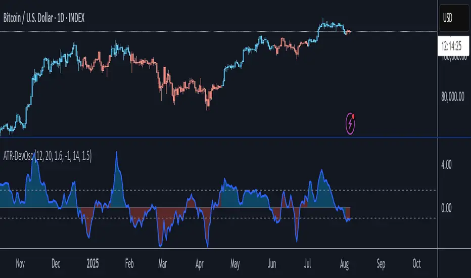
ATR-Scaled Deviation OscillatorATR-DevOsc is a custom momentum-and-volatility adaptive oscillator that scales N-bar price momentum by its rolling deviation and then reacts dynamically to sudden ATR spikes. By shrinking the deviation window when true volatility surges, it amplifies extreme moves—making medium-term trend shifts and deep drawdowns far more likely to breach your predefined thresholds.
Key features include:
• configurable momentum length and separate deviation length for precise control over look-back periods
• ATR Reaction Multiplier to tune how strongly sudden volatility spikes contract the deviation, boosting oscillator amplitude during extreme moves
• independent upper and lower threshold inputs for clear long/short signal definitions
• integrated candle-coloring overlay to immediately visualize trend state on your price chart
• built-in alert conditions for both oscillator-threshold crossovers and ATR-reactive triggers
This indicator is particularly useful for swing traders seeking medium-term entry and exit points in highly volatile markets like BTC. It combines normalized momentum readings with true volatility feedback, so large drawdowns or breakouts generate unmistakable signal events while routine noise stays filtered.
Note: ATR-DevOsc is provided “as is” without formal robustness or optimization testing. Past performance is not indicative of future results; use in live trading only after sufficient back-testing and validation.
Time-Based Range w/ FibsThis is a simple indicator for automatically placing fib levels on a range, primarily time based.
We can use fibs from time ranges to seek exhaustion levels where price will respect and return to the range and/or back through it. The default levels are the ones I like to use and is derived from the fib levels I seen @JJumboFX on X use.

Daily Manipulation Probability Dashboard📜 Summary
Tired of getting stopped out on a "Judas Swing" just before the price moves in your intended direction? This indicator is designed to give you a statistical edge by quantifying the daily manipulation move.
The Daily Manipulation Probability Dashboard analyzes thousands of historical trading days to reveal the probability of the initial "stop-hunt" or "fakeout" move reaching certain percentage levels. It presents this data in a clean, intuitive dashboard right on your chart, helping you make more data-driven decisions about stop-loss placement and entry timing.
🧠 The Core Concept
The logic is simple but powerful. For every trading day, we measure two things:
Amplitude Above Open (AAO): The distance price travels up from the daily open (High - Open).
Amplitude Below Open (ABO): The distance price travels down from the daily open (Open - Low).
The indicator defines the "Manipulation" as the smaller of these two moves. The idea is that this smaller move often acts as a liquidity grab to trap traders before the day's primary, larger move ("Distribution") begins.
This tool focuses exclusively on providing deep statistical insight into this crucial manipulation phase.
🛠️ How to Use This Tool
This dashboard is designed to be a practical part of your daily analysis and trade planning.
1. Smarter Stop-Loss Placement
This is the primary use case. The "Prob. (%)" column tells you the historical chance of the manipulation move being at least a certain size.
Example: If the table shows that for EURUSD, the ≥ 0.25% level has a probability of 30%, you can flip this information: there is a 70% probability that the daily manipulation move will be less than 0.25%.
Action: Placing your stop-loss just beyond a level with a low probability gives you a statistically sound buffer against typical stop-hunts.
2. Entry Timing and Patience
The live arrow (→) shows you where the current day's manipulation falls.
Example: If the arrow is pointing at ≥ 0.10% and you know there is a high probability (e.g., 60%) of the manipulation reaching ≥ 0.20%, you might wait for a deeper pullback before entering, anticipating that the "Judas Swing" hasn't completed yet.
3. Assessing Daily Character
Quickly see if the current day's action is unusual. If the manipulation move is already in a very low probability zone (e.g., > 1.00%), it might indicate that your Bias is wrong, or signal a high-volatility day or a potential trend reversal.
📊 Understanding the Dashboard
Ticker: The top-right shows the current symbol you are analyzing.
→ (Arrow): Points to the row that corresponds to the current, live day's manipulation amplitude.
Manip. Level: The percentage threshold being analyzed (e.g., ≥ 0.20%).
Days Analyzed: The raw count of historical days where the manipulation move met or exceeded this level.
Prob. (%): The key statistic. The cumulative probability of the manipulation move being at least the size of the level.
⚙️ Settings
Position: Choose where you want the dashboard to appear on your chart.
Text Size: Adjust the font size for readability.
Max Historical Days to Analyze: Set the number of past daily candles to include in the statistical analysis. A larger number provides a more robust sample size.
I believe this tool provides a unique, data-driven edge for intraday traders across all markets (Forex, Crypto, Stocks, Indices). Your feedback and suggestions are highly welcome!
- @traderprimez

Live Market - Performance MonitorLive Market - Performance Monitor – Study Material & Usage Guide
Overview:
The Live Market - Performance Monitor is a multi-layered TradingView indicator that assists traders in identifying high-probability setups by combining key technical elements: order block detection, dynamic trendline analysis, volume and volatility filtering, signal validation, and ATR-based target projection. This guide provides the essential logic, formulas, and practical steps to help users apply the system effectively.
________________________________________
Key Functional Features and Formulas
________________________________________
1. Order Block Detection
The indicator identifies price zones where strong institutional buying or selling has likely occurred, based on candle sequences.
• User Input: Number of consecutive candles to define relevance (e.g., 3–7 bars)
• Validation Formula:
• Price Move % = |Close(n) - Close(1)| / Close(n) × 100
• Bullish Order Block: A bearish candle followed by consecutive bullish candles
• Bearish Order Block: A bullish candle followed by consecutive bearish candles
Only valid zones that meet a minimum price move threshold are retained and plotted.
________________________________________
2. Trendline Logic
Trendlines are dynamically plotted using price pivots.
• Pivot Calculation: Highs and lows over a lookback period (e.g., 10 bars)
• Trendline Slope:
• Slope = (Pivot_new - Pivot_old) / (Time_new - Time_old)
• Trendline Projection:
• Projected Price = StartPrice + Slope × (CurrentTime - StartTime)
These lines act as dynamic support/resistance zones and are used to confirm breakout trades.
________________________________________
3. Volume and ATR Filters
Signals are filtered using real-time volume and volatility analysis to eliminate low-quality setups.
• Average Volume:
• AvgVol = SMA(Volume, 20)
• Volume Spike Condition:
• Volume > AvgVol × VolumeThreshold
• ATR (Volatility Filter) – Calculated using 14-bar period:
• (High - Low) > ATR × ATRMultiplier
When both filters are passed, the market is considered active and valid for trade.
________________________________________
4. Signal Generation Logic
• Bullish Signal: Triggered when:
o Price breaks above a resistance zone or bullish order block
o Volume and ATR filters confirm activity
o Trend alignment: EMA9 > EMA21 > EMA50
• Bearish Signal: Triggered under opposite conditions:
o Price breaks below a support zone or bearish order block
o Trend alignment: EMA9 < EMA21 < EMA50
Labels such as "BUY" or "SELL" appear on the chart at the trigger candle.
________________________________________
5. Target and Stop Loss Projection
The script dynamically calculates TP (take profit) and SL (stop loss) levels based on the ATR.
• For Long Trades:
• TP = High + (ATR × 2)
• SL = Low - (ATR × 1)
• For Short Trades:
• TP = Low - (ATR × 2)
• SL = High + (ATR × 1)
These levels are plotted on the chart and adjust as price evolves.
________________________________________
6. Performance Tracking
The script automatically tracks wins and losses for each signal based on TP/SL outcomes.
• Win Rate Formula:
• Win Rate (%) = (Number of Wins / Total Signals) × 100
This is useful for evaluating the system over time and adjusting risk or position sizing.
________________________________________
Practical Usage Steps
1. Apply the Indicator
o Add to your chart via Pine Editor or Indicators menu.
o Configure all input parameters including OB periods, pivot lookback, volume threshold, and ATR multiplier.
2. Signal Monitoring
o Wait for a "BUY" or "SELL" label to appear on the chart.
o Confirm alignment using:
EMA trend stacking (e.g., EMA9 > EMA21 > EMA50)
RSI/MACD momentum
Volume and ATR filters
3. Trade Execution
o Enter the trade on the candle following the signal.
o Use the plotted TP/SL lines to manage the trade.
o Monitor price action; exit if trend shifts or targets are achieved.
4. Review Performance
o Use the win rate and PnL counters to monitor your success.
o Analyze losing trades for trend or filter failures and optimize settings accordingly.
________________________________________
Alerts
The script includes alert support for:
• Signal Triggers: BUY or SELL label detection
• Take Profit / Stop Loss Hits: Automatically notifies when TP or SL is reached
These can be configured for push, email, or webhook delivery via TradingView alert settings.
________________________________________
Disclaimer from aiTrendview
This tool and the content provided by aiTrendview.com are for educational and research purposes only. They do not constitute investment advice, trading recommendations, or financial guidance. All forms of trading involve significant risk. Past performance does not guarantee future outcomes. Users are fully responsible for their trading decisions, including risk management, position sizing, and due diligence. It is strongly advised to test all strategies on a demo account before applying them to live capital. Consult a licensed financial advisor if necessary.

Mean Reversion & Momentum Hybrid | D_QUANT 📌 Mean Reversion & Momentum Hybrid | D_QUANT
📖 Description:
This indicator combines mean reversion logic, volatility filtering, and percentile-based momentum to deliver clear, context-aware buy/sell signals designed for trend-following and contrarian setups.
At its core, it merges:
A Bollinger Band % Positioning Model (BB%)
A 75th/25th Percentile Momentum System
A Volatility-Adjusted Trend Filter using RMA + ATR
All tied together with a dynamic gradient-style oscillator that visualizes signal strength and persistence over time — making it easy to track high-conviction setups.
Signals only trigger when all three core components align, filtering out noise and emphasizing high-probability turning points or trend continuations.
⚙️ Methodology Overview:
Bollinger Bands % (BB%):
Price is measured as a percentage between upper and lower Bollinger Bands (based on OHLC4). Entries are only considered when price exceeds custom BB% thresholds — emphasizing market extremes.
Volatility-Based Trend Filter (RMA + ATR):
A smoothed RMA baseline is paired with ATR to define trend bias. This ensures signals only occur when price deviates meaningfully beyond recent volatility.
Percentile Momentum Model (75th/25th Rank):
Price is compared against its rolling 75th and 25th percentile. If price breaks these statistical boundaries (adjusted by ATR), it triggers a directional momentum condition.
Signal Consensus Engine:
All three layers must agree — BB% condition, trend filter, and percentile momentum — before a buy or sell signal is plotted.
Gradient Oscillator Visualization:
Signals appear as a fading oscillator line with a gradient-filled area beneath it. The color intensity represents how “fresh” or “strong” the signal is, fading over time if not reconfirmed, offering both clarity and signal aging at a glance.
🔧 User Inputs:
🧠 Core Settings:
Source: Select the price input (default: close)
Bollinger Bands Length: Period for BB basis and deviation
Bollinger Bands Multiplier: Width of the bands
Minimum BB Width (% of Price): Prevents signals during low-volatility chop
📊 BB% Thresholds:
BB% Long Threshold (L): Minimum %B to consider a long
BB% Short Threshold (S): Maximum %B to consider a short
🔍 Trend Filter Parameters:
RMA Length: Period for the smoothed trend baseline
ATR Length: Lookback for ATR in trend deviation filter
⚡️ Momentum Parameters:
Momentum Length: Period for percentile momentum calculation
Mult_75 / Mult_25: ATR-adjusted thresholds for breakout above/below percentile levels
🎨 Visualization:
Bar Coloring: Highlights candles during active signals
Background Coloring: Optional background shading for signals
Show Oscillator Plot: Toggle the gradient-style oscillator
🧪 Use Case:
This indicator works well across all assets for trend identification. It is particularly effective when used on higher timeframes (e.g. 12H, 1D,2D) to capture mean reversion bounces or confirm breakouts backed by percentile momentum and volatility expansion.
⚠️ Notes:
This is not financial advice. Use in combination with proper risk management and confluence from other tools.

Signal Strength Technical AnalysisSignal Strength Technical Analysis – Study Material & Usage Guide
Overview:
This tool is a multi-layered TradingView indicator developed to help traders identify high-probability trade setups using order block detection, dynamic trendlines, volume and volatility filters, and ATR-based target projections. This guide outlines each feature, its formulaic foundation, and how to use the tool effectively in live markets.
________________________________________
Key Features and How to Use Them
1. Order Block Detection:
The script identifies institutional-level buying/selling zones using sequences of directional candles.
• You define the number of consecutive candles to qualify an order block.
• A move qualifies as an order block if:
• Price Move % = |Close(n) - Close(1)| / Close(n) × 100 ≥ Threshold
• Bullish Order Block: A down candle followed by multiple up candles.
• Bearish Order Block: An up candle followed by multiple down candles.
These blocks are plotted and used for trade entry confirmation and support/resistance analysis.
________________________________________
2. Trendline Logic:
Support and resistance lines are drawn dynamically using pivots.
• Pivot highs/lows are identified over a user-defined period (e.g., 10 bars).
• Trendline slope is calculated using:
• Slope = (Pivot_new - Pivot_old) / (Time_new - Time_old)
• Current projected support or resistance:
• Price = StartPrice + Slope × (CurrentTime - StartTime)
Breakouts beyond these levels are interpreted as potential trade signals when confirmed by other filters.
________________________________________
3. Volume and ATR Filters:
These filters help eliminate weak or low-conviction signals.
• Average Volume:
• AvgVol = SMA(Volume, 20)
• Volume Spike Detection:
• Volume > AvgVol × VolumeThreshold
• ATR Volatility Filter (ATR over 14 bars):
• (High - Low) > ATR × ATRMultiplier
If both filters pass, the market is considered active and eligible for trade setup.
________________________________________
4. Signal Generation Logic:
• Bullish Signal: Triggered when:
o Price breaks above resistance or a bullish order block
o Volume and ATR filters are passed
o Trend is confirmed: EMA9 > EMA21 > EMA50
• Bearish Signal: Triggered when:
o Price breaks below support or a bearish order block
o Volume and ATR filters are passed
o Trend is confirmed: EMA9 < EMA21 < EMA50
________________________________________
5. Target and Stop Loss Projection:
Based on the Average True Range (ATR):
• For Long Trades:
• TP = High + (ATR × 2)
• SL = Low - (ATR × 1)
• For Short Trades:
• TP = Low - (ATR × 2)
• SL = High + (ATR × 1)
Targets and stops are plotted on the chart and update dynamically.
________________________________________
6. Trade Management and Win Rate Calculation:
• Once in a trade, the script monitors price:
o Hits TP → Recorded as win
o Hits SL → Recorded as loss
• Win Rate Calculation:
• Win Rate = (Wins / Total Signals) × 100%
This helps track the strategy's live effectiveness and improve decision-making.
________________________________________
How to Use the Indicator – Practical Steps
1. Setup
o Add the indicator to your TradingView chart
o Configure OB periods, trendline pivots, volume and ATR multipliers
o Adjust display preferences
2. Wait for Signal
o Look for a “BUY” or “SELL” label to appear
o Confirm with:
EMA trend alignment
RSI and MACD momentum
Volume and ATR filters
3. Execute Trade
o Enter on the next bar after confirmation
o Use the plotted TP/SL levels as risk management
o Adjust position sizing according to your trading rules
4. Manage Trade
o Monitor PnL and win rate live
o Exit manually or let price hit TP/SL
o Respect the indicator’s environment reading (avoid trading in low-volatility or sideways zones)
________________________________________
Alerts and Automation
• The script includes built-in alert conditions for:
o Buy/Sell signal confirmation
o Take-profit level reached
o Stop-loss triggered
Enable alerts in TradingView to receive real-time notifications to your mobile, email, or connected services.
________________________________________
Disclaimer from aiTrendview
This tool is provided for educational and research purposes only. It is not intended as financial advice or an investment recommendation. Trading in financial markets involves substantial risk. Past performance does not guarantee future results. The user alone is responsible for all trading decisions, including risk management and strategy selection. We strongly recommend testing this tool on a demo account before applying it to real capital and consulting a licensed financial advisor where necessary.

RSI ⇄ Price Divergence on Graphic//@version=5
indicator("RSI ⇄ Price Divergence with Emphasis", overlay=true, max_lines_count=500)
// === Inputs ===
rsiLength = input.int(14, "RSI Length")
pivotLR = input.int(5, "Pivot Left/Right", minval=1)
rescaleLook = input.int(100, "Bars to rescale RSI→Price", minval=10)
minLabelSize = input.string("small", "Label size", options= )
// === Calculate RSI & price pivots ===
rsi = ta.rsi(close, rsiLength)
isPh = ta.pivothigh(high, pivotLR, pivotLR)
isPl = ta.pivotlow(low, pivotLR, pivotLR)
// === Helpers to map RSI into price range ===
priceHigh = ta.highest(high, rescaleLook)
priceLow = ta.lowest(low, rescaleLook)
priceRange = priceHigh - priceLow
scaleRsi(x) => priceLow + (x / 100.0) * priceRange
// Utility to measure divergence strength
getStrength(p0, p1, r0, r1) =>
math.abs((p1 - p0) / p0) + math.abs((r1 - r0) / 100)
// === State storage ===
var int lastPhBar = na
var float lastPhPrice = na
var float lastPhRsi = na
var float lastPhStrength = 0.0
var int lastPlBar = na
var float lastPlPrice = na
var float lastPlRsi = na
var float lastPlStrength = 0.0
// === Containers for drawings ===
var line divLines = array.new_line()
var label divLabels = array.new_label()
// Function to clear old drawings ===
clearAll() =>
if array.size(divLines) > 0
for i = 0 to array.size(divLines) - 1
line.delete(array.get(divLines, i))
array.clear(divLines)
if array.size(divLabels) > 0
for i = 0 to array.size(divLabels) - 1
label.delete(array.get(divLabels, i))
array.clear(divLabels)
// === Bearish divergence ===
if isPh
curBar = bar_index - pivotLR
curPrice = high
curRsi = rsi
if not na(lastPhBar)
if (curPrice > lastPhPrice) and (curRsi < lastPhRsi)
strength = getStrength(lastPhPrice, curPrice, lastPhRsi, curRsi)
if strength >= lastPlStrength
clearAll()
l1 = line.new(lastPhBar, lastPhPrice, curBar, curPrice, color=color.red, width=2)
l2 = line.new(lastPhBar, scaleRsi(lastPhRsi), curBar, scaleRsi(curRsi), color=color.red, style=line.style_dashed, width=1)
lbl = label.new(curBar, curPrice, "Bear Div", xloc=xloc.bar_index, yloc=yloc.price, color=color.red, style=label.style_label_down, textcolor=color.white, size=size.small)
array.push(divLines, l1)
array.push(divLines, l2)
array.push(divLabels, lbl)
lastPhStrength := strength
lastPhBar := curBar
lastPhPrice := curPrice
lastPhRsi := curRsi
// === Bullish divergence ===
if isPl
curBar = bar_index - pivotLR
curPrice = low
curRsi = rsi
if not na(lastPlBar)
if (curPrice < lastPlPrice) and (curRsi > lastPlRsi)
strength = getStrength(lastPlPrice, curPrice, lastPlRsi, curRsi)
if strength > lastPhStrength
clearAll()
l1 = line.new(lastPlBar, lastPlPrice, curBar, curPrice, color=color.green, width=2)
l2 = line.new(lastPlBar, scaleRsi(lastPlRsi), curBar, scaleRsi(curRsi), color=color.green, style=line.style_dashed, width=1)
lbl = label.new(curBar, curPrice, "Bull Div", xloc=xloc.bar_index, yloc=yloc.price, color=color.green, style=label.style_label_up, textcolor=color.white, size=size.small)
array.push(divLines, l1)
array.push(divLines, l2)
array.push(divLabels, lbl)
lastPlStrength := strength
lastPlBar := curBar
lastPlPrice := curPrice
lastPlRsi := curRsi
// Plot RSI pane for context ===
plot(rsi, title="RSI", color=color.blue)
hline(70, "Overbought", color=color.gray, linestyle=hline.style_dotted)
hline(30, "Oversold", color=color.gray, linestyle=hline.style_dotted)
/*
HOW TO USE (for TradingView Publishing)
1. Apply to Chart
- Copy and paste the full Pine v5 script into the TradingView Pine Editor.
- Save the script and click “Add to Chart”.
2. Configure Inputs
• RSI Length: Number of bars for the RSI calculation (default 14).
• Pivot Left/Right: Bars on each side to define a pivot high/low (default 5).
• Bars to Rescale RSI→Price: Lookback window for mapping RSI to price scale for on-chart lines (default 100).
3. Interpret Signals
- **Bearish Divergence** (Red): Price makes higher highs, RSI makes lower highs. The stronger signal replaces any existing bullish divergence.
- **Bullish Divergence** (Green): Price makes lower lows, RSI makes higher lows. The stronger signal replaces any existing bearish divergence.
- A dashed line connects RSI pivots in the price pane to highlight the divergence visually.
4. Alerts
- (Optional) Create custom alerts based on label text or line drawings using the `plotshape` or alertcondition functions if desired.
5. Best Practices
- Check divergences on higher timeframes (4H, Daily) for reliability.
- Use in conjunction with support/resistance zones and volume confirmation.
- Adjust inputs to match the volatility profile of the instrument and timeframe.
*/

quad Stoch'sIt's like a Stochastic Oscillator, but there are four of them. Wait for all four to show overbought or oversold and then enter once the fastest moving oscillator breaks out
ai quant oculusAI QUANT OCULUS
Version 1.0 | Pine Script v6
Purpose & Innovation
AI QUANT OCULUS integrates four distinct technical concepts—exponential trend filtering, adaptive smoothing, momentum oscillation, and Gaussian smoothing—into a single, cohesive system that delivers clear, objective buy and sell signals along with automatically plotted stop-loss and three profit-target levels. This mash-up goes beyond a simple EMA crossover or standalone TRIX oscillator by requiring confluence across trend, adaptive moving averages, momentum direction, and smoothed price action, reducing false triggers and focusing on high‐probability turning points.
How It Works & Why Its Components Matter
Trend Filter: EMA vs. Adaptive MA
EMA (20) measures the prevailing trend with fixed sensitivity.
Adaptive MA (also EMA-based, length 10) approximates a faster-responding moving average, standing in for a KAMA-style filter.
Bullish bias requires AMA > EMA; bearish bias requires AMA < EMA. This ensures signals align with both the underlying trend and a more nimble view of recent price action.
Momentum Confirmation: TRIX
Calculates a triple-smoothed EMA of price over TRIX Length (15), then converts it to a percentage rate-of-change oscillator.
Positive TRIX reinforces bullish entries; negative TRIX reinforces bearish entries. Using TRIX helps filter whipsaws by focusing on sustained momentum shifts.
Gaussian Price Smoother
Applies two back-to-back 5-period EMAs to the price (“gaussian” smoothing) to remove short-term noise.
Price above the smoothed line confirms strength for longs; below confirms weakness for shorts. This layer avoids entries on erratic spikes.
Confluence Signals
Buy Signal (isBull) fires only when:
AMA > EMA (trend alignment)
TRIX > 0 (momentum support)
Close > Gaussian (price strength)
Sell Signal (isBear) fires under the inverse conditions.
Requiring all three conditions simultaneously sharply reduces false triggers common to single-indicator systems.
Automatic Risk & Reward Plotting
On each new buy or sell signal (edge detection via not isBull or not isBear ), the script:
Stores entryPrice at the signal bar’s close.
Draws a stop-loss line at entry minus ATR(14) × Stop Multiplier (1.5) by default.
Plots three profit-target lines at entry plus ATR × Target Multiplier (1×, 1.5×, and 2×).
All previous labels and lines are deleted on each new signal, keeping the chart uncluttered and focusing only on the current trade.
Inputs & Customization
Input Description Default
EMA Length Period for the main trend EMA 20
Adaptive MA Length Period for the faster adaptive EM A substitute 10
TRIX Length Period for the triple-smoothed momentum oscillator 15
Dominant Cycle Length (Reserved) 40
Stop Multiplier ATR multiple for stop-loss distance 1.5
Target Multiplier ATR multiple for first profit target 1.5
Show Buy/Sell Signals Toggle on-chart labels for entry signals On
How to Use
Apply to Chart: Best on 15 m–1 h timeframes for swing entries or 5 m for agile scalps.
Wait for Full Confluence:
Look for the AMA to cross above/below the EMA and verify TRIX and Gaussian conditions on the same bar.
A bright “LONG” or “SHORT” label marks your entry.
Manage the Trade:
Place your stop where the red or green SL line appears.
Scale or exit at the three yellow TP1/TP2/TP3 lines, automatically drawn by volatility.
Repeat Cleanly: Each new signal clears prior annotations, ensuring you only track the active setup.
Why This Script Stands Out
Multi-Layer Confluence: Trend, momentum, and noise-reduction must all align, addressing the weaknesses of single-indicator strategies.
Automated Trade Management: No manual plotting—stop and target lines appear seamlessly with each signal.
Transparent & Customizable: All logic is open, adjustable, and clearly documented, allowing traders to tweak lengths and multipliers to suit different instruments.
Disclaimer
No indicator guarantees profit. Always backtest AI QUANT OCULUS extensively, combine its signals with your own analysis and risk controls, and practice sound money management before trading live.

Time Window Optimizer [theUltimator5]The Time Window Optimizer is designed to identify the most profitable 30-minute trading windows during regular market hours (9:30 AM - 4:00 PM EST). This tool helps traders optimize their intraday strategies by automatically discovering time periods with the highest historical performance or allowing manual selection for custom analysis. It also allows you to select manual timeframes for custom time period analysis.
🏆 Automatic Window Discovery
The core feature of this indicator is its intelligent Auto-Find Best 30min Window system that analyzes all 13 possible 30-minute time slots during market hours.
How the Algorithm Works:
Concurrent Analysis: The indicator simultaneously tracks performance across all 13 time windows (9:30-10:00, 10:00-10:30, 10:30-11:00... through 15:30-16:00)
Daily Performance Tracking: For each window, it captures the percentage change from window open to window close on every trading day
Cumulative Compounding: Daily returns are compounded over time to show the true long-term performance of each window, starting from a normalized value of 1.0
Dynamic Optimization: The system continuously identifies the window with the highest cumulative return and highlights it as the optimal choice
Statistical Validation: Performance is validated through multiple metrics including average daily returns, win rates, and total sample size
Visual Representation:
Best Window Line: The top-performing window is displayed as a thick colored line for easy identification
All 13 Lines (optional): Users can view performance lines for all time windows simultaneously to compare relative performance
Smart Coloring: Lines are color-coded (green for gains, red for losses) with the best performer highlighted in a user-selected color
📊 Comprehensive Performance Analysis
The indicator provides detailed statistics in an information table:
Average Daily Return: Mean percentage change per trading session
Cumulative Return: Total compounded performance over the analysis period
Win Rate: Percentage of profitable days (colored green if ≥50%, red if <50%)
Buy & Hold Comparison: Shows outperformance vs. simple buy-and-hold strategy
Sample Size: Number of trading days analyzed for statistical significance
🛠️ User Settings
imgur.com
Auto-Optimization Controls:
Auto-Find Best Window: Toggle to enable/disable automatic optimization
Show All 13 Lines: Display all time window performance lines simultaneously
Best Window Line Color: Customize the color of the top-performing window
Manual Mode:
imgur.com
Custom Time Window: Set any desired time range using session format (HHMM-HHMM)
Crypto Support: Built-in timezone offset adjustment for cryptocurrency markets
Chart Type Options: Switch between candlestick and line chart visualization
Visual Customization:
imgur.com
Background Highlighting: Optional background color during active time windows
Candle Coloring: Custom colors for bullish/bearish candles within the time window
Table Positioning: Flexible placement of the statistics table anywhere on the chart
🔧 Technical Features
Market Compatibility:
Stock Markets: Optimized for traditional market hours (9:30 AM - 4:00 PM EST)
Cryptocurrency: Includes timezone offset adjustment for 24/7 crypto markets
Exchange Detection: Automatically detects crypto exchanges and applies appropriate settings
Performance Optimization:
Efficient Calculation: Uses separate arrays for each time block to minimize computational overhead
Real-time Updates: Dynamically updates the best-performing window as new data becomes available
Memory Management: Optimized data structures to handle large datasets efficiently
💡 Use Cases
Strategy Development: Identify the most profitable trading hours for your specific instruments
Risk Management: Focus trading activity during historically successful time periods
Performance Comparison: Evaluate whether time-specific strategies outperform buy-and-hold
Market Analysis: Understand intraday patterns and market behavior across different time windows
📈 Key Benefits
Data-Driven Decisions: Base trading schedules on historical performance data
Automated Analysis: No manual calculation required - the algorithm does the work
Flexible Implementation: Works in both automated discovery and manual selection modes
Comprehensive Metrics: Multiple performance indicators for thorough analysis
Visual Clarity: Clear, color-coded visualization makes interpretation intuitive
This indicator transforms complex intraday analysis into actionable insights, helping traders optimize their time allocation and improve overall trading performance through systematic, data-driven approach to market timing.

Liquidation Heatmap Proxy [victhoreb]Author: victhoreb
This script was inspired by the Coinglass indicator: www.coinglass.com
It divides each bar into subbars determined by the intrabar period. For each bar, it considers subbars with a positive OID (open interest delta) (if the user sets "Filter by Signal" to true, it only considers subbars with OID > 0 from a main bar that had a peak in open interest). In these subbars, it considers opened long/short positions based on the intrabar price movement and the dispersion factor (which becomes completely unnecessary if the user is using Intrabar Resolution in ticks; in this case, set the dispersion factor = 0).
After determining the opened long and short positions, it determines, based on the user-selected leverages, the liquidation level for each position. The width of each level is given by syminfo.mintick * scale. The script uses the intrabar OID from the previous step to store an estimate of the number of contracts to be liquidated at each level. This estimate is used to color the levels by order of magnitude.
If there is a subsequent increase in liquidations at a pre-existing level, the script accumulates the estimated number of contracts to be liquidated and repaints the level. A note about a visual limitation of the script is important: in Coinglass' version, when there is a subsequent increase in liquidations at a pre-existing level, Coinglass paints the level a brighter color ONLY from the moment of the increase—however, this script does not do this; it repaints the entire level with the brighter color. Note: While accurate, this script is only a proxy. Use at your own risk.
This script has alerts for when there is liquidation in the long or short direction.

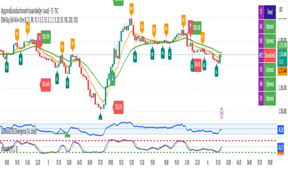
EMA Buy Sell All-in-One✨ Description (แนะนำให้ใช้ตอนกด Publish):
This all-in-one indicator combines several powerful trading tools into one script:
• EMA Cross Entry System: Customizable fast/slow EMA cross for buy/sell signals
• Dynamic SL/TP System: Choose between swing-based or custom SL/TP; auto-calculated RR support
• HH, HL, LH, LL Labels: Market structure points marked directly on chart (toggle ON/OFF)
• Multi-Timeframe Trend Table: Visual overview of EMA trends across D1 → M1 timeframes
• H1 Trend Change Icons: Alerts when the hourly trend flips direction
➤ Clean and responsive display
➤ Fully customizable via input panel
➤ Great for intraday or swing traders following trend + structure alignment
Feel free to fork or modify. Made for those who want clarity and confluence in one view.
GOLD SCALPER SESSIONS - By The Homerun SeriesThis zones should be used to turn on/off your gold scalper, for access to our gold scalper please dm the author or @_theindiantrader_ on instagram

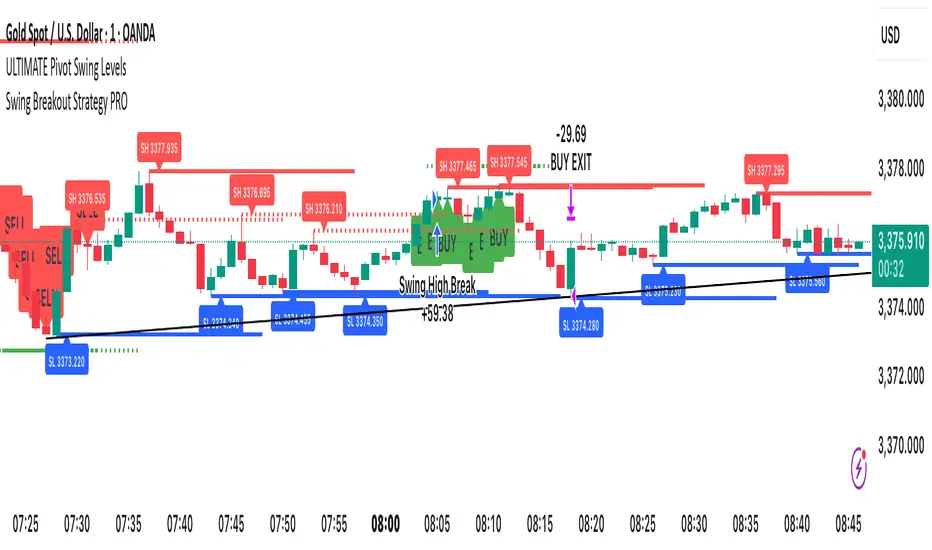
Swing Breakout Strategy PRO“Swing Strategy Pro”
A powerful trading tool designed for price action & swing traders. This indicator automatically detects swing highs and lows and generates precise Buy & Sell signals based on breakout confirmations.
✅ How It Works:
• Buy signal: When swing high breaks with confirmation candle
• Sell signal: When swing low breaks with confirmation candle
• Target = Distance between recent swing high & low
• Stop Loss = Opposite swing level
📌 Perfect for Breakout Trading, Swing Entries, and Trend Continuation strategies.
🎯 Fully automated with visual alerts & clean chart design.
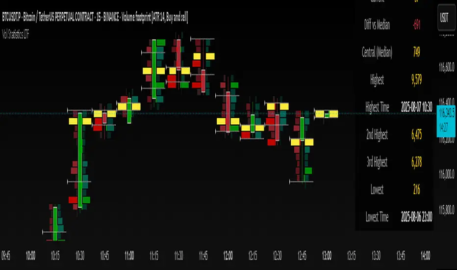
Volume Statistics - IntraweekVolume Statistics - Intraweek: For Orderflow Traders
This tool is designed for traders using volume footprint charts and orderflow methods.
Why it matters:
In orderflow trading, you care about the quality of volume behind each move. You’re not just watching price; you’re watching how much aggression is behind that price move. That’s where this indicator helps.
What to look at:
* Current Volume shows you how much volume is trading right now.
* Central Volume (median or average over 24h or 7D) gives you a baseline for what's normal volume VS abnormal volume.
* The Diff vs Central tells you immediately if current volume is above or below normal.
How this helps:
* If volume is above normal, it suggested elevated levels of buyer or seller aggression. Look for strong follow-through or continuation.
* If volume is below normal, it may signal low interest, passive participation, a lack of conviction, or a fake move.
* Use this context to decide if what you're seeing in the footprint (imbalances, absorption, traps) is actually worth acting on.
Extra context:
* The highest and lowest volume levels and their timestamps help you spot prior key reactions.
* Second and third highest bars help you see other major effort points in the recent window.
Comment with any suggestions on how to improve this indicator.
5MA+ZZ+RSI+Sessions+CandlesHere is an combination indicator which presented the EMA, RSI, Fibonacci zigzag level, Market session and Candle theory.
You can visible which indicator you want.

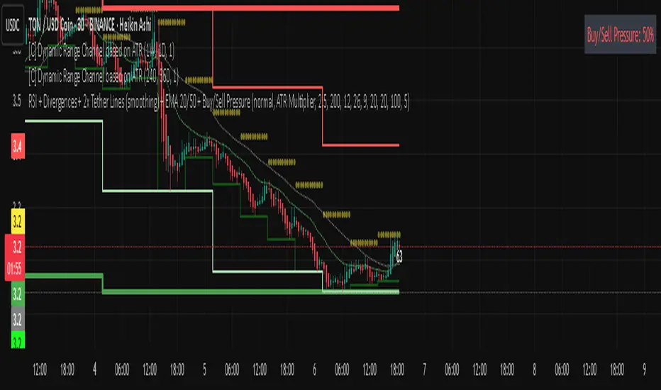
Rsi bar, divergences, tether line, ema 20,50 -Ema 20,50
-Tether Line dominance
-Buy/sell pressure
-Rsi last candle
-byu sell signal
-rsi divergence
-macd divergence
-Coloured candles 25,30 rsi and 70 rsi