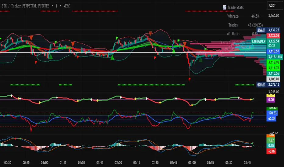
FR33 SCR1PT D1STR1BUTIONMajor market moves often align with Key Time Cycle SMTs. This indicator detects SMTs on lower timeframes and higher timeframes and identify Key Market Reversals in real-time.
For a more information and to learn more about SMTs, visit: SMTdetector.com
Penunjuk dan strategi

Elliott Wave Principle Pro - Frost & Prechter [abusuhil]الوصف العربي اسفل الوصف الإنجليزي .
✅ Professional Description (English)
Elliott Wave Principle Pro – Frost & Prechter Edition
A complete, professional-grade Elliott Wave detection and trading system designed for traders who want to identify market structure with precision and execute trades based on confirmed wave completion signals — without repainting.
This indicator combines the classical Elliott Wave rules from Frost & Prechter’s “Elliott Wave Principle” with modern algorithmic detection, Fibonacci validation, ZigZag pivot systems, and fully automated entry/exit levels.
⭐ Core Features
1. Automatic Elliott Wave Detection
Detects Impulse Waves (5-3-5-3-5)
Detects Corrective Waves (ABC) including:
• Zigzag
• Flat
• Expanded Flat
Supports multiple wave degrees (Cycle → Minuette)
2. Strict Elliott Rule Engine
All major EW rules are applied:
Wave 2 never retraces beyond Wave 1
Wave 4 must not overlap Wave 1
Wave 3 is never the shortest
Wave relationships validated using Fibonacci ratios
You can choose Strict / Standard / Flexible rule modes.
⭐ 3. Non-Repainting Confirmation System
Waves are confirmed only after pivot completion
Signals never change once displayed
Historical signals remain stable
Fully resistant to repainting
⭐ 4. Automated Trading Signals
Every completed structure triggers:
BUY Signals
End of Wave C
End of bearish Impulse (Wave 5)
SELL Signals
End of Wave 5 in bullish impulse
End of bullish ABC correction
Each signal includes:
Entry Line
Stop Loss (3 methods: Wave / ATR / Fixed)
TP1 – TP2 – TP3 (Fibonacci-based or Wave Projected)
Optional PRZ (Potential Reversal Zone)
You may show only the latest signal for clarity.
⭐ 5. Advanced Visual Tools
Wave numbers (1–5 / A–B–C)
Wave lines
Channels
Projection levels
Degree colors
Customizable labels and signal shapes (Box / Arrow / No Text)
A clean Simple Mode is available to hide all waves and show signals only.
⭐ 6. Informational Table (Optional)
Displays:
Last detected structure
Direction (Bullish / Bearish)
Active signal status (Buy / Sell / Wait)
⭐ How Traders Benefit
This tool helps traders:
Understand the full Elliott Wave context instantly
Know exactly when a wave cycle has completed
Enter trades with predefined, optimized levels
Avoid emotional decisions and subjective wave counting
Rely on a non-repainting analytical engine
Identify high-probability reversal zones
Improve trade timing and risk management
Perfect for swing trading, intraday trading, and wave practitioners.
🇸🇦 الوصف الاحترافي (العربية)
Elliott Wave Principle Pro – نسخة فروسـت وبريشتـر
مؤشر احترافي متكامل لتحليل موجات إليوت واكتشاف البُنى السعريّة بشكل آلي ودقيق، مع إعطاء إشارات تداول مؤكدة عند اكتمال الموجات — بدون إعادة رسم (Non-Repainting).
يجمع هذا المؤشر بين قواعد مدرسة إليوت الكلاسيكية من كتاب “Elliott Wave Principle” وبين خوارزميات حديثة تعتمد على الـ ZigZag، والفيبوناتشي، والتحقق الرياضي من صحة الموجة.
⭐ أهم المزايا
1. اكتشاف آلي كامل لموجات إليوت
اكتشاف الموجات الدافعة Impulse 5-3-5-3-5
اكتشاف الموجات التصحيحية ABC بما يشمل:
• Zigzag
• Flat
• Expanded Flat
دعم جميع درجات الموجة من Cycle حتى Minuette
⭐ 2. محرك قواعد إليوت الاحترافي
يطبق المؤشر جميع القواعد الأساسية لموجات إليوت، مثل:
الموجة 2 لا تتجاوز بداية الموجة 1
الموجة 4 يجب ألا تتداخل مع الموجة 1
الموجة 3 ليست الأقصر
تأكيد العلاقات باستخدام نسب فيبوناتشي
مع إمكانية اختيار نمط القواعد: صارم / قياسي / مرن.
⭐ 3. نظام تأكيد بدون إعادة رسم
لا يتم تأكيد الموجة إلا بعد اكتمالها فعليًا
لا يتم حذف أي إشارة بعد ظهورها
جميع النتائج ثابتة وغير قابلة للتغيير
مقاوم لإعادة الرسم 100%
⭐ 4. إشارات تداول تلقائية
يصدر المؤشر إشارات شراء وبيع عند اكتمال التركيبات التالية:
إشارات BUY
نهاية موجة C
نهاية موجة 5 الهابطة (انعكاس صاعد)
إشارات SELL
نهاية موجة 5 الصاعدة
نهاية تصحيح ABC الصاعد
وتتضمن الإشارة:
مستوى الدخول
وقف الخسارة (Wave / ATR / نسبة ثابتة)
الأهداف TP1 – TP2 – TP3
منطقة انعكاس محتملة PRZ (اختيارية)
ويمكن عرض آخر إشارة فقط لسهولة القراءة.
⭐ 5. أدوات بصرية متقدمة
ترقيم الموجات 1–5 و A–B–C
خطوط الموجات
قنوات Elliott
مستويات الإسقاط
ألوان الدرجات
تخصيص شكل الإشارة (مربع / سهم / بدون نص)
كما يمكن تفعيل الوضع البسيط لإظهار الإشارات فقط.
⭐ 6. جدول معلومات الاختياري
يعرض:
نوع آخر موجة مكتشفة
اتجاهها (صاعد / هابط)
حالة الإشارة الحالية (شراء / بيع / انتظار)
⭐ فوائد استخدام المؤشر للمتداول
هذا المؤشر يساعدك على:
فهم بنية موجات إليوت دون قراءة الشارت يدويًا
اكتشاف نقاط الانعكاس القوية قبل حدوثها
الدخول في صفقات محسوبة مسبقًا (Entry + SL + TP)
تقليل التشتت والتقدير الشخصي في العدّ
تحسين إدارة المخاطر
تعزيز دقة التوقيت في بداية الاتجاهات الجديدة
دراسة السوق بطريقة احترافية تعتمد على قاعدة علمية واضحة
مثالي للمضارب اليومي، المتداول المتأرجح، ولممارسي مدرسة إليوت.

Tamil | MTF DashboardThe Tamil | MTF Dashboard is a powerful multi-timeframe (MTF) market strength and trend-bias analyzer designed to give traders a fast, at-a-glance understanding of market conditions across 7 timeframes.
This dashboard consolidates essential indicators into a clean table plus a dynamic bias label that updates live with the chart timeframe.
⸻
✅ What This Dashboard Shows
1. RSI (Multi-Timeframe)
• Uses custom color logic:
• Green: RSI > 55
• Red: RSI < 45
• Gray: Neutral zone (45–55)
• Quickly identifies momentum shifts across multiple timeframes.
2. Stochastic (Multi-Timeframe)
• Values clamped to 0–100
• Color-coded:
• Oversold (<20): Green
• Overbought (>80): Red
• Neutral: Gray
3. Supertrend Direction
• Returns Buy / Sell / Neutral per timeframe
• Color-coded trend bias for quick directional confirmation.
4. Moving Average Trend (SMA or EMA)
• Choose between SMA or EMA
• Shows whether price is above/below MA
• Above MA → Bullish (Buy)
• Below MA → Bearish (Sell)
5. Combined Score (-4 to +4)
A powerful numeric sentiment summarizing 4 trend components:
• RSI score
• Stochastic score
• Supertrend score
• MA trend score
Each indicator contributes -1, 0, or +1, giving a total score:
• +2 to +4 = Bullish
• -2 to -4 = Bearish
• Between -1 and +1 = Neutral
Includes Trend Strength:
• Very Weak
• Weak
• Moderate
• Strong
All shown inside the Score cell per timeframe.
⸻
📌 Bias Label (Chart Timeframe Only)
Displays real-time information for the active chart timeframe:
• Bias (Bullish / Bearish / Neutral)
• Combined Score
• ATR value
• ADX value (0–100, DI-based calculation)
Perfect for gauging trend strength without cluttering the chart.
⸻
🧩 Supported Timeframes
The dashboard updates the following timeframes simultaneously:
• 1m, 3m, 5m, 15m, 1H, 4H, 1D
⸻
🎯 Designed For
• Intraday traders
• Swing traders
• Scalpers
• Multi-timeframe analysts
• Traders who want instant visual confirmation of market strength
⸻
⭐ Why This Dashboard Is Unique
• True multi-timeframe aggregation
• Custom, realistic scoring engine
• Accurate ADX (0–100) matching textbook DI calculation
• Clean color logic for fast interpretation
• Zero repainting (uses standard indicators + request.security)
• Works on any market: Stocks, Crypto, Forex, Futures

Bollinger Bands SMThis script plots four custom Bollinger Band envelopes on price to map volatility, trend and extremes on a single chart.
What it shows
BB Set 1 – 50-length, 1.25σ (cyan/red)
Short–to–medium-term volatility channel. Good for spotting squeezes, early breakouts and pullbacks in the active trend.
BB Set 2 – 200-length, 1.25σ (lime/yellow)
Higher-timeframe “trend envelope”. When price rides the upper band the trend is strong; closes below the lower band often signal deeper corrections.
BB Set 3 – 14-length, 3.2σ (white/blue, green fill)
Fast, very wide band for short-term volatility spikes. Tags of these outer bands highlight overextended moves that often mean-revert.
BB Set 4 – 200-length, 5σ (white/red, purple fill)
Extreme long-term volatility boundary. Price reaching this zone is rare and can mark exhaustion, blow-off moves or panic washes.
How I use it
Look for squeezes where bands contract tightly before large moves.
Watch for confluence when multiple bands line up as support/resistance.
Treat outer band touches as risk zones, not automatic reversal signals – wait for confirmation from structure or your own system.
This is a visual tool to understand volatility and trend context, not a standalone buy/sell system and not financial advice.

Weekly Moving Average50, 21, 200 & Daily 200This indicator plots key higher-timeframe moving averages on any chart:
Weekly 50 SMA (orange) – medium-term trend guide.
Weekly 21 EMA (lime) – faster trend and pullback zone.
Weekly 70 EMA (pink/purple) – swing trend and “deeper dip” buy/sell area.
Weekly 200 & 300 SMA (red / blue) – long-term bull/bear lines and major support/resistance.
Daily 200 SMA (yellow) – classic trend filter for shorter-term trades.
By overlaying weekly and daily MAs on the same chart, this tool helps you quickly see where price is in relation to major trend levels, potential support/resistance zones, and areas of confluence for entries, take-profits, or invalidation levels.
Use it to keep your lower-timeframe trades aligned with the higher-timeframe structure. This is a visual tool for market context only, not financial advice.

The Composite Predictive Index-(CPI-IG v5)*The Composite Predictive Index (CPI-IG v5) is the creation of Alcides Davila (Alcides0265), Daily Trader. This indicator, which I call "The Predictor Index" and is also known as "The Composite Predictive Index (CPI-IG v5)", is an overlay indicator designed for institutional-grade market analysis and trading signals. Daily traders could also take advantage of this indicator by making the necessary adjustments for each trading session, whether for short-term (scalping), medium-term, or long-term investments. It synthesizes multiple technical factors (e.g., RSI, MACD, Bollinger Bands, VWAP, EMAs/SMAs, volume pressure, delta volume, manual sentiment/news inputs) into a weighted Z-score-based probability model (probUp) for forecasting price direction—generating buy/sell gates, strong/ultra signals, and short-term projections. It supports multi-timeframe alignment (HTF/LTF), breakout/breakdown detection with retests, internal backtesting, and alerts, while displaying dashboards for probabilities, stats, oscillators (bull/bear/neutral), major indexes (S&P, DJIA, Nasdaq), and ETFs (SPY, QQQ, etc.).
In terms of structure, it's highly reliable and productive: modular code with error-handling (safe divisions, approximations for tanh/erf), customizable modes (scalp to long-term), efficient resource use (max_bars_back=500), and cooldowns to prevent alert spam. Quality is strong, with transparent math, visual flexibility, and no apparent logic bugs—though real-world performance depends on market conditions and user tuning.
Investors can benefit significantly by using it for data-driven decisions, reducing bias through probability scores (e.g., >68% for buys), timing entries/exits with cross-confirmations, and monitoring broader market context via indexes/ETFs. It's especially useful for trend-following or reversal strategies, potentially improving win rates in volatile markets, but, like all indicators, it's not foolproof—use it in combination with risk management.
Strongest feature: The probability engine, which normalizes diverse signals into a robust, Z-scaled probUp metric (via the normal CDF or a logistic), enabling a quantifiable edge over traditional oscillators.

Vassago & Tesla Ex-Machina 197 45 21 [Hakan Yorganci]Vassago & Tesla Ex-Machina 197 45 21
"Any sufficiently advanced technology is indistinguishable from magic." — Arthur C. Clarke
🌑 The Genesis: Algorithmic Esotericism
This script is not merely a technical indicator; it is a digital artifact born from the convergence of Software Engineering and Hermetic Tradition.
As a developer and researcher dedicated to "Technomancy"—the study of applying esoteric logic to computational systems—I designed this algorithm using a custom, experimental programming environment I am currently developing. My goal was to move beyond standard, arbitrary financial inputs (like the default 200 SMA or 14 RSI) and instead derive parameters based on Universal Harmonics and Historical Archetypes.
This indicator, Ex-Machina, is the result of that transmutation. It applies ancient numeric precision to modern market chaos.
🔢 Decoding the Protocol: 197 - 45 - 21
Why these specific numbers? They were not chosen randomly; they were calculated through specific harmonic reductions to filter out market noise.
1. The Harmonic Trend (Tesla Protocol)
* The Logic: Standard analysis uses the 200-period Moving Average simply out of habit. However, applying Nikola Tesla’s 3-6-9 vibrational principles, the engine reduced the period to 197.
* The Numerology: 1+9+7 = 17 \rightarrow 1+7 = \mathbf{8}. In esoteric numerology, 8 represents infinite power, authority, and financial flow. This creates a baseline that aligns more organically with market accumulation than the static 200.
2. The Hidden Dip (Solomonic Sight)
* The Archetype: Based on the attributes of Vassago, the archetype of discovering "hidden things," the algorithm identified 45 as the precise threshold for a "Sniper Entry."
* The Function: Unlike the standard 30 RSI, this level identifies the exact moment a correction matures within a bullish trend—catching the dip before the crowd returns.
3. The Prophetic Vision
* The Logic: Using the Fibonacci Sequence, the indicator projects the support line 21 bars into the future.
* The Utility: This allows you to visualize where the support will be, granting you foresight before price action arrives.
⚖️ The Dual Mode Engine: Sealed vs. Living
Respecting the user's will, I have engineered this script as a Hybrid System. You can choose how the "spirit" of the code interacts with the market via the settings menu.
1. The Sealed Ritual (Default - Unchecked)
* Philosophy: "Trust in the Constants."
* Behavior: Strictly adheres to the 197 SMA and 45 RSI.
* Visual: Displays a Blue Trend Line.
* Best For: Traders who value stability, long-term trends, and the unyielding nature of harmonic mathematics.
2. The Living Spirit (Adaptive Mode - Checked)
* Philosophy: "As the market breathes, so does the code."
* Behavior:
* Transmutation: The trend line shifts from a Simple Moving Average (SMA) to an Exponential Moving Average (EMA 197) for faster reaction.
* Adaptive Volatility: The RSI entry level (45) becomes dynamic. It expands and contracts based on ATR (Average True Range). In high volatility, it demands a deeper dip to trigger a signal, protecting you from fake-outs.
* Visual: Displays a Fuchsia (Pink) Trend Line.
* Best For: Volatile markets (Crypto/Forex) and traders who want the algorithm to "sense" the fear and greed in the air.
⚙️ How to Trade
* Timeframe: Optimized for 4H (The Builder) and 1D (The Architect).
* The Signal: Wait for the "EX-MACHINA ENTRY" label. This signal manifests ONLY when:
* Price is holding above the 197 Harmonic Trend.
* Momentum crosses the Optimized Threshold (45 or Adaptive).
* Trend Strength is confirmed via ADX.
Author's Note:
I built this tool for those who understand that code is the modern spellbook. Use it wisely, risk responsibly, and let the harmonics guide your entries.
— Hakan Yorganci
Technomancer & Full Stack Developer

The Composite Predictive Index (CPI-IG v5)The Composite Predictive Index (CPI-IG v5) is the creation of Alcides Davila (Alcides0265), Daily Trader. This indicator, which I call "The Predictor Index" and is also known as "The Composite Predictive Index (CPI-IG v5)", is an overlay indicator designed for institutional-grade market analysis and trading signals. Daily traders could also take advantage of this indicator by making the necessary adjustments for the trading sessions, whether for short (scalping), medium, or long-term investments. It synthesizes multiple technical factors (e.g., RSI, MACD, Bollinger Bands, VWAP, EMAs/SMAs, volume pressure, delta volume, manual sentiment/news inputs) into a weighted Z-score-based probability model (probUp) for forecasting price direction—generating buy/sell gates, strong/ultra signals, and short-term projections. It supports multi-timeframe alignment (HTF/LTF), breakout/breakdown detection with retests, internal backtesting, and alerts, while displaying dashboards for probabilities, stats, oscillators (bull/bear/neutral), major indexes (S&P, DJIA, Nasdaq), and ETFs (SPY, QQQ, etc.).
In terms of structure, it's highly reliable and productive: modular code with error-handling (safe divisions, approximations for tanh/erf), customizable modes (scalp to long-term), efficient resource use (max_bars_back=500), and cooldowns to prevent alert spam. Quality is strong, with transparent math, visual flexibility, and no apparent logic bugs—though real-world performance depends on market conditions and user tuning.
Investors can benefit significantly by using it for data-driven decisions, reducing bias through probability scores (e.g., >68% for buys), timing entries/exits with cross-confirmations, and monitoring broader market context via indexes/ETFs. It's especially useful for trend-following or reversal strategies, potentially improving win rates in volatile markets, but, like all indicators, it's not foolproof—use it in combination with risk management.
Strongest feature: The probability engine, which normalizes diverse signals into a robust, Z-scaled probUp metric (via the normal CDF or a logistic), enabling a quantifiable edge over traditional oscillators.

LiquidityPulse Higher Timeframe Consecutive Candle Run LevelsLiquidityPulse Higher Timeframe Consecutive Candle Run Levels
Research suggests that financial markets can alternate between trend-persistence and mean-reversion regimes, particularly at short (intraday) or very long timeframes. Extended directional moves, whether prolonged intraday rallies or sell-offs, also carry a statistically higher chance of retracing or reversing (Safari & Schmidhuber, 2025). In addition, studies examining support and resistance behaviour show that swing highs or lows formed after strong directional moves may act as structurally and psychologically important price levels, where subsequent price interactions have an increased likelihood of stalling or bouncing rather than passing through directly (Chung & Bellotti, 2021). By highlighting higher-timeframe candle runs and marking their extremal levels, this indicator aims to display areas where directional momentum previously stopped, providing contextual "watch levels" that traders may incorporate into their broader analysis.
How this information is used in the indicator:
When a sequence of consecutive higher-timeframe candles prints in the same direction, the indicator highlights the lower-timeframe chart with a green or red background, depending on whether the higher-timeframe run was bullish or bearish. The highest high (for a bull run) or lowest low (for a bear run) of that sequence forms a recent extremum, and this value is plotted as a swing-high or swing-low level. These levels appear only after the required number of consecutive higher-timeframe candles (set by the user) have closed, and they continue updating as long as the higher-timeframe streak remains intact. A level "freezes" and stops updating only when an opposite-colour higher-timeframe candle closes (e.g., a red candle ending a bull run, or a green candle ending a bear run). Once frozen, the level remains fixed to preserve that structural information for future analysis or retests. The number of past bull/bear levels displayed on the chart is also adjustable in the settings.
Why capture a level after a long directional run:
When price moves in one direction for several consecutive candles (e.g. 4, 5, or more), it reflects strong directional bias, often associated with momentum, liquidity imbalance, or liquidity grabs. Once that sequence breaks, the final level reached marks a point of exhaustion or structural resistance/support, where that bias failed to continue. These inflection points are often used by traders and trading algorithms to assess potential reversals, retests, or breakout setups. By freezing these levels once the run ends, the indicator creates a map of historically significant price zones, allowing traders to observe how price behaves around them over time.
Additional information displayed by the indicator:
Each detected run includes a label showing the run length (the number of consecutive higher-timeframe candles in the streak) along with the source timeframe used for detection. The indicator also displays an overstretch marker: this numerical value appears when the total size of the candle bodies within the run exceeds a user-defined multiple of the average higher-timeframe body size (default: 1.5x). This helps highlight runs that were unusually strong or extended relative to typical volatility. You can also enable alerts that trigger when this overstretch ratio exceeds a higher threshold.
Key Settings
Timeframe: Choose which HTF to analyse (e.g., 15m, 1h, 4h)
Minimum Candle Run Length: Define how many consecutive candles are needed to trigger a level (e.g., 4)
Overstretch Settings: Customize detection threshold and alert trigger (in multiples of average body size)
Background Tints: Enable/disable visual highlights for bull and bear runs
Display Capacity: Choose how many past bull/bear levels to show
How Traders Can Use This Indicator
Traders can:
-Watch levels for retests, reversals, breakouts, or consolidation
-Identify areas where price showed strong directional conviction
-Spot extended or aggressive moves based on overstretch detection
-Monitor how price reacts when retesting prior run levels
-Build confluence with your existing levels, zones, or indicators
Disclaimer
This tool does not reflect true order flow, liquidity, or institutional positioning. It is a visual aid that highlights specific candle behaviour patterns and does not produce predictive signals. All analysis is subject to interpretation, and past price behaviour does not imply future outcomes.
References:
Trends and Reversion in Financial Markets on Time Scales from Minutes to Decades (Sara A. Safari & Christof Schmidhuber, 2025)
Evidence and Behaviour of Support and Resistance Levels in Financial Time Series (Chung & Bellotti, 2021)

TrendForce X🔹 Indicator Overview
This indicator is built to give traders simple, reliable, and high-probability signals by combining three powerful concepts:
market structure, trend direction, and premium/discount zones.
It removes complexity and delivers clean BUY and SELL signals that align with the true flow of the market.
📌 Key Features
Accurate trend detection to stay aligned with market direction
Premium & Discount model to identify smart-money price zones
Automatic Market Structure analysis ( CHoCH & BOS )
BUY signals when price shifts bullishly from a discount area
SELL signals when price breaks structure bearish from a premium area
Clean, user-friendly visual signals
Works on any pair , market , or timeframe .
🟢 Buy Signal Logic
A BUY signal is generated when:
Price is in a discount zone
The market shows a bullish change of structure
This combination filters out weak setups and highlights strong upside reversals.
🔻 Sell Signal Logic
A SELL signal is triggered when:
Price is in a premium zone
The market forms a bearish break of structure
This helps catch high-probability downside moves with precision.
⚠️ Disclaimer
This indicator is a powerful tool, but no indicator guarantees 100% accuracy. Always practice proper risk management and confirm signals with your trading plan.

Meme Cluster Strength Scanner [Ambrosia] 📌 Cluster Strength Watchlist – Leaders / Pack / Followers
A cluster overview for Memecoins & Altcoins – designed as a companion to your existing trading system.
⚠️ Note: Currently available for Bitget only
This indicator is built exclusively for the Bitget exchange.
All symbols, clusters, and strength scores are mapped to Bitget trading pairs.
📩 If you want the same logic for another exchange (e.g., Binance, Bybit, OKX):
Just leave a comment. If enough traders ask for a specific exchange, I will create a free add-on.
🧠 What this indicator is – and what it is not
This indicator:
❌ does not generate entry signals
❌ does not replace your trading system
❌ does not include SL/TP rules
It is a cluster and watchlist tool you use alongside your main system to answer questions like:
“Is my coin currently the strongest in the pack, or just a follower?”
“Are there 1–2 other coins in the same narrative worth splitting my position into?”
“How strong is the overall cluster right now – bullish, neutral, or bearish?”
Your entry comes from your main indicator.
The Cluster Strength Indicator helps you afterwards with position sizing and risk distribution.
🧩 Which clusters are included?
The indicator groups selected coins into fixed narrative clusters:
🟣 Solana Meme Cluster
BONK, WIF, POPCAT, DEGEN, GRASS, ORCA, PIXEL, ROAM, TRU
🟢 PEPE / NewGen Meme Cluster
PEPE, BOME, MEME, TURBO, PENGU, TOSHI, NEIROCTO, MEW, 10000ELON
🐕 Dog Meme Cluster
DOGE, SHIB, FLOKI, BABYDOGE, HMSTR
🔵 Layer-1 / High-Throughput Cluster
SOL, SUI, NEAR, SEI, INJ, ATOM
🟠 Layer-2 / Scaling Cluster
ARB, OP, IMX, AEVO, MANTA
🟡 Utility / CEX / Payment Cluster
BNB, XRP, ADA, DOT, TRX, LTC
Whichever chart you currently have open — the indicator automatically displays the matching cluster.
📊 What the indicator actually calculates
For each coin inside the selected cluster, the script calculates:
a structure-based strength score (0–100%)
a colored strength emoji (🟥🟧🟨🟩)
a direction arrow (↑ bullish, → neutral, ↓ weakening)
a mini sparkline showing how the score developed over the last bars
Important:
The exact internal calculation method is intentionally not disclosed.
The goal is to support your strategy — not to invite comparison with other indicator types.
The score simply answers:
"How constructive or fragile is this coin’s current structure compared to others in the same cluster?"
Additionally, the indicator calculates the overall cluster strength:
average score of all coins in the cluster
with traffic-light interpretation:
🔹 Bullish (strong average)
🟧 Neutral / mixed
🔻 Bearish / weak
You also see:
the analysis timeframe (1m, 5m, 15m, 1h, 4h, 1D — choose only one to avoid an error)
the lookback depth, adjustable per timeframe
🧭 How the table is structured
The table is divided into three columns:
Leaders – coins with high influence in the cluster
Pack – coins that tend to move in sync with the leaders
Followers – narrative participants with secondary influence
Your current symbol is highlighted, so you immediately see:
"Where does my coin stand inside the pack?"
At the top, you find:
Title / Cluster Name / Current Symbol
Cluster Strength (in % + bullish/neutral/bearish classification)
Column headers: Leader / Pack / Follower
Below that, the coins of your active cluster appear with:
ticker
strength score %
strength emoji
arrow indicator
mini sparkline
💸 Example: How this indicator helps you trade smarter
You have a 100 € risk budget for your next trade.
Your main indicator gives a long signal — let’s say on PEPE.
Without the cluster indicator:
You go 100 € all-in on PEPE (e.g., 10× leverage → 1000 € position).
If it hits SL immediately → the whole setup is lost.
With the Cluster Strength Indicator:
You open the PEPE / NewGen Meme Cluster and see:
PEPE → 78% 🟩 ↑
BOME → 74% 🟩 ↑
NEIROCTO → 71% 🟩 ↑
You decide to split:
50 € on PEPE
25 € on BOME
25 € on NEIROCTO
🔻 If the trade fails:
PEPE hits SL → others often weaken simultaneously.
The indicator shows declining scores → you can exit all positions early.
Result: smaller loss than a full single-coin position.
🔺 If the trade runs well:
PEPE hits TP, BOME and NEIRO still strong →
you adjust TPs to capture more profit from the cluster momentum.
👥 Who is this indicator for?
Traders with their own entry/strategy system
Meme, Altcoin and narrative traders
Traders who prefer sector-wide confirmation rather than a single-coin view
Anyone who doesn’t want to risk everything on a single asset
🛡️ Important Disclaimer
This is:
not a signal generator
not financial advice
not a profit guarantee
It is a watchlist and decision-support tool for:
cluster strength evaluation
leader/pack/follower identification
risk distribution within a narrative
And now:
Good luck and good profits — yours, Ambrosia.

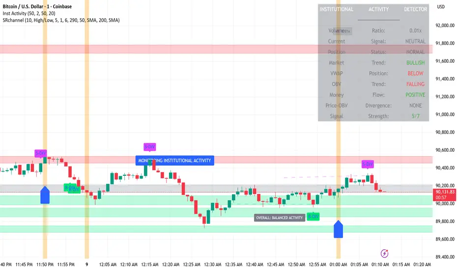
TRADE ORBIT:-Institutional FOOTPRINTBUY WHEN:
✅ Green position building zone
✅ Multiple strong buy signals
✅ Volume ratio > 2.0x
✅ Signal strength 6-7/7
✅ No bearish divergence
SELL WHEN:
🔴 Red position exiting zone
🔴 Multiple strong sell signals
🔴 Volume spike on down bars
🔴 Signal strength 6-7/7
🔴 No bullish divergence
WAIT WHEN:
⚠️ Conflicting signals
⚠️ Low volume
⚠️ Signal strength < 4/7
⚠️ Sideways market
COMMON MISTAKES TO AVOID
Don't trade on single signals
Don't ignore the overall trend
Don't overlook divergence signals
Always check volume confirmation
Wait for multiple time frame confirmation
PERFECT BUY SETUP:
Chart shows green background (position building)
Large green triangles appear below bars
Table shows:
Volume Ratio: 2.5x ✅
Signal: STRONG BUY ✅
Position Status: BUILDING ✅
Market Trend: BULLISH ✅
Signal Strength: 7/7 ✅
Price above VWAP and rising OBV
DANGER SELL SETUP:
Chart shows red background (position exiting)
Large red triangles appear above bars
Table shows:
Signal: STRONG SELL ✅
Position Status: EXITING ✅
Money Flow: NEGATIVE ✅
Bearish divergence present ✅
TIME FRAMES:
Best: Daily charts (most accurate for institutional detection)
Good: 4-hour and Weekly charts
For confirmation: Use multiple time frames
CONFIRMATION RULES:
Never trade on a single signal alone
Look for clusters of signals
Check signal strength (5-7/7 is strong)
Ensure trend alignment (don't fight the trend)
Watch for divergence as early warnings
RISK MANAGEMENT:
Entry: After 2-3 confirming signals in same direction
Stop Loss: Below recent support for buys, above resistance for sells
Position Size: Smaller during conflicting signals, larger during high confirmation
Recommended Alerts:
Strong Institutional Buying - For entry opportunities
Strong Institutional Selling - For exit warnings
Position Building - For accumulation phases
Position Exiting - For distribution phases
Bullish Divergence - Early accumulation signals
Bearish Divergence - Early distribution signals
BACKGROUND COLORS:
🔵 Blue background = High volume spike (2x+ average)
🟢 Green background = Position building zone (cluster of buys)
🔴 Red background = Position exiting zone (cluster of sells)
DIVERGENCE SIGNALS:
B-DIV = Bullish divergence (price low, OBV high = accumulation)
S-DIV = Bearish divergence (price high, OBV low = distribution)
MTF Alignment & Key Levelsso this one is specifically for the 1hr and 4hr time frame. but what it does is alert you once the monthly weekly and daily timeframes align with a trend in a certain direction wether its bearish or bullish but then it will mark out key levels on the 1hr and 4hr time frame to indicate when price breaks through that level to enter a trade in the direction of the higher timeframes alignment.

Damians UJ Strategy20 Pip Candle Strategy (No Engulfing)
Trades taken at 6pm direcrtly after candle close
Inputs allow you to reorganize retracement pips, SL, TP, 5PM candle amount.

Daily Range Box (RIC) V0.2This update enhances the "Daily Range Box" indicator by adding user-configurable inputs for colors and line styles. Users can now customize the box border color and the midline color independently through dedicated color picker inputs. Additionally, separate dropdown menus allow selection of line styles (Solid, Dashed, or Dotted) for both the box border and the midline, enabling personalized visualization while maintaining the core functionality of drawing daily range boxes with midlines across all timeframes.

EMA Crossover CandlesEMA Crossover Candles
This indicator colors your chart candles based on the relationship between two Exponential Moving Averages (EMAs).
How It Works
Green Candles - When the Fast EMA is above the Slow EMA, indicating bullish momentum
Red Candles - When the Fast EMA is below the Slow EMA, indicating bearish momentum
Settings
Source - The price data used for EMA calculations (default: close)
Fast Length - Period for the fast EMA (default: 5)
Slow Length - Period for the slow EMA (default: 10)
How To Use
This indicator provides a quick visual reference for trend direction. Green candles suggest the short-term trend is bullish, while red candles suggest bearish conditions. This can help you:
Identify trend direction at a glance
Filter trades in the direction of the trend
Spot potential trend changes when candle colors shift
Tips
Adjust the Fast and Slow Length settings to match your trading timeframe
Shorter periods = more responsive but more false signals
Longer periods = smoother but slower to react to trend changes
Consider hiding default candles in Chart Settings for a cleaner look
Note: This indicator is for informational purposes only and should not be used as the sole basis for trading decisions. Always use proper risk management and consider combining with other forms of analysis.
Feel free to modify this to match your style or add any additional details you'd like to include.Claude is AI and can make mistakes. Please double-check responses. Opus 4.5

Wheel Strategy SMAsPlots the 200 SMA and 50 SMA- For CSP, look for a strike price that is at or just below teh 200 sma

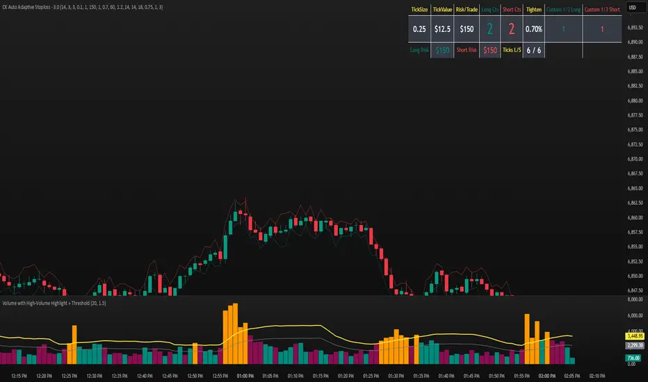
CK Auto Adaptive StoplossThis tool automatically finds the best stop-loss for every trade by analyzing candle structure, ATR volatility, volume spikes, and market momentum. It tightens or widens the stop dynamically and shows you exactly how many contracts you can use based on your risk per trade.
It also plots bold stop-loss lines on your chart and includes a live position-sizing table so you always stay consistent.
Reversal (Heikin Ashi-ready)This indicator detects bullish and bearish reversal patterns based purely on price action relative to prior candles. It is designed to be Heikin Ashi–compatible, meaning it can optionally use HA OHLC values rather than standard candles.
The script identifies:
Bullish reversals (V Up triangles)
Bearish reversals (V Down triangles)
It uses a two-stage system:
Context detection (a potential reversal setup forms).
Confirmation detection (price breaks a key level within a specified number of bars).

SPX Expected High/Low Move, S&R, Gamma (Daily Manual update Req)This script enables users to manually plot the anticipated low and high price movements, while also visualizing both positive and negative gamma exposures. The anticipated low represents the projected downside threshold based on expected volatility, whereas the anticipated high reflects the potential upside boundary under similar conditions. Positive gamma indicates scenarios where option positions benefit from underlying price movements, enhancing convexity and reducing directional risk. Conversely, negative gamma highlights exposures where option positions lose value as the underlying price moves, amplifying directional risk and requiring active hedging.
I use Barchart to manually update my personal chart each morning. I am not responsible for any information presented on their website. This is a reference tool to determine when and where to take profit, levels where price will test, etc. Use in conjunction with the appropriate EMAs for your timeframe and strategy.
